Investing money is necessary to survive the increasing cost of living.
1.1 Why should one Invest?
Before we address the above question, let us understand what would happen if one chooses not to invest. Let us assume you earn Rs.50,000/- per month, and you spend Rs.30,000/-towards your cost of living, which includes housing, food, transport, shopping, medical, etc. The balance of Rs.20,000/- is your monthly surplus. For the sake of simplicity, let us ignore the effect of personal income tax in this discussion.
To drive the point across, let us make a few simple assumptions.
The employer is kind enough to give you a 10% salary hike every year.
The cost of living is likely to go up by 8% year on year.
You are 30 years old and plan to retire at 50. This leaves you with 20 more years to earn
You don’t intend to work after you retire.
Your expenses are fixed and don’t foresee any other expense.
The balance cash of Rs.20,000/- per month is retained in the form of hard cash.
Going by these assumptions, here is how the cash balance will look like in 20 years.
Years
Yearly Income
Yearly Expense
Cash Retained
1
600,000
360,000
240,000
2
6,60,000
3,88,800
2,71,200
3
7,26,000
4,19,904
3,06,096
4
7,98,600
4,53,496
3,45,104
5
8,78,460
4,89,776
3,88,684
6
9,66,306
5,28,958
4,37,348
7
10,62,937
5,71,275
4,91,662
8
11,69,230
6,16,977
5,52,254
9
12,86,153
6,66,335
6,19,818
10
14,14,769
7,19,642
6,95,127
11
15,56,245
7,77,213
7,79,032
12
17,11,870
8,39,390
8,72,480
13
18,83,057
9,06,541
9,76,516
14
20,71,363
9,79,065
10,92,298
15
22,78,499
10,57,390
12,21,109
16
25,06,349
11,41,981
13,64,368
17
27,56,984
12,33,339
15,23,644
18
30,32,682
13,32,006
17,00,676
19
33,35,950
14,38,567
18,97,383
20
36,69,545
15,53,652
21,15,893
Total Income
17,890,693
If one were to analyze these numbers, you would soon realize this is a scary situation to be in. Few things are quite startling from the above calculations:
After 20 years of hard work you have accumulated Rs.1.7Crs.
Since your expenses are fixed, your lifestyle has not changed over the years, you probably even suppressed your lifelong aspirations – better home, a better car, vacations, etc.
After you retire, assuming the expenses will continue to grow at 8%, Rs.1.7Crs is good enough to sail you through roughly about 8 years of post-retirement life. 8th year onwards you will be in a very tight spot with literally no savings left to back you up.
What would you do after you run out of all the money in 8 years? How do you fund your life? Is there a way to ensure that you collect a larger sum at the end of 20 years?
Let’s consider another scenario where instead of keeping the cash idle, you choose to invest the cash in an investment option that grows at let’s say 12% per annum. For example – in the first year you retained Rs.240,000/- which when invested at 12% per annum for 20 years yields Rs.2,067,063/- at the end of 20th year.
Years
Yearly Income
Yearly Expense
Cash Retained
Retained Cash Invested @12%
1
600,000
360,000
240,000
20,67,063
2
6,60,000
3,88,800
2,71,200
20,85,519
3
7,26,000
4,19,904
3,06,096
21,01,668
4
7,98,600
4,53,496
3,45,104
21,15,621
5
8,78,460
4,89,776
3,88,684
21,27,487
6
9,66,306
5,28,958
4,37,348
21,37,368
7
10,62,937
5,71,275
4,91,662
21,45,363
8
11,69,230
6,16,977
5,52,254
21,51,566
9
12,86,153
6,66,335
6,19,818
21,56,069
10
14,14,769
7,19,642
6,95,127
21,58,959
11
15,56,245
7,77,213
7,79,032
21,60,318
12
17,11,870
8,39,390
8,72,480
21,60,228
13
18,83,057
9,06,541
9,76,516
21,58,765
14
20,71,363
9,79,065
10,92,298
21,56,003
15
22,78,499
10,57,390
12,21,109
21,52,012
16
25,06,349
11,41,981
13,64,368
21,46,859
17
27,56,984
12,33,339
15,23,644
21,40,611
18
30,32,682
13,32,006
17,00,676
21,33,328
19
33,35,950
14,38,567
18,97,383
21,25,069
20
36,69,545
15,53,652
21,15,893
21,15,893
Total cash after 20 years
4,26,95,771
With the decision to invest the surplus cash, your cash balance has increased significantly. The cash balance has grown to Rs.4.26Crs from Rs.1.7Crs. This is a staggering 2.4x times the regular amount. This translates to you being in a much better situation to deal with your post retirement life.
Now, going back to the initial question of why invest? There are a few compelling reasons for one to invest.
Fight Inflation – By investing one can deal better with the inevitable – growing cost of living – generally referred to as Inflation
Create Wealth – By investing, one can aim to have a better corpus by the end of the defined time period. In the above example, the time period was up to retirement, but it can be anything – children’s education, marriage, house purchase, retirement holidays, etc
Having figured out the reasons to invest, the next obvious question would be – Where would one invest, and what are the returns one could expect by investing.
When it comes to investing, one has to choose an asset class that suits the individual’s risk and return temperament.
An asset class is a category of investment with particular risk and return characteristics. The following are some of the popular asset classes.
Fixed income instruments
Equity
Real estate
Commodities (precious metals)
Fixed Income Instruments
These are investable instruments with minimal risk to the principle, and the return is paid as an interest to the investor based on the particular fixed-income instrument. The interest paid could be quarterly, semi-annual or annual intervals. At the end of the term of deposit, (also known as maturity period) the capital is returned to the investor.
Typical fixed income investment includes:
Fixed deposits offered by banks.
Bonds issued by the Government of India
Bonds issued by Government related agencies such as HUDCO, NHAI, etc
Bonds issued by corporate’s
As of June 2014, the typical return from a fixed income instrument varies between 8% and 11%.
Equity
Investment in Equities involves buying shares of publicly listed companies. The shares are traded on the Bombay Stock Exchange (BSE), and the National Stock Exchange (NSE).
When an investor invests in equity, unlike a fixed income instrument, there is no capital guarantee. However, as a trade-off, the returns from equity investment can be handsome. Indian Equities have generated returns close to 14% – 15% CAGR (compound annual growth rate) over the past 15 years.
Investing in some of the best and well run Indian companies has yielded over 20% CAGR in the long-term. Identifying such investment opportunities requires skill, hard work, and patience.
Taxation on Equity investments held for more than 365 days is taxed at 10%, if the gains are more than Rs 1 lakh starting from 1st April 2018(previously such investments were tax-free). This is comparatively a lower rate of tax than the other asset classes.
Real Estate Investment involves transacting (buying and selling) commercial and non-commercial land. Typical examples would include transacting in sites, apartments and commercial buildings. There are two income sources from real estate investments, namely – Rental income, and Capital appreciation of the investment amount.
The transaction procedure can be quite complex involving legal verification of documents. The cash outlay in real estate investment is usually quite large. There is no official metric to measure the returns generated by real estate. Hence it would be hard to comment on this.
Investments in gold and silver are considered one of the most popular investment avenues. Gold and silver over a long-term period have appreciated. Investments in these metals have yielded a CAGR return of approximately 8% over the last 20 years. There are several ways to invest in gold and silver. One can choose to invest in the form of jewellery or Exchange Traded Funds (ETF).
Going back to our initial example of investing the surplus cash it would be interesting to see how much one would have saved by the end of 20 years considering he can invest in any one – fixed income, equity or bullion.
By investing in fixed income at an average rate of 9% per annum, the corpus would have grown to Rs.3.3Crs.
Investing in equities at an average rate of 15% per annum, the corpus would have grown to Rs.5.4Crs.
Investing in bullion at an average rate of 8% per annum, the corpus would have grown to Rs.3.09Crs.
Clearly, equities tend to give you the best returns, especially when you have a multi-year investment perspective.
A note on investments
Investments optimally should have a strong mix of all asset classes. It is smart to diversify your investment among the various asset classes. The technique of allocating money across assets classes is termed as ‘Asset Allocation’.
For instance, a young professional may take a higher amount of risk given his age and years of investment available to him. Typically investors should allocate around 70% of their investable amount in Equity, 20% in Precious metals, and the rest in Fixed income investments.
Alongside the same rationale, a retired person could invest 80 per cent of his saving in fixed income, 10 per cent in equity markets and 10 per cent in precious metals. The ratio in which one allocates investments across asset classes depends on the investor’s risk appetite.
Investing is a great option, but before you venture into investments, it is good to be aware of the following…
Risk and Return go hand in hand. Higher the risk, higher the return. Lower the risk; lower is the return.
Investment in fixed income is a good option if you want to protect your principal amount. It is relatively less risky. However, you have the risk of losing money when you adjust the inflation return. Example – A fixed deposit which gives you 9% when the inflation is 10% means you are losing a net 1% per annum. Fixed-income investment is best suited for ultra risk-averse investors.
Investment in Equities is a great option. It is known to beat inflation over a long period of time. Historically equity investment has generated returns close to 14-15%. However, equity investments can be risky.
Real Estate investment requires a large outlay of cash and cannot be done with smaller amounts. Liquidity is another issue with real estate investment – you cannot buy or sell whenever you want. You always have to wait for the right time and the right buyer or seller to transact with you.
Gold and silver are relatively safer, but the historical return on such investment has not been very encouraging.
The corpus you intend to build at the end of the defined period is sensitive to the return rate the investment generates. A small variation to rate can have a big impact on the corpus.
Choose an instrument that best suits your risk and return appetite.
Equity should be a part of your investment if you want to beat the inflation in the long run
Investing in equities is an important investment that we make to generate inflation-beating returns. This was the conclusion we drew from the previous chapter. Having said that, how do we go about investing in equities? Clearly, before we dwell further into this topic, it is essential to understand the ecosystem in which equities operate.
Just like the way we go to the neighbourhood Kirana store or a supermarket to shop for our daily needs, similarly, we go to the stock market to shop (read as transact) for equity investments. The stock market is where everyone who wants to transact in shares goes to. Transact, in simple terms, means buying and selling. You can’t buy/sell shares of a public company like Infosys without transacting through the stock markets for all practical purposes.
The main purpose of the stock market is to help you facilitate your transactions. So if you are a buyer of a share, the stock market helps you meet the seller and vice versa.
Now unlike a supermarket, the stock market does not exist in a brick and mortar form. It exists in electronic form. You access the market electronically from your computer and go about conducting your transactions (buying and selling of shares).
It is also important to note that you can access the stock market via a registered intermediary called the stockbroker. We will discuss more the stockbrokers at a later point.
There are two main stock exchanges in India that make up the stock markets. They are the Bombay Stock Exchange (BSE) and the National Stock Exchange (NSE). Besides these two exchanges, there are many other regional stock exchanges like Bangalore Stock Exchange, Madras Stock Exchange that are more or less getting phased out and don’t really play any meaningful role anymore.
The stock market attracts individuals and corporations from diverse backgrounds. Anyone who transacts in the stock market is called a market participant. The market participant can be classified into various categories. Some of the categories of market participants are as follows:
Domestic Retail Participants – These are people like you and me transacting in markets
NRI’s and OCI – These are people of Indian origin but based outside India
Domestic Institutions – These are large corporate entities based in India. A classic example would be the LIC of India.
Domestic Asset Management Companies (AMC) – Typical participants in this category would be the mutual fund companies such as SBI Mutual Fund, DSP Black Rock, Fidelity Investments, HDFC AMC, etc.
Foreign Institutional Investors – Non-Indian corporate entities. These could be foreign asset management companies, hedge funds, and other investors.
Now, irrespective of the category of market participant, everyone’s agenda is the same – to make profitable transactions. More bluntly put – to make money.
When money is involved, human emotions in the form of greed and fear run high. One can easily fall prey to these emotions and get involved in unfair practices. India has its fair share of such twisted practices, thanks to Harshad Mehta’s operations and the like.
Given this, the stock markets need someone who can set the game rules (commonly referred to as regulation and compliance) and ensure that people adhere to these regulations and compliance thereby making the markets a level playing field for everyone.
In India, the stock market regulator is called The Securities and Exchange Board of India, often referred to as SEBI. The objective of SEBI is to promote the development of stock exchanges, protect the interest of retail investors, and regulate market participants and financial intermediaries’ activities. In general, SEBI ensures:
The stock exchanges (BSE and NSE) conducts its business fairly
Stockbrokers and sub-brokers conduct their business fairly
Participants don’t get involved in unfair practices
Corporate’s don’t use the markets to unduly benefit themselves (Example – Satyam Computers)
Small retail investors interests are protected
Large investors with huge cash pile should not manipulate the markets
Overall development of markets
Given the above objectives, it becomes imperative for SEBI to regulate the following entities. All the entities mentioned below are directly involved in the stock markets. Malpractice by anyone of the following entities can disrupt what is otherwise a harmonious market in India.
SEBI has prescribed a set of rules and regulations to each one of these entities. The entity should operate within the legal framework as prescribed by SEBI. The specific rules applicable to a specific entity are made available by SEBI on their website. They are published under the ‘Legal Framework’ section of their site.
Entity
Example of companies
What do they do?
In simpler words
Credit Rating Agency (CRA)
CRISIL, ICRA, CARE
They rate the creditworthiness of corporate and governments
If a corporate or Govt entity wants to avail the loan, CRA checks if the entity is worthy of giving a loan
Debenture Trustees
Almost all banks in India
Act as a trustee to corporate debenture
When companies want to raise a loan, they can issue debenture against which they promise to pay interest. The public can subscribe to these debentures. A Debenture Trustee ensures that the
debenture obligation is honoured
Depositories
NSDL and CDSL
Safekeeping, reporting and settlement of clients securities
Acts like a vault for the shares that you buy. The depositories hold your shares and facilitate the exchange of your securities. When you buy shares these shares sit in your Depositary account usually referred to as the DEMAT account. This is maintained electronically by only two companies in India
Depository Participant (DP)
Most of the banks and few stockbrokers
Act as an agent to the two depositories
You cannot directly interact with NSDL or CDSL. You need to liaison with a DP to open and maintain your DEMAT account
Foreign Institutional Investors
Foreign corporate, funds and individuals
Make investments in India
These are foreign entities with interest to invest in India. They usually transact in large amounts of money, and hence their activity in the markets have an impact in terms of market sentiment
Merchant Bankers
Karvy, Axis Bank, Edelweiss Capital
Help companies raise money in the primary markets
If a company plans to raise money by floating an IPO, then merchant bankers are the ones who help companies with the IPO process
Asset Management Companies
(AMC)
HDFC AMC, Reliance Capital, SBI Capital
Offer Mutual Fund Schemes
An AMC collects money from the public, puts that money in a single account, and then invests that money in markets intending to make the investments grow and generate wealth.
Portfolio Managers/
Portfolio Management System
(PMS)
Religare Wealth Management, Parag Parikh PMS
Offer PMS schemes
They work similarly to a mutual fund except in a PMS; you have to invest a minimum of Rs.25,00,000; however, there is no such cap in a mutual fund.
Stock Brokers and Sub Brokers
Zerodha, Sharekhan, ICICI Direct
Act as an intermediary between an investor and the stock exchange
Whenever you want to buy or sell shares from the stock exchange, you have to do so through registered stock brokers. A sub-broker is like an agent to a stockbroker.
The stock market is the place to go to if you want to transact in equities.
Stock markets exist electronically and can be accessed through a stockbroker.
There are many different kinds of market participants operating in the stock markets.
Every entity operating in the market has to be regulated, and they can operate only within the framework as prescribed by the regulator.
SEBI is the regulator of the securities market in India. They set the legal framework and regulate all entities interested in operating in the market.
Most importantly you need to remember that SEBI is aware of what you are doing and they can flag you down if you are upto something fishy in the markets!
From the time you access the market – let’s say, to buy a stock till the stocks come and hit your DEMAT account, many corporate entities are actively involved in making this work for you. These entities play their role quietly behind the scene, always complying with the rules laid out by SEBI and ensure an effortless and smooth experience for your transactions in the stock market. These entities are generally referred to as the Financial Intermediaries.
Together, these financial intermediaries, interdependent of one another, create an ecosystem in which the financial markets exist. This chapter will help you get an overview of what these financial intermediaries are and the services they offer.
3.2 The Stock Broker
The stockbroker is probably one of the most important financial intermediaries that you need to know. A stockbroker is a corporate entity, registered as a trading member with the stock exchange and holds a stockbroking license. They operate under the guidelines prescribed by SEBI.
A stockbroker is your gateway to stock exchanges. First, you need to open something called a ‘Trading Account’ with a broker who meets your requirements. Your requirement could be as simple as the proximity between the broker’s office and your house. Simultaneously, it can be as complicated as identifying a broker who can provide you with a single platform using which you can transact across multiple exchanges across the world. At a later point, we will discuss what these requirements could be and how to choose the right broker.
A trading account lets you carry financial transactions in the market. A trading account is an account with the broker, which lets the investor buy/sell securities.
So assuming you have a trading account – whenever you want to transact in the markets, you need to interact with your broker. There are a few standard ways through which you can interact with your broker.
You can go to the broker’s office and meet the dealer in the broker’s office and tell him what you wish to do. A dealer is an executive at the stock broker’s office who carries out these transactions on your behalf.
You can make a telephone call to your broker, identify yourself with your client code (account code) and place an order for your transaction. The dealer at the other end will execute the order for you and confirm the status of the same while you are still on the call.
Do it yourself – this is perhaps the most popular way of transacting in the markets. The broker gives you access to the market through software called ‘Trading Terminal’. After you log in to the trading terminal, you can view live price quotes from the market and place orders yourself.
The basic services provided by the brokers include…
Give you access to markets and letting you transact
Give you margins for trading – We will discuss this point at a later stage.
Provide support – Dealing support if you have to call and trade. Software support if you have issues with the trading terminal
Issue contract notes for the transactions – A contract note is a written confirmation detailing the transactions you have carried out during the day.
Facilitate the fund transfer between your trading and bank account
Provide you with a back-office login – using which you can see the summary of your account
The broker charges a fee for the services he provides called the ‘brokerage charge’ or just brokerage. The brokerage rates vary, and it’s upto you to find a broker who strikes a balance between the fee he collects versus the services he provides.
When you buy a property, the only way to identify and claim that you actually own the property is by producing the property papers. Hence it becomes essential to store the property papers in a safe and secure place.
Likewise, when you buy a share (a share represents part ownership in a company) the only way to claim your ownership is by producing your share certificate. A share certificate is nothing but a piece of document entitling you as the owner of the shares in a company.
Before 1996 the share certificate was in paper format; however post 1996, the share certificates were converted to digital form. Converting a paper format share certificate into a digital format share certificate is called “Dematerialization” often abbreviated as DEMAT.
The share certificate in DEMAT format has to be stored digitally. The storage place for the digital share certificate is the ‘DEMAT Account’. A Depository is a financial intermediary which offers the service of the Demat account. A DEMAT account in your name will have all the shares in the electronic format you bought. Think of the DEMAT account as a digital vault for your shares.
As you may have guessed, your broker’s trading account and the DEMAT account from the Depository are interlinked.
For example, if your idea is to buy Infosys shares, then all you need to do is open your trading account, look for Infosys’ prices, and buy it. Once the transaction is complete, the role of your trading account is done. After you buy, the shares of Infosys will automatically come and sit in your DEMAT account.
Likewise, when you wish to sell Infosys shares, all you have to do is open your trading account and sell the stock. This takes care of the transaction part…however in the backend, the shares which are sitting in your DEMAT account will get debited, and the shares move out of your DEMAT account.
At present, only two depositaries are offering you DEMAT account services. They are The National Securities Depository Limited (NSDL) and Central Depository Services (India) Limited. There is virtually no difference between the two, and both of them operate under strict SEBI regulations.
Just like the way you cannot walk into National Stock Exchange’s office to open a trading account, you cannot walk into a Depository to open a DEMAT account. To open a DEMAT account, you need to liaison with a Depository Participant (DP). A DP helps you set up your DEMAT account with a Depository. A DP acts as an agent to the Depository. Needless to say, even the DP is governed by the regulations laid out by the SEBI.
Banks play a very straightforward role in the market ecosystem. They help in facilitating the fund transfer from your bank account to your trading account. You cannot transfer money from a bank account that is not in your name.
You can link multiple bank accounts to your trading through which you can transfer funds and trade. At Zerodha, you can add 1 primary bank account and up to 2 secondary bank accounts. You can use all the bank accounts to add funds, but withdrawals are only processed to the primary bank account. Also, dividend payments, money from buybacks will be sent to the primary bank account. The primary bank account is connected to your trading account and with the Depository and the Registrar and transfer agents (RTA).
At this stage, you must have realized that the three financial intermediaries operate via three different accounts – trading account, DEMAT account and Bank account. All three accounts operate electronically and are interlinked, giving you a very seamless experience.
NSCCL – National Security Clearing Corporation Ltd and Indian Clearing Corporation are wholly owned subsidiaries of National Stock Exchange and Bombay Stock Exchange.
The job of the clearing corporation is to ensure guaranteed settlement of your trades/transactions. For example, if you were to buy 1 share of Biocon at Rs.446 per share, there must be someone who has sold that 1 share to you at Rs.446. For this transaction, you will be debited Rs.446 from your trading account, and someone must be credited that Rs.446 toward the sale of Biocon. In a typical transaction like this, the clearing corporation’s role is to ensure the following:
a) Identify the buyer and seller and match the debit and credit process
b) Ensure no defaults – The clearing corporation also ensures there are no defaults by either party. For instance, after selling the shares, the seller should not be in a position to back out, thereby defaulting in his transaction.
For all practical purposes, it’s ok not to know much about NSCCL or ICCL simply because, you as a trader or investor would not be interacting with these agencies directly. You need to be aware that certain professional institutions are heavily regulated and work towards a smooth settlement and efficient clearing activity.
The market ecosystem is built by a cluster of financial intermediaries, each offering services unique to the functioning of markets.
A stockbroker is your access to markets, so make sure you choose a broker that matches your requirements, and services well.
A stockbroker provides you with a trading account which is used for all market-related transactions (buying and selling of financial instruments like shares)
A Depository is a corporate entity which holds the shares in electronic form, against your name, in your account. Your account with the depository is called the ‘DEMAT’ account.
There are only two depositories in India – NSDL and CDSL.
To open a DEMAT account with one of the depositaries, you need to liaison with a Depository Participant (DP). A DP functions as an agent to the Depository
A clearing corporation works towards clearing and settling of trades executed by you.
The initial three chapters have set the background on some of the basic market concepts you need to know. It becomes imperative to address a fundamental question at this stage – Why do companies go public?
A good understanding of this topic lays down a sound foundation for all future topics. We will learn new financial concepts during the course of this chapter.
Before we jump ahead to seek an answer as to why companies go public, let us spend some time figuring out a more basic concept – the origins of a typical business. To understand this concept better, we will build a tangible story around it. Let us split this story into several scenes to get a clear understanding of how the business and the funding environment evolve.
Scene 1 – The Angels
Imagine a budding entrepreneur with a brilliant business idea – to manufacture highly fashionable, organic cotton t-shirts. The designs are unique, has attractive price points, and the best quality cotton is used to make these t-shirts. He is confident that the business will be successful and is enthusiastic about launching the idea into a business.
As a typical entrepreneur, he is likely to be hit by the typical problem – where would he get the money to fund the idea? Assuming the entrepreneur has no business background, he will not attract any serious investor at the initial stage. Chances are, he would approach his family and friends to pitch the idea and raise some money. He could approach the bank for a loan, but this would not be the best option.
Let us assume that he pools in his own money and convinces two of his good friends to invest in his business. These two friends are investing in the pre-revenue stage and taking a blind bet on the entrepreneur called the Angel investors. Please note, the money from the angels is not a loan; it is actually an investment made by them.
So let us imagine that the promoter, along with the angels, raises INR 5 Crore in the capital. This initial money that he gets to kick start his business is called ‘The Seed Fund’. It is important to note that the seed fund will not sit in the entrepreneur’s (also called the promoter) personal bank account but instead sits in its bank account. Once the seed capital hits the company’s bank account, the money will be referred to as the company’s initial share capital.
In return for the initial seed investment, the original three (promoter plus 2 angels) will be issued share certificates of the company which entitles them to the company.
The only asset that the company has at this stage is the cash of INR 5 Crs, the company’s value is also INR 5 Crs. This is called the company’s valuation.
Issuing shares is quite simple; the company assumes that each share is worth Rs.10 and because there is Rs.5 crore as share capital, there have to be 50 lakh shares with each share worth Rs.10. In this context, Rs.10 is called the ‘Face value’ (FV) of the share. The face value could be any number. If the FV is Rs.5, then the number of shares would be 1 crore, so on and so forth.
A total of 50 lakh shares is called the Authorized shares of the company. These shares have to be allotted amongst the promoter, and two angels plus the company has to retain some amount of shares with itself to be issued in the future.
So let us assume the promoter retains 40% of the shares, and the two angels get 5% each, and the company retains 50% of the shares. Since the promoter and two angels own 50% of the shares, this allotted portion is called Issued shares.
The shareholding pattern of this company would look something like this:
Sl No
Name of Share Holder
No of Shares
%Holding
1
Promoter
2,000,000
40%
2
Angel 1
250,000
05%
3
Angel 2
250,000
05%
Total
2,500,000
50%
Please note the company retains the balance of 50% of the shares totalling 2,500,000 equity shares. These shares are authorized but not allotted.
Now backed by a good company structure and a healthy seed fund, the promoter kick starts his business operations. He wants to move cautiously. Hence he decides to open just one small manufacturing unit and one store to retail his product.
Scene 2 – The Venture Capitalist
His hard work pays off, and the business starts to pick up. At the end of the first two years of operations, the company starts to break even. The promoter is now no longer a rookie business owner. Instead, he is more knowledgeable about his own business and of course, more confident.
Backed by his confidence, the promoter now wants to expand his business by adding 1 more manufacturing unit and a few additional retail stores in the city. He chalks out the plan and figures out that the fresh investment needed for his business expansion is INR 7 Crs.
He is now in a better situation when compared to where he was two years ago. The big difference is the fact that his business is generating revenues. The healthy inflow of revenue validates the business and its offerings. He is now in a situation where he can access reasonably savvy investors for investing in his business. Let us assume he meets one such professional investor who agrees to give him 7 Crs for a 14% stake in his company.
The investor who typically invests in such an early stage of business is called a Venture Capitalist (VC), and the money that the business gets at this stage is called Series A funding.
After the company agrees to allot 14% to the VC from the authorized capital, the shareholding pattern looks like this:
Sl No
Name of Share Holder
No of Shares
%Holding
1
Promoter
2,000,000
40%
2
Angel 1
250,000
05%
3
Angel 2
250,000
05%
4
Venture Capitalist
700,000
14%
Total
3,200,000
64%
Note, the balance 36% of shares is still retained within the company and has not been issued.
With the VC’s money coming into the business, an exciting development has taken place. The VC values the entire business at INR 50 Crs by valuing his 14% stake in the company at INR 7Crs. With the initial valuation of 5Crs, there is a 10 fold increase in the company’s valuation. This is what a good business plan, validated by a healthy revenue stream, can do to businesses. It works as a perfect recipe for wealth creation.
With the valuations going up, the investments made by the initial investors will have an impact. The following table summarizes the same…
Sl No
Name of Share Holder
Initial Shareholding
Initial Valuation
Shareholding after 2 Yrs
Valuation after 2 Yrs
Wealth Created
1
Promoter
40%
2 Cr
40%
20 Cr
10 times
2
Angel 1
05%
25 Lakhs
05%
2.5 Cr
10 times
3
Angel 2
05%
25 Lakhs
05%
2.5 Cr
10 times
4
Venture Capitalist
0%
-NA-
14%
07 Cr
-NA-
Total
50%
2.5 Cr
64%
32 Cr
Going forward with our story, the promoter now has the additional capital he requires for the business. The company gets an additional manufacturing unit and a few more retail outlets in the city as planned. Things are going great; the popularity of the product grows, translating into higher revenues. The management team gets more professional, thereby increasing the operational efficiency, which translates to better profits.
Scene 3 – The Banker
Three more years pass by, and the company is phenomenally successful. The company decides to have a retail presence in at least 3 more cities. To back the retail presence across three cities, the company also plans to increase the production capacity and hire more resources. Whenever a company plans such expenditure to improve the overall business, the expenditure is called ‘Capital Expenditure’ or simply ‘CAPEX’.
The management estimates 40Crs towards their CAPEX requirements. How does the company get this money or in other words, how can the company fund its CAPEX requirements?
There are few options with the company to raise the required funds for their CAPEX:
The company has made some profits over the last few years; a part of the CAPEX requirement can be funded through the profits. This is also called funding through internal accruals.
The company can approach another VC and raise another round of VC funding by allotting shares from the authorized capital – this is called Series B funding.
The company can approach a bank and seek a loan. The bank would be happy to tender this loan as the company has been doing fairly well. The loan is also called ‘Debt.’
The company decides to exercise all three options at its disposal to raise funds for Capex. It ploughs 15Crs from internal accruals, plans a series B – divests 5% equity for a consideration of 10Crs from another VC and raises 15Crs debt from the banker.
Note, with 10Crs coming in for 5%, the company’s valuation now stands at 200 Crs. Of course, this may seem a bit exaggerated, but then the whole purpose of this story is to drive across the concept!
The shareholding and valuation look something like this:
Sl No
Name of Share Holder
No of Shares
%Holding
Valuation
1
Promoter
2,000,000
40%
80 Cr
2
Angel 1
250,000
05%
10 Cr
3
Angel 2
250,000
05%
10 Cr
4
VC Series A
700,000
14%
28 Cr
5
VC Series B
250,000
05%
10 Cr
Note, the company still has 31% of shares not allotted to shareholders now being valued at 62 Crs. Also, I would encourage you to think about the wealth that has been created over the years. This is exactly what happens to entrepreneurs with great business ideas and a highly competent management team.
Classic real-world examples of such wealth creation stories would be Infosys, Page Industries, Eicher Motors, Titan Industries, and the international space one could think of Google, Facebook, Twitter, Whatsapp, etc.
Scene 4 – The Private Equity
A few years pass by, and the company’s success continues to shine on. With the growing success of this 8-year-old, 200 Cr Company, the ambitions are also growing. The company decides to raise the bar and branch out across the country. They also decide to diversify the company by manufacturing and retailing fashion accessories, designer cosmetics and perfumes.
The CAPEX requirement for the new ambition is now pegged at 60 Crs. The company does not want to raise money through debt because of the interest rate burden, also called the financecharges, which would eat away the company’s profits.
They decide to allot shares from the authorized capital for a Series C funding. They cannot approach a typical VC because VC funding is usually small and runs into a few crores. This is when a Private Equity (PE) investor comes into the picture.
PE investors are quite savvy. They are highly qualified and have an excellent professional background. They invest large amounts of money to provide the capital for constructive use and place their own people on the board of the investee company to ensure the company steers in the required direction.
Assuming they pick up a 15% stake for a consideration of 60Crs, they are now valuing the company at 400Crs. Let’s have a quick look at the shareholding and valuations:
Sl No
Name of Share Holder
No of Shares
%Holding
Valuation (in Crs)
1
Promoter
2,000,000
40%
160
2
Angel 1
250,000
05%
20
3
Angel 2
250,000
05%
20
4
VC Series A
700,000
14%
56
5
VC Series B
250,000
05%
20
6
PE Series C
7,50,000
15%
60
Total
4,450,000
84%
336
Please note, the company has retained a 16% stake which has not been allotted to any shareholder. This portion is valued at 64 Crs.
Usually, when a PE invests, they invest intending to fund large CAPEX requirements. Besides, they do not invest in the early stage of a business; instead, they prefer to invest in companies that already have a revenue stream, and are in operation for a few years. Deploying the PE capital and utilizing the capital for the CAPEX requirements takes up a few years.
Scene 5 – The IPO
5 years after the PE investment, the company has progressed really well. They have successfully diversified their product portfolio and have a presence across all the country’s major cities. Revenues are good, profitability is stable, and the investors are happy. The promoter, however, does not want to settle in for just this.
The promoter now aspires to go international! He wants his brand to be available across all the major international cities; he wants at least two outlets in each major city across the world.
This means the company needs to invest in market research to understand what people like in other countries, invest in people, and increase manufacturing capacities. Besides they also need to invest in real estate space across the world.
This time around the CAPEX requirement is huge, and the management estimates this at 200 Crs. The company has few options to fund the CAPEX requirement.
Fund Capex from internal accruals
Raise Series D from another PE fund
Raise debt from bankers
Float a bond (this is another form of raising debt)
File for an Initial Public Offer (IPO) by allotting shares from authorized capital
A combination of all the above
For convenience, let us assume the company decides to fund the CAPEX partly through internal accruals and files for an IPO. When a company files for an IPO, they have to offer their shares to the general public. The general public will subscribe to the shares (i.e. if they want to) by paying a certain price. Now, because the company is offering the shares for the first time to the public, it is called the “Initial Public Offer’.
We are now at a very crucial juncture, where a few questions need to be answered.
Why did the company decide to file for an IPO? In general, why do companies go public?
Why did they not file for the IPO when they were in Series A, B and C situation?
What would happen to the existing shareholders after the IPO?
What does the general public look for before they subscribe to the IPO?
How does the IPO process evolve?
Which of the financial intermediaries involved in the IPO markets?
What happens after the company goes public?
In the following chapter, we will address each of the above questions plus more, and we will also give you more insights into the IPO Market. For now, hopefully, you should have developed a sense of how a successful company evolves before they come out to the public to offer their shares.
This chapter aims to give you a sense of completeness when one thinks about an IPO.
Before understanding why companies go public, it is important to understand the origin of business.
The people who invest in your business in the pre-revenue stage are called Angel Investors.
Angel investors take the maximum risk. They take in as much risk as the promoter.
The money that angels give to start the business is called the seed fund.
Angel’s invest relatively a small amount of capital
Valuation of a company simply signifies how much the company is valued at. When one values the company, they consider the company’s assets and liabilities.
Face value is simply a denominator to indicate how much one share is originally worth.
Authorized shares of the company are the total number of shares that are available with the company.
The shares distributed from the authorized shares are called the issued shares. Issued shares are always a subset of authorized shares.
The shareholding pattern of a company tells us who owns how much stake in the company.
Venture Capitalists invest at an early stage in business; they do not risk Angel investors. The quantum of investments by a VC is usually somewhere in between an angel and private equity investment.
The money the company spends on business expansion is called capital expenditure or CAPEX
Series A, B, and C, etc., are all funding that the company seeks as they start evolving. Usually higher the series, higher is the investment required.
Beyond a certain size, VCs cannot invest, and hence the company seeking investments will have to approach Private Equity firms.
PE firms invest large sums of money, and they usually invest at a slightly more mature stage of the business.
In terms of risk, PE’s have a lower risk appetite as compared to VC or angels.
Typical PE investors would like to deploy their own people on the investee company’s board to ensure business moves in the right direction.
The valuation of the company increases as and when the business, revenues and profitability increases.
An IPO is a process using which a company can raise fund. The funds raised can be for any valid reason – for CAPEX, restructuring debt, rewarding shareholders, etc
The previous chapter gave us an understanding of how a company evolved right from the idea generation stage to all the way until it decides to file for an IPO. The idea behind creating the fictional story in the previous chapter was to give you a sense of how a business matures over time. The emphasis obviously was on the different stages of business and funding options available at various stages of business. The previous chapter gives you a perspective of what a company would have gone through before it comes out to the public to offer its shares.
This is extremely important to know because the IPO market, also called the Primary market sometimes attracts companies offering their shares to the public without actually going through a healthy round of funding in the past. A few rounds of funding by credible VC and PE firms validate the quality of the business and its promoters. Of course, you need to treat this with a pinch of salt but nevertheless it acts as an indicator to identify well run companies.
We closed the previous chapter with a few critical questions. One of which – Why did the company decide to file for an IPO, and in general why do companies go public?
When a company decides to file for an IPO, invariably the main reason is to raise funds to fuel their CAPEX requirement. The promoter has 3 advantages by taking his company public:
He is raising funds to meet CAPEX requirement
He is avoiding the need to raise debt which means he does not have to pay finance charges which translates to better profitability
Whenever you buy a share of a company, you are in essence taking the same amount of risk as the promoter is taking. Needless to say, the proportion of the risk and its impact will depend on the number of shares you hold. Nonetheless, whether you like it or not, when you buy shares you also buy risk. So when the company goes public, the promoter is actually spreading his risk amongst a large group of people.
There are other advantages as well in going for an IPO…
Provide an exit for early investors – Once the company goes public, the shares of the company start trading publicly. Any existing shareholder of the company – could be promoters, angel investors, venture capitalists, PE funds; can use this opportunity to sell their shares in the open market. By selling their shares, they get an exit on their initial investment in the company. They can also choose to sell their shares in smaller chunks if they wish.
Reward employees –Employees working for the company would have shares allotted to them as an incentive. This sort of arrangement between the employee and the company is called the “Employee Stock Option”. The shares are allotted at a discount to the employees. Once the company goes public, the employees stand a chance to see capital appreciation in the shares. Few examples where the employee benefited from ESOP would be Google, Infosys, Twitter, Facebook, etc
Improve visibility – Going public definitely increases visibility as the company has a status of being publicly held and traded. There is a greater chance of people’s interest in the company, consequently creating a positive impact on its growth.
So let’s just build on our fictional business story from the previous chapter a little further and figure out the IPO details of this company.
If you recollect, the company requires 200 Crs to fund their CAPEX and the management had decided to fund this partly by internal accrual and partly by filing for an IPO.
Do recollect that the company still has 16% of authorized capital translating to 800,000 shares which are not allotted. The last valuation of these shares when the PE firm invested in Series B was 64Crs. The company has progressed really well ever since the PE firm has invested and naturally the valuation of these shares would have gone up.
For the sake of simplicity, let us assume the company is now valuing the 16% shares anywhere between 125 Crs to 150 Crs. This translates to a per-share value, anywhere between Rs.1562 to Rs.1875/-…(125Crs/8lakh).
So if the company puts 16% on the block to the public, they are likely to raise anywhere between 125 to 150 Crs. The remainder has to come from internal accruals. So naturally, the more money they raise, the better it is for the company.
Having decided to go public, the company must now do a series of things to ensure a successful initial public offering. The first and foremost step would be to appoint a merchant banker. Merchant bankers are also called Book Running Lead Managers (BRLM)/Lead Manager (LM). The job of a merchant banker is to assist the company with various aspects of the IPO process including:
Conduct due diligence on the company filing for an IPO, ensure their legal compliance and also issue a due diligence certificate
Should work closely with the company and prepare their listing documents including Draft Red Herring Prospectus (DRHP). We will discuss this in a bit more detail at a later stage
Underwrite shares – By underwriting shares, merchant bankers essentially agree to buy all or part of the IPO shares and resell the same to the public
Help the company arrive at the price band for the IPO. A price band is the lower and upper limit of the share price within which the company will go public. In the case of our example, the price band will be Rs.1562/- and Rs.1875/-
Help the company with the roadshows – This is like a promotional/marketing activity for the company’s IPO
Appointment of other intermediaries namely, registrars, bankers, advertising agencies, etc. The Lead manager also makes various marketing strategies for the issue
Once the company partners with the merchant banker, they will work towards taking the company public.
Needless to say, each and every step involved in the IPO sequence has to happen under the SEBI guidelines. In general, the following are the sequence of steps involved.
Appoint a merchant banker. In case of a large public issue, the company can appoint more than 1 merchant banker
Apply to SEBI with a registration statement – The registration statement contains details on what the company does, why the company plans to go public and the financial health of the company
Getting a nod from SEBI – Once SEBI receives the registration statement, SEBI takes a call on whether to issue a go-ahead or a ‘no go’ to the IPO
DRHP – If the company gets the initial SEBI nod, then the company needs to prepare the DRHP. A DRHP is a document that gets circulated to the public. Along with a lot of information, DRHP should contain the following details:
The estimated size of the IPO
The estimated number of shares being offered to the public
Why the company wants to go public and how does the company plan to utilize the funds along with the timeline projection of fund utilization
Business description including the revenue model, expenditure details
Complete financial statements
Management Discussion and Analysis – how the company perceives future business operations to emerge
Risks involved in the business
Management details and their background
Market the IPO – This would involve TV and print advertisements in order to build awareness about the company and its IPO offering. This process is also called the IPO roadshow
Fix the price band – Decide the price band between which the company would like to go public. Of course, this can’t be way off the general perception. If it is, then the public will not subscribe for the IPO
Book Building – Once the roadshow is done and the price band fixed the company now has to officially open the window during which the public can subscribe for shares. For example, if the price band is between Rs.100 and Rs.120, then the public can actually choose a price they think is fair enough for the IPO issue. The process of collecting all these price points along with the respective quantities is called Book Building. Book building is perceived as an effective price discovery method
Closure – After the book building window is closed (generally open for few days) then the price point at which the issue gets listed is decided. This price point is usually the price at which maximum bids have been received.
Listing Day – This is the day when the company actually gets listed on the stock exchange. The listing price is the price decided based on market demand and supply on that day and the stock is listed at a premium, par or discount of the cut-off price
During the bidding process (also called the date of issue) investors can bid for shares at a particular price within the specified price band. This whole system around the date of the issue where one bids for shares, is referred to as the Primary Market. The moment the stock gets listed and debuts on the stock exchange, the stock starts to trade publicly. This is called the secondary market.
Once the stock transitions from primary markets to secondary markets, the stock gets traded daily on the stock exchange. People start buying and selling stocks regularly.
Why do people trade? Why does the stock price fluctuate? Well, we will answer all these questions and more in the subsequent chapters.
Before we wrap up the chapter on IPO’s let us review a few important IPO jargons.
Under subscription – Let’s say the company wants to offer 100,000 shares to the public. During the book-building process, it is discovered that only 90,000 bids were received, then the issue is said to be under subscribed. This is not a great situation to be in as it indicates negative public sentiment
Oversubscription – If there are 200,000 bids for 100,000 shares on offer then the issue is said to be oversubscribed 2 times (2x)
Green Shoe Option – Part of the underwriting agreement which allows the issuer to authorize additional shares (typically 15 percent) to be distributed in the event of oversubscription. This is also called the overallotment option
Fixed Price IPO –Sometimes the companies fix the price of the IPO and do not opt for a price band. Such issues are called fixed price IPO
Price Band and Cut off price –Price band is a price range between which the stock gets listed. For example, if the price band is between Rs.100 and Rs.130, then the issue can list within the range. Let’s says it gets listed at 125, then 125 is called the cut off price.
Having understood the IPO process and what really goes behind the company’s transition from primary to secondary market we are now set to explore the stock markets a step further.
By virtue of being a public company, the company is now liable to disclose all information related to the company to the public. The shares of a public limited company are traded on the stock exchanges on a daily basis.
There are few reasons why market participants trade stocks. We will explore these reasons in this chapter.
Like we discussed in chapter 2, the stock market is an electronic market place. Buyers and sellers meet and trade their point of view.
For example, consider the current situation of Infosys. At the time of writing this, Infosys is facing a succession issue, and most of its senior level management personnel are quitting the company for internal reasons. It seems like the leadership vacuum is weighing down the company’s reputation heavily. As a result, the stock price dropped to Rs.3,000 all the way from Rs.3,500. Whenever there are new reports regarding Infosys management change, the stock prices react to it.
Assume there are two traders – T1 and T2.
T1’s point of view on Infosys – The stock price is likely to go down further because the company will find it challenging to find a new CEO.
If T1 trades as per his point of view, he should be a seller of the Infosys stock.
T2, however views the same situation in a different light and therefore has a different point of view – According to him, the stock price of Infosys has over reacted to the succession issue and soon the company will find a great leader, after whose appointment the stock price will move upwards.
If T2 trades as per his point of view, he should be a buyer of the Infosys stock.
So at, Rs.3, 000 T1 will be a seller, and T2 will be a buyer in Infosys.
Now both T1 and T2 will place orders to sell and buy the stocks respectively through their respective stock brokers. The stock broker, obviously routes it to the stock exchange.
The stock exchange has to ensure that these two orders are matched, and the trade gets executed. This is the primary job of the stock market – to create a market place for the buyer and seller.
The stock market is a place where market participants can access any publicly listed company and trade from their point of view, as long as there are other participants who have an opposing point of view. After all, different opinions are what make a market.
Let us continue with the Infosys example to understand how stocks really move. Imagine you are a market participant tracking Infosys.
It is 10:00 AM on 11th June 2014 ,and the price of Infosys is 3000. The management makes a statement to the press that they have managed to find a new CEO who is expected to steer the company to greater heights. They are confident on his capabilities and they are sure that the new CEO will deliver much more than what is expected out of him.
Two questions –
How will the stock price of Infosys react to this news?
If you were to place a trade on Infosys, what would it be? Would be a buy or a sell?
The answer to the first question is quite simple, the stock price will move up.
Infosys had a leadership issue, and the company has fixed it. When positive announcements are made market participants tend to buy the stock at any given price and this cascades into a stock price rally.
Let me illustrate this further :
Sl No
Time
Last Traded Price
What price the seller wants
What does the buyer do?
New Last Trade Price
01
10:00
3000
3002
He buys
3002
02
10:01
3002
3006
He buys
3006
03
10:03
3006
3011
He buys
3011
04
10:05
3011
3016
He buys
3016
Notice, whatever prices the seller wants the buyer is willing to pay for it. This buyer-seller reaction tends to push the share price higher.
So as you can see, the stock price jumped 16 Rupees in a matter of 5 minutes. Though this is a fictional situation, it is a very realistic, and typical behavior of stocks. The stocks price tends to go up when the news is good or expected to be good.
In this particular case, the stock moves up because of two reasons. One, the leadership issue has been fixed, and two, there is also an expectation that the new CEO will steer the company to greater heights.
The answer to the second question is now quite simple; you buy Infosys stocks considering the fact that there is good news surrounding the stock.
Now, moving forward in the same day, at 12:30 PM ‘The National Association of Software & Services company’, popularly abbreviated as NASSCOM makes a statement. For those who are not aware, NASSCOM is a trade association of Indian IT companies. NASSCOM is considered to be a very powerful organization and whatever they say has an impact on the IT industry.
The NASSCOM makes a statement stating that the customer’s IT budget seems to have come down by 15%, and this could have an impact on the industry going forward.
By 12:30 PM let us assume Infosys is trading at 3030. Few questions for you..
How does this new information impact Infosys?
If you were to initiate a new trade with this information what would it be?
What would happen to the other IT stocks in the market?
The answers to the above questions are quite simple. Before we start answering these questions, let us analyze NASSCOM’s statement in a bit more detail.
NASSCOM says that the customer’s IT budget is likely to shrink by 15%. This means the revenues and the profits of IT companies are most likely to go down soon. This is not great news for the IT industry.
Let us now try and answer the above questions..
Infosys being a leading IT major in the country will react to this news. The reaction could be mixed one because earlier during the day there was good news specific to Infosys. However a 15% decline in revenue is a serious matter and hence Infosys stocks are likely to trade lower
At 3030, if one were to initiate a new trade based on the new information, it would be a sell on Infosys
The information released by NASSCOM is applicable to the entire IT stocks and not just Infosys. Hence all IT companies are likely to witness a selling pressure.
So as you notice, market participants react to news and events and their reaction translates to price movements! This is what makes the stocks move.
At this stage you may have a very practical and valid question brewing in your mind. You may be thinking what if there is no news today about a particular company? Will the stock price stay flat and not move at all?
Well, the answer is both yes and no, and it really depends on the company in focus.
For example let us assume there is absolutely no news concerning two different companies..
Reliance Industries Limited
Shree Lakshmi Sugar Mills
As we all know, Reliance is one the largest companies in the country and regardless of whether there is news or not, market participants would like to buy or sell the company’s shares and therefore the price moves constantly.
The second company is a relatively unknown and therefore may not attract market participant’s attention as there is no news or event surrounding this company. Under such circumstances, the stock price may not move or even if it does it may be very marginal.
To summarize, the price moves because of expectation of news and events. The news or events can be directly related to the company, industry or the economy as a whole. For instance the appointment of Narendra Modi as the Indian Prime Minister was perceived as positive news and therefore the whole stock market moved.
In some cases there would be no news but still the price could move due to the demand and supply situation.
You have decided to buy 200 shares of Infosys at 3030, and hold on to it for 1 year. How does it actually work? What is the exact process to buy it? What happens after you buy it?
Luckily there are systems in place which are fairly well integrated.
With your decision to buy Infosys, you need to login to your trading account (provided by your stock broker) and place an order to buy Infosys. Once you place an order, an order ticket gets generated containing the following details:
Details of your trading account through which you intend to buy Infosys shares – therefore your identity is revealed.
The price at which you intend to buy Infosys
The number of shares you intend to buy
Before your broker transmits this order to the exchange he needs to ensure you have sufficient money to buy these shares. If yes, then this order ticket hits the stock exchange. Once the order hits the market the stock exchange (through their order matching algorithm) tries to find a seller who is willing to sell you 200 shares of Infosys at 3030.
Now the seller could be 1 person willing to sell the entire 200 shares at 3030 or it could be 10 people selling 20 shares each or it could be 2 people selling 1 and 199 shares respectively. The permutation and combination does not really matter. From your perspective, all you need is 200 shares of Infosys at 3030 and you have placed an order for the same. The stock exchange ensures the shares are available to you as long as there are sellers in the market.
Once the trade is executed, the shares will be electronically credited to your DEMAT account. Likewise the shares will be electronically debited from the sellers DEMAT account.
After you buy the shares, the shares will now reside in your DEMAT account. You are now a part owner of the company, to the extent of your share holding. To give you a perspective, if you own 200 shares of Infosys then you own 0.000035% of Infosys.
By virtue of owning the shares you are entitled to few corporate benefits like dividends, stock split, bonus, rights issue, voting rights etc. We will explore all these shareholder privileges at a later stage.
Holding period is defined as the period during which you intend to hold the stock. You may be surprised to know that the holding period could be as short as few minutes to as long as ‘forever’. When the legendary investor Warren Buffet was asked what his favorite holding period was, he in fact replied ‘forever’.
In the earlier example quoted in this chapter, we illustrated how Infosys stocks moved from 3000 to 3016 in a matter of 5 minutes. Well, this is not a bad return after all for a 5 Minute holding period! If you are satisfied with it you can very well close the trade and move on to find another opportunity. Just to remind you, this is very much possible in real markets. When things are hot, such moves are quite common.
Now, everything in markets boils down to one thing. Generating a reasonable rate of return!
If your trade generates a good return all your past stock market sins are forgiven. This is what really matters.
Returns are usually expressed in terms of annual yield. There are different kinds of returns that you need to be aware of. The following will give you a sense of what they are and how to calculate the same…
Absolute Return – This is return that your trade or investment has generated in absolute terms. It helps you answer this question – I bought Infosys at 3030 and sold it 3550. How much percentage return did I generate?
The formula to calculate the same is [Ending Period Value / Starting Period Value – 1]*100
i.e [3550/3030 -1] *100
= 0.1716 * 100
= 17.16%
A 17.6% is not a bad return at all!
Compounded Annual Growth Rate (CAGR) – An absolute return can be misleading if you want to compare two investments. CAGR helps you answer this question – I bought Infosys at 3030 and held the stock for 2 years and sold it 3550. At what rate did my investment grow over the last two years?
CAGR factors in the time component which we had ignored when we computed the absolute return.
The formula to calculate CAGR is ..
Applying this to answer the question..
{[3550/3030]^(1/2) – 1} = 8.2%
This means the investment grew at a rate of 8.2% for 2 years. Considering the fact that Indian fixed deposit market offers a return of close to 8.5% return with capital protection an 8.2% return suddenly looks a bit unattractive.
So, always use CAGR when you want to check returns over multiple years. Use absolute return when your time frame is for a year or lesser.
What if you have bought Infosys at 3030 and sold it at 3550 within 6 months? In that case you have generated 17.16% in 6 months which translates to 34.32% (17.16% * 2) for the year.
So the point is, if you have to compare returns, its best done when the return is expressed on an annualized basis.
Each market participant has his or her own unique style to participate in the market. Their style evolves as and when they progress and witness market cycles. Their style is also defined by the kind of risk they are willing to take in the market. Irrespective of what they do, they can be categorized as either a trader or an investor.
A trader is a person who spots an opportunity and initiates the trade with an expectation of profitably exiting the trade at the earliest given opportunity. A trader usually has a short term view on markets. A trader is alert and on his toes during market hours constantly evaluating opportunities based on risk and reward. He is unbiased toward going long or going short. We will discuss what going long or short means at a later stage.
There are different types of traders :
Day Trader – A day trader initiates and closes the position during the day. He does not carry forward his positions. He is risk averse and does not like taking overnight risk. For example – He would buy 100 shares of TCS at 2212 at 9:15AM and sell it at 2220 at 3:20 PM making a profit of Rs.800/- in this trade. A day trader usually trades 5 to 6 stocks per day.
Scalper – A type of a day trader. He usually trades very large quantities of shares and holds the stock for very less time with an intention to make a small but quick profit. For example – He would buy 10,000 shares of TCS as 2212 at 9:15 and sell it 2212.1 at 9.16. He ends up making 1000/- profit in this trade. In a typical day, he would have placed many such trades. As you may have noticed a scalp trader is highly risk averse.
Swing Trader – A swing trader holds on to his trade for slightly longer time duration, the duration can run into anywhere between few days to weeks. He is typically more open to taking risks. For example – He would buy 100 shares of TCS at 2212 on 12th June 2014 and sell it 2214 on 19th June 2014.
Some of the really successful traders the world has seen are – George Soros, Ed Seykota, Paul Tudor, Micheal Steinhardt, Van K Tharp, Stanley Druckenmiller etc
An investor is a person who buys a stock expecting a significant appreciation in the stock. He is willing to wait for his investment to evolve. The typical holding period of investors usually runs into a few years. There are two popular types of investors..
Growth Investors – The objective here is to identify companies which are expected to grow significantly because of emerging industry and macro trends. A classic example in the Indian context would be buying Hindustan Unilever, Infosys, Gillette India back in 1990s. These companies witnessed huge growth because of the change in the industry landscape thereby creating massive wealth for its shareholders.
Value Investors – The objective here is to identify good companies irrespective of whether they are in growth phase or mature phase but beaten down significantly due to the short term market sentiment thereby making a great value buy. An example of this in recent times is L&T. Due to short term negative sentiment; L&T was beaten down significantly around August/September of 2013. The stock price collapsed to 690 all the way from 1200. At 690 (given its fundamentals around Aug 2013), a company like L&T is perceived as cheap, and therefore a great value pick. Eventually it did pay off, as the stock price scaled back to 1440 around May 2014.
Some of the really famous investors the world has seen – Charlie Munger, Peter Lynch, Benjamin Graham, Thomas Rowe, Warren Buffett, John C Bogle, John Templeton, etc.
So what kind of market participant would you like to be?
If I were to ask you to give me a real-time summary of the traffic situation, how would you possibly do it?
Your city may have 1000’s of roads and junctions; it is unlikely you would check every road in the city to find the answer. The wiser thing for you to do would be to quickly check a few important roads and junctions across the city’s four directions and observe how the traffic is moving. If you observe chaotic conditions across these roads, you would simply summarize the traffic situation as chaotic, else traffic can be considered normal.
The few important roads and junctions that you tracked to summarize the traffic situation served as a barometer for the entire city’s traffic situation!
Drawing parallels, if I were to ask you how the stock market is moving today, how would you answer my question? There are approximately 5,000 listed companies in the Bombay Stock Exchange and about 2,000 listed companies on the National Stock Exchange. It would be clumsy to check every company, figure out if they are up or down for the day and then give a detailed answer.
Instead, you would just check a few important companies across key industrial sectors. If a majority of these companies are moving up, you would say markets are up, if the majority is down, you would say markets are down, and if there is a mixed trend, you would say markets are sideways!
So essentially identify a few companies to represent the broader markets. Every time someone asks you how the markets are doing, you would just check the general trend of these selected stocks and then answer. These companies that you have identified collectively make up the stock market index!
Luckily you need not actually track these selected companies individually to get a sense of how the markets are doing. The important companies are pre-packaged and continuously monitored to give you this information. This pre-packaged market information tool is called the ‘Market Index’.
There are two main market indices in India. The S&P BSE Sensex representing the Bombay stock exchange and CNX Nifty representing the National Stock exchange.
S&P stands for Standard and Poor’s, a global credit rating agency. S&P has the technical expertise in constructing the index which they have licensed to the BSE. Hence the index also carries the S&P tag.
CNX Nifty consists of the largest and most frequently traded stocks within the National Stock Exchange. It is maintained by India Index Services & Products Limited (IISL), a joint venture of the National Stock Exchange and CRISIL. In fact, the term ‘CNX’ stands for CRISIL and NSE.
An ideal index gives us minute by minute reading about how the market participants perceive the future. The movements in the Index reflect the changing expectations of the market participants. When the index goes up, it is because the market participants think the future will be better. The index drops if the market participants perceive the future pessimistically.
Some of the practical uses of Index are discussed below.
Information – The index reflects the general market trend for a period of time. The index is a broad representation of the country’s state of the economy. A stock market index that up indicates people are optimistic about the future. Likewise, when the stock market index is down, people are pessimistic about the future.
For example, the Nifty value on the 1st of January 2014 was 6301, and the value as of 24th June 2014 was 7580. This represents a change of 1279 points in the index of a 20.3% increase. This simply means that during the time period under consideration, the markets have gone up quite significantly, indicating a strong optimistic economic future.
The time frame for calculating the index can be for any length of time. For example, the Index at 9:30 AM on 25th June 2014 was at 7,583, but an hour later it moves to 7,565. A drop of 18 points during this period indicates that the market participants are not too enthusiastic.
Benchmarking – For all the trading or investing activity that one does, a yardstick to measure the performance is required. Assume over the last 1 year you invested Rs.100,000/- and generated Rs.20,000 return to make your total corpus Rs.120,000/-. How do you think you performed? Well on the face of it, a 20% return looks great. However, what if Nifty moved to 7,800 points from 6,000 points generating a return on 30% during the same year?
Well, suddenly it may seem to you that you have underperformed the market! If not for the Index, you can’t really figure out how you performed in the stock market. You need the index to benchmark the performance of a trader or investor. Usually, the objective of market participants is to outperform the Index.
Trading – Trading on the index is probably one of the most popular uses of the index. Majority of the traders in the market trade the index. They take a broader call on the economy or general state of affairs and translate that into a trade.
For example, imagine this situation. At 10:30 AM, the Finance Minister is expected to deliver his budget speech. An hour before the announcement Nifty index is at 6,600 points. You expect the budget to be favourable to the nation’s economy. What do you think will happen to the index? Naturally, the index will move up. So to trade your point of view, you may want to buy the index at 6,600. After all, the index is the representation of the broader economy.
So as per your expectation, the budget is good, and the index moves to 6,900. You can now book your profits, and exit the trade at a 300 points profit! Trades such as these are possible through what is known as the ‘Derivative’ segment of the markets. We are probably a bit early to explore derivatives, but for now, do remember that index trading is possible through the derivative markets.
Portfolio Hedging – Investors usually build a portfolio of securities. A typical portfolio contains 10 – 12 stocks which they would have bought from a long term perspective. While the stocks are held from a long term perspective, they could foresee a prolonged adverse movement in the market (2008), potentially eroding the capital in the portfolio. In such a situation, investors can use the index to hedge the portfolio. We will explore this topic in the risk management module.
It is important to know how the index is constructed /calculated especially if one wants to advance as an index trader. As we discussed, the Index is a composition of many stocks from different sectors that collectively represent the economy’s state. To include a stock in the index, it should qualify certain criteria. Once qualified as an index stock, it should continue to qualify on the stated criteria. If it fails to maintain the criteria, the stock gets replaced by another stock that qualifies the prerequisites.
Based on the selection procedure, the list of stocks is populated. Each stock in the index should be assigned a certain weightage. Weightage in simpler terms defines how much importance a certain stock in the index gets compared to the others. For example, if ITC Limited has 7.6% weightage on the Nifty 50 index, then it is as good as saying that the 7.6% of Nifty’s movement can be attributed to ITC.
The obvious question is – How do we assign weights to the stock that make up the Index?
There are many ways to assign weights, but the Indian stock exchange follows a free-float market capitalization method. The weights are assigned based on the company’s free-float market capitalization, the larger the market capitalization, the higher is the weight.
Free float market capitalization is the product of the total number of shares outstanding in the market and the stock price.
For example company, ABC has 100 shares outstanding in the market, and the stock price is at 50 then the free-float market cap of ABC is 100*50 = Rs.5,000.
At the time of writing this chapter, the following are the 50 stocks in Nifty as per their weightage:
Sl No
Name of the company
Industry
The weightage (%)
01
ITC Limited
Cigarettes
7.60
02
ICICI Bank Ltd
Banks
6.55
03
HDFC Ltd
Housing Finance
6.45
04
Reliance Industry Ltd
Refineries
6.37
05
Infosys Ltd
Computer Software
6.26
06
HDFC Bank Ltd
Banks
5.98
07
TCS Ltd
Computer Software
5.08
08
L&T Ltd
Engineering
4.72
09
Tata Motors Ltd
Automobile
3.09
10
SBI Ltd
Banks
2.90
11
ONGC Ltd
Oil Exploration
2.73
12
Axis Bank Ltd
Banks
2.50
13
Sun Pharma Ltd
Pharmaceuticals
2.29
14
M&M Ltd
Automobiles
2.13
15
HUL Ltd
FMCG
1.87
16
Bharti Airtel Ltd
Telecom Services
1.70
17
HCL Technologies Ltd
Computer Software
1.61
18
Tata Steel Ltd
Metal -Steel
1.42
19
Kotak Mahindra Bank Ltd
Banks
1.40
20
Sesa Sterlite Ltd
Mining
1.38
21
Dr Reddy’s Lab Ltd
Pharmaceuticals
1.37
22
Wipro Ltd
Computer Software
1.37
23
Maruti Suzuki India Ltd
Automobile
1.29
24
Tech Mahindra Ltd
Computer Software
1.24
25
Hero Motocorp Ltd
Automobile
1.20
26
NTPC Ltd
Power
1.15
27
Power Grid Corp Ltd
Power
1.13
28
Asian Paints Ltd
Paints
1.10
29
Lupin Ltd
Pharmaceuticals
1.09
30
Bajaj Auto Ltd
Automobile
1.07
31
Hindalco Industries Ltd
Metal – Aluminum
0.95
32
Ultratech Cements Ltd
Cements
0.95
33
Indusind Bank Ltd
Banks
0.94
34
Coal India Ltd
Mining
0.93
35
Cipla Ltd
Pharmaceuticals
0.89
36
BHEL Ltd
Electrical Equipment
0.79
37
Grasim Industries Ltd
Cements
0.79
38
Gail (India) Ltd
Gas
0.78
39
IDFC Ltd
Financial Services
0.74
40
Cairn India Ltd
Oil Exploration
0.72
41
United Spirits Ltd
Distillery
0.70
42
Tata Power Co.Ltd
Power
0.68
43
Bank of Baroda
Banks
0.63
44
Ambuja Cements Ltd
Cements
0.61
45
BPCL
Refineries
0.58
46
Punjab National Bank
Banks
0.55
47
NMDC Ltd
Mining
0.52
48
ACC Ltd
Cements
0.50
49
Jindal Steel & Power
Steel
0.38
50
DLF Ltd
Construction
0.34
As you can see, ITC Ltd has the highest weightage. This means the Nifty index is most sensitive to price changes in ITC Ltd and least sensitive to price changes in DLF Ltd.
While the Sensex and Nifty represent the broader markets, certain indices represent specific sectors. These are called the sectoral indices. For example, the Bank Nifty on NSE represents the mood specific to the banking industry. The CNX IT on NSE represents the behaviour of all the IT stocks in the stock markets. Both BSE and NSE have sector-specific indexes. The construction and maintenance of these indices are similar to the other major indices.
An index acts as a barometer of the whole economy.
An index going up indicates that the market participants are optimistic.
An index going down indicates that the market participants are pessimistic.
There are two main indices in India – The BSE Sensex and NSE’s Nifty
An index can be used for a variety of purposes – information, benchmarking, trading and hedging.
Index trading is probably the most popular use of the index.
India follows the free-float market capitalization method to construct the index.
There are sector-specific indices which convey the sentiment of specific sectors.
This chapter aims to help you learn some of the common market terminologies and concepts associated with it.
Bull Market (Bullish) – If you believe that the stock prices are likely to go up,, you are bullish on the stock price. From a broader perspective, if the stock market index is going up during a particular time period, it is referred to as the bull market.
Bear Market (Bearish) – If you believe that the stock prices are likely to go down,, you are bearish on the stock price. From a broader perspective, if the stock market index is going down during a particular time period, it is referred to as the bear market.
Trend – The term ‘trend’ usually refers to the general market direction and its associated strength. For example, if the market is declining fast, the trend is said to be bearish. If the market is trading flat with no movement, then the trend is said to be sideways.
Face value of a stock – Face value (FV) or par value of a stock indicates a share’s fixed denomination. The face value is important concerning a corporate action. Usually, when dividends and stock split are announced, they are issued keeping the face value in perspective. For example, the FV of Infosys is 5, and if they announce an annual dividend of Rs.63/- then it means the dividend paid is 1260%s (63 divided by 5).
52 week high/low – 52 week high is the highest point at which a stock has traded during the last 52 weeks (which also marks a year) and likewise, 52 weeks low marks the lowest point at which the stock has traded during the last 52 weeks. The 52 weeks high and low gives a sense of the range within which the stock has traded during the year. Many people believe that if a stock reaches 52 weeks high, then it indicates a bullish trend for the foreseeable future. Similarly, if a stock hits 52 week low, some traders believe it indicates a bearish trend for the foreseeable future.
All-time high/low – This is similar to the 52 weeks high and low, with the only difference being the all-time high price is the highest price the stock has ever traded from the time it has been listed. Similarly, the all-time low price is the lowest price at which the stock has ever traded from the time it has been listed.
Upper Circuit/Lower Circuit – The exchange sets up a price band at which the stock can be traded in the market on a given trading day. The highest price the stock can reach on the day is the upper circuit limit, and the lowest price is the lower circuit limit. The limit for a stock is set to 2%, 5%, 10% or 20% based on the exchange’s selection criteria. The exchange places these restrictions to control excessive volatility when a stock reacts to certain news related to the company.
Long Position – Long position or going long is simply a reference to the direction of your trade. For example, if you have bought or intend to buy Biocon shares,, you are long on Biocon or planning to go long on Biocon, respectively. If you have bought the Nifty Index with an expectation that the index will trade higher then essentially you have a long position on Nifty. If you are long on a stock or an index, you are said to be bullish.
Short Position – Going short or simply ‘shorting’ is a term used to describe a transaction carried out in a particular order. This is a slightly tricky concept. To help you understand the concept shorting, I’d like to narrate a recent incident that happened to me at work.
If you are a gadget enthusiast like me, you would probably know that Xiaomi (Chinese manufactures of smartphones) recently entered into an exclusive partnership with Flipkart to sell their flagship smartphone model called Mi3 in India. The price of Mi3 was speculated to be around Rs.14,000/-. If one wished to buy Mi3, he had to be a registered Flipkart user, the phone was not available for a non registered user, and the registration was open only for a short time. I had promptly registered to buy the phone, but my colleague Rajesh had not. Though he wanted to buy the phone, he could not because he had not registered on time.
Out of sheer desperation, Rajesh walked up to me and made an offer. He said he is willing to buy the phone from me at Rs. 16,500/-. Being a trader at heart, I readily agreed to sell him the phone! In fact, I even demanded him to pay me the money right away.
After I pocketed the money, I thought to myself, what have I done?? Look at the situation I’ve put myself into? I’ve sold a phone to Rajesh, which I don’t own yet!!
But then, it was not a bad deal after all. I agree I had sold a phone that I didn’t own. However, I could always buy the phone on Flipkart and pass on the new, unopened box to Rajesh. My only fear in this transaction was, what if the phone price is above Rs.16,500?? In that case, I’d make a loss, and I’d regret entering into this transaction with Rajesh. For example, if the phone were priced at Rs.18,000, my loss would be Rs.1,500 (18,000 – 16,500).
However, to my luck, the phone was priced at Rs.14,000/-, I promptly bought it on Flipkart, upon delivery, I handed over the phone to Rajesh, and in the whole process, I made a clean profit of Rs.2,500/- (16500 – 14000)!
If you look at the transactions sequence, I first sold the phone (that I didn’t own) to Rajesh, and then I bought it later on Flipkart and delivered the same to Rajesh. Put I had sold first, and bought it later!
This type of transaction is called a ‘Short Trade’.
The concept of shorting is very counter-intuitive simply because we are not used to ‘shorting’ in our day to day activity unless you have a trader mentality 🙂
Going back to stock markets, think about this straightforward transaction – on day 1 you buy Wipro shares at Rs.405, two days later (day 3) the stock moves, and you sell your shares at Rs.425. You made a profit of Rs.20/- on this transaction.
In this transaction, your first leg was to buy Wipro at Rs.405, and the second leg was to sell Wipro at Rs.425, and you were bullish on the stock.
In the future, on day 4, the stock is still trading at Rs.425, and you are now bearish on the stock. You are convinced that the stock will trade lower at Rs.405 in a few days. Now, is there a way you can profit out of your bearish expectation? Well, you could, and it can be done so by shorting the stock.
You sell the stock at Rs.425, and 2 days later assuming the stock trades at Rs.405, you repurchase it.
If you realize the trade’s first leg was to sell at Rs.425, and the second leg was to buy the stock at Rs.405. This is always the case with shorting – you first sell at a price you perceive as high to buy it back at a lower price at a later point in time.
You have actually executed the same trade as buying at Rs.405 and selling at Rs.425 but in reverse order.
An obvious question you may have – How can one sell Wipro shares without owning it. Well, you can do so, just like the way I sold a phone that I did not own.
When you first sell, you are essentially borrowing it from someone else in the market, and when you repurchase it, you actually return the shares. All this happens in the backend, and the stock exchange facilitates borrowing and returning it.
In fact, when you short a stock, it works so seamlessly that you will not even realize that you are borrowing it from someone else. From your perspective, all you need to know is that when you are bearish on the stock, you can short the stock, and the exchange takes care of borrowing the stock on your behalf. When you repurchase the stocks, the exchange will ensure the stocks are returned.
To sum it all up…
When you short, you have a bearish view on the stock. You profit if the stock price goes down. After you short, if the stock price goes up, you will end up making a loss.
When you short, you essentially borrow from another market participant, you will have to deliver them back. You need not worry about the mechanics of this. The system will ensure all this happens in the background.
Shorting a stock is easy – either you call your broker and ask him to short the stock, or you do it yourself by selecting the stock you wish to short, and click on sell.
For all practical purposes, if you want to short a stock, and hold the position for a few days, it is best done on the derivatives markets.
When you are short, you make money when the stock price goes down. You will make a loss if the stock price goes up after you have shorted the stock.
To summarize long and short positions…
Position
1st Leg
2nd Leg
Expectation
Make money when
You will lose money if
Long
Buy
Sell
Bullish
Stock goes up
Stock price drops
Short
Sell
Buy
Bearish
Stock goes down
Stock price goes up
Square off – Square off is a term used to indicate that you intend to close an existing position. If you are long on a stock squaring off the position means to sell the stock. When you are selling the stock to close an existing long position you are not shorting the stock!
When you are short on the stock, squaring off a position means to repurchase the stock. Remember when you repurchase it, you are just closing an existing position, and you are not going long!
When you are
Square off position is
Long
Sell the stock
Short
Buy the stock
Intraday position – This is a trading position you initiate with an expectation to square off the position within the same day.
OHLC – OHLC stands for open, high, low and close. We will understand more about this in the technical analysis module. For now, open is the price at which the stock opens for the day, high is the highest price at which the stock trade during the day, low is the lowest price at which the stock trades during the day and the close is the closing price of the stock. For example, the OHLC of ACC on 17th June 2014 was 1486, 1511, 1467 and 1499.
Volume – Volumes and their impact on stock prices are important concepts that we will explore in greater detail in the technical analysis module. Volumes represent the total transactions (both buy and sell put together) for a particular stock on a particular day. For example, on 17th June 2014, the volume on ACC was 5, 33,819 shares.
Market Segment – A market segment is a division within which a certain type of financial instrument is traded. Each financial instrument is characterized by its risk and reward parameters. The exchange operates in three main segments.
Capital Market – Capital market segments offer a wide range of tradable securities such as equity, preference shares, warrants, and exchange-traded funds. Capital Market segment has sub-segments under which instruments are further classified. For example, common shares of companies are traded under the equity segment abbreviated as EQ. So if you were to buy or sell shares of a company you are essentially operating in the capital market segment.
Futures and Options – Futures and Option, generally referred to as the equity derivative segment, would trade leveraged products. We will explore the derivative markets in greater depth in the derivatives module.
Wholesale Debt Market – The wholesale debt market deals with fixed income securities. Debt instruments include government securities, treasury bills, bonds issued by a public sector undertaking, corporate bonds, corporate debentures, etc.
When a market participant wants to transact in the market, he can do so by opting one of the options:
Call the stockbroker, and trade, usually called “Call & Trade.”
Use a web application and the mobile application like Zerodha Kite on a computer browser to access the markets
Use the trading software like Pi
Each of the above methods is a gateway to the exchanges. The gateway allows you to do multiple things such as transacting in shares, tracking your Profit & Loss, tracking market movements, following the news, managing your funds, viewing stock charts, accessing trading tools, etc. This chapter aims to familiarize you with the Kite(or a similar platform) and its interface.
You can access the trading terminal(TT) by simply entering the URL on your browser. For Zerodha Kite, it is kite.zerodha.com. It is quite a user-friendly interface, as most of its functionalities are menu-driven. To access the trading terminal, you need to have a trading account with your broker.
A good trading terminal offers you numerous useful features. We will start by understanding a few basic features. To keep this chapter as practical as possible, let us set two basic tasks using the trading terminal.
Buy 1 share of ITC, and
Track the price of Infosys
While we achieve the above two tasks, we will also learn about all the relevant concepts. For this chapter, we will be using Zerodha’s web platform ‘Kite.’
9.2 – The login process
The trading terminal is quite sensitive as it contains all your trading account information. To ensure adequate security, brokers usually follow a stringent login process. The process involves entering your password and answering a secret 6-digit PIN for 2 Factor Authentication. Alternatively, you can set a T-OTP for enhanced security. The snapshot below shows this process.
9.3 – The Market watch
Once you login to the platform you will have to populate the ‘market watch’ with the stocks you are interested in. Think about the market watch as a blank slate. Once the stock is loaded on the market watch, you can easily transact and query information about it. A blank market watch looks like this (this is also the screen that you see once you log in)
Keeping the first task in mind, we will load ITC Ltd onto the market watch. To do this, we simply have to type in the stock symbol ITC in the search bar, and the drop-down will show the stock in different exchanges(NSE/BSE)
Click on the Add symbol to add the stock to the Market Watch
The Marketwatch will display last traded price, a percentage change of the stock
The last traded price of the stock (LTP) – This gives us a sense of how much the stock is trading at the very moment
Percentage change – This indicates the percentage points the LTP is varying concerning the previous day close
Some basic information that will be needed at this point would be:
The previous day close – At what price did the stock closed the previous day
OHLC – Open, High, Low and Close gives us a sense of the range within which the stock is trading during the day
Volumes – Gives a sense of how many shares are being traded at a particular point of time
You can find this information under Market Depth. If you hover over the stock name, you will find Buy, Sell, Market Depth and Stock Information. If you click on Marketdepth, you will find the above information and the best bid and ask price ladder. We will be covering Bid and Ask price in the latter part of the Chapter.
As you can see, the last traded price of ITC is Rs.262.25, and it is trading -0.40% lower than the previous day close, which is Rs.263.30. The open for the day was at Rs.265.90, the highest price and the lowest price at which the stock traded for the day was Rs.265.90 and Rs.262.15 respectively. The volume for the day is close to 27 lakh shares.
9.4 – Buying stock through the trading terminal
Our goal is to buy 1 share of ITC. We now have ITC in our trading terminal, and we are convinced that buying ITC at Rs.261, which is roughly Rs.1.25 lesser than the last traded price is a great idea.
The first step for this process would be to invoke what is called a buy order form.
Hover over the stock you want to Buy and click on the Buy Icon(B)
This will invoke the Buy. When the buy order form is invoked, the following order form will appear on your screen.
The order form is pre-populated with some information like the price and quantity. We need to modify this as per our requirement. Let us begin by the first drop-down option on the top. By default, the exchange specified would be NSE.
The next entry is the ‘order type’. By clicking on the drop-down menu, you will see the following four options:
Limit
Market
SL
SL-Market
Let us understand what these options actually mean.
You can opt for a ‘Limit’ order when you are very particular about the price you want to pay for a stock. In our case, the last traded price of ITC is Rs.262.25 but say we want to limit our buy price to Rs.261. In such a situation where we are particular about the price we want to transact in, we can limit order price. If the price does not fall to Rs.261, then you will not get the shares. This is one of the drawbacks of a limit order.
You can also opt for a market order when you intend to buy at market available prices instead of a concrete price that you have in mind. So if you were to place a market order, as long as there are sellers available, your order would go through, and ITC will be bought in the vicinity of Rs.262.25. Suppose the price goes up to Rs.265 coinciding with your market order placement, then you will get ITC at Rs.265. When you place a market order, you will never be sure of the price at which you would transact, which could be quite a dangerous situation if you are an active trader.
A stop-loss order protects you from an adverse movement in the market after initiating a position. Suppose you buy ITC at Rs.262.25 with an expectation that ITC will hit Rs.275 shortly. But instead, what if the price of ITC starts going down? We can first protect ourselves by defining the worst possible loss you are willing to take. For instance, in the example let us assume you don’t want to take a loss beyond Rs.255
This means you have gone long on ITC at Rs.262.25 and the maximum loss you are willing to take on this trade is Rs.6 (255). If the stock price drops down to Rs.255, the stop loss order gets active and hits the exchange, and you will be out of the loss-making position. As long as the price is above 255, the stop-loss order will be dormant.
A stop-loss order is a passive order. To activate it, we need to enter a trigger price. A trigger price, usually above the stop-loss price acts as a price threshold and only after crossing this price the stop-loss order transitions from a passive order to an active order.
Going with the above example:
We are long at Rs.261. In case the trade goes bad, we would want to get rid of the position at Rs.255. Therefore 255 is the stop-loss price. The trigger price is specified so that the stop-loss order would transition from passive to an active order. The trigger price has to be higher/equal than the stop-loss price. We can set this to Rs.255 or higher. If the price drops below 255, the stop loss order gets active.
Going back to the main buy order entry form, we now move directly to the quantity once the order type is selected. Remember the task is to buy 1 share of ITC; hence we enter 1 in the quantity box. We ignore the trigger price and disclosed quantity for now. The next thing to select would be the product type.
Select CNC for delivery trades. If you intend to buy and hold the shares for multiple days/months/years, you need to ensure the shares reside in your Demat account. Selecting CNC is your way of communicating this to your broker.
Select NRML or MIS if you want to trade intraday. MIS is a margin product; we will understand more about this when we take up the derivatives module.
Once these details are filled in your order form, the order is good to hit the markets. The order gets transmitted to the exchange as soon as you press the submit button on the order form. A unique order ticket number is generated against your order.
Once the order is sent to the exchange, it will not get executed unless the price hits Rs.261. As soon as the price drops to Rs.261 (and assuming sellers are willing to sell 1 share) your order gets through and is eventually executed. As soon as your order is executed, you will own 1 share of ITC.
9.5 – The order book and Trade book
The order book and trade book are two online registers within the trading terminal. The order book keeps track of all the orders you have sent to the exchange, and the trade book tracks all the trades that you have transacted during the day.
The order book has all the details regarding your order. You can navigate to the order book by clicking the Orders tab.
The order book provides the details of the orders you have placed. You should access the order book to:
Double-check the order details – quantity, price, order type, product type
Modify the orders – For example, if you want to modify the buy order from 332 to 333, you can do so from the order book.
Check Status – After you have placed the order, you can check the status of the same. The status would state open if the order is completed partially, it would state completed if the order has been completed, and it would state rejected if your order has been rejected. You can also see the details of the rejection in the order book.
If you notice, there is an open order to buy 1 share of ITC at Rs.261.
If you hover over the pending orders, you can find the option to modify or cancel the order.
By clicking ‘modify’ the order form will be invoked, and you can make the desired changes to the order.
Once the order has been processed, and the trade has been executed, the trade details will be available in the trade book. You can find the trade book just below the order book.
Here is a snapshot of the trade book:
The trade book confirms that the user executed an order to buy 1 share of ITC at Rs 262.2. Also notice a unique exchange order number is generated for the trade.
So with this, our first task is complete!
You now officially own 1 share of ITC. This share will reside in our DEMAT account until you decide to sell it.
The next task is to track the price of Infosys. The first step would be to add Infosys to the market watch. We can do this by searching for Infosys in the search box.
The trading symbol for Infosys is Infy. Once we select Infy, we press Add to add it to the market watch.
We can now track some live information about Infosys. The last trade price is Rs.1014.75; the stock is down -0.11% from its previous days close of Rs.1015.85. Infosys opened the day at Rs.1014.80 made a low of Rs.998.40 and a high of Rs.1028.95. The volumes were 3.6 million shares.
Please note, while the open price will be fixed at Rs. 1014.80 the high and low prices change as and when the price of Infosys changes. For example, if Infosys moves from Rs.1014.2 to Rs.1050, the high price will reflect Rs. 1050 as the new high.
Notice that the LTP of Infosys is highlighted in green and ITC in red. If the current LTP is more than the previous LTP, the cell is highlighted in green else in red.
Have a look at the snapshot below:
The price of Infosys moved from 1014.20 to 1020.80, and the colour changed to red from blue.
Besides the basic information about the LTP, OHLC, and volume, we can also dig deeper to understand the real-time market participation. To see this, we need to invoke what is called a ‘Market Depth’ window also referred to as the snap quote window. As you can see, there is a lot of information in the snap quote window. I specifically want to draw your attention to the blue, and red numbers called the Bid and Ask prices.
You can use a Kite by Zerodha more effectively by going through its user manual.
If you want to buy a share, you obviously need to buy it from a seller. The seller will sell the shares at a price that he thinks is fair enough. The price that the sellers ask you is called the ‘Ask Price’. The asking price is highlighted in red. Let us analyze this in a bit more detail.
Sl No
Ask Price
Ask Quantity
Number of Sellers
01
3294.80
2
2
02
3294.85
4
2
03
3295.00
8
2
04
3296.20
25
1
05
3296.25
5
1
By default, the snap quote window displays the top 5 bid and asks prices. In the table above we have the top 5 ask prices.
The first ask price is Rs.3294.80. At this particular moment, this is the best price to buy Infosys, and there are only 2 shares available at this price being offered by 2 different sellers (both of them are selling 1 share each). The next best price is Rs.3294.85. At this price, there are 4 shares available being offered by 2 different sellers. The third best price is Rs.3295, at which 8 shares are available, and two sellers offer this price. So on and so forth.
As you notice, the higher the asking price, the lower is the priority. For example, a 5th position is an asking price of Rs.3296.25 for 5 shares. This is because the stock exchanges prioritise sellers willing to sell their shares at the least possible price.
Notice even if you want to buy 10 shares at Rs.3294.8, you can only buy 2 shares because only 2 shares are being offered at Rs.3294.8. However, if you are not particular about the price (aka limit price), you can place a market order. When you place a market order at this stage, this is what happens:
2 shares are bought @ Rs.3294.8
4 shares are bought @ Rs.3294.85
4 shares are bought @ Rs.3295.00
The 10 shares will be bought at three different prices. Also in the process, the LTP of Infosys will jump to Rs.3295 from Rs.3294.8
If you want to sell a share, you obviously need to sell it to a buyer willing to buy it from you. The buyer will buy the shares at a price that he thinks is fair enough. The price that the buyer demands is called the ‘bid price’. The bid price is highlighted in blue. Let us analyze this part in a bit more detail:
Sl No
Bid Price
Bid Quantity
Number of Buyers
01
3294.75
10
5
02
3294.20
6
1
03
3294.15
1
1
04
3293.85
6
1
05
3293.75
125
1
Again by default, the snap quote window displays the top five bid prices. Notice the best price at which you can sell shares is at Rs.3294.75, and at this price you can only sell 10 shares as only 5 buyers are willing to buy from you.
If you were to sell 20 Infosys shares at market price, the following would be the execution pattern :
10 shares sold @ Rs.3294.75
6 shares sold @ Rs.3294.20
1 share sold @ Rs.3294.15
3 shares sold @ Rs.3293.85
So in essence, the bid and ask prices give you information about the top 5 prices at which the buyers and sellers are stacked up. You need to understand how the buyers and sellers place their trades, especially if you are an intraday trader.
The trading terminal is your gateway to markets. The trading terminal has many features that are useful to traders. We will explore these features as we progress through the various learning modules. For now, you should be in a position to understand how to set up a market watch, transact (buy and sell) in stocks, view the order and trade book, and understand the market depth window.
A trading terminal is your gateway to markets. You must know the operations of a trading terminal if you aspire to become an active trader.
You can load the stock you are interested in on the market watch to track all the relevant information.
Some of the basic information on a market watch is – LTP, % change, OHLC, and volumes.
To buy a stock, you need to invoke a buy order form by pressing ‘B’ key. Likewise, to sell a stock you need to invoke a sell order form by pressing ‘S’ key.
You choose a limit order type when you are keen on transacting at a particular price; else you can opt for a market order.
You choose CNC as product type if you want to buy and hold the stock across multiple days. If you want to trade intraday, you choose NRML or MIS.
An order book lets you track orders that are both open and completed. You can modify the open orders by clicking on the modify button at the order book’s bottom.
Once the order is completed, you can view the trade details in the trade book. In the case of a market order, you can view the exact trade price by accessing the trade book.
You can press the F6 key to invoke the market depth or snap quote window. The market watch enables you to see bid and ask prices.
The bid & ask prices refer to the price at which you can transact. By default, the top 5 bid and ask prices are displayed in the market depth window at all times.
While clearing and settlement are quite theoretical, it is important to understand the mechanics behind it. As a trader or an investor, you need not actually worry about how the trades are cleared and settled as there are professional intermediaries to carry out this function seamlessly for you.
However, the lack of understanding of the clearing and settlement process could leave a void, and would not give a sense of completeness to the learning process. Hence, for this reason, we will explore what happens behind the scene from the time you buy a stock to the time it hits your DEMAT account.
We will keep this very practical with a clear emphasis on what you should really know as a market participant.
Assume on 23rd June 2014 (Monday) you buy 100 shares of Reliance Industries at Rs.1,000/- per share. The total buy value is Rs.100,000/- (100 * 1000). The day you make the transaction is referred to as the trade date, represented as ‘T Day’.
By the end of trade day, your broker will debit Rs.100,000/- and the applicable charges towards your purchase. Assuming the trade is executed through Zerodha, the applicable charges would be as follows:
Sl No
Chargeable Item
Applicable Charges
Amount
01
Brokerage
Zero charges on Equity Delivery or 0.03% or Rs.20/- whichever is lower for intraday trades
Zero
02
Security Transaction Charges
0.1% of the turnover
100/-
03
Transaction Charges
0.00325% of the turnover
3.25/-
04
GST
18% of Brokerage + Transaction charges
0.585/-
07
SEBI Charges
Rs.10 per crore of transaction
0.1/
Total
103.93/-
So an amount of Rs.100,000/- plus Rs.103.93/- (which includes all the applicable charges) totalling Rs.100,103.93/- will be debited from your trading account the day you make the transaction. Remember, the money goes out of your account, but the stock has not come into your DEMAT account yet.
Also, on the same day, the broker generates a ‘contract note’ and sends you a copy. A contract note is like a bill generated detailing every transaction you made. This is an important document that is worth saving for future reference. A contract note typically shows a break up of all transactions done during the day along with the trade reference number. It also shows the breakup of charges charged by the broker.
Day 2 – Trade Day + 1 (T+ day, Tuesday)
The day after you made the transaction is called the T+1 day. On T+1 day, you can sell the stock that you purchased the previous day. If you do so, you are basically making a quick trade called “Buy Today, Sell Tomorrow” (BTST) or “Acquire Today, Sell Tomorrow” (ATST). Remember the stock is not in your DEMAT account yet. Hence, there is a risk involved, and you could be in trouble for selling a stock that you don’t really own. This doesn’t mean, every time you make a BTST trade, you end up in trouble, but it does once in a way, especially when you trade B group and illiquid stocks. This happens a little convoluted, and we deliberately will not touch this topic now.
If you start fresh in the markets, I would suggest you do not make BTST trades unless you understand the risk involved.
From your perspective, nothing happens on T+1 day. However, in the background, the money required to purchase the shares is collected by the exchange and the exchange transaction charges and Security transaction tax.
Day 3 – Trade Day + 2 (T+2 day, Wednesday)
On day 3 or the T+2 day, around 11 AM shares are debited from the person who sold you the shares and credited to the brokerage with whom you are trading, who will in turn credit it to your DEMAT account by the end of the day. Similarly, money that was debited from you is credited to the person who sold the shares.
The shares will now start reflecting in the DEMAT account indicating that you own 100 shares of Reliance.
So for all practical purposes, if you buy a share on day T Day, you can expect to receive the shares in your DEMAT account only by the end of T+2 day. The shares are available for a transaction on T+3day.
The day you sell the stocks is again called the trading day, represented as ‘T Day’. The moment you sell the stock from your DEMAT account, the stock gets blocked. Before the T+2 day, the blocked shares are given to the exchange. On T+2 day you would receive the funds from the sale which will be credited to your trading account after deduction of all applicable charges.
Corporate actions are initiatives taken up by a corporate entity that brings in a change to its stock. There are many types of corporate actions that an entity can choose to initiate. A good understanding of these corporate actions gives a clear picture of the company’s financial health and determines whether to buy or sell a particular stock.
This chapter will be looking into the five most important corporate actions and their impact on stock prices.
A corporate action is initiated by the board of directors and approved by the company’s shareholders.
The company pays dividends to its shareholders. Dividends are paid to distribute the profits made by the company during the year. Dividends are paid on a per-share basis. For example, during the financial year, 2012-13 Infosys had declared a dividend of Rs.42 per share. The dividend paid is also expressed as a percentage of the face value. In the above case, the face value of Infosys was Rs.5/- and the dividend paid was Rs.42/- hence the dividend payout is said to be 840% (42/5).
It is not mandatory to pay out dividends every year. If the company feels that instead of paying dividends to shareholders, they are better off utilizing the same cash to fund a new project for a better future, they can do so.
Besides, the dividends need not be paid from the profits alone. If the company has made a loss during the year, but it does hold a healthy cash reserve, then the company can still pay dividends from its cash reserves.
Sometimes distributing the dividends may be the best way forward for the company. When the company’s growth opportunities have exhausted, and the company holds excess cash, it would make sense for the company to reward its shareholders, thereby repaying the trust the shareholders hold in the company.
The decision to pay a dividend is taken in the Annual General Meeting (AGM) during which the directors of the company meet. The dividends are not paid right after the announcement. This is because the shares are traded throughout the year, and it would be difficult to identify who gets the dividend and who doesn’t. The following timeline would help you understand the dividend cycle.
Dividend Declaration Date: This is the date on which the AGM takes place, and the company’s board approves the dividend issue
Record Date: This is when the company decides to review the shareholders register to list down all the eligible shareholders for the dividend. Usually, the time difference between the dividend declaration date and the record date is 30 days.
Ex-Date/Ex-Dividend date: The ex-dividend date is normally set two business days before the record date. Only shareholders who own the shares before the ex-dividend date are entitled to the dividend. This is because, in India, the normal settlement is on a T+2 basis. So for all practical purposes, if you want to be entitled to receive a dividend, you need to ensure you buy the shares before the ex-dividend date.
Dividend Payout Date: This is when the dividends are paid out to shareholders listed in the register of the company.
Cum Dividend: The shares are said to be cum dividend till the ex-dividend date.
When the stock goes ex-dividend, usually the stock drops to the extent of dividends paid. For example, if ITC (trading at Rs. 335) has declared a dividend of Rs.5. On ex-date, the stock price will drop to the extent of dividend paid, and as in this case, the price of ITC will drop down to Rs.330. The reason for this price drop is because the amount paid out no longer belongs to the company.
Dividends can be paid anytime during the financial year. If it’s paid during the financial year, it is called the interim dividend. If the dividend is paid at the end of the financial year, it is called the final dividend.
A bonus issue is a stock dividend, allotted by the company to reward the shareholders. The bonus shares are issued out of the reserves of the company. These are free shares that the shareholders receive against shares that they currently hold. These allotments typically come in a fixed ratio such as 1:1, 2:1, 3:1, etc.
If the ratio is 2:1 ratio, the existing shareholders get 2 additional shares for every 1 share they hold at no additional cost. So if a shareholder owns 100 shares, he will be issued an additional 200 shares, so his total holding will become 300 shares. When the bonus shares are issued, the number of shares the shareholder holds will increase, but an investment’s overall value will remain the same.
To illustrate this, let us assume a bonus issue on different ratios – 1:1, 3:1 and 5:1
Bonus Issue
No of shares held before bonus.
Share price before Bonus issue
Value of Investment
Several shares held after Bonus.
Share price after Bonus issue
Value of Investment
1:1
100
75
7,500
200
37.5
7500
3:1
30
550
16,500
120
137.5
16,500
5:1
2000
15
30,000
12,000
2.5
30,000
There is a bonus announcement date, ex-bonus date, and record date similar to the dividend issue.
Companies issue bonus shares to encourage retail participation, especially when the company’s price per share is very high, and it becomes tough for new investors to buy shares. By issuing bonus shares, the number of outstanding shares increases, but each share’s value reduces, as shown in the example above. The face value remains unchanged.
For the first time, the word stock split sounds weird, but this happens regularly in the markets. What this means is quite obvious – the stocks that you hold actually are split!
When the company declares a stock split, the number of shares held increases, but the investment value/market capitalization remains similar to the bonus issue. The stock is split concerning the face value. Suppose the stock’s face value is Rs.10, and there is a 1:2 stock split then the face value will change to Rs.5. If you owned 1 share before the split, you would now own 2 shares after the split.
We will illustrate this with an example:
Split Ratio
Old FV
No of shares you own before split
Share Price before split
Investment Value before split
New FV
No of shares you own after the split
Share Price after the split
Investment value after the split
1:2
10
100
900
90,000
5
200
450
90,000
1:5
10
100
900
90,000
2
500
180
90,000
Like a bonus issue, a stock split is usually to encourage more retail participation by reducing the value per share.
The idea behind a rights issue is to raise fresh capital. However, instead of going public, the company approaches its existing shareholders Think about the rights issue as a second IPO and a select group of people (existing shareholders). The rights issue could be an indication of promising new development in the company. The shareholders can subscribe to the rights issue in the proportion of their shareholding. For example, 1:4 rights issue means every 4 shares a shareholder owns; he can subscribe to 1 additional share. Needless to say, the new shares under the rights issue will be issued at a lower price than what prevails in the markets.
However, a word of caution – The investor should not be swayed by the company’s discount, but they should look beyond that. A rights issue is different from a bonus issue as one is paying money to acquire shares. Hence the shareholder should subscribe only if he or she is completely convinced about the company’s future. If the market price is below the subscription price/right issue price, it is obviously cheaper to buy it from the open market.
A buyback can be seen as a company’s method to invest in itself by buying shares from other investors in the market. Buybacks reduce the number of shares outstanding in the market; however, buyback of shares is an important corporate restructuring method. There could be many reasons why corporates choose to buy back shares…
Improve the profitability on a per-share basis
To consolidate their stake in the company.
To prevent other companies from taking over.
To show the confidence of the promoters about their company.
To support the share price from declining in the markets.
When a company announces a buyback, it signals the company’s confidence about itself. Hence this is usually positive for the share price.
Dividends are a means of rewarding shareholders. The dividend is announced as a percentage of the face value.
If you aspire to get the dividend, you need to own the stock before the ex-dividend date.
A bonus issue is a form of the stock dividend. This is the company’s way of rewarding the shareholders with additional shares.
A stock split is done based on the face value. The face value and the stock price changes in proportion to the change in face value
A rights issue is a way through which the company raises fresh capital from the existing shareholders. Subscribe to it only if you think it makes sense
Buyback signals a positive outlook of the promoters. This also conveys to the shareholders that the promoters are optimistic about the company’s prospects.
For a market participant transacting just based on company-specific information may not be sufficient. It is also important to understand the events that influence the markets. Various outside factors, economic and/or non-economic events have a key impact on stocks and markets’ performance in general.
In this chapter, we will try to understand some of these events, and also how the stock market reacts to them.
The monetary policy is a tool with which the Reserve Bank of India (RBI) controls the money supply by controlling the interest rates. They do this by tweaking the interest rates. RBI is India’s central bank. The world over every country’s central bank is responsible for setting interest rates.
While setting the interest rates, the RBI has to strike a balance between growth and inflation. In a nutshell – if the interest rates are high, that means the borrowing rates are high (particularly for corporations). If corporate can’t borrow easily, they cannot grow. If corporations don’t grow, the economy slows down.
On the other hand, when the interest rates are low, borrowing becomes easier. This translates to more money in the hands of corporations and consumers. With more money, there is increased spending which means the sellers tend to increase prices leading to inflation.
To strike a balance, the RBI has to consider all the factors and carefully set a few key rates. Any imbalance in these rates can lead to economic chaos. The key RBI rates that you need to track are as follows:
Repo Rate – Whenever banks want to borrow money, they can borrow from the RBI. The rate at which RBI lends money to other banks is called the repo rate. If the repo rate is high, that means the cost of borrowing is high, leading to slow growth in the economy. Currently, the repo rate in India is 8%. Markets don’t like the RBI increasing the repo rates.
Reverse repo rate – Reverse Repo rate is the rate at which RBI borrows money from banks. When banks lend money to RBI, they are certain that RBI will not default, and hence they are happier to lend their money to RBI as opposed to a corporate. However, when banks choose to lend money to the RBI instead of the corporate entity, the banking system’s supply of money reduces. An increase in reverse repo rate is not great for the economy as it tightens the supply of money. The reverse repo rate is currently at 7%.
Cash reserve ratio (CRR) – Every bank is mandatorily required to maintain funds with RBI. The amount that they maintain is dependent on the CRR. If CRR increases, then more money is removed from the system, which is not good for the economy.
The RBI meets every two months to review the rates. This is a key event that the market watches out for. The first to react to rate decisions would be interest-rate sensitive stocks across various sectors such as – banks, automobile, housing finance, real estate, metals, etc.
Inflation is a sustained increase in the general prices of goods and services. Increasing inflation erodes the purchasing power of money. All things being equal, if the cost of 1 KG of onion has increased from Rs.15 to Rs.20, then this price increase is attributed to inflation. Inflation is inevitable, but a high inflation rate is not desirable as it could lead to economic uneasiness. A high level of inflation tends to send a bad signal to markets. Governments work towards cutting down the inflation to a manageable level. Inflation is generally measured using an index. If the index is going up by certain percentage points, it indicates rising inflation, likewise index falling indicates inflation cooling off.
There are two types of inflation indices – Wholesale Price Index (WPI) and Consumer Price Index (CPI).
Wholesale Price Index (WPI) – The WPI indicates the movement in prices at the wholesale level. It captures the price increase or decreases when they are sold between organizations as opposed to actual consumers. WPI is an easy and convenient method to calculate inflation. However, the inflation measured here is at an institutional level and does not necessarily capture the consumer’s inflation.
As I write this, the WPI inflation for May 2014 stands at 6.01%.
Consumer Price Index(CPI)– The CPI, on the other hand, captures the effect of the change in prices at a retail level. As a consumer, CPI inflation is what really matters. The calculation of CPI is quite detailed as it involves classifying consumption into various categories and subcategories across urban and rural regions. Each of these categories is made into an index. This means the final CPI index is a composition of several internal indices.
The computation of CPI is quite rigorous and detailed. It is one of the most critical metrics for studying the economy. A national statistical agency called the Ministry of Statistics and Programme Implementation (MOSPI) publishes the CPI numbers around the 2nd week of every month.
The CPI stands at 8.28% for May 2014. Here is a chart for the inflation for the last one year in India.
As you can notice, the CPI inflation had kind of cooled off from a peak of 11.16% in November 2013. The RBI’s challenge is to strike a balance between inflation and interest rates. Usually, a low-interest rate tends to increase inflation, and a high-interest rate tends to arrest inflation.
The Index of Industrial Production (IIP) is a short-term indicator of how the country’s industrial sector is progressing. The data is released every month (along with inflation data) by the Ministry of Statistics and Programme Implementation (MOSPI). As the name suggests, the IIP measures the Indian industrial sectors’ production, keeping a fixed reference point. As of today, India uses the reference point of 2004-05. The reference point is also called the base year.
Roughly about 15 different industries submit their production data to the ministry, which collates the data and releases it as an index number. If the IIP is increasing it indicates a vibrant industrial environment (as the production is going up) and hence a positive sign for the economy and markets. A decreasing IIP indicates a sluggish production environment, hence a negative sign for the economy and markets.
To sum up, an upswing in industrial production is good for the economy, and a downswing rings an alarm. As India is getting more industrialized, the relative importance of the Index of Industrial Production is increasing.
A lower IIP number puts pressure on the RBI to lower the interest rates. The following graph shows the change in IIP in percentage terms for the last 1 year.
The Purchasing managers’ index (PMI) is an economic indicator that tries to capture business activity across the country’s manufacturing and service sectors. This is a survey-based indicator where the respondents – usually the purchasing managers- indicate their business perception change concerning the previous month. A separate survey is conducted for the service and the manufacturing sectors. The data from the survey are consolidated on a single index. Typical areas covered in the survey include new orders, output, business expectations, and employment.
The PMI number usually oscillates around 50. A reading above 50 indicates expansion, and below 50 indicates a contraction in the economy. And reading at 50 indicates no change in the economy.
A Budget is an event during which the Ministry of Finance discusses the country’s finance in detail. The Finance Minister, on behalf of the ministry, makes a budget presentation to the entire country. During the budget, major policy announcements and economic reforms are announced, which impacts various industries across the markets. Therefore the budget plays a vital role in the economy
To illustrate this further, one of the budget expectations (July 2014) was to increase the duties on a cigarette. As expected, during the budget, the Finance Minister raised the duties on a cigarette, and hence the prices of cigarettes were also increased. An increased cigarette price has a few implications:
Increased cigarette prices discourage smokers from buying cigarettes (needless to say this is debatable), and hence the profitability of the cigarette manufacturing companies such as ITC decreases. If the profitability decreases, then investors may want to sell shares of ITC.
If market participants start selling ITC, then the markets will come down because ITC is an index heavyweight.
As a reaction to the budget announcement, ITC traded 3.5% lower for this precise reason.
A budget is an annual event, and it is announced during the last week of February. However, under certain special circumstances such as a new government formation, the budget announcement could be delayed.
This is perhaps one of the important events to which the stocks react. The listed companies (trading on the stock exchange) must declare their earning numbers once in every quarter, also called the quarterly earnings numbers. During an earnings announcement, the corporate gives out details on various operational activities, including:
How much revenue has the company generated?
How has the company managed its expense?
How much money they did the company pay in terms of taxes and interest charges?
What is the profitability during the quarter?
Besides some companies give an overview of what they expect from the upcoming quarters. This forecast is called ‘corporate guidance’.
Invariably every quarter, the first blue-chip company to make the quarterly announcement is Infosys Limited. They also give out guidance regularly. Market participants keenly follow what Infosys has to say in terms of guidance as it has an overall impact on the markets.
The table below gives you an overview of the earning season in India:
Sl No
Months
Quarter
Result Announcement
01
April to June
Quarter 1 (Q1)
1st week of July
02
July to September
Quarter 2 (Q2)
1st week of Oct
03
October to December
Quarter 3 (Q3)
1st Week of Jan
04
January to March
Quarter 4 (Q4)
1st Week of April
Every quarter when the company declares its earnings, the market participants match the earnings with their own expectation of how much the company should have earned. The market participant’s expectation is called the ‘street expectation’.
The stock price will react positively if the company’s earnings are better than street expectation. On a similar logic, the stock price will react negatively if the actual numbers are below the street expectation.
If the street expectation and actual numbers match, the stock price tends to trade flat with a negative bias more often than not. This is mainly because the company could not give any positive surprises.
Key takeaways from this chapter
Markets and individual stocks react to events. Market participants should equip themselves to understand and decipher these events.
Monetary policy is one of the most important economic events. During the monetary policy, review actions on a repo, reverse repo, CRR etc. are initiated.
Interest rates and inflation are related. Increasing interest rates curbs inflation and vice versa
Inflation data is released every month by MOSPI. As a consumer, CPI inflation data is what you need to track.
IIP measures industrial production activity. Increase in IIP cheers the markets, and lower IIP disappoints the market.
PMI is a survey-based business sentiment indicator. The PMI number oscillates around the 50 marks. Above 50 is good news to markets, and PMI below 50 is not.
The Budget is an important market event where policy announcements and reform initiatives are taken. Markets and stocks react strongly to budget announcements.
Corporate earnings are reported every quarter. Stocks react mainly due to the variance in actual number versus the street’s expectation.
Assuming you are done reading and understanding the entire 12 chapters in our very first module – Introduction to stock markets, you are now warmed up to dig deeper!
The objective of the first module is to give you a quick hands-on introduction to the stock markets. In our endeavour to introduce the stock markets to you, we have carefully selected concepts you need to know, especially if you are absolutely new to markets. If you have many unanswered questions at this stage, it is a good sign. You will find your answers as we proceed to other modules.
At this stage, you need to understand why we have so many different learning modules and how these modules are interrelated. Here are some of the modules that we will cover in Varsity to give you a head up.
The idea of ‘Varsity at Zerodha’ is to put up a repository of high-quality market related educational content. The content will cover fundamental analysis, technical analysis, derivatives, trading strategies, risk management, financial modelling, etc. Each main topic is categorized as a module. If you are new to the markets, you could be wondering how each of these topics fit within the grand scheme of things.
To help you get a perspective, allow me to post a simple question to you.
To be successful in the markets, what according to you is the single most important factor? Success in markets is easily defined – if you make money consistently, you are successful, and if you don’t, you are not!
So if you were to answer this question for me, chances are you will think about risk management, discipline, market timing, access to information, etc. as the key to success in markets.
While one cannot deny the importance of these factors, what is even more compelling and primary is developing a point of view (POV).
A point of view is the art of developing a sense of direction on a stock or the markets in general. If you think the stock is going up, your POV is bullish hence you would be a buyer of the stock. Likewise, if you think a stock is going down your POV is bearish, you would be a stock seller.
Having said that, how do you actually develop a point of view? How do you figure out if the stock is going up or down?
To develop a point of view, one needs to develop a systematic approach to analyze the markets. A few methods are using which you can figure out/ analyze what to buy or sell. They are:
Fundamental Analysis (FA)
Technical Analysis (TA)
Quantitative Analysis (QA)
Outside views
To give you a preview, here is a typical illustration of a trader’s thought process while developing a POV (whether to buy or sell stocks) based on a particular method of analysis –
FA based POV – The quarterly numbers look impressive. The company has reported a 25% top-line and 15% bottom-line growth. The company’s guidance also looks positive. With all the fundamentals factors aligned, the stock looks bullish; hence the stock is a buy.
TA based POV – The MACD indicator has turned bullish along with a bullish engulfing candlestick pattern, with that study the stock’s short term sentiment looks positive; therefore, the stocks are a buy.
QA based POV – With the recent up move, the stock’s price to earnings (PE) touched the 3rd standard deviation. There is only a 1% chance for the PE to breach the 3rd standard deviation. Hence it is prudent to expect a reversion to mean; therefore, the stock is a sell.
Outside view – The analyst on TV recommends a buy on the stock; therefore, the stock is a buy.
The POV you take should always be based on your own analysis rather than an outsider’s view, as more often than not one ends up regretting taking action based on an outside view.
So after developing a POV, what does one generally do? Does the straight away go and trade the point of view? Here is where the complexity of markets starts to kick in.
If the POV is bullish, you can choose to do one of the following:
Buy the stock in the spot market.
Buy the stock in the derivatives markets.
Within derivatives, you can choose to buy the futures.
Or choose to trade via the options market.
Within the options market, there are call options and put options.
You can also do a combination of call and put options to create a synthetic bullish trade.
So what you choose to do after developing a POV is totally a different ball game. Choosing the right instrument to trade which complements your POV is highly critical to profitable trading.
For example, if I’m extremely bullish on the stock from a 1-year prospective, I’m better off making a delivery trade. However, if I’m out rightly bullish on the stock from a short term perspective (say 1 week), I’d rather choose a futures instrument to trade.
If I’m bullish with constraints attached (example – I’m expecting the markets to bounce because of a great budget announcement, but I don’t want to risk much), it would be prudent to choose an option instrument.
So the message here is – the market participant should develop a point of view and complement the POV with the right trading instrument. A well researched POV combined with the right instrument to trade is a perfect recipe for market success.
Also by now, hopefully, you have got a sense of how all the different modules in “Varsity” play an important role in assimilating the market.
So keeping this in the background, go ahead and explore the content on Varsity at Zerodha.
The next two modules will explore concepts that will help us develop POV based on Technical and Fundamental Analysis.
After reading through these two modules, you will get a sense of developing a point of view on markets. In the later modules, we will discuss the different trading instruments you can choose to compliment your perspective. As we progress along, we will ramp up the flow to help you start calibrating your trades with effective risk management techniques.
Initial Public Offering is when a company is introduced into the publicly traded stock markets for the first time. In the IPO, the company’s promoters choose to offer a certain percentage of shares to the public. The reason for going public and the process of an IPO is explained in detail in Chapters 4 and 5.
The primary reason for going public is to raise capital to fund expansion projects or cash out early investors. After the IPO is listed on the exchange and is traded in the secondary market, promoters of the company might still want additional capital. There are three options available: Rights Issue, Offer for Sale and Follow-on Public Offer.
The promoters can choose to raise additional capital from its existing shareholders by offering them new shares at a discounted price (generally lower than Market Price). The company offers new shares in the proportion of shares already held by the shareholders. For example, a 1:4 Rights Issue would mean that every 4 shares held 1 additional share is offered. Although this option looks good, it limits the company to raise the capital from a small number of investors who are already holding shares of the company and might not want to invest more. A rights issue leads to the creation of new shares that are offered to the shareholders, which dilutes the value of the previously held shares.
An example of a Rights issue is South Indian Bank which announced a 1:3(One share for every 3 held) issue for Rs 14 which is 30% lower than the Market Price the stock was trading (Rs 20 as on Record date 17 Feb 2017). The bank offered 45.07 lakh shares to the existing shareholders.
The rights issue is covered in detail in Chapter 11, covering key Corporate Actions.
The promoters can choose to offer the secondary issue of shares to the whole market, unlike a rights issue restricted to existing shareholders. The Exchange provides a separate window through the stockbrokers for the Offer for Sale. The exchange allows a company to route funds through OFS only if the Promoters want to sell out their holdings and/or maintain minimum public shareholding requirements (Govt. PSU have a public shareholding requirement of 25%).
There is a floor price set by the company, at or above which both Retail and Non-Retail investors can make bids. The shares are allotted, if bids are at a cut-off price or above will be settled by the exchange into the investor Demat account in T+1 days.
An example of an Offer for Sale is NTPC limited, which offered a maximum of 46.35 million shares at a floor price of Rs 168 and was fully subscribed in the 2 day period. The OFS was held on 29th August 2017 for Non-Retail Investors and 30th August 2017.
An FPO also has the same intent of raising additional capital after it has been listed but follows a different mechanism for applying and allotting shares. Shares can be diluted, and fresh shares can be created and offered in an FPO. Just like an IPO, an FPO requires that Merchant Bankers be appointed to create a Draft Red Herring Prospectus which has to be approved by SEBI after which bidding is allowed in a 3-5 day period. Investors can place their bids through ASBA and shares are allotted based on the Cut-off Price decided after the book-building process. Since the introduction of OFS in 2012, FPOs are seldom used due to the lengthy approval process.
The company decides on a Price Band, and the FPO is publicly advertised. Prospective investors can bid for the issue using the ASBA portal through Internet Banking or apply offline through a Bank Branch. After the bidding process is complete, the cut-off price is declared based on the demand and the additional shares allotted are listed on the exchange for trading in the secondary markets.
An example of an FPO is of Engineers India Ltd which underwent an issue in February 2014 with Rs 145-Rs 150. The issue was oversubscribed by 3 times. The shares on the day of the starting date of the issue were trading at Rs 151.1. The lower price band was at a 4.2% discount from the market price.
I’ve driven a car for many years and I’ve even changed my car a few times now. Each time I changed my car, the engine remained more or less the same, but the features within the vehicle and its aesthetics continuously changed. Air conditioner, power steering, and power windows were all luxury features in the car at one point, but today, I guess no one buys a car without these essential features. The game-changer for me though was parking assist. The little camera at the back of the car gave me complete visibility of the parking space available. I was no longer required to pop and twist my head out and struggle to park the car, nor did I have to bug my co-passenger to get down and help me navigate my way into a parking spot. The parking assist feature did everything and helped me execute a perfect parallel park. The parking assist feature was my edge for hassle-free car parking.
I feel the same edge while trading the markets with the level 3 data 🙂
Level 3 or the 20 market depth feature is unique and has multiple uses. You’ll probably appreciate the level 3 market window if you have traded at an institutional desk. A regular retail trader would not understand this feature anytime soon, simply because this feature was unavailable all these years until we introduced it for the very first time to the Indian retail traders.
The purpose of this chapter is to help you understand how useful this feature is and get you started on building trading strategies around this feature.
If you are entirely new to this, I’d suggest you read this blog to understand what the level 3 data is all about.
Assuming you know what it is, this chapter will help you understand the multiple uses of this feature.
For the option traders, the 20-depth order book gives great visibility into the availability of contracts to trade and help identify better price points to execute these trade. Without this visibility, it becomes really hard to trade illiquid contracts. While I’m specifically talking about options here, you can extend this to Futures contracts as well, especially the illiquid ones.
Let us put this in context, have a look at the regular market depth (i.e. the top 5 bid-ask) of the 13000 CE expiring in Jan 2020.
We can see narrow bids on the right and a notch better offer to the left. You’d probably hesitate to trade this contract if you are someone looking at trading a few lots of Nifty.
But check what’s hiding under the hood here by opening the level 3 data –
As you can see, there are many contracts available, but they are not visible in the regular market depth. In fact, the bid and offer quantities are heavily concentrated below the 8th row respectively.
Given the availability of the contracts in this strike, the perspective to trade or not completely changes and will now depend upon your trading strategy.
Level 3 data gives you full visibility of the approximate execution price for your trade. This is particularly useful when you decide to scalp the market. When you scalp the market —
You trade large quantities, i.e. buy and sell large amounts in quick succession to profit from small tick moves in the stock
Since these are quick trades, you place market orders only
Let us say you want to buy and sell 5000 shares of Hindustan Zinc; the regular market depth window gives you the following information —
As you can see, there is no visibility on how these 5000 shares will get filled. Now, take a look at the 20 depth window —
The 20 depth window paints an entirely different picture. It not only tells me that I’ll get the 5000 shares, but it also gives me information about the approximate buy price. If I were to place a market order for 5000 shares, I’d be buying this order book from 210.5 to 211.25. I also see at 211; there are 2425 shares available, so I can expect the average price is at or around 211.
Now, my decision to scalp the stock should depend on the pop I’d expect over and above 211. Maybe 211.5 or so. Of course, you’ll get the exact breakeven (post charges) if you were to use a brokerage calculator.
Level 3 market window plays a critical role in ‘guesstimating’ the number of shares to trade, given the liquidity of the stock. For the sake of this discussion, we will assume that the availability of capital is not an issue.
Now, have a look at the regular market depth —
You expect Siemens to move from 1675 to about 1690 over the next hour. So, given the fact that you are not constrained by capital, how many shares will you buy for this intraday trade?
The regular market depth window suggests that you can buy close to 175 shares. However, the 20 depth opens up a different perspective altogether —
In fact, the liquidity in this stock lies below the best five bid and ask, and the impact cost is reasonable. The regular market depth window fails to capture this information. Assuming you intend to buy about 1500 shares, the buy price will lie somewhere within 1675.5 to 1678, which is spread of 0.149%.
In this case, assuming you are sure about the target price (1690), you can go all in and buy through whatever is available at that moment.
You can extend the position sizing concept and use the 20 depth market watch to place a stop loss or a limit order. Assume you have an intraday buy position in VST Tillers at 1313.8.
The question is, where you would place the stop loss for this trade? Can the 20 market depth help us with this?
Of course. Have a look at the 20 depth window for VST Tillers. As you can see, there is a concentration of bids in 1290. The good part is that the number of order count is also the highest (35) in 1290.
This implies that several traders have placed an order at 1290, indicating some sort of price action at that level. This perhaps builds a case for placing the stop-loss.
A prudent trader would probably place a stoploss not at 1290, but maybe at a price just below it.
So I was a buyer in this stock, then purely based on 20 depth I’d probably place my SL at 1290 or below, maybe at 1287 and by the same logic, set my target at 1340 or at 1338.8.
I find this extremely interesting. In the example above, we identified 1290 as the stoploss price, simply because there was a concentration of bids. In other words, we expect 1290 as a support price.
If this is indeed true, then it should show up on the charts as well, right? Have a look at the chart below –
Clearly, there is some price action around 1296. Remember, support and resistance is not one price point, but rather a range. Therefore 1290 – 1300 marks as an intraday support for this stock.
This is a perfect example of seeing the price action concept play out in the market.
Another way to look at this is first to identify the S&R level and then check the 20 depth to figure if there is a concentration of bids/offers in that zone.
Hopefully, by now you’ve started to appreciate the immeasurable value 20 depth order book brings to you while trading.
Remember, irrespective of which technique you use to develop a point of view (technical or quantitative analysis), things boil down to price, and the action trades take at that price.
The 20 depth market window is essentially your ticket to validate the truth of this price action. Make sure you use your card wisely!
Do post your comments and tell us how differently you will use the 20 depth window for identifying trading opportunities.
The previous module set us on a good plane with a basic understanding of the stock markets. Taking cues from the previous module, we now know that developing a well-researched perspective is critical for stock market success. A good point of view should have a directional view and should also include information such as:
Price at which one should buy and sell stocks
Risk involved
Expected reward
Expected holding period
Technical Analysis (also abbreviated as TA) is a popular technique that allows you to do just that. It helps you develop a point of view on a particular stock or index and helps you define the trade, keeping in mind the entry, exit, and risk perspective.
Like all research techniques, Technical Analysis also comes with its own attributes, some of which can be highly complex. However, technology makes it easy to understand. We will discover these attributes as we proceed along with this module.
Imagine you are vacationing in a foreign country where everything, including the language, culture, climate, and food is new to you. On day 1, you do the regular touristy activities, and by evening you are starving. You want to end your day by having a great dinner. You ask around for a good restaurant and you are told about a nice food street close by. You decide to give it a try.
To your surprise, many vendors are selling different varieties of food. Everything looks different and interesting. You are absolutely clueless as to what to eat for dinner. To add to your dilemma, you cannot ask around as you do not know the local language. So given all this, how will you decide on what to eat?
Well, you have two options to figure out what to eat.
Option 1: You visit a vendor, figure out what they are cooking/selling. Check on the ingredients used, cooking style, probably taste a bit and figure out if you actually like the food. You repeat this exercise across a few vendors, after which you would most likely end up eating at a place that satisfies you the most.
The advantage of this technique is that you know exactly what you are eating since you have researched it independently. However, on the flip side, the methodology you adopted is not really scalable. There could be about 100 odd vendors, and with limited time at your disposal, you can probably cover about 4 or 5 vendors. Hence there is a high probability that you could have missed the best-tasting food on the street!
Option 2: You stand in a corner and observe all the vendors. You try and find a vendor who is attracting the maximum crowd. Once you find such a vendor you make a simple assumption -‘The vendor is attracting so many customers which means he must be making the best food!’ Based on your assumption and the crowd’s preference, you decide to go to that particular vendor for your dinner. The chances are that you could be eating the best tasting food available on the street.
The advantage of this method is the scalability. You need to spot the vendor with the maximum number of customers and bet that it is good based on the crowd’s preference. However, on the flip side, the crowd need not always be right.
If you could recognize, option 1 is very similar to Fundamental Analysis where you research a few companies thoroughly. We will explore the Fundamental Analysis in greater detail in the next module.
Option 2 is very similar to Technical Analysis, where one scans for opportunities based on the current trend, aka the market’s preference.
Technical Analysis is a research technique to identify trading opportunities in the market based on market participants’ actions. The actions of market participants can be visualized, utilizing a stock chart. Over time, patterns are formed within these charts, and each pattern conveys a certain message. The job of a technical analyst is to identify these patterns and develop a point of view.
Like any research technique, technical analysis stands on a bunch of assumptions. As a technical analysis practitioner, you need to trade the markets, keeping these assumptions in perspective. Of course, we will understand these assumptions in detail as we proceed along.
Also, at this point, it makes sense to throw some light on a matter concerning FA and TA. Often people get into an argument contending a particular research technique is a better approach to the market. However, in reality, there is no such thing as the best research approach. Every research method has its own merits and demerits. It would be futile to compare TA and FA to figure out which is a better approach.
Both techniques are different and not comparable. In fact, a prudent trader would spend time educating himself on both the techniques to identify great trading or investing opportunities.
Often market participants approach technical analysis as a quick and easy way to make a windfall gain in the markets. On the contrary, technical analysis is anything but quick and easy. Yes, if done right, a windfall gain is possible but to get to that stage, one must put in the required effort to learn the technique.
If you approach TA as a quick and easy way to make money in markets, trading catastrophe is bound to happen. When a trading debacle happens, more often than not, the blame is on technical analysis and not on the trader’s inability to efficiently apply Technical Analysis to markets. Hence before you start delving deeper into technical analysis, it is important to set expectations on what can and cannot be achieved with technical analysis.
Trades – TA is best used to identify short term trades. Do not use TA to identify long term investment opportunities. Long term investment opportunities are best identified using fundamental analysis. Also, If you are a fundamental analyst, use TA to calibrate the entry and exit points.
Return per trade – TA based trades are usually short term in nature. Do not expect huge returns within a short duration of time. The trick with TA being successful is to identify frequent short-term trading opportunities that can give you small but consistent profits.
Holding Period – Trades based on technical analysis can last anywhere between few minutes and few weeks, and usually not beyond that. We will explore this aspect when we discuss the topic of timeframes.
Risk – Often, traders initiate a trade for a certain reason; however, in case of an adverse movement in the stock, the trade starts making a loss. Usually, in such situations, traders hold on to their loss-making trade with a hope they can recover the loss. Remember, TA based trades are short term, in case the trade goes sour, do remember to cut the losses and move on to identify another opportunity.
In the previous chapter, we briefly understood what Technical Analysis was about. In this chapter, we will focus on the versatility and the assumptions of Technical Analysis.
One of the greatest versatile features of technical analysis is the fact you can apply TA on any asset class as long as the asset type has historical time series data. Time series data in technical analysis context is the price variables’ information, namely – open high, low, close, volume, etc.
Here is an analogy that may help. Think about learning how to drive a car. Once you learn how to drive a car, you can literally drive any car. Likewise, you only need to learn technical analysis once. Once you do so, you can apply TA’s concept on any asset class – equities, commodities, foreign exchange, fixed income, etc.
This is probably one of the biggest advantages of TA compared to the other fields of study. For example, one has to study the profit and loss, balance sheet, and cash flow statements when it comes to fundamental analysis of equity. However, fundamental analysis of commodities is completely different.
If you are dealing with an agricultural commodity like Coffee or Pepper, then the fundamental analysis includes analyzing rainfall, harvest, demand, supply, inventory etc. However, the fundamentals of metal commodities are different, so it is for energy commodities. So every time you choose a commodity, the fundamentals change.
Anyhow, the concept of technical analysis will remain the same irrespective of the asset you are studying. For example, an indicator such as ‘Moving average convergence divergence’ (MACD) or ‘Relative strength index’ (RSI) is used the same way on equity, commodity or currency.
Unlike fundamental analysts, technical analysts don’t care whether a stock is undervalued or overvalued. In fact, the only thing that matters is the stocks past trading data (price and volume) and what information this data can provide about the future movement in the security.
Technical Analysis is based on a few key assumptions. One needs to be aware of these assumptions to ensure the best results.
1)Markets discount everything – This assumption tells us that, all known and unknown information in the public domain is reflected in the latest stock price. For example, there could be an insider buying the company’s stock in large quantity in anticipation of a good quarterly earnings announcement. While he does this secretively, the price reacts to his actions, revealing to the technical analyst that this could be a good buy.
2)The ‘how’ is more important than ‘why’ – This is an extension to the first assumption. Going with the same example as discussed above – the technical analyst would not be interested in questioning why the insider bought the stock as long as he knows how the price reacted to the insider’s action.
3) Price moves in trend – All major moves in the market is an outcome of a trend. The concept of trend is the foundation of technical analysis. For example, the recent upward movement in the NIFTY Index to 7700 from 6400 did not happen overnight. This move happened in a phased manner, in over 11 months. Another way to look at it is that once the trend is established, the price moves in the trend direction.
4)History tends to repeat itself – In the technical analysis context, the price trend tends to repeat itself. This happens because the market participants consistently react to price movements remarkably similar way, every time the price moves in a certain direction. For example, in up trending markets, market participants get greedy and want to buy irrespective of the high price. Likewise, in a downtrend, market participants want to sell irrespective of the low and unattractive prices. This human reaction ensures that the price history repeats itself.
The Indian stock market is open from 9:15 AM to 03:30 PM. During the 6 hours 15-minute market session, there are millions of trades that take place. Think about an individual stock – every minute there is a trade that gets executed on the exchange. As a market participant, do we need to keep track of all the different price points at which a trade is executed?
To illustrate this further, let us consider this imaginary stock in which there are many trades. Look at the picture below. Each point refers to a trade being executed at a particular time. If one manages to plot a graph which includes every second from 9:15 AM to 3:30 PM, the graph will be cluttered with many points. Hence in the chart below, for ease of understating I’ve plotted a limited time scale period:
The market opened at 9:15 AM and closed at 3:30 PM during which there were many trades. It will be practically impossible to track all these different price points. In fact, what one needs is a summary of the trading action and not really the details on all the different price points.
By tracking the Open, high, low and close, we can summarise the price action.
When the markets open for trading, the first price at which a trade executes is called the opening price.
The high – This represents the highest price at which the market participants were willing to transact for the given day.
The Low – This represents the lowest level at which the market participants were willing to transact for the given day.
The Close price is the most important because it is the final price at which the market closed for a particular period of time. The close serves as an indicator for the intraday strength. If the close is higher than the open, then it is considered a positive day otherwise negative. Of course, we will deal with this in greater detail as we progress through the module.
The closing price also shows the market sentiment and serves as a reference point for the next day’s trading. For these reasons, the closing price is more important than the Open, High or Low prices.
The open, high, low, close prices are the main data points from the technical analysis perspective. Each of these prices has to be plotted on the chart and analyzed.
Key takeaways from this chapter
Its scope does not bind technical Analysis. The TA concepts can be applied across any asset classes as long as it has a time-series data.
TA is based on a few core assumptions.
Markets discount everything
The how is more important than why
Price moves in trends
History tends to repeat itself.
A good way to summarize the daily trading action is by marking the open, high, low and close prices usually abbreviated as OHLC
Having recognized that the Open (O), high (H), low (L), and close (C) serves as the best way to summarize the trading action for the given period, we need a charting technique that displays this information in the most comprehensible way. If not for a good charting technique, charts can get quite complex. Each trading day has four data points, ’ i.e. the OHLC. If we are looking at a 10-day chart, we need to visualize 40 data points (1-day x 4 data points per day). So you can imagine how complex it would be to visualize 6 months or a year’s data.
As you may have guessed, the regular charts that we are generally used to – like the column chart, pie chart, area chart etc. do not work for technical analysis. The only exception to this is the line chart.
The regular charts don’t work mainly because they display one data point at a given point in time. However, Technical Analysis requires four data points to be displayed at the same time.
Below are some of the chart types:
Line chart
Bar Chart
Japanese Candlestick
This module’s focus will be on the Japanese Candlesticks; however, before we get to candlesticks, we will understand why we don’t use the line and bar chart.
The line chart is the most basic chart type, and it uses only one data point to form the chart. When it comes to technical analysis, a line chart is formed by plotting a stock’s closing prices or an index. A dot is placed for each closing price, and a line then connects the various dots.
If we are looking at 60-day data, then the line chart is formed by connecting the closing prices’ dots for 60 days.
The line charts can be plotted for various time frames, namely monthly, weekly, hourly etc. So, if you wish to draw a weekly line chart, you can use weekly closing prices of securities and other time frames.
The advantage of the line chart is its simplicity. With one glance, the trader can identify the general trend of security. However, the disadvantage of the line chart is also its simplicity. Besides giving the analysts a view on the trend, the line chart does not provide any additional detail. Plus the line chart takes into consideration only the closing prices ignoring the open, high and low. For this reason, traders prefer not to use the line charts.
The bar chart, on the other hand, is a bit more versatile. A bar chart displays all four price variables: open, high, low, and close. A bar has three components.
The central line – The top of the bar indicates the highest price the security has reached. The bottom end of the bar indicates the lowest price for the same period.
The left mark/tick – indicates the open.
The right mark/tick – indicates the close.
For example, assume the OHLC data for a stock as follows:
Open – 65
High – 70
Low – 60
Close – 68
For the above data, the bar chart would look like this:
As you can see, in a single bar, we can plot four different price points. If you wish to view 5 days chart, we will have 5 vertical bars as you would imagine. So on and so forth.
Note that the left and right mark on the bar chart varies based on how the market has moved for the given day.
If the left mark, which represents the opening price, is lower than the right mark, it indicates that the close is higher than the open (close > open), hence a positive day for the markets. For example consider this: O = 46, H = 51, L = 45, C = 49. To indicate it is a bullish day, the bar is represented in blue colour.
Likewise, if the left mark is higher than the right mark, it indicates that the close is lower than the open (close <open), hence a negative day for markets. For example consider this: O = 74, H=76, L=70, C=71. To indicate it is a bearish day, the bar is represented in red colour.
The length of the central line indicates the range for the day. A range can be defined as the difference between the high and low. Longer the line, bigger the range, shorter the line, smaller is the range.
While the bar chart displays all the four data points, it still lacks a visual appeal. This is probably the biggest disadvantage of a bar chart. It becomes tough to spot potential patterns brewing when one is looking at a bar chart. The complexity increases when a trader has to analyze multiple charts during the day.
Hence, for this reason, the traders do not use bar charts. However, it is worth mentioning that there are traders who prefer to use bar charts. But if you are starting fresh, I would strongly recommend the use of Japanese Candlesticks. Candlesticks are the default option for the majority in the trading community.
Before we jump in, it is worth spending time to understand in brief the history of the Japanese Candlesticks. As the name suggests, the candlesticks originated from Japan. The earliest use of candlesticks dates back to the 18th century by a Japanese rice merchant named Homma Munehisa.
Though the candlesticks have been in existence for a long time in Japan, and are probably the oldest form of price analysis, the western world traders were clueless about it. It is believed that sometime around 1980’s a trader named Steve Nison accidentally discovered candlesticks, and he introduced the methodology to the rest of the world. He authored the first-ever book on candlesticks titled “Japanese Candlestick Charting Techniques” which is still a favourite amongst many traders.
Most of the candlesticks pattern still retains the Japanese names; thus giving an oriental feel to technical analysis.
While in a bar chart the open and the close prices are shown by a tick on the left and the right sides of the bar respectively, however in a candlestick the open and close prices are displayed by a rectangular body.
In a candlestick chart, candles can be classified as a bullish or bearish candle usually represented by blue/green/white and red/black candles. Needless to say, the colours can be customized to any colour of your choice; the technical analysis software allows you to do this. This module has opted for the blue and red combination to represent bullish and bearish candles, respectively.
Let us look at the bullish candle. The candlestick, like a bar chart, is made of 3 components.
The Central real body – The real body, rectangular connects the opening and closing price.
Upper shadow – Connects the high point to the close.
Lower Shadow – Connects the low point to the open.
Have a look at the image below to understand how a bullish candlestick is formed:
This is best understood with an example. Let us assume the prices as follows.
Open = 62
High = 70
Low = 58
Close = 67
Likewise, the bearish candle also has 3 components:
The Central real body – The real body, rectangular which connects the opening and closing price. However, the opening is at the top end, and the closing is at the rectangle’s bottom end.
Upper shadow – Connects the high point to the open.
Lower Shadow – Connects the Low point to the close.
This is how a bearish candle would look like:
This is best understood with an example. Let us assume the prices as follows.
Open = 456
High = 470
Low = 420
Close = 435
Here is a little exercise to help you understand the candlestick pattern better. Try and plot the candlesticks for the given data.
Day
Open
High
Low
Close
Day 1
430
444
425
438
Day 2
445
455
438
450
Day 3
445
455
430
437
If you find any difficulty in doing this exercise, please ask your query in the comments at the end of this chapter.
Once you internalize the way candlesticks are plotted, reading the candlesticks to identify patterns becomes a lot easier.
This is how the candlestick chart looks like if you were to plot them on a time series. The blue candle indicates bullishness and red indicates bearishness.
Also note, a long-bodied candle depicts strong buying or selling activity. A short-bodied candle depicts less trading activity and hence less price movement.
To sum up, candlesticks are easier to interpret in comparison to the bar chart. Candlesticks help you quickly visualize the relationship between the open and close and the high and low price points.
A time frame is defined as the time duration during which one chooses to study a particular chart. Some of the popular time frames that technical analysts use are:
Monthly Charts
Weekly charts
Daily or End of day charts
Intraday charts – 30 Mins, 15 mins and 5 minutes
One can customize the time frame as per their requirement. For example, a high-frequency trader may want to use a 1-minute chart instead of any other time frame.
Here is a quick note on different types of time frames.
Time Frame
Open
High
Low
Close
No of Candles
Monthly
The opening price on the first day of the month
The highest price at which the stock traded during the entire month
The lowest price at which the stock traded during the entire month
The closing price on the last day of the month
12 candles for the entire year
Weekly
Monday’s Opening Price
The highest price at which the stock traded during the entire week
The lowest price at which the stock traded during the entire week
The closing price on Friday
52 candles for the entire year
Daily or EOD
The opening price of the day
The highest price at which the stock traded during the day
The lowest price at which the stock traded during the entire day
The closing price of the day
One candle per day, 252 candles for the entire year
Intraday 30 minutes
The opening price at the beginning of the 1st minute
The highest price at which the stock traded during the 30-minute duration
The lowest price at which the stock traded during the 30-minute duration
The closing price as on the 30th minute
Approximately 12 candles per day
Intraday 15 minutes
The opening price at the beginning of the 1st minute
The highest price at which the stock traded during the 15-minute duration
The lowest price at which the stock traded during the 15-minute duration
The closing price as on the 15th minute
25 candles per day
Intraday 5 minutes
The opening price at the beginning of the 1st minute
The highest price at which the stock traded during the 5-minute duration
The lowest price at which the stock traded during the 5-minute duration
The closing price as on the 5th minute
75 candles per day
As you can see from the table above, the number of candles (data points) increases when the time frame reduces. Based on the type of trader you are, you need to take a stand on the time frame you need.
The data can either be information or noise. As a trader, you need to filter information from noise. For instance, a long term investor is better off looking at weekly or monthly charts as this would provide information. While on the other hand an intraday trader executing 1 or 2 trades per day is better off looking at the end of the day (EOD) or at best 15 mins charts. Likewise, for a high-frequency trader, 1-minute charts can convey a lot of information.
So based on your stance as a trader, you need to choose a time frame. This is extremely crucial for your trading success because a successful trader looks for information and discards the noise.
As mentioned earlier, one of the key assumptions in technical analysis is that we rely on the fact that history tends to repeats itself. This probably is one of the most important assumptions in Technical Analysis.
It would make sense to explore this assumption in greater detail at this juncture as candlestick patterns are heavily dependent on it.
Assume today, the 7th of July 2014 few things are happening in a particular stock. Let us call this factor:
Factor 1 – The stock has been falling for the last 4 consecutive trading sessions
Factor 2 –Today (7th July 2014) is the 5th session, and the stock is falling on relatively lower volumes
Factor 3 – The range in which the stock trades today is quite small compared to the last four days.
With these factors playing in the background, let us assume that on the next day (8th July 2014) the fall in stock gets arrested and the stock rallies towards a positive close. So, as an outcome of the 3 factors, the stock went up on the 6th day.
Time passes and let’s says after a few months, the same set of factors is observed for 5 consecutive trading sessions. What would you expect for the 6th day?
According to the assumption – History tends to repeat itself. However, we need to make an addendum to this assumption. When a set of factors that have panned out in the past tends to repeat itself in the future, we expect the same outcome to occur, as was observed in the past, provided the factors are the same.
Therefore, based on this assumption, we can expect the stock price to go up on the 6th trading session even this time around.
The candlesticks are used to identify trading patterns. Patterns, in turn, help the technical analyst to set up a trade. The patterns are formed by grouping two or more candles in a certain sequence. However, sometimes powerful trading signals can be identified by just a single candlestick pattern.
Hence, candlesticks can be broken down into single candlestick pattern and multiple candlestick patterns.
Under the single candlestick pattern, we will be learning the following…
Marubozu
Bullish Marubozu
Bearish Marubozu
Doji
Spinning Tops
Paper umbrella
Hammer
Hanging man
Shooting star
Multiple candlestick patterns are a combination of multiple candles. Under the multiple candlestick patterns, we will learn the following:
Engulfing pattern
Bullish Engulfing
Bearish Engulfing
Harami
Bullish Harami
Bearish Harami
Piercing Pattern
Dark cloud cover
Morning Star
Evening Star
Of course, you must be wondering what these names mean. As I had mentioned in the previous chapter, some of the patterns retain the original Japanese name.
Candlestick patterns help the trader develop a complete point of view. Each pattern comes with an in-built risk mechanism. Candlesticks give an insight into both entry and stop-loss price.
Before we jump in and start learning about the patterns, there are few more assumptions that we need to keep in mind. These assumptions are specific to candlesticks. Do pay a lot of attention to these assumptions as we will keep referring back to these assumptions quite often later.
At this stage, these assumptions may not be obvious to you. I will explain them in greater detail as and when we proceed. However, do keep these assumptions in the back of your mind:
Buy strength and sell weakness – Strength is represented by a bullish (blue) candle and weakness by a bearish (red) candle. Hence whenever you are buying ensure, it is a blue candle day and whenever you are selling, ensure it’s a red candle day.
Be flexible with patterns (quantify and verify) – While the textbook definition of a pattern could state certain criteria, there could be minor variations to the pattern owing to market conditions. So one needs to be a bit flexible. However, one needs to be flexible within limits, and hence it is always required to quantify the flexibility.
Look for a prior trend – If you are looking at a bullish pattern, the prior trend should be bearish, and likewise, if you are looking for a bearish pattern, the prior trend should be bullish.
In the next chapter, we will begin by learning about single candlestick patterns.
As the name suggests, a single candlestick pattern is formed by just one candle. So as you can imagine, the trading signal is generated based on 1 day’s trading action. The trades based on a single candlestick pattern can be extremely profitable provided the pattern has been identified and executed correctly.
One needs to pay some attention to the length of the candle while trading based on candlestick patterns. The length signifies the range for the day. In general, the longer the candle, the more intense is the buying or selling activity. If the candles are short, it can be concluded that the trading action was subdued.
The following picture gives a perspective on the long/short – bullish, and bearish candle.
The trades have to be qualified based on the length of the candle as well. One should avoid trading based on subdued short candles. We will understand this perspective as and when we learn about specific patterns.
The Marubozu is the first single candlestick pattern that we will understand. The word Marubozu means “Bald” in Japanese. We will understand the context of the terminology soon. There are two types of marubozu – the bullish marubozu and the bearish marubozu.
Before we proceed, let us lay down the three important rules about candlesticks. We looked at it in the previous chapter; I’ve reproduced the same for quick reference:
Buy strength and sell weakness.
Be flexible with patterns (verify and quantify)
Look for the prior trend.
Marubozu is probably the only candlestick pattern that violates rule number 3, i.e., looking for a prior trend. A Marubozu can appear anywhere in the chart irrespective of the prior trend; the trading implication remains the same.
The textbook defines Marubozu as a candlestick with no upper and lower shadow (therefore appearing bald). A Marubozu has just the real body, as shown below. However, there are exceptions to this. We will look into these exceptions shortly.
The red candle represents the bearish marubozu, and the blue represents the bullish marubozu.
The absence of the upper and lower shadow in a bullish marubozu implies that the low is equal to the open and the high is equal to the close. Hence whenever the Open = Low and High = close, a bullish marubozu is formed.
A bullish marubozu indicates that there is so much buying interest in the stock that the market participants were willing to buy the stock at every price point during the day, so much so that the stock closed near its high point for the day. It does not matter what the prior trend has been, the action on the marubozu day suggests that the sentiment has changed and the stock is now bullish.
The expectation is that with this sudden change in sentiment, there is a surge of bullishness, and this bullish sentiment will continue over the next few trading sessions. Hence a trader should look at buying opportunities with the occurrence of a bullish marubozu. The buying price should be around the closing price of the marubozu.
In the chart above (ACC Limited), the encircled candle is a bullish marubozu. Notice the bullish marubozu candle does not have a visible upper and a lower shadow. The OHLC data for the candle is: Open = 971.8, High = 1030.2, Low = 970.1, Close = 1028.4
Please notice the textbook definition of a marubozu Open = Low, and High = Close. However, in reality, there is a minor variation to this definition. The price variation is not much when measured in percentage terms, for example, the variation between high and close is 1.8, which as a percentage of high is just 0.17%. This is where the 2nd rule applies – Be flexible, Quantify and Verify.
With this occurrence of a marubozu the expectation has turned bullish, and hence one would be a buyer of the stock. The trade setup for this would be as follows:
Buy Price = Around 1028.4 and Stoploss = 970.0
As it is evident, candlestick patterns do not give us a target. However, we will address the issue of setting targets at a later stage in this module.
Having decided to buy the stock, when do we actually buy the stock? The answer to this depends on your risk appetite. Let us assume two types of a trader with different risk profiles – the risk-taker and the risk-averse.
The risk-taker would buy the stock on the same day as the marubozu is being formed. However, the trader needs to validate the occurrence of a marubozu. Validating is quite simple. Indian markets close at 3:30 PM. So, around 3:20 PM one needs to check if the current market price (CMP) is approximately equal to the high price for the day, and the opening price of the day is approximately equal to the low price the day. If this condition is satisfied, you know the day is forming a marubozu, you can buy the stock around the closing price. It is also essential to note that the risk-taker is buying on a bullish/blue candle day, thereby following rule 1, i.e., buying on strength and selling on weakness.
The risk-averse trader would buy the stock on the next day, i.e. the day after the pattern has been formed. However, before buying the trader, ensure that the day is a bullish day to comply with rule number 1. This means the risk-averse buyer can buy the stock only around the close of the day. The disadvantage of buying the next day is that the buy price is way above the suggested buy price, and therefore the stoploss is quite deep. However, as a trade-off, the risk-averse trader is buying only after doubly confirming that the bullishness is indeed established.
As per the ACC’s chart above, both the risk taker and the risk-averse would have been profitable in their trades.
Here is another example (Asian Paints Ltd) where both the risk-taker, and the risk-averse trader would have been profitable.
Here is an example where the risk-averse trader would have benefited :
Notice in the chart above, a bullish marubozu has been encircled. The risk-taker would have initiated a trade to buy the stock on the same day around the close, only to book a loss on the next day. However, the risk-averse would have avoided buying the stock entirely because the next day happened to be a red candle day. Going by the rule, we should buy only on a blue candle day and sell on a red candle day.
What if after buying, the market reverses its direction and the trade goes wrong? Like I had mentioned earlier, candlestick patterns come with an inbuilt risk management mechanism. In case of a bullish marubozu, the low of the stock acts as a stoploss. So after you initiate a buy trade, if the markets move in the opposite direction, you should exit the stock if price breaches the low of the marubozu.
Here is an example where the bullish marubozu qualified as a buy for both the risk-averse and the risk-taker. The OHLC is : O = 960.2, H = 988.6, L = 959.85, C = 988.5.
But the pattern eventually failed, and one would have booked a loss. The stoploss for this trade would be the low of marubozu, i.e. 959.85.
Booking a loss is a part of the game. Even a seasoned trader goes through this. However, the best part of following the candlestick is that the losses cannot run indefinitely. There is a clear agenda as to what price one has to get out of trade provided the trade starts to move in the opposite direction. In this particular case booking a loss would have been the most prudent thing to do as the stock continued to go down.
Of course, there could be instances where the stoploss gets triggered, and you pull out of the trade. But the stock could reverse direction and start going up after you pulled out of the trade. But unfortunately, this is also a part of the game, and one cannot really help it. No matter what happens, the trader should stick to the rules and not find excuses to deviate from it.
Bearish Marubozu indicates extreme bearishness. Here the open is equal to the high and close the is equal to low. Open = High, and Close = Low.
A bearish marubozu indicates that there is so much selling pressure in the stock that the market participants actually sold at every price point during the day, so much so that the stock closed near its low point of the day. It does not matter what the prior trend has been, the action on the marubozu day suggests that the sentiment has changed and the stock is now bearish.
The expectation is that this sudden change in sentiment will be carried forward over the next few trading sessions, and hence one should look at shorting opportunities. The selling price should be around the closing price of the marubozu.
In the chart above (BPCL Limited), the encircled candle indicates the presence of a bearish marubozu. Notice the candle does not have an upper and a lower shadow. The OHLC data for the candle is as follows:
Open = 355.4, High = 356.0, Low = 341, Close = 341.7
As we had discussed earlier, a minor variation between the OHLC figures leading to small upper and lower shadows is ok as long as it is within a reasonable limit.
The trade on the bearish marubozu would be to short BPCL approximately at 341.7 with a stoploss at the high point of the candle. In this case, the stoploss price is 356.0. Of course, we still haven’t dealt with setting targets at this stage, and we will figure that out much later in this module.
Remember this: Once a trade is initiated, you should hold on to it until either the target is hit or the stoploss is breached. If you attempt to do something else before any one of these event triggers, your trade could most likely go bust. So staying on the course of the plan is extremely crucial.
Trade can be initiated based on the risk appetite of the person. The risk-taker can initiate a short trade on the same day around the closing. Of course, he has to make sure that the candle is forming a bearish marubozu. To do this at 3:20 PM, the trader must confirm if the open is approximately equal to the high and the current market price is equal to the low price. If the condition is validated, then it is a bearish marubozu, a short position can be initiated.
If the trader is risk-averse, he can wait till the next day’s closing. The short trade will go through only by 3:20 PM next day after ensuring that the day is a red candle day. This is also to ensure that we comply with 1st rule – Buy strength, and Sell weakness.
In the BPCL chart above, both risk taker and risk-averse would have been profitable.
Here is another chart, Cipla Limited, where the bearish marubozu has been profitable for both risk-taker, and a risk-averse trader. Remember these are short term trades and one needs to be quick in booking profits.
Here is a chart showing a bearish marubozu pattern that would not have worked out for the risk-taker, but a risk-averse trader would have avoided initiating the trade, thanks to rule 1.
Earlier in this chapter, we did discuss the length of the candle. One should avoid trading during a minimal (below 1% range) or long candle (above 10% range).
A small candle indicates subdued trading activity, and hence it would be difficult to identify the direction of the trade. On the other hand, a long candle indicates extreme activity. The problem with lengthy candles would be the placement of stoploss. The stoploss would be deep, and in case the trade goes wrong, the penalty for paying would be painful. For this reason, one should avoid trading on candles that are either too short or too long.
The spinning top is a very interesting candlestick. Unlike the Marubuzo, it does not give the trader a trading signal with specific entry or an exit point. However, the spinning top gives out useful information concerning the current situation in the market. The trader can use this information to position himself in the market.
A spinning top looks like the candle shown below. Take a good look at the candle. What observations do you make concerning the structure of the candle?
Two things are quite prominent…
The candles have a small real body.
The upper and lower shadow is almost equal.
What do you think would have transpired during the day that leads to creating a spinning top? On its face, the spinning top looks like a humble candle with a small real body, but in reality, there were a few dramatic events that took place during the day.
Let us follow these events:
Small real body – This indicates that the open price and close price are quite close. For instance, the open could be 210, and the close could be 213. Or the open could be 210 and close at 207. Both these situations lead to creating a small real body because a 3 point move on a 200 Rupee stock is not much. Because the open and close price points are nearby to one another, the colour of the candle does not really matter. It could be a blue or a red candle, what really matters is that the open prices and close prices are near to one another.
The upper shadow – The upper shadow connects the real body to the high point of the day. If it is a red candle, the high and open are connected. If it is a blue candle, the high and close are connected. If you think about the real body in conjunction with the upper shadow ignoring the lower shadow, what do you think had happened? The presence of the upper shadow tells us that the bulls did attempt to take the market higher. However, they were not really successful in their endeavour. If the bulls were truly successful, then the real body would have been a long blue candle and not really a short candle. Hence this can be treated as an attempt by the bulls to take the markets higher, but they were not really successful at it.
The lower shadow – The lower shadow connects the real body to the low point of the day. If it is a red candle, the low and close are connected. If it is a blue candle, the low and open are connected. What do you think had happened if you think about the real body in conjunction with the lower shadow ignoring the upper shadow? This is pretty much the same thing that happened with the bulls. The presence of the lower shadow tells us that the bears did attempt to take the market lower. However, they were not really successful in their endeavour. If the bears were truly successful, then the real body would have been long red candle and not really a short candle. Hence, the bears’ attempt to take the markets lower can be treated as an attempt, but they were not really successful.
Now think about the spinning top as a whole along with all its components, i.e. real body, upper shadow, and lower shadow. The bulls made a futile attempt to take the market higher. The bears tried to take the markets lower, and it did not work either. Neither the bulls nor the bears could establish any influence on the market as this is evident with the small real body. Thus Spinning tops are indicative of a market where indecision and uncertainty prevails.
If you look at a spinning top in isolation, it does not mean much. It just conveys indecision as both bulls and bears were not able to influence the markets. However, when you see the spinning top concerning the chart trend, it gives out a compelling message based on which you can position your stance in the markets.
What if the spinning tops were to occur when the stock is in a downtrend?
In a downtrend, the bears are in absolute control as they manage to grind the prices lower. With the spinning top in the downtrend, the bears could be consolidating their position before resuming another bout of selling. The bulls have also attempted to arrest the price fall and have tried to hold on to their position, though not successfully. After all, if they were successful, the day would have resulted in a good blue candle and not really a spinning top.
So what stance would you take considering that there are spinning tops in a downtrend? The stance depends on what we expect going forward. Clearly, there are two foreseeable situations with an equal probability:
Either there will be another round of selling.
Or the markets could reverse its directions, and the prices could increase.
Clearly, with no clarity on what is likely to happen, the trader needs to be prepared for both the situations, i.e. reversal and continuation.
If the trader has been waiting for an opportunity to go long on the stock, probably this could be his opportunity to do so. However, to play safe, he could test the waters with only half the quantity. If the trader wants to buy 500 shares, he could probably enter the trade with 250 shares and wait and watch the market. If the market reverses its direction, and the prices start going up, then the trader can average up by buying again. If the prices reverse, the trader would most likely have bought the stocks at the lowest prices.
If the stock starts to fall, the trader can exit the trade and book a loss. At least the loss is just on half the quantity and not really on the entire quantity.
Here is a chart, which shows the downtrend followed by a set of spinning tops. The stock rallied post the occurrence of the spinning top.
Here is another chart which shows the continuation of a downtrend after the occurrence of spinning tops.
So, think about the spinning top as “The calm before the storm”. The storm could be in the form of a continuation or a reversal of the trend. In which way, the price will eventually move is not certain; however, what is certain is the movement itself. One needs to be prepared for both situations.
A spinning top in an uptrend has similar implications as the spinning top in a downtrend, except that we look at it slightly differently. Look at the chart below, what can you see and what would be the inference?
An obvious observation is that there is an uptrend in the market, which implies the bulls have been in absolute control over the last few trading sessions. However, with the occurrence of the recent spinning tops, the situation is a bit tricky:
The bulls are no longer in control; spinning tops would not be formed on the charts if they were.
With the formation of spinning tops, the bears have made an entry to the markets. Though not successful, the emphasis is on the fact that the bulls gave leeway to bears.
Having observed the above, what does it actually mean, and how do you position yourself in the market?
The spinning top basically conveys indecision in the market, i.e. neither the bulls nor the bears can influence the markets.
Placing the above fact in the context of an uptrend, we can conclude two things…
The bulls could be consolidating their position before initiating another leg of the up move.
Or the bulls are fatigued and may give way to bears. Hence a correction could be around the corner.
The chances of both these events taking place are equal, i.e. 50%
Having said that, what should you do? The chances of both events playing out are equal, how are you going to take a stance? Well, in such a situation, you should prepare for both the outcomes!
Assume you had bought the stock before the rally started; this could be your chance to book some profits. However, you do not book profits on the entire quantity. Assume you own 500 shares; you can use this opportunity to book profits on 50% of your holding, i.e. 250 shares. Two things can happen after you do this:
The bears make an entry – When this happens the market starts to slide down, and as you have booked 50% profits at a higher price, and can now choose to book profits on the balance 50% as well. Your net selling price will anyway be higher than the current market price.
The bulls make an entry – It turns out that the bulls were indeed taking a pause and the rally continues, at least you are not completely out of the market as you still have the balance 50% of your holdings invested in the markets.
The stance you take helps you tackle both the outcomes.
Here is a chart showing an uptrend, and after spinning tops, the stock rallied. By being invested 50%, you can continue to ride the rally.
To sum up, the spinning top candle shows confusion and indecision in the market with an equal probability of reversal or continuation. Until the situation becomes clear, the traders should be cautious and minimize their position size.
The Doji’s are very similar to the spinning tops, except that it does not have a real body. This means the open and close prices are equal. Doji’s provide crucial information about the market sentiments and is an important candlestick pattern.
The classic definition of a Doji suggests that the open price should be equal to the close price with virtually a non-existent real body. The upper and lower wicks can be of any length.
However keeping in mind the 2nd rule, i.e. ‘be flexible, verify and quantify’ even if there is a wafer-thin body, the candle can be considered a Doji.
Obviously, the colour of the candle does not matter in case of a wafer-thin real body. What matters is the fact that the open and close prices were very close to each other.
The Dojis have similar implications as the spinning top. Whatever we learnt for spinning tops applies to Dojis as well. In fact, more often than not, the dojis and spinning tops appear in a cluster indicating indecision in the market.
Have a look at the chart below, where the dojis appears in a downtrend indicating indecision in the market before the next big move.
Here is another chart where the doji appears after a healthy uptrend after which the market reverses its direction and corrects.
So the next time you see either a Spinning top or a Doji individually or in a cluster, remember there is indecision in the market. The market could swing either way, and you need to build a stance that adapts to the expected movement in the market.
A spinning top has a small real body. The upper and lower shadows are almost equal in length.
The colour of the spinning top does not matter. What matters is the fact that the open and close prices are very close to each other.
Spinning tops convey indecision in the market with both bulls and bears being in equal control.
Spinning top at the top end of the rally indicates that either the bulls are pausing before they can resume the uptrend further or the bears are preparing to break the trend. In either case, the trader’s stance has to be cautious. If the trader intends to buy, he is better off buying only half the quantity, and he should wait for the markets to move in his direction.
Spinning top at the bottom end of the rally indicates that either the bears are pausing before they can resume the downtrend further or the bulls are preparing to break the trend and take the markets higher. Either case, the trader’s stance has to be cautious. If the traders intend to buy, he is better off buying only half the quantity, and he should wait for the markets to make a move.
Doji’s are very similar to spinning tops. Doji also conveys indecision in the market. By definition, dojis do not have a real body. However, in reality, even if a wafer-thin body appears, it is acceptable.
A trader’s stance based on dojis is similar to the stance taken when a spinning top occurs.
The paper umbrella is a single candlestick pattern which helps traders in setting up directional trades. The interpretation of the paper umbrella changes based on where it appears on the chart.
A paper umbrella consists of two trend reversal patterns, namely the hanging man and the hammer. The hanging man pattern is bearish, and the hammer pattern is relatively bullish. A paper umbrella is characterized by a long lower shadow with a small upper body.
If the paper umbrella appears at the bottom end of a downward rally, it is called the ‘Hammer’.
If the paper umbrella appears at the top end of an uptrend rally, it is called the ‘Hanging Man’.
To qualify a candle as a paper umbrella, the lower shadow’s length should be at least twice the length of the real body. This is called the ‘shadow to real body ratio’.
Let us look at this example: Open = 100, High = 103, Low = 94, Close = 102 (bullish candle).
Here, the real body’s length is Close – Open, i.e. 102-100 = 2 and the length of the lower shadow is Open – Low, i.e. 100 – 94 = 6. As the length of the lower shadow is more than twice the real body; hence we can conclude that a paper umbrella has formed.
The bullish hammer is a significant candlestick pattern that occurs at the bottom of the trend. A hammer consists of a small real body at the upper end of the trading range with a long lower shadow. The longer, the lower shadow, the more bullish the pattern.
The chart below shows the presence of two hammers formed at the bottom of a downtrend.
Notice the blue hammer has a very tiny upper shadow, which is acceptable considering the “Be flexible – quantify and verify” rule.
A hammer can be of any colour as it does not really matter as long as it qualifies ‘the shadow to real body’ ratio. However, it is slightly more comforting to see a blue-coloured real body.
The prior trend for the hammer should be a downtrend. The prior trend is highlighted with the curved line. The thought process behind a hammer is as follows:
The market is in a downtrend, where the bears are in absolute control of the markets.
During a downtrend, every day the market would open lower compared to the previous day’s close and again closes lower to form a new low
On the day the hammer pattern forms, the market as expected trades lower, and makes a new low
However, at the low point, some amount of buying interest emerges, which pushes the prices higher to the extent that the stock closes near the high point of the day.
The price action on the hammer formation day indicates that the bulls attempted to break the prices from falling further, and were reasonably successful.
This action by the bulls has the potential to change the sentiment in the stock. Hence one should look at buying opportunities.
The trade setup for the hammer is as follows:
A hammer formation suggests a long trade.
The trader’s entry time depends on the risk appetite of the trader. If the trader is a risk-taker, he can buy the stock the same day. Remember, the real body’s colour in hammer does not matter; hence there is no violation of Rule 1. If the trader is risk-averse, he can buy the stock the day after the pattern has formed only after ensuring that the day is a blue candle day
Risk takers can qualify the day as a hammer by checking the following condition at 3:20 PM on the hammer day…
Open and close should be almost the same (within 1-2% range)
Lower shadow length should be at least twice the length of the real body.
If both these conditions are met, then the pattern is a hammer, and the risk-taker can go long.
The risk-averse trader should evaluate the OHLC data on the 2nd If it’s a blue candle, the trade is valid so that he can go long.
The low of the hammer acts as the stoploss for the trade.
The chart below shows a hammer’s formation where both the risk taker and the risk-averse would have set up a profitable trade. This is a 15 minutes intraday chart of Cipla Ltd.
The trade set up would be as follows:
Buy Price for a risk-taker – He takes the trade on the Hammer candle itself at – Rs.444/-
Buy price for a risk-averse – He takes the trade on the next candle after evaluating that the candle is blue at – Rs. 445.4/-
Stoploss for both the traders is at Rs.441.5/-,, which is the low of the hammer formation.
Do notice how the trade has evolved, yielding a desirable intraday profit.
Here is another chart where the risk-averse trader would have benefited under the ‘Buy strength and Sell weakness’ rule.
Here is another interesting chart with two hammer formation.
Both the hammers qualified on the preconditions of a hammer, i.e.:
The prior trend to be a downtrend
Shadow to real body ratio
The risk-averse trader would have saved himself from a loss-making trade on the first hammer, thanks to Rule 1 of candlesticks. However, the second hammer would have enticed both the risk-averse and risk-taker to enter a trade. After initiating the trade, the stock did not move up; it stayed nearly flat and cracked down eventually.
Please note once you initiate the trade you stay in it until either the stop loss or the target is reached. It would help if you did not tweak the trade until one of these events occurs. The loss in this particular trade (first hammer) is inevitable. But remember this is a calculated risk and not a mere speculative risk.
Here is another chart where a perfect hammer appears; however, it does not satisfy the prior trend condition, and hence it is not a defined pattern.
If a paper umbrella appears at the top end of a trend, it is called a Hanging Man. The bearish hanging man is a single candlestick and a top reversal pattern. A hanging man signals a market high. The hanging man is classified as a hanging man only if an uptrend precedes it. Since the hanging man is seen after a high, the bearish hanging man pattern signals to sell pressure.
A hanging man can be of any colour, and it does not really matter as long as it qualifies ‘the shadow to real body’ ratio. The hanging man’s prior trend should be an uptrend, as highlighted by the curved line in the chart above. The thought process behind a hanging man is as follows:
The market is in an uptrend. Hence the bulls are in absolute control.
New highs and higher lows characterize the market.
The day the hanging man pattern appears, the bears have managed to make an entry.
This is emphasized by a long lower shadow of the hanging man.
The entry of bears signifies that they are trying to break the stronghold of the bulls.
Thus, the hanging man makes a case for shorting the stock. The trade set up would be as follows:
For the risk-taker, a short trade can be initiated the same day around the closing price.
For the risk-averse, a short trade can be initiated at the close of the next day after ensuring that a red candle would appear.
The method to validate the candle for the risk-averse, and risk-taker is the same as explained in a hammer pattern.
Once the short has been initiated, the candle’s high works as a stoploss for the trade.
In the chart above, BPCL Limited has formed a hanging man at 593. The OHLC details are –
Open = 592, High = 593.75, Low = 587, Close = 593. Based on this, the trade set up would be as follows:
The risk-taker initiates the short trade on the day the pattern appears (at 593)
The risk-averse initiates the short trade on the next day at closing prices after ensuring it is a red candle day
Both the risk-taker and the risk-averse would have initiated their respective trades
The stoploss price for this trade would be the high price, i.e. above 593.75
The trade would have been profitable for both the risk types.
While both the hammer and the hanging man are valid candlestick patterns, my dependence on a hammer is a little more as opposed to a hanging man. All else equal, if there were two trading opportunities in the market, one based on the hammer and the other based on hanging man I would prefer to place my money on the hammer. The reason to do so is based on my experience in trading with both the patterns.
My only concern with a hanging man is that if the bears were indeed influential during the day, why did the price go up after making a low? This, in my opinion, re-establishes the bull’s supremacy in the market.
I would encourage you to develop your own thesis based on observations that you make in the markets. This will help you calibrate your trade more accurately and help you develop structured market thinking.
The shooting star is the last single candlestick pattern that we will learn about before moving to multiple candlestick patterns. The shooting star’s price action is quite powerful, thus making the shooting star a trendy candlestick pattern to trade.
The shooting star looks just like an inverted paper umbrella.
Unlike a paper umbrella, the shooting star does not have a long lower shadow. Instead, it has a long upper shadow where the shadow’s length is at least twice the length of the real body. The body’s colour does not matter, but the pattern is slightly more reliable if the real body is red. The longer the upper wick, the more bearish is the pattern. The small real body is a common feature between the shooting star and the paper umbrella. Going by the textbook definition, the shooting star should not have a lower shadow. However, a small lower shadow, as seen in the chart above, is considered alright. The shooting star is a bearish pattern; hence the prior trend should be bullish.
The thought process behind the shooting star is as follows:
The stock is in an uptrend implying that the bulls are in absolute control. When bulls are in control, the stock or the market tends to make a new high and higher low.
On the day the shooting star pattern forms, the market as expected trades higher, and in the process makes a new high
However, at the high point of the day, there is a selling pressure where the stock price recedes to close near the low point of the day, thus forming a shooting star.
The selling indicates that the bears have made an entry, and they were actually quite successful in pushing the prices down. This is evident by the long upper shadow.
The expectation is that the bears will continue selling over the next few trading sessions. Hence the traders should look for shorting opportunities.
Take a look at this chart where a shooting star has been formed right at the top of an uptrend.
The OHLC data on the shooting star is; open = 1426, high = 1453, low = 1410, close = 1417. The short trade set up on this would be:
The risk-taker will initiate the trade-in 1417, basically on the same day the shooting star forms.
The risk-taker initiates the trade the same day after ensuring that the day has formed a shooting star. To confirm this, the trader has to validate:
If the current market price is more or less equal to the low price
The length of the upper shadow is at least twice the length of the real body.
The risk-averse will initiate the trade on the next day, only after ensuring that the 2nd day a red candle has formed.
Once the trade has been initiated, the stoploss is to be placed at the pattern’s high. In the case, the stop loss is at 1453
As we have discussed this before, once a trade has been set up, we should wait for either the stoploss or the target to be triggered. It is advisable not to do anything else, except for maybe trailing your stoploss. Of course, we still haven’t discussed trailing stoploss yet. We will discuss it at a later stage.
Here is a chart where both the risk taker and the risk-averse would have made a remarkable profit on a trade based on a shooting star.
Here is an example, where both the risk-averse and the risk-taker would have initiated the trade based on a shooting star. However, the stoploss has been breached. Do remember, when the stop-loss triggers, the trader will have to exit the trade, as the trade no longer stands valid. More often than not, exiting the trade is the best thing to do when the stoploss triggers.
A paper umbrella has a long lower shadow and a small real body. The lower shadow and the real body should maintain the ‘shadow to real body’ ratio. In the case of the paper umbrella, the lower shadow should be at least twice the real body’s length.
Since the open and close prices are close to each other, the paper umbrella’s colour should not matter.
If a paper umbrella appears at the bottom of a downtrend, it is called the ‘hammer.’
If the paper umbrella appears at the top end of an uptrend, it is called the hanging man.
The hammer is a bullish pattern, and one should look at buying opportunities when it appears.
The low of the hammer acts as the stop-loss price trade.
The hanging man is a bearish pattern which appears at the top end of the trend, and one should look at selling opportunities when it appears.
The high of the hanging man acts as the stop loss price for the trade.
The shooting star is a bearish pattern which appears at the top end of the trend. One should look at shorting opportunities when a shooting star appears.
The high of the shooting star will be the stop loss price for the trade.
In a single candlestick pattern, the trader needed just one candlestick to identify a trading opportunity. However, when analyzing multiple candlestick patterns, the trader needs 2 or sometimes 3 candlesticks to identify a trading opportunity. This means the trading opportunity evolves over a minimum of 2 trading sessions.
The engulfing pattern is the first multiple candlestick patterns that we need to look into. The engulfing pattern needs 2 trading sessions to evolve. In a typical engulfing pattern, you will find a small candle on day 1 and a relatively long candle on day 2, which appears as if it engulfs the candle on day 1. If the engulfing pattern appears at the bottom of the trend, it is called the “Bullish Engulfing” pattern. If the engulfing pattern appears at the top end of the trend, it is called the “Bearish Engulfing” pattern.
The bullish engulfing pattern is a two candlestick pattern which appears at the bottom of the downtrend. As the name suggests, this is a bullish pattern which prompts the trader to go long. The two-day bullish engulfing pattern is encircled in the chart below. The prerequisites for the pattern are as follows:
The prior trend should be a downtrend
The first day of the pattern (P1) should be a red candle reconfirming the bearishness in the market
The candle on the 2nd day of the pattern (P2) should be blue, long enough to engulf the red candle
The thought process behind the bullish engulfing pattern is as follows:
The market is in a downtrend with prices steadily moving down
On the first day of the pattern (P1), the market opens low and makes a new low. This forms a red candle in the process
On the second day of the pattern (P2), the stock opens near the closing prices of P1 and attempts to make a new low. However, there is a sudden buying interest at this low point of the day, which drives the prices to close higher than the previous day’s open. This price action forms a blue candle
The price action on P2 also suggests that bulls made a very sudden and strong attempt to break the bearish trend, and they did so quite successfully. This is evident by the long blue candle on P2
The bears would not have expected the bull’s sudden action on P2 and hence the bull’s action kind of rattles the bears causing them some amount of nervousness
The bullishness is expected to continue over the next few successive trading sessions, driving the prices higher and hence the trader should look for buying opportunities
The trade set up for the bullish engulfing pattern is as follows:
The bullish engulfing pattern evolves over two days
The suggested buy price is around the close price of the blue candle, i.e. on P2
Risk-taker initiates the trade on P2 itself after ensuring P2 is engulfing P1
The risk-averse initiates the trade on the next day, i.e. the day after P2 around the closing price, after confirming the day is forming a blue candle
If the day after P2 is a red candle day, the risk-averse trader will ignore the trade, owing to rule 1 of candlesticks (Buy strength and Sell weakness)
On a personal note, in multiple candlestick patterns where the trade evolves over 2 or more days, it is worth to be a risk-taker as opposed to a risk-averse trader
The stop loss for the trade would be at the lowest low between P1 and P2
Needless to say, once the trade has been initiated, you will have to wait until the target has been hit or the stoploss has been breached. Of course, one can always trail the stop loss to lock in profits.
Have a look at DLF’s chart below; the bullish engulfing pattern is encircled.
The OHLC on P1 – Open = 163, High = 168, Low = 158.5, Close = 160. On P2 the OHLC details are – Open = 159.5, High = 170.2, Low = 159, Close = 169.
The trade set up for the bullish engulfing pattern is as follows:
The risk-taker would go long on P2 at 169. He can do this by validating P2 as an engulfing pattern. To validate P2 as an engulfing pattern, there are 2 conditions:
One, the current market price at 3:20 PM on P2 should be higher than P1’s open.
Second, the open on P2 should be equal to or lower than P1’s close.
The risk-averse will initiate the trade, the day after P2 only after ensuring that the day is a blue candle day. So if the P1 falls on a Monday, the risk-averse would be initiating the trade on Wednesday, around 3:20 PM. However, as I had mentioned earlier, while trading based on multiple candlestick patterns, it may be worth initiating the trade on pattern completion day itself, i.e. P2
The stop loss on this trade will be the lowest low between P1 and P2. In this example, the lowest low falls on P1 at 158.5
In this example, both the risk-averse and the risk-taker would have been profitable.
Here is an example of a perfect bullish engulfing pattern formed on Cipla Ltd, the risk-averse trader would have completely missed out a great trading opportunity.
There is often a lot of confusion on whether the candle should engulf just the real body or the whole candle, including the lower and upper shadows. As long as the real bodies are engulfed in my personal experience, I would be happy to classify the candle as a bullish engulfing pattern. Of course, candlestick sticklers would object to this but what really matters is how well you hone your trading skills with a particular candlestick pattern.
So going by that thought, I’d be happy to classify the following pattern as a bullish engulfing pattern, even though the shadows are not engulfed.
The bearish engulfing pattern is a two candlestick pattern that appears at the top end of the trend, making it a bearish pattern. The thought process remains very similar to the bullish engulfing pattern, except one has to think about it from a shorting perspective.
Take a look at the chart below, the two candles that make up the bearish engulfing pattern is encircled. You will notice:
To begin with, the bulls are in absolute control, pushing the prices higher.
On P1, as expected, the market moves up and makes a new high, reconfirming a bullish trend in the market.
On P2, as expected, the market opens higher and attempts to make a new high. However, at this high point, selling pressure starts. This selling comes unexpected and hence tends to displace the bulls.
The sellers push the prices lower, so much so that the stock closes below the previous day’s (P1) open. This creates nervousness amongst the bulls.
The strong sell on P2 indicates that the bears may have successfully broken down the bull’s stronghold and the market may continue to witness selling pressure over the next few days.
The idea is to short the index or the stock to capitalize on the expected downward slide in prices.
The trade set up would be as follows:
The bearish engulfing pattern suggests a short trade.
The risk-taker initiates the trade on the same day after validating two conditions.
The open on P2 is higher than P1’s close.
The current market price at 3:20 PM on P2 is lower than P1’s open price. If the two conditions are satisfied, then it would be logical to conclude that it is a bearish engulfing pattern.
The risk-averse will initiate the trade on the day after P2 only after ensuring that it is a red candle day.
Since the bearish engulfing pattern is a 2-day pattern, it makes sense to be a risk-taker. However, this purely depends on the individual’s risk appetite.
Take a look at the chart below of Ambuja Cements. There are two bearish engulfing patterns formed. The first pattern on the chart (encircled, starting from left) did not favour a risk-taker. However, the risk-averse would have completely avoided taking the trade. The second bearish engulfing pattern would have been profitable for both the risk taker and the risk-averse.
The OHLC data for the bearing engulfing pattern (encircled at the top end of the chart) is as below:
P1: Open – 214, High – 220, Low – 213.3, Close – 218.75
P2: Open – 220, High – 221, Low – 207.3, Close – 209.4
The trade setup for the short trade, based on the bearish engulfing pattern is as follows:
On P2 by 3:20 PM the risk-taker would initiate the short trade at 209 after ensuring P1, and P2 together form a bearish engulfing pattern.
The risk-averse will initiate the trade, the day after P2 only after ensuring that the day is a red candle day.
The stoploss in both cases will be the highest high of P1 and P2, which in this case is at 221.
Both the risk-averse and the risk-taker would have been profitable in this particular case.
Now here is a fascinating chart. From my own personal experience, I can tell you, charts like the one shown below are highly profitable. One should not miss such trading opportunities
Take a look at the chart, what are the things that catch your attention?
An obvious uptrend as highlighted
A bearish engulfing pattern right at the top end of the upward rally
A doji formation on the day following P2
What implication would a doji have in this chart?
Let us inspect this chart event by event:
A prolonged uptrend in the chart confirms the bulls are in absolute control.
On P1, a blue candle is formed, reconfirming the bull’s dominance in the markets.
On P2 markets open higher and make a new high comforting the bulls. However, at the high point, a strong surge to sell builds up, to the extent that the prices close below P1’s opening prices.
This trading action on P2 sets in a bit of panic to bulls, but they are not shaken yet.
On day 3, let us call it as P3, though the opening is weak it is not much lower than P2’s close. This is not too comforting for the bulls, as they expect the markets to be stronger.
During P3, the market attempts to move higher (Doji’s upper shadow); however, the high is not sustained. Even the low is not sustained and eventually, the day closes flat, forming a Doji. As you may recall, Dojis indicate indecision in the market.
On P2 bulls panicked and on P3 bulls were uncertain.
Panic with uncertainty is the perfect recipe for a catastrophe. Which explains the long red candle following the Doji
From my own personal trading experience, I can tell you that whenever a doji follows a recognizable candlestick pattern, the opportunity created is bigger. Besides illustrating this point, I also want to draw your attention to chart analysis methodology. Notice in this particular chart, we did not just look at what was happening on P1 or P2. Still, we went beyond that and actually combined two different patterns to develop a comprehensive market view.
The piercing pattern is very similar to the bullish engulfing pattern with a minor variation. In a bullish engulfing pattern, the P2’s blue candle engulfs P1’s red candle. However in a piercing pattern P2’s blue candle partially engulfs P1’s red candle. However, engulfing should be between 50% and less than 100%. You can validate this visually or calculate the same. For example, if P1’s range (Open-Close) is 12, P2’s range should be at least 6 or higher,r but below 12.
As long as this condition is satisfied, everything else is similar to the bullish engulfing, including the trade set up. Here a risk-taker would initiate the trade on P2 around the close. The risk-averse would initiate the trade, the day after P2 only after ensuring a blue candle is formed. The stoploss would be the low of the pattern.
Have a look at the following chart:
Here P2’s blue candle engulfs just under 50% of P1’s red candle. For this reason, we do not consider this as a piercing pattern.
The dark cloud cover is very similar to the bearish engulfing pattern with a minor variation. In a bearish engulfing pattern the red candle on P2 engulfs P1’s blue candle. However, in a dark cloud cover, the red candle on P2 engulfs about 50 to 100% of P1’s blue candle. The trade set up is the same as the bearish engulfing pattern. Think about the dark cloud cover as the inverse of a piercing pattern.
Typically stocks in the same sector have similar price movement. For example, think about TCS and Infosys or ICICI Bank and HDFC Bank. Their price movement is similar because they are more or less of the same size, have a similar business, and have the same external factors that affect their business. However, this does not mean their stock price movement would match point to point. For example, if there is negative news in the banking sector, banking stocks are bound to fall. In such a scenario if the stock price of ICICI Bank falls by 2%, it is not really necessary that HDFC Bank’s stock price should also fall exactly 2%. Probably HDFC Bank stock price may fall by 1.5% or 2.5%. Hence the two stocks may form 2 different (but somewhat similar) candlestick patterns such as a bearish engulfing and dark cloud cover at the same time.
Both these are recognisable candlestick patterns, but I chose between the two patterns to set up a trade. I would put my money on the bearish engulfing pattern as opposed to a dark cloud cover. This is because the bearishness in a bearish engulfing pattern is more pronounced (because it engulfs the previous day’s entire candle). On the same lines, I would choose a bullish engulfing pattern over a piercing pattern.
However, there is an exception to this selection criterion. Later in this module, I will introduce a 6 point trading checklist. A trade should satisfy at least 3 to 4 points on this checklist to be considered a qualified trade. Keeping this point in perspective, assume a situation where the ICICI Bank stock forms a piercing pattern, and the HDFC Bank stock forms a bullish engulfing pattern. Naturally, one would be tempted to trade the bullish engulfing pattern, however, if the HDFC Bank stock satisfies 3 checklist points, and ICICI Bank stock satisfies 4 checklist points, I would go ahead ICICI Bank stock even though it forms a less convincing candlestick pattern.
On the other hand, if both the stocks satisfy 4 checklist points, I will go ahead with the HDFC Bank trade.
Multiple candlestick patterns evolve over two or more trading days.
The bullish engulfing pattern evolves over two trading days. It appears at the bottom end of a downtrend. Day one is called P1, and day 2 is called P2.
In a bullish engulfing pattern, P1 is a red candle, and P2 is a blue candle. P2’s blue candle completely engulfs P1’s red candle.
A risk-taker initiates a long trade at the close of P2 after ensuring P1 and P2 together form a bullish engulfing pattern. A risk-averse trader will initiate the trade the day after P2, near the close of the day.
The stoploss for the bullish engulfing pattern is the lowest low between P1 and P2.
The bearish engulfing pattern appears at the top end of an uptrend. P2’s red candle completely engulfs P1’s blue candle.
A risk-taker initiates a short trade at the close of P2 after ensuring P1 and P2 together form a bearish engulfing pattern. The risk-averse trader will initiate the trade the day after P2, after confirming the day forms a red candle.
The highest high of P1 and P2 forms the stoploss for a bearish engulfing pattern
The presence of a doji after an engulfing pattern tends to catalyze the pattern’s evolution.
The piercing pattern works very similarly to the bullish engulfing pattern, except that P2’s blue candle engulfs at least 50% and below 100% of P1’s red candle.
The dark cloud cover works similar to the bearish engulfing pattern, except that P2’s red candle engulfs at least 50% and below 100% of P1’s blue candle.
Before you get thinking, the word ‘Harami’ does not stand for the word harami used in Hindi :). Apparently, it is the old Japanese word for ‘pregnant’. You’d appreciate the intuitiveness of this word when you see the candlestick formation.
Harami is a two candle pattern. The first candle is usually long, and the second candle has a small body. The second candle is generally opposite in colour to the first candle. On the appearance of the harami pattern, a trend reversal is possible. There are two types of harami patterns – the bullish harami and the bearish harami.
As the name suggests, the bullish harami is a bullish pattern appearing at the bottom end of the chart. The bullish harami pattern evolves over a two day period, similar to the engulfing pattern.
In the chart below, the bullish harami pattern is encircled.
The thought process behind a bullish harami pattern is as follows:
The market is in a downtrend pushing the prices lower, giving the bears absolute control over the markets.
On day 1 of the pattern (P1), a red candle with a new low is formed, reinforcing the bear’s position in the market.
On day 2 of the pattern (P2), the market opens at a price higher than the previous day’s close. On seeing a high opening price, the bears panic, as they would have otherwise expected a lower opening price.
The market gains strength on P2 and manages to close on a positive note, thus forming a blue candle. However, P2’s closing price is just below the previous days (P1) open price.
The price action on P2 creates a small blue candle which appears contained (pregnant) within P1’s long red candle.
The small blue candle on a standalone basis looks harmless, but what really causes the panic is that the bullish candle appears suddenly when it is least expected.
The blue candle not only encourages the bulls to build long positions but also unnerves the bears.
The expectation is that panic amongst the bears will spread faster, giving a greater push to bulls. This tends to push the prices higher. Hence one should look at going long on the stock.
The trade setup for the bullish harami is as follows:
The idea is to go long on the bullish harami formation.
Risk takers can initiate a long trade around the close of the P2 candle.
Risk takers can validate the following conditions to confirm if P1 and P2 together form a bullish harami pattern:
The opening on P2 should be higher than the close of P1.
The current market price at 3:20 PM on P2 should be less than P1’s opening price.
If both these conditions are satisfied, one can conclude that both P1 and P2 form a bullish harami pattern.
The risk-averse can initiate a long trade at the close of the day after P2, only after confirming that the day is forming a blue candle.
The lowest low of the pattern will be the stoploss for the trade.
Here is a chart of Axis Bank; the bullish harami is encircled below:
The OHLC details for the pattern are as follows:
P1 – Open = 868, High = 874, Low = 810, Close = 815
P2 – Open = 824, High = 847, Low = 818, Close = 835
The risk-taker would initiate the long position at the close of P2, which is around 835. The stop loss for the trade would be the lowest low price between P1 and P2; which in this case, it is 810.
The risk-averse will initiate the trade the day near the close of the day after P2, provided it is a blue candle day, which in this case is.
Once the trade has been initiated, the trader will have to wait for either the target to be hit or the stop loss to be triggered.
Here is a chart below where the encircled candles depict a bullish harami pattern, but it is not. The prior trend should be bearish, but in this case, the prior trend is almost flat, which prevents us from classifying this candlestick pattern as a bullish harami.
And here is another example where a bullish harami occurred, but the stoploss on the trade triggered a loss.
The bearish harami pattern appears at the top end of an uptrend, allowing the trader to initiate a short trade.
The thought process behind shorting a bearish harami is as follows:
The market is in an uptrend, placing the bulls in absolute control.
On P1, the market trades higher and makes a new high and closes positively forming a blue candle day. The trading action reconfirms bulls dominance in the market.
On P2 the market unexpectedly opens lower, displaces the bulls, and sets in a bit of panic to bulls.
The market continues to trade lower to an extent where it manages to close negatively forming a red candle day.
The unexpected negative drift in the market causes panic making the bulls to unwind their positions.
The expectation is that this negative drift is likely to continue, and therefore one should look at setting up a short trade.
The trade setup for the short trade based on bearish harami is as follows:
The risk-taker will short the market near the close of P2 after ensuring P1 and P2 together forms a bearish harami. To validate this, two conditions must be satisfied:
The open price of P2 should be lower than the close price of P1.
The close price of P2 should be greater than the open price of P1.
The risk-averse will short the market the day after P2 after ensuring it forms a red candle day.
The highest high between P1 and P2 acts as the stoploss for the trade.
Here is a chart of IDFC Limited where the bearish harami is identified. The OHLC details are as follows:
P1 – Open = 124, High = 129, Low = 122, Close = 127
P2 – Open = 126.9, High = 129.70, Low, = 125, Close = 124.80
The risk-taker will initiate the trade on day 2, near the closing price of 125. The risk-averse will initiate the trade on the day after P2, only after ensuring it forms a red candle day. In the above example, the risk-averse would have avoided the trade completely.
The stop loss for the trade would be the highest high between P1 and P2. In this case, it would be 129.70.
The harami pattern evolves over 2 trading sessions – P1 and P2.
Day 1 (P1) of the pattern forms a long candle and day 2(P2) of the pattern forms a small candle which appears as if it has been tucked inside the P1’s long candle.
A bullish harami candle pattern is formed at the lower end of a downtrend. P1 is a long red candle, and P2 is a small blue candle. The idea is to initiate a long trade near the close of P2 (risk taker). A risk-averse trader will initiate the long trade near the close of the day after P2 only after ensuring it forms a blue candle day.
The stop loss on a bullish harami pattern is the lowest low price between P1 and P2.
The bearish harami pattern is formed at the top end of an uptrend. P1 is a long blue candle, and P2 is a small red candle. The idea is to initiate a short trade near the close of P2 (risk taker). The risk-averse will initiate the short near the day’s close only after ensuring it is a red candle day.
The stop loss on a bearish harami pattern is the highest high price between P1 and P2.
The morning star and the evening star are the last two candlestick patterns we will be studying.
Before we understand the morning star pattern, we need to understand two common price behaviours –gap up opening and gap down opening. Gaps (a general term used to indicate both gaps up and gap down) are a common price behaviour. A daily chart gap happens when the stock closes at one price but opens on the following day at a different price.
Gap up the opening – A gap up opening indicates buyer’s enthusiasm. Buyers are willing to buy stocks at a price higher than the previous day’s close. Hence, the stock (or the index) opens directly above the previous day’s close because of the enthusiastic buyer’s outlook. For example, consider the closing price of ABC Ltd was Rs.100 on Monday. After the market closes on Monday assume ABC Ltd announces their quarterly results. The numbers are so good that the buyers are willing to buy the stock at any price on Tuesday morning. This enthusiasm would lead to stock price jumping to Rs.104 directly. This means there was no trading activity between Rs.100 and Rs.104, yet the stock jumped to Rs.104. This is called a gap up opening. Gap up opening portrays bullish sentiment.
In the following image, the green arrows point to a gap up openings.
Gap down opening – Similar to gap up opening, a gap down opening shows the bears’ enthusiasm. The bears are so eager to sell that they are willing to sell at a price lower than the previous day’s close. In the example stated above, if the quarterly results were bad, the sellers would want to get rid of the stock and hence the market on Tuesday could open directly at Rs.95 instead of Rs.100. In this case, though there was no trading activity between Rs.100 and Rs.95, the stock plummeted to Rs.95. Gap down opening portrays bearish sentiment. In the following image, the green arrows point to a gap down opening.
The morning star is a bullish candlestick pattern which evolves over a three day period. It is a downtrend reversal pattern. The pattern is formed by combining 3 consecutive candlesticks. The morning star appears at the bottom end of a downtrend. In the chart below the morning, the star is encircled.
The morning star pattern involves 3 candlesticks sequenced in a particular order. The pattern is encircled in the chart above. The thought process behind the morning star is as follow:
The market is in a downtrend placing the bears in absolute control. The market makes successive new lows during this period.
On day 1 of the pattern (P1), as expected, the market makes a new low and forms a long red candle. The large red candle shows selling acceleration.
On day 2 of the pattern (P2), the bears show dominance with a gap down opening. This reaffirms the position of the bears.
After the gap down opening, nothing much happens during the day (P2) resulting in either a doji or a spinning top. Note the presence of doji/spinning top represents indecision in the market.
The occurrence of a doji/spinning sets in a bit of restlessness within the bears, as they would have otherwise expected another down day especially in the backdrop of a promising gap down opening.
On the third day of the pattern (P3), the market/stock opens with a gap, followed by a blue candle that manages to close above P1’s red candle opening.
In the absence of P2’s doji/spinning top, it would have appeared as though P1 and P3 formed a bullish engulfing pattern.
P3 is where all the action unfolds. On the gap up opening itself, the bears would have been a bit jittery. Encouraged by the gap up opening buying persists through the day, so much so that it manages to recover all the losses of P1.
The expectation is that the bullishness on P3 is likely to continue over the next few trading sessions, and hence one should look at buying opportunities in the market.
Unlike the single and two candlestick patterns, both the risk taker and the risk-averse trader can initiate the trade on P3 itself. Waiting for a confirmation on the 4th day may not be necessary while trading based on a morning star pattern.
The long trade setup for a morning star would be as follows:
Initiate a long trade at the close of P3 (around 3:20 PM) after ensuring that P1, P2, and P3 together form a morning star
To validate the formation of a morning star on P3, the following conditions should satisfy:
P1 should be a red candle
With a gap down opening, P2 should be either a doji or a spinning top
P3 opening should be a gap up, plus the current market price at 3:20 PM should be higher than the opening of P1
The lowest low in the pattern would act as a stop loss for the trade
The evening star is the last candlestick pattern that we would learn in this module.
The evening star is a bearish equivalent of the morning star. The evening star appears at the top end of an uptrend. Like the morning star, the evening star is a three candle formation and evolves over three trading sessions.
The reasons to go short on an evening star are as follows:
The market is in an uptrend placing the bulls in absolute control
During an uptrend, the market/stock makes new highs
On the first day of the pattern (P1), as expected, the market opens high, makes a new high, and closes near the day’s high point. The long blue candle formed on day 1 (P1) shows buying acceleration
On the 2nd day of the pattern (P2), the market opens with a gap reconfirming the bull’s stance in the market. However, after the encouraging open, the market/stock does not move and closes by forming a doji/spinning top. The closing on P2 sets in a bit of panic for bulls
On the 3rd day of the pattern (P3), the market opens gap down and progresses into a red candle. The long red candle indicates that the sellers are taking control. The price action on P3 sets the bulls in panic
The expectation is that the bulls will continue to panic, and hence the bearishness will continue over the next few trading session. Therefore one should look at shorting opportunities
The trade setup for an evening star is as follows:
Short the stock on P3, around the close of 3:20 PM after validating that P1 to P3 form an evening star
To validate the evening star formation on day 3, one has to evaluate the following:
P1 should be a blue candle
P2 should be a doji or a spinning top with a gap up opening
P3 should be a red candle with a gap down opening. The current market price at 3:20 PM on P3 should be lower than the opening price of P1
Both risk-taker and risk-averse can initiate the trade on P3
The stop loss for the trade will be the highest high of P1, P2, and P3.
Before we conclude this chapter let us summarize the entry and stop loss for both long and short trades. Remember, during the candlesticks study, we have not dealt with the trade exit (aka targets). We will do so in the next chapter.
Risk-taker – The risk-taker enters the trade on the last day of the pattern formation around the closing price (3:20 PM). The trader should validate the pattern rules and if the rules are validated; then the opportunity qualifies as a trade.
Risk-averse – The risk-averse trader will initiate the trade after he identifies a confirmation on the following day. For a long trade, the candle’s colour should be blue, and for a short trade, the candle’s colour should be red.
As a rule of thumb, the higher the number of days involved in a pattern, the better it is to initiate the trade on the same day.
The stoploss for a long trade is the lowest low of the pattern. The stoploss for a short trade is the highest high of the pattern.
We have looked at 16 candlestick patterns, and is that all you may wonder?.
No, not really. There are many candlestick patterns, and I could go on explaining these patterns, but that would defeat the ultimate goal.
The ultimate goal is to understand and recognize that candlesticks are a way of thinking about the markets. You need not know all the patterns.
Think about car driving; once you learn how to drive a car, it does not matter which car you drive. Driving a Honda is pretty much the same as driving a Hyundai or Ford. Driving comes naturally irrespective of which car you are driving. Likewise, once you train your mind to read the thought process behind a candlestick, it does not matter which pattern you see. You will know how to react and set up a trade based on the chart you are seeing. Of course, to reach this stage, you will have to go through the rigour of learning and trading the standard patterns.
So my advice to you would be to know the patterns that we have discussed here. They are some of the most frequent and profitable patterns to trade on the Indian markets. As you progress, start developing trades based on the thought process behind the bulls’ actions and the bears. This, over time, is probably the best approach to study candlesticks.
Star formation occurs over three trading sessions. The candle of P2 is usually a doji or a spinning top.
If there is a doji on P2 in a star pattern, it is called a doji star (morning doji star, evening doji star) else it is just called the star pattern (morning star, evening star)
Morning star is a bullish pattern which occurs at the bottom end of the trend. The idea is to go long on P3 with the lowest low pattern being the stop loss for the trade.
The evening star is a bearish pattern, which occurs at the top end of an uptrend. The idea is to go short on P3, with the highest pattern acting as a stop loss.
The star formation evolves over a 3 days period. Hence both the risk-averse and risk taker are advised to initiate the trade on P3.
Candlesticks portray the traders thought process. One should nurture this thought process as he dwells deeper into the candlestick study
While discussing candlestick patterns, we had learnt about the entry and the stoploss points. However, the target price was not discussed. We will discuss the same in this chapter.
The best way to identify the target price is to identify the support and resistance points. The support and resistance (S&R) are specific price points on a chart expected to attract the maximum amount of either buying or selling. The support price is a price at which one can expect more buyers than sellers. Likewise, the resistance price is a price at which one can expect more sellers than buyers.
On a standalone basis, traders can use S&R to identify trade entry points as well.
As the name suggests, resistance is something which stops the price from rising further. The resistance level is a price point on the chart where traders expect maximum supply (in terms of selling) for the stock/index. The resistance level is always above the current market price.
The likelihood of the price rising to the resistance level, consolidating, absorbing all the supply, and declining is high. The resistance is one of the critical technical analysis tools which market participants look at in a rising market. The resistance often acts as a trigger to sell.
Here is the chart of Ambuja Cements Limited. The horizontal line coinciding at Rs.215 on the chart, marks the resistance level for Ambuja Cements.
I have deliberately compressed the chart to include more data points, the reasons for which I will shortly explain. But before that there are two things that you need to pay attention to while looking at the above chart:
The resistance level, indicated by a horizontal line, is higher than the current market price.
While the resistance level is at 215, the current candle is at 206.75. The current candle and its corresponding price level are encircled for your reference
For a moment let us imagine Ambuja cement at Rs.206 forming a bullish marubuzo with a low of 202. We know this is a signal to initiate a long trade, and we also know that the stoploss for this trade is at 202. With the new-found knowledge on resistance, we now know that we can set 215 as a possible target for this trade!
Why 215 you may wonder? The reasons are simple:-
The resistance of 215 implies there is a likelihood of excess supply.
Excess supply builds selling pressure.
Selling pressure tends to drag the prices lower.
Hence for reasons stated above, when a trader is long, he can look at resistance points to set targets and to set exit points for the trade.
Also, with the identification of the resistance, the long trade can now be completely designed as follows:
Entry – 206, Stoploss – 202, and Target – 215.
The next obvious question is, how do we identify the resistance level? Identifying price points as either a support or resistance is extremely simple. The identification process is the same for both support and resistance. If the current market price is below the identified point, it is called a resistance point; else it is called a support point.
Since the process is the same, let us proceed to understand ‘support’, and we will follow it up with the procedure to identify S&R.
Having learnt about resistance, understanding the support level should be quite simple and intuitive. As the name suggests, support is something that prevents the price from falling further. The support level is a price point on the chart where the trader expects maximum demand (in terms of buying) coming into the stock/index. Whenever the price falls to the support line, it is likely to bounce back. The support level is always below the current market price.
There is a maximum likelihood that the price could fall until the support, consolidate, absorb all the demand, and then start moving upwards. The support is one of the critical technical level market participants look for in a falling market. The support often acts as a trigger to buy.
Here is the chart of Cipla Limited. The horizontal line coinciding at 435 on the chart marks the support level for Cipla.
Few things that you need to notice on the chart above:
The support level, indicated by the horizontal line is below the current market price.
While the support level is at 435, the current candle is at 442.5. The current candle and its corresponding price level are encircled for your reference
Like we did while understanding resistance, let us imagine a bearish pattern formation – perhaps a shooting star at 442 with a high of 446. Clearly, with a shooting star, the call is too short Cipla at 442, with 446 as the stoploss. Since we know 435 the immediate support, we can set the target at 435.
So what makes Rs.435 target worthy? The following reasons back the decision:
Support at 435 implies there is a maximum likely hood of excess demand to emerge.
Excess demand builds buying pressure.
Buying pressure tends to drag the price higher.
Hence for the reasons stated above, when a trader is short, he can look at support points to set targets and to set exit points for the trade.
Also, with the identification of the support, the short trade is now completely designed.
Here is a 4 step guide to help you understand how to identify and construct the support and the resistance line.
Step 1) Load data points – If the objective is to identify short term S&R load at least 3-6 months of data points. If you want to identify long term S&R, load at least 12 – 18 months of data points. When you load many data points, the chart looks compressed. This also explains why the above two charts look squeezed.
Long term S&R – is useful for swing trading.
Short term S&R – is useful intraday and BTST trades.
Here is a chart where I have loaded 12 months of data points
Step 2) Identify at least 3 price action zones – A price action zone can be described as ‘sticky points’ on the chart where the price has displayed at least one of the behaviours:
Hesitated to move up further after a brief up move
Hesitated to move down further after a brief down move
Sharp reversals at a particular price point
Here are a series of charts that identifies the above 3 points in the same order:
In the chart below, the encircled points indicate the price hesitating to move up further after a brief up move:
In the chart below, the encircled points indicate the price hesitating to move down further after a brief down move:
In the chart below, the encircled points indicate sharp price reversals:
Step 3) Align the price action zones – When you look at a 12-month chart, it is common to spot many price action zones. But the trick is to identify at least 3 price action zones at the same price level.
For example here is a chart where two price action zones are identified, but they are not at the same price point.
Look at the following chart, I have encircled 3 price action zones that are around the same price points:
A critical point to note while identifying these price action zones is to make sure these price zones are well spaced in time. Meaning, if the 1st price action zone is identified on 2nd week on May, then it will be meaningful to identify the 2nd price action zone at any point after 4th week of May (well spaced in time). The more distance between two price action zones, the more powerful is the S&R identification.
Step 4)Fit a horizontal line – Connect the three price action zones with a horizontal line. Based on where this line fits in concerning the current market price, it either becomes support or resistance.
Have a look at this chart
Starting from left:
The 1st circle highlights a price action zone where there is a sharp reversal of price.
The 2nd circle highlights a price action zone where the price is sticky.
The 3rd circle highlights a price action zone where there is a sharp reversal of price.
The 4th circle highlights a price action zone where the price is sticky.
The 5th circle highlights the current market price of Cipla – 442.5
In the above chart, all the 4 price action zones are around the same price points, i.e. at 429. Clearly, the horizontal line is below the current market price of 442.5, making 429 an immediate support price for Cipla.
Please note that whenever you run a visual exercise in Technical Analysis such as identifying S&R, you run the approximation risk. Hence always give room for error. The price level is usually depicted in a range and not at a single price point. It is actually a zone or an area that acts as support or resistance.
Going by the above logic, I would be happy to consider a price range around 426 to 432 as a support region for Cipla. There is no specific rule for this range; I just subtracted and added 3 points to 429 to get my price range for the support!
Here is another chart, where both S&R have been identified for Ambuja Cements Limited.
The current price of Ambuja is 204.1, the support is identified at 201 (below current market price), and the resistance at 214 (above current market price). So if one were too short Ambuja at 204, the target, based on support, can be at 201. Probably this would be a good intraday trade. For a trader going long at 204, 214 can be a reasonable target expectation based on resistance.
Notice in both the support and the resistance level, there at least 3 price action zone identified at the price level, all of which are well spaced in time.
The support and resistance lines are only indicative of a possible reversal of prices. They by no means should be taken for ascertain. Like anything else in technical analysis, one should weigh the possibility of an event occurring (based on patterns) in terms of probability.
For example, based on the chart of Ambuja Cements –
Current Market Price = 204
Resistance = 214
The expectation here is that if Ambuja cement starts to move up at all, it is likely to face resistance at 214. Meaning, at 214 sellers could emerge who can potentially drag the prices lower. What is the guarantee that the sellers would come in at 214? In other words, what is the dependence of the resistance line? Honestly, your guess is as good as mine.
However, historically it can be seen that whenever Ambuja reached 214, it reacted in a peculiar way leading to the formation of a price action zone. The comforting factor here is that the price action zone is well spaced in time. This mean 214 stands as a time tested price action zone. Therefore keeping the very first rule of technical analysis in perspective, i.e. “History tends to repeat itself” we go with the belief that support and resistance levels will be reasonably honoured.
Purely from my personal trading experience, well constructed S&R points are usually well respected.
Perhaps, we are now at the most important juncture in this module. We will start discovering a few optimization techniques which will help us identify high-quality trades. Remember, when you seek quality, quantity is always compromised, but this is a compromise that is worth making. The idea is to identify quality trading signals as opposed to identifying plenty but worthless trades.
Optimization, in general, is a technique wherein you fine-tune a process for best possible results. The process in this context is about identifying trades.
Let us go back to candlesticks patterns, maybe to the very first we learnt – bullish marubuzo. A bullish marubuzo suggests a long trade near the close of the marubuzo, with the low of the marubuzo acting as the stoploss.
Assume the following credentials for the bullish marubuzo:
Open = 432, High = 449, Low = 430, Close = 448
Hence the entry for the long trade is approximately at 448, with 430 as the stoploss.
Now, what if the low of the marubuzo also coincides with a good time tested support? Do you see a remarkable confluence of two technical theories here?
We have a double confirmation to go long. Think about it on the following terms:
A recognized candlestick pattern (bullish marubuzo) suggests the trader initiate a long trade.
Support near the stoploss price suggests the trader the presence of significant buying interest around the low.
While dealing with a fairly random environment such as the markets, what a trader really needs is a well-crafted trade setup. The occurrence of the above two conditions (marubuzo + support near the low) suggests the same action, i.e. to initiate a long trade in this case.
This leads us to an important idea. What if we had a checklist (call it a framework if you like) for every trade we consider? The checklist would act as a guiding principle before initiating a trade. The trade should comply with the conditions specified in the checklist. If it does, we take the trade; else we drop it and look for another trade opportunity that complies with the checklist.
Discipline, they say makes up for the 80% of the trader’s success. In my opinion, the checklist forces you to be disciplined; it helps you avoid taking an abrupt and reckless trading decision.
In fact, to begin with, we have the first two critical factors of the checklist:
The stock should form a recognizable candlestick pattern.
Note: We have learnt some of the popular patterns in this module. To begin with, you can use just these patterns to comply with the checklist
S&R should confirm to the trade. The stoploss price should be around S&R.
For a long trade, the low of the pattern should be around the support.
For a short trade, the high of the pattern should be around the resistance.
From now on in this module, as and when we learn new TA concepts, we will build this checklist. But to quench your curiosity, the final checklist will have 6 checklist points. In fact, when we have the grand 6 checklist points, we will weigh down each one of them. For example, checklist point number 4 may not be as important as point number 1, but it is more important than 100 other factors that distract the trader.
Support is a price point below the current market price that indicate buying interest.
Resistance is a price point above the current market price that indicate selling interest.
To identify S&R, place a horizontal line in such a way that it connects at least 3 price action zones, well-spaced in time. The more number of price action zones (well spaced in time) the horizontal line connects, the stronger is S&R
S&R can be used to identify targets for the trade. For a long trade, look for the immediate resistance level as the target. For a short trade, look for the immediate support level as the target.
Lastly, comply with the checklist for optimal trading results
Volume plays a very integral role in technical analysis as it helps us to confirm trends and patterns. Consider volumes as a means to gain insights into how other participants perceive the market.
Volumes indicate how many shares are bought and sold over a given period of time. The more active the share, the higher would be its volume. For example, you decide to buy 100 shares of Amara Raja Batteries at 485, and I decide to sell 100 shares of Amara Raja Batteries at 485. There are a price and quantity match, which results in a trade. You and I together have created a volume of 100 shares. Many people tend to assume volume count as 200 (100 buys + 100 sells), which is not the right way to look at volumes.
The following fictional example should help you understand how volumes add up on a typical trading day:
Sl No
Time
Buy Quantity
Sell Quantity
Price
Volume
Cumulative Volume
01
9:30 AM
400
400
62.20
400
400
02
10.30 AM
500
500
62.75
500
900
03
11:30 AM
350
350
63.10
350
1,250
04
12:30 PM
150
150
63.50
150
1,400
05
1:30 PM
625
625
63.75
625
2,025
06
2:30 PM
475
475
64.20
475
2,500
07
3:30 PM
800
800
64.50
800
3,300
At 9:30 AM there were 400 shares exchanged at the price of 62.20. An hour later, 500 shares were traded at 62.75. At 10:30 AM if you were to check the total volume for the day, it would be 900 (400 + 500). Likewise, 350 shares at 63.10 were traded at 11:30 AM, and upto 11:30 AM, the volume was 1,250 (400+500+350). So on, and so forth.
Here is a screenshot from the live market highlighting the volumes for some of the shares. The screenshot was taken around 2:55 PM on 5th of August 2014.
If you notice, the volume on Cummins India Limited is 12,72,737 shares. Likewise, the volume on Naukri (Info Edge India Limited) is 85,427 shares.
The volume information that you see here is the cumulative volume. Meaning, at 2:55 PM, a total of 12,72,737 shares of Cummins were traded at various price points ranging from 634.90 (low) and 689.85 (high).
With 35 minutes left for the markets to close, it is only logical to expect the volumes to increase (assuming traders continue to trade the stock for the rest of the day). In fact here is another screenshot taken at 3:30 PM for the same set of stocks with volume highlighted.
As you can see, the volume for Cummins India Limited has increased from 12,72,737 to 13,49,736. Therefore, for Cummins India, the volume for the day is 13,49,736 shares. The volume for Naukri has increased from 85,427 to 86,712, making 86,712 shares as the volume for the day. You need to note that the volumes shown here are cumulative.
Volume information on its own is quite useless. For example, we know that the volumes on Cummins India are 13,49,736 shares. So how useful is this information when read in isolation? If you think about it, it has no merit and hence would actually mean nothing. However, when you associate today’s volume information with the preceding price and volume trend, volume information becomes more meaningful.
In the table below, you will find a summary of how to use volume information:
Sl No
Price
Volume
What is the expectation?
01
Increases
Increases
Bullish
02
Increases
Decreases
Caution – weak hands buying
03
Decreases
Increases
Bearish
04
Decreases
Decreases
Caution – weak hands selling
The first line in the table above says, when the price increases along with an increase in volume, the expectation is bullish.
Before we understand the table above in detail, think about this – we are talking about an ‘increase in the volume’. What does this actually mean? What is the reference point? Should it be an increase over the previous day’s volume number or the previous week’s aggregate volume?
As a practice, traders usually compare today’s volume over the average of the last 10 days volume. Generally, the rule of thumb is as follows:
High Volume = Today’s volume > last 10 days average volume
Low Volume = Today’s volume < last 10 days average volume
Average Volume = Today’s volume = last 10 days average volume
To get the last 10-day average, all you need to do is draw a moving average line on the volume bars, and the job is done. Of course, we will discuss moving averages in the next chapter.
In the chart above, you can see that volumes are represented by blue bars (at the bottom of the chart). The red line overlaid on the volume bars indicates the 10-day average. As you notice, all the volume bars that are over and above the 10-day average can be considered as the increased volume where some institutional activity (or large participation) has taken place.
Keeping this in perspective, I would suggest you now look at the volume – price table.
When institutional investors buy or sell, they obviously do not transact in small chunks. For example, think about India’s LIC; they are one of India’s biggest domestic institutional investors. If they would buy shares of Cummins India, would you think they would buy 500 shares? Obviously not, they would probably buy 500,000 shares or even more. If they were to buy 500,000 shares from the open market, it would start reflecting in volumes. Besides, because they are buying a large chunk of shares, the share price also tends to go up. Usually, institutional money is referred to as “smart money”. It is perceived that ‘smart money’ always makes wiser moves in the market than retail traders. Hence following the smart money seems like a wise idea.
If both the price and the volume are increasing this only means one thing – a big player is showing interest in the stock. Going by the assumption that smart money always makes smart choices, the expectation turns bullish, and hence one should look at buying opportunity in the stock.
Or as a corollary, whenever you decide to buy, ensure that the volumes are substantial. This means that you are buying along with the smart money.
This is exactly what the 1st row in the volume trend table indicates – expectation turns bullish when both the price and volume increases.
What do you think happens when the price increases but the volume decreases as indicated in the 2nd row?
Think about it on the following terms:
Why is the price increasing?
Because market participants are buying
Are there any institutional buyers associated with the price increase?
Not likely
How would you know that there is no meaningful purchase by institutional investors?
Simple, if they were buying, then the volumes would have increased and not decrease.
So what does a price increase, associated by decreasing volumes indicate?
It means the price is increasing because of small retail participation and not really influential buying. Hence it would help if you were cautious as this could be a possible bull trap.
Going forward, the 3rd row says, a decrease in price along with an increase in volume sets a bearish expectation. Why do you think so?
A price decrease indicates that market participants are selling the stock. Increase in volumes indicates the presence of smart money. Both events occurring together (decrease in price + increase in volumes) imply that smart money is selling stocks. Going by the assumption that smart money always makes smart choices, the expectation is bearish, and hence one should look at selling opportunity in the stock.
Or as a corollary, whenever you decide to sell, ensure that the volumes are good. This means that you too, are selling, along with the smart money.
Moving forward, what do you think happens when both volume and price decrease as indicated in the 4th row?
Think about it in on following terms:
Why is the price decreasing?
Because market participants are selling.
Are there any institutional sellers associated with the price decrease?
Not likely
How would you know that there are no meaningful sell orders by institutional investors?
Simple, if they were selling, then the volume would increase and not decrease.
So how would you infer a decline in price and a decline in volume?
It means the price decreases because of small retail participation, and not really influential (read as smart money) selling. Hence it would help if you were cautious as this could be a possible bear trap.
Let us revisit the checklist and evaluate from the perspective of the volume. Imagine this hypothetical technical situation in a stock:
The occurrence of a bullish engulfing pattern – this suggests a long trade for reasons discussed previously
A support level around the low of bullish engulfing – support indicates demand. Therefore the occurrence of a bullish engulfing pattern near the support area suggests there is indeed a strong demand for the stock, and hence the trader can look at buying the stock.
With a recognizable candlestick pattern and support near the stoploss, the trader gets a double confirmation to go long.
Now along with support near the low, imagine high volumes on the 2nd day of the bullish engulfing pattern, i.e. on P2 (blue candle). What can you infer from this?
The inference is quite clear – high volumes and a price increase confirm that large, influential market participants are positioning themselves to buy the stock.
With all three independent variables, i.e. candlesticks, S&R, and volumes, suggest taking the same action, i.e. to go long. If you realize this is a triple confirmation!
I want to drive across the fact that volumes are compelling as it helps the trader confirm a trade. For this reason, it is an important factor and therefore, must be included in the checklist.
Here is how the updated checklist now stands:
The stock should form a recognizable candlestick pattern
S&R should confirm the trade. The stoploss price should be around S&R
For a long trade, the low of the pattern should be around the support
For a short trade, the high of the pattern should be around the resistance
Volumes should confirm to the trade
Presence of above average volumes on both buy and sell day
Low volumes are not encouraging and hence do feel free to hesitate to take a trade where the volumes are low
100 share buy and 100 shares sell the total volume 100, not 200
The end of day volumes indicates the cumulative volume across trades executed throughout the day
High volumes indicate the presence of smart money
Low volumes indicate retail participation
When you initiate a trade to either go long or short always make sure if volumes confirm
Avoid trading on low volume days
We have all learnt about averages in school, moving average is just an extension of that. Moving averages are trend indicators and are frequently used due to their simplicity and effectiveness. Before we learn moving averages, let us have a quick recap on how averages are calculated.
Assume 5 people are sitting on a nice sunny beach enjoying a nice chilled bottled beverage. The sun is so bright and nice that each one of them ends up drinking several bottles of the beverage. Assume the final count to be something like this:
Sl No
Person
No of Bottles
01
A
07
02
B
05
03
C
06
04
D
03
05
E
08
Total # of bottles consumed
29
Assume a 6th person walks in to find out 29 bottles of beverages lying around them. He can quickly get a sense of ‘roughly’ how many bottles each of them consumed by dividing [the total number of bottles] by [total number of people].
In this case, it would be:
=29/5
=5.8 bottles per head.
So, the average, in this case, tells us roughly how many bottles each person had consumed. Obviously, there would be few of them who had consumed above and below the average. For example, Person E drank 8 bottles of beverage, which is way above the average of 5.8 bottles. Likewise, person D drank just 3 bottles of beverage, which is way below the average of 5.8 bottles. Therefore the average is just an estimate, and one cannot expect it to be accurate.
Extending the concept to stocks, here are the closing prices of ITC Limited for the last 5 trading sessions. The last 5-day average close would be calculated as follows:
Date
Closing Price
14/07/14
344.95
15/07/14
342.35
16/07/14
344.20
17/07/14
344.25
18/07/14
344.0
Total
1719.75
= 1719.75 / 5
= 343.95
Hence the average closing price of ITC over the last 5 trading sessions is 343.95.
Consider a situation where you want to calculate the average closing price of Marico Limited for the latest5 days. The data is as follows:
Date
Closing Price
21/07/14
239.2
22/07/14
240.6
23/07/14
241.8
24/07/14
242.8
25/07/14
247.9
Total
1212.3
= 1212.3/ 5
= 242.5
Hence the average closing price of Marico over the last 5 trading sessions is 242.5
Moving forward, the next day, i.e. 28th July (26th and 27th were Saturday and Sunday respectively) we have a new data point. This implies now the ‘new’ latest 5 days would be 22nd, 23rd, 24th, 25th and 28th. We will drop the data point belonging to the 21st as our objective is to calculate the latest 5-day average.
Date
Closing Price
22/07/14
240.6
23/07/14
241.8
24/07/14
242.8
25/07/14
247.9
28/07/14
250.2
Total
1223.3
= 1223.3/ 5
= 244.66
Hence the average closing price of Marico over the last 5 trading sessions is 244.66
As you can see, we have included the latest data (28th July) and discarded the oldest data (21st July) to calculate the 5-day average. On 29th, we would include 29th data and exclude 22nd data, on 30th, we would include 30th data point but eliminate 23rd data, so on.
We are essentially moving to the latest data point and discarding the oldest to calculate the latest 5-day average. Hence the name “moving” average!
In the above example, the calculation of the moving average is based on the closing prices. Sometimes, moving averages are also calculated using other parameters such as high, low, and open. However, the closing prices are used mostly by the traders and investors as it reflects the price at which the market finally settles down.
Moving averages can be calculated for any time frame, from minutes, hours to years. Any time frame can be selected from the charting software-based of your requirements.
For those of you familiar with excel, here is a screenshot of how moving averages are calculated on MS Excel. Notice how the cell reference moves in the average formula, eliminating the oldest to include the latest data points.
Cell Ref
Date
Close Price
5 Day Average
Average Formula
D3
1-Jan-14
1287.7
D4
2-Jan-14
1279.25
D5
3-Jan-14
1258.95
D6
6-Jan-14
1249.7
D7
7-Jan-14
1242.4
D8
8-Jan-14
1268.75
1263.6
=AVERAGE(D3:D7)
D9
9-Jan-14
1231.2
1259.81
=AVERAGE(D4:D8)
D10
10-Jan-14
1201.75
1250.2
=AVERAGE(D5:D9)
D11
13-Jan-14
1159.2
1238.76
=AVERAGE(D6:D10)
D12
14-Jan-14
1157.25
1220.66
=AVERAGE(D7:D11)
D13
15-Jan-14
1141.35
1203.63
=AVERAGE(D8:D12)
D14
16-Jan-14
1152.5
1178.15
=AVERAGE(D9:D13)
D15
17-Jan-14
1139.6
1162.41
=AVERAGE(D10:D14)
D16
20-Jan-14
1140.6
1149.98
=AVERAGE(D11:D15)
D17
21-Jan-14
1166.35
1146.26
=AVERAGE(D12:D16)
D18
22-Jan-14
1165.4
1148.08
=AVERAGE(D13:D17)
D19
23-Jan-14
1168.25
1152.89
=AVERAGE(D14:D18)
As it is evident, the moving average changes as and when the closing price changes. As calculated above, a moving average is called a ‘Simple Moving Average’ (SMA). Since we are calculating it as per the latest 5 days of data, it is called referred to as 5 Day SMA.
The averages for the 5 days (or it could be anything like 5, 10, 50, 100, 200 days) are then joined to form a smooth curving line known as the moving average line, and it continues to move as the time progresses.
In the chart shown below, I have overlaid a 5 day SMA over ACC’s candlestick graph.
So what does a moving average indicator, and how does one use it? There are many moving average applications, and shortly I will introduce a simple trading system based on moving averages. But before that, let us learn about the Exponential Moving Average.
When one calculates the average across these numbers, there is an unstated assumption. We are essentially giving each data point equal importance. We are assuming that the data point on 22nd July is as important as the data point on 28th July. However, when it comes to markets, this may not always be true
Remember the basic assumption of technical analysis – markets discount everything. This means the latest price you see (on 28th July) discounts all the known and unknown information. This also implies the price on 28th is more sacred than the price on 25th.
One would like to assign weightage to data points based on the ‘newness’ of the data. Therefore the data point on 28th July gets the highest weightage, 25th July gets the next highest weightage, 24th July gets the 3rd highest, and so on.
By doing so, I have essentially scaled the data points according to its newness – the latest data point gets the maximum attention, and the oldest data point gets the least attention.
The average calculated on this scaled set of numbers gives us the Exponential Moving Average (EMA). I deliberately skipped the EMA calculation part, simply because most of the technical analysis software lets us drag and drop the EMA on prices. Hence we will focus on EMA’s application as opposed to its calculation.
Here is a chart of Cipla Ltd. I have plotted a 50 day SMA (black) and a 50 day EMA (red) on Cipla’s closing prices. Though both SMA and EMA are for a 50 day period, you can notice that the EMA is more reactive to the prices and sticks closer to the price.
EMA is quicker to react to the current market price because EMA gives more importance to the most recent data points. This helps the trader to take quicker trading decisions. Hence, for this reason, traders prefer the use of the EMA over the SMA.
The moving average can be used to identify buying and selling opportunities with its own merit. When the stock price trades above its average price, it means the traders are willing to buy the stock at a price higher than its average price. This means the traders are optimistic about the stock price going higher. Therefore one should look at buying opportunities.
Likewise, when the stock price trades below its average price, it means the traders are willing to sell the stock at a price lesser than its average price. This means the traders are pessimistic about the stock price movement. Therefore one should look at selling opportunities.
We can develop a simple trading system based on these conclusions. A trading system can be defined as a set of rules that help you identify entry and exit points.
We will now try and define one such trading system based on a 50-day exponential moving average. Remember a good trading system gives you a signal to enter a trade and a signal to close out the trade. We can define the moving average trading system with the following rules:
Rule 1) Buy (go long) when the current market price turns greater than the 50 days EMA. Once you go long, you should stay invested till the necessary sell condition is satisfied.
Rule 2) Exit the long position (square off) when the current market price turns lesser than the 50 days EMA.
Here is a chart that shows the application of the trading system on Ambuja cement. The black line on the price chart is the 50-day exponential moving average.
Starting from left, the first opportunity to buy originated at 165, highlighted on the charts as [email protected] Notice, at point B1, the stock price moved to a point higher than its 50 days EMA. Hence as per the trading system rule, we initiate a fresh long position.
We stay invested by the trading system till we get an exit signal, which we eventually got at 187, marked as [email protected] This trade generated a profit of Rs.22 per share.
The next signal to go long came at [email protected], followed by a signal to square off at [email protected] This trade was not as impressive as it resulted in a profit of just Rs.4. However, the last trade, [email protected], and [email protected] were quite impressive, resulting in a profit of Rs.50.
Here is a quick summary of these trades based on the trading system fared:
Sl No
Buy Price
Sell Price
Gain/Loss
% Return
01
165
187
22
13%
02
178
182
04
2.2%
03
165
215
50
30%
From the above table, it is obvious that the first and last trades were profitable, but the 2nd trade was not so profitable. If you inspect why this happened, it is evident that the stock was trending during the 1st and the 3rd trade, but during the 2nd trade, the stock moved sideways.
This leads us to a significant conclusion about the moving averages. Moving averages works brilliantly when there is a trend and fails to perform when the stock moves sideways. This basically means the ‘Moving average’ in its simplest form is a trend following system.
From my own personal experience of trading based on moving averages, I have noticed a few important characteristics:
Moving averages gives you many trading signals (buy and sell) during a sideways market. Most of these signals result in marginal profits, if not for losses
However usually one of those many trades results in a massive rally (like the [email protected] trade) leading to impressive gains
It would be tough to segregate the big winner from the many small trades
Hence the trader should not be selective in terms of selecting signals that moving average system suggest. In fact, the trader should trade all the trades that the system suggests
Remember the losses are minimized in a moving average system, but that 1 big trade is good enough to compensate for all the losses and can give you sufficient profits
The profit-making trade ensures you are in the trend as long as the trend lasts. Sometimes even upto several months. For this reason, MA can be used as a proxy for identifying long term investment ideas
The key to MA trading system is to take all the trades and not be judgmental about the signals being generated by the system.
Here is another example of BPCL, where the MA system suggested multiple trades during the sideways market; however, none of them was really profitable. However, the last trade resulted in a 67% profit in about 5 months.
As its evident now the problem with the plain vanilla moving average system is that it generates far too many trading signals in a sideways market. A moving average crossover system is an improvisation over the plain vanilla moving average system. It helps the trader to take fewer trades in a sideways market.
Instead of the usual single moving average in a MA crossover system, the trader combines two moving averages. This is usually referred to as ‘smoothing’.
A typical example of this would be to combine a 50 day EMA, with a 100 day EMA. The shorter moving average (50 days in this case) is also referred to as the faster-moving average. The longer moving average (100 days moving average) is referred to as the slower moving average.
The shorter moving average takes a lesser number of data points to calculate the average, and hence it tends to stick closer to the current market price and therefore reacts more quickly. A longer moving average takes more data points to calculate the average, and hence it tends to stay away from the current market price. Hence the reactions are slower.
Here is the Bank of Baroda chart, showing you how the two moving averages stack up when loaded on a chart.
As you can see, the black 50 day EMA line is closer to the current market price (as it reacts faster) compared to the pink 100 days EMA (as it reacts slower).
Traders have modified the plain vanilla MA system with the crossover system to smoothen out the entry and exit points. The trader gets far fewer signals in the process, but the chances of the trade being profitable are quite high.
The entry and exit rules for the crossover system is as stated below:
Rule 1) – Buy (fresh long) when the short term moving averages turns greater than the long term moving average. Stay in the trade as long as this condition is satisfied
Rule 2) – Exit the long position (square off) when the short term moving average turns lesser than the longer-term moving average
Let us apply the MA crossover system to the same BPCL example that we looked at. For ease of comparison, I have reproduced the BPCL’s chart with a single 50 day MA.
Notice, when the markets were moving sideways, MA suggested at least 3 trading signals. However, the 4th trade was the winner which resulted in 67% profit.
The chart shown below shows the application of a MA crossover system with 50 and 100 days EMA.
The black line plots the 50-day moving average and the pink line plots the 100-day moving average. As per the cross overrule, the signal to go long originates when the 50-day moving average (short term MA) crosses over the 100-day moving average (long term MA). The crossover point has been highlighted with an arrow. Please do notice how the crossover system keeps the trader away from the 3 unprofitable trades. This is the biggest advantage of a cross over system.
A trader can use any combination to create a MA cross over system. Some of the popular combinations for a swing trader would be:
9 day EMA with 21 days EMA – use this for short term trades ( upto few trading session)
25 day EMA with 50 days EMA – use this to identify medium-term trade (upto few weeks)
50 day EMA with 100 Day EMA – use this to identify trades that lasts upto few months
100 day EMA with 200 days EMA – use this to identify long term trades (investment opportunities), some of them can even last for over a year or more.
Remember, longer the time frame, the lesser the number of trading signals.
Here is an example of a 25 x 50 EMA crossover. Three trading signals qualify under the crossover rule.
Needless to say, the MA crossover system can also be applied for intraday trading. For instance, one could use the 15 x 30 minutes crossover to identify intraday opportunities. A more aggressive trader could use a 5 x 10-minute crossover.
You may have heard this popular saying in the markets – “The trend is your, friend”. Well, the moving averages help you identify this friend.
Remember, MA is a trend following system – as long as there is a trend, the moving averages work brilliantly. It does not matter which time frame you use or which cross over combination you use.
A standard average calculation is a quick approximation of a series of numbers
In an average calculation where the latest data is included, and the oldest is excluded called a Moving Average
The simple moving average (SMA) gives equal weightage to all data points in the series
An exponential moving average (EMA) scales the data according to its newness. Recent data gets the maximum weightage, and the oldest gets the least weightage
For all practical purposes, use an EMA as opposed to SMA. This is because the EMA gives more weightage to the most recent data points
The outlook is bullish when the current market price is greater than the EMA. The outlook turns bearish when the current market price turns lesser than the EMA
In a non-trending market, moving averages may result in whipsaws, thereby causing frequent losses. To overcome this, an EMA crossover system is adopted
In a typical crossover system, the price chart is overlaid with two EMAs. The shorter EMA is faster to react, while the longer EMA is slower to react
The outlook turns bullish when the faster EMA crosses and is above the slower EMA. Hence one should look at buying the stock. The trade lasts upto a point where the faster EMA starts going below, the slower EMA
The longer the time frame one chooses for a crossover system, the lesser the trading signals.
If you look at a stock chart displayed on a trader’s trading terminal, you are most likely to see lines running all over the chart. These lines are called the ‘Technical Indicators’. A technical indicator helps a trader analyze the price movement of a security.
Indicators are independent trading systems introduced to the world by successful traders. Indicators are built on preset logic using which traders can supplement their technical study (candlesticks, volumes, S&R) to arrive at a trading decision. Indicators help in buying, selling, confirming trends, and sometimes predicting trends.
Indicators are of two types, namely leading and lagging. A leading indicator leads the price, meaning it usually signals the occurrence of a reversal or a new trend in advance. While this sounds interesting, you should note, not all leading indicators are accurate. Leading indicators are notorious for giving false signals. Therefore, the trader should be highly alert while using leading indicators. In fact, the efficiency of using leading indicators increases with trading experience.
A majority of leading indicators are called oscillators as they oscillate within a bounded range. Typically an oscillator oscillates between two extreme values – for example, 0 to 100. Based on the oscillator’s reading (for example 55, 70 etc.) the trading interpretation varies.
On the other hand, a lagging indicator lags the price; meaning it usually signals the occurrence of a reversal or a new trend after it has occurred. You may think, what would be the use of getting a signal after the event has occurred? Well, it is better late than never. One of the most popular lagging indicators is the moving averages.
You might be wondering if the moving average is an indicator in itself, why we discussed it even before we discussed the indicators formally. The reason is that moving averages is a core concept on its own. It finds its application within several indicators such as RSI, MACD, Stochastic etc. Hence, for this reason, we discussed moving average as a standalone topic.
Before we further understand individual indicators, I think it is a good idea to understand what momentum means. Momentum is the rate at which the price changes. For example, if the stock price is Rs.100 today and it moves to Rs.105 the next day, and Rs.115, the day after, we say the momentum is high as the stock price has changed by 15% in just 3 days. However, if the same 15% change happened over to let us say 3 months, we can conclude the momentum is low. So the more rapidly the price changes, the higher the momentum.
Relative strength Index or just RSI, is a prevalent indicator developed by J.Welles Wilder. RSI is a leading momentum indicator which helps in identifying a trend reversal. RSI indicator oscillates between 0 and 100 and based on the latest indicator reading, the expectations on the markets are set.
The term “Relative Strength Index” can be a bit misleading as it does not compare the relative strength of two securities, but instead shows the internal strength of the security. RSI is the most popular leading indicator, which gives out the strongest signals during the periods of sideways and non-trending ranges.
The formula to calculate the RSI is as follows:
Let us understand this indicator with the help of the following example:
Assume the stock is trading at 99 on day 0, with this in perspective; consider the following data points:
Sl No
Closing Price
Points Gain
Points Lost
01
100
1
0
02
102
2
0
03
105
3
0
04
107
2
0
05
103
0
4
06
100
0
3
07
99
0
1
08
97
0
2
09
100
3
0
10
105
5
0
11
107
2
0
12
110
3
0
13
114
4
0
14
118
4
0
Total
29
10
In the above table, points gained/lost denote the number of points gained/lost concerning the previous day close. For example, if today’s close is 104 and yesterday’s close was 100, points gained would be 4 and points lost would be 0. Similarly, if today’s close was 104 and the previous day’s close was 107, the points gained would be 0 and points lost would be 3. Please note that the loses are computed as positive values.
We have used 14 data points for the calculation, the default period setting in the charting software. This is also called the ‘look-back period’. If you are analyzing hourly charts, the default period is 14 hours, and if you are analyzing daily charts, the default period is 14 days.
The first step is to calculate ‘RS’ also called the RSI factor. As you can see in the formula, RS is the ratio of average points gained by the average points lost.
Average Points Gained = 29/14
= 2.07
Average Points Lost = 10/14
= 0.714
RS = 2.07/0.714
= 2.8991
Plugging in the value of RS in RSI formula,
= 100 – [100/ (1+2.8991)]
= 100 – [100/3.8991]
= 100 – 25.6469
RSI = 74.3531
As you can see, the RSI calculation is fairly simple. The objective of using RSI is to help the trader identify oversold and overbought price areas. Overbought implies that the stock’s positive momentum is so high that it may not be sustainable for long, and hence there could be a correction. Likewise, an oversold position indicates that the negative momentum is high, leading to a possible reversal.
Take a look at the chart of Cipla Ltd; you will find a lot of interesting developments:
To begin with, the red line below the price chart indicates the 14 periods RSI. If you notice the RSI’s scale, you will realize it’s upper bound to 100, and lower bound to 0. However, 100 and 0 are not visible in the chart.
When the RSI reading is between 30 and 0, the security is supposed to be oversold and ready for an upward correction. When the security reading is between 70 and 100, the security is supposed to be heavily bought and is ready for a downward correction.
The first vertical line marked from left shows a level where RSI is below 30; in fact, RSI is 26.8. Hence RSI suggests that the stock is oversold. In this particular example, the RSI value of 26.8, also coincides with a bullish engulfing pattern. This gives the trader a double confirmation to go long! Needless to say, both volumes and S&R should also conform to this.
The second vertical line points to a level where the RSI turns 81, a value which is considered overbought. Hence, if not for looking at shorting opportunities, the trader should be careful in his decision to buy the stock. Again, if you notice the candles, they form a bearish engulfing pattern. A bearish engulfing pattern, backed by an RSI of 81 is a sign to short the stock. What follows this is a quick and a short correction in the stock.
The example that I have shown here is quite nice, meaning both the candlestick pattern and RSI perfectly align to confirm the same event’s occurrence. This may not always be true. This leads us to another interesting way to interpret RSI. Imagine the following two scenarios:
Scenario 1) A stock which is in a continuous uptrend (remember the uptrend can last from few days to few years) the RSI will remain stuck in the overbought region for a long time, and this is because the RSI is upper bound to 100. It cannot go beyond 100. Invariably the trader would be looking at shorting opportunities, but the stock, on the other hand, will be in a different orbit. Example – Eicher Motors Limited, the stock has generated a return of close to 100% year on year.
Scenario 2) A stock that is in a continuous downtrend, the RSI will be stuck in the oversold region since it is lower bound to 0. It cannot go beyond 0. In this case, the trader will be looking at buying opportunities, but the stock will be going down lower. Example – Suzlon Energy, the stock has generated a return of negative 34% year on year.
This leads us to interpret RSI in many different ways besides the classical interpretation (which we discussed earlier)
If the RSI is fixed in an overbought region for a prolonged period, look for buying opportunities instead of shorting. The RSI stays in the overbought region for a prolonged period because of an excess positive momentum.
If the RSI is fixed in an oversold region for a prolonged period, look for selling opportunities rather than buying. RSI stays in the oversold region for a prolonged period because of an excess negative momentum
If the RSI value starts moving away from the oversold value after a prolonged period, look for buying opportunities. For example, the RSI moves above 30 after a long time may mean that the stock may have bottomed out, hence a case of going long.
If the RSI value starts moving away from the overbought value after a prolonged period, look for selling opportunities. For example, RSI moving below 70 after a long time. This means the stock may have topped out, hence a case for shorting.
None of the parameters used while analyzing RSI should be treated with rigidity. For example, J.Welles Wilder opted to use a lookback period of 14 days simply because that was the value which gave the best results considering the market conditions in 1978 (which is when RSI was introduced to the world). You may choose to use 5,10,20, or even 100 days look back period if you wish too. In fact, this is how you develop your edge as a trader. You need to analyze what works for you and adopt the same. Please note, the fewer the days you use to calculate the RSI, the more volatile the indicator would be.
Also, J.Welles Wilder decided to use 0-30 to indicate oversold regions and 70-100 level to indicate the overbought region. Again this is not set in stone; you can arrive at your own combination.
I personally prefer to use 0-20 level and 80-100 to identify oversold and overbought regions respectively. I use this along with the classical 14 days look back period.
Of course, I urge you to explore the parameters that work for you. In fact, this is how you would eventually develop as a successful trader.
Finally, do remember RSI is not used often as a standalone indicator by traders; it is used along with other candlestick patterns and indicators to study the market.
Indicators are independent trading systems developed and introduced by successful traders.
Indicators are leading or lagging. Leading indicators signal the possible occurrence of an event. Lagging indicators, on the other hand, confirms an ongoing trend.
RSI is a momentum oscillator which oscillates between 0 and 100 level
A value between 0 and 30 is considered oversold. Hence the trader should look at buying opportunities.
A value between 70 and 100 is considered overbought. Hence the trader should look at selling opportunities.
If the RSI value is fixed in a region for a prolonged period, it indicates excess momentum. Hence, instead of taking a reversed position, the trader can consider initiating a trade in the same direction.
In the late seventies, Gerald Appel developed the Moving Average Convergence and Divergence (MACD) indicator. Traders consider MACD as the grand old daddy of indicators. Though invented in the seventies, MACD is still considered one of the most reliable momentum traders’ indicators.
As the name suggests, MACD is all about the convergence and divergence of the two moving averages. Convergence occurs when the two moving averages move towards each other, and divergence occurs when the moving averages move away.
A standard MACD is calculated using a 12 day EMA and a 26 day EMA. Please note, both the EMA’s are based on the closing prices. We subtract the 26 EMA from the 12 day EMA, to estimate the convergence and divergence (CD) value. A simple line graph of this is often referred to as the ‘MACD Line’. Let us go through the math first and then figure out the applications of MACD.
Date
Close
12 Day EMA
26 Day EMA
MACD Line
1-Jan-14
6302
2-Jan-14
6221
3-Jan-14
6211
6-Jan-14
6191
7-Jan-14
6162
8-Jan-14
6175
9-Jan-14
6168
10-Jan-14
6171
13-Jan-14
6273
14-Jan-14
6242
15-Jan-14
6321
16-Jan-14
6319
17-Jan-14
6262
6230
20-Jan-14
6304
6226
21-Jan-14
6314
6233
22-Jan-14
6339
6242
23-Jan-14
6346
6254
24-Jan-14
6267
6269
27-Jan-14
6136
6277
28-Jan-14
6126
6274
29-Jan-14
6120
6271
30-Jan-14
6074
6258
31-Jan-14
6090
6244
3-Feb-14
6002
6225
4-Feb-14
6001
6198
5-Feb-14
6022
6176
6-Feb-14
6036
6153
6198
-45
7-Feb-14
6063
6130
6188
-58
10-Feb-14
6053
6107
6182
-75
11-Feb-14
6063
6083
6176
-94
12-Feb-14
6084
6066
6171
-106
13-Feb-14
6001
6061
6168
-107
Let us go through the table starting from left:
We have the dates, starting from 1st Jan 2014
Next to the dates, we have the closing price of Nifty
We leave the first 12 data points (closing price of Nifty) to calculate the 12 day EMA
We then leave the first 26 data points to calculate the 26 day EMA
Once we have both 12 and 26 day EMA running parallel to each other (6th Feb 2014) we calculate the MACD value
MACD value = [12 day EMA – 26 day EMA]. For example, on 6th Feb 2014, 12 day EMA was 6153, and 26 day EMA was 6198. Hence the MACD would be 6153-6198 = – 45
When we calculate the MACD value over 12 and 26 day EMAs and plot it as a line graph, we get the MACD line, which oscillates above and below the central line.
Date
Close
12 Day EMA
26 Day EMA
MACD Line
1-Jan-14
6302
2-Jan-14
6221
3-Jan-14
6211
6-Jan-14
6191
7-Jan-14
6162
8-Jan-14
6175
9-Jan-14
6168
10-Jan-14
6171
13-Jan-14
6273
14-Jan-14
6242
15-Jan-14
6321
16-Jan-14
6319
17-Jan-14
6262
6230
20-Jan-14
6304
6226
21-Jan-14
6314
6233
22-Jan-14
6339
6242
23-Jan-14
6346
6254
24-Jan-14
6267
6269
27-Jan-14
6136
6277
28-Jan-14
6126
6274
29-Jan-14
6120
6271
30-Jan-14
6074
6258
31-Jan-14
6090
6244
3-Feb-14
6002
6225
4-Feb-14
6001
6198
5-Feb-14
6022
6176
6-Feb-14
6036
6153
6198
-45
7-Feb-14
6063
6130
6188
-58
10-Feb-14
6053
6107
6182
-75
11-Feb-14
6063
6083
6176
-94
12-Feb-14
6084
6066
6171
-106
13-Feb-14
6001
6061
6168
-107
14-Feb-14
6048
6051
6161
-111
17-Feb-14
6073
6045
6157
-112
18-Feb-14
6127
6045
6153
-108
19-Feb-14
6153
6048
6147
-100
20-Feb-14
6091
6060
6144
-84
21-Feb-14
6155
6068
6135
-67
24-Feb-14
6186
6079
6129
-50
25-Feb-14
6200
6092
6126
-34
26-Feb-14
6239
6103
6122
-19
28-Feb-14
6277
6118
6119
-1
3-Mar-14
6221
6136
6117
20
4-Mar-14
6298
6148
6112
36
5-Mar-14
6329
6172
6113
59
6-Mar-14
6401
6196
6121
75
7-Mar-14
6527
6223
6131
92
10-Mar-14
6537
6256
6147
110
11-Mar-14
6512
6288
6165
124
12-Mar-14
6517
6324
6181
143
13-Mar-14
6493
6354
6201
153
14-Mar-14
6504
6380
6220
160
Given the MACD value, let’s try and find the answer for a few obvious questions:
What does a negative MACD value indicate?
What does a positive MACD value indicate?
What does the magnitude of the MACD value actually mean? As in, what information does a -90 MACD convey versus a – 30 MACD?
The sign associated with the MACD just indicates the direction of the stock’s move. For example, if the 12 Day EMA is 6380, and 26 Day EMA is 6220, the MACD value is +160. Under what circumstance do you think the 12 day EMA will be greater than the 26 day EMA? Well, we had looked into this in the moving average chapter. The shorter-term average will generally be higher than the long term only when the stock price trends upward. Remember, the shorter-term average will always be more reactive to the current market price than the long term average. A positive sign tells us that there is positive momentum in the stock, and the stock is drifting upwards. The higher the momentum, the higher is the magnitude. For example, +160 indicate a positive trend which is stronger than +120.
However, while dealing with the magnitude, always remember the price of the stock influences the magnitude. For example, the higher the underlying price such as Bank Nifty, naturally, the higher will be the magnitude of the MACD.
When the MACD is negative, it means the 12 day EMA is lower than the 26 day EMA. Therefore the momentum is negative. Higher the magnitude of the MACD, the more strength in the downward trend.
The difference between the two moving averages is called the MACD spread. The spread decreases when the momentum mellows down and increases when the momentum increases. To visualize convergence and the divergence traders usually plot the MACD value chart, often referred to as the MACD line.
The following is the MACD line chart of Nifty for data points starting from 1st Jan 2014 to 18th Aug 2014.
As you can see, the MACD line oscillates over a central zero line. This is also called the ‘Centerline’. The basic interpretation of the MACD indicator is:
When the MACD Line crosses the centerline from the negative territory to positive territory, it means there is a divergence between the two averages. This is a sign of increasing bullish momentum; therefore, one should look at buying opportunities. From the chart above, we can see this panning out around 27th Feb
When the MACD line crosses the centerline from positive territory to the negative territory, it means there is a convergence between the two averages. This is a sign of increasing bearish momentum; therefore, one should look at selling opportunities. As you can see, there were two instances during which the MACD almost turned negative (8th May, and 24th July) but the MACD just stopped at the zero lines and reversed directions.
Traders generally argue that while waiting for the MACD line to crossover the centerline, a bulk of the movie would already be done and perhaps it would be late to enter a trade. To overcome this, there is an improvisation over this basic MACD line. The improvisation comes in the form of an additional MACD component which is the 9-day signal line. A 9-day signal line is an exponential moving average (EMA) of the MACD line. If you think about this, we now have two lines:
A MACD line
A 9 day EMA of the MACD line also called the signal line.
A trader can follow a simple 2 line crossover strategy with these two lines as discussed in the moving averages chapter and no longer wait for the centerline cross over.
The sentiment is bullish when the MACD line crosses the 9 day EMA wherein MACD line is greater than the 9 days EMA. When this happens, the trader should look at buying opportunities.
The sentiment is bearish when the MACD line crosses below the 9 day EMA wherein the MACD line is lesser than the 9 day EMA. When this happens, the trader should look at selling opportunities.
The chart below plots the MACD indicator on Asian Paints Limited. You can see the MACD indicator below the price chart.
The indicator uses standard parameters of MACD:
12 day EMA of closing prices
26 day EMA of closing prices
MACD line (12D EMA – 26D EMA) represented by the black line
9 day EMA of the MACD line represented by the red line
The chart’s vertical lines highlight the chart’s crossover points where a signal to buy or sell originated.
For example, the first vertical line starting from left points to a crossover where the MACD line lies below the signal line (9 day EMA) lies and suggests a short trade.
The 2nd vertical line from left points to a crossover where the MACD line lies above the signal line should look at buying opportunity. So on and so forth.
Please note, at the core of the MACD system, are moving averages. Hence the MACD indicator has similar properties like that of a moving average system. They work quite well when there is a strong trend and are not too useful when moving sideways. You can notice this between the 1st two-line starting from left.
Needless to say, the MACD parameters are not set in stone. One is free to change the 12 days, and 26 day EMA to whatever time frame one prefers. I personally like to use the MACD in its original form, as introduced by Gerald Appel.
Introduced by John Bollinger in the 1980s, Bollinger Bands (BB) is perhaps one of the most useful technical analysis indicators. BB is used to determine overbought and oversold levels, where a trader will try to sell when the price reaches the top of the band and will execute a buy when the price reaches the bottom of the band.
The BB has 3 components:
The middle line which is The 20 day simple moving average of the closing prices
An upper band – this is the +2 standard deviation of the middle line
A lower band – this is the -2 standard deviation of the middle line
The standard deviation (SD) is a statistical concept; which measures a particular variable’s variance from its average. In finance, the standard deviation of the stock price represents the volatility of a stock. For example, if the standard deviation is 12%, it is as good as saying that the stock’s volatility is 12%.
In BB, the standard deviation is applied on the 20 days SMA. The upper band indicates the +2 SD. Using a +2 SD, we multiply the SD by 2 and add it to the average.
For example if the 20 day SMA is 7800, and the SD is 75 (or 0.96%), then the +2 SD would be 7800 + (75*2) = 7950. Likewise, a -2 SD indicates we multiply the SD by 2 and subtract it from the average. 7800 – (2*75) = 7650.
We now have the components of the BB:
20 day SMA = 7800
Upper band = 7950
Lower band = 7650
Statistically speaking, the current market price should hover around the average price of 7800. However, if the current market price is around 7950, it is considered expensive concerning the average. Hence one should look at shorting opportunities with an expectation that the price will scale back to its average price.
Therefore the trade would be to sell at 7950, with a target of 7800.
Likewise, if the current market price is around 7650, it is considered cheap concerning the average prices. Hence, one should consider buying opportunities to expect that the prices will scale back to its average price.
Therefore the trade would be to buy at 7650, with a target of 7800.
The upper and lower bands act as a trigger to initiate a trade.
The following is the chart of BPCL Limited,
The central black line is the 20 day SMA. The two red lines placed above and below the black like are the +2 SD and -2SD. The idea is to short the stock when the price touches the upper band, expecting it to revert to average. Likewise, one can go long when the price touches the lower band, expecting it to revert to the average.
I have highlighted using a down arrow all the sell signals BB generated, while most of the signals worked quite well, there was a phase when the price stuck to the upper band. In fact, the price continued to drift higher, and therefore even the upper band expanded. This is called an envelope expansion.
The BB’s upper and lower band together forms an envelope. The envelope expands, whenever the price drifts in a particular direction, indicating strong momentum. The BB signal fails when there is an envelope expansion. This leads us to an important conclusion; BB works well in sideways markets and fails in a trending market.
Whenever I use BB, I expect the trade to start working in my favour almost immediately. If it does not, I start validating the possibility of an envelope expansion.
There are numerous other technical indicators, and the list is endless. The question is, should you know all these indicators to be a successful trader? The answer is a simple no. Technical indicators are good to know, but they by no means should be your main tool of analysis.
I have personally met many aspiring traders who spend a lot of time and energy learning different indicators, but this is futile in the long run. The working knowledge of a few basic indicators, such as those discussed in this module is sufficient.
In the previous chapters, we started building a checklist that acts as a guiding force behind the trader’s decision to buy or sell. It is time to revisit that checklist.
The indicators act as a tool which the traders can use to confirm their trading decisions, and it is worthwhile to check what the indicators are conveying before placing a buy or a sell order. While the dependence on indicators is not as much S&R, volumes or candlestick patterns, it is always good to know what the basic indicators suggest. For this reason, I would recommend adding indicators in the checklist, but with a twist to it. I will explain the twist in a bit, but before that, let us reproduce the updated checklist.
The stock should form a recognizable candlestick pattern
S&R should confirm to the trade. The stoploss price should be around S&R
For a long trade, the low of the pattern should be around the support
For a short trade, the high of the pattern should be around the resistance
Volumes should confirm
Ensure above average volumes on both buy and sell day
Low volumes are not encouraging, hence do feel free to hesitate while taking trade where the volumes are low
Indicators should confirm
Scale the size higher if the confirm
If they don’t confirm, go ahead with the original plan
The sub-bullet points under indicators are where the twist lies.
Now, hypothetically imagine a situation where you are looking at an opportunity to buy shares of Karnataka Bank Limited. On a particular day, Karnataka Bank has formed a bullish hammer, assume everything ticks on the checklist:
Bullish hammer is a recognizable candlestick pattern
The low of the bullish hammer also coincides with the support
The volumes are above average
There is also a MACD crossover (signal line turns greater than the MACD line)
With all four checklist points being ticked off I would be happy to buy Karnataka Bank. Hence I place an order to buy, let us say for 500 shares.
However, imagine a situation where the first 3 checklist conditions are met, but the 4th condition (indicators should confirm) is not satisfied. What do you think I should do?
I would still go ahead and buy, but instead of 500 shares, I’d probably buy 300 shares.
This should hopefully convey to you how I tend to (and advocate) the use of indicators.
When Indicators confirm, I increase my bet size, but when Indicators don’t confirm I still go ahead with my decision to buy, I scale down my bet size.
However, I would not do this with the first three checklist points. For example, if the low of the bullish hammer does not coincide in and around the support, I’ll really reconsider my plan to buy the stock; in fact, I may skip the opportunity, and look for another opportunity.
But I do not treat the indicators with the same conviction. It is always good to know what indicators convey, but I don’t base my decisions. If the indicators confirm, I increase the bet size; if they don’t, I still go ahead with my original game plan.
A crossover strategy can be applied between the MACD Line and the signal line
The Bollinger band captures the volatility. It has a 20-day average, a +2 SD, and a -2 SD
One can short when the current price is at +2SD with an expectation that the price reverts to the average
One can go long when the current price is at -2SD with an expectation that the price reverts to the average
BB works well in a sideways market. In a trending market, the BB’s envelope expands and generates many false signals
Indicators are good to know, but it should not be treated as a single source for decision making.
The topic of Fibonacci retracements is quite intriguing. To fully understand and appreciate the concept of Fibonacci retracements, one must understand the Fibonacci series. The origins of the Fibonacci series can be traced back to the ancient Indian mathematic scripts, with some claims dating back to 200 BC. However, in the 12th century, Leonardo Pisano Bogollo, an Italian mathematician from Pisa, known to his friends as Fibonacci discovered Fibonacci numbers.
The Fibonacci series is a sequence of numbers starting from zero arranged so that the value of any number in the series is the sum of the previous two numbers.
The ratio of 1.618 is considered as the Golden Ratio, also referred to as the Phi. Fibonacci numbers have their connection to nature. The ratio can be found in the human face, flower petals, animal bodies, fruits, vegetables, rock formation, galaxy formations etc. Of course, let us not get into this discussion as we would be digressing from the main topic. For those interested, I would suggest you search on the internet for golden ratio examples, and you will be pleasantly surprised. Further into the ratio properties, one can find remarkable consistency when a number is in the Fibonacci series is divided by its immediate succeeding number.
It is believed that the Fibonacci ratios, i.e. 61.8%, 38.2%, and 23.6%, finds its application in stock charts. Fibonacci analysis can be applied when there is a noticeable up-move or down-move in prices. Whenever the stock moves either upwards or downwards sharply, it usually tends to retrace back before its next move. For example, if the stock has run up from Rs.50 to Rs.100, it is likely to retrace back to probably Rs.70 before moving Rs.120.
‘The retracement level forecast’ is a technique that can identify upto which level retracement can happen. These retracement levels provide a good opportunity for the traders to enter new positions in the trend direction. The Fibonacci ratios, i.e. 61.8%, 38.2%, and 23.6%, help the trader identify the retracement’s possible extent. The trader can use these levels to position himself for trade.
Have a look at the chart below:
I’ve encircled two points on the chart, at Rs.380 where the stock started its rally and at Rs.489, where the stock prices peaked.
I would now define the move of 109 (380 – 489) as the Fibonacci upmove. As per the Fibonacci retracement theory, after the upmove one can anticipate a correction in the stock to last up to the Fibonacci ratios. For example, the first level up to which the stock can correct could be 23.6%. If this stock continues to correct further, the trader can watch out for the 38.2% and 61.8% levels.
Notice in the example shown below, the stock had retraced up to 61.8%, which coincides with 421.9, before it resumed the rally.
We can arrive at 421 by using simple math as well –
Total Fibonacci up move = 109
61.8% of Fibonacci up move = 61.8% * 109 = 67.36
Retracement @ 61.8% = 489- 67.36 = 421.6
Likewise, we can calculate for 38.2% and the other ratios. However one need not manually do this as the software will do this for us.
Here is another example where the chart has rallied from Rs.288 to Rs.338. Therefore 50 points move makes up for the Fibonacci upmove. The stock retraced back 38.2% to Rs.319 before resuming its up move.
The Fibonacci retracements can also be applied to falling stocks to identify levels upto which the stock can bounce back. In the chart below (DLF Limited), the stock started to decline from Rs.187 to Rs. 120.6 thus making 67 points as the Fibonacci down move.
After the down move, the stock attempted to bounce back retracing back to Rs.162, which is the 61.8% Fibonacci retracement level.
As we now know, Fibonacci retracements are movements in the chart that go against the trend. To use the Fibonacci retracements, we should first identify the 100% Fibonacci move. The 100% move can be an upward rally or a downward rally. To mark the 100% move, we need to pick the most recent peak and trough on the chart. Once this is identified, we connect them using a Fibonacci retracement tool. This is available in most of the technical analysis software packages including Zerodha’s Pi 🙂
Here is a step by step guide:
Step 1) Identify immediate peak and trough. In this case, the trough is at 150, and the peak is at 240. The 90 point moves make it 100%.
Step 2) Select the Fibonacci retracement tool from the chart tools
Step 3) Use the Fibonacci retracement tool to connect the trough and the peak.
After selecting the Fibonacci retracement tool from the charts tool, the trader has to click on trough first, and without un-clicking, he has to drag the line till the peak. While doing this, simultaneously, the Fibonacci retracements levels start getting plotted on the chart. However, the software completes the retracement identification process only after selecting both the trough and the peak. This is how the chart looks after selecting both points.
You can now see the Fibonacci retracement levels are calculated and loaded on the chart. Use this information to position yourself in the market.
Think of a situation where you wanted to buy a particular stock, but you have not been able to do so because of a sharp run-up in the stock. The most prudent action to take would be to wait for a retracement in the stock in such a situation. Fibonacci retracement levels such as 61.8%, 38.2%, and 23.6% act as a potential level upto which a stock can correct.
By plotting the Fibonacci retracement levels, the trader can identify these retracement levels, and therefore position himself for an opportunity to enter the trade. However please note like any indicator, use the Fibonacci retracement as a confirmation tool.
I would buy a stock only after it has passed the other checklist items. In other words, my conviction to buy would be higher if the stock has:
Formed a recognizable candlestick pattern
The stoploss coincides with the S&R level.
Volumes are above average.
Along with the above points, if the stoploss also coincides with the Fibonacci level, I know the trade setup is well aligned to all the variables, and hence I would go in for a strong buy. The word ‘strong’ usage indicates the level of conviction in the trade set up. The more confirming factors we use to study the trend and reversal, more robust is the signal. The same logic can also be applied for the short trade.
The Fibonacci series forms the basis for Fibonacci retracement
A Fibonacci series has many mathematical properties. These mathematical properties are prevalent in many aspects of nature.
Traders believe the Fibonacci series has its application in stock charts as it identified potential retracement levels.
Fibonacci retracements are levels (61.8%, 38.2%, and 23.6% ) upto which a stock can retrace before it resumes the original directional move.
At the Fibonacci retracement level, the trader can look at initiating a new trade. However, before initiating the trade, other points in the checklist should also confirm.
The Dow Theory has always been a very integral part of technical analysis. The Dow Theory was used extensively even before the western world discovered candlesticks. In fact, even today, Dow Theory concepts are being used. In fact, traders blend the best practices from Candlesticks and Dow Theory.
The Dow Theory was introduced to the world by Charles H. Dow, who also founded the Dow-Jones financial news service (Wall Street Journal). During his time, he wrote a series of articles starting from the 1900s which in the later years was referred to as ‘The Dow Theory’. Much credit goes to William P Hamilton, who compiled these articles with relevant examples over a period of 27 years. Much has changed since the time of Charles Dow, and hence there are supporters and critics of the Dow Theory.
The Dow Theory is built on a few beliefs. These are called the Dow Theory tenets. Charles H Dow developed these tenets over the years of his observation on the markets. 9 tenets are considered as the guiding force behind the Dow Theory. They are as follows:
Sl No
Tenet
What does it mean?
01
Indices discounts everything
The stock market indices discount everything which is known & unknown in the public domain. If a sudden and unexpected event occurs, the stock market indices quickly recalibrate itself to reflect the accurate value
02
Overall there are 3 broad market trends.
Primary Trend, Secondary Trend, and Minor Trends
03
The Primary Trend
This is the major trend of the market that lasts from a year to several years. It indicates the broader multiyear direction of the market. While the long term investor is interested in the primary trend, an active trader is interested in all trends. The primary trend could be a primary uptrend or a primary downtrend
04
The Secondary Trend
These are corrections to the primary trend. Think of this as a minor counter-reaction to the larger movement in the market. Example – corrections in the bull market, rallies & recoveries in the bear market. The counter-trend can last anywhere between a few weeks to several months
05
Minor Trends/Daily fluctuations
These are daily fluctuations in the market; some traders prefer to call them market noise
06
All Indices must confirm with each other.
We cannot confirm a trend based on just one index. For example, the market is bullish only if CNX Nifty, CNX Nifty Midcap, CNX Nifty Smallcap etc. all move in the same upward direction. It would not be possible to classify markets as bullish, just by the action of CNX Nifty alone
07
Volumes must confirm
The volumes must confirm along with the price. The trend should be supported by volume. The volume must increase as the price rises and should reduce as the price falls in an uptrend. In a downtrend, the volume must increase when the price falls and decrease when the price rises. You could refer chapter 12 for more details on volume
08
Sideway markets can substitute secondary markets.
Markets may remain sideways (trading between a range) for an extended period. Example:- Reliance Industries between 2010 and 2013 was trading between 860 and 990. The sideways markets can be a substitute for a secondary trend
09
The closing price is the most sacred.
Between the open, high, low and close prices, the close is the most important price level as it represents the final evaluation of the stock during the day.
Dow Theory suggests the markets are made up of three distinct phases, which are self-repeating. These are called the Accumulation phase, the Markup phase, and the Distribution phase.
The Accumulation phase usually occurs right after a steep sell-off in the market. The steep sell-off in the markets would have frustrated many market participants, losing hope of any uptrend in prices. The stock prices would have plummeted to rock bottom valuations, but the buyers would still be hesitant to buy fearing another sell-off. Hence the stock price languishes at low levels. This is when the ‘Smart Money’ enters the market.
Smart money is usually the institutional investors who invest in a long term perspective. They invariably seek value investments which are available after a steep sell-off. Institutional investors start to acquire shares regularly, in large quantities over an extended period of time. This is what makes up an accumulation phase. This also means that the sellers trying to sell during the accumulation phase will easily find buyers, and therefore the prices do not decline further. Hence invariably, the accumulation phase marks the bottom of the markets. More often than not, this is how the support levels are created. Accumulation phase can last up to several months.
Once the institutional investors (smart money) absorb all the available stocks, short term traders since the support. This usually coincides with the improved business sentiment. These factors tend to take the stock price higher. This is called the markup phase. During the Markup phase, the stock price rallies quickly and sharply. The most important feature of the markup phase is speed. Because the rally is quick, the public at large is left out of the rally. New investors are mesmerized by the return, and everyone from the analysts to the public sees higher levels ahead.
Finally, when the stock price reaches new highs (52 weeks high, all-time high), everyone around would be talking about the stock market. The news reports turn optimistic, business environment suddenly appears vibrant, and everyone (public) wants to invest in the markets. By and large, the public wants to get involved in the markets as there is a positive sentiment. This is when the distribution phase occurs.
The judicious investors (smart investors) who got in early (during the accumulation phase) will start offloading their shares slowly. The public will absorb all the volumes offloaded by the institutional investors (smart money) there by giving them the well-needed price support. The distribution phase has similar price properties as that of the accumulation phase. Whenever the prices attempt to go higher in the distribution phase, the smart money offloads their holdings. Over a period of time, this action repeats several times, and thus the resistance level is created.
Finally, when the institutional investors (smart money) completely sell off their holdings, there would no further support for prices. Hence, what follows after the distribution phase is a complete sell-off in the markets, also known as the mark down of prices. The selloff in the market leaves the public in an utter state of frustration.
Completing the circle, what follows the selloff phase is a fresh round of accumulation phase, and the whole cycle repeats. It is believed that that entire cycle from the accumulation phase to the selloff spans over a few years.
It is important to note that no two market cycles are the same. For example, in the Indian context, the bull market of 2006 – 07 is way different from the bull market of 2013-14. Sometimes the market moves from the accumulation to the distribution phase over a prolonged multi-year period. On the other hand, the same move from the accumulation to the distribution can happen over a few months. The market participant needs to tune himself to evaluating markets in the context of different phases, as this sets a stage for developing a view on the market.
Like in candlesticks, there are few important patterns in Dow Theory as well. The trader can use these patterns to identify trading opportunities. Some of the patterns that we will study are:
The Double bottom & Double top formation
The Triple Bottom & Triple Top
Range formation, and
Flag formation
The support and resistance is also a core concept for the Dow Theory, but we have discussed it much earlier a chapter dedicated to it because of its importance (in terms of placing targets and stop-loss).
A double top & double bottom is considered a reversal pattern. A double bottom occurs when a stock’s price hits a shallow price level and rebounds back with a quick recovery. Following the price recovery, the stock trades at a higher level (relative to the low price) for at least 2 weeks (well spaced in time). After which the stock attempts to hit back to the low price previously made. If the stock holds up once again and rebounds, then a double bottom is formed.
A double bottom formation is considered bullish, and hence one should look at buying opportunities. Here is a chart that shows a double bottom formation in Cipla Limited:
Notice the time interval between the two bottom formations. The price level was well spaced in time.
Likewise, in a double top formation, the stock attempts to hit the same high price twice but eventually sells off. Of course, the time gap between the two attempts of crossing the high should at least be 2 weeks. In the chart below (Cairn India Ltd), we can notice the double top at 336 levels. On close observation, you will notice the first top was around Rs.336, and the second top was around Rs.332. With some amount of flexibility, a small difference such as this should be considered alright.
From my own trading experience, I find both double tops and double bottoms handy while trading. I always look for opportunities where the double formation coincides with a recognizable candlesticks formation.
For instance, imagine a situation wherein the double top formation, the 2nd top forms a bearish pattern such as a shooting star. This means, both from the Dow Theory and candlestick perspective there is consensus to sell; hence the conviction to take the trade is higher.
As you may have guessed, a triple formation is similar to a double formation, except that the price level is tested thrice as opposed twice in a double bottom. The interpretation of the triple formation is similar to the double formation.
As a rule of thumb, the more number of times the price tests, and reacts to a certain price level, the more sacred the price level is considered. Therefore by this, the triple formation is considered more powerful than the double formation.
The following chart shows a triple top formation for DLF Limited. Notice the sharp sell-off after testing the price level for the 3rd time, thus completing the triple top.
Dow Theory was used in the western world even before candlesticks were formally introduced.
Dow Theory works on 9 basic tenets.
The market can be viewed in 3 basic phases – accumulation, mark up, and distribution phase.
The accumulation phase is when the institutional investor (smart money) enters the market, mark up phase is when traders make an entry. The final distribution phase is when the larger public enter the market.
What follows the distribution phase is the markdown phase, following which the accumulation phase will complete the circle.
The Dow theory has a few basic patterns, which are best used in conjunction with candlesticks.
The double and triple formations are reversal patterns, which are quite effective.
The interpretation of double and triple formations are the same
The concept of the range is a natural extension to the double and triple formation. The stock attempts to hit the same upper and lower price level multiple times for an extended period of time in a range. This is also referred to as the sideways market. As the price oscillates in a narrow range without forming a particular trend, it is called a sideways market or sideways drift. So, when both the buyers and sellers are not confident about the market direction, the price would typically move in a range. Hence, typically long term investors would find the markets a bit frustrating during this period.
However, the range provides multiple opportunities to trade both ways (long and short) with reasonable accuracy for a short term trader. The upside is capped by resistance and the downside by the support. Thus it is known as a range-bound market or a trading market as there are enough opportunities for both the buyers and the sellers.
In the chart below, you can see the stock’s behaviour in a typical range:
As you can see, the stock hit the same upper (Rs.165) and the same lower (Rs.128) level multiple times and continued to trade within the range. The area between the upper and lower level is called the width of the range. One of the easy trades to initiate in such a scenario would be to buy near the lower level and sell near the higher level. In fact, the trade can be both ways with the trader opting to short at a higher level and repurchasing it at the lower level.
In fact, the chart above is a classic example of blending Dow Theory with candlestick patterns. Starting from left, notice the encircled candles:
The bullish engulfing pattern is suggesting along.
Morning doji star suggesting along
Bearish engulfing pattern is suggesting a short
Bearish harami pattern is suggesting a short
The short term trader should not miss out such trades, as these are easy to identify trading opportunities with a high probability of being profitable. The duration of the range can be anywhere between a few weeks to a couple of years. The longer the duration of the range, the longer is the width of the range.
Stocks do break out of the range after being in the range for a long time. Before we explore this, it is interesting to understand why stocks trade in the range in the first place.
Stocks can trade in the range for two reasons:
When there are no meaningful fundamental triggers that can move the stock, these triggers are quarterly/ annual result announcements, new product launches, new geographic expansions, change in management, joint ventures, mergers, acquisitions, etc. When nothing is exciting or nothing bad about the company, the stock tends to trade in a trading range. The range under these circumstances could be quite long-lasting until a meaningful trigger occurs.
In anticipation of a big announcement – When the market anticipates a big corporate announcement, the stock can swing in either direction based on the announcement’s outcome. Till the announcement is made both buyers and sellers would be hesitant to take action, and hence the stock gets into the range. The range under such circumstances can be short-lived lasting until the announcement (event) is made.
The stock after being in the range can break out of the range. The range breakout more often than not indicates the start of a new trend. The direction in which the stock will breakout depends on the nature of the trigger or the event’s outcome. What is more important is the breakout itself, and the trading opportunity it provides.
A trader will take a long position when the stock price breaks the resistance levels and will go short after the support level breaks.
Think of the range as an enclosed compression chamber where the pressure builds up on each passing day. With a small vent, the pressure eases out with a great force. This is how the breakout happens. However, the trader needs to be aware of the concept of a ‘false breakout’.
A false breakout happens when the trigger is not strong enough to pull the stock in a particular direction. Loosely put, a false breakout happens when a ‘not so trigger friendly event’ occurs, and impatient retail market participants react to it. Usually, the volumes are low on false range breakouts indicating; there is no smart money involved in the move. After a false breakout, the stock usually falls back within the range.
A true breakout has two distinct characteristics:
Volumes are high and
After the breakout, the momentum (rate of change of price) is high.
Have a look at the chart below:
The stock attempted to break out of the range three times. However, the first two attempts were false breakouts. Low volumes and low momentum characterized the first 1st breakout (starting from left). The 2nd breakout was characterized by impressive volumes but lacked momentum.
However, the 3rd breakout had the classic breakout attributes, i.e. high volumes and high momentum.
Traders buy the stock as soon as the stock breaks out of the range on good volumes. Good volumes confirm just one of the prerequisite of the range breakout. However, there is no way for the trader to figure out if the momentum (second prerequisite) will continue to build. Hence, the trader should always have a stoploss for range breakout trades.
For example – Assume the stock is trading in a range between Rs.128 and Rs.165. The stock breaks out of the range and surges above Rs.165 and now trades at Rs.170. Then trader would be advised to go long 170 and place a stoploss at Rs.165.
Alternatively, assume the stock breaks out at Rs.128 (also called the breakdown) and trades at Rs.123. The trader can initiate a short trade at Rs.123 and treat Rs.128 as the stoploss level.
After initiating the trade, if the breakout is genuine, then the trader can expect a move in the stock that is at least equivalent to the range’s width. For example, with the breakout at Rs.168, the minimum target expectation would be 43 points since the width is 168 – 125 = 43. This translates to a price target of Rs.168+43 = 211.
The flag formation usually occurs when the stock posts a sustained rally with almost a vertical or a steep increase in stock prices. Flag patterns are marked by a big move which is followed by a short correction. In the correction phase, the price would generally move within two parallel lines. Flag pattern takes the shape of a parallelogram or a rectangle, and they have the appearance of a flag on the pole. The price decline can last anywhere between 5 and 15 trading sessions.
With these two events (i.e. price rally, and price decline) occurring consecutively a flag formation is formed. When a flag forms, the stock invariably spurts back suddenly and continues to rally upwards.
For a trader who has missed the opportunity to buy the stock, the flag formation offers a second chance to buy. However, the trader has to be quick in taking the position as the stock tends to move up suddenly. In the chart above, the sudden upward moved is quite evident.
The logic behind the flag formation is fairly simple. The steep rally in the stock offers an opportunity for market participants to book profits. Invariably, the retail participants who are happy with the recent stock gains start booking profits by selling the stock. This leads to a decline in the stock price. As only the retail participants are selling, the volumes are on the lower side. The smart money is still invested in the stock, and hence the sentiment is positive for the stock. Many traders see this as an opportunity to buy the stock, and hence the price rallies all of a sudden.
The concept of reward to risk ratio (RRR) is generic and not really specific to Dow Theory. It would have been apt to discuss this under ‘trading systems and Risk management’. However, RRR finds its application across every trading type, be it trades based on technical analysis or investments through fundamentals. For this reason, we will discuss the concept of RRR here.
The calculation of the reward to risk ratio is straightforward. Look at the details of this short term long trade:
Entry: 55.75
Stop loss: 53.55
Expected target: 57.20
On the face of it, considering it is a short term trade, the trade looks alright. However, let us inspect this further:
What is the risk the trader is taking? – [Entry – Stoploss] i.e 55.75 – 53.55 = 2.2
What is the reward the trader is expecting? – [Exit – Entry] i.e 57.2 – 55.75 = 1.45
This means for a reward of 1.45 points the trader is risking 2.2 points or in other words, the Reward to Risk ratio is 1.45/2.2 = 0.65. Clearly, this is not a great trade.
A good trade should be characterised by a rich RRR. In other words, for every Rs.1/- you risk on trade your expected return should be at least Rs.1.3/- or higher. Otherwise, it is simply not worth the risk.
For example, consider this long trade:
Entry: 107
Stop loss: 102
Expected target: 114
In this trade, the trader is risking Rs.5/- (107 – 102) for an expected reward of Rs.7/- (114 – 107). RRR, in this case, is 7/5 = 1.4. This means for every Rs.1/- of risk, the trader is assuming, he is expecting Rs.1.4 as a reward. Not a bad deal.
The minimum RRR threshold should be set by each trader based on his/her risk appetite. For instance, personally, I wouldn’t say I like to take up trades with a RRR of less than 1.5. Some aggressive traders don’t mind a RRR of 1, meaning for every Rs.1 they risk they expect a reward of Rs.1. Some would prefer the RRR to be at least 1.25. Ultra cautious traders would prefer their RRR to be upwards of 2, meaning for every Rs.1/- of risk they would expect at least Rs.2 as a reward.
A trade must qualify the trader’s RRR requirement. Remember, a low RRR is just not worth the trade. Ultimately if RRR is not satisfied, then even a trade that looks attractive must be dropped as it is just not worth the risk.
To give you a perspective think about this hypothetical situation:
A bearish engulfing pattern has been formed, right at the top end of a trade. The point at which the bearish engulfing pattern has formed also marks a double top formation. The volumes are beautiful as they are at least 30% more than the 10-day average volumes. Near the bearish engulfing patterns high, the chart is showing medium-term support.
In the above situation, everything seems perfectly aligned with a short trade. Assume the trade details are as below:
Entry: 765.67
Stop loss: 772.85
Target: 758.5
Risk: 7.18 (772.85 – 765.67) i.e [Stoploss – Entry]
Reward: 7.17 (765.67 – 758.5) i.e [Entry – Exit]
RRR: 7.17/7.18 = ~ 1.0
As I mentioned earlier, I do have a stringent RRR requirement of at least 1.5. For this reason, even though the trade above looks great, I would be happy to drop it and move on to scout the next opportunity.
As you may have guessed by now, RRR finds a spot in the checklist.
Having covered all the important technical analysis aspects, we now need to look at the checklist again and finalize it. As you may have guessed, Dow Theory obviously finds a place in the checklist as it provides another round of confirmation to initiate the trade.
The stock should form a recognisable candlestick pattern.
S&R should confirm to the trade. The stoploss price should be around S&R.
For a long trade, the low of the pattern should be around the support.
For a short trade, the high of the pattern should be around the resistance.
Volumes should confirm
Ensure above average volumes on both buy and sell day
Low volumes are not encouraging, and hence do feel free to hesitate while taking trade where the volumes are low.
Look at the trade from the Dow Theory perspective.
Primary, secondary trends
Double, triple, range formations
Recognisable Dow formation
Indicators should confirm
Scale the trade size higher if indicators confirm to your plan of action
If the indicators do not confirm go ahead with the original plan
RRR should be satisfactory
Think about your risk appetite and identify your RRR threshold
For a complete beginner, I would suggest the RRR be as high as possible as this provides a margin of safety.
For an active trader, I would suggest a RRR of at least 1.5
When you identify a trading opportunity, always look at how the trade is positioned from the Dow Theory perspective. For example, if you consider a long trade based on candlesticks, then look at what the primary and secondary trend is suggesting. If the primary trend is bullish, then it would be a good sign, however, if we are in the secondary trend (which is counter to the primary), you may want to think twice as the immediate trend is counter to the long trade.
If you follow the checklist mentioned above and completely understand its importance, I can assure you that your trading will improve multiple folds. So the next time you take a trade, ensure you comply with an above checklist. If not for anything, at least you will have no reason to initiate a trade based on loose and unscientific logic.
We have covered many aspects of technical analysis in this module. I can assure you the topics covered here are good enough to put you on a strong platform. You may believe there is a need to explore other patterns and indicators that we have not discussed here. If we have not discussed a pattern or an indicator here on Varsity, do remember it is for a specific purpose. So be assured that you have all that you need to begin your journey with Technical analysis.
If you can devote time to understanding each one of these topics thoroughly, then you can be certain about developing a strong TA based thinking framework. The next logical progression from here would be to explore ideas behind backtesting trading strategies, risk management, and trading psychology—all of which we will cover in the subsequent modules.
In the next concluding chapter, we will discuss a few practical aspects that will help you start with Technical Analysis.
Key takeaways from this chapter
A range is formed when the stock oscillates between the two price points.
A trader can buy at the lower price point, and sell at a higher price point.
The stock gets into a range for a specific reason such as the lack of fundamental triggers, or event expectation.
The stock can break out of the range. A good breakout is characterized by above-average volumes and a sharp surge in prices.
If the trader has missed an opportunity to buy a stock, the flag formation offers another window to buy
RRR is a critical parameter for trade evaluation. Develop a minimum RRR threshold based on your risk appetite
Before initiating a trade, the trader should look at the opportunity from the Dow Theory perspective.
Over the last 18 chapters, we have learnt many aspects of Technical Analysis. If you have read through all the chapters and understood what is being discussed, you are certainly at a stage where you can start trading based on Technical Analysis. The objective of this chapter is to help you get started by identifying technical trading opportunities.
Kindly note, the suggestions I have put forth in this chapter are based on my trading experience.
To begin with, you need a chart visualization software, called the ‘Charting Software’. The charting software helps you look at the various stock charts and analyze the same. Needless to say, the charting software is an essential tool for a technical analyst.
There are many charting software’s available. The two most popular ones are ‘Metastock’ and ‘Amibroker’. Majority of the technical analysts use one of the two charting software’s. Needless to say, these are paid software’s, and you need to purchase the software license before using it.
A few online free charting tools are available that you can use – these are available on Yahoo Finance, Google Finance, and pretty much all the business media websites. However, my advice to you is – if you aspire to become a technical analyst, get access to good charting software.
Think of the charting software as a DVD player; once you have a DVD player installed, you will still need to rent DVDs to watch movies. Similarly, once you have a charting software installed, you will still need to feed it with data to view the charts. The data feed required provided by the data vendors.
There are many data vendors in India, giving you access to data feeds. I would suggest you look upon the internet for reliable vendors. You need to inform the data vendor which charting software you have, and he will provide you with the data feeds in a format that is compatible with your charting software. Of course, the data feeds come at a cost. Once you sign up with a data vendor, he will first give you all the historical data, after which you will have to update the data from his server daily to stay current.
From my experience buying the latest version of a good charting software (Metastock or Amibroker) can cost you a onetime fee of anywhere between Rs.25,000/- and Rs.30,000/-. Add to this another Rs.15,000/- to Rs.25,000 towards the data feeds. Of course, while the software cost is one time, the cost of data feeds recurs annually. Do note, the older versions of the charting software may cost you much lesser.
Now, if you are in no mood to spend so much for the charting software & data feed combination, there is another alternative. And that would be Zerodha’s Pi.
As you may know, Zerodha has a proprietary trading terminal called ‘Pi’. Pi helps you in many ways; I would like to draw your attention to some of its features in the context of Technical Analysis:
It is bundled – Pi is a charting software and a data feed package bundled into a single software.
Great Visualizations – Pi helps you visualize charts across multiple time frames, including intraday charts.
Advanced Features – Pi has advanced charting features and includes 80 built-in technical indicators and over 30 drawing tools.
Scripting you strategy – Pi has a scripting language employing which you can code technical strategies and backtest the same on historical data. Please do note, on Varsity we will soon include a module on building trading strategies and scripting.
Easy Opportunity Recognition – Pi has a pattern recognition feature that lets you draw a screen pattern. Once you draw, command Pi to scout for that pattern across the market, and it will do just that for you.
Trade from Pi – Pi also lets you execute trades directly from the chart (a huge plus point for a technical trader)
Data Dump – Pi has a massive historical data dump (over 50,000 candles) which means backtesting your strategy will be more efficient.
Your personal trading assistant – Pi’s ‘Expert Advisor’, keeps you informed about the patterns being developed in the live markets.
Super Advanced features – Pi has Artificial Intelligence and Genetic Algorithms. These are optimisation tools which help you optimize your trading algorithms.
It is free – Zerodha is giving it free of cost to all its active traders.
The list is quite exhaustive, ranging from the basic to advanced features. I would strongly suggest you try out Pi before deciding to venture out for charting package and data feed bundle.
We discussed ‘Timeframes in chapter 3. I would request you to read through it again to refresh your memory.
Selecting the timeframe while scanning for trading opportunities is perhaps one of the biggest confusion a newbie technical analyst has. You can choose many timeframes from – 1 minute, 5 minutes, 10 minutes, 15 minutes, EOD, Weekly, Monthly, and Yearly. It is quite easy to get confused about this.
As a thumb rule, the higher the timeframe, the more reliable the trading signal is. For example, a ‘Bullish Engulfing’ pattern on the 15-minute timeframe is far more reliable than a ‘Bullish Engulfing’ pattern on a 5-minute timeframe. Keeping this in perspective, one has to choose a timeframe based on the intended length of the trade.
So how do you decide the intended length of your trade?
If you are starting fresh or not a seasoned trader, I suggest you avoid day trading. Start with trades to hold the trade for a few days. This is called ‘Positional Trading’ or ‘Swing Trading’. An active swing trader usually keeps his trading position open for a few days. The best lookback period for a swing trader is 6 months to 1 year.
On the other hand, a scalper is a seasoned day trader; typically, he uses 1minute or 5 minutes timeframe.
Once you are comfortable with holding trades over multiple days, graduate yourself to ‘Day Trading’. My guess is, your transition from a positional trader to a day trader will take some time. Needless to say for a dedicated and disciplined trader, the transition period is remarkably lesser.
Look back period is simply the number of candles you wish to view before taking a trading decision. For instance, a lookback period of 3 months means you are looking at today’s candle in the backdrop of at least the recent 3 months data. By doing this, you will develop a perspective on today’s price action concerning last 3 months price action.
For swing trading opportunities, what is the ideal look back period? From my experience, I would suggest that a swing trader should look for at least 6 months to 1-year data. Likewise, a scalper is better off looking at the last 5 days data.
However, while plotting the S&R levels, you should increase the look back period to at least 2 years.
There are roughly about 6000 listed stocks in the Bombay Stock Exchange (BSE) and close to about 2000 listed stocks in the National Stock Exchange (NSE). Does it make sense for you to scan for opportunities across these thousands of stocks, daily? Obviously not. Over a period of time, you need to identify a set of stocks that you are comfortable trading. These set of stocks would constitute your “Opportunity Universe’. Daily, you scan your opportunity universe to identify trading opportunities.
Here are some pointers to select stocks to build your opportunity universe:
Ensure the stock has adequate liquidity. One way to ensure adequate liquidity is to look at the bid-ask spread. The lesser the spread, the more liquid the stock
Alternatively, you can have ‘minimum volume criteria’. For example, you can consider only those stocks where the volume per day is at least 500000
Make sure the stock is in the ‘EQ’ segment. This is basically because stocks in the ‘EQ’ segment can be day traded. I agree, I discouraged day trading for a newbie, however in a situation where you initiated a positional trade and the target is achieved the same day, there is no harm in closing the position intraday.
This is a bit tricky, but make sure the stock is not operator driven. Unfortunately, there is no quantifiable method to identify operator driven stocks. This comes to you by sheer experience.
If you find it difficult to find stocks that comply with the above points, I would advise you to stick to the Nifty 50 or the Sensex 30 stocks. These are called the index stocks. The exchanges carefully select index stocks; this selection process ensures they comply with many points, including those mentioned above.
Keeping Nifty 50 as your opportunity universe is probably a good idea for both swing trader and scalper.
Let us now proceed to understand how one should go about selecting stocks for trading. In other words, we will try and identify a process, employing which we can scan for trading opportunities. The process is mainly suited for a swing trader.
We have now set the 4 important aspects –
The charting software – Suggest you use Zerodha’s Pi
Timeframe – End of Day data
Opportunity Universe – Nifty 50 stocks
Trade type – Positional trades with an option to square off intraday, provided the target hits the same day.
Look back period – Between 6 months to 1 year. Increase to 2 years while plotting the S&R level
Having fixed these important practical aspects, I will now share my methodology of scanning trading opportunities. I have divided the process into 2 parts:
Part 1 – The Shortlisting process
I look at the chart of all the stocks within my opportunity universe.
While looking at the chart, my attention is only on the recent 3 or maximum of 4 candles
While looking at the recent 3 candles, I check if any recognisable candlestick pattern is developed.
If I find an interesting pattern, I shortlist this stock for further investigation, and I continue the scouting process. I always ensure I check all the 50 charts.
Part 2 – The Evaluation process
At this stage, I am usually left with 4-5 shortlisted stocks (out of the 50 stocks in my opportunity universe) which exhibit a recognisable candlestick pattern. I then proceed to evaluate these 4-5 charts in detail. Typically I spend at least 15 – 20 minutes on each chart. Here is what I do when looking at the shortlisted chart:
I generally look at how strong the pattern is – I am specifically interested in checking if there is any need for me to be more flexible.
For example, if a Bullish Marubuzo has a shadow, I evaluate the shadow’s length concerning the range.
After this, I look at the ‘prior trend’. For all bullish patterns, the prior trend should be a downtrend, and for all bearish patterns, the prior trend should be an uptrend. I do pay a lot of attention to prior trends.
At this stage, if everything looks good (i.e. I have identified a recognizable pattern with a well defined prior trend), I proceed to inspect the chart further.
After this, I look at the volumes. The volume should be at least equal to or more than the 10-day average volume.
Provided both the candlestick pattern and volumes confirm, I then check the support (in case of a long trade) and resistance (in case of a short trade) level.
The S&R level should coincide (as much as possible) with the stoploss of the trade (as defined by the candlestick pattern)
If the S&R level is more than 4% away from the stoploss, I stop evaluating the chart further and proceed to the next chart.
I then look for Dow patterns, particularly for double and triple top & bottom formations, flags formations, and a range breakout possibility.
Needless to say, I also establish the Primary and secondary market trend.
If the steps 1 to 5 are satisfactory, I proceed to calculate the risk to reward ratio (RRR)
To calculate RRR, I first establish the target by plotting either the support or resistance level.
The minimum RRR should be at least 1.5
Finally, I look at the MACD and RSI indicators to get a perspective if they confirm, and if I have spare cash, I increase my trade size.
Usually out of the 4-5 shortlisted stocks, at the most 1 or 2 may qualify for a trade. There are days when there are no trading opportunities. Deciding not to trade in itself is a big trading decision. Remember this is a fairly stringent checklist; if a stock is confirming the checklist, my conviction to trade is very high.
I have mentioned this many times in this module; I will mention this for one last time – once you place a trade, do nothing until your target is achieved, or stoploss is triggered. Of course, you can trail your stoploss, which is a healthy practice. Otherwise, do nothing if your trade complies with the checklist and do remember the trade is highly curetted; hence the chance of being successful is high. So it makes sense to stay put with conviction.
For a seasoned swing trader, scalping is another option. Scalping is a technique where the trader initiates a fairly large trade to hold the trade for a few minutes. Here is a typical example of the trade done by a scalper –
1st Leg of the trade
2nd leg of the trade
Time – 10:15 AM
Time – 10:25 AM
Stock – Infosys
Stock – Infosys
Price – 3980
Price – 3976
Action – Sell
Action – Buy
Quantity – 1000 shares
Quantity – 1000 shares
Overall profit after applicable charges = Rs.2644/-
The overall profit is calculated considering that you are trading with Zerodha, the overall profitability would shrink remarkably if you are scalping with expensive brokerage rates. Containing transaction charges is one of the keys to successful scalping.
A scalper is a highly focused trader with a sharp sense for the price. He utilizes exact charts such with 1 minute and 5-minute timeframe to make his trading decisions. A successful scalper executes many such trades within the day. His objective is simple – large quantity trade intending to hold for a few minutes. He intends to profit from the small moves in the stock.
If you aspire to be a scalper, here are few guidelines –
Remember the checklist we have mentioned but do not expect all the checklist items to comply as the trade duration is very low.
If I were to handpick just 1 or 2 items in the checklist for scalping, it would be candlestick pattern and volume.
A risk-reward ratio of even 0.5 to 0.75 is acceptable while scalping.
Scalping should be done only on liquid stocks.
Have an effective risk management system – be really quick to book a loss if need be
Keep a tab on the bid-ask spread to see how the volumes are building.
Keep a tab on global markets – for example, if there is a sudden drop in the Hang Seng (Hong Kong stock exchange) it invariably leads to a sudden drop in local markets.
Choose a low-cost broker to ensure your costs are controlled.
Use margins effectively do not over leverage.
Have a reliable intraday charting software
If you sense the day is going wrong, stop trading and move away from your terminal.
Scalping is a day trading technique requires a great presence of mind and a machine-like approach. A successful scalper embraces volatility and is indifferent to market swings.
If you aspire to become a technical trader, ensure you equip yourself with good charting software. Zerodha’s Pi is my preference.
Choose EOD chart for both day trading and swing trading.
Look at intraday charts if you like scalping the markets.
The lookback period should be at least 6 months to 1 year for swing trading.
Nifty 50 is a great opportunity universe, to begin with
The opportunity scanning can be done in 2 parts.
Part 1 involves skimming through the charts of all the stocks in opportunity universe and shortlisting those charts that display a recognizable candlestick pattern.
Part 2 involves investigating the shortlisted charts to figure out if they comply with the checklist.
About: The Average Directional Index (ADX), Minus Directional Indicator (-DI) and Directional Indicator (+DI) represent a group of directional movement indicators that form a trading system developed by Welles Wilder. The Average Directional Index (ADX) measures trend strength without regard to trend direction. The other two indicators, Plus Directional Indicator (+DI) and Minus Directional Indicator (-DI), complement ADX by defining trend direction. Used together, chartists can determine both the direction and strength of the trend. Source: stockcharts.com
What should you know?
ADX system has three components – ADX, +DI, and -DI
ADX is used to measure the strength/weakness of the trend and not the actual direction
ADX above 25 indicates that the present trend is strong, ADX below 20 suggest that the trend lacks strength. ADX between 20 and 25 is a grey area
A buy signal is generated when ADX is 25, and the +DI crosses over –DI
A sell signal is generated when ADX is 25 and the –DI crosses over +DI
Once the buy or sell signal is generated, take the trade by defining the stop loss.
The stop loss is usually the low of the signal candle (for buy signals) and the high of the signal candles ( for short signals)
The trade stays valid till the stoploss is breached (even if the +DI and –DI reverses the crossover)
The default lookback period for ADX is 14 days.
On Kite: Load the ADX indicator from studies. Kite gives you an option to change the lookback period; by default, the lookback period is set.
You can customize the colour of all the three components of the ADX system. Click on ‘create’ to load the indicator –
By default, the ADX indicator is loaded below the instrument. The black line represents ADX, ensure it is above 25 while looking for the crossovers.
About: An indicator designed to signal a trend absence, formation and direction. Bill Williams saw the alligator’s behaviour as an allegory of the market’s one: the resting phase is turning into the price-hunting as the alligator awakes so that to come back to sleep after the feeding is over. The longer the alligator is sleeping, the hungrier it gets and the stronger the market move will be. Source: infimarkets.com
What should you know?
The Alligator indicator is overlaid on the price chart.
The indicator comprises three simple moving averages – 13, 8, and 5-period averages are used.
The 13 period MA refers to the Alligator’s jaw, 8 period MA refers to the Alligator’s teeth, and the 5 period MA refers to the Alligator’s lips.
By default 13 MA is coloured blue, 8 MA is coloured red, and 5 MA is coloured green.
A buy signal is generated when the following condition is satisfied –
All three MA’s are separated.
The price is above the 5MA, 5MA is above 8MA, and 8MA is above 13 MA.
Once the above condition is satisfied, it means that the asset is trending up.
When the uptrend is established, it is upto the trader to identify a good entry point within this trend.
A sell signal is generated when the following condition is satisfied –
All three MA’s are separated.
The price is below the 5MA, 5MA is below 8MA, and 8MA is below 13 MA.
Once the above condition is satisfied, it means that the asset is trending down.
When the downtrend is established, it is upto the trader to identify a good entry point within this trend.
Periods, when the 13, 8, and 5 MA are intervened (or moving flat), is considered a ‘no trader’ zone, and therefore the trader is advised to stay out of markets.
On Kite: Load the Alligator indicator from the studies. As you can see, the moving averages’ default values are loaded, i.e. 13, 8, and 5.
As you can see, the indicator input also loads the ‘offset’ values for each MA. Default values also load these offset values. Offsetting or displacing the moving average reduces the number of whipsaws in the average. Needless to say that you can change the default values for moving average and offset to any value that you deem appropriate. Further, you can even customize the colour of each indicator to your preference.
Here is the snapshot of how the indicator looks when the indicator is overlaid on the chart. There are 2 instances when the sell condition is satisfied (highlighted in red) and 1 instance when the buy condition is satisfied (highlighted in blue).
About: Developed by Tushar Chande in 1995, Aroon is an indicator system that determines whether a stock is trending or not and how strong the trend is. “Aroon” means “Dawn’s Early Light” in Sanskrit. Change chose this name because the indicators are designed to reveal the beginning of a new trend. The Aroon indicators measure the number of periods since price recorded an x-day high or low. There are two separate indicators: Aroon-Up and Aroon-Down.
A 25-day Aroon-Up measures the number of days since a 25-day high. A 25-day Aroon-Down measures the number of days since a 25-day low. In this sense, the Aroon indicators are quite different from typical momentum oscillators, focusing on price relative to time. Aroon is unique because it focuses on time relative to price. Chartists can use the Aroon indicators to spot emerging trends, identify consolidations, define correction periods and anticipate reversals. Source: stockcharts.com
What should you know?
The indicator measures the number of days since last high or low is made. Hence the indicator is a measure of time relative to the price.
Aroon consists of two-component – Aroon up and Aroon Down.
The default value for Aroon is 25 days. Aroon up measures the number of days since the last 25 day high occurred and Aroon down measures the number of days since the last 25 days low has occurred
Both Aroon up and Aroon down are plotted side by side.
Aroon Up/Down is lower bound to zero and upper bound to 100
A buy is generated when Aroon up is above 50 and Aroon low is below 30
A sell is generated when Aroon down is above 50, and Aroon up is below 30
On Kite: Here is the snapshot of the indicator when loaded from studies –
As you can see, the default period is 14, feel free to change this to any number, you wish. 14 here represent the ‘number of days’. Remember if the period is 14; the Aroon measures the number of days since the stock made 14 days high/low.
As you can see both Aroon up and Aroon Down are plotted.
Aroon Oscillator is an extension of the Aroon indicator. The Aroon Oscillator measures the difference between the Aroon up and Aroon down and plots the difference in the form of an oscillator. The oscillator swings between -100 to +100, with the ‘0’ level as the centre point.
The snapshot below shows the Aroon Oscillator loaded on to the chart –
A reading above zero means that Aroon-Up is greater than Aroon-Down, which implies that prices make new highs more recently than new lows. Conversely, readings below zero indicate that Aroon-Down is greater than Aroon-Up. This implies that prices are recording new lows more recently than new highs.
As you can see, the Aroon Oscillator is either going to be positive or negative the vast majority of the time. This makes interpretation straight-forward—time and price favour an uptrend when the indicator is positive and a downtrend when it is negative. A positive or negative threshold can be used to define the strength of the trend. For example, a surge above +50 would reflect a strong upside move, while a plunge below -50 would indicate a strong downside move. Source: stockcharts.com
About: Developed by J. Welles Wilder, the Average True Range (ATR) is an indicator that measures volatility. As with most of his indicators, Wilder designed ATR with commodities and daily prices in mind. Commodities are frequently more volatile than stocks. They were are often subject to gaps and limit moves, which occur when a commodity opens up or down its maximum allowed move for the session. A volatility formula based only on the high-low range would fail to capture volatility from gap or limit moves. Wilder created the Average True Range to capture this “missing” volatility. It is important to remember that ATR does not indicate the price direction, just volatility. Source: stockcharts.com
What should you know?
Average True Range (ATR) is an extension of the True Range concept.
ATR is no upper or lower bound, hence can take any value
ATR is stock price specific, hence for Stock 1 ATR can be in the range of 1.2 and Stock 2 ATR could be in the range of 150
ATR attempts to measure the volatility situation and not really the direction of the prices
ATR is used to identify stop loss as well
If the ATR of a stock is 48, then it means that the stock is likely to move 48 points either ways up or down on average. You can add this to the current day’s range to estimate the day’s range. For example, the stock price is 1320; then the stock is likely to trade between 1320 – 48 = 1272 and 1320 + 48 = 1368
If the ATR for the next day decreases to say 40, then it means that the volatility is decreasing, and so is the expected range for the day.
It is best to use ATR to identify the volatility-based SL while trading. Assume you have initiated a long trade on the stock at 1325, then your SL should be at least 1272 or below since the ATR is 48
Likewise, if you have initiated a short at 1320, then your stoploss should be at least 1368 or above.
If these SL levels are outside your risk to reward appetite, then its best to avoid such trade.
On Kite: As you can see, the default value of ATR is 14, which means to say that the system calculates the ATR for the last 14 days. Of course, you can change this to any value to wish. Here is the snapshot –
Once you load the chart, ATR is plotted below the price chart as seen below –
So the next time you place a stoploss make sure you check the ATR value to see if stoploss level is relevant. You may also want to read more about volatility and its application (including volatility based SL) – Click Here.
The ATR bands are an extension of the ATR concept. The idea is to plot an envelope around the stock price to evaluate if the stock prices are behaving “normally” or trending in a particular direction. To do this, the ATR band calculates the upper and lower band.
What should you know?
The ATR band calculates and plots the upper and lower envelope around the stock price.
To begin with, a moving average of the stock price is calculated.
The ATR value is added to the moving average value, and this forms the upper envelope.
The ATR value is subtracted to the moving average value, and this forms the lower envelope.
If the stock price penetrates either the upper or lower envelop, the expectation is that the stock price will continue to move in the same direction. For example, if the stock price has penetrated above the upper envelop, the expectation is that the stock will continue to move higher.
You can even use the ATR bands as an alternative to the Bollinger Bands trading system. You can read more about the Bollinger Band (section 15.2)
On Kite: When you load the ATR band from studies, you will be prompted for a few inputs –
Period refers to the MA time frame; the default value is 5 days. You can change this to whichever time frame that you deem suitable. We would suggest you ignore the ‘shift’ parameter. For the ‘field’ option select ‘close’, this means to say that you are plotting the MA values on the closing prices. The rest of the options are mainly aesthetic features, feel free to explore them. Once you click create, you will see the ATR bands plotted on the chart.
Before understanding the supertrend indicator, understanding the ATR is necessary as the super trend employs ATR values to calculate the indicator values. The supertrend indicator is plotted over the price chart of the stock or the index. The indicator line changes its colour between green and red based on the price moment in the underlying. The super trend does not predict the direction, rather once the direction is established, it will guide you by initiating a position and suggesting that you stay in the position until the trend sustains.
What should you know?
When plotted, the supertrend indicator appears like an alternating green and red continuous line.
A buy signal is generated when the stock/index price turns greater than the indicator value. At this stage, the indicator colour turns green, and you can also see a crossover of the price versus the indicator (price greater than indicator value)
Once the long position has been established, the trader is advised to hold the position till the price closes below the green line. So in a sense, the green line helps as a trailing stoploss for the long position.
A sell signal is generated when the stock/index price turns lesser than the indicator value. At this stage, the indicator colour turns red, and you can also see a crossover of the price versus the indicator (price lesser than indicator value)
The sell signal can be used to initiate a fresh short or exit long. Although waiting for the sell signal to exit the existing long position can sometimes lead to the loss. So the trader should use his discretion here.
Once the short position has been established, the trader is advised to hold the position till the price closes below the green line. So in a sense, the red line helps as a trailing stoploss for the short position.
Supertrend is basically used to identify a trend. Therefore, it works best in a trending market.
The supertrend indicator, when compared to a regular Moving Average trading system generates fewer false signals; for this reason, the super trend indicator is preferred over a Moving Average trading system.
On Kite: When you select the Supertrend indicator from the list of studies, you will be prompted for two inputs – Period and Multiplier.
Period refers to the ATR number of days. The default value on Kite is 7, which means that the system will calculate the ATR value for the last 7 days. You can input any value you deem suitable.
The multiplier refers to a value by which the ATR will get multiplied. The default value on Kite is 3, so whatever is the ATR value, it will get multiplied by 3. The multiplier is a crucial input for Super trend. If the multiplier value is too high, then a lesser number of signals are generated. Likewise, if the multiplier value is too small, then the frequency of signals increase, hence chances of generating false trading signals are quite high. I would suggest you keep this value between 3 and 4.
Once the indicator is plotted, this is how it appears on the chart –
Notice how the indicator changes the colour as the price moves. Also, whenever the buy/sell signal is generated, green and red arrows are generated (respectively) prompting the trader to go long or short on the stock.
VWAP is one of the simplest indicators to use. It works on the principle of averaging the traded price in terms of volume traded. Let me give you an example to help you understand this better.
Here is how Infy traded between 14:30 and 14:35 on 2nd Nov 2016 –
The data is quite simple to understand; for example, at 14:32, 2475 shares were traded; it made a high of 983.95, low of 983, and closed the minute at 983.1.
Now, we use this data and compute the VWAP price. To do this, we calculate the following –
Typical price = which is the average price of High, Low, and close
Volume Price (VP) = we get this by multiplying the typical price with its volume.
Total VP = This is a cumulative number, which is got by adding the current VP to the previous VP
Total volume = This is again a cumulative number, which is got by adding the current volume to the previous volume.
VWAP = We get this VWAP number by dividing the Total VP by Total Volume. The resulting number indicates the average traded price, weighted by volume.
Let’s do the math on Infy data –
As you see, the VWAP is a dynamic number, changing based on how the trades flow in.
How to use the VWAP?
VWAP is an intraday indicator, use it on minute charts. Often when you plot this, you will notice a jump at 9:15 AM, when compared to previous day’s data. Ignore this jump as it means nothing
VWAP is an average, and like any indicators employing averages, this too lags the current market price
VWAP is used for 2 main reasons – to get a sense of intraday direction and to get a sense of the efficiency of order execution
If the current price is below VWAP, then the general opinion is that the intraday trend is down.
If the current price is above VWAP, then the general opinion is that the stock is trending higher.
If the VWAP lies in between the high and low, then the expectation is that the stock will remain volatile.
If you intend to short a stock, it is considered an efficient fill if you short the stock at a higher price than VWAP.
Likewise, if you intend to go long on a stock, it is considered an efficient fill if you go long at a price lower than VWAP.
On Kite:
Open the chart of your preference and select VWAP from the studies dropdown –
Note, VWAP can be applied only on an intraday time frame and cannot be applied on EOD data.
Once you select the time frame (1 min, 5 mins, 10 mins etc.), the engine calculates the VWAP and plots it on the chart as an overlay.
You can now visualize the VWAP and the current market price and plan your trades accordingly.
If you don’t know already, then TradingView is now available on Kite. Here is the TradingQ&A post announcing the beta launch.
Given this, I could share a few of my favourite features on Tradingview (TV), and hopefully, this will help you, especially if you are new to TV. I do not intend to discuss the most obvious charting features on TV, which I’m guessing would be quite intuitive to understand. These are a few offbeat ones, comes in quite handy when you are working with the charts.
This feature is not specific to TV, but I feel that this works better on TV compared to other platforms. I’m sure most of you are fairly familiar with the layout options.
Imagine, you intend to trade ‘Indigo’ on an intraday basis. One of the things, you’d want to look at before placing the order is how Indigo’s price looks on different time frames. The regular practice changes the frequency from 1 day to say, 15 minutes or 5 minutes. While this serves the purpose, it would be nice to see how the chart looks at different periods on a continuous and simultaneous basis. This helps you anchor the price and build a perspective of where the current market price concerns other timeframes. For example, I like to look at the 1-day chart, 30-minute chart, and 15-minute chart, all at the same time.
You can do this fairly easily with TV. Here is how –
Click on the ‘Select Layout’, an option available at the top right corner, and a select a layout you are comfortable with. Since I want 3 charts, I’ve picked a 3 chart layout which suits my preference.
Once you pick the layout, this is how the chart layout appears. Notice all the three charts now displays the same scrip, same time frame, i.e. Indigo’s 1-day chart –
Also note, the one on the left panel is highlighted within the three charts, which is evident with the blue border.
The next step is to change the time frame across the three periods. My personal preference is to keep the left panel to the frequency that I intend to trade on, i.e. 15 minutes, the right top panel would be 30 mins, and the right bottom panel would be 1 day. You can change the time-frequency by clicking on the chart (when you do so, the chart is highlighted and a blue border appears), and changing the frequency to your desired one. A red arrow highlights the option to change the frequency.
With this layout, I can now see all the price behaviour across all the periods in 1 single shot.
Once you have this setup, then you can do a few cool things. For example, the crosshair is in sync here –
So when you place the crosshair on a particular price point, it simultaneously appears across all the time frames. This helps you build a perspective on the price action panning out across these time frames.
Out of the three charts, if you want to focus on any 1 particular chart, then click on the toggle button at the right bottom. This will blow out the chart to help you focus better –
You can annotate the chart, make notes, and make it visible on only the desired timeframe. For example, the end of day chart may hint at a double top, if yes, I want to keep my shorts ready. However, this is at the end of day chart. So I can annotate just that chart. Click on the text options, and select a text box –
Drop the text box to the time-period you want and scribble your notes –
That’s with the multi-timeframe functionality, which, in my opinion, helps with intraday trades.
This one is a fun feature that I really like. Many times, I mess up the charts by placing trend lines and indicators that do not make sense, like this one –
If you have to get rid of this, you’d be required to select the trend line and delete in most of the other platforms. In TV, you can do this with a click. Please note, the undo functionality undoes only the most recent action.
This is another cool feature. The visibility settings help you visualize a certain drawing or a trend line only on a certain time period. Here is an example of Fibonacci retracement at the end of day chart –
Now, I change this to an hourly chart, and I can still see the Fibonacci retracement –
This can be a distraction as the study may not really be relevant to this particular time frame. TV has this feature wherein you can fix the study only to the relevant time frame, and when you change the time frame, the study would not appear.
To do this, double click on the study and invoke the settings –
Here, I’ve specified that the study should be visible only at the end of day chart. So when I change the frequency to any other, this study will not appear.
This one is really cool. How many times have you been in a situation where you would want to figure out how the stock price behaved on a certain date on a specific time. Let’s say, and I want to know what Infy did on 2nd Jan 2019, at 12:30 PM. To figure this, you usually have to scroll through the charts, and after few trial and error, you’d land upon the exact date. There is no such hassle with TV, as TV has a ‘Go-to’, feature. This feature is so powerful that it can take you to the exact candle, even on an intraday basis. This is available right at the bottom of the chart –
How many times, have you created a meaningful chart with tons of study on it. You want to share it with your friend over what apps or tweet it out, but you end up taking a screenshot of the chart, and that results in a rather ugly output. You can avoid this by taking high-quality images of the chart on TV.
To get the image, all you need to do is click on ‘Alt + S’ –
This will give you an option to either save the image or tweet it.
I’ll keep this chapter open. I’ll add more interesting features as I discover them myself. Meanwhile, if you have something interesting to share, go ahead and comment below.
If you are familiar with Zerodha’s trading terminal, Kite, you probably know that you can choose to analyze stock/index charts either on Tradingview or on ChartIQ. These two charting platforms are probably the most powerful charting engines to analyze charts. As a customer of Zerodha, you have access to both these platforms without having to pay for it.
ChartIQ recently had an update, and with this update, there are many cool indicators and studies that you can use. Let me list a few –
Candlestick Patterns
Stochastic RSI
RSI divergence
MACD divergence
Stochastic divergence
Central pivot range (CPR)
Trade from chart
I particularly find the candle pattern, CRP, and the trade from chart quite useful, hence this quick supplementary note to bring you up to speed.
Ensure you have opted to look at charts from ChartIQ. You can do this by clicking on the profile section in Kite.
Now, open any chart from your market watch –
On the top right, you can now see a Trade button. Click on the trade button to invoke the quick order window.
This is a floating order window and helps me drag the order window to key price points and fire order from the chart itself. For example, when I look at this Ashok Leyland chart, I know the stock is moving sideways from the last couple of trading sessions. I may consider a buy position if the stocks break out from the trading range.
From the chart, I know the break out point is around 45 or thereabouts. All I have to do is click, drag the order window, and drop it in a place that I think is relevant on the chart. Once I do, I can place an order to either buy or sell. I can even choose between a delivery/CNC and MIS for intraday.
In Ashok Leyland’s case, I want to be a buyer at around 45.40, a price I think is crucial for momentum to pick up.
As you can see, I’ve dragged the order window up to 45.40, and I can fire an order within the charts without going back to the marketwatch and getting distracted with other quotes. The current market price, i.e. 42.45, is seen with the red background.
Please use this feature; I think this is a great way to isolate yourself from the information clutter and focus purely on the price action.
Candlestick pattern is an interesting addition in the recent update. The candlestick pattern study helps you identify the candlestick formation from the charts. The candlestick pattern identification is a great way to validate the patterns. However, I was hoping you could use this with some caution.
To load a candlestick pattern, select the same from studies –
Once you load from studies, you can see that the system automatically identifies the candlestick patterns.
ChartIQ identifies candlestick patterns on the chart. I’m looking at the EOD chart here, but you can do this on intraday charts as well.
While this is a great way to validate the candlestick pattern, there is one problem with this. The identification process does not consider the ‘prior trend’, rule that is critical to candlestick pattern.
For example, the three engulfing patterns are accurate, but one should not trade based on this, given the fact that the prior trend is missing. However, look at the hanging man pattern; this is one makes sense.
So how should one use this?
Well, I’d suggest you carry out your analysis as usual, and once you are convinced that there is a trading opportunity based on a candlestick pattern, then switch on the candlestick pattern studies and validate the pattern. The pattern you have in mind and the one ChartIQ should match.
For example, here is the chart of DCB Bank. Pay attention to the encircled part here.
There are a couple of things that are happening –
Stock is in a downtrend
P1 formed a long bearish candle
P2, after a gap down, forms a spinning top
P3, after a gap up, forms a long bullish candle
P1, P2, and P3 together appears to be forming a morning start
A trader would probably go long based on the above. However, before placing the order, I’d now want to switch on the candlestick pattern in studies to validate the pattern –
I get the confirmation of the pattern; hence I’d be more confident in placing my buy trade here.
The Central Pivot Range (CPR) is an indicator to identify key price points to set up trades. CPR is beneficial for intraday trading.
Before you understand the CPR, it is important for you to know the Support and Resistance; I’d suggest you read through this chapter to know what more about Support and Resistance before proceeding further.
The CPR consists of three components –
Pivot
Bottom Central Pivot (BC)
Top Central Pivot (TC)
These are derived out of the underlying’s High, Low, and Close calculations –
Pivot = (High + Low + Close)/3
Bottom CPR = (High + Low)/ 2
Top CPR = (Pivot – BC) + Pivot
Spend a minute to understand the formula. These are simple averages and manipulation to the averages. In any technical indicator, the moment you see averages, you need to associate the indicator to the underlying trend.
The CPR does just this, i.e. helps the trader identify key price points and the associated trend around these price points.
Today’s CPR values act as the reference for tomorrow’s trading. We will get back to this in a bit.
On Kite search for ‘Pivot’ in studies, and you’ll find the CPR indicator –
I’m looking 15-minute chart of M&M here. Once you load the CPR, the CPR loads as three horizontal lines, as seen below.
One thing that stands out is the varying width of the CPR. I’ve marked three points on the chart to discuss this.
I want you to look at the first arrow starting from left, ignore the CPR but look at the price action itself. Remember this is the 15-minute chart, and it is quite clear that the day started with a small green candle with not much movement through the day. The open and close were close to each other.
Whenever, we have a sideways movement, the next day’s CPR narrow ranged, this is exactly what we observe on the next day. Now the 2nd day itself was trending day. Hence the CPR for 3rd day was a wide-ranged one.
So the point is –
If today is a narrow range day, tomorrow’s CPR will be a narrow ranged CPR.
If today is a trending day, tomorrow’s CPR is a wide-ranged one. Higher the trend, wider is the CPR.
Alright, so how do we use the CPR? Well, this is quite straightforward –
Bullish outlook, look for buying opportunities when the current market price is higher than ‘Top central pivot’ (TC).
Let me elaborate. Assume a stock has rallied for a bit. The current market price is higher than the TC, and you are looking for an opportunity to set up a buy trade.
You can now wait till the stock arrests its rally and retraces back to the TC line.
I’ve highlighted a possible opportunity here –
From a price action perspective, when the current market price is higher than the TC, it indicates that the traders are willing to buy even though the average price is higher. Hence, it would help if you are looking for buying opportunities. Remember, when CMP is higher than TC, the TC now acts as a support line.
Likewise, when the stock or the index is trading lesser than the “Bottom Central Pivot’ (BC). When the current market price is less than that BC, it implies that there is bearishness in the market, hence look for selling opportunities.
Again, look for a price pull back to the BC line before initiating a fresh short.
You can even trade the stock while it is within the CPR. Trading while the stock price is within the CPR is like a range trade.
You buy when the stock is at BC, with TC as a target and sell (fresh short) when the stock is at the TC with an expectation that the price declines to BC soon.
Of course, I know many traders who prefer not to trade the range and prefer to trade only the pullbacks. I too would prefer to use CPR only to trade the pullbacks.
Lastly, here is something that you need to be aware of when trading the CPR.
When you plot the EOD CPR, the previous month’s OHLC is referenced.
Previous week’s OHLC is a reference when you plot CPR for 30mins and 1-hour candles.
Previous day’s OHLC is referenced when you plot CPR for 1, 3, 5, 10, and 15 minutes candles.
Fundamental Analysis (FA) is a holistic approach to study a business. When an investor wishes to invest in a business for the long term (say 3 – 5 years), it becomes essential to understand the business from various perspectives. It is critical for an investor to separate the daily short term noise in the stock prices and concentrate on the underlying business performance. Over the long term, a fundamentally strong company’s stock prices tend to appreciate, thereby creating wealth for its investors.
We have many such examples in the Indian market. To name a few, one can think of companies such as Infosys Limited, TCS Limited, Page Industries, Eicher Motors, Bosch India, Nestle India, TTK Prestige etc. Each of these companies has delivered an average over 20% compounded annual growth return (CAGR) year on year for over 10 years. At a 20% CAGR, the investor would double his money in roughly about 3.5 years to give you a perspective. Higher the CAGR faster is the wealth creation process. Some companies such as Bosch India Limited have delivered close to 30% CAGR. Therefore, you can imagine the magnitude and the speed at which wealth is created if one would invest in fundamentally strong companies.
Here are long term charts of Bosch India, Eicher Motors, and TCS Limited that can set you thinking about long term wealth creation. Do remember these are just 3 examples amongst the many that you may find in Indian markets.
At this point, you may think that I am biased as I am selectively posting charts that look impressive. You may wonder how the long term charts of companies such as Suzlon Energy, Reliance Power, and Sterling Biotech may look? Well here are the long term charts of these companies:
These are just 3 examples of the wealth destructors amongst the many you may find in the Indian Markets.
The trick has always been to separate the investment-grade companies which create wealth from the companies that destroy wealth. All investment-grade companies have a few common attributes that set them apart. Likewise, all wealth destructors have a few common traits which are clearly visible to an astute investor.
Fundamental Analysis is the technique that gives you the conviction to invest for a long term by helping you identify these attributes of wealth-creating companies.
Of course, you can be. It is a common misconception that only chartered accountants and professionals from commerce background can be good fundamental analysts. This is not true at all. A fundamental analyst adds 2 and 2 to ensure it sums up to 4. To become a fundamental analyst, you will need a few basic skills:
Understanding the basic financial statements
Understand businesses concerning the industry in which it operates
Basic arithmetic operations such as addition, subtraction, division, and multiplication
This module’s objective on Fundamental Analysis is to ensure that you gain the first two skill sets.
Technical Analysis (TA) helps you garner quick short term returns. It helps you time the market for a better entry and exit. However, TA is not an effective approach to create wealth. Wealth is created only by making intelligent long term investments. However, both TA & FA must coexist in your market strategy. To give you a perspective, let me reproduce the chart of Eicher Motors:
Let us say a market participant identifies Eicher motors as a fundamentally strong stock to invest and therefore invests his money in the stock in 2006. You can see the stock made a relatively negligible move between 2006 and 2010. The real move in Eicher Motors started only from 2010. This also means FA based investment in Eicher Motors did not give the investor any meaningful return between 2006 and 2010. The market participant would have been better off taking short term trades during this time. Technical Analysis helps the investor in taking short term trading bets. Hence both TA & FA should coexist as a part of your market strategy. In fact, this leads us to an important capital allocation strategy called “The Core Satellite Strategy”.
Let us say, a market participant has a corpus of Rs.500,000/-. This corpus can be split into two unequal portions; for example, the split can be 60 – 40. The 60% of capital, Rs 300,000/- can be invested for a long term is fundamentally strong. This 60% of the investment makes up the core of the portfolio. One can expect the core portfolio to grow at least 12% to 15% CAGR year on year basis.
The balance 40% of the amount, which is Rs.200,000/- can be utilized for active short term trading using Technical Analysis technique on equity, futures, and options. The Satellite portfolio can be expected to yield at least 10% to 12% absolute return every year.
The tools required for fundamental analysis are fundamental, most of which are available for free. Specifically, you would need the following:
The company’s annual report – All the information you need for FA is available in the annual report. You can download the annual report from the company’s website for free
Industry-related data – You will need industry data to see how the company under consideration is performing concerning the industry. Basic data is available for free and is usually published in the industry’s association website
Access to the news – Daily News helps you stay updated on the latest developments in the industry and the company you are interested in. A good business newspaper or services such as Google Alert can help you stay abreast of the latest news
MS Excel – Although not free, MS Excel can be extremely helpful in fundamental calculations
With just these four tools, one can develop a fundamental analysis that can rival institutional research. You can believe me when I say that you don’t need any other tool to do good fundamental research. In fact, even at the institutional level, the objective is to keep the research simple and logical.
Fundamental Analysis is used to make long term investments.
Investment in a company with good fundamentals creates wealth.
Using Fundamental Analysis, one can separate an investment-grade company from a junk company.
All investment-grade companies exhibit a few common traits. Likewise, all junk companies exhibit common traits.
Fundamental analysis helps the analysts identify these traits.
Both Technical analysis and fundamental analysis should coexist as a part of your market strategy.
To become a fundamental analyst, one does not require any special skill. Common sense, basic mathematics, and a bit of business sense are all that is required.
A core-satellite approach to capital allocation is a prudent market strategy.
The tools required for FA are generally fundamental; most of these tools are available for free.
Depending on how you would like to participate in the market, you can choose to speculate, trade or invest. All three types of participation are different from one another. One has to take a stance on the type of market participant he would like to be. Having clarity on this can have a huge impact on his Profit & Loss account.
To help you get this clarity, let us consider a market scenario and identify how each market participant (speculator, trader, and investor) would react to it.
SCENARIO
RBI in the next two days is expected to convene to announce their latest stance on the monetary policy. Owing to the high and sticky inflation, RBI has hiked the interest rates during the previous 4 monetary policy reviews. As we know, an increase in interest rates means tougher growth prospects for Corporate India – hence corporate earnings would take a hit.
Assume there are three market participants – Sunil, Tarun, and Girish. Each of them views the above scenario differently and hence would take different actions in the market. Let us go through their thought process.
(Please note: I will briefly speak about option contracts here, this is only for illustration purpose. We will understand more about derivatives in the subsequent modules)
Sunil: He thinks through the situation, and his thought process is as follows:
He feels the interest rate are at an unsustainably high level.
High-interest rates hamper the growth of corporate India.
He also believes that RBI has hiked the interest rates to a record high level and it would be really tough for RBI to hike the rate again.
He looks at what the popular analysts on TV are opinionating about the situation, and he is happy to note that his thoughts and the analyst thoughts are similar.
He concludes that RBI is likely to cut the rates if not for keeping the interest rates flat.
As an outcome, he expects the market to go up.
To put his thoughts into action, he buys call options of State Bank of India.
Tarun: He has a slightly different opinion about the situation. His thought process is as below:
He feels expecting RBI to cut the rates is wishful thinking. In fact, he thinks that nobody can clearly predict what RBI is likely to do
He also identifies that the volatility in the markets is high. Hence he believes that option contracts are trading at very high premiums.
He knows from his previous experience (via backtesting) that the volatility is likely to drop drastically just after RBI makes its announcement.
To put his thoughts into action, he sells 5 lots of Nifty Call options and expects to square off the position just around the announcement time.
Girish: He has a portfolio of 12 stocks which he has been holding for over 2 years. Though he is a keen observer of the economy, he has no view on what RBI is likely to do. He is also not worried about the policy’s outcome as he anyway plans to hold on to his shares for a long time. Hence with this perspective, he feels the monetary policy is another short-term passing tide in the market and will not have a major impact on his portfolio. Even if it does, he has both the time and patience to hold on to his shares.
However, Girish plans to buy more of his portfolio shares if the market overreacts to the RBI news and his portfolio stocks fall steeply after the announcement is made.
Now, what RBI will eventually decide and who makes money is not our concern. The point is to identify a speculator, a trader, and an investor based on their thought process. All three men seem to have a logic based on which they have taken a market action. Please note, Girish’s decision to do nothing itself is market action.
Sunil seems to be highly certain on what RBI is likely to do, and therefore his market actions are oriented towards a rate cut. In reality, it is quite impossible to call a shot on what RBI (or for that matter any regulator) will do. These are complex matters and not straightforward to analyze. Betting on blind faith, without rational reasoning backing one’s decision is speculation. Sunil seems to have done just that.
Tarun has arrived at what needs to be done based on a plan. If you are familiar with options, he is simply setting up a trade to take advantage of the high options premium. He clearly does not speculate on what RBI is likely to do as it does not matter to him. His view is simple – volatility is high; hence the premiums are attractive for an options seller. He is expecting the volatility to drop just before RBI decision.
Is he speculating on the fact that the volatility will drop? Not really, because he seems to have backtested his strategy for similar scenarios in the past. A trader designs all his trades and not just speculates on an outcome.
Girish, the investor, on the other hand, seems to be the least bit worked up on what RBI is expected to do. He sees this as a short term market noise which may not have any major impact on his portfolio. Even if it did have an impact, he believes that his portfolio will eventually recover from it. Time is the only luxury markets offer, and Girish is keen on leveraging this luxury to the maximum. In fact, he is even prepared to buy more of his portfolio stocks in case the market overreacts. His idea is to hold on to his positions for a long period of time and not get swayed by short term market movements.
All the three of them have different mindsets which lead them to react differently to the same situation. This chapter’s focus is to understand why Girish, the investor has a long-term perspective and not really bothered about short-term movements in the market.
To appreciate why Girish decided to stay invested and not really react to short term market movement, one must understand how money compounds. Compounding in simple terms is the ability of money to grow when year 1 are reinvested for year 2.
For example, consider investing Rs.100, which is expected to grow at 20% year on year (recall this is also called the CAGR). At the end of the first year, the money is expected to grow to Rs.120. At the end of year 1, you have two options:
Let Rs.20 in profits remain invested along with the original principal of Rs.100 or
Withdraw the profits of Rs.20.
You decide not to withdraw Rs.20 profit; instead, you decide to reinvest the money for the 2nd year. At the end of the 2nd year, Rs.120 grows to Rs.144. At the end of 3rd year, Rs.144 grows to Rs.173. So on and so forth.
Compare this with withdrawing Rs.20 profits every year. Had you opted to withdraw Rs.20 every year than at the end of 3rd year the profits would have been just Rs. 60.
However, since you decided to stay invested, the profits at the end of 3 years are Rs.173. A good Rs.13 or 21.7% over Rs.60 is generated because you opted to do nothing and decided to stay invested. This is called the compounding effect. Let us take this analysis a little further, have a look at the chart below:
The chart above shows how Rs.100 invested at 20% grows over a 10 year period. If you notice, it took almost 6 years for the money to grow from Rs.100 to Rs.300. However, the next Rs.300 was generated in only 4 years, i.e. from the 6th to 10th year.
This is, in fact, the most interesting property of the compounding effect. The longer you stay invested, the harder (and faster) the money works for you. This is exactly why Girish decided to stay invested – to exploit the luxury of time that the market offers.
All investments made based on fundamental analysis require the investors to stay committed for the long term. The investor has to develop this mindset while he chooses to invest.
Think about a sapling – if you give it the right amount of water, manure, and care would it not grow? Of course, it will. Likewise, think about a good business with healthy sales, great margins, innovative products, and ethical management. Is it not obvious that the share price of such companies would appreciate? In some situations, the price appreciation may delay (recall the Eicher Motors chart from the previous chapter), but it will always appreciate it. This has happened over and over again across markets in the world, including India.
An investment in a good company defined by investable grade attributes will always yield results. However, one has to develop an appetite to digest short term market volatility.
Like we discussed briefly in the previous chapter, an investible grade company has a few distinguishable characteristics. These characteristics can be classified under two heads: the ‘Qualitative aspect’ and the ‘Quantitative aspects’. The process of evaluating a fundamentally strong company includes a study of both these aspects. In fact, I give the qualitative aspects a little more importance over the quantitative aspects of my personal investment practice.
The Qualitative aspect mainly involves understanding the non-numeric aspects of the business. This includes many factors, such as:
Management’s background – Who are they, their background, experience, education, do they have the merit to run the business, any criminal cases against the promoters etc
Business ethics – is the management involved in scams, bribery, unfair business practices.
Corporate governance – Appointment of directors, organization structure, transparency etc
Minority shareholders – How does the management treat minority shareholders, do they consider their interest while taking corporate actions
Share transactions – Is the management buying/selling shares of the company through clandestine promoter groups.
Related party transactions – Is the company tendering financial favours to known entities such as promoter’s relatives, friends, vendors etc. at the cost of the shareholder’s funds?
Salaries paid to promoters – Is the management paying themselves a hefty salary, usually a percentage of profits.
Operator activity in stocks – Does the stock price display unusual price behaviour, especially when the promoter is transacting in the shares.
Shareholders – Who are the significant shareholders in the firm, who are the people with above 1% of the outstanding shares of the company
Political affiliation – Is the company or its promoters too close to a political party? Does the business require constant political support?
Promoter lifestyle – Are the promoters too flamboyant and loud about their lifestyle? Do they like to display their wealth?
A red flag is raised when any of the factors mentioned above do not fall in the right place. For example, if a company undertakes too many related party transactions, it would send favouritism and malpractice. This is not good in the long run. So even if the company has great profit margins, malpractice is not acceptable. It would only be a matter of time before the market discovers matters about ‘related party transactions’ and punishes the company by bringing the stock price lower. Hence an investor would be better off not investing in companies with great margins if such a company scores low on corporate governance.
Qualitative aspects are not easy to uncover because these are very subtle matters. However, a diligent investor can easily figure this out by paying attention to the annual report, management interviews, news reports etc. As we proceed through this module, we will highlight various qualitative aspects.
The quantitative aspects are matters related to financial numbers. Some of the quantitative aspects are straightforward, while some of them are not. For example, cash held in inventory is straight forward; however, ‘inventory number of days’ is not. This is a metric that needs to be calculated. The stock markets pay a lot of attention to quantitative aspects. Quantitative aspects include many things, to name a few:
Profitability and its growth
Margins and its growth
Earnings and its growth
Matters related to expenses
Operating efficiency
Pricing power
Matters related to taxes
Dividends payout
Cash flow from various activities
Debt – both short term and long term
Working capital management
Asset growth
Investments
Financial Ratios
The list is virtually endless. In fact, each sector has different metrics. For example:
For a retail Industry:
For an Oil and Gas Industry:
Total number of stores
Average sales per store
Total sales per square foot
Merchandise margins
Owned store to franchisee ratio
Oil to Natural Gas revenue ratio
Exploration costs
Opening oil balance (inventory)
Developed reserves
Total production growth
Over the next few chapters, we will understand how to read the basic financial statements, as published in the annual report. As you may know, the financial statement is the source for all the number-crunching required to analyse quantitative aspects.
The annual report (AR) is a yearly publication by the company and is sent to the shareholders and other interested parties. The annual report is published by the end of the Financial Year, and all the data made available in the annual report is dated to 31st March. The AR is usually available on the company’s website (in the investor’s section) as a PDF document, or one can contact the company to get a hard copy of the same.
Since the company’s annual report, whatever is mentioned in the AR is assumed to be official. Hence, any misrepresentation of facts in the annual report can be held against the company. To give you a perspective, AR contains the auditor’s certificates (signed, dated, and sealed) certifying the sanctity of the financial data included in the annual report.
Potential investors and the present shareholders are the primary audiences for the annual report. Annual reports should provide the most pertinent information to an investor and communicate its primary message. For an investor, the annual report must be the default option to seek information about a company. Of course, many media websites claim to give financial information about the company; however, the investors should avoid seeking information from such sources. Remember the information is more reliable if we get it to get it directly from the annual report.
Why would the media website misrepresent the company information you may ask? Well, they may not do it deliberately, but they may be forced to do it due to other factors. For example, the company may like to include ‘depreciation’ in the expense side of P&L, but the media website may like to include it under a separate header. While this would not impact the overall numbers, it does interrupt the overall sequencing of data.
The annual report has many sections that contain useful information about the company. One has to be careful while going through the annual report as there is a fragile line between the company’s facts and the marketing content that the company wants you to read.
Let us briefly go through the various sections of an annual report and understand what the company is trying to communicate in the AR. For the sake of illustration, I have taken the Annual Report of Amara Raja Batteries Limited, belonging to Financial Year 2013-2014. As you may know, Amara Raja Batteries Limited manufactures automobile and industrial batteries. You can download ARBL’s FY2014 AR from here (https://www.amararajabatteries.com/Investors/annual-reports/)
Please remember, this chapter’s objective is to give you a brief orientation on how to read an annual report. Running through every page of an AR is not practical; however, I would like to share insights into how I would personally read through an AR and understand what kind of information is required and what information we can ignore.
To better understand, I would urge you to download the Annual Report of ARBL and go through it simultaneously as we progress through this chapter.
ARBL’s annual report contains the following 9 sections:
Financial Highlights
The Management Statement
Management Discussion & Analysis
10-year Financial highlights
Corporate Information
Director’s Report
Report on Corporate governance
Financial Section, and
Notice
Note, no two annual reports are the same; they are all made to suit the company’s requirement keeping in perspective the industry they operate in. However, some of the sections in the annual report are common across annual reports.
The first section in ARBL’s AR is the Financial Highlights. Financial Highlights contains the bird’s eye view on how the company’s financials look for the year gone by. . The information in this section can be in the form of a table or a graphical display of data. This section of the annual report generally makes a multi-year comparison of the operating and business metrics.
Here is the snapshot of the same:
The details you see in the Financial Highlights section are basically an extract from its financial statement. Along with the extracts, the company can also include a few financial ratios calculated by the company itself. I briefly look through this section to get an overall idea, but I wouldn’t say I like to spend too much time on it. The reason for looking at this section briefly is that, I would anyway calculate these and many other ratios myself, and while I do so, I would gain greater clarity on the company and its numbers. Over the next few chapters, we will understand how to read and understand its financial statements and how to calculate the financial ratios.
The next two sections, i.e. the ‘Management Statement’ and ‘Management Discussion & Analysis’, are quite important. I spend time going through these sections. These sections give you a sense of what the company’s management has to say about their business and the industry in general. As an investor or a potential investor in the company, every word mentioned in these sections is important. In fact, some of the details related to the ‘Qualitative aspects’ (as discussed in chapter 2), can be found in these two sections of the AR.
In the ‘Management Statement’ (sometimes called the Chairman’s Message), the investor gets a perspective of how the man sitting right on top is thinking about his business. The content here is usually broad-based and gives a sense of how the business is positioned. When I read through this section, I look at how realistic the management is. I am very keen to see if the company’s management has its feet on the ground. I also observe if they are transparent in discussing what went right and what went wrong.
One example that I explicitly remember was reading through the chairman’s message of a well-established tea manufacturing company. In his message, the chairman was talking about revenue growth of nearly 10%. However, the historical revenue numbers suggested that the company’s revenue grew by 4-5%. Clearly, in this context, the growth rate of 10% seemed like a celestial move. This also indicated that the man on top might not really be in sync with ground reality, so I decided not to invest in the company. Retrospectively when I look back at my decision not to invest, it was probably the right decision.
Here is Amara Raja Batteries Limited; I have highlighted a small part that I think is interesting. I would encourage you to read through the entire message in the Annual Report.
Moving ahead, the next section is the ‘Management Discussion & Analysis’ or ‘MD&A’. This, in my opinion, is perhaps one of the most important sections in the whole of AR. The most standard way for any company to start this section is by talking about the macro trends in the economy. They discuss the overall economic activity of the country and the business sentiment across the corporate world. If the company has high exposure to exports, they even talk about global economic and business sentiment.
ARBL has both exports and domestic business interest; hence they discuss both these angles in their AR. See the snapshot below:
ARBL’s view on the Indian economy:
Following this, the companies usually talk about industry trends and what they expect for the year ahead. This is an important section as we can understand what the company perceives as threats and opportunities in the industry. Most importantly, I read through this and compare it with its peers to understand if the company has an advantage over its peers.
For example, if Amara Raja Batteries Limited is a company of interest, I would read through this part of the AR and read through what Exide Batteries Limited has to say in their AR.
Remember, until this point, the discussion in the Management Discussion & Analysis is broad-based and generic (global economy, domestic economy, and industry trends). However, in the future, the company would discuss various aspects related to its business. It talks about how the business had performed across various divisions, how it fares compared to the previous year, etc. The company, in fact, gives out specific numbers in this section.
Here is a snapshot of the same:
Some companies even discuss their guidelines and strategies for the year ahead across the various verticals. Do have a look at the snapshot below:
After discussing these in ‘Management Discussion & Analysis,’ the annual report includes a series of other reports such as – Human Resources report, R&D report, Technology report etc. Each of these reports is important in the context of the industry the company operates in. For example, if I am reading through a manufacturing company annual report, I would be particularly interested in the human resources report to understand if the company has any labour issues. If there are serious signs of labour issues, it could lead to the factory being shut down, which is not good for its shareholders.
Finally, the last section of the AR contains the financial statements of the company. As you would agree, the financial statements are perhaps one of the most important aspects of an Annual Report. There are three financial statements that the company will present namely:
The Profit and Loss statement
The Balance Sheet and
The Cash flow statement
We will understand each of these statements in detail over the next few chapters. However, it is important to understand that the financial statements come in two forms at this stage.
Standalone financial statement or simply standalone numbers and
Consolidated financial statement or simply consolidated numbers
To understand the difference between standalone and consolidated numbers, we need to understand a company’s structure.
Typically, a well-established company has many subsidiaries. These companies also act as a holding company for several other well-established companies. To help you understand this better, I have taken the example of CRISIL Limited’s shareholding structure. You can find the same in CRISIL’s annual report. As you may know, CRISIL is an Indian company with a major focus on corporate credit rating services.
As you can see in the above shareholding structure:
Standard & Poor’s (S&P), a US-based rating agency holds a 51% stake in CRISIL. Hence S&P is the ‘Holding company’ or the ‘Promoter’ of CRISIL.
Public and other Financial institutions hold the balance of 49% of shares of CRISIL.
However, S&P itself is 100% subsidiary of another company called ‘The McGraw-Hill Companies’
This means McGraw Hill fully owns S&P, and S&P owns 51% of CRISIL.
Further, CRISIL itself fully owns (100% shareholding) another company called ‘Irevna’.
Keeping the above in perspective, think about this hypothetical situation. Assume, for the financial year 2014, CRISIL makes a loss of Rs.1000 Crs and Irevna, its 100% subsidiary makes a profit of Rs.700 Crs. What do you would be the overall profitability of CRISIL?
Well, this is quite simple – CRISIL on its own made a loss of Rs.1000 Crs, but its subsidiary Irevna made a profit of Rs.700 Crs, hence the overall P&L of CRISIL is (Rs.1000 Crs) + Rs.700 Crs = (Rs.300 Crs).
Thanks to its subsidiary, CRISIL’s loss is reduced to Rs.300 Crs instead of a massive loss of Rs.1000 Crs. Another way to look at it is that CRISIL on a standalone basis made a loss of Rs.1000 Crs, but on a consolidated basis, it made a loss of Rs.300 Crs.
Hence, Standalone Financial statements represent the company’s standalone numbers/ financials and do not include its subsidiaries’ financials. However, the consolidated numbers include the companies (i.e.standalone financials) and its subsidiaries financial statements.
I personally prefer to look through the consolidated financial statements to represent the company’s financial position better.
When the company reports its financial statements, they usually report the full statement and then follow it up with a detailed explanation.
Have a look at the snapshot of one of ARBL’s financial statement (balance sheet):
Each particular in the financial statement is referred to as the line item. For example, the first line item in the Balance Sheet (under Equity and Liability) is the share capital (as pointed out by the green arrow). If you notice, there is a note number associated with share capital. These are called the ‘Schedules’ related to the financial statement. Looking into the above statement, ARBL states that the share capital stands at Rs.17.081 Crs (or Rs.170.81 Million). As an investor, I would obviously be interested in knowing how ARBL arrived at Rs.17.081 Crs as their share capital. To figure this out, one needs to look into the associated schedule (note number 2). Please look at the snapshot below:
Of course, considering you may be new to financial statements, jargon like share capital makes much sense. However, the financial statements are straightforward to understand, and over the next few chapters, you will understand how to read the financial statements and make sense of it. But for now, remember that the main financial statement gives you the summary and the associated schedules give the details about each line item.
The Annual Report (AR) of a company is an official communication from the company to its investors and other stakeholders.
The AR is the best source to get information about the company; hence AR should be the default choice for the investor to source company-related information.
The AR contains many sections, with each section highlighting a certain aspect of the business.
The AR is also the best source to get information related to the qualitative aspects of the company.
The management discussion and analysis is one of the most important sections in the AR. It has the management’s perspective on the country’s overall economy, their outlook on the industry they operate in for the year gone by (what went right and what went wrong), and what they foresee for the year ahead.
The AR contains three financial statements – Profit & Loss Statement, Balance Sheet, and Cash Flow statement.
The standalone statement contains the financial numbers of only the company into consideration. However, the consolidated numbers contain the company and its subsidiaries financial numbers.
You can think about the financial statements from two different angles:
From the maker’s perspective
From the user’s perspective
A maker prepares financial statements. He is typically a person with an accounting background. His job involves preparing ledger entries, matching bills and receipts, tallying the inflows versus the outflows, auditing etc. The final objective is to prepare transparent financial statements that best represent the company’s true financial position. To prepare such a financial statement, certain skills are required. Usually, these skills are developed through the rigour of a Chartered Accountant’s training program.
On the other hand, the user just needs to be in a position to understand what the maker has prepared. He is just the user of the financial statements. He need not really know the details of the journal entries or the audit procedure. His main concern is to read what is being stated and use it to make his decisions.
To put this in context, think about Google. Most of us do not understand Google’s complex search engine algorithm that runs in the backend. However, we all know how to use Google effectively. Such is the distinction between the maker and the user of financial statements.
A common misconception amongst the market participants is that they believe the fundamental analyst needs to be thorough with financial statement preparation concepts. While knowing this certainly helps, it is not really required. To be a fundamental analyst, one needs to be the user and not the financial statement maker.
There are three main financial statements that a company showcases to represent its performance.
The Profit and Loss statement
The Balance Sheet
The Cash flow statement
Over the next few chapters, we will understand each of these statements from the user’s perspective.
The Profit and Loss statement is also popularly referred to as the P&L statement, Income Statement, Statement of Operations, and Statement of Earnings. The Profit and Loss statement shows what has transpired during a time period. The P&L statement reports information on:
The revenue of the company for the given period (yearly or quarterly)
The expenses incurred to generate the revenues
Tax and depreciation
The earnings per share number
From my experience, the financial statements are best understood by looking at the actual statement and figuring out the information. Hence, here is the P&L statement of Amara Raja Batteries Limited (ARBL). Let us understand every line item.
You may have heard analysts talk about the top line of a company. When they do so, they are referring to the revenue side of the P&L statement. The revenue side is the first set of numbers the company presents in the P&L.
Before we start understanding the revenue side, let us notice a few things mentioned on the header of the P&L statement:
The header clearly states:
The statement of P&L for the year ending March 31, 2014, hence this is an annual statement and not a quarterly statement. Also, since it is as of March 31st 2014, it is evident that the statement is for the Financial Year 2013 – 2014 or it can be referred to as the FY14 numbers.
All currency is denominated in Rupee Million. Note – 1 Million Rupees is equal to Ten Lakh Rupees. It is upto the company’s discretion to decide which unit they would prefer to express their numbers in
The particulars show all the main headings of the statement. Any associated note to the particulars is present in the note section (also called the schedule). An associated number is assigned to the note (Note Number)
By default, when companies report the numbers in the financial statement, they present the current year number on the left-most column and the previous year number to the right. In this case, the numbers are for FY14 (latest) and FY13 (previous)
The first line item on the revenue side is called the Sale of Products.
Since we know, we are dealing with a batteries company. Clearly, the sale of products means the Rupee value of all the battery sales the company has sold during FY14. The sales stand at Rs.38,041,270,000/- or about Rs.3,804 Crore. The company sold batteries worth Rs.3,294 Cr in the previous financial year, i.e. FY13.
Please note, I will restate all the numbers in Rupee Crore as I believe this is more intuitive to understand.
The next line item is the excise duty. This is the amount (Rs.400 Crs) the company would pay to the government; hence, the revenue must be adjusted.
The revenue adjusted after the excise duty is the net sales of the company. The net sales of ARBL are Rs.3403 Crs for FY14. The same was Rs.2943 Crs for FY13.
Apart from the sale of products, the company also draws revenue from services. This could probably be in the form of annual battery maintenance. The revenue from the sale of services stands at Rs.30.9Crs for FY14.
The company also includes “other operating revenues” at Rs.2.1crs.This could be revenues through the sale of products or services that is incidental to the company’s core operations.
Finally, the revenue from Sale of products + Sale of services + Other operating revenues sums up to give the company’s total operating revenue. This is reported at Rs.3436 Crs for FY14 and Rs.2959Crs for FY13. Interesting, there is a note; numbered 17 associated with “Net Revenue from Operations” will help us inspect this aspect further.
Do recall, in the previous chapter we had discussed notes and schedules of the financial statement.
The following snapshot gives the details of note 17.
The notes clearly give a more detailed analysis of the split-up of revenues from operations (does not include other income details). As you can see under the particulars, section ‘a’ talks about the split up under sales of products.
Sale of storage batteries in the form of finished goods for the year FY14 is Rs.3523 Crs versus Rs.3036 Crs in FY13.
Sale of Storage batteries (stock in trade) is Rs.208 Crs in FY14 versus 149 Crs. Stock in trade refers to finished goods of previous financial year being sold in this financial year.
Sale of home UPS (stock in goods) is at Rs.71 Crs in FY14 versus Rs.109 Crs FY13
Net sales from sales of products adjusted for excise duty amounts to Rs.3403 Crs, matching the number reported in the P&L statement.
Likewise, you can notice the split up for revenue from services. The revenue number of Rs.30.9 tallies with the number reported in the P&L statement
In the note, the company says the “Sale of Process Scrap” generated revenue of Rs.2.1 Cr. Note that the sale of process scrap is incidental to the operations of the company, hence reported as ‘Other operating revenue”.
Adding up all the revenue streams of the company, i.e. Rs.3403 Crs+ Rs.30.9 Crs +Rs.2.1 Crs gets us the Net revenue from operations = Rs.3436 Crs.
You can also find similar split up for FY13
If you notice the P&L statement, apart from net revenue from operations, ARBL also reports ‘Other Income’ of Rs.45.5 Crs. Note number 18 reproduced below explains what the other income is all about.
As we can see, the other income includes income that is not related to the company’s main business. It includes interest on bank deposits, dividends, insurance claims, royalty income etc. Usually the other income forms (and it should) a small portion of the total income. A large ‘other income’ usually draws a red flag, demanding a further investigation.
So adding up revenue from operations (Rs.3436 Crs) and other income (Rs.45 Crs), we have the total revenue for FY14 at Rs.3482Crs.
The financial statement provides information and conveys the financial position of the company.
A complete set of financial statements include the Profit & Loss Account, Balance Sheet and Cash Flow Statement.
A fundamental Analyst is a financial statement user, and he needs to know what the maker of the financial statements states.
The profit and loss statement gives the profitability of the company for the year under consideration.
The P&L statement is an estimate, as the company can revise the numbers at a later point. Also, by default, companies publish data for the current year and the previous year, side by side.
The revenue side of the P&L is also called the top line of the company.
Revenue from operations is the main source of revenue for the company.
Other operating income includes revenue incidental to the business.
The other income includes revenue from non-operating sources.
The sum of revenue from (operations less of duty) and other operating income gives the “net revenue from operations”.
In the previous chapter, we had learnt about the revenues a company generates. Moving further on the P&L statement, in this chapter, we will look at the expense side of the Profit and Loss Statement along with the associated notes. Expenses are generally classified according to their function, which is also called the cost of sales method or based on the expense’s nature. An analysis of the expenses must be shown in the Profit and Loss statement or the notes. As you can see in the extract below, almost all the line items have a note associated with it.
The first line item on the expense side is ‘Cost of materials consumed’; this is invariably the raw material cost that the company requires to manufacture finished goods. As you can see, the cost of raw material consumed/raw material is the company’s largest expense. This expense stands at Rs.2101 Crs for the FY14 and Rs.1760 Crs for the FY13. Note number 19 gives the associated details for this expense; let us inspect the same.
As you can see, note 19 gives us the details of the material consumed. The company uses lead, lead alloys, separators and other items, all of which adds up to Rs.2101 Crs.
The next two line items talk about ‘Purchases of Stock in Trade’ and ‘Change in Inventories of finished goods, work-in-process & stock-in-trade’. Both these line items are associated with the same note (Note 20).
Purchases of stock in the trade refer to all the purchases of finished goods that the company buys towards conducting its business. This stands at Rs.211 Crs. I will give you more clarity on this line item shortly.
Change in the inventory of finished goods refers to the costs of manufacturing incurred by the company in the past, but the goods manufactured in the past were sold in the present/current financial year. This stands at (Rs.29.2) Crs for the FY14.
A negative number indicates that the company produced more batteries in the FY14 than it managed to sell. To give a sense of proportion (in terms of sales and sales costs), the company deducts the cost incurred in manufacturing the extra goods from the current year costs. The company will add this cost when they manage to sell these extra products sometime in future. This cost, which the company adds back later, will be included in the “Purchases of Stock in Trade” line item.
Here is an extract of Note 20 which details the above two line items:
The details mentioned in the above extract are quite straightforward and is easy to understand. At this stage, it may not be necessary to dig deeper into this note. It is good to know where the total lies. However, when we take up ‘Financial Modeling’ as a separate module, we will delve deeper into this aspect.
The next line item on the expense side is “Employee Benefits Expense”. This is quite intuitive as it includes expense incurred in terms of the salaries paid, contribution towards provident funds, and other employee welfare expenses. This stands at Rs.158 Crs for the FY14. Have a look at the extract of note 21, which details the ‘Employee Benefits Expense’.
Here is something for you to think about – A company generating Rs.3482 Crs is spending only Rs.158 Crs or just 4.5% of its sales on its employees. In fact, this is the pattern across most companies (at least non IT). Perhaps it is time for you to rethink about that entrepreneurial dream you may have nurtured.
The next line item is the “Finance Cost / Finance Charges/ Borrowing Costs”. Finance cost is interest costs and other costs that an entity pays when it borrows funds. The interest is paid to the lenders of the company. The lenders could be banks or private lenders. The company’s finance cost stands at Rs.0.7 Crs for the FY14. We will discuss the debt and related matters more when we take up the chapter on the balance sheet later.
Following the finance cost, the next line item is “Depreciation and Amortization” costs which stand at Rs.64.5 Crs. To understand depreciation and amortization, we need to understand the concept of tangible and intangible assets.
A tangible asset has a physical form and provides an economic value to the company—for example, a laptop, a printer, a car, plants, machinery, buildings etc.
An intangible asset does not have a physical form but still provides an economic value to the company such as brand value, trademarks, copyrights, patents, franchises, customer lists etc.
An asset (tangible or intangible) has to be depreciated over its useful life. Useful life is defined as the period during which the asset can provide economic benefit to the company. For example, the useful life of a laptop could be 4 years. Let us understand depreciation better with the help of the following example.
Zerodha, a stockbroking firm generates Rs.100,000/- from the stockbroking business. However, Zerodha incurred Rs.65,000/- towards the purchase of a high-performance computer server. The economic life (useful life) of the server is expected to be 5 years. Now if you were to look into the earning capability of Zerodha it appears that on the one hand, Zerodha earned Rs.100,000/- and on the other hand, spent Rs.65,000/- and therefore retained just Rs.35,000/-. This skews the earnings data for the current year and does not really reflect the company’s true earning capability.
Remember the asset even though purchased this year, would continue to provide economic benefits over its useful life. Hence it makes sense to spread the cost of acquiring the asset over its useful life. This is called depreciation. This means instead of showing an upfront lump sum expense (towards the purchase of an asset), the company can show a smaller amount spread across the useful life of an asset.
Thus Rs.65,000/- will be spread across the server’s useful life, which is 5. Hence 65,000/ 5 = Rs.13,000/- would be depreciated every year over the next five years. By depreciating the asset, we are spreading the upfront cost. Hence after the depreciation computation, Zerodha would now show its earnings as Rs.100,000 – Rs.13,000 = Rs.87,000/-.
We can do a similar exercise for non-tangible assets. The depreciation equivalent for non-tangible assets is called amortization.
Here is an important idea – Zerodha depreciates the cost of acquiring an asset over its useful life. However, there is an actual outflow of Rs.65,000/- paid towards the asset purchase in reality. But now, it seems like the P&L is not capturing this outflow. As an analyst, how do we get a sense of the cash movement? The cash movement is captured in the cash flow statement, which we will understand in the later chapters.
Here is the snapshot of Note 23, detailing the depreciation cost.
The last line item on the expense side is “other expenses” at Rs.434.6 Crs. This is a huge amount classified under ‘other expenses’. Hence it deserves a detailed inspection.
From the note, it is quite clear that other expenses include manufacturing, selling, administrative and other expenses. The details are mentioned in the note. For example, Amara Raja Batteries Limited (ARBL) spent Rs.27.5 Crs on advertisements and promotional activities.
Adding up all the expenses mentioned in the expense side of P&L, it seems that Amara Raja Batteries has spent Rs.2941.6 Crs.
It refers to the net operating income after deducting operating expenses but before deducting taxes and interest. Proceeding further on the P&L statement, we can see that ARBL has mentioned their profit before tax and exceptional item numbers.
Put the profit before tax (PBT) is:
Profit before Tax = Total Revenues – Total Operating Expenses
= Rs.3482 – Rs.2941.6
=Rs.540.5
However, there seems to be an exceptional item/ extraordinary item of Rs.3.8 Crs, which needs to be deducted. Exceptional items/ extraordinary items are expenses occurring at one odd time for the company, and the company does not foresee this as a recurring expense. Hence they treat it separately on the P&L statement.
Hence profit before tax and extraordinary items will be:
= 540.5 – 3.88
= Rs.536.6 Crs
The snapshot below (extract from P&L) shows the PBT(Profit Before Tax) of ARBL:
After-tax, the net operating profit is defined as its operating profit after deducting its tax liability. We are now looking into the last part of the P&L statement, the profit after tax. This is also called the bottom line of the P&L statement.
As you can see from the snapshot above, to arrive at the profit after tax (PAT), we need to deduct all the applicable tax expenses from the PBT. Current tax is the corporate tax applicable for the given year. This stands at Rs.158 Crs. Besides this, there are other taxes that the company has paid. All taxes together total upto Rs.169.21 Crs. Deducting the tax amount from the PBT of Rs.536.6 gives us the profit after tax (PAT) at Rs.367.4 Crs.
Hence Net PAT = PBT – Applicable taxes.
The last line in the P&L statement talks about basic and diluted earnings per share. The EPS is one of the most frequently used statistics in financial analysis. EPS also serves to assess the stewardship and management role performed by the company directors and managers. The earnings per share (EPS) is a very sacred number which indicates how much the company is earning per face value of the ordinary share. It appears that ARBL is earning Rs.21.51 per share. The detailed calculation is as shown below:
The company indicates that 17,08,12,500 shares are outstanding in the market. Dividing the total profit after tax number by the outstanding number of shares, we can arrive at the earnings per share number. In this case:
Rs.367.4 Crs divided by 17,08,12,500 yields Rs.21.5 per share.
Now that we have gone through all the line items in the P&L statement, let us relook at it in its entirety.
Hopefully, the statement above should look more meaningful to you by now. Remember, almost all line items in the P&L statement will have an associated note. You can always look into the notes to seek greater clarity. Also, we have just understood how to read the P&L statement at this stage, but we still need to analyze what the numbers mean. We will do this when we take up the financial ratios. The P&L statement is also very closely connected with the other two financial statements, i.e. the balance sheet and the cash flow statement. We will explore these connections at a later stage.
While the P&L statement gives us information about the company’s profitability, the balance sheet gives us information about the assets, liabilities, and shareholders equity. The P&L statement, as you understood, discusses the profitability for the financial year under consideration. Hence it is good to say that the P&L statement is standalone. However, the balance sheet is prepared on a flow basis, meaning, it has financial information about the company right from the time it was incorporated. Thus while the P&L talks about how the company performed in a particular financial year; the balance sheet, on the other hand, discusses how the company has evolved financially over the years.
Have a look at the balance sheet of Amara Raja Batteries Limited (ARBL):
As you can see, the balance sheet contains details about the assets, liabilities, and equity.
We had discussed assets in the previous chapter. Assets, both tangible and intangible, are owned by the company. An asset is a resource controlled by the company and is expected to have an economic value in the future. Typical examples of assets include plants, machinery, cash, brands, patents etc. Assets are of two types, current and non-current, we will discuss these later in the chapter.
Liability, on the other hand, represents the company’s obligation. The company takes up the obligation because it believes these obligations will provide economic value in the long run. Liability in simple words is the loan that the company has taken, and it is obligated to repay. Typical examples of obligation include short term borrowing, long term borrowing, payments due etc. Liabilities are of two types, namely current and non-current. We will discuss the kinds of liabilities later on in the chapter.
In any typical balance sheet, the company’s total assets should be equal to the company’s total liabilities. Hence,
Assets = Liabilities
The equation above is called the balance sheet equation or the accounting equation. In fact, this equation depicts the balance sheet’s key property, i.e. the balance sheet, should always be balanced. In other words, the Assets of the company should be equal to the Liabilities of the company. This is because everything that a company owns (Assets) has to be purchased either from either the owner’s capital or liabilities.
Owners Capital is the difference between the Assets and Liabilities. It is also called the ‘Shareholders Equity’ or the ‘Net worth’. Representing this in the form of an equation :
As we know, the balance sheet has two main sections, i.e. the assets and the liabilities. The liabilities, as you know, represent the obligation of the company. The shareholders’ fund, which is integral to the balance sheet’s liabilities side, is highlighted in the snapshot below. Many people find this term a little confusing.
On the one hand, if you think about it, we are discussing liabilities that represent the company’s obligation. On the other hand, we discuss the shareholders’ fund, which represents the shareholders’ wealth. This is quite counter-intuitive, isn’t it? How can liabilities and shareholders’ funds appear on the ‘Liabilities’ side of the balance sheet? After all the shareholder’s funds represent the funds belonging to its shareholders’ which in the true sense is an asset and not really a liability.
To make sense of this, you should change how you look at a company’s financial statement. Think about the entire company as an individual, whose sole job is to run its core operation and create wealth for its shareholders’. By thinking this way, you are in fact separating the shareholders’ (which also includes its promoters) and the company. With this new perspective, now think about the financial statement. You will appreciate that the financial statements are a statement published by the company (which is an entity on its own) to communicate to the world about its financial well being.
This also means the shareholders’ funds do not belong to the company as it rightfully belongs to its shareholders’. Hence from the company’s perspective, the shareholders’ funds are an obligation payable to shareholders’. Hence this is shown on the liabilities side of the balance sheet.
The liabilities side of the balance sheet details all the liabilities of the company. Within liabilities, there are three sub-sections – shareholders’ fund, non-current liabilities, and current liabilities. The first section is the shareholders’ funds.
To understand share capital, think about a fictional company issuing shares for the first time. Imagine, Company ABC issues 1000 shares, with each share having a face value of Rs.10 each. In this case, the share capital would be Rs.10 x 1000 = Rs.10,000/- (Face value X number of shares).
In the case of ARBL, the share capital is Rs.17.081 Crs (as published in the Balance Sheet), and the Face Value is Rs.1/-. I got the FV value from the NSE’s website:
I can use the FV and share capital value to calculate the number of shares outstanding. We know:
Share Capital = FV * Number of shares
Therefore,
Number of shares = Share Capital / FV
Hence in case of ARBL,
Number of shares = 17,08,10,000 / 1
= 17,08,10,000 shares
The next line item on the Balance Sheet’s liability side is the ‘Reserves and Surplus’. Reserves are usually money earmarked by the company for specific purposes. The surplus is where all the profits of the company reside. The reserves and surplus for ARBL stand at Rs.1,345.6 Crs. The reserves and surplus have an associated note, numbered 3. Let us look into the same.
As you can notice from the note, the company has earmarked funds across three kinds of reserves:
Capital reserves – Usually earmarked for long term projects. Clearly, ARBL does not have much amount here. This amount belongs to the shareholders, but cannot be distributed to them.
Securities premium reserve/account – This is where the premium over and above the shares’ face/par value sits. ARBL has an Rs.31.18 Crs under this reserve
General reserve – This is where all the company’s accumulated profits, which is not yet distributed to the shareholder, reside. The company can use the money here as a buffer. As you can see, ARBL has Rs.218.4 Crs in general reserves.
The next section deals with the surplus. As mentioned earlier, the surplus holds the profits made during the year. Couple of interesting things to note:
As per the last year (FY13) balance sheet, the surplus was Rs.829.8Crs. This is what is stated as the opening line under a surplus. See the image below:
The current year (FY14) profit of Rs.367.4 Crs is added to previous years closing balance of surplus. Few things to take note here:
Notice how the bottom line of P&L is interacting with the balance sheet. This highlights a significant fact – all three financial statements are closely related.
Notice how the previous year balance sheet number is added up to this year’s number. This highlights that the balance sheet is prepared on a flow basis, adding the carrying forward numbers year on year.
Previous year’s balance plus this year’s profit adds up to Rs.1197.2 Crs. The company can choose to apportion this money for various purposes.
The first thing a company does is transfer some money from the surplus to general reserves so that it will come handy for future use. They have transferred close to Rs.36.7 Crs for this purpose.
After transferring to general reserves, they have distributed Rs.55.1 Crs as dividends over which they have to pay Rs.9.3 Crs as dividend distribution taxes.
After making the necessary apportions the company has Rs.1095.9 Crs as surplus as closing balance. This, as you may have guessed, will be the opening balance for next year’s (FY15) surplus account.
Total Reserves and Surplus = Capital reserve + securities premium reserve + general reserves + surplus for the year. This stands at Rs.1345.6 Crs for the FY 14 against Rs.1042.7 Crs for the FY13
The total shareholders’ fund is a sum of share capital and reserves & surplus. Since this amount on the balance sheet’s liability side represents the money belonging to shareholders’, this is called the ‘shareholders funds’.
Non-current liabilities represent the long term obligations, which the company intends to settle/ pay off not within 365 days/ 12 months of the balance sheet date. These obligations stay on the books for a few years. Non-current liabilities are generally settled after 12 months after the reporting period.
Here is the snapshot of the non-current liabilities of Amara Raja batteries Ltd.
The company has three types of non-current liabilities; let us inspect each one of them.
The long term borrowing (associated with note 4) is the first line item within the non-current liabilities. Long term borrowing is one of the most important line items in the entire balance sheet as it represents the amount of money that the company has borrowed through various sources. Long term borrowing is also one of the key inputs while calculating some of the financial ratios. Subsequently, in this module, we will look into the financial ratios.
Let us look into the note associated with ‘Long term borrowings’:
From the note, it is quite clear that the ‘Long term borrowings’ is in the form of ‘interest-free sales tax deferment’. To understand what interest-free sales tax deferment really means, the company has explained the note below (I have highlighted the same in a red box). It appears to be some tax incentive from the state government. The company plans to settle this amount over a period of 14 years.
You will find that there are many companies which do not have long term borrowings (debt). While it is good to know that the company has no debt, you must also question why there is no debt? Is it because the banks are refusing to lend to the company? Or is it because the company is not taking initiatives to expand its business operations. Of course, we will deal with the analysis part of the balance sheet later in the module.
Do recollect; we looked at ‘Finance Cost’ as a line item when we looked at the P&L statement. If the debt of the company is high, then the finance cost will also be high.
The next line item within the non-current liability is ‘Deferred Tax Liability’. The deferred tax liability is basically a provision for future tax payments. The company foresees a situation where it may have to pay additional taxes in the future; hence they set aside some funds for this purpose. Why do you think the company would put itself in a situation where it has to pay more taxes for the current year at some point in the future?
This happens because of the difference in the way depreciation is treated as per the Company’s act and Income tax. We will not get into this aspect as we will digress from our objective of becoming users of financial statements. But do remember, deferred tax liability arises due to the treatment of depreciation.
The last line item within the non-current liability is the ‘Long term provisions’. Long term provisions are usually money set aside for employee benefits such as gratuity; leave encashment, provident funds etc.
Current liabilities are a company’s obligations which are expected to be settled within 365 days (less than 1 year). The term ‘Current’ is used to indicate that the obligation will be settled soon, within a year. Going by that ‘non-current’ clearly means obligations that extend beyond 365 days.
Think about this way – if you buy a mobile phone on EMI (via a credit card) you obviously plan to repay your credit card company within a few months. This becomes your ‘current liability’. However, if you buy an apartment by seeking a 15 year home loan from a housing finance company, it becomes your ‘non-current liability’.
Here is the snapshot of ARBL’s current liabilities:
As you can see, there are 4 line items within the current liabilities. The first one is the short term borrowings. As the name suggests, these are short term obligations of the company usually undertaken by the company to meet day to day cash requirements (also called working capital requirements). Here is the extract of note 7, which details what short term borrowings mean:
Clearly, as you can see, these are short-term loans available from the State bank of India and Andhra Bank towards meeting the working capital requirements. It is interesting to note that the short term borrowing is also kept at a low level, at just Rs.8.3Crs.
The next line item is Trade Payable (also called account payable) at Rs.127.7 Crs. These are obligations payable to vendors who supply to the company. The vendors could be raw material suppliers, utility companies providing services, stationery companies etc. Have a look at note 8 which gives the details:
The next line item says ‘Other current liabilities’ which stands at Rs.215.6 Crs. Usually ‘Other current Liabilities’ are obligations associated with the statutory requirements and obligations that are not directly related to the company’s operations. Here is note 9 associated with ‘Other current liabilities’:
The last line item in current liabilities is the ‘Short term provisions’ which stands at Rs.281.8 Crs. Short term provisions are quite similar to long term provisions, which deals with setting aside funds for employee benefits such as gratuity, leave encashment, provident funds etc. Interestingly the note associated with ‘Short term Provisions’ and the ‘Long term provisions’ is the same. Have a look at the following:
Since note 6 is detailing both long and short term provisions, it runs into several pages; hence, for this reason, I will not represent an extract of it. Those who are curious to look into the same can refer to pages 80, 81, 82 and 83 in the FY14 Annual report for Amara Raja Batteries Limited.
However, from the user of a financial statement perspective, all you need to know is that these line items (short and long term provisions) deal with the employee and related benefits. Please note, one should always look at the associated note to run through the details.
We have now looked through half of the balance sheet, which is broadly classified as the Balance sheet’s Liabilities side. Let us relook at the balance sheet once again to get a perspective:
Clearly,
Total Liability = Shareholders’ Funds + Non Current Liabilities + Current Liabilities
A Balance sheet also called the Statement of Financial Position is prepared on a flow basis that depicts the company’s financial position at any given point in time. It is a statement which shows what the company owns ( assets) and what the company owes (liabilities)
A business will generally need a balance sheet when it seeks investors, applies for loans, submits taxes etc.
Balance sheet equation is Assets = Liabilities + Shareholders’ Equity.
Liabilities are obligations or debts of a business from past transactions, and Share capital is the number of shares * face value.
Reserves are the funds earmarked for a specific purpose, which the company intends to use in future.
The surplus is where the profits of the company reside. This is one of the points where the balance sheet and the P&L interact. Dividends are paid out of the surplus.
Shareholders’ equity = Share capital + Reserves + Surplus. Equity is the claim of the owners on the assets of the company. It represents the assets that remain after deducting the liabilities if you rearrange the Balance Sheet equation, Equity = Assets – Liabilities.
Non-current liabilities or the long-term liabilities are expected to be settled in not less than 365 days or 12 months of the balance sheet date.
Deferred tax liabilities arise due to the discrepancy in the way the depreciation is treated. Deferred tax liabilities are amounts of income taxes payable in the future concerning taxable differences as per accounting books and tax books.
Current liabilities are the company’s obligations to settle within 365 days /12 months of the balance sheet date.
In most cases, both long and short term provisions are liabilities dealing with employee-related matters
Total Liability = Shareholders’ Funds + Non-Current Liabilities + Current Liabilities. . Thus, total liabilities represent the total amount of money the company owes to others
In the previous chapter, we looked at the liability side of the balance sheet in detail. We will now understand the 2nd half of the balance sheet, i.e. the Asset side of the balance sheet. The Asset side shows us all the company’s assets (in different forms) right from its inception. Assets in simple terms are the resources held by a company, which help in generating the revenues. Here is the snapshot of the Assets side of the balance sheet:
As you can see, the Asset side has two main sections, i.e. Non-current assets and Current assets. Both these sections have several line items (with associated notes) included within. We will look into each one of these line items.
Similar to what we learnt in the previous chapter, non-current assets talk about the company’s assets, the economic benefit of which is enjoyed over a long period (beyond 365 days). Remember, an asset owned by a company is expected to give the company an economic benefit over its useful life.
If you notice within the non-current assets, there is a subsection called “Fixed Assets” with many line items under it. Fixed assets are assets (both tangible and intangible) that the company owns, which cannot be converted to cash easily or which cannot be liquidated easily. Typical examples of fixed assets are land, plant and machinery, vehicles, building etc. Intangible assets are also considered fixed assets because they benefit companies over a long period of time. If you see, all the line items within fixed assets have a common note, numbered 10, which we will explore in great detail shortly.
Here is the snapshot of fixed assets of Amara Raja Batteries Limited:
The first line item ‘Tangible Assets’ is valued at Rs.619.8Crs. Tangible assets consist of assets which have a physical form. In other words, these assets can be seen or touched. This usually includes plant and machinery, vehicles, buildings, fixtures etc.
Likewise, the next line item reports the value of Intangible assets valued at Rs.3.2 Crs. Intangible assets are assets which have an economic value but do not have a physical nature. This usually includes patents, copyrights, trademarks, designs etc.
Remember, when we discussed the P&L statement we discussed depreciation. Depreciation is a way of spreading the cost of acquiring the asset over its useful life. The value of the assets depletes over time, as the assets lose their production capacity due to obsolescence and physical wear and tear. This value is called the Depreciation expense, shown in the Profit and Loss Account and the Balance Sheet.
All the assets should be depreciated over its useful life. Keeping this in perspective, when the company acquires an asset, it is called the ‘Gross Block’. Depreciation should be deducted from the Gross block, after which we can arrive at the ‘Net Block’.
Net Block = Gross Block –Accumulated Depreciation
Note, the term ‘Accumulated’ is used to indicate all the depreciation value since its incorporation.
When we read tangible assets at Rs.619.8 Crs and Intangible assets at Rs.3.2 Crs, remember the company is reporting its Net block, which is Net of Accumulated depreciation. Have a look at Note 10, which is associated with fixed assets.
At the top of the note, you can see the Gross Block, Depreciation/amortization, and a Net block is highlighted. I have also highlighted two netblock numbers which tally with what was mentioned in the balance sheet.
Let us look at a few more interesting aspects of this note. Notice under Tangible assets you can see the list of all the assets the company owns.
For example, the company has listed ‘Buildings’ as one of its tangible assets. I have highlighted this part:-
As of 31st March 2013 (FY13), ARBL reported the building’s value at Rs.93.4 Crs. During the FY14 the company added Rs.85.8Crs worth of building, this amount is classified as ‘additions during the year’. Further, they also wound up 0.668 Crs worth of building; this amount is classified as ‘deductions during the year’. Hence the current year value of the building would be:
Previous year’s value of building + addition during this year – deduction during the year
93.4 + 85.8 – 0.668
= 178.5Crs
You can notice this number is highlighted in blue in the above image. Do remember this is the gross block of the building. One needs to deduct the accumulated depreciation from the gross block to arrive at the ‘Net Block’. In the snapshot below, I have highlighted the depreciation section belonging to the ‘Building’.
As of 31st March 2013 (FY13), ARBL has depreciated Rs.17.2 Crs, to which they need to add Rs.2.8 Crs belonging to the year FY14, adjust 0.376 Crs as the deduction for the year. Thus, the Total Depreciation for the year is:-
Previous year’s depreciation value + Current year’s depreciation – deduction for the year
= 17.2 + 2.8 – 0.376
Total Depreciation= Rs.19.736 Crs. This is highlighted in red in the image above.
So, we have to build gross block at Rs.178.6 Crs and depreciation at Rs.19.73 Crs which gives us a netblock of Rs.158.8 Crs ( 178.6– 19.73). The same has been highlighted in the image below:
The same exercise is carried out for all the other tangible and intangible assets to arrive at the Total Net block number.
The next two line items under the fixed assets are Capital work in progress (CWIP) and Intangible assets under development.
CWIP includes building under construction, machinery under assembly etc. at the time of preparing the balance sheet. Hence it is aptly called the “Capital Work in Progress”. This amount is usually mentioned in the Net block section. CWIP is the work that is not yet complete but where capital expenditure has already been incurred. As we can see, ARBL has Rs.144.3 Crs under CWIP. Once the construction process is done, and the asset is put to use, the asset is moved to tangible assets (under fixed assets) from CWIP.
The last line item is ‘Intangible assets under development’. This is similar to CWIP but for intangible assets. The work in the process could be patent filing, copyright filing, brand development etc. This is at a minuscule cost of 0.3 Crs for ARBL. All these costs are added to arrive at the total fixed cost of the company.
Besides the fixed assets under the non-current assets, there are other line items as well. Here is a snapshot of the same:
Non-current investments are investments made by ARBL with a long term perspective. This stands at Rs.16.07 Crs. The investment could be anything – buying listed equity shares, minority stake in other companies, debentures, mutual funds etc. Here is the partial (as I could not fit the entire image) snapshot of Note 11. This should give you a perspective.
The next line item is long term loans and advances which stand at Rs.56.7Crs. These are loans and advances given out by the company to other group companies, employees, suppliers, vendors etc.
The last line item under the Non-current assets is ‘Other Non-current assets’ which is at Rs. 0.122 Crs. This includes other miscellaneous long term assets.
Current assets are assets that can be easily converted to cash, and the company foresees a situation of consuming these assets within 365 days. Current assets are the assets that a company uses to fund its day to day operations and ongoing expenses.
The most common current assets are cash and cash equivalents, inventories, receivables, short term loans and advances and sundry debtors.
Here is the snapshot of the current assets of ARBL:
The first line item on the Current assets is Inventory which stands at Rs.335.0 Crs. Inventory includes all the finished goods manufactured by the company, raw materials in stock, goods that are manufactured incompletely etc. Inventories are goods at various stages of production and hence have not been sold. When any product is manufactured in a company, it goes through various raw material processes to work in progress to finished good. Snapshot of Note 14 associated with the inventory of the company is as shown below:
As you can see, a bulk of the inventory value comes from ‘Raw material’ and ‘Work-in-progress’.
The next line item is ‘Trade Receivables’ also referred to as ‘Accounts Receivables’. This represents the amount of money that the company is expected to receive from its distributors, customers and other related parties. The trade receivable for ARBL stands at Rs.452.7 Crs.
The next line item is the Cash and Cash equivalents, which are considered the most liquid assets found in any company’s Balance sheet. Cash comprises of cash on hand and cash on demand. Cash equivalents are short term, highly liquid investments with a maturity date of fewer than three months from its acquisition date. This stands at Rs.294.5 Crs. Note 16 associated with Cash and bank balances is as shown below. As you can see, the company has cash parked in various types of accounts.
The next line item is short-term loans and advances that the company has tendered and is expected to be repaid to the company within 365 days. It includes various items such as advances to suppliers, loans to customers, loans to employees, advance tax payments (income tax, wealth tax) etc. This stands at Rs.211.9 Crs. Following this is the last line item on the Assets side and on the Balance sheet itself. This is the ‘Other current assets’ which are not considered important, hence termed ‘Other’. This stands at Rs.4.3 Crs.
To sum up, the Total Assets of the company would now be:-
Fixed Assets + Current Assets
= Rs.840.831 Crs + Rs.1298.61 Crs
= Rs. 2139.441 Crs, which is exactly equal to the liabilities of the company.
With this, we have now run through the Balance sheet’s entire Assets side, and in fact the whole of Balance sheet itself. Let us relook at the balance sheet in its entirety:
As you can see in the above, the balance sheet equation holds for ARBL’s balance sheet,
Asset = Shareholders’ Funds + Liabilities
Do remember, over the last few chapters we have only inspected the balance sheet and the P&L statements. However, we have not analyzed the data to infer if the numbers are good or bad. We will do the same when we look into the financial ratio analysis chapter.
The next chapter will look into the last financial statement, which is the cash flow statement. However, before we conclude this chapter, we must look into the many ways the Balance sheet and the P&L statement are interconnected.
Let us now focus on the Balance Sheet and the P&L statement and the multiple ways they are connected (or affect) to each other.
Have a look at the following image:
In the image above, we have the line items on a typical standard P&L statement on the left-hand side. Corresponding to that on the right-hand side, we have some of the standard Balance Sheet items. From the previous chapters, you already know what each of these line items means. However, we will now understand how the P&L and Balance Sheet line items are connected.
To begin with, consider the Revenue from Sales. When a company makes a sale, it incurs expenses. For example, if the company undertakes an advertisement campaign to spread awareness about its products, the company has to spend cash on the campaign. The money spent tends to decrease the cash balance. If the company makes a sale on credit, the Receivables (Accounts Receivables) go higher.
Operating expenses include the purchase of raw material, finished goods and other similar expenses. When a company incurs these expenses, to manufacture goods, two things happen. If the purchase is on credit (which invariably is), then the Trade payables (accounts payable) go higher. Two, the Inventory level also gets affected. Whether the inventory value is high or low, depends on how much time the company needs to sell its products.
When companies purchase Tangible assets or invest in Brand building exercises (Intangible assets), the company spreads the asset’s purchase value over the asset’s economic useful life. This tends to increase the depreciation mentioned in the Balance sheet. Do remember the Balance sheet is prepared on a flow basis. Hence the Depreciation in the balance sheet is accumulated year on year. Please note, Depreciation in the Balance sheet is referred to as the Accumulated depreciation.
Other income includes monies received in interest income, sale of subsidiary companies, rental income etc. Hence, when companies undertake investment activities, other incomes tend to get affected.
When the company undertakes Debt (it could be short term or long term), the company obviously spends money towards financing the debt. The money that goes towards financing the debt is called the Finance Cost/Borrowing Cost. Hence, when debt increases the finance cost also increases and vice versa.
Finally, as you may recall the Profit after tax (PAT) adds to the company’s surplus, which is a part of the Shareholders equity.
The Cash flow statement is a significant financial statement, as it reveals how much cash the company is actually generating. Is this information not revealed in the P&L statement you may think? Well, the answer is both a yes and a no.
Consider the following scenario.
Assume a simple coffee shop selling coffee and short eats. All the shop’s sales are mostly on a cash basis, meaning if a customer wants to have a cup of coffee and a snack, he needs to have enough money to buy what he wants. On a particular day, assume the shop manages to sell Rs.2,500/- worth of coffee and Rs.3,000/- worth of snacks. The shop’s income is Rs.5,500/- for that day. Rs.5,500/- is reported as revenues in P&L, and there is no ambiguity with this.
Now think about another business that sells laptops. For the sake of simplicity, let us assume that the shop sells only 1 type of laptop at a standard fixed rate of Rs.25,000/- per laptop. Assume on a certain day; the shop manages to sell 20 such laptops. Clearly the revenue for the shop would be Rs.25,000 x 20 = Rs.500,000/-. But what if 5 of the 20 laptops were sold on credit? A credit sale is when the customer takes the product today but pays the cash at a later point in time. In this situation here is how the numbers would look:
Cash sale: 15 * 25000 = Rs.375,000/-
Credit sale: 5 * 25000 = Rs.125,000/-
Total sales: Rs.500,000/-
If this shop were to show its total revenue in its P&L statement, you would see revenue of Rs.500,000/- which may seem good on the face of it. However, how much of this Rs.500,000/- is actually present in the company’s bank account is not clear. What if this company had a loan of Rs.400,000/- that had to be repaid urgently? Even though the company has a sale of Rs.500,000, it has only Rs.375,000/- in its account. This means the company has a cash crunch, as it cannot meet its debt obligations.
The cash flow statement captures this information. A statement of cash flows should be presented as an integral part of an entity’s financial statements. Hence in this context evaluation of the cash flow statement is highly critical as it reveals, amongst other things, the true cash position of the company.
To sum up, every company’s financial performance is not so much dependent on the profits earned during a period, but more realistically on liquidity or cash flows.
Before we understand the cash flow statement, it is important to understand ‘the activities’ of a company. If you think about a company and the various business activities, you will realize that the company’s activities can be classified under one of the three standard baskets. We will understand this in terms of an example.
Imagine a business, maybe a very well established fitness centre (Talwalkars, Gold’s Gym etc.) with a sound corporate structure. What are the typical business activities you think a fitness centre would have? Let me go ahead and list a few business activities:
Display advertisements to attract new customers
Hire fitness instructors to help clients in their fitness workout
Buy new fitness types of equipment to replace worn-out equipment.
Seek short term loan from bankers
Issue a certificate of deposit for raising funds
Issue new shares to a few known friends to raise fresh capital for expansion (also called preferential allotment)
Invest in a startup company working towards innovative fitness regimes
Park excess money (if any) in fixed deposits
Invest in a building coming up in the neighbourhood, for opening a new fitness centre sometime in the future
Upgrade the sound system for a better workout experience
As you can see, the above-listed business activities are quite diverse; however, they are all related to the business. We can classify these activities as:
Operational activities (OA): Activities related to the daily core business operations are called operational activities. Typical operating activities include sales, marketing, manufacturing, technology upgrade, resource hiring etc.
Investing activities (IA): Activities about investments that the company makes intending to reap benefits at a later stage. Examples include parking money in interest-bearing instruments, investing in equity shares, investing in land, property, plant and equipment, intangibles and other non-current assets etc.
Financing activities (FA): Activities about all financial transactions of the company such as distributing dividends, paying interest to service debt, raising fresh debt, issuing corporate bonds etc
All activities a legitimate company performs can be classified under one of the above three mentioned categories.
Keeping the above three activities in perspective, we will now classify each of the above-mentioned activities into three categories /baskets.
Display advertisements to attract new customers – OA
Hire fitness instructors to help customers with their fitness workout – OA
Buy new fitness equipment to replace worn-out equipment – OA.
Seek a short term loan from bankers – FA
Issue a certificate of deposit (CD) for raising funds – FA
Issue new shares to few known friends to raise fresh capital for expansion (also called preferential allotment) – FA
Invest in a startup company working towards innovative fitness regimes – IA
Park excess money (if any) in fixed deposit – IA
Invest in a building coming up in the neighbourhood for opening a new fitness centre sometime in the future – IA
Upgrade the sound system for better workout experience- OA
Now think about the cash moving in and out of the company and its impact on the cash balance. Each activity that the company undertakes has an impact on cash. For example “Upgrade the sound system for a better workout experience” means the company has to pay money towards purchasing a new sound system. Hence the cash balance decreases. It is also interesting to note that the new sound system itself will be treated as a company asset.
Keeping this in perspective, we will now understand for the example given above how the various activities listed would impact the cash balance and how would it impact the balance sheet.
Activity No
Activity Type
Rational
Cash Balance
On Balance Sheet
01
OA
Expenditure on advertisement
Decreases
Treated as an asset as it increases the brand value
02
OA
Expenditure towards recruits
Decreases
Treated as an asset as it increases the company’s intellectual capital
03
OA
Expenditure on new equipment
Decreases
Treated as asset
04
FA
Loan means cash inflow to business
Increases
The loan is a liability
05
FA
Deposits via CD means cash inflow
Increases
CD is a liability
06
FA
Issue of fresh capital means cash inflow
Increases
Treated as a liability as share capital increases
07
IA
Investment in a startup means cash outflow
Decreases
Investment is an asset
08
IA
Money parked in FD means cash going out of business
Decreases
Equivalent to cash, hence considered an asset
09
IA
Investment in the building means cash going out of business
Decreases
Gross block considered an asset
10
OA
Expenditure towards the sound system
Decreases
Treated as an asset
The table above is colour coded:
Increase in cash is colour coded in blue
The decrease in cash is colour coded in red
Assets are colour coded in green and
Liabilities are colour coded in purple.
If you look through the table and start correlating the ‘Cash Balance’ and ‘Asset/Liability’ you will observe that:
Whenever the liabilities of the company increases, the cash balance also increases.
This means if the liabilities decreases, the cash balance also decreases.
Whenever the asset of the company increases, the cash balance decreases.
This means if the assets decreases, the cash balance increases.
The above conclusion is the key concept while constructing a cash flow statement. Also, extending this further, you will realize that each company’s activity is its operating activity, financing activity, or investing activity either produces cash (net increase in cash) or reduces (net decrease in cash)the cash for the company.
Hence the total cash flow for the company will be:-
Cash Flow of the company = Net cash flow from operating activities + Net Cash flow from investing activities + Net cash flow from financing activities
Having some insight into the cash flow statement, you would now appreciate that you need to look into the cash flow statement to review the company from a cash perspective.
Typically when companies present their cash flow statement, they split the statement into three segments to explicitly show how much cash the company has generated across the three business activities. Continuing with our example from the earlier chapters, here is the cash flow statement of Amara Raja Batteries Limited (ARBL):
I will skip going through each line item, as most of them are self-explanatory. However, please notice that ARBL has generated Rs.278.7 Crs from operating activities. Note, a company with a positive cash flow from operating activities is always a sign of financial well being.
Here is the snapshot of ARBL’s cash flow from investing activities:
As you can see, ARBL has consumed Rs.344.8 Crs in its investing activities. This is quite intuitive as investing activities tend to consume cash. Also, remember healthy investing activities foretells the investor that the company is serious about its business expansion. Of course, how much is considered healthy and how much is not, is something we will understand as we proceed through this module.
Finally, here is the snapshot of ARBL’s cash balance from financing activities:
ARBL consumed Rs.53.1Crs through its financing activities. If you notice the bulk of the money went in paying dividends. Also, if ARBL takes on new debt in the future, it would increase the cash balance (remember the increase in liabilities, increases cash balance). We know from the balance sheet that ARBL did not undertake any new debt.
Let us summarize the cash flow from all the activities:
Cash Flow from
Rupees Crores (2013-14)
Rupees Crores (2012-13)
Operating Activities
278.7
335.4
Investing Activities
(344.8)
(120.05)
Financing Activities
(53.1)
(34.96)
Total
(119.19)
179.986
This means the company consumed total cash of Rs.119.19 Crs for the financial year 2013 -2014. Fair enough, but what about the cash from the previous year? As we can see, the company generated Rs.179.986 Crs through all its activities from the previous year. Here is an extract from ARBL’s cash flow statement:
Look at the section highlighted in green (for the year 2013-14). It says the opening balance for the year is Rs.409.46Crs. How did they get this? Well, this happens to be the closing balance for the previous year (refer to the arrow marks). Add to this the current year’s cash equivalents (Rs.119.19) Crs along with a minor forex exchange difference of Rs.2.58 Crs we get the company’s total cash position which is Rs.292.86 Crs. This means, while the company guzzled cash every year, they still have adequate cash, thanks to the previous year’s carry forward.
Note, the closing balance of 2013-14 will now be the opening balance for the FY 2014 – 15. You can watch out for this when ARBL provides its cash flow numbers for the year ended 31st March 2015.
At this point, let us run through a few interesting questions and answers:
What does Rs.292.86 Crs actually state?
This literally shows how much cash ARBL has in its various bank accounts.
What is cash?
Cash comprises cash on hand and demand deposits. Obviously, this is a liquid asset of the company.
What are liquid assets?
Liquid assets are assets that can be easily converted to cash or cash equivalents.
Are liquid assets similar to ‘current items’ that we looked at in the Balance sheet?
Yes, you can think of it that way.
If cash is current and cash is an asset, shouldn’t it reflect under the Balance sheet’s current asset?
Exactly and here it is. Look at the balance sheet extract below.
Clearly, we can now infer that the cash flow statement and the balance sheet interact with each other. This is in line with what we had discussed earlier, i.e. all the three financial statements are interconnected.
Over the last few chapters, we have discussed the company’s three important financial statements, i.e. the P&L statement, the Balance Sheet and the Cash Flow statement of the company. While the Cash flow and P&L statement are prepared on a standalone basis (representing the given year’s financial position), the Balance Sheet is prepared on a flow basis.
The P&L statement discusses how much the company earned as revenues versus how much the company expanded in terms of expenses. The company’s retained earnings, also called the surplus of the company, are carried forward to the balance sheet. The P&L also incorporates the depreciation number. The depreciation mentioned in the P&L statement is carried forward to the balance sheet.
The Balance Sheet details the company’s assets and liabilities. On the liabilities side of the Balance sheet, the company represents the shareholders’ funds. The assets should always be equal to the liabilities; only then do we say the balance sheet has balanced. One of the key details on the balance sheet is the cash and cash equivalents of the firm. This number tells us how much money the company has in its bank account. This number comes from the cash flow statement.
The cash flow statement provides information to the users of the financial statements about the entity’s ability to generate cash and cash equivalents and indicates the cash needs of a company. Cash flows are prepared on a historical basis providing information about the cash and cash equivalents, classifying cash flows in to operating, financing and investing activities. The final number of cash flow tells us how much money the company has in its bank account.
We have so far looked into how to read the financial statements and what to expect from each of them. We have not yet ventured into how to analyze these numbers. One of the ways to analyze the financial numbers is by calculating a few important financial ratios. In fact, we will focus on the financial ratios in the next few chapters.
Over the last few chapters, we have understood how to read financial statements. We will now focus our attention on analyzing these financial statements. The best way to analyze the financial statements is by studying the ‘Financial Ratios’. The theory of financial ratios was made popular by Benjamin Graham, who is popularly known as the fundamental analysis father. Financial ratios help interpret the results and compare with previous years and other companies in the same industry.
A typical financial ratio utilizes data from the financial statement to compute its value. Before we start understanding the financial ratios, we need to be aware of certain financial ratios’ attributes.
On its own merit, the financial ratio of a company conveys very little information. For instance, assume Ultratech Cements Limited has a profit margin of 15%, how useful do you think this information is? Well, not much, really. 15% profit margin is good, but how would I know if it is the best?
However, assume you figure out ACC Cement’s profit margin is 12%. Now, as we are comparing two similar companies, comparing the profitability makes sense. Clearly, Ultratech Cements Limited seems to be a more profitable company between the two. I am trying to drive across that more often than not, Financial Ratios on its own is quite mute. The ratio makes sense only when you compare the ratio with another company of a similar size or when you look into the financial ratio trend. This means that once the ratio is computed, the ratio must be analyzed (either by comparison or tracking the ratio’s historical trend) to get the best possible inference.
Also, here is something that you need to be aware off while computing ratios. Accounting policies may vary across companies and different financial years. A fundamental analyst should be cognizant of this fact and adjust the data accordingly before computing the financial ratio.
Financial ratios can be ‘somewhat loosely’ classified into different categories, namely –
Profitability Ratios
Leverage Ratios
Valuation Ratios
Operating Ratios
The Profitability ratios help the analyst measure the profitability of the company. The ratios convey how well the company can perform in terms of generating profits. The profitability of a company also signals the competitiveness of the management. As the profits are needed for business expansion and to pay dividends to its shareholders, a company’s profitability is an important consideration.
The Leverage ratios also referred to as solvency ratios/ gearing ratios measures the company’s ability (in the long term) to sustain its day to day operations. Leverage ratios measure the extent to which the company uses the debt to finance growth. Remember for the company to sustain its operations, it has to pay its bills and obligations. Solvency ratios help us understand the company’s long term sustainability, keeping its obligation in perspective.
The Valuation ratios compare the company’s stock price with either the profitability of the company or the company’s overall value to get a sense of how cheap, or expensive the stock is trading. Thus, this ratio helps us analyse whether the company’s current share price is perceived as high or low. In simpler words, the valuation ratio compares the cost of security with the perks of owning the stock.
The Operating Ratios also called the ‘Activity Ratios’ measures the efficiency at which a business can convert its assets (both current and noncurrent) into revenues. This ratio helps us understand how efficient the management of the company is. For this reason, Operating Ratios are sometimes called the ‘Management Ratios’.
Strictly speaking, ratios (irrespective of the category it belongs to) convey a certain message, usually related to the company’s financial position. For example, ‘Profitability Ratio’ can convey the company’s efficiency, which is usually measured by computing the ‘Operating Ratio’. Because of such overlaps, it is difficult to classify these ratios. Hence the ratios are ‘somewhat loosely’ classified.
We will look into the following ratios under ‘The Profitability Ratio’:
EBITDA Margin (Operating Profit Margin)
EBITDA Growth (CAGR)
PAT Margin
PAT Growth (CAGR)
Return on Equity (ROE)
Return on Asset (ROA)
Return on Capital Employed (ROCE)
EBITDA Margin:
The Earnings before Interest Tax Depreciation & Amortization (EBITDA) margin indicates the efficiency of the management. It tells us how efficient the company’s operating model is. EBITDA Margin tells us how profitable (in percentage terms) the company is at an operating level. It always makes sense to compare the company’s EBITDA margin versus its competitor to get a sense of the management’s efficiency in terms of managing their expense.
To calculate the EBITDA Margin, we first need to calculate the EBITDA itself.
EBITDA = [Operating Revenues – Operating Expense]
Operating Revenues = [Total Revenue – Other Income]
Note: Other income is income under investments and other non-operational activity. Including other income in EBITDA calculation would clearly skew the data. For this reason, we have to exclude Other Income from Total Revenues.
[3482 – 46] – [2942 – 0.7 – 65]
= [3436] – [2876]
= 560 Crores
Hence the EBITDA Margin is:
560 / 3436
= 16.3%
I have two questions for you at this stage:
What do an EBITDA of Rs.560 Crs and an EBITDA margin of 16.3% indicate?
How good or bad an EBITDA margin of 16.3% is?
The first question is fairly simple. An EBITDA of Rs.560 Crs means that the company has retained Rs.560 Crs from its operating revenue of Rs.3436 Crs. This also means out of Rs.3436 Crs the company spent Rs.2876 Crs towards its expenses. In percentage terms, the company spent 83.7% of its revenue towards its expenses and retained 16.3% of the revenue at the operating level, for its operations.
Now for the 2nd question, hopefully, you should not have an answer.
Remember, we did discuss this point earlier in this chapter. A financial ratio on its own conveys very little information. To make sense of it, we should either see the trend or compare it with its peers. Going with this, a 16.3% EBITDA margin conveys very little information.
To makes some sense of the EBITDA margin, let us look at Amara Raja’s EBITDA margin trend for the last 4 years, (all numbers in Rs Crs, except EBITDA margin):
Year
Operating Revenues
Operating Expense
EBITDA
EBITDA Margin
2011
1761
1504
257
14.6%
2012
2364
2025
340
14.4%
2013
2959
2508
451
15.2%
2014
3437
2876
560
16.3%
It appears that ARBL has maintained its EBITDA at an average of 15%, and in fact, on a closer look it is clear the EBITDA margin is increasing. This is a good sign as it shows consistency and efficiency in the management’s operational capabilities.
In 2011 the EBITDA was Rs.257 Crs, and in 2014 the EBITDA is Rs.560Crs. This translates to a 4 year EBITDA CAGR growth of 21%.
Please note, we have discussed the formula for CAGR in module 1.
Clearly, it appears that both the EBITDA margin and EBITDA growth are quite impressive. However, we still do not know if it is the best. To find out if it is the best one needs to compare these numbers with its competitors. In the case of ARBL, it would be Exide batteries Limited. I would encourage you to do the same for Exide and compare the results.
PAT Margin:
While the EBITDA margin is calculated at the operating level, the Profit After Tax (PAT) margin is calculated at the final profitability level. At the operating level, we consider only the operating expenses; however, other expenses such as depreciation and finance costs are not considered. Along with these expenses, there are tax expenses as well. When we calculate the PAT margin, all expenses are deducted from the company’s Total Revenues to identify the company’s overall profitability.
PAT Margin = [PAT/Total Revenues]
PAT is explicitly stated in the Annual Report. ARBL’s PAT for the FY14 is Rs.367 Crs on the overall revenue of Rs.3482 Crs (including other income). This translates to a PAT margin of:
= 367 / 3482
=10.5 %
Here is the PAT and PAT margin trend for ARBL:
Year
PAT (in INR Crs)
PAT Margin
2011
148
8.4%
2012
215
8.9%
2013
287
9.6%
2014
367
10.5%
The PAT and PAT margin trend seems impressive as we can clearly see a margin expansion. The 4-year CAGR growth stands at 25.48%, which is again good. Needless to say, it always makes sense to compare ratios with its competitors.
Return on Equity (RoE):
The Return on Equity (RoE) is a critical ratio, as it helps the investor assess the return the shareholder earns for every unit of capital invested. RoE measures the entity’s ability to generate profits from the shareholder’s investments. In other words, RoE shows the efficiency of the company in terms of generating profits to its shareholders. Obviously, the higher the RoE, the better it is for the shareholders. In fact, this is one of the key ratios that help the investor identify investable attributes of the company. The average RoE of top Indian companies varies between 14 – 16% to give you a perspective. I personally prefer to invest in companies that have an RoE of 18% upwards.
This ratio is compared with the other companies in the same industry and is also observed over time.
Also note, if the RoE is high, a good amount of cash is being generated by the company. Hence the need for external funds is less. Thus a higher ROE indicates a higher level of management performance.
RoE can be calculated as: [Net Profit / Shareholders Equity* 100]
There is no doubt that RoE is an important ratio to calculate, but like any other financial ratios, it also has a few drawbacks. To help you understand its drawbacks, consider this hypothetical example.
Assume Vishal runs a Pizza store. To bake pizza’s Vishal needs an oven which costs him Rs.10,000/-. The oven is an asset to Vishal’s business. He procures the oven from his own funds and seeks no external debt. You would agree on his balance sheet that he has shareholder equity of Rs.10,000 and an asset equivalent to Rs.10,000.
Now, assume in his first year of operation, Vishal generates a profit of Rs.2500/-. What is his RoE? This is quite simple to compute:
RoE = 2500/10000*100
=25.0%.
Now let us twist the story a bit. Vishal has only Rs.8000/- he borrows Rs.2000 from his father to purchase an oven worth Rs.10000/-. How do you think his balance sheet would look?
On the liability side, he would have:
Shareholder Equity = Rs.8000
Debt = Rs.2000
This makes Vishal’s total liability Rs. 10,000. Balancing this on the asset side, he has an asset worth Rs.10,000. Let us see how his RoE looks now:
RoE = 2500 / 8000*100
= 31.25%
With an additional debt, the RoE shot up quite significantly. Now, what if Vishal had only Rs.5000 and borrowed the additional Rs.5000 from his father to buy the oven. His balance sheet would look like this:
On the liability side, he would have:
Shareholder Equity = Rs.5000
Debt = Rs.5000
Vishal’s total liability is Rs. 10,000. Balancing this on the asset side, he has an asset worth Rs.10,000. Let us see how his RoE looks now:
RoE = 2500 / 5000 *100
=50.0%
Clearly, higher the debt Vishal seeks to finance his asset, (which in turn is required to generate profits) higher is the RoE. A high RoE is great, but certainly not at the cost of high debt. The problem is with a high amount of debt, running the business gets very risky as the finance cost increases drastically. For this reason, inspecting the RoE closely becomes extremely important. One way to do this is by implementing a technique called the ‘DuPont Model’ also called DuPont Identity.
This model was developed in the 1920s by the DuPont Corporation. DuPont Model breaks up the RoE formula into three components, representing a certain aspect of the business. The DuPont analysis uses both the P&L statement and the Balance sheet for the computation.
The RoE as per DuPont model can be calculated as:
If you notice the above formula, the denominator and the numerator cancel out with one another eventually leaving us with the original RoE formula which is:
RoE = Net Profit / Shareholder Equity *100
However, in decomposing the RoE formula, we gained insights into three distinct aspects of the business. Let us look into the three components of the DuPont model that makes up the RoE formula :
Net Profit Margin = Net Profits/ Net Sales*100
This is the first part of the DuPont Model, and it expresses the company’s ability to generate profits. This is nothing but the PAT margin we looked at earlier in this chapter. A low Net profit margin would indicate higher costs and increased competition.
Asset Turnover = Net Sales / Average Total asset.
Asset turnover ratio is an efficiency ratio that indicates how efficiently the company is using its assets to generate revenue. Higher the ratio, it means the company is using its assets more efficiently. Lower the ratio, it could indicate management or production problems. The resulting figure is expressed as several times per year.
Financial Leverage = Average Total Assets / Shareholders Equity
Financial leverage helps us answer this question – ‘For every unit of shareholders equity, how many units of assets does the company have’. For example, if the financial leverage is 4, for every Rs.1 of equity, the company supports Rs.4 worth of assets. Higher the financial leverage, along with increased amounts of debt, will indicate the company is highly leveraged, and hence the investor should exercise caution. The resulting figure is expressed as several times per year.
As you can see, the DuPont model breaks up the RoE formula into three distinct components, with each component giving an insight into the company’s operating and financial capabilities.
Let us now proceed to implement the DuPont Model to calculate Amara Raja’s RoE for FY 14. For this, we need to calculate the values of the individual components.
Net Profit Margin: As I mentioned earlier, this is same as the PAT margin. From our calculation earlier, we know the Net Profit Margin for ARBL is 9.2%
Asset Turnover = Net Sales / Average Total Assets.
We know from the FY14 Annual Report, Net sales of ARBL stands at Rs.3437 Crs.
The denominator has Average Total Assets which we know can be sourced from the Balance Sheet. But what does the word ‘Average’ indicate?
From ARBL’s balance sheet, the total asset for FY14 is Rs.2139Crs. The reported number is for the Financial Year 2014, which starts from 1st of April 2013 and close on 31st March 2014. This implies that at the start of the financial year 2014 (1st April 2013), the company must have commenced its operation with assets carried forward from the previous financial year (FY 2013). During the financial year (FY 2014), the company has acquired some more assets which, when added to the previous year’s (FY2013) assets totalled to Rs.2139 Crs. Clearly, the company started the financial year with a certain rupee value of assets but closed the year with a totally different rupee value of assets.
Keeping this in perspective, if I were to calculate the asset turnover ratio, which asset value should I consider for the denominator? Should I consider the asset value at the beginning of the year or the asset value at the end of the year? To avoid confusion, the practice is to take an average of the two financial years’ asset values.
Do remember this technique of averaging line items, as we will be using this across other ratios.
From ARBL’s annual report, we know:
Net Sales in FY14 is Rs.3437Cr
Total Assets in FY13 is Rs.1770 Cr
Total Assets in FY14 is Rs.2139 Cr
Average Assets = (1770 + 2139) / 2
= 1955
Asset Turnover = 3437 / 1955
= 1.75 times
This means for every Rs.1 of asset deployed; the company is generating Rs.1.75 in revenues.
We will now calculate the last component, that is the Financial Leverage.
Financial Leverage = Average Total Assets / Average Shareholders Equity
We know the average total assets is Rs.1955. We just need to look into the shareholder’s equity. For reasons similar to taking the “Average Assets” instead of just the current year assets, we will consider “Average Shareholder equity” as opposed to just the current year’s shareholder equity.
Shareholders Equity for FY13 = Rs.1059 Crs
Shareholders Equity for FY14 = Rs.1362 Crs
Average shareholder equity = Rs.1211 Crs
Financial Leverage = 1955 / 1211
= 1.61 times
Considering ARBL has little debt, Financial Leverage of 1.61 is indeed an encouraging number. The number above indicates that for every Rs.1 of Equity, ARBL supports Rs.1.61 of assets.
We now have all the inputs to calculate RoE for ARBL; we will now proceed to do the same:
RoE = Net Profit Margin X Asset Turnover X Financial Leverage
= 9.2% * 1.75 * 1.61
~ 25.9%. Quite impressive, I must say!
I understand this is a lengthy way to calculate RoE, but this is perhaps the best way to calculate RoE, we can develop valuable insights into the business. DuPont model not only answers what the return is but also the quality of the return.
However, if you wish to do a quick RoE calculation, you can do so the following way:
RoE = Net Profits / Avg shareholders Equity
From the annual report we know for the FY14 the PAT is Rs.367 Cr.
RoE = 367 / 1211
= 30.31%
Return on Asset (RoA):
Having understood the DuPont Model, understanding the next two ratios should be simple. Return on Assets (RoA) evaluates the effectiveness of the entity’s ability to use the assets to create profits. A well-managed entity limits investments in non-productive assets. Hence RoA indicates the management’s efficiency at deploying its assets. Needless to say, the higher the ROA, the better it is.
RoA = [Net income + interest*(1-tax rate)] / Total Average Assets
From the Annual Report, we know:
Net income for FY 14 = Rs.367.4 Crs
And we know from the Dupont Model the Total average assets (FY13 and FY14) = Rs.1955 Cr.
So what does interest *(1- tax rate) mean? Well, think about it, the loan taken by the company is also used to finance the assets, which in turn is used to generate profits. So in a sense, the debtholders (entities who have given a loan to the company) are also a part of the company. From this perspective, the interest paid out also belongs to a stakeholder of the company. The company also benefits in terms of paying lesser taxes when interest is paid out; this is called a ‘tax shield’. For these reasons, we need to add interest (by accounting for the tax shield) while calculating the ROA.
The Interest amount (finance cost) is Rs.7 Crs, accounting for the tax shield it would be
= 7* (1 – 32%)
= 4.76 Cr. Please note, 32% is the average tax rate.
Hence ROA would be –
RoA = [367.4 + 4.76] / 1955
~ 372.16 / 1955
~19.03%
Return on Capital Employed (ROCE):
The Return on Capital employed indicates the company’s profitability, taking into consideration the overall capital it employs.
Overall capital includes both equity and debt (both long term and short term).
ROCE = [Profit before Interest & Taxes / Overall Capital Employed]
Overall Capital Employed = Short term Debt + Long term Debt + Equity.
A Financial ratio is a useful financial metric of a company. On its own merit, the ratio conveys very little information
It is best to study the ratio’s recent trend or compare it with the company’s peers to develop an opinion
Financial ratios can be categorized into ‘Profitability’, ‘Leverage’, ‘Valuation’, and ‘Operating’ ratios. Each of these categories gives the analyst a certain view on the company’s business
EBITDA is the amount of money the company makes after subtracting the operational expenses of the company from its operating revenue
EBITDA margin indicates the percentage profitability of the company at the operating level
PAT margin gives the overall profitability of the firm
Return on Equity (ROE) is a precious ratio. It indicates how much return the shareholders are making over their initial investment in the company
A high ROE and high debt is not a great sign
DuPont Model helps in decomposing the ROE into different parts, with each part throwing light on different aspects of the business
DuPont method is probably the best way to calculate the ROE of a firm
Return on Assets is an indicator of how efficiently the company is utilizing its assets
Return on Capital employed indicates the overall return the company generates considering both the equity and debt.
For the ratios to be useful, it should be analyzed compared to other companies in the same industry.
Also, ratios should be analyzed both at a single point in time and as an indicator of broader trends over time
We touched upon the topic of financial leverage while discussing Return on Equity and the DuPont analysis. The use of leverage (debt) is like a double edged sword.
Well managed companies seek debt if they foresee a situation where, they can deploy the debt funds in an environment which generates a higher return in contrast to the interest payments the company has to makes to service its debt. Do recollect a judicious use of debt to finance assets also increases the return on equity.
However if a company takes on too much debt, then the interest paid to service the debt eats into the profit share of the shareholders. Hence there is a very thin line that separates the good and the bad debt. Leverage ratios mainly deal with the overall extent of the company’s debt, and help us understand the company’s financial leverage better.
We will be looking into the following leverage ratios:
Interest Coverage Ratio
Debt to Equity Ratio
Debt to Asset Ratio
Financial Leverage Ratio
So far we have been using Amara Raja Batteries Limited (ARBL) as an example, however to understand leverage ratios, we will look into a company that has a sizable debt on its balance sheet. I have chosen Jain Irrigation Systems Limited (JISL), I would encourage you calculate the ratios for a company of your choice.
Interest Coverage Ratio:
The interest coverage ratio is also referred to as debt service ratio or the debt service coverage ratio. The interest coverage ratio helps us understand how much the company is earning relative to the interest burden of the company. This ratio helps us interpret how easily a company can pay its interest payments. For example, if the company has an interest burden of Rs.100 versus an income of Rs.400, then we clearly know that the company has sufficient funds to service its debt. However a low interest coverage ratio could mean a higher debt burden and a greater possibility of bankruptcy or default.
The formula to calculate the interest coverage ratio: [Earnings before Interest and Tax / Interest Payment]
The ‘Earnings before Interest and Tax’ (EBIT) is:
EBITDA – Depreciation & Amortization
Let us apply this ratio on Jain Irrigation Limited. Here is the snapshot of Jain Irrigation’s P&L statement for the FY 14, I have highlighted the Finance costs in red:
We know EBITDA = [Revenue – Expenses]
To calculate the expenses, we exclude the Finance cost (Rs.467.64Crs) and Depreciation & Amortization cost (Rs.204.54) from the total expenses of Rs.5730.34 Crs.
We know EBIT = EBITDA – [Depreciation & Amortization]
= Rs.769.98 – 204.54
= Rs. 565.44
We know Finance Cost = Rs.467.64,
Hence Interest coverage is:
= 565.44/ 467.64 = 1.209x
The ‘x’ in the above number represents a multiple. Hence 1.209x should be read as 1.209 ‘times’.
Interest coverage ratio of 1.209x suggests that for every Rupee of interest payment due, Jain Irrigation Limited is generating an EBIT of 1.209 times.
Debt to Equity Ratio:
This is a fairly straightforward ratio. Both the variables required for this computation can be found in the Balance Sheet. It measures the amount of the total debt capital with respect to the total equity capital. A value of 1 on this ratio indicates an equal amount of debt and equity capital. Higher debt to equity (more than 1) indicates higher leverage and hence one needs to be careful. Lower than 1 indicates a relatively bigger equity base with respect to the debt.
The formula to calculate Debt to Equity ratio is: [Total Debt/Total Equity]
Please note, the total debt here includes both the short term debt and the long term debt.
Here is JSIL’s Balance Sheet, I have highlighted total equity, long term, and short term debt:
Total debt = Long term borrowings + Short term borrowings
= 1497.663 + 2188.915
= Rs.3686.578Crs
Total Equity is Rs.2175.549 Crs
Thus, Debt to Equity ratio will be computed as follows:
= 3686.578 / 2175.549 = 1.69
Debt to Asset Ratio:
This ratio helps us understand the asset financing pattern of the company. It conveys to us how much of the total assets are financed through debt capital.
The formula to calculate the same is: Total Debt / Total Assets
For JSIL, we know the total debt is Rs.3686.578Crs.
From the Balance Sheet, we know the total assets as Rs.8204.447 Crs:
Hence the Debt to Asset ratio is:
=3686.578 / 8204.44 = 0.449 or ~45%.
This means roughly about 45% of the assets held by JSIL is financed through debt capital or creditors (and therefore 55% is financed by the owners). Needless to say, higher the percentage the more concerned the investor would be as it indicates higher leverage and risk.
Financial Leverage Ratio
We briefly looked at the financial leverage ratio in the previous chapter, when we discussed about Return on Equity. The financial leverage ratio gives us an indication, to what extent the assets are supported by equity.
The formula to calculate the Financial Leverage Ratio is: Average Total Asset / Average Total Equity
From JSIL’s FY14 balance sheet, I know the average total assets is Rs.8012.615.The average total equity is Rs.2171.755. Hence the financial leverage ratio or simply the leverage ratio is:
8012.615 / 2171.755 = 3.68
This means JSIL supports Rs.3.68 units of assets for every unit of equity. Do remember higher the number, higher is the company’s leverage.
Operating Ratios also called ‘Activity ratios’ or the ‘Management ratios’ indicate the efficiency of the company’s operational activity. To some degree, the operating ratios reveal the management’s efficiency as well. These ratios are called the Asset Management Ratios, as these ratios indicate the efficiency with which the assets of the company are utilized.
Some of the popular Operating Ratios are:
Fixed Assets Turnover Ratio
Working Capital Turnover Ratio
Total Assets Turnover Ratio
Inventory Turnover Ratio
Inventory Number of Days
Receivable Turnover Ratio
Days Sales Outstanding (DSO)
The above ratios combine data from both the P&L statement and Balance sheet. We will understand these ratios by calculating them for Amara Raja Batteries Limited.
To get a true sense of how good or bad the operating ratios of a company are, one must compare the ratios with the company’s peers /competitors or these ratios should be compared over the years for the same company.
Fixed Assets Turnover
The ratio measures the extent of the revenue generated in comparison to its investment in fixed assets. It tells us how effectively the company uses its plant and equipment. Fixed assets include the property, plant and equipment. Higher the ratio, it means the company is effectively and efficiently managing its fixed assets.
Fixed Assets Turnover = Operating Revenues / Total Average Asset
The assets considered while calculating the fixed assets turnover should be net of accumulated depreciation, which is nothing but the net block of the company. It should also include the capital work in progress. Also, we take the average assets for reasons discussed in the previous chapter.
From ARBL’s FY14 Balance Sheet:
= (767.864 + 461.847)/2
= Rs.614.855 Crs
We know the operating revenue for FY14 is Rs.3436.7 Crs, hence the Fixed Asset Turnover ratio is:
= 3436.7 / 614.85
=5.59
While evaluating this ratio, do keep in mind the stage the company is in. For a very well established company, the company may not be utilizing its cash to invest in fixed assets. However for a growing company, the company may invest in fixed assets and hence the fixed assets value may increase year on year. You can notice this in case of ARBL as well, for the FY13 the Fixed assets value is at Rs.461.8 Crs and for the FY14 the fixed asset value is at Rs.767.8 Crs.
This ratio is mostly used by capital intensive industries to analyze how effectively the fixed assets of the company are used.
Working Capital Turnover
Working capital refers to the capital required by the firm to run its day to day operations. To run the day to day operations, the company needs certain type of assets. Typically such assets are – inventories, receivables, cash etc. If you realize these are current assets. A well managed company finances the current assets by current liabilities. The difference between the current assets and current liabilities gives us the working capital of the company.
Working Capital = Current Assets – Current Liabilities
If the working capital is a positive number, it implies that the company has working capital surplus and can easily manage its day to day operations. However if the working capital is negative, it means the company has a working capital deficit. Usually if the company has a working capital deficit, they seek a working capital loan from their bankers.
The concept of ‘Working Capital Management’ in itself is a huge topic in Corporate Finance. It includes inventory management, cash management, debtor’s management etc. The company’s CFO (Chief Financial Officer) strives to manage the company’s working capital efficiently. Of course, we will not get into this topic as we will digress from our main topic.
The working capital turnover ratio is also referred to as Net sales to working capital. The working capital turnover indicates how much revenue the company generates for every unit of working capital. Suppose the ratio is 4, then it indicates that the company generates Rs.4 in revenue for every Rs.1 of working capital. Needless to say, higher the number, better it is. Also, do remember all ratios should be compared with its peers/competitors in the same industry and with the company’s past and planned ratio to get a deeper insight of its performance.
The formula to calculate the Working Capital Turnover: Working Capital Turnover =[Revenue / Average Working Capital]
Let us implement the same for Amara Raja Batteries Limited. To begin with, we need to calculate the working capital for the FY13 and the FY14 and then find out the average. Here is the snapshot of ARBL’s Balance sheet, I have highlighted the current assets (red) and current liabilities (green) for both the years:
The average working capital for the two financial years can be calculated as follows:
Current Assets for the FY13
Rs.1256.85
Current Liabilities for the FY13
Rs.576.19
Working Capital for the FY13
Rs.680.66
Current Asset for the FY14
Rs.1298.61
Current Liability for the FY14
Rs.633.70
Working Capital for the FY14
Rs.664.91
Average Working Capital
Rs.672.78
We know the revenue from operations for ARBL is Rs.3437 Crs. Hence the working capital turnover ratio is:
= 3437 / 672.78
= 5.11 times
The number indicates that for every Rs.1 of working capital, the company is generating Rs.5.11 in terms of revenue. Higher the working capital turnover ratio the better it is, as it indicates the company is generating better sales in comparison with the money it uses to fund the sales.
Total Assets Turnover
This is a very straight forward ratio. It indicates the company’s capability to generate revenues with the given amount of assets. Here the assets include both the fixed assets as well as current assets. A higher total asset turnover ratio compared to its historical data and competitor data means the company is using its assets well to generate more sales.
Total Asset Turnover = Operating Revenue / Average Total Assets
The average total assets for ARBL is as follws –
Total Assets for FY 13 – Rs.1770.5 Crs and Total Assets for FY 14 – 2139.4 Crs. Hence the average assets would be Rs. 1954.95 Crs.
Operating revenue (FY 14) is Rs. 3437 Crs. Hence Total Asset Turnover is:
= 3437 / 1954.95 = 1.75 times
Inventory Turnover Ratio
Inventory refers to the finished goods that a company maintains in its store or showroom with an expectation of selling the finished goods to prospective clients. Typically, the company besides keeping the goods in the store would also keep some additional units of finished goods in its warehouse.
If a company is selling popular products, then the goods in the inventory gets cleared rapidly, and the company has to replenish the inventory time and again. This is called the ‘Inventory turnover’.
For example think about a bakery selling hot bread. If the bakery is popular, the baker probably knows how many pounds of bread he is likely to sell on any given day. For example, he could sell 200 pounds of bread daily. This means he has to maintain an inventory of 200 pounds of bread every day. So, in this case the rate of replenishing the inventory and the inventory turnover is quite high.
This may not be true for every business. For instance, think of a car manufacturer. Obviously selling cars is not as easy as selling bread. If the manufacturer produces 50 cars, he may have to wait for sometime before he sells these cars. Assume, to sell 50 cars (his inventory capacity) he will need 3 months. This means, every 3 months he turns over his inventory. Hence in a year he turns over his inventory 4 times.
Finally, if the product is really popular the inventory turnover would be high. This is exactly what the ‘Inventory Turnover Ratio’ indicates.
The formula to calculate the ratio is: Inventory Turnover = [Cost of Goods Sold / Average Inventory]
Cost of goods sold is the cost involved in making the finished good. We can find this in the P&L Statement of the company. Let us implement this for ARBL.
To evaluate the cost of goods sold, I need to look into the expense of the company, here is the extract of the same:
Cost of materials consumed is Rs.2101.19 Crs and purchases of stock-in-trade is Rs.211.36 Crs. These line items are directly related to the cost of goods sold. Along with this I would also like to inspect ‘Other Expenses’ to identify any costs that are related to the cost of goods sold. Here is the extract of Note 24, which details ‘Other Expenses’.
There are two expenses that are directly related to manufacturing i.e. Stores & spares consumed which is at Rs.44.94 Crs and the Power & Fuel cost which is at Rs.92.25Crs.
Hence the Cost of Goods Sold = Cost of materials consumed + Purchase of stock in trade + Stores & spares consumed + Power & Fuel
= 2101.19 + 211.36 + 44.94 + 92.25
COGS= Rs.2449.74 Crs
This takes care of the numerator. For the denominator, we just take the average inventory for the FY13 and FY14. From the balance sheet – Inventory for the FY13 is Rs.292.85 Crs and for the FY14 is Rs.335.00 Crs. The average works out to Rs.313.92 Crs
The Inventory turnover ratio is:
= 2449.74 / 313.92 = 7.8 times ~ 8.0 times a year
This means Amara Raja Batteries Limited turns over its inventory 8 times in a year or once in every 1.5 months. Needless to say, to get a true sense of how good or bad this number is, one should compare it with its competitor’s numbers.
Inventory Number of days
While the Inventory turnover ratio gives a sense of how many times the company ‘replenishes’ their inventory, the ‘Inventory number of Days’ gives a sense of how much time the company takes to convert its inventory into cash. Lesser the number of days, the better it is. A short inventory number of day’s number implies, the company’s products are fast moving. The formula to calculate the inventory number of days is:
Inventory Number of Days = 365 / Inventory Turnover
The inventory number of days is usually calculated on a yearly basis. Hence in the formula above, 365 indicates the number of days in a year.
Calculating this for ARBL:
= 365 / 7.8
= 46.79 days ~ 47.0 days
This means ARBL roughly takes about 47 days to convert its inventory into cash. Needless to say, the inventory number of days of a company should be compared with its competitors, to get a sense of how the company’s products are moving.
Now here is something for you to think about – What would you think about the following situation?
A certain company under consideration has a high inventory turnover ratio
Because of a high inventory turnover ratio, the inventory number of days is very low
On the face of it, the inventory management of this company looks good. A high inventory turnover ratio signifies that the company is replenishing its inventory quickly, which is excellent. Along with the high inventory turnover, a low inventory number of days indicate that the company is quickly able to convert its goods into cash. Again, this is a sign of great inventory management.
However, what if the company has a great product (hence they are able to sell quickly) but a low production capacity? Even in this case the inventory turnover will be high and inventory days will be low. But a low production capacity can be a bit worrisome as it raises many questions about the company’s production:
Why is the company not able to increase their production?
Are they not able to increase production because they are short of funds?
If they are short of funds, why can’t they seek a bank loan?
Have they approached a bank and are not been able to raise a loan successfully?
If they are not able to raise a loan, why?
What if the management does not have a great track record, hence the banks hesitation to give a loan?
If funds are not a problem, why can’t the company increase production?
Is sourcing raw materials difficult? Is the raw material required regulated by government (like Coal, power, Oil etc).
Difficult access to raw material – does that mean the business is not scalable?
As you can see, if any of the points above is true, then a red flag is raised, hence investing in the company may not be advisable. To fully understand the production issues (if any), the fundamental analyst should read through the annual report (especially the management discussion & analysis report) from the beginning to the end.
This means whenever you see impressive inventory numbers, always ensure to double check the production details as well.
Accounts Receivable Turnover Ratio
Having understood the inventory turnover ratio, understanding the receivable turnover ratio should be quite easy. The receivable turnover ratio indicates how many times in a given period the company receives money/cash from its debtors and customers. Naturally a high number indicates that the company collects cash more frequently.
The formula to calculate the same is: Accounts Receivable Turnover Ratio = Revenue / Average Receivables
From the balance sheet we know,
Trade Receivable for the FY13 : Rs.380.67 Crs
Trade Receivable for the FY14 : Rs. 452.78 Crs
Average Receivable for the FY13 : Rs.416.72
Operating Revenue for the FY14 : Rs.3437 Crs
Hence the Receivable Turnover Ratio is:
= 3437 / 416.72
= 8.24 times a year
~ 8.0 times
This means ARBL receives cash from its customers roughly about 8.24 times a year or once every month and a half.
Days Sales Outstanding (DSO) )/ Average Collection Period/ Day Sales in Receivables
The days sales outstanding ratio illustrates the average cash collection period i.e the time lag between billing and collection. This calculation shows the efficiency of the company’s collection department. Quicker/faster the cash is collected from the creditors, faster the cash can be used for other activities. The formula to calculate the same is:
Days Sales outstanding = 365 /Receivable Turnover Ratio
Solving this for ARBL,
= 365 / 8.24
= 44.29 days
This means ARBL takes about 45 days from the time it raises an invoice to the time it can collect its money against the invoice.
Both Receivables Turnover and the DSO indicate the credit policy of the firm. A efficiently run company, should strike the right balance between the credit policy and the credit it extends to its customers.
Leverage ratios include Interest Coverage, Debt to Equity, Debt to Assets and the Financial Leverage ratios
The Leverage ratios mainly study the company’s debt with respect to the company’s ability to service the long term debt
Interest coverage ratio inspects the company’s earnings ability (at the EBIT level) as a multiple of its finance costs
Debt to equity ratio measures the amount of equity capital with respect to the debt capital. Debt to equity of 1 implies equal amount of debt and equity
Debt to Asset ratio helps us understand the asset financing structure of the company (especially with respect to the debt)
The Financial Leverage ratio helps us understand the extent to which the assets are financed by the owner’s equity
The Operating Ratios also referred to as the Activity ratios include – Fixed Assets Turnover, Working Capital turnover, Total Assets turnover, Inventory turnover, Inventory number of days, Receivable turnover and Day Sales Outstanding ratios
The Fixed asset turnover ratio measures the extent of the revenue generated in comparison to its investment in fixed assets
Working capital turnover ratio indicates how much revenue the company generates for every unit of working capital
Total assets turnover indicates the company’s ability to generate revenues with the given amount of assets
Inventory turnover ratio indicates how many times the company replenishes its inventory during the year
Inventory number of days represents the number of days the company takes to convert its inventory to cash
A high inventory turnover and therefore a low inventory number of days is a great combination
However make sure this does not come at the cost of low production capacity
The Receivable turnover ratio indicates how many times in a given period the company receives money from its debtors and customers
The Days sales outstanding (DSO) ratio indicates the Average cash collection period i.e the time lag between the Billing and Collection
Valuation, in general, is the estimate of the ‘worth’ of something. In the context of investments, ‘something’ refers to the price of a stock. When making an investment decision, irrespective of how attractive the business appears, what matters finally is the business’s valuation. Valuations dictate the price you pay to acquire a business. Sometimes, a mediocre business at a ridiculously cheap valuation may be a great investment option instead of an exciting business with an extremely high valuation.
The valuation ratios help us develop a sense of how the market participants value the stock price. These ratios help us understand the attractiveness of the stock price from an investment perspective. The point of valuation ratios is to compare the price of a stock viz a viz the benefits of owning it. Like all the other ratios we had looked at, a company’s valuation ratios should be evaluated alongside the company’s competitors.
Valuation ratios are usually computed as a ratio of the company’s share price to an aspect of its financial performance. We will be looking at the following three important valuation ratios:
Price to Sales (P/S) Ratio
Price to Book Value (P/BV) Ratio and
Price to Earnings (P/E) Ratio
Continuing with the Amara Raja Batteries Limited (ARBL) example, let us implement these ratios to see how ARBL fares. The stock price of ARBL is a vital input used to calculate the valuation ratios. As I write this chapter on 28th of Oct 2014, ARBL trades at Rs.661 per share.
We also need the total number of shares outstanding in ARBL to calculate the above ratios. If you recollect, we have calculated the same in chapter 6. The total number of shares outstanding is 17,08,12,500 or 17.081Crs
Price to Sales (P/S) Ratio
In many cases, investors may use sales instead of earnings to value their investments. The earnings figure may not be true as some companies might be experiencing a cyclical low in their earning cycle. Additionally, due to some accounting rules, a profitable company may seem to have no earnings at all, due to the huge write-offs applicable to that industry. So, investors would prefer to use this ratio. This ratio compares the stock price of the company with the company’s sales per share. The formula to calculate the P/S ratio is:
Price to sales ratio = Current Share Price / Sales per Share
Let us calculate the same for ARBL. We will take up the denominator first:
Sales per share = Total Revenues / Total number of shares
We know from ARBL’s P&L statement:
Total Revenue = Rs.3482 Cr
Number of Shares = 17.081 Cr
Sales per share = 3482 / 17.081
Therefore the Sales per share = Rs. 203.86
This means for every share outstanding, ARBL does Rs.203.86 worth of sales.
Price to Sales Ratio = 661 / 203.86
= 3.24x or 3.24 times
A P/S ratio of 3.24 times indicates that, for every Rs.1 of sales, the stock is valued Rs.3.24 times higher. Obviously, the higher the P/S ratio, the higher is the valuation of the firm. One has to compare the P/S ratio with its competitors to get a fair sense of how expensive or cheap the stock is.
Here is something that you need to remember while calculating the P/S ratio. Assume there are two companies (Company A and Company B) selling the same product. Both companies generate a revenue of Rs.1000/-each. However, Company A retains Rs.250 as PAT and Company B retains Rs.150 as PAT. In this case, Company A has a profit margin of 25% versus Company B’s, which has a 15% profit margin. Hence, Company A’s sales are more valuable than Company B. Hence, if Company A is trading at a higher P/S. The valuation may be justified because every rupee of sales Company A generates, a higher profit is retained.
Whenever you feel a particular company is trading at a higher valuation from the P/S ratio perspective, do remember to check the profit margin for cues.
Price to Book Value (P/BV) Ratio
Before we understand the Price to Book Value ratio, we need to understand the term ‘Book Value’ means.
Consider a situation where the company has to close down its business and liquidate all its assets. What is the minimum value the company receives upon liquidation? The answer to this lies in the “Book Value” of the firm.
The “Book Value” of a firm is simply the amount of money left on the table after the company pays off its obligations. Consider the book value as the salvage value of the company. Suppose the book value of a company is Rs.200Crs, then this is the amount of money the company can expect to receive after it sells everything and settles its debts. Usually, the book value is expressed on a per-share basis. For example, if the book value per share is Rs.60, then Rs.60 per share is what the shareholder can expect if the company decides to liquidate. The ‘Book Value’ (BV) can be calculated as follows:
BV = [Share Capital + Reserves (excluding revaluation reserves) / Total Number of shares]
Let us calculate the same for ARBL:
From ARBL’s balance sheet, we know:
Share Capital = Rs.17.1 Crs
Reserves = Rs.1345.6 Crs
Revaluation Reserves = 0
Number of shares: 17.081
Hence the Book Value per share = [17.1+1345.6 – 0] / 17.081
= Rs.79.8 per share
This means if ARBL were to liquidate all its assets and pay off its debt, Rs.79.8 per shares is what the shareholders can expect.
Moving ahead, if we divide the stock’s current market price by the book value per share, we will get the price to the firm’s book value. The P/BV indicates how many times the stock is trading over and above the firm’s book value. Clearly, the higher the ratio, the more expensive the stock is.
Let us calculate this for ARBL. We know:
The stock price of ARBL = Rs.661 per share
BV of ARBL = 79.8 per share
P/BV = 661/79.8
= 8.3x or 8.3 times
This means ARBL is trading over 8.3 times its book value.
A high ratio could indicate that the firm is overvalued relative to the company’s equity/ book value. A low ratio could indicate the company is undervalued relative to the equity/ book value.
Price to Earning (P/E) Ratio
The Price to Earnings ratio is perhaps the most popular financial ratio. Everybody likes to check the P/E of a stock. Because of the popularity, the P/E ratio enjoys, it is often considered the ‘financial ratio superstar’.
The P/E of a stock is calculated by dividing the current stock price by the Earning Per Share (EPS). Before we proceed to understand the PE ratio, let us understand what “Earnings per Share” (EPS) stands for.
EPS measures the profitability of a company on a per-share basis. For example, assume a certain company with 1000 shares outstanding generates a profit of Rs.200000/-. Then the earnings on a per-share basis would be:
=200000 / 1000
= Rs.200 per share.
Hence the EPS gives us a sense of the profits generated on a per-share basis. Clearly, higher the EPS, better it is for its shareholders.
If you divide the current market price with EPS, we get the Price to Earnings ratio. The P/E ratio measures the market participants’ willingness to pay for the stock, for every rupee of profit that the company generates. For example, if the P/E of a certain firm is 15, it simply means that the company earns the market participants for every unit of profit the company earns, the market participants are willing to pay 15 times. Higher the P/E, more expensive is the stock.
Let us calculate the P/E for ARBL. We know from its annual report –
PAT = Rs.367Crs
Total Number of Shares = 17.081 Cr
EPS = PAT / Total Number of shares
= 367 / 17.081
= Rs.21.49
Current Market Price of ARBL = 661
Hence P/E = 661 / 21.49
= 30.76 times
This means for every unit of profit generated by ARBL; the market participants are willing to pay Rs.30.76 to acquire the share.
Now assume, ARBL’s price jumps to Rs.750 while the EPS remains at Rs.21.49, the new P/E would be:
= 750/21.49
= 34.9 times
While the EPS stayed flat at Rs.21.49 per share, the stock’s P/E jumped. Why do you think this happened?
Clearly, the P/E Ratio jumped because of the increase in the stock price as we know the company’s stock price increases when the expectations from the company increase.
Remember, P/E Ratio is calculated with ‘earnings’ in its denominator. While looking at the P/E ratio, do remember the following key points:
P/E indicates how expensive or cheap the stock is trading at. Never buy stocks that are trading at high valuations. Personally, I wouldn’t say I like to buy stocks that are trading beyond 25 or at the most 30 times its earnings, irrespective of the company and the sector it belongs to
The denominator in P/E ratio is the ‘Earnings’, and the earnings can be manipulated.
Make sure the company is not changing its accounting policy too often – this is one way the company tries to manipulate its earnings.
Pay attention to the way depreciation is treated. Provision for lesser depreciation can boost earnings.
If the company’s earnings are increasing but not its cash flows and sales, something is clearly not right.
Like a stock, the stock market indices such as the BSE Sensex and the CNX Nifty 50 have their valuations measured by the P/E, P/B and Dividend Yield ratios. The stock exchanges usually publish the Index valuation daily. The index valuations give us a sense of how cheap or expensive the market is trading at. To calculate the CNX Nifty 50 P/E ratio, the National Stock Exchange combines the market capitalization for all the 50 stocks and divides that amount by the combined earnings for all the 50 stocks. Tracking the Index P/E ratio gives a sense of the market’s current state as perceived by the market participants. Here is the historical chart of Nifty 50 P/E ratio* –
* Source – Creytheon
From the P/E chart above, we can make a few important observations –
The peak Index valuation was 28x (early 2008), what followed this was a major crash in the Indian markets
The corrections drove the valuation down to almost 11x (late 2008, early 2009). This was the lowest valuation the Indian market had witnessed in the recent past
Usually the Indian Indices P/E ratio ranges between 16x to 20x, with an average of 18x
As of today (2014) we are trading around 22x, which is above the average P/E ratio
Based on these observations, the following conclusions can be made –
One has to be cautious while investing in stocks when the market’s P/E valuations are above 22x
Historically the best time to invest in the markets is when the valuations are around 16x or below.
On NSE’s home page click on Products > Indices > Historical Data > P/E, P/B & Div > Search
In the search field, enter today’s date, and you will get the latest P/E valuation of the market. Do note; the NSE updates this information around 6:00 PM every day.
Here is a snapshot of the search result –
Clearly, as of today (13th Nov 2014), the Indian market is trading close to the higher end of the P/E range; history suggests that we need to be cautious while taking investment decisions at this level.
Over the last few chapters, we understood how to read the financial statements and calculate a few important financial ratios. These chapters have laid the foundation for this module’s final objective: – To use fundamental analysis to identify the stocks to invest. If you recollect in the earlier chapters, we had discussed investable grade attributes. Investable grade attributes define a company’s prerequisites that need to be validated before making an investment decision. Think of the investable grade attributes as a checklist based on the fundamentals of the company. A company that satisfies most of the items in the checklist is considered investment-worthy.
Now, this is where few differences come up. For instance, what I consider as an investable grade attribute may not be so important to you. For example, – I may pay a lot of attention to corporate governance, but another investor may choose not to pay so much attention to corporate governance. He could brush it off saying “all companies have shades of grey, as long as the numbers add up I am fine investing in the company”.
So the point is, there is no prescribed checklist. Each investor has to build his own checklist based on his investment experience. However, one has to ensure that each item on the checklist is qualified based on sound logic. Later in this chapter, I will share a checklist that I think is reasonably well-curated. You could take pointers from this checklist if you are starting fresh. We will keep this checklist as a guideline and proceed further in this module.
Now before we proceed further and generate a checklist, we must address a more basic issue. The process of investing requires us first to select a stock that looks interesting. After selecting the stock, we must subject it to the checklist to figure out if the stock matches all the checklist criteria, if it does we invest, we look for other opportunities.
So in the first place, how do we even select a stock that looks interesting? In other words, how do we generate a list of stocks that seems interesting enough to investigate further? Well, there are a few methods to do this –
General Observation – This may sound rudimentary, but believe me, this is one of the best ways to develop a stock idea. All you need to do is keep your eyes and ears open and observe the economic activity around you. Observe what people are buying and selling, see what products are being consumed, keep an eye on the neighbourhood to see what people are talking about. In fact, Peter Lynch, one of the most illustrious Wall Street investor, advocates this method in his book “One up on Wall Street”. Personally, I have used this method to pick some of my investments – PVR Cinemas Ltd (because I noticed PVR multiplexes mushrooming in the City), Cummins India Limited (because I noticed most of the buildings had a Cummins diesel generator in their premises), and Info Edge Limited (Info Edge owns naukri.com, which is probably the most preferred job portal).
Stock screener – A stock screener helps to screen for stocks based on the parameters you define and, therefore, help investors perform quality stock analysis. For example, you can use a stock screener to identify stocks with an ROE of 25% and PAT margins of 20%. A stock screener is a beneficial tool when you want to shortlist a handful of investment ideas from a big basket of stocks. There are many stock screeners available; I personally like the Google finance’s stock screener and screener. In.
Macro Trends – Keeping a general tab on the macroeconomic trend is a great way of identifying good stocks. Here is an illustration of the same – As of today, there is a great push for infrastructure projects in India. An obvious beneficiary of this push would be the cement companies operating in India. Hence, I would look through all the cement companies and apply the checklist to identify which cement companies are well-positioned to leverage this macro trend.
Sectoral Trends – This is sector-specific. One needs to track sectors to identify emerging trends and companies within the sector that can benefit from it. For example, the non-alcoholic beverages market is a very traditional sector. Mainly, three kinds of products are sold: coffee, tea, and packaged water. Hence, most of the companies manufacture and sell just these three products. However, there is a slight shift in the consumer taste these days – the market for energy drink is opening up, and it seems promising. Hence the investor may want to check for companies within the best-positioned sector to leverage this change and adapt to it.
Special Situation – This is a slightly complicated way of generating a stock idea. One has to follow companies, company-related news, company events etc., to generate an idea based on a special situation. One example that I distinctly remember was that of Cox & Kings. You may know that Cox & Kings is one of India’s largest and the oldest tour operator. In late 2013, the company announced Mr Keki Mistry (from HDFC Bank) to its advisory board. Corporate India has immense respect for him as he is known to be a very transparent and efficient business professional. A colleague of mine was convinced that Cox & Kings would benefit significantly with Mr Keki Mistry on its board. This alone acted as a primary trigger for my colleague to investigate the stock further. Upon further research, my colleague happily invested in Cox & Kings Limited. Good for my him, as I write this today I know he is sitting on a 200% gain
Circle of Competence – This is where you leverage your professional skills to identify stock ideas. This is a highly recommended technique for a newbie investor. This method requires you to identify stocks within your professional domain. For example, if you are a medical professional, your competence circle would be the healthcare industry. You will probably be a better person to understand that industry than a stockbroker or an equity research analyst. All you need to do is identify the listed companies in this space and pick the best based on your assessment. Likewise, if you are banker, you will probably know more about banks than the others do. So, leverage your circle of competence to pick your investments.
The point is that the trigger for investigating stocks may come from any source. In fact, as and when you feel a particular stock looks interesting, add it to your list. This list over time will be your ‘watch list’. An essential thing to note here is that a stock may not satisfy the checklist items at a particular time, however as the time progresses, as business dynamics change at some point, it may match up to the checklist. Hence, it is important to evaluate the stocks in your watch list from time to time.
After selecting a stock, one has to run the checklist to investigate the stock further. This is called “Investment due diligence”. The due diligence process is critical, and one has to ensure maximum attention is paid to every aspect of this exercise. I will shortly present a checklist that I think is reasonable. But before that, we need to talk about ‘The Moat’.
Moat (or economic moat) is a term that was popularized by Warren Buffet. The term refers to the company’s competitive advantage (over its competitors). A company with a strong moat, ensures the company’s long term profits are safeguarded. Of course, the company should not only have a moat, but it should also be sustainable over a long period of time. A company that possesses wider moat characteristics (such as better brand name, pricing power, and better market share) would be more sustainable. It would be difficult for the company’s rivals to eat away its market share.
To understand moats, think of “Eicher Motors Limited”. Eicher Motors is a major Indian automobile manufacturer. It manufactures commercial vehicles along with the iconic Royal Enfield bikes. The Royal Enfield bikes enjoy a huge fan following both in India and outside India. It has a massive brand recall. Royal Enfield caters to a niche segment which is growing fast. Their bikes are not as expensive as the Harley Davidson nor are they as inexpensive as the TVS bikes. It would be tough for any company to enter this space and shake up or rattle the brand loyalty that Royal Enfield enjoys. In other words, displacing Eicher Motors from this sweet spot will require massive efforts from its competitors. This is one of Eicher Motors’ moat.
Many companies exhibit such interesting moats. In fact, true wealth-creating companies have a sustainable moat as an underlying factor. Think about Infosys – the moat was labour arbitrage between US and India, Page Industries – the moat was manufacturing and distribution license of Jockey innerwear, Prestige Industries – the moat was manufacturing and selling pressure cookers, Gruh Finance Limited – the moat was small ticket size credits disbursed to a certain market segment…so on and so forth. Hence always invest in companies which have wider economic moats.
The equity research due diligence process involves the following stages –
Understanding the business – requires reading the annual reports
Application of the checklist and
Valuation – to estimate the intrinsic value of the business
In stage 1, i.e., understanding the business, we dwell deep into the business to know the company inside out. We need to make a list of questions for which we need to find answers to. A good way to start would be by posting a fundamental question about the company – What business is the company involved in?
To find the answer, we do not go to Google and search, instead look for it in the company’s latest Annual Report or their website. This helps us understand what the company has to say about itself.
When it comes to my own investing practice, I usually like to invest in companies where the competition is less, and there is very little government intervention. For example, when I decided to invest in PVR Cinemas, there were only 3 listed players in that space. PVR, INOX, and Cinemax. PVR and Cinemax merged, leaving just 2 listed companies in that space. However, there are a few new players who have entered this space now. Hence it is time for me to re-evaluate my investment thesis in PVR.
Once we are comfortable knowing the business, we move to stage 2, i.e., applying thechecklist. At this stage, we get some performance-related answers. Without much ado, here is the 10 point checklist that I think is good enough for a start –
Sl No
Variable
Comment
What does it signify
1
Gross Profit Margin (GPM)
> 20%
Higher the margin, higher is the evidence of a sustainable moat
2
Revenue Growth
In line with the gross profit growth
Revenue growth should be in line with the profit growth
3
EPS
EPS should be consistent with the Net Profits
If a company is diluting its equity, then it is not good for its shareholders
4
Debt Level
The company should not be highly leveraged
High debt means the company is operating on high leverage. Plus the finance cost eats away the earnings
5
Inventory
Applicable for manufacturing companies
A growing inventory, along with a growing PAT margin is a good sign. Always check the inventory number of days
6
Sales vs Receivables
Sales backed by receivables is not a great sign
This signifies that the company is just pushing its products to show revenue growth
7
Cash flow from operations
Has to be positive
If the company is not generating cash from operations, then it indicates operating stress
8
Return on Equity
>25%
Higher the ROE, better it is for the investor, however, make sure you check the debt levels along with this
9
Business Diversity
1 or 2 simple business lines
Avoid companies that have multiple business interests. Stick to companies that operate in 1 or 2 segments
10
Subsidiary
Not many
If there are too many subsidiaries, it could sign the company siphoning off money. Be cautious while investing in such companies.
Lastly, a company could satisfy each point mentioned in the checklist above, but if the stock is not trading at the right price in the market, there is no point buying the stock. So how do we know if the stock is trading at the right price or not? Well, this is what we do in stage 3. We need to run a valuation exercise on the stock. The most popular valuation method is called the “Discounted Cash Flow (DCF) Analysis”.
Over the next few chapters, we will discuss the framework to go about formally researching the company. This is called “Equity Research”. The focus of our discussion on equity research will largely be on Stage 2 and 3, as I believe stage 1 involves reading up the annual report in a fairly detailed manner.
Circle of competence and General observation is a great way to start.
It is advisable to have a watch list which includes stocks that look interesting.
Once a stock is identified, we should look for sustainable moats.
The due diligence process involves understanding the business, running the checklist to understand its financial performance, and the valuation exercise.
When it comes to an understanding the business, one should be completely thorough with the company’s business operation.
The checklist should be improvised as and when the investor gains investment experience.
The DCF method is one of the best techniques to identify the intrinsic value of the business
Having set the context in the previous chapter, we will now develop a methodology for conducting a ‘limited resource’ equity research. The reason why I call it ‘limited resource’ is because you and I, as a retail investor, have access to just a few resources to conduct equity research. These resources are – internet, company annual report, and MS Excel. Whilst an Institution has access to human resource (analyst), access to company management, financial database (such as Bloomberg, Reuters, Factset etc.), industry reports etc. So my objective here is to demonstrate how one can better understand a company and its business with the limited resources at hand. Of course, we will do this exercise keeping the end objective in perspective, i.e., deciding whether to buy or not to buy a stock.
As mentioned in the previous chapter, we will structure the equity research process in 3 stages-
Understanding the Business
Application of the checklist
Intrinsic Value estimation (Valuation) to understand the fair price of the stock
Each stage mentioned above has several steps within it. One must understand that there is no shortcut to this, and one must not compromise any of these steps.
When we take up a company for research, the first step is to understand the business as much as possible. People often miss this crucial step and go directly into the stock price analysis. Well, just analyzing the stock price is great if you have a short term perspective. However, for long term investments, understanding the business is essential.
Why is it important you may wonder? Well, the reason is simple: the more you know the company, the higher is your conviction to stay put with the investment, especially during bad times (aka bear markets). Remember, during bear markets, the prices react and not the business fundamentals. Understanding the company and its business well gives you the required conviction to reason why it makes sense to stay invested in the stock even though the market may think otherwise. They say bear markets creates value, so if you have a high conviction on the company, you should consider buying into the stock during bear markets and not really selling the stock. Needless to say, this is highly counter-intuitive, and it takes years of investment practice to internalize this fact.
Anyway, moving ahead the best source to get information related to the business is the company’s website and its annual report. We need to study at least the last 5-year annual report to understand how it is evolving across business cycles.
As a first step towards understanding the business, we need to make a list of questions we need to find answers to. Do note, the answers to all these questions can be found out by reading through the company’s annual report and website.
Here are a bunch of questions that I think helps us in our quest to understand the business. I have discussed the rationale behind each question.
Sl No
Question
The rationale behind the question
1
What does the company do?
To get a basic understanding of the business
2
Who are its promoters? What are their backgrounds?
To know the people behind the business. Sanity check to eliminate criminal background, intense political affiliation etc
3
What do they manufacture (in case it is a manufacturing company)?
To know their products better, helps us get a sense of the product’s demand-supply dynamics
4
How many plants do they have and where are they located?
To get a sense of their geographic presence. Also at times, their plants could be located in a prime location, and the value of such location could go off-balance sheet, making the company highly undervalued
5
Are they running the plant in full capacity?
Gives us an idea on their operational abilities, demand for their products, and their positioning for future demand
6
What kind of raw material is required?
Helps us understand the dependency of the company. For example, the raw material could be regulated by Govt (like Coal) or the raw material needs to be imported either of which needs further investigation
7
Who are the company’s clients or end-users?
By knowing the client base, we can get a sense of the sales cycle and efforts required to sell the company’s products
8
Who are their competitors?
Helps in knowing the competitors. Too many competing companies means margin pressure. In such a case, the company has to do something innovative. Margins are higher if the company operates in – monopoly, duopoly, or oligopoly market structure
9
Who are the major shareholders of the company?
Besides the promoter and promoter group, it helps to know who else owns the company’s shares. If a highly successful investor holds the shares in the company, then it could be a good sign
10
Do they plan to launch any new products?
Gives a sense of how ambitious and innovative the company is. While at the same time a company launching products outside their domain raises some red flags – is the company losing focus?
11
Do they plan to expand to different countries?
Same rationale as above
12
What is the revenue mix? Which product sells the most?
Helps us understand which segment (and therefore, the product) is contributing the most to revenue. This in turns helps us understand the drivers for future revenue growth
13
Do they operate under a heavy regulatory environment?
This is both good and bad – Good because it acts a natural barrier from new competition to enter the market, bad because they are limited with choices when it comes to being innovative in the industry
14
Who are their bankers, auditors?
Good to know, and to rule out the possibility of the companies associated with scandalous agencies
15
How many employees do they have? Does the company have labour issues?
Gives us a sense of how labour-intensive the company’s operations are. Also, if the company requires a lot of people with a niche skillset, then this could be another red flag
16
What are the entry barriers for new participants to enter the industry?
Helps us understand how easy or difficult it is for new companies to enter the market and eat away the margins
17
Is the company manufacturing products that can be easily replicated in a country with cheap labour?
If yes, the company may be sitting on a time bomb – think about companies manufacturing computer hardware, mobile handsets, garments etc
18
Does the company have too many subsidiaries?
If yes, you need to question why? Is it away for the company to siphon off funds?
These questions are thought starters for understanding any company. In finding answers, you will automatically start posting new questions for which you will have to find answers to. It does not matter which company you are looking at if you follow this Q&A framework. I’m very confident your understanding of the company would drastically increase. This is because the Q&A process requires you to read and dig out so much information about the company that you will start getting a greater understanding of the company.
Remember, this is the first step in the equity research process. If you find red flags (or something not right about the company) while discovering the answers, I would advise you to drop researching the company further irrespective of how attractive the business looks. In case of a red flag, there is no point proceeding to stage 2 of equity research.
From my experience, I can tell you that stage 1 of equity research, i.e. ‘Understanding the Company’ takes about 15 hours. After going through this process, I usually try to summarize my thoughts on a single sheet of paper which would encapsulate all the important things I have discovered about the company. This information sheet has to be crisp and to the point. If I’m unable to achieve this, then it is clear that I do not know enough about the company. After going through stage 1, I proceed to stage 2 of equity research, which is “Application of Checklist”. Please do bear in mind the equity research stages are sequential and should follow the same order.
We will now proceed to stage 2 of equity research. The best way to understand stage 2 is by actually implementing the checklist on a company.
We have worked with Amara Raja Batteries Limited (ARBL) throughout this module. Hence I guess it makes sense to go ahead and evaluate the checklist on the same company. Do remember, the company may differ, but the equity research framework remains the same.
As we proceed, a word of caution at this point – the discussion going forward will mainly revolve around ARBL as we will understand this company better. The idea here is not to showcase how good or bad ARBL is but instead illustrate a framework of what I perceive as a ‘fairly adequate’ equity research process.
Stage 1 of the equity research process helps us understand how, what, who, and why. It helps us develop a holistic view of the company. However, as they say – the proof of the pudding is in the eating; so no matter how attractive the business looks, the numbers of the company should also look attractive.
The objective of the 2nd stage of equity research’s objective is to help us comprehend the numbers and actually evaluate if both the nature of the business and the business’s financial performance complement each other. If they do not complement each other, then clearly the company will not qualify as an investible grade.
We looked at the checklist in the previous chapter; I’ll reproduce the same here for quick reference.
Sl No
Variable
Comment
What does it signify
1
Net Profit Growth
In line with the gross profit growth
Revenue growth should be in line with the profit growth
2
EPS
EPS should be consistent with the Net Profits
If a company is diluting its equity, then it is not good for its shareholders
3
Gross Profit Margin (GPM)
> 20%
Higher the margin, higher is the evidence of a sustainable moat
4
Debt Level
The company should not be highly leveraged
High debt means the company is operating on high leverage. Plus the finance cost eats away the earnings
5
Inventory
Applicable for manufacturing companies
A growing inventory, along with a growing PAT margin is a good sign. Always check the inventory number of days
6
Sales vs Receivables
Sales backed by receivables is not a great sign
This signifies that the company is just pushing its products to show revenue growth
7
Cash flow from operations
Has to be positive
If the company is not generating cash from operations, then it indicates operating stress
8
Return on Equity
>25%
Higher the ROE, better it is for the investor, however, make sure you check the debt levels along with this
Let us go ahead and evaluate each of the checklist items on Amara Raja Batteries and see what the numbers are suggesting. First, we will look into the P&L items – Gross Profit, Net Profit, and EPS of the company.
Revenue & Pat Growth
The first sign of a company that may qualify as the investable grade is the rate at which it is growing. To evaluate the growth of the company, we need to check the revenue and PAT growth. We will evaluate growth from two perspectives –
Year on Year growth – this will give us a sense of progress the company makes every year. Do note; industries do go through cyclical shifts. From that perspective, if a company has a flat growth, it is ok. However, just make sure you check the competition and ensure the growth is a flat industry-wide.
Compounded Annual Growth Rate (CAGR) – The CAGR gives us a sense of how the company is evolving and growing across business cycles. A good, investable grade company is usually the first company to overcome the shifts in business cycles. This will eventually reflect in a healthy CAGR.
I prefer to invest in growing (Revenue and PAT) companies over and above 15% on a CAGR basis.
Let us see how ARBL fares here…
FY 09 -10
FY 10-11
FY 11-12
FY 12 -13
FY 13 – 14
Revenue (INR Crs)
1481
1769
2392
3005
3482
Revenue Growth
19.4%
35.3%
25.6%
15.9%
PAT (INR Crs)
167
148
215
287
367
PAT Growth
(11.3%)
45.2%
33.3%
27.8%
The 5-year CAGR revenue growth is 18.6%, and the 5-year CAGR PAT growth is 17.01%. These are an interesting set of numbers; they qualify as a healthy set of numbers. However, we still need to evaluate the other numbers on the checklist.
Earnings per Share (EPS)
The earnings per share represent the profitability on a per-share basis. The EPS and PAT growing at a similar rate indicate that the company does not dilute the earnings by issuing new shares, which is good for the existing shareholders. One can think of this as a reflection of the company’s management’s capabilities.
FV Rs.1
FY 09 -10
FY 10-11
FY 11-12
FY 12 -13
FY 13 – 14
EPS (In INR)
19.56
17.34
12.59
16.78
21.51
Share Cap(INR Crs)
17.08
17.08
17.08
17.08
17.08
EPS Growth
–
-11.35%
– 27.39%
33.28%
28.18%
The 5 year EPS CAGR stands at 1.90% for the FY14.
Gross Profit margins
Gross profit margins, expressed as a percentage is calculated as a –
Gross Profits / Net Sales
Where,
Gross Profits = [Net Sales – Cost of Goods Sold]
Cost of goods sold is the cost involved in making the finished good; we had discussed this calculation while understanding the inventory turnover ratio. Let us proceed to check how ARBL’s Gross Profit margins have evolved over the years.
In INR Crs, unless indicated.
FY 09-10
FY 10-11
FY 11-12
FY 12 -13
FY 13 – 14
Net Sales
1464
1757
2359
2944
3404
COGS
1014
1266
1682
2159
2450
Gross Profits
450
491
677
785
954
Gross Profit Margins
30.7%
27.9%
28.7%
26.7%
28.0%
Clearly, the Gross Profit Margins (GPM) looks very impressive. The checklist mandates a minimum GPM of 20%. ARBL has much more than the minimum GPM requirement. This implies a couple of things –
ARBL enjoys a premium spot in the market structure. This may be because of the absence of competition in the sector, which enables a few companies to enjoy higher margins
Good operational efficiency, which in turn is a reflection of management’s capabilities
Debt level – Balance Sheet check
The first three points in the checklist were mainly related to the company’s Profit & Loss statement. We will now look through a few Balance sheet items. One of the most important line items that we need to look at on the Balance Sheet is the Debt. An increasingly high level of debt indicates a high degree of financial leverage. Growth at the cost of financial leverage is quite dangerous. Also do remember, a large debt on balance sheets means a large financial cost charge. This eats into the retained earnings of the firm.
Here is how the debt stands for ARBL –
Debt( INR Crs) Evaluation –
FY 09-10
FY 10-11
FY 11-12
FY 12 -13
FY 13 – 14
Debt
91.19
95.04
84.07
87.17
84.28
EBIT
261
223
321
431
541
Debt/EBIT (%)
35%
42.61%
26.19%
20.22%
15.57%
The debt seems to have stabilized around 85Crs. In fact, it is encouraging to see that the debt has come down in comparison to FY 09-10. Besides checking for the interest coverage ratio (which we have discussed previously), I also like to check the debt as a per cent of ‘Earnings before interest and taxes’ (EBIT). This just gives a quick perspective on how the company is managing its finance. We can see that the Debt/EBIT ratio has consistently reduced.
I personally think ARBL has done a good job here by managing its debt level efficiently.
Inventory Check
Checking for the inventory data makes sense only if the company under consideration is a manufacturing company. Scrutinizing the inventory data helps us in multiple ways –
Raising inventory with raising PAT indicates are signs of a growing company
A stable inventory number of days indicates management’s operational efficiency to some extent
Let us see how ARBL fares on the inventory data –
FY 09-10
FY 10-11
FY 11-12
FY 12 -13
FY 13 – 14
Inventory (INR Crs)
217.6
284.7
266.6
292.9
335.0
Inventory Days
68
72
60
47
47
PAT (INR Crs)
167
148
215
287
367
The inventory number of days is more or less stable. In fact, it does show some sign of a slight decline. Do note; we have discussed the calculation of the inventory number of days in the previous chapter. Both the inventory and PAT are showing a similar growth sign which is again a good sign.
Sales vs Receivables
We now look at the sales number in conjunction with the receivables of the company. A sale backed by receivables is not an encouraging sign. It signifies credit sales, and therefore many questions arise out of it. For instance – are the company sales personal force selling products on credit? Is the company offering attractive (but not sustainable) credit to suppliers to push sales?
FY 09-10
FY 10-11
FY 11-12
FY 12 -13
FY 13 – 14
Net Sales(INR Crs)
1464
1758
2360
2944
3403
Receivables (INR Crs)
242.3
305.7
319.7
380.7
452.6
Receivables as a% of Net Sales
16.5%
17.4%
13.5%
12.9%
13.3%
The company has shown stability here. From the table above we can conclude a large part of their sales is not really backed back receivables, which is quite encouraging. In fact, just like the inventory number of days, the receivables as % of net sales has also shown signs of a decline, which is quite impressive.
Cash flow from Operations
In fact, this is one of the most important checks one needs to run before deciding to invest in a company. The company should generate cash flows from operations; this is, in fact, where the proof of the pudding lies. A company which is draining cash from operations raises some sort of red flag.
In INR Cr
FY 09-10
FY 10-11
FY 11-12
FY 12 -13
FY 13 – 14
Cash flow from Operations
214.2
86.1
298.4
335.4
278.7
The cash flow from operations through a bit volatile has remained positive throughout the last 5 years. This only means ARBL’s core business operations are generating cash and therefore, can be considered successful.
Return on Equity
We have discussed at length about Return on Equity in chapter 9 of this module. I will encourage you to go through it again if you wish to refresh. Return on Equity (ROE) measures in percentage the return generated by the company keeping the shareholder’s equity in perspective. In a sense, ROE measures how successful the company’s promoters are for having invested their own funds in the company.
Here is how ARBL’s ROE has fared for the last 5 years –
In INR Cars
FY 09-10
FY 10-11
FY 11-12
FY 12 -13
FY 13 – 14
PAT
167
148
215
287
367
Shareholders’ Equity
543.6
645.7
823.5
1059.8
1362.7
ROE
30.7%
22.9%
26.1%
27.1%
27.0%
These numbers are awe-inspiring. I personally like to invest in companies that have an ROE of over 20%. Do remember, in case of ARBL, the debt is quite low. Hence the good set of return on equity numbers is not backed by excessive financial leverage, which is again highly desirable.
Conclusion
Remember, we are in stage 2 of equity research. I see ARBL qualifying quite well on almost all the required parameters in stage 2. As an equity research analyst, you have to view the output of stage 2 in conjunction with your finding from stage 1 (which deals with understanding the business). If you can develop a comfortable opinion (based on facts) after these 2 stages, the business surely appears to have investable grade attributes and therefore worth investing.
However, before you buy the stock, you need to ensure the price is right. This is exactly what we do in stage 3 of equity research.
‘Limited Resource’ Equity Research can be performed in 3 stages
Understanding the Business
Application of the checklist
Valuations
The objective of stage 1, i.e. understanding the business requires us to gather all business information. The best way to go about this is the Q&A way
In the Q&A way, we begin with posting some simple and straightforward questions for which we find answers
By the time we finish stage 1, we should be through with all the information related to the business
Most of the answers required in stage 1 are present in the company’s annual report and website
Do you remember while researching the company in stage 1, if there is something not very convincing about the company, it is often a good idea to stop researching further
You need to get convinced (based on facts) about the company in stage 1. This is how you will develop a strong conviction to stay put during bear markets
Stage 2 of Equity Research requires you to evaluate the performance of the company on various counts.
You will proceed to stage 3 only after the company clears in stage 1 & 2.
In the previous chapter, we understood stage 1 and stage 2 of equity research. Stage 1 dealt with understanding the business, and stage 2 dealt with understanding the company’s financial performance. One can proceed to stage 3, only if he is convinced with both the earlier stages’ findings. Stage 3 deals with the stock price valuation.
An investment is considered a great investment only if a great business is bought at a great price. In fact, I would even stretch to say that it is wonderful to buy a mediocre business, as long as you are buying it at a great price. This only shows the significance of ‘the price’ when it comes to investing.
The objective of the next two chapters is to help you understand “the price”. A valuation technique can estimate the price of a stock. Valuation per se helps you determine the ‘intrinsic value’ of the company. We use a valuation technique called the “Discounted Cash Flow (DCF)” method to calculate the company’s intrinsic value. The intrinsic value as per the DCF method is evaluating the ‘perceived stock price’ of a company, keeping all the future cash flows in perspective.
The DCF model is made up of several concepts which are interwoven with one another. Naturally, we need to understand each of these concepts individually and then place it in the context of DCF. In this chapter we will understand the core concept of DCF called “The Net Present Value (NPV)”, and then we will proceed to understand the other concepts involved in DCF, before understanding the DCF as a whole.
The concept of future cash flow is the crux of the DCF model. We will understand this with the help of a simple example.
Assume Vishal is a pizza vendor who serves the best pizzas in town. His passion for baking pizzas leads him to innovation. He invents an automatic pizza maker which automatically bakes pizzas. All he has to do is, pour the ingredients required for making a pizza in the slots provided and within 5 minutes a fresh pizza pops out. He figures out that with this machine, he can earn annual revenue of Rs.500,000/- and the machine has a life span of 10 years.
His friend George is very impressed with Vishal’s pizza machine. So much so that, George offers to buy this machine from Vishal.
Here is a question for you – What do you think is the minimum price that George should pay Vishal to buy this machine? Obviously, to answer this question, we need to see how economically useful this machine will be for George. Assuming he buys this machine today (2014), over the next 10 years, the machine will earn him Rs.500,000/- each year.
Here is how George’s cash flow in the future looks like –
2015
2016
2017
2018
2019
2020
2021
2022
2023
2024
500,000
500,000
500,000
500,000
500,000
500,000
500,000
500,000
500,000
500,000
I was hoping you could do note, for the sake of convenience, I have assumed the machine will start generating cash starting from 2015.
Clearly, George will earn Rs.50,00,000/- (10 x 500,000) over the next 10 years, after which the machine is worthless. One thing is clear at this stage, whatever is the cost of this machine, it cannot cost more than Rs.50,00,000/-. Think about it – Does it make sense to pay an entity a price which is more than the economic benefit it offers?
To go ahead with our calculation, assume Vishal asks George to pay “Rs. X” towards the machine. At this stage, assume George has two options – either pay Rs. X and buy the machine or invest the same Rs—x in a fixed deposit scheme that guarantees his capital and pays him an interest of 8.5%. Let us assume that George decides to buy the machine instead of the fixed deposit alternative. This implies, George has foregone an opportunity to earn 8.5% risk-free interest. This is the ‘opportunity cost’ for having decided to buy the machine.
So far, in our quest to price the automatic pizza maker we have deduced three crucial bits of information –
The total cash flow from the pizza maker over the next 10 years – Rs.50,00,000/-
Since the total cash flow is known, it also implies that the machine’s cost should be less than the total cash flow from the machine.
The opportunity cost for buying the pizza machine is an investment option that earns 8.5% interest.
Keeping the above three points in perspective, let us move ahead. We will now focus on cash flows. We know that George will earn Rs.500,000/- every year from the machine for the next 10 years. So think about this – George in 2014, is looking at the future –
How much is the Rs.500,000/- that he receives in 2016 worth in today’s terms?
How much is the Rs.500,000/- that he receives in 2018 worth in today’s terms?
How much is the Rs.500,000/- that he receives in 2020 worth in today’s terms?
To generalize, how much is the cash flow of the future worth in today’s terms?
The answer to these questions lies in the realms of the “Time value of money”. In simpler words, if I can calculate the value of all the future cash flows from that machine in terms of today’s value, then I would be in a better situation to price that machine.
Please note that we will digress/move away from the pizza problem in the next section, but we will eventually get back to it.
Time value of money plays an extremely crucial role in finance. The TMV finds its application in almost all the financial concepts. Be it discounted cash flow analysis, financial derivatives pricing, project finance, calculation of annuities etc., the time value of money is applicable. Think of the ‘Time value of money’ as the car engine, with the car itself being the “Financial World”.
The concept of the time value of money revolves around the fact that money does not remain the same across time. Meaning, the value of Rs.100 today is not really Rs.100, 2 years from now. Inversely, the value of Rs.100, 2 years from now is not really Rs.100 as of today. Whenever there is the passage of time, there is an element of opportunity. Money has to be accounted (adjusted) for that opportunity.
If we have to evaluate, what would be the value of money that we have today sometime in the future, then we need to move the ‘money today’ through the future. This is called the “Future Value (FV)” of the money. Likewise, if we have to evaluate the value of money that we are expected to receive in the future in today’s terms, then we have to move the future money back to today’s terms. This is called the “Present Value (PV)” of money.
In both cases, as there is a passage of time, the money must be adjusted for the opportunity cost. This adjustment is called “Compounding” when we have to calculate the future value of money. It is called “Discounting” when we have to calculate the present value of money.
Without getting into the mathematics involved (which is really simple) I will give you the formula required to calculate the FV and PV.
Example 1 – How much is Rs.5000/- in today’s terms (2014) worth five years later assuming an opportunity cost of 8.5%?
This is a case of Future Value (FV) computation, as we are trying to evaluate the future value of the money that we have today –
Future Value = Amount * (1+ opportunity cost rate) ^ Number of years.
= 5000 *(1 + 8.5%) ^ 5
= 7518.3
This means Rs.5000 today is comparable with Rs.7518.3 after 5 years, assuming an opportunity cost of 8.5%.
Example 2 – How much is Rs.10,000/- receivable after 6 years, worth in today’s terms assuming an opportunity cost of 8.5%?
This is clearly the case of Present Value (PV) computation as we are trying to evaluate the present value of cash receivable in future in terms of today’s value.
Present Value = Amount / (1+Discount Rate) ^ Number of years
= 10,000 / (1+ 8.5% ) ^ 6
= 6129.5
This means Rs.10,000/- receivable after 6 years in future is comparable to Rs.6,129.5 in today’s terms assuming a discount rate of 8.5%.
Example 3 – If I reframe the question in the first example – How much is Rs.7518.3 receivable in 5 years worth in today’s terms given an opportunity cost @ 8.5%?
We know this requires us to calculate the present value. Also, since we have done the reverse of this in example 1, we know the answer should be Rs.5000/-. Let us calculate the present value to check this –
= 7518.3 / (1 + 8.5%) ^ 5
= 5000.0
Assuming you are clear with the concept of the time value of money, I guess we are now equipped to go back to the pizza problem.
We are still in the process of evaluating the price of the pizza machine. We know George is entitled to receive a stream of cash flows (under owning the pizza machine) in the future. The cash flow structure is as follows
2015
2016
2017
2018
2019
2020
2021
2022
2023
2024
500,000
500,000
500,000
500,000
500,000
500,000
500,000
500,000
500,000
500,000
We posted this question earlier, let me repost it again – How much is the cash flow of the future worth in today’s terms?
As we can see, the cash flow is uniformly spread across time. We need to calculate each cash flow (receivable in the future) by discounting it with the opportunity cost.
Here is a table that calculates the PV of each cash flow keeping the discount rate of 8.5% –
Year
Cash Flow (INR)
Receivable in (years)
Present Value (INR)
2015
500,000
1
460,829
2016
500,000
2
424808
2017
500,000
3
391481
2018
500,000
4
360802
2019
500,000
5
332535
2020
500,000
6
306485
2021
500,000
7
282470
2022
500,000
8
260,335
2023
500,000
9
239,946
2024
500,000
10
221151
Total
50,00,000
32,80,842
The sum of all the present values of the future cash flow is called “The Net Present Value (NPV)”. The NPV, in this case, is Rs. 32,80,842 This also means, the value of all the future cash flows from the pizza machine in today’s terms is Rs. 32,80,842. If George has to buy the pizza machine from Vishal, he has to ensure the price is Rs. 32,80,842 or lesser, but definitely not more than that and this is roughly how much the pizza machine should cost George.
Now, think about this – What if we replace the pizza machine with a company? Can we discount all future cash flows that the company earns to evaluate its stock price? Yes, we can, and in fact, this is exactly what will we do in the “Discounted Cash Flow” model.
A valuation model, such as the DCF model helps us estimate the price of a stock.
The DCF model is made up of several interwoven financial concepts.
The ‘Time Value of Money’ is one of the most crucial concepts in finance, as it finds its application in several financial concepts, including the DCF method.
The value of money cannot be treated the same across the time scale – which means the value of money in today’s terms is not really the same at some point in the future.
To compare money across time, we have to ‘time travel the money’ after accounting for the opportunity cost.
Future Value of money is the estimation of the value of money we have today at some point in the future.
The present value of money estimates the value of money receivable in the future in terms of today’s value.
The Net Present Value (NPV) of money is the sum of all the present values of the future cash flows.
We discussed “The Net Present Value (NPV)” in the previous chapter. NPV plays a vital role in the DCF valuation model. Having understood this concept, we now need to understand a few other related topics to the DCF valuation model. In fact, we will learn more about these concepts by implementing the DCF model on Amara Raja Batteries Limited (ARBL). With this, we will conclude the 3rd stage of Equity Research, i.e. ‘The Valuation’.
In the previous chapter, to evaluate the pizza machine’s price, we looked at the future cash flows from the pizza machine and discounted them back to get the present value. We added all the present value of future cash flows to get the NPV. Towards the end of the previous chapter, we also toyed with the idea –What will happen if the company’s stock replaces the pizza machine? In that case, we just need an estimate of the future cash flows from the company, and we will be able to price the company’s stock.
But what cash flow are we talking about? And how do we forecast the future cash flow for a company?
We need to consider the cash flow for the DCF Analysis is called the “Free Cash flow (FCF)” of the company. The free cash flow is basically the excess operating cash that the company generates after accounting for capital expenditures such as buying land, building and equipment. This is the cash that shareholders enjoy after accounting for the capital expenditures. The mark of a healthy business eventually depends on how much free cash it can generate.
Thus, free cash is the amount of cash the company is left with after paying all its expenses, including investments.
When the company has free cash flows, it indicates the company is healthy. Hence investors often look out for such companies whose share prices are undervalued but who have high or rising free cash flow, as they believe over time, the disparity will disappear as the share price will soon increase.
Thus the Free cash flow helps us know if the company has generated earnings in a year or not. Hence as an investor to assess the company’s true financial health, look at the free cash flow besides the earnings.
FCF for any company can be calculated easily by looking at the cash flow statement. The formula is –
FCF = Cash from Operating Activities – Capital Expenditures
Let us calculate the FCF for the last 3 financial years for ARBL –
Particular
2011 -12
2012 -13
2013 -14
Cash from Operating Activities (after income tax)
Rs.296.28 Cars
Rs.335.46
Rs.278.7
Capital Expenditures
Rs.86.58
Rs.72.47
Rs.330.3
Free Cash Flow (FCF)
Rs.209.7
Rs.262.99
(Rs.51.6)
Here is the snapshot of ARBL’s FY14 annual report from where you can calculate the free cash flow –
Please note, the Net cash from operating activities is computed after adjusting for income tax. The net cash from operating activities is highlighted in green, and the capital expenditure is highlighted in red.
You may now have a fair point in your mind – When the idea is to calculate the future free cash flow, why are we calculating the historical free cash flow? The reason is simple while working on the DCF model; we need to predict the future free cash flow. The best way to predict the future free cash flow is by estimating the historical average free cash flow and then sequentially growing the free cash flow by a certain rate… This is a standard practice in the industry.
Now, by how much do we grow, the free cash flow is the next big question? Well, the growth rate you would assume should be as conservative as possible. I personally like to estimate the FCF for at least 10 years. I do this by growing the cash flow at a certain rate for the first 5 years, and then I factor in a lower rate for the next five years. If you are getting a little confused here, I will encourage you to go through the following step by step calculation for better clarity.
Step 1 – Estimate the average free cash flow.
As the first step, I estimate the average cash flow for the last 3 years for ARBL –
= 209.7 + 262.99 + (51.6) / 3
=Rs.140.36 Crs
The reason for taking the average cash flow for the last 3 years is to ensure we are averaging out extreme cash flows and accounting for the business’s cyclical nature. For example, in ARBL, the latest year cash flow is negative at Rs.51.6 Crs. Clearly, this is not a true representation of ARBL’s cash flow; hence, for this reason, it is always advisable to take the average free cash flow figures.
Step 2 – Identify the growth rate.
Select a rate which you think is reasonable. This is the rate at which the average cash flow will grow going forward. I usually prefer to grow the FCF in 2 stages. The first stage deals with the first 5 years, and the 2nd stage deals with the last 5 years. Specifically, concerning ARBL, I prefer to use 18% for the first 5 years and around 10% for the next five years. If the company under consideration is a mature company that has grown to a certain size (as in a large-cap company), I would prefer to use a growth rate of 15% and 10%, respectively. The idea here is to be as conservative as possible.
Step 3 – Estimate the future cash flows.
We know the average cash flow for 2013 -14 is Rs.140.26 Crs. At 18% growth, the cash flow for the year 2014 – 2015 is estimated to be –
= 140.36 * (1+18%)
= Rs. 165.62 Crs.
The free cash flow for the year 2015 – 2016 is estimated to be –
165.62 * (1 + 18%)
= Rs. 195.43 Crs.
So on and so forth. Here is a table that gives the detailed calculation…
An estimate of future cash flow –
Sl No
Year
Growth rate assumed
Future Cash flow (INR Crs)
01
2014 – 15
18%
165.62
02
2015 – 16
18%
195.43
03
2016 – 17
18%
230.61
04
2017 – 18
18%
272.12
05
2018 – 19
18%
321.10
06
2019 – 20
10%
353.21
07
2020 – 21
10%
388.53
08
2021 – 22
10%
427.38
09
2022 – 23
10%
470.11
10
2023 – 24
10%
517.12
With this, we now have a fair estimate of the future free cash flow. How reliable are these numbers, you may ask? After all, predicting the free cash flow implies predicting the sales, expenses, business cycles, and literally every aspect of the business. Well, the estimate of the future cash flow is just that; it is an estimate. The trick here is to be as conservative as possible while assuming the free cash flow growth rate. We have assumed 18% and 10% growth rate for the future; these are fairly conservative growth rate numbers for a well managed and growing company.
We have tried to predict the future free cash flow for upto 10 years. But what would happen to the company after the 10th year? Would it cease to exist? Well, it would not. A company is expected to be a ‘going concern’ which continues to exist forever. This also means that as long as the company exists, some amount of free cash is generated. However, as companies mature, the rate at which free cash is generated starts to diminish.
The rate at which the free cash flow grows beyond 10 years (2024 onwards) is called the “Terminal Growth Rate”. Usually, the terminal growth rate is considered to be less than 5%. I personally like to set this rate between 3-4%, and never beyond that.
The “Terminal Value” is the sum of all the future free cash flow beyond the 10th year, also called the terminal year. To calculate the terminal value, we just have to take the cash flow of the 10th year and grow it at the terminal growth rate. However, the formula to do this is different as we are calculating the value literally to infinity.
Do note, the FCF used in the terminal value calculation is that of the 10th year. Let us calculate the terminal value for ARBL considering a discount rate of 9% and terminal growth rate of 3.5% :
We know the future free cash flow for the next 10 years, and we also know the terminal value (which is the future free cash flow of ARBL beyond the 10th year and upto infinity). We now need to find out the value of these cash flows in today’s terms. As you may recall, this is the present value calculation. Once we find out the present value, we will add these present values to estimate the net present value (NPV) of ARBL.
We will assume the discount rate at 9%.
For example, in 2015 – 16 (2 years from now), ARBL is expected to receive Rs.195.29 Crs. At a 9% discount rate, the present value would be –
= 195.29 / (1+9%)^2
= Rs.164.37 Crs
So here is how the present value of the future cash flows stack up –
Sl No
Year
Growth rate
Future Cash flow (INR Crs)
Present Value (INR Crs)
1
2014 – 15
18%
165.62
151.94
2
2015 – 16
18%
195.29
164.37
3
2016 – 17
18%
230.45
177.94
4
2017 – 18
18%
271.93
192.72
5
2018 – 19
18%
320.88
208.63
6
2019 – 20
10%
352.96
210.54
7
2020 – 21
10%
388.26
212.48
8
2021 – 22
10%
427.09
214.43
9
2022 – 23
10%
470.11
216.55
10
2023 – 24
10%
517.12
218.54
Net Present Value (NPV) of future free cash flows
Rs.1968.14 Crs
Along with this, we also need to calculate the net present value for the terminal value. To calculate this, we simply discount the terminal value by discount rate –
= 9731.25 / (1+9%)^10
= Rs.4110.69 Crs
Therefore, the sum of the present values of the cash flows is = NPV of future free cash flows + PV of terminal value
= 1968.14 + 4110.69
= Rs.6078.83 Crs
This means standing today and looking into the future; I expect ARBL to generate a totally free cash flow of Rs.6078.83 Crs, all of which would belong to the shareholders of ARBL.
We are now at the very last step of the DCF analysis. We will now calculate the share price of ARBL based on the firm’s future free cash flow.
We now know the total free cash flow that ARBL is likely to generate. We also know the number of shares outstanding in the markets. Dividing the total free cash flow by the total number of shares would give us the per-share price of ARBL.
However, before doing that, we need to calculate the value of ‘Net Debt’ from its balance sheet. Net debt is the current year total debt minus current year cash & cash balance.
Net Debt = Current Year Total Debt – Cash & Cash Balance.
For ARBL, this would be (based on the FY14 Balance sheet) –
Net Debt = 75.94 – 294.5
= (Rs.218.6 Crs)
A negative sign indicates that the company has more cash than debt. This naturally has to be added to the total present value of free cash flows.
= Rs.6078.83 Crs – (Rs. 218.6 Crs)
= Rs.6297.43 Crs
Dividing the above number by the total number of shares should give us the company’s share price, also called the intrinsic value of the company.
Share Price = Total Present Value of Free Cash flow / Total Number of shares.
We know from ARBL’s annual report the total number of outstanding shares is 17.081 Crs. Hence the intrinsic value or the per-share value is –
= Rs.6297.43 Crs / 17.081 Crs
~ Rs.368 per share!
This, in fact, is the final output of the DCF model.
The DCF model though quite scientific, is built on a bunch of assumptions. Making assumptions, especially in finance, takes on an art form. You get better at it as you progress through and gain more experience. Hence, we should assume (yet another assumption ) that we have made a few errors while making the intrinsic value calculation for all practical purposes. Hence, we should accommodate for modelling errors.
A leeway for the modelling error simply allows us to be flexible with calculating the per-share value. I personally prefer to add + 10% as an upper band and – 10% as the lower band for what I perceive as the stock’s intrinsic value.
Applying that on our calculation –
Lower intrinsic value = 368 * (1- 10%) = Rs. 331
Upper intrinsic value = Rs.405
Hence, instead of assuming Rs.368 as the stock’s fair value, I would now assume that the stock is fairly valued between 331 and 405. This would be the intrinsic value band.
Now keeping this value in perspective, we check the market value of the stock. Based on its current market price, we conclude the following –
If the stock price is below the lower intrinsic value band, we consider the stock to be undervalued. Hence one should look at buying the stock.
If the stock price is within the intrinsic value band, then the stock is considered fairly valued. While no fresh buy is advisable, one can continue to hold on to the stock if not adding more to the existing positions.
If the stock price is above the higher intrinsic value band, the stock is considered overvalued. The investor can either book profits at these levels or continue to stay put. But should certainly not buy at these levels.
Keeping these guidelines, we could check for Amara Raja Batteries Limited’s stock price as of today (2nd Dec 2014). Here is a snapshot from the NSE’s website –
The stock is trading at Rs.726.70 per share! Way higher than the upper limit of the intrinsic value band. Clearly, buying the stock at these levels implies one is buying at extremely high valuations.
Long term investment and activities surrounding long term investing are like a slow-moving locomotive train. Active trading, on the other hand, is like the fast bullet train. When long term value opportunity is created, the opportunity lingers in the market for a while. It does not really disappear in a hurry. For instance, we now know that Amara Raja Batteries Limited is overvalued at the current market price. It is trading way higher than the upper limit of the intrinsic value band. But the scene was totally different a year ago. Recall based on FY 2013- 2014, ARBL’s intrinsic value band is between Rs. 331 and Rs.405.
Here is the chart of ARBL –
The blue highlight clearly shows that the stock was comfortable trading within the band for almost 5 months! You could have bought the stock anytime during the year. After buying, all you had to do was stay put for the returns to roll!
In fact, this is the reason why they say – Bear markets create value. The whole of last year (2013), the markets were bearish, creating valuable buying opportunities in quality stocks.
Over the last 3 chapters, we have looked at different aspects of equity research. As you may have realized, equity research is simply the process of inspecting the company from three different perspectives (stages).
In stage 1, we looked at the qualitative aspects of the company. At this stage, we figured out who, what, when, how, and why of the company. I consider this an extremely crucial stage of equity research. If something is not really convincing here, I do not proceed further. Remember, markets are an ocean of opportunities, so do not force yourself to commit to an opportunity that does not give you the right vibe.
I proceed to stage 2 only after I am 100% convinced with my findings in stage 1. Stage 2 is basically the application of the standard checklist, where we evaluate the company’s performance. The checklist that we have discussed is just my version of what I think is a fairly good checklist. I would encourage you to build your own checklist, but make sure you have a reasonable logic while including each checklist item.
Assuming the company clears both stage 1 and 2 of equity research, I proceed to equity research stage 3. In stage 3, we evaluate the stock’s intrinsic value and compare it with the market value. If the stock is trading cheaper than the intrinsic value, then it is considered a good buy. Else it is not.
When all the 3 stages align to your satisfaction, you certainly would have the conviction to own the stock. Once you buy, stay put, ignore the daily volatility (that is, in fact, the virtue of capital markets) and let the markets take its own course.
Please note, I have included a DCF Model on ARBL, which I have built on excel. You could download this and use it as a calculator for other companies as well.
The free cash flow (FCF) for the company is calculated by deducting the capital expenditures from the net cash from operating activates.
The free cash flow tracks the money left over for the investors.
The latest year FCF is used to forecast the future year’s cash flow.
The growth rate at which the FCF is grown has to be conservative.
The terminal growth rate is when the company’s cash flow is supposed to grow beyond the terminal year.
The terminal value is the value of the company’s cash flow from the terminal year upto infinity.
The future cash flow, including the terminal value, has to be discounted back to today’s value.
The sum of all the discounted cash flows (including the terminal value) is the total net present value of cash flows.
From the total net present value of cash flows, the net debt has to be adjusted. Dividing this by the total number of shares gives us the per-share value of the company.
One needs to accommodate for modelling errors by including a 10% band around the share price.
By including a 10% leeway, we create an intrinsic value band.
Stock trading below the range is considered a good buy, while the stock price above the intrinsic value band is considered expensive.
Wealth is created by long term ownership of undervalued stocks.
Thus, the DCF analysis helps the investors identify whether the company’s current share price is justified.
In this concluding chapter, we will discuss a few important topics that could significantly impact how you make your investment decisions. We learned about the intrinsic value calculation using the Discounted Cash Flow (DCF) analysis in the previous chapter. The DCF method is probably one of the most reliable methods available to evaluate a company’s stock’s intrinsic value. However, the DCF method has its fair share of drawbacks which you need to be aware of. The DCF model is only as good as the assumptions which are fed to it. If the assumptions used are incorrect, the fair value and stock price computation could be skewed.
DCF requires us to forecast – To begin with, the DCF model requires us to predict the future cash flow and the business cycles. This is a challenge, let alone for a fundamental analyst and the top management of the company.
Highly sensitive to the Terminal Growth rate – The DCF model is susceptible to the terminal growth rate. A small change in the terminal growth rate would lead to a large difference in the final output, i.e. the per-share value. For instance, in the ARBL case, we have assumed 3.5% as the terminal growth rate. At 3.5%, the share price is Rs.368/- but if we change this to 4.0% (an increase of 50 basis points), the share price will change to Rs.394/-
Constant Updates – Once the model is built, the analyst needs to constantly modify and align the model with new data (quarterly and yearly data) that comes in. Both the inputs and the assumptions of the DCF model needs to be updated regularly.
Long term focus – DCF is heavily focused on long term investing, and thus it does not offer anything to investors who have a short term focus. (i.e. 1-year investment horizon)
The DCF model may also make you miss out on unusual opportunities as the model is based on certain rigid parameters.
Having stated the above, the only way to overcome the drawbacks of the DCF Model is by being as conservative as possible while making the assumptions. Some guidelines for the conservative assumptions are –
FCF (Free Cash Flow) growth rate – The rate at which you grow the FCF year on year has to be around 20%. Companies can barely sustain growing their free cash flow beyond 20%. If a company is young and belongs to the high growth sector, then probably a little under 20% is justified, but no company deserves an FCF growth rate of over 20%
Some years – This is a bit tricky, while longer the duration, the better it is. At the same time, longer the duration, there would be more room for errors. I generally prefer to use a 10 year 2 stage DCF approach
2 stage DCF valuation – It is always good to split the DCF analysis into 2 stages, as demonstrated in the previous chapter’s ARBL example. As discussed, In stage 1, I would grow the FCF at a certain rate, and in stage 2, I would grow the FCF at a rate lower than the one used in stage 1
Terminal Growth Rate – As I mentioned earlier, the DCF model is susceptible to terminal growth. The simple thumb rule here – keep it as low as possible. I personally prefer to keep it around 4% and never beyond it.
Now, despite making some conservative assumptions, things could still go wrong. How do you insulate yourself against that? This is where the concept of ‘Margin of Safety’ would arrive. The margin of safety thought process was popularized by Benjamin Graham in his seminal book titled “Intelligent Investor”. The ‘margin of safety’ suggests that an investor should buy stocks only when available at a discount to the estimated intrinsic value calculation. Following the Margin of Safety does not imply successful investments but would provide a buffer for calculation errors.
Here is how I exercise the ‘Margin of Safety’ principle in my own investment practice. Consider Amara Raja Batteries Limited; the intrinsic value estimate was around Rs.368/- per share. Further, we applied a 10% modelling error to create the intrinsic value band. The lower intrinsic value estimate was Rs.331/-. At Rs.331/- we are factoring in modelling errors. The Margin of Safety advocates us to discount the intrinsic value further. I usually like to discount the intrinsic value by another 30% at least.
But why should we discount it further? Aren’t we extra conservative, you may ask? Yes, but this is the only way you can insulate yourself from the bad assumptions and bad luck. Think about it, given all the fundamentals, if a stock looks attractive at Rs.100, then at Rs.70, you can be certain it is indeed a good bet! This is, in fact, what the savvy value investors always practice.
Going back to the case of ARBL –
Intrinsic value is Rs.368/-
Accounting for modelling errors @10%, the lower intrinsic band value is Rs.331/-
Discounting it further by another 30%, to accommodate for the margin of safety, the intrinsic value would be around Rs.230/-
At 230/- I would be a buyer in this stock with great conviction.
When quality stocks fall way below its intrinsic value, they get picked up by value investors. Hence when the margin of safety is at play, you should consider buying it as soon as you can. As a long term investor, sweet deals like this (as in a quality stock trading below its intrinsic value) should not be missed.
Also, remember good stocks will be available at great discounts, mostly in a bear market when people are extremely pessimistic about stocks. So make sure you have sufficient cash during bear markets to go shopping!
Throughout the module, we have discussed buying stocks. But what about selling? When do we book profits? For instance, assume you bought ARBL at around Rs.250 per share. It is now trading close to Rs.730/- per share. This translates to an absolute return of 192%. A great return rate by any yardstick (considering the return is generated in over a year). So does that mean you actually sell out this stock and book a profit? Well, the decision to sell depends on the disruption in investible grade attributes.
Disruption in investible grade attributes – Remember, the decision to buy the stock does not stem from the stock trades’ price. Meaning, we do not buy ARBL just because it has declined by 15%. We buy ARBL only because it qualifies through the rigour of the“investible grade attributes”. Suppose a stock does not showcase investible grade attributes; we do not buy. Therefore going by that logic, we hold on to stocks as long as the investible grade attributes stay intact.
The company can continue to showcase the same attributes for years together. The point is, as long as the attributes are intact, we stay invested in the stock. Under these attributes, the stock price naturally increases, thereby creating wealth for you. The moment these attributes shows signs of crumbling down, one can consider selling the stock.
The number of stocks that you need to own in your portfolio is often debated. While holding many stocks helps you diversify risk, others say holding far fewer helps you take concentrated bets, which can potentially reap great rewards. Here is what some of the legendary investors have advised when it comes to the number of stocks in your portfolio –
Seth Klarman – 10 to 15 stocks
Warren Buffet – 5 to 10 stocks
Ben Graham – 10 to 30 stocks
John Keynes – 2 to 3 stocks
I have about 13 stocks in my own personal portfolio, and at no point, I would be comfortable owning beyond 15 stocks. While it is hard to comment on the minimum number of stocks, I believe there is no point in owning a large number of stocks in your portfolio. When I say large, I have a figure of over 20 in my mind.
Over the last 16 chapters, we have learnt and discussed several topics related to the markets and fundamental analysis. Perhaps it is now the right time to wrap up and leave you with a few last points that I think are worth remembering –
Be reasonable – Markets are volatile; it is the nature of the beast. However, if you have the patience to stay put, markets can reward you fairly well. When I say “reward you fairly well”, I have a CAGR of about 15-18% in mind. I personally think this is a fairly decent and realistic expectation. Please don’t be swayed by abnormal returns like 50- 100% in the short term; even if it is achievable, it may not be sustainable
Long term approach – I have discussed this topic in chapter 2 to why investors need to have a long term approach. Remember, money compounds faster the longer you stay invested
Look for investible grade attributes – Look for stocks that display investible grade attributes and stay invested in them as long as these attributes last. Book profits when you think the company no longer has these attributes
Respect Qualitative Research – Character is more important than numbers. Always look at investing in companies whose promoters exhibit good character
Cut the noise and apply the checklist – No matter how much the analyst on TV/newspaper brags about a certain company, doesn’t fall prey to it. You have a checklist; apply the same to see if it makes any sense
Respect the margin of safety – As this literally works like a safety net against bad luck
IPO’s – Avoid buying into IPOs. IPOs are usually overpriced. However, if you were compelled to buy into an IPO, then analyze the IPO in the same 3 stage equity research methodology
Continued Learning – Understanding markets requires a lifetime effort. Always look at learning new things and exploring your knowledge base.
I want to leave you with 4 book recommendations that will help you develop a great investment mindset.
So friends, with these points, I would like to close this module on Fundamental Analysis. I hope you enjoyed reading this as much as I enjoyed writing it.
The Futures market is an integral part of the Financial Derivatives world. ‘Derivatives’, as they are called, is a security whose value is derived from another financial entity referred to as an ‘Underlying Asset’. The underlying asset can be anything a stock, bond, commodity or currency. The financial derivatives have been around for a long time now. The earliest reference to the application of derivatives in India dates back to 320 BC in ‘Kautilya’s Arthashastra’. It is believed that in the ancient Arthashastra (study of Economics) script, Kautilya described the pricing mechanism of the standing crops ready to be harvested at some point in the future. Apparently, he used this method to pay the farmers much in advance, thereby structuring a true ‘forwards contract’.
Given the similarities between the forwards and the futures market, I think the best possible way to introduce the futures market is by first understanding the ‘Forwards market’. The Understanding of Forwards Market would lay a strong foundation for learning the Futures Market.
The forwards’ contract is the simplest form of derivative. Consider the forwards’ contract as the older avatar of the futures contract. Both the futures and the forward contracts share a common transactional structure, except that the futures contracts have become the trader’s default choice over the years. The forward contracts are still in use but are limited to a few participants, such as the industries and banks. The focus of this chapter is to help you understand the structure of a typical forwards transaction, after which we will break it down into its elements and understand its advantages and disadvantages.
The Forward market was primarily started to protect the interest of the farmers from adverse price movements. In a forward market, the buyer and seller agree to exchange the goods for cash. The exchange happens at a specific price on a specific future date. The goods’ price is fixed by both the parties on the day they agree. Similarly, the date and time of the goods to be delivered is also fixed. The agreement happens face to face with no intervention from a third party. This is called “Over the Counter or OTC” agreement. Forward contracts are traded only in the OTC (Over the Counter) market, where individuals/ institutions trade through negotiations on a one to one basis.
Consider this example; there are two parties involved here.
One is a jeweller whose job is to design and manufacture jewellery. Let us call him ‘ABC Jewelers’. The other is a gold importer whose job is to sell gold at a wholesale price to jewellers. Let us call him’ XYZ Gold Dealers’.
On 9th Dec 2014, ABC agreed with XYZ to buy 15 kilograms of gold at a certain purity (say 999 purity) in three months (9th March 2015). They fix the price of gold at the current market price, which is Rs.2450/- per gram or Rs.24,50,000/- per kilogram. Hence as per this agreement, on 9th March 2015, ABC is expected to pay XYZ a sum of Rs.3.675 Crs (24,50,000/Kg*15) in return for the 15 kgs of Gold.
This is a very straightforward and typical business agreement that is prevalent in the market. An agreement of this sort is called a ‘Forwards Contract’ or a ‘Forwards Agreement’.
Do note; the agreement is executed on 9th Dec 2014, irrespective of the price of gold 3 months later, i.e. 9th March 2015, both ABC and XYZ are obligated to honour the agreement. Before we proceed further, let us understand each party’s thought process and understand what compelled them to enter this agreement.
Why do think ABC entered into this agreement? Well, ABC believes the price of gold would go up over the next 3 months; hence they would want to lock in today’s market price for the gold. Clearly, ABC wants to insulate itself from an adverse increase in gold prices.
In a forwards contract, the party agreeing to buy the asset at some point in the future is called the “Buyer of the Forwards Contract”; in this case, it is ABC Jewelers.
Likewise, XYZ believes the price of gold would go down over the next 3 months, and hence they want to cash in on the high price of gold available in the market today. In a forwards contract, the party agreeing to sell the asset at some point in the future is called the “Seller of the Forwards Contract”, in this case, it is XYZ Gold Dealers.
Both the parties have an opposing view on gold; hence they see this agreement to be in line with their future expectation.
While both these parties have their own view on gold, only three possible scenarios could pan out at the end of 3 months. Let us understand these scenarios and how they could impact both the parties.
Scenario 1 – The price of gold goes higher.
Assume on 9th March 2015, the price of gold (999 purity) is trading at Rs.2700/- per gram. Clearly, ABC Jeweler’s view on the gold price has come true. At the time of the agreement, the deal was valued at Rs 3.67 Crs, but now, with the increase in Gold prices, the deal is valued at Rs.4.05 Crs. As per the agreement, ABC Jewelers is entitled to buy Gold (999 purity) from XYZ Gold Dealers at a price they had previously agreed upon, i.e. Rs.2450/- per gram.
The increase in Gold price impacts both the parties in the following way –
Party
Action
Financial Impact
ABC Jewelers
Buys gold from XYZ Gold Dealers @ Rs.2450/- per gram
ABC saves Rs.38 Lakhs ( 4.05 Crs – 3.67 Crs) by this agreement
XYZ Gold Dealers
Obligated to sell Gold to ABC @ Rs.2450/- per gram
Incurs a financial loss of Rs.38 Lakhs.
Hence, XYZ Gold Dealers will have to buy Gold from the open market at Rs.2700/- per gram and sell it to ABC Jewelers at the rate of Rs.2450/- per gram, thereby facing a loss in this transaction.
Scenario 2 – The price of gold goes down.
Assume on 9th March 2015, the price of gold (999 purity) is trading at Rs.2050/- per gram. Under such circumstances, XYZ Gold Dealers view on the gold price has come true. At the time of the agreement, the deal was valued at Rs 3.67 Cr, but now, with the decrease in gold prices, the deal is valued at Rs.3.075 Cr. However, according to the agreement, ABC Jewelers is obligated to buy Gold (999 purity) from XYZ Gold Dealers at a price they had previously agreed upon, i.e. Rs.2450/- per gram.
This decrease in the gold price would impact both the parties in the following way –
Party
Action
Financial Impact
ABC Jewelers
Is obligated to buy gold from XYZ Gold Dealers @ Rs.2450/- per gram
ABC loses Rs.59.5 Lakhs ( 3.67 Crs – 3.075 Crs) under this agreement
XYZ Gold Dealers
Entitled to sell Gold to ABC @ Rs.2450/- per gram
XYZ enjoys a profit of Rs.59.5 Lakhs.
Even though Gold is available at a much cheaper rate in the open market, ABC Jewelers is forced to buy gold at a higher rate from XYZ Gold Dealers hence incurring a loss.
Scenario 3 – The price of Gold stays the same.
If on 9th March 2015, the price is the same as on 9th Dec 2014, then neither ABC nor XYZ would benefit from the agreement.
Here is a visual representation of the impact of gold prices on ABC Jewelers –
As you can see from the chart above, at Rs.2450/- per gram, there is no financial impact for ABC. However, as per the graph above, we can notice that ABC’s financials are significantly impacted by a directional movement in the gold prices. Higher the price of gold (above Rs.2450/-), higher is ABC’s savings or the potential profit. Likewise, as and when the gold price lowers (below Rs.2450/-), ABC is obligated to buy gold at a higher rate from XYZ, thereby incurring a loss.
Similar observations can be made with XYZ –
At Rs.2450/- per gram, there is no financial impact on XYZ. However, as per the graph above, XYZ’s financials are significantly impacted by a directional movement in the gold prices. As and when the price of gold increases (above Rs.2450/-), XYZ is forced to sell gold at a lower rate, thereby incurring a loss. However, as and when the price of gold decreases (below Rs.2450/-), XYZ would enjoy the benefit of selling gold at a higher rate, at a time when gold is available at a lower rate in the market, thereby making a profit.
Assume that on 9th March 2015, the price of Gold is Rs.2700/- per gram. Clearly, as we have just understood, at Rs.2700/- per gram, ABC Jewelers stands to benefit from the agreement. At the time of the agreement (9th Dec 2014), 15 Kgs gold was worth Rs. 3.67Crs, as of 9th March 2015, 15 kgs Gold is valued at Rs.4.05 Crs. Assuming at the end of 3 months, i.e. 9th March 2015, both the parties honour the contract, here are two options available to them for settling the agreement –
Physical Settlement – – The buyer of a forward contract pays the full purchase price, and the seller delivers the actual asset. XYZ buys 15 Kgs of gold from the open market by paying Rs.4.05Crs and would deliver the same to ABC on the receipt of Rs.3.67 Crs. This is called a physical settlement
Cash Settlement – In a cash settlement, there is no actual delivery or receipt of security. In cash settlement, the buyer and the seller will exchange the cash difference. As per the agreement, XYZ is obligated to sell Gold at Rs.2450/- per gram to ABC. In other words, ABC pays Rs.3.67 Crs in return for the 15 Kgs of Gold which is worth Rs.4.05Cr in the open market. However, instead of making this transaction, i.e. ABC paying Rs.3.67 Crs in return for the gold worth Rs.4.05Crs, the two parties can agree to exchange only the cash differential. In this case, it would be Rs.4.05 Crs – Rs.3.67 Crs = Rs.38 Lakhs. Hence XYZ would pay Rs.38 lakhs to ABC and settle the deal. This is called a cash settlement
We will understand a lot more about the settlement at a much later stage. Still, at this stage, you need to be aware that there are basically two basic types of settlement options available in a Forwards Contract – physical and cash.
While we are clear about the structure (terms and conditions) of the agreement and the impact of the price variation on either party, what about the risk involved? Do note, the risk is not just with price movements, there are other major drawbacks in a forward contract, and they are–
Liquidity Risk – In our example, we have conveniently assumed that ABC finds a party XYZ who has an exact opposite view with a certain view on gold. Hence they easily strike a deal. In the real world, this is not so easy. In a real-life situation, the parties would approach an investment bank and discuss their intention. The investment bank would scout the market to find a party who has an opposite view. Of course, the investment bank does this for a fee.
Default Risk/ / Counterparty risk – Consider this, assume the gold prices have reached Rs.2700/- at the end of 3 months. ABC would feel proud of the financial decision they had taken 3 months ago. They are expecting XYZ to pay up. But what if XYZ defaults?
Regulatory Risk – The Forwards contract agreement is executed by mutual consent of the parties involved, and there is no regulatory authority governing the agreement. In the absence of a regulatory authority, a sense of lawlessness creeps in, which in turn increases the incentive to default.
Rigidity – Both ABC and XZY entered into this agreement on 9th Dec 2014 with a certain gold view. However, what would happen if their view would strongly change when they are halfway through the agreement? The rigidity of the forward agreement is such that they cannot foreclose the agreement halfway through.
The forward contracts have a few disadvantages, and hence future contracts were designed to reduce the risks of the forward agreements.
In India, the Futures Market is a part of a highly vibrant Financial Derivatives Market. During the course of this module, we will learn more about the Futures and methods to trade this instrument efficiently!
In the previous chapter, we looked at a straightforward Forwards Contract example, where two parties agreed to exchange cash for goods at some point in the future. We inspected the structure of the transaction and understood how the variation in price impacts the parties involved. Towards the end of the chapter, we had listed down 4 key risks (or issues) concerning the forward’s contracts, and we concluded that a futures contract is structured to overcome the critical risks of a forward agreement, namely –
Liquidity risk
Default Risk
Regulatory Risk
The rigidity of the transitional structure
We will continue referring to the same example in this chapter as well. Hence you may want to refresh your understanding of the example quoted in the previous chapter.
From the previous chapter, one thing is quite clear – If you view the price of an asset, you can benefit significantly by entering into a forward agreement. All one needs to do is to find a counterparty willing to take the opposite side. Needless to say, a forward agreement is limited by the inherent risks involved, all of which is overcome by a futures agreement.
The Futures contract or Futures Agreement is an improvisation of the Forwards Agreement. The Futures Contract is designed so that it retains the core transactional structure of a Forwards Market. At the same time, it eliminates the risks associated with the forward’s contract. A Forward Agreement would give you a financial benefit as long as you have an accurate directional view of an asset’s price; this is what I mean when I say ‘core transactional structure’.
This may seem a bit absurd but think about it – the ‘transaction structure’ of an old generation car was to transport you from point ‘A’ to point ‘B’. However, the new generation car comes with improvisations in terms of the safety features – airbags, seat belts, ABS, power steering etc… However, it still retains the core ‘transaction structure’, i.e. to help you move from point ‘A’ to point ‘B’. This is the same distinction between the forwards and the futures agreement.
As we now know, the core transactional structure of the futures and forwards is the same, and I guess it makes sense to look into the features that distinguish the Futures from the forwards. We will have a quick sneak peek into these features in this chapter, but we will dig into each feature in greater detail at a later stage.
Recall, in the example we had quoted in the previous chapter, ABC jeweller agrees with XYZ to buy a certain quantity of gold at a certain point in the future. Now imagine this, what if ABC found it really hard to find XYZ as a counterparty to the agreement? Under such circumstances, though ABC has a certain view on gold and is also willing to enter into a financial agreement, they would be left helpless because there is no counterparty to take the opposite side of the agreement.
Now further, imagine this. What if ABC, instead of spending its time and effort to scout for a counterparty, decides to walk into a financial supermarket where many counterparties are willing to take the opposite view. With such a financial supermarket in place, ABC has to announce its intention, and the willing counterparties would line up to take the opposing stance. What more, a true financial supermarket of this sort would not just have people with a view on gold, but instead will also have people with a view on Silver, Copper, Crude oil, and pretty much any asset class, including stocks!
In fact, this is exactly how the Futures Contracts are made available. They are available and accessible to all of us and not just available to a corporate such as ABC Jewelers. The futures contracts are available to us in the financial (super) market, often called the “Exchange”. The exchange can be a stock exchange or a commodity exchange.
As we know, a futures contract is structured a little differently compared to a forwards contract. This is mainly to overcome the risks involved in the forwards market. Let us look at each of these points that differentiate the futures from the forward’s agreement.
Note that you may still not be very clear about futures; that’s alright; keep the following points in perspective. We will shortly consider a futures example, and with that, you should be clear about how Futures agreement works.
Futures Contract mimics the underlying – In the example of ABC jewellers and XYZ Gold Dealers, the forwards’ agreement was based on gold (as an asset) and its price. However, when it comes to a Futures Contract, the agreement is based on the asset’s future price. The futures price mimics the asset, which is also called the underlying. For example, gold as an asset can have a ‘Gold Futures’ contract. Please think of the underlying and its futures contract somewhat as twin siblings. Whatever the underlying asset does, the futures contract does the same. Therefore if the price of the underlying goes up, the futures contract’s price would also go up. Likewise, if the price of the underlying goes down, the futures contract’s price also goes down.
Standardized Contracts – Again, going back to the example of ABC jewellers and XYZ Gold Dealers, the agreement was to deal with 15 kgs of gold of certain purity. If both the parties mutually agreed, the agreement could have been for 14.5Kgs, or 15.25 Kgs or whatever they would think is convenient for them. However, in the futures contract, the parameters are standardized. They are not negotiable.
Futures Contracts are tradable – The futures contract is easily tradable. If I get into an agreement with a counterparty, unlike a forward contract, I need not honour the contract until the end (also called the expiry day). At any point in time, if my view changes, I can transfer the contract to someone else and get out of the agreement.
Futures Market is highly regulated – A regulatory authority highly regulates the Futures markets (or, for that matter, the entire financial derivatives market). In India, the regulatory authority is “Securities and Exchange Board of India (SEBI)”. This means there is always someone overlooking the activities in the market and making sure things run smoothly. This also means default on a futures agreement is hardly a possibility.
Futures Contracts are time-bound – We will understand this point in detail a bit later, but for now, remember that all the futures contracts available to you have different time frames. In the example from the previous chapter, ABC jewellers had a certain view on gold, keeping 3 months in perspective. If ABC were to do a similar agreement in the futures market, contracts would be available to them in the 1 month, 2 months, and 3-month time frame. The time frame upto which the contract lasts is called ‘The expiry of the contract.
Cash settled – Most of the futures contracts are cash-settled. This means only the cash differential is paid out. There is no worry of moving the physical asset from one place to another. The cash settlement is overseen by the regulatory authority ensuring total transparency in the cash settlement process.
To sum up, here is a table that quickly summarizes the difference between the “Forwards Contract” and “Futures Contract.”
Forwards Contract
Futures Contract
Contracts are traded over the counter (OTC)
Futures Contract are traded in the exchange.
Contracts can be customized.
Future Contracts are standardized.
High counterparty risk
No counterparty risk
Not regulated
Regulated by SEBI (in India)
Contracts are not transferable.
Transferable hence easily tradable
Time-bound to just 1-time frame
Multiple time frame contracts available
The settlement is flexible (physical or cash)
Cash settled
At this stage, I feel there is a need to stress the distinction between the spot price and the futures price. The spot price is the price at which the asset trades in the ‘regular’ market, also called the ‘spot market’. For example, if we are talking about gold as an underlying, then there are two prices we are referring to – gold in the regular market called the Spot market and gold in the Futures market, called the Gold Futures. The spot market prices and futures market prices move in tandem, meaning if one goes up, the other also goes up.
With these perspective points, let us now focus our attention on a few other futures contract nuances.
Before we dig deeper and understand the working of a futures contract, we need to understand a few other aspects of futures trading. Do remember at a later stage, we will revisit these points and discuss them in greater detail. But for now, good working knowledge on the following points is what is required.
Lot size – Future is a standardized contract where everything related to the agreement is pre-determined. The lot size is one such parameter. Lot size specifies the minimum quantity that you will have to transact in a futures contract. Lot size varies from one asset to another.
Contract Value – In our example of ABC jeweller and XYZ Gold Dealers, ABC agreed to buy 15 kgs of Gold at the rate of Rs.2450/- per gram or Rs.24,50,000/- per kilogram. Since the deal was to buy 15 kgs, the whole deal was valued at Rs.24,50,000 x 15 = Rs.3.675 Crs. In this case, it is said that the contract Value’ is Rs.3.675 Crs. Simply put, the contract value is the quantity of the price of the asset. We know the futures agreement has a standard pre-determined minimum quantity (lot size). The contract value of a futures agreement can be generalized to “Lot size x Price”.
Margin – Again, referring back to the example of ABC jeweller and XYZ Gold Dealers at the time of the agreement, i.e. on 9th Dec 2014, both the parties would have had a gentleman’s word and nothing beyond that. Meaning both the parties would have just agreed to honour the contract on the agreement’s expiry day, i.e. 9th March 2015. Do notice there is no exchange of money on 9th Dec 2014.
However, in a futures agreement, the moment a transaction occurs, both the parties involved will have to deposit some money. Consider this as the token advance required for agreeing. The money has to be deposited with the broker. Usually, the money that needs to be deposited is calculated as a % of the contract value. This is called the margin amount’. Margins play a pivotal role in futures trading; we will understand this in greater detail later. For now, remember that to enter into a futures agreement, a margin amount is required, which is a certain percentage of the contract value.
Expiry – As we know, all futures contracts are time-bound. The expiry or the expiry date of the futures contract is the date upto which the agreement is valid. Beyond the valid date, the contract ceases to exist. Also, be aware that the day a contract expires, the exchanges introduce new contracts.
With these few points that we have discussed so far, I guess we can now understand a simple example of futures trading.
In the last chapter, we learnt various concepts related to the futures market. Remember, the motivation for any trader entering into a futures agreement is to benefit financially. The trader needs to have a directional view of the price of the underlying asset. Perhaps it is time we take up a practical example of a futures trade to demonstrate how this is done. Let us move away from the Gold example and look into an example related to the stocks.
Today (15th Dec 2014), Tata Consultancy Services (TCS) management, a leading Indian Software Company, had investors meet, wherein the TCS management announced that they are cautious about the revenue growth for the December Quarter. The markets do not like such cautious statements, especially from the company’s management. After the statement, the markets reacted to it, and as we can see from the TCS’s spot market quote, the stock went down by over 3.6%. In the snapshot below, the price per share is highlighted in blue. Ignore the red highlight; we will discuss it shortly.
As a trader, I believe that the TCS stock price reaction to the management’s statement is exaggerated. Here is my rational – If you follow TCS or any Indian IT sector company in general, you will know that December is usually a lacklustre month for the Indian IT companies. December is the financial year-end in the US (the biggest market for the Indian IT companies) and the holiday season; hence the business moves quite slowly for such companies. This furlough has a significant impact on the IT sector revenues. This information is already known and factored in by the market. Hence, I believe the stock sinking by 3.6% is unwarranted. I also feel this could be an opportunity to buy TCS, as I believe the stock price will eventually go up. Hence I would be a buyer in TCS after such an announcement.
Notice, based on my thoughts (which I perceive as rational), I have developed a ‘directional view’ on the asset’s price (TCS). I believe the TCS (underlying asset) stock price will increase in due course of time from my analysis. In other words, I am bullish about TCS at the current market price.
Instead of buying TCS shares in the spot market, I decide to buy the TCS Futures (for reasons I will discuss in the next chapter). Having decided to buy futures, all I need to see is the price at which the TCS Futures is trading. The contract details are readily available on the NSE’s website. In fact, the link to get details for a TCS futures contract is available on the spot market quotes. I have highlighted the same in red in the image above.
Recall, the futures price should always mimic the spot price, meaning if the spot price has gone down, the futures price should also go down. Here is a snapshot from NSE’s website showing the TCS Futures price.
As expected, the futures price has mimicked the spot price, and therefore the TCS Futures is also down by 3.77%. You may have two questions at this point –
TCS in the spot market is down by 3.61%. However, TCS futures is down by 3.77%? Why the difference?
TCS spot price is at Rs.2362.35, but Futures price is at Rs.2374.90? Why the difference?
Both these are valid questions at this point, and the answer to these questions depends upon the “Futures Pricing Formula”, a topic we will deal with at a later point in time. But the most important point to note at this stage is that the futures price has moved in line with the spot price, and both of them are down for the day. Before we proceed any further, let us relook at the futures contract and inspect a few key elements. Allow me to repost the futures contract with a few important features highlighted.
Starting from the top, the box highlighted in red has three important bits of information –
Instrument Type – Remember, the underlying asset is the stock of a company, and we are interested in the asset’s future contract. Hence, the instrument type here is the ‘stock futures.’
Symbol – This highlights the name of the stock, TCS in this case
Expiry Date – This is the date on which the contract ceases to exist. As we can see, the TCS futures contract specifies 24th Dec 2014 as the expiry. You may be interested to know that all derivative contracts in India expire on the last Thursday of the month. We will discuss more what happens on the expiry date at a later point.
We had looked at the blue box a little earlier; it just highlights the future price.
Lastly, the black box highlights two important parameters – the underlying value and the market lot.
Underlying Value – This is the same as the price at which the underlying is trading in the spot market. We know TCS was trading at Rs.2362.35 per share; however, when I took the above snapshot, TCS fell by another few points. Hence the price we see here is Rs.2359.95. per share
Market lot (lot size) – Remember, a futures contract is a standardized contract. The parameters are prefixed. The lot size is the minimum number of shares that we need to buy/sell if we wish to agree. The lot size for the TCS futures is 125, which means a minimum of 125 shares (or a multiple of 125 shares) have to be transacted while trading the TCS futures.
In the previous chapter, Recall discussed the ‘contract value’, which is ‘Lot size’ multiplied by the futures price. We can now calculate the contract value for TCS futures as follows–
Contract Value = Lot size x Price of futures
= 125 x Rs.2374.90
= Rs. 296,862.5
Before we proceed to discuss the TCS futures trade, let us quickly look at another ‘Futures Contract’ to rivet our understanding so far. Here is the snapshot of the futures contract of ‘State Bank of India (SBI)’.
With the help of the above snapshot, you can perhaps answer the following questions –
What is the instrument type?
What is SBI’s futures price?
How does SBI’s future price compare with its spot price?
What is the expiry date of the Futures contract?
What are the lot size and the contract value of SBI futures?
Going back to the TCS futures trade, the idea is to buy a futures contract as I expect the TCS stock price to go up. The price at which I would buy TCS Futures is Rs.2374.9/- per share. Remember, the minimum number of shares that I need to buy is 125. The minimum number of shares is also colloquially called ‘one lot’.
So how do we buy the ‘Futures Contract’? This is quite simple we can call our broker and ask him to buy 1 lot of TCS futures at Rs.2374.9/- or we can buy it ourselves through the broker’s trading terminal.
I prefer to place trades myself through the trading terminal. If you are new to the trading terminal, I suggest you read through the chapter on the Trading terminal. Once TCS Futures is loaded on my market watch, all I need to do is press F1 and buy the contract.
The moment I press the F1 key (expressing my interest to buy TCS futures) on my trading terminal, a couple of things happen in the background.
Margin Validation – Remember, whenever we enter into a futures agreement, we need to deposit a margin amount (sort of a token advance), which is simply a percentage of the contract value. We will discuss margins shortly. If there is insufficient margin, we cannot agree. So as the first step, the broker’s risk management system/ software checks if I have sufficient money in my trading account (to suffice the margin requirement) to enter into a futures agreement.
The counterparty search – After validating the margins, the system scouts for a relevant counterparty match. The match has to be made between me – the buyer of the TCS futures and the TCS futures seller. Remember, the stock exchange is a ‘Financial supermarket’ where one can find many participants with different views on an asset’s price. The seller of TCS futures obviously thinks TCS futures price will go further down. Like my rationale as to why the TCS stock price will go higher, the seller has his own rationale for his directional view. Hence he wants to be a seller.
The signoff – Once Step 1 and 2 are through, i.e. the margin validation and finding the counterparty, the buyer and the seller digitally sign the futures agreement. This is mainly a symbolic process. By agreeing to buy (or sell) the futures agreement, one gives the other consent to honour the contract specifications.
The margin block – After the signoff is done, the required margin is blocked in our trading account. We cannot use the blocked margin for any other purpose. The money will be blocked as long as we hold the futures contract.
With the completion of these 4 steps, I now own 1 lot of TCS Futures Contract. You may be surprised to know, in the real markets, all the above-mentioned steps happen sequentially in a matter of a few seconds!
Here is a critical question – What does it mean by “I now own 1 lot of TCS Futures Contract”? Well, it simply means by purchasing TCS futures on 15th Dec 2014, I have digitally agreed with a certain counterparty agreeing to buy 125 TCS shares from me (the counterparty) at Rs.2374.9/- per share. This futures agreement between me and the counterparty expires on 24th Dec 2014.
After agreeing, 3 possible scenarios can pan out by 24th Dec 2014. We know what these scenarios are (we studied them in chapter 1) – the price of TCS can go up, the price of TCS can come down, or the price of TCS could stay the same. Let us arbitrarily take up a few possible price situations and see the price’s impact on both the parties involved.
Scenario 1 – TCS stock price goes up by 24th Dec.
This is a case where my directional view on TCS shares has come true. Therefore I stand to benefit.
Assume on 24th Dec 2014, the stock price of TCS has gone up from Rs.2374.9/- to Rs.2450/- per share; by the increase in the spot price, the futures price would also increase. This means, as per the agreement, I am entitled to buy the TCS shares at Rs.2374.9/- per share, which is a much lower price compared to what is available in the market. My profit will be Rs.75.1/- per share (Rs.2450 – Rs.2374.9). Since the deal is for 125 shares, my overall profit will be Rs.9387.5/- (Rs.75.1/- * 125).
The seller obviously incurs a loss, as he is forced to sell TCS shares at Rs.2374.9 per share instead of selling it in the open market at a much higher price of Rs.2450/- per share. Clearly, the buyer’s gain is the seller loss.
Scenario 2 – TCS stock price goes down by 24th Dec.
This is a case where my directional view on TCS shares has gone wrong. Therefore I would stand to lose.
Assume on 24th Dec 2014, the stock price of TCS goes down from Rs.2374.9/- to Rs.2300/- per share; by this decrease, the futures price will also be around the same level. This means, as per the agreement, I am obligated to buy the TCS shares at Rs.2374.9/- per share, which is a much higher price compared to what is available in the market. My loss will be Rs.75./- per share (Rs.2374.9 – Rs.2300). Since the deal is for 125 shares, my overall loss will be Rs.9375/- (Rs.75/- * 125).
I would obviously incur a loss as I’m forced to buy the TCS shares at Rs.2374.9/- per share instead of buying it in the open market at a much lower price of Rs.2300/- per share. Clearly, the sellers gain is the buyer’s loss.
Scenario 3 – TCS stock price remains unchanged.
Under such a situation, neither the buyer nor the seller benefit, hence there is no financial impact on either party.
So here is a situation – after buying the TCS futures on 15th Dec 2014 at Rs.2374.9/- the next day, i.e. 16th Dec 2014, TCS price shot up. It is now trading at Rs.2460/-. What do I do? Clearly, with the price increase, I stand to benefit significantly. To be precise, at the time of taking the snapshot, I am sitting at a profit of Rs.85.1/- per share or Rs.10,637.5/- (Rs.85.1/- * 125) as an overall profit.
Suppose I am happy with the money that I have made overnight. Can I close out the agreement? Or rather, at Rs.2460 per share, what if my view changes? What if I no longer feel bullish about TCS at Rs.2460? Do I really need to hold on to the agreement until the contract expiry date, i.e. 24th Dec 2014, by which time if the price goes down, it could lead to a loss?
Well, as I had mentioned in the previous chapter, the futures agreement is tradable. Meaning, at any point after entering into a futures agreement, I can easily get out of the agreement by transferring the agreement to someone else. This means I can close the existing TCS futures position and book a profit of Rs.10,637.5/-. Not bad for a 1-day job, right? J
Closing an existing futures position is called “square off”. By squaring off, I offset an existing open position. In the case of the TCS example, I initially bought 1 lot of TCS futures, and when I square off, I have to sell 1 lot of TCS futures (so that my initial buy position is offset). The following table summarizes the concept of square off in general –
Serial No
Initial Leg
View at the time of initial leg
Square off leg
View at the time of squaring off
01
Buy / Long
Expect the price to go higher – Bullish
Sell
No longer expect the price to go higher, or one wants to get out of the existing position (for whatever reason)
02
Sell/Short
Expect the price to go lower – Bearish
Buy
No longer expect the price to go lower, or one wants to get out of the existing position (for whatever reason)
When I intend to square off a position, I can either call my broker asking him to square off the open position or do it myself on the trading terminal. In the example, we have a buy open position in TCS futures (1 lot). To offset this open position, the square off position would be to “sell 1 lot of TCS futures”. The following things happen when I opt to square off the TCS position –
The broker (via trading terminal) scouts for a counterparty that would be willing to buy the futures position from me. In simpler words, “my existing buy position will simply be transferred to someone else”. That ‘someone else’ by buying the contract from me now bears the TCS price’s risk going up or down. Hence this is referred to as the “Risk Transfer.”
Note, the transfer will happen at the current futures price in the market, i.e. 2460/- per share.
My position is considered to offset (or squared off) after the trade is executed.
Once the trade is executed, the margins that were initially blocked would now be unblocked. I can utilize this cash for other transactions.
The profit or loss made on the transaction will be credited or debited to my trading account the same evening itself.
And with this, the futures trade is now set to be complete.
Note, if at Rs.2460 I develop a view that the price will be much higher; I could continue to hold the stock futures. In fact, I can continue to hold the futures till the contract’s expiry, i.e. 24th Dec 2014. As long as I continue to hold the futures, I continue to hold the risk of TCS price fluctuation. In fact, here is the snapshot of TCS futures taken on 23rd Dec 2014, just 1 day before the expiry of the contract. Had I opted to hold the futures till 23rd Dec, my profits would have been much higher – TCS futures is trading at Rs.2519.25/- per share.
In fact, on 16th Dec 2014, when I decided to book profits at Rs.2460/-, ‘someone else’ bought the TCS futures from me. In other words, I transferred my buy position to someone else, and even that ‘someone else’ (the counterparty) would also have made money on this contract by buying the contract at Rs.2460/- from me and holding it until 23rd Dec 2014. Now here are two simple questions for you –
What would be my Profit & Loss (P&L) on a per share and an overall basis had I held the TCS futures from 15th Dec 2014 (Rs.2374.9) to 23rd Dec 2015 (Rs.2519.25)
On 16th Dec 2014, I squared off my position at Rs.2460/-, obviously by the contract’s square was transferred to a counterparty. Assuming the counterparty held on to the TCS futures position until 23rd Dec 2014, what would be his Profit & Loss (P&L) on a per-share basis and overall?
If you cannot answer the above two questions, you can drop in a query in the comment box below, and I will be happy to explain the answer. But I sincerely hope you get the answers to the questions above yourself 🙂
In the next chapter, we will discuss margins, an essential aspect of futures trading.
With the Tata Consultancy Services (TCS) example in the previous chapter, we got a working knowledge of how Futures trading works. The futures trade example required us to go long on TCS futures as the expectation was that the TCS stock price would increase in due course. Further, we decided to square off the contract the very next day for a profit. However, if you recall, right at the beginning of the example, we posed a fundamental question; let me rephrase and repost the same for your ready reference.
A rational to go long on TCS was built – the thought was that TCS stock price had overreacted to the management’s statement. I expected the stock price to increase in due course of time. A directional view was established, and hence a futures trade was initiated. The question was – anyway, the expectation is that the stock price will go higher, why should one bother about buying futures and why not the stock in the spot market?
In fact, buying futures requires one to enter a digital agreement with the counterparty. Besides, a futures agreement is time-bound, meaning the directional view has to pan out within the specified time period. If it does not pan out within the specified time (as in the expiry), one has to suffer a loss. Contrast this (futures buying) with just buying stock and letting it reside in your DEMAT account. There is no obligation of an agreement or the pressure of time. So why does one really need futures? What makes it so attractive? Why not just buy the stock and stay oblivious to the stock price and the time?
The answers to all these questions lie in the financial leverage inherent in financial derivatives, including futures. As they say, Leverage is a true financial innovation; if used in the right context and spirit, leverage can create wealth. Without much ado, let us explore this angle of futures trading.
Leverage is something we use at some point or the other in our lives. We don’t think about it in the way it is supposed to be thought about. We miss seeing through the numbers and therefore never really appreciate the essence of leverage.
Here is a classic example of leverage – many of you may relate to this one.
A friend of mine is a real estate trader; he likes to buy apartments, sites, and buildings, hold them for a while, and then sell them for a later stage. He believes this is better than trading inequities, and I beg to differ – I could go on and on debating this, but maybe some other time.
Anyway, here is a summary of a recent real estate transaction he carried out. In November 2013, Prestige Builders (popular builders in Bangalore) identified land in South Bangalore. They announced a new project – A luxurious apartment complex with state of the art amenities. My friend jumped in and booked a 2 bedroom, hall, and kitchen apartment, expected to come up on the 9th floor for a sum of Rs.10,000,000/-. The project is expected to be completed by mid-2018. Since the apartment was just notified, and no work had started, the potential buyers were only required to pay 10% of the actual buy value. This is pretty much the norm when it comes to buying brand new apartments. The remaining 90% was scheduled to be paid as the construction progressed.
So back in Nov 2013, for an initial cash outlay of Rs.10,00,000/- (10% of 10,000,000/-), my friend was entitled to buy a property worth Rs.10,000,000/-. In fact, the property was so hot; all the 120 apartments were sold out like hot cakes just within 2 months of Prestige Builder announcing the brand new project.
Fast forward to Dec 2014, and my friend had a potential buyer for his apartment. Being a real estate trader, my friend jumped into the opportunity. A quick survey revealed that the area’s property value had appreciated by at least 25% (well, that’s how crazy real estate is in Bangalore). So my friend’s 9th-floor apartment was now valued at Rs.12,500,000/-. My friend and the potential buyer struck a deal and settled on the sale at Rs.12,500,000/-.
Here is a table summarizing the transaction –
Particulars
Details
Initial Value of Apartment
Rs. 10,000,000/-
Date of Purchase
November 2013
Initial Cash outlay @ 10% of the apartment value
Rs.10,00,000/-
Balance Payment to Builder
Rs.90,00,000/-
Appreciation in apartment value
25%
Value of the apartment in Dec 2014
Rs.12,500,000/-
New buyer agrees to pay the balance payment
Rs.90,00,000/- to the builder
My friend gets paid
12,500,000 – 9000000 = Rs.35,00,000/-
My friend’s profit on the transaction
Rs.35,00,000/- minus Rs.10,00,000/- = Rs.25,00,000/-
Return on investment
25,00,000 / 10,00,000 = 250%
Clearly, few things stand out in this transaction.
My friend was able to participate in a large transaction by paying only 10% of the transaction value.
To enter into the transaction, my friend had to pay 10% of the actual value (call it the contract value)
The initial value he pays (10 lakhs) can be considered a token advance, or in terms of ‘Futures Agreement,’ it would be the initial margin deposit.
A small change in the asset value impacts the return massively.
This is quite obvious – a 25% increase in asset value resulted in a 250% return on investment.
A transaction of this type is called a “Leveraged Transaction.”
Do make sure you understand this example thoroughly because this is very similar to a futures trade, as all futures transactions are leveraged. Do keep this example in perspective as we will now move back to the TCS trade.
While we looked at the futures trade’s overall structure in the previous chapter, let us now re-work the TCS example with some specific details. For the sake of simplicity, the trade details are as follows: we will assume the opportunity to buy TCS occurs on the 15th of Dec at Rs.2362/- per share. Further, we will assume the opportunity to square off this position occurs on 23rd Dec 2014 at Rs.2519/-. Also, we will assume there is no difference between the spot and futures price.
Particulars
Details
Underlying
TCS Limited
Directional View
Bullish
Action
Buy
Capital available for the trade
Rs.100,000/-
Trade Type
Short term
Remarks
The expectation is that the stock price will increase over the next few days
By Date
15th Dec 2014
Approximate buy Price
Rs.2362/- per share
Sell Date
23rd Dec 2014
Approximate Sell Price
Rs.2519/- per share
So with a bullish view on TCS stock price and Rs.100,000/ in hand, we have to decide between the two options at our disposal – Option 1 – Buy TCS stock in the spot market or Option 2 – Buy TCS futures from the Derivatives market. Let us evaluate each option to understand the respective dynamics.
Option 1 – Buy TCS Stock in the spot market
Buying TCS in the spot market requires us to check for the price at which the stock is trading and calculate the number of stocks we can afford to buy (with the capital at our disposal). After buying the stock in the spot market, we have to wait for at least two working days (T+2) to get credited to our DEMAT account. Once the stocks reside in the DEMAT account, we just have to wait for the right opportunity to sell them.
Few salient features of buying the stock in the spot market (delivery based buying) –
Once we buy the stock (for delivery to DEMAT), we have to wait for at least 2 working days before deciding to sell it. This means even if the very next day, if a good opportunity to sell comes up, we cannot really sell the stock.
We can buy the stock to the extent of the capital at our disposal. Meaning if our disposable cash is Rs.100,000/- we can only buy to the extent of Rs.100,000/- not beyond this.
There is no pressure of time – as long as one has the time and patience, one can wait for a really long time before deciding to sell
Specifically, with Rs.100,000/- at our disposal, on 15th Dec 2014, we can buy –
= 100,000 / 2362
~ 42 shares
Now, on 23rd Dec 2014, when TCS is trading at Rs.2519/- we can square off the position for a profit –
= 42 * 2519
= Rs.105,798/-
So Rs.100,000/- invested in TCS on 14th Dec 2014 has now turned into Rs.105,798/- on 23rd Dec 2014, generating Rs.5,798/- in profits. Interesting, let us check the return generated by this trade –
= [5798/100,000] * 100
= 5.79 %
A 5.79% return over 9 days is quite impressive. In fact, a 9-day return of 5.79% when annualized yields about 235%. This is phenomenal!
But how does this contrast with option 2?
Option 2 – Buy TCS Stock in the futures market
Recall in futures market variables are predetermined. For instance, the minimum number of shares (lot size) that needs to be bought in TCS is 125 or in multiples of 125. The lot size multiplied by the futures price gives us the ‘contract value’. We know the futures price is Rs.2362/- per share; hence the contract value is –
= 125 * 2362
= Rs.295,250/-
Does that mean to participate in the futures market, I need Rs.295,250/- in total cash? Not really; Rs. 295,250/- is the contract value; however, to participate in the futures market, one just needs to deposit a margin amount which is a certain % of the contract value. In the case of TCS futures, we need about 14% margin. At 14% margin (14% of Rs.295,250/-), Rs.41,335/- is all we need to enter into a futures agreement. At this stage, you may get the following questions in your mind –
What about the balance money? i.e Rs.253,915/- ( Rs.295,250/ minus Rs.41,335/-)
Well, that money is never really paid out.
What do I mean by ‘never really paid out’?
We will understand this in greater clarity when we take up the chapter on “Settlement – mark 2 markets.”
Is 14% fixed for all stocks?
No, it varies from stock to stock.
So, keeping these few points in perspective, let us explore the futures trade further. The cash available in hand is Rs.100,000/-. However, the cash requirement in terms of margin amount is just Rs. Rs.41,335/-.
This means instead of 1 lot, maybe we can buy 2 lots of TCS futures. With 2 lots of TCS futures, the number of shares would be 250 (125 * 2) – at the cost of Rs.82,670/- as the margin requirement. After committing Rs.82,670/- as margin amount for 2 lots, we would still be left with Rs.17,330/- in cash. But we cannot really do anything with this money; hence it is best left untouched.
Now here is how the TCS futures equation stacks up –
Lot Size – 125
No of lots – 2
Futures Buy price – Rs. 2362/-
Futures Contract Value at the time of buying = Lot size *number of lots* Futures Buy Price
= 125 * 2 * Rs. 2362/-
= Rs. 590,500/-
Margin Amount – Rs.82,670/-
Futures Sell price = Rs.2519/-
Futures Contract Value at the time of selling = 125 * 2 * 2519
= Rs.629,750/-
This translates to a profit of Rs. 39,250/-!
Can you see the difference? A move from 2361 to 2519 generated a profit of Rs.5,798/- in the spot market, but the same move generated Rs’ profit. 39,250/-. Let us see how juicy this looks in terms of % return.
Remember our investment for the futures trade is Rs.82,670/-, hence the return has to be calculated keeping this as the base –
[39,250 / 82,670]*100
Well, this translates to a whopping 47% over 9 days! Contrast that with 5.79% in the spot market. For the sake of annualizing, this translates to an annual return of 1925 % …. With this, hopefully, I should have convinced you why short term traders prefer transactions in the Futures market as opposed to spot market transactions.
Futures offer something more than a plain vanilla spot market transaction. Thanks to the existence of ‘Margins’, you require a much lesser amount to enter into a relatively large transaction. If your directional view is right, your profits can be huge.
We can take positions much bigger than the capital available; this is called “Leverage”. Leverage is a double-edged sword. If used in the right spirit and knowledge, leverage can create wealth; if not, it can destroy wealth.
Before we proceed further, let us just summarize the contrast between the spot and futures market in the following table –
Particular
Spot Market
Futures Markets
Capital Available
Rs.100,000/-
Rs.100,000/-
By Date
15th Dec 2014
15th Dec 2014
Buy Price
Rs.2362 per share
Rs.2362 per share
Qty
100,000 / 2362 = 42 shares
Depends on Lot size
Lot Size
Not Applicable
125
Margin
Not Applicable
14%
Contract value per lot
Not Applicable
125 * 2362 = 295,250/-
Margin Deposit per lot
Not Applicable
14% * 295,250 = 41,335/-
How many lots can be bought
Not Applicable
100,000/41,335= 2.4 or 2 Lots
Margin Deposit
Not Applicable
41,335 * 2 = 82,670/-
No of shares bought
42 (as calculated above)
125 * 2 = 250
Buy Value (Contract Value)
42 * 2362 = 100,000/-
2 * 125 * 2362 = 590,500/-
Sell Date
23rd Dec 2014
23rd Dec 2014
No of days trade was live
9 days
9 days
Sell Price
Rs.2519/- per share
Rs.2519/- per share
Sell Value
42 * 2519 = 105,798
250 * 2519 = 629,750/-
Profit earned
105798 – 100000 = Rs.5798/-
629750 – 590500 = Rs.39,250/-
Absolute Return for 9 days
5798 / 100,000 = 5.79 %
39250 / 82670 = 47%
% Return annualized
235%
1925%
All through, we have discussed rewards of transacting in futures, but what about the risk involved? What if the directional view does not pan out as expected? To understand both the sides of a futures trade, we need to understand how much money we stand to make (or lose) based on the underlying movement. This is called the “Futures Payoff”.
Usually, when we talk about leverage, the common questions one gets asked is – “How many times leverage are you exposed to?” The higher the leverage, the higher is the risk, and the higher is the profit potential.
Calculating leverage is quite easy –
Leverage = [Contract Value/Margin]. Hence for TCS trade the leverage is
= [295,250/41,335]
= 7.14, which is read as 7.14 times or simply as a ratio – 1: 7.14.
This means every Rs.1/- in the trading account can buy upto Rs.7.14/- worth of TCS. This is a very manageable ratio. However, if the leverage increases, then the risk also increases. Allow me to explain.
At 7.14 times leverage, TCS has to fall by 14% for one to lose all the margin amount; this can be calculated as –
1 / Leverage
= 1/ 7.14
= 14%
Now for a moment, assume the margin requirement was just Rs.7000/- instead of Rs.41,335/-. In this case, the leverage would be –
= 295,250 / 7000
= 42.17 times
This is clearly is a very high leverage ratio. One will lose all his capital if TCS falls by –
1/41.17
= 2.3%.
So, the higher the leverage, the higher is the risk. When leverage is high, only a small move in the underlying is required to wipe out the margin deposit.
Alternatively, at roughly 42 times leverage, you just need a 2.3% move in the underlying to double your money.☺
I personally don’t like to over-leverage. I stick to trades where the leverage is about 1:10 or about 1:12, not beyond this.
Imagine this – when I bought TCS futures, the expectation was that TCS stock price would go higher, and therefore, I would financially benefit from the futures transaction. But what if instead of going up, TCS stock price went down? I would obviously make a loss. Think about it after initiating a futures trade. At every price point, I would either stand to make a profit or loss. The payoff structure of a futures transaction simply highlights the extent to which I either make a profit or loss at various possible price points.
To understand the payoff structure better, let us build one for the TCS trade. Remember it is a long trade initiated at Rs.2362/- on 16th of Dec. After initiating the trade, by 23rd Dec, the price of TCS can go anywhere. Like I mentioned, at every price point, I will either make a profit or a loss. Hence while building the structure’s pay, I will assume various possible price point situations that can pan out by 23rd Dec, and I will analyze the P&L situation at each of these possibilities. In fact, the table below does the same –
Possible Price on 23rd Dec
Buyer P&L (Price on 23rd Dec – Buy Price)
2160
(202)
2180
(182)
2200
(162)
2220
(142)
2240
(122)
2260
(102)
2280
(82)
2300
(62)
2320
(42)
2340
(22)
2360
(2)
2380
18
2400
38
2420
58
2440
78
2460
98
2480
118
2500
138
2520
158
2540
178
2560
198
2580
218
2600
238
This is the way you need to read this table – considering you are a buyer at Rs.2362/-, what would be the P&L by 23rd Dec assuming TCS is trading is Rs.2160/-. As the table suggests, you would make a loss of Rs.202/-per share (2362 – 2160).
Likewise, what would be your P&L if TCS is trading at 2600? Well, as the table suggest, you would make a profit of Rs.238/- per share (2600 – 2362). So on and so forth.
In fact, if you recollect from the previous chapter, we stated that if the buyer is making Rs. X/- as profit, then the seller is suffering a loss to the extent of Rs. X/-. So assuming 23rd Dec TCS is Trading at 2600, the buyer makes a profit of Rs.238/- per share, and the seller would be making a loss of Rs.238/- per share, provided that the seller has shorted the share at Rs.2362/-.
Another way to look at this is that the money is being transferred from the seller’s pocket to the buyer’s pocket. It is just a transfer of money and not a creation of money!
There is a difference between the transfer of money and creation of money. Money is generated when the value is created. For example, you have bought TCS shares from a long term perspective, TCS as a business does well, profits and margins improve. Obviously, you as a shareholder will benefit from under-appreciation in the share price. This is money creation or wealth generation. If you contrast this with Futures, money is not being created but moving from one pocket to another.
Precisely for this reasons, Futures (rather financial derivatives in general) is called a “Zero Sum Game”.
Further, let us now plot a graph of the possible price on 23rd December versus the buyers P&L. This is also called the “Payoff Structure”.
As you can see, any price above the buy price (2362) results in a profit and any price below the buy price results in a loss. Since the trade involved purchasing 2 lots of futures (250 shares), a 1 point positive movement (from 2362 to 2363) results in a gain of Rs.250. Likewise, a 1 point negative movement (from 2362 to 2361) results in a loss of Rs.250. Clearly, there is a sense of proportionality here. The proportionality comes from the fact that the money made by the buyer is the loss suffered by the seller (provided they have bought/short the same price), and vice versa.
Most importantly, because the P&L is a smooth straight line, it is said that the futures are a “Linear Payoff Instrument”.
Margins clearly play a very crucial role in futures trading as it enables one to leverage. In fact, margins are the one that gives a ‘Futures Agreement’ the required financial twist (as compared to the spot market transaction). For this reason, understanding the margins and many facets of margins is extremely important.
However, before we proceed any further, let us list down a list of things you should know by now. These are concepts we had learnt over the last 4 chapters; reiterating these crucial takeaways will help us consolidate all the learning. If you are not clear about any of the following points, you will need to revisit the previous chapters and refresh your understanding.
Future is an improvisation over the Forwards.
The futures agreement inherits the transactional structure of the forwards market.
A futures agreement enables you to financially benefit if you have an accurate directional view of the asset price.
The futures agreement derives its value from its corresponding underlying in the spot market.
For example, TCS Futures derives its value from the underlying in the TCS Spot market.
The Futures price mimics the underlying price in the spot market.
The futures price and the spot price of an asset are different, attributable to the futures pricing formula. We will discuss this point at a later stage in the module.
The futures contract is a standardized contract wherein the agreement variables are predetermined – lot size and expiry date.
The lot size is the minimum quantity specified in the futures contract.
Contract value = Futures Price * Lot Size
Expiry is the last date up to which one can hold the futures agreement.
To enter into a futures agreement, one has to deposit a margin amount calculated as a certain % of the contract value.
Margins allow us to deposit a small amount of money and take exposure to a large value transaction, thereby leveraging the transaction.
When we transact in a futures contract, we digitally sign the agreement with the counterparty; this obligates us to honour the contract upon expiry.
The futures agreement is tradable. Which means you need not hold on to the agreement till the expiry
You can hold the futures contract until you have a conviction on the asset’s directional view; once your view changes, you can get out of the futures agreement.
You can even hold the futures agreement for a few minutes and financially benefit if the price moves in your .favour
An example of the above point would be to buy Infosys Futures at 9:15 AM for 1951 and sell it by 9:17 AM in 1953. Since Infosys lot size is 250, one would stand to make Rs.500/- (2 * 250) within a matter of 2 minutes
You can even choose to hold it overnight for a few days or hold on to it till expiry.
Equity futures contracts are cash-settled
Under leverage, a small change in the underlying results in a massive impact on the P&L
The profits made by the buyer is equivalent to the loss made by the seller and vice versa.
Futures Instrument allows one to transfer money from one pocket to another. Hence it is called a “Zero Sum Game.”
The higher the leverage, the higher the risk.
The payoff structure of a futures instrument is linear.
The futures market is regulated by the Securities and Exchange Board of India (SEBI). Thanks to the watchful eye of SEBI, there has been no incidence of counterparty default in the futures market.
If you can clearly understand the points mentioned above, then I’d assume you are on the right track so far. If you have any questions on any of the above-mentioned points, you need to revisit the previous four chapters to get the concept right.
Anyway, assuming you are clear so far, let us now focus more on the concept of margins and mark to market.
Let us now rewind to the example we quoted in the forwards market (chapter 1). In the example quoted, 3 months from now, ABC Jewelers agrees to buy 15Kgs of Gold at Rs.2450/- per gram from XYZ Gold Dealers.
We can now clearly appreciate that any gold price variation will either affect ABC or XYZ negatively. If the price of gold increases, then XYZ suffers a loss, and ABC makes a profit. Likewise, if the price of gold decreases, ABC suffers a loss, and XYZ makes a profit. Also, we know that a forwards agreement works on a gentleman’s word. Consider a situation where gold price has drastically increased, placing XYZ Gold Dealers in a difficult spot. Clearly, XYZ can say they cannot make the necessary payment and thereby default on the deal. Obviously, what follows will be a long and gruelling legal chase, but outside our focus area. The point to be noted here is that in a forwards agreement, the scope and the incentive to default is very high.
Since the futures market is an improvisation over the forwards market, the default angle is carefully and intelligently dealt with. This is where the margins play a role.
In the forwards market, there is no regulator. The agreement takes place between two parties with literally no intermediary watching over their transaction. However, in the futures market, all trades are routed through an exchange. The exchange in return takes the onus of guaranteeing the settlement of all the trades. When I say ‘onus of guaranteeing’, it literally means the exchange makes sure you get your money if you are entitled. This also means they ensure they collect the money from the party who is supposed to pay up.
So how does the exchange make sure this works seamlessly? Well, they make this happen using –
Collecting the margins
Marking the daily profits or losses to market (also called M2M)
We briefly looked into the concept of Margin in the previous chapter. The concept of Margin and M2M is something that you need to know in parallel to appreciate futures trading dynamics fully. However, since it is difficult to explain both the concepts simultaneously, I would like to pause a bit on margins and proceed to M2M. We will understand M2M completely and come back again to margins. We will then relook at margins keeping M2M in perspective. But before we move to M2M, I would like you to keep the following points in the back of your mind –
At the time of initiating the futures position, margins are blocked in your trading account.
The margins that get blocked is also called the “Initial Margin.”
The initial margin is made up of two components, i.e. SPAN margin and the Exposure Margin.
Initial Margin = SPAN Margin + Exposure Margin
Initial Margin will be blocked in your trading account for how many days you choose to hold the futures trade.
The value of the initial margin varies daily as it depends on the futures price.
Remember, Initial Margin = % of Contract Value
Contract Value = Futures Price * Lot Size
The lot size is fixed, but the futures price varies every day. This means the margins also vary every day.
So, for now, remember just these points. We will go ahead to understand M2M, and then we will come back to margins to complete this chapter.
As we know, the futures price fluctuates daily, under which you either stand to make a profit or a loss. Marking to market or mark to market (M2M) is a simple accounting procedure which involves adjusting the profit or loss you have made for the day and entitling you the same. As long as you hold the futures contract, M2M is applicable. Let us take up a simple example to understand this.
Assume on 1st Dec 2014 at around 11:30 AM; you decide to buy Hindalco Futures at Rs.165/-. The Lot size is 2000. 4 days later, on 4th Dec 2014, you decide to square off the position at 2:15 PM at Rs.170.10/-. Clearly, as the calculation below shows, this is a profitable trade –
Buy Price = Rs.165
Sell Price = Rs.170.1
Profit per share = (170.1 – 165) = Rs.5.1/-
Total Profit = 2000 * 5.1
= Rs.10,200/-
However, the trade was held for 4 working days. Each day the futures contract is held, the profits or loss is marked to market. While marking to market, the previous day closing price is taken as the reference rate to calculate the profit or losses.
Day
Closing Price
1st Dec 2014
168.3
2nd Dec 2014
172.4
3rd Dec 2014
171.6
4th Dec 2014
169.9
The table above shows the futures price movement over the 4 days the contract was held. Let us look at what happens on a day to day basis to understand how M2M works –
On Day 1 at 11:30 AM, the futures contract was purchased at Rs.165/-, clearly after the contract was purchased, the price has gone up further to close at Rs.168.3/-. Hence profit for the day is 168.3 minus 165 = Rs.3.3/- per share. Since the lot size is 2000, the net profit for the day is 3.3*2000 = Rs.6600/-.
Hence the exchange ensures (via the broker) that Rs.6600/- is credited to your trading account at the end of the day.
But where is this money coming from?
Obviously, it is coming from the counterparty. Which means the exchange is also ensuring that the counterparty is paying up Rs.6600/- towards his loss
But how does the exchange ensure they get this money from the party who is supposed to pay up?
Obviously, through the margins that are deposited at the time of initiating the trade. But more on this later.
Now here is another important aspect you need to note – from an accounting perspective, the futures buy price is no longer treated as Rs.165 but instead, it will be considered as Rs.168.3/- (closing price of the day). Why is that so, you may ask? The profit earned for the day has been given to you already using crediting the trading account. So you are fair and square for the day, and the next day is considered a fresh start. Hence the buy price is now considered at Rs. 168.3, which is the closing price of the day.
On day 2, the futures closed at Rs.172.4/-, clearly another day of profit. The day’s profit would be Rs.172.4/ – minus Rs.168.3/- i.e. Rs.4.1/- per share or Rs.8,200/- net profit. The profits that you are entitled to receive is credited to your trading account, and the buy price is reset to the day’s closing price, i.e. 172.4/-.
On day 3, the futures closed at Rs.171.6/- which means concerning the previous day’s close price, there is a loss to the extent of Rs.1600 /- (172.4 – 171.6 * 2000 ). The loss amount will be automatically debited from your trading account. Also, the buy price is now reset to Rs.171.6/-.
On day 4, the trader did not continue to hold the position through the day but rather decided to square off the position mid-day 2:15 PM at Rs.170.10/-. Hence concerning the previous day’s close, he again made a loss. That would be a loss of Rs.171.6/- minus Rs.170.1/- = Rs.1.5/- per share and Rs.3000/- (1.5 * 2000) net loss. Needless to say, after the square off, it does not matter where the futures price goes as the trader has squared off his position. Also, Rs.3000/- is debited from the trading account by the end of the day.
Now, let us just tabulate the value of the daily mark to market and see how much money has come in and how much money has gone out –
Day
Ref Price for M2M
Closing Price
Daily M2M
1st Dec 2014
165
168.3
+ Rs.6,600/-
2nd Dec 2014
168.3
172.4
+Rs.8,200/-
3rd Dec 2014
172.4
171.6
-Rs.1,600/-
4th Dec 2014
171.6 & 170.1
169.9
– Rs.3,000/-
Total
+Rs.10,200/-
Well, if you summed up all the M2M cash flow, you will end up the same amount that we originally calculated, which is –
Buy Price = Rs.165/-
Sell Price = Rs.170.1/-
Profit per share = (170.1 – 165) = Rs.5.1/-
Total Profit = 2000 * 5.1
= Rs.10,200/-
So, the mark to market is just a daily accounting adjustment where –
Money is either credited or debited (also called daily obligation) based on how the futures price behaves.
The previous day close price is taken into consideration to calculate the present-day M2M.
Why do you think M2M is required in the first place? Think about it – M2M is a daily cash adjustment by which the exchange drastically reduces the counterparty default risk. As long a trader holds the contract, the exchange by the M2M ensures both the parties are fair and square daily.
Keeping this basic concept of M2M, let us now move back to relook at margins and see how the trade evolves during its life.
Let us now relook at margins keeping M2M in perspective. As mentioned earlier, the margins required to initiate a futures trade are called “Initial Margin (IM)”. Initial margin is a certain % of the contract value. We also know –
Every time a trader initiates a futures trade (for that matter, any trade), few financial intermediaries work in the background, ensuring that the trade carries out smoothly. The two prominent financial intermediaries are the broker and the exchange.
If the client defaults on an obligation, it obviously has a financial repercussion on both the broker and the exchange. Hence if both the financial intermediaries have to be insulated against a possible client default, they need to be covered adequately using a margin deposit.
In fact, this is exactly how it works – ‘SPAN Margin’ is the minimum requisite margins blocked as per the exchange’s mandate, and ‘Exposure Margin’ is the margin blocked over and above the SPAN to cushion for any MTM losses. Do note both SPAN and Exposure margin are specified by the exchange. So at the time of initiating a futures trade, the client has to adhere to the initial margin requirement. The exchange blocks the entire initial margin (SPAN + Exposure).
SPAN Margin is more important between the two margins as not having this in your account means a penalty from the exchange. The SPAN margin requirement must be strictly maintained as long as the trader wishes to carry his position overnight/next day. For this reason, SPAN margin is also sometimes referred to as the “Maintenance Margin”.
So how does the exchange decide what should be the SPAN margin requirement for a particular futures contract? Well, they use an advance algorithm to calculate the SPAN margins daily. One of the key inputs that go into this algorithm is the ‘Volatility’ of the stock. Volatility is a very crucial concept; we will discuss it at length in the next module. For now, just remember this – if volatility is expected to go up, the SPAN margin requirement also goes up.
Exposure margin, which is an additional margin, varies between 4% -5% of the contract value.
Now, let us look at a futures trade, keeping both the margin and the M2M perspective. The trade details are as shown below –
Particular
Details
Symbol
HDFC Bank Limited
Trade Type
Long
By Date
10th Dec 2014
Buy Price
Rs.938.7/- per share
Sell Date
19th Dec
Sell Price
Rs.955/- per share
Lot Size
250
Contract Value
250*938.7 = Rs.234,675/-
SPAN Margin
7.5% of CV = Rs.17,600/-
Exp Margin
5.0% of CV = Rs.11,733/-
IM (SPAN + Exposure)
17600 + 11733 = Rs.29,334/-
P&L per share
Profit of Rs.16.3/- per share (955 – 938.7)
Net Profit
250 * 16.3 = Rs.4,075/-
If you are trading with Zerodha, you may know that we provide a Margin calculator that explicitly states the SPAN and Exposure margin requirements. Of course, at a later stage, we will discuss the utility of this handy tool in detail. But for now, you could check out this margin calculator.
Keeping the above trade details in perspective, let us look at how the margins and M2M plays a role simultaneously during the life of the trade. The table below shows how the dynamics change on a day to day basis –
I hope you don’t get intimidated looking at the table above; in fact, it is quite easy to understand. Let us go through it sequentially, day by day.
10th Dec 2014
Sometime during the day, HDFC Bank futures contract was purchased at Rs.938.7/-. The lot size is 250. Hence the contract value is Rs.234,675/-. As we can see from the box on the right, SPAN is 7.5%, and Exposure is 5% of CV, respectively. Hence 12.5% of CV is blocked as margins (SPAN + Exposure); this works up to a total margin of Rs.29,334/-. The initial margin is also considered as the initial cash blocked by the broker.
Going ahead, HDFC closes at 940 for the day. At 940, the CV is now Rs.235,000/- and therefore, the total margin requirement is Rs.29,375/- which is a marginal increase of Rs.41/- compared to the margin required at the time of the trade initiation. The client is not required to infuse this money into his account as he is sufficiently covered with an M2M profit of Rs.325/- which will be credited to his account.
The total cash balance in the trading account = Cash Balance + M2M
= Rs.29,334 + Rs.325
= Rs.29,659/-
Clearly, the cash balance is more than the total margin requirement of Rs.29,375/- hence there is no problem. Further, the reference rate for the next day’s M2M is now set to Rs.940/-.
11th Dec 2014
The next day, HDFC Bank drop by Rs.1/- to Rs.939/- per share, impacting the M2M by negative Rs.250/-. This money is taken out from the cash balance (and will be credited to the person making this money). Hence the new cash balance will be –
= 29659 – 250
= Rs.29,409/-
Also, the new margin requirement is calculated as Rs.29,344/-. Clearly, the cash balance is higher than the margin required; hence there is nothing to worry about. Also, the reference rate for the next day’s M2M is reset at Rs.939/-
12th Dec 2014
This is an interesting day. The futures price fell by Rs.9/- taking the price to Rs.930/- per share. At Rs.930/- the margin requirement also falls to Rs.29,063/-. However, because of an M2M loss of Rs.2250/- the cash balance drops to Rs.27,159/- (29409 – 2250), which is less than the total margin requirement. Since the cash balance is less than the total margin requirement, is the client required to pump in the additional money? Not really.
Remember, between the SPAN and Exposure margin; the most sacred one is the SPAN margin. Most brokers allow you to continue to hold your positions as long as you have the SPAN Margin (or maintenance margin). The moment the cash balance falls below the maintenance margin, they will call you asking you to pump in more money. In the absence of which, they will force close the positions themselves. This call that the broker makes requesting you to pump in the required margin money is also popularly called the “Margin Call”. If you are getting a margin call from your broker, it means your cash balance is dangerously low to continue the position.
Going back to the example, the cash balance of Rs.27,159/- is above the SPAN margin (Rs.17,438/-); hence there is no problem. The M2M loss is debited from the trading account, and the reference rate for the next day’s M2M is reset to Rs.930/-.
Well, I hope you have got a sense of how both margins and M2M come into play simultaneously. I also hope you can appreciate how under the margins and M2M, the exchange can efficiently tackle a possible default threat. The margin + M2M combination is virtually a foolproof method to ensure defaults don’t occur.
Assuming you are getting a sense of the dynamics of margins and M2M calculation, I will now take the liberty to cut through the remaining days and proceed directly to the last day of trade.
19th Dec 2014
At 955, the trader decides to cash out and square off the trade. The reference rate for M2M is the previous day’s closing rate which is Rs.938. So the M2M profit would Rs.4250/- which gets added to the previous day cash balance of Rs.29,159/-. The final cash balance of Rs.33,409/- (Rs.29,159 + Rs.4250) will be released by the broker as soon as the trader squares off the trade.
So what about the overall P&L of the trade? Well, there are many ways to calculate this –
For a moment, let us assume the trade was not closed on 19th Dec, and in fact, carried forward to the next day, i.e. 20th Dec. Also, let us assume HDFC Bank drops heavily on 20th December – maybe an 8% drop, dragging the price to 880 all the way from 955. What do you think will happen? In fact, can you answer the following questions?
What is the M2M P&L?
What is the impact on cash balance?
What is the SPAN and Exposure margin required?
What action does the broker take?
I hope you can calculate and answer these questions yourself; if not, here are the answers for you –
The M2M loss would be Rs.18,750/- = (955 – 880)*250. The cash balance on 19th Dec was Rs. 33,409/- from which the M2M loss would be deducted, making the cash balance Rs.14,659/- (Rs.33,409 – Rs.18,750).
Since the price has dropped, the new contract value would be Rs.220,000/- (250*880)
SPAN = 7.5% * 220000 = Rs.16,500/-
Exposure = Rs.11,000/-
Total Margin = Rs.27,500/-
Clearly, since the cash balance (Rs.14,659/-) is less than SPAN Margin (Rs.16,500/-), the broker will give a Margin Call to the client, or in fact, some brokers will even cut the position in real-time as and when the cash balance drops below the SPAN requirement.
A margin payment is required (which will be blocked by your broker) as long as the futures trade is live.
The margin blocked by the broker at the time of initiating the futures trade is called the initial margin.
Both the buyer and the seller of the futures agreement will have to deposit the initial margin amount.
The margin amount collected acts as leverage, as it allows you to deposit a small amount of money and take exposure to a large value transaction.
M2M is a simple accounting adjustment; the process involves crediting or debiting the daily obligation money in your trading account based on how the futures price behaves.
The previous day closing price figure is taken to calculate the current day’s M2M.
SPAN Margin is the margin collected as per the exchanges instruction, and the Exposure Margin is collected as per the broker’s requirement
The SPAN and Exposure Margin are determined as per the norms of the exchange.
The SPAN Margin is popularly referred to as the Maintenance Margin.
If the margin account goes below the SPAN, the investor must deposit more cash into his account if he aspires to carry forward the future position.
The Margin Call is when the broker requests the trader to infuse the required margin money when the cash balance goes below the required level.
In continuation of our discussion on margins in the previous chapter, we will now discuss the margin calculator. Over the next two chapters, we will discuss the margin calculator and learn a few associated topics related to margins.
Do recollect, in the previous chapter, we learnt about the various types of margins required to initiate a futures trade. Margins vary from one future contract to another as the margins depend on the volatility of the underlying. We will talk about volatility in the next module, but for now, remember that the volatility changes from one underlying to another; hence the margins vary from one underlying to another. So how do we know what is the margin requirement of a particular contract? Well, if you are trading with Zerodha, chances are you would have come across the ‘Margin Calculator’.
Zerodha’s margin calculator is one of our popular offerings, and rightly so. It is a simple to use tool that has a very sophisticated engine in the background. In this chapter, I will introduce you to the margin calculator and help you understand the margin requirement for the contract you choose. We will revisit this topic on the margin calculator when we take up the chapter on Options in the next module; at that point, we will understand Zerodha’s margin calculator’s complete versatility.
Let us take up a case where one decides to buy the futures contract of IDEA Cellular Limited, expiring on 29th January 2015. Now to initiate this trade, one needs to deposit the initial margin amount. We also know that the Initial Margin (IM) = SPAN Margin + Exposure Margin. To find out the IM requirement, all you need to do is this –
Step 1 – The link to the Margin Calculator is https://zerodha.com/margin-calculator/SPAN/. As you can see from the image below, many different options are available (I have highlighted the same in black). However, our focus, for now, will be on the first two options called ‘SPAN’ and ‘Equity Futures”. In fact, you will land on the SPAN Margin Calculator subpage by default, highlighted in red.
Step 2 – The SPAN Margin Calculator has two main sections within it; let us inspect the same –
The red section has 3 drops down menu options. The ‘Exchange’ dropdown option basically requires you to choose the exchange you wish to operate. Select –
NFO if you wish to trade Futures on NSE,
MCX if you wish to trade commodity futures on MCX
CDS if you wish to trade currency derivatives on NSE
The next drop down on your right is the ‘Product’; choose Futures if you wish to trade a futures contract, or if you wish to trade options, select Options. The third drop-down menu lists symbols where all the futures and options contracts are made available. From this drop-down menu, choose the contract you wish to trade. Since we are interested in IDEA Cellular Limited expiring on 29th Jan, I have selected the same; please see the image below –
Step 4 – Once you select the futures contract, the Net Quantity automatically gets pre-populated to 1 lot. If you wish to trade more than one lot, you need to enter the new quantity manually. Notice in the image below, as soon as I select the IDEA futures contract, the net quality has changed to the respective lot size, 2000. If I wish to trade, say 3 lots, I have to type in 6000 (2000 * 3). Once this is done, click on the radio button, either a buy or sell (depending on what you wish to do) and finally click on the blue “Add” button
Once you instruct the SPAN calculator to add the margins, it will do the same, and it will give you the split up between the SPAN, Exposure, and the total initial margin. This is as shown below, highlighted in the red box –
The SPAN calculator is suggesting the following –
SPAN Margin = Rs.22,160/-
Exposure Margin = Rs.14,730/-
Initial Margin (SPAN + Exp) = Rs.36,890/-
With this, you know how much money is required to initiate the futures trade on IDEA Cellular; it is as simple as that! The next interesting section within the margin calculator is the “Equity Futures”. We will discuss the same in the next chapter. However, before we understand this, let us quickly understand 3 more topics, namely the Expiry, Spreads, and Intraday order types. Once we understand these topics, we will be placed better to understand the “Equity Futures” on the margin calculator.
In the earlier chapters, we briefly figured out what the ‘Expiry’ of a futures contract means. Expiry specifies the last date up to which the contract lasts, beyond which it will cease to exist. Consider this; if I buy IDEA Cellular Limited futures contract at 149/- expiring on 29th January 2015, with an expectation that it will hit 155, it simply means that this move to 155 has to pan out by 29th January 2015. Obviously, if the price of IDEA is below 149 before the expiry, then I have to book a loss. Even if the price of IDEA futures hits 155 (or in fact any price above 149) on 30th January 2015 (1 day after the expiry), it is of no use to me as the contract has already expired. In simple words, when I buy a futures contract, it has to move in my favour on or before the expiry day, else there is no point.
Does it really have to be so rigid? Is there any flexibility in terms of going beyond the stated expiry date? Let me illustrate what I mean –
I know that the Central Government budget is expected sometime around the last week of February 2015, which is a little more than a month away (considering today is 19th Jan 2015). I expect a good budget this time around, and I’m hopeful that the manufacturing sector will significantly benefit from the budget in the backdrop of the ‘Make in India’ campaign. Given this, I would like to bet that Bharat Forge, a manufacturing major, will significantly benefit from the upcoming budget. To be precise, I expect Bharat Forge to rally from now, all the way till the budget (pre-budget rally). Therefore to exploit my directional perspective on Bharat Forge, I would like to buy its futures today. Have a look at the snapshot below –
Bharat Forge January 2015 contract is trading at Rs.1022/-, but here is a situation – my view is that Bharat Forge will rally from now, all the way till the last week of Feb 2015. But If I buy the futures contract, as shown above, it expires on 29th Jan 2015, leaving me stranded halfway through.
Clearly, since my directional view goes beyond the January expiry period, I need not be bound to buy the January expiry contract. In fact, for reasons similar to this, NSE allows you to select a contract that suits the expiry requirement.
At any given point, NSE allows us to buy a futures contract with 3 different expiries. For example, we are in January; hence we have 3 contracts of Bharat Forge with different expiry –
29th January 2015 – This is called the near month contract or the current month contract
26th February 2015 – This is called the mid-month contract
26th March 2015 – This is called the far month contract
Have a look at the image below –
As you can see, from the expiry drop-down menu, I can choose any contract between the current month, mid-month, or far month based on my specific requirement. Needless to say, I would choose the mid-month contract expiring on 26th Feb 2015 in this particular case (as shown below) –
One thing that stands out clearly is the change in futures price. The contract expires on 26th Feb 2015 is trading at Rs.1,032/- while at the same time the contract expiring on 29th Jan is trading at Rs.1,022.8/-. Which means the mid-month contract is more expensive compared to the current month contract. This is always the case; the larger the time to expiry, the higher is the price. In fact, as I write this, Bharat Forge Limited’s March contract expiring on 29th March 2015 is trading at Rs.1,037.4/-.
For now, remember this – The current month futures price should be less than mid-month futures price, which should be less than far month futures price. There is a mathematical reason for this; the same will be discussed when we take up the futures pricing formula.
Also, here is another important concept you need to remember – As I had mentioned earlier, at any given point, the NSE ensures there are 3 future contracts (current, mid, and far month) available to trade. For now, we know, Bharat Forge contract is expiring on 29th January 2015. This means the January contract can be traded till 3:30 PM on 29th January 2015, after which it will cease to exist. Does that mean from 29th January 2015 onwards, the January contract goes out of the system leaving behind just the February and March contract?
Not really; till 3:30 PM on January 29th 2015, the January contract is available, after which it will expire. On 9:15 AM 30th January 2015, NSE will introduce April 2015 contract. So on 30th January, we will have three contracts –
The February contract would now graduate as the current month contract from the mid-month contract until the previous day.
The March contract would now be considered the mid-month contract (graduated from being the far month the previous day to a mid-month now)
The April contract, which is newly introduced, becomes the far month contract.
Likewise, when the February contract expires, NSE will introduce the May contract. Hence the market will have March, April, and May contracts to trade. So on and so forth.
Anyway, continuing with Bharat Forge Limited futures contract example, because I have a slightly longer-term view, I can buy the futures contract expiring on 26th February 2015 and hold the February contract till I deem appropriate. However, there is another alternative, as well. Instead of buying the February contract, I can buy the January contract, hold on to it until around expiry and very close to expiry. I can square off the January contract and buy the February contract. This is called a ‘rollover’.
If you watch business news regularly, the TV anchor usually talks about the ‘rollover data’ around the expiry time. Well, don’t get too confused about this; in fact, it is quite straight forward. They are trying to convey a % measure of how many traders have ‘rolled over’ (or carried over) their existing positions from the current month to the mid-month. If many traders are rolling over their existing long positions to the next month, it is considered bullish; likewise, if many traders are rolling over their existing short positions to the next month, it is considered bearish. This is as simple as that. Now is this a proven technique to draw any concrete inference about the markets? Not really; it is just a perception of the market.
So under what circumstances would one want to roll over rather than buy a long-dated futures contract? One of the main reasons for this is the ease of buying and selling, aka ‘The liquidity. In simple words, at any given point, there is more number of traders who prefer to trade the current month contract as compared to the mid or far month contract. Obviously, when more traders are trading the same contract, the ease of buying and selling gets better.
We are now at an exciting stage. You may find some of the discussion below a bit confusing, but just read through this and try to grasp as much as you can. At the right time in future, we will talk more about this in detail.
Just think about these two contracts –
Bharat Forge Limited Futures, expiring on 29th January 2015
Bharat Forge Limited Futures, expiring on 26th February 2015
These are two different contracts for all practical purposes, priced slightly differently; both derive its value from the same underlying, i.e. Bharat Forge Limited, hence they behave the same. If Bharat Forge stock price in the spot market goes up, then both January futures and February futures price would go up. Likewise, if Bharat Forge stock price in the spot market goes down, then both January futures and February futures price would go down.
At times there are opportunities created whereby simultaneously buying the current month contract and selling the mid-month contract or vice versa, one can make money. Opportunities of this type are called ‘Calendar Spreads’. How to identify such opportunities and setup trades is a different topic altogether. We will discuss this soon. But at this moment, I want to draw your attention to the margins aspect.
We know why margins are charged – mainly from the risk management perspective. What kind of risk would exist if we are buying the contract on the one hand and selling the same type of contract on the other? The risk is drastically reduced. Let me illustrate this with numbers –
Scenario 1 – Trader buys only Bharat Forge Limited’s January Futures.
Bharat Forge Spot Price = Rs.1021/- per share
Bharat Forge January contract Price= Rs.1023/- per share
Lot Size = 250
After buying, assume the spot price drops to Rs.1011/- (10 point fall)
Approximate futures price = Rs.1013/-
P&L = (10 * 250) = Rs.2500/- loss
Scenario 2 – Trader buys January and sells February Futures.
Bharat Forge Spot Price = Rs.1021/- per share
Long on Bharat Forge January contract at Rs.1023/- per share.
Short on Bharat Forge February contract at Rs.1033/- per share
Lot Size = 250
After setting up this trade, assume the spot price drops to 1011 (10 point fall)
Approximate price of January Futures = Rs.1013/-
Approximate price of February Futures = Rs.1023/-
P&L on January Contract = (10*250) = Rs.2500/- loss
P&L on February Contract = 10*250 = Rs.2500/- profit
Net P&L = – 2500 + 2500 = 0
Scenario 3 – Trader sells January and buys February Futures.
Bharat Forge Spot Price = Rs.1021/- per share
Short on Bharat Forge January contract at Rs.1023/- per share
Long on Bharat Forge February contract at Rs.1033/- per share.
Lot Size = 250
After setting up this trade, assume the spot price increases to 1031 (10 point increase)
Approximate price of January Futures = Rs.1033/-
Approximate price of February Futures = Rs.1043/-
P&L on January Contract = (10*250) = Rs.2500/- Loss
P&L on February Contract =(10*250)= Rs.2500 /- Profit
Net P&L = – 2500 + 2500 = 0
Clearly, the point that I’m trying to make here is that when you are long on one contract and short on another contract, the risk is virtually reduced to zero. However, it is not completely risk-free; one has to account for the liquidity, volatility, execution risk, etc. But by and large, the risk reduces drastically. So when risk reduces drastically, the margins should also reduce drastically.
In fact, this is what happens, have a look at the following snapshots –
This is the margin requirement (Rs.37,362/-) when we intend to buy January contracts of Bharat Forge.
This is the margin requirement (Rs.37,629/-) when we intend to sell February contracts of Bharat Forge.
And this is the margin requirement (Rs.7,213/-) when we intend to buy January contract and sell February contract simultaneously.
As you can see, individually, the January and February contracts require Rs.37,362/- and Rs.37,629/- respectively. Hence a total of Rs.74,991/-. However, when a futures contract is bought and sold simultaneously, the risk reduces drastically, hence the margin requirement. As we can see from the image above, the combined position requires a margin of Rs.7,213/- only. Another way to look at it would be from a total of Rs.74,991/-, Rs.67,658/- i.e. Margin Benefit (highlighted in black) is reduced, and the benefit is passed on to the client. But do remember this – A simultaneous long and short position is built only when opportunities arise. These opportunities are called the ‘Calendar Spread’. If the calendar spread opportunity is not there, then there is no point initiating such trades.
Zerodha’s margin calculator is a simple tool that lets you calculate the margin required for a futures contract.
The margin calculator has many versatile features inbuilt.
The margin calculator gives the split up between the SPAN and Exposure margin.
At any given point, NSE ensures there are three contracts of the same underlying, which expire on 3 different (but consecutive) months.
A trader can choose the contract of his choice based on the expiry date.
The contract belonging to the present month is called ‘Current Month Contract’, the next month contract is called ‘Mid Month’, and the 3rd one is called “Far Month Contract.’
On every expiry, the current month contract expires and a new far month contract is introduced. In the process, the mid-month contract would graduate to the current month contract.
A calendar spread is a trading technique which involves buying a certain month contract and selling another month contract simultaneously for the same underlying.
When a calendar spread is initiated, the margins required are lower since the risk is drastically reduced.
I’m going to start this chapter by posting the same old question again – Why do you think margins are charged? Before you get annoyed and come chasing me, let me post the answer.
Margins are charged from a risk management perspective. It helps in preventing any undesired counterparty default. The risk management system at the broker’s office (often called the RMS system) is responsible for overseeing the overall risk management. You may be interested to know that the RMS is a computer program, and all orders placed by the clients reach the exchange only once this program approves it (which takes a fraction of a second), and people are monitoring if everything done is right/wrong.
When you place a trade, let us say to buy a futures contract (via a buy order entry form), you are essentially conveying the following details to the risk management system (RMS) –
The contract you wish to buy (like TCS futures, IDEA futures etc.)
The quantity you wish to buy ( number of lots)
The price at which you want to buy (market or limit)
Once you place the order, the RMS system evaluates the margin requirement and allows your trade to go through (provided you have the required margin amount).
However, the information that you don’t normally provide to the RMS system is the following –
The duration up to which you wish to hold your trade – is your trade intraday, or you would wish to hold on to it over multiple days?
The stoploss point – If the trade goes against you, at what price point you would wish to book a loss and square off the position.
Now, what would happen if you provided these additional details to the RMS system? Obviously, with the additional information flowing to the RMS system, it would better clarify your risk appetite.
For example, the detail on the trade duration would let the system know how much volatility you are exposed to. If your trade is intraday, you are only exposed to 1-day volatility. However, if your trade is for multiple days, you are exposed to multiple days volatility and are also exposed to the ‘overnight risk’.
Overnight risk is the risk of carrying the position overnight. For example, assume I’m holding a long BPCL (a major oil marketing company in India) futures position overnight. BPCL is highly sensitive to fluctuations in crude oil prices. While I’m holding the BPCL futures, assume overnight the crude oil market shoots up by 5%. This will obviously harm BPCL the next day as it becomes more expensive for BPCL to buy crude oil from the international markets. Hence under holding a BPCL position overnight, I will suffer a loss. Therefore an M2M cut. This is called ‘overnight risk’. Anyway, the point that I’m trying to make here is straightforward – from the RMS system’s perspective, the longer you wish to hold the trade, the higher is the risk you are exposed to.
Likewise, think about the stoplossfor the trade. By not expressing your intended stoploss, you keep the RMS system in total darkness concerning your risk appetite. Do note; this is not mandatory information that you need to reveal. However, if you do, the RMS system gets more clarity on your trade. For example, assume I buy BPCL futures Rs.649/-, in the absence of specifying a stoploss, I’m virtually exposed to unlimited risk. However, if I specify my stoploss as, let us say, Rs.9/-, then when BPCL falls to Rs.640/- (649 – 9), I would book a loss and get out of the trade. Hence, there is complete clarity on the amount of risk I’m willing to take, which is valuable information from the RMS system’s perspective.
So both – the duration and the stoploss of the trade give more clarity about your risk appetite to the RMS system. So what does this mean to you as a trader?
Well, think about it – the more clarity you provide in terms of the risk you face, the higher clarity the RMS system develops. The more clarity it has, the lesser the margins required!
Very loosely put, think about this as an equivalent to shopping for television at a consumer electronics store. I know this may not be very apt, but I hope the following analogy gives you the right message.
If you go to a consumer electronics store and inquire about a television’s price, the seller will assume you are a regular customer, and he will quote the normal selling price. However, if you tell him that you are likely to purchase 50 televisions, he will instantly drop the price.
If you tell him you are carrying the cash with you and are willing to finish the transaction right away, he will drop both his jaws and the prices even lower. The point is – as and when the shop keeper gets more information about the transaction, the more attractive the price gets.
So far, one thing is clear, the more information (in terms of risk) you are willing to convey to the RMS system, the lesser is the margin required. Needless to say, the lesser the margins required, the more you can do with your capital. So, how does a trader convey this information to the RMS system? Well, there are specific product types that are meant for this purpose. While placing an order (to either buy or sell), you can specify the product type. There are many Product types, and they vary from one another, mainly in terms of their functionality and the information they convey to the RMS system. While the core functionality of these product types is standard, every broker calls them with different names. Of course, I will talk about the product types used at Zerodha; if you are still trading with another broker, I will request you to speak to them and identify the nomenclature used.
NRML – NRML is a standard product type. Use this when you intend to buy and hold the futures trade.
Remember, when you use NRML, the risk management system has no additional information on your trade length (as you can continue to hold the contract till expiry), nor does it have any information on the stoploss. You suffer losses (and therefore continue to pump in the required margins). Hence because of the lack of clarity, the broker’s RMS system charges you the full margins (i.e. SPAN and Exposure).
Use NRML when you intend to buy and hold the futures position over multiple days. However, do remember you can use NRML product type for intraday as well.
Margin Intraday Square off (MIS) – Zerodha’s MIS is a pure intraday product, meaning all trades placed as MIS product type will indicate that the trade will last only for the day. You cannot select MIS as an order type and expect the position to be carried forward to the next day. You have to mandatorily cut the position by 3:20 PM, failing which the RMS system will do the same.
Now because the product type is MIS, the RMS system clearly knows that it is an intraday trade, which is a notch better than NRML in terms of information flow. Remember, when the trade is intraday, the trader is exposed to only 1 day’s volatility. Hence the margin requirement is lower compared to the NRML margins.
Cover order (CO) – The concept of cover order is simple. First, similar to MIS, the cover order (CO) is also an intraday product. However, the CO conveys additional information in terms of stoploss. This means, at the time of placing a CO, you will have to specify the stoploss as well. Hence CO conveys both the vital information –
The length of the trade, which is intraday
The stoploss, which is the maximum loss you will bear in case the trade moves against you.
The snapshot below shows the buy CO form –
The area highlighted in black is where one is required to specify the stoploss. Of course, I will not get into the logistics bit, explaining how to place a CO from the trading terminal, as we have already done that through an article in z-connect.
I want you to be aware of this – by placing a CO, you are not only conveying that your trade is intraday but also conveying the maximum loss you are willing to bear. Hence under this, the margins should drop considerably (even lower than MIS).
Bracket Order (BO) – The bracket order is quite versatile. Consider the BO as an improvisation over the cover order. Needless to say, a BO is an intraday order, which means all BO orders have to be squared off within the day on or before 3:20 PM. While placing a BO, you will have to mention a few other things –
The stoploss – At what place you would like to get out of the trade-in case the trade moves against you
The Trailing stoploss – This is an optional feature where you can trail your stoploss. We have not spoken about “The trailing stoploss” so far. We will discuss the same towards the end of this chapter. But for now, remember the BO gives you an option to trail your stoploss; in fact, this is one of the most popular features of a BO.
Target – If the trade moves in your favour, the BO also requires you to specify the price at which you would like to book the profits
The BO sends your order to the exchange, where simultaneously you can specify the target and the stoploss. This is a huge relief to active traders as it helps them in many ways. Of course, for the logistics bit on how to place a BO, you can check out this article as it beautifully explains what needs to be done.
The snapshot below shows the BO buy order form; the green box highlights the SL placements –
If you think about the Bracket Order, the trader conveys the same set of information to the RMS system as that of the CO. Besides, through the BO, the trader is also conveying the target price. Now, what difference does the information on the target price make to the RMS system? Well, it literally makes no difference to it from the risk management perspective. Remember, the RMS is only worried about your risk and not your reward. Hence, for this reason, the margin charged for BO and CO is the same.
Let us now keep the above discussion in perspective and look into a few other options available on Zerodha’s margin calculator.
Here is a quick recap – in the previous chapter, we introduced Zerodha’s margin calculator. The objective of the margin calculator is straight forward. It helps the trader figure out how much margin is required for the contract he wishes to trade. In our quest to understand the same, we also understood concepts of expiry, rollover, and spread margins. With this chapter’s help, we are now clear about the information flow to the RMS system and its impact on the applicable margins. Let us keep these in perspective and look at the other two options highlighted in red in the margin calculator – “Equity Futures” and “BO&CO”. Here is a snapshot highlighting these features –
Equity Futures – The equity futures section in the margin calculator is a ready reckoner, as it helps the trader understand the following –
The NRML margin required for a particular contract
The MIS margin required for a particular contract
The number of lots that a trader can buy for the given amount of money in his trading account
The Equity Futures section contains nearly 475 contracts (as of January 2015). To understand this better, let us take up a few tasks. We will solve these tasks by using the Equity Futures section of the margin calculator. And hopefully, in the process, you will understand how to use the section better.
Task 1 – A trader has Rs.80,000/- in his trading account. He wants to buy ACC Cements Limited Futures expiring 26th February 2015 and hold the same for 3 trading sessions. Find out the margin requirement for this contract. He also wants to trade Infosys January futures for intraday; what is the margin required? Does he have sufficient margins to initiate both the trades?
Solution – Let us deal with the ACC futures first. Since the trader intends to hold the futures contract for 3 working days, we need to look for NRML margins. Do note; this task can be achieved by using the SPAN calculator as well. We discussed this in the previous chapter. However, the Equity Futures calculator has a few more advantages over a SPAN calculator.
Visit the Equity Futures section, and you can see all the contacts listed here; scroll till you find the desired contract. I have highlighted the same in green. Do notice; the calculator is also listing the contract’s expiry date, lot size, and the price at which the contract is trading.
The black vertical box highlights the NRML margin for each contract.
From the table, it is clear that the ACC Feb 2015 requires a margin of Rs.48,686/-.
To determine the margin requirement for Infosys, I need to scroll down till I spot Infosys January contracts or type “Infy” in the search box provided.
As we can see, Infy’s NRML margin is Rs.67,698/-(highlighted in the black arrow), and MIS margin is Rs.27,079/-(highlighted in the red arrow). Do note the MIS margin amount is drastically lower compared to the NRML margin,
Clearly, since the trade is for intraday, the trader can choose MIS product type and benefit from a lower margin requirement, which is Rs.27,079/-. Do note; the trader can select NRML product type even for intraday; there is no harm doing so. But when one does this, the NRML margin amount gets blocked. If one is clear in his mind about the intraday trade, then it makes sense to opt for MIS and efficiently use the capital available.
Anyway, the trader’s total margin requirement would be –
48,686/- towards the ACC contract (NRML margin as the trader wishes to hold the position for 3 days)
27,079/- towards the Infosys contract (MIS margins as it is a pure intraday product).
Total margin of Rs.75,765/- (48,686 + 27079)
Clearly, since the trader has Rs.80,000/- in his account, he can initiate both the trades.
Task 2 – A trader has Rs.120,000/- in his trading account. How many lots of Wipro January Futures can he buy on an intraday basis and a multiple-day base?
Solution – Search for Wipro in the search box provided. Next to the MIS margin column, there is an option to click on “Calculate” (highlighted in green arrow). Click on the same.
After you click on it, a form sort of window opens up; you need to enter –
The amount of cash in your trading account (by default, this is set to Rs.100,000/- you can edit the same to meet your requirement)
The price at which the contract is trading (in fact, this is pre-populated)
Have a look at the screenshot below –
The calculator suggests that I can trade up to 3 lots of Wipro futures under the NRML product type, considering NRML margin is Rs.36,806/- per lot. Under the MIS product type, I can trade up to 8 lots, considering the margin requirement is just Rs.14,722/- per lot.
And with that, we know all the Equity Futures section of the margin calculator’s functionalities, as easy as that. We now move over to the BO&CO calculator.
Both bracket order and cover order have similar margin requirements for reasons we discussed earlier. Using the BO&CO calculator is quite simple; it is quite similar to the SPAN calculator. In the following snapshot, I’m trying to calculate the margin requirement for Biocon Futures expiring in February 2015. Notice, I have selected everything that I need to, except for the stoploss.
Without selecting the stoploss, I proceed and press the ‘calculate’ button. When I do so, the calculator calculates the default stoploss that one can choose and the margin required. Now once I mention the stop loss, the calculator calculates the amount as shown below.
As per the BO&CO calculator, the stoploss one can choose Rs.403. Of course, you can vary the stoploss to any point, and the margins will change accordingly. Anyway, the margin required is Rs.9,062/-, which is remarkably lower compared to NRML margin of Rs.26,135/- and MIS margin of Rs.11,545.
Before we conclude this chapter, let us briefly discuss the ‘trailing stoploss’. The concept of trailing stoploss finds its application in bracket orders and, in general, plays a crucial role while trading. Hence I guess it is important to know how to trail your stoploss. Consider this situation (in fact, most of us would have been in this situation) – you buy a stock at Rs.250, with an expectation that the stock price will hit Rs.270 sooner or later. You keep a stoploss at Rs.240 (just in case the trade goes against you) and hope for the best.
Things move as expected; the stock rallies all the way from Rs.250 to Rs.265 (just a few Rupees away from your target of Rs.270), however thanks to market volatility, it starts to retrace back…all the way to hit your stoploss at Rs.240. So, in essence, you saw profits coming in for a brief while but were eventually forced to book a loss. How do you deal with such a situation? More often than not, we are always put in such a spot where we are right about the overall direction but get ‘stopped out’ due to market volatility.
Well, thanks to the technique of ‘trailing your stop loss, you can prevent yourself from being in this situation. In fact, at times, trailing stoploss gives you a chance of making a better profit than you originally thought about.
Trailing stoploss is a simple concept. All one needs to do is adjust the stoploss based on the movement in the stock. Let me illustrate this with an example. Here is a typical trade setup –
Trade type
Long
Script
Infosys
Instrument
Futures
Futures Price
Rs.2175/-
Target
Rs.2220/-
Stoploss
Rs.2150/-
Risk
Rs.25 (2175 – 2150)
Reward
Rs.45 (2220 – 2175)
Clearly, the idea is to go long at Rs.2175 and keep a stoploss at Rs.2150. The idea is to adjust the stoploss as and when the price moves in the trade direction. To be precise, for every 15 points of the price movement in the trade direction, the SL can be adjusted accordingly. The SL can be adjusted to any level with an idea of locking in the profits. When you adjust the SL intending to lock the profits, it is called “Trailing Stop Loss”. I was hoping you could note that I have randomly opted for a 15 point move in this example, but in reality, it can be any price move. Please look at the following table; as and when the price moves 15 points in the trades favour, I trail my SL and thereby lock in a certain amount of profit.
Please note that the original price target was Rs.2220, but thanks to the trailing SL technique, I can ride the momentum and close in on a higher profit.
We briefly discussed shorting in Module 1. However in this chapter we will look at shorting in greater detail. Shorting is a tricky concept because we are not used to shorting in our day to day transaction. For example imagine this transaction – You buy an apartment today for let us say Rs.X, sell it 2 years later for Rs.X+Y. The profit made on the transaction is the incremental value over and above Rs.X, which happens to be Rs.Y. This is a simple and a highly intuitive transaction. In fact most of the day to day transactions requires us to buy something first and sell it later (maybe for a profit or a loss). These are simple to understand transactions and we are used to it. However in a short sale or a just ‘shorting’ we carry out the transactions in the exact opposite direction i.e. to sell first and buy later.
So what would compel a trader to sell something first and then buy it later? Well, it is quite simple – When we believe the price of an asset such as a stock is likely to increase we buy the stock first and sell it later. However, when we believe the price of the stock is going to decline, we usually sell it first and buy it later!
Confused? Well, let me try giving you a rudimentary analogy just so that you can get the gist of the concept at this stage. Imagine your friend and you are watching a nail biting India Pakistan cricket match. Both of you are in a mood for a little wager. You bet that India is going to win the match, and your friend bets that India will lose the match. Quite naturally this means you make money if India wins. Likewise your friend would make money if India were to lose the match. Now for a minute think of the India (as in the Indian cricket team in this context) as a stock trading in the stock market. When you do so, your bet is equivalent to saying that you would make money if the stock goes up (India wins the match), and your friend would make money if the stock goes down (India loses the match). In market parlance, you are long on India and your friend is short on India.
Still confused? May not be I suppose, but I would imagine a few unanswered questions crawling in your mind. If you are completely new to shorting, just remember this one point for now – When you feel the price of a stock is likely to decline, you can make money by shorting the stock. To short stock or futures, you will have to sell first and buy later. In fact the best way to learn shorting is by actually shorting a stock/futures and experiencing the P&L. However in this chapter, I will try and explain all the things you need to know before you go ahead and short the stock/futures.
Before we understand how one can short a stock in the futures market, we need to understand how shorting works in the spot market. Think about the following hypothetical situation –
A trader looks at the daily chart of HCL Technologies Limited and identifies the formation of a bearish Marubuzo
Along with the bearish Marubuzo, other checklist items (as discussed in TA module) complies as well
Above average volumes
Presence of the resistance level
Indicators confirm
The Risk & Reward ratio is satisfactory
Based on the analysis the trader is convinced that HCL Technologies will decline by at least 2.0% the following day
Now given this outlook, the trader wants to profit by the expected price decline. Hence he decides to short the stock. Let us understand this better by defining the trade –
Stock
HCL Technologies
Trade Type
Short (sell first and buy later)
Trade Type
Short (sell first and buy later)
Trade Duration
Intra day
Short Price
Rs.1990/-
Number of shares
50
Target Price
Rs.1950/-
% Profit Expected
2.0%
Stoploss
Rs.2000/-
Risk
Rs.10/-
Reward
Rs.40/-
As we know, when one shorts a stock or stock futures, the expectation is that the stock price goes down and therefore one can profit out of the falling prices. So from the table above the idea is to short the stock at Rs.1990.
On the trading platform when you are required to short, all you need to do is highlight the stock (or futures contract) you wish to short and press F2 on your trading platform. Doing so invokes the sell order form; enter the quantity and other details before you hit Submit. When you hit submit, the order hits the exchange and assuming it gets filled, you would have created a short open position for yourself.
Anyway, now think about this – When you enter a trading position, under what circumstances would you make a loss? Well, quite obviously you would lose money when the stock price goes against your expected direction. So,
When you short a stock what is the expected directional move?
The expectation is that the stock price would decline, so the directional view is downwards
So when would you start making a loss?
When the stock moves against the expected direction
And what would that be?
This means you will start making a loss if the stock price instead of going down starts to move up
For this reason whenever you short, the stoploss price is always higher than the price at which you have shorted the stock. Therefore from the table above you can see that the short trade entry is Rs.1990/- and the stoploss is Rs.2000/-, which is Rs.10/- higher than the entry price.
Now, after initiating the short trade at Rs.1990/- let us now hypothetically imagine 2 scenarios.
Scenario 1 – The stock price hits the target of Rs.1950/-
In this case the stock has moved as per the expectation. The stock has fallen from Rs.1990/- to Rs.1950/-. Since the target has been achieved, the trader is expected to close the position. As we know in a short position the trader is required to –
First sell @ Rs.1990/- and
Later buy @ Rs.1950/-
In the whole process, the trader would have made a profit equal to the differential between the selling and buying price – i.e. Rs.40/- (1990 – 1950).
If you look at it from another angle (i.e. the usual buy first and sell later angle), this is as good as buying at Rs.1950 and selling at Rs.1990. It is just that the trader has reversed the transaction order by selling first and buying later.
Scenario 2 – The stock price increases to Rs.2000/-
In this case the stock has gone higher than the short price of Rs.1990/-. Recollect when you short, for you to profit the stock needs to decline in price. If the stock price goes up instead then there would be a loss. In this case the stock has gone up, hence there would be a loss –
The trader shorted @ Rs.1990/-. After shorting, the stock went up as opposed to the trader’s expectation
The stock hits Rs.2000/- and triggers the stoploss. To prevent further losses, the trader will have to close the position by buying the stock back.
In the whole process the trader would have suffered a loss of Rs.10/- (2000 – 1990). If you look at it from the regular buy first sell later angle – this transaction is as good as buying at Rs.2000/- and selling at Rs.1990/ , and again if we reverse the order it would be sell first and buy later.
Hopefully the above two scenarios should have convinced you about the fact that, when you short you make money when the price goes down and you lose when the price increases.
Shorting in the spot market has one restriction – it strictly has to be done on an intraday basis. Meaning you can initiate the short trade anytime during the day, but you will have to buy back the shares (square off) by end of the day before the market closes. You cannot carry forward the short position for multiple days. To understand why shorting in the spot market is strictly an intraday affair we need to understand how the exchange treats the short position.
When you short in the spot market, you obviously sell first. The moment you sell a stock, the backend process would alert the exchange that you have sold a particular stock. The exchange does not differentiate between a regular selling of stock (from DEMAT account) and a short sale. From their perspective they are of the opinion that you have sold the shares which would obligate you to deliver the same. In order to do so, you need to keep the shares ready in your DEMAT account by next day. However the exchange would know about your obligation only after the market closes and not during the market hours.
Keep the above discussion in the back of your mind. Now for a moment let us assume you have shorted a stock and hope to benefit from the price decline. After you short, the price has not declined as expected and hence you decide to wait for another day. However at the end of the day, exchange would figure out that you have sold shares during the day, hence you would be required to keep these shares ready for delivery. However you do not have these shares for meeting your delivery obligation. This means you will default against your obligation; hence there would be a hefty penalty for this default. This situation is also referred to as “Short Delivery”.
Under a short delivery situation, the exchange would take up the issue and settle it in the auction market. I would encourage you to read this articleon Z-Connect which beautifully explains the auction market procedures and how penalty is imposed on the client defaulting on delivery obligation. A piece of advice here, never get into the ‘short delivery’ situation, always make sure you close your short trade before the market close, else the penalty could be as high as 20% above your short price.
Also, this leads us to an important thought – the exchange anyway checks for the obligations after the market closes. Hence before the exchange can run the ‘obligation check’ if one were to cover the short position (by squaring off) then there would be no obligation at all by end of the day. Hence for this reason, shorting in spot market has to be done strictly as an intraday trade without actually carrying forward the delivery obligation.
So does that mean all short positions have to be closed within the day? Not really. A short position created in the futures market can be carried forward overnight.
Shorting a stock in the futures segment has no restrictions like shorting the stock in the spot market. In fact this is one of the main reasons why trading in futures is so popular. Remember the ‘futures’ is a derivative instrument that just mimics the movement of its respective underlying. So if the underlying value is going down, so would the futures. This means if you are bearish about a stock then you can initiate a short position on its futures and hold on to the position overnight.
Similar to depositing a margin while initiating a long position, the short position also would require a margin deposit. The margins are similar for both the long and short positions and they do not really change.
To help you understand the ‘Mark to Market’ (M2M) perspective when you short futures, let us take up the following example. Imagine you have shorted HCL Technologies Limited at Rs.1990/-. The lot size is 125. The table below shows the stock price movement over the next few days and the respective M2M –
Day
Ref price for M2M
Closing Price
P&L for the day
01 – (Initiate short)
1990
1982
125 x 8 = 1000
02
1982
1975
125 x 7 + 875
03
1975
1980
125 x 5 = 625
04
1980
1989
125 x 9 = 1125
05
1989
1970
125 x 19 = 2375
06 – (Square off)
1970
1965
125 x 5 = 625
The two lines marked in red highlights the fact that they are loss making days. To get the overall profitability of the trade we could just add up all the M2M values –
+ 1000 + 875 – 625 – 1125 + 2375 + 625
= Rs.3125/-
Alternatively we could look at it as –
(Selling Price – Buying price) * Lot Size
= (1990 – 1965) * 125
= 25*125
=Rs.3125/-
So, shorting futures is very similar to initiating a long futures position, except that when you short you profit only if the price declines. Besides this, the margin requirement and the M2M calculation remains the same.
Shorting is a very integral part of active trading. I would suggest you get as comfortable with initiating a short trade as you would with a long trade.
Key takeaways from this chapter
Shorting requires us to sell first and buy later
Short trade is profitable only when the closing price is lower than the entry price
When the price goes higher than the price at which one has shorted, then there would be a loss
The stoploss in a short trade is always higher than the price at which one has shorted
One can only short on an intraday basis in the spot market
The short positions cannot be carried overnight in the spot market
The short position in the futures market can be carried forward overnight
The margins requirement for both short and long trades are similar
The M2M computation is also similar for both short and long trades
Within the Indian derivatives world, the Nifty Futures has a very special place. The ‘Nifty Futures’ is the most widely traded futures instrument, thus making it the most liquid contract in the Indian derivative markets. In fact you may be surprised to know that Nifty Futures is easily one of the top 10 index futures contracts traded in the world. Once you get comfortable with futures trading I would imagine, like many of us you too would be actively trading the Nifty Futures. For this reason, it would make sense to understand Nifty futures thoroughly. However before we proceed any further, I would request you to refresh your memory on the Index, we have discussed the same here.
I assume you are comfortable with the basic understanding of the index; therefore I will proceed to discuss the Index Futures or the Nifty Futures.
As we know the futures instrument is a derivative contract that derives its value from an underlying asset. In the context of Nifty futures, the underlying is the Index itself. Hence the Nifty Futures derives its value from the Nifty Index. This means if the value of Nifty Index goes up, then the value of Nifty futures also goes up. Likewise if the value of Nifty Index declines, so would the Index futures.
Here is the snapshot of Nifty Futures Contract –
Like any other futures contract, Nifty Futures is also available in three variants – current month, mid-month, and far month. I have highlighted the same in red for your reference. Further, I have highlighted the Nifty Futures price which at the time of taking this snapshot was Rs. 11,484.9 per unit of Nifty. The corresponding underlying value (index value in spot) was Rs. 11,470.70. Of course, there is a difference between the spot price and the futures price, which is due to the futures pricing formula. We will understand the concepts related to futures pricing in the next chapter.
Further, if you notice the lot size here is 75. We know the contract value is –
CV = Futures Price * Lot Size
= 11484.90 * 75
= Rs.861,367/-
Here are the margin requirements for trading Nifty Futures; I’ve used Zerodha Margin Calculator to get the margin values –
Order Type
Margin
NRML
Rs.68,810/-
MIS
Rs.24,083/-
BO & CO
Rs.12,902/-
These details should give you a basic overview of the Nifty Futures. One of the main features of Nifty Futures that makes it so popular is its liquidity. Let us now proceed to understand what liquidity is and how one would measure it.
Updated 24th August 2021 – As per the NSE’s definition, Impact Cost is defined as the cost that a buyer or a seller needs to bear when executing a transaction in a given security. It is a measure to gauge the market liquidity and provides a much more accurate picture of the cost traders bear when executing a trade in comparison to the bid-ask spread. It is measured separately for the buy-side & the sell-side and varies according to the size of the transaction. The Impact cost is dynamic in nature and keeps changing based on the order book. For stocks that are to be included in indices (like Nifty 50, Nifty 500), one of the criteria for eligibility is the impact cost being below a certain threshold (For more details about this, refer to the Index Methodology document).
The formula for calculating the impact cost is as follows –
Ideal Price = (Best Buy Price in Orderbook + Best Sell Price in Orderbook) / 2
Actual Buy Price = Sum of (Quantity * Execution Price) / Total Quantity
As you know the Nifty Index is a basket of 50 stocks. These stocks are selected to represent a wide section of the India economic sectors. This makes Nifty a good representative of the broader economic activity in India. This naturally means if the general economic activity is going up or at least expected to go up then Nifty’s value also goes up, and vice versa. This also makes trading Nifty Futures a much better choice as compared to single stock futures. There are many reasons for this, here are some –
It is diversified – At times taking a directional call on a single stock can be a tough task, this is mainly from the risk perceptive. For example, let us just say I decide to buy Infosys Limited with a hope that the quarterly results would be good. In case the results don’t impress the markets, then obviously the stock would take a knock and so would my P&L. Nifty futures, on the other hand, has a diversified portfolio of 50 stocks. As it is a portfolio of stocks, the movement of the Index does not really depend on a single stock. Of course, occasionally a few stocks (index heavyweights) can influence Nifty to some extent but not on an everyday basis. In other words when you trade Nifty futures you completely eliminate ‘unsystematic risk’ and deal with only with ‘systematic risk’. I know these are new jargons being introduced here, we will discuss these terms in more detail at a later stage when we talk about hedging.
Hard to manipulate – The movement in Nifty is a response to the collective movement in the top 50 companies in India (by market capitalization). Hence there is virtually no scope to manipulate the Nifty index. However the same cannot be said about individual stocks (remember Satyam, DHCL, Bhushan Steel etc)
Highly Liquid (easy fills, less slippage) – We discussed liquidity earlier in the chapter. Since the Nifty is so highly liquid you can literally transact any quantity of Nifty without worrying about losing money on the impact cost. Besides, there is so much liquidity that you can literally transact any number of contracts that you wish.
Lesser margins – Nifty futures require much lesser margins as compared to individual stock futures. To give you a perspective Nifty’s margin requirement varies between 12-15%, however individual stock margins can go as high as 45-60%.
Broader economic call – Trading the Nifty futures requires one to take a broad-based economic call rather than company specify directional calls. From my experience, doing the former is much easier than the latter.
Application of Technical Analysis – Technical Analysis works best on liquid instruments. Liquid stocks are hard to manipulate, hence they usually move based on the demand-supply dynamics of the market, which obviously is what a TA mainly relies on
Less volatile – Nifty futures are less volatile compared to individual stock futures. To give you perspective the Nifty futures has an annualized volatility of around 16-17%, whereas individual stocks like say Infosys has annualized volatility of upwards of 30%.
Nifty Futures derives its value based on the Nifty Index in spot, which is its underlying
At present, the Nifty futures lot size is 75
The Nifty futures is the most liquid futures contract in India
Just like other future contracts, Nifty Futures contracts are also available with three different expiry options (Current month, Mid Month, and Far Month)
A round trip trade is an arbitrary quick instantaneous trade which involves buying at the best available sell price and selling at the best available buy price
A round trip trade always results in a loss
Impact cost measures the loss of a round trip as a % of average of bid and ask
Higher the impact cost, lesser the liquidity and vice versa
When you place a market order to transact, you may lose some money owing to impact cost
Nifty has an impact cost close to 0.0082%, which makes it the most liquid contract to trade
If you were to take a conventional course on Futures trading, you would probably be introduced to the futures pricing formula right at the very beginning of the course. However we have deliberately opted to talk about it now, at a much later stage. The reason is simple – if you are trading futures based on technical analysis (I assume a vast majority of you are doing this) then you would not really need to know how the futures are priced, although a good working knowledge would help. However if you aspire to trade futures by employing quantitative strategies such as Calendar Spreads or Index Arbitrage then you certainly need to know this. In fact we will have a module dedicated to ‘Trading Strategies’ where we would discuss some of these strategies, hence the discussion in this chapter will lay down a foundation for the forthcoming modules.
If you recall, in some of the earlier chapters occasionally we discussed the ‘Futures Pricing Formula’ as the prime reason for the difference between the spot price and the futures price. Well, I guess it is time now to lift the veil and introduce the ‘Future Pricing Formula’.
We know the futures instrument derives its value from its respective underlying. We also know that the futures instrument moves in sync with its underlying. If the underlying price falls, so would the futures price and vice versa. However, the underlying price and the futures price differs and they are not really the same. To give you a perspective as I write this, Nifty Spot is at 8,845.5 whereas the corresponding current month contract is trading at 8,854.7, please refer to the snap shot below. This difference in price between the futures price and the spot price is called the “basis or spread”. In case of the Nifty example below, the spread is 9.2 points (8854.7 – 8845.5).
The difference in price is attributable to the ‘Spot – Future Parity’. The spot future parity the difference between the spot and futures price that arises due to variables such as interest rates, dividends, time to expiry etc. In a very loose sense it is simply is a mathematical expression to equate the underlying price and its corresponding futures price. This is also known as the futures pricing formula.
The futures pricing formula simply states –
Futures Price = Spot price *(1+ rf )– d
Where,
rf = Risk-free rate
d – Dividend
Note, ‘rf’ is the risk-free rate that you can earn for the entire year (365 days); considering the expiry is at 1, 2, and 3 months one may want to scale it proportionately for time periods other than the exact 365 days. Therefore a more generic formula would be –
Futures Price = Spot price * [1+ rf*(x/365)]– d
Where,
x = number of days to expiry.
One can take the RBI’s 91 day Treasury bill as a proxy for the short term risk-free rate. You can find the same on the RBI’s home page, as shown in the snapshot below –
As we can see from the image above, the current rate is 8.3528%. Keeping this in perspective let us work on a pricing example. Assume Infosys spot is trading at 2,280.5 with 7 more days to expiry, what should Infosys’s current month futures contract be priced at?
Futures Price = 2280.5 * [1+8.3528 %( 7/365)] – 0
Do note, Infosys is not expected to pay any dividend over the next 7 days, hence I have assumed dividend as 0. Solving the above equation, the future price turns out to be 2283. This is called the ‘Fair value’ of futures. However the actual futures price as you can see from the image below is 2284. The actual price at which the futures contract trades is called the ‘Market Price’.
The difference between the fair value and market price mainly occurs due to market costs such as transaction charges, taxes, margins etc. However by and large the fair value reflects where the futures should be trading at a given risk free rate and number of days to expiry. Let us take this further, and figure out the futures price for mid month and far month contracts.
Mid month calculation
Number of days to expiry = 34 (as the contract expires on 26th March 2015)
From NSE website let us take a look at the actual market prices –
Snapshot of Infosys’s mid month contract
Snapshot of Infosys’s mid month contract
Clearly there is a difference between the calculated fair value and the market price. I would attribute this to the applicable costs. Besides, the market could be factoring in some financial yearend dividends as well. However the key point to note is as the number of days to expiry increases, the difference between the fair value and market value widens.
In fact this leads us to another important commonly used market terminology – the discount and the premium.
If the futures is trading higher than the spot, which mathematically speaking is the natural order of things, then the futures market is said to be at ‘premium’. While ‘Premium’ is a term used in the Equity derivatives markets, the commodity derivatives market prefer to refer to the same phenomenon as ‘Contango’. However, both contango and premium refer to the same fact – The Futures are trading higher than the Spot.
Here is a plot of Nifty spot and its corresponding futures for the January 2015 series. As you can see the Nifty futures is trading above the spot during the entire series.
I specifically want to draw your attention to the following few points –
At the start of the series (highlighted by a black arrow) the spread between the spot and futures is quite high. This is because the number of days to expiry is high hence the x/365 factor in the futures pricing formula is also high.
The futures remained at premium to the spot throughout the series
At the end of the series (highlighted by a blue arrow) the futures and the spot have converged. In fact this always happens. Irrespective of whether the future is at a premium or a discount, on the day of the expiry, the futures and spot will always converge.
If you have a futures position and if you fail to square off the position by expiry, then the exchange will square off the position automatically and it will be settled at the spot price as both futures and spot converges on the day of the expiry
Not always does the futures trade richer than the spot. There could be instances – mainly owing to short term demand and supply imbalances where the futures would trade cheaper than its corresponding spot. This situation is when the futures is said to be trading at a discount to the spot. In the commodities world, the same situation is referred to as the “backwardation”.
Before we conclude this chapter, let us put the futures pricing formula to some practical use. Like I had mentioned earlier, futures pricing formula comes very handy when you aspire to trade employing quantitative trading techniques. Please note, the following discussion is only a preview window into the world of trading strategies. We will discuss all these things plus more in greater detail when we take up the module on “Trading Strategies”. Consider this situation –
Wipro Spot = 653
Rf – 8.35%
x = 30
d = 0
Given this, the futures should be trading at –
Futures Price = 653*(1+8.35 %( 30/365)) – 0
= 658
Accommodate for market charges, the futures should be trading in and around 658. Now what if instead the futures contract is trading at a drastically different price? Let’s say 700? Clearly there is a trade here. The difference between the spot and futures should ideally be just 5 points, but due to market imbalances the difference has shot up to 47 points. This is a spread that we can capture by deploying a trade.
Here is how one can do this – since the future contract is trading above its fair value, we term the futures market price as expensive relative to its fair value. Alternatively we can say, the spot is trading cheaper with respect to the futures.
The thumb rule in any sort of ‘spread trade’ is to buy the cheaper asset and sell the expensive one. Hence going by this, we can sell Wipro Futures on one hand and simultaneously buy Wipro in the spot market. Let us plug in the numbers and see how this goes –
Buy Wipro in Spot @ 653
Sell Wipro in Futures @ 700
Now we know that on the expiry day, both the spot and the futures converge into one single price (refer to the Nifty graph posted above). Let us assume a few random values at which the futures and the spot converge – 675, 645, 715 and identify what happens to the trade –
Expiry Value
Spot Trade P&L (Long)
Futures Trade P&L (Short)
Net P&L
675
675 – 653 = +22
700 – 675 = +25
+22 + 25 = +47
645
645 – 653 = -08
700 – 645 = +55
-08 + 55 = +47
715
715 – 653 = +62
700 – 715 = -15
+62 – 15 = +47
As you can notice, once you have executed the trade at the expected price you have essentially locked in the spread. So irrespective of where the market goes by expiry, the profits are guaranteed! Of course, it goes without saying that it makes sense to square off the positions just before the expiry of the futures contract. This would require you to sell Wipro in spot market and buy back Wipro in Futures market.
This kind of trade between the futures and the spot to extract and profit from the spread is also called the ‘Cash & Carry Arbitrage’.
10.3 – Calendar Spreads
The calendar spread is a simple extension of the cash & carry arbitrage. In a calendar spread, we attempt to extract and profit from the spread created between two futures contracts of the same underlying but with different expiries. Let us continue with the Wipro example and understand this better –
Wipro Spot is trading at = 653
Current month futures fair value (30 days to expiry) = 658
Actual market value of current month futures = 700
Mid month futures fair value (65 days to expiry) = 663
Actual market value of mid month futures = 665
From the above example, clearly the current month futures contract is trading way above its expected theoretical fair value. However the mid month contract is trading close to its actual fair value estimate. With these observations, I will make an assumption that the current month contract’s basis will eventually narrow down and the mid month contract will continue to trade close to its fair value.
Now with respect to the mid month contract, the current month contract appears to be expensive. Hence we sell the expensive contract and buy the relatively cheaper one. Therefore the trade set up would require me to buy the mid month futures contract @ 665 and sell the current month contract @ 700.
What do you think is the spread here? Well, the spread is the difference between the two future contracts i.e 700 – 665 = 35 points.
The trade set up to capture the spread goes like this –
Sell the current month futures @ 700
Buy the mid month futures @ 665
Do note – because you are buying and selling the same underlying futures of different expiries, the margins are greatly reduced as this is a hedged position.
Now after initiating the trade, one has to wait for the current month’s futures to expire. Upon expiry, we know the current month futures and the spot will converge to a single price. Of course on a more practical note, it makes sense to unwind the trade just before the expiry.
Let us arbitrarily take a few scenarios as below and see how the P&L pans out –
Expiry Value
Current month P&L (Short)
Mid Month P&L (Long)
Net P&L
660
700 – 660 = +40
660 – 665 = -5
+40 – 5 = +35
690
700 – 690 = +10
690 – 665 = +25
+10 + 25 = +35
725
700 – 725 = -25
725 – 665 = +60
-25 + 60 = +35
Of course, do recall the critical assumption we have made here is that i.e. the mid month contract will stick close to its fair value. From my trading experience this happens most of the times.
Most importantly please do bear in mind the discussion with respect to spreads in this chapter is just a sneak peek into the world of trading strategies. We will discuss these strategies in a separate module which would give you an in depth analysis on how one can professionally deploy these strategies.
The futures pricing formula states that the Futures Price = Spot price *(1+Rf (x/365)) – d
The difference between futures and spot is called the basis or simply the spread
The futures price as estimated by the pricing formula is called the “Theoretical fair value”
The price at which the futures trade in the market is called the ‘market value’
The theoretical fair value of futures and market value by and large should be around the same value. However there could be slight variance mainly due to the associated costs
If the futures is rich to spot then the futures is said to be at premium else it is said to be at a discount
In commodity parlance Premium = Contango and Discount = Backwardation
Cash and carry is a spread where one can buy in the spot and sell in the futures
Calendar spread is an extension of a cash and carry where one buys a contract and simultaneously sells another contract (with a different expiry) but of the same underlying
One of the most important and practical applications of Futures is ‘Hedging’. In the event of any adverse market movements, hedging is a simple work around to protect your trading positions from making a loss. Let me to attempt giving you an analogy to help you understand what hedging really is.
Imagine you have a small bit of vacant barren land just outside your house, instead of seeing it lie vacant and barren you decide to lawn the entire plot and plant few nice flowering plants. You nurture the little garden, water it regularly, and watch it grow. Eventually your efforts are paid off and the lawn grows lush green and the flowers finally start to blossom. As the plants grow and flowers start to bloom it starts to attract attention of the wrong kind. Soon you realize your little garden has become a hot destination for a few stray cows. You notice these stray cows merrily gazing away the grass and spoiling the nice flowers. You are really annoyed with this and decide to protect your little garden? A simple work around is what you have in mind – you erect a fence (maybe a wooden hedge) around the garden to prevent the cows from entering your garden. This little work around ensures your garden stays protected and also lets your garden flourish.
Let us now correlate this analogy to the markets –
Imagine you nurture a portfolio by picking each stock after careful analysis. Slowly you invest a sizable corpus in your portfolio. This is equivalent to the garden you grow
At some point after your money is invested in the markets you realize that the markets may soon enter a turbulent phase which would result in portfolio losses. This is equivalent to the stray cow grazing your lawn and spoiling your flower plants
To prevent your market positions from losing money you construct a portfolio hedge by employing futures. This is equivalent to erecting a fence (wooden hedge) around your garden
I hope the above analogy gave you got a fair sense of what ‘hedging’ is all about. Like I had mentioned earlier, hedging is a technique to ensure your position in the market is not affected by any adverse movements. Please don’t be under the impression that hedging is done only to protect a portfolio of stocks, in fact you can employ a hedge to protect individual stock positions, albeit with some restrictions.
A common question that gets asked frequently when one discusses about hedging is why really hedge a position? Imagine this – A trader or an investor has a stock which he has purchased at Rs.100. Now he feels the market is likely to decline and so would his stock. Given this, he can choose to do one of the following –
Take no action and let his stock decline with a hope it will eventually bounce back
Sell the stock and hope to buy it back later at a lower price
Hedge the position
Firstly let us understand what really happens when the trader decides not to hedge. Imagine the stock you invested declines from Rs.100 to let us say Rs.75. We will also assume eventually as time passes by the stock will bounce back to Rs.100. So the point here is when the stock eventually moves back to its original price, why should one really hedge?
Well, you would agree the drop from Rs.100/- to Rs.75/- is a 25% drop. However when the stock has to move back from Rs.75/- to Rs.100/- it is no longer a scale back of 25% instead it works out to that the stock has to move by 33.33% to reach the original investment value! This means when the stock drops it takes less effort do to so, but it requires extra efforts to scale back to the original value. Also, from my experience I can tell you stocks do not really go up that easily unless it is a raging bull market. Hence for this reason, whenever one anticipates a reasonably massive adverse movement in the market, it is always prudent to hedge the positions.
But what about the 2nd option ? Well, the 2nd option where the investor sells the position and buys back the same at a later stage requires one to time the market, which is not something easy to do. Besides when the trader transacts frequently, he will also not get the benefit of Long term capital tax. Needless to say, frequent transaction also incurs additional transactional fees.
For all these reasons, hedging makes sense as he is virtually insulates the position in the market and is therefore becomes indifferent to what really happens in the market. It is like taking vaccine shot against a virus. Hence when the trader hedges he can be rest assured the adverse movement in the market will not affect his position.
Before we proceed to understand how we could hedge our positions in the market, I guess it is important to understand what is that we are trying to hedge. Quite obviously as you can imagine, we are hedging the risk, but what kind of risk?
When you buy the stock of a company you are essentially exposed to risk. In fact there are two types of risk – Systematic Risk and Unsystematic Risk. When you buy a stock or a stock future, you are automatically exposed to both these risks.
The stock can decline (resulting in losses for you) for many reasons. Reasons such as –
Declining revenue
Declining profit margins
Higher financing cost
High leverage
Management misconduct
All these reasons represent a form of risk, in fact there could be many other similar reasons and this list can go on. However if you notice, there is one thing common to all these risks – they are all company specific risk. For example imagine you have an investable capital of Rs.100,000/-. You decide to invest this money in HCL Technologies Limited. Few months later HCL makes a statement that their revenues have declined. Quite obviously HCL stock price will decline. Which means you will lose money on your investment. However this news will not impact HCL’s competitor’s (Tech Mahindra or Mindtree) stock price. Likewise if the management is guilty of any misconduct, then Tech Mahindra’s stock price will go down and not its competitors. Clearly these risks which are specific to the company affect only the company in question and not others. Such risks are often called the “Unsystematic Risk”.
Unsystematic risk can be diversified, meaning instead of investing all the money in one company, you can choose to diversify and invest in 2-3 different companies (preferably from different sectors). When you do so, unsystematic risk is drastically reduced. Going back to the above example imagine instead of buying HCL for the entire capital, you decide to buy HCL for Rs.50,000/- and maybe Karnataka Bank Limited for the other Rs.50,000/-. Under such a circumstance, even if HCL stock price declines (owing to the unsystematic risk) the damage is only on half of the investment as the other half is invested in a different company. In fact instead of just two stocks you can have a 5 stock or 10 or maybe 20 stock portfolio. The higher the number of stocks in your portfolio, higher the diversification and therefore lesser the unsystematic risk.
This leads us to a very important question – how many stocks should a good portfolio have so that the unsystematic risk is completely diversified. Research has it that up to 21 stocks in the portfolio will have the required necessary diversification effect and anything beyond 21 stocks may not help much in diversification.
The graph below should give you a fair sense of how diversification works –
As you can notice from the graph above, the unsystematic risk drastically reduces when you diversify and add more stocks. However after about 20 stocks the unsystematic risk is not really diversifiable, this is evident as the graph starts to flatten out after 20 stocks. In fact the risk that remains even after diversification is called the “Systematic Risk”.
Systematic risk is the risk that is common to all stocks. These are usually the macroeconomic risks which tend to affect the whole market. Example of systematic risk include –
De-growth in GDP
Interest rate tightening
Inflation
Fiscal deficit
Geo political risk
Of course the list can go on but I suppose you got a fair idea of what constitutes systematic risk. Systematic risk affects all stocks. So assuming you have a well diversified 20 stocks portfolio, a de-growth in GDP will certainly affect all 20 stocks and hence they are all likely to decline. Systematic risk is inherent in the system and it cannot really be diversified. However systematic risk can be ‘hedged’. So when we are talking about hedging, do bear in mind that it is not the same as diversification.
Remember, we diversify to minimize unsystematic risk and we hedge to minimize systematic risk.
We will first talk about hedging a single stock future as it is relatively simple and straight forward to implement. We will also understand its limitation and then proceed to understand how to hedge a portfolio of stocks.
Imagine you have bought 250 shares of Infosys at Rs.2,284/- per share. This works out to an investment of Rs.571,000/-. Clearly you are ‘Long’ on Infosys in the spot market. After you initiated this position, you realize the quarterly results are expected soon. You are worried Infosys may announce a not so favorable set of numbers, as a result of which the stock price may decline considerably. To avoid making a loss in the spot market you decide to hedge the position.
In order to hedge the position in spot, we simply have to enter a counter position in the futures market. Since the position in the spot is ‘long’, we have to ‘short’ in the futures market.
Here are the short futures trade details –
Short Futures @ 2285/-
Lot size = 250
Contract Value = Rs.571,250/-
Now on one hand you are long on Infosys (in spot market) and on the other hand we are short on Infosys (in futures price), although at different prices. However the variation in price is not of concern as directionally we are ‘neutral’. You will shortly understand what this means.
After initiating this trade, let us arbitrarily imagine different price points for Infosys and see what will be the overall impact on the positions.
Arbitrary Price
Long Spot P&L
Short Futures P&L
Net P&L
2200
2200 – 2284 = – 84
2285 – 2200 = +85
-84 + 85 = +1
2290
2290 – 2284 = +6
2285 – 2290 = -5
+6 – 5 = +1
2500
2500 – 2284 = +216
2285 – 2500 = -215
+216 – 215 = +1
The point to note here is – irrespective of where the price is headed (whether it increases or decreases) the position will neither make money nor lose money. It is as if the overall position is frozen. In fact the position becomes indifferent to the market, which is why we say when a position is hedged it stays ‘neutral’ to the overall market condition. As I had mentioned earlier, hedging single stock positions is very straight forward with no complications. We can use the stock’s futures contract to hedge the position. But to use the stocks futures position one must have the same number of shares as that of the lot size. If they vary, the P&L will vary and position will no longer be perfectly hedged. This leads to a few important questions –
What if I have a position in a stock that does not have a futures contract? For example South Indian Bank does not have a futures contract, does that mean I cannot hedge a spot position in South Indian Bank?
The example considered the spot position value was Rs.570,000/-, but what if I have relatively small positions – say Rs.50,000/- or Rs.100,000/- is it possible to hedge such positions?
In fact the answer to both these questions is not really straight forward. We will understand how and why shortly. For now we will proceed to understand how we can hedge multiple spot positions (usually a portfolio). In order to do so, we first need to understand something called as “Beta” of a stock.
Beta, denoted by the Greek symbol β, plays a very crucial concept in market finance as it finds its application in multiple aspects of market finance. I guess we are at a good stage to introduce beta, as it also finds its application in hedging portfolio of stocks.
In plain words Beta measures the sensitivity of the stock price with respect to the changes in the market, which means it helps us answer these kinds of questions –
If market moves up by 2% tomorrow, what is the likely movement in stock XYZ?
How risky (or volatile)is stock XYZ compared to market indices (Nifty, Sensex)?
How risky is stock XYZ compared to stock ABC?
The beta of a stock can take any value greater or lower than zero. However, the beta of the market indices (Sensex and Nifty) is always +1. Now for example assume beta of BPCL is +0.7, the following things are implied –
For every +1.0% increase in market, BPCL is expected to move up by 0.7%
If market moves up by 1.5%, BPCL is expected to move up by 1.05%
If market decreases by 1.0%, BPCL is expected to decline by 0.7%
Because BPCL’s beta is less than the market beta (0.7% versus 1.0%) by 0.3%, it is believed that BPCL is 30% less risky than markets
One can even say, BPCL relatively carries less systematic risk
Assuming HPCL’s beta is 0.85%, then BPCL is believed to be less volatile compared HPCL, therefore less risky
The following table should help you get a perspective on how to interpret beta value for stock –
If Beta of a stock is
Interpretation
Less than 0, Ex : -0.4
A -ve sign indicates the stock price and markets move in the
opposite direction. If market moves up by 1%, then –ve beta stock
of -0.4 is expected to decline by 0.4%
Equal to 0
It means the stock is independent of the market movement.
The variation in the market is not likely to affect the movement in the
stock. However, stocks with 0 beta is hard to find
Higher than 0 lesser than 1,
Ex : 0.6
It means the stock and the market move in the same direction;
however the stock is relatively less risky. A move of 1% in the market
influences the stock to move up by 0.6%. These are generally called the low beta stocks.
Higher than 1, Ex : 1.2
It means the stock moves in the same direction as the markets;
however the stock tends to move 20% more than the market.
Meaning, if the market increases by 1.0%, the stock is expected
to go up by 1.2%. Likewise if the market declines by 1% the stock
is expected to decline by 1.2%. These are generally called the high beta stocks.
As of January 2015, here is the Beta value for a few blue chip stocks –
You can easily calculate the beta value of any stock in excel by using a function called ‘=SLOPE’. Here is a step by step method to calculate the same; I have taken the example of TCS.
Download the last 6 months daily close prices of Nifty and TCS. You can get this from the NSE website
Format for the slope function is =SLOPE(known_y’s,known_x’s), where known_y’s is the array of daily return of TCS, and known_x’s is the array of daily returns of Nifty.
TCS 6 month beta (3rd September 2014 to 3rd March 2015) works out to 0.62
You can refer to this excel sheet for the above calculation.
Let us now focus back to hedging a portfolio of stocks by employing Nifty futures. However before we proceed with this, you may have this question – why should we use Nifty Futures to hedge a portfolio? Why not something else?
Do recall there are 2 types of risk – systematic and unsystematic risk. When we have a diversified portfolio we are naturally minimizing the unsystematic risk. What is left after this is the systematic risk. As we know systematic risk is the risk associated with the markets, hence the best way to insulate against market risk is by employing an index which represents the market. Hence the Nifty futures come as a natural choice to hedge the systematic risk.
Assume I have Rs.800,000/- invested across the following stocks –
Sl No
Stock Name
Stock Beta
Investment Amount
01
ACC Limited
1.22
Rs.30,000/-
02
Axis Bank Limited
1.40
Rs.125,000/-
03
BPCL
1.42
Rs.180,000/-
04
Cipla
0.59
Rs.65,000/-
05
DLF
1.86
Rs.100,000/-
06
Infosys
0.43
Rs.75,000/-
07
LT
1.43
Rs.85,000/-
08
Maruti Suzuki
0.95
Rs.140,000/-
Total
Rs.800,000/-
Step 1 – Portfolio Beta
There are a few steps involved in hedging a stock portfolio. As the first step we need to calculate the overall “Portfolio Beta”.
Portfolio beta is the sum of the “weighted beta of each stock”.
Weighted beta is calculated by multiplying the individual stock beta with its respective weightage in the portfolio
Weightage of each stock in the portfolio is calculated by dividing the sum invested in each stock by the total portfolio value
For example, weightage of Axis Bank is 125,000/800,000 = 15.6%
Hence the weighted beta of Axis Bank on the portfolio would be 15.6% * 1.4 = 0.21
The following table calculates the weighted beta of each stock in the portfolio –
Sl No
Stock Name
Beta
Investment
Weight in Portfolio
Weighted Beta
01
ACC Limited
1.22
Rs.30,000/-
3.8%
0.046
02
Axis Bank Limited
1.40
Rs.125,000/-
15.6%
0.219
03
BPCL
1.42
Rs.180,000/-
22.5%
0.320
04
Cipla
0.59
Rs.65,000/-
8.1%
0.048
05
DLF
1.86
Rs.100,000/-
12.5%
0.233
06
Infosys
0.43
Rs.75,000/-
9.4%
0.040
07
LT
1.43
Rs.85,000/-
10.6%
0.152
08
Maruti Suzuki
0.95
Rs.140,000/-
17.5%
0.166
Total
Rs.800,000/-
100%
1.223
The sum of the weighted beta is the overall Portfolio Beta. For the portfolio above the beta happens to be 1.223. This means, if Nifty goes up by 1%, the portfolio as a whole is expected to go up by 1.223%. Likewise if Nifty goes down, the portfolio is expected to go down by 1.223%.
Step 2 – Calculate the hedge value
Hedge value is simply the product of the Portfolio Beta and the total portfolio investment
= 1.223 * 800,000
= 978,400/-
Remember this is a long only portfolio, where we have purchased these stocks in the spot market. We know in order to hedge we need to take a counter position in the futures markets. The hedge value suggests, to hedge a portfolio of Rs.800,000/- we need to short futures worth Rs.978,400/-. This should be quite intuitive as the portfolio is a ‘high beta portfolio’.
Step 3 – Calculate the number of lots required
At present Nifty futures is trading at 9025, and with the current lot size of 25, the contract value per lot works out to –
= 9025 * 25
= Rs.225,625/-
Hence the number of lots required to short Nifty Futures would be
= Hedge Value / Contract Value
= 978,400 / 225625
= 4.33
The calculation above suggests that, in order to perfectly hedge a portfolio of Rs.800,000/- with a beta of 1.223, one needs to short 4.33 lots of Nifty futures. Clearly we cannot short 4.33 lots as we can short either 4 or 5 lots, fractional lot sizes are not available.
If we choose to short 4 lots, we would be slightly under hedged. Likewise if we short 5 units we would be over hedged. In fact for this reason, we cannot always perfectly hedge a portfolio.
Now, let as assume after employing the hedge, Nifty in fact goes down by 500 points (or about 5.5%). With this we will calculate the effectiveness of the portfolio hedge. Just for the purpose of illustration, I will assume we can short 4.33 lots.
Nifty Position
Short initiated at – 9025
Decline in Value – 500 points
Nifty value – 8525
Number of lots – 4.33
P & L = 4.33 * 25 * 500 = Rs.54,125
The short position has gained Rs.54,125/-. We will look into what could have happened on the portfolio.
Portfolio Position
Portfolio Value = Rs.800,000/-
Portfolio Beta = 1.223
Decline in Market = 5.5%
Expected Decline in Portfolio = 5.5% * 1.233 = 6.78%
= 6.78% * 800000
= Rs. 54,240
Hence as you can see, one hand the Nifty short position has gained Rs.54,125 and on the other hand the long portfolio has lost Rs.54,240/-. As a net result, there is no loss or gain (please ignore the minor difference) in the net position in the market. The loss in portfolio is offset by the gain in the Nifty futures position.
With this, I hope you are now in a position to understand how you could hedge a portfolio of stocks. I would encourage you to replace 4.33 lots by either 4 or 5 lots and run the same exercise.
Finally before we wrap up this chapter, let us revisit two unanswered questions that we posted when we discussed hedging single stock positions. I will repost the same here for your convenience –
What if I have a position in a stock that does not have a futures contract? For example South Indian Bank does not have a futures contract, does that mean I cannot hedge a spot position in South Indian Bank?
The example considered, the spot position value was Rs.570,000/-, but what if I have relatively small positions – say Rs.50,000/- or Rs.100,000/- is it possible to hedge such positions?
Well, you can hedge stocks that do not have stock futures. For example assume you have Rs.500,000/- worth of South Indian Bank. All you need to do is multiply the stocks beta with the investment value to identify the hedge value. Assuming the stock has a beta of 0.75, the hedge value would be
500000*0.75
= 375,000/-
Once you arrive at this, directly divide the hedge value by the Nifty’s contract value to estimate the number of lots required (to short) in the futures market, and hence with this you can hedge the spot position safely.
As far as the 2nd question goes – no, you cannot hedge small positions whose value is relatively lower than the contract value of Nifty. However you can hedge such positions by employing options. We will discuss the same when we take up options.
Hedging allows you to insulate your market position against any adverse movements in the market
When you hedge your loss in the spot market it is offset by gains in the futures market
There are two types of risk – systematic and unsystematic risk
Systematic risk is risk specific to macroeconomic events. Systematic risk can be hedged. Systematic risk is common to all stocks
Unsystematic risk is the risk associated with the company. This is unique to each company. Unsystematic risk cannot be hedge, but can be diversified
Research suggests, beyond 21 stocks unsystematic risk cannot be diversified any further
To hedge a single stock position in spot we simply have to take a counter position in the futures market. But the extent of spot value and futures value have to be same
Market beta is always +1.0
Beta measures the sensitivity of stock
Stock with Beta of less than 1 is called low beta stock
Stocks with Beta higher than 1 is called a high beta stock
One can easily estimate the stock beta in MS Excel by employing the ‘Slope’ function
To hedge a portfolio of stocks we need to follow the following steps
Calculate individual stock beta
Calculate individual weightage of each stock in the portfolio
Estimate the weighted beta of each stock
Sum up the weighted beta to get the portfolio beta
Multiply the portfolio beta with Portfolio value to get the hedge value
Divide the hedge value by Nifty Contract Value to get the number of lots
Short the required number of lots in the futures market
Remember a perfect hedge is difficult to construct, for this reason we are forced to either under hedge or over hedge.
Before we conclude this module on “Futures Trading”, we must address one of the questions that is often asked- “What is Open Interest (OI)?”, “How is it different from Volumes?”, and “How can we benefit from the Volumes and Open interest data?” Let me attempt to answer these questions and more in this chapter. After reading this, you will be able to interpret OI data in conjunction with the Volumes to make better decisions while trading. Also, I would suggest you refresh your understanding on Volumes from here.
Open Interest (OI) is a number that tells you how many futures (or Options) contracts are currently outstanding (open) in the market. Remember that there are always 2 sides to a trade – a buyer and a seller. Let us say the seller sells 1 contract to the buyer. The buyer is said to be long on the contract and the seller is said to be short on the same contract. The open interest in this case is said to be 1.
Let me illustrate OI with an example. Assume the market consists of 5 traders who trade NIFTY futures. We will name them Arjun, Neha, Varun, John, and Vikram. Let us go through their day to day trading activity and observe how open interest varies. Please note, you need to exercise some patience while understanding the flow of events below, else you can quite easily get frustrated!
Lets get started.
Monday: Arjun buys 6 futures contracts and Varun buys 4 futures contracts, while Neha sells all of those 10 contracts. After this transaction, there are 10 contracts in total with 10 on the long side (6 + 4) and another 10 on the short side; hence the open interest is 10. This is summarized in the table below.
Tuesday: Neha wants to get rid of 8 contracts out of the 10 contracts she holds, which she does. John comes into the market and takes on the 8 shorts contracts from her. You must realize that this transaction did not create any new contracts in the market. It was a simple transfer from one person to another. Hence the OI will still stand at 10. Tuesday’s transaction is summarized in the table below.
Wednesday: To the existing 8 short contracts, John wants to add 7 more short positions, while at the same time both Arjun and Varun decide to increase their long position. Hence John sold 3 contracts to Arjun and 2 contracts to Varun. Note, these are 5 new contracts created. Neha decides to close out her open positions. By going long on 2 contracts, she effectively transferred 2 of her short contracts to John and hence Neha holds no more contracts. The table now looks like this:
By the end of Wednesday, there are 15 long (9+6) and 15 short positions in the market, hence OI stands at 15!
Thursday: A big guy named Vikram comes to the market and sells 25 contracts. John decides to liquidate 10 contracts, and hence buys 10 contracts from Vikram, effectively transferring his 10 contracts to Vikram. Arjun adds 10 more contracts from Vikram and finally Varun decides to buy the remaining 5 contracts from Vikram. In summary, 15 new contracts got added to the system. OI would now stands at 30.
Friday: Vikram decides to square off 20 of the 25 contracts he had sold previously. So he buys 10 contracts each from Arjun and Varun. This means, 20 contracts in system got squared off, hence OI reduces by 20 contracts. The new OI is 30-20 = 10. The final summary is listed in the table below.
So on and so forth; I hope the above discussion is giving you a fair sense of what Open Interest (OI) is all about. The OI information just indicates how many open positions are there in the market. Here is something you should have noticed by now. In the ‘contracts held’ column, if you assign a +ve sign to a long position and a –ve sign to a short position and add up the long and short positions, it always equates to zero. In other words, wealth is transferred from buyers and sellers (or vice versa) and no new wealth is created (like if you hold a stock and stock price appreciates, then everyone makes money). For this reason, derivatives are often termed as a zero-sum game!
Have a look at the following snapshot –
As of 4th March 2015, OI on Nifty futures is roughly 2.78 Crores. It means that there are 2.78 crore Long Nifty positions and 2.78 crore Short Nifty positions. Also, about 55,255 (or 0.2% over 2.78Crs) new contracts have been added today. OI is very useful in understanding how liquid the market is. Bigger the open interest, more liquid the market is. And hence it will be easier to enter or exit trades at competitive bid / ask rates.
Open interest information tells us how many contracts are open and live in the market. Volume on the other hand tells us how many trades were executed on the given day. For every 1 buy and 1 sell, volume adds up to 1. For instance, on a given day, 400 contracts were bought and 400 were sold, then the volume for the day is 400 and not 800. Clearly volumes and open interest are two different; buy seemingly similar set of information. The volume counter starts from zero at the start of the day and increments as and when new trades occur. Hence the volume data always increases on an intra-day basis. However, OI is not discrete like volumes, OI stacks up or reduces based on the entry and exit of traders. In fact for the example we have just discussed, let us summarize the OI and volume information.
Notice how OI and volume change on a daily basis. Today’s volume has no implication on tomorrow’s volume. However, it is not true for OI. From a stand-alone perspective both OI and volume numbers are pretty useless. However traders generally associate these numbers with prices to draw an inference about the market.
The following tables summarizes the trader’s perspective with respect to changes in volume and prices –
Price
Volume
Trader’s Perception
Increase
Increase
Bullish
Decrease
Decrease
Bearish trend could probably end, expect reversal
Decrease
Increase
Bearish
Increase
Decrease
Bullish trend could probably end, expect reversal
Unlike volumes, the change in Open interest does not really convey any directional view on markets. However it does give a sense of strength between bullish and bearish positions. The following tables summarizes the trader’s perspective with respect to changes in the OI and prices –
Price
OI
Trader’s Perception
Increase
Increase
More trades on the long side
Decrease
Decrease
Longs are covering their position, also called long unwinding
Decrease
Increase
More trades on the short side
Increase
Decrease
Shorts are covering their position, also called short covering
Do note, if there is an abnormally high OI backed by a rapid increase or decrease in prices then be cautious. This situation simply means that there is a lot of euphoria and leverage being built up in the market. In situations like this, even a small trigger could lead to a lot of panic in the market.
And with this, I would like to conclude this module on Futures Trading. I hope you enjoyed reading through this module as much as I enjoyed writing it!
Open Interest (OI) is a number that tells you how many contracts are currently outstanding (open) in the market
OI increases when new contracts are added. OI decreases when contracts are squared off
OI does not change when there is transfer of contracts from one party to another
Unlike volumes, OI is continuous data
On a stand along basis OI and Volume information does not convey information, hence it makes sense to always pair it with the price to understand the impact of their respective variation
Abnormally high OI indicates high leverage, beware of such situations.
Updated : 24th Aug 2016 – If you use intra day OI information as a critical input for your trading strategy, then you should read this before you trade.
Until recent times, trading in equity futures and options was cash settled in India. What this means is that upon expiry of the contract, buyers or sellers had to settle their position in cash without having to take delivery of the underlying security. On April 11, 2018, SEBI released a circular making physical delivery of stocks for all stock F&O contracts mandatory in a phased manner. The aim was to curb excessive speculation which would result in too much volatility in individual stocks.
It means all stock F&O contracts at expiry, are required to be given/taken delivery of the underlying security. From October 2019’s expiry, all stock F&O contracts are compulsorily settled physically.
Let’s understand this with an example, before the introduction of physical settlement, if you bought only a lot of SBI futures expiring this month, on expiry, the contract will be cash-settled based on the settlement price and you will receive the credit or debit in your trading account. We’ve explained how marked to market settlement works in this chapter. But with the physical settlement, if you don’t close or rollover your position till expiry, you are required to pay the total contract and you will receive the delivery of shares to your Demat account.
When the contract is cash-settled, traders only are required to maintain the margin(SPAN +Exposure) for the contract and can lead to short-sellers building up excessive short positions closer to expiry artificially bringing down the price. With the physical settlement, these traders will have to buy the stock from the equity market or borrow on the SLB markets to be able to deliver the stocks to the counterparty. This brings in balance to the price not allowing for price manipulation.
If you have multiple positions of the same underlying for the same expiration date and they form a hedge, depending on the direction of the trade, they will be netted off.
1st Leg
2nd Leg
Long Futures
Short ITM Call
Long ITM Put
Short Futures
Long ITM Call
Short ITM Put
Long ITM Call
Long ITM Put
Short ITM Call
Long ITM Put
Long ITM Call
Short ITM Put
Short ITM Call
Long ITM Call
Short ITM Put
Short ITM Put
Short ITM Call
Long ITM Put
For example, if you have an SBI June long futures contract and long ITM Put of strike 200(SBI spot price at Rs 180), the long futures position will lead to a take delivery obligation and the long put option to a given delivery obligation. This will be netted off for your account and there won’t be any physical delivery obligation.
When you are trading in the F&O segment, for futures and short options, you will require to maintain only the margin amount in your account, for long options, just the premium required to buy. However, this changes with the physical settlement mechanism, where you are required to bring in 100% of the contract value to take delivery of the contract or bring in stocks to give delivery(depending on the direction of your trade). Brokers introduce additional margins when such positions get closer to expiry.
You can read on Zerodha’s physical settlement policy here.
As with any of the previous modules in Varsity, we will again make the same old assumption that you are new to options and therefore know nothing about options. For this reason we will start from scratch and slowly ramp up as we proceed. Let us start with running through some basic background information.
The options market makes up for a significant part of the derivative market, particularly in India. I would not be exaggerating if I were to say that nearly 80% of the derivatives traded are options and the rest is attributable to the futures market. Internationally, the option market has been around for a while now, here is a quick background on the same –
Custom options were available as Over the Counter (OTC) since the 1920’s. These options were mainly on commodities
Options on equities began trading on the Chicago Board Options Exchange (CBOE) in 1972
Options on currencies and bonds began in late 1970s. These were again OTC trades
Exchange-traded options on currencies began on Philadelphia Stock Exchange in 1982
Interest rate options began trading on the CME in 1985
Clearly the international markets have evolved a great deal since the OTC days. However in India from the time of inception, the options market was facilitated by the exchanges. However options were available in the off market ‘Badla’ system. Think of the ‘badla system’ as a grey market for derivatives transactions. The badla system no longer exists, it has become obsolete. Here is a quick recap of the history of the Indian derivative markets –
June 12th 2000 – Index futures were launched
June 4th 2001 –Index options were launched
July 2nd 2001 – Stock options were launched
November 9th 2001 – Single stock futures were launched.
Though the options market has been around since 2001, the real liquidity in the Indian index options was seen only in 2006! I remember trading options around that time, the spreads were high and getting fills was a big deal. However in 2006, the Ambani brothers formally split up and their respective companies were listed as separate entities, thereby unlocking the value to the shareholders. In my opinion this particular corporate event triggered vibrancy in the Indian markets, creating some serious liquidity. However if you were to compare the liquidity in Indian stock options with the international markets, we still have a long way to catch up.
There are two types of options – The Call option and the Put option. You can be a buyer or seller of these options. Based on what you choose to do, the P&L profile changes. Of course we will get into the P&L profile at a much later stage. For now, let us understand what “The Call Option” means. In fact the best way to understand the call option is to first deal with a tangible real world example, once we understand this example we will extrapolate the same to stock markets. So let’s get started.
Consider this situation; there are two good friends, Ajay and Venu. Ajay is actively evaluating an opportunity to buy 1 acre of land that Venu owns. The land is valued at Rs.500,000/-. Ajay has been informed that in the next 6 months, a new highway project is likely to be sanctioned near the land that Venu owns. If the highway indeed comes up, the valuation of the land is bound to increase and therefore Ajay would benefit from the investment he would make today. However if the ‘highway news’ turns out to be a rumor- which means Ajay buys the land from Venu today and there is no highway tomorrow, then Ajay would be stuck with a useless piece of land!
So what should Ajay do? Clearly this situation has put Ajay in a dilemma as he is uncertain whether to buy the land from Venu or not. While Ajay is muddled in this thought, Venu is quite clear about selling the land if Ajay is willing to buy.
Ajay wants to play it safe, he thinks through the whole situation and finally proposes a special structured arrangement to Venu, which Ajay believes is a win-win for both of them, the details of the arrangement is as follows –
Ajay pays an upfront fee of Rs.100,000/- today. Consider this as a non refundable agreement fees that Ajay pays
Against this fees, Venu agrees to sell the land after 6 months to Ajay
The price of the sale( which is expected 6 months later) is fixed today at Rs.500,000/-
Because Ajay has paid an upfront fee, only he can call off the deal at the end of 6 months (if he wants to that is), Venu cannot
In the event Ajay calls off the deal at the end of 6 months, Venu gets to keep the upfront fees
So what do you think about this special agreement? Who do you think is smarter here – Is it Ajay for proposing such a tricky agreement or Venu for accepting such an agreement? Well, the answer to these questions is not easy to answer, unless you analyze the details of the agreement thoroughly. I would suggest you read through the example carefully (it also forms the basis to understand options) – Ajay has plotted an extremely clever deal here! In fact this deal has many faces to it.
Let us break down Ajay’s proposal to understand some details –
By paying an agreement fee of Rs.100,000/-, Ajay is binding Venu into an obligation. He is forcing Venu to lock the land for him for the next 6 months
Ajay is fixing the sale price of the land based on today’s price i.e Rs.500,000/- which means irrespective of what the price would be 6 months later he gets to buy the land at today’s price. Do note, he is fixing a price and paying an additional Rs.100,000/- today
At the end of the 6 months, if Ajay does not want to buy the land he has the right to say ‘no’ to Venu, but since Venu has taken the agreement fee from Ajay, Venu will not be in a position to say no to Ajay
The agreement fee is non negotiable, non refundable
Now, after initiating this agreement both Ajay and Venu have to wait for the next 6 months to figure out what would actually happen. Clearly, the price of the land will vary based on the outcome of the ‘highway project’. However irrespective of what happens to the highway, there are only three possible outcomes –
Once the highway project comes up, the price of the land would go up, say it shoots up to Rs.10,00,000/-
The highway project does not come up, people are disappointed, the land price collapses, say to Rs.300,000/-
Nothing happens, price stays flat at Rs.500,000/-
I’m certain there could be no other possible outcomes that can occur apart from the three mentioned above.
We will now step into Ajay’s shoes and think through what he would do in each of the above situations.
Scenario 1 – Price goes up to Rs.10,00,000/-
Since the highway project has come up as per Ajay’s expectation, the land price has also increased. Remember as per the agreement, Ajay has the right to call off the deal at the end of 6 months. Now, with the increase in the land price, do you think Ajay will call off the deal? Not really, because the dynamics of the sale are in Ajay’s favor –
Current Market price of the land = Rs.10,00,000/-
Sale agreement value = Rs.500,000/-
This means Ajay now enjoys the right to buy a piece of land at Rs.500,000/- when in the open market the same land is selling at a much higher value of – Rs.10,00,000/-. Clearly Ajay is making a steal deal here. Hence he would go ahead and demand Venu to sell him the land. Venu is obligated to sell him the land at a lesser value, simply because he had accepted Rs.100,000/- agreement fees from Ajay 6 months earlier.
So how much money is Ajay making? Well, here is the math –
Buy Price = Rs.500,000/-
Add: Agreement Fees = Rs.100,000/- (remember this is a non refundable amount)
Total Expense = 500,000 + 100,000 = 600,000/-
Current Market of the land = Rs.10,00,000/-
Hence his profit is Rs.10,00,000 – Rs.600,000 = Rs.400,000/-
Another way to look at this is – For an initial cash commitment of Rs.100,000/- Ajay is now making 4 times the money! Venu even though very clearly knows that the value of the land is much higher in the open market, is forced to sell it at a much lower price to Ajay. The profit that Ajay makes (Rs.400,000/-) is exactly the notional loss that Venu would incur.
Scenario 2 – Price goes down to Rs.300,000/-
It turns out that the highway project was just a rumour, and nothing really is expected to come out of the whole thing. People are disappointed and hence there is a sudden rush to sell out the land. As a result, the price of the land goes down to Rs.300,000/-.
So what do you think Ajay will do now? Clearly it does not make sense to buy the land, hence he would walk away from the deal. Here is the math that explains why it does not make sense to buy the land –
Remember the sale price is fixed at Rs.500,000/-, 6 months ago. Hence if Ajay has to buy the land he has to shell out Rs.500,000/- plus he had paid Rs.100,000/- towards the agreement fees. Which means he is in effect paying Rs.600,000/- to buy a piece of land worth just Rs.300,000/-. Clearly this would not make sense to Ajay, since he has the right to call of the deal, he would simply walk away from it and would not buy the land. However do note, as per the agreement Ajay has to let go of Rs.100,000/-, which Venu gets to pocket.
Scenario 3 – Price stays at Rs.500,000/-
For whatever reasons after 6 months the price stays at Rs.500,000/- and does not really change. What do you think Ajay will do? Well, he will obviously walk away from the deal and would not buy the land. Why you may ask, well here is the math –
Cost of Land = Rs.500,000/-
Agreement Fee = Rs.100,000/-
Total = Rs.600,000/-
Value of the land in open market = Rs.500,000/-
Clearly it does not make sense to buy a piece of land at Rs.600,000/- when it is worth Rs.500,000/-. Do note, since Ajay has already committed 1lk, he could still buy the land, but ends up paying Rs 1lk extra in this process. For this reason Ajay will call off the deal and in the process let go of the agreement fee of Rs.100,000/- (which Venu obviously pockets).
I hope you have understood this transaction clearly, and if you have then it is good news as through the example you already know how the call options work! But let us not hurry to extrapolate this to the stock markets; we will spend some more time with the Ajay-Venu transaction.
Here are a few Q&A’s about the transaction which will throw some more light on the example –
Why do you think Ajay took such a bet even though he knows he will lose his 1 lakh if land prices does not increase or stays flat?
Agreed Ajay would lose 1 lakh, but the best part is that Ajay knows his maximum loss (which is 1 lakh) before hand. Hence there are no negative surprises for him. Also, as and when the land prices increases, so would his profits (and therefore his returns). At Rs.10,00,000/- he would be making Rs.400,000/- profit on his investment of Rs.100,000/- which is 400%.
Under what circumstances would a position such as Ajay’s make sense?
Only that scenario when the price of the land increases
Under what circumstances would Venu’s position makes sense
Only that scenario when the price of the land decreases or stays flat
Why do you think Venu is taking such a big risk? He would lose a lot of money if the land prices increase after 6 months right?
Well, think about it. There are only 3 possible scenarios, out which 2 indeed benefit Venu. Statistically, Venu has 66.66% chances of winning the bet as opposed to Ajay’s 33.33% chance
Let us summarize a few important points now –
The payment from Ajay to Venu ensures that Ajay has a right (remember only he can call off the deal) and Venu has an obligation (if the situation demands, he has to honor Ajay’s claim)
The outcome of the agreement at termination (end of 6 months) is determined by the price of the land. Without the land, the agreement has no value
Land is therefore called an underlying and the agreement is called a derivative
An agreement of this sort is called an “Options Agreement”
Since Venu has received the advance from Ajay, Venu is called the ‘agreement seller or Writer’ and Ajay is called the ‘agreement buyer’
In other words since this agreement is called “an options agreement”, Ajay can be called an Options Buyer and Venu the Options Seller/writer.
The agreement is entered after the exchange of 1 lakh, hence 1 lakh is the price of this option agreement. This is also called the “Premium” amount
Every variable in the agreement – Area of the land, price and the date of sale is fixed.
As a thumb rule, in an options agreement the buyer always has a right and the seller has an obligation
I would suggest you be absolutely thorough with this example. If not, please go through it again to understand the dynamics involved. Also, please remember this example, as we will revisit the same on a few occasions in the subsequent chapters.
Let us now proceed to understand the same example from the stock market perspective.
Let us now attempt to extrapolate the same example in the stock market context with an intention to understand the ‘Call Option’. Do note, I will deliberately skip the nitty-gritty of an option trade at this stage. The idea is to understand the bare bone structure of the call option contract.
Assume a stock is trading at Rs.67/- today. You are given a right today to buy the same one month later, at say Rs. 75/-, but only if the share price on that day is more than Rs. 75, would you buy it?. Obviously you would, as this means to say that after 1 month even if the share is trading at 85, you can still get to buy it at Rs.75!
In order to get this right you are required to pay a small amount today, say Rs.5.0/-. If the share price moves above Rs. 75, you can exercise your right and buy the shares at Rs. 75/-. If the share price stays at or below Rs. 75/- you do not exercise your right and you do not need to buy the shares. All you lose is Rs. 5/- in this case. An arrangement of this sort is called Option Contract, a ‘Call Option’ to be precise.
After you get into this agreement, there are only three possibilities that can occur. And they are-
The stock price can go up, say Rs.85/-
The stock price can go down, say Rs.65/-
The stock price can stay at Rs.75/-
Case 1 – If the stock price goes up, then it would make sense in exercising your right and buy the stock at Rs.75/-.
The P&L would look like this –
Price at which stock is bought = Rs.75
Premium paid =Rs. 5
Expense incurred = Rs.80
Current Market Price = Rs.85
Profit = 85 – 80 = Rs.5/-
Case 2 – If the stock price goes down to say Rs.65/- obviously it does not makes sense to buy it at Rs.75/- as effectively you would spending Rs.80/- (75+5) for a stock that’s available at Rs.65/- in the open market.
Case 3 – Likewise if the stock stays flat at Rs.75/- it simply means you are spending Rs.80/- to buy a stock which is available at Rs.75/-, hence you would not invoke your right to buy the stock at Rs.75/-.
This is simple right? If you have understood this, you have essentially understood the core logic of a call option. What remains unexplained is the finer points, all of which we will learn soon.
At this stage what you really need to understand is this – For reasons we have discussed so far whenever you expect the price of a stock (or any asset for that matter) to increase, it always makes sense to buy a call option!
Now that we are through with the various concepts, let us understand options and their associated terms
Variable
Ajay – Venu Transaction
Stock Example
Remark
Underlying
1 acre land
Stock
Do note the concept of lot size is applicable in options. So just like in the land deal where the deal was on 1 acre land, not more or not less, the option contract will be the lot size
Expiry
6 months
1 month
Like in futures there are 3 expiries available
Reference Price
Rs.500,000/-
Rs.75/-
This is also called the strike price
Premium
Rs.100,000/-
Rs.5/-
Do note in the stock markets, the premium changes on a minute by minute basis. We will understand the logic soon
Regulator
None, based on good faith
Stock Exchange
All options are cash settled, no defaults have occurred until now.
Finally before I end this chapter, here is a formal definition of a call options contract –
“The buyer of the call option has the right, but not the obligation to buy an agreed quantity of a particular commodity or financial instrument (the underlying) from the seller of the option at a certain time (the expiration date) for a certain price (the strike price). The seller (or “writer”) is obligated to sell the commodity or financial instrument should the buyer so decide. The buyer pays a fee (called a premium) for this right”.
In the next chapter, we will look into a few finer details with regard to the ‘Call Option’.
Options are traded in the Indian markets for over 15 years, but the real liquidity was available only since 2006
An Option is a tool for protecting your position and reducing risk
A buyer of the call option has the right and the seller has an obligation to make delivery
The option is only given to one party in the transaction ( buyer of an option)
The option seller is also called the option writer
At the time of agreement the option buyer pays a certain amount to the option seller, this is called the ‘Premium’ amount
The agreement happens at a pre-specified price, often called the ‘Strike Price’
The option buyer benefits only if the price of the asset increases higher than the strike price
If the asset price stays at or below the strike, the buyer does not benefit, for this reason it always makes sense to buy options when you expect the price to increase
Statistically the option seller has higher odds of winning in an typical option contract
The directional view has to pan out before the expiry date, else the option will expire worthless
In the previous chapter, we understood the basic call option structure. The idea of the previous chapter was to capture a few essential ‘Call Option’ concepts such as –
It makes sense to be a buyer of a call option when you expect the underlying price to increase
If the underlying price remains flat or goes down then the buyer of the call option loses money
The money the buyer of the call option would lose is equivalent to the premium (agreement fees) the buyer pays to the seller/writer of the call option.
In the next chapter i.e. Call Option (Part 2), we will attempt to understand the call option in a bit more detail. However before we proceed further let us decode a few basic option jargons. Discussing these jargons at this stage will not only strengthen our learning, but will also make the forthcoming discussion on the options easier to comprehend.
Here are a few jargons that we will look into –
Strike Price
Underlying Price
Exercising of an option contract
Option Expiry
Option Premium
Option Settlement
Do remember, since we have only looked at the basic structure of a call option, I would encourage you to understand these jargons only with respect to the call option.
Strike Price
Consider the strike price as the anchor price at which the two parties (buyer and seller) agree to enter into an options agreement. For instance, in the previous chapter’s ‘Ajay – Venu’ example the anchor price was Rs.500,000/-, which is also the ‘Strike Price’ for their deal. We also looked into a stock example where the anchor price was Rs.75/-, which is also the strike price. For all ‘Call’ options the strike price represents the price at which the stock can be bought on the expiry day.
For example, if the buyer is willing to buy ITC Limited’s Call Option of Rs.350 (350 being the strike price) then it indicates that the buyer is willing to pay a premium today to buy the rights of ‘buying ITC at Rs.350 on expiry’. Needless to say he will buy ITC at Rs.350, only if ITC is trading above Rs.350.
In fact here is a snap shot from NSE’s website where I have captured different strike prices of ITC and the associated premium.
The table that you see above is called an ‘Option Chain’, which basically lists all the different strike prices available for a contract along with the premium for the same. Besides this information, the option chain has a lot more trading information such as Open Interest, volume, bid-ask quantity etc. I would suggest you ignore all of it for now and concentrate only on the highlighted information –
The highlight in maroon shows the price of the underlying in the spot. As we can see at the time of this snapshot ITC was trading at Rs.336.9 per share
The highlight in blue shows all the different strike prices that are available. As we can see starting from Rs.260 (with Rs.10 intervals) we have strike prices all the way up to Rs.480
Do remember, each strike price is independent of the other. One can enter into an options agreement , at a specific strike price by paying the required premium
For example one can enter into a 340 call option by paying a premium of Rs.4.75/- (highlighted in red)
This entitles the buyer to buy ITC shares at the end of expiry at Rs.340. Of course, you now know under which circumstance it would make sense to buy ITC at 340 at the end of expiry
Underlying Price
As we know, a derivative contract derives its value from an underlying asset. The underlying price is the price at which the underlying asset trades in the spot market. For example in the ITC example that we just discussed, ITC was trading at Rs.336.90/- in the spot market. This is the underlying price. For a call option, the underlying price has to increase for the buyer of the call option to benefit.
Exercising of an option contract
Exercising of an option contract is the act of claiming your right to buy the options contract at the end of the expiry. If you ever hear the line “exercise the option contract” in the context of a call option, it simply means that one is claiming the right to buy the stock at the agreed strike price. Clearly he or she would do it only if the stock is trading above the strike. Here is an important point to note – you can exercise the option only on the day of the expiry and not anytime before the expiry.
Hence, assume with 15 days to expiry one buys ITC 340 Call option when ITC is trading at 330 in the spot market. Further assume, after he buys the 340 call option, the stock price increases to 360 the very next day. Under such a scenario, the option buyer cannot ask for a settlement (he cannot exercise) against the call option he holds. Settlement will happen only on the day of the expiry, based on the price the asset is trading in the spot market on the expiry day.
Option Expiry
Similar to a futures contract, options contract also has expiry. In fact both equity futures and option contracts expire on the last Thursday of every month. Just like futures contracts, option contracts also have the concept of current month, mid month, and far month. Have a look at the snapshot below –
This is the snapshot of the call option to buy Ashok Leyland Ltd at the strike price of Rs.70 at Rs.3.10/-. As you can see there are 3 expiry options – 26th March 2015 (current month), 30th April 2015 (mid month), and 28th May 2015 (far month). Of course the premium of the options changes as and when the expiry changes. We will talk more about it at an appropriate time. But at this stage, I would want you to remember just two things with respect to expiry – like futures there are 3 expiry options and the premium is not the same across different expiries.
Option Premium
Since we have discussed premium on a couple instances previously, I guess you would now be clear about a few things with respect to the ‘Option Premium’. Premium is the money required to be paid by the option buyer to the option seller/writer. Against the payment of premium, the option buyer buys the right to exercise his desire to buy (or sell in case of put options) the asset at the strike price upon expiry.
If you have got this part clear till now, I guess we are on the right track. We will now proceed to understand a new perspective on ‘Premiums’. Also, at this stage I guess it is important to let you know that the whole of option theory hinges upon ‘Option Premium’. Option premiums play an extremely crucial role when it comes to trading options. Eventually as we progress through this module you will see that the discussions will be centered heavily on the option premium.
Let us revisit the ‘Ajay-Venu’ example, that we took up in the previous chapter. Consider the circumstances under which Venu accepted the premium of Rs.100,000/- from Ajay –
News flow – The news on the highway project was only speculative and no one knew for sure if the project would indeed come up
Think about it, we discussed 3 possible scenarios in the previous chapter out of which 2 were favorable to Venu. So besides the natural statistical edge that Venu has, the fact that the highway news is speculative only increases his chance of benefiting from the agreement
Time – There was 6 months time to get clarity on whether the project would fructify or not.
This point actually favors Ajay. Since there is more time to expiry the possibility of the event working in Ajay’s favor also increases. For example consider this – if you were to run 10kms, in which time duration are you more likely to achieve it – within 20 mins or within 70 mins? Obviously higher the time duration higher is the probability to achieve it.
Now let us consider both these points in isolation and figure out the impact it would have on the option premium.
News – When the deal was done between Ajay and Venu, the news was purely speculative, hence Venu was happy to accept Rs.100,000/- as premium. However for a minute assume the news was not speculative and there was some sort of bias. Maybe there was a local politician who hinted in the recent press conference that they may consider a highway in that area. With this information, the news is no longer a rumor. Suddenly there is a possibility that the highway may indeed come up, albeit there is still an element of speculation.
With this in perspective think about this – do you think Venu will accept Rs.100,000/- as premium? Maybe not, he knows there is a good chance for the highway to come up and therefore the land prices would increase. However because there is still an element of chance he may be willing to take the risk, provided the premium will be more attractive. Maybe he would consider the agreement attractive if the premium was Rs.175,000/- instead of Rs.100,000/-.
Now let us put this in stock market perspective. Assume Infosys is trading at Rs.2200/- today. The 2300 Call option with a 1 month expiry is at Rs.20/-. Put yourself in Venu’s shoes (option writer) – would you enter into an agreement by accepting Rs.20/- per share as premium?
If you enter into this options agreement as a writer/seller, then you are giving the right (to the buyer) of buying Infosys option at Rs. 2300 one month down the lane from now.
Assume for the next 1 month there is no foreseeable corporate action which will trigger the share price of Infosys to go higher. Considering this, maybe you may accept the premium of Rs.20/-.
However what if there is a corporate event (like quarterly results) that tends to increase the stock price? Will the option seller still go ahead and accept Rs.20/- as the premium for the agreement? Clearly, it may not be worth to take the risk at Rs.20/-.
Having said this, what if despite the scheduled corporate event, someone is willing to offer Rs.75/- as premium instead of Rs.20/-? I suppose at Rs.75/-, it may be worth taking the risk.
Let us keep this discussion at the back of our mind; we will now take up the 2nd point i.e. ‘time’
When there was 6 months time, clearly Ajay knew that there was ample time for the dust to settle and the truth to emerge with respect to the highway project. However instead of 6 months, what if there was only 10 days time? Since the time has shrunk there is simply not enough time for the event to unfold. Under such a circumstance (with time not being on Ajay’s side), do you think Ajay will be happy to pay Rs.100,000/- premium to Venu?. I don’t think so, as there is no incentive for Ajay to pay that kind of premium to Venu. Maybe he would offer a lesser premium, say Rs.20,000/- instead.
Anyway, the point that I want to make here keeping both news and time in perspective is this – premium is never a fixed rate. It is sensitive to several factors. Some factors tend to increase the premium and some tend to decrease it, and in real markets, all these factors act simultaneously affecting the premium. To be precise there are 5 factors (similar to news and time) that tends to affect the premium. These are called the ‘Option Greeks’. We are too early to understand Greeks, but will understand the Greeks at a much later stage in this module.
For now, I want you to remember and appreciate the following points with respect to option premium –
The concept of premium is pivotal to the Option Theory
Premium is never a fixed rate, it is a function of many (influencing) factors
In real markets premiums vary almost on a minute by minute basis
If you have gathered and understood these points so far, I can assure that you are on the right path.
Options Settlement
Consider this Call option agreement –
As highlighted in green, this is a Call Option to buy JP Associates at Rs.25/-. The expiry is 26th March 2015. The premium is Rs.1.35/- (highlighted in red), and the market lot is 8000 shares.
Assume there are 2 traders – ‘Trader A’ and ‘Trader B’. Trader A wants to buy this agreement (option buyer) and Trader B wants to sell (write) this agreement. Considering the contract is for 8000 shares, here is how the cash flow would look like –
Since the premium is Rs.1.35/- per share, Trader A is required to pay the total of
= 8000 * 1.35
= Rs.10,800/- as premium amount to Trader B.
Now because Trader B has received this Premium form Trader A, he is obligated to sell Trader A 8000 shares of JP Associates on 26th March 2015, if Trader A decides to exercise his agreement. However, this does not mean that Trader B should have 8000 shares with him on 26th March. Options are cash settled in India, this means on 26th March, in the event Trader A decides to exercise his right, Trader B is obligated to pay just the cash differential to Trader A.
To help you understand this better, consider on 26th March JP Associates is trading at Rs.32/-. This means the option buyer (Trader A) will exercise his right to buy 8000 shares of JP Associates at 25/-. In other words, he is getting to buy JP Associates at 25/- when the same is trading at Rs.32/- in the open market.
Normally, this is how the cash flow should look like –
On 26th Trader A exercises his right to buy 8000 shares from Trader B
The price at which the transaction will take place is pre decided at Rs.25 (strike price)
Trader A pays Rs.200,000/- (8000 * 25) to Trader B
Against this payment Trader B releases 8000 shares at Rs.25 to Trader A
Trader A almost immediately sells these shares in the open market at Rs.32 per share and receives Rs.256,000/-
Trader A makes a profit of Rs.56,000/- (256000 – 200000) on this transaction
Another way to look at it is that the option buyer is making a profit of Rs.7/- per shares (32-25) per share. Because the option is cash settled, instead of giving the option buyer 8000 shares, the option seller directly gives him the cash equivalent of the profit he would make. Which means Trader A would receive
= 7*8000
= Rs.56,000/- from Trader B.
Of course, the option buyer had initially spent Rs.10,800/- towards purchasing this right, hence his real profits would be –
= 56,000 – 10,800
= Rs.45,200/-
In fact if you look at in a percentage return terms, this turns out to be a whopping return of 419% (without annualizing).
The fact that one can make such large asymmetric return is what makes options an attractive instrument to trade. This is one of the reasons why Options are massively popular with traders.
In the previous chapters we looked at the basic structure of a call option and understood the broad context under which it makes sense to buy a call option. In this chapter, we will formally structure our thoughts on the call option and get a firm understanding on both buying and selling of the call option. Before we move ahead any further in this chapter, here is a quick recap of what we learnt in the first chapter –
It makes sense to be a buyer of a call option when you expect the underlying price to increase
If the underlying price remains flat or goes down then the buyer of the call option loses money
The money the buyer of the call option would lose is equivalent to the premium (agreement fees) the buyer pays to the seller/writer of the call option
We will keep the above three points in perspective (which serves as basic guidelines) and understand the call option to a greater extent.
There are many situations in the market that warrants the purchase of a call option. Here is one that I just discovered while writing this chapter, thought the example would fit well in the context of our discussions. Have a look at the chart below –
The stock in consideration is Bajaj Auto Limited. As you may know, they are one of the biggest manufacturers of two wheelers in India. For various reasons the stock has been beaten down in the market, so much so that the stock is trading at its 52 week low price. I believe there could be an opportunity to initiate a trade here. Here are my thoughts with respect to this trade –
Bajaj Auto is a quality fundamental stock, there is no denying this.
The stock has been beaten down so heavily, makes me believe this could be the market’s over reaction to volatility in Bajaj Auto’s business cycle.
I expect the stock price to stop falling sometime soon and eventually rise.
However I do not want to buy the stock for delivery (yet) as I’m worried about a further decline of the stock.
Extending the above point, the worry of M2M losses prevents me from buying Bajaj Auto’s futures as well.
At the same time I don’t want to miss an opportunity of a sharp reversal in the stock price.
To sum up, I’m optimistic on the stock price of Bajaj Auto (the stock price to eventually increase) but I’m kind of uncertain about the immediate outlook on the stock. The uncertainty is mainly due the fact that my losses in the short term could be intense if the weakness in the stock persists. However as per my estimate the probability of the loss is low, but nevertheless the probability still exists. So what should I do?
Now, if you realize I’m in a similar dilemma that was Ajay was in (recall the Ajay – Venu example from chapter 1). A circumstance such as this, builds up for a classic case of an options trade.
In the context of my dilemma, clearly buying a call option on Bajaj Auto makes sense for reasons I will explain shortly. Here is a snapshot of Bajaj Auto’s option chain –
As we can see the stock is trading at Rs.2026.9 (highlighted in blue). I will choose to buy 2050 strike call option by paying a premium of Rs.6.35/- (highlighted in red box and red arrow). You may be wondering on what basis I choose the 2050 strike price when in fact there are so many different strike prices available (highlighted in green)?. Well, the process of strike price selection is a vast topic on its own, we will eventually get there in this module, but for now let us just believe 2050 is the right strike price to trade.
So what happens to the call option now considering the expiry is 15 days away? Well, broadly speaking there are three possible scenarios which I suppose you are familiar with by now –
Scenario 1 – The stock price goes above the strike price, say 2080
Scenario 2 – The stock price goes below the strike price, say 2030
Scenario 3 – The stock price stays at 2050
The above 3 scenarios are very similar to the ones we had looked at in chapter 1, hence I will also assume that you are familiar with the P&L calculation at the specific value of the spot in the given scenarios above (if not, I would suggest you read through Chapter 1 again).
The idea I’m interested in exploring now is this –
You will agree there are only 3 broad scenarios under which the price movement of Bajaj Auto can be classified (upon expiry) i.e. the price either increases, decreases, or stays flat
But what about all the different prices in between? For example if as per Scenario 1 the price is considered to be at 2080 which is above the strike of 2050. What about other strike prices such as 2055, 2060, 2065, 2070 etc? Can we generalize anything here with respect to the P&L?
In scenario 2, the price is considered to be at 2030 which is below the strike of 2050. What about other strike prices such as 2045, 2040, 2035 etc? Can we generalize anything here with respect to the P&L?
What would happen to the P&L at various possible prices of spot (upon expiry) – I would like to call these points as the “Possible values of the spot on expiry” and sort of generalize the P&L understanding of the call option.
In order to do this, I would like to first talk about (in part and not the full concept) the idea of the ‘intrinsic value of the option upon expiry’.
The intrinsic value (IV) of the option upon expiry (specifically a call option for now) is defined as the non – negative value which the option buyer is entitled to if he were to exercise the call option. In simple words ask yourself (assuming you are the buyer of a call option) how much money you would receive upon expiry, if the call option you hold is profitable. Mathematically it is defined as –
IV = Spot Price – Strike Price
So if Bajaj Auto on the day of expiry is trading at 2068 (in the spot market) the 2050 Call option’s intrinsic value would be –
= 2068 – 2050
= 18
Likewise, if Bajaj Auto is trading at 2025 on the expiry day the intrinsic value of the option would be –
= 2025 – 2050
= -25
But remember, IV of an option (irrespective of a call or put) is a non negative number; hence we leave the IV at 2025
= 0
Now our objective is to keep the idea of intrinsic value of the option in perspective, and to identify how much money I will make at every possible expiry value of Bajaj Auto and in the process make some generalizations on the call option buyer’s P&L.
Now keeping the concept of intrinsic value of an option at the back of our mind, let us work towards building a table which would help us identify how much money, I as the buyer of Bajaj Auto’s 2050 call option would make under the various possible spot value changes of Bajaj Auto (in spot market) on expiry. Do remember the premium paid for this option is Rs 6.35/–. Irrespective of how the spot value changes, the fact that I have paid Rs.6.35/- remains unchanged. This is the cost that I have incurred in order to buy the 2050 Call Option. Let us keep this in perspective and work out the P&L table –
Please note – the negative sign before the premium paid represents a cash out flow from my trading account.
Serial No.
Possible values of spot
Premium Paid
Intrinsic Value (IV)
P&L (IV + Premium)
01
1990
(-) 6.35
1990 – 2050 = 0
= 0 + (– 6.35) = – 6.35
02
2000
(-) 6.35
2000 – 2050 = 0
= 0 + (– 6.35) = – 6.35
03
2010
(-) 6.35
2010 – 2050 = 0
= 0 + (– 6.35) = – 6.35
04
2020
(-) 6.35
2020 – 2050 = 0
= 0 + (– 6.35) = – 6.35
05
2030
(-) 6.35
2030 – 2050 = 0
= 0 + (– 6.35) = – 6.35
06
2040
(-) 6.35
2040 – 2050 = 0
= 0 + (– 6.35) = – 6.35
07
2050
(-) 6.35
2050 – 2050 = 0
= 0 + (– 6.35) = – 6.35
08
2060
(-) 6.35
2060 – 2050 = 10
= 10 +(-6.35) = + 3.65
09
2070
(-) 6.35
2070 – 2050 = 20
= 20 +(-6.35) = + 13.65
10
2080
(-) 6.35
2080 – 2050 = 30
= 30 +(-6.35) = + 23.65
11
2090
(-) 6.35
2090 – 2050 = 40
= 40 +(-6.35) = + 33.65
12
2100
(-) 6.35
2100 – 2050 = 50
= 50 +(-6.35) = + 43.65
So what do you observe? The table above throws out 2 strong observations –
Even if the price of Bajaj Auto goes down (below the strike price of 2050), the maximum loss seems to be just Rs.6.35/-
Generalization 1 – For a call option buyer a loss occurs when the spot price moves below the strike price. However the loss to the call option buyer is restricted to the extent of the premium he has paid
The profit from this call option seems to increase exponentially as and when Bajaj Auto starts to move above the strike price of 2050
Generalization 2 – The call option becomes profitable as and when the spot price moves over and above the strike price. The higher the spot price goes from the strike price, the higher the profit.
From the above 2 generalizations it is fair for us to say that the buyer of the call option has a limited risk and a potential to make an unlimited profit.
Here is a general formula that tells you the Call option P&L for a given spot price –
Going by the above formula, let’s evaluate the P&L for a few possible spot values on expiry –
2023
2072
2055
The solution is as follows –
@2023
= Max [0, (2023 – 2050)] – 6.35
= Max [0, (-27)] – 6.35
= 0 – 6.35
= – 6.35
The answer is in line with Generalization 1 (loss restricted to the extent of premium paid).
@2072
= Max [0, (2072 – 2050)] – 6.35
= Max [0, (+22)] – 6.35
= 22 – 6.35
= +15.65
The answer is in line with Generalization 2 (Call option gets profitable as and when the spot price moves over and above the strike price).
@2055
= Max [0, (2055 – 2050)] – 6.35
= Max [0, (+5)] – 6.35
= 5 – 6.35
= -1.35
So, here is a tricky situation, the result what we obtained here is against the 2nd generalization. Despite the spot price being above the strike price, the trade is resulting in a loss! Why is this so? Also if you observe the loss is much lesser than the maximum loss of Rs.6.35/-, it is in fact just Rs.1.35/-. To understand why this is happening we should diligently inspect the P&L behavior around the spot value which is slightly above the strike price (2050 in this case).
Serial No.
Possible values of spot
Premium Paid
Intrinsic Value (IV)
P&L (IV + Premium)
01
2050
(-) 6.35
2050 – 2050 = 0
= 0 + (– 6.35) = – 6.35
02
2051
(-) 6.35
2051 – 2050 = 1
= 1 + (– 6.35) = – 5.35
03
2052
(-) 6.35
2052 – 2050 = 2
= 2 + (– 6.35) = – 4.35
04
2053
(-) 6.35
2053 – 2050 = 3
= 3 + (– 6.35) = – 3.35
05
2054
(-) 6.35
2054 – 2050 = 4
= 4 + (– 6.35) = – 2.35
06
2055
(-) 6.35
2055 – 2050 = 5
= 5 + (– 6.35) = – 1.35
07
2056
(-) 6.35
2056 – 2050 = 6
= 6 + (– 6.35) = – 0.35
08
2057
(-) 6.35
2057 – 2050 = 7
= 7 +(- 6.35) = + 0.65
09
2058
(-) 6.35
2058 – 2050 = 8
= 8 +(- 6.35) = + 1.65
10
2059
(-) 6.35
2059 – 2050 = 9
= 9 +(- 6.35) = + 2.65
As you notice from the table above, the buyer suffers a maximum loss (Rs. 6.35 in this case) till the spot price is equal to the strike price. However, when the spot price starts to move above the strike price, the loss starts to minimize. The losses keep getting minimized till a point where the trade neither results in a profit or a loss. This is called the breakeven point.
The formula to identify the breakeven point for any call option is –
B.E = Strike Price + Premium Paid
For the Bajaj Auto example, the ‘Break Even’ point is –
= 2050 + 6.35
= 2056.35
In fact let us find out find out the P&L at the breakeven point
= Max [0, (2056.35 – 2050)] – 6.35
= Max [0, (+6.35)] – 6.35
= +6.35 – 6.35
= 0
As you can see, at the breakeven point we neither make money nor lose money. In other words, if the call option has to be profitable it not only has to move above the strike price but it has to move above the breakeven point.
So far we have understood a few very important features with respect to a call option buyer’s payoff; I will reiterate the same –
The maximum loss the buyer of a call option experiences is, to the extent of the premium paid. The buyer experiences a loss as long as the spot price is below the strike price
The call option buyer has the potential to realize unlimited profits provided the spot price moves higher than the strike price
Though the call option is supposed to make a profit when the spot price moves above the strike price, the call option buyer first needs to recover the premium he has paid
The point at which the call option buyer completely recovers the premium he has paid is called the breakeven point
The call option buyer truly starts making a profit only beyond the breakeven point (which naturally is above the strike price)
Interestingly, all these points can be visualized if we plot the chart of the P&L. Here is the P&L chart of Bajaj Auto’s Call Option trade –
From the chart above you can notice the following points which are in line with the discussion we have just had –
The loss is restricted to Rs.6.35/- as long as the spot price is trading at any price below the strike of 2050
From 2050 to 2056.35 (breakeven price) we can see the losses getting minimized
At 2056.35 we can see that there is neither a profit nor a loss
Above 2056.35 the call option starts making money. In fact the slope of the P&L line clearly indicates that the profits start increasing exponentially as and when the spot value moves away from the strike
Again, from the graph one thing is very evident – A call option buyer has a limited risk but unlimited profit potential. And with this I hope you are now clear with the call option from the buyer’s perspective. In the next chapter we will look into the Call Option from the seller’s perspective.
It makes sense to be a buyer of a call option when you expect the underlying price to increase
If the underlying price remains flat or goes down then the buyer of the call option loses money
The money the buyer of the call option would lose is equivalent to the premium (agreement fees) the buyer pays to the seller/writer of the call option
Intrinsic value (IV) of a call option is a non negative number
IV = Max[0, (spot price – strike price)]
The maximum loss the buyer of a call option experiences is to the extent of the premium paid. The loss is experienced as long as the spot price is below the strike price
The call option buyer has the potential to make unlimited profits provided the spot price moves higher than the strike price
Though the call option is supposed to make a profit when the spot price moves above the strike price, the call option buyer first needs to recover the premium he has paid
The point at which the call option buyer completely recovers the premium he has paid is called the breakeven point
The call option buyer truly starts making a profit only beyond the breakeven point (which naturally is above the strike price).
Do you remember the 1975 Bollywood super hit flick ‘Deewaar’, which attained a cult status for the incredibly famous ‘Mere paas maa hai’ dialogue ☺? The movie is about two brothers from the same mother. While one brother, righteous in life grows up to become a cop, the other brother turns out to be a notorious criminal whose views about life is diametrically opposite to his cop brother.
Well, the reason why I’m talking about this legendary movie now is that the option writer and the option buyer are somewhat comparable to these brothers. They are the two sides of the same coin. Of course, unlike the Deewaar brothers there is no view on morality when it comes to Options trading; rather the view is more on markets and what one expects out of the markets. However, there is one thing that you should remember here – whatever happens to the option seller in terms of the P&L, the exact opposite happens to option buyer and vice versa. For example if the option writer is making Rs.70/- in profits, this automatically means the option buyer is losing Rs.70/-. Here is a quick list of such generalisations –
If the option buyer has limited risk (to the extent of premium paid), then the option seller has limited profit (again to the extent of the premium he receives)
If the option buyer has unlimited profit potential then the option seller potentially has unlimited risk
The breakeven point is the point at which the option buyer starts to make money, this is the exact same point at which the option writer starts to lose money
If option buyer is making Rs.X in profit, then it implies the option seller is making a loss of Rs.X
If the option buyer is losing Rs.X, then it implies the option seller is making Rs.X in profits
Lastly if the option buyer is of the opinion that the market price will increase (above the strike price to be particular) then the option seller would be of the opinion that the market will stay at or below the strike price…and vice versa.
To appreciate these points further it would make sense to take a look at the Call Option from the seller’s perspective, which is the objective of this chapter.
Before we proceed, I have to warn you something about this chapter – since there is P&L symmetry between the option seller and the buyer, the discussion going forward in this chapter will look very similar to the discussion we just had in the previous chapter, hence there is a possibility that you could just skim through the chapter. Please don’t do that, I would suggest you stay alert to notice the subtle difference and the huge impact it has on the P&L of the call option writer.
Recall the ‘Ajay-Venu’ real estate example from chapter 1 – we discussed 3 possible scenarios that would take the agreement to a logical conclusion –
The price of the land moves above Rs.500,000 (good for Ajay – option buyer)
The price stays flat at Rs.500,000 (good for Venu – option seller)
The price moves lower than Rs.500,000 (good for Venu – option seller)
If you notice, the option buyer has a statistical disadvantage when he buys options – only 1 possible scenario out of the three benefits the option buyer. In other words 2 out of the 3 scenarios benefit the option seller. This is just one of the incentives for the option writer to sell options. Besides this natural statistical edge, if the option seller also has a good market insight then the chances of the option seller being profitable are quite high.
Please do note, I’m only talking about a natural statistical edge here and by no way am I suggesting that an option seller will always make money.
Anyway let us now take up the same ‘Bajaj Auto’ example we took up in the previous chapter and build a case for a call option seller and understand how he would view the same situation. Allow me repost the chart –
The stock has been heavily beaten down, clearly the sentiment is extremely weak
Since the stock has been so heavily beaten down – it implies many investors/traders in the stock would be stuck in desperate long positions
Any increase in price in the stock will be treated as an opportunity to exit from the stuck long positions
Given this, there is little chance that the stock price will increase in a hurry – especially in the near term
Since the expectation is that the stock price won’t increase, selling the Bajaj Auto’s call option and collecting the premium can be perceived as a good trading opportunity
With these thoughts, the option writer decides to sell a call option. The most important point to note here is – the option seller is selling a call option because he believes that the price of Bajaj Auto will NOT increase in the near future. Therefore he believes that, selling the call option and collecting the premium is a good strategy.
As I mentioned in the previous chapter, selecting the right strike price is a very important aspect of options trading. We will talk about this in greater detail as we go forward in this module. For now, let us assume the option seller decides to sell Bajaj Auto’s 2050 strike option and collect Rs.6.35/- as premiums. Please refer to the option chain below for the details –
Let us now run through the same exercise that we ran through in the previous chapter to understand the P&L profile of the call option seller and in the process make the required generalizations. The concept of an intrinsic value of the option that we discussed in the previous chapter will hold true for this chapter as well.
Serial No.
Possible values of spot
Premium Received
Intrinsic Value (IV)
P&L (Premium – IV)
01
1990
+ 6.35
1990 – 2050 = 0
= 6.35 – 0 = + 6.35
02
2000
+ 6.35
2000 – 2050 = 0
= 6.35 – 0 = + 6.35
03
2010
+ 6.35
2010 – 2050 = 0
= 6.35 – 0 = + 6.35
04
2020
+ 6.35
2020 – 2050 = 0
= 6.35 – 0 = + 6.35
05
2030
+ 6.35
2030 – 2050 = 0
= 6.35 – 0 = + 6.35
06
2040
+ 6.35
2040 – 2050 = 0
= 6.35 – 0 = + 6.35
07
2050
+ 6.35
2050 – 2050 = 0
= 6.35 – 0 = + 6.35
08
2060
+ 6.35
2060 – 2050 = 10
= 6.35 – 10 = – 3.65
09
2070
+ 6.35
2070 – 2050 = 20
= 6.35 – 20 = – 13.65
10
2080
+ 6.35
2080 – 2050 = 30
= 6.35 – 30 = – 23.65
11
2090
+ 6.35
2090 – 2050 = 40
= 6.35 – 40 = – 33.65
12
2100
+ 6.35
2100 – 2050 = 50
= 6.35 – 50 = – 43.65
Before we proceed to discuss the table above, please note –
The positive sign in the ‘premium received’ column indicates a cash inflow (credit) to the option writer
The net P&L calculation for an option writer changes slightly, the logic goes like this
When an option seller sells options he receives a premium (for example Rs.6.35/). He would experience a loss only after he losses the entire premium. Meaning after receiving a premium of Rs.6.35, if he loses Rs.5/- it implies he is still in profit of Rs.1.35/-. Hence for an option seller to experience a loss he has to first lose the premium he has received, any money he loses over and above the premium received, will be his real loss. Hence the P&L calculation would be ‘Premium – Intrinsic Value’
You can extend the same argument to the option buyer. Since the option buyer pays a premium, he first needs to recover the premium he has paid, hence he would be profitable over and above the premium amount he has received, hence the P&L calculation would be ‘ Intrinsic Value – Premium’.
The table above should be familiar to you now. Let us inspect the table and make a few generalizations (do bear in mind the strike price is 2050) –
As long as Bajaj Auto stays at or below the strike price of 2050, the option seller gets to make money – as in he gets to pocket the entire premium of Rs.6.35/-. However, do note the profit remains constant at Rs.6.35/-.
Generalization 1 – The call option writer experiences a maximum profit to the extent of the premium received as long as the spot price remains at or below the strike price (for a call option)
The option writer experiences a loss as and when Bajaj Auto starts to move above the strike price of 2050
Generalization 2 – The call option writer starts to lose money as and when the spot price moves over and above the strike price. Higher the spot price moves away from the strike price, larger the loss.
From the above 2 generalizations, it is fair to conclude that, the option seller can earn limited profits and can experience unlimited loss
We can put these generalizations in a formula to estimate the P&L of a Call option seller –
Going by the above formula, let’s evaluate the P&L for a few possible spot values on expiry –
2023
2072
2055
The solution is as follows –
@2023
= 6.35 – Max [0, (2023 – 2050)]
= 6.35 – Max [0, -27]
= 6.35 – 0
= 6.35
The answer is in line with Generalization 1 (profit restricted to the extent of premium received).
@2072
= 6.35 – Max [0, (2072 – 2050)]
= 6.35 – 22
= -15.56
The answer is in line with Generalization 2 (Call option writers would experience a loss as and when the spot price moves over and above the strike price)
@2055
= 6.35 – Max [0, (2055 – 2050)]
= 6.35 – Max [0, +5]
= 6.35 – 5
= 1.35
Though the spot price is higher than the strike, the call option writer still seems to be making some money here. This is against the 2nd generalization. I’m sure you would know this by now, this is because of the ‘breakeven point’ concept, which we discussed in the previous chapter.
Anyway let us inspect this a bit further and look at the P&L behavior in and around the strike price to see exactly at which point the option writer will start making a loss.
Serial No.
Possible values of spot
Premium Received
Intrinsic Value (IV)
P&L (Premium – IV)
01
2050
+ 6.35
2050 – 2050 = 0
= 6.35 – 0 = 6.35
02
2051
+ 6.35
2051 – 2050 = 1
= 6.35 – 1 = 5.35
03
2052
+ 6.35
2052 – 2050 = 2
= 6.35 – 2 = 4.35
04
2053
+ 6.35
2053 – 2050 = 3
= 6.35 – 3 = 3.35
05
2054
+ 6.35
2054 – 2050 = 4
= 6.35 – 4 = 2.35
06
2055
+ 6.35
2055 – 2050 = 5
= 6.35 – 5 = 1.35
07
2056
+ 6.35
2056 – 2050 = 6
= 6.35 – 6 = 0.35
08
2057
+ 6.35
2057 – 2050 = 7
= 6.35 – 7 = – 0.65
09
2058
+ 6.35
2058 – 2050 = 8
= 6.35 – 8 = – 1.65
10
2059
+ 6.35
2059 – 2050 = 9
= 6.35 – 9 = – 2.65
Clearly even when the spot price moves higher than the strike, the option writer still makes money, he continues to make money till the spot price increases more than strike + premium received. At this point he starts to lose money, hence calling this the ‘breakdown point’ seems appropriate.
Breakdown point for the call option seller = Strike Price + Premium Received
For the Bajaj Auto example,
= 2050 + 6.35
= 2056.35
So, the breakeven point for a call option buyer becomes the breakdown point for the call option seller.
As we have seen throughout this chapter, there is a great symmetry between the call option buyer and the seller. In fact the same can be observed if we plot the P&L graph of an option seller. Here is the same –
The call option sellers P&L payoff looks like a mirror image of the call option buyer’s P&L pay off. From the chart above you can notice the following points which are in line with the discussion we have just had –
The profit is restricted to Rs.6.35/- as long as the spot price is trading at any price below the strike of 2050
From 2050 to 2056.35 (breakdown price) we can see the profits getting minimized
At 2056.35 we can see that there is neither a profit nor a loss
Above 2056.35 the call option seller starts losing money. In fact, the slope of the P&L line clearly indicates that the losses start to increase as and when the spot value moves away from the strike price
Think about the risk profile of both the call option buyer and a call option seller. The call option buyer bears no risk. He just has to pay the required premium amount to the call option seller, against which he would buy the right to buy the underlying at a later point. We know his risk (maximum loss) is restricted to the premium he has already paid.
However, when you think about the risk profile of a call option seller, we know that he bears an unlimited risk. His potential loss can increase as and when the spot price moves above the strike price. Having said this, think about the stock exchange – how can they manage the risk exposure of an option seller in the backdrop of an ‘unlimited loss’ potential? What if the loss becomes so huge that the option seller decides to default?
Clearly, the stock exchange cannot afford to permit a derivative participant to carry such a huge default risk, hence it is mandatory for the option seller to park some money as margins. The margins charged for an option seller is similar to the margin requirement for a futures contract.
Here is the snapshot from the Zerodha Margin calculator for Bajaj Auto futures and Bajaj Auto 2050 Call option, both expiring on 30th April 2015.
And here is the margin requirement for selling 2050 call option.
As you can see the margin requirements are somewhat similar in both the cases (option writing and trading futures). Of course there is a small difference; we will deal with it at a later stage. For now, I just want you to note that option selling requires margins similar to futures trading, and the margin amount is roughly the same.
I hope the last four chapters have given you all the clarity you need with respect to call options buying and selling. Unlike other topics in Finance, options are a little heavy duty. Hence I guess it makes sense to consolidate our learning at every opportunity and then proceed further. Here are the key things you should remember with respect to buying and selling call options.
With respect to option buying
You buy a call option only when you are bullish about the underlying asset. Upon expiry the call option will be profitable only if the underlying has moved over and above the strike price
Buying a call option is also referred to as ‘Long on a Call Option’ or simply ‘Long Call’
To buy a call option you need to pay a premium to the option writer
The call option buyer has limited risk (to the extent of the premium paid) and an potential to make an unlimited profit
The breakeven point is the point at which the call option buyer neither makes money nor experiences a loss
You sell a call option (also called option writing) only when you believe that upon expiry, the underlying asset will not increase beyond the strike price
Selling a call option is also called ‘Shorting a call option’ or simply ‘Short Call’
When you sell a call option you receive the premium amount
The profit of an option seller is restricted to the premium he receives, however his loss is potentially unlimited
The breakdown point is the point at which the call option seller gives up all the premium he has made, which means he is neither making money nor is losing money
Since short option position carries unlimited risk, he is required to deposit margin
Margins in case of short options is similar to futures margin
When you are bullish on a stock you can either buy the stock in spot, buy its futures, or buy a call option
When you are bearish on a stock you can either sell the stock in the spot (although on a intraday basis), short futures, or short a call option
The calculation of the intrinsic value for call option is standard, it does not change based on whether you are an option buyer/ seller
However the intrinsic value calculation changes for a ‘Put’ option
The net P&L calculation methodology is different for the call option buyer and seller.
Throughout the last 4 chapters we have looked at the P&L keeping the expiry in perspective, this is only to help you understand the P&L behavior better
One need not wait for the option expiry to figure out if he is going to be profitable or not
Most of the option trading is based on the change in premiums
For example, if I have bought Bajaj Auto 2050 call option at Rs.6.35 in the morning and by noon the same is trading at Rs.9/- I can choose to sell and book profits
The premiums change dynamically all the time, it changes because of many variables at play, we will understand all of them as we proceed through this module
Call option is abbreviated as ‘CE’. So Bajaj Auto 2050 Call option is also referred to as Bajaj Auto 2050CE. CE is an abbreviation for ‘European Call Option’.
Initially when option was introduced in India, there are two types of options available – European and American Options. All index options (Nifty, Bank Nifty options) were European in nature and the stock options were American in nature. The difference between the two was mainly in terms of ‘Options exercise’.
European Options – If the option type is European then it means that the option buyer will have to mandatory wait till the expiry date to exercise his right. The settlement is based on the value of spot market on expiry day. For example if he has bought a Bajaj Auto 2050 Call option, then for the buyer to be profitable Bajaj Auto has to go higher than the breakeven point on the day of the expiry. Even not it the option is worthless to the buyer and he will lose all the premium money that he paid to the Option seller.
American Options – In an American Option, the option buyer can exercise his right to buy the option whenever he deems appropriate during the tenure of the options expiry. The settlement is dependent of the spot market at that given moment and not really depended on expiry. For instance he buys Bajaj Auto 2050 Call option today when Bajaj is trading at 2030 in spot market and there are 20 more days for expiry. The next day Bajaj Auto crosses 2050. In such a case, the buyer of Baja Auto 2050 American Call option can exercise his right, which means the seller is obligated to settle with the option buyer. The expiry date has little significance here.
For people familiar with option you may have this question – ‘Since we can anyway buy an option now and sell it later, maybe in 30 minutes after we purchase, how does it matter if the option is American or European?’.
Valid question, well think about the Ajay-Venu example again. Here Ajay and Venu were to revisit the agreement in 6 months time (this is like a European Option). If instead of 6 months, imagine if Ajay had insisted that he could come anytime during the tenure of the agreement and claim his right (like an American Option). For example there could be a strong rumor about the highway project (after they signed off the agreement). In the back of the strong rumor, the land prices shoots up and hence Ajay decides exercise his right, clearly Venu will be obligated to deliver the land to Ajay (even though he is very clear that the land price has gone up because of strong rumors). Now because Venu carries addition risk of getting ‘exercised’ on any day as opposed to the day of the expiry, the premium he would need is also higher (so that he is compensated for the risk he takes).
For this reason, American options are always more expensive than European Options.
Also, you maybe interested to know that about 3 years ago NSE decided to get rid of American option completely from the derivatives segment. So all options in India are now European in nature, which means the buyer can exercise his option based on the spot price on the expiry day.
We will now proceed to understand the ‘Put Options’.
I hope by now you are through with the practicalities of a Call option from both the buyers and sellers perspective. If you are indeed familiar with the call option then orienting yourself to understand ‘Put Options’ is fairly easy. The only change in a put option (from the buyer’s perspective) is the view on markets should be bearish as opposed to the bullish view of a call option buyer.
The put option buyer is betting on the fact that the stock price will go down (by the time expiry approaches). Hence in order to profit from this view, he enters into a Put Option agreement. In a put option agreement, the buyer of the put option can buy the right to sell a stock at a price (strike price) irrespective of where the underlying/stock is trading at.
Remember this generality – whatever the buyer of the option anticipates, the seller anticipates the exact opposite, therefore a market exists. After all, if everyone expects the same a market can never exist. So if the Put option buyer expects the market to go down by expiry, then the put option seller would expect the market (or the stock) to go up or stay flat.
A put option buyer buys the right to sell the underlying to the put option writer at a predetermined rate (Strike price. This means the put option seller, upon expiry will have to buy if the ‘put option buyer’ is selling him. Pay attention here – at the time of the agreement the put option seller is selling a right to the put option buyer wherein the buyer can ‘sell’ the underlying to the ‘put option seller’ at the time of expiry.
Confusing? well, just think of the ‘Put Option’ as a simple contract where two parties meet today and agree to enter into a transaction based on the price of an underlying –
The party agreeing to pay a premium is called the ‘contract buyer’ and the party receiving the premium is called the ‘contract seller’
The contract buyer pays a premium and buys himself a right
The contract seller receives the premium and obligates himself
The contract buyer will decide whether or not to exercise his right on the expiry day
If the contract buyer decides to exercise his right then he gets to sell the underlying (maybe a stock) at the agreed price (strike price) and the contract seller will be obligated to buy this underlying from the contract buyer
Obviously, the contract buyer will exercise his right only if the underlying price is trading below the strike price – this means by virtue of the contract the buyer holds, he can sell the underlying at a much higher price to the contract seller when the same underlying is trading at a lower price in the open market.
Still, confusing? Fear not, we will deal with an example to understand this more clearly.
Consider this situation, between the Contract buyer and the Contract seller –
Assume Reliance Industries is trading at Rs.850/-
Contract buyer buys the right to sell Reliance to contract seller at Rs.850/- upon expiry
To obtain this right, the contract buyer has to pay a premium to the contract seller
Against the receipt of the premium, contract seller will agree to buy Reliance Industries shares at Rs.850/- upon expiry but only if contract buyer wants him to buy it from him
For example, if upon expiry Reliance is at Rs.820/- then contract buyer can demand contract seller to buy Reliance at Rs.850/- from him
This means contract buyer can enjoy the benefit of selling Reliance at Rs.850/- when it is trading at a lower price in the open market (Rs.820/-)
If Reliance is trading at Rs.850/- or higher upon expiry (say Rs.870/-) it does not make sense for contract buyer to exercise his right and ask contract seller to buy the shares from him at Rs.850/-. This is quite obvious since he can sell it at a higher rate in the open market
An agreement of this sort where one obtains the right to sell the underlying asset upon expiry is called a ‘Put option’
Contract seller will be obligated to buy Reliance at Rs.850/- from contract buyer because he has sold Reliance 850 Put Option to the contract buyer
I hope the above discussion has given you the required orientation to the Put Options. If you are still confused, it is alright as I’m certain you will develop more clarity as we proceed further. However, there are 3 key points you need to be aware of at this stage –
The buyer of the put option is bearish about the underlying asset, while the seller of the put option is neutral or bullish on the same underlying
The buyer of the put option has the right to sell the underlying asset upon expiry at the strike price
The seller of the put option is obligated (since he receives an upfront premium) to buy the underlying asset at the strike price from the put option buyer if the buyer wishes to exercise his right.
Like we did with the call option, let us build a practical case to understand the put option better. We will first deal with the Put Option from the buyer’s perspective and then proceed to understand the put option from the seller’s perspective.
Here is the end of day chart of Bank Nifty (as on 8th April 2015) –
Here are some of my thoughts with respect to Bank Nifty –
Bank Nifty is trading at 18417
2 days ago Bank Nifty tested its resistance level of 18550 (resistance level highlighted by a green horizontal line)
I consider 18550 as resistance since there is a price action zone at this level which is well spaced in time (for people who are not familiar with the concept of resistance I would suggest you read about it here
I have highlighted the price action zone in blue rectangular boxes
On 7th of April (yesterday), RBI maintained a status quo on the monetary rates – they kept the key central bank rates unchanged (as you may know RBI monetary policy is the most important event for Bank Nifty)
Hence in the backdrop of technical resistance and lack of any key fundamental trigger, banks may not be the flavour of the season in the markets
As a result of which traders may want to sell banks and buy something else which is the flavour of the season
For these reasons I have a bearish bias towards Bank Nifty
However shorting futures maybe a bit risky as the overall market is bullish, it is only the banking sector which is lacking lustre
Under circumstances such as these employing an option is best, hence buying a Put Option on the bank Nifty may make sense
Remember when you buy a put option you benefit when the underlying goes down
Backed by this reasoning, I would prefer to buy the 18400 Put Option which is trading at a premium of Rs.315/-. Remember to buy this 18400 Put option, I will have to pay the required premium (Rs.315/- in this case) and the same will be received by the 18400 Put option seller.
Of course, buying the Put option is quite simple – the easiest way is to call your broker and ask him to buy the Put option of a specific stock and strike and it will be done for you in a matter of a few seconds. Alternatively, you can buy it yourself through a trading terminal such as Zerodha Pi We will get into the technicalities of buying and selling options via a trading terminal at a later stage.
Now assuming I have bought Bank Nifty’s 18400 Put Option, it would be interesting to observe the P&L behaviour of the Put Option upon its expiry. In the process, we can even make a few generalizations about the behaviour of a Put option’s P&L.
Before we proceed to generalize the behaviour of the Put Option P&L, we need to understand the calculation of the intrinsic value of a Put option. We discussed the concept of intrinsic value in the previous chapter; hence I will assume you know the concept behind IV. Intrinsic Value represents the value of money the buyer will receive if he were to exercise the option upon expiry.
The calculation for the intrinsic value of a Put option is slightly different from that of a call option. To help you appreciate the difference let me post here the intrinsic value formula for a Call option –
IV (Call option) = Spot Price – Strike Price
The intrinsic value of a Put option is –
IV (Put Option) = Strike Price – Spot Price
I want you to remember an important aspect here with respect to the intrinsic value of an option – consider the following timeline –
The formula to calculate the intrinsic value of an option that we have just looked at is applicable only on the day of the expiry. However, the calculation of the intrinsic value of an option is different during the series. Of course, we will understand how to calculate (and the need to calculate) the intrinsic value of an option during the expiry. But for now, we only need to know the calculation of the intrinsic value upon expiry.
Keeping the concept of intrinsic value of a put option at the back of our mind, let us work towards building a table which would help us identify how much money, I as the buyer of Bank Nifty’s 18400 put option would make under the various possible spot value changes of Bank Nifty (in the spot market) on expiry. Do remember the premium paid for this option is Rs 315/–. Irrespective of how the spot value changes, the fact that I have paid Rs.315/- will remain unchanged. This is the cost that I have incurred in order to buy the Bank Nifty 18400 Put Option. Let us keep this in perspective and work out the P&L table –
Please note – the negative sign before the premium paid represents a cash out flow from my trading account.
Serial No.
Possible values of spot
Premium Paid
Intrinsic Value (IV)
P&L (IV + Premium)
01
16195
-315
18400 – 16195 = 2205
2205 + (-315) = + 1890
02
16510
-315
18400 – 16510 = 1890
1890 + (-315)= + 1575
03
16825
-315
18400 – 16825 = 1575
1575 + (-315) = + 1260
04
17140
-315
18400 – 17140 = 1260
1260 + (-315) = + 945
05
17455
-315
18400 – 17455 = 945
945 + (-315) = + 630
06
17770
-315
18400 – 17770 = 630
630 + (-315) = + 315
07
18085
-315
18400 – 18085 = 315
315 + (-315) = 0
08
18400
-315
18400 – 18400 = 0
0 + (-315)= – 315
09
18715
-315
18400 – 18715 = 0
0 + (-315) = -315
10
19030
-315
18400 – 19030 = 0
0 + (-315) = -315
11
19345
-315
18400 – 19345 = 0
0 + (-315) = -315
12
19660
-315
18400 – 19660 = 0
0 + (-315) = -315
Let us make some observations on the behaviour of the P&L (and also make a few P&L generalizations). For the above discussion, set your eyes at row number 8 as your reference point –
The objective behind buying a put option is to benefit from a falling price. As we can see, the profit increases as and when the price decreases in the spot market (with reference to the strike price of 18400).
Generalization 1 – Buyers of Put Options are profitable as and when the spot price goes below the strike price. In other words, buy a put option only when you are bearish about the underlying
As the spot price goes above the strike price (18400) the position starts to make a loss. However, the loss is restricted to the extent of the premium paid, which in this case is Rs.315/-
Generalization 2 – A put option buyer experiences a loss when the spot price goes higher than the strike price. However, the maximum loss is restricted to the extent of the premium the put option buyer has paid.
Here is a general formula using which you can calculate the P&L from a Put Option position. Do bear in mind this formula is applicable on positions held till expiry.
Let us pick 2 random values and evaluate if the formula works –
16510
19660
@16510 (spot below strike, position has to be profitable)
= Max (0, 18400 -16510)] – 315
= 1890 – 315
= + 1575
@19660 (spot above strike, position has to be loss making, restricted to premium paid)
= Max (0, 18400 – 19660) – 315
= Max (0, -1260) – 315
= – 315
Clearly both the results match the expected outcome.
Further, we need to understand the breakeven point calculation for a Put Option buyer. Note, I will take the liberty of skipping the explanation of a breakeven point as we have already dealt with it in the previous chapter; hence I will give you the formula to calculate the same –
Breakeven point = Strike Price – Premium Paid
For the Bank Nifty breakeven point would be
= 18400 – 315
= 18085
So as per this definition of the breakeven point, at 18085 the put option should neither make any money nor lose any money. To validate this let us apply the P&L formula –
= Max (0, 18400 – 18085) – 315
= Max (0, 315) – 315
= 315 – 315
=0
The result obtained is clearly in line with the expectation of the breakeven point.
Important note – The calculation of the intrinsic value, P&L, and Breakeven point is all with respect to the expiry. So far in this module, we have assumed that you as an option buyer or seller would set up the option trade with an intention to hold the same till expiry.
But soon you will realize that more often than not, you will initiate an options trade only to close it much earlier than expiry. Under such a situation the calculations of breakeven point may not matter much, however, the calculation of the P&L and intrinsic value does matter and there is a different formula to do the same.
To put this more clearly let me assume two situations on the Bank Nifty Trade, we know the trade has been initiated on 7th April 2015 and the expiry is on 30th April 2015–
What would be the P&L assuming the spot is at 17000 on 30th April 2015?
What would be the P&L assuming the spot is at 17000 on 15th April 2015 (or for that matter any other date apart from the expiry date)
Answer to the first question is fairly simple, we can straightway apply the P&L formula –
= Max (0, 18400 – 17000) – 315
= Max (0, 1400) – 315
= 1400 – 315
= 1085
Going on to the 2nd question, if the spot is at 17000 on any other date apart from the expiry date, the P&L is not going to be 1085, it will be higher. We will discuss why this will be higher at an appropriate stage, but for now just keep this point in the back of your mind.
If we connect the P&L points of the Put Option and develop a line chart, we should be able to observe the generalizations we have made on the Put option buyers P&L. Please find below the same –
Here are a few things that you should appreciate from the chart above, remember 18400 is the strike price –
The Put option buyer experienced a loss only when the spot price goes above the strike price (18400 and above)
However, this loss is limited to the extent of the premium paid
The Put Option buyer will experience an exponential gain as and when the spot price trades below the strike price
The gains can be potentially unlimited
At the breakeven point (18085) the put option buyer neither makes money nor losses money. You can observe that at the breakeven point, the P&L graph just recovers from a loss-making situation to a neutral situation. It is only above this point the put option buyer would start to make money.
Buy a Put Option when you are bearish about the prospects of the underlying. In other words, a Put option buyer is profitable only when the underlying declines in value
The intrinsic value calculation of a Put option is slightly different when compared to the intrinsic value calculation of a call option
IV (Put Option) = Strike Price – Spot Price
The P&L of a Put Option buyer can be calculated as P&L = [Max (0, Strike Price – Spot Price)] – Premium Paid
The breakeven point for the put option buyer is calculated as Strike – Premium Paid
Previously we understood that, an option seller and the buyer are like two sides of the same coin. They have a diametrically opposite view on markets. Going by this, if the Put option buyer is bearish about the market, then clearly the put option seller must have a bullish view on the markets. Recollect we looked at the Bank Nifty’s chart in the previous chapter; we will review the same chart again, but from the perspective of a put option seller.
The typical thought process for the Put Option Seller would be something like this –
Bank Nifty is trading at 18417
2 days ago Bank Nifty tested its resistance level at 18550 (resistance level is highlighted by a green horizontal line)
18550 is considered as resistance as there is a price action zone at this level which is well spaced in time (for people who are not familiar with the concept of resistance I would suggest you read about it here)
I have highlighted the price action zone in a blue rectangular boxes
Bank Nifty has attempted to crack the resistance level for the last 3 consecutive times
All it needs is 1 good push (maybe a large sized bank announcing decent results – HDFC, ICICI, and SBI are expected to declare results soon)
A positive cue plus a move above the resistance will set Bank Nifty on the upward trajectory
Hence writing the Put Option and collecting the premiums may sound like a good idea
You may have a question at this stage – If the outlook is bullish, why write (sell) a put option and why not just buy a call option?
Well, the decision to either buy a call option or sell a put option really depends on how attractive the premiums are. At the time of taking the decision, if the call option has a low premium then buying a call option makes sense, likewise if the put option is trading at a very high premium then selling the put option (and therefore collecting the premium) makes sense. Of course to figure out what exactly to do (buying a call option or selling a put option) depends on the attractiveness of the premium, and to judge how attractive the premium is you need some background knowledge on ‘option pricing’. Of course, going forward in this module we will understand option pricing.
So, with these thoughts assume the trader decides to write (sell) the 18400 Put option and collect Rs.315 as the premium. As usual let us observe the P&L behavior for a Put Option seller and make a few generalizations.
Do Note – when you write options (regardless of Calls or Puts) margins are blocked in your account. We have discussed this perspective here,request you to go through the same.
Please do remember the calculation of the intrinsic value of the option remains the same for both writing a put option as well as buying a put option. However the P&L calculation changes, which we will discuss shortly. We will assume various possible scenarios on the expiry date and figure out how the P&L behaves.
Serial No.
Possible values of spot
Premium Received
Intrinsic Value (IV)
P&L (Premium – IV)
01
16195
+ 315
18400 – 16195 = 2205
315 – 2205 = – 1890
02
16510
+ 315
18400 – 16510 = 1890
315 – 1890 = – 1575
03
16825
+ 315
18400 – 16825 = 1575
315 – 1575 = – 1260
04
17140
+ 315
18400 – 17140 = 1260
315 – 1260 = – 945
05
17455
+ 315
18400 – 17455 = 945
315 – 945 = – 630
06
17770
+ 315
18400 – 17770 = 630
315 – 630 = – 315
07
18085
+ 315
18400 – 18085 = 315
315 – 315 = 0
08
18400
+ 315
18400 – 18400 = 0
315 – 0 = + 315
09
18715
+ 315
18400 – 18715 = 0
315 – 0 = + 315
10
19030
+ 315
18400 – 19030 = 0
315 – 0 = + 315
11
19345
+ 315
18400 – 19345 = 0
315 – 0 = + 315
12
19660
+ 315
18400 – 19660 = 0
315 – 0 = + 315
I would assume by now you will be in a position to easily generalize the P&L behavior upon expiry, especially considering the fact that we have done the same for the last 3 chapters. The generalizations are as below (make sure you set your eyes on row 8 as it’s the strike price for this trade) –
The objective behind selling a put option is to collect the premiums and benefit from the bullish outlook on market. Therefore as we can see, the profit stays flat at Rs.315 (premium collected) as long as the spot price stays above the strike price.
Generalization 1 – Sellers of the Put Options are profitable as long as long as the spot price remains at or higher than the strike price. In other words sell a put option only when you are bullish about the underlying or when you believe that the underlying will no longer continue to fall.
As the spot price goes below the strike price (18400) the position starts to make a loss. Clearly there is no cap on how much loss the seller can experience here and it can be theoretically be unlimited
Generalization 2 – A put option seller can potentially experience an unlimited loss as and when the spot price goes lower than the strike price.
Here is a general formula using which you can calculate the P&L from writing a Put Option position. Do bear in mind this formula is applicable on positions held till expiry.
Let us pick 2 random values and evaluate if the formula works –
16510
19660
@16510 (spot below strike, position has to be loss making)
= 315 – Max (0, 18400 -16510)
= 315 – 1890
= – 1575
@19660 (spot above strike, position has to be profitable, restricted to premium paid)
= 315 – Max (0, 18400 – 19660)
= 315 – Max (0, -1260)
= 315
Clearly both the results match the expected outcome.
Further, the breakdown point for a Put Option seller can be defined as a point where the Put Option seller starts making a loss after giving away all the premium he has collected –
Breakdown point = Strike Price – Premium Received
For the Bank Nifty, the breakdown point would be
= 18400 – 315
= 18085
So as per this definition of the breakdown point, at 18085 the put option seller should neither make any money nor lose any money. Do note this also means at this stage, he would lose the entire Premium he has collected. To validate this, let us apply the P&L formula and calculate the P&L at the breakdown point –
= 315 – Max (0, 18400 – 18085)
= 315 – Max (0, 315)
= 315 – 315
=0
The result obtained is clearly in line with the expectation of the breakdown point.
If we connect the P&L points (as seen in the table earlier) and develop a line chart, we should be able to observe the generalizations we have made on the Put option seller’s P&L. Please find below the same –
Here are a few things that you should appreciate from the chart above, remember 18400 is the strike price –
The Put option seller experiences a loss only when the spot price goes below the strike price (18400 and lower)
The loss is theoretically unlimited (therefore the risk)
The Put Option seller will experience a profit (to the extent of premium received) as and when the spot price trades above the strike price
The gains are restricted to the extent of premium received
At the breakdown point (18085) the put option seller neither makes money nor losses money. However at this stage he gives up the entire premium he has received.
You can observe that at the breakdown point, the P&L graph just starts to buckle down – from a positive territory to the neutral (no profit no loss) situation. It is only below this point the put option seller starts to lose money.
And with these points, hopefully you should have got the essence of Put Option selling. Over the last few chapters we have looked at both the call option and the put option from both the buyer and sellers perspective. In the next chapter we will quickly summarize the same and shift gear towards other essential concepts of Options.
Over the last few chapters, we have looked at two basic option type’s, i.e. the ‘Call Option’ and the ‘Put Option’. Further, we looked at four different variants originating from these 2 options –
Buying a Call Option
Selling a Call Option
Buying a Put Option
Selling a Put Option
With these 4 variants, a trader can create numerous different combinations and venture into some really efficient strategies, generally referred to as ‘Option Strategies’. Think of it this way – if you give a good artist a colour palette and canvas he can create some fascinating paintings, similarly a good trader can use these four option variants to create some outstanding trades. Imagination and intellect is the only requirement for creating these option trades. Hence before we get deeper into options, it is important to have a strong foundation on these four variants of options. For this reason, we will quickly summarize what we have learnt so far in this module.
Please find below the pay off diagrams for the four different option variants –
Arranging the Payoff diagrams in the above fashion helps us understand a few things better. Let me list them for you –
Let us start from the left side – if you notice we have stacked the pay off diagram of Call Option (buy) and Call option (sell) one below the other. If you look at the payoff diagram carefully, they both look like a mirror image. The mirror image of the payoff emphasis the fact that the risk-reward characteristics of an option buyer and seller are opposite. The maximum loss of the call option buyer is the maximum profit of the call option seller. Likewise, the call option buyer has unlimited profit potential, mirroring this the call option seller has maximum loss potential.
We have placed the payoff of Call Option (buy) and Put Option (sell) next to each other. This is to emphasize that both these option variants make money only when the market is expected to go higher. In other words, do not buy a call option or do not sell a put option when you sense there is a chance for the markets to go down. You will not make money doing so, or in other words, you will certainly lose money in such circumstances. Of course, there is an angle of volatility here which we have not discussed yet; we will discuss the same going forward. The reason why I’m talking about volatility is that volatility has an impact on option premiums.
Finally, on the right, the pay off diagram of Put Option (sell) and the Put Option (buy) are stacked one below the other. Clearly, the pay off diagrams looks like the mirror image of one another. The mirror image of the payoff emphasizes the fact that the maximum loss of the put option buyer is the maximum profit of the put option seller. Likewise, the put option buyer has unlimited profit potential, mirroring this the put option seller has maximum loss potential.
Further, here is a table where the option positions are summarized.
Your Market View
Option Type
Position also called
Other Alternatives
Premium
Bullish
Call Option (Buy)
Long Call
Buy Futures or Buy Spot
Pay
Flat or Bullish
Put Option (Sell)
Short Put
Buy Futures or Buy Spot
Receive
Flat or Bearish
Call Option (Sell)
Short Call
Sell Futures
Receive
Bearish
Put Option (Buy)
Long Put
Sell Futures
Pay
It would help if you remembered that when you buy an option, it is also called a ‘Long’ position. Going by that, buying a call option and buying a put option is called Long Call and Long Put position respectively.
Likewise, whenever you sell an option, it is called a ‘Short’ position. Going by that, selling a call option and selling a put option is also called Short Call and Short Put position respectively.
Now here is another important thing to note, you can buy an option under 2 circumstances –
You buy to create a fresh option position.
You buy intending to close an existing short position.
The position is called ‘Long Option’ only if you are creating a fresh buy position. If you are buying with and intention of closing an existing short position, then it is merely called a ‘square off’ position.
Similarly, you can sell an option under 2 circumstances –
You sell intending to create a fresh short position.
You sell intending to close an existing long position.
The position is called ‘Short Option’ only if you are creating a fresh sell (writing an option) position. If you are selling with and intention of closing an existing long position, then it is merely called a ‘square off’ position.
By now, I’m certain you would have a basic understanding of the call and put option both from the buyer’s and seller’s perspective. However, I think it is best to reiterate a few key points before we make further progress in this module.
Buying an option (call or put) makes sense only when we expect the market to move strongly in a certain direction. If fact, for the option buyer to be profitable, the market should move away from the selected strike price. Selecting the right strike price to trade is a major task; we will learn this at a later stage. For now, here are a few key points that you should remember –
P&L (Long call) upon expiry is calculated as P&L = Max [0, (Spot Price – Strike Price)] – Premium Paid
P&L (Long Put) upon expiry is calculated as P&L = [Max (0, Strike Price – Spot Price)] – Premium Paid
The above formula is applicable only when the trader intends to hold the long option till expiry
The intrinsic value calculation we have looked at in the previous chapters is only applicable on the expiry day. We CANNOT use the same formula during the series
The P&L calculation changes when the trader intends to square off the position well before the expiry
The buyer of an option has limited risk, to the extent of the premium paid. However, he enjoys an unlimited profit potential
The option sellers (call or put) are also called the option writers. The buyers and sellers have the exact opposite P&L experience. Selling an option makes sense when you expect the market to remain flat or below the strike price (in case of calls) or above strike price (in case of put option).
I want you to appreciate the fact that all else equal, markets are slightly favourable to option sellers. This is because, for the option sellers to be profitable the market has to be either flat or move in a certain direction (based on the type of option). However for the option buyer to be profitable, the market has to move in a certain direction. Clearly there are two favorable market conditions for the option seller versus one favorable condition for the option buyer. But of course, this in itself should not be a reason to sell options.
Here are a few key points you need to remember when it comes to selling options –
P&L for a short call option upon expiry is calculated as P&L = Premium Received – Max [0, (Spot Price – Strike Price)]
P&L for a short put option upon expiry is calculated as P&L = Premium Received – Max (0, Strike Price – Spot Price)
Of course the P&L formula is applicable only if the trader intends to hold the position till expiry
When you write options, margins are blocked in your trading account
The seller of the option has unlimited risk but minimal profit potential (to the extent of the premium received)
Perhaps this is the reason why Nassim Nicholas Taleb in his book “Fooled by Randomness” says “Option writers eat like a chicken but shit like an elephant”. This means to say that the option writers earn small and steady returns by selling options, but when a disaster happens, they tend to lose a fortune.
Well, with this I hope you have developed a strong foundation on how a Call and Put option behaves. To give you a heads up, the focus going forward in this module will be on moneyness of an option, premiums, option pricing, option Greeks, and strike selection. Once we understand these topics, we will revisit the call and put option all over again. When we do so, I’m certain you will see the calls and puts in a new light and perhaps develop a vision to trade options professionally.
This is the snapshot of how the premium has behaved on an intraday basis (30th April 2015) for BHEL. The strike under consideration is 230, and the option type is a European Call Option (CE). This information is highlighted in the red box. Below the red box, I have highlighted the price information of the premium. If you notice, the premium of the 230 CE opened at Rs.2.25, shot up to make a high of Rs.8/- and closed the day at Rs.4.05/-.
Think about it; the premium has gyrated over 350% intraday! i.e. from Rs.2.25/- to Rs.8/-, and it roughly closed up 180% for the day, i.e. from Rs.2.25/- to Rs.4.05/-. Moves like this should not surprise you. These are fairly common to expect in the options world.
Assume in this massive swing you managed to capture just 2 points while trading this particular option intraday. This translates to a sweet Rs.2000/- in profits considering the lot size is 1000 (highlighted in green arrow). In fact this is exactly what happens in the real world. Traders trade premiums. Hardly any traders hold option contracts until expiry. Most of the traders are interested in initiating a trade now and squaring it off in a short while (intraday or maybe for a few days) and capturing the movements in the premium. They do not really wait for the options to expire.
In fact, you might be interested to know that a return of 100% or so while trading options is not really a thing of surprise. But please don’t just get carried away with what I just said; to enjoy such returns consistently you need to develop a deep insight into options.
Have a look at this snapshot –
This is the option contract of IDEA Cellular Limited, strike price is 190, expiry is on 30th April 2015 and the option type is a European Call Option . These details are marked in the blue box. Below this we can notice the OHLC data, which quite obviously is very interesting.
The 190CE premium opened the day at Rs.8.25/- and made a low of Rs.0.30/-. I will skip the % calculation simply because it is a ridiculous figure for intraday. However assume you were a seller of the 190 call option intraday and you managed to capture just 2 points again, considering the lot size is 2000, the 2 point capture on the premium translates to Rs.4000/- in profits intraday, good enough for that nice dinner at Marriot with your better half J.
The point that I’m trying to make is that, traders (most of them) trade options only to capture the variations in premium. They don’t really bother to hold till expiry. However by no means I am suggesting that you need not hold until expiry, in fact I do hold options till expiry in certain cases. Generally, speaking option sellers tend to hold contracts till expiry rather than option buyers. This is because if you have written an option for Rs.8/- you will enjoy the full premium received, i.e. Rs.8/- only on expiry.
So having said that the traders prefer to trade just the premiums, you may have a few fundamental questions cropping up in your mind. Why do premiums vary? What is the basis for the change in premium? How can I predict the change in premiums? Who decides what should be the premium price of a particular option?
Well, these questions and therefore, the answers to these form the crux of option trading. If you can master these aspects of an option, let me assure you that you would set yourself on a professional path to trade options.
To give you a heads up – the answers to all these questions lies in understanding the 4 forces that simultaneously exerts its influence on options premiums, as a result of which the premiums vary. Think of this as a ship sailing in the sea. The speed at which the ship sails (assume its equivalent to the option premium) depends on various forces such as wind speed, sea water density, sea pressure, and the power of the ship. Some forces tend to increase the speed of the ship, while some tend to decrease the speed of the ship. The ship battles these forces and finally arrives at an optimal sailing speed.
Likewise the premium of the option depends on certain forces called as the ‘Option Greeks’. Crudely put, some Option Greeks tends to increase the premium, while some try to reduce the premium. A formula called the ‘Black & Scholes Option Pricing Formula’ employs these forces and translates the forces into a number, which is the premium of the option.
Try and imagine this – the Option Greeks influence the option premium; however, the Option Greeks itself are controlled by the markets. As the markets change on a minute by minute basis, therefore the Option Greeks change and therefore the option premiums!
In the future, in this module, we will understand each of these forces and their characteristics. We will understand how the force gets influenced by the markets and how the Option Greeks further influence the premium.
So the end objective here would be to be –
To get a sense of how the Option Greeks influence premiums
To figure out how the premiums are priced considering Option Greeks and their influence
Finally keeping the Greeks and pricing in perspective, we need to smartly select strike prices to trade
One of the key things we need to know before we attempt to learn the option Greeks is to learn about the ‘Moneyness of an Option’. We will do the same in the next chapter.
A quick note here – the topics in the future will get a little complex, although we will try our best to simplify it. While we do that, we would request you to please be thorough with all the concepts we have learnt so far.
The moneyness of an option contract is a classification method wherein each option (strike) gets classified as either – In the money (ITM), At the money (ATM), or Out of the money (OTM) option. This classification helps the trader to decide which strike to trade, given a particular circumstance in the market. However, before we get into the details, I guess it makes sense to look through the concept of intrinsic value again.
The intrinsic value of an option is the money the option buyer makes from an options contract provided he has the right to exercise that option on the given day. Intrinsic Value is always a positive value and can never go below 0. Consider this example –
Underlying
CNX Nifty
Spot Value
8070
Option strike
8050
Option Type
Call Option (CE)
Days to expiry
15
Position
Long
Given this, assume you bought the 8050CE and instead of waiting for 15 days to expiry you had the right to exercise the option today. Now my question to you is – How much money would you stand to make provided you exercised the contract today?
Do you remember when you exercise a long option, the money you make is equivalent to the intrinsic value of an option minus the premium paid. Hence to answer the above question, we need to calculate the intrinsic value of an option, for which we need to pull up the call option intrinsic value formula from Chapter 3.
Here is the formula –
Intrinsic Value of a Call option = Spot Price – Strike Price
Let us plug in the values
= 8070 – 8050
= 20
So, if you were to exercise this option today, you are entitled to make 20 points (ignoring the premium paid).
Here is a table which calculates the intrinsic value for various options strike (these are just random values that I have used to drive across the concept) –
Option Type
Strike
Spot
Formula
Intrinsic Value
Remarks
Long Call
280
310
Spot Price – Strike Price
310 – 280 = 30
Long Put
1040
980
Strike Price – Spot Price
1040 -980 = 60
Long Call
920
918
Spot Price – Strike Price
918 – 920 = 0
Since IV cannot be -ve
Long Put
80
88
Strike Price – Spot Price
80 – 88 = 0
Since IV cannot be -ve
With this, I hope you are clear about the intrinsic value calculation for a given option strike. Let me summarize a few important points –
The intrinsic value of an option is the amount of money you would make if you were to exercise the option contract
The intrinsic value of an options contract can never be negative. It can be either zero or a positive number
Call option Intrinsic value = Spot Price – Strike Price
Put option Intrinsic value = Strike Price – Spot price
Before we wrap up this discussion, here is a question for you – Why do you think the intrinsic value cannot be negative?
To answer this, let us pick an example from the above table – Strike is 920, the spot is 918, and option type is a long call. Let us assume the premium for the 920 Call option is Rs.15.
Now,
If you were to exercise this option, what do you get?
Clearly, we get the intrinsic value.
How much is the intrinsic value?
Intrinsic Value = 918 – 920 = -2
The formula suggests we get ‘– Rs.2’. What does this mean?
This means Rs.2 is going from our pocket.
Let us believe this is true for a moment; what will be the total loss?
15 + 2 = Rs.17/-
But we know the maximum loss for a call option buyer is limited to the extent of the premium one pays; in this case, it will be Rs.15/-
However, if we include a negative intrinsic value, this property of option payoff is not obeyed (Rs.17/- loss as opposed to Rs.15/-). However, to maintain the non-linear property of option payoff, the Intrinsic value can never be negative
You can apply the same logic to the put option intrinsic value calculation
Hopefully, this should give you some insights into why the intrinsic value of an option can never go negative.
With our discussions on the intrinsic value of an option, the concept of moneyness should be quite easy to comprehend. Moneyness of an option is a classification method that classifies each option strike based on how much money a trader will make if he were to exercise his option contract today. There are three broad classifications –
In the Money (ITM)
At the Money (ATM)
Out of the Money (OTM)
And for all practical purposes, I guess it is best to further classify these as –
Deep In the money
In the Money (ITM)
At the Money (ATM)
Out of the Money (OTM)
Deep Out of the Money
Understanding these options, strike classification is very easy. All you need to do is figure out the intrinsic value. If the intrinsic value is a non zero number, then the option strike is considered ‘In the money’. If the intrinsic value is a zero the option strike is called ‘Out of the money’. The strike, which is closest to the Spot price, is called ‘At the money’.
Let us take up an example to understand this well. As of today (7th May 2015) the value of Nifty is at 8060, keeping this in perspective I’ve taken the snapshot of all the available strike prices (the same is highlighted within a blue box). The objective is to classify each of these strikes as ITM, ATM, or OTM. We will discuss the ‘Deep ITM’ and ‘Deep OTM’ later.
As you can notice from the image above, the available strike prices trade starts from 7100 all the way upto 8700.
We will first identify ‘At the Money Option (ATM)’ as this is the easiest to deal with.
From the definition of ATM option that we posted earlier, we know, ATM option is that option strike which is closest to the spot price. Considering the spot is at 8060, the closest strike is probably 8050. If there were an 8060 strike, then clearly 8060 would be the ATM option. But in the absence of 8060 strikes, the next closest strike becomes ATM. Hence we classify 8050 as, the ATM option.
Having established the ATM option (8050), we will proceed to identify ITM and OTM options. To do this, we will pick a few strikes and calculate the intrinsic value.
7100
7500
8050
8100
8300
Do remember the spot price is 8060, keeping this in perspective the intrinsic value for the strikes above would be –
@ 7100
Intrinsic Value = 8060 – 7100
= 960
Non zero value, hence the strike should be In the Money (ITM) option
@7500
Intrinsic Value = 8060 – 7500
= 560
Non zero value, hence the strike should be In the Money (ITM) option
@8050
We know this is the ATM option as 8050 strike is closest to the spot price of 8060. So we will not bother to calculate its intrinsic value.
@ 8100
Intrinsic Value = 8060 – 8100
= – 40
Negative intrinsic value, therefore the intrinsic value is 0. Since the intrinsic value is 0, the strike is Out of the Money (OTM).
@ 8300
Intrinsic Value = 8060 – 8300
= – 240
Negative intrinsic value, therefore the intrinsic value is 0. Since the intrinsic value is 0, the strike is Out of the Money (OTM).
You may have already sensed the generalizations (for call options) that exists here, however, allow me to restate the same again
All option strikes that are higher than the ATM strike are considered OTM
All option strikes that are below the ATM strike are considered ITM
In fact, I would suggest you relook at the snapshot we just posted –
NSE presents ITM options with a pale yellow background, and all OTM options have a regular white background. Now let us look at 2 ITM options – 7500 and 8000. The intrinsic value works out to be 560 and 60, respectively (considering the spot is at 8060). Higher the intrinsic value, deeper the moneyness of the option. Therefore 7500 strikes are considered as ‘Deep In the Money’ option and 8000 as just ‘In the money’ option.
I would encourage you to observe the premiums for all these strike prices (highlighted in the green box). Do you sense a pattern here? The premium decreases as you traverse from ‘Deep ITM’ option to ‘Deep OTM option’. In other words, ITM options are always more expensive compared to OTM options.
Let us run through the same exercise to find out how strikes are classified as ITM and OTM for Put options. Here is the snapshot of various strikes available for a Put option. The strike prices on the left are highlighted in a blue box. Do note at the time of taking the snapshot (8th May 2015) Nifty’s spot value is 8202.
As you can see, there are many strike prices available right from 7100 to 8700. We will first classify the ATM option and then proceed to identify the ITM and OTM option. Since the spot is at 8202, the nearest strike to spot should be the ATM option. As we can see from the snapshot above, there is a strike at 8200 which is trading at Rs.131.35/-. This obviously becomes the ATM option.
We will now pick a few strikes above and below the ATM and figure out ITM and OTM options. Let us go with the following strikes and evaluate their respective intrinsic value (also called the moneyness) –
7500
8000
8200
8300
8500
@ 7500
We know the intrinsic value of the put option can be calculated as = Strike – Spot.
Intrinsic Value = 7500 – 8200
= – 700
Negative intrinsic value, therefore the option is OTM
@ 8000
Intrinsic Value = 8000 – 8200
= – 200
Negative intrinsic value, therefore the option is OTM
@8200
8200 is already classified as an ATM option. Hence we will skip this and move ahead.
@ 8300
Intrinsic Value = 8300 – 8200
= +100
Positive intrinsic value, therefore the option is ITM
@ 8500
Intrinsic Value = 8500 – 8200
= +300
Positive intrinsic value, therefore the option is ITM
Hence, an easy generalization for Put options are –
All strikes higher than ATM options are considered ITM
All strikes lower than ATM options are considered OTM
And as you can see from the snapshot, the premiums for ITM options are much higher than the premiums for the OTM options.
I hope you have got a clear understanding of how option strikes are classified based on their moneyness. However, you may still be wondering about the need to classify options based on their moneyness. Well, the answer to this lies in ‘Option Greeks’ again. As you briefly know by now, Option Greeks are the market forces which act upon options strikes and therefore affect the premium associated with these strikes. So a certain market force will have a certain effect on ITM option while at the same time, it will have a different effect on an OTM option. Hence classifying the option strikes will help us in understanding the Option Greeks and their impact on the premiums better.
The Option chain is a common feature on most of the exchanges and trading platforms. The option chain is a ready reckoner of sorts that helps you identify all the strikes that are available for a particular underlying and also classifies the strikes based on their moneyness. Besides, the option chain also provides information such as the premium price (LTP), bid-ask price, volumes, open interest etc. for each of the option strikes.
Have a look at the option chain of Ashoka Leyland Limited as published on NSE –
Few observations to help you understand the option chain better –
The underlying spot value is at Rs.68.7/- (highlighted in blue)
The Call options are on to the left side of the option chain
The Put options are on to the right side of the option chain
The strikes are stacked on an increasing order in the centre of the option chain
Considering the spot at Rs.68.7, the closest strike is 67.5. Hence that would be an ATM option (highlighted in yellow)
For Call options – all option strikes lower than ATM options are ITM option. Hence they have a pale yellow background
For Call options – all option strikes higher than ATM options are OTM options. Hence they have a white background
For Put Options – all option strikes higher than ATM are ITM options. Hence they have a pale yellow background
For Put Options – all option strikes lower than ATM are OTM options. Hence they have a white background
The pale yellow and white background from NSE is just a segregation method to bifurcate the ITM and OTM options. The colour scheme is not a standard convention.
Here is the link to check the option chain for Nifty Options.
Having understood the basics of the call and put options both from the buyers and sellers perspective and also having understood the concept of ITM, OTM, and ATM I suppose we are all set to dwell deeper into options.
The next couple of chapters will be dedicated to understanding Option Greeks and the kind of impact they have on option premiums. Based on the Option Greeks impact on the premiums, we will figure out a way to select the best possible strike to trade for a given circumstance in the market. Further, we will also understand how options are priced by briefly running through the ‘Black & Scholes Option Pricing Formula’. The ‘Black & Scholes Option Pricing Formula’ will help us understand things like – Why Nifty 8200 PE is trading at 131 and not 152 or 102!
I hope you are as excited to learn about all these topics as we are to write about the same. So please stay tuned.
The intrinsic value of an option is equivalent to the value of money the option buyer makes provided if he were to exercise the contract.
Intrinsic Value of an option cannot be negative; it is a non zero positive value.
The intrinsic value of call option = Spot Price – Strike Price
The intrinsic value of put option = Strike Price – Spot Price.
Any option that has an intrinsic value is classified as ‘In the Money’ (ITM) option.
Any option that does not have an intrinsic value is classified as ‘Out of the Money’ (OTM) option.
If the strike price is almost equal to spot price, then the option is considered as ‘At the money’ (ATM) option.
All strikes lower than ATM are ITM options (for call options)
All strikes higher than ATM are OTM options (for call options)
All strikes higher than ATM are ITM options (for Put options)
All strikes lower than ATM are OTM options (for Put options)
When the intrinsic value is very high, it is called ‘Deep ITM’ option.
Likewise, when the intrinsic value is the least, it is called ‘Deep OTM’ option.
The premiums for ITM options are always higher than the premiums for OTM option.
The Option chain is a quick visualization to understand which option strike is ITM, OTM, ATM (for both calls and puts) along with other information relevant to options.
Yesterday I watched the latest bollywood flick ‘Piku’. Quite nice I must say. After watching the movie I was casually pondering over what really made me like Piku – was it the overall storyline, or Amitabh Bachchan’s brilliant acting, or Deepika Padukone’s charming screen presence, or Shoojit Sircar’s brilliant direction? Well, I suppose it was a mix of all these factors that made the movie enjoyable.
This also made me realize, there is a remarkable similarity between a bollywood movie and an options trade. Similar to a bollywood movie, for an options trade to be successful in the market there are several forces which need to work in the option trader’s favor. These forces are collectively called ‘The Option Greeks’. These forces influence an option contract in real time, affecting the premium to either increase or decrease on a minute by minute basis. To make matters complicated, these forces not only influence the premiums directly but also influence each another.
To put this in perspective think about these two bollywood actors – Aamir Khan and Salman Khan. Movie buffs would recognize them as two independent acting forces (similar to option Greeks) of Bollywood. They can independently influence the outcome of the movie they act in (think of the movie as an options premium). However if you put both these guys in a single flick, chances are that they will try to pull one another down while at the same time push themselves up and at the same time try to make the movie a success. Do you see the juggling around here? This may not be a perfect analogy, but I hope it gives you a sense of what I’m trying to convey.
Options Premiums, options Greeks, and the natural demand supply situation of the markets influence each other. Though all these factors work as independent agents, yet they are all intervened with one another. The final outcome of this mixture can be assessed in the option’s premium. For an options trader, assessing the variation in premium is most important. He needs to develop a sense for how these factors play out before setting up an option trade.
So without much ado, let me introduce the Greeks to you –
Delta – Measures the rate of change of options premium based on the directional movement of the underlying
Gamma – Rate of change of delta itself
Vega – Rate of change of premium based on change in volatility
Theta – Measures the impact on premium based on time left for expiry
We will discuss these Greeks over the next few chapters. The focus of this chapter is to understand the Delta.
Notice the following two snapshots here – they belong to Nifty’s 8250 CE option. The first snapshot was taken at 09:18 AM when Nifty spot was at 8292.
A little while later…
Now notice the change in premium – at 09:18 AM when Nifty was at 8292 the call option was trading at 144, however at 10:00 AM Nifty moved to 8315 and the same call option was trading at 150.
In fact here is another snapshot at 10:55 AM – Nifty declined to 8288 and so did the option premium (declined to 133).
From the above observations one thing stands out very clear – as and when the value of the spot changes, so does the option premium. More precisely as we already know – the call option premium increases with the increase in the spot value and vice versa.
Keeping this in perspective, imagine this – you have predicted that Nifty will reach 8355 by 3:00 PM today. From the snapshots above we know that the premium will certainly change – but by how much? What is the likely value of the 8250 CE premium if Nifty reaches 8355?
Well, this is exactly where the ‘Delta of an Option’ comes handy. The Delta measures how an options value changes with respect to the change in the underlying. In simpler terms, the Delta of an option helps us answer questions of this sort – “By how many points will the option premium change for every 1 point change in the underlying?”
Therefore the Option Greek’s ‘Delta’ captures the effect of the directional movement of the market on the Option’s premium.
The delta is a number which varies –
Between 0 and 1 for a call option, some traders prefer to use the 0 to 100 scale. So the delta value of 0.55 on 0 to 1 scale is equivalent to 55 on the 0 to 100 scale.
Between -1 and 0 (-100 to 0) for a put option. So the delta value of -0.4 on the -1 to 0 scale is equivalent to -40 on the -100 to 0 scale
We will soon understand why the put option’s delta has a negative value associated with it
At this stage I want to give you an orientation of how this chapter will shape up, please do keep this at the back of your mind as I believe it will help you join the dots better –
We will understand how we can use the Delta value for Call Options
A quick note on how the Delta values are arrived at
Understand how we can use the Delta value for Put Options
Delta Characteristics – Delta vs. Spot, Delta Acceleration (continued in next chapter)
Option positions in terms of Delta (continued in next chapter)
We know the delta is a number that ranges between 0 and 1. Assume a call option has a delta of 0.3 or 30 – what does this mean?
Well, as we know the delta measures the rate of change of premium for every unit change in the underlying. So a delta of 0.3 indicates that for every 1 point change in the underlying, the premium is likely change by 0.3 units, or for every 100 point change in the underlying the premium is likely to change by 30 points.
The following example should help you understand this better –
Nifty @ 10:55 AM is at 8288
Option Strike = 8250 Call Option
Premium = 133
Delta of the option = + 0.55
Nifty @ 3:15 PM is expected to reach 8310
What is the likely option premium value at 3:15 PM?
Well, this is fairly easy to calculate. We know the Delta of the option is 0.55, which means for every 1 point change in the underlying the premium is expected to change by 0.55 points.
We are expecting the underlying to change by 22 points (8310 – 8288), hence the premium is supposed to increase by
= 22*0.55
= 12.1
Therefore the new option premium is expected to trade around 145.1 (133+12.1)
Which is the sum of old premium + expected change in premium
Let us pick another case – what if one anticipates a drop in Nifty? What will happen to the premium? Let us figure that out –
Nifty @ 10:55 AM is at 8288
Option Strike = 8250 Call Option
Premium = 133
Delta of the option = 0.55
Nifty @ 3:15 PM is expected to reach 8200
What is the likely premium value at 3:15 PM?
We are expecting Nifty to decline by – 88 points (8200 – 8288), hence the change in premium will be –
= – 88 * 0.55
= – 48.4
Therefore the premium is expected to trade around
= 133 – 48.4
= 84.6(new premium value)
As you can see from the above two examples, the delta helps us evaluate the premium value based on the directional move in the underlying. This is extremely useful information to have while trading options. For example assume you expect a massive 100 point up move on Nifty, and based on this expectation you decide to buy an option. There are two Call options and you need to decide which one to buy.
Call Option 1 has a delta of 0.05
Call Option 2 has a delta of 0.2
Now the question is, which option will you buy?
Let us do some math to answer this –
Change in underlying = 100 points
Call option 1 Delta = 0.05
Change in premium for call option 1 = 100 * 0.05
= 5
Call option 2 Delta = 0.2
Change in premium for call option 2 = 100 * 0.2
= 20
As you can see the same 100 point move in the underlying has different effects on different options. In this case clearly the trader would be better off buying Call Option 2. This should give you a hint – the delta helps you select the right option strike to trade. But of course there are more dimensions to this, which we will explore soon.
At this stage let me post a very important question – Why is the delta value for a call option bound by 0 and 1? Why can’t the call option’s delta go beyond 0 and 1?
To help understand this, let us look at 2 scenarios wherein I will purposely keep the delta value above 1 and below 0.
Scenario 1: Delta greater than 1 for a call option
Nifty @ 10:55 AM at 8268
Option Strike = 8250 Call Option
Premium = 133
Delta of the option = 1.5 (purposely keeping it above 1)
Nifty @ 3:15 PM is expected to reach 8310
What is the likely premium value at 3:15 PM?
Change in Nifty = 42 points
Therefore the change in premium (considering the delta is 1.5)
= 1.5*42
= 63
Do you notice that? The answer suggests that for a 42 point change in the underlying, the value of premium is increasing by 63 points! In other words, the option is gaining more value than the underlying itself. Remember the option is a derivative contract, it derives its value from its respective underlying, hence it can never move faster than the underlying.
If the delta is 1 (which is the maximum delta value) it signifies that the option is moving in line with the underlying which is acceptable, but a value higher than 1 does not make sense. For this reason the delta of an option is fixed to a maximum value of 1 or 100.
Let us extend the same logic to figure out why the delta of a call option is lower bound to 0.
Scenario 2: Delta lesser than 0 for a call option
Nifty @ 10:55 AM at 8288
Option Strike = 8300 Call Option
Premium = 9
Delta of the option = – 0.2 (have purposely changed the value to below 0, hence negative delta)
Nifty @ 3:15 PM is expected to reach 8200
What is the likely premium value at 3:15 PM?
Change in Nifty = 88 points (8288 -8200)
Therefore the change in premium (considering the delta is -0.2)
= -0.2*88
= -17.6
For a moment we will assume this is true, therefore new premium will be
= -17.6 + 9
= – 8.6
As you can see in this case, when the delta of a call option goes below 0, there is a possibility for the premium to go below 0, which is impossible. At this point do recollect the premium irrespective of a call or put can never be negative. Hence for this reason, the delta of a call option is lower bound to zero.
The value of the delta is one of the many outputs from the Black & Scholes option pricing formula. As I have mentioned earlier in this module, the B&S formula takes in a bunch of inputs and gives out a few key outputs. The output includes the option’s delta value and other Greeks. After discussing all the Greeks, we will also go through the B&S formula to strengthen our understanding on options. However for now, you need to be aware that the delta and other Greeks are market driven values and are computed by the B&S formula.
However here is a table which will help you identify the approximate delta value for a given option –
Option Type
Approx Delta value (CE)
Approx Delta value (PE)
Deep ITM
Between + 0.8 to + 1
Between – 0.8 to – 1
Slightly ITM
Between + 0.6 to + 1
Between – 0.6 to – 1
ATM
Between + 0.45 to + 0.55
Between – 0.45 to – 0.55
Slightly OTM
Between + 0.45 to + 0.3
Between – 0.45 to -0.3
Deep OTM
Between + 0.3 to + 0
Between – 0.3 to – 0
Of course you can always find out the exact delta of an option by using a B&S option pricing calculator.
Do recollect the Delta of a Put Option ranges from -1 to 0. The negative sign is just to illustrate the fact that when the underlying gains in value, the value of premium goes down. Keeping this in mind, consider the following details –
Parameters
Values
Underlying
Nifty
Strike
8300
Spot value
8268
Premium
128
Delta
-0.55
Expected Nifty Value (Case 1)
8310
Expected Nifty Value (Case 2)
8230
Note – 8268 is a slightly ITM option, hence the delta is around -0.55 (as indicated from the table above).
The objective is to evaluate the new premium value considering the delta value to be -0.55. Do pay attention to the calculations made below.
Case 1: Nifty is expected to move to 8310
Expected change = 8310 – 8268
= 42
Delta = – 0.55
= -0.55*42
= -23.1
Current Premium = 128
New Premium = 128 -23.1
= 104.9
Here I’m subtracting the value of delta since I know that the value of a Put option declines when the underlying value increases.
Case 2: Nifty is expected to move to 8230
Expected change = 8268 – 8230
= 38
Delta = – 0.55
= -0.55*38
= -20.9
Current Premium = 128
New Premium = 128 + 20.9
= 148.9
Here I’m adding the value of delta since I know that the value of a Put option gains when the underlying value decreases.
I hope with the above two Illustrations you are now clear on how to use the Put Option’s delta value to evaluate the new premium value. Also, I will take the liberty to skip explaining why the Put Option’s delta is bound between -1 and 0.
In fact I would encourage the readers to apply the same logic we used while understanding why the call option’s delta is bound between 0 and 1, to understand why Put option’s delta is bound between -1 and 0.
In the next chapter we will dig deeper into Delta and understand some of its characteristics.
The previous chapter gave you a sneak peek into the first option Greek – the Delta. Besides discussing the delta, there was another hidden agenda in the previous chapter – to set you on a ‘model thinking’ path. Let me explain what I mean by this – the previous chapter opened up a new window to evaluate options. The window threw open different option trading perspectives – hopefully, you now no longer think about options in a one-dimensional perspective.
For instance, going forward if you have a view on markets (bullish for example) you may not strategize your trade this way – ‘My view is bullish, therefore it makes sense to either buy a call option or collect a premium by selling a put option’.
Rather you may strategize this way – “My view is bullish as I expect the market to move by 40 points, therefore it makes sense to buy an option which has a delta of 0.5 or more as the option is expected to gain at least 20 points for the given 40 point move in the market”.
See the difference between the two thought processes? While the former is a bit naïve and casual, the latter is well defined and quantitative in nature. The expectation of a 20 point move in the option premium was an outcome of a formula that we explored in the previous chapter –
Expected change in option premium = Option Delta * Points change in underlying
The above formula is just one piece in the whole game plan. As and when we discover the other Greeks, the evaluation metric becomes more quantitative and in the process, the trade selection becomes more scientifically streamlined. Point is – the thinking going forward will be guided by equations and numbers and ‘casual trading thoughts’ will have a very little scope. I know there are many traders who trade just with a few random thoughts and some may even be successful. However, this is not everybody’s cup of tea. The odds are better when you put numbers in perspective – and this happens when you develop ‘model thinking’.
So please do keep model thinking framework in perspective while analyzing options, as this will help you set up systematic trades.
In the previous chapter, we looked at the significance of Delta and also understood how one can use delta to evaluate the expected change in premium. Before we proceed any further, here is a quick recap from the previous chapter –
Call options have a +ve delta. A Call option with a delta of 0.4 indicates that for every 1 point gain/loss in the underlying the call option premium gains/losses 0.4 points
Put options have a –ve delta. A Put option with a delta of -0.4 indicates that for every 1 point loss/gain in the underlying the put option premium gains/losses 0.4 points
OTM options have a delta value between 0 and 0.5, ATM option has a delta of 0.5, and ITM option has a delta between 0.5 and 1.
Let me take cues from the 3rd point here and make some deductions. Assume Nifty Spot is at 8312, strike under consideration is 8400, and option type is CE (Call option, European).
What is the approximate Delta value for the 8400 CE when the spot is 8312?
Delta should be between 0 and 0.5 as 8400 CE is OTM. Let us assume Delta is 0.4
Assume Nifty spot moves from 8312 to 8400, what do you think is the Delta value?
Delta should be around 0.5 as the 8400 CE is now an ATM option
Further assume Nifty spot moves from 8400 to 8500, what do you think is the Delta value?
Delta should be closer to 1 as the 8400 CE is now an ITM option. Let us say 0.8.
Finally assume Nifty Spot cracks heavily and drops back to 8300 from 8500, what happens to delta?
With the fall in spot, the option has again become an OTM from ITM, hence the value of delta also falls from 0.8 to let us say 0.35.
What can you deduce from the above 4 points?
Clearly as and when the spot value changes, the moneyness of an option changes, and therefore the delta also changes.
Now this is a very important point here – the delta changes with changes in the value of spot. Hence delta is a variable and not really a fixed entity. Therefore if an option has a delta of 0.4, the value is likely to change with the change in the value of the underlying.
Have a look at the chart below – it captures the movement of delta versus the spot price. The chart is a generic one and not specific to any particular option or strike as such. As you can see there are two lines –
The blue line captures the behaviour of the Call option’s delta (varies from 0 to 1)
The red line captures the behavior of the Put option’s delta (varies from -1 to 0)
Let us understand this better –
This is a very interesting chart, and to begin with I would suggest you look at only the blue line and ignore the red line completely. The blue line represents the delta of a call option. The graph above captures few interesting characteristics of the delta; let me list them for you (meanwhile keep this point in the back of your mind – as and when the spot price changes, the moneyness of the option also changes) –
Look at the X-axis – starting from left the moneyness increases as the spot price traverses from OTM to ATM to ITM
Look at the delta line (blue line) – as and when the spot price increases so does the delta
Notice at OTM the delta is flattish near 0 – this also means irrespective of how much the spot price falls ( going from OTM to deep OTM) the option’s delta will remain at 0
Remember the call option’s delta is lower bound by 0
When the spot moves from OTM to ATM the delta also starts to pick up (remember the option’s moneyness also increases)
Notice how the delta of option lies within 0 to 0.5 range for options that are less than ATM
At ATM, the delta hits a value of 0.5
When the spot moves along from the ATM towards ITM the delta starts to move beyond the 0.5 mark
Notice the delta starts to fatten out when it hits a value of 1
This also implies that as and when the delta moves beyond ITM to say deep ITM the delta value does not change. It stays at its maximum value of 1.
You can notice similar characteristics for the Put Option’s delta (red line).
If you are fairly involved in the options world you may have heard of bizarre stories of how traders double or triple their money by trading OTM option. If you have not heard such stories, let me tell you one – It was 17th May 2009 (Sunday), the election results were declared, the UPA Government got re-elected at the center and Dr.Manmohan Singh came back as the country’s Prime Minister to serve his 2nd term. Stock markets likes stability at the center and we all knew that the market would rally the next day i.e. 18th May 2009. The previous day Nifty had closed at 3671.
Zerodha was not born then, we were just a bunch of traders trading our own capital along with a few clients. One of our associates had taken a huge risk few days prior to 17th May – he bought far off options (OTM) worth Rs.200,000/-. A dare devil act this was considering the fact that nobody can really predict the outcome of a general election. Obviously he would benefit if the market rallied, but for the market to rally there were many factors at play. Along with him, we too were very anxious to figure out what would happen. Finally the results were declared and we all knew he would make money on 18th May – but none of us really knew to what extent he would stand to benefit.
18th May 2009, a day that I cannot forget – markets opened at 9:55 AM (that was the market opening time back then), it was a big bang open for market, Nifty immediately hit an upper circuit and the markets froze. Within a matter of few minutes Nifty rallied close to 20% to close the day at 4321! The exchanges decided to close the market at 10:01 AM as it was overheated…and thus it was the shortest working day of my life.
Here is the chart that highlights that day’s market move –
In the whole process our dear associate had made a sweet fortune. At 10:01 AM on that glorious Monday morning, his option were valued at Rs.28,00,000/- a whopping 1300% gain all achieved overnight! This is the kind of trades that almost all traders including me aspire to experience.
Anyway, let me ask you a few questions regarding this story and that will also bring us back to the main topic –
Why do you think our associate choose to buy OTM options and not really ATM or ITM options?
What would have happened if he had bought an ITM or ATM option instead?
Well, the answers to these questions lie in this graph –
This graph talks about the ‘Delta Acceleration’ – there are 4 delta stages mentioned in the graph, let us look into each one of them.
Before we move ahead with the following discussion some points for you here –
I would advise you to pay a lot of attention to the following discussion, these are some of the really important points to know and remember
Do recollect and revise the delta table (option type, approximate delta value etc) from the previous chapter
Please do bear in mind the delta and premium numbers used here is an intelligent assumption for the sake of this illustration –
Predevelopment – This is the stage when the option is OTM or deep OTM. The delta here is close to 0. The delta will remain close to 0 even when the option moves from deep OTM to OTM. For example when spot is 8400, 8700 Call Option is Deep OTM, which is likely to have a delta of 0.05. Now even if the spot moves from 8400 to let us say 8500, the delta of 8700 Call option will not move much as 8700 CE is still an OTM option. The delta will still be a small non – zero number.
So if the premium for 8700 CE when spot is at 8400 is Rs.12, then when Nifty moves to 8500 (100 point move) the premium is likely to move by 100 * 0.05 = 5 points.
Hence the new premium will be Rs.12 + 5 = Rs.17/-. However the 8700 CE is now considered slightly OTM and not really deep OTM.
Most important to note – the change in premium value in absolute terms maybe small (Rs.5/-) but in percentage terms the Rs.12/- option has changed by 41.6% to Rs.17/-
Conclusion – Deep OTM options tends to put on an impressive percentage however for this to happen the spot has to move by a large value.
Recommendation – avoid buying deep OTM options because the deltas are really small and the underlying has to move massively for the option to work in your favor. There is more bang for the buck elsewhere. However for the very same reason selling deep OTM makes sense, but we will evaluate when to sell these options when we take up the Greek ‘Theta’.
Take off & Acceleration – This is the stage when the option transitions from OTM to ATM. This is where the maximum bang for the buck lies, and therefore the risk.
Consider this – Nifty spot @ 8400, Strike is 8500 CE, option is slightly OTM, delta is 0.25, Premium is Rs.20/-.
Spot moves from 8400 to 8500 (100 points), to figure out what happens on the premium side, let us do some math –
Change in underlying = 100
Delta for 8500 CE = 0.25
Premium change = 100 * 0.25 = 25
New premium = Rs.20 + 25 = Rs.45/-
Percentage change = 125%
Do you see that? For the same 100 point move slightly OTM options behaves very differently.
Conclusion – The slightly OTM option which usually has a delta value of say 0.2 or 0.3 is more sensitive to changes in the underlying. For any meaningful change in the underlying the percentage change in the slightly OTM options is very impressive. In fact this is exactly how option traders double or triple their money i.e. by buying slightly OTM options when they expect big moves in the underlying. But I would like to remind you that this is just one face of the cube, there are other faces we still need to explore.
Recommendation – Buying slightly OTM option is more expensive than buying deep OTM options, but if you get your act right you stand to make a killing. Whenever you buy options, consider buying slightly OTM options (of course assuming there is plenty of time to expiry, we will talk about this later).
Let us take this forward and see how the ATM option would react for the same 100 point move.
Spot = 8400
Strike = 8400 (ATM)
Premium = Rs.60/-
Change in underlying = 100
Delta for 8400 CE = 0.5
Premium change = 100 * 0.5 = 50
New premium = Rs.60 + 50 = Rs.110/-
Percentage change = 83%
Conclusion – ATM options are more sensitive to changes in the spot when compared to OTM options. Now because the ATM’s delta is high the underlying need not really move by a large value. Even if the underlying moves by a small value the option premium changes. However, buying ATM options are more expensive when compared to OTM options.
Recommendation – Buy ATM options when you want to play safe. The ATM option will move even if the underlying does not move by a large value. Also as a corollary, do not attempt to sell an ATM option unless you are very sure about what you are doing.
Stabilization – When the option transitions from ATM to ITM and Deep ITM the delta starts to stabilize at 1. As we can see from the graph, the delta starts to flatten out when hits the value of 1. This means the option can be ITM or deep ITM but the delta gets fixed to 1 and would not change in value.
Let us see how this works –
Nifty Spot = 8400
Option 1 = 8300 CE Strike, ITM option, Delta of 0.8, and Premium is Rs.105
Option 2 = 8200 CE Strike, Deep ITM Option, Delta of 1.0, and Premium is Rs.210
Change in underlying = 100 points, hence Nifty moves to 8500.
Given this let us see how the two options behave –
Change in premium for Option 1 = 100 * 0.8 = 80
New Premium for Option 1 = Rs.105 + 80 = Rs.185/-
Percentage Change = 80/105 = 76.19%
Change in premium for Option 2 = 100 * 1 = 100
New Premium for Option 2 = Rs.210 + 100 = Rs.310/-
Percentage Change = 100/210 = 47.6%
Conclusion – In terms of the absolute change in the number of points, the deep ITM option scores over the slightly ITM option. However, in terms of percentage change, it is the other way round. Clearly ITM options are more sensitive to the changes in the underlying but certainly most expensive.
Most importantly notice the change in the deep ITM option (delta 1) for a change of 100 points in the underlying there is a change of 100 points in the option premium. This means to say when you buy a deep ITM option it is as good as buying the underlying itself. This is because whatever is the change in the underlying, the deep ITM option will experience the same change.
Recommendation – Buy the ITM options when you want to play very safe. When I say safe, I’m contrasting the deep ITM option with deep OTM option. The ITM options have a high delta, which means they are most sensitive to changes in the underlying.
Deep ITM option moves in line with the underlying, this means you can substitute a deep ITM option to a futures contract!
Think about this –
Nifty Spot @ 8400
Nifty Futures = 8409
Strike = 8000 (deep ITM)
Premium = 450
Delta = 1.0
Change in spot = 30 points
New Spot value = 8430
Change in Futures = 8409 + 30 = 8439 à Reflects the entire 30 point change
Change Option Premium = 1*30 = 30
New Option Premium = 30 + 450 = 480 à Reflects the entire 30 point change
So the point is, both futures and Deep ITM options react very similar to the changes in the underlying. Hence you are better off buying a Deep ITM option and therefore lessen your margin burden. However if you opt to do this, you need to constantly make sure that the Deep ITM option continues to remain Deep ITM (in other words make sure the delta is always 1), plus do keep an eye on the liquidity of the contract.
I would suspect that at this stage the information contained in this chapter could be an overdose, especially if you are exploring the Greeks for the first time. I would suggest you take your time to learn this one bit at a time.
There are few more angles we need to explore with respect to the delta, but will do that in the next chapter. However before we conclude this chapter let us summarize the discussion with the help of a table.
This table will help us understand how different options behave differently given a certain change in the underlying.
I’ve considered Bajaj Auto as the underlying. The price is 2210 and the expectation is a 30 point change in the underlying (which means we are expecting Bajaj Auto to hit 2240). We will also assume there is plenty of time to expiry; hence time is not really a concern.
Moneyness
Strike
Delta
Old Premium
Change in Premium
New Premium
% Change
Deep OTM
2400
0.05
Rs.3/-
30* 0.05 = 1.5
3+1.5 = 4.5
50%
Slightly OTM
2275
0.3
Rs.7/-
30*0.3 = 9
7 +9 = 16
129%
ATM
2210
0.5
Rs.12/-
30*0.5 = 15
12+15 = 27
125%
Slightly ITM
2200
0.7
Rs.22/-
30*0.7 = 21
22+21 = 43
95.45%
Deep ITM
2150
1
Rs.75/-
30*1 = 30
75 + 30 =105
40%
As you can see each option behaves differently for the same move in the underlying.
Before I wrap this chapter – I narrated a story to you earlier in this chapter following which I posted few questions. Perhaps you can now revisit the questions and you will hopefully know the answers .
Here is an interesting characteristic of the Delta – The Deltas can be added up!
Let me explain – we will go back to the Futures contract for a moment. We know for every point change in the underlying’s spot value the futures also changes by 1 point. For example if Nifty Spot moves from 8340 to 8350 then the Nifty Futures will also move from 8347 to 8357 (i.e. assuming Nifty Futures is trading at 8347 when the spot is at 8340). If we were to assign a delta value to Futures, clearly the future’s delta would be 1 as we know for every 1 point change in the underlying the futures also changes by 1 point.
Now, assume I buy 1 ATM option which has a delta of 0.5, then we know that for every 1 point move in the underlying the option moves by 0.5 points. In other words owning 1 ATM option is as good as holding half futures contract. Given this, if I hold 2 such ATM contracts, then it as good as holding 1 futures contract because the delta of the 2 ATM options i.e. 0.5 and 0.5, which adds up to total delta of 1! In other words the deltas of two or more option contracts can be added to evaluate the total delta of the position.
Let us take up a few case studies to understand this better –
Case 1 – Nifty spot at 8125, trader has 3 different Call option.
Sl No
Contract
Classification
Lots
Delta
Position Delta
1
8000 CE
ITM
1 -Buy
0.7
+ 1 * 0.7 = + 0.7
2
8120 CE
ATM
1 -Buy
0.5
+ 1 * 0.5 = + 0.5
3
8300 CE
Deep OTM
1- Buy
0.05
+ 1 * 0.05 = + 0.05
Total Delta of positions
= 0.7 + 0.5 + 0.05 = + 1.25
Observations –
The positive sign next to 1 (in the Position Delta column) indicates ‘Long’ position
The combined positions have a positive delta i.e. +1.25. This means both the underlying and the combined position moves in the same direction
For every 1 point change in Nifty, the combined position changes by 1.25 points
If Nifty moves by 50 points, the combined position is expected to move by 50 * 1.25 = 62.5 points
Case 2 – Nifty spot at 8125, trader has a combination of both Call and Put options.
Sl No
Contract
Classification
Lots
Delta
Position Delta
1
8000 CE
ITM
1- Buy
0.7
+ 1*0.7 =0.7
2
8300 PE
Deep ITM
1- Buy
– 1.0
+ 1*-1.0 = -1.0
3
8120 CE
ATM
1- Buy
0.5
+ 1*0.5 = 0.5
4
8300 CE
Deep OTM
1- Buy
0.05
+ 1*0.05 = 0.05
Total Delta of positions
0.7 – 1.0 + 0.5 + 0.05 = + 0.25
Observations –
The combined positions have a positive delta i.e. +0.25. This means both the underlying and the combined position move in the same direction
With the addition of Deep ITM PE, the overall position delta has reduced, this means the combined position is less sensitive to the directional movement of the market
For every 1 point change in Nifty, the combined position changes by 0.25 points
If Nifty moves by 50 points, the combined position is expected to move by 50 * 0.25 = 12.5 points
Important point to note here – Deltas of the call and puts can be added as long as it belongs to the same underlying.
Case 3 – Nifty spot at 8125, trader has a combination of both Call and Put options. He has 2 lots Put option here.
Sl No
Contract
Classification
Lots
Delta
Position Delta
1
8000 CE
ITM
1- Buy
0.7
+ 1 * 0.7 = + 0.7
2
8300 PE
Deep ITM
2- Buy
-1
+ 2 * (-1.0) = -2.0
3
8120 CE
ATM
1- Buy
0.5
+ 1 * 0.5 = + 0.5
4
8300 CE
Deep OTM
1- Buy
0.05
+ 1 * 0.05 = + 0.05
Total Delta of positions
0.7 – 2 + 0.5 + 0.05 = – 0.75
Observations –
The combined positions have a negative delta. This means the underlying and the combined option position move in the opposite direction
With an addition of 2 Deep ITM PE, the overall position has turned delta negative, this means the combined position is sensitive to the directional movement of the market
For every 1 point change in Nifty, the combined position changes by – 0.75 points
If Nifty moves by 50 points, the position is expected to move by 50 * (- 0.75) = -37.5 points
Case 4 – Nifty spot at 8125, the trader has Calls and Puts of the same strike, same underlying.
Sl No
Contract
Classification
Lots
Delta
Position Delta
1
8100 CE
ATM
1- Buy
0.5
+ 1 * 0.5 = + 0.5
2
8100 PE
ATM
1- Buy
-0.5
+ 1 * (-0.5) = -0.5
Total Delta of positions
+ 0.5 – 0.5 = 0
Observations –
The 8100 CE (ATM) has a positive delta of + 0.5
The 8100 PE (ATM) has a negative delta of – 0.5
The combined position has a delta of 0, which implies that the combined position does not get impacted by any change in the underlying
For example – If Nifty moves by 100 points, the change in the options positions will be 100 * 0 = 0
Positions such as this – which have a combined delta of 0 are also called ‘Delta Neutral’ positions
Delta Neutral positions do not get impacted by any directional change. They behave as if they are insulated to the market movements
However Delta neutral positions react to other variables like Volatility and Time. We will discuss this at a later stage.
Case 5 – Nifty spot at 8125, trader has sold a Call Option
Sl No
Contract
Classification
Lots
Delta
Position Delta
1
8100 CE
ATM
1- Sell
0.5
– 1 * 0.5 = – 0.5
2
8100 PE
ATM
1- Buy
-0.5
+ 1 * (-0.5) = – 0.5
Total Delta of positions
– 0.5 – 0.5 = – 1.0
Observations –
The negative sign next to 1 (in the Position Delta column) indicates ‘short’ position
As we can see a short call option gives rise to a negative delta – this means the option position and the underlying move in the opposite direction. This is quite intuitive considering the fact that the increase in spot value results in a loss to the call option seller
Likewise if you short a PUT option the delta turns positive
-1 * (-0.5) = +0.5
Lastly just consider a case wherein the trader has 5 lots long deep ITM option. We know the total delta of such position would + 5 * + 1 = + 5. This means for every 1 point change in the underlying the combined position would change by 5 points in the same direction.
Do note the same can be achieved by shorting 5 deep ITM PUT options –
– 5 * – 1 = + 5
-5 indicate 5 short positions and -1 is the delta of deep ITM Put options.
The above case study discussions should give you a perspective on how to add up the deltas of the individual positions and figure out the overall delta of the positions. This technique of adding up the deltas is very helpful when you have multiple option positions running simultaneously and you want to identify the overall directional impact on the positions.
In fact I would strongly recommend you always add the deltas of individual position to get a perspective – this helps you understand the sensitivity and leverage of your overall position.
Also, here is another important point you need to remember –
Delta of ATM option = 0.5
If you have 2 ATM options = delta of the position is 1
So, for every point change in the underlying the overall position also changes by 1 point (as the delta is 1). This means the option mimics the movement of a Futures contract. However, do remember these two options should not be considered as a surrogate for a futures contract. Remember the Futures contract is only affected by the direction of the market, however the options contracts are affected by many other variables besides the direction of the markets.
There could be times when you would want to substitute the options contract instead of futures (mainly from the margins perspective) – but whenever you do so be completely aware of its implications, more on this topic as we proceed.
Before we wrap up our discussion on Delta, here is another interesting application of Delta. You can use the Delta to gauge the probability of the option contract to expire in the money.
Let me explain – when a trader buys an option (irrespective of Calls or Puts), what is that he aspires? For example what do you expect when you buy Nifty 8000 PE when the spot is trading at 8100? (Note 8000 PE is an OTM option here). Clearly we expect the market to fall so that the Put option starts to make money for us.
In fact the trader hopes the spot price falls below the strike price so that the option transitions from an OTM option to ITM option – and in the process the premium goes higher and the trader makes money.
The trader can use the delta of an option to figure out the probability of the option to transition from OTM to ITM.
In the example 8000 PE is slightly OTM option; hence its delta must be below 0.5, let us fix it to 0.3 for the sake of this discussion.
Now to figure out the probability of the option to transition from OTM to ITM, simply convert the delta to a percentage number.
When converted to percentage terms, delta of 0.3 is 30%. Hence there is only 30% chance for the 8000 PE to transition into an ITM option.
Interesting right? Now think about this situation – although an arbitrary situation, this in fact is a very real life market situation –
8400 CE is trading at Rs.4/-
Spot is trading at 8275
There are two day left for expiry – would you buy this option?
Well, a typical trader would think that this is a low cost trade, after all the premium is just Rs.4/- hence there is nothing much to lose. In fact the trader could even convince himself thinking that if the trade works in his favor, he stands a chance to make a huge profit.
Fair enough, in fact this is how options work. But let’s put on our ‘Model Thinking’ hat and figure out if this makes sense –
8400 CE is deep OTM call option considering spot is at 8275
The delta of this option could be around 0.1
Delta suggests that there is only 10% chance for the option to expire ITM
Add to this the fact that there are only 2 more days to expiry – the case against buying this option becomes stronger!
A prudent trader would never buy this option. However don’t you think it makes perfect sense to sell this option and pocket the premium? Think about it – there is just 10% chance for the option to expire ITM or in other words there is 90% chance for the option to expire as an OTM option. With such a huge probability favoring the seller, one should go ahead and take the trade with conviction!
In the same line – what would be the delta of an ITM option? Close to 1 right? So this means there is a very high probability for an already ITM option to expire as ITM. In other words the probability of an ITM option expiring OTM is very low, so beware while shorting/writing ITM options as the odds are already against you!
Remember smart trading is all about taking trades wherein the odds favor you, and to know if the odds favor you, you certainly need to know your numbers and don your ‘Model Thinking’ hat.
And with this I hope you have developed a fair understanding on the very first Option Greek – The delta.
How many of you remember your high school calculus? Does the word differentiation and integration ring a bell? The word ‘Derivatives’ meant something else to all of us back then – it simply referred to solving lengthy differentiation and integration problems.
Let me attempt to refresh your memory – the idea here is to just drive a certain point across and not really get into the technicalities of solving a calculus problem. Please note, the following discussion is very relevant to options, so please do read on.
Consider this –
A car is set into motion; it starts from 0 kms travels for 10 minutes and reaches the 3rd kilometer mark. From the 3rd kilometer mark, the car travels for another 5 minutes and reaches the 7th kilometer mark.
Let us focus and note what really happens between the 3rd and 7th kilometer, –
Let ‘x’ = distance, and ‘dx’ the change in distance
Change in distance i.e. ‘dx’, is 4 (7 – 3)
Let ‘t’ = time, and ‘dt’ the change in time
Change in time i.e. ‘dt’, is 5 (15 – 10)
If we divide dx over dt i.e. change in distance over change in time we get ‘Velocity’ (V)!
V = dx / dt
= 4/5
This means the car is travelling 4Kms for every 5 Minutes. Here the velocity is being expressed in Kms travelled per minute, clearly this is not a convention we use in our day to day conversation as we are used to express speed or velocity in Kms travelled per hour (KMPH).
We can convert 4/5 to KMPH by making a simple mathematical adjustment –
5 minutes when expressed in hours equals 5/60 hours, plugging this back in the above equation
= 4 / (5/ 60)
= (4*60)/5
= 48 Kmph
Hence the car is moving at a velocity of 48 kmph (kilometers per hour).
Do remember Velocity is change in distance travelled divided over change in time. In the calculus world, the Speed or Velocity is called the ‘1st order derivative’ of distance travelled.
Now, let us take this example forward – In the 1st leg of the journey the car reached the 7th Kilometer after 15 minutes. Further assume in the 2nd leg of journey, starting from the 7th kilometer mark the car travels for another 5 minutes and reaches the 15th kilometer mark.
We know the velocity of the car in the first leg was 48 kmph, and we can easily calculate the velocity for the 2nd leg of the journey as 96 kmph (here dx = 8 and dt = 5).
It is quite obvious that the car travelled twice as fast in the 2nd leg of the journey.
Let us call the change in velocity as ‘dv’. Change in velocity as we know is also called ‘Acceleration’.
We know the change in velocity is
= 96KMPH – 48 KMPH
= 48 KMPH /??
The above answer suggests that the change in velocity is 48 KMPH…. but over what? Confusing right?
Let me explain –
** The following explanation may seem like a digression from the main topic about Gamma, but it is not, so please read on, if not for anything it will refresh your high school physics ☺ **
When you want to buy a new car, the first thing the sales guy tells you is something like this – “the car is really fast as it can accelerate 0 to 60 in 5 seconds”. Essentially he is telling you that the car can change velocity from 0 KMPH (from the state of complete rest) to 60 KMPH in 5 seconds. Change in velocity here is 60KMPH (60 – 0) over 5 seconds.
Likewise in the above example we know the change in velocity is 48KMPH but over what? Unless we answer “over what” part, we would not know what the acceleration really is.
To find out the acceleration in this particular case, we can make some assumptions –
Acceleration is constant
We can ignore the 7th kilometer mark for time being – hence we consider the fact that the car was at 3rd kilometer mark at the 10th minute and it reached the 15th kilometer mark at the 20th minute
Using the above information, we can further deduce more information (in the calculus world, these are called the ‘initial conditions’).
Velocity @ the 10th minute (or 3rd kilometer mark) = 0 KMPS. This is called the initial velocity
Time lapsed @ the 3rd kilometer mark = 10 minutes
Acceleration is constant between the 3rd and 15th kilometer mark
Time at 15th kilometer mark = 20 minutes
Velocity @ 20th minute (or 15th kilometer marks) is called ‘Final Velocity”
While we know the initial velocity was 0 kmph, we do not know the final velocity
Total distance travelled = 15 – 3 = 12 kms
Total driving time = 20 -10 = 10 minutes
Average speed (velocity) = 12/10 = 1.2 kmps per minute or in terms of hours it would be 72 kmph
Now think about this, we know –
Initial velocity = 0 kmph
Average velocity = 72 kmph
Final velocity =??
By reverse engineering we know the final velocity should be 144 Kmph as the average of 0 and 144 is 72.
Further we know acceleration is calculated as = Final Velocity / time (provided acceleration is constant).
Hence the acceleration is –
= 144 kmph / 10 minutes
10 minutes when converted to hours is (10/60) hours, plugging this back in the above equation
= 144 kmph / (10/60) hour
= 864 Kilometers per hour.
This means the car is gaining a speed of 864 kilometers every hour, and if a salesman is selling you this car, he would say the car can accelerate 0 to 72kmph in 5 secs (I’ll let you do this math).
We simplified this problem a great deal by making one assumption – acceleration is constant. However in reality acceleration is not constant, you accelerate at different speeds for obvious reasons. Generally speaking, to calculate such problems involving change in one variable due to the change in another variable one would have to dig into derivative calculus, more precisely one needs to use the concept of ‘differential equations’.
Now just think about this for a moment –
We know change in distance travelled (position) = Velocity, this is also called the 1st order derivative of distance position.
Change in Velocity = Acceleration
Acceleration = Change in Velocity over time, which is in turn the change in position over time.
Hence it is apt to call Acceleration as the 2nd order derivative of the position or the 1st derivative of Velocity!
Keep this point about the 1st order derivative and 2nd order derivative in perspective as we now proceed to understand the Gamma.
Over the last few chapters we understood how Delta of an option works. Delta as we know represents the change in premium for the given change in the underlying price.
For example if the Nifty spot value is 8000, then we know the 8200 CE option is OTM, hence its delta could be a value between 0 and 0.5. Let us fix this to 0.2 for the sake of this discussion.
Assume Nifty spot jumps 300 points in a single day, this means the 8200 CE is no longer an OTM option, rather it becomes slightly ITM option and therefore by virtue of this jump in spot value, the delta of 8200 CE will no longer be 0.2, it would be somewhere between 0.5 and 1.0, let us assume 0.8.
With this change in underlying, one thing is very clear – the delta itself changes. Meaning delta is a variable, whose value changes based on the changes in the underlying and the premium! If you notice, Delta is very similar to velocity whose value changes with change in time and the distance travelled.
The Gamma of an option measures this change in delta for the given change in the underlying. In other words Gamma of an option helps us answer this question – “For a given change in the underlying, what will be the corresponding change in the delta of the option?”
Now, let us re-plug the velocity and acceleration example and draw some parallels to Delta and Gamma.
1st order Derivative
Change in distance travelled (position) with respect to change in time is captured by velocity, and velocity is called the 1st order derivative of position
Change in premium with respect to change in underlying is captured by delta, and hence delta is called the 1st order derivative of the premium
2nd order Derivative
Change in velocity with respect to change in time is captured by acceleration, and acceleration is called the 2nd order derivative of position
Change in delta is with respect to change in the underlying value is captured by Gamma, hence Gamma is called the 2nd order derivative of the premium
As you can imagine, calculating the values of Delta and Gamma (and in fact all other Option Greeks) involves number crunching and heavy use of calculus (differential equations and stochastic calculus).
Here is a trivia for you – as we know, derivatives are called derivatives because the derivative contracts derives its value based on the value of its respective underlying.
This value that the derivatives contracts derive from its respective underlying is measured using the application of “Derivatives” as a mathematical concept, hence the reason why Futures & Options are referred to as ‘Derivatives’ ☺.
You may be interested to know there is a parallel trading universe out there where traders apply derivative calculus to find trading opportunities day in and day out. In the trading world, such traders are generally called ‘Quants’, quite a fancy nomenclature I must say. Quantitative trading is what really exists on the other side of this mountain called ‘Markets’.
From my experience, understanding the 2nd order derivative such as Gamma is not an easy task, although we will try and simplify it as much as possible in the subsequent chapters.
Financial derivatives are called Financial derivatives because of its dependence on calculus and differential equations (generally called Derivatives)
Delta of an option is a variable and changes for every change in the underlying and premium
Gamma captures the rate of change of delta, it helps us get an answer for a question such as “What is the expected value of delta for a given change in underlying”
We now know for a fact that the Delta of an option is a variable, as it constantly changes its value relative to the change in the underlying. Let me repost the graph of the delta’s movement here –
If you look at the blue line representing the delta of a call option, it is quite clear that it traverses between 0 and 1 or maybe from 1 to 0 as the situation would demand. Similar observations can be made on the red line representing the put option’s delta (except the value changes between 0 to -1). This graph reemphasizes what we already know, i.e. the delta is a variable, and it changes all the time. Given this, the question that one needs to answer is –
I know the delta changes, but why should I care about it?
If the change in delta really matters, how do I estimate the likely change in the delta?
We will talk about the 2nd question first as I’m reasonably certain the answer to the first question will reveal itself as we progress through this chapter.
As introduced in the previous chapter, ‘The Gamma’ (2nd order derivative of premium) also referred to as the curvature of the option gives the rate at which the option’s delta changes as the underlying changes. The gamma is usually expressed in deltas gained or lost per one-point change in the underlying – with the delta increasing by the amount of the gamma when the underlying rises and falls by the amount of the gamma when the underlying falls.
For example consider this –
Nifty Spot = 8326
Strike = 8400
Option type = CE
Moneyness of Option = Slightly OTM
Premium = Rs.26/-
Delta = 0.3
Gamma = 0.0025
Change in Spot = 70 points
New Spot price = 8326 + 70 = 8396
New Premium =??
New Delta =??
New moneyness =??
Let’s figure this out –
Change in Premium = Delta * change in spot i.e 0.3 * 70 = 21
New premium = 21 + 26 = 47
Rate of change of delta = 0.0025 units for every 1 point change in underlying
Change in delta = Gamma * Change in underlying i.e 0.0025*70 = 0.175
New Delta = Old Delta + Change in Delta i.e 0.3 + 0.175 = 0.475
New Moneyness = ATM
When Nifty moves from 8326 to 8396, the 8400 CE premium changed from Rs.26 to Rs.47, and along with this the Delta changed from 0.3 to 0.475.
Notice with the change of 70 points, the option transitions from slightly OTM to ATM option. Which means the option’s delta has to change from 0.3 to somewhere close to 0.5. This is exactly what’s happening here.
Further, let us assume Nifty moves up another 70 points from 8396; let us see what happens with the 8400 CE option –
Old spot = 8396
New spot value = 8396 + 70 = 8466
Old Premium = 47
Old Delta = 0.475
Change in Premium = 0.475 * 70 = 33.25
New Premium = 47 + 33.25 = 80.25
New moneyness = ITM (hence delta should be higher than 0.5)
Change in delta =0.0025 * 70 = 0.175
New Delta = 0.475 + 0.175 = 0.65
Let’s take this forward a little further, now assume Nifty falls by 50 points, let us see what happens with the 8400 CE option –
Old spot = 8466
New spot value = 8466 – 50 = 8416
Old Premium = 80.25
Old Delta = 0.65
Change in Premium = 0.65 *(50) = – 32.5
New Premium = 80.25 – 32. 5 = 47.75
New moneyness = slightly ITM (hence delta should be higher than 0.5)
Change in delta = 0.0025 * (50) = – 0.125
New Delta = 0.65 – 0.125 = 0.525
Notice how well the delta transitions and adheres to the delta value rules we discussed in the earlier chapters. Also, you may wonder why the Gamma value is kept constant in the above examples. Well, in reality, the Gamma also changes with the change in the underlying. This change in Gamma due to changes in underlying is captured by 3rd derivative of underlying called “Speed” or “Gamma of Gamma” or “DgammaDspot”. For all practical purposes, it is not necessary to get into the discussion of Speed, unless you are mathematically inclined or you work for an Investment Bank where the trading book risk can run into several $ Millions.
Unlike the delta, the Gamma is always a positive number for both Call and Put Option. Therefore when a trader is long options (both Calls and Puts), the trader is considered ‘Long Gamma’, and when he is short options (both calls and puts) he is considered ‘Short Gamma’.
For example, consider this – The Gamma of an ATM Put option is 0.004, if the underlying moves 10 points, what do you think the new delta is?
Before you proceed, I would suggest you spend a few minutes to think about the solution for the above.
Here is the solution – Since we are talking about an ATM Put option, the Delta must be around – 0.5. Remember Put options have a –ve Delta. Gamma, as you notice, is a positive number, i.e. +0.004. The underlying moves by 10 points without specifying the direction, so let us figure out what happens in both cases.
Case 1 – Underlying moves up by 10 points
Delta = – 0.5
Gamma = 0.004
Change in underlying = 10 points
Change in Delta = Gamma * Change in underlying = 0.004 * 10 = 0.04
New Delta = We know the Put option loses delta when underlying increases, hence – 0.5 + 0.04 = – 0.46
Case 2 – Underlying goes down by 10 points
Delta = – 0.5
Gamma = 0.004
Change in underlying = – 10 points
Change in Delta = Gamma * Change in underlying = 0.004 * – 10 = – 0.04
New Delta = We know the Put option gains delta when underlying goes down, hence – 0.5 + (-0.04) = – 0.54
Now, here is a trick question for you – In the earlier chapters, we had discussed that the Delta of the Futures contract is always 1, so what do you think the gamma of the Futures contract is? Please leave your answers in the comment box below :).
I know many traders define their risk limits while trading. Here is what I mean by a risk limit – for example, the trader may have a capital of Rs.300,000/- in his trading account. Margin required for each Nifty Futures is approximately Rs.16,500/-. Do note you can use Zerodha’s SPAN calculator to figure out the margin required for any F&O contract. So considering the margin and the M2M margin required, the trader may decide at any point he may not want to exceed holding more than 5 Nifty Futures contracts, thus defining his risk limits, this seems fair enough and works really well while trading futures.
But does the same logic work while trading options? Let’s figure out if it is the right way to think about risk while trading options.
Here is a situation –
Number of lots traded = 10 lots (Note – 10 lots of ATM contracts with a delta of 0.5 each is equivalent to 5 Futures contract)
Option = 8400 CE
Spot = 8405
Delta = 0.5
Gamma = 0.005
Position = Short
The trader is short 10 lots of Nifty 8400 Call Option; this means the trader is within his risk boundary. Recall the discussion we had in the Delta chapter about adding up the delta. We can essentially add up the deltas to get the overall delta of the position. Also, each delta of 1 represents 1 lot of the underlying. So we will keep this in perspective, and we can figure out the overall position’s delta.
Delta = 0.5
Number of lots = 10
Position Delta = 10 * 0.5 = 5
So from the overall delta perspective, the trader is within his risk boundary of trading not more than 5 Futures lots. Also, do note since the trader is short options, he is essentially short gamma.
The position’s delta of 5 indicates that the trader’s position will move 5 points for every 1 point movement in the underlying.
Now, assume Nifty moves 70 points against him, and the trader continues to hold his position, hoping for a recovery. The trader is obviously under the impression that he is holding 10 lots of options which is within his risk appetite…
Let’s do some forensics to figure out behind the scenes changes –
Delta = 0.5
Gamma = 0.005
Change in underlying = 70 points
Change in Delta = Gamma * change in underlying = 0.005 * 70 = 0.35
New Delta = 0.5 + 0.35 = 0.85
New Position Delta = 0.85*10 = 8.5
Do you see the problem here? Although the trader has defined his risk limit of 5 lots, thanks to a high Gamma value, he has overshot his risk limit and now holds positions equivalent to 8.5 lots, way beyond his perceived risk limit. An inexperienced trader can be caught unaware of this and still be under the impression that he is well under his risk radar. But in reality, his risk exposure is getting higher.
Now since the delta is 8.5, his overall position is expected to move 8.5 points for every 1 point change in the underlying. For a moment, assume the trader is long on the call option instead of being short – obviously, he would enjoy the situation here as the market is moving in his favour. Besides the favourable movement in the market, his positions are getting ‘Longer’ since the ‘long gamma’ tends to add up the deltas. Therefore the delta tends to get bigger, which means the rate of change on premium concerning the change in underlying is faster.
Suggest you read that again in small bits if you found it confusing.
But since the trader is short, he is essentially short gamma…this means when the position moves against him (as in the market moves up while he is short) the deltas add up (thanks to gamma) and therefore at every stage of market increase, the delta and gamma gang up against the short option trader, making his position riskier way beyond what the plain eyes can see. Perhaps this is the reason why they say – shorting options carry a huge amount of risk. In fact, you can be more precise and say “shorting options carry the risk of being short gamma”.
Note – By no means I’m suggesting that you should not short options. In fact, a successful trader employs both short and long positions as the situation demands. I’m only suggesting that when you short options, you need to be aware of the Greeks and what they can do to your positions.
Also, I’d strongly suggest you avoid shorting option contracts which has a large Gamma.
This leads us to another interesting topic – what is considered as ‘large gamma’.
Earlier in the chapter, we briefly discussed that the Gamma changes concerning the change in the underlying. This change in Gamma is captured by the 3rd order derivative called ‘Speed’. I won’t get into discussing ‘Speed’ for reasons stated earlier. However, we need to know the behaviour of Gamma movement so that we can avoid initiating trades with high Gamma. Of course, there are other advantages of knowing the behaviour of Gamma, and we will talk about this at a later stage in this module. But for now, we will look into how the Gamma behaves concerning changes in the underlying.
Have a look at the chart below,
The chart above has 3 different CE strike prices – 80, 100, and 120 and their respective Gamma movement. For example, the blue line represents the Gamma of the 80 CE strike price. I would suggest you look at each graph individually to avoid confusion. In fact, for the sake of simplicity, I will only talk about the 80 CE strike option, represented by the blue line.
Let us assume the spot price is at 80, thus making the 80 strike ATM. Keeping this in perspective we can observe the following from the above chart –
Since the strike under consideration is 80 CE, the option attains ATM status when the spot price equals 80
Strike values below 80 (65, 70, 75 etc) are ITM and values above 80 (85, 90, 95 etx) are OTM options.
Notice the gamma value is low for OTM Options (80 and above). This explains why the premium for OTM options doesn’t change much in terms of absolute point terms; however, in % terms, the change is bigger. For example – the premium of an OTM option can change from Rs.2 to Rs.2.5, while the absolute change in is just 50 paisa, the % change is 25%.
The gamma peaks when the option hits ATM status. This implies that the rate of change of delta is highest when the option is ATM. In other words, ATM options are most sensitive to the changes in the underlying.
Also, since ATM options have the highest Gamma – avoid shorting ATM options.
The gamma value is also low for ITM options (80 and below). Hence for a certain change in the underlying, the rate of change of delta for an ITM option is much lesser compared to ATM option. However, do remember the ITM option inherently has a high delta. So while ITM delta reacts slowly to the change in underlying (due to low gamma) the change in premium is big (due to high base value of delta).
You can observe similar Gamma behaviour for other strikes, i.e. 100, and 120. In fact, the reason to show different strikes is to showcase the fact that the gamma behaves in the same way for all options strikes
Just in case you found the above discussion bit overwhelming, here are 3 simple points that you can take home –
Delta changes rapidly for ATM option.
Delta changes slowly for OTM and ITM options.
Never short ATM or ITM option with a hope that they will expire worthless upon expiry
OTM options are great candidates for short trades assuming you intend to hold these short trades upto expiry wherein you expect the option to expire worthlessly
One of the keys to successful options trading is to understand how the individual option Greeks behave under various circumstances. Now besides understanding the individual Greek behaviour, one also needs to understand how these individual option Greeks react with each other.
So far, we have considered only the premium change concerning the changes in the spot price. We have not yet discussed time and volatility. Think about the markets and the real-time changes that happen. Everything changes – time, volatility, and the underlying price. So an options trader should be in a position to understand these changes and its overall impact on the option premium.
You will fully appreciate this only when you understand the cross interactions of the option Greeks. Typical Greek cross interactions would be – gamma versus time, gamma versus volatility, volatility vs time, time vs delta etc.
Finally, all your understanding of the Greeks boils down to a few critical decision making factors such as –
For the given market circumstances, which is the best strike to trade?
What is your expectation of the premium of that particular strike – would it increase or decrease? Hence would you be a buyer or a seller in that option?
If you plan to buy an option – is there a realistic chance for the premium to increase?
If you plan to short an option – is it really safe to do so? Are you able to see risk beyond what the naked eyes can spot?
The answers to all these questions will evolve once you fully understand individual Greeks and their cross interactions.
Given this, here is how this module will develop going further –
So far, we have understood Delta and Gamma.
Over the next few chapters, we will understand Theta and Vega.
When we introduce Vega (change in premium concerning the change in volatility) – we will digress slightly to understand volatility based stoploss
Introduce Greek cross interactions – Gamma vs time, Gamma vs spot, Theta vs Vega, Vega vs Spot etc
Overview of Black and Scholes option pricing formula
Option calculator
So as you see, we have miles to walk before we sleep :-).
Remember the adage “Time is money”, it seems like this adage about time is highly relevant when it comes to options trading. Forget all the Greek talk for now, we shall go back to understand one basic concept concerning time. Assume you have enrolled for a competitive exam, you are inherently a bright candidate and have the capability to clear the exam, however, if you do not give it sufficient time and brush up the concepts, you are likely to flunk the exam – so given this what is the likelihood that you will pass this exam? Well, it depends on how much time you spend to prepare for the exam right? Let’s keep this in perspective and figure out the likelihood of passing the exam against the time spent preparing for the exam.
Number of days for preparation
Likelihood of passing
30 days
Very high
20 days
High
15 days
Moderate
10 days
Low
5 days
Very low
1 day
Ultra-low
Quite obviously higher the number of days for preparation, the higher is the likelihood of passing the exam. Keeping the same logic in mind, think about the following situation – Nifty Spot is 8500, you buy a Nifty 8700 Call option – what is the likelihood of this call option to expire In the Money (ITM)? Let me rephrase this question in the following way –
Given Nifty is at 8500 today, what is the likelihood of Nifty moving 200 points over the next 30 days and therefore 8700 CE expiring ITM?
The chance for Nifty to move 200 points over the next 30 days is quite high, hence the likelihood of an option expiring ITM upon expiry is very high
What if there are only 15 days to expiry?
An expectation that Nifty will move 200 points over the next 15 days is reasonable, hence the likelihood of an option expiring ITM upon expiry is high (notice it is not very high, but just high).
What if there are only 5 days to expiry?
Well, 5 days, 200 points, not really sure hence the likelihood of 8700 CE expiring in the money is low
What if there was only 1 day to expiry?
The probability of Nifty to move 200 points in 1 day is quite low, hence I would be reasonably certain that the option will not expire in the money, therefore the chance is ultra-low.
Is there anything that we can infer from the above? Clearly, the more time for expiry the likelihood for the option to expire In the Money (ITM) is higher. Now keep this point in the back of your mind as we now shift our focus on the ‘Option Seller’. We know an option seller sells/writes an option and receives the premium for it. When he sells an option he is very well aware that he carries an unlimited risk and limited reward potential. The reward is limited to the extent of the premium he receives. He gets to keep his reward (premium) fully only if the option expires worthless. Now, think about this – if he is selling an option early in the month he very clearly knows the following –
He knows he carries unlimited risk and limited reward potential
He also knows that by virtue of time, there is a chance for the option he is selling to transition into ITM option, which means he will not get to retain his reward (premium received)
In fact at any given point, thanks to ‘time’, there is always a chance for the option to expire in the money (although this chance gets lower and lower as time progresses towards the expiry date). Given this, an option seller would not want to sell options at all right? After all, why would you want to sell options when you very well know that simply because of time there is scope for the option you are selling to expire in the money. Clearly, time in the option sellers context acts as a risk. Now, what if the option buyer in order to entice the option seller to sell options offers to compensate for the ‘time risk’ that he (option seller) assumes? In such a case it probably makes sense to evaluate the time risk versus the compensation and take a call right? In fact, this is what happens in real-world options trading. Whenever you pay a premium for options, you are indeed paying towards –
Time Risk
The intrinsic value of options.
In other words – Premium = Time value + Intrinsic Value Recall earlier in this module we defined ‘Intrinsic Value’ as the money you are to receive if you were to exercise your option today. Just to refresh your memory, let us calculate the intrinsic value for the following options assuming Nifty is at 8423 –
8350 CE
8450 CE
8400 PE
8450 PE
We know the intrinsic value is always a positive value or zero and can never be below zero. If the value turns out to be negative, then the intrinsic value is considered zero. We know for Call options the intrinsic value is “Spot Price – Strike Price” and for Put options, it is “Strike Price – Spot Price”. Hence the intrinsic values for the above options are as follows –
8350 CE = 8423 – 8350 = +73
8450 CE = 8423 – 8450 = -ve value hence 0
8400 PE = 8400 – 8423 = -ve value hence 0
8450 PE = 8450 – 8423 = + 27
So given that we know how to calculate the intrinsic value of an option, let us attempt to decompose the premium and extract the time value and intrinsic value. Have a look at the following snapshot – Details to note are as follows –
Spot Value = 8531
Strike = 8600 CE
Status = OTM
Premium = 99.4
Today’s date = 6th July 2015
Expiry = 30th July 2015
Intrinsic value of a call option – Spot Price – Strike Price i.e 8531 – 8600 = 0 (since it’s a negative value) We know – Premium = Time value + Intrinsic value 99.4 = Time Value + 0 This implies Time value = 99.4! Do you see that? The market is willing to pay a premium of Rs.99.4/- for an option that has zero intrinsic value but ample time value! Recall time is money ☺ Here is a snapshot of the same contract that I took the next day i.e 7th July – Notice the underlying value has gone up slightly (8538) but the option premium has decreased quite a bit! Let’s decompose the premium into its intrinsic value and time value – Spot Price – Strike Price i.e 8538 – 8600 = 0 (since it’s a negative value) We know – Premium = Time value + Intrinsic value 87.9 = Time Value + 0 This implies Time value = 87.9! Notice the overnight drop in premium value? We will soon understand why this happened. Note – In this example, the drop in premium value is 99.4 minus 87.9 = 11.5. This drop is attributable to a drop in volatility and time. We will talk about volatility in the next chapter. For the sake of argument, if both volatility and spot were constant, the drop in premium would be completely attributable to the passage of time. I would suspect this drop would be around Rs.5 or so and not really Rs.11.5/-. Let us take another example –
Spot Value = 8514.5
Strike = 8450 CE
Status = ITM
Premium = 160
Today’s date = 7th July 2015
Expiry = 30th July 2015
Intrinsic value of call option – Spot Price – Strike Price i.e 8514.5 – 8450 = 64.5 We know – Premium = Time value + Intrinsic value 160 = Time Value + 64.5 This implies the Time value = 160 – 64.5 = 95.5 Hence out of the total premium of Rs.160, traders are paying 64.5 towards intrinsic value and 95.5 towards the time value. You can repeat the calculation for all options (both calls and puts) and decompose the premium into the Time value and intrinsic value.
Time as we know moves in one direction. Keep the expiry date as the target time and think about the movement of time. Quite obviously as time progresses, the number of days for expiry gets lesser and lesser. Given this let me ask you this question – With roughly 18 trading days to expiry, traders are willing to pay as much as Rs.100/- towards time value, will they do the same if the time to expiry was just 5 days? Obviously, they would not right? With lesser time to expiry, traders will pay a much lesser value towards time. In fact here is a snapshot that I took from the earlier months –
Date = 29th April
Expiry Date = 30th April
Time to expiry = 1 day
Strike = 190
Spot = 179.6
Premium = 30 Paisa
Intrinsic Value = 179.6 – 190 = 0 since it’s a negative value
Hence time value should be 30 paisa which equals the premium
With 1 day to expiry, traders are willing to pay a time value of just 30 paise. However, if the time to expiry was 20 days or more the time value would probably be Rs.5 or Rs.8/-. The point that I’m trying to make here is this – with every passing day, as we get closer to the expiry day, the time to expiry becomes lesser and lesser. This means the option buyers will pay lesser and lesser towards time value. So if the option buyer pays Rs.10 as the time value today, tomorrow he would probably pay Rs.9.5/- as the time value. This leads us to a very important conclusion – “All other things being equal, an option is a depreciating asset. The option’s premium erodes daily and this is attributable to the passage of time”. Now the next logical question is – by how much would the premium decrease on a daily basis owing to the passage of time? Well, Theta the 3rd Option Greek helps us answer this question.
All options – both Calls and Puts lose value as the expiration approaches. The Theta or time decay factor is the rate at which an option loses value as time passes. Theta is expressed in points lost per day when all other conditions remain the same. Time runs in one direction, hence theta is always a positive number, however, to remind traders it’s a loss in options value it is sometimes written as a negative number. A Theta of -0.5 indicates that the option premium will lose -0.5 points for every day that passes by. For example, if an option is trading at Rs.2.75/- with a theta of -0.05 then it will trade at Rs.2.70/- the following day (provided other things are kept constant). A long option (option buyer) will always have a negative theta meaning all else equal, the option buyer will lose money on a day by day basis. A short option (option seller) will have positive theta. Theta is a friendly Greek to the option seller. Remember the objective of the option seller is to retain the premium. Given that options lose value on a daily basis, the option seller can benefit by retaining the premium to the extent it loses value owing to time. For example, if an option writer has sold options at Rs.54, with a theta of 0.75, all else equal, the same option is likely to trade at – =0.75 * 3 = 2.25 = 54 – 2.25 = 51.75 Hence the seller can choose to close the option position on T+ 3 day by buying it back at Rs.51.75/- and profiting Rs.2.25 …and this is attributable to theta! Have a look at the graph below – This is the graph of how premium erodes as a time to expiry approaches. This is also called the ‘Time Decay’ graph. We can observe the following from the graph –
At the start of the series – when there are many days for expiry, the option does not lose much value. For example, when there were 120 days to expiry the option was trading at 350, however, when there were 100 days to expiry, the option was trading at 300. Hence the effect of theta is low
As we approach the expiry of the series – the effect of theta is high. Notice when there were 20 days to expiry the option was trading around 150, but when we approach towards expiry the drop in premium seems to accelerate (option value drops below 50).
So if you are selling options at the start of the series – you have the advantage of pocketing a large premium value (as the time value is very high) but do remember the fall in premium happens at a low rate. You can sell options closer to the expiry – you will get a lower premium but the drop in premium is high, which is advantageous to the options seller. Theta is a relatively straightforward and easy Greek to understand. We will revisit theta again when we will discuss cross dependencies of Greeks. But for now, if you have understood all that’s being discussed here you are good to go. We shall now move forward to understand the last and the most interesting Greek – Vega!
Having understood Delta, Gamma, and Theta, we are now at all set to explore one of the most interesting Option Greeks – The Vega. Vega, as most of you might have guessed is the rate of change of option premium concerning the change in volatility. But the question is – What is volatility? I have asked this question to quite a few traders, and the most common answer is “Volatility is the up-down movement of the stock market”. If you have a similar opinion on volatility, then it is about time we fixed that ☺.
So here is the agenda, I suppose this topic will spill over a few chapters –
Have you watched this Hollywood movie called ‘Moneyball’? It’s a real-life story, Billy Beane – manager of a baseball team in the US. The movie is about Billy Beane and his young colleague, and how they leverage the power of statistics to identify relatively low profile but extremely talented baseball players. A method that was unheard of during his time, and a method that proved to be both innovative and disruptive.
I love this movie, not just for Brad Pitt, but for the message it drives across on topics related to life and business. I will not get into the details now, however, let me draw some inspiration from the Moneyball method, to help explain volatility :).
The discussion below may appear unrelated to stock markets, but please don’t get discouraged. I can assure you that it is relevant and helps you relate better to the term ‘Volatility’.
Consider 2 batsmen and the number of runs they have scored over 6 consecutive matches –
Match
Billy
Mike
1
20
45
2
23
13
3
21
18
4
24
12
5
19
26
6
23
19
You are the captain of the team, and you need to choose either Billy or Mike for the 7th match. The batsman should be dependable – in the sense that the batsman you choose should be in a position to score at least 20 runs. Whom would you choose? From my experience, I have noticed that people approach this problem in one of the two ways –
Calculate the total score (also called ‘Sigma’) of both the batsman – pick the batsman with the highest score for the next game. Or…
Calculate the average (also called ‘Mean’) number of scores per game – pick the batsman with a better average.
Let us calculate the same and see what numbers we get –
Billy’s Sigma = 20 + 23 + 21 + 24 + 19 + 23 = 130
Mike’s Sigma = 45 + 13 + 18 + 12 + 26 + 19 = 133
So based on the sigma, you are likely to select Mike. Let us calculate the mean or average for both the players and figure out who stands better –
Billy = 130/6 = 21.67
Mike = 133/6 = 22.16
So it seems from both the mean and sigma perspective, Mike deserves to be selected. But let us not conclude that yet. Remember the idea is to select a player who can score at least 20 runs, and with the information that we have now (mean and sigma), there is no way we can conclude who can score at least 20 runs. Therefore, let’s do some further investigation.
To begin with, for each match played, we will calculate the deviation from the mean. For example, we know Billy’s mean is 21.67, and in his first match, Billy scored 20 runs. Therefore deviation from mean from the 1st match is 20 – 21.67 = – 1.67. In other words, he scored 1.67 runs lesser than his average score. For the 2nd match, it was 23 – 21.67 = +1.33, meaning he scored 1.33 runs more than his average score.
Here is the diagram representing the same (for Billy) –
The middle black line represents the average score of Billy, and the double arrowed vertical line represents the deviation from the mean, for each of the match played. We will now go ahead and calculate another variable called ‘Variance’.
Variance is simply the ‘sum of the squares of the deviation divided by the total number of observations’. This may sound scary, but it’s not. We know the total number of observations, in this case, happens to be equivalent to the total number of matches played, hence 6.
Further, we will define another variable called ‘Standard Deviation’ (SD) which is calculated as –
std deviation = √ variance
So the standard deviation for Billy is –
= SQRT (3.22)
= 1.79
Likewise, Mike’s standard deviation works out to be 11.18.
Let’s stack up all the numbers (or statistics) here –
Statistics
Billy
Mike
Sigma
130
133
Mean
21.6
22.16
SD
1.79
11.18
We know what ‘Mean’, and ‘Sigma’ signifies, but what about the SD? Standard Deviation generalizes and represents the deviation from the average.
Here is the textbook definition of SD “In statistics, the standard deviation (SD, also represented by the Greek letter sigma, σ) is a measure that is used to quantify the amount of variation or dispersion of a set of data values”.
Please don’t get confused between the two sigma’s – the total is also called sigma represented by the Greek symbol ∑ and standard deviation is also sometimes referred to as sigma represented by the Greek symbol σ.
One way to use SD is to project how many runs Billy and Mike are likely to score in the next match. To get this projected score, you need to add and subtract the SD from their average.
Player
Lower Estimate
Upper Estimate
Billy
21.6 – 1.79 = 19.81
21.6 + 1.79 = 23.39
Mike
22.16 – 11.18 = 10.98
22.16 + 11.18 = 33.34
These numbers suggest that in the upcoming 7th match Billy is likely to get a score anywhere in between 19.81 and 23.39 while Mike stands to score anywhere between 10.98 and 33.34. Because Mike has a wide range, it isn’t easy to figure out if he is going to score at least 20 runs. He can either score 10 or 34 or anything in between.
However, Billy seems to be more consistent. His range is smaller, which means he will neither be a big hitter nor a lousy player. He is expected to be consistent and is likely to score anywhere between 19 and 23. In other words – selecting Mike over Billy for the 7th match can be risky.
Going back to our original question, which player do you think is more likely to score at least 20 runs? By now, the answer must be clear; it has to be Billy. Billy is consistent and less risky compared to Mike.
So in principle, we assessed the riskiness of these players by using “Standard Deviation”. Hence ‘Standard Deviation’ must represent ‘Risk’. In the stock market world, we define ‘Volatility’ as the riskiness of the stock or an index. Volatility is a % number as measured by the standard deviation.
I’ve picked the definition of Volatility from Investopedia for you – “A statistical measure of the dispersion of returns for a given security or market index. Volatility can either be measured by using the standard deviation or variance between returns from that same security or market index. Commonly higher the standard deviation, higher is the risk”.
Going by the above definition, if Infosys and TCS have the volatility of 25% and 45% respectively, then clearly Infosys has less risky price movements when compared to TCS.
Before I wrap this chapter, let’s make some prediction –
Today’s Date = 15th July 2015
Nifty Spot = 8547
Nifty Volatility = 16.5%
TCS Spot = 2585
TCS Volatility = 27%
Given this information, can you predict the likely range within which Nifty and TCS will trade 1 year from now?
Of course we can, let us put the numbers to good use –
Asset
Lower Estimate
Upper Estimate
Nifty
8547 – (16.5% * 8547) = 7136
8547 + (16.5% * 8547) = 9957
TCS
2585 – (27% * 2585) = 1887
2585 + (27% * 2585) = 3282
So the above calculations suggest that in the next 1 year, given Nifty’s volatility, Nifty is likely to trade anywhere between 7136 and 9957 with all values in between having the varying probability of occurrence. This means to say on 15th July 2016 the probability of Nifty to be around 7500 could be 25%, while 8600 could be around 40%.
This leads us to an exciting platform –
We estimated the range for Nifty for 1 year; similarly, can we estimate the range Nifty is likely to trade over the next few days or the range within which Nifty is likely to trade upto the series expiry?
If we can do this, then we will be in a better position to identify options that are likely to expire worthless, meaning we could sell them today and pocket the premiums.
We figured the range in which Nifty is likely to trade in the next 1 year as 7136 and 9957 – but how sure are we? Is there any degree of confidence while expressing this range?
How do we calculate Volatility? I know we discussed the same earlier in the chapter, but is there an easier way? Hint – we could use MS Excel!
We calculated Nifty’s range estimating its volatility as 16.5%, what if the volatility changes?
Over the next few chapters, we will answer all these questions and more!
In the previous chapter, we introduced the concept of standard deviation and how it can be used to evaluate ‘Risk or Volatility’ of a stock. Before we move any further on this topic I would like to discuss how one can calculate volatility. Volatility data is not easily available, hence its always good to know how to calculate the same yourself.
Of course in the previous chapter we looked into this calculation (recall the Billy & Mike example), we outlined the steps as follows –
Calculate the average
Calculate the deviation – Subtract the average from the actual observation
Square and add up all deviations – this is called variance
Calculate the square root of variance – this is called standard deviation
The purpose of doing this in the previous chapter was to show you the mechanics behind the standard deviation calculation. In my opinion it is important to know what really goes beyond a formula, it only enhances your insights. In this chapter however, we will figure out an easier way to calculate standard deviation or the volatility of a given stock using MS Excel. MS Excel uses the exact same steps we outlined above, just that it happens at a click of a button.
I’ll give you the border steps involved first and then elaborate on each step –
Download the historical data of closing prices
Calculate the daily returns
Use the STDEV function
So let us get to work straight away.
Step 1 – Download the historical closing prices
You can do this from any data source that you have. Some of the free and reliable data sources are NSE India website and Yahoo Finance.
I will take the data from NSE India for now. At this point I must tell you that NSE’s website is quite resourceful, and in terms of information provided, I guess NSE’s website is one of the best stock exchange websites in the world.
Here is a snapshot where I have highlighted the search option –
Once you hit search, a set of fields open up, filling them up is quite self explanatory – just fill in the required details and hit ‘Get Data’. Do make sure you get the data for the last 1 year. The dates that I have selected here is from 22nd July 2014 to 21st July 2015.
Once you hit ‘get data’, NSE’s website will query your request and fetch you the required data. At this point you should see the following screen –
Once you get this, click on ‘Download file in CSV format’ (highlighted in the green box), and that’s it.
You now have the required data on Excel. Of course along with the closing prices, you have tons of other information as well. I usually like to delete all the other unwanted data and stick to just the date and closing price. This makes the sheet look clutter free and crisp.
Here is a snapshot of how my excel sheet looks at this stage –
Do note, I have deleted all the unnecessary information. I have retained just the date and closing prices.
Step 2 – Calculate Daily Returns
We know that the daily returns can be calculated as –
Return = (Ending Price / Beginning Price) – 1
However for all practical purposes and ease of calculation, this equation can be approximated to:
Return = LN (Ending Price / Beginning Price), where LN denotes Logarithm to Base ‘e’, note this is also called ‘Log Returns’.
Here is a snap shot showing you how I’ve calculated the daily log returns of WIPRO –
I have used the Excel function ‘LN’ to calculate the long returns.
Step 3 – Use the STDEV Function
Once the daily returns are calculated, you can use an excel function called ‘STDEV’ to calculate the standard deviation of daily returns, which if you realize is the daily Volatility of WIPRO.
Note – In order to use the STDEV function all you need to do is this –
Take the cursor an empty cell
Press ‘=’
Follow the = sign by the function syntax i.e STDEV and open a bracket, hence the empty cell would look like =STEDEV(
After the open bracket, select all the daily return data points and close the bracket
Press enter
Here is the snapshot which shows the same –
Once this is done, Excel will instantly calculate the daily standard deviation aka volatility of WIPRO for you. I get the answer as 0.0147 which when converted to a percentage reads as 1.47%.
This means the daily volatility of WIPRO is 1.47% !
The value we have calculated is WIPRO’s daily volatility, but what about its annual volatility?
Now here is a very important convention you will have to remember – in order to convert the daily volatility to annual volatility just multiply the daily volatility number with the square root of time.
Likewise to convert the annual volatility to daily volatility, divide the annual volatility by square root of time.
So in this case we have calculated the daily volatility, and we now need WIPRO’s annual volatility. We will calculate the same here –
Daily Volatility = 1.47%
Time = 252
Annual Volatility = 1.47% * SQRT (252)
= 23.33%
In fact I have calculated the same on excel, have a look at the image below –
So with this, we know WIPRO’s daily volatility is 1.47% and its annual volatility is about 23%.
Lets double-check these numbers with what the NSE has published on their website. NSE publishes these numbers only for F&O stocks and not other stocks. Here is the snapshot of the same –
Our calculation is pretty much close to what NSE has calculated – as per NSE’s calculation Wipro’s daily volatility is about 1.34% and Annualized Volatility is about 25.5%.
So why is there a slight difference between our calculation and NSE’s? – One possible reason could be that we are using spot price while NSE is using Futures price. However, I really don’t want to get into investigating why this slight difference exists. The agenda here is to know how to calculate the volatility of the security given its daily returns.
Before we wrap up this chapter, let us just do one more calculation. Assume we directly get the annual volatility of WIPRO as 25.5%, how do we figure out its daily volatility?
Like I mentioned earlier, to convert annual volatility to daily volatility you simply have to divide the annual volatility by the square root of time, hence in this particular case –
= 25.5% / SQRT (252)
= 1.60%
So far we have understood what volatility is and how to calculate the same. In the next chapter, we will understand the practical application of volatility.
Do remember we are still in the process of understanding volatility; however the final objective is to understand the options greek Vega and that really means. So please do not lose sight of our end objective.
In the earlier chapter we had this discussion about the range within which Nifty is likely to trade given that we know its annualized volatility. We arrived at an upper and lower end range for Nifty and even concluded that Nifty is likely to trade within the calculated range.
Fair enough, but how sure are we about this? Is there a possibility that Nifty would trade outside this range? If yes, what is the probability that it will trade outside the range and what is the probability that Nifty will trade within the range? If there is an outside range, then what are its values?
Finding answers to these questions are very important for several reasons. If not for anything it will lay down a very basic foundation to a quantitative approach to markets, which is very different from the regular fundamental and technical analysis thought process.
The discussion we are about to have is extremely important and highly relevant to the topic at hand, and of course very interesting as well.
Have a look at the image below –
What you see is called a ‘Galton Board’. A Galton Board has pins stuck to a board. Collecting bins are placed right below these pins.
The idea is to drop a small ball from above the pins. Moment you drop the ball, it encounters the first pin after which the ball can either turn left or turn right before it encounters another pin. The same procedure repeats until the ball trickles down and falls into one of the bins below.
Do note, once you drop the ball from top, you cannot do anything to artificially control the path that the ball takes before it finally rests in one of the bins. The path that the ball takes is completely natural and is not predefined or controlled. For this particular reason, the path that the ball takes is called the ‘Random Walk’.
Now, can you imagine what would happen if you were to drop several such balls one after the other? Obviously each ball will take a random walk before it falls into one of the bins. However what do you think about the distribution of these balls in the bins?.
Will they all fall in the same bin? or
Will they all get distributed equally across the bins? or
Will they randomly fall across the various bins?
I’m sure people not familiar with this experiment would be tempted to think that the balls would fall randomly across various bins and does not really follow any particular pattern. But this does not happen, there seems to be an order here.
Have a look at the image below –
It appears that when you drop several balls on the Galton Board, with each ball taking a random walk, they all get distributed in a particular way –
Most of the balls tend to fall in the central bin
As you move further away from the central bin (either to the left or right), there are fewer balls
The bins at extreme ends have very few balls
A distribution of this sort is called the “Normal Distribution”. You may have heard of the bell curve from your school days, bell curve is nothing but the normal distribution. Now here is the best part, irrespective of how many times you repeat this experiment, the balls always get distributed to form a normal distribution.
This is a very popular experiment called the Galton Board experiment; I would strongly recommend you to watch this beautiful video to understand this discussion better –
So why do you think we are discussing the Galton Board experiment and the Normal Distribution?
Well many things in real life follow this natural order. For example –
Gather a bunch of adults and measure their weights – segregate the weights across bins (call them the weight bins) like 40kgs to 50kgs, 50kgs to 60kgs, 60kgs to 70kgs etc. Count the number of people across each bin and you end up getting a normal distribution
Conduct the same experiment with people’s height and you will end up getting a normal distribution
You will get a Normal Distribution with people’s shoe size
Weight of fruits, vegetables
Commute time on a given route
Lifetime of batteries
This list can go on and on, however I would like to draw your attention to one more interesting variable that follows the normal distribution – the daily returns of a stock!
The daily returns of a stock or an index cannot be predicted – meaning if you were to ask me what will be return on TCS tomorrow I will not be able to tell you, this is more like the random walk that the ball takes. However if I collect the daily returns of the stock for a certain period and see the distribution of these returns – I get to see a normal distribution aka the bell curve!
To drive this point across I have plotted the distribution of the daily returns of the following stocks/indices –
Nifty (index)
Bank Nifty ( index)
TCS (large cap)
Cipla (large cap)
Kitex Garments (small cap)
Astral Poly (small cap)
As you can see the daily returns of the stocks and indices clearly follow a normal distribution.
Fair enough, but I guess by now you would be curious to know why is this important and how is it connected to Volatility? Bear with me for a little longer and you will know why I’m talking about this.
I think the following discussion could be a bit overwhelming for a person exploring the concept of normal distribution for the first time. So here is what I will do – I will explain the concept of normal distribution, relate this concept to the Galton board experiment, and then extrapolate it to the stock markets. I hope this will help you grasp the gist better.
So besides the Normal Distribution there are other distributions across which data can be distributed. Different data sets are distributed in different statistical ways. Some of the other data distribution patterns are – binomial distribution, uniform distribution, poisson distribution, chi square distribution etc. However the normal distribution pattern is probably the most well understood and researched distribution amongst the other distributions.
The normal distribution has a set of characteristics that helps us develop insights into the data set. The normal distribution curve can be fully described by two numbers – the distribution’s mean (average) and standard deviation.
The mean is the central value where maximum values are concentrated. This is the average value of the distribution. For instance, in the Galton board experiment the mean is that bin which has the maximum numbers of balls in it.
So if I were to number the bins (starting from the left) as 1, 2, 3…all the way upto 9 (right most), then the 5th bin (marked by a red arrow) is the ‘average’ bin. Keeping the average bin as a reference, the data is spread out on either sides of this average reference value. The way the data is spread out (dispersion as it is called) is quantified by the standard deviation (recollect this also happens to be the volatility in the stock market context).
Here is something you need to know – when someone says ‘Standard Deviation (SD)’ by default they are referring to the 1st SD. Likewise there is 2nd standard deviation (2SD), 3rd standard deviation (SD) etc. So when I say SD, I’m referring to just the standard deviation value, 2SD would refer to 2 times the SD value, 3 SD would refer to 3 times the SD value so on and so forth.
For example assume in case of the Galton Board experiment the SD is 1 and average is 5. Then,
1 SD would encompass bins between 4th bin (5 – 1 ) and 6th bin (5 + 1). This is 1 bin to the left and 1 bin to the right of the average bin
2 SD would encompass bins between 3rd bin (5 – 2*1) and 7th bin (5 + 2*1)
3 SD would encompass bins between 2nd bin (5 – 3*1) and 8th bin (5 + 3*1)
Now keeping the above in perspective, here is the general theory around the normal distribution which you should know –
Within the 1st standard deviation one can observe 68% of the data
Within the 2nd standard deviation one can observe 95% of the data
Within the 3rd standard deviation one can observe 99.7% of the data
The following image should help you visualize the above –
Applying this to the Galton board experiment –
Within the 1st standard deviation i.e between 4th and 6th bin we can observe that 68% of balls are collected
Within the 2nd standard deviation i.e between 3rd and 7th bin we can observe that 95% of balls are collected
Within the 3rd standard deviation i.e between 2nd and 8th bin we can observe that 99.7% of balls are collected
Keeping the above in perspective, let us assume you are about to drop a ball on the Galton board and before doing so we both engage in a conversation –
You – I’m about to drop a ball, can you guess which bin the ball will fall into?
Me – No, I cannot as each ball takes a random walk. However, I can predict the range of bins in which it may fall
You – Can you predict the range?
Me – Most probably the ball will fall between the 4th and the 6th bin
You – Well, how sure are you about this?
Me – I’m 68% confident that it would fall anywhere between the 4th and the 6th bin
You – Well, 68% is a bit low on accuracy, can you estimate the range with a greater accuracy?
Me – Sure, I can. The ball is likely to fall between the 3rd and 7th bin, and I’m 95% sure about this. If you want an even higher accuracy then I’d say that the ball is likely to fall between the 2nd and 8th bin and I’m 99.5% sure about this
You – Nice, does that mean there is no chance for the ball to fall in either the 1st or 10th bin?
Me – Well, there is certainly a chance for the ball to fall in one of the bins outside the 3rd SD bins but the chance is very low
You – How low?
Me – The chance is as low as spotting a ‘Black Swan’ in a river. Probability wise, the chance is less than 0.5%
You – Tell me more about the Black Swan
Me – Black Swan ‘events’ as they are called, are events (like the ball falling in 1st or 10th bin) that have a low probability of occurrence. But one should be aware that black swan events have a non-zero probability and it can certainly occur – when and how is hard to predict. In the picture below you can see the occurrence of a black swan event –
In the above picture there are so many balls that are dropped, but only a handful of them collect at the extreme ends.
17.4 – Normal Distribution and stock returns
Hopefully the above discussion should have given you a quick introduction to the normal distribution. The reason why we are talking about normal distribution is that the daily returns of the stock/indices also form a bell curve or a normal distribution. This implies that if we know the mean and standard deviation of the stock return, then we can develop a greater insight into the behavior of the stock’s returns or its dispersion. For sake of this discussion, let us take up the case of Nifty and do some analysis.
To begin with, here is the distribution of Nifty’s daily returns is –
As we can see the daily returns are clearly distributed normally. I’ve calculated the average and standard deviation for this distribution (in case you are wondering how to calculate the same, please do refer to the previous chapter). Remember to calculate these values we need to calculate the log daily returns.
Daily Average / Mean = 0.04%
Daily Standard Deviation / Volatility = 1.046%
Current market price of Nifty = 8337
Do note, an average of 0.04% indicates that the daily returns of nifty are centered at 0.04%. Now keeping this information in perspective let us calculate the following things –
The range within which Nifty is likely to trade in the next 1 year
The range within which Nifty is likely to trade over the next 30 days.
For both the above calculations, we will use 1 and 2 standard deviation meaning with 68% and 95% confidence.
So with 68% confidence I can say that the value of Nifty is likely to be in the range of –
= Average + 1 SD (Upper Range) and Average – 1 SD (Lower Range)
= 9.66% + 16.61% = 26.66%
= 9.66% – 16.61% = -6.95%
Note these % are log percentages (as we have calculated this on log daily returns), so we need to convert these back to regular %, we can do that directly and get the range value (w.r.t to Nifty’s CMP of 8337) –
Upper Range
= 8337 *exponential (26.66%)
= 10841
And for lower range –
= 8337 * exponential (-6.95%)
= 7777
The above calculation suggests that Nifty is likely to trade somewhere between 7777 and 10841. How confident I am about this? – Well as you know I’m 68% confident about this.
Let us increase the confidence level to 95% or the 2nd standard deviation and check what values we get –
Average + 2 SD (Upper Range) and Average – 2 SD (Lower Range)
= 9.66% + 2* 16.61% = 42.87%
= 9.66% – 2* 16.61% = -23.56%
Hence the range works out to –
Upper Range
= 8337 *exponential (42.87%)
= 12800
And for lower range –
= 8337 * exponential (-23.56%)
= 6587
The above calculation suggests that with 95% confidence Nifty is likely to trade anywhere in the range of 6587 and 12800 over the next one year. Also as you can notice when we want higher accuracy, the range becomes much larger.
I would suggest you do the same exercise for 99.7% confidence or with 3SD and figure out what kind of range numbers you get.
Now, assume you do the range calculation of Nifty at 3SD level and get the lower range value of Nifty as 5000 (I’m just quoting this as a place holder number here), does this mean Nifty cannot go below 5000? Well it certainly can but the chance of going below 5000 is low, and if it really does go below 5000 then it can be termed as a black swan event. You can extend the same argument to the upper end range as well.
Solution 2 – (Nifty’s range for next 30 days)
We know the daily mean and SD –
Average = 0.04%
SD = 1.046%
Since we are interested in calculating the range for next 30 days, we need to convert the same for the desired time period –
So with 68% confidence I can say that, the value of Nifty over the next 30 days is likely to be in the range of –
= Average + 1 SD (Upper Range) and Average – 1 SD (Lower Range)
= 1.15% + 5.73% = 6.88%
= 1.15% – 5.73% = – 4.58%
Note these % are log percentages, so we need to convert them back to regular %, we can do that directly and get the range value (w.r.t to Nifty’s CMP of 8337) –
= 8337 *exponential (6.88%)
= 8930
And for lower range –
= 8337 * exponential (-4.58%)
= 7963
The above calculation suggests that with 68% confidence level I can estimate Nifty to trade somewhere between 8930 and 7963 over the next 30 days.
Let us increase the confidence level to 95% or the 2nd standard deviation and check what values we get –
Average + 2 SD (Upper Range) and Average – 2 SD (Lower Range)
= 1.15% + 2* 5.73% = 12.61%
= 1.15% – 2* 5.73% = -10.31%
Hence the range works out to –
= 8337 *exponential (12.61%)
= 9457 (Upper Range)
And for lower range –
= 8337 * exponential (-10.31%)
= 7520
I hope the above calculations are clear to you. You can also download the MS excel that I’ve used to make these calculations.
Of course you may have a very valid point at this stage – normal distribution is fine, but how do I get to use the information to trade? I guess as such this chapter is quite long enough to accommodate more concepts. Hence we will move the application part to the next chapter. In the next chapter we will explore the applications of standard deviation (volatility) and its relevance to trading. We will discuss two important topics in the next chapter (1) How to select strikes that can be sold/written using normal distribution and (2) How to set up stoploss using volatility.
Of course, do remember eventually the idea is to discuss Vega and its effect on options premium.
The last couple of chapters have given a basic understanding on volatility, standard deviation, normal distribution etc. We will now use this information for few practical trading applications. At this stage I would like to discuss two such applications –
Selecting the right strike to short/write
Calculating the stoploss for a trade
However at a much later stage (in a different module altogether) we will explore the applications under a different topic – ‘Relative value Arbitrage (Pair Trading) and Volatility Arbitrage’. For now we will stick to trading options and futures.
So let’s get started.
One of the key challenges an option writer always faces is to select the right strike so that he can write that option, collect the premium, and not really be worried about the possibility of the spot moving against him. Of course, the worry of spot moving against the option writer will always exist, however a diligent trader can minimize this.
Normal Distribution helps the trader minimize this worry and increase his confidence while writing options.
Let’s have a quick recap –
The bell curve above suggests that with reference to the mean (average) value –
68% of the data is clustered around mean within the 1st SD, in other words there is a 68% chance that the data lies within the 1st SD
95% of the data is clustered around mean within the 2nd SD, in other words there is a 95% chance that the data lies within the 2nd SD
99.7% of the data is clustered around mean within the 3rd SD, in other words there is a 99.7% chance that the data lies within the 3rd SD
Since we know that Nifty’s daily returns are normally distributed, the above set of properties is applicable to Nifty. So what does it mean?
This means, if we know Nifty’s mean and SD then we can pretty much make an ‘educated guess’ about the range within which Nifty is likely to trade over the selected time frame. Take this for example –
Date = 11th August 2015
Number of days for expiry = 16
Nifty current market price = 8462
Daily Average Return = 0.04%
Annualized Return = 14.8%
Daily SD = 0.89%
Annualized SD = 17.04%
Given this I would now like to identify the range within which Nifty will trade until expiry i.e 16 days from now –
16 day SD = Daily SD *SQRT (16)
= 0.89% * SQRT (16)
= 3.567%
16 day average = Daily Avg * 16
= 0.04% * 16 = 0.65%
These numbers will help us calculate the upper and lower range within which Nifty is likely to trade over the next 16 days –
Upper Range = 16 day Average + 16 day SD
= 0.65% + 3.567%
= 4.215%, to get the upper range number –
= 8462 * (1+4.215%)
= 8818
Lower Range = 16 day Average – 16 day SD
= 0.65% – 3.567%
= 2.920% to get the lower range number –
= 8462 * (1 – 2.920%)
= 8214
The calculation suggests that Nifty is likely to trade anywhere in the region of 8214 to 8818. How sure are we about this, well we know that there is a 68% probability for this calculation to work in our favor. In other words there is 32% chance for Nifty to trade outside 8214 and 8818 range. This also means all strikes outside the calculated range ‘may’ go worthless.
Hence –
You can sell all call options above 8818 and collect the premiums because they are likely to expire worthless
You can sell all put options below 8214 and collect the premiums because they are likely to expire worthless
Alternatively if you were thinking of buying Call options above 8818 or Put options below 8214 you may want to think twice, as you now know that there is a very little chance for these options to expire in the money, hence it makes sense to avoid buying these strikes.
Here is the snapshot of all Nifty Call option strikes above 8818 that you can choose to write (short) and collect premiums –
If I were to personally select a strike today it would be either 8850 or 8900 or probably both and collect Rs.7.45 and Rs.4.85 in premium respectively. The reason to select these strikes is simple – I see an acceptable balance between risk (1 SD away) and reward (7.45 or 4.85 per lot).
I’m certain many of you may have this thought – if I were to write the 8850 Call option and collect Rs.7.45 as premium, it does not really translate to any meaningful amount. After all, at Rs.7.45 per lot it translates to –
= 7.45 * 25 (lot size)
= Rs.186.25
Well, this is exactly where many traders miss the plot. I know many who think about the gains or loss in terms of absolute value and not really in terms of return on investment.
Think about it, margin amount required to take this trade is roughly Rs.12,000/-. If you are not sure about the margin requirement then I would suggest you use Zerodha’s margin calculator.
The premium amount of Rs.186.25/- on a margin deposit of Rs.12,000/- works out to a return of 1.55%, which by any stretch on imagination is not a bad return, especially for a 16 day holding period! If you can consistently achieve this every month, then we are talking about a return of over 18% annualized just by means of option writing.
I personally use this strategy to write options and I’d like to share some of my thoughts regarding this –
Put Options – I don’t like to short PUT options for the simple reason that panic spreads faster than greed. If there is panic in the market, the fall in market can be much quicker than you can imagine. Hence even before you can realize the OTM option that you have written can soon become ATM or ITM. Therefore it is better to avoid than regret.
Call Options – You inverse the above point and you will understand why writing call options are better than writing put options. For example in the Nifty example above, for the 8900 CE to become ATM or ITM Nifty has to move 438 points over 16 days. For this to happen, there has to be excess greed in the market…and like I said earlier a 438 up move takes a bit longer than 438 down move. Therefore my preference to short only call options.
Strike identification – I do the whole exercise of identifying the strike (SD, mean calculation, converting the same w.r.t to number days to expiry, selecting appropriate strike only the week before expiry and not before that. The timing here is deliberate
Timing – I prefer to short options only on the last Friday before the expiry week. For example given the August 2015 series expiry is on 27th, I’d short the call option only on 21st August around the closing. Why do I do this? This is to mainly ensure that theta works in my favor. Remember the ‘time decay’ graph we discussed in the theta chapter? The graph makes it amply evident that theta kicks in full force as we approach expiry.
Premium Collected – Because I write call options very close to expiry, the premiums are invariably low. The premium that I collect is around Rs.5 or 6 on Nifty Index, translating to about 1.0% return. But then I find the trade quite comforting for two reasons – (1) For the trade to work against me Nifty has to move 1 SD over 4 days, something that does not happen frequently (2) Theta works in my favor, the premiums erode much faster during the last week of expiry favoring the option seller
Why bother ? – Most of you may have this thought that the premiums are so low, why should I even bother? Honestly I too had this thought initially; however over time I have realized that trades with the following characteristics makes sense to me –
Visibility on risk and reward – both should be quantifiable
If a trade is profitable today then I should be able to replicate the same again tomorrow
Consistency in finding the opportunities
Assessment of worst case scenarios
This strategy ticks well on all counts above, hence my preference.
SD consideration – When I’m writing options 3-4 days before expiry I prefer to write 1 SD away, however for whatever reason when I’m writing the option much earlier then I prefer to go 2 SD away. Remember higher the SD consideration, higher is the confidence level but lower is the premium that you can collect. Also, as a thumb rule I never write options when there is more than 15 days for expiry.
Events – I avoid writing options whenever there are important market events such as monetary policy, policy decision, corporate announcement etc. This is because the markets tend to react sharply to events and therefore a good chance of getting caught on the wrong side. Hence it is better safe than sorry.
Black Swan – I’m completely aware that despite all the precaution, markets can move against me and I could get caught on the wrong side. The price you pay for getting caught on the wrong side, especially for this trade is huge. Imagine you collect 5 or 6 points as premium but if you are caught on the wrong side you end up paying 15 or 20 points or more. So all the small profits you made over 9 to 10 months is given away in 1 month. In fact the legendary Satyajit Das in his highly insightful book “Traders, Guns, and Money” talks about option writing as “eating like a hen but shitting like an elephant’.
The only way to make sure you minimize the impact of a black swan event is to be completely aware that it can occur anytime after you write the option. So here is my advice to you in case you decide to adopt this strategy – track the markets and gauge the market sentiment all along. The moment you sense things are going wrong be quick to exit the trade.
Success Ratio – Option writing keeps you on the edge of the seat. There are times when you feel that markets are going against you (fear of black swan creeps in) but only to cool off eventually. When you write options such roller coaster feelings are bound to emerge. The worst part is that during this roller coaster ride you may be forced to believe that the market is going against you (false signal) and hence you get out of a potentially profitable trade.
In fact there is a very thin line between a false signal and an actual black swan event. The way to overcome this is by developing conviction in your trades. Unfortunately I cannot teach you conviction; you will have to develop that on your own J. However your conviction improves as and when you do more of these trades (and all trades should be backed by sound reasoning and not blind guesses).
Also, I personally get out of the trade when the option transitions from OTM to ATM.
Expenses – The key to these trades is to keep your expense to bare minimum so that you can retain maximum profits for yourself. The expenses include brokerage and applicable charges. If you short 1 lot of Nifty options and collect Rs.7 as premium then you will have to let go few points as expense. If you are trading with Zerodha, your expense will be around 1.95 for 1 lot. The higher the number of lots the lesser is your expense. So if I were trading 10 lots (with Zerodha) instead of 1, my expense drastically comes down to 0.3 points. You can use Zerodha’s brokerage calculator to get the details.
The cost varies broker to broker so please do make sure your broker is not greedy by charging you ridiculous brokerage fees. Even better, if you are not with Zerodha, it is about time you join us and become a part of our beautiful family ☺
Capital Allocation – An obvious question you might have at this stage – how much money do I deploy to this trade? Do I risk all my capital or only a certain %? If it’s a %, then how much would it be? There is no straight forward answer to this; hence I’ll take this opportunity to share my asset allocation technique.
I’m a complete believer in equities as an asset class, so this rules out investment in Gold, Fixed Deposit, and Real Estate for me. 100% of my capital (savings) is invested in equity and equity based products. However it is advisable for any individual to diversify capital across multiple asset classes.
So within Equity, here is how I split my money –
35% of my money is invested in equity based mutual funds via SIP (systematic investment plan) route. I have further divided this across 4 funds.
40% of my capital in an equity portfolio of about 12 stocks. I consider both mutual funds and equity portfolio as long term investments (5 years and beyond).
25% is earmarked for short term strategies.
The short term strategies include a bunch of trading strategies such as –
Momentum based swing trades (futures)
Overnight futures/options/stock trades
Intraday trades
Option writing
I make sure that I do not expose more than 35% of the 25% capital for any particular strategy. Just to make it more clear, assume I have Rs.500,000/- as my capital, here is how I would split my money –
35% of Rs.500,000/- i.e Rs.175,000/- goes to Mutual Funds
40% of Rs.500,000/- i.e Rs.200,000/- goes to equity portfolio
25% of Rs.500,000/- i.e Rs.125,000/- goes to short term trading
35% of Rs.125,000/- i.e Rs.43,750/- is the maximum I would allocate per trade
Hence I will not short more than 4 lots of options
43,750/- is about 8.75% of the overall capital of Rs.500,000/-
So this self mandated rule ensures that I do not expose more than 9% of my over all capital to any particular short term strategies including option writing.
Instruments – I prefer running this strategy on liquid stocks and indices. Besides Nifty and Bank Nifty I run this strategy on SBI, Infosys, Reliance, Tata Steel, Tata Motors, and TCS. I rarely venture outside this list.
So here is what I would suggest you do. Run the exercise of calculating the SD and mean for Nifty, Bank Nifty on the morning of August 21st (5 to 7 days before expiry). Identify strikes that are 1 SD away from the market price and write them virtually. Wait till the expiry and experience how this trade goes. If you have the bandwidth you can run this across all the stocks that I’ve mentioned. Do this diligently for few expiries before you can deploy capital.
Lastly, as a standard disclaimer I have to mention this – the thoughts expressed above suits my risk reward temperament, which could be very different from yours. Everything that I mentioned here comes from my own personal trading experience, these are not standard practices.
I would suggest you note these points, understand your own risk-reward temperament, and calibrate your strategy. Hopefully the pointers here should help you develop that orientation.
This is quite contradicting to this chapter but I have to recommend you to read Nassim Nicholas Taleb’s “Fooled by Randomness” at this point. The book makes you question and rethink everything that you do in markets (and life in general). I think just being completely aware of what Taleb writes in his book along with the actions you take in markets puts you in a completely different orbit.
The discussion here is a digression from Options, in fact this would have been more apt in the futures trading module, but I think we are at the right stage to discuss this topic.
The first thing you need to identify before you initiate any trade is to identify the stop-loss (SL) price for the trade. As you know, the SL is a price point beyond which you will not take any further losses. For example, if you buy Nifty futures at 8300, you may identify 8200 as your stop-loss level; you will be risking 100 points on this particular trade. The moment Nifty falls below 8200, you exit the trade taking the loss. The question however is – how to identify the appropriate stop-loss level?
One standard approach used by many traders is to keep a standard pre-fixed percentage stop-loss. For example one could have a 2% stop-loss on every trade. So if you are to buy a stock at Rs.500, then your stop-loss price is Rs.490 and you risk Rs.10 (2% of Rs.500) on this trade. The problem with this approach lies in the rigidity of the practice. It does not account for the daily noise / volatility of the stock. For example the nature of the stock could be such that it could swing about 2-3% on a daily basis. As a result you could be right about the direction of the trade but could still hit a ‘stop-loss’. More often than not, you would regret keeping such tight stops.
An alternate and effective method to identify a stop-loss price is by estimating the stock’s volatility. Volatility accounts for the daily ‘expected’ fluctuation in the stock price. The advantage with this approach is that the daily noise of the stock is factored in. Volatility stop is strategic as it allows us to place a stop at the price point which is outside the normal expected volatility of the stock. Therefore a volatility SL gives us the required logical exit in case the trade goes against us.
Let’s understand the implementation of the volatility based SL with an example.
This is the chart of Airtel forming a bullish harami, people familiar with the pattern would immediately recognize this is an opportunity to go long on the stock, keeping the low of the previous day (also coinciding with a support) as the stoploss. The target would be the immediate resistance – both S&R points are marked with a blue line. Assume you expect the trade to materialize over the next 5 trading sessions. The trade details are as follows –
Long @ 395
Stop-loss @ 385
Target @ 417
Risk = 395 – 385 = 10 or about 2.5% below entry price
Reward = 417 – 385 = 32 or about 8.1% above entry price
Reward to Risk Ratio = 32/10 = 3.2 meaning for every 1 point risk, the expected reward is 3.2 point
This sounds like a good trade from a risk to reward perspective. In fact I personally consider any short term trade that has a Reward to Risk Ratio of 1.5 as a good trade. However everything hinges upon the fact that the stoploss of 385 is sensible.
Let us make some calculations and dig a little deeper to figure out if this makes sense –
Step 1: Estimate the daily volatility of Airtel. I’ve done the math and the daily volatility works out to 1.8%
Step 2: Convert the daily volatility into the volatility of the time period we are interested in. To do this, we multiply the daily volatility by the square root of time. In our example, our expected holding period is 5 days, hence the 5 day volatility is equal to 1.8%*Sqrt(5). This works out to be about 4.01%.
Step 3. Calculate the stop-loss price by subtracting 4.01% (5 day volatility) from the expected entry price. 395 – (4.01% of 395) = 379. The calculation above indicates that Airtel can swing from 395 to 379 very easily over the next 5 days. This also means, a stoploss of 385 can be easily knocked down. So the SL for this trade has be a price point below 379, lets say 375, which is 20 points below the entry price of 395.
Step 4 : With the new SL, the RRR works out to 1.6 (32/20), which still seems ok to me. Hence I would be happy to initiate the trade.
Note : In case our expected holding period is 10 days, then the 10 day volatility would be 1.6*sqrt(10) so on and so forth.
Pre-fixed percentage stop-loss does not factor in the daily fluctuation of the stock prices. There is a very good chance that the trader places a premature stop-loss, well within the noise levels of the stock. This invariably leads to triggering the stop-loss first and then the target.
Volatility based stop-loss takes into account all the daily expected fluctuation in the stock prices. Hence if we use a stocks volatility to place our stop-loss, then we would be factoring in the noise component and in turn placing a more relevant stop loss.
The last few chapters have laid a foundation of sorts to help us understand Volatility better. We now know what it means, how to calculate the same, and use the volatility information for building trading strategies. It is now time to steer back to the main topic – Option Greek and in particular the 4th Option Greek “Vega”. Before we start digging deeper into Vega, we have to discuss one important topic – Quentin Tarantino ☺.
I’m huge fan of Quentin Tarantino and his movies. For people not familiar with Quentin Tarantino let me tell you, he is one of the most talented directors in Hollywood. He is the man behind super cult flicks such as Pulp Fiction, Kill Bill, Reservoir Dogs, Django Unchained etc. If you’ve not watched his movies, I’d suggest you do, you may just love these movies as much as I do.
It is a known fact that when Quentin Tarantino directs a movie, he keeps all the production details under wraps until the movies trailer hits the market. Only after the trailer is out people get to know the name of movie, star cast details, brief story line, movie location etc. However, this is not the case with the movie he is directing these days, titled “The Hateful Eight”, due to be released in December 2015. Somehow everything about ‘The Hateful Eight’ – the star cast, storyline, location etc is leaked, hence people already know what to expect from Tarantino. Now given that most of the information about the movie is already known, there are wild speculations about the box office success of his upcoming movie.
We could do some analysis on this –
Past movies – We know almost all of Tarantino’s previous movies were successful. Based on his past directorial performance we can be reasonably certain that ‘The Hateful Eight’ is likely to be a box office hit
Movie Analyst’s forecast – There are these professional Hollywood movie analysts, who understand the business of cinema very well. Some of these analysts are forecasting that ‘The Hateful Eight’ may not do well (unlike his previous flicks) as most of the details pertaining to the movie is already, failing to enthuse the audience
Social Media – If you look at the discussions on ‘The Hateful Eight’ on social media sites such as Twitter and Facebook, you’d realize that a lot of people are indeed excited about the movie, despite knowing what to expect from the movie. Going by the reactions on Social Media, ‘The Hateful Eight’ is likely to be a hit.
The actual outcome – Irrespective of what really is being expected, once the movie is released we would know if the movie is a hit or a flop. Of course this is the final verdict for which we have to wait till the movie is released.
Tracking the eventual fate of the movie is not really our concern, although I’m certainly going to watch the movie ☺.
Given this, you may be wondering why we are even discussing Quentin Tarantino in a chapter concerning Options and Volatility! Well this is just my attempt (hopefully not lame) to explain the different types of volatility that exist – Historical Volatility, Forecasted Volatility, and Implied Volatility. So let’s get going.
Historical Volatility is similar to us judging the box office success of ‘The Hateful Eight’ based on Tarantino’s past directorial ventures. In the stock market world, we take the past closing prices of the stock/index and calculate the historical volatility. Do recall, we discussed the technique of calculating the historical volatility in Chapter 16. Historical volatility is very easy to calculate and helps us with most of the day to day requirements – for instance historical volatility can ‘somewhat’ be used in the options calculator to get a ‘quick and dirty’ option price (more on this in the subsequent chapters).
Forecasted Volatility is similar to the movie analyst attempting to forecast the fate of ‘The Hateful Eight’. In the stock market world, analysts forecast the volatility. Forecasting the volatility refers to the act of predicting the volatility over the desired time frame.
However, why would you need to predict the volatility? Well, there are many option strategies, the profitability of which solely depends on your expectation of volatility. If you have a view of volatility – for example you expect volatility to increase by 12.34% over the next 7 trading sessions, then you can set up option strategies which can profit this view, provided the view is right.
Also, at this stage you should realize – to make money in the stock markets it is NOT necessary to have a view on the direction on the markets. The view can be on volatility as well. Most of the professional options traders trade based on volatility and not really the market direction. I have to mention this – many traders find forecasting volatility is far more efficient than forecasting market direction.
Now clearly having a mathematical/statistical model to predict volatility is much better than arbitrarily declaring “I think the volatility is going to shoot up”. There are a few good statistical models such as ‘Generalized AutoRegressive Conditional Heteroskedasticity (GARCH) Process’. I know it sounds spooky, but that’s what it’s called. There are several GARCH processes to forecast volatility, if you are venturing into this arena, I can straightaway tell you that GARCH (1,1) or GARCH (1,2) are better suited processes for forecasting volatility.
Implied Volatility (IV) is like the people’s perception on social media. It does not matter what the historical data suggests or what the movie analyst is forecasting about ‘The Hateful Eight’. People seem to be excited about the movie, and that is an indicator of how the movie is likely to fare. Likewise the implied volatility represents the market participant’s expectation on volatility. So on one hand we have the historical and forecasted volatility, both of which are sort of ‘manufactured’ while on the other hand we have implied volatility which is in a sense ‘consensual’. Implied volatility can be thought of as consensus volatility arrived amongst all the market participants with respect to the expected amount of underlying price fluctuation over the remaining life of an option. Implied volatility is reflected in the price of the premium.
For this reason amongst the three different types of volatility, the IV is usually more valued.
You may have heard or noticed India VIX on NSE website, India VIX is the official ‘Implied Volatility’ index that one can track. India VIX is computed based on a mathematical formula, here is a whitepaper which explains how India VIX is calculated –
If you find the computation a bit overwhelming, then here is a quick wrap on what you need to know about India VIX (I have reproduced some of these points from the NSE’s whitepaper) –
NSE computes India VIX based on the order book of Nifty Options
The best bid-ask rates for near month and next-month Nifty options contracts are used for computation of India VIX
India VIX indicates the investor’s perception of the market’s volatility in the near term (next 30 calendar days)
Higher the India VIX values, higher the expected volatility and vice-versa
When the markets are highly volatile, market tends to move steeply and during such time the volatility index tends to rise
Volatility index declines when the markets become less volatile. Volatility indices such as India VIX are sometimes also referred to as the ‘Fear Index’, because as the volatility index rises, one should become careful, as the markets can move steeply into any direction. Investors use volatility indices to gauge the market volatility and make their investment decisions
Volatility Index is different from a market index like NIFTY. NIFTY measures the direction of the market and is computed using the price movement of the underlying stocks whereas India VIX measures the expected volatility and is computed using the order book of the underlying NIFTY options. While Nifty is a number, India VIX is denoted as an annualized percentage
Further, NSE publishes the implied volatility for various strike prices for all the options that get traded. You can track these implied volatilities by checking the option chain. For example here is the option chain of Cipla, with all the IV’s marked out.
The Implied Volatilities can be calculated using a standard options calculator. We will discuss more about calculating IV, and using IV for setting up trades in the subsequent chapters. For now we will now move over to understand Vega.
Realized Volatility is pretty much similar to the eventual outcome of the movie, which we would get to know only after the movie is released. Likewise the realized volatility is looking back in time and figuring out the actual volatility that occurred during the expiry series. Realized volatility matters especially if you want to compare today’s implied volatility with respect to the historical implied volatility. We will explore this angle in detail when we take up “Option Trading Strategies”.
Have you noticed this – whenever there are heavy winds and thunderstorms, the electrical voltage in your house starts fluctuating violently, and with the increase in voltage fluctuations, there is a chance of a voltage surge and therefore the electronic equipments at house may get damaged.
Similarly, when volatility increases, the stock/index price starts swinging heavily. To put this in perspective, imagine a stock is trading at Rs.100, with increase in volatility, the stock can start moving anywhere between 90 and 110. So when the stock hits 90, all PUT option writers start sweating as the Put options now stand a good chance of expiring in the money. Similarly, when the stock hits 110, all CALL option writers would start panicking as all the Call options now stand a good chance of expiring in the money.
Therefore irrespective of Calls or Puts when volatility increases, the option premiums have a higher chance to expire in the money. Now, think about this – imagine you want to write 500 CE options when the spot is trading at 475 and 10 days to expire. Clearly there is no intrinsic value but there is some time value. Hence assume the option is trading at Rs.20. Would you mind writing the option? You may write the options and pocket the premium of Rs.20/- I suppose. However, what if the volatility over the 10 day period is likely to increase – maybe election results or corporate results are scheduled at the same time. Will you still go ahead and write the option for Rs.20? Maybe not, as you know with the increase in volatility, the option can easily expire ‘in the money’ hence you may lose all the premium money you have collected. If all option writers start fearing the volatility, then what would compel them to write options? Clearly, a higher premium amount would. Therefore instead of Rs.20, if the premium was 30 or 40, you may just think about writing the option I suppose.
In fact this is exactly what goes on when volatility increases (or is expected to increase) – option writers start fearing that they could be caught writing options that can potentially transition to ‘in the money’. But nonetheless, fear too can be overcome for a price, hence option writers expect higher premiums for writing options, and therefore the premiums of call and put options go up when volatility is expected to increase.
The graphs below emphasizes the same point –
X axis represents Volatility (in %) and Y axis represents the premium value in Rupees. Clearly, as we can see, when the volatility increases, the premiums also increase. This holds true for both call and put options. The graphs here go a bit further, it shows you the behavior of option premium with respect to change in volatility and the number of days to expiry.
Have a look at the first chart (CE), the blue line represents the change in premium with respect to change in volatility when there is 30 days left for expiry, likewise the green and red line represents the change in premium with respect to change in volatility when there is 15 days left and 5 days left for expiry respectively.
Keeping this in perspective, here are a few observations (observations are common for both Call and Put options) –
Referring to the Blue line – when there are 30 days left for expiry (start of the series) and the volatility increases from 15% to 30%, the premium increases from 97 to 190, representing about 95.5% change in premium
Referring to the Green line – when there are 15 days left for expiry (mid series) and the volatility increases from 15% to 30%, the premium increases from 67 to 100, representing about 50% change in premium
Referring to the Red line – when there are 5 days left for expiry (towards the end of series) and the volatility increases from 15% to 30%, the premium increases from 38 to 56, representing about 47% change in premium
Keeping the above observations in perspective, we can make few deductions –
The graphs above considers a 100% increase of volatility from 15% to 30% and its effect on the premiums. The idea is to capture and understand the behavior of increase in volatility with respect to premium and time. Please be aware that observations hold true even if the volatility moves by smaller amounts like maybe 20% or 30%, its just that the respective move in the premium will be proportional
The effect of Increase in volatility is maximum when there are more days to expiry – this means if you are at the start of series, and the volatility is high then you know premiums are plum. Maybe a good idea to write these options and collect the premiums – invariably when volatility cools off, the premiums also cool off and you could pocket the differential in premium
When there are few days to expiry and the volatility shoots up the premiums also goes up, but not as much as it would when there are more days left for expiry. So if you are a wondering why your long options are not working favorably in a highly volatile environment, make sure you look at the time to expiry
So at this point one thing is clear – with increase in volatility, the premiums increase, but the question is ‘by how much?’. This is exactly what the Vega tells us.
The Vega of an option measures the rate of change of option’s value (premium) with every percentage change in volatility. Since options gain value with increase in volatility, the vega is a positive number, for both calls and puts. For example – if the option has a vega of 0.15, then for each % change in volatility, the option will gain or lose 0.15 in its theoretical value.
It is now perhaps time to revisit the path this module on Option Trading has taken and will take going forward (over the next few chapters).
We started with the basic understanding of the options structure and then proceeded to understand the Call and Put options from both the buyer and sellers perspective. We then moved forward to understand the moneyness of options and few basic technicalities with respect to options.
We further understood option Greeks such as the Delta, Gamma, Theta, and Vega along with a mini series of Normal Distribution and Volatility.
At this stage, our understanding on Greeks is one dimensional. For example we know that as and when the market moves the option premiums move owing to delta. But in reality, there are several factors that works simultaneously – on one hand we can have the markets moving heavily, at the same time volatility could be going crazy, liquidity of the options getting sucked in and out, and all of this while the clock keeps ticking. In fact this is exactly what happens on an everyday basis in markets. This can be a bit overwhelming for newbie traders. It can be so overwhelming that they quickly rebrand the markets as ‘Casino’. So the next time you hear someone say such a thing about the markets, make sure you point them to Varsity ☺.
Anyway, the point that I wanted to make is that all these Greeks manifest itself on the premiums and therefore the premiums vary on a second by second basis. So it becomes extremely important for the trader to fully understand these ‘inter Greek’ interactions of sorts. This is exactly what we will do in the next chapter. We will also have a basic understanding of the Black & Scholes options pricing formula and how to use the same.
(The following article was featured in Business Line dated 31st August 2015)
Here is something that happened very recently. By now everyone remotely connected with the stock market would know that on 24th August 2015, the Indian markets declined close to 5.92% making it one of the worse single day declines in the history of Indian stock markets. None of the front line stocks survived the onslaught and they all declined by 8-10%. Panic days such as these are a common occurrence in the equity markets.
However something unusual happened in the options markets on 24th August 2015, here are some data points from that day –
Nifty declined by 4.92% or about 490 points –
India VIX shot up by 64% –
But Call option Premiums shot up!
Traders familiar with options would know that the call option premiums decline when market declines. In fact most of the call option premiums (strikes below 8600) did decline in value but option strikes above 8650 behaved differently – their premium as opposed to the general expectation did not decline, rather increased by 50-80%. This move has perplexed many traders, with many of the traders attributing this move to random theories such as rate rigging, market manipulation, technological inefficiency, liquidity issues etc. But I suspect any of this is true; in fact this can be explained based on the option theory logic.
We know that option premiums are influenced by sensitivity factors aka the Option Greeks. Delta as we know captures the sensitivity of options premium with respect to the movement of the underlying. Here is a quick recap – if the Delta of a particular call option is 0.75, then for every 1 point increase/decrease in the underlying the premium is expected to increase/decrease by 0.75 points. On 24th August, Nifty declined by 490 points, so all call options which had ‘noticeable Delta’ (like 0.2, 0.3, 0.6 etc) declined. Typically ‘in the money’ options (as on 24th Aug, all strike below 8600) tend to have noticeable Delta, therefore all their premiums declined with the decline in the underlying.
‘Out of the money’ options usually have a very low delta like 0.1 or lower. This means, irrespective of the move in the underlying the moment in the option premium will be very restrictive. As on August 24th, all options above 8600 were ‘out of the money’ options with low delta values. Hence irrespective of the massive fall in the market, these call options did not lose much premium value.
The above explains why certain call options did not lose value, but why did the premiums go up? The answer to this is lies in Vega – the option Greek which captures the sensitivity of market volatility on options premiums.
With increase in volatility, the Vega of an option increases (irrespective of calls and puts), and with increase in Vega, the option premium tends to increase. On 24th August the volatility of Indian markets shot up by 64%. This increase in volatility was totally unexpected by the market participants. With the increase in volatility, the Vega of all options increases, thereby their respective premiums also increased. The effect of Vega is particularly high for ‘Out of the money’ options. So on one hand the low delta value of ‘out of the money’ call options prevented the option premiums from declining while on the other hand, high Vega value increased the option premium for these out of the money options.
Hence on 24th August 2015 we got to witness the unusual – call option premium increasing 50 – 80% on a day when markets crashed 5.92%.
We had briefly looked at inter Greek interactions in the previous chapter and how they manifest themselves on the options premium. This is an area we need to explore in more detail, as it will help us select the right strikes to trade. However before we do that we will touch upon two topics related to volatility called ‘Volatility Smile’ and ‘Volatility Cone’.
Volatility Smile is an interesting concept, something that I consider ‘good to know’ kind of concept. For this reason I will just touch upon this and not really dig deeper into it.
Theoretically speaking, all options of the same underlying, expiring on the same expiry day should display similar ‘Implied Volatilities’ (IV). However in reality this does not happen.
Have a look at this image –
This is the option chain of SBI as of 4th September 2015. SBI is trading around 225, hence the 225 strike becomes ‘At the money’ option, and the same is highlighted with a blue band. The two green bands highlight the implied volatilities of all the other strikes. Notice this – as you go away from the ATM option (for both Calls and Puts) the implied volatilities increase, in fact further you move from ATM, the higher is the IV. You can notice this pattern across all the different stocks/indices. Further you will also observe that the implied volatility of the ATM option is the lowest. If you plot a graph of all the options strikes versus their respective implied volatility you will get to see a graph similar to the one below –
The graph appears like a pleasing smile; hence the name ‘Volatility Smile’ ☺
(All the graphs in this chapter and in this section on Volatility Cone has been authored by Prakash Lekkala)
So far we have not touched upon an option strategy called ‘Bull Call Spread’, but for the sake of this discussion I will make an assumption that you are familiar with this strategy.
For an options trader, implied volatility of the options greatly affects the profitability. Consider this – you are bullish on stock and want to initiate an option strategy such as a Bull Call Spread. If you initiate the trade when the implied volatility of options is high, then you will have to incur high upfront costs and lower profitability potential. However if you initiate the position when the option implied volatility is low, your trading position will incur lower costs and higher potential profit.
For instance as of today, Nifty is trading at 7789. Suppose the current implied volatility of option positions is 20%, then a 7800 CE and 8000 CE bull call spread would cost 72 with a potential profit of 128. However if the implied volatility is 35% instead of 20%, the same position would cost 82 with potential profit of 118. Notice with higher volatility a bull call spread not only costs higher but the profitability greatly reduces.
So the point is for option traders , it becomes extremely crucial to assess the level of volatility in order to time the trade accordingly. Another problem an option trader has to deal with is, the selection of the underlying and the strike (particularly true if your strategies are volatility based).
For example – Nifty ATM options currently have an IV of ~25%, whereas SBI ATM options have an IV of ~52%, given this should you choose to trade Nifty options because IV is low or should you go with SBI options?
This is where the Volatility cone comes handy – it addresses these sorts of questions for Option traders. Volatility Cone helps the trader to evaluate the costliness of an option i.e. identify options which are trading costly/cheap. The good news is, you can do it not only across different strikes of a security but also across different securities as well.
Let’s figure out how to use the Volatility Cone.
Below is a Nifty chart for the last 15 months. The vertical lines mark the expiry dates of the derivative contracts, and the boxes prior to the vertical lines mark the price movement of Nifty 10 days prior to expiry.
If you calculate the Nifty’s realized volatility in each of the boxes, you will get the following table –
Expiry Date
Annualized realized volatility
Jun-14
41%
Jul-14
38%
Aug-14
33%
Sep-14
28%
Oct-14
28%
Nov-14
41%
Dec-14
26%
Jan-15
22%
Feb-15
56%
Mar-15
19%
Apr-15
13%
May-15
34%
Jun-15
17%
Jul-15
41%
Aug-15
21%
From the above table we can observe that Nifty’s realized volatility has ranged from a maximum of 56% (Feb 2015) to a minimum of 13% (April 2015).
We can also calculate mean and variance of the realized volatility, as shown below –
Particulars
Details
Maximum Volatility
56%
+2 Standard Deviation (SD)
54%
+1 Standard Deviation (SD)
42%
Mean/ Average Volatility
31%
-1 Standard Deviation (SD)
19%
-2 Standard Deviation (SD)
7%
Minimum Volatility
13%
If we repeat this exercise for 10, 20, 30, 45, 60 & 90 day windows, we would get a table as follows –
Days to Expiry
10
20
30
45
60
90
Max
56%
49%
41%
40%
37%
35%
+2 SD
54%
46%
42%
41%
40%
38%
+1 SD
42%
38%
36%
36%
35%
33%
Mean/Average
30%
29%
30%
30%
30%
29%
-1 SD
19%
21%
23%
24%
24%
24%
-2 SD
7%
13%
17%
19%
19%
19%
Min
13%
16%
21%
22%
21%
20%
The graphical representation of the table above would look like a cone as shown below, hence the name ‘Volatility Cone’ –
The way to read the graph would be to first identify the ‘Number of days to Expiry’ and then look at all the data points that are plotted right above it. For example if the number of days to expiry is 30, then observe the data points (representing realized volatility) right above it to figure out the ‘Minimum, -2SD, -1 SD, Average implied volatility etc’. Also, do bear in mind; the ‘Volatility Cone’ is a graphical representation on the ‘historical realized volatility’.
Now that we have built the volatility cone, we can plot the current day’s implied volatility on it. The graph below shows the plot of Nifty’s near month (September 2015) and next month (October 2015) implied volatility on the volatility cone.
Each dot represents the implied volatility for an option contract – blue are for call options and black for put options.
For example starting from left, look at the first set of dots – there are 3 blue and black dots. Each dot represents an implied volatility of an option contract – so the first blue dot from bottom could be the implied volatility of 7800 CE, above that it could be the implied volatility of 8000 CE and above that it could be the implied volatility of 8100 PE etc.
Do note the first set of dots (starting form left) represent near month options (September 2015) and are plotted at 12 on x-axis, i.e. these options will expire 12 days from today. The next set of dots is for middle month (October 2015) plotted at 43, i.e. these options will expire 43 days from today.
Interpretation
Look at the 2nd set of dots from left. We can notice a blue dot above the +2SD line (top most line, colored in maroon) for middle month option. Suppose this dot is for option 8200 CE, expiring 29-Oct-2015, then it means that today 8200 CE is experiencing an implied volatility, which is higher (by +2SD) than the volatility experienced in this stock whenever there are “43 days to expiry” over the last 15 months [remember we have considered data for 15 months]. Therefore this option has a high IV, hence the premiums would be high and one can consider designing a trade to short the ‘volatility’ with an expectation that the volatility will cool off.
Similarly a black dot near -2 SD line on the graph, is for a Put option. It suggests that, this particular put option has very low IV, hence low premium and therefore it could be trading cheap. One can consider designing a trade so as to buy this put option.
A trader can plot volatility cone for stocks and overlap it with the option’s current IV. In a sense, the volatility cone helps us develop an insight about the state of current implied volatility with respect to the past realized volatility.
Those options which are close to + 2SD line are trading costly and options near -2 SD line are considered to be trading cheap. Trader can design trades to take advantage of ‘mispriced’ IV. In general, try to short options which are costlier and go long on options which are trading cheap.
Please note: Use the plot only for options which are liquid.
With this discussion on Volatility Smile and Volatility Cone, hopefully our understanding on Volatility has come to a solid ground.
Over the next two sections let us focus our attention to inter greek interactions.
Let us now focus a bit on greek interactions, and to begin with we will look into the behavior of Gamma with respect to time. Here are a few points that will help refresh your memory on Gamma –
Gamma measures the rate of change of delta
Gamma is always a positive number for both Calls and Puts
Large Gamma can translate to large gamma risk (directional risk)
When you buy options (Calls or Puts) you are long Gamma
When you short options (Calls or Puts) you are short Gamma
Avoid shorting options which have a large gamma
The last point says – avoid shorting options which have a large gamma. Fair enough, however imagine this – you are at a stage where you plan to short an option which has a small gamma value. The idea being you short the low gamma option and hold the position till expiry so that you get to keep the entire option premium. The question however is, how do we ensure the gamma is likely to remain low throughout the life of the trade?
The answer to this lies in understanding the behavior of Gamma versus time to expiry/maturity. Have a look at the graph below –
The graph above shows how the gamma of ITM, ATM, and OTM options behave as the ‘time to expiry’ starts to reduce. The Y axis represents gamma and the X axis represents time to expiry. However unlike other graphs, don’t look at the X – axis from left to right, instead look at the X axis from right to left. At extreme right, the value reads 1, which suggests that there is ample time to expiry. The value at the left end reads 0, meaning there is no time to expiry. The time lapse between 1 and 0 can be thought of as any time period – 30 days to expiry, 60 days to expiry, or 365 days to expiry. Irrespective of the time to expiry, the behavior of gamma remains the same.
The graph above drives across these points –
When there is ample time to expiry, all three options ITM, ATM, OTM have low Gamma values. ITM option’s Gamma tends to be lower compared to ATM or OTM options
The gamma values for all three strikes (ATM, OTM, ITM) remain fairly constant till they are half way through the expiry
ITM and OTM options race towards zero gamma as we approach expiry
The gamma value of ATM options shoot up drastically as we approach expiry
From these points it is quite clear that, you really do not want to be shorting “ATM” options, especially close to expiry as ATM Gamma tends to be very high.
In fact if you realize we are simultaneously talking about 3 variables here – Gamma, Time to expiry, and Option strike. Hence visualizing the change in one variable with respect to change in another makes sense. Have a look at the image below –
The graph above is called a ‘Surface Plot’, this is quite useful to observe the behavior of 3 or more variables. The X-axis contains ‘Time to Expiry’ and the ‘Y axis’ contains the gamma value. There is another axis which contains ‘Strike’.
There are a few red arrows plotted on the surface plot. These arrows are placed to indicate that each line that the arrow is pointing to, refers to different strikes. The outermost line (on either side) indicates OTM and ITM strikes, and the line at the center corresponds to ATM option. From these lines it is very clear that as we approach expiry, the gamma values of all strikes except ATM tends to move towards zero. The ATM and few strikes around ATM have non zero gamma values. In fact Gamma is highest for the line at the center – which represents ATM option.
We can look at it from the perspective of the strike price –
This is the same graph but shown from a different angle, keeping the strike in perspective. As we can see, the gamma of ATM options shoot up while the Gamma of other option strikes don’t.
In fact here is a 3D rendering of Gamma versus Strike versus Time to Expiry. The graph below is a GIF, in case it refuses to render properly, please do click on it to see it in action.
Hopefully the animated version of the surface plot gives you a sense of how gamma, strikes, and time to expiry behave in tandem.
These are interesting times for options traders, have a look at the image below –
The snapshot was taken on 11th September when Nifty was trading at 7,794. The snapshot is that of 6800 PE which is currently trading at Rs.8.3/-.
Figure this, 6800 is a good 1100 points way from the current Nifty level of 7794. The fact that 6800 PE is trading at 8.3 implies there are a bunch of traders who expect the market to move 1100 points lower within 11 trading sessions (do note there are also 2 trading holidays from now to expiry).
Given the odds of Nifty moving 1100 (14% lower from present level) in 11 trading sessions are low, why is the 6800 PE trading at 8.3? Is there something else driving the options prices higher besides pure expectations? Well, the following graph may just have the answer for you –
The graph represents the movement of Delta with respect to strike price. Here is what you need to know about the graph above –
The blue line represents the delta of a call option, when the implied volatility is 20%
The red line represents the delta of a call option, when the implied volatility is 40%
The green line represents the delta of a Put option, when the implied volatility is 20%
The purple line represents the delta of a Put option, when the implied volatility is 40%
The call option Delta varies from 0 to 1
The Put option Delta varies from 0 to -1
Assume the current stock price is 175, hence 175 becomes ATM option
With the above points in mind, let us now understand how these deltas behave –
Starting from left – observe the blue line (CE delta when IV is 20%), considering 175 is the ATM option, strikes such as 135, 145 etc are all Deep ITM. Clearly Deep ITM options have a delta of 1
When IV is low (20%), the delta gets flattened at the ends (deep OTM and ITM options). This implies that the rate at which Delta moves (further implying the rate at which the option premium moves) is low. In other words deep ITM options tends to behave exactly like a futures contract (when volatility is low) and OTM option prices will be close to zero.
You can observe similar behavior for Put option with low volatility (observe the green line)
Look at the red line (delta of CE when volatility is 40%) – we can notice that the end (ITM/OTM) is not flattened, in fact the line appears to be more reactive to underlying price movement. In other words, the rate at which the option’s premium change with respect to change in underlying is high, when volatility is high. In other words, a large range of options around ATM are sensitive to spot price changes, when volatility is high.
Similar observation can be made for the Put options when volatility is high (purple line)
Interestingly when the volatility is low (look at the blue and green line) the delta of OTM options goes to almost zero. However when the volatility is high, the delta of OTM never really goes to zero and it maintains a small non zero value.
Now, going back to the initial thought – why is the 6800 PE, which is 1100 points away trading at Rs.8.3/-?
Well that’s because 6800 PE is a deep OTM option, and as the delta graph above suggests, when the volatility is high (see image below), deep OTM options have non zero delta value.
I would suggest you draw your attention to the Delta versus IV graph and in particular look at the Call Option delta when implied volatility is high (maroon line). As we can see the delta does not really collapse to zero (like the blue line – CE delta when IV is low). This should explain why the premium is not really low. Further add to this the fact that there is sufficient time value, the OTM option tends to have a ‘respectable’ premium.
So far in this module we have discussed all the important Option Greeks and their applications. It is now time to understand how to calculate these Greeks using the Black & Scholes (BS) Options pricing calculator. The BS options pricing calculator is based on the Black and Scholes options pricing model, which was first published by Fisher Black and Myron Scholes (hence the name Black & Scholes) in 1973, however Robert C Merton developed the model and brought in a full mathematical understanding to the pricing formula.
This particular pricing model is highly revered in the financial market, so much so that both Robert C Merton and Myron Scholes received the 1997 Noble Prize for Economic Sciences. The B&S options pricing model involves mathematical concepts such as partial differential equations, normal distribution, stochastic processes etc. The objective in this module is not to take you through the math in B&S model; in fact you could look at this video from Khan Academy for the same –
My objective is to take you through the practical application of the Black & Scholes options pricing formula.
Think of the BS calculator as a black box, which takes in a bunch of inputs and gives out a bunch of outputs. The inputs required are mostly market data of the options contract and the outputs are the Option Greeks.
The framework for the pricing model works like this:
We input the model with Spot price, Strike price, Interest rate, Implied volatility, Dividend, and Number of days to expiry
The pricing model churns out the required mathematical calculation and gives out a bunch of outputs
The output includes all the Option Greeks and the theoretical price of the call and put option for the strike selected
The illustration below gives the schema of a typical options calculator:
On the input side:
Spot price – This is the spot price at which the underlying is trading. Note we can even replace the spot price with the futures price. We use the futures price when the option contract is based on futures as its underlying. Usually the commodity and in some cases the currency options are based on futures. For equity option contacts always use the spot price.
Interest Rate – This is risk free rate prevailing in the economy. Use the RBI 91 day Treasury bill rate for this purpose. You can get the rate from the RBI website, RBI has made it available on their landing page, as highlighted below.
As of September 2015 the prevailing rate is 7.4769% per annum.
Dividend – This is the dividend per share expected in the stock, provided the stock goes ex dividend within the expiry period. For example, assume today is 11th September and you wish to calculate the Option Greeks for the ICICI Bank option contract. Assume ICICI Bank is going ex dividend on 18th Sept with a dividend of Rs.4. The expiry for the September series is 24th September 2015, hence the dividend would be Rs.4. in this case.
Number of days to expiry – This the number of calendar days left to expiry
Volatility – This is where you need to enter the option’s implied volatility. You can always look at the option chain provided by NSE to extract the implied volatility data. For example, here is the snap shot of ICICI Bank’s 280 CE, and as we can see, the IV for this contract is 43.55%.
Let us use this information to calculate the option Greeks for ICICI 280 CE.
Spot Price = 272.7
Interest Rate = 7.4769%
Dividend = 0
Number of days to expiry = 1 (today is 23rd September, and expiry is on 24th September)
Volatility = 43.55%
Once we have this information, we need to feed this into a standard Black & Scholes Options calculator. We do have this calculator on our website – https://zerodha.com/tools/black-scholes , you can use the same to calculate the Greeks.
Once you enter the relevant data in the calculator and click on ‘calculate’, the calculator displays the Option Greeks –
On the output side, notice the following –
The premium of 280 CE and 280 PE is calculated. This is the theoretical option price as per the B&S options calculator. Ideally this should match with the current option price in the market
Below the premium values, all the Options Greeks are listed.
I’m assuming that by now you are fairly familiar with what each of the Greeks convey, and the application of the same.
One last note on option calculators – the option calculator is mainly used to calculate the Option Greeks and the theoretical option price. Sometimes small difference arises owing to variations in input assumptions. Hence for this reason, it is good to have room for the inevitable modeling errors. However by and large, the option calculator is fairly accurate.
While we are discussing the topic on Option pricing, it perhaps makes sense to discuss ‘Put Call Parity’ (PCP). PCP is a simple mathematical equation which states –
Put Value + Spot Price = Present value of strike (invested to maturity) + Call Value.
Assuming you are familiar with the concept of Present value, we can restate the above equation as –
P + S = Ke(-rt) + C
Where, Ke(-rt) represents the present value of strike, with K being the strike itself. In mathematical terms, strike K is getting discounted continuously at rate of ‘r’ over time‘t’
Also, do realize if you hold the present value of the strike and hold the same to maturity, you will get the value of strike itself, hence the above can be further restated as –
Put Option + Spot Price = Strike + Call options
So why should the equality hold? To help you understand this better think about two traders, Trader A and Trader B.
Trader A holds ATM Put option and 1 share of the underlying stock (left hand side of PCP equation)
Trader B holds a Call option and cash amount equivalent to the strike (right hand side of PCP equation)
This being the case, as per the PCP the amount of money both traders make (assuming they hold till expiry) should be the same. Let us put some numbers to evaluate the equation –
Underlying = Infosys
Strike = 1200
Spot = 1200
Trader A holds = 1200 PE + 1 share of Infy at 1200
Trader B holds = 1200 CE + Cash equivalent to strike i.e 1200
Assume upon expiry Infosys expires at 1100, what do you think happens?
Trader A’s Put option becomes profitable and he makes Rs.100 however he loses 100 on the stock that he holds, hence his net pay off is 100 + 1100 = 1200.
Trader B’s Call option becomes worthless, hence the option’s value goes to 0, however he has cash equivalent to 1200, hence his account value is 0 + 1200 = 1200.
Let’s take another example, assume Infy hits 1350 upon expiry, lets see what happens to the accounts of both the trader’s.
Trader A = Put goes to zero, stock goes to 1350/-
Trader B = Call value goes to 150 + 1200 in cash = 1350/-
So clearly, irrespective of where the stock expires, the equations hold true, meaning both trader A and trader B end up making the same amount of money.
All good, but how would you use the PCP to develop a trading strategy? Well, for that you will have to wait for the next module which is dedicated to “Option Strategies” J. Before we start the next module on Option Strategies, we have 2 more chapters to go in this module.
I suppose this chapter’s title may confuse you. After rigorously going through the options concept over the last 21 chapters, why are we now going back to “Call & Put Options” again? In fact we started the module by discussing the Call & Put options, so why all over again?
Well, this is because I personally believe that there are two learning levels in options – before discovering option Greeks and after discovering the option Greeks. Now that we have spent time learning Option Greeks, perhaps it is time to take a fresh look at the basics of the call and put options, keeping the option Greeks in perspective.
Let’s have a quick high-level recap –
You buy a Call option when you expect the underlying price to increase (you are out rightly bullish)
You sell a Call option when you expect the underlying price not to increase (you expect the market to either stay flat or go down but certainly not up)
You buy a Put option when you expect the underlying price to decrease (you are out rightly bearish)
You sell a Put option when you expect the underlying price not to decrease (you expect the market to stay flat or go up but certainly not down)
Of course the initial few chapters gave us an understanding on the call and put option basics, but the agenda now is to understand the basics of call and put options keeping both volatility and time in perspective. So let’s get started.
We know that one needs to buy a Call Option when he/she expects the underlying asset to move higher. Fair enough, for a moment let us assume that Nifty is expected to go up by a certain percent, given this would you buy a Call option if –
The volatility is expected to go down while Nifty is expected to go up?
What would you do if the time to expiry is just 2 days away?
What would you do if the time to expiry is more than 15 days away?
Which strike would you choose to trade in the above two cases – OTM, ATM, or ITM and why would you choose the same?
These questions clearly demonstrate the fact that buying a call option (or put option) is not really a straightforward task. There is a certain degree of ground work required before you buy an option. The ground work mainly revolves around assessment of volatility, time to expiry, and of course the directional movement of the market itself.
I will not talk about the assessment of market direction here; this is something you will have to figure out yourself based on theories such as technical analysis, quantitative analysis, or any other technique that you deem suitable.
For instance you could use technical analysis to identify that Nifty is likely to move up by 2-3% over the next few days. Having established this, what would you do? Would you buy an ATM option or ITM option? Given the fact that Nifty will move up by 2-3% over the next 2 days, which strike gives you maximum bang for the buck? This is the angle I would like to discuss in this chapter.
Let’s start by looking at the following graph, if you recollect we discussed this in the chapter on Vega –
The graph above depicts how a call option premium behaves with respect to increase in volatility across different ‘time to expiry’ time frames. For example the blue line shows how the call option premium behaves when there are 30 days to expiry, green for 15 days to expiry, and red for 5 days to expiry.
With help of the graph above, we can arrive at a few practical conclusions which we can incorporate while buying/selling call options
Regardless of time to expiry, the premium always increases with increase in volatility and the premium decreases with decrease in volatility
For volatility to work in favor of a long call option one should time buying a call option when volatility is expected to increase and avoid buying call option when volatility is expected to decrease
For volatility to work in favor of a short call option, one should time selling a call option when volatility is expected to fall and avoid selling a call option when the volatility is expected to increase
Here is the graph of the put option premium versus volatility –
This graph is very similar to the graph of call premium versus volatility – therefore the same set of conclusions hold true for put options as well.
These conclusions make one thing clear – buy options when you expect volatility to increase and short options when you expect the volatility to decrease. Now the next obvious question is – which strike to choose when you decide to buy or sell options? This is where the assessment of time to expiry comes into play.
Let us just assume that the volatility is expected to increase along with increase in the underlying prices. Clearly buying a call option makes sense. However the more important aspect is to identify the right strike to buy. Infact when you wish to buy an option it is important to analyze how far away we are with respect to market expiry. Selection of strike depends on the time to expiry.
Do note – understanding the chart below may seem a bit confusing in the beginning, but it is not. So don’t get disheartened if you don’t get it the first time you read, just give it another shot
Before we proceed we need to get a grip on the timelines first. A typical F&O series has about 30 days before expiry (barring February series). To help you understand better, I have divided the series into 2 halves – the first half refers to the first 15 days of the series and the 2nd half refers to the last 15 days of the F&O series. Please do keep this in perspective while reading through below.
Have a look at the image below; it contains 4 bar charts representing the profitability of different strikes. The chart assumes –
The stock is at 5000 in the spot market, hence strike 5000 is ATM
The trade is executed at some point in the 1st half of the series i.e between the start of the F&O series and 15th of the month
We expect the stock to move 4% i.e from 5000 to 5200
Given the above, the chart tries to investigate which strike would be the most profitable given the target of 4% is achieved within –
5 days of trade initiation
15 days of trade initiation
25 days of trade initiation
On expiry day
So let us start from the first chart on the left top. This chart shows the profitability of different call option strikes given that the trade is executed in the first half of the F&O series. The target is expected to be achieved within 5 days of trade execution.
Here is a classic example – today is 7th Oct, Infosys results are on 12th Oct, and you are bullish on the results. You want to buy a call option with an intention of squaring it off 5 days from now, which strike would you choose?
From the chart it is clear – when there is ample time to expiry (remember we are at some point in the 1st half of the series), and the stock moves in the expected direction, then all strikes tend to make money. However, the strikes that make maximum money are (far) OTM options. As we can notice from the chart, maximum money is made by 5400 and 5500 strike.
Conclusion – When we are in the 1st half of the expiry series, and you expect the target to be achieved quickly (say over few days) buy OTM options. In fact I would suggest you buy 2 or 3 strikes away from ATM and not beyond that.
Look at the 2nd chart (top right) – here the assumption is that the trade is executed in the 1st half the series, the stock is expected to move by 4%, but the target is expected to be achieved in 15 days. Except for the time frame (target to be achieved) everything else remains the same. Notice how the profitability changes, clearly buying far OTM option does not makes sense. In fact you may even lose money when you buy these OTM options (look at the profitability of 5500 strike).
Conclusion – When we in the 1st half of the expiry series, and you expect the target to be achieved over 15 days, it makes sense to buy ATM or slightly OTM options. I would not recommend buying options that are more than 1 strike away from ATM. One should certainly avoid buying far OTM options.
In the 3rd chart (bottom left) the trade is executed in the 1st half the series and target expectation (4% move) remains the same but the target time frame is different. Here the target is expected to be achieved 25 days from the time of trade execution. Clearly as we can see OTM options are not worth buying. In most of the cases one ends up losing money with OTM options. Instead what makes sense is buying ITM options.
Also, at this stage I have to mention this – people end up buying OTM options simply because the premiums are lower. Do not fall for this, the low premium of OTM options creates an illusion that you won’t lose much, but in reality there is a very high probability for you to lose all the money, albeit small amounts. This is especially true in cases where the market moves but not at the right speed. For example the market may move 4% but if this move is spread across 15 days, then it does not make sense holding far OTM options. However, far OTM options make money when the movement in the market is swift – for example a 4% move within 1 or say 2 days. This is when far OTM options moves smartly.
Conclusion – When we are at the start of the expiry series, and you expect the target to be achieved over 25 days, it makes sense to buy ITM options. One should certainly avoid buying ATM or OTM options.
The last chart (bottom right) is quite similar to the 3rd chart, except that you expect the target to be achieved on the day of the expiry (over very close to expiry). The conclusion is simple – under such a scenario all option strikes, except ITM lose money. Traders should avoid buying ATM or OTM options.
Let us look at another set of charts – the idea here is to figure out which strikes to choose given that the trade is executed in the 2nd half of the series i.e at any point from 15th of the month till the expiry. Do bear in mind the effect of time decay accelerates in this period; hence as we are moving closer to expiry the dynamic of options change.
The 4 charts below help us identify the right strike for different time frames during which the target is achieved. Of course we do this while keeping theta in perspective.
Chart 1 (top left) evaluates the profitability of different strikes wherein the trade is executed in the 2nd half of the series and the target is achieved the same day of trade initiation. News driven option trade such as buying an option owing to a corporate announcement is a classic example. Buying an index option based on the monetary policy decision by RBI is another example. Clearly as we can see from the chart all strikes tend to make money when the target is achieved the same day, however the maximum impact would be on (far) OTM options.
Do recall the discussion we had earlier – when market moves swiftly (like 4% in 1 day), the best strikes to trade are always far OTM.
Conclusion – When you expect the target to be achieved the same day (irrespective of time to expiry) buy far OTM options. I would suggest you buy 2 or 3 strikes away from ATM options and not beyond that. There is no point buying ITM or ATM options.
Chart 2 (top right) evaluates the profitability of different strikes wherein the trade is executed in the 2nd half of the series and the target is achieved within 5 days of trade initiation. Notice how the profitability of far OTM options diminishes. In the above case (chart 1) the target is expected to be achieved in 1 day therefore buying (far) OTM options made sense, but here the target is achieved in 5 days, and because the trade is kept open for 5 days especially during the 2nd half of the series, the impact of theta is higher. Hence it just does not make sense risking with far OTM options. The safest bet under such a scenario is strikes which are slightly OTM.
Conclusion – When you are in the 2nd half of the series, and you expect the target to be achieved around 5 days from the time of trade execution buy strikes that are slightly OTM. I would suggest you buy 1 strike away from ATM options and not beyond that.
Chart 3 (bottom right) and Chart 4 (bottom left) – both these charts are similar except in chart 3 the target is achieved 10 days from the trade initiation and in chart 4, the target is expected to be achieved on the day of the expiry. I suppose the difference in terms of number of days won’t be much, hence I would treat them to be quite similar. From both these charts we can reach 1 conclusion – far OTM options tend to lose money when the target is expected to be achieved close to expiry. In fact when the target is achieved closer to the expiry, the heavier the far OTM options bleed. The only strikes that make money are ATM or slightly ITM option.
While the discussions we have had so far are with respect to buying a call option, similar observations can be made for PUT options as well. Here are two charts that help us understand which strikes to buy under various situations –
These charts help us understand which strikes to trade when the trade is initiated in the first half of the series, and the target is achieved under different time frames.
While these charts help us understand which strikes to trade when is the trade is executed in the 2nd half of the series and the target is achieved under different time frames.
If you go through the charts carefully you will realize that the conclusions for the Call options holds true for the Put options as well. Given this we can generalize the best practices for buying options –
Position Initiation
Target Expectation
Best strike to trade
1st half of the series
5 days from initiation
Far OTM (2 strikes away from ATM)
1st half of the series
15 days from initiation
ATM or slightly OTM (1 strike away from ATM)
1st half of the series
25 days from initiation
Slightly ITM options
1st half of the series
On expiry day
ITM
2nd half of the series
Same day
Far OTM (2 or 3 strikes away from ATM)
2nd half of the series
5 days from initiation
Slightly OTM (1 strike away from ATM)
2nd half of the series
10 days from initiation
Slightly ITM or ATM
2nd half of the series
On expiry day
ITM
So the next time you intend to buy a naked Call or Put option, make sure you map the period (either 1st half or 2nd half of the series) and the time frame during which the target is expected to be achieved. Once you do this, with the help of the table above you will know which strikes to trade and more importantly you will know which strikes to avoid buying.
With this, we are now at the verge of completion of this module. In the next chapter I would like to discuss some of the simple trades that I initiated over the last few days and also share my trade rationale behind each trade. Hopefully the case studies that I will present in the next chapter will give you a perspective on the general thought process behind simple option trades.
We are now at the very end of this module and I hope the module has given you a fair idea on understanding options. I’ve mentioned this earlier in the module, at this point I feel compelled to reiterate the same – options, unlike futures is not a straight forward instrument to understand. Options are multi dimensional instruments primarily because it has many market forces acting on it simultaneously, and this makes options a very difficult instrument to deal with. From my experience I’ve realized the only way to understand options is by regularly trading them, based on options theory logic.
To help you get started I would like to discuss few simple option trades executed successfully. Now here is the best part, these trades are executed by Zerodha Varsity readers over the last 2 months. I believe these are trades inspired by reading through the contents of Zerodha Varsity, or at least this is what I was told. 🙂
Either ways I’m happy because each of these trades has a logic backed by a multi disciplinary approach. So in that sense it is very gratifying, and it certainly makes a perfect end to this module on Options Theory.
Do note the traders were kind enough to oblige to my request to discuss their trades here, however upon their request I will refrain from identifying them.
Here are the 4 trades that I will discuss –
CEAT India – Directional trade, inspired by Technical Analysis logic
Nifty – Delta neutral, leveraging the effect of Vega
Infosys – Delta neutral, leveraging the effect of Vega
Infosys – Directional trade, common sense fundamental approach
For each trade I will discuss what I like about it and what could have been better. Do note, all the snapshots presented here are taken by the traders themselves, I just specified the format in which I need these snapshots.
The trade was executed by a 27 year old ‘Options newbie’. Apparently this was his first options trade ever.
Here is his logic for the trade: CEAT Ltd was trading around Rs.1260/- per share. Clearly the stock has been in a good up trend. However he believed the rally would not continue as there was some sort of exhaustion in the rally.
My thinking is that he was encouraged to believe so by looking at the last few candles, clearly the last three day’s trading range was diminishing.
To put thoughts into action, he bought the 1220 (OTM) Put options by paying a premium of Rs.45.75/- per lot. The trade was executed on 28th September and expiry for the contract was on October 29th. Here is the snapshot of the same –
I asked the trader few questions to understand this better –
Why did you choose to trade options and not short futures?
Shorting futures would be risky, especially in this case as reversals could be sharp and MTM in case of sharp reversals would be painful
When there is so much time to expiry, why did I choose to trade a slightly OTM option and not really far OTM option?
This is because of liquidity. Stock options are not really liquid, hence sticking to strikes around ATM is a good idea
What about stoploss?
The plan is to square off the trade if CEAT makes a new high. In other words a new high on CEAT indicates that the uptrend is still intact, and therefore my contrarian short call was flawed
What about target?
Since the stock is in a good up trend, the idea is to book profits as soon as it’s deemed suitable. Reversals can be sharp, so no point holding on to short trades. In fact it would not be a bad idea to reverse the trade and buy a call option.
What about holding period?
The trade is a play on appreciation in premium value. So I will certainly not look at holding this to expiry. Given that there is ample time to expiry, a small dip in stock price will lead to a decent appreciation in premium.
Note – the QnA is reproduced in my own words, the idea here is to produce the gist and not the exact word to word conversation.
So after he bought CEAT PE, this is what happened the very next day –
Stock price declined to 1244, and the premium appreciated to 52/-. He was right when he said “since there is ample time to expiry, a small dip in the stock price will lead to a good increase in option premium”. He was happy with 7/- in profits (per lot) and hence he decided to close the trade.
Looking back I guess this was probably a good move.
Anyway, I guess this is not bad for a first time, overnight options trade.
My thoughts on this trade – Firstly I need to appreciate this trader’s clarity of thought, more so considering this was his first options trade. If I were to set up a trade on this, I would have done this slightly differently.
From the chart perspective the thought process was clear – exhaustion in the rally. Given this belief I would prefer selling call options instead of buying them. Why would I do this? – Well, exhaustion does not necessarily translate to correction in stock prices. More often than not, the stock would enter a side way movement making it attractive to option sellers
I would select strikes based on the normal distribution calculation as explained earlier in this module (needless to say, one had to keep liquidity in perspective as well)
I would have executed the trade (selling calls) in the 2nd half of the series to benefit from time decay
Personally I do not prefer naked directional trades as they do not give me a visibility on risk and reward. However the only time when I initiate a naked long call option (based on technical analysis) trade is when I observe a flag formation –
Stock should have rallied (prior trend) at least 5-10%
Should have started correcting (3% or so) on low volumes – indicates profit booking by week hands
This is a trade in Nifty Index options based on RBI’s monetary policy announcement. The trade was executed by a Varsity reader from Delhi. I considered this trade structured and well designed.
Here is the background for this trade.
Reserve Bank of India (RBI) was expected to announce their monetary policy on 29th September. While it is hard for anyone to guess what kind of decision RBI would take, the general expectation in the market was that RBI would slash the repo rates by 25 basis points. For people not familiar with monetary policy and repo rates, I would suggest you read this –
RBI’s monetary policy is one of the most eagerly awaited events by the market participants as it tends to have a major impact on market’s direction.
Here are few empirical market observations this trader has noted in the backdrop market events –
The market does not really move in any particular direction, especially 2 – 3 days prior to the announcement. He find this applicable to stocks as well – ex : quarterly results
Before the event/announcement market’s volatility invariably shoots up
Because the volatility shoots up, the option premiums (for both CE and PE) also shoot up
While, I cannot vouch for his first observations, the 2nd and 3rd observation does make sense.
So in the backdrop of RBI’s policy announcement, ample time value, and increased volatility (see image below) he decided to write options on 28th of September.
Nifty was somewhere around 7780, hence the strike 7800 was the ATM option. The 7800 CE was trading at 203 and the 7800 PE was trading at 176, both of which he wrote and collected a combined premium of Rs.379/-.
Here is the option chain showing the option prices.
I had a discussion with him to understand his plan of action; I’m reproducing the same (in my own words) for your understanding –
Why are you shorting 7800 CE and 7800 PE?
Since there was ample time to expiry and increased volatility, I believe that the options are expensive, and premiums are higher than usual. I expect the volatility to decrease eventually and therefore the premiums to decrease as well. This would give me an opportunity to buyback both the options at a lower price
Why did you choose to short ATM option?
There is a high probability that I would place market orders at the time of exit, given this I want to ensure that the loss due to impact cost is minimized. ATM options have lesser impact cost, therefore it was a natural choice.
For how long do you plan to hold the trade?
Volatility usually drops as we approach the announcement time. From empirical observation I believe that the best time to square of these kinds of trade would be minutes before the announcement. RBI is expected to make the announcement around 11:00 AM on September29th; hence I plan to square off the trade by 10:50 AM.
What kind of profits do you expect for this trade?
I expect around 10 – 15 points profits per lot for this trade.
What is you stop loss for this trade?
Since the trade is a play on volatility, its best to place SL based on Volatility and not really on the option premiums. Besides this trade comes with a predefined ‘time based stoploss’ – remember no matter what happens, the idea is to get out minutes before RBI makes the announcement.
So with these thoughts, he initiated the trade. To be honest, I was more confident about the success of this trade compared to the previous trade on CEAT. To a large extent I attribute the success of CEAT trade to luck, but this one seemed like a more rational set up.
Anyway, as per plan the next day he did manage to close the trade minutes before RBI could make the policy announcement.
Here is the screenshot of the options chain –
As expected the volatility dropped and both the options lost some value. The 7800 CE was trading at 191 and the 7800 PE was trading at 178. The combined premium value was at 369, and he did manage to make a quick 10 point profit per lot on this trade. Not too bad for an overnight trade I suppose.
Just to give you a perspective – this is what happened immediately after the news hit the market.
My thoughts on this trade – In general I do subscribe to the theory of volatility movement and shorting options before major market events. However such trades are to be executed couple of days before the event and not 1 day before.
Let me take this opportunity to clear one misconception with respect to the news/announcement based option trades. Many traders I know usually set up the opposite trade i.e buy both Call and Put option before major events. This strategy is also called the “Long Straddle”. The thought process with a long straddle is straight forward – after the announcement the market is bound to move, based on the direction of the market movement either Call or Put options will make money. Given this the idea is simple – hold the option which is making money and square off the option that is making a loss. While this may seem like a perfectly logical and intuitive trade, what people usually miss out is the impact of volatility.
When the news hits the market, the market would certainly move. For example if the news is good, the Call options will definitely move. However more often than not the speed at which the Put option premium will lose value is faster than the speed at which the call option premium would gain value. Hence you will end up losing more money on the Put option and make less money on Call option. For this reasons I believe selling options before an event to be more meaningful.
This trade is very similar to the previous RBI trade but better executed. The trade was executed by another Delhiite.
Infosys was expected to announce their Q2 results on 12th October. The idea was simple – news drives volatility up, so short options with an expectation that you can buy it back when the volatility cools off. The trade was well planned and the position was initiated on 8th Oct – 4 days prior to the event.
Infosys was trading close to Rs.1142/- per share, so he decided to go ahead with the 1140 strike (ATM).
Here is the snapshot at the time of initiating the trade –
On 8th October around 10:35 AM the 1140 CE was trading at 48/- and the implied volatility was at 40.26%. The 1140 PE was trading at 47/- and the implied volatility was at 48%. The combined premium received was 95 per lot.
I repeated the same set of question (asked during the earlier RBI trade) and the answers received were very similar. For this reason I will skip posting the question and answer extract here.
Going back to Infosys’s Q2 results, the market’s expectation was that Infosys would announce fairly decent set of numbers. In fact the numbers were better than expected, here are the details –
“For the July-September quarter, Infosys posted a net profit of $519 million, compared with $511 million in the year-ago period. Revenue jumped 8.7 % to $2.39 billion. On a sequential basis, revenue grew 6%, comfortably eclipsing market expectations of 4-4.5% growth.
In rupee terms, net profit rose 9.8% to Rs.3398 crore on revenue of Rs. 15,635 crore, which was up 17.2% from last year”. Source: Economic Times.
The announcement came in around 9:18 AM, 3 minutes after the market opened, and this trader did manage to close the trade around the same time.
Here is the snapshot –
The 1140 CE was trading at 55/- and the implied volatility had dropped to 28%. The 1140 PE was trading at 20/- and the implied volatility had dropped to 40%.
Do pay attention to this – the speed at which the call option shot up was lesser than the speed at which the Put option dropped its value. The combined premium was 75 per lot, and he made a 20 point profit per lot.
My thoughts on this trade – I do believe this trader comes with some experience; it is quite evident with the trade’s structure. If I were to execute this trade I would probably do something very similar.
This trade was executed by a fellow Bangalorean. I know him personally. He comes with impressive fundamental analysis skills. He has now started experimenting with options with the intention of identifying option trading opportunities backed by his fundamental analysis skills. It would certainly be interesting to track his story going forward.
Here is the background to the trade –
Infosys had just announced an extremely good set of numbers but the stock was down 5% or so on 12th Oct and about 1% on 13th Oct.
Upon further research, he realize that the stock was down because Infosys cut down their revenue guidance. Slashing down the revenue guidance is a very realistic assessment of business, and he believed that the market had already factored this. However the stock going down by 6% was not really the kind of reaction you would expect even after markets factoring in the news.
He believed that the market participants had clearly over reacted to guidance value, so much so that the market failed to see through the positive side of the results.
His belief – if you simultaneously present the markets good news and bad news, market always reacts to bad news first. This was exactly what was going on in Infosys.
He decided to go long on a call option with an expectation that the market will eventually wake up and react to the Q2 results.
He decided to buy Infosys’s 1100 CE at 18.9/- which was slightly OTM. He planned to hold the trade till the 1100 strike transforms to ITM. He was prepared to risk Rs.8.9/- on this trade, which meant that if the premium dropped to Rs.10, he would be getting out of the trade taking a loss.
After executing the trade, the stock did bounce back and he got an opportunity to close the trade on 21st Oct.
Here is the snapshot –
He more than doubled his money on this trade. Must have been a sweet trade for him
Do realize the entire logic for the trade was developed using simple understanding of financial statements, business fundamentals, and options theory.
My thoughts on this trade – Personally I would not be very uncomfortable initiating naked trades. Besides in this particular while the entry was backed by logic, the exit, and stoploss weren’t. Also, since there was ample time to expiry the trader could have risked with slightly more OTM options.
And with this my friends, we are at the end of this module on Options Theory!
I hope you found this material useful and I really hope this makes a positive impact on your options trading techniques.
Until recent times, trading in equity futures and options was cash settled in India. What this means is that upon expiry of the contract, buyers or sellers had to settle their position in cash without having to take delivery of the underlying security. On April 11, 2018, SEBI released a circular making physical delivery of stocks for all stock F&O contracts mandatory in a phased manner. The aim was to curb excessive speculation which would result in too much volatility in individual stocks.
It means all stock F&O contracts at expiry, are required to be given/taken delivery of the underlying security. From October 2019’s expiry, all stock F&O contracts are compulsorily settled physically.
Let’s understand this with an example, before the introduction of physical settlement, if you bought only a lot of SBI futures expiring this month, on expiry, the contract will be cash-settled based on the settlement price and you will receive the credit or debit in your trading account. We’ve explained how marked to market settlement works in this chapter. But with the physical settlement, if you don’t close or rollover your position till expiry, you are required to pay the total contract value and you will receive the delivery of shares to your Demat account.
When the contract is cash-settled, traders only are required to maintain the margin(SPAN +Exposure) for the contract and can lead to short-sellers building up excessive short positions closer to expiry artificially bringing down the price. With the physical settlement, these traders will have to buy the stock from the equity market or borrow on the SLB markets to be able to deliver the stocks to the counterparty. This brings in balance to the price not allowing for price manipulation.
If you have multiple positions of the same underlying for the same expiration date and they form a hedge, depending on the direction of the trade, they will be netted off.
1st Leg
2nd Leg
Long Futures
Short ITM Call
Long ITM Put
Short Futures
Long ITM Call
Short ITM Put
Long ITM Call
Long ITM Put
Short ITM Call
Long ITM Put
Long ITM Call
Short ITM Put
Short ITM Call
Long ITM Call
Short ITM Put
Short ITM Put
Short ITM Call
Long ITM Put
For example, if you have an SBI June long futures contract and long ITM Put of strike 200(SBI spot price at Rs 180), the long futures position will lead to a take delivery obligation and the long put option to a given delivery obligation. This will be netted off for your account and there won’t be any physical delivery obligation.
When you are trading in the F&O segment, for futures and short options, you will require to maintain only the margin amount in your account, for long options, just the premium required to buy. However, this changes with the physical settlement mechanism, where you are required to bring in 100% of the contract value to take delivery of the contract or bring in stocks to give delivery(depending on the direction of your trade). Brokers introduce additional margins when such positions get closer to expiry.
You can read on Zerodha’s physical settlement policy here.
After many years, I’m updating this module with a new chapter, and it still feels as if I wrote this module on options just yesterday.
Thousands of queries have poured in for this module, and one question that has come up repeatedly is – ‘I’ve sold (written) an option, and after which, the option premium has gone up. What is my loss?’
The question comes up because people expect options to have a mark to market (M2M) for options just like the futures contract.
In this chapter, I’ll try and explain why that’s not the case.
Let’s shift focus back to Futures for a moment.
If I decide to trade Reliance Futures, I need to ensure I have the required margins in my account. As of today, the margin for Reliance is Rs.1,40,133.
The lot size is 250 shares, and the contract value is –
250 * 2504.7
= Rs.6,26,175.
The margin is similar even if I want to short Reliance futures.
Margin blocked has two components, i.e. the SPAN and Exposure. If you wish to know the rough breakup, you can always visit Zerodha’s margin calculator to figure the split between SPAN and Exposure.
Now that apart, I want you to think about why futures trading attracts margins. To understand, you need to think about the core premise of a futures contract. Rather, the core premise of a forwards contract. Remember, futures are essentially an improvisation over a forwards contract.
The underlying premise in the futures contract is that buyers and sellers agree to get into a contract TODAY at a pre-decided price and quantity. The actual exchange of goods (stocks) happens at a date set in the future.
For example, suppose I press that buy button and buy Reliance Futures today, then it implies I get the delivery of Reliance shares from the Reliance futures seller on contract expiry in December. Of course, assuming I hold the contract till expiry.
Now, for a moment, assume on the contract expiry day, instead of taking delivery of Reliance, I walk away from my obligation. What happens next?
Walking away from the obligation implies that the person who sold the futures to me, i.e. my counterparty, is left with an open-ended contract. The purpose of a futures contract is lost, and the exchanges cannot afford to let this happen.
The exchange overcomes the default or the counterparty risk by charging a margin and running a P&L mark to market (M2M).
The structure of a futures contract is such that there is no counterparty/default risk. Of course, there is a price risk, but that’s another thing altogether. Exchanges prevent default in two ways – they block a margin when buyers and sellers enter a futures trade, and the exchange also runs a daily mark to market process.
Margins ensure there is skin in the game, and the mark to market process ensures that daily profits and losses are credited and debited to the relevant parties.
I’ve explained the technicalities of margins and mark to market in the futures module. At this stage, please keep this thought of margins and mark to market and shift gears back to options.
Place yourself in the shoes of the buyer of an option. To buy options, you pay a premium. Premium times the lot size times the number of lots is the total cash required to purchase an option.
For example, if I want to buy one lot of Reliance 2500 Call option –
The call option is trading at 76, lot size is 250, therefore –
1 *250*76
=Rs.19,000/-
As long as I have 19K in my account, I can buy the RIL 2500 CE. In a sense, this is a cash and carry deal, which makes two things very clear –
The amount required to buy an option and get into an options agreement – 19K in this case
The maximum risk for the buyer – again 19K
Unlike buying futures, the risk is not open-ended when you buy an option regardless of call or put. The risk is predetermined, and since it’s a cash and carry deal, there is no question of default.
Given that the risk of default is zero for an option buyer, do you think it makes sense to block margins for an option buyer? It does not make sense in doing so for obvious reasons.
But is there a need to mark to market the daily profits and losses to the option buyer? We will answer that in a bit.
Shift gears and think about the option seller.
For an option seller, we know the risk is significantly higher compared to an option buyer, and it is similar to a futures trader’s risk.
The risk of option selling is open-ended, and that introduces the risk of default as well.
Since the risk profile of an option seller is similar to the futures seller, the exchange levies a margin (SPAN + Exposure) to option sellers to counter the default risk.
For example, if I were to sell the RIL 2500 CE, the margin I need to bring to the table is Rs.1,36,530/-.
However, unlike in the futures contract, there is no mark to market in options. Think about it – in a futures trade, both the buyer and the seller have to put in a margin to enter the trade. But in options, only the seller puts in a margin. The buyer pays the premium in full.
If there was a mark to market in options, it implies that the notional profits or losses should be credited or debited to the option buyer. However, the option buyer has not placed any margins on the exchange.
Hence there is no concept of mark to market (M2M) in options.
The fact that there is no mark to market triggers another common question – how are profits and loss settled in options?
Option P&L is pretty straightforward, and the lack of mark to market makes it easier to understand compared to understanding the future’s P&L.
The complication in understanding the options P&L stems from the multiple market scenarios for the position you have. Here is what I mean by that –
A trader can go long on a call option or short on the call, post which the trader can decide to hold the position up until the expiry or close the position before expiry. The P&L in each case varies.
The same goes with the put option –
As an options trader, you need to get comfortable with P&L calculation in each of these cases.
But the good thing is that we can generalize the P&L for both long and short trades for instances where the trader closes the position before expiry.
For trades held to expiry, physical settlement kicks in, making it slightly tricky to understand.
As you know, when a trader shorts an option (regardless of call or put), margins are blocked to the extent of SPAN + Exposure.
Margin charged is a function of premium price and the volatility of the underlying. Generally, margin increases if –
The price of the option (premium) moves against your position
Volatility increase
Both don’t need to happen; margins can increase even if one of them occurs.
For example, assume you wrote/sold the Reliance 2500 put option at 80; the lot size is 250. If you write the put option, volatility stays the same, but the premium increases to 130, i.e. an increase of 50 Rupees, then the margin also increases by approximately Rs.12,500 (50*250).
Or let us say after you write the option, volatility shoots up, and the price remains the same; then again, the margins increase. Having said that, as you know, when volatility rises, option premium increases; we have discussed that extensively in the volatility chapter.
Have a look at this again –
To short or write Reliance 2500 CE at 76 per lot, I need a margin of Rs.1,36,530. Now, after I write this option, imagine the price increases to 126, the margin for this option increases approximately –
50 * 250
= 12,500.
Therefore, the new margin required is –
= 136530 +12500
= 149030
At, this point the broker will notify to bring in the additional margins (margin call) because the percentage margin utilization is –
Current margin / Margin at the time of writing the option
= 149030 / 136530
=109%
If you fail to bring in the additional margins, the broker can square off the short position because of the penalties imposed by the peak margin policy. Usually, the tolerance is about 120% margin utilization, beyond which the broker squares off the position immediately.
Anyway, continuing with our example, when the premium hits 126, and you no longer wish to hold the position (by adding additional margins to your account) and decide to square off.
The P&L is –
[Difference between the buy price and sell price of premium] * lot size * number of lots
= 50 * 250 * 1
=12,500
When you square off the position, margins are unblocked after adjusting for the profit or loss; settlement of P&L happens on a T+1 basis if you wish to withdraw the funds.
Now let’s shift focus to options trades held to expiry.
In the money (ITM), options held to expiry get physically settled. If the option is OTM, then the buyer loses the premium paid, and the seller gets to retain the entire premium received at the time of writing the option.
We have discussed the physical settlement in detail in this chapter. However, for the sake of completeness, let’s quickly discuss only the P&L part.
Calculating the P&L if you hold a long call position to expiry is a little tricky since the stock options as physically settled.
Continuing with the above example, assume the settlement price of Reliance is 2650 upon expiry. The 2500 option is In the money (ITM); hence physically settled. Since it’s a call option, the option buyer has the right to buy Reliance at the strike price, i.e. 2500. Premium paid is 76.
The effective price at which you get the shares is strike price + premium paid. In this case,
2500 + 76
= 2576
Assuming the stock price on Monday is 2650, the profit you’ll make here is –
2650 – 2576
= 74
As you know, the expiry of derivatives is on the last Thursday of the month; the delivery of shares happen on a T+2 basis. Hence the shares are delivered on the following Monday.
The call option seller sells the 2500 CE at 76. Here the option seller has to give delivery of shares. The price at which the seller gives delivery is 2500, but since the seller receives a premium of 76, the effective price is –
2500 + 76
= 2576.
The stock is trading at 2650, but the seller sells the same at 2576. The loss for the option writer is –
2650 – 2576
= 74.
The shares will be debited from the seller’s Demat account and credited to the buyer’s Demat account.
Let us change the example from Reliance to TCS, to break the monotony 😊
Here are the trade details –
Underlying = TCS
Strike = 3520
Premium = 55
Option type = Put
Position = long
Settlement price = 3390
Since the settlement price is 3390, 3520 is an ‘In the Money’ (ITM) option, hence physically settled. The buyer of a put option has the right to sell the put option or give delivery of shares.
The put option buyer will give the delivery of shares at 3520, but since the put buyer has paid a premium, the effective price for delivery is –
Strike – Premium
= 3520 – 55
= 3465
The put seller gets to sell the stock at 3465 when the same stock is trading at 3390. The gain here is –
Continuing the same example, the put option seller has to take delivery of shares. The delivery price is the settlement price, i.e. 3390, but the seller has received the premium. Adjusting for that, the effective ‘take delivery’ price is –
Strike – premium
= 3520 – 55
= 3465
The put option seller has to take delivery of shares at an effective price of 3465 when the same underlying is available at 3390 in the market. Hence the loss here is 75.
Of course, physical settlement of options is net off if you have two opposite ITM positions. For example, if you have a spread position in which the ‘give delivery’ obligation arising out of one option offsets another option position, that has to take delivery obligation. I’d suggest you read this chapter to learn about position offsets.
Before we start this module on Option Strategy, I would like to share with you a Behavioral Finance article I read couple of years ago. The article was titled “Why winning is addictive”.
Here is the article, authored by B.Venkatesh (a regular columnist for HBL) –
“To buy and bet on a lottery ticket – a game that you typically avoid because you understand the odds of winning the jackpot is really low. However, if you do win the ticket, you will be most likely tempted to buy a lottery ticket regularly thereafter!
We exhibit similar behavior when it comes to our investments as well. What drives such behavior? As humans, our life is governed by anticipation. So, looking forward to winning a lottery is exciting and so is realizing that expectation.
Research in neuroscience has however shown that anticipating a win is more exciting than actual winning! Nevertheless, once you experience the excitement of winning a lottery you feel the need to indulge. That is, your brain compels you to buy a lottery ticket, even though you are aware of the odds of winning the second one.
This happens because we tend to use more of reflexive brain than reflective brain. The reflective brain performs calculation that helps you analyze and think. The reflexive brain helps you feel and is more intuitive. When you feel an urge to buy a lottery ticket, it is your reflexive brain that is pushing you to do so. Your reflective brain is likely to tell you that the odds of winning the jackpot for the second time are low!
Now consider trading in equity options. You know that buying calls and puts has its risk, as options often expire worthless. Yet we may choose to buy them regularly, especially if we have already experienced large gains from such investments, for it is the reflexive brain in action. With trading options there is another factor at play. We know that options carry the risk of losing capital when our view on the underlying stock or the index turns wrong.
The fact that we can lose money makes our experience of winning against such odds even more exciting! This is not so much true of lottery because a lottery is a game of chance while investments, we believe, require some degree of skill”
–End of article–
You maybe be wondering, why I chose to post the above article right at the beginning of this module. Well, this article echoes some of my own thoughts; in fact it goes a step further to put things in the behavioral finance context. From the many interactions that I’ve have had with both experienced and aspiring options traders, one point is quite common – most options traders treat options trading as a ‘hit or miss” kind of a trade. There is always a sense of amusement when one initiates an option trade, many don’t realize how fatal this naïve amusement can be.
Traders buy options (month after month) with a hope they would double their investment. Trading options with such a mindset is a perfect recipe for a P&L disaster. The bottom line is this – if you aspire to trade options, you need to do it the right way and follow the right approach. Else you can be rest assured the gambling attitude will eventually consume your entire trading capital and you will end up having a short, self destructive option trading career.
I do have to mention this now – the common phrase that goes like this (w.r.t options) “limited risk, unlimited profit potential” is a silent P&L killer. Newbie traders are disillusioned by this ‘theoretically correct’ but practically disastrous fact and thereby end up blowing up their books, slowly and steadily. Hence I do believe that trading options blindly without a strategy is a “dangerous but irresistible pass time” ☺ (courtesy – Pink Floyd).
I don’t intend to scare you with this note; I’m only trying to set the context here. With the previous module on Options Theory, I’m sure you would have realized that unlike other topics in the markets, the science involved in Options is heavy duty. It can be quite overwhelming, but you will have to trust me here – the only way to understand and master options trading is by structuring your learning path with a good judicious mix of theory and practice.
In this module, I will attempt to give you a good overview of what you really need to know about some of the popular options strategies. Like always, I will try and stick to the practical aspect and ignore the unwanted (and confusing) theory part.
As far as I’m aware, there are close to 475 options strategies out there in the public domain and I’m sure at least another 100 odd strategies are hidden in the proprietary books of brokers, bankers, and traders. Given this should you know all these strategies put up in the public domain?
You only need to know a handful of strategies but you need to know them really well. Once you know these strategies all you need to do is analyze the current state of markets (or the stock) and map it with the right option strategy from your strategy quiver.
Keeping this in perspective we will discuss certain strategies.
Bullish Strategies
Bull Call Spread
Bull Put Spread
Call Ratio Back Spread
Bear Call Ladder
Call Butterfly
Synthetic Call
Straps
Bearish Spreads
Bear Call Spread
Bear Put Spread
Bull Put Ladder
Put Ratio Back spread
Strip
Synthetic Put
Neutral Strategies
Long & Short Straddles
Long & Short Strangles
Long & Short Iron Condor
Long & Short Butterfly
Box
Besides discussing the above strategies I also intend to discuss –
Max Pain for option writing – (some key observations and practical aspects)
The plan is to discuss one option strategy per chapter so that there is ample clarity about the strategy, without any mix up or confusion. This means to say we will have roughly about 20 chapters in this module, although I suppose each chapter would not be too lengthy. For each of the strategy I will discuss the background, implementation, payoff, breakeven, and perhaps the right strikes to use considering the time to expiry. I also intend to share a working excel model which would come handy if you intent to employ the strategy.
Do note, while I will discuss all these strategies keeping the Nifty Index as reference, you can use the same for any stock options.
Now here is the most important thing I want you to be aware of – do not expect a holy grail in this module. None of the strategies that we discuss here in the module is sure shot money making machine; in fact nothing is in the markets. The objective here in this module is to ensure that we discuss few basic but important strategies, if you deploy them right you can make money.
Think about this way – if you have a nice car and drive it properly, you can use it to commute and ensure comfort of yourself and your family. However if you are rash with the car, then it can be dangerous to you and everyone else around you.
Likewise these strategies make money if you use it right; if you don’t then they can create a hole in your P&L. My job here is to help you understand these strategies (help you learn how to drive the car) and I will also attempt to explain the best condition under which you can use these strategies. But making sure it works for you is in your control, this really depends on your discipline and reading of markets. Having said this, I’m reasonably certain your application of strategies will improve as and when you spend more ‘quality’ time in the markets.
So starting from the next chapter we focus on the Bullish strategies with the ‘Bull Call Spread’ making its debut.
The spread strategies are some of the simplest option strategies that a trader can implement. Spreads are multi leg strategies involving 2 or more options. When I say multi leg strategies, it implies the strategy requires 2 or more option transactions.
Spread strategy such as the ‘Bull Call Spread’ is best implemented when your outlook on the stock/index is ‘moderate’ and not really ‘aggressive’. For example the outlook on a particular stock could be ‘moderately bullish’ or ‘moderately bearish’.
Some of the typical scenarios where your outlook can turn ‘moderately bullish’ are outlined as below –
Fundamental perspective – Reliance Industries is expected to make its Q3 quarterly results announcement. From the management’s Q2 quarterly guidance you know that the Q3 results are expected to be better than both Q2 and Q3 of last year. However you do not know by how many basis points the results will be better. This is clearly the missing part of the puzzle.
Given this you expect the stock price to react positively to the result announcement. However because the guidance was laid out in Q2 the market could have kind of factored in the news. This leads you to think that the stock can go up, but with a limited upside.
Technical Perspective – The stock that you are tracking has been in the down trend for a while, so much so that it is at a 52 week low, testing the 200 day moving average, and also near a multi-year support. Given all this there is a high probability that the stock could stage a relief rally. However you are not completely bullish as whatever said and done the stock is still in a downtrend.
Quantitative Perspective – The stock is consistently trading between the 1st standard deviation both ways (+1 SD & -1 SD), exhibiting a consistent mean reverting behavior. However there has been a sudden decline in the stock price, so much so that the stock price is now at the 2nd standard deviation. There is no fundamental reason backing the stock price decline, hence there is a good chance that the stock price could revert to mean. This makes you bullish on the stock, but the fact that it there is a chance that it could spend more time near the 2nd SD before reverting to mean caps your bullish outlook on the stock.
The point here is – your perspective could be developed from any theory (fundamental, technical, or quantitative) and you could find yourself in a ‘moderately bullish’ stance. In fact this is true for a ‘moderately bearish’ stance as well. In such a situation you can simply invoke a spread strategy wherein you can set up option positions in such a way that
You protect yourself on the downside (in case you are proved wrong)
The amount of profit that you make is also predefined (capped)
As a trade off (for capping your profits) you get to participate in the market for a lesser cost
The 3rd point could be a little confusing at this stage; you will get clarity on it as we proceed.
Amongst all the spread strategies, the bull call spread is one the most popular one. The strategy comes handy when you have a moderately bullish view on the stock/index.
The bull call spread is a two leg spread strategy traditionally involving ATM and OTM options. However you can create the bull call spread using other strikes as well.
To implement the bull call spread –
Buy 1 ATM call option (leg 1)
Sell 1 OTM call option (leg 2)
When you do this ensure –
All strikes belong to the same underlying
Belong to the same expiry series
Each leg involves the same number of options
For example –
Date – 23rd November 2015
Outlook – Moderately bullish (expect the market to go higher but the expiry around the corner could limit the upside)
Nifty Spot – 7846
ATM – 7800 CE, premium – Rs.79/-
OTM – 7900 CE, premium – Rs.25/-
Bull Call Spread, trade set up –
Buy 7800 CE by paying 79 towards the premium. Since money is going out of my account this is a debit transaction
Sell 7900 CE and receive 25 as premium. Since I receive money, this is a credit transaction
The net cash flow is the difference between the debit and credit i.e 79 – 25 = 54.
Generally speaking in a bull call spread there is always a ‘net debit’, hence the bull call spread is also called referred to as a ‘debit bull spread’.
After we initiate the trade, the market can move in any direction and expiry at any level. Therefore let us take up a few scenarios to get a sense of what would happen to the bull call spread for different levels of expiry.
Scenario 1 – Market expires at 7700 (below the lower strike price i.e ATM option)
The value of the call options would depend upon its intrinsic value. If you recall from the previous module, the intrinsic value of a call option upon expiry is –
Max [0, Spot-Strike]
In case of 7800 CE, the intrinsic value would be –
Max [0, 7700 – 7800]
= Max [0, -100]
= 0
Since the 7800 (ATM) call option has 0 intrinsic value we would lose the entire premium paid i.e Rs.79/-
The 7900 CE option also has 0 intrinsic value, but since we have sold/written this option we get to retain the premium of Rs.25.
So our net payoff from this would be –
-79 + 25
= 54
Do note, this is also the net debit of the overall strategy.
Scenario 2 – Market expires at 7800 (at the lower strike price i.e the ATM option)
I will skip the math here, but you need to know that both 7800 and 7900 would have 0 intrinsic value, therefore the net loss would be 54.
Scenario 3 – Market expires at 7900 (at the higher strike price, i.e the OTM option)
The intrinsic value of the 7800 CE would be –
Max [0, Spot-Strike]
= Max [0, 7900 – 7800]
= 100
Since we are long on this option by paying a premium of 79, we would make a profit of –
100 -79
= 21
The intrinsic value of 7900 CE would be 0, therefore we get to retain the premium Rs.25/-
Net profit would be 21 + 25 = 46
Scenario 4 – Market expires at 8000 (above the higher strike price, i.e the OTM option)
Both the options would have a positive intrinsic value
7800 CE would have an intrinsic value of 200, and the 7900 CE would have an intrinsic value of 100.
On the 7800 CE we would make 200 – 79 = 121 in profit
And on the 7900 CE we would lose 100 – 25 = 75
The overall profit would be
121 – 75
= 46
To summarize –
Market Expiry
LS – IV
HS – IV
Net pay off
7700
0
0
(54)
7800
0
0
(54)
7900
100
0
+46
8000
200
100
+46
From this, 2 things should be clear to you –
Irrespective of the down move in the market, the loss is restricted to Rs.54, the maximum loss also happens to be the ‘net debit’ of the strategy
The maximum profit is capped to 46. This also happens to be the difference between the spread and strategy’s net debit
We can define the ‘Spread’ as –
Spread = Difference between the higher and lower strike price
We can calculate the overall profitability of the strategy for any given expiry value. Here is screenshot of the calculations that I made on the excel sheet –
LS – IV – Lower Strike – Intrinsic value (7800 CE, ATM)
PP – Premium Paid
LS Payoff – Lower Strike Payoff
HS-IV – Higher strike – Intrinsic Value (7900 CE, OTM)
PR – Premium Received
HS Payoff – Higher Strike Payoff
As you can notice, the loss is restricted to Rs.54, and the profit is capped to 46. Given this,we can generalize the Bull Call Spread to identify the Max loss and Max profit levels as –
Bull Call Spread Max loss = Net Debit of the Strategy
Net Debit = Premium Paid for lower strike – Premium Received for higher strike
Bull Call Spread Max Profit = Spread – Net Debit
This is how the pay off diagram of the Bull Call Spread looks like –
There are three important points to note from the payoff diagram –
The strategy makes a loss in Nifty expires below 7800. However the loss is restricted to Rs.54.
The breakeven point (where the strategy neither make a profit or loss) is achieved when the market expires at 7854 (7800 + 54). Therefore we can generalize the breakeven point for a bull call spread as Lower Strike + Net Debit
The strategy makes money if the market moves above 7854, however the maximum profit achievable is Rs.46 i.e the difference between the strikes minus the net debit
7900 – 7800 = 100
100 – 54 = 46
I suppose at this stage you may be wondering why anyone would choose to implement a bull call spread versus buying a plain vanilla call option. Well, the main reason is the reduced strategy cost.
Do remember your outlook is ‘moderately bullish’. Given this buying an OTM option is ruled out. If you were to buy the ATM option you would have to pay Rs.79 as the option premium and if the market proves you wrong, you stand to lose Rs.79. However by implementing a bull call spread you reduce the overall cost to Rs.54 from Rs.79. As a tradeoff you also cap your upside. In my view this is a fair deal considering you are not aggressively bullish on the stock/index.
How would you quantify moderately bullish/bearish? Would you consider a 5% move on Infosys as moderately bullish move, or should it be 10% and above? What about the index such as Bank Nifty and Nifty 50? What about mid caps stocks such as Yes Bank, Mindtree, Strides Arcolab etc? Well, clearly there is no one shoe fits all solution here. One can attempt to quantify the ‘moderate-ness’ of the move by evaluating the stock/index volatility.
Based on volatility I have devised a few rules (works alright for me) you may want to improvise on it further – If the stock is highly volatile, then I would consider a move of 5-8% as ‘moderate’. However if the stock is not very volatile I would consider sub 5% as ‘moderate’. For indices I would consider sub 5% as moderate.
Now consider this – you have a ‘moderately bullish’ view on Nifty 50 (sub 5% move), given this which are the strikes to select for the bull call spread? Is the ATM + OTM combo the best possible spread?
The answer to this depends on good old Theta!
Here are a bunch of graphs that will help you identify the best possible strikes based on time to expiry.
Before understanding the graphs above a few things to note –
Nifty spot is assumed to be at 8000
Start of the series is defined as anytime during the first 15 days of the series
End of the series is defined as anytime during the last 15 days of the series
The bull call spread is optimized and the spread is created with 300 points difference
The thought here is that the market will move up moderately by about 3.75% i.e from 8000 to 8300. So considering the move and the time to expiry, the graphs above suggest –
Graph 1 (top left) – You are at the start of the expiry series and you expect the move over the next 5 days, then a bull spread with far OTM is most profitable i.e 8600 (lower strike long) and 8900 (higher strike short)
Graph 2 (top right) – You are at the start of the expiry series and you expect the move over the next 15 days, then a bull spread with slightly OTM is most profitable i.e 8200 and 8500
Graph 3 (bottom left) – You are at the start of the expiry series and you expect the move in 25 days, then a bull spread with ATM is most profitable i.e 8000 and 8300. It is also interesting to note that the strikes above 8200 (OTM options) make a loss.
Graph 4 (bottom right) – You are at the start of the expiry series and you expect the move to occur by expiry, then a bull spread with ATM is most profitable i.e 8000 and 8300. Do note, the losses with OTM and far OTM options deepen.
Here are another bunch of charts; the only difference is that for the same move (i.e 3.75%) these charts suggest the best possible strikes to select assuming you are in the 2nd half of the series.
Graph 1 (top left) – If you expect a moderate move during the 2nd half of the series, and you expect the move to happen within a day (or two) then the best strikes to opt are far OTM i.e 8600 (lower strike long) and 8900 (higher strike short)
Graph 2 (top right) – If you expect a moderate move during the 2nd half of the series, and you expect the move to happen over the next 5 days then the best strikes to opt are far OTM i.e 8600 (lower strike long) and 8900 (higher strike short). Do note, both Graph 1 and 2 are suggesting the same strikes, but the profitability of the strategy reduces, thanks to the effect of Theta!
Graph 3 (bottom right) – If you expect a moderate move during the 2nd half of the series, and you expect the move to happen over the next 10 days then the best strikes to opt are slightly OTM (1 strike away from ATM)
Graph 4 (bottom left) – If you expect a moderate move during the 2nd half of the series, and you expect the move to happen on expiry day, then the best strikes to opt are ATM i.e 8000 (lower strike, long) and 8300 (higher strike, short). Do note, far OTM options lose money even if the market moves up.
2.3 – Creating Spreads
Here is something you should know, wider the spread, higher is the amount of money you can potentially make, but as a trade off the breakeven also increases.
To illustrate –
Today is 28th November, the first day of the December series. Nifty spot is at 7883, consider 3 different bull call spreads –
Set 1 – Bull call spread with ITM and ATM strikes
Lower Strike (ITM, Long)
7700
Higher Strike (ATM, short)
7800
Spread
7800 – 7700 = 100
Lower Strike Premium Paid
296
Higher Strike Premium Received
227
Net Debit
296 – 227 = 69
Max Loss (same as net debit)
69
Max Profit (Spread – Net Debit)
100 – 69 = 31
Breakeven
7700 + 69 = 7769
Remarks
Considering the outlook is moderately bullish,
7769 breakeven is easily achievable,
however the max profit is 31,
skewing the risk (69 pts) to reward (31 pts) ratio.
Set 2 – Bull call spread with ATM and OTM strikes (classic combo)
Lower Strike (ATM, Long)
7800
Higher Strike (ATM, short)
7900
Spread
7900 – 7800 = 100
Lower Strike Premium Paid
227
Higher Strike Premium Received
167
Net Debit
227 – 167 = 60
Max Loss (same as net debit)
60
Max Profit (Spread – Net Debit)
100 – 60 = 40
Breakeven
7800 + 60 = 7860
Remarks
Risk reward is better, but the breakeven is higher
Set 3 – Bull call spread with OTM and OTM strikes
Lower Strike (ATM, Long)
7900
Higher Strike (ATM, short)
8000
Spread
8000 – 7900 = 100
Lower Strike Premium Paid
167
Higher Strike Premium Received
116
Net Debit
167 – 116 = 51
Max Loss (same as net debit)
51
Max Profit (Spread – Net Debit)
100 – 51 = 49
Breakeven
7900 + 51 = 7951
Remarks
Risk reward is attractive, but the breakeven is higher
So the point is that, the risk reward changes based on the strikes that you choose. However don’t just let the risk reward dictate the strikes that you choose. Do note you can create a bull call spread with 2 options, for example – buy 2 ATM options and sell 2 OTM options.
Like other things in options trading, do consider the Greeks, Theta in particular!
I suppose this chapter has laid a foundation for understanding basic ‘spreads’. Going forward I will assume you are familiar with what a moderately bullish/bearish move would mean, hence I would probably start directly with the strategy notes.
Similar to the Bull Call Spread, the Bull Put Spread is a two leg option strategy invoked when the view on the market is ‘moderately bullish’. The Bull Put Spread is similar to the Bull Call Spread in terms of the payoff structure; however there are a few differences in terms of strategy execution and strike selection. The bull put spread involves creating a spread by employing ‘Put options’ rather than ‘Call options’ (as is the case in bull call spread).
You may have a fundamental question at this stage – when the payoffs from both Bull call spread and Bull Put spread are similar, why should one choose a certain strategy over the other?
Well, this really depends on how attractive the premiums are. While the Bull Call spread is executed for a debit, the bull put spread is executed for a credit. So if you are at a point in the market where –
The markets have declined considerably (therefore PUT premiums have swelled)
The volatility is on the higher side
There is plenty of time to expiry
And you have a moderately bullish outlook looking ahead, then it makes sense to invoke a Bull Put Spread for a net credit as opposed to invoking a Bull Call Spread for a net debit. Personally I do prefer strategies which offer net credit rather than strategies which offer net debit.
The bull put spread is a two leg spread strategy traditionally involving ITM and OTM Put options. However you can create the spread using other strikes as well.
To implement the bull put spread –
Buy 1 OTM Put option (leg 1)
Sell 1 ITM Put option (leg 2)
When you do this ensure –
All strikes belong to the same underlying
Belong to the same expiry series
Each leg involves the same number of options
For example –
Date – 7th December 2015
Outlook – Moderately bullish (expect the market to go higher)
Nifty Spot – 7805
Bull Put Spread, trade set up –
Buy 7700 PE by paying Rs.72/- as premium; do note this is an OTM option. Since money is going out of my account this is a debit transaction
Sell 7900 PE and receive Rs.163/- as premium, do note this is an ITM option. Since I receive money, this is a credit transaction
The net cash flow is the difference between the debit and credit i.e 163 – 72 = +91, since this is a positive cashflow, there is a net credit to my account.
Generally speaking in a bull put spread there is always a ‘net credit’, hence the bull put spread is also called referred to as a ‘Credit spread’.
After we initiate the trade, the market can move in any direction and expiry at any level. Therefore let us take up a few scenarios to get a sense of what would happen to the bull put spread for different levels of expiry.
Scenario 1 – Market expires at 7600 (below the lower strike price i.e OTM option)
The value of the Put options at expiry depends upon its intrinsic value. If you recall from the previous module, the intrinsic value of a put option upon expiry is –
Max [Strike-Spot, o]
In case of 7700 PE, the intrinsic value would be –
Max [7700 – 7600 – 0]
= Max [100, 0]
= 100
Since we are long on the 7700 PE by paying a premium of Rs.72, we would make
= Intrinsic Value – Premium Paid
= 100 – 72
= 28
Likewise, in case of the 7900 PE option it has an intrinsic value of 300, but since we have sold/written this option at Rs.163
Payoff from 7900 PE this would be –
163 – 300
= – 137
Overall strategy payoff would be –
+ 28 – 137
= – 109
Scenario 2 – Market expires at 7700 (at the lower strike price i.e the OTM option)
The 7700 PE will not have any intrinsic value, hence we will lose all the premium that we have paid i.e Rs.72.
The 7900 PE’s intrinsic value will be Rs.200.
Net Payoff from the strategy would be –
Premium received from selling 7900PE – Intrinsic value of 7900 PE – Premium lost on 7700 PE
= 163 – 200 – 72
= – 109
Scenario 3 – Market expires at 7900 (at the higher strike price, i.e ITM option)
The intrinsic value of both 7700 PE and 7900 PE would be 0, hence both the potions would expire worthless.
Net Payoff from the strategy would be –
Premium received for 7900 PE – Premium Paid for 7700 PE
= 163 – 72
= + 91
Scenario 4 – Market expires at 8000 (above the higher strike price, i.e the ITM option)
Both the options i.e 7700 PE and 7900 PE would expire worthless, hence the total strategy payoff would be
Premium received for 7900 PE – Premium Paid for 7700 PE
= 163 – 72
= + 91
To summarize –
Market Expiry
7700 PE (intrinsic value)
7900 PE (intrinsic value)
Net pay off
7600
100
300
-109
7700
0
200
-109
7900
0
0
91
8000
0
0
91
From this analysis, 3 things should be clear to you –
The strategy is profitable as and when the market moves higher
Irrespective of the down move in the market, the loss is restricted to Rs.109, the maximum loss also happens to be the difference between “Spread and net credit’ of the strategy
The maximum profit is capped to 91. This also happens to be the net credit of the strategy.
We can define the ‘Spread’ as –
Spread = Difference between the higher and lower strike price
We can calculate the overall profitability of the strategy for any given expiry value. Here is screenshot of the calculations that I made on the excel sheet –
LS – IV — Lower Strike – Intrinsic value (7700 PE, OTM)
PP — Premium Paid
LS Payoff — Lower Strike Payoff
HS-IV — Higher strike – Intrinsic Value (7900 PE, ITM)
PR — Premium Received
HS Payoff — Higher Strike Payoff
As you can notice, the loss is restricted to Rs.109, and the profit is capped to Rs.91. Given this, we can generalize the Bull Put Spread to identify the Max loss and Max profit levels as –
Bull PUT Spread Max loss = Spread – Net Credit
Net Credit = Premium Received for higher strike – Premium Paid for lower strike
Bull Put Spread Max Profit = Net Credit
This is how the pay off diagram of the Bull Put Spread looks like –
There are three important points to note from the payoff diagram –
The strategy makes a loss if Nifty expires below 7700. However, the loss is restricted to Rs.109.
The breakeven point (where the strategy neither makes a profit or loss) is achieved when the market expires at 7809. Therefore we can generalize the breakeven point for a Bull Put spread as Higher Strike – Net Credit
The strategy makes money if the market moves above 7809, however the maximum profit achievable is Rs.91 i.e the difference between the Premium Received for ITM PE and the Premium Paid for the OTM PE
Remember the spread is defined as the difference between the two strike prices. The Bull Put Spread is always created with 1 OTM Put and 1 ITM Put option, however, the strikes that you choose can be any OTM and any ITM strike. The further these strikes are the larger the spread, the larger the spread the larger is the possible reward.
Let us take some examples considering spot is at 7612 –
Bull Put spread with 7500 PE (OTM) and 7700 PE (ITM)
Lower Strike (OTM, Long)
7500
Higher Strike (ITM, short)
7700
Spread
7700 – 7500 = 200
Lower Strike Premium Paid
62
Higher Strike Premium Received
137
Net Credit
137 – 62 = 75
Max Loss (Spread – Net Credit)
200 – 75 = 125
Max Profit (Net Credit)
75
Breakeven (Higher Strike – Net Credit)
7700 – 75 = 7625
Bull Put spread with 7400 PE (OTM) and 7800 PE (ITM)
Lower Strike (OTM, Long)
7400
Higher Strike (ITM, short)
7800
Spread
7800 – 7400 = 400
Lower Strike Premium Paid
40
Higher Strike Premium Received
198
Net Credit
198 – 40 = 158
Max Loss (Spread – Net Credit)
400 – 158 = 242
Max Profit (Net Credit)
158
Breakeven (Higher Strike – Net Credit)
7800 – 158 = 7642
Bull Put spread with 7500 PE (OTM) and 7800 PE (ITM)
Lower Strike (OTM, Long)
7500
Higher Strike (ITM, short)
7800
Spread
7800 – 7500 = 300
Lower Strike Premium Paid
62
Higher Strike Premium Received
198
Net Credit
198 – 62 = 136
Max Loss (Spread – Net Credit)
300 – 136 = 164
Max Profit (Net Credit)
136
Breakeven (Higher Strike – Net Credit)
7800 – 136 = 7664
So the point here is that, you can create the spread with any combination of OTM and ITM option. However based on the strikes that you choose (and therefore the spread you create), the risk reward ratio changes. In general, if you have a high conviction on a ‘moderately bullish’ view then go ahead and create a larger spread; else stick to a smaller spread.
The Bull Put Spread is an alternative to the Bull Call Spread. Its best executed when the outlook on the market is ‘moderately bullish’
Bull Put Spread results in a net credit
The Bull Put Spread is best executed when the market has cracked, put premiums are high, the volatility is on the higher side, and you expect the market to hold up (without cracking further)
The Bull Put strategy involves simultaneously buying an OTM Put option and selling an ITM Put option
Maximum profit is limited to the extent of the net credit
Maximum loss is limited to the Spread minus Net credit
Breakeven is calculated as Higher Strike – Net Credit
One can create the spread by employing any OTM and ITM strikes
Higher the spread, higher the profit potential, and higher the breakeven point.
The Call Ratio Back Spread is an interesting options strategy. I call this interesting keeping in mind the simplicity of implementation and the kind of pay off it offers the trader. This should certainly have a spot in your strategy arsenal. The strategy is deployed when one is out rightly bullish on a stock (or index), unlike the bull call spread or bull put spread where one is moderately bullish.
At a broad level this is what you will experience when you implement the Call Ratio Back Spread-
Unlimited profit if the market goes up
Limited profit if market goes down
A predefined loss if the market stay within a range
In simpler words you can get to make money as long as the market moves in either direction.
Usually, the Call Ratio Back Spread is deployed for a ‘net credit’, meaning money flows into your account as soon as you execute Call Ratio Back Spread. The ‘net credit’ is what you make if the market goes down, as opposed to your expectation (i.e market going up). On the other hand, if the market indeed goes up, then you stand to make an unlimited profit. I suppose this should also explain why the call ratio spread is better than buying a plain vanilla call option.
The Call Ratio Back Spread is a 3 leg option strategy as it involves buying two OTM call option and selling one ITM Call option. This is the classic 2:1 combo. In fact the call ratio back spread has to be executed in the 2:1 ratio meaning 2 options bought for every one option sold, or 4 options bought for every 2 option sold, so on and so forth.
Let take an example – assume Nifty Spot is at 7743 and you expect Nifty to hit 8100 by the end of expiry. This is clearly a bullish outlook on the market. To implement the Call Ratio Back Spread –
Sell one lot of 7600 CE (ITM)
Buy two lots of 7800 CE (OTM)
Make sure –
The Call options belong to the same expiry
Belongs to the same underlying
The ratio is maintained
The trade set up looks like this –
7600 CE, one lot short, the premium received for this is Rs.201/-
7800 CE, two lots long, the premium paid is Rs.78/- per lot, so Rs.156/- for 2 lots
Net Cash flow is = Premium Received – Premium Paid i.e 201 – 156 = 45 (Net Credit)
With these trades, the call ratio back spread is executed. Let us check what would happen to the overall cash flow of the strategies at different levels of expiry.
Do note we need to evaluate the strategy payoff at various levels of expiry as the strategy payoff is quite versatile.
Scenario 1 – Market expires at 7400 (below the lower strike price)
We know the intrinsic value of a call option (upon expiry) is –
Max [Spot – Strike, 0]
The 7600 would have an intrinsic value of
Max [7400 – 7600, 0]
= 0
Since we have sold this option, we get to retain the premium received i.e Rs.201
The intrinsic value of 7800 call option would also be zero; hence we lose the total premium paid i.e Rs.78 per lot or Rs.156 for two lots.
Net cash flow would Premium Received – Premium paid
= 201 – 156
= 45
Scenario 2 – Market expires at 7600 (at the lower strike price)
The intrinsic value of both the call options i.e 7600 and 7800 would be zero, hence both of them expire worthless.
We get to retain the premium received i.e Rs.201 towards the 7600 CE however we lose Rs.156 on the 7800 CE resulting in a net payoff of Rs.45.
Scenario 3 – Market expires at 7645 (at the lower strike price plus net credit)
You must be wondering why I picked the 7645 level, well this is to showcase the fact that the strategy break even is at this level.
The intrinsic value of 7600 CE would be –
Max [Spot – Strike, 0]
= [7645 – 7600, 0]
= 45
Since, we have sold this option for 201 the net pay off from the option would be
201 – 45
= 156
On the other hand we have bought two 7800 CE by paying a premium of 156. Clearly the 7800 CE would expire worthless hence, we lose the entire premium.
Net payoff would be –
156 – 156
= 0
So at 7645 the strategy neither makes money or loses any money for the trader, hence 7645 is treated as a breakeven point for this trade.
Scenario 4 – Market expires at 7700 (half way between the lower and higher strike price)
The 7600 CE would have an intrinsic value of 100, and the 7800 would have no intrinsic value.
On the 7600 CE we get to retain 101, as we would lose 100 from the premium received of 201 i.e 201 – 100 = 101.
We lose the entire premium of Rs.156 on the 7800 CE, hence the total payoff from the strategy would be
= 101 – 156
= – 55
Scenario 5 – Market expires at 7800 (at the higher strike price)
This is an interesting market expiry level, think about it –
At 7800 the 7600 CE would have an intrinsic value of 200, and hence we have to let go of the entire premium received i.e 201
At 7800, the 7800 CE would expire worthless hence we lose the entire premium paid for the 7800 CE i.e Rs.78 per lot, since we have 2 of these we lose Rs.156
So this is like a ‘double whammy’ point for the strategy!
The net pay off for the strategy is –
Premium Received for 7600 CE – Intrinsic value of 7600 CE – Premium Paid for 7800 CE
= 201 – 200 – 156
= -155
This also happens to be the maximum loss of this strategy.
Scenario 6 – Market expires at 7955 (higher strike i.e 7800 + Max loss)
I’ve deliberately selected this strike to showcase the fact that at 7955 the strategy breakeven!
But we dealt with a breakeven earlier, you may ask?
Well, this strategy has two breakeven points – one on the lower side (7645) and another one on the upper side i.e 7955.
At 7955 the net payoff from the strategy is –
Premium Received for 7600 CE – Intrinsic value of 7600 CE + (2* Intrinsic value of 7800 CE) – Premium Paid for 7800 CE
= 201 – 355 + (2*155) – 156
= 201 – 355 + 310 – 156
= 0
Scenario 7 – Market expires at 8100 (higher than the higher strike price, your expected target)
The 7600 CE will have an intrinsic value of 500, and the 7800 CE will have an intrinsic value of 300.
The net payoff would be –
Premium Received for 7600 CE – Intrinsic value of 7600 CE + (2* Intrinsic value of 7800 CE) – Premium Paid for 7800 CE
= 201 – 500 + (2*300) – 156
= 201 – 500 + 600 -156
= 145
Here are various other levels of expiry, and the eventual payoff from the strategy. Do note, as the market goes up, so does the profits, but when the market goes down, you still make some money, although limited.
I suppose you are familiar with these graphs by now. The following graphs show the profitability of the strategy considering the time to expiry and therefore these graphs help the trader select the right strikes.
Before understanding the graphs above, note the following –
Nifty spot is assumed to be at 8000
Start of the series is defined as anytime during the first 15 days of the series
End of the series is defined as anytime during the last 15 days of the series
The Call Ratio Back Spread is optimized and the spread is created with 300 points difference
The thought here is that the market will move up by about 6.25% i.e from 8000 to 8500. So considering the move and the time to expiry, the graphs above suggest –
Graph 1 (top left) and Graph 2 (top right) – You are at the start of the expiry series and you expect the move over the next 5 days (and 15 days in case of Graph 2), then a Call Ratio Spread with 7800 CE (ITM) and 8100 CE (OTM) is the most profitable wherein you would sell 7800 CE and buy 2 8100 CE. Do note – even though you would be right on the direction of movement, selecting other far OTM strikes call options tend to lose money
Graph 3 (bottom left) and Graph 4 (bottom right) – You are at the start of the expiry series and you expect the move in 25 days (and expiry day in case of Graph 3), then a Call Ratio Spread with 7800 CE (ITM) and 8100 CE (OTM) is the most profitable wherein you would sell 7800 CE and buy 2 8100 CE.
You must be wondering that the selection of strikes is same irrespective of time to expiry. Well yes, in fact this is the point – Call ratio back spread works best when you sell slightly ITM option and buy slightly OTM option when there is ample time to expiry. In fact all other combinations lose money, especially the ones with far OTM options and especially when you expect the target to be achieved closer to the expiry.
Here are another bunch of charts; the only difference is that the move (i.e 6.25%) occurs during the 2nd half of the series –
Graph 1 (top left) & Graph 2 (top right) – If you expect the move during the 2nd half of the series, and you expect the move to happen within a day (or within 5 days, graph 2) then the best strikes to opt are deep ITM and slightly ITM i.e 7600 (lower strike short) and 7900 (higher strike long). Do note, this is not the classic combo of an ITM + OTM spread, instead this is an ITM and ITM spread! In fact all other combinations don’t work.
Graph 3 (bottom right) & Graph 4 (bottom left) – If you expect the move during the 2nd half of the series, and you expect the move to happen within 10 days (or on expiry day, graph 4) then the best strikes to opt are deep ITM and slightly ITM i.e 7600 (lower strike short) and 7900 (higher strike long). This is similar to what graph 1 and graph 2 suggest.
Again, the point to note here is besides getting the direction right, the strike selection is the key to the profitability of this strategy. One needs to be diligent enough to map the time to expiry to the right strike to make sure that the strategy works in your favor.
What about the effect of volatility on this strategy? Well, volatility plays a key role here, have a look at the image below –
There are three colored lines depicting the change of “net premium” aka the strategy payoff versus change in volatility. These lines help us understand the effect of increase in volatility on the strategy keeping time to expiry in perspective.
Blue Line – This line suggests that an increase in volatility when there is ample time to expiry (30 days) is beneficial for the Call ratio back spread. As we can see the strategy payoff increases from -67 to +43 when the volatility increase from 15% to 30%. Clearly this means that when there is ample time to expiry, besides being right on the direction of stock/index you also need to have a view on volatility. For this reason, even though I’m bullish on the stock, I would be a bit hesitant to deploy this strategy at the start of the series if the volatility is on the higher side (say more than double of the usual volatility reading)
Green line – This line suggests that an increase in volatility when there are about 15 days time to expiry is beneficial, although not as much as in the previous case. As we can see the strategy payoff increases from -77 to -47 when the volatility increase from 15% to 30%.
Red line – This is an interesting, counter intuitive outcome. When there are very few days to expiry, increase in volatility has a negative impact on the strategy! Think about it, increase in volatility when there are few days to expiry enhances the possibility of the option to expiry OTM, hence the premium decreases. So, if you are bullish on a stock / index with few days to expiry, and you also expect the volatility to increase during this period then thread cautiously.
The Call Ratio Backspread is best executed when your outlook on the stock/index is bullish
The strategy requires you to sell 1 ITM CE and buy 2 OTM CE, and this is to be executed in the same ratio i.e for every 1 sold option, 2 options have to be purchased
The strategy is usually executed for a ‘net Credit’
The strategy makes limited money if the stock price goes down, and unlimited profit if the stock price goes up. The loss is pre defined
There are two break even points – lower breakeven and upper breakeven points
Spread = Higher Strike – Lower Strike
Net Credit = Premium Received for lower strike – 2*Premium of higher strike
Max Loss = Spread – Net Credit
Max Loss occurs at = Higher Strike
The payoff when market goes down = Net Credit
Lower Breakeven = Lower Strike + Net Credit
Upper Breakeven = Higher Strike + Max Loss
Irrespective of the time to expiry opt for slightly ITM + Slightly OTM combination of strikes
Increase in volatility is good for this strategy when there is more time to expiry, but when there is less time to expiry, increase in volatility is not really good for this strategy.
The ‘Bear’ in the “Bear Call Ladder” should not deceive you to believe that this is a bearish strategy. The Bear Call Ladder is an improvisation over the Call ratio back spread; this clearly means you implement this strategy when you are out rightly bullish on the stock/index.
In a Bear Call Ladder, the cost of purchasing call options is financed by selling an ‘in the money’ call option. Further, the Bear Call Ladder is also usually setup for a ‘net credit’, where the cash flow is invariably better than the cash flow of the call ratio back spread. However, do note that both these strategies showcase similar payoff structures but differ slightly in terms of the risk structure.
The Bear Call Ladder is a 3 leg option strategy, usually setup for a “net credit”, and it involves –
Selling 1 ITM call option
Buying 1 ATM call option
Buying 1 OTM call option
This is the classic Bear Call Ladder setup, executed in a 1:1:1 combination. The bear Call Ladder has to be executed in the 1:1:1 ratio meaning for every 1 ITM Call option sold, 1 ATM and 1 OTM Call option has to be bought. Other combination like 2:2:2 or 3:3:3 (so on and so forth) is possible.
Let’s take an example – assume Nifty Spot is at 7790 and you expect Nifty to hit 8100 by the end of expiry. This is clearly a bullish outlook on the market. To implement the Bear Call Ladder –
Sell 1 ITM Call option
Buy 1 ATM Call option
Buy 1 OTM Call option
Make sure –
The Call options belong to the same expiry
Belongs to the same underlying
The ratio is maintained
The trade set up looks like this –
7600 CE, one lot short, the premium received for this is Rs.247/-
7800 CE, one lot long, the premium paid for this option is Rs.117/-
7900 CE, one lot long, the premium paid for this option is Rs.70/-
The net credit would be 247-117-70 = 60
With these trades, the bear call ladder is executed. Let us check what would happen to the overall cash flow of the strategies at different levels of expiry.
Do note we need to evaluate the strategy payoff at various levels of expiry as the strategy payoff is quite versatile.
Scenario 1 – Market expires at 7600 (below the lower strike price)
We know the intrinsic value of a call option (upon expiry) is –
Max [Spot – Strike, 0]
The 7600 would have an intrinsic value of
Max [7600 – 7600, 0]
= 0
Since we have sold this option, we get to retain the premium received i.e Rs.247/-
Likewise the intrinsic value of 7800 CE and 7900 CE would also be zero; hence we lose the premium paid i.e Rs.117 and Rs.70 respectively.
Net cash flow would Premium Received – Premium paid
= 247 – 117 – 70
= 60
Scenario 2 – Market expires at 7660 (lower strike + net premium received)
The 7600 CE would have an intrinsic value of –
Max [Spot – Strike, 0]
The 7600 would have an intrinsic value of
Max [7660 – 7600, 0]
= 60
Since the 7600 CE is short, we will lose 60 from 247 and retain the balance
= 247 – 60
= 187
The 7800 and 7900 CE would expire worthless, hence we lose the premium paid i.e 117 and 70 respectively.
The total strategy payoff would be –
= 187 – 117 – 70
= 0
Hence at 7660, the strategy would neither make money nor lose money. Hence this is considered a (lower) breakeven point.
Scenario 3 – Market expires at 7700 (between the breakeven point and middle strike i.e 7660 and 7800)
The intrinsic value of 7600 CE would be –
Max [Spot – Strike, 0]
= [7700 – 7600, 0]
= 100
Since, we have sold this option for 247 the net pay off from the option would be
247 – 100
= 147
On the other hand we have bought 7800 CE and 7900 CE, both of which would expire worthless, hence we lose the premium paid for these options i.e 117 and 70 respectively –
Net payoff from the strategy would be –
147 – 117 – 70
= – 40
Scenario 4 – Market expires at 7800 (at the middle strike price)
Pay attention here, as this is where the tragedy strikes!
The 7600 CE would have an intrinsic value of 200, considering we have written this option for a premium of Rs.247, we stand to lose the intrinsic value which is Rs.200.
Hence on the 7600 CE, we lose 200 and retain –
247 – 200
= 47/-
Both 7800 CE and 7900 CE would expire worthless, hence the premium that we paid goes waste, i.e 117 and 70 respectively. Hence our total payoff would be –
47 – 117 – 70
= -140
Scenario 5 – Market expires at 7900 (at the higher strike price)
Pay attention again, tragedy strikes again ☺
The 7600 CE would have an intrinsic value of 300, considering we have written this option for a premium of Rs.247, we stand to lose all the premium value plus more.
Hence on the 7600 CE, we lose –
247 – 300
= -53
Both 7800 CE would have an intrinsic value of 100, considering we have paid a premium of Rs.117, the pay off for this option would be –
100 – 117
= – 17
Finally 7900 CE would expire worthless, hence the premium paid i.e 70 would go waste. The final strategy payoff would be –
-53 – 17 – 70
= -140
Do note, the loss at both 7800 and 7900 is the same.
Scenario 6 – Market expires at 8040 (sum of long strike minus short strike minus net premium)
Similar to the call ratio back spread, the bear call ladder has two breakeven points i.e the upper and lower breakeven. We evaluated the lower breakeven earlier (scenario 2), and this is the upper breakeven point. The upper breakeven is estimated as –
(7900 + 7800) – 7600 – 60
= 15700 – 7600 – 60
= 8100 – 60
= 8040
Do note, both 7900 and 7800 are strikes we are long on, and 7600 is the strike we are short on. 60 is the net credit.
So at 8040, all the call options would have an intrinsic value –
7600 CE would have an intrinsic value of 8040 – 7600 = 440, since we are short on this at 247, we stand to lose 247 – 440 = -193.
7800 CE would have an intrinsic value of 8040 – 7800 = 240, since we are long on this at 117, we make 240 – 117 = +123
7900 CE would have an intrinsic value of 8040 – 7900 = 140, since we are long on this at 70, we make 140 – 70 = +70
Hence the total payoff from the Bear Call Ladder would be –
-193 + 123 + 70
= 0
Hence at 8040, the strategy would neither make money nor lose money. Hence this is considered a (upper) breakeven point.
Do note, at 7800 and 7900 the strategy was making a loss and at 8040 the strategy broke even. This should give you a sense that beyond 8040, the strategy would make money. Lets just validate this with another scenario.
Scenario 7 – Market expires at 8300
At 8300 all the call options would have an intrinsic value.
7600 CE would have an intrinsic value of 8300 – 7600 = 700, since we are short on this at 247, we stand to lose 247 – 700 = -453.
7800 CE would have an intrinsic value of 8300 – 7800 = 500, since we are long on this at 117, we make 500 – 117 = +383
7900 CE would have an intrinsic value of 8300 – 7900 = 400, since we are long on this at 70, we make 400 – 70 = +330
Hence the total payoff from the Bear Call Ladder would be –
-453 + 383 + 330
= 260
As you can imagine, the higher the market move, the higher is the profit potential. Here is a table that gives you the payoffs at various levels.
Do notice, when the market goes below you stand to make a modest gain of 60 points, but when the market moves up the profits are uncapped.
Going by the above discussed scenarios we can make few generalizations –
Spread = technically this is a ladder and not really a spread. However the 1st two option legs creates a classic “spread” wherein we sell ITM and buy ATM. Hence the spread could be taken as the difference between the ITM and ITM options. In this case it would be 200 (7800 – 7600)
Net Credit = Premium Received from ITM CE – Premium paid to ATM & OTM CE
Max Loss = Spread (difference between the ITM and ITM options) – Net Credit
Max Loss occurs at = ATM and OTM Strike
The payoff when market goes down = Net Credit
Lower Breakeven = Lower Strike + Net Credit
Upper Breakeven = Sum of Long strike minus short strike minus net premium
Here is a graph that highlights all these important points –
Notice how the strategy makes a loss between 7660 and 8040, but ends up making a huge profit if the market moves past 8040. Even if the market goes down you still end up making a modest profit. But you are badly hit if the market does not move at all. Given this characteristics of the Bear Call Ladder, I would suggest you implement the strategy only when you are absolutely sure that the market will move, irrespective of the direction.
From my experience, I believe this strategy is best executed on stocks (rather than index) when the quarterly results are due.
The effect of Greeks on this strategy is very similar to the effect of Greeks on Call Ratio Back spread, especially the volatility bit. For your easy reference, I’m reproducing the discussion on volatility we had in the previous chapter.
There are three colored lines depicting the change of “net premium” aka the strategy payoff versus change in volatility. These lines help us understand the effect of increase in volatility on the strategy keeping time to expiry in perspective.
Blue Line – This line suggests that an increase in volatility when there is ample time to expiry (30 days) is beneficial for the Bear Call Ladder spread. As we can see the strategy payoff increases from -67 to +43 when the volatility increase from 15% to 30%. Clearly this means that when there is ample time to expiry, besides being right on the direction of stock/index you also need to have a view on volatility. For this reason, even though I’m bullish on the stock, I would be a bit hesitant to deploy this strategy at the start of the series if the volatility is on the higher side (say more than double of the usual volatility reading)
Green line – This line suggests that an increase in volatility when there are about 15 days time to expiry is beneficial, although not as much as in the previous case. As we can see the strategy payoff increases from -77 to -47 when the volatility increase from 15% to 30%.
Red line – This is an interesting, counter intuitive outcome. When there are very few days to expiry, increase in volatility has a negative impact on the strategy! Think about it, increase in volatility when there are few days to expiry enhances the possibility of the option to expiry OTM, hence the premium decreases. So, if you are bullish on a stock / index with few days to expiry, and you also expect the volatility to increase during this period then thread cautiously.
Bear Call Ladder is an improvisation over the Call Ratio Spread
Invariably the cost of executing a bear call ladder is better than the Call Ratio Spread, but the range above which the market has to move also becomes large
The Bear Call Ladder is executed by selling 1 ITM CE, buying 1 ATM CE, and 1 OTM CE
Net Credit = Premium Received from ITM CE – Premium paid to ATM & OTM CE
Max Loss = Spread (difference between the ITM and ITM options) – Net Credit
Max Loss occurs at = ATM and OTM Strike
The payoff when market goes down = Net Credit
Lower Breakeven = Lower Strike + Net Credit
Upper Breakeven = Sum of Long strike minus short strike minus net premium
Execute the strategy only when you are convinced that the market will move significantly higher.
Imagine a situation where you would be required to simultaneously establish a long and short position on Nifty Futures, expiring in the same series. How would you do this and more importantly why would you do this?
We will address both these questions in this chapter. To begin with let us understand how this can be done and later move ahead to understand why one would want to do this (if you are curious, arbitrage is the obvious answer).
Options as you may have realized by now, are highly versatile derivative instruments; you can use these instruments to create any kind of payoff structure including that of the futures (both long and short futures payoff).
In this chapter we will understand how we can artificially replicate a long futures pay off using options. However before we proceed, you may want to just review the long Future’s ‘linear’ payoff here
Alternatively, here is a quick overview –
As you can see, the long futures position has been initiated at 2360, and at that point you neither make money nor lose money, hence the point at which you initiate the position becomes the breakeven point. You make a profit as the futures move higher than the breakeven point and you make a loss the lower the futures move below the breakeven point. The amount of profit you make for a 10 point up move is exactly the same as the amount of loss you’d make for a 10 point down move. Because of this linearity in payoff, the future is also called a linear instrument.
The idea with a Synthetic Long is to build a similar long Future’s payoff using options.
Executing a Synthetic Long is fairly simple; all that one has to do is –
Buy the ATM Call Option
Sell the ATM Put Option
When you do this, you need to make sure –
The options belong to the same underlying
Belongs to the same expiry
Let us take an example to understand this better. Assume Nifty is at 7389, which would make 7400 the ATM strike. Synthetic Long would require us to go long on 7400 CE, the premium for this is Rs.107 and we would short the 7400 PE at 80.
The net cash outflow would be the difference between the two premiums i.e 107 – 80 = 27.
Let us consider a few market expiry scenarios –
Scenario 1 – Market expires at 7200 (below ATM)
At 7200, the 7400 CE would expire worthless, hence we would lose the premium paid i.e Rs.107/-. However the 7400 PE would have an intrinsic value, which can be calculated as follows –
Intrinsic value of Put Option = Max [Strike-Spot, 0]
= Max [7400 – 7200, 0]
=Max [200, 0]
= 200.
Clearly, since we are short on this option, we would lose money from the premium we have received. The loss would be –
80 – 200 = -120
Total payoff from the long Call and short Put position would be –
= -107 – 120
= -227
Scenario 2 – Market expires at 7400 (At ATM)
If the market expires exactly at 7400, both the options would expire worthless and hence –
We lose the premium paid for the 7400 CE option i.e 107
We get the retain the premium for the 7400 PE option i.e 80
Net payoff from both the positions would be -27e 80 – 107
Do note, 27 also happens to be the net cash outflow of the strategy, which is also the difference between the two premiums
Scenario 3 – Market expires at 7427 (ATM + Difference between the two premiums)
7427 is an interesting level, this is the breakeven point for the strategy, where we neither make money nor lose money.
7400 CE – the option is ITM and has an intrinsic value of 27. However we have paid 107 as premium hence we experience a total loss of 80
7400 PE – the option would expire OTM, hence we get to retain the entire premium of 80.
On one hand we make 80 and the other we lose 80. Hence we neither make nor lose any money, making 7427 the breakeven point for this strategy.
Scenario 4 – Market expires at 7600 (above ATM)
At 7600, the 7400 CE would have an intrinsic value of 200, we would make –
Intrinsic value – Premium
= 200 – 107
= 93
The 7400 PE would expire worthless; hence we get to retain the entire premium of Rs.80.
Total payoff from the strategy would be –
= 93 + 80
= 173
With the above 4 scenarios, we can conclude that the strategy makes money while the market moves higher and loses money while the market goes lower, similar to futures. However this still does not necessarily mean that the payoff is similar to that of futures. To establish that the synthetic long payoff behaves similar to futures, we need evaluate the payoff of the strategy with reference to the breakeven point; let’s say 200 point above and below the breakeven point. If the payoff is identical, then clearly there is linearity in the payoff, similar to futures.
So let’s figure this out.
We know the breakeven point for this is –
ATM + difference between the premiums
= 7400 + 27
= 7427
The payoff around this point should be symmetric. We will consider 7427 + 200 = 7627 and 7427-200 = 7227 for this.
At 7627 –
The 7400 CE would have an intrinsic value of 227, hence we get to make 227 – 107 = 120
The 7400 PE would expire worthless, hence we get to keep the entire premium of 80
In all we experience a payoff of 120 + 80 = 200
At 7227 –
The 7400 CE would not have any intrinsic value, hence we lose the entire premium paid i.e 107
The 7400 PE would have an intrinsic value of 7400 – 7227 = 173, since we have received 80 as premium the net loss would be 80 – 173 = -93.
In all we experience a payoff of -93-107 = -200
Clearly, there is payoff symmetry around the breakeven, and for this reason, the Synthetic Long mimics the payoff of the long futures instrument.
Further, here is the payoff at various expiry levels –
And when you plot the Net Payoff, we get the payoff structure which is similar to the long call futures.
Having figured out how to set up a Synthetic long, we need to figure out the typical circumstances under which setting up a synthetic long is required.
I’ll assume that you have a basic understanding on Arbitrage. In easy words, arbitrage is an opportunity to buy goods/asset in a cheaper market and sell the same in expensive markets and pocket the difference in prices. If executed well, arbitrage trades are almost risk free. Let me attempt to give you a simple example of an arbitrage opportunity.
Assume you live by a coastal city with abundant supply of fresh sea fish, hence the rate at which fish is sold in your city is very low, let’s say Rs.100 per Kg. The neighboring city which is 125 kms away has a huge demand for the same fresh sea fish. However, in this neighboring city the same fish is sold at Rs.150 per Kg.
Given this if you can manage to buy the fish from your city at Rs.100 and manage to sell the same in the neighboring city at Rs.150, then in process you clearly get to pocket the price differential i.e Rs.50. Maybe you will have to account for transportation and other logistics, and instead of Rs.50, you get to keep Rs.30/- per Kg. This is still a beautiful deal and this is a typical arbitrage in the fish market!
It looks perfect, think about it – if you can do this everyday i.e buy fish from your city at Rs.100 and sell in the neighboring city at Rs.150, adjust Rs.20 towards expenses then Rs.30 per KG is guaranteed risk free profit.
This is indeed risk free, provides nothing changes. But if things change, so will your profitability, let me list few things that could change –
No Fish (opportunity risk) – Assume one day you go to the market to buy fish at Rs.100, and you realize there is no fish in the market. Then you have no opportunity to make Rs.30/-.
No Buyers (liquidity risk) – You buy the fish at Rs.100 and go to the neighboring town to sell the same at Rs.150, but you realize that there are no buyers. You are left holding a bag full of dead fish, literally worthless!
Bad bargaining (execution risk) – The entire arbitrage opportunity hinges upon the fact that you can ‘always’ bargain to buy at Rs.100 and sell at Rs.150. What if on a bad day you happen to buy at 110 and sell at 140? You still have to pay 20 for transport, this means instead of the regular 30 Rupees profit you get to make only 10 Rupees, and if this continues, then the arbitrage opportunity would become less attractive and you may not want to do this at all.
Transport becomes expensive (cost of transaction) – This is another crucial factor for the profitability of the arbitrage trade. Imagine if the cost of transportation increases from Rs.20 to Rs.30? Clearly the arbitrage opportunity starts looking less attractive as the cost of execution goes higher and higher. Cost of transaction is a critical factor that makes or breaks an arbitrage opportunity
Competitionkicks in(who can drop lower?) – Given that the world is inherently competitive you are likely to attract some competition who would also like to make that risk free Rs.30. Now imagine this –
So far you are the only one doing this trade i.e buy fish at Rs.100 and sell at Rs.150
Your friend notices you are making a risk free profit, and he now wants to copy you. You can’t really prevent his as this is a free market.
Both of you buy at Rs.100, transport it at Rs.20, and attempt to sell it in the neighboring town
A potential buyer walks in, sees there is a new seller, selling the same quality of fish. Who between the two of you is likely to sell the fish to the buyer?
Clearly given the fish is of the same quality the buyer will buy it from the one selling the fish at a cheaper rate. Assume you want to acquire the client, and therefore drop the price to Rs.145/-
Next day your friend also drops the price, and offers to sell fish at Rs.140 per KG, and therefore igniting a price war. In the whole process the price keeps dropping and the arbitrage opportunity just evaporates.
How low can the price drop? Obviously it can drop to Rs.120 (cost of buying fish plus transport). Beyond 120, it does not makes sense to run the business
Eventually in a perfectly competitive world, competition kicks in and arbitrage opportunity just ceases to exist. In this case, the cost of fish in neighboring town would drop to Rs.120 or a price point in that vicinity.
I hope the above discussion gave you a quick overview on arbitrage. In fact we can define any arbitrage opportunity in terms of a simple mathematical expression, for example with respect to the fish example, here is the mathematical equation –
[Cost of selling fish in town B – Cost of buying fish in town A] = 20
If there is an imbalance in the above equation, then we essentially have an arbitrage opportunity. In all types of markets – fish market, agri market, currency market, and stock market such arbitrage opportunities exist and they are all governed by simple arithmetic equations.
Arbitrage opportunities exist in almost every market, one needs to be a keen observer of the market to spot it and profit from it. Typically stock market based arbitrage opportunities allow you to lock in a certain profit (small but guaranteed) and carry this profit irrespective of which direction the market moves. For this reason arbitrage trades are quite a favorite with risk intolerant traders.
I would like to discuss a simple arbitrage case here, the roots of which lie in the concept of ‘Put Call Parity’. I will skip discussing the Put Call Parity theory but would instead jump to illustrate one of its applications.
However I’d suggest you watch this beautiful video from Khan Academy to understand the Put Call Parity –
So based on Put Call Parity, here is an arbitrage equation –
Long Synthetic long + Short Futures = 0
You can elaborate this to –
Long ATM Call + Short ATM Put + Short Futures = 0
The equation states that the P&L upon expiry by virtue of holding a long synthetic long and short future should be zero. Why should this position result in a zero P&L, well the answer to this is attributable to the Put Call Parity.
However, if the P&L is a non zero value, then we have an arbitrage opportunity.
Here is an example that will help you understand this well.
On 21st Jan, Nifty spot was at 7304, and the Nifty Futures was trading at 7316.
The 7300 CE and PE (ATM options) were trading at 79.5 and 73.85 respectively. Do note, all the contracts belong to the January 2016 series.
Going by the arbitrage equation stated above, if one were to execute the trade, the positions would be –
Long 7300 CE @ 79.5
Short 7300 PE @ 73.85
Short Nifty futures @ 7316
Do note, the first two positions together form a long synthetic long. Now as per the arbitrage equation, upon expiry the positions should result in a zero P&L. Let’s evaluate if this holds true.
Scenario 1 – Expiry at 7200
The 7300 CE would expire worthless, hence we lose the premium paid i.e 79.5
The 7300 PE would have an intrinsic value of 100, but since we are short at 73.85, the net payoff would be 73.85 – 100 = -26.15
We are short on futures at 7316, which would result in a profit of 116 points (7316 – 7200)
Net payoff would be -79.5 – 26.15 + 116 = +10.35
Clearly, instead of a 0 payoff, we are experiencing a positive non zero P&L.
Scenario 2 – Expiry at 7300
The 7300 CE would expire worthless, hence we lose the premium paid i.e 79.5
The 7300 PE would expire worthless, hence we get to retain 73.85
We are short on futures at 7316, which would result in a profit of 16 points (7316 – 7300)
Net payoff would be -79.5 +73.85+16 = +10.35
Scenario 3 – Expiry at 7400
The 7300 CE would have an intrinsic value of 100, and therefore the payoff would be 100 – 79.5 = 20.5
The 7300 PE would expire worthless, hence we get to retain 73.85
We are short on futures at 7316, which would result in loss of 84 points (7316 – 7400)
Net payoff would be 20.5 + 73.85 – 84 = +10.35
You could test this across any expiry value (in other words the markets can move in any direction) but you are likely to pocket 10.35 points, upon expiry. I’d like to stress this again; this arbitrage lets you make 10.35, upon expiry.
Here is the payoff structure at different expiry values –
Interesting isn’t it? But what’s the catch you may ask?
Transaction charges!
One has to account for the cost of execution of this trade and figure out if it still makes sense to take up the trade. Consider this –
Brokerage – if you are trading with a traditional broker, then you will be charged on a percentage basis which will eat away your profits. So on one hand you make 10 points, but you may end up paying 8 – 10 points as brokerage. However if you were to do this trade with a discount broker like Zerodha, your breakeven on this trade would be around 4-5 points. This should give you more reason to open your account with Zerodha ☺
STT – Do remember the P&L is realised upon expiry; hence you would have to carry forward your positions to expiry. If you are long on an ITM option (which you will be) then upon expiry you will have to pay a hefty STT, which will further eat away your profits. Please do read this to know more.
Other applicable taxes – Besides you also have to account for service tax, stamp duty etc
So considering these costs, the efforts to carry an arbitrage trade for 10 points may not make sense. But it certainly would, if the payoff was something better, maybe like 15 or 20 points. With 15 or 20 points you can even maneuver the STT trap by squaring off the positions just before expiry – although it will shave off a few points.
Over the last five chapters we’ve discussed various multi leg bullish strategies. These strategies ranged to suit an assortment of market outlook – from an outrightly bullish market outlook to moderately bullish market outlook. Reading through the last 5 chapters you must have realised that most professional options traders prefer initiating a spread strategy versus taking on naked option positions. No doubt, spreads tend to shrink the overall profitability, but at the same time spreads give you a greater visibility on risk. Professional traders value ‘risk visibility’ more than the profits. In simple words, it’s a much better deal to take on smaller profits as long as you know what would be your maximum loss under worst case scenarios.
Another interesting aspect of spreads is that invariably there is some sort of financing involved, wherein the purchase of an option is funded by the sale of another option. In fact, financing is one of the key aspects that differentiate a spread versus a normal naked directional position. Over the next few chapters we will discuss strategies which you can deploy when your outlook ranges from moderately bearish to out rightly bearish. The composition of these strategies is similar to the bullish strategies that we discussed earlier in the module.
The first bearish strategy we will look into is the Bear Put Spread, which as you may have guessed is the equivalent of the Bull Call Spread.
Similar to the Bull Call Spread, the Bear Put Spread is quite easy to implement. One would implement a bear put spread when the market outlook is moderately bearish, i.e you expect the market to go down in the near term while at the same time you don’t expect it to go down much. If I were to quantify ‘moderately bearish’, a 4-5% correction would be apt. By invoking a bear put spread one would make a modest gain if the markets correct (go down) as expected but on the other hand if the markets were to go up, the trader will end up with a limited loss.
A conservative trader (read as risk averse trader) would implement Bear Put Spread strategy by simultaneously –
Buying an In the money Put option
Selling an Out of the Money Put option
There is no compulsion that the Bear Put Spread has to be created with an ITM and OTM option. The Bear Put spread can be created employing any two put options. The choice of strike depends on the aggressiveness of the trade. However do note that both the options should belong to the same expiry and same underlying. To understand the implementation better, let’s take up an example and see how the strategy behaves under different scenarios.
As of today Nifty is at 7485, this would make 7600 PE In the money and 7400 PE Out of the money. The ‘Bear Put Spread’ would require one to sell 7400 PE, the premium received from the sale would partially finance the purchase of the 7600 PE. The premium paid (PP) for the 7600 PE is Rs.165, and the premium received (PR) for the 7400 PE is Rs.73/-. The net debit for this transaction would be –
73 – 165
= -92
To understand how the payoff of the strategy works under different expiry circumstances, we need to consider different scenarios. Please do bear in mind the payoff is upon expiry, which means to say that the trader is expected to hold these positions till expiry.
Scenario 1 – Market expires at 7800 (above long put option i.e 7600)
This is a case where the market has gone up as opposed to the expectation that it would go down. At 7800 both the put option i.e 7600 and 7400 would not have any intrinsic value, hence they would expire worthless.
The premium paid for 7600 PE i.e Rs.165 would go to 0, hence we retain nothing
The premium received for 7400 PE i.e Rs.73 would be retained entirely
Hence at 7800, we would lose Rs.165 on one hand but this would be partially offset by the premium received i.e Rs.73
The overall loss would be -165 + 73 = -92
Do note the ‘-ve’ sign associated with 165 indicates that this is a money outflow from the account, and the ‘+ve’ sign associated with 73 indicates that the money is received into the account.
Also, the net loss of 92 is equivalent to the net debit of the strategy.
Scenario 2 – Market expired at 7600 (at long put option)
In this scenario we assume the market expires at 7600, where we have purchased a Put option. But then, at 7600 both 7600 and 7400 PE would expire worthless (similar to scenario 1) resulting in a loss of -92.
Scenario 3 – Market expires at 7508 (breakeven)
7508 is half way through 7600 and 7400, and as you may have guessed I’ve picked 7508 specifically to showcase that the strategy neither makes money nor loses any money at this specific point.
The 7600 PE would have an intrinsic value equivalent to Max [7600 -7508, 0], which is 92.
Since we have paid Rs.165 as premium for the 7600 PE, some of the premium paid would be recovered. That would be 165 – 92 = 73, which means to say the net loss on 7600 PE at this stage would be Rs.73 and not Rs.165
The 7400 PE would expire worthless, hence we get to retain the entire premium of Rs.73
So on hand we make 73 (7400 PE) and on the other we lose 73 (7600 PE) resulting in a no loss no profit situation
Hence, 7508 would be the breakeven point for this strategy.
Scenario 4 – Market expires at 7400 (at short put option)
This is an interesting level, do recall when we initiated the position the spot was at 7485, and now the market has gone down as expected. At this point both the options would have interesting outcomes.
The 7600 PE would have an intrinsic value equivalent to Max [7600 -7400, 0], which is 200
We have paid a premium of Rs.165, which would be recovered from the intrinsic value of Rs.200, hence after compensating for the premium paid one would retain Rs.35/-
The 7400 PE would expire worthless, hence the entire premium of Rs.73 would be retained
The net profit at this level would be 35+73 = 108
The net payoff from the strategy is in line with the overall expectation from the strategy i.e the trader gets to make a modest profit when the market goes down.
Scenario 5 – Market expires at 7200 (below the short put option)
This is again an interesting level as both the options would have an intrinsic value. Lets figure out how the numbers add up –
The 7600 PE would have an intrinsic value equivalent to Max [7600 -7200, 0], which is 400
We have paid a premium of Rs.165, which would be recovered from the intrinsic value of Rs.400, hence after compensating for the premium paid one would retain Rs.235/-
The 7400 PE would have an intrinsic value equivalent to Max [7400 -7200, 0], which is 200
We received a premium of Rs.73, however we will have to let go of the premium and bear a loss over and above 73. This would be 200 -73 = 127
On one hand we make a profit of Rs.235 and on the other we lose 127, therefore the net payoff of the strategy would be 235 – 127 = 108.
Summarizing all the scenarios (I’ve put up the payoff values directly after considering the premiums)
Market Expiry
Long Put (7600)_IV
Short Put (7400)_IV
Net payoff
7800
0
0
-92
7600
0
0
-92
7508
92
0
0
7200
400
200
+108
Do note, the net payoff from the strategy is in line with the overall expectation from the strategy i.e the trader gets to make a modest profit when the market goes down while at the same time the losses are capped in case the market goes up.
Have a look at the table below –
The table below shows the strategy payoff at different expiry levels. The losses are capped to 92 (when markets go up) and the profits are capped to 108 (when markets go down).
This is something I missed talking about in the earlier chapters, but its better late than never :-). Whenever you implement an options strategy always add up the deltas. I used the B&S calculator to calculate the deltas.
The delta of 7600 PE is -0.618
The delta of 7400 PE is – 0.342
The negative sign indicates that the put option premium will go down if the markets go up, and premium gains value if the markets go down. But do note, we have written the 7400 PE, hence the Delta would be
-(-0.342)
+ 0.342
Now, since deltas are additive in nature we can add up the deltas to give the combined delta of the position. In this case it would be –
-0.618 + (+0.342)
= – 0.276
This means the strategy has an overall delta of 0.276 and the ‘–ve’ indicates that the premiums will go up if the markets go down. Similarly you can add up the deltas of other strategies we’ve discussed earlier – Bull Call Spread, Call Ratio Back spread etc and you will realize they all have a positive delta indicating that the strategy is bullish.
When you have more than 2 option legs it gets really difficult to estimate the overall bias of the strategy (whether the strategy is bullish or bearish), in such cases you can quickly add up the deltas to know the bias. Further, if in case the deltas add to zero, then it means that the strategy is not really biased to any direction. Such strategies are called ‘Delta Neutral’. We will eventually discuss these strategies at a later point in this module.
Also, you may be interested to know that while the delta neutral strategies are immune to market’s directional move, they react to changes in volatility and time, hence these are also sometime called “Volatility based strategies”.
The strike selection for a bear put spread is very similar to the strike selection methodology of a bull call spread. I hope you are familiar with the ‘1st half of the series’ and ‘2nd half of the series’ methodology. If not I’d suggest you to kindly read through section 2.3.
Have a look at the graph below –
If we are in the first half of the series (ample time to expiry) and we expect the market to go down by about 4% from present levels, choose the following strikes to create the spread
Expect 4% move to happen within
Higher strike
Lower strike
Refer graph on
5 days
Far OTM
Far OTM
Top left
15 days
ATM
Slightly OTM
Top right
25 days
ATM
OTM
Bottom left
At expiry
ATM
OTM
Bottom right
Now assuming we are in the 2nd half of the series, selecting the following strikes to create the spread would make sense –
Expect 4% move to happen within
Higher strike
Lower strike
Refer graph on
Same day (even specific)
OTM
OTM
Top left
5 days
ITM/OTM
OTM
Top right
10 days
ITM/OTM
OTM
Bottom left
At expiry
ITM/OTM
OTM
Bottom right
I hope you will find the above two tables useful while selecting the strikes for the bear put spread.
We will now shift our focus on the effect of volatility on the bear put spread. Have a look at the following image –
The graph above explains how the premium varies with respect to variation in volatility and time.
The blue line suggests that the cost of the strategy does not vary much with the increase in volatility when there is ample time to expiry (30 days)
The green line suggests that the cost of the strategy varies moderately with the increase in volatility when there is about 15 days to expiry
The red line suggests that the cost of the strategy varies significantly with the increase in volatility when there is about 5 days to expiry
From these graphs it is clear that one should not really be worried about the changes in the volatility when there is ample time to expiry. However one should have a view on volatility between midway and expiry of the series. It is advisable to take the bear put spread only when the volatility is expected to increase, alternatively if you expect the volatility to decrease, its best to avoid the strategy.
Similar to the Bear Put Spread, the Bear Call Spread is a two leg option strategy invoked when the view on the market is ‘moderately bearish’. The Bear Call Spread is similar to the Bear Put Spread in terms of the payoff structure; however there are a few differences in terms of strategy execution and strike selection. The Bear Call spread involves creating a spread by employing ‘Call options’ rather than ‘Put options’ (as is the case in bear put spread).
You may have a fundamental question at this stage – when the payoffs from both Bear Put spread and Bear Call spread are similar, why should one choose a Bear Call spread over a Bear Put spread?
Well, this really depends on how attractive the premiums are. While the Bear Put spread is executed for a debit, the Bear Call spread is executed for a credit. So if you are at a point in the market where –
The markets have rallied considerably (therefore CALL premiums have swelled)
The volatility is favorable
Ample time to expiry
And you have a moderately bearish outlook going forward, then it makes sense to invoke a Bear Call Spread for a net credit as opposed to invoking a Bear Put Spread for a net debit. Personally I do prefer strategies which offer net credit rather than strategies which offer net debit.
The Bear Call Spread is a two leg spread strategy traditionally involving ITM and OTM Call options. However you can create the spread using other strikes as well. Do remember, the higher the difference between the two selected strikes (spread), larger is the profit potential.
To implement the bear call spread –
Buy 1 OTM Call option (leg 1)
Sell 1 ITM Call option (leg 2)
Ensure –
All strikes belong to the same underlying
Belong to the same expiry series
Each leg involves the same number of options
Let us take up example to understand this better –
Date – February 2016
Outlook – Moderately bearish
Nifty Spot – 7222
Bear Call Spread, trade set up –
Buy 7400 CE by paying Rs.38/- as premium; do note this is an OTM option. Since money is going out of my account this is a debit transaction
Sell 7100 CE and receive Rs.136/- as premium, do note this is an ITM option. Since I receive money, this is a credit transaction
The net cash flow is the difference between the debit and credit i.e 136 – 38 = +98, since this is a positive cashflow, there is a net credit to my account.
Generally speaking in a bear call spread there is always a ‘net credit’, hence the bear call spread is also called referred to as a ‘credit spread’. After we initiate the trade, the market can move in any direction and expiry at any level. Therefore let us take up a few scenarios to get a sense of what would happen to the bear put spread for different levels of expiry.
Scenario 1 – Market expires at 7500 (above the long Call)
At 7500, both the Call options would have an intrinsic value and hence they both would expire in the money.
7400 CE would have an intrinsic value of 100, since we have paid a premium of Rs.38, we would be in a profit of 100 – 38 = 62
7100 CE would have an intrinsic value of 400, since we have sold this option at Ra.136, we would incur a loss of 400 – 136 = -264
Net loss would be -264 + 62 = – 202
Scenario 2 – Market expires at 7400 (at the long call)
At 7400, the 7100 CE would have an intrinsic value and hence would expire in the money. The 7400 CE would expire worthless.
7400 CE would expire worthless, hence the entire premium of Rs.38 would be written of as a loss.
7100 CE would have an intrinsic value of 300, since we have sold this option at Ra.136, we would incur a loss of 300 – 136 = -164
Net loss would be -164 -38 = – 202
Do note, the loss at 7400 is similar to the loss at 7500 pointing to the fact that above a certain point loss is capped to 202.
Scenario 3 – Market expires at 7198 (breakeven)
At 7198, the trade neither makes money or losses money, hence this is considered a breakeven point. Let us see how the numbers play out here –
At 7198, the 7100CE would expire with an intrinsic value of 98. Since we have sold the option at Rs.136, we get to retain a portion of the premium i.e 136 – 98 = +38
7400 CE would expire worthless, hence we will lose the premium paid i.e 38
Net payoff would -38 + 38 = 0
This clearly indicates that the strategy neither makes money or losses money at 7198.
Scenario 4 – Market expires at 7100 (at the short call)
At 7100, both the Call options would expire worthless, hence it would be out of the money.
7400 would not have any value, hence the premium paid would be a complete loss, i.e Rs.38
7100 will also not have any intrinsic value, hence the entire premium received i.e Rs.136 would be retained back
Net profit would be 136 – 38 = 98
Clearly, as and when the market falls, the strategy makes a profit.
Scenario 5 – Market expires at 7000 (below the short call)
This scenario tests the profitability of the strategy when the market falls further. At 7000, both the call options would expire worthless. While we treat the premium paid for 7400 CE i.e Rs.38 as a loss , we will retain the entire premium received for 7100 CE i.e Rs.136 as a profit. Hence the net profit from the strategy would be 136-38 = 98. Clearly, as and when the market falls, the strategy tends to make money, but it is capped to Rs.98.
Here is the payoff for the strategy at different expiries –
These payoffs can be plotted to get the graph of the strategy payoff –
As you can observe, the payoff is similar to a bear put spread where both the profits under best case scenario and losses under worst case scenario is pre defined.
Going by the above payoff we can generalize the key trigger points for the strategy –
Spread = Difference between the strikes
7400 – 7100 = 300
Net Credit = Premium Received – Premium Paid
136 – 38 = 98
Breakeven = Lower strike + Net Credit
7100 + 98 = 7198
Max Profit = Net Credit
Max Loss = Spread – Net Credit
300 – 98 = 202
At this stage, we can add up the Deltas to get the overall position delta to know the strategy’s sensitivity to the directional movement.
From the BS calculator I got the Delta values as follows –
7400 CE is OTM option and has a delta of +0.32
7100 CE is ITM option and has a delta of +0.89
Since we are short 7100 CE, the delta is –(+0.89) = -0.89
Overall position delta is = +0.32 + (-0.89) = -0.57
The delta of the strategy is negative, and it indicates that the strategy makes money when the underlying goes down, and makes a loss when the underlying goes up.
The following images help us identify the best call option strikes to choose, given the time to expiry. We have discussed the split up of time frame (1st and 2nd half of the series) several times before, hence for this reason I will just post the graphs and the summary table.
Strikes to select when we are in the 1st half of the series –
Expect 4% move to happen within
Higher strike
Lower strike
Refer graph on
5 days
Far OTM
ATM+2 strikes
Top left
15 days
Far OTM
ATM + 2 strikes
Top right
25 days
OTM
ATM + 1 strike
Bottom left
At expiry
OTM
ATM
Bottom right
Strikes to select when we are in the 2nd half of the series –
Expect 4% move to happen within
Higher strike
Lower strike
Refer graph on
5 days
Far OTM
Far OTM
Top left
15 days
Far OTM
Slightly OTM
Top right
25 days
Slightly OTM
ATM
Bottom left
At expiry
OTM
ATM/ITM
Bottom right
The following graph talks about the variation in strategy cost with respect to changes in the volatility –
The graph above explains how the premium varies with respect to variation in volatility and time.
The blue line suggests that the cost of the strategy does not vary much with the increase in volatility when there is ample time to expiry (30 days)
The green line suggests that the cost of the strategy varies moderately with the increase in volatility when there is about 15 days to expiry
The red line suggests that the cost of the strategy varies significantly with the increase in volatility when there is about 5 days to expiry
From these graphs it is clear that one should not really be worried about the changes in the volatility when there is ample time to expiry. However one should have a view on volatility between midway and expiry of the series. It is advisable to take the bear call spread only when the volatility is expected to increase, alternatively if you expect the volatility to decrease, its best to avoid the strategy.
We discussed the “Call Ratio Back spread” strategy extensively in chapter 4 of this module. The Put ratio back spread is similar except that the trader invokes this when he is bearish on the market or stock.
At a broad level this is what you will experience when you implement the Put Ratio Back Spread
Unlimited profit if the market goes down
Limited profit if market goes up
A predefined loss if the market stays within a range
In simpler words you make money as long as the market moves in either direction, of course the strategy is more favorable if market goes down.
Usually, the Put Ratio Back Spread is deployed for a ‘net credit’, meaning money flows into your account as soon as you execute Put Ratio Back Spread. The ‘net credit’ is what you make if the market goes up, as opposed to your expectation (i.e market going down). On the other hand if the market indeed goes down, then you stand to make an unlimited profit.
I suppose this should also explain why the put ratio back spread is better than buying a plain vanilla put option.
The Put Ratio Back Spread is a 3 leg option strategy as it involves buying two OTM Put options and selling one ITM Put option. This is the classic 2:1 combo. In fact the put ratio back spread has to be executed in the 2:1 ratio meaning 2 options bought for every one option sold, or 3 options bought for every 2 options sold, so on and so forth.
Let take an example – Nifty Spot is at 7506 and you expect Nifty to hit 7000 by the end of expiry. This is clearly a bearish expectation. To implement the Put Ratio Back Spread –
Sell one lot of 7500 PE (ITM)
Buy two lots of 7200 PE (OTM)
Make sure –
The Put options belong to the same expiry
Belong to the same underlying
The ratio is maintained
The trade set up looks like this –
7500 PE, one lot short, the premium received for this is Rs.134/-
7200 PE, two lots long, the premium paid is Rs.46/- per lot, so Rs.92/- for 2 lots
Net Cash flow is = Premium Received – Premium Paid i.e 134 – 92 = 42 (Net Credit)
With these trades, the Put ratio back spread is executed. Let us check what would happen to the overall cash flow of the strategies at different levels of expiry.
Do note we need to evaluate the strategy payoff at various levels of expiry, as the strategy payoff is quite versatile.
Scenario 1 – Market expires at 7600 (above the ITM option)
At 7600, both the Put options would expire worthless. The intrinsic value of options and the eventual strategy payoff is as below –
7200 PE, would expire worthless, since we are long 2 lots of this option at Rs.46 per lot, we would lose the entire premium of Rs.92 paid
7500 PE would also expire worthless, but we have written this option and received a premium of Rs.134, which in this case can be retained back
The net payoff from the strategy is 134 – 92 = 42
Do note, the net payoff of the strategy at 7600 (higher than the ITM strike) is equivalent to the net credit.
Scenario 2 – Market expires at 7500 (at the higher strike i.e the ITM option)
At 7500 both the options would have no intrinsic value, hence they both would expire worthless. Hence the payoff would be similar to the payoff we discussed at 7600. Hence the net strategy payoff would be equal to Rs.42 (net credit).
In fact as you may have guessed, the payoff of the strategy at any point above 7500 is equal to the net credit.
Scenario 3 – Market expires at 7458 (higher break even)
Like in the call ratio back spread strategy, the put ratio back spread too has two breakeven points i.e the upper breakeven and the lower breakeven point. 7458 marks the upper breakeven level; of course we will discuss how we arrived at the upper breakeven point a little later in the chapter.
At 7458, the 7500 PE will have an intrinsic value. As you may recall, the put option intrinsic value can be calculated as Max[Strike – Spot, 0] i.e Max[7500 – 7458, 0] hence 42
Since we have sold 7500 PE at 134, we will lose a portion of the premium received and retain the rest. Hence the payoff would be 134 – 42 = 92
The 7200 PE will not have any intrinsic value, hence the entire premium paid i.e 92 is lost
So on one hand we made 92 on the 7500 PE and on the other we would lose 92 on the 7200 PE resulting in no loss, no gain. Thus, 7458 marks as one of the breakeven points.
Scenario 4 – Market expires at 7200 (Point of maximum pain)
This is the point at which the strategy causes maximum pain, let us figure out why.
At 7200, 7500 PE would have an intrinsic value of 300 (7500 – 7200). Since we have sold this option and received a premium of Rs.134, we would lose the entire premium received and more. The payoff on this would be 134 – 300 = – 166
7200 PE would expire worthless as it has no intrinsic value. Hence the entire premium paid of Rs.92 would be lost
The net strategy payoff would be -166 – 92 = – 258
This is a point where both the options would turn against us, hence is considered as the point of maximum pain
Scenario 5 – Market expires at 6942 (lower break even)
At 6942, both the options would have an intrinsic value; however this is the lower breakeven point. Let’s figure out how this works –
At 6942, 7500 PE will have an intrinsic value equivalent of 7500 – 6942 = 558. Since have sold this option at 134, the payoff would be 134 – 558 = – 424
The 7200 PE will also have an intrinsic value equivalent of 7200 – 6942 = 258 per lot, since we are long two lots the intrinsic value adds upto 516. We have initially paid a premium of Rs.92 (both lots included), hence this needs to be deducted to arrive at the payoff would be 516 – 92 = +424
So on one hand we make 424 on the 7200 PE and on the other we would lose 424 on the 7500 PE resulting in no loss, no gain. Thus, 6942 marks as one of the breakeven points.
Scenario 6 – Market expires at 6800 (below the lower strike price)
Remember, the put ratio backspread is a bearish strategy. It is supposed to make money once the market goes below the lower breakeven point. So lets understand how the pay off behaves at a point lower than the lower breakeven point.
At 6800, 7500 PE will have an intrinsic value of 700 and since we are short 7500PE at 134, we would lose 134 -700 = – 566
7200 PE will have an intrinsic value of 400. Since we are long 2 lots, the intrinsic value would be 800. Premium paid for two lots is Rs.92, hence after adjusting for the premium paid, we get to make 800 – 92 = +708
Net strategy payoff would be 708 – 566 = +142
Likewise, you can evaluate the strategy payoff at different levels of market expiry and you will realize that the profits are uncapped as long as the market continues to slide. The following table showcases the same –
Plotting the different payoff points, gives us the strategy payoff graph –
Clearly from the graph above, we can conclude –
If markets go down, then the profits are unlimited
As we know, the strategy gets more profitable as and when the market falls. In other words this is a directional strategy (profitable when markets go down) and therefore the delta at overall strategy level should reflect this. Let us do the math to figure this out –
7500 PE is ITM option, delta is – 0.55. However since we have written the option, the delta is –(-0.55) = +0.55
7200 PE is OTM, has a delta of – 0.29, remember we are long two lots here
The overall position delta would be +0.55 + (-0.29) +(-0.29) = – 0.03
The non zero Delta value clearly indicates that the strategy is sensitive to the directional movement (although negligible). The negative sign indicates that the strategy makes money when the market goes down.
As far as the strikes are concerned, I’d suggest you stick to the classic combination of ITM and OTM options. Remember the trade needs to be executed for a ‘Net Credit’. Do not initiate this strategy if there is a net outflow of cash at the time of execution.
Let’s look at the variation in volatility and its effect on the strategy –
There are three colored lines depicting the change of “premium value” versus change in volatility. These lines help us understand the effect of increase in volatility on the strategy keeping time to expiry in perspective.
Blue Line – This line suggests that an increase in volatility when there is ample time to expiry (30 days) is beneficial for the Put ratio back spread. As we can see the strategy payoff increases from -57 to +10 when the volatility increase from 15% to 30%. Clearly this means that when there is ample time to expiry, besides being right on the direction of stock/index you also need to have a view on volatility. For this reason, even though I’m bearish on the stock, I would be a bit hesitant to deploy this strategy at the start of the series if the volatility is on the higher side (say more than double of the usual volatility reading)
Green line – This line suggests that an increase in volatility when there are about 15 days time to expiry is beneficial, although not as much as in the previous case. As we can see the strategy payoff increases from -77 to -47 when the volatility increase from 15% to 30%.
Red line – Clearly increase in volatility when we have a few days to expiry does not have much impact on the premium value. This means, when you are close to expiry you only need to worry about the directional movement and need not really worry much about the variation in volatility.
The Put Ratio Back spread is best executed when your outlook on the stock/index is bearish
The strategy requires you to sell 1 ITM PE and buy 2 OTM PE, and this is to be executed in the same ratio i.e for every 1 option sold, 2 options have to be purchased
The strategy is usually executed for a ‘Net Credit’
The strategy makes limited money if the stock price goes up, and unlimited profit when the stock price goes down
There are two break even points – lower breakeven and upper breakeven
Spread = Higher Strike – Lower Strike
Net Credit = Premium Received for Higher strike – 2*Premium paid for lower strike
Max Loss = Spread – Net Credit
Max Loss occurs at = Lower Strike
The payoff when market goes up = Net Credit
Lower Breakeven = Lower Strike – Max Loss
Upper Breakeven = Lower Strike + Max Loss
Irrespective of the time to expiry opt for ITM and OTM strike combination
Increase in volatility is good for this strategy when there is more time to expiry
How many times have you been in a situation wherein you take a trade after much conviction, either long or short and right after you initiate the trade the market moves just the other way round? All your strategy, planning, efforts, and capital go for a toss. I’m certain this is one situation all of us have been in. In fact this is one of the reasons why most professional traders go beyond the regular directional bets and set up strategies which are insulated against the unpredictable market direction.
Strategies whose profitability does not really depend on the market direction are called “Market Neutral” or “Delta Neutral” strategies. Over the next few chapters we will understand some of the market neutral strategies and how a regular retail trader can execute such strategies. Let us begin with a ‘Long Straddle’.
Long straddle is perhaps the simplest market neutral strategy to implement. Once implemented, the P&L is not affected by the direction in which the market moves. The market can move in any direction, but it has to move. As long as the market moves (irrespective of its direction), a positive P&L is generated. To implement a long straddle all one has to do is –
Buy a Call option
Buy a Put option
Ensure –
Both the options belong to the same underlying
Both the options belong to the same expiry
Belong to the same strike
Here is an example which explains the execution of a long straddle and the eventual strategy payoff. As I write this, the market is trading at 7579, which would make the strike 7600 ‘At the money’. Long straddle would require us to simultaneously purchase the ATM call and put options. As you can see from the snapshot above, 7600CE is trading at 77 and 7600 PE is trading at 88. The simultaneous purchase of both these options would result in a net debit of Rs.165. The idea here is – the trader is long on both the call and put options belonging to the ATM strike. Hence the trader is not really worried about which direction the market would move.
If the market goes up, the trader would expect to see gains in Call options far higher than the loss made (read premium paid) on the put option. Similarly, if the market goes down, the gains in the Put option far exceeds the loss on the call option. Hence irrespective of the direction, the gain in one option is good enough to offset the loss in the other and still yield a positive P&L. Hence the market direction here is meaningless. Let us break this down further and evaluate different expiry scenarios.
Scenario 1 – Market expires at 7200, put option makes money This is a scenario where the gain in the put option not only offsets the loss made in the call option but also yields a positive P&L over and above. At 7200 –
7600 CE will expire worthless, hence we lose the premium paid i.e Rs. 77
7600 PE will have an intrinsic value of 400. After adjusting for the premium paid i.e Rs.88, we get to retain 400 – 88 = 312
The net payoff would be 312 – 77 = +235
As you can see, the gain in put option after adjusting for the premium paid for put option and after adjusting for the premium paid for the call option still yields a positive P&L.
Scenario 2 – Market expires at 7435 (lower breakeven) This is a situation where the strategy neither makes money nor loses any money.
7600 CE would expire worthless; hence the premium paid has to be written off. Loss would be Rs.77
7600 PE would have an intrinsic value of 165, hence this is the gain in the put option
However the net premium paid for the call and put option is Rs.165, which gets adjusted with the gain in the put option
If you think about it, with respect to the ATM strike, market has indeed expired at a lesser value. So therefore the put option makes money. However, the gains made in the put option adjusts itself against the premium paid for both the call and put option, eventually leaving no money on the table.
Scenario 3 – Market expires at 7600 (at the ATM strike) At 7600, the situation is quite straight forward as both the call and put option would expire worthless and hence the premium paid would be gone. The loss here would be equivalent to the net premium paid i.e Rs.165.
Scenario 4 – Market expires at 7765 (upper breakeven) This is similar to the 2nd scenario we discussed. This is a point at which the strategy breaks even at a point higher than the ATM strike.
7600 CE would have an intrinsic value of 165, hence this is the gain in Call option
7600 PE would expire worthless, hence the premium paid towards the option is lost
The gain made in the 7600 CE is offset against the combined premium paid
Hence the strategy would breakeven at this point.
Scenario 5 – Market expires at 8000, call option makes money Clearly the market in this scenario is way above the 7600 ATM mark. The call option premiums would swell, so much so that the gains in call option will more than offset the premiums paid. Let us check the numbers –
7600 PE will expire worthless, hence the premium paid i.e Rs.88 is to be written off
At 8000, the 7600 CE will have an intrinsic value of 400
The net payoff here is 400 – 88 – 77 = +235
So as you can see, the gain in call option is significant enough to offset the combined premiums paid. Here is the payoff table at different market expiry levels. As you can observe –
The maximum loss (165) occurs at 7600, which is the ATM strike
The profits are unlimited in either direction of the market
We can visualize these points in the payoff structure here – From the V shaped payoff graph, the following things are quite clear –
With reference to the ATM strike, the strategy makes money in either direction
Maximum loss is experienced when markets don’t move and stay at ATM
Max loss = Net premium paid
There are two breakevens – on either side, equidistant from ATM
Upper Breakeven = ATM + Net premium
Lower Breakeven = ATM – Net premium
I’m certain, you find this strategy quite straight forward to understand and implement. In summary, you buy calls and puts, each leg has a limited down side, hence the combined position also has a limited downside and an unlimited profit potential. So in essence, a long straddle is like placing a bet on the price action each-way – you make money if the market goes up or down. Hence the direction does not matter here. But let me ask you this – if the direction does not matter, what else matters for this strategy?
Yes, volatility matters quite a bit when you implement the straddle. I would not be exaggerating if I said that volatility makes or breaks the straddle. Hence a fair assessment on volatility serves as the backbone for the straddle’s success. Have a look at this graph below – The y-axis represents the cost of the strategy, which is simply the combined premium of both the options and the x-axis represents volatility. The blue, green, and red line represents how the premium increases when the volatility increases given that there is 30, 15, and 5 days to expiry respectively. As you can see, this is a linear graph and irrespective of time to expiry, the strategy cost increases as and when the volatility increases. Likewise the strategy costs decreases when the volatility decreases.
Have a look at the blue line; it suggests when volatility is 15%, the cost of setting up a long straddle is 160. Remember the cost of a long straddle represents the combined premium required to buy both call and put options. So at 15% volatility it costs Rs.160 to set up the long straddle, however keeping all else equal, when volatility increases to 30% it costs Rs.340 to set up the same long straddle. In other words, you are likely to double your money in the straddle provided –
You set up the long straddle at the start of the month
The volatility at the time of setting up the long straddle is relatively low
After you set up the long straddle, the volatility doubles
You can make similar observations with the green and red line which represents the ‘price to volatility’ behavior when the time to expiry is 15 and 5 days respectively. Now, this also means you will lose money if you execute the straddle when the volatility is high which starts to decline after you execute the long straddle. This is an extremely crucial point to remember. At this point, let us have a quick discussion on the overall strategy’s delta. Since we are long on ATM strike, the delta of both the options is close to 0.5.
The call option has a delta of + 0.5
The put option has a delta of – 0.5
The delta of call option offsets the delta of put option thereby resulting in a net ‘0’ overall delta. Recall, delta shows the direction bias of the position. A +ve delta indicates a bullish bias and a -ve delta indicates a bearish bias. Given this, a 0 delta indicates that there is no bias whatsoever to the direction of the market. So all strategies which have zero deltas are called ‘Delta Neutral’ and Delta Neutral strategies are insulated against the market direction.
On the face of it a long straddle looks great. Think about it – you get to make money whichever way the market decides to move. All you need is the right volatility estimate. Therefore, what can really go wrong with a straddle? Well, two things come in between you and the profitability of a long straddle –
Theta Decay – All else equal, options are depreciating assets and this particularly hurts long positions. The closer you get to expiration, the lesser time value of the option. Time decay accelerates exponentially during the last week before expiration, so you do not want to hold onto out-of-the-money or at-the-money options into the last week and lose premiums rapidly.
Large breakevens – Recollect, in the example we discussed earlier, the breakeven points were 165 points away from the ATM strike. The lower breakeven point was 7435 and the upper breakeven was 7765, considering the ATM strike was 7600. In percentage terms, the market has to move 2.2% (either ways) to achieve breakeven.This means that from the time you initiate the straddle, the market or the stock has to move atleast 2.2% either ways for you to start making money…and this move has to happen within a maximum of 30 days. Further if you want to make a profit of atleast 1% on this trade, then we are talking about a 1% move over and above 2.2% on the index. Such large move on the index is quite a challenge in my opinion and I will explain why in the next chapter.
Keeping the above two points plus the impact on volatility in perspective, we can summarize what really needs to work in your favor for the straddle to be profitable –
The volatility should be relatively low at the time of strategy execution
The volatility should increase during the holding period of the strategy
The market should make a large move – the direction of the move does not matter
The expected large move is time bound, should happen quickly – well within the expiry
From my experience trading long straddles, they are profitable when setup around major market events and the impact of such events should exceed over and above what the market expects. Let me explain the ‘event and expectation’ part a bit more, please do read the following carefully. Let us take the Infosys results as an example here.
Event – Quarterly results of Infosys
Expectation – ‘Muted to flat’ revenue guideline for the coming few quarters.
Actual Outcome – As expected Infosys announces ‘muted to flat’ revenue guideline for the coming few quarters. If you were the set up a long straddle in the backdrop of such an event (and its expectation), and eventually the expectation is matched, then chances are that the straddle would fall apart. This is because around major events, volatility tends to increase which tends to drive the premium high.
So if you are to buy ATM call and put options just around the corner of an event, then you are essentially buying options when the volatility is high. When events are announced and the outcome is known, the volatility drops like a ball, and therefore the premiums. This naturally breaks the straddle down and the trader would lose money owing to the ‘bought at high volatility and sold at low volatility’ phenomena. I’ve noticed this happening over and over again, and unfortunately have seen many traders lose money exactly for this reason.
Favorable Outcome – However imagine, instead of ‘muted to flat’ guideline they announce an ‘aggressive’ guideline. This would essentially take the market by surprise and drive premiums much higher, resulting in a profitable straddle trade. This means there is another angle to straddles – your assessment of the event’s outcome should be couple of notches better than the general market’s assessment.
You cannot setup a straddle with a mediocre assessment of events and its outcome. This may seem like a difficult proposition but you will have to trust me here – few quality years of trading experience will actually get you to assess situations way better than the rest of the market. So, just for clarity, I’d like to repost all the angles which need to be aligned for the straddle to be profitable –
The volatility should be relatively low at the time of strategy execution
The volatility should increase during the holding period of the strategy
The market should make a large move – the direction of the move does not matter
The expected large move is time bound, should happen quickly – well within the expiry
Long straddles are to be set around major events, and the outcome of these events to be drastically different from the general market expectation.
You may be wondering there are far too many points that come in between you and the long straddle’s profitability. But worry not, I’ll share an antidote in the next chapter – The Short Straddle, and why it makes sense.
Strategies which are insulated to market direction are called ‘Market Neutral’ or ‘Delta neutral’
Market neutral strategies such as long straddle makes money either which way the market moves
Long straddle requires you to simultaneously buy the ATM Call and Put option. The options should belong to the same underlying, same strike, and same expiry
By buying the CE and PE – the trader is placing the bet on either direction
The maximum loss is equal to the net premium paid, and it occurs at the strike at which the long straddle has been initiated
The upper breakeven is ‘strike + net premium’. The lower breakeven is ‘strike – net premium’
The deltas in a long straddle adds up to zero
The volatility should be relatively low at the time of strategy execution
The volatility should increase during the holding period of the strategy
The market should make a large move – the direction of the move does not matter
The expected large move is time bound, should happen quickly – well within the expiry
Long straddles are to be set around major events, and the outcome of these events to be drastically different from the general market expectation.
In the previous chapter we understood that for the long straddle to be profitable, we need a set of things to work in our favor, reposting the same for your quick reference –
The volatility should be relatively low at the time of strategy execution
The volatility should increase during the holding period of the strategy
The market should make a large move – the direction of the move does not matter
The expected large move is time bound, should happen quickly – well within the expiry
Long straddles are to be setup around major events, and the outcome of these events to be drastically different from the general market expectation.
Agreed that the directional movement of the market does not matter in the long straddle, but the bargain here is quite hard. Considering the 5 points list, getting the long straddle to work in you favor is quite a challenge. Do recall, in the previous chapter the breakdown was at 2%, add to this another 1% as desired profits and we are essentially looking for, at least a 3% move on the index. From my experience expecting the market to make such moves regularly is quite a challenge. In fact for this reason alone, I think twice each and every time I need to initiate a long straddle.
I have witnessed many traders recklessly set up long straddles thinking they are insulated to the market’s directional movement. But in reality they end up losing money in a long straddle – time delay and the general movement in the market (or the lack of it) works against them. Please note, I’m not trying to discourage you from employing the long straddle, no one denies the simplicity and elegance of a long straddle. It works extremely well when all the 5 points above are aligned. My only issue with long straddle is the probability of these 5 points aligning with each other.
Now think about this – there are quite a few factors which prevents the long straddle to be profitable. So as an extension of this – the same set of factors ‘should’ favor the opposite of a long straddle, i.e the ‘Short Straddle’.
Although many traders fear the short straddle (as losses are uncapped), I personally prefer trading the short straddle on certain occasions over its peer strategies. Anyway let us quickly understand the set up of a short straddle, and how its P&L behaves across various scenarios.
Setting up a short straddle is quite straight forward – as opposed to buying the ATM Call and Put options (like in long straddle) you just have to sell the ATM Call and Put option. Obviously the short strategy is set up for a net credit, as when you sell the ATM options, you receive the premium in your account.
Here is an example, consider Nifty is at 7589, so this would make the 7600 strike ATM. The option premiums are as follows –
7600 CE is trading at 77
7600 PE is trading at 88
So the short straddle will require us to sell both these options and collect the net premium of 77 + 88 = 165.
Please do note – the options should belong to the same underlying, same expiry, and of course same strike. So assuming you have executed this short straddle, let’s figure out the P&L at various market expiry scenarios.
Scenario 1 – Market expires at 7200 (we lose money on put option)
This is a scenario where the loss in the put option is so large that it eats away the premium collected by both the CE and PE, resulting in an overall loss. At 7200 –
7600 CE will expire worthless, hence we get the retain the premium received i.e 77
7600 PE will have an intrinsic value of 400. After adjusting for the premium received i.e Rs.88, we lose 400 – 88 = – 312
The net loss would be 312 – 77 = – 235
As you can see, the gain in call option is offset by the loss in the put option.
Scenario 2 – Market expires at 7435 (lower breakdown)
This is a situation where the strategy neither makes money nor loses any money.
7600 CE would expire worthless; hence the premium received is retained. Profit here is Rs.77
7600 PE would have an intrinsic value of 165, out of which we have received Rs.88 as premium, hence our loss would be 165 – 88 = -77
The gain in the call option is completely offset by the loss in the put option. Hence we neither make money nor lose money at 7435.
Scenario 3 – Market expires at 7600 (at the ATM strike, maximum profit)
This is the most favorable outcome for a short straddle. At 7600, the situation is quite straight forward as both the call and put option would expire worthless and hence the premium received from both the call and put option will be retained. The gain here would be equivalent to the net premium received i.e Rs.165.
So this means, in a short straddle you make maximum money when the markets don’t move!
Scenario 4 – Market expires at 7765 (upper breakdown)
This is similar to the 2nd scenario we discussed. This is a point at which the strategy breaks even at a point higher than the ATM strike.
7600 CE would have an intrinsic value of 165, hence after adjusting for the premium received of Rs. 77, we stand to lose Rs.88 (165 – 77)
7600 PE would expire worthless, hence the premium received i.e Rs.88 is retained
The gain made in the 7600 PE is offset against the loss on the 7600 CE, hence we neither make money nor lose money.
Clearly this is the upper breakdown point.
Scenario 5 – Market expires at 8000 (we lose money on call option)
Clearly the market in this scenario is way above the 7600 ATM mark. The call option premium would swell, so would the loss –
7600 PE will expire worthless, hence the premium received i.e Rs.88 is retained
At 8000, the 7600 CE will have an intrinsic value of 400, hence after adjusting for the premium received of Rs. 77, we stand to lose Rs. 323( 400 -77)
We have received Rs.88 as premium for the Put option, therefore the loss would be 88- 323 = -235
So as you can see, the loss in the call option is significant enough to offset the combined premiums received.
Here is the payoff table at different market expiry levels.
As you can observe –
The maximum profit 165 occurs at 7600, which is the ATM strike
The strategy remains profitable only between the lower and higher breakdown numbers
The losses are unlimited in either direction of the market
We can visualize these points in the payoff structure here –
From the inverted V shaped payoff graph, the following things are quite clear –
The point at which you can experience maximum profits is at ATM, the profits shrink as you move away from the ATM mark
The strategy is profitable as long as the market stays within the breakdown points
Maximum loss is experienced when markets move further away from the breakdown point. The further away the market moves from the breakdown point, higher the loss
Max loss = Unlimited
There are two breakdown points – on either side, equidistant from ATM
Upper Breakdown = ATM + Net premium
Lower Breakdown = ATM – Net premium
As you may have realized by now, the short straddle works exactly opposite to the long straddle. Short straddle works best when markets are expected to be in a range and not really expected to make a large move.
Many traders fear short straddle considering the fact that short straddles have unlimited losses on either side. However from my experience, short straddles work really well if you know how exactly to deploy this. In fact in the last chapter of the previous module, I had posted a case study involving short straddle. Probably that was one of the best examples of when to implement the short straddle.
I will repost the same again here and I hope you will be able to appreciate the case study better.
The following case study was a part of Module 5, Chapter 23. I’m reposting the same here as I assume you would appreciate the example better at this stage. To get the complete context, I’d request you to read the chapter.
Infosys was expected to announce their Q2 results on 12th October. The idea was simple – news drives volatility up, so short options with an expectation that you can buy it back when the volatility cools off. The trade was well planned and the position was initiated on 8th Oct – 4 days prior to the event.
Infosys was trading close to Rs.1142/- per share, so he decided to go ahead with the 1140 strike (ATM).
Here is the snapshot at the time of initiating the trade –
On 8th October around 10:35 AM the 1140 CE was trading at 48/- and the implied volatility was at 40.26%. The 1140 PE was trading at 47/- and the implied volatility was at 48%. The combined premium received was 95 per lot.
Market’s expectation was that Infosys would announce fairly decent set of numbers. In fact the numbers were better than expected, here are the details –
“For the July-September quarter, Infosys posted a net profit of $519 million, compared with $511 million in the year-ago period. Revenue jumped 8.7 % to $2.39 billion. On a sequential basis, revenue grew 6%, comfortably eclipsing market expectations of 4- 4.5% growth.
In rupee terms, net profit rose 9.8% to Rs.3398 crore on revenue of Rs. 15,635 crore, which was up 17.2% from last year”. Source: Economic Times.
The announcement came in around 9:18 AM, 3 minutes after the market opened, and this trader did manage to close the trade around the same time.
Here is the snapshot –
The 1140 CE was trading at 55/- and the implied volatility had dropped to 28%. The 1140 PE was trading at 20/- and the implied volatility had dropped to 40%.
Do pay attention to this – the speed at which the call option shot up was lesser than the speed at which the Put option dropped its value. The combined premium was 75 per lot, and he made a 20 point profit per lot.
Since we are dealing with ATM options, the delta of both CE and PE would be around 0.5. We could add the deltas of each option and get a sense of how the overall position deltas behave.
7600 CE Delta @ 0.5, since we are short, the delta would be -0.5
7600 PE Delta @ – 0.5, since we are short, the delta would be + 0.5
Combined delta would be -0.5 + 0.5 = 0
The combined delta indicates that the strategy is directional neutral. Remember both long and short straddle is delta neutral. In case of long straddle, delta neutral suggests that the profits are uncapped and in case of short straddle, the losses are uncapped.
Now here is something for you to think about – When you initiate a straddle you are obviously delta neutral. But as the markets move, will your position still remain delta neutral? If yes, why do you think so? If no, then is there a way to keep the position delta neutral?
If you can build your thoughts around these points, then I can guarantee you that your options knowledge is far greater than 90% of the market participants. To answer these simple questions, you will need to step a little deeper and get into 2nd level of thinking.
Short straddle requires you to simultaneously Sell the ATM Call and Put option. The options should belong to the same underlying, same strike, and same expiry
By selling the CE and PE – the trader is placing the bet that the market wont move and would essentially stay in a range
The maximum profit is equal to the net premium paid, and it occurs at the strike at which the long straddle has been initiated
The upper breakdown is ‘strike + net premium’. The lower breakdown is ‘strike – net premium’
The deltas in a short straddle adds up to zero
The volatility should be relatively high at the time of strategy execution
The volatility should decrease during the holding period of the strategy
Short straddles can be set around major events, wherein before the event, the volatility would drive the premiums up and just after the announcement, the volatility would cool off, and so would the premiums.
If you have understood the straddle, then understanding the ‘Strangle’ is quite straightforward. For all practical purposes, the thought process behind the straddle and strangle is quite similar. Strangle is an improvisation over the straddle, mainly to reduce the cost of implementation. Let me explain this further.
Consider this – Nifty is trading at 5921, which would make 5900 the ATM strike. If you were to set up the long straddle here, you would be required to buy the 5900 CE and 5900 PE. The premiums for both these options are 66 and 57 respectively.
Net cash outlay = 66 + 57 = 123
Upper breakeven = 5921+123 = 6044
Lower breakeven = 5921 – 123 = 5798
Therefore to set up a straddle, you spend 123 and the breakeven on either side is 2.07% away. As you know the straddle is delta neutral, meaning the strategy is insulated to the directional movement of the market. The idea here is that you know that the market will move to a large extent, but the direction is unknown.
Consider this – from your research you know that the market will move (direction unknown) hence you have set up the straddle. However the straddle requires you to make an upfront payment of 123.
How would it be if you were to set up a market neutral strategy – similar to the straddle, but at a much lower cost?
The strangle is an improvisation over the straddle. The improvisation mainly helps in terms of reduction of the strategy cost, however as a tradeoff the points required to breakeven increases.
In a straddle you are required to buy call and put options of the ATM strike. However the strangle requires you to buy OTM call and put options. Remember when compared to the ATM strike, the OTM will always trade cheap, therefore this implies setting up a strangle is cheaper than setting up a straddle.
Let’s take an example to explain this better –
Nifty is trading at 7921, to set up a strangle we need to buy OTM Call and Put options. Do note, both the options should belong to the same expiry and same underlying. Also the execution should happen in the same ratio (missed this point while discussing straddle).
Same ratio here means – one should buy the same number of call option as that of put option. For instance it can be 1:1 ratio meaning 1 lot of call, 1 lot of put option. Or it can be 5:5, meaning buy 5 lots of call and 5 lots of put option. Something like 2:3 is not considered strangle (or straddle) as in this case you would be buying 2 lots of call options and 3 lots of put options.
Going back to the example, considering Nifty is at 7921, we need to buy OTM Call and Put options. I’d prefer to buy strikes which are 200 points either way (note, there is no particular reason for choosing strikes 200 points away). So this would mean I would buy 7700 Put option and 8100 Call option. These options are trading at 28 and 32 respectively.
The combined premium paid to execute the ‘strangle’ is 60. Let’s figure out how the strategies behave under various scenarios. I’ll keep this discussion brief as I do believe you are now comfortable accessing the P&L across various market scenarios.
Scenario 1 – Market expires at 7500 (much below the PE strike)
At 7500, the premium paid for the call option i.e. 32 will go worthless. However the put option will have an intrinsic value of 200 points. The premium paid for the Put option is 28, hence the total profit from the put option will be 200 – 28 = +172
We can further deduct for the premium paid for call option i.e. 32 from the profits of Put option and arrive at the overall profitability i.e. 172 – 32 = +140
Scenario 2 – Market expires at 7640 (lower breakeven)
At 7640, the 7700 put option will have an intrinsic value of 60. The put option’s intrinsic value offsets the combined premium paid towards both the call and put option i.e. 32+28 = 60. Hence at 7640, the strangle neither makes money nor losses money.
Scenario 3 – Market expires at 7700 (at PE strike)
At 7700, both the call and put options would expire worthless, hence we would lose the entire premium paid i.e. 32 + 28 = 60. Do note, this also happens to be the maximum loss the strategy would suffer.
Scenario 4 – Market expires at 7900, 8100 (ATM and CE strike respectively)
Both the options expire worthless at 7900 and 8100. Hence we would lose the entire premium paid i.e. 60.
Scenarios 5 – Market expires at 8160 (upper breakeven)
At 8160, the 8100 Call option has an intrinsic value of 60, the gains in the call option would offset the loss incurred against the premium paid towards the call and put options.
Scenarios 6 – Market expires at 8300 (much higher than the CE strike)
Clearly at 8300, the 8100 call option would have an intrinsic value of 200 points; therefore the option would make 200 points. After adjusting for the combined premium paid of 60 points, we would be left with 140 points profit. Notice the symmetry of payoff above the upper and below the lower breakeven points.
Here is a table which contains various other market expiry scenarios and the eventual payoff at these expiry levels –
We can plot the strategy payoff to visualize the payoff diagram of the strangle –
We can generalize a few things about the ‘Strangle’ –
The maximum loss is restricted to the net premium paid
The loss would be maximum between the two strike prices
Upper Breakeven point = CE strike + net premium paid
Lower Breakeven point = PE strike – net premium paid
Profit potentially is unlimited
So as long as the market moves (irrespective of the direction) the profits are expected to follow.
Both straddles and strangles are similar strategies, therefore the Greeks have a similar effect on strangle and straddles.
Since we are dealing with OTM options (remember we chose strikes that are equidistant from ATM), the delta of both CE and PE would be around 0.3, or lesser. We could add the deltas of each option and get a sense of how the overall position deltas behave.
7700 PE Delta @ – 0.3
8100 CE Delta @ + 0.3
Combined delta would be -0.3 + 0.3 = 0
Of course, I’ve just assumed 0.3 for both the options for convenience; however both the deltas could be slightly different, hence we could not be delta neutral in a strict sense. But then the deltas will certainly not be too high such that it renders a directional bias on the strategy. Anyway, the combined delta indicates that the strategy is directional neutral.
The volatility has similar effect on both straddles and strangles. I’d suggest you refer Chapter 10, section 10.3 to get a sense of how the volatility impacts the strangles.
To summarize the effect of Greeks on strangles –
The volatility should be relatively low at the time of strategy execution
The volatility should increase during the holding period of the strategy
The market should make a large move – the direction of the move does not matter
The expected large move is time bound, should happen quickly – well within the expiry
Long strangle is to be setup around major events, and the outcome of these events have to be drastically different from the general market expectation
I suppose you understand why long strangles have to be set up around major market events; we have discussed this point earlier as well. If you are confused, I’d request you to read Chapter 10.
The execution of a short strangle is the exact opposite of the long strangle. One needs to sell OTM Call and Put options which are equidistant from the ATM strike. In fact you would short the ‘strangle’ for the exact opposite reasons as to why you go long strangle. I will skip discussing the different expiry scenarios as I assume you are fairly comfortable with establishing the payoff by now.
I’ve used the same strikes (the one used in long strangle example) for the short strangle example. Instead of buying these options, you would sell these OTM options to set up a short strangle. Here is the payoff table of the short strangle –
As you can notice, the strategy results in a loss as and when the market moves in any particular direction. However the strategy remains profitable between the lower and upper breakeven points. Recall –
Upper breakeven point is at 8160
Lower breakeven point is at 7640
Max profit is net premium received, which is 60 points
In other words you get to take home 60 points as long as the market stays within 7640 and 8160. In my opinion this is a fantastic proposition. More often than not market stays within certain trading ranges and therefore the market presents such beautiful trading opportunities.
So here is something for you to think about – identify stocks which are in a trading range, typically stocks in a trading range form double/triple tops and bottom. Setup the ‘strangle’ by writing strikes which are outside the upper and lower range. When you write strangles in this backdrop make sure you watch closely for breakouts or breakdowns.
I remember setting up this trade over and over again in Reliance couple of years ago – Reliance was stuck between 850 and 1000 for the longest time.
Anyway, here is the payoff graph of the short strangle –
As you can notice –
The payoff of the short strangle looks exactly opposite of the long strangle
The profits are restricted to the extent of the net premium received
The profits are maximum as long as the stock stays within the two strike prices
The losses are potentially unlimited
The breakeven point calculation is the same as the breakeven points of a long strangle, which we have discussed earlier.
In the never ending list of controversial market theories, the theory of ‘Option Pain’ certainly finds a spot. Option Pain, or sometimes referred to as ‘Max Pain’ has a significant fan following and probably an equal number of people who despise it. I’ll be honest; I’ve been in both camps! In the initial days of following Option Pain, I was never able to make money consistently. However, overtime I found methods to improvise on this theory to suit my own risk appetite, and that yielded a decent result. Later in the chapter I will discuss this as well.
Anyway, now this is my attempt to present you the Option Pain theory and talk to you about what I like and what I don’t about Max Pain. You can take cues from this chapter and decide for yourself which camp you want to be in.
Option Pain theory requires you to be familiar with the concept of ‘Open Interest’.
The origins of Option Pain dates back to 2004. So, in a sense, this is still a very young theory. As far as I know there are no academic/scholastic papers on it, which makes one wonder why the academia has ignored this concept.
The theory of options pain stems as a corollary to the belief – “90% of the options expire worthless, hence option writers/sellers tend to make money more often, more consistently than the option buyers”.
Now if this statement is true, then we can make a bunch of logical deductions –
At any point only one party can make money i.e either the option buyers or option sellers, but not both. From the above statement, it is clear that the sellers are the ones making money.
If option sellers tend to make maximum money, then it also means that the price of the option on expiry day should be driven to a point where it would cause least amount of loss to option writers.
If point 2 is true, then it further implies that option prices can be manipulated, at least on the day of expiry.
If point 3 is true, then it further implies that there exists a group of traders who can manipulate the option prices, at least on the day of expiry.
If such a group exists then it must be the option writers/sellers since it is believed that they are the ones who make maximum money/consistently make money trading options.
Now considering all the above points, there must exist a single price point at which, if the market expires, then it would cause least amount of pain to the option writers (or cause maximum amount of pain to option buyers).
If one can identify this price point, then it’s most likely that this is the point at which markets will expire. The ‘Option Pain’ theory does just this – identify the price at which the market is likely to expire considering least amount of pain is caused to option writers.
Here is how optionspain.com formally defines Option Pain – “In the options market, wealth transfer between option buyers and sellers is a zero sum game. On option expiration days, the underlying stock price often moves toward a point that brings maximum loss to option buyers. This specific price, calculated based on all outstanding options in the markets, is called Option Pain. Option Pain is a proxy for the stock price manipulation target by the option selling group”.
Here is a step by step guide to calculate the Max Pain value. At this stage, you may find this a bit confusing, but I recommend you read through it all the same. Things ill get clearer once we take up an example –
Step 1 – List down the various strikes on the exchange and note down the open interest of both calls and puts for these strikes.
Step 2 – For each of the strike price that you have noted, assume that the market expires at that strike.
Step 3 – Calculate how much money is lost by option writers (both call option and put option writers) assuming the market expires as per the assumption in step 2.
Step 4 – Add up the money lost by call and put option writers.
Step 5 – Identify the strike at which the money lost by option writers is least.
This level, at which least amount of money is lost by option writers is the point at which maximum pain is caused to option buyers. Therefore this is the price at which the market is most likely to expire.
Let us take up a very simple example to understand this. For the sake of this example, I’ll assume there are only 3 Nifty strikes available in the market. I have made a note of the open interest for both call and put options for the respective strike.
Strike
Call Option OI
Put option OI
7700
1823400
5783025
7800
3448575
4864125
7900
5367450
2559375
Scenario 1 – Assume markets expires at 7700
Remember when you write a Call option, you will lose money only if the market moves above the strike. Likewise, when you write a Put option you will lose money only when the market moves below the strike price.
Therefore if the market expires at 7700, none of the call option writers will lose money. Which means call option writers of 7700, 7800, and 7900 strikes will retain the premiums received.
However, the put option writers will be in trouble. Let’s start with the 7900 PE writers –
At 7700 expiry, 7900 PE writers would lose 200 points. Since the OI is 2559375, the Rupee value of loss would be –
= 200 * 2559375 = Rs.5,11,875,000/-
7800 PE writers would lose 100 points, the Rupee value would be
= 100 * 4864125 = Rs.4,864,125,000/-
7700 PE writers will not lose any money.
So the combined money lost by option writers if the markets expire at 7700 would be –
Total money lost by Call Option writers + Total money lost by Put Option writers
Keep in mind that total money lost by Call Option writers = money lost by 7700 CE writer + money lost by 7800 CE + money lost by 7900 CE
Likewise the Total money lost by Put Option writers = money lost by 7700 PE writer + money lost by 7800 PE + money lost by 7900 PE
Scenario 2 – Assume markets expires at 7800
At 7800, the following call option writers would lose money –
7700 CE writers would lose 100 points, multiplying with its Open Interest we get the Rupee value of the loss.
100*1823400 = Rs.1,82,340,000/-
Both 7800 CE and 7900 CE seller would not lose money.
The 7700 and 7800 PE seller wouldn’t lose money
The 7900 PE would lose 100 points, multiplying with the Open Interest, we get the Rupee value of the loss.
100*2559375 = Rs.2,55,937,500/-
So the combined loss for Options writers when market expires at 7800 would be –
= 182340000 + 255937500
= Rs.4,38,277,500/-
Scenario 3 – Assume markets expires at 7900
At 7900, the following call option writers would lose money –
7700 CE writer would lose 200 points, the Rupee value of this loss would be –
200 *1823400 = Rs.3,646,800,000/-
7800 CE writer would lose 100 points, the Rupee value of this loss would be –
100*3448575 = Rs.3,44,857,500/-
7900 CE writers would retain the premiums received.
Since market expires at 7900, all the put option writers would retain the premiums received.
So therefore the combined loss of option writers would be –
= 3646800000 + 344857500 = Rs. 7,095,375,000/-
So at this stage, we have calculated the total Rupee value loss for option writers at every possible expiry level. Let me tabulated the same for you –
Strike
Call Option OI
Put option OI
Loss value of calls
Loss value of Puts
Total loss
7700
1823400
5783025
0
998287500
998287500
7800
3448575
4864125
182340000
255937500
438277500
7900
5367450
2559375
7095375000
0
7095375000
Now that we have identified the combined loss the option writers would experience at various expiry level, we can easily identify the point at which the market is likely to expire.
As per the option pain theory, the market will expire at such a point where there is least amount of pain (read it as least amount of loss) to Option sellers.
Clearly, from the table above, this point happens to be 7800, where the combined loss is around 438277500 or about 43.82 Crores, which is much lesser compared to the combined loss at 7700 and 7900.
The calculation is as simple as that. However, I’ve used only 3 strikes in the example for simplicity. But in reality there are many strikes for a given underlying, especially Nifty. Calculations become a bit cumbersome and confusing, hence one would have to resort to a tool like excel.
I’ve calculated the option pain value as of today (10th May 2016) on excel, have a look at the image –
For all the available strikes, we assume market would expire at that point and then compute the Rupee value of the loss for CE and PE option writers. This value is shown in the last column titled “Total Value”. Once you calculate the total value, we simply have to identify the point at which the least amount of money is lost by the option writer. You can identify this by plotting the ‘bar graph’ of the total value. The bar graph would look like this –
As you can see, the 7800 strike is the point at which option writers would lose the least amount of money, so as per the option pain theory, 7800 is where the market is likely to expire for the May series.
Now that you have established the expiry level, how can you use this information? Well, there are multiple ways you can use this information.
Most traders use this max pain level to identity the strikes which they can write. In this case, since 7800 is the expected expiry level, one can choose to write call options above 7800 or put options below 7800 and collect all the premiums.
13.4 – A Few Modifications
In the initial days, I was very eager to learn about Option Pain. Everything about it made absolute sense. I remember crunching numbers, identifying the expiry level, and writing options to glory. But shockingly the market would expire at some other point leaving me booking a loss and I wondering if I was wrong with my calculations or if the entire theory is flawed!
So I eventually improvised on the classic option pain theory to suit my risk appetite. Here is what I did –
The OI values change every day. This means the option pain could suggest 7800 as the expiry level on 10th of May and may very well suggest 8000 on 20th of May. I froze on a particular day of the month to run this computation. I preferred doing this when there were 15 days to expiry.
I identified the expiry value as per the regular option pain method.
I would add a 5% ‘safety buffer’. So at 15 days to expiry, the theory suggest 7800 as expiry, then I’d add a 5% safety buffer. This would make the expiry value as 7800 + 5% of 7800 = 8190 or 8200 strike.
I would expect the market to expire at any point between 7800 to 8200.
I would set up strategies keeping this expiry range in mind, my most favorite being to write call options beyond 8200.
I would avoid writing Put option for this simple belief – panic spreads faster than greed. This means markets can fall faster than it can go up.
I would hold the options sold up to expiry, and would usually avoid averaging during this period.
The results were much better when I followed this method. Unfortunately, I never tabulated the results, hence I cannot quantify my gains. However if you come from a programming background, you can easily back test this logic and share the results with the rest of community here. Anyway, at a much later stage I realized the 5% buffer was essentially taking to strikes which were approximately 1.5 to 2% standard deviations away, which meant the probability of markets moving beyond the expected expiry level was about 34%.
You can download the Option Pain computation excel.
13.5 – The Put Call Ratio
The Put Call Ratio is a fairly simple ratio to calculate. The ratio helps us identify extreme bullishness or bearishness in the market. PCR is usually considered a contrarian indicator. Meaning, if the PCR indicates extreme bearishness, then we expect the market to reverse, hence the trader turns bullish. Likewise if PCR indicates extreme bullishness, then traders expect markets to reverse and decline.
To calculate PCR, all one needs to do is divide the total open interest of Puts by the total open interest of the Calls. The resulting value usually varies in and around one. Have a look at the image below –
As on 10th May, the total OI of both Calls and Puts has been calculated. Dividing the Put OI by Call OI gives us the PCR ratio –
37016925 / 42874200 = 0.863385
The interpretation is as follows –
If the PCR value is above 1, say 1.3 – then it suggests that there are more Puts being bought compared to Calls. This suggests that the markets have turned extremely bearish, and therefore sort of oversold. One can look for reversals and expect the markets to go up.
Low PCR values such as 0.5 and below indicates that there are more calls being bought compared to puts. This suggests that the markets have turned extremely bullish, and therefore sort of overbought. One can look for reversals and expect the markets to go down.
All values between 0.5 and 1 can be attributed to regular trading activity and can be ignored.
Needless to say, this is a generic approach to PCR. What would really make sense is to historically plot the daily PCR values for say 1 or 2 years and identify these extreme values. For example for Nifty value such as 1.3 can indicate extreme bearishness, but for say Infy something like 1.2 could be extreme bearishness. So you need to be clear about this, hence back testing helps.
You may wonder why the PCR is used as a contrarian indicator. Well, the explanation to this is rather tricky, but the general opinion is this – if the traders are bearish/bullish, then most of them have already taken their respective position (hence a high/low PCR) and therefore there aren’t many other players who can come in and drive the positions in the desired direction. Hence the position will eventually be squared off which would drive the stock/index in the opposite direction.
So that’s PCR for you. You may come across many variants of this – some prefer to take the total traded value instead of OI, some even prefer to take the volumes. But I personally don’t think it is required to over-think PCR.
And with this, I’d like to end this module on Options, which has spread across 2 modules and 36 chapters!
We have discussed close to 15 different option strategies in this module, which I personally think is more than sufficient for retail traders to trade options professionally. Yes, going forward you will encounter many fancy option strategies, perhaps your friend will suggest a fancy option strategy and show off the technicalities of the strategy, but do remember – ‘fancy’ does not really translate to profit. Some of the best strategies are simple , elegant and easy to implement.
The content we have presented in both, Module 5 and Module 6, is written with an intention of giving you a clear picture on options trading – what is possible to be achieve with options trading and what is not possible. We have thought through and discussed what is required and what isn’t. Frankly these two modules are more than sufficient to answer most of your concerns/doubts related to options.
So please do take some time to read through the contents here, at your own pace, and I’m certain you will you will start trading options the way it is supposed to be done.
Finally, I hope you will enjoy reading this as much as I enjoyed writing this for you.
These are fascinating times we are living in, especially if you are an options trader in India 🙂
Starting 1st June 2020, NSE’s new margin framework is live, which essentially brings down the margin requirement for the hedged position.
What is a hedged position you may ask? Well, we have discussed this several times in this module, but for the sake of completeness of this chapter, we will quickly discuss this again.
Assume you are riding a bike at 75Kms per hour, without wearing a helmet. Suddenly you come across a pothole, you slam the breaks to cut speed, but it’s too late, you crash and fall. What is the probability of injuring your head? Quite high given the fact that you are not wearing a helmet.
Now imagine the same situation, but instead of being carefree, you decide to wear a helmet. Given the crash, what is the probability of injuring your head? Low probability, right? Because the helmet protects you from an injury.
The helmet acts as a hedge against a potential disaster.
In the same way, a naked futures or options position in the market is like riding a bike without wearing a helmet. The risk of market-moving against your position, causing capital erosion is high.
However, if you hedge your position, then the risk of losing capital reduces drastically.
Now, think about this – if your capital loss is minimal, then it implies that the risk for your broker is also minimum right? Now, if the risk for the broker reduces, it also means the risk for the exchange reduces.
So what does this mean to you as a trader?
Remember, the critical margin dynamics – the lesser the risk you carry, the lower the margin requirement. Higher the risk, higher the margin requirement.
Therefore, this means whenever you initiate a hedged strategy, the margins blocked by your broker is less compared to the margin required for a naked position.
In essence, NSE has proposed the same in the new margin framework.
The presentation is quite technical; you do not have to crack your head to understand this unless you really want to.
From a trader’s point of view, there are three key takeaways from the new margin policy; all the three highlighted in 1 slide of this presentation, here is a snapshot –
Starting from the top –
Portfolio 1 – Margins have increased for naked unhedged positions to 18.5% from the current 16.7%.
Portfolio 2 – 70% reduction in margins for market-neutral positions
Portfolio 3 – 80% reduction in margins for spread positions
What does this mean to you as an options trader?
Well, some of the useful strategies, which looked great on paper but were prohibitive to implement due to excessive margin requirement, now look enticing.
A trick question for you here – why do you think the margin reduction is higher for spread position compared to a neutral market position?.
Do think about it and post your response in the comment section.
So given this, I want to discuss one more options strategy in this module, I had not discussed it earlier since the margin requirement was very high, but now, it’s no longer the case.
The iron condor is a four-legged option setup. The iron condor is an improvisation over the short strangle.
Have a look at this –
I’ve taken this snapshot from Sensibull’s Strategy Builder. As you can see, Nifty is at 9972.9, and I’m trying to set up a short strangle by shorting OTM calls and puts –
9800 Put at 165.25
10100 Call at 145.25
Since both the options are written/sold, I get to collect a total premium of 164.25+145.25 = 309.5.
For those of you not familiar with the strangles, I’d suggest you read through this chapter.
The pay off for this short strangle set up is as follows –
I love this strategy because it lets me retain the premium as long as Nifty stays within a range, which most often it does. Besides, this is also a great way to trade volatility. Whenever you think the volatility has shot up (usually it does around big market events) and therefore the option premiums, then you’d want to be an options seller and pocket the high premiums. Short strangles is perfect for such trades.
In a short strangle, since you sell/write options, it results in a net premium credit. In this case, you get a premium of Rs.23,288/-.
The only issue with short strangles is the exposed ends. The strategy bleeds if the underlying asset moves in either direction.
For example, this particular short strangle has a range of safety between 9490 and 10411.
I agree this is a wide enough range, but markets have taught that it can make crazy moves within a short period. Most recent being the COVID-19 crash in early 2020 followed by quick recovery from the lows.
If you are caught with such a rapid market move, the potential loss can be colossal and can wipe your account clean. Now, because the possible loss is unlimited, this means the risk to you and the broker is quite high. Eventually, this translates to higher margins as well –
The margin to set up a short strangle is nearly 1.45L, which is quite prohibitive for many traders.
However, this does not mean that you have to say goodbye to a short strangle. You can improvise on the short strangle and set up an iron condor, which in my opinion is a far better strategy.
An iron condor improvises a short strangle by plugging in the open ends. Think of an iron condor in 3 parts –
Part 1 – Set up a short strangle by selling a slightly OTM Call and Put option
Part 2 – Buy a further OTM Call to protect the short call against a massive market rally
Part 3 – Buy a further OTM Put to protect the short Put against a massive market decline
This makes an iron condor a four-leg option strategy. Let us see how this looks –
Part 1 – Sell 9800 PE at 165.25 and sell a 10100CE at 145.25, collect a premium of 310.5 or Rs.23,288/-.
Part 2 – Buy 10300 CE at 77 to protect the short 10100 CE
Part 3 – Buy 9600 PE at 105.05 to protect the short 9800 PE
The trade setup looks like this –
If you think about this, the short option premium collected finances the long option positions.
Since you buy two options to protect against two short options, the profit potential reduces to a certain extent –
As you can see, the max profit is now Rs.9,634/-, but the reduced profit comes with reduced stress 🙂
The max loss is no longer unlimited but restricted to Rs.5,366, which in my opinion is awesome because I now have visibility on risk and it is not open-ended.
The profit is restricted, as long as Nifty stays within a range, in this case between 9672 and 10228. Notice, the range has shrunk compared to the short strangle.
The payoff of an iron condor looks like this –
Now, what do you think about the risk? The risk here is completely defined. You have clear visibility on the worst-case scenario. So what does it mean to you as a trader, and what does it mean to the broker?
You guessed it right since the risk is defined, the margins are lesser.
This is where the new margin framework of NSE comes into play. An iron condor requires you to pay an upfront margin of only Rs.44,303/-, contrast this with the short strangle’s margin requirement of Rs.1.45L.
Besides, before the new margin framework, executing an iron condor was not very viable for a retail trader. For these strikes and premiums, the margin requirement for an Iron Condor was roughly in the range of 2 to 2.2L.
There are a few important things you need to remember while executing an iron condor –
The PE and CE that you buy should have even strike distribution from the sold strike. For example, here we have sold 9800 PE and 10,100 CE. We have protected the sold strikes by going long on 9600 PE and 10,300 CE. The difference between 9800 PE and 9600 PE is 200 and 10,100 CE and 10,300 CE is 200. The spread should be even. I cannot protect 9800 PE by buying 9700 PE (difference of 100) and then protect 10,100 CE with 10,300 CE (difference of 200).
The Max loss occurs when the market moves either above long CE i.e. 10,300 CE or moves below long PE i.e. 9,600PE
Spread = 200 i.e. the difference between the sold strike and its protective strike.
Max Profit = Net premium received. In this case, it is 128.45 (9634/75)
Max loss = Spread – Net premium received. In this case, it is 200 – 128.45 = 71.54.
I’d suggest you look at the excel sheet at the end of this chapter for detail working of this. Please note, I have updated the excel sheet 2 days after I wrote this chapter, hence the values are different.
By setting up a short strangle, you receive a premium of Rs.23,288/- and for the iron condor, the premium receivable is Rs.9,643/-. Agreed, in terms of absolute Rupees, the iron condor offers a far lesser premium inflow. But when you measure this against the margin requirement, the ROI flips in favour of the Iron condor.
Short strangle requires a margin of Rs.1,45,090/-. Therefore the ROI is –
23,288/1,45,090
=16%.
The margin requirement for iron condor is Rs.44,303/-. Therefore the ROI is –
9,643/44,303
= 21%
As a trader, you need to think in terms of ROI and not absolute numbers, and the margin benefit makes a significant difference here.
The sequence of trade execution makes a big difference here. If you are considering an iron condor, then here is the trade sequence –
Buy the far OTM call option
Sell the OTM Call option
Buy the far OTM PUT
Sell the OTM PUT option
The point here is that you need to have a long position first before initiating the short position.
Why? Because short option position is a margin guzzler, so when you have a long position, the system knows the risk is contained and hence will ask you for lesser margins for the short position.
Please note, I’ve only considered the margin blocked for the ROI calculation, I’ve not considered the money paid to buy the options and the money received when you write an option.
So traders, as a next step, I’d urge you to select different strikes for the long positions and see what happens to the premium receivable, breakeven points, and the max loss.
I remember a time (maybe about 10 years ago) I had the opportunity to meet one of those hard to find Chartered Accountants who knew both taxation and markets quite well. It was at a friend’s party that I got introduced to him. He asked me what I do for a living, to which I promptly replied that I trade for a living. We immediately struck a chord and had a great conversation going. Somewhere during that engaging conversation, he asked me a few questions –
How would I declare my Profits and/or Losses from my market activity?
Do I bifurcate between speculative business income and non-speculative business income?
Also, he asked me about the books of accounts that I’m supposed to maintain.
Thanks to my ignorance I had no answers to give him.
I was an eager learner, as I spent all my time learning about the markets and trading strategies but spent very little time learning about taxation and its relevance to market participants.
Probably the reason why I consciously ignored learning about taxation was that I always feared the heavy usage of jargon, random references to sections, subsections, circulars, and whatnot. To my defense – I once did honestly try to learn about taxation. I paid a visit to my broker’s office and met my dealer and questioned him on taxation. This is what he had to say – “Arre, why are you so worried? Long-term capital tax is 0% and short-term capital gains tax is 15%, that’s it, it is a simple matter.”
I for sure knew it was not just that, I insisted to meet someone more knowledgeable to understand the topic in greater detail. To my luck I got to meet the Regional Head of the stockbroking company, enthusiastically I picked his brains about taxation for market participants; unfortunately even he reiterated the same thing that my dealer had told me. It seemed even worse as the regional manager had a sense of pride while he gave me that sloppy answer.
Frustrated, I visited a CA and he essentially said the same thing that my dealer said, but he used fancy jargon and complicated the whole matter to no end. At that point in time, nobody had blogged about it online, no good articles were written on the topic, and thus my quest to learn taxation related to markets got squashed like a bug.
In retrospect, had I known more about this topic, had I got more information – I would have clearly benefited in multiple ways.
I’m certain there are many traders and investors in a similar situation as I was many years ago. In fact, this is true considering that our blog on taxation (which was put up a few years ago) has received over 10000 questions! This number is beside the numerous emails received and queries asked on Trading Q&A.
Keeping this in perspective, we are happy to introduce our new module on Zerodha Varsity aptly titled “Markets & Taxation”. The module deals with literally everything that you need to know about taxation related to markets – be it short term capital gains, or treating your intraday trades as speculative business income, or about Section 44AD & 44ADA – we have it all on Zerodha Varsity – in one place, concise, and simplified.
Now here is the best part – the whole module is authored by Nithin himself, which means that we get to learn about taxation from a trader/investor’s perspective and not really from the CA’s perspective. This makes a huge difference in terms of topic narrative. With a seasoned trader discussing taxation, we get to learn about the essential topics without digressing into the taxation wilderness.
Lastly, if I look back in time, I could not imagine brokers giving out such valuable information to clients. In fact, stockbrokers were always known to hoard information and pass it only to select clients. I’m sure you would agree with me on this, especially if you have been trading the Indian markets for a while now. Stock Brokers in India have always been snobby, expensive, and full of unwanted attitude.
However, the stockbroking industry is slowly waking up to the fact that the customer, irrespective of his size deserves the best. This change in attitude is leading to a revolution of sorts in the industry – and I do believe Zerodha is the epicenter of this revolution – changing the way the Indian broking industry functions. Be it providing you high-quality tools to trade, better trader education, or ready to use tax-friendly reports – Zerodha has it all for you.
So please do go ahead and explore this unique module on Markets & Taxation. I can assure you that the content presented here will make you more confident about matters related to taxation, and with that new-found confidence, you will never have to fear the taxman!
India needs help from all of us countrymen in developing a tax culture. The fear of the income tax department can be removed only by gaining knowledge of all the basic rules and regulations. Income tax rates in India have drastically reduced from over 90% in the early seventies to now (2020) where no tax has to be paid on annual income up to Rs 2.5lks. But the apathy of taxpayers towards filing income tax returns and paying taxes continues till today.
With the systems used by the IT department becoming sophisticated every year, the chances of repercussions in terms of notices and penalties due to non-filing, misfiling, and hiding information while filing your income tax returns (ITR) is going up significantly. Similar to how Income-tax (IT) department has access to all your bank account details, they can also check up on all your capital market activity easily through the exchanges as they are all mapped to your PAN (Permanent account number). With AADHAR slowly getting linked everywhere the day isn’t far when the IT department will be able to send you a consolidated activity (income and expenses) statement, similar to how NSDL/CDSL sends for your holdings across all Demat accounts.
Check this notice received by a client who hadn’t declared his trading activity on commodity exchanges in FY 2012/13. The notice was sent only in 2015 asking for an explanation. Check this link that has a list of various codes in which these notices are sent by the IT department.
Even if the intent is there to be compliant, most people including many Chartered Accountants (CAs) don’t understand the subject of taxation when investing & trading very well. We had put up a blog post, “Taxation Simplified” on Z-Connect many years back simplifying key aspects of taxation for market participants. We received a few thousand queries on that post. Answering all of them it was obvious that we had to do a lot more to simplify all aspects around taxation while trading or investing in the markets, hence this module.
If you only invest in stocks or mutual funds filing returns is quite simple, but can get tricky if trading intraday stocks or financial derivatives (futures and options).
We will in this module break all the concepts down into small easy to understand chapters without any of that jargon typically used by CA’s or tax consultants. Here is a sneak peek into what you can expect going forward in this module –
It is a tax levied by the Government of India on the income of every person. The provisions governing the Income-tax Law are given in the Income-tax Act, 1961. In simpler words, Income Tax is a portion of the money that you earn paid to the government of India.
Why should I pay tax?
Yes, India does not offer social security and free medical facilities as being provided in some developed countries, but the government needs funds collected as taxes to discharge a number of responsibilities like Government hospitals, Education, National defense, Infrastructure development just to name a few.
Who is supposed to pay income tax?
Income-tax is to be paid by every person who earns more than the minimum income slab set by the government. The term ‘person’ as defined under the Income-tax Act covers in its ambit natural as well as artificial persons (including corporate).
Only 5 percent of over 130 crore population file income tax returns and only 1.5 crore Indians (<1%) pay any income tax. If you had to compare, over 45% of the population in a developed economy like the U.S.A pay taxes. Part of the reason for such an abysmally low number is also because many Indians don’t earn enough to qualify to pay income tax, but the larger factor has got to do with a lack of tax culture.
Taxes have to be paid based on how much income you earn every financial year. The financial year in India starts from April 1st and ends on 31st March. Do note that year can be specified either as a financial year (FY) or assessment Year (AY).
FY is used to denote the actual year the income was earned for which you are filing taxes. So FY 2019/20 is the financial year starting April 1st, 2019, and ending 31st March 2020.
AY is used to denote the year in which you are supposed to file your taxes. So AY 2020/21 is the year when you file the returns for income earned in FY 2019/20. So AY 2020/21 and FY 2019/20 are one and the same. So you will use ITR with AY 2020/21 on it to file your taxes for the income earned in the financial year starting April 1st, 2019, and ending 31st March 2020.
All Indians have to pay taxes on the total income earned every year as per the below tax slabs they belong to. If you are salaried, your employer would already be paying taxes on your behalf to the government and issuing you a ‘Form 16’ as an acknowledgment for having paid the taxes. Your employer will not have access to all your sources of income, like bank interest, capital gains, rental income, and others. You are supposed to use the form 16, add all your other income, calculate and pay any additional tax, and file your income tax returns before due date every year. The tax slab for individuals (FY 20/21) is as below –
Individual (age upto 60 years)
Income slabs
Tax Rates
0 – Rs 2.5lks
NIL
Rs 2.5lks – Rs 5lks
5% of the amount by which income exceeds Rs 2.5lks.
Rs 5lks – Rs 10lks
Rs. 12,500 + 20% of the amount by which income exceeds Rs 5lks
10lks and above
Rs. 112,500 + 30% of the amount by which income exceeds Rs 10lks
Senior citizen (age 60 to 80 years)
Income slabs
Tax Rates
0 – Rs 3lks
NIL
Rs 3lks – Rs 5lks
5% of amount by which income exceeds Rs 3lks.
Rs 5lks – Rs 10lks
Rs. 10,000 + 20% of the amount by which income exceeds Rs 5lks
10lks and above
Rs. 110,000 + 30% of the amount by which income exceeds Rs 10lks
Super senior citizen (age 80 years and above)
Income slabs
Tax Rates
0 – Rs 5 lks
NIL
Rs 5lks – Rs 10lks
20% of the amount by which income exceeds Rs 5lks
10lks and above
Rs. 100,000 + 30% of the amount by which income exceeds Rs 10lks
If total income between Rs 2.5 to Rs 5lks, you can claim for the 5% tax rebate and effectively paying zero tax.
Surcharge for all the above age groups: 10% of income tax if income between Rs 50lks to Rs 1 crore. 15% if income between Rs 1 Crore to Rs 2 crores. 25% if income between Rs 2 crores to Rs 5 crores. 37% if it exceeds Rs 5 crores.
Budget 2020 has introduced a new tax regime where the taxpayer has an option to decide either to pay taxes as per the above slabs claiming the various deductions (eg. Investment in ELSS, House rent allowance, etc) or let go of all deductions and opt-in for the below tax slabs. The surcharge as applicable above.
0 – Rs 2.5lks
NIL
Rs 2.5lks – Rs 5lks
5% of the amount by which income exceeds Rs 2.5lks.
Rs 5lks – Rs 7.5lks
Rs. 12,500 + 10% of the amount by which income exceeds Rs 5lks
Rs 7.5lks – Rs 10lks
Rs. 37,500 + 15% of the amount by which income exceeds Rs 7.5lks
Rs 10lks- Rs 12.5lks
Rs. 75,000 + 20% of the amount by which income exceeds Rs 10lks
Rs 12.5lks- Rs 15lks
Rs. 1,25,000 + 25% of the amount by which income exceeds Rs 12.5lks
Above 15lks
Rs. 187,500 + 30% of the amount by which income exceeds Rs 15lks
From the next chapter, we will start focusing in detail on all aspects of taxation when trading and investing in the markets.
Filing correct Income tax return is the duty of every Indian
The Income-tax department has access to your market activity
Only 5% of Indians file Income tax returns and ~1% pay any income tax.
Financial year (FY) is the year when income was earned, Assessment year (AY) is the year you file your taxes on the income earned
The financial year is between 1st of April of the current year and 31st March of the following year
The income tax applicable to you depends on the income tax slab you belong to
The income tax slabs vary based on your age group
Disclaimer – Do consult a chartered accountant (CA) before filing your returns. The content above is for your general knowledge only. Content meant for Individual retail investors/traders in India.
Identifying yourself as a trader or an investor is the first step to file your income tax returns.
This may seem like an easy task, but here is what this circular from CBDT (Central board of direct taxes) says:
“If you buy shares with the intent of earning income through dividends you are an investor, and if you buy and sell shares with the intent to profit, you are a trader”:).
Yes, that is how vague it is, and this is a circular dated 2007, released after 18 years of the original circular. Numerous judicial pronouncements and government were still unable to clear this highly debatable issue. Thanks to the vagueness of this circular, it has given too much power in the hands of the assessing Income tax officer (AO) especially considering the fact that most of the stock purchases are done intending to profit from the price appreciation.
Updated 2nd March 2016
Finally the income tax department has brought in clarity in classifying yourself as a trader or an investor (equity delivery trades) through this CBDT circular.
It now says that an individual can decide on his own to either show his stock investments as capital gains or as a business income (trading) irrespective of the period of holding the listed shares and securities. Whatever is the stance once taken, the taxpayer will have to continue with the same in the subsequent years.
So before filing income tax returns, you will have to first classify yourself as an investor, trader, or both. We will in this chapter help you figure this out in line with what most AO’s would be expecting. By income, I mean both profits and losses.
When trading or investing you need to classify your income under one of these heads, broadly speaking they are –
Long term capital gain (LTCG)
Short term capital gain (STCG)
Speculative business income
Non-speculative business income
Let us understand what each of these means.
Long term capital gain (LTCG)
Assume you buy stocks or Mutual Funds today for Rs.50,000/- and sell the same after 365 days at Rs.55,000/-, then the profit or gain of Rs.5,000/- is considered as Long term capital gain. Generally speaking, gain or profit earned by investing in stocks or equity mutual funds, and selling after 1 year from date of purchase can be categorized under LTCG. Currently, in India any gains realized and categorized as LTCG (equity & equity MF) is completely exempt from taxes for the first Rs 1lk and at 10% if LTCG for the year exceeds Rs 1lk (from FY 2018/19). Do note – the purchase and sale of shares have to be conducted via a recognized exchange.
Until FY 2017/18 – if you had bought Infosys shares worth Rs.1,00,000/- 10 years ago, and sold the same today for Rs 1 crore, you don’t have to pay any taxes on your gain or profit of Rs 99,00,000. So, taxes on long term capital gain of Rs 99,00,000 = 0 (Zero) or would have been exempt.
Going forward, LTCG exceeding Rs 1lk will be taxed at 10%. To ensure that this tax is applied only from the date of announcement of this tax (Union Budget, Feb 1st, 2018), a grandfather clause was introduced – for all stocks held before Feb 1st, the acquisition cost for the purpose of computing capital gains will be the higher of the actual purchase price or the maximum traded price on Jan. 31.
If the investment and the consequent sale were done via an off-market transaction,
Unlisted stocks – Tax on LTCG is 20% (for example purchase and sale of shares belonging to startup companies by Venture Capitalists)
Listed stocks – No tax on first Rs 1lk, Tax on LTCG at 10% exceeding Rs 1lk
Short term capital gain (STCG)
Assume you buy listed stocks or equity-oriented mutual funds today for Rs.50,000/- and sell the same within the period of 12 months, say at Rs.55,000/-, then the profit or gain of Rs.5,000/- is taxed as a Short term capital gain(STCG).
Generally speaking, gain or profit earned by investing in stocks or equity mutual funds holding for more than 1 day (also called delivery based) and selling them within 12 months from date of purchase can be categorized under STCG.
Currently, tax on STCG in India is flat 15% on the gain or profit from sale of shares or equity-oriented mutual funds.
Therefore, if you buy Infosys shares worth Rs 100,000/- today and sell the same 10 days later for Rs.120,000/-, then you are liable to pay 15% on Rs 20,000 (STCG) or Rs 3000/- as taxes.
So, tax on short term capital gain = flat 15% of the gain/profit (listed stocks).
Speculative Business income
As per section 43(5) of the Income Tax Act, 1961, profits earned by trading equity or stocks for intraday or non-delivery is categorized under speculative business income. Currency trading is also considered as speculative since there is no STT (unless you are using currency derivatives to hedge).
There is no fixed rate like capital gains tax rate when you have a business income. If you have a business income, it has to be added to the rest of your other income and tax has to be paid as per the tax slab you fall in.
For example, assume for the financial year my profit from trading intraday stocks was Rs. 100,000/-, and my salary for the year was Rs.400,000/-. So my total income for the year is Rs 5,00,000, and I have to pay taxes on this as per my tax slab, Rs 25000 in this case as shown below.
SL No.
Slab
Taxable Amount
Tax Rate
Tax Amount
1
0 to Rs.250,000
2,50,000
0%
Nil
2
250,000 to 5,00,000
2,50,000
5%
12500
Total Tax applicable
Rs. 12,500
So the point here is that one needs to club the speculative business income with other income sources and identify the taxable amount. Once this is done, the tax has to be paid based on the tax slab one belongs to.
Non – speculative Business income
Income from trading futures & options on recognized exchanges (equity, commodity) is categorized under non-speculative business income as per section 43(5) of the Income Tax Act, 1961.
As discussed earlier, business income has no fixed tax rate, you are required to add the non-speculative business income to all your other income, and pay taxes according to the slab applicable to you.
For example, assume a trader cum hotelier earns Rs, 500,000 by trading F&O. Besides this assume he also earns Rs.20,00,000/- from his hotel business. Therefore his total income for the year is Rs 25,00,000/- (Rs.500,000 + Rs.20,00,000) and therefore his tax obligation is as follows
SL No.
Slab
Taxable Amount
Tax Rate
Tax Amount
1
0 to Rs.250,000
2,50,000
0%
Nil
2
250,000 to 500,000
2,50,000
5%
12500
3
500,000 to 1,000,000
5,00,000
20%
1,00,000
4
10,00,000 to 25,00,000
15,00,000
30%
4,50,000
Total Tax applicable
Rs.562,500
Effectively the businessman here is paying 30% of his F&O profits as taxes.
You would be wondering why trading equity intraday is considered ‘speculative’ but trading F&O is considered ‘non-speculative’?
When trading intraday there is no intention of taking delivery, and hence it is considered a speculative business. F&O is defined as non-speculative by the government, maybe as they can be used for hedging and also for taking/giving delivery of the underlying contract (even though currently equity and currency derivatives in India are all cash-settled, but by definition, they give rise to giving/taking delivery. Certain commodity F&O contracts like gold have delivery options to it).
Let us look at the bright side first; here is a list of advantages of declaring trading as a business income
Low tax – If the total income (trading + any other) is less than Rs.250,000/-, then there is no tax implication, and now even if less than Rs.500,000/- effectively one has to pay zero tax as you can avail a rebate if total income less than Rs 5lks.
Claim expense – One can claim the benefit of all expenses incurred for the business of trading (while for capital gains only charges on your contract note other than STT can be claimed). For example, brokerage charges, STT, other statutory taxes while trading, internet, phone, newspapers, depreciation of computers and electronics, research reports, books, advisory, etc.
Offset the loss with gains – If one incurs any non-speculative F&O trading loss, this can be set-off against any income other than salary. For example, if I incur Rs 5,00,000 loss in trading F&O and my other income (like rent & interest, excluding salary) is Rs 10,00,000, I will have to pay tax only on Rs 5,00,000.
Carry forward the F&O loss – If there is net loss any year (non-speculative F&O + any income other than salary), and if income tax returns are filed before the due date, the loss can be carried forward for the next 8 years. During the next 8 years, this loss can be set-off against any other business gain (non-speculative business income). For example, if you had net loss of Rs 5,00,000 this year trading F&O which was declared on time, you can carry forward this loss next year and assuming you made a profit of Rs 20,00,000 next year, you can set off the previous year’s Rs 5,00,000 loss and pay taxes only on Rs 15,00,000.
Carry forward your intraday equity loss – Any speculative or intraday equity trading loss can be set-off only against any other speculative gain (note: you cannot set-off intraday equity trading loss which is considered speculative with F&O trading which is considered non-speculative). Speculative losses can be carried forward for 4 years if the returns are filed on time. So assume an equity intraday trader makes a loss of Rs.100,000/- this year, he cannot offset this against any other business income. However, he can carry it forward to the next year (up to 4 years). Assume the next year he makes a profit of Rs.50,000/- by trading equity intraday, then, in that case, he can use the previous year’s Rs.100,000/- loss to offset the complete gains of this year (Rs.50,000). The balance loss of Rs.50,000/- can still be carried forward to the next 3 years. So do note, the partial offset of losses is possible.
The following table summarizes the above points –
Head of income under which Loss is incurred
Whether loss can be set- off within the same year
Whether Losses can be carried forward and set-off in subsequent years
Time limit for carry forward and set-off of losses
Under the same head
Under any other Head
Under the same head
Under any other Head
Losses of F&O as a Trader
Yes
Yes
Yes
No
8 years
Speculation Business
Yes
No
Yes
No
4 years
Capital Gain (Short-Term)
Yes
No
Yes
No
8 years
Now, here is a set of drawbacks for declaring your business income –
Potentially high taxes – If you fall under the 30% tax slab, you will effectively pay 30% of all your trading profits as taxes
ITR Forms – Declaring business income would mean having to use an ITR3 (ITR 4 until 2016) or ITR 4 (ITR 4S until 2016), which would mean needing help of a CA to file your IT returns. This can be an added effort and cost especially for those salaried people who might have been using the very easy ITR 1 or ITR 2 (we will discuss more on this topic in the chapter on ITR forms)
Audit – Having to maintain the book of accounts which will need to be audited if your turnover goes above Rs 5 crore (was Rs 2 crore until FY 19/20) for a year or if your profit is less than 6% of your turnover (we will discuss more on this topic in the chapter on Turnover)
Coming back to our original discussion, according to CBDT
Investor: anyone who invests with the intention of earning through dividends
Trader: anyone who buys and sells with the intention of profiting from the price rise.
As an investor, you can claim all your delivery based equity gains/profit to be capital gains. But as a trader, it becomes your business income which has its own pros and cons as discussed above.
The rule is very clear with respect to F&O trading, and intraday equity trading. F&O trading has to be considered as a non-speculative business, and intraday equity as speculative business. So if you trade these instruments, you have to use ITR 3 for filing IT returns. So even if you are salaried, you have to compulsorily use ITR3 and declare this income (profit or loss) from trading as a business.
Unlike what most people think, losses also are recommended to be declared. Hiding trading activity on the exchange from the IT department could mean trouble, especially in case of any IT scrutiny (IT scrutiny is when the assessing income tax officer (AO) demands you to meet him and give an explanation on your IT returns). The chances of getting a call for scrutiny are higher when the IT department systems/algorithms pick up trading activity on your PAN, but the same not declared on your ITR.
For equity delivery based investments, if you are holding stocks for more than a year, you would have received some kind of dividend and even if you didn’t, you can show them all as investments and claim an exemption under the long term capital gain. If you are buying and selling stocks frequently (yes it is an open statement, but there is no rule which quantifies ‘frequent’) for shorter terms, it is best to declare that as non-speculative business income instead of STCG.
Another thing to keep in mind is that if investing/trading on the markets is your only source of income, and even if your trading activity is moderate, it is best to classify income from all your equity trades as a business income instead of capital gains. On the other hand, if you are salaried or have some other business as your primary source of business, it becomes easier to show your equity trades as capital gains even if the frequency is slightly higher.
Thankfully one thing that the circular clarified was that you can be a trader and investor both at the same time. So you can have stocks meant as an investment for the long term, and stocks meant for shorter-term trades. Just because you indulge in a lot of shorter-term trades, wouldn’t necessarily convert all your long term holdings or investments into trades and therefore bring those long term gains under business income. But it is important to clearly demarcate your trading and investment portfolio while filing returns.
Similarly, if you are trading F&O or intraday equity trading, you compulsorily have to classify yourself as a trader, but you can still show your long term investments under the capital gains head to get the benefit of LTCG being exempt from taxes.
So, you can be an investor, trader, or both, but make sure to keep the above points in mind, and do consult a chartered accountant before filing returns.
Even though this might seem confusing, rules are made for 1% of the population that is trying to break them. As long as your intent is right, you know the basic concerns of the IT department and keep those in mind while filing IT returns, it is quite simple. But stay consistent with the way you classify yourself, don’t keep switching between being an investor or trader to declare your equity short term trades.
If you follow these simple rules, let me assure you – there is no need to fear the taxman.
Before we wrap this chapter, here are some interesting links that you should read through.
Trading F&O (Equity, currency, commodity) is considered non-speculative business
Trading intraday equity is considered speculative business
Equity holdings for more than 1 year are considered Long term capital gain (LTCG)
Equity holdings between 1 day to 1 year with a low frequency of trades is considered Short term capital gain (STCG), else in case of a high frequency of trades it should be considered as non-speculative business income
Disclaimer – Do consult a chartered accountant (CA) before filing your returns. The content above is in the context of taxation for retail individual investors/traders only.
Buying and selling stocks after taking delivery to your DEMAT account
If the frequency of transactions (buy/sells) is high, it is best to consider them as trades and not investments. If considered as trades, any income is non-speculative business income, whereas if these are investments, then it falls under capital gains.
Keeping this in perspective, you may have few questions –
What is long term?
What is considered high frequency of transactions (buy/sells)?
We discussed this in the previous chapter, but just to refresh your memory – there is no set rule from the IT department to quantify ‘frequency’ or determine ‘long term’.
As long as your intent is right, and you are consistent across financial years in the way you identify long term or high frequency, there is nothing to worry about.
Do note, if you are indulging in equity delivery based trades as frequently as a few times every week, it would be best to consider all of them as ‘trades’ and classifying income from them as business income instead of capital gains.
Reiterating again that if investing/trading on the markets is the only source of income, and even if you are trading with moderate frequency, it is best to classify income from all your equity trades as a business income instead of capital gains.
On the other hand, if you are salaried or have some other business as your primary source of business, it becomes easier to show your equity trades as capital gains even if the frequency of trades is slightly higher.
Updated 2nd March 2016
Finally, the income tax department has brought in clarity by allowing an individual to decide on his own to either show his stock investments as capital gains or as a business income (trading) irrespective of the period of holding the listed shares and securities. Whatever is the stance once taken, the taxpayer will have to continue with the same in the subsequent years. Check this circular.
So essentially,
Stocks that you hold for more than 1 year can be considered as investments as you would have most likely received some dividends and also held for a longish time
Shorter-term equity delivery buy/sells can be considered as investments as long as the frequency of such buy/sell is low.
If you wish, you can also show your equity delivery trades as a business income, but whatever stance you take, you should continue with it in the future years as well.
The focus of this chapter is on investing; hence we will keep the discussion limited to just points 1 and 2. We will talk about taxation when trading/business income in the next chapter.
Firstly you need to know that, when you buy & sell (long trades) or sell & buy (short trades) stocks within a single trading day then such transactions are called intraday equity/stock trades. Alternatively, if you are buying stocks/equity and wait till it gets delivered to your DEMAT account before selling it, then it is called ‘equity delivery based’ transactions.
Any gain or profit earned through equity delivery based trades or mutual funds can be categorized under capital gains, which can be subdivided into:
Long term capital gain (LTCG): equity delivery based investments where the holding period is more than 1 year
Short term capital gain (STCG): equity delivery based investments where the holding period is lesser than 1 year
Taxes on long term capital gains for equity and mutual funds are discussed below –
For stocks/equity – 0% for first Rs 1lk and @10% exceeding Rs 1lk
The above taxation rate is only if the transactions (buy/sells) are executed on recognized stock exchanges where STT (Security transaction tax) is paid. As discussed above, LTCG is a holding period of more than 1 year.
If the transactions (buy/sells) are executed through off-market transfer where shares are transferred from one person to another via delivery instruction booklet and not via a recognized exchange by paying STT, then LTCG is 20% in case of both listed and non-listed stocks (Listed are those which trade on recognized exchanges). Do note that when you carry an off-market transaction Security Transaction Tax (STT) is not paid, but you end up paying higher capital gains tax.
Note that a gift from a relative through DIS slip is not considered as a transaction and hence not capital gain. It is important that gift not be treated as transfer, and relative could be (i) spouse of the individual (ii) brother or sister of the individual (iii) brother or sister of the spouse of the individual(iv) brother or sister of either of the parents of the individual (v) any lineal ascendant or descendant of the individual(vi) any lineal ascendant or descendant of the spouse of the individual (vii) spouse of the person referred to in clauses (ii) to (vi)
For equity mutual funds (MF) – 0% for first Rs 1lk and @10% exceeding Rs 1lk
Similar to equity delivery based trades, any gain in investment in equity-oriented mutual funds for more than 1 year is considered as LTCG and exempt from taxes up to Rs 1lk per year. A mutual fund is considered as equity-oriented if at least 65% of the investible funds are deployed into equity or shares of domestic companies.
For non-equity oriented/Debt MF – flat 20% on the gain with indexation benefit
Union budget 2014 brought in a major change to non-equity mutual funds. As opposed to 1 year in equity-based funds, you have to stay invested for 3 years in non-equity/debt funds for the investment to be considered as long term capital gain. If you sell the funds within 3 years to realize profits, then that gain is considered as STCG.
When calculating capital gains in case of non-equity oriented mutual funds, property, gold, and others where you are taxed on LTCG, you get the indexation benefit to determine your net capital gain.
I guess we would all agree that inflation eats into most of what is earned as profits by investing in capital assets such as the ones mentioned above.
For someone wondering what that inflation is, here is a simple example to help you understand the same –
All else equal, if a box of sweets priced at Rs.100 last year, chances are the same could cost Rs.110 this year. The price differential is attributable to Inflation, which in this example is 10%. Inflation is the % by which the purchasing value of your money diminishes.
Assuming the average inflation rate in India of around 6.5%, if you had invested into a debt fund, wouldn’t a big portion of your long term capital gain at the end of 3 years get eaten away by inflation?
For example assume you had invested Rs.100, 000/- into a debt fund, and you got back Rs 130,000/- at the end of 3 years. You have a long term capital gain of Rs.30,000/-. But in the same period assume the purchasing value of money is dropped by 18k because of inflation. Should you still pay long term capital gain on the entire 30k? Clearly this does not make sense right?
Indexation is a simple method to determine the true value of the sale of an asset after considering the effect of inflation. This can be done with the help of the Cost inflation index (CII) which can be found on the income tax website.
Let me explain this with an example of a purchase/sale of a debt mutual fund.
Purchase value: Rs.100,000/-
Year of purchase: 2005
Sale value: Rs 300,000
Year of sale: 2015
Long term capital gain: Rs 200,000/-
Without indexation, I would have to pay tax of 20% on the capital gains of Rs 200,000/-, which works out to Rs 40,000/-.
But we can reduce the LTCG by considering indexation.
Indexed purchase value = Purchase value * (CII for the year of sale/ CII for the year of purchase)
So –
Indexed purchase value = Rs 100000 * (240/117)
= Rs 205128.21
Long term capital gain = Sale value – Indexed purchase value
Therefore, in our example
LTCG = Rs 300,000 – Rs 205128.21
= Rs 94871.79/-
So the tax now would be 20% of Rs 94,871.79 = Rs 18,974.36, much lesser than Rs 40,000/- you would have had to pay without the indexation benefit.
Like I had said earlier, the indexed purchase value can be calculated using the above method for all long term capital gains which are taxable like debt funds, real estate, gold, among others. You could use the IT department’s Cost inflation index utility to check on the indexed purchase value of your capital assets instead of having to calculate manually.
The interesting thing to note in regards to 20% after indexation for non-equity oriented or debt funds: Most of these funds return between 8 to 10% and typically inflation in India has been around that for the last many years. So with the indexation benefit, you typically won’t have to pay any tax on LTCG of non-equity oriented funds.
Tax on short term capital gains for equity and mutual funds are discussed below –
For stocks/equity: 15% of the gain
It is 15% of the gain if the transactions (buy/sells) are executed on recognized stock exchanges where STT (Security transaction tax) is paid. STCG is applicable for holding period over 1 day and not more than 12 months.
If the transactions (buy/sells) are executed via off-market transfer (where shares are transferred from one person to another via delivery instruction booklet and not on the exchange) where STT is not paid, STCG will be taxable as per your applicable tax slab rate. For example, if you are earning over Rs.10,00,000/- per year in salary, you will fall in the 30% slab, and hence STCG will also be taxed at 30%. Also, STCG is applicable only when the income exceeds the minimum tax slab of Rs 2.5lks/year. So if there is no other income for the year and assuming there was Rs 1lk STCG, it would not entail the flat 15% tax.
For equity mutual funds (MF): 15% of the gain
Similar to STCG for equity delivery based trades, any gain in investment in equity-oriented mutual funds held for lesser than 1 year is considered as STCG and taxed at 15% of the gain. Do note a fund is considered Equity based if 65% of the funds are invested in domestic companies.
For non-equity oriented/Debt MF: As per your individual tax slab
Union budget 2014 brought in a major change to non-equity mutual funds. You have to now stay invested for 3 years for the investment to be considered as long term capital gain. All gains made on investments in such funds held for less than 3 years are now considered as STCG. STCG, in this case, has to be added to your other business income and tax paid according to your income tax slab.
For example, if you are earning around Rs 800,000/- per year in your normal business/salary and you had STCG of Rs 100,000/- from debt funds, you will fall in the 20% slab as your total income is Rs 9,00,000/-. So effectively in this example, you will pay 20% of STCG as taxes.
For an investor, the taxation difference between LTCG and STCG is quite huge. If you sold stocks 360 days from when you had bought, you would have to pay 15% of all gains as taxes on STCG. The same stock if held for 5 days more (1 year or 365 days), the entire gain would be exempt from taxation as it would be LTCG now.
It becomes imperative that you as an investor keep a tab on the number of days since you purchased your stock holdings. If you have purchased the same stock multiple times during the holding period, then the period will be determined using FIFO (First in First out) method.
Let me explain –
Assume on 10th April 2014, you bought 100 shares of Reliance at Rs.800 per share, and on June 1st, 2014 another 100 shares were bought at Rs.820 per share.
A year later, on May 1st, 2015, you sold 150 shares at 920.
Following FIFO guidelines, 100 shares bought on 10th April 2014 and 50 shares from the 100 bought on June 1st, 2014 should be considered as being sold.
Hence, for shares bought on 10th April 2014 gains = Rs 120 (920-800) x 100 = Rs 12,000/- (LTCG and hence 0 tax).
For shares bought on June 1st, Gain = Rs 100 (920-820) x 50 = Rs 5,000/- (STCG and hence 15% tax).
Small little sales pitch here 🙂 – if you are trading at Zerodha the holdings page in our back office platform called Console will keep a tab for you on a number of days since your holdings were purchased, and even a breakdown if bought in multiple trades.
Here is a snapshot of the same –
The highlights show –
Day counter
A green arrow signifying holdings more than 365 days, selling which won’t attract any taxes.
If you have bought the same holdings in multiple trades, the split up showing the same.
Besides Zerodha Q, equity tax P&L is probably the only report offered by an Indian brokerage which gives you a complete breakdown of speculative income, STCG, and LTCG.
STT (Securities Transaction Tax) is a tax payable to the government of India on trades executed on recognized stock exchanges. The tax is not applicable to off-market transactions which are when shares are transferred from one DEMAT to another through delivery instruction slips instead of routing the trades via exchange. But off-market transactions attract higher capital gains tax as explained previously. The current rate of STT for equity delivery based trades is 0.1% of the trade value.
When calculating taxes on capital gains, STT can’t be added to the cost of acquisition or sale of shares/stocks/equity. Whereas brokerage and all other charges (which include exchange charges, SEBI charges, stamp duty, service tax) that you pay when buying/selling shares on the exchange can be added to the cost of share, hence indirectly taking benefit of these expenses that you incur.
Advance tax when you have realized capital gains (STCG)
Every taxpayer with business income or with realized (profit booked) short term capital gains is required to pay advance tax on 15th June, 15th Sept, 15th December, and 15th March. Advance tax is paid keeping in mind an approximate income and taxes that you would have to pay on your business and capital gain income by the end of the year. You as an individual are required to pay 15% of the expected annual tax that you are likely to pay for that financial year by 15th June, 45% by 15th Sept, 75% by 15th Dec, and 100% by 15th March. Not paying would entail a penalty of annualized interest of around 12% for the period by which it was delayed.
When you are investing in the stock markets, it is very tough to extrapolate the capital gain (STCG) or profit that will be earned by selling shares for an entire year just based on STCG earned for a small period of time. So if you have sold shares and are sitting on profits (STCG), it is best to pay advance tax only on that profit which is booked until now. Even if you eventually end up making a profit for the entire year which is lesser than for what you had paid advance tax, you can claim for a tax refund. Tax refunds are processed in quick time by the IT department now.
We pay 15% tax on short term capital gains and 0% on long term capital gains, what if these were not gains but net losses for the year.
Short term capital losses if filed within time can be carried forward for 8 consecutive years and set off against any gains made in those years. For example, if the net short term capital loss for this year is Rs.100,000/-, this can be carried forward to next year, and if net short term capital gain next year is Rs.50,000/- then 15% of this gain need not be paid as taxes because this gain can be set off against the loss which was carried forward. We will still be left with Rs Rs.50,000 (Rs.100,000 – Rs.50,000) loss which is carried forward for another 7 years.
Long term capital losses can now (post introduction of LTCG [email protected]%) also be set off against long term gains.
Long term capital loss can be setoff only against long term capital gain. Short term capital loss can be setoff against both long term gains and short term gains.
Disclaimer – Do consult a chartered accountant (CA) before filing your returns. The content above is in the context of taxation for retail individual investors/traders only.
You can classify yourself as an Investor if you hold equity investments for more than 1 year and show income as long term capital gain (LTCG). You can also consider yourself an investor and gains as short term capital gains (STCG) if your holding period is more than 1 day and less than 1 year. We also discussed how it is best to show your capital gains as a business income if the frequency of trades is higher or if investing/trading is your primary source of income.
In this chapter we will discuss all aspects of taxation when trading is declared as a business income, which can be categorized either as:
Speculative business income – Income from intraday equity trading is considered as speculative. It is considered as speculative as you would be trading without the intention of taking delivery of the contract.
Non-speculative business income – Income from trading F&O (both intraday and overnight) on all the exchanges are considered as non-speculative business income as it has been specifically defined this way. F&O is also considered as non-speculative as these instruments are used for hedging and also for taking/giving delivery of the underlying contracts. Even though currently almost all equity, currency, & commodity contracts in India are cash-settled, but by definition, they give rise to giving/taking delivery (there are a few commodity futures contracts like gold and almost all agri-commodity contracts with the delivery option to it).Income from shorter-term equity delivery based trades (held for between 1 day to 1 year) are also best to be considered as non-speculative business income if the frequency of such trades executed by you is high or if investing/trading in the markets is your main source of income.
Unlike capital gains, there is no fixed taxation rate when you have a business income. Speculative and non-speculative business income has to be added to all your other income (salary, other business income, bank interest, rental income, and others), and taxes paid according to the tax slab you fall in. You can refer to chapter 1 for tax slabs as applicable for FY 2020-21.
Let me explain this with an example:
My salary – Rs.1,000,000/-
Short term capital gains from delivery based equity – Rs.100,000/-
Profits from F&O trading – Rs.100,000/-
Intraday equity trading – Rs.100,000/-
Gives these incomes for the year, what is my tax liability?
In order to find out my tax liability, I need to calculate my total income by summing up salary, and all business income (speculative and non-speculative). The reason capital gains are not added is that capital gains have fixed taxation rates unlike a salary, or business income.
Total income (salary + business) = Rs.1,000,000 (salary income) + Rs.100,000 (Profits from F&O trading) + Rs.100,000 (Intraday equity trading) = Rs 1,200,000/-
I now have to pay tax on Rs 12,00,000/- based on the tax slab –
Now, I also have an additional income of Rs.100,000/- classified under short term capital gains from delivery based equity. The tax rate on this is flat 15%.
STCG: Rs 100,000/-, so at 15%, tax liability is Rs.15,000/-
Total tax = Rs.172,500 + Rs.15,000 = Rs.187,500/-
I hope this example gives you a basic orientation of how to treat your income and evaluate your tax liability.
We will now proceed to find a list of important factors that have to be kept in mind when declaring trading as a business income for taxation.
If you file your income tax returns on time July 31st for non-audit case and Sept 30th for audit case, you can carry forward any business loss that is incurred.
Speculative losses can be carried forward for 4 years and can be set-off only against any speculative gains you make in that period.
Non-speculative losses can be set-off against any other business income except salary income the same year. So they can be set-off against bank interest income, rental income, capital gains, but only in the same year.
You carry forward non-speculative losses to the next 8 years; however, do remember carried forward non-speculative losses can be set-off only against any non-speculative gains made in that period.
For example, consider this – my hotel business income is Rs 1,500,000/-, my interest income for the year is Rs.200,000/-, and I make a non-speculative loss of Rs 700,000. In such a case, my tax liability for the year would be –
My gain is Rs 1,500,000/ from business and Rs.200,000/- from interest, so total of Rs.1,700,000/-.
I have a non-speculative business loss of Rs.700,000/-, which I can use to offset my business gains, and therefore lower my tax liability. Hence
Speculative (Intraday equity) loss can’t be offset with non-speculative (F&O) gains, but speculative gains can be offset with non-speculative losses.
If you incur speculative (intraday equity) loss of Rs.100,000/- for a year, and a non-speculative profit of Rs 100,000/-, then you cannot net-off each other and say zero profits. You would still have to pay taxes on Rs 100,000/- from non-speculative profit and carry forward the speculative loss.
For example, consider this –
Income from Salary = Rs.500,000/-
Non Speculative profit = Rs.100,000/-
Speculative loss = Rs.100,000/-
I calculate my tax liability as –
Total income = Income from Salary + Gains from Non Speculative Business income
= Rs.500,000 + Rs.100,000 = Rs.600,000/-
I’m required to pay the tax on Rs.600,000 as per the slab rates –
0 – Rs.250,000 : 0% – Nil
250,000 – Rs.500,000 : 5% – Rs.12,500/-
500,000 – Rs.600,000 : 20% – Rs.20,000/-,
Hence total tax = Rs.12,500 + Rs.20,000 = Rs.32,500/-
I can carry forward speculative loss of Rs.100,000/-, which I can set-off against any future (up to 4 years) speculative gains. Also to reiterate, speculative business losses can be set-off only against other speculative gains either the same year or when carried forward. Speculative losses can’t be set-off against other business gains.
But if I had a speculative gain of Rs 100,000/- and non-speculative loss of Rs 100,000/- they can offset each other, and hence tax in the above example would be only on the salary of Rs 500,000/-.
Towards the end of a financial year, you might have realized profits and unrealized losses. If you let it be, you will pay taxes on realized profits and carry forward your unrealized losses to next year. This would mean a higher tax outgo immediately, and hence any interest that you could have earned on that capital goes away as taxes.
You can very easily postpone this tax outgo by booking the unrealized loss, and immediately getting back on the same trade. By booking the loss, the tax liability for the financial year would reduce.
While there is no explicit regulation in India that disallows tax loss harvesting. In the US, if stocks are sold and bought back within 30 days just to reduce taxes on realized gains, they are called wash sales, and taxes are disallowed to be offset. Given this, it is advisable for clients trading in India to consult a CA while filing income tax returns, as they could potentially be questioned by the income tax authorities during tax scrutiny if the same stock is sold and bought back just to save on the taxes.
We at Zerodha are the only brokerage in India presently giving out a tax loss harvesting report, which will spot all opportunities for you to harvest losses. Click here to learn more.
BTST (Buy today Sell tomorrow) or ATST (Acquire today sell tomorrow) is quite popular among equity traders. It is called BTST when you buy today and sell tomorrow without taking delivery of the stock.
Since you are not taking delivery, should it be considered as speculative similar to intraday equity trading?
There are both schools of thought, one which considers it to be speculative because no delivery was taken. However, I come from the second school, which is to consider it as non-speculative/STCG as the exchange itself charges the security transaction tax (STT) for BTST trades similar to regular delivery based trades. A factor to consider is if such BTST trades are done just a few times in the year show it as STCG, but if done frequently it is best to show it as speculative business income.
Paying advance tax is important when you have a business income. Like we discussed in the previous chapter, the advance tax has to be paid every year – 15% by 15th Jun, 45% by 15th Sep, 75% by 15th Dec, and 100% by 15th March. I guess the question that will arise is % of what?
The % of the annual tax that you are likely to pay, yes! When you have a business income you have to pay most of your taxes before the year ends on March 31st. The issue with trading as a business is that you might have a great year until September, but you can’t extrapolate this to say that you will continue to earn at the same rate until the end of the financial year. It could be more or less.
But everything said and done, you are required to pay that advance tax, otherwise, the penalty is 12% annualized for the time period it was not paid for. The best way to pay advance tax is by paying tax for that particular time period, so Sept 15th pay for what was earned until then, and by March 15th close to the year-end, you can make all balance payments as you would have a fair idea on how you will close the year. You can claim a tax refund if you end up paying more tax than what was required to pay for the financial year. Tax refunds are processed in a quick time by the IT department.
When you have declared trading as a business income, you are required to like any other business to create a balance sheet and P&L or income statement for the financial year. Both these financial statements might need an audit based on your turnover and profitability. We will discuss more on this in the next chapter.
An audit is required if you have a business income and if your business turnover is more than Rs 5 crore for a financial year (from FY 20-21). In the case of digital transactions (equity transactions are 100% digital), this turnover limit is Rs 5 crores. For equity traders, an audit is also required as per section 44AD in cases where turnover is less than Rs.5 Crores but profits are lesser than 6% of the turnover and total income is above the minimum exemption limit.
We will discuss this in detail in the next chapter.
However, let us understand what audit really means.
The dictionary meaning of the term “audit” is check, review, inspection, etc. There are various types of audits prescribed under different laws like company law requires a company audit; cost accounting law requires a cost audit, etc. Likewise, the Income-tax Law requires the taxpayer to get the audit of the accounts of his business/profession from the view point of Income-tax Law if he meets the above-mentioned turnover criteria.
An audit can also be defined as having an accountant verify if you have prepared all your accounts right. In this case, it is getting an accountant to check if you have created a correct balance sheet and P&L statement for the year. Ideally, this audit should be done by the IT department itself, but considering the number of balance sheets out there, it is surely impossible for the IT department to audit each one of them. Hence we need a Chartered accountant (CA), who is a qualified professional and authorized by the Income-tax department to perform audits on the balance sheet and P&L statements. You the taxpayer can use any CA of your choice.
What role should a CA play?
Ideally, a CA is required to only audit and sign on the balance sheets and P&L statements. But a CA also typically ends up creating your balance sheets and P&L statements and will audit them only if required. We will in the next chapter briefly explain how a CA typically creates these two statements.
The importance of the audit process by a CA cannot be understated, apart from all the reporting requirements an audit also helps traders/investors know their financial health, ensure it faithfully reflects the income, and claims for deduction are correctly made. It also helps lenders evaluate credibility, and act as a check for any fraudulent practices.
Which ITR form to use? – ITR3 (ITR 4 until 2016), we will discuss more on this in the last chapter. I have come across incidents where people have declared both speculative and non-speculative as capital gains to avoid having to declare business income, and not having to use ITR3. Taking a shortcut like this could mean a lot of trouble if called for an IT scrutiny.
Business expenses when trading – Advantage of showing trading as a business is that you can show all expenses incurred as a cost which can then be used to reduce your tax outgo and if a net loss for the year after all these costs, it can be carried forward as explained above.
Following are some of the expenses that can be shown as a cost when trading
All charges when trading (STT, Brokerage, Exchange charges, and all other taxes). I hope you remember that STT can’t be shown as a cost when declaring income as capital gains, but it can be in case of business income.
Internet/phone bills if used for trading (portion proportionate to your usage on the bill)
Depreciation of computer/other electronics (used for trading)
Rental expense (if the place used for trading if a room used – a portion of your rent)
Salary paid to anyone helping you trade
Advisory fees, cost of books, newspapers, subscriptions, and more…
Speculative business income if trading intraday equity.
Non-speculative if trading F&O, or short term equity delivery actively.
Speculative losses can’t be set-off against non-speculative gains.
The advance tax has to be paid when trading as a business –15% by Jun 15th 45% by Sep 15th, 75% by Dec 15th, and 100% by Mar 15th.
Can claim all expenses if income from trading shown as a business income.
Disclaimer – Do consult a chartered accountant (CA) before filing your returns. The content above is in the context of taxation for retail individual investors/traders only.
In the previous chapter, we discussed briefly on tax audit, and when it is required if you are declaring trading as a business income. To determine if an audit is required or not, we need to first determine the turnover of your trading business.
Reiterating – the requirement of calculating turnover arises only when treating trading P&L as a business income (An audit is not required if you only have capital gains income irrespective of the turnover). Turnover is only to determine if a tax audit is required or not. Your tax liability does not get affected by your turnover.
An audit is required if –
Rs 5 Crores mark – Turnover for the year crosses the Rs 5 crores. Note, the Rs.5 Crore limit is applicable from the next financial year i.e. 2019 – 2020. This is in the case of digital transactions, and stock market trading is 100% digital.
Section 44AD – If the turnover is less than Rs 2 crore, and if profit lessthan 6% of turnover and total income exceeds basic exemption limit (this section applies only if person’s taxable income other than the loss from trading is more than the taxation slab) An audit is not required if turnover is less than Rs 5 crores but your total income is within the taxable limit of Rs 2.5lks. (This limit was extended to Rs 5 crores for FY 2019 – 20).
Note: The turnover value has been changed to 5 crores after the introduction of the Finance Bill 2020, effective from the FY 2019-2020 an audit is only required to be conducted if the turnover crosses the 5 crores limit.
I am sure the first thing that came to your mind after reading turnover is contract turnover, i.e
Nifty is at 8000, you buy 100 Nifty
Buy-side value = 8000 * 100 = Rs.800,000/-
Nifty goes to 8100, you square off the 100 Nifty
Sell-side value = 8100 * 100 = Rs,810,000/-
Turnover = Buy-side value + Sell-side value = 800,000 + 810,000 = 1,610,000/-
But it is not the contract turnover the IT department is interested in; they are interested in your business turnover.
Read below on how business turnover can be calculated –
The method of calculating turnover is a debatable issue and what makes it a grey area is that there is no guideline as such from the IT department. One article of great help though is the guidance note on tax audit under Section 44AB by ICAI (Institute of chartered accountants of India, the governing body for CA’s). The article on Page 23, Section 5.12 of this guidance note has a guideline on how turnover can be calculated. It says:
Delivery based transactions
For all delivery based transactions, where you buy stocks and hold it more than 1 day and sell them, the total value of the sales is to be considered as turnover. So if you bought 100 Reliance shares at Rs 800 and sold them at Rs 820, the selling value of Rs 82000 (820 x 100) can be considered as turnover.
But remember that the above calculation of turnover for delivery trades is only applicable if you are declaring equity delivery based trades also as a business income. If you are declaring them as capital gains or investments, there is no need to calculate turnover on such transactions. Also, there is no need for an audit if you have only capital gains irrespective of turnover or profitability.
For all speculative transactions, aggregate or absolute sum of both positive and negative differences from trades is to be considered as a turnover. So if you buy 100 shares of Reliance at 800 in the morning and sell at 820 by afternoon, you make a profit or positive difference of Rs 2000, this Rs.2000 can be considered as turnover for this trade.
Non-speculative transactions (Futures and options)
For all non-speculative transactions, the article says that turnover to be determined as follows –
The total of favourable and unfavourable differences shall be taken as turnover
Premium received on sale of options is also to be included in turnover. On Aug 19th 2022,ICAI clarified that however where the premium received is included for determining net profit for transactions, the same should not be separately included.
In respect of any reverse trades entered, the difference thereon should also form part of the turnover.
So if you buy 25 units or 1 lot of Nifty futures at 8000 and sell at 7900, Rs.2500 (25 x 100) the negative difference or loss on the trade is turnover.
In options, if you buy 100 or 4 lots of Nifty 8200 calls at Rs.20 and sell at Rs.30. Firstly, the favourable difference or profit of Rs 1000 (10 x 100) is the turnover. So total turnover on this option trade = Rs 1000.
The above calculations (points 1 to 3) are fairly straight forward; the next important thing to decide though is if you want to calculate turnover scrip wise or trade wise.
Scrip wise is when you calculate the turnover by collating all trades on the particular contract/scrip for the financial year, find average buy/sell value, and then determine the turnover using the above 3 rules with the total profit/loss or favourable/unfavourable difference on this average price.
Trade wise is when you calculate the turnover by summing up the absolute value of profit and loss of every trade done during the year and following the above rules.
Let me explain both with some examples –
100 Nifty Jan future bought at 8000 and sold at 8100 on 1st Another 100 Nifty Jan future bought at 8100 and sold at 8050 on 10th Jan. Determine turnover
Using scrip wise:
Average Nifty Jan Fut buy: 200 Nifty Buy at 8050
Average Nifty Jan Fut sell: 200 Nifty Sell at 8075
Total profit/loss = 200 x Rs 25 = Profit of Rs 5000 = Turnover of Nifty Jan Futures
Using trade wise:
100 Nifty Buy at 8000, Sell at 8100, Profit = Rs 10,000
100 Nifty Buy at 8100, Sell at 8050, Loss = Rs 5000
Turnover of Nifty Jan futures = Rs 10,000 + Rs 5000 (absolute sum of the loss) = Rs 15000
100 Nifty Dec 8000 puts bought at 100 and sold at 50 on Dec 3rd. Another 100 Nifty Dec 8000 puts bought at 50 and sold at 30. Determine turnover
Using scrip wise:
Average of Nifty Dec 8000 puts buy: 200 puts at 75
Average of Nifty Dec 8000 puts sell: 200 puts at 40
Total profit/loss = 200 x Rs 35 = Loss of Rs 7000
Total Turnover for Dec 8000 puts = Rs 7000
Using trade wise:
Trade 1
100 Nifty Dec puts bought at 100 and sold at 50, Loss = Rs 5000
Turnover = Rs 5000
Trade 2
100 Nifty Dec puts bought at 50 and sold at 30, Loss = Rs 2000
Turnover = Rs 2000
Total turnover = turnover of (trade 1+trade2) = Rs 7000
Which of the methods scrip wise or trade wise should I follow?
Calculating turnover trade wise is the most compliant way of determining turnover. The tricky bit calculating trade wise turnover though is that no broker (other than us at Zerodha) currently offers trade wise turnover reports. All brokers provide a P&L with an average buy/sell price, which can be used to calculate scrip wise turnover. If you are not trading at Zerodha and are looking at calculating turnover trades, you will have to download all trades done during the year on an excel sheet and calculate turnover manually.
Here are the scrip wise and trade wise turnover reports on Console
Once you determine the turnover, you will know if you need an audit or not, that is if a visit to a CA and have him verify your balance sheet and P&L statements is compulsory or not.
An audit is also required as discussed above if your profit is less than 6% of the turnover. By turnover, I am referring to all business turnover (speculative, non-speculative, and any other business you have), and by profit, I am referring to only your net business profits (not including, salary, capital gains, and others). This means that if you are trading as a business and incur a loss, you will most likely have to get the books audited.
But an important thing to remember is that if your turnover is less than Rs 5 crore (was Rs 2 crore until FY 19/20) and if your profit is less than 6% of turnover an audit is not required if your total tax liability for the year is zero. That means if your total income (Salary + Business income + capital gain) is less than Rs 2.5lks (minimum tax slab), you have no tax liability, and hence audit not required. But it is advisable if losses are substantial to file the return with an audit.
Applying section 44AD for trading as a business income is causing a huge inconvenience for the retail trading community. Turnover in an ordinary business to turnover while trading on the markets is hugely different. Unlike an ordinary business where there is a fixed margin every time there is a transaction, in the business of trading there is no such guarantee. This section is an unnecessary burden that indirectly gets most small retail traders to have their books audited. We at Zerodha have petitioned to the government through this campaign on Change.org, make sure to support it and also get your trading friends to do the same.
When you show trading as a business income, you will have to file using ITR3, which would mean that like any other business you are required to create and maintain –
Balance Sheet
P&L statement
Books of Accounts
As discussed above, these will need to be audited based on your turnover (either turnover crosses the 5 Crore mark or in case the turnover is less than 5 Crore and your profits are less than 6% of the total turnover). Creating a balance sheet, P&L, and maintaining books of account is quite simple for individuals with just trading as a business income, it is explained below in brief.
A personal balance sheet provides an overall snapshot of your wealth at a specific period in time. It is a summary of your assets (what you own), your liabilities (what you owe), and your net worth (assets minus liabilities).
Creating a personal balance sheet is fairly simple first pull together all of this information:
Your latest bank statements
Loan statement,
House loan statement
Personal loan statements
Principal balance of any outstanding loans
Demat holding statement
Once you have all of that information available, start developing your balance sheet by listing all of your assets (financial and tangible assets) with its respective values. Typical examples of the assets could be –
Cash (in the bank, in hand, deposits with Bank)
All investments (mutual funds, Shares, Debt investment )
Property value ( Cost of Purchase + Duty any paid + Interiors etc)
Automobile value ( Motor Car + Two-wheeler )
Personal Property Value ( jewelry, household items, etc)
Other assets ( Computers, Loans to friends, a plot of land, etc)
The sum of all of those values is the total value of your assets.
Next, you can look at your liabilities, which should be everything you owe. Here are some common liability categories:
Remaining mortgage balance (Loan Statement)
Car loans
Student loans
Any other personal loans
Credit card balances
The sum of all of the money you owe is your liabilities.
The difference between your assets and your liabilities is your net worth.
That’s it; this is your balance sheet. Instead of creating one at the end of every financial year, it probably makes sense to update once every few months.
Profit & Loss statement
Profit and loss will summarize your revenue streams and your expenses for the financial year.
To create your P&L for the given Financial Year, you will have to list down all revenues and expenses.
Revenue –
Realized sale value from your stock holdings (Capital gains)
The Income from F&O, Intraday, or Commodity Trades. (Speculative and non-speculative business income)
Remember that you can’t add your salary income (if you are working elsewhere) into your revenue stream on the P&L.
Expenses –
Salaries, if you have people helping you trade.
Rent, if you are using an office or any space for the trading activity for which you are paying a rental income
Brokerage charges, taxes, and all other trade-related expenses.
Advisory fees, consultancy, depreciation of computer, and etc (read the expenses section in the chapter on taxation-traders)
Revenue minus the Expense equals profit.
A Balance sheet helps you understand your networth between two dates and the P&L will give you the reasons why your networth went up or down in that period. Maintaining financial discipline is the key to long term personal wealth creation. A personal balance sheet and P&L will ensure that you are constantly in touch with reality – your assets and liabilities.
Book of accounts/Book-keeping
Maintaining a book of accounts and Book-keeping seem like very complex tasks, and typical reactions I have seen from traders is to get scared of the word and try postponing the decision to learn more on the topic. Again for an individual with only trading as a business income and/or salary, it is super simple- you just need to maintain two books.
Bank book: Take an excel download of all your bank statements, and make a note next to every entry to identify the nature of the transaction. It is also best to keep a copy of all the bills in case of expenses.
Trading book: This should be automatically getting maintained for you by the broker where you trade. The broker should be able to give you a P&L statement including all expenses for the year, ledger statement, and an online repository of contract notes if required. Unlike what many people think, contract notes aren’t really required unless scrutiny by the IT department, and even then if only asked for the same.
As a person who has traded with over 10 online brokers in India, the ledger and P&L statements with all expenses on it will show up any hidden charges by the broker.
At Zerodha, we take great pride in the transparency we bring in as a business. Every charge other than brokerage is captured on the other credits/debits section on the tax P&L on Console. We also give you a summary with value of all your open option positions starting April 1st and closing March 31st. This is extremely useful when you are trying to tally your ledger with your P&L statement.
We are almost done with the taxation module. The last chapter will have an explanation of what kind of ITR forms to use, and also an excel download of a sample ITR 4 form with all details as an easy reference.
Audit of the books is required if turnover is more than Rs 5 Crore mark
Audit of the books is required if turnover is less than Rs 5 Crore but if the profits are less than 6% and total income more than the basic exemption limit (was 2 cr until FY 2019/20)
Audit of the books is NOT required if turnover is less than INR 5 Crore and profits higher than 6% of the turnover (was 2 cr until FY 2019/20)
Turnover does not take into consideration the regular contract turnover
Turnover refers to the business turnover
Business turnover (for trading as a business) can be calculated scrip wise or trade wise
Trade wise turnover is the most compliant way of declaring turnover.
If you are declaring trading as a business then one needs to use the ITR3 (ITR 4 until 2016) form to file tax returns
ITR3 requires you to have Balance Sheet and Profit and Loss statement along with books of account
Balance sheet equation states that Net worth = Assets – Liabilities
P&L statement details the revenues and expenses
If trading as a business maintaining 2 books of accounts becomes mandatory – Bank Book and Trade book
It is advisable to maintain and update the Balance Sheet, P&L, and books of accounts once in every quarter.
Disclaimer – Do consult a chartered accountant (CA) before filing your returns. The content above is in the context of taxation for retail individual investors/traders only.
The last step of taxation is filing your Income tax returns (ITR), and this can be done using ITR forms. Find below a brief explanation of everything important on ITR that you need to know as an investor/trader.
I have noticed from my interactions with many that they are confused between the two actions i.e ‘paying income tax’ and ‘filing income tax’. Many are of the opinion that if they pay income tax the act of filing income tax is not really necessary. This is not true, let me explain why.
Paying Income tax – If you are employed and draw a salary you very clearly know that your employer on your behalf deducts tax (based on your tax slab) and pays the income tax on your behalf. This is usually called ‘Tax Deducted at Source (TDS)’. Now, what if you have an income source besides your salary?
For example for the given year assume besides drawing a salary, you also made a profit by actively trading delivery based equity trading. As we now know this activity falls under “Non-speculative Business Income”. Since the employer is not privy to this activity it becomes your responsibility to declare this source of income to the Income-tax department and paying the appropriate amount as tax.
Filing Income tax returns – Filing income tax returns is a mandatory way of communicating to the IT department all the sources of income you have including your salary. An Income Tax Return Form (ITR) form is simply a form that you need to fill up declaring your sources of income. There are different ITR forms for different sources of income. You may wonder why I should file my returns when I don’t have any other source of income besides salary. Well, in such a case by virtue of filing your income tax returns (via appropriate ITR form) you are officially communicating to the income tax department that you do not have any other source of income.
So in essence, the act of filing your returns is your official communication to the IT department about all the sources of income that you have along with the tax you have paid against that income. You do this via the prescribed ITR forms.
More formally, an ITR is a prescribed form through which the particulars of income earned by a person in a financial year and taxes paid on such income are communicated to the Income-tax Department. There are different types of ITR forms, one needs to select the appropriate ITR form, based on the different sources of income. These forms can be downloaded from here https://incometaxindiaefiling.gov.in/
In the context of this module, which is focused on individuals having investments as capital gains or trading as a business income, the important ITR forms to know about are:
ITR 1 – when you earn a salary, interest income, or rental income from only one house property, you can use ITR 1 forms to file your income tax returns (total income up to Rs 50lks). This is the most common type, but if you have capital gains or trading as a business income, you can’t use this ITR form.
ITR 2 – for individuals and HUF not carrying out any business/profession and when you have a salary, interest income, income from house property or income from capital gains, you can use ITR 2. So if you are an individual who only invests in the market (remember investor, hence capital gains), you need to use ITR2
ITR 3(ITR 4 renamed to ITR3 from 2017) – when you have a salary, interest income, income from house property, income from capital gains, and income from business/profession, you can use ITR 3.
So if you are an individual who is declaring trading as a business income, you have to use ITR 3. If you are an investor and trader, you can show trading under business income and investments as capital gains on the same ITR 3 form.
ITR 4 (ITR 4S earlier) – this is similar to ITR3 but with a presumptive scheme, if section 44AD and 44AE used for computation of business income. ITR 4 can’t be used to declare any capital gains or if losses have to be carried forward. So you can use ITR 4 only if you have business income (speculative + non-speculative), but it is best avoided if by use of this form you are reducing your tax liability.
The advantage of ITR 4 is that it can be used by taxpayers who do not maintain a regular book of accounts or want it to be audited (refer chapter 2) provided your turnover is lesser than Rs 5 Crores for the year.
You can get away without maintaining books or getting audited if you firstly calculate turnover based on section 44AD (check the previous chapter) and then declare 6%* of this turnover as your presumptive income. You have to then pay taxes adding this 6%* of the turnover to your other income and pay tax as per the slabs.
So if you are a trader with turnover less than Rs 5 Crores for the year (was Rs 2 crore until FY 19/20) and profit less than 6%* of the turnover with only business income (not possible if you have capital gains), you can declare presumptive income of 6%* of the turnover, and get away from the need to get your books audited. There is no need to pay advance taxes if you are using ITR4 (4S earlier), but you are not allowed to deduct any business expenses against your income.
For example, assume my salary was Rs.500,000/- for the last FY, and I had incurred F&O loss of Rs.25,000/- on a turnover of Rs.400,000/-. Since my profit is less than 6%* (25,000/400,000) of my turnover I will need to use ITR4, maintain books, and have them audited. Instead of this, I could use ITR4S and declare 6%* of Rs.400,000/- (business turnover) or Rs.24,000/- as my presumptive trading business income even though I have incurred a loss.
Update: % is reduced from 8% to 6% from AY 2017/18 or FY 2016/17
My total income for the year is Rs 500,000 (salary) + R 24,000 (business income) = Rs.524,000/-. Therefore my tax liability would be as follows –
Upto Rs.250,000 – No Tax
Between Rs.250,000 to Rs.500,000 – 5% – Rs.12,500/-
Between Rs.500,000 to Rs.524,000 – 20% –Rs.4,800/-
Total tax = Rs.12,500 + Rs.4,800 = Rs.17,300/-
Here, by virtue of declaring a presumptive business income of Rs.24,000/- I’m paying an additional tax of Rs.4,800/-. This works out to be a cheaper alternative than getting an audit done for which the CA fees could have been Rs.15,000/- and above. So using ITR4 would make sense only if your turnover is low, hence declaring 6% of turnover as income would work out cheaper than paying an audit fee to the CA.
How to file the return of income electronically? The income-tax department has established an independent portal for e-filing of return of income. You can log on to www.incometaxindiaefiling.gov.in for e-filing the return of income. Check this very nice video on e-filing put by the IT department.
Is it necessary to attach documents along with the return of income? ITR return forms are attachment-less forms. Hence along with the ITR form (whether filed manually or filed electronically), you are not required to attach any document (like proof of investment, TDS certificates, etc) unless if you fall under the audit case.
However, these documents should be retained by you and should be produced before the tax authorities when demanded in situations like assessment, inquiry, scrutiny, etc. But in audit cases, a soft copy of the balance sheet, P&L, and any notes along with the audit report needs to be attached.
What is the difference between e-payment and e-filing? E-payment is the process of electronic payment of tax (i.e., by net banking or SBI’s debit/credit card)
E-filing is the process of electronically furnishing (filing) of return of income.
Using the e-payment and e-filing facility, payment of tax and furnishing of return is quick, easy, and hassle-free.
Is it necessary to file the return of income when I do not have any positive income? If you have sustained a loss in the financial year, which you propose to carry forward to the subsequent year for adjustment against subsequent year(s) positive income, you must make a claim of loss by filing your return before the due date.
What are the due dates for filing returns of income/loss? If no audit: July 31st
If audit: September 30th
What is to be mentioned as the “nature of business” on ITR 3 (ITR 4 until 2017)?
Nature of business can be mentioned as Trading-Others (Code: 0204) – until 2017
For FY 2017/18, Code: 13010 – Financial intermediation/Investment activities. This seems to be the closest category to investment/trading related activity.
If I fail to furnish my return within the due date, will I be fined or penalized? Yes, if you have not furnished the return within the due date, you will have to pay interest on tax due. If the return is not filed up to the end of the assessment year, in addition to interest, a penalty of Rs. 5,000 shall be levied under section 271F.
How to show profit and loss on the balance sheet?
You can show all positive turnover as gross receipts, and negative turnover as gross sales.
Can a return be filed after the due date? Yes, you can. Return filed after the prescribed due date is called a belated return. If one could not file the return of income on or before the prescribed due date, then he can file a belated return. A belated return can be filed within a period of one year from the end of the financial year or before completion of the assessment, whichever is earlier. A belated return attracts interest and penalty as discussed in the previous FAQ.
For Example – In the case of income earned during FY 2013-14, the belated return can be filed up to 31st March 2016. However, if the return is filed after 31st March 2016, the penalty under section 271F can be levied.
If I have committed any mistake in my original return, am I permitted to file a revised return to correct the mistake? Yes, provided the original return has been filed before the due date and the IT Department has not completed the assessment. It is expected that the mistake in the original return is of a genuine and bonafide nature and not rectification of any deliberate mistake. However, a belated return (being a return filed after the due date) cannot be revised.
Return can be revised within a period of one year from the end of the relevant assessment year or before completion of the assessment whichever is earlier.
For example, in case of income earned during FY 2013-14, the due date of filing the return of income (considering no audit) is 31st July 2014. If the return of income is filed on or before 31st July 2014 then the return can be revised up to 31st March 2016 (assuming assessment is not completed by that date). However, if the return is filed after 31st July 2014, then it will be a belated return and a belated return cannot be revised.
ITR forms are typically Microsoft Excel sheets where you can fill all the relevant details, and the calculations happen automatically.
Find attached an ITR 4 form with all types of income, salary, capital gains, trading as a business, and rental income. This should act as an easy reference if you are trying to fill this on your own. This is the ITR4 form from AY 14/15(FY 13/14).
The act of paying your taxes is called “Tax Payment”, which can be done via e-payment
The act of communicating different sources of income and tax paid against that is called “Income Tax Return filing”
Filing income tax returns is mandatory, even though you have paid taxes
An ITR form should be used to file taxes
Use different ITRs for different sources of income
ITR 4S for presumptive business income. Use this to lower your cash outflow (paying taxes versus audit fees)
Phew! That brings us to the end of the taxation module. Keeping it simple is most challenging, especially a topic like this where almost every other word is a jargon. Hopefully, I have done a decent job with it, and this module acts as your ready reckoner for everything on taxation when trading and investing.
Financial discipline is the key to long term wealth creation, and it starts with the compliant filing of your income tax returns. It is best not to avoid or postpone especially with the advancement of technology and reach of our income tax department.
Do help spread the word,
Happy Trading,
Nithin Kamath
Zerodha
Special thanks to TaxIQ for providing valuable inputs throughout this module.
Disclaimer – Do consult a chartered accountant (CA) before filing your returns. The content above is in the context of taxation for retail individual investors/traders only.
At the onset, let me give you a quick orientation so that you can set your expectations for this module. The focus of this module will be on three main topics –
Currencies and currency trading
Understanding Commodities
Interest Rate Futures
I agree that each of these topics is vast, and commands an entire module on its own. However, these assets are not as liquid as equities. We are still at a very nascent stage when it comes to trading these alternate assets in India. Given this, the idea here would introduce these assets, familiarize you with what drives these assets, and what you need to watch out for before placing your trades. So, in a sense, you could consider this module as a ‘thought-starter’ of sorts for trading these alternative assets. Needless to say, we will try and discuss these topics to a reasonable depth, ensuring you have more than just the bare basics on these topics.
We’ll begin the module by discussing Currencies. We’ll discuss some of the popular currency pairs traded in India such as USD-INR, GBP-INR, and INR-JPY. We also discuss other (non INR) currency pairs such as EUR-USD, GBP-USD, and USD-JPY. The discussion on currencies would be spread across a few chapters. The objective here would be to introduce these currency pairs and familiarize with not just the contract specification but also with a few fundamental factors that affect these currencies.
Once this is done, we’ll move on to the next part of the module. This deal with Commodities. We’ll follow a similar template here – i.e. introduce the commodities (both agri and non-Agri) and get familiarize you with not just the contract specifications but also a few fundamental factors which would influence the movement of these commodities. Some of the commodities we’ll be discussing would be – Gold, Silver, Zinc, Aluminum, Crude oil, Natural Gas, Turmeric, Cardamom, Pepper, Cotton, etc. Of course, the formula to calculate the price of commodities such as Gold, based on the price of Gold in International markets will also be discussed.
Lastly, this module will discuss ‘Interest Rate Futures (IFR)’, which I think is an inspiring space. The discussion would deal with topics related to RBI’s borrowing pattern, issuance of sovereign bonds, listing on NSE, and eventually trading them. Based on how we progress, we can even touch topics related to bond trading and bond trading strategies.
As you see, we have some fascinating stuff lined up. I believe this will be a great learning experience for you, and me!
Before we get started on currencies, let me share with you an interesting conversation I had with my 6-year-old daughter. Perhaps this could set a good starting point for our discussion on currencies. 🙂
I had recently been to Austria with my family on vacation. As you can imagine, the country is wonderful. It was my daughter’s first visit to Europe, and she was in complete awe. Needless to say, she was attracted to all the small little stores selling pretty little things. On one of the days while we were there, she forcibly took me to this toy store she spotted off the street, and I knew I was in for trouble. After spending about 5-10 minutes scanning through the shop, she finally picked up a colourful wooden caterpillar, and she wanted me to buy her that. It looked really nice, and I was willing to buy her that until I saw the price! The wooden caterpillar had a 25 Euro price tag. I thought I’d negotiate with her and buy her something else.
I tried telling her that it was 25 Euros, and 25 Euros was quite steep, especially for a tiny wooden caterpillar! She obviously didn’t understand my point and refused to budge from her stance. In fact, she said ‘it’s just 25 Euros’, and I realised that she equated 25 Euros to 25 Rupees, completely oblivious to the fact that she needs to multiply each Euro with 78 to get the exact Rupee equivalent.
However, this got me thinking – why isn’t one Euro or for that matter, one Dollar equal to one Rupee? More generally, why isn’t one unit of currency belonging to country A equivalent to another unit of currency belonging to country B? I understand this may sound very basic, and some of you may already know the answer. Still, I think it is essential to discuss this and understand why the inequality between currencies exists. After all, it is this inequality which allows us to trade the currency pairs.
To understand this, we need to brush up a bit on the history of currencies and how currency trading evolved. Don’t worry; I won’t get into history lessons here; will restrict this to a quick recap :). For the sake of simplicity, let me break this down into different stages for you based on my own understanding of the evolution of currency.
Stage 1 – The Barter era
Before the advent of currencies, transactions occurred through something called the ‘barter system’. A barter system is a ‘method of exchange’ which has existed for many centuries. In a typical barter, people exchange goods for other goods (or services). A classic example would be – say a farmer has harvested cotton, he could exchange (or barter) cotton with another farmer giving him wheat. Similarly, a farmer who has oranges could exchange the oranges he has harvested with someone who agrees to wash his cows and sheep.
The problem with the barter system was the scale and divisibility of the system. For example assume a farmer had 5 bales of cotton and he wants to barter cotton with someone selling cattle, assuming 2 bales for 1 cow, after the barter he’d be left with 2 cows and a bale of cotton. He would certainly not get half a cow for 1 bale of cotton. This caused a divisibility issue within the system.
The scalability was also an issue with the barter system – it required our farmer to travel from one part of the country (with all his produce) to another part of the country to barter for goods of his choice.
Both these issues were eventually overcome with an improved system – Goods for metal.
Stage 2 – Goods for the Metal era
The problems that plagued the barter system eventually paved the way to the next transaction methodology. People tried to invent a common denominator for the ‘exchange’. The common denominator ranged from food grains to metals. But eventually, metals thrived for obvious reasons. The metal was divisible, easily movable, and metal had no issue with shelf life. Further, of all the metals, Gold and Silver were the most popular; therefore, eventually, these metals became the standard for transactions. The direct exchange between gold/silver and goods lasted for many centuries; however, things started to change when people deposited gold and silver coins in safe havens and issued a ‘paper’ against the value of gold. This paper derived its value based on the gold/silver coins deposited in haven.
With time, safe havens evolved to banks and the paper transformed to different currencies. Perhaps this was the start of the book-entry of the currency system.
Stage 3 – The Gold Standard era
Over time, as domestic trade flourished, trading across borders also flourished. Economic sense prevailed, and merchants realized producing everything locally did not make sense. Merchants started exploring cross border trade – simple import and export of goods thrived. This also meant merchants transacting across the border also required to pay for it in a currency that was acceptable across borders. Banking systems also evolved, and somewhere around the late 19th Century exchanging goods for Gold (not silver) became the norm. Valuing the local currency against the value of gold was called the ‘Gold Standard’.
As things progressed, the geopolitical situation changed (world wars, civil wars, cold wars etc.) and so did the economic situation across the world. When it came to cross border transactions, there was an urgent need for merchants to trust one currency and value their own currency against that currency. This was when the ‘Bretton Woods System’ came to the picture. You can read more on the Bretton Woods System.
However, here is a simplified version of the Bretton Woods System (BWS). The BWS was a way of defining the monetary relationship between countries, where the currencies were pegged to USD at a fixed rate while the value of the USD itself was marked against the value of Gold. Countries accepted this system with a room for 1% variation either side (against the pegged value). Needless to say, with BWS in place the USD became the currency the world transacted in, as USD was backed by Gold!
Developed countries slowly withdrew from the BWS system, and eventually, BWS became history. Countries adopted a more market-driven approach, where the market decided the value of one currency against the other. The market drives the value of currencies based on the political and economic landscape of a country versus the other.
Internationally, the national currency trading volume is massive and needs a moment to digest the figure. As per the April 2013 survey conducted by ‘Bank of International Settlement’ (BIS) the size of International Markets stands at $5.4 Trillion! Here is the link for the detailed report. My guess is we could be close to $5.8 – 6 Trillion as of April 2016. If you can imagine, this is roughly 20% higher than the entire Indian annual GDP that gets traded daily!
Probably what really contributes to such massive trading is the fact that currency markets chase the Sun. Currencies are traded across all the major markets, and information flows seamlessly.
To understand what I mean, keep the Indian markets as a reference and think about it. Before Indian markets are open, the Australian, Japanese, Hong Kong, and Singapore markets are open. In fact, we get some overlap with these markets. While the Southeast market closes, Indian markets would have just warmed up with Middle Eastern markets opening up. This leads to the European markets opening up – London, Frankfurt, and Paris being the financial nerve centre of Europe. In fact, Indian markets are situated in a sweet spot as our time zone overlaps with major Southeast Asian markets and the European markets. Finally, the US markets open, followed by the Japanese markets, and the cycle continues 24 hours a day, 6 days a week!
Having said that, the most active time for currencies is when the US, UK, Japanese, and Australian markets are open. This is when the order flow gets brimful.
This leads us to an interesting question – who are these people trading currencies, and why are the notional values so crazy? More importantly, how are currencies traded?
Unlike Equity markets, participation in Forex is not just restricted to investors and traders. The participants in the Foreign Exchange (Forex) markets are many – Central Banks, Corporate, Banks, Travelers, and of course, traders. Each of these participants has their own agenda while participating in the Forex markets. For example, the corporate may be buying/selling USD to hedge their order book, and a traveller maybe buying USD for his travel expense. At the same time, the trader may be just speculating on the movement of the currency. Obviously, since participation comes in from many quarters, the volumes are driven up. More so, Forex trading is highly leveraged, hence the notional value appears large.
There is no centralized International exchange where the Forex transactions take place. Transactions occur at different financial institutions (like NSE in India), and information flows from one platform to another, making it borderless.
The standard practice while trading currencies is to trade the currency as a ‘pair’. The value of the pair keeps fluctuating as the trades flow through. An example of the pair could be USD INR or GBP INR. The currency pair has a standard format, as shown below –
Base Currency / Quotation Currency = value
There are three parts here, let’s figure out each one of them –
Base Currency – Base Currency is always fixed to 1 unit of a currency (like 1 US Dollar, 1 Indian Rupee, 1 Euro etc.)
Quotation Currency – Refers to another currency which equates to the base currency (obviously it can be any currency apart from the base currency)
Value – Indicates the value of the Quotation Currency against the Base Currency.
Confusing? Let take an example to make it clearer. Assume USD/INR = 67.
The Base Currency here is USD, and as I mentioned earlier, the Base Currency is always fixed to 1 unit. Hence this is fixed to 1 US Dollar.
Quotation Currency is in Indian Rupees (INR)
Value is 67, which means for 1 unit of Base Currency, i.e. 1 USD, the equivalent quotation currency is 67. In simpler terms $1 = Rs.67.
The most active currency pairs that get traded across the world and its current value as on 3rd June 3, 2016, are as follows –
SL No
Base Currency
Quotation Currency
Pair
Pair Value
1
Euro
US Dollar
EUR/USD
1.11
2
US Dollar
Japanese Yen
USD/JPY
108.94
3
Great Britain Pound
US Dollar
GBP/USD
1.44
4
Australian Dollar
US Dollar
AUD/USD
0.72
5
UD Dollar
Canadian Dollar
USD/CAD
1.31
6
US Dollar
Swiss Franc
USD/CHF
0.99
Now here is the big question – what makes the pairs move? Why do they move? Are there events that influence the pairs?
Think about a stock, Infosys for example, when you buy or sell Infosys – your view on the stock is straightforward – you are either bullish or bearish on Infosys. Therefore, you buy or sell Infosys. Now think about a currency pair – say USD INR, when you buy or sell USD INR, whether you know or not, you have a dual view on the pair. For instance, when you buy USD INR; it implies you are bullish on the US Dollar and bearish on the Indian currency.
Why is it this way you may ask?
Well, the value of a currency is always quoted against another. Recall from the previous chapter – the currency pair is quoted as –
Base Currency / Quotation Currency = Value
In other words, this format tells us how many units of quotation currency one can buy for 1 unit of the base currency.
If you buy a currency pair, clearly it implies that you expect the value of the pair to go up. Consider this example – USD INR = 65, one would buy the pair, hoping for the price of the pair to hit 68.
Now if the price of the pair is expected to increase, then it implies that in the future 1 unit of base currency can buy more units of quotation currency, i.e. 1 USD to buy more INR.
In other words, if the value of the pair goes up, then the power of the Base currency goes up while at the same time, the quotation currency weakens. This translates to you being bullish on the Base currency and bearish on the quotation currency at the same time.
Similarly, if you sell the USD INR pair, it implies that you anticipate the Base Currency to buy a lesser amount of quotation currency. This translates to you being bearish on base currency and bullish on the quotation currency.
Given this, “strengthening/weakening of a currency” refers to the following situations –
Base currency strengthens when it can buy more units of quotation currency. For example, USD INR moves from 67 to 68; it means the base currency (USD) strengths and the quotation currency (INR) weakens.
Quotation currency strengths when the base currency buys lesser units of quotation currency. For example, USD INR moves from 66 to 65; it means the base currency (USD) weakens and the quotation currency (INR) strengthens.
Note that strengthening and weakening of a currency are equivalent to a currency appreciating and depreciating. These terminologies are often used interchangeably.
Before we proceed, here is something you need to know. Just like a stock, the currency (and the currency pair) has a ‘two-way quote’. The two-way quote enables one to identify the rate at which one can buy and sell the currency (and currency pair).
Don’t get thinking on the ‘two-way quote’, it simply refers to ‘Bid and Ask’ rates J, but we do need to touch upon this as its vital to know how the two-way quote works.
Have a look at the image below –
This is a snapshot of the currency spot rates, as quoted on a Forex trading site. For the sake of this discussion, I’ve highlighted the two-way quote for EUR USD and GBP USD. The quote gives you the rate at which you can buy and sell the currency pair.
For example, if you want to buy the EUR/USD – you will have to buy the pair at the ‘Ask’ price, i.e. 1.1270. When you buy the pair, technically you are long EUR and short USD. Likewise, if you want to sell the EUR/USD, then you would do so at 1.1269 (Bid price), and here you would be short EUR and long USD (remember the dual view concept).
The pairs are sometimes quoted in a short form, which is actually quite a popular way to quote currencies internationally. The shortened two-way quote would be something like this for the EUR/USD pair –
EUR/USD – 1.1269/70.
If you notice in the shortened version, the ‘bid’ price is stated in full, but only the last two digits of ‘ask’ is stated.
Further, in the Forex lingo, digits are referred to as ‘pips’. Therefore, if the EURUSD moves from 1.1270 to 1.1272, then it means that the pair has moved 2 pips.
As of today, the USD/INR rate stands at 67.0737. This rate is fixed by the RBI daily, and is called RBI’s ‘Reference Rate’; in fact, RBI publishes these rates daily on their website. The Reference rate acts as a crucial input for the currency futures trading as all settlements are based on this Reference rate.
Have a look at this –
The above is a snapshot from the RBI’s site showing the reference rate for 14th June 2016. Do note; these are spot rates and not future rates. Future rates are as seen on NSE’s website.
Anyway, the obvious question is – how does the RBI arrive at this rate?
Well, nothing hi-tech here, RBI follows the age-old method of polling to arrive at the spot rate! Click here to see the RBI circular that explains the rate-fixing procedure, but if you are in no mood to read the circular, you could read the following points that summarize the procedure.
RBI has identified a list of banks based on their market share in the foreign exchange market. RBI calls them the ‘contributing banks’
Every day between 11:30 AM and 12:30 PM RBI calls a set of banks (randomly selected) listed under the contributing banks and ask them to give a two-way quote on USD INR
RBI collates these rates and averages out the rate based on the bid and ask
The average rate is set as the USD INR rate for the day.
The same process is repeated every day except for weekends and bank holidays.
It’s as simple as that!
The procedure is quite simple; however, RBI polls only for the USD INR rates. For the other major rates, i.e. EUR INR, GBP INR, JPY INR RBI adopts a technique called ‘Crossing’ also referred to as the cross rate mechanism.
While crossing, the direct rate of one currency is not available concerning another. For example, the direct rate of Euro concerning INR is not readily available; one needs to cross these rates with a common denominator to arrive at the rates.
Let me take the example of deriving the EUR INR rate by crossing, keeping USD as the common denominator. Hopefully, this will give you better clarity on the crossing technique.
Let us begin with getting the spot rate for USD INR, as we can see from the snapshot above, the USD INR spot is –
USD INR – 67.0737
This is the spot rate; the two-way quote for this would be something like this –
USD INR – 67.0730 / 67.0740
This means if I have to buy 1 USD, I need to pay INR 67.0740 and if I have to sell 1 USD, I will receive INR 67.0730.
Let’s keep this information aside. We now focus on EUR USD spot rates from the international markets.
The two-way quote from Bloomberg suggests –
EUR USD – 1.1134/40
This means I need USD 1.1140 (Ask price) to buy 1 Euro. In other words, the cost of 1 Euro in terms of the US Dollar is 1.1140. Hence if I convert the price of 1.1140 USD to INR, then I will have enough INR to buy 1 Euro, and by doing so, I will also get the EUR/INR rate.
Now going back to the USD INR rate –
1 USD = Rs.67.0740
1.1140 USD = How many Rupees?
= 67.0740 * 1.1140
= 74.72044
Hence to buy 1 Euro I need 74.72400 INR, or EUR INR = 74.72400
Notice how the USD acts as a pivot in the crossing technique.
Now here is a simple task for you – using the crossing technique, we have calculated the ASK price of the EUR INR pair, can you extend this logic to calculate the Bid price for the EUR INR pair? Feel free to post your answers in the comments section below.
If you think about this, it’s now clear that the reference rates and the cross rates change every day based the sentiments of the contributing banks. This leads us to a bigger question – what influences the sentiment of the contributing banks?
The answer is quite simple – domestic and international events.
Think about an event that can potentially change the sentiment on a stock. Quarterly result of the company is one such event. Estimating the change in sentiment based on this event is quite straightforward. If the quarterly result is good, the sentiment is positive; therefore, the stock price is expected to go up. Alternatively, if the quarterly result is not great, the sentiment is hurt, and therefore the stock price is expected to go down. The point here is, there is some linearity between the event and the expected outcome.
However, when it comes to currency pairs, there is no such linearity, which makes it a herculean task to assess the impact of events, a.k.a. fundamentals on currencies. The complexity mainly stems from the fact that currencies are quoted as pairs. While some factors lead to the strengthening of a pair, an event could occur at the same time that weakens the pair.
Let me give you an example to illustrate this – imagine two economic events running in parallel. Event 1 – India receives a continuous inflow of Foreign Direct Investments (FDI) geared towards long term investments. Clearly, this is a big positive for the economy, and therefore it tends to strengthen the INR. Event 2 – There is an uptick in the US economy (or a fear of a crash in commodities) leading to an appreciation in the US Dollar.
Given these two events occur in parallel – which direction will the USD INR currency pair move? Well, the answer to this is not straightforward. Eventually, the currency pair will take cues from the more dominant of the two factors and head in that direction, but until this happens, the pair invariably exhibits volatile behaviour. Hence, to successfully trade currencies, it becomes essential to track world events and assess their impact on the currency pair in question.
Here are few such events and data that you should track –
Import/Export Data – These numbers are highly significant, especially for a country like India, whose economy is susceptible to trade deficits. India exports goods and services such as rice and software and imports commodities such as crude oil and bullion. In general, an increase in exports tends to strong domestic currency, and an increase in imports tends to weaken the domestic currency. Why do you may ask?
When imports are made (crude oil, for example), the purchase has to be made in the International market, which requires one to pay in USD. Therefore one has to sell INR and buy USD to facilitate this purchase, which in turn causes a demand for USD and hence USD strengths.
We can extend the same logic to exports. When we export goods, we receive USD; we sell the USD received and convert to INR. This causes the INR to strength.
The Trade Deficit – the excess of imports over exports is a key factor to track as it influences the direction in which the currency trades. In general, narrowing the trade deficit is positive for the domestic currency. The trade deficit is also referred to as the ‘Current account deficit’. I’d suggest you read this news piece to reinforce your understanding of this topic.
Interest Rates – Typically, investors borrow money from countries where the interest rate is low and invest in countries where the interest rates are high and profit from the interest rate difference. This is called the ‘carry trade’. Clearly, the country offering higher interest attracts a lot more foreign investment into the country. Naturally, this leads to the strengthening of the domestic currency. This clearly implies that the ‘Interest rate’ is one big number of currency traders watch out for.
The monetary policy review conducted by the central banks (RBI in India, Federal Reserves in the US, and ECB in the Euro region) reviews the interest rates of the country. This is the reason why there is so much attention paid for the policy review. Besides tracking the actual change in numbers in the on-going review, the market participants look for cues regarding the policy stance. The monetary stance helps the participants understand the future course of action concerning the interest rate.
Dovish – Dovish is a term used to describe the central bank’s stance wherein they are likely to lower the interest rate in the future. Remember, lower interest rate weakens the domestic currency. Here is a new headline talking about the relationship between a dovish stance and the currency.
Hawkish – Hawkish is a term used to describe the central bank’s stance wherein they are likely to increase the interest rate in the future. Remember, higher interest rates attract foreign investments to the country and therefore strengthens the domestic currency.
And here is another new headline which talks about hawkish stance.
Inflation – Inflation, as you may know, is the rate at which the prices of basic goods and services increase over time. If inflation increases, then it means the cost of necessities is increasing, therefore this affects the day to day living of the common man. Given this, the central bank strives hard to keep inflation in control. The link between inflation and currency movement is a bit tricky.
One of the direct mechanisms to curb inflation is by tweaking the interest rates. If the inflation is perceived as high, then the central bank is likely to take a hawkish stance and increase the interest rates.
What do you think is the logic here?
Well, easy money in the hands-on consumers and corporates increases spending; when spending increase merchants smell an opportunity to make higher margins, and therefore this leads to a rapid increase in prices, and thus the inflation increases. When inflation increases, the central banks tend to curb the spending by cutting access to easy money. And how do they do that? Well, they increase interest rates!
Therefore, when inflation is on the rise, expect the central banks to take a hawkish stance and increase the interest rates when interest rates increase, the domestic currency strengths!
Therefore, as I mentioned earlier, the relationship between interest rates and currencies is a little tricky. So traders eagerly track inflation data to figure out what the central banks are likely to do and accordingly take positions on the currency pair.
Remember this – if the inflation is high, expect a hawkish stance by the central government and therefore expect the domestic currency to strengthen. Likewise, if inflation is low, expect a dovish stance (as the central bankers want to encourage spending). Therefore the interest rates are likely to come down. This leads to domestic currency weakening.
Consumer Price Index (CPI) – The CPI is a time-series data, averaged out to capture the prices of basic goods and services. Hence the CPI is a measure for inflation. A rising CPI means inflation is increasing, and vice versa. For the most accurate Indian CPI data and information check this website.
Gross Domestic Product (GDP) – The GDP of a country represents the total Rupee value (for Indian GDP of course) of all the goods and services produced in the country for a given year. As you can imagine, the GDP would be a massive number, and it does not make sense to repeat the GDP number while making estimates or during conversations. Therefore one always refers to the GDP as a growth rate. For example, if the GDP of a country is 7.1%, it means that the GPD number is growing at a rate of 7.1%.
Higher the GDP growth rate, higher is the investor confidence in that country, and therefore the stronger the countries domestic currency.
The list of events that matter while trading currencies is virtually endless. At some point, you will realize that every piece of data you can look at is interconnected with one another. Honestly, it would help if you had not known the unknowns of each event the way an economist would. Understanding the cause and effect relationship is good enough. I’ve listed some of the key events/data points that matter while trading currencies. I guess this would serve as a good start If nothing more.
The base currency is said to strengthen/appreciate against the quotation currency when it can buy more units of quotation currency.
The base currency is said to weaken/depreciate against the quotation currency when it buys lesser units of the quotation currency.
When you go long on a currency pair, you are essentially going long on the base currency and short on the quotation currency.
When you go short on a currency pair, you are essentially going short on the base currency and long on the quotation currency.
The RBI sets the reference rate of USD INR daily by conducting a poll; the ‘contributing banks’ participate in this poll.
The reference rates for other currency pairs are derived by crossing technique.
Understanding events and its impact on currencies are complicated, simply because of the currency is quoted in pairs and impact on the pair could be similar.
Eventually, the more dominating event will set the direction for the pair.
Countries with higher interest rates tend to have stringer currencies and vice versa.
Lower the trade deficit of the country; stronger is the country’s currency.
Higher inflation leads to the strengthening of currency and vice versa.
Knowing the cause and effect of events on currencies helps while trading currencies.
I originally planned to dedicate this entire chapter to the USD INR pair, which as you may know is the largest traded currency contract in India. But then, the BREXIT issue happened today, and I can’t help writing about it as it has huge relevance to what we just discussed in the previous chapter – events and their impact on currency pairs.
To give you a sense of what happened, have a look at how the Great Britain Pound (GBP) reacted to the event. It was down a massive 8.64%, which you will eventually realize is a big deal in currencies.
My objective here is to simplify Brexit to the best of my knowledge and help you understand why the pound reacted the way it did. Obviously, the bigger agenda here is to help you understand the potential impact of such events on currencies. By doing so, you’ll get a grip on how to summarize global events such as Brexit and understand what kind of impact they could have on currencies.
For the sake of simplicity and brevity, let me bullet point Brexit for you. We start with a bit of history –
After World War 2, Germany and France debated the idea of forming a union of sorts. The thought process was that if countries traded and did business together, then they are less likely to wage war against each other.
This laid the foundation for forming a bigger union called the ‘European Union’ (EU) with more European countries agreeing to join the EU.
The EU formed a single market of sorts where goods, service, and people moved easily across countries. So much so that the EU decided to have its own currency called the ‘Euro’.
The UK, although was a part of the EU, never accepted the Euro as their currency. Note there are many other countries in the EU which still have their own currency, example – Switzerland, Chez Republic, Denmark etc…
There was a growing debate in the UK in recent times on whether the UK should remain in the EU. Many of UK’s citizens believed that the UK was better off outside the union as the rules laid out by the EU commission was more taxing on the UK’s citizen than actually benefiting them. In simpler words – they believe they would progress faster and better economically and as a society being outside the EU.
Britain option to exit from the EU was called ‘Brexit’.
The UK decided to formally seek its citizens’ vote on 23rd June 2016, wherein the citizen would vote for being in or leaving the EU. This is called a ‘referendum.’
The outcome of the referendum was a bit of shocker with the UK actually deciding to opt-out of the EU. In fact, many in the UK and the world believed that the UK would vote to stay in the EU.
The referendum’s outcome sent a shiver down the spine for traders and investors around the globe. The GBP crashed to a 31 year low, the major European indices dove close to 8-10%.
Now, why did this happen? Why did the markets fall? What is the connection between the Brexit and the currency markets and the work markets?
Now here is where I’m hoping the previous chapter comes to help us J
Recall in the previous chapter; we discussed how a strong economy (defied by inflation, interest rates, trade deficit etc.) leads to a strong currency.
Given this, think about the UK – clearly, the UK is one of the strongest economies in the world and contributes significantly to the EU. Now with UK opting out of the EU, things are set to change both economically and politically.
While the UK has a trade deficit with the rest of the world, it maintains a trade surplus with the EU. This should give you a sense of how strongly the UK’s economy is coupled with the EU. With UK opting out of the EU, its finances are certainly going to take a hit.
Further, the problem is with clarity. Everyone knows that the economic situation is bound to change, but to what extent is something no one really knows. How will the Bank of England react? Will, they cut the rates near zero?
Uncertainty is one thing that the market despises, and given its nature, Brexit has many. Therefore, as a result, the markets cracked.
You, as a currency trader, should be in a position to study the event and understand some basics. From my experience, sometimes the best trades are set up backed by simple common sense and basic knowledge.
Remember if you had studied the event and arrived at a conclusion not to take on a trade, then that in itself would have been a good trade, as the rule of thumb says “when in confusion, do nothing”.
The point is – when you have events of this magnitude around the corner, it is mandatory for you to know what is happening. Taking on a trade without the prerequisite knowledge is equivalent to a blind speculative bet!
So, that’s about Brexit and how events like this can impact the currencies.
Let us move ahead to figure out a few other currency concepts.
Imagine a perfect world, wherein you can borrow money at a certain interest rate, invest the borrowed money at a higher rate, and earn the differential in the rates. Confusing? Let me give you an example to simplify this.
The interest rate in the United States is about 0.5%, arguably one of the lowest in the world. Assume you borrow $10,000 from a bank in the United States at 0.5%; invest this borrowed money in a country like India where the interest rate is about 6-7%.
To do this, you will have to convert the borrowed money (which is in USD), to INR. At today’s conversion rate, a US dollar gets you 67 INR. Therefore $10,000 fetches Rs.670,000/-. We invest the converted money in India at say 7%.
At the end of the invested year, we get back 7% interest plus the initial capital. This would be –
670000 + 670000*(7%)
= 670000 + 46900
= Rs.716,900/-
We convert this money to USD, assume the conversion rate is 67; we get back $10,700. We now have to repay the principal amount plus 0.5% in interest. This would be $10000 plus $50.
So after repaying $10,050, we get to retain $650, which if you realize is a risk-free gain!
If you realize, $650 is the interest rate differential times the borrowed money –
10000*(7%-0.5%)
10000*(6.5%)
650
This is a simple case of arbitrage, quite easy to implement, don’t you think so?
Given this, imagine a situation where you could borrow large amounts of money from the US and invest this large amount in India and make pot loads of money year on year, right?
Well, sorry to burst the bubble, such trades happen only in fairy tales J. In the world we live in, such easy risk-free profits does not exist. Even if it did, it would vanish before even you realize.
However, the bigger question we need to answer is – why is this ‘fair trade’ not possible?
The problem with the above trade is that there are one too many assumptions, we assumed–
We could borrow unlimited amounts of money in the US
We could deposit unlimited amounts of money in India
There is no cost of the transaction, no taxes
Easy movement of currency between countries
Most importantly we assumed the conversion rate stayed flat at 67 after 1 year
Given that such arbitrage cannot exist for long, the currency rate a year later should be such that it would prohibit the arbitrage from existing. In other words,
The money we receive from India a year later = Money we repay to banks in the US a year later
From the example we discussed above, we borrowed $10,000 from the US, invested the same in India and a year later we received Rs.716,900/-.
For the arbitrage to NOT exist, at the end of 1 year, Rs.716,900/- should be equal to $10,050.
This means the conversion rate should be –
716900/10050
= 71.33
This is called the ‘Forward Premia’ in the currency world. The approximate formula to calculate the Forward Premia is –
F = S * ( 1+ Roc * N) / (1 + Rbc * N)
Where,
F = Future Rate
S = Today’s spot rate
N = Period in years
Roc = Interest rate in quotation currency
Rbc = Interest rate in base currency
Let’s apply this formula to check if we get the forward rate right for the above situation. Remember the spot rate is 67,
F = 67*(1+7%*1) / (1+0.5%*1)
= 71.33
Further, note that the forward premia rate is approximately equal to the spot rate plus spot times the difference in interest rate i.e. –
F = S*(1+difference in interest rates)
= 67*(1+ 7% – 0.5%)
= 67*(1+6.5%)
= 71.35
This is called the ‘Interest rate parity’.
Think about this – Indian Rupees is trading at 67 today compared to 71.35 in the future. Therefore the Rupee is considered to be at a discount now. Generally speaking, the future value of any currency which has a higher interest rate is at a discount to a currency which has a lower interest rate.
So why are we discussing all this and what is the relevance to currency trading? Well, the forward premia play an important role in determining the futures price!
We make an extremely critical assumption at this stage – we will assume you are familiar with how Future and Options contracts work.
Technical Analysis plays an important role in setting up short term currency trades, so we’ll assume you know Technical Analysis as well.
If you are not familiar with these topics, then I’d strongly suggest you read through these modules before proceeding further. The currency and commodities market is largely a Futures market; hence a working knowledge of these derivative instruments is the key.
Now, assuming you understand these concepts fairly well, let us begin by slicing and dicing the USD INR futures contract. The contract specification of the USD INR futures gives us insights on trade logistics.
Here are the salient features of the USD INR pair –
Particular
Details
Remark
Lot Size
$1,000
Inequity derivatives, the lot is number of shares, but here it’s a dollar amount
Underlying
The rate of Indian Rupee against 1 USD
Tick Size
0.25 Paise or in Rupee terms INR 0.0025
Trading Hours
Monday to Friday between 9:00 AM to 5:00 PM
Expiry Cycle
Upto 12 month contracts
Note, equity derivatives have an expiry upto 3 months.
Last trading day
Contracts trade till 12:30 PM, 2 days before the last working day.
Equity derivatives continue to trade till 3:30 PM of the expiry day.
Final Settlement day
Last working day of the month
Margin
SPAN + Exposure
Usually, SAPN is about 1.5%, and exposure is around 1%. Hence roughly about 2.5% is the overall margin requirement.
Settlement Price
RBI Reference rate on the day of Final settlement
The closing price of spot
To give you a sense of how this works, let’s take an example –
This is the 15-minute chart of the USD INR pair, as you can see the encircled candle has formed a bearish Marubuzo. One can initiate a short trade based on this, keeping the high of the Marubuzo as the stoploss.
Note that I’m not trying to justify a trade here, my objective is to showcase how the USD INR contract works.
The trade details are as below –
Date: 1st July 2016
Position – Short
Entry – 67.6900
SL – 67.7500
Number of lots to short – 10
1 lot of USD INR = $ 1000
The contract value of 1 lot of USD INR = Lot size * price
=1000 * 67.7000
=67,700
The margin required for this can be fetched from Zerodha’s margin calculator; here is the snapshot of the same.
As you can see, the margin required to initiate a fresh position in USD INR is about Rs.1,524/-. Therefore on a contract size of 67700, this works out to –
1525/67700
= 2.251%
Out of this, I’m guessing about 1.5% would be SAPN margin requirement (read as the minimum margin required as per exchange) and the rest as exposure margin.
Further, the idea is to short 10 lots, hence total margin required is –
10 * 1525
= 15,250/-
A point to note here – when trading equity futures, one has to earmark anywhere between 15% and 65% of the contract value as margins, this obviously varies from stock to stock. In contrast to equities, the margin charged in currencies is way lower. This should give you a sense of how leveraged currency trading really is.
On the other hand, currency sticks to a tight trading range compared to equities—hence higher leverage.
Notice how the currency futures are quoted – they go upto the 4th decimal digit. There is a reason for this – when it comes to currency futures, a number as small as this – 0.0025 is considered big.
When RBI states the reference rate, they quote upto the 4th decimal. Even a minor difference at the 4th decimal can alter the foreign reserves by a large degree. In fact, it is a norm world over to quote the currency to 4th decimal – in case of USD INR, this is 0.0025. This is called the tick size or in currency parlance, a ‘pip’. A pip/tick is the minimum number of points by which a currency can move.
So when the USD INR moved from 67.9000 to 67.9025, it is said that the currency has moved up by a pip.
How much money would you make per pip in the USD INR pair? Well, this should be easy to figure out –
Lot Size * pip (tick size)
= 1000 * 0.0025
= 2.5
This means to say, for every pip or every tick movement you make Rs.2.5/-.
Going back to the short trade, here is how the Marubuzo panned out –
After initiating the short, the currency pair declined 67.6000. If I choose to close this position, he is how much I would make –
Entry = 67.6900
CMP = 67.6000
Total number of points = 67.6900 – 67.6000 = 0.0900
Position – Short
This could be a bit tricky, do pay attention. A pip as you know is the minimum number of points the currency can move. To know how many pips a currency had moved when it moved by 0.09 paise, we divide the total number of points moved by the pip size.
Number of pips = 0.0900/0.0025
= 36
As you can see the trade managed to capture 36 pips, let us now calculate how much money one would make –
Lot size * number of lots * number of pips * tick size
We know, Number of pips * tick size is as good as the total number of points caught with this trade. Therefore we can restate the above formula –
Lot Size * Number of lots * total number of points
= 1000 * 10 * 0.0900
= 900
Remember this is an intraday trade. What if you were to carry this forward to expiry? Well, we can carry this forward as long as we maintain the adequate margin requirements. The July contract will stay in series 2 days before the last working day of the month.
Here is the calendar –
So 29th July happens to be the last working day of the month. Hence 27th July will be the expiry of this series. In fact, you can hold the contract only till 12:30 PM on 27th July.
Of course, you can always look at the contract to see the exact date of the expiry.
Another question at this stage – at what price will the settlement happen?
The settlement will happen at the RBI reference rate set for 27th July, and it is important to note that the P&L will be settled in INR.
So for example, if I hold this position till 12:30 PM on 27th July and let it expiry, assume the price is 67.4000, then I’d stand to make –
= 1000 * 0.29 * 10
=2900/-
And this money will be credited to my trading account on 28th July 2016. Needless to say, as long as you hold the contract, your position will be marked to market (M2M). This is similar to the way it works for equity futures.
Hopefully, this example should give you a sense of how the logistics for the currency futures work.
Let us quickly run through the USDINR options contract.
Let us have a look at how the USDINR option contract is structured. You may be interested to know that the option contract is made available only for the USD INR pair. Hopefully, in the future, we could see option contracts on other currency pairs as well. While most of the parameters are similar to the futures contract, there are few features specific to option contracts.
Option expiry style – European
Premium – Quoted in INR
Contract cycle – While the future contracts are available for 12 months forward, the options contracts are available just 3 months forward. This is similar to equity derivatives. So, since we are in July, contracts are available for July, August, and September.
Strikes available – 12 In the Money, 12 Out of the Money, and 1 Near the money option. So this is roughly 25 strikes available for you to pick and choose from. Of course, more options are added based on how the market behaves. Strikes are available at every 0.25 paisa intervals.
Settlement – Settled in INR based on the settlement price (RBI reference rate on expiry date).
Let’s have a look at the USD INR option contract and figure out the logistics. Have a look at the following image –
From the option quote, we know the following –
Option type – Call option
Strike – 67.0000
Spot price (see RBI reference rate) – 67.1848
Expiry Date – 27th July 2016
Position – Long
Premium – 0.7400 (quoted in INR)
We know the lot size is $1000, although the lot size has not been mentioned in the quote above. Usually, this information is made available in the quote for equity derivatives. So if you are seeing this for the first time, be aware that the lot size is $1000.
Now, if you were to buy this option, what would be the premium outlay? Well, this is fairly easy to calculate –
Premium to be paid = lot size * premium
= 1000 * 0.7400
= 740
The option contract works similar to the equity derivative contracts. Here is another snapshot I captured –
As you can see, the premium has shot up, and I can choose to close my trade right away. If I did, here is how much I would make –
= 1000 * 0.7750
=775
This translated to a profit of 775 – 740 = 35 per lot.
What if you were to sell/write this option instead? Well, you know that option selling requires you to deposit margins. You can use Zerodha’s F&O Margin calculator to get an estimate on the margin required.
Have a look at the snapshot below; I’ve used the calculator to identify the margin required to write (short) this option –
As you can see, the margin required is Rs.2,390/-.
I hope this chapter has given you a basic sense of how the USD INR contracts are designed. In the next chapter, we will try and discuss some quantitative aspects of the USD INR pair and perhaps look at the contract specification of other currency pairs.
All else equal, the futures contract is always supposed to trade at a premium to the spot. This, as we know, can be attributed to the interest rate factor (cost of carrying) in the Futures pricing formula. We have discussed this earlier in the Futures module. Any variation in this equation leads to an arbitrage opportunity.
For a quick low-level recap on that, consider this scenario where there is arbitrage opportunity between Spot and Futures –
Futures trade at a lower price – Assume the spot price is at 100, and the fair value of its future is at 105. The fair value of the future can be calculated using the futures pricing formula. The ‘no-arbitrage spread’ is the difference between spot and Future’s fair value, i.e. 105 – 100 = 5
Given this, for whatever reasons (read as market mispricing) assume the future is trading at 98, this leads to a spread of 7 (105-98) between the spot and future, which can be captured.
All one has to do is buy the future at 98, and simultaneously sell the spot at 100. We know upon expiry, the futures and the spot will converge, and therefore the spread gets captured.
If you are unable to understand the above clearly, I will encourage you to read the chapter from the Futures module (link posted above).
Likewise, if the futures trade at a higher price (over and above its fair value), then one can capture the spread by selling the futures and buying the spot.
We have learnt this before, and this is quite straight forward. However, when it comes to the USDINR contract, for practical reasons such as arbitrage trades involving spot and futures cannot be executed. This is because the USDINR spot market is not really accessible to the retail.
So how does one trade the spreads in the currency segment? Well, this is fairly easy – as opposed to spot-future spread, one has to identify the spread between two different futures contracts expiring over two different dates. This is also known as the ‘Calendar Spread’.
In a calendar spread, you decide whether the spread between two futures contract is considered normal or otherwise. All else equal, the long-dated futures contract will always trade at a premium over the ‘short term’ dated futures contract. For example, the August month futures contract is expected to trade at a premium when compared to July month. Therefore a certain amount of spread between these two contracts is deemed ‘normal’. However, there could be situations where the spread goes beyond normal (either higher or lower), and this is when opportunities arise.
As of today the USD INR July Futures is trading at 67.3075, and the August contract is trading at 67.6900.
The spread is calculated as the difference between the two futures contract –
67.6900 – 67.3075
= 0.3825
Now assume, for whatever reason you think this spread of 0.3825 high, and it should ideally be 0.2000 as opposed to 0.3825. This means you have an arbitrage opportunity here, and you stand to make –
0.3825 – 0.2000
= 0.1825
To capture the spread, you are required to buy the July Futures and simultaneously sell the Aug futures –
Long July Futures at 67.3075
Short August Futures at 67.6900
When you set up a trade wherein you are long current expiry and short further term expiry; it is also called a “Future Bull Spread”. Likewise, a ‘Futures Bear spread’ is when you are required to short the current month expiry and go long on the further month expiry.
Anyway, once you set up the ‘Future Bull Spread’, you will have to monitor the trade and close the position when the spread converges to 0.2000 or lower. You will profit when one of the following things happen –
When the July (long) leg rises and Aug (short) leg falls
When the long leg raises, and the short leg remains unchanged
When the long leg raises, and short leg rises, albeit at a lower rate.
When the short leg falls faster than the long leg
When the long leg remains unchanged and short leg falls
Will the spread converge? If yes, then when will it converge? Why should it converge? Will one of the above situations really pan out? Well, the answer to this really depends on how well you know the spread, and for you to know the spread really well, you need to backtest it. Techniques of backtesting are perhaps a topic for another day; however, I’d like to show you how easy it is to buy sell the spread from your trading terminal.
How would it be if you could directly buy or sell the spread? For example, in the above case, we concluded 0.3825 is an overpriced spread, to capture this spread you execute two orders, i.e. buy July Futures and sell August futures.
Executing these trades has some inefficiency mainly in terms of execution risk – by the time you buy/sell both the contracts, the prices could move, and thereby the spread may no longer look attractive.
Given this, it would be really convenient to buy the spreads directly and not really deal with two different contracts. If you are a Zerodha customer, you have access to NEST trader, from which you can trade the spread directly. Of course, in the future, this will also be available in both Pi and Kite.
Here is a series of snapshots which will help you trade the spreads directly.
Look at the part highlighted in red, as you may have realized; this snapshot is from the market watch. Starting from the left –
We select ‘Spread’ from the dropdown, which specifies that we are looking at spread contracts.
After selecting spreads, we choose CDS from the dropdown to indicate currency derivatives as the segment.
FUTCUR indicates that within CDS spreads; we are interested in Future contracts.
USDINR indicates that we are interested in the USDINR contracts.
The full view of the dropdown menu is visible here, as you can see, there are many different spreads available. However, we are only interested in the July-August spread, which is what we have selected.
Once we configure the above-market watch, we submit this to load the spread, here is how it looks like –
I’ve highlighted the spread’s last traded price. As you can see, this particular spread instrument denotes the spread between July and August contract.
Note – the spread should be trading at 0.3825 and not really 0.3700 right? Why do you think there is a price difference?
I’ll try and explain this from as per my own understanding, and I could be wrong; therefore, comments are more than welcome! Also, we are digressing a bit here, so try not to lose focus on the main topic, i.e. how to trade the spreads.
Have a look at the snapshot below –
The market watch has July, August and the July-August spread contract loaded.
Forget about the spread contract, for now, assume you want to set up a Future Bull Spread (buy July, sell Aug) contract, then you essentially –
Buy July contract at the Ask Rate – 67.3100
Sell Aug contract at the Bid Rate – 67.6775
Spread = 67.6775 – 67.3100 = 0.3675
Now, if you were to set up a Future Bear Spread, then you essentially –
Buy August contract at Ask Rate – 67.6850
Sell July contract at Bid Rate – 67.3075
Spread = 67.6850 – 67.3075 = 0.3775
As you can see, there are two spreads possible based on what you intend to do, i.e. future bull/bear spread.
Now the question is – which price should the spread reflect? Would it be that of the Future Bull Spread or the Future Bear spread?
I guess that the spread trades close to the average of the two spreads. In this case, the average is 0.3725, and the actual market spread is 0.3700. Why 0.3700 and not really 0.3725? I’d attribute this to one of the two things – the latest quote has not been captured by the terminal or lack of liquidity.
A different explanation here could be that the spread itself is mispriced!
Anyway, back to the main topic, i.e. buying/selling the spread. Once the spread instrument is loaded, all you need to do is select the instrument from your market watch and press F1 or F2 for buying and selling respectively.
This is what you see upon invoking the buy order window –
The window is pre-populated with the spread details; you may want to edit the quantity bit to suit your lot size requirement. Press submit to place the order.
I thought it would be interesting to study some statistics on the USD INR pair; I downloaded the USD INR spot data from the RBI site.
Let us start by looking at the long term chart of the USD INR over the last 8 years (July 2008 to July 2016) –
Clearly, the US Dollar has strengthened against the Indian Rupee over the last 8 years. Quite intuitive as our economy has literally stagnated over these years. ☺
Have a look at the daily return plot of the USD INR –
We can observe a few interesting parameters from this –
The average daily return of USD INR is about 0.025%. The maximum and minimum daily return stands at +4.01% and -2.962%, contrast this with Nifty 50’s maximum and minimum daily return of +3.81% and -5.92%, you will realize that the USD INR pair is a lot less volatility compared to Nifty 50 or in fact any other indices. This fact is further manifested in the volatility numbers –
Daily Standard deviation (last 8 years) – 0.567%
Daily standard deviation (2015) – 0.311%
Annualized standard deviation (2015) – 4.94%
These numbers are clearly much lower compared to the Nifty 50’s daily volatility and annualized volatility number of 0.82% and 15.71% respectively.
Further, I also ran a correlation function on Nifty 50 and USD INR, before I tell you the answer I want you to guess what this correlation would be like.
For those of you who don’t know what correlation is, here is a quick explanation –
Correlation between two variables gives us a sense of how two variables move concerning each other. Correlation is measured as a number which varies between -1 to +1. For example, if the correlation between the two variables is +0.75, then it tells us two things –
The plus preceding the number tells us that they both are positively correlated, i.e. they move in the same direction.
The actual number gives us a sense of the strength of this movement. In a loose sense, the closer it is to +1 (or -1) the higher is the tendency for the two variables to move in tandem.
A correlation of 0 suggests that the two variables are not related to each other.
From the above, we know a correlation of +0.75 suggests that the two variables move not only in the same direction but also tend to move together closely. Note, the correlation does not suggest the extent of the move; all suggest is that the move in the same direction is likely to happen. For example, if Stock A moves 3%, and the correlation between stock A and stock B is +0.75, then it does not mean that Stock B will also move by 3%, all that the correlation suggests is that Stock B will move up positively, just like Stock A.
But, there is another twist here – suppose stock A and Stock B are correlated at 0.75, and the daily average return of Stock A and Stock B is 0.9% a 1.2%. It can be said that on any given day, if Stock A moves above its daily average return of 0.9%, then stock B is also likely to move higher than its daily average return of 1.2%.
Likewise, a correlation of -0.75 indicates that the two variables move in opposite directions (indicated by the -ve sign). Suppose stock A moves up by +2.5%, then under a correlation, we know that Stock B is likely to come down, but by what degree will it come down isn’t known.
While we are at it, one more point on correlation. This bit is only for those interested in the maths of correlation. The correlation data makes sense only if the data series is ‘stationary around the mean’. What does this mean? – Well, it simply means that the data set should be sticking close to the average values. Take another look at the graph of the daily returns of the USD INR, reposting the same for your convenience –
The daily average return here is 0.025%. If you notice the daily returns, it is mean reverting in nature, meaning even if the returns shoots up, or comes down, it eventually sticks back to the average value. A data series which exhibits such property is said to be “stationary around the mean”. Stock/commodity/currency returns are invariably stationary, but the Stock/commodity/currency prices are not stationary as they tend to trend.
Confusing? Well, the key point that you need to remember here is that when you run a correlation test, make sure you run it on the daily returns (as they are stationary) and not really on the daily prices (as they tend to trend).
Calculating the correlation between two variables is quite easy, in fact, has just 2 steps –
Calculate the daily returns
Use the ‘=Correl’ function in excel.
Press enter, and you get the correlation between the two variables.
Remember the correlation between stock A and Stock B is the same as the correlation between Stock B and Stock A.
I hope you’ve had a decent understanding of correlation, its time I repost the question asked earlier.
If you were to guess the correlation between USDINR and Nifty 50, what would it be? Forget about the number, can you at least guess whether they are positively correlated or negatively correlated?
Let us try and deduce this – If the markets (as a representation of the whole economy) are doing good, then the markets tend to attract investments from overseas. This means dollars are coming into the country. The dollars get sold to get converted to Rupee. Essentially this translates to dollars being sold for Rupees, naturally the Rupee strengths. This means the USDINR goes down while the Nifty 50 increases. The same logic can be applied when you look at it from the other way, i.e. market going down while USDINR increases.
This means Nifty 50 and the USDINR should be inversely correlated. In fact, this is true, and the correlation value is -0.12267 (2015 data).
In the next chapter, we will briefly look into other currency contracts and the role of Technical Analysis while trading currencies. With this discussion, we will wrap up currencies and start exploring the world oh commodities!
We focused on the USD INR pair extensively over the last few chapters, and we now look into the other currency pairs that are traded in the Indian markets, namely the EUR INR, GBP INR, and JPY INR. The functioning of the other currency pairs is very similar to the USD INR. Think about it this way – you know how the Nifty 50 contracts work, then you pretty much know or are capable of knowing how Bank Nifty works.
Given this, the agenda for this chapter is to quickly run through the contract specifications of the other three crosses available for us to trade. In the 2nd part of this chapter, we’ll dwell on some of the common trading techniques, mainly employing technical analysis. With this, we will conclude our discussion on currencies and start looking into commodities.
So let’s get started.
EUR INR
Globally the EUR USD is one of the most actively traded currencies. However we do not have that contract yet in India, but RBI has given the exchanges a nod to list these crosses as well. So I guess it is a matter of time before we have the EUR USD pair along with GBP USD, JPY USD etc. But for now, we do have EUR INR to trade.
The EUR, as we know, is the currency of the European Union. Unlike other currencies, the EURO is backed by the economy of many European countries and not just one economy.
The EUR INR contract structure is quite similar to the USD INR contract. Here are the key details that you need to know –
Particular
EUR INR
Remarks
Lot Size
€ 1,000
In equity derivatives lot is the number of shares, but here it’s a Euro amount
Underlying
The rate of Indian Rupee against 1 EUR
Tick Size
0.25 Paise or in Rupee terms INR 0.0025
Trading Hours
Monday to Friday between 9:00 AM to 5:00 PM
Expiry Cycle
Upto 12 month contracts
Note, equity derivatives have an expiry upto 3 months.
Last trading day
Contracts trade till 12:30 PM, 2 days before the last working day.
Equity derivatives continue to trade till 3:30 PM of the expiry day.
Final Settlement day
Last working day of the month
Margin
SPAN + Exposure
Usually, SAPN is about 1.5%, and exposure is around 1%. Hence roughly about 2.5% is the overall margin requirement.
Settlement Price
RBI Reference rate on the day of Final settlement
The closing price of spot
So as you see, the contract specifications are similar to that of the USD INR pair. The only difference is that the lot size in EUR INR is € 1,000 as opposed to $1,000 in USD INR.
Let’s see how this would impact the margins; here is the snapshot of the EUR INR futures –
As you can see, the last traded price of the contract is 74.8950, with this we can estimate the contract value –
Contract Value = Lot size * Contract price
= 1000 * 74.8950
=74,895.0
Assuming the margin is approximately 2.5%, the margin should be in the vicinity if Rs.1,870/-, in fact, one can use the margin calculator on Zerodha to get the exact value of the margin required.
So the margins are slightly higher than the USD INR pair, but still way lower compared to what is required for any equity derivative contract.
GBP INR
The GBP INR contract is probably the 2nd most popular currency contract after the USD INR pair. On the contract specification side of things, everything remains the same except for the lot size and the underlying. The underlying is the exchange rate of 1 GBP in Indian Rupees. The lot size is £1,000, which makes the contract value approximately Rs.89,345/- considering the futures are trading at 89.3450 as of 5th August 2016.
As you see below, the margin required for this slightly higher compared to the other two contracts we’ve already discussed–
By the way, did you know in the international markets that the GBP USD pair is also called the ‘Cable’?. So, when you hear a currency trader says he is short cable, he means he is short GBP USD cross.
JPY INR
The JPY INR contracts are a bit tricky compared to the other currency contracts. The lot size is not the usual 1000 units, but 100000 and the underlying here is the exchange rate for 100 Japanese Yen in Indian Rupees.
So when we look at this –
We are essentially looking at the rate of 100 Japanese Yen, stated in Indian Rupees. In other words, it costs Rs.66.2750 to buy 100 Japanese Yen. Since the lot size is 100,000 the contract value is –
= (100000 *66.2750) / 100
= Rs.66,275/-
The P&L for one pip(tick) movement of the currency will be 0.0025*1000= Rs 2.5 which is the same for all INR pairs
The margin required for the JPY INR contract is Rs.2,808/-,, which translates to about 4.2%.
Clearly, the margins required for JPY INR contract is the highest in the currency segment, and I guess this is because this contract could be the most volatile (owing to lower liquidity). Of course, this is just a casual observation, and I’d encourage you to calculate the actual value on Excel to get a perspective on the volatility of JPY INR.
Spread contracts are available on all the currency pairs across all the expiries. Here is the snapshot of the same form NSE’s website –
But as you can see, the spread contracts (apart from USD INR) are not really liquid.
Finally, if you were to select contracts to trade based on liquidity, here is what I’d suggest you look at, in order of preference–
USD INR Futures
USD INR ATM Options
GBP INR Futures
EUR INR Futures
JPY INR Futures
With this, I’m assuming that you are clear with the logistics involved in currency trading. We now focus on developing some basic trading approach.
There is often a lot of debate on the seasonality involved in currencies. By seasonality I mean things like “USD INR always goes down in December” or something like “USD INR always goes up a week before expiry”. In fact, many people base their trades based on this expectation without actually validating for seasonality. Given this, we thought we should check for the seasonality in currencies, and needless to say, we picked the USD INR spot data to run the required test.
** Warning**
The following discussion can get a bit technical, and this is not meant for regular Varsity readers. If you want a direct answer for whether any seasonality exists in the USD INR pair, then the straight forward answer is – no, there is the seasonality of any sort across any time frame. With this conclusion, you can jump directly to the next section. However, if you have a statistical approach to things, then you may want to read through. Of course, I’ll try my best to keep it brief.
Also, this section is contributed by our good friend Prakash; any queries regarding this should be directed to [email protected]
Seasonality in any time series can be checked by employing a statistical test called “Holt-Winters test”. A typical Holt-Winters method has 3 components –
Level
Trend
Seasonality
Level: this indicator measures the average change in USD INR on a YOY basis
Trend: This indicator measures the average change in USD INR on a month on month basis
Seasonality: This indicator measures if there is any seasonal impact on price change. For example – USD INR almost always rises in January, and almost always falls in April etc.
There are two possibilities for components (level, trend, and seasonality)
Additive
Multiplicative
I guess the details of this are beyond the scope of this discussion.
Holt-Winters test for seasonality:
In Holt-Winters test, we check for seasonality in a time series by building a forecast model (let us call it Model 1) and study its residuals. Model 1 does not have any seasonality component inbuilt. We then build another forecast model with a seasonality component (Model 2) and check for the errors of this model.
We compare the errors of both the models and compare to check if model 2 gives us a better forecast when compared to Model 1. We do this by employing ‘Chi-Square’ test to determine if accuracies are better. If Model 2 is statistically better than Model 1, then we conclude that there is some seasonal pattern in data. However, if the accuracies are the same for both models or if Model 1 has better accuracy, there is no seasonality in data.
Seasonality results for USD INR
Check for weekly seasonality:
Model 1 (without seasonality component): The best model is (M, N, N) with coefficients 0.9999
This model indicates that weekly data has only a level component and no trend component. The coefficient of “level” is 0.9999, i.e. next week’s price is about 0.9999 times this week’s price.
For readers who are aware of the Random Walk Theory will be able to appreciate these parameters. The model is suggesting that every week USD INR price movement is a random walk.
Model 2 (with seasonality component): The best model is (M, N, M) with coefficients 0.7 and 0.0786
This model indicates that weekly data have a level and seasonality component. The interpretation is that next week’s price is 0.7 times of this week’s price and the remaining price is contributed by seasonality.
Conclusion: Chi-square test concluded that there is a 100% chance that model 2 accuracy is the same as model 1 accuracy, i.e. forcing a seasonality model on USD INR isn’t increasing its accuracy.
This can only happen when there is no seasonality in the data. As the data is prepared for weekly analysis, we can conclude that there is no seasonality on weekly a basis.
Monthly seasonality:
Model 1: The best model is (A, N, N) with coefficients 0.9999
Like in the case of a weekly model, model on monthly data also suggests a random walk.
Model 2: The best model is (A, N, A) with coefficients 0.9999 and 0.0001
This model indicates that next month closing price is almost the same as this month’s closing price with a small impact of seasonality.
Conclusion: Chi-square test concluded that there is a 20% chance that model 2 accuracy is better than model 1 accuracy. In statistical terms, such improvement in accuracy might happen due to randomness, like the window period you choose, the sample data etc.
Typically in statistics, the norm is to look for at least 95% chance that model 2’s accuracy is better than model 1’s to conclude there is seasonality in data. So in the case of USD-INR, we can conclude that there is neither monthly nor weekly seasonality.
The last 8 years USD INR spot data for this is taken from RBI’s website.
So the next time you hear someone make a random statement like “the USD INR pair almost always goes down before Christmas”, then you know he is just trying to sound smart with no real insights. ☺
Think about conducting a fundamental analysis of a company, for example – Hindustan Unilever Limited. Typically, you would study its business, financial statements, corporate governance, study its peers, and perhaps build a financial model to identify if the stock is worth investing in. Fundamental analysis is a straight forward affair when it comes to equities. However when you look at currency pairs, USD INR for example, they’re a lot more fundamental dimensions – the macroeconomics of the USA which is dependent on multiple domestic and international factors and the macroeconomics of India which is again dependent on multiple domestic and international factors. Once you understand these, you need to weigh each one of these against another and build a relative view.
This is no easy task, and not many are capable of doing this. It would help if you were an economist with a trader’s mindset to pull off quality fundamental analysis on currency pairs. Perhaps, this is the reason why Technical Analysis (TA) is so much more popular when it comes to trading currencies and commodities. As you are probably aware, Technical Analysis assumes that the price that you see on the screen discounts everything, including all the complex fundamental views that are panning out at the moment. With this assumption, you go ahead and analyze the charts and develop a viewpoint.
TA on currencies and commodities works just like it does on equities. If you are not conversant on how to use Technical Analysis, I’d strongly suggest you read through this module on TA.
I’ll post few snapshots of TA based trade setups –
The two encircled candles form a classic candlestick pattern called ‘Piercing pattern’. The piercing pattern suggests the trader go long on the USD INR pair. As you can see, the trade panned out well without triggering the stop loss.
Here is a bearish Marubozu on GBP INR –
The bearish Marubozu suggests you short the underlying with an expectation that the asset will continue to slide down.
Naturally, the trade setups can be endless. I know many people are under the belief that currency and commodities require one to know a different set of technical analysis, but this is not true. TA works the same way on any time series data, be it – stocks, commodities, currencies, or bonds.
And with this, I would like to end our discussion on Currencies and would like to start our discussion on the 2nd part of this module, i.e. commodity trading.
As you know, there are two commodity exchanges in India – Multi Commodity Exchange (MCX) and National Commodity and Derivative Exchange (NCDEX). MCX is particularly popular for the Metals and Energy commodities while NCDEX for all the agri commodities. However, there is a lot of activity picking up on MCX for agri commodities as well. My job over the next few chapters is to discuss these commodities which are traded on the exchanges and get you familiar with the commodity contracts.
We will look into every commodity that is actively traded on the commodity exchanges. The idea is to know how the commodity contract works (contract specification), figure out which contract to trade and identify the factor which influences the commodity. I will skip the usual background to commodities market part, the one which talks about the history, forwards markets, the farmers in the US, the Chicago Mercantile Exchange etc. You will find this in almost any material on the Commodity market. I want to get straight to the heart of the topic by slicing and dicing the contract specifications of commodities and other details around them.
Here is the list of commodities available on MCX to trade; of course I got this list from the MCX website –
The idea is to cover all the major commodities that one can trade. Needless to say, one has to know how ‘Derivative Futures’ function before attempting to understand Commodities. So if you are not familiar with Futures, I’d encourage you to read the module on futures trading.
Anyway, assuming you are familiar with Futures, we will now start with Gold.
Gold is a very actively traded contract in MCX. It has ample liquidity, with daily trades of roughly 15,000 contracts translating to a Rupee value of over 4500 Crore. Note, these numbers belong to just one type of Gold contract, often nicknamed “Big Gold”.
Gold comes in quite a few variants that one can choose to trade-in. Newbie and sometimes even the experienced commodity traders often get confused with these contracts, not knowing which one to trade and the difference between them. To begin with, let me list down all the different types of Gold contracts –
Gold (The Big Gold)
Gold Mini
Gold Guinea
Gold Petal
All these variants belong to the same underlying, i.e. Gold. I guess the best way to understand the difference is by understanding the contract specification of each of these variants. We will start with the big boy first, i.e. ‘The Gold’.
Here is the contract specification as per MCX, let me list the important things first, and then we will understand them one by one –
Particular
Value
Price Quotation
Rupee per 10 grams inclusive of all taxes and levies relating to import duty
Lot Size
1 kilogram
Tick Size
1 rupee
P&L per tick
Rs. 100
Expiry Date
5th day of the contract month
Delivery Logic
Compulsory
Delivery Unit
1 kilogram
Let me discuss these details in the same sequential order so that it becomes easy for you to understand the subsequent contracts. We’ll start with the price quotation.
The price quotation, as you can see, is for 10 grams of Gold. This price includes all the import duties and taxes; of course, we will talk more about this at a later stage. For now, be aware that the price of MCX is all-inclusive. Have a look at the following snapshot, and it shows the last traded price of gold futures on MCX –
As you can see, the last traded price of Gold is Rs.31,331/-. Do note; this is the quote for 10 grams of gold. Since the lot size is 1 Kg (1000 Grams), we can calculate the contract value –
(1000 * 31331) / 10
= Rs.31,33,100/-
So what is the margin required to trade this? We can check this from Zerodha’s margin calculator –
The margin amount required is Rs.1,25,868/-, which means the margin percentage is roughly –
1,25,868 / 31,33,100
= 4.017%
As you can see, the margin percentage is just about 4%, which is pretty much similar to the currency contracts. However, the Rupee value of the margin is way too high, and it, therefore, prohibits many retail traders from initiating positions in Gold. In fact, this is the reason we have contracts like Gold Mini and Gold Petal, where the Rupee value of the margins is lower. We will talk about these contracts a little later.
Now assume you buy 1 lot of Gold on MCX, this means you have to park close to 1.25 lakhs as margin, and with each tick, you will either make Rs.100 or lose Rs.100 and how did we arrive at that? Well, it is fairly simple –
P&L per tick = (Lot Size / Quotation) * Tick Size
Let us apply this on Gold –
= (1000 Grams / 10 Grams) * 1 Rupee
= 100 Rupees
In fact, you can apply this formula to any futures and options contract to calculate the P&L per tick. Let me demonstrate this formula for the JPY INR contract. If you recollect the lot size for this contract is 100000 JPY, and the quotation was for 100 JPY, and the tick size is 0.0025, using this we can calculate the P&L per tick –
(100000/100)*0.0025
= 2.5 Rupees
Anyway, let us now focus on expiry. If you look at the expiry of Gold, it simply says 5th day of the contract month. Gold contracts are introduced every 2 months, and each contract stays in the system for a year, and at any point, you will have 6 contracts to choose from. Considering we were in August 2016, the following table should give you an idea of how this works –
Currently available contract
Expires on
October 2016
5th Oct 2016
December 2016
5th Dec 2016
February 2017
5th Feb 2017
April 2017
5th April 2017
June 2017
5th Jun 2017
August 2017
5th Aug 2017
Needless to say, the most recent contract is the most liquid contract to trade; in this case, it would be October 2016 contract. Now when the October 2016 contract expires on 5th Oct 2016, September 2017 contract will be introduced, and the most active contract from 5th Oct 2016 would now be the December 2016 contract.
Do recall, settlement in equities is always in cash and not physical. However, when it comes to commodities, the settlement is physical and therefore ‘delivery’ is compulsory. This means if you hold 10 lots of gold and you opt for delivery, then you will get 10 kg of gold. To get the delivery of the commodity, one has to express his intention to do so. This has to be done any time before 4 days to expiry. So given that the expiry is on 5th, one has to express his intent to take delivery anytime on or before the 4th (1st, 2nd, 3rd, 4th).
If you are trading with Zerodha then do note, we do not allow you to get into the physical delivery of commodities. So you will be forced to close the position before 1st of the expiry month. In fact, I personally prefer to close the positions early on and not really get into the physical delivery of commodities.
For all practical purposes, if you know these things about the Gold contract, you pretty much know what is really required before you trade the big Gold contract.
We will now move on to know the other variants of gold that gets traded on the exchange.
The big gold contract, as you realize demands a heavy margin requirement in terms of Rupee value. This prevents a lot of traders from trading the big gold contract, and perhaps this is the reason the exchanges introduced contracts with much lesser margin requirement.
The other gold contracts that are available to trade is –
Gold Mini
Gold Guinea
Gold Petal
The details for the other gold contracts are as follows –
Price Quote
Lot Size
Tick Size
P&L/tick
Expiry
Delivery Logic
Delivery Unit
Gold Mini
Rs. per 10 gm
100 gm
1 rupee
Rs.10
5th day
Compulsory
100 gm
Gold Guinea
Rs. per 8 gm
8 gm
1 Rupee
Rs.1
Last day
Compulsory
8 gm
Gold Petal
Rs. per 1 gm
1 gm
1 Rupee
Rs.1
Last day
Compulsory
8 gm
I’m assuming the table above is a lot easier to understand now considering we have discussed these details earlier. Let’s dig straight into the margin details.
As you can see, Gold Mini (GoldM) contract requires a margin of Rs.15,682/-. In terms of percentage –
= Margin / Contract Value
Contract Value = (Price * Lot size)/Price Quotation
= (31365 * 100)/10
= Rs.313,650
=15682/313650
= 5%
In terms of margin percentage, this is roughly the same as big Gold. For the sake of completeness let us quickly calculate the P&L per tick for Gold Mini. We know –
P&L per tick = (Lot Size / Quotation) * Tick Size
= (100/10)*1
= Rs.10/- per tick.
Beyond the Gold Mini contract, we have Gold Guinea and Gold Petal contract. These are extremely tiny contracts which demand a shallow margin, as low as Rs.1251 (Gold Guinea) and Rs.154 (Gold Petal). The lot size is small, and therefore the contract value is small as well. You will find a few variants like Gold Petal (Delhi), Gold Guinea (Ahmadabad) etc., and I would suggest you ignore these, especially if your idea is to trade Gold.
Here is my honest opinion – if you are trading Gold stick to either the Big Gold contract or the Gold Mini contract, simply because the liquidity is quite bad in all the other contracts. To give you a perspective on liquidity on a regular trading day (on MCX) –
12 – 13K lots of big gold contracts get traded
14-15K lots of Gold mini contracts get traded
1-1.5K lots of Gold Guinea contracts get traded
8-9K lots of Gold Petal contracts get traded
The number of lots in Gold Petal should not entice you to believe that the liquidity is high, do remember Gold Petal lot size is just 8 grams, and therefore 8-9K lots translates to roughly 2-2.5 Crs.
Another important thing to note – liquidity is highest in the nearest month contract, so always stick to these. The thumb rule here is – farther the contract expiry, lower is the liquidity.
With this, I assume you are familiar with the Gold contracts and logistics. In the next chapter, we will discuss a few interesting topics such as the parity in domestic and International gold contracts, factors influencing Gold, the relationship between gold, equities, and dollar etc.
In the previous chapter, we discussed the various Gold contracts that are available on MCX. I want to begin this chapter by discussing how the prices of Gold in the spot market are arrived at internationally and in India. However, I have to mention this – this method to ‘fix’ gold prices is merely symbolic and holds very little relevance to trading gold futures at MCX. I’m discussing this simply because it is an interesting thing to know. J
Internationally, the price of Gold is fixed in London daily, twice a day in two different sessions. The morning session at 10:30 AM is referred to as ‘AM Fix’ and the evening session at 3:00 PM is called the ‘PM Fix’. The prices are fixed by the gold dealers from London’s biggest bullion desk. The whole process is facilitated by Nathan Mayer Rothschild & Sons.
There are about 10-11 participating banks, which include names like JP Morgan, Standard Chartered, ScotiaMocatta (Scotiabank), Société Générale etc. Do note, the general public and other banks are not permitted to participate in this process. The dealers from these banks call the dedicated conference line at the designated time and submit their bids to buy and sell gold. From all the bids and offers an average price is arrived at, and the same price is relayed to the market, which then becomes the benchmark for gold trading. The whole process lasts for about 10-15 minutes. The process is again repeated in the ‘PM session’, and the gold prices are again discovered and relayed to the markets.
The gold price that is fixed by the AM and PM sessions is very close to the actual price of gold that is traded in London and other international markets. So in a sense, the price that is relayed holds no surprise to traders or bullion dealers, in fact, some participants even believe that like many things in England, even this is conducted more to keep up with tradition.
India too follows a somewhat similar practice, but less elaborate. India, being one of the biggest consumers of Gold, imports the yellow metal. The gold is imported by designated banks and the banks in turn supply this gold to bullion dealers (after adding the necessary charges; more on this a little later). The Indian Bullion Association then bids for the gold through its network of bullion dealers. These dealers mainly base their quotes on how much gold they would like to buy or sell at a given price, the rates are averaged out, and this roughly sets the floor for the Gold prices in India. In fact, there is some circularity here because dealers tend to look at the Gold futures price traded on MCX before placing their bids with the Indian bullion association. Anyway, this price is relayed to the dealers’ and jewellers’ network, and the price for the day is set.
Traders tend to compare the Gold futures rate in Chicago Mercantile Exchange (CME) and the Gold Futures rate on MCX and assume there is an arbitrage opportunity lurking around. The rationale for this is that Gold being an international commodity should often trade at around the same price, in the absence of which an arbitrage opportunity arises. So for example, if 10 grams of 995 purity Gold in CME is quoted at $430, then on MCX the price of 10 grams of 995 purity should be in and around $ 430.
But this is often not the case, they trade at a significantly different price, and due to this a disparity between gold futures in CME and MCX always exists. The question however is, why does this disparity between the two gold futures contracts exist?
Let us figure this out –
To understand the disparity between the two futures contracts, one should understand how the Gold spot rate evolves in India.
Remember, India is a net importer of gold. In the international markets, US especially, Gold is quoted on a per troy ounce basis. One troy ounce is approximately 31.1035 grams. Assume Gold in the US spot market is traded at $1320 per troy ounce – given this, what do you think should be the spot price of gold in India. Assume $ 1 = Rs 65.
The general tendency is to identify the cost for 10 gram of gold in USD and multiply the same with the current USD INR rate and figure out the price. Let us do this math quickly –
31.1 Grams = $1320, therefore 10 grams = $424.43. Since USD INR is at 65, the price of Gold in India should be approximate = Rs.27,588/-.
Unfortunately, in reality, this is not so straightforward. Gold when imported (remember it is the banks which import gold) attracts duties and taxes. The spot price of Gold in India should include all these charges. In fact, let me list down all the costs that are applicable when a bank imports gold –
CIF applicable in Dollars (CIF stands for cost, insurance, and freight)
Custom duty
Cess
Bank cost
With all these charges, the landed price of Gold tends to increase. In fact, this post on TradingQ&A beautifully illustrates how the cost adds up.
So for example, if the rate of spot Gold in the US is $420 per 10 grams, then in India after adding all the additional costs, the spot rate will be much higher. For the sake of this discussion, let us assume the rate in India is $435 – leading to a $15 disparity in spot rates.
Now, this explains the disparity in spot rates, but what about the futures price? Remember the futures prices is a derived from spot rates, the formula linking futures price with spot price is –
So in the US markets, the basis for the future pricing will be the spot price of Gold in the US, i.e. $420, while at the same time the basis for the future price in India will be the spot price of gold in India, i.e. $435. Given this, naturally, the futures price of gold in CME and MCX will differ. This difference should not be mistaken for an arbitrage opportunity.
Investors across the world have this strange, but predictable behaviour – at times of uncertainties, well at least economic uncertainties, they are all in a hurry to buy gold. Gold has always been considered a haven capable of safeguarding investments against any economic meltdown.
Consider the Brexit (June 2016) event, the most recent event which kind of shook the world, and here is how Gold behaved before and after the event –
There was a clear run-up in Gold before the event and post the event, in fact, the big candle that you see during this period is on 24th June, the day after the Brexit verdict was out. Naturally, gold rallied owing to the outcome of Brexit. In fact, every time there is any global/domestic uncertainty, investors flock to buy gold. This is mainly driven by the fact that Gold is considered a haven, capable of preserving your wealth.
Almost all the major events in the past have had an impact on Gold, think about it – Oil crisis, middle eastern uprising, Israel-Palestine, EU migrant crisis, Greek economy, Euro crisis, Lehman Brothers; the list is never-ending. But the point to note is that every world event impacts the prices of gold.
This leads us to an important conclusion – Gold tends to increase in value in the backdrop of economic uncertainties. In fact, in the backdrop of economic uncertainties, demand for risky assets such as equities goes down, and the demand for safe-haven assets such as Gold tends to increase.
Now besides the uncertain events, even on a day to day basis, investors tend to buy gold considering it a safe hedge against inflation. They believe, in the long run, the value of gold will continue to rise. This perception is justified if you look at a very long term chart of gold –
Take a look at the chart above, in 1970 Gold was at roughly $35 and today in 2016, Gold is at $1360, translating to a 37x return. However, when you look at it from a CARG perspective, this translates to about 8% year on year growth. The world average inflation is roughly between 5-6%. This means if you are an investor in gold, on the one hand, you are expected to make 8%, and on the other, you lose about 6% (owing to inflation) netting you with an outperformance of 2%. However, in countries such as India where inflation is high, investment in Gold does not really fetch much.
The movement in gold is also related to how the currencies and interest rate of the economy moves. So if you are a trader in Gold, then it is not only important to keep track of world economics, but also important to keep track of currencies and interest rates. The equations are simple; let us start with the dollar and build on it.
Have a look at this graph below –
Source: https://fred.stlouisfed.org/graph/?g=33vD
This is the graph of USD versus Gold. The inverse relation between the two is quite evident. This inverse relation can broadly be attributed to two reasons –
When the dollar decreases in values concerning another currency, then the value of the other currency increases. With the increase in the currency value, the demand for commodities, including Gold tends to increase. As the demand for gold increases, the prices too tend to increase.
A falling US dollar becomes less attractive to investors; the investors tend to look at parking their money in safer havens such as gold.
Having said this, one should be aware that this may not always be true. There could be instances when both gold and USD tends to increase. For example, think about a crisis in Saudi Arabia (declining oil prices), domestic investors may want to move away from investments in Saudi and park it in safer assets such as Gold and USD, thereby increasing the value of both these assets.
Either way, it must be clear to you now that USD has a role to play in the directional movement of Gold. Having said, one must study the correlations between various variables and gold to see if any correlations actually exist. For example, an increase in the US federal rates tends to strengthen the US Dollar. Under this Gold, price should reduce. But this does not necessarily happen all the time, and if I’m right, the correlation between Gold and Federal rates is just under 0.3.
I understand the discussion above is counter-intuitive, as in earlier I mentioned a strong dollar tends to push gold prices down. Still, the factors that influence USD may not actually have a strong bearing on Gold itself.
Confusing? Yes, it is, I agree.
So how would one actually trade gold? One of the best ways to trade gold is by studying its demand and supply. Demand and supply factors are many and complex, especially for an international commodity such as Gold. However, the demand and supply pressures reflect themselves in prices and a sense manifest themselves in the form of charts, and charts can be read using ‘Technical Analysis’, and this is how you can develop trading insights in gold.
I’m a huge fan of Fundamental Analysis when it comes equities, but when it comes to commodities and currencies, I resort to charts.
If you are not familiar with Technical Analysis (TA), then I’d suggest you read the module on TA.
One of the key attributes of TA is that TA can be applied to any asset class, including currencies and commodities. Let me develop some trading notes on Gold by employing TA. Hopefully, this will give you a sense of how to apply TA on Gold.
When I trade Gold, the objective is obvious – it is a short term trade, and there are no intentions to carry the trade for say more than a few days.
The very first thing that I do when developing a trading view is to look at the long term chart of the asset; by long term, I mean at least 2 years. I’ll do the same here; I’ll look at the end of day Gold Bees (ETF) chart for this. Do note, and I will use this chart to develop a rough idea on the primary trend of Gold and also observe critical price points if any.
From the chart above, I note the following points –
Gold declined to start from late 2013, all the way to late 2015.
Prices bottomed over the last few months of 2015.
Gold in fact formed a double bottom between Sept-Dec 2015.
Prices have been trending up since early 2016.
Traders have bought Gold at every decline starting from early 2016.
Clearly, the bearishness in gold is no longer there, and this is evident given the fact that gold has scaled back to 2013 prices.
With all this, I can conclude that I’d be more comfortable with long trades than short, but this does not mean that I will not short Gold. I would if the risk to reward is enticing enough. However, if I short Gold, I will always be aware that traders out there are looking for opportunities to buy gold at every dip; hence I will be quick to cover my short position. I was hoping you could do note, until this stage, I have only developed a broad-based view on Gold and have not ventured into any specific price levels.
I would now be interested in looking at a short term chart of Gold, in identifying trading opportunities if any. Please have a look at the chart below, before we get into identifying trading opportunities (for which we will have to look at the right side of the chart), let’s spend a little time on the left side of the chart.
The starting point of this chart is sometime in late 2015, and till about the end of June 2016; there is pretty much no activity. This is evident when you look at both the price and volume. The volume is almost non-existent, and the prices tend to gap up and down. Can you guess why?
Well, remember Gold contracts are introduced almost a year in advance, for example, the Oct 2016 contract (which we are looking at), would have been introduced around Oct 2015. However, this contract does not attract any liquidity till it nears its actual expiry, i.e. October 2016. If on the other hand, our markets were very vibrant with lots of liquidity, then probably this contract would have attracted liquidity much earlier.
Anyway, let us now look into the left side of the chart and identify trading opportunities if any. I’ll repost the chart emphasizing the recent candles; I have overlaid 9 and 21-day exponential moving averages on the prices –
The current market price is below both the short term averages.
There are three price action zones in the recent past at around 30956 (I’ve encircled the same in blue circles), and since the current market price is below this level, 30956 becomes an immediate resistance.
In the recent past, we can see a Bearish Marubuzo formed (circled in black), which has played out well. Traders may be booking profits on this one.
Considering all the above, I would be looking at buying opportunities in Gold, the moment it crosses the resistance level of 30956. Notice, this also coincides with the two short term moving averages, which further encourages me to go long. However, if the price of gold stays below the resistance level, I would hesitate to short for reasons we discussed earlier. So, in summary, my trade would be something like this –
Position: Long
Price: Above 30956
Target: 31418 (have placed a short blue line)
Stoploss: 30700 (current market price)
Reward to risk assuming I’m going long at 30956: 1.8
% move from entry – 1.5%
Not a bad trade from a reward to risk perspective I’d think. Also, since we are looking a 1.5% move, this may pretty much happen in a single day.
Anyway, the whole point here is to elaborately explain to you that TA can easily be applied to commodities such as Gold.
I hope the last two chapters have given you enough information on Gold, this, in my opinion, is put you in a good spot to get started in trading Gold.
To begin with, I need to apologise for the delay in putting up this chapter. Perhaps this is the longest ‘in-between chapter’ break I’ve taken from the time I have started writing for Varsity. I’ve been working on another high priority project which required my time and attention, hence the delay.
Anyway, let us get straight to work and discuss Silver. Precious metals such as Gold, Silver, and Platinum are collectively referred to as ‘Bullion’. There is a common perception that the market price of gold and silver makes similar moves. If this is true, then it gives rise to many trading opportunities such a ‘pair trading’. We will discuss pair trading in detail, perhaps in a different module altogether. However, let us go ahead and investigate if Gold and Silver move in tandem. I did run a correlation check on Gold and Silver using 30 minutes intraday data for the last 3 months (note this is over a 1000 data points) and here are the results –
The correlation on an intraday basis is 0.7, which is quite remarkable. I’m guessing the correlation at the end of day basis would be even better. So what does this mean? Well, the correlation suggests that the two metals make similar moves on an intraday basis. If you recall, we discussed the concept of correlation in detail in the USD INR chapter. I’d suggest you read up section 5.3 of chapter 5 if you haven’t already done so.
If the intraday correlation is as tight as 0.7, then we can think about exploring trading ideas of going long on gold and short on silver or vice versa. This will be a kind of hedged strategy as you are long and short (on similar assets) at the same time. The idea here is just to let you know that building such a trading strategy is a possibility; please don’t jump in and set up a trade just with this information. J
There are lots of other things to take care of when you initiate such trades; more on pair trading at a later point. Meanwhile, have a look at the intraday graph of both gold and silver; I’ve normalized it to start at 100 so that the graphs are more comparable –
If you were to look at the graph and take a call on how closely the two metals move, then chances are you would disregard any correlation between them J, but the actual numbers paint a completely different picture!
Anyway, as I mentioned earlier, I’ve used intraday data here to develop both the correlation and the graph. Longer-term data will portray more meaningful information. In fact, I dug up the correlation data between silver and gold from a recent survey by Thomson Reuters, and here is what they suggest –
The correlations are broken down every quarter (clearly a longer-term approach here) and as you can see the correlation between Gold and Silver is on average is about 0.8, which is why traders prefer to call this pair the ‘Bullion Twins’.
The tight EOD correlation implies that traders and investors consider both gold and silver as safe havens in times of economic crisis. This further implies that any global geopolitical tensions tend to drive the price of not just gold, but silver as well.
Also, please do note the correlation of Silver with Oil, it is quite erratic and gives a sense on unreliability here.
Silver has applications in industrial fabrication, photography, fashion, electrical, and electronics industries. Hence, there is always a demand for silver. In fact, the recent survey from ‘‘The Silver Institute’ in the United States suggests that the global silver demand stands at 1170.5 million ounces. Historically, the demand for silver has grown at roughly 2.5% year on year. Out of the total global demand, the bulk of it comes from industrial fabrication and manufacturing. This directly suggests that the price of silver is influenced by the growth of manufacturing and industrial economies such as China and, to some extent, India.
On the supply side, global mining production along with scarp and sovereign sales stands at 1040.6 million ounces, clearly indicating that silver as a commodity is under slight deficit. The supply has not really improved over the years; in fact, the data suggest that supply growth has just been about 1.4%.
Here is the table which gives you the complete demand-supply scenario in silver –
Given how the supply and demand scenario plays out, there is a lot of scopes to trade silver as a commodity. This leads us back to the most important question – who decides the rate of silver? Well, silver rates are fixed the same way as that of gold, in London, by a pool of participating banks. To know how gold/silver rates are fixed, I’d recommend you read this.
There are four variants of silver contracts that are available for you to trade on MCX. They differ mainly in terms of the contract value, and therefore the margin required. These contracts are as follows –
Contracts
Price Quote
Lot Size
Tick Size
P&L/tick
Expiry
Delivery Units
Silver
1 kilogram
30 kgs
Rs.1/tick
Rs.30/tick
5th day of the expiry month
30 kgs
Silver Mini
1 kilogram
5 kgs
Rs.1/tick
Rs.5/tick
Last day of the expiry month
30 kgs
Silver Micro
1 kilogram
1 kg
Rs.1/tick
Rs.1/tick
Last day of the expiry month
30 kgs
Silver 1000
1 kilogram
1 kg
Rs.1/tick
Rs.1/tick
Last day of the expiry month
1 kg
Of all the four contracts, the ‘Silver’ 30 kg contract and ‘Silver Mini’ are most actively traded on MCX; we shall discuss both these contracts detail. Let us begin with the main Silver contract.
The price quotation for the Silver contract is 1 kilogram. This means when you check the price of Silver on MCX or your trading terminal, the price that you see is for 1 kg of silver. This price includes the import duties, taxes, and all the other applicable duties. Have a look at the screenshot below (taken from Kite) –
The current price of Silver December Future is Rs.42,266/-, note this is quoted on a per kg basis. Since the contract is for 30 kgs (lot size), the contract value will be –
= 30 * 42,266
= Rs.12,67,980/-
The margins on Silver is roughly 5%, in fact here is the snapshot of the margin required to trade these contracts –
This works out to –
= 68619/1267980
= 5.41%
The P&L per tick can be calculated using the following formula –
P&L per tick = (Lot Size / Quotation) * Tick Size
= (30 kgs /1 kg) * Rs.1/-
= Rs. 30/-
So for every tick on Silver, you either make Rs.30/- or lose Rs.30/-.
As far as the contracts expiries are concerned, here are the set of contracts that are available to trade as of now (as of Oct 2016), note all contracts expire on the 5th of the contract month –
December 2016
March 2017
May 2017
July 2017
September 2017
When the December 2016 contract expires, the December 2017 contract gets introduced to the market. You must be aware by now that the most liquid contract to trade would be the one which has the closest expiry date. For example, we were now in Oct 2016, and if I were to trade Silver, I’d choose the December 2016 contract.
Do recall, settlement in equities is always in cash and not physical. However, when it comes to commodities, the settlement is physical and therefore ‘delivery’ is compulsory. This means if you hold 10 lots of Silver and you opt for delivery, then you will get delivery on 30 kg of Silver. To get the delivery of the commodity, one has to express his intention to do so. This has to be done any time before 4 days to expiry. So given that the expiry is on 5th, one has to express his intent to take delivery anytime on or before the 4th (1st, 2nd, 3rd, 4th).
If you are trading with Zerodha, note that we do not allow you to get into the physical delivery of commodities. So you will be forced to close the position before 1st of the expiry month. In fact, I personally prefer to close the positions early on and not really get into the physical delivery of commodities just because of the logistics involved.
Another important point to note here – while the delivery is mandatory for Silver (30 kgs) contract, delivery is not mandatory for the Silver Mini and Silver Micro contracts. This means to say that you can let the Silver Mini/Micro contract expire and settle for cash (or opt for delivery). However, you do not have the option to cash settle the Silver 30 kg contract.
Finally, here is something else you should know. Have a look at this snapshot below –
The table above maps a commodity with a location; for example, Silver Micro is mapped to Ahmedabad. Ever wondered what this really means?
We all know that upon expiry, the price of the underlying in the spot market and its futures price converge to a single price point. Now in case of equities, the underlying and its futures are traded on the same platform, i.e. NSE (and now BSE as well). So, for example, Infosys Spot in NSE will converge with Infosys Futures on NSE. However, in the case of commodities, there are many different spot markets. For example, Pepper and Rubber are prominently traded in Kochi. Gold is traded in both Mumbai and Ahmedabad and so on. Given this, upon expiry, the futures of Gold should merge with which spot price? Should it be the one in Mumbai or the one in Ahmedabad? For this exact reason, MCX has mapped each commodity with a spot market, and upon expiry, the futures price will converge with the price of the designated spot market.
If you are comfortable with the contract details of Silver mentioned above, then it is fairly easy to understand the other silver contracts that are traded on MCX. They vary mainly in terms of the lot size and therefore the margin requirement.
I’ll skip working out the math, but instead, put up the margin numbers and the delivery option directly for you. The delivery option helps you decided whether you would like to take delivery of the contract or simply cash settle.
Contract
Margin Required
Margin as a %
Delivery options
Silver Mini
Rs.13,158/-
6.27%
Cash/Physical
Silver Micro
Rs.2,618/-
5.1%
Cash/Physical
Silver 1000
Rs.2,711/-
6.2%
Physical only
As you can see, the margins required are much lesser (quite naturally) compared to the big silver contract.
As far as trading is concerned, similar to Gold, the Silver Fundamentals are quite complex – tracking them on a day to day basis may not really be possible and in fact, is not really required. Most traders I know trade commodities based on technical analysis. I personally think this a much better way to go about active commodity trading.
Apart from technical analysis, one can even choose to trade based on quantitative techniques such as ‘Pair Trading’. As stated earlier in this chapter, we’ll discuss this technique in a separate module altogether.
Key takeaways from this chapter
Gold and Silver are correlated both on an intraday basis and on an end of day basis.
Gold and Silver make a good pair for trading based on the ‘Pair trading technique’.
Silver does not have a great correlation with crude oil.
There are 4 variants of silver traded on MCX.
The main Silver contract has a lot size of 30 kgs and requires a margin close to Rs.75,000/-.
The average margin requirement for silver is roughly between 5-6% of the contract value.
If I have to pick one international commodity which can give you all the dramatic ups and downs of stock markets as portrayed in the movies, then it has to be the ‘Crude Oil’. Wonder why? Have a look at the chart below –
The dramatic rise to $140 per barrel to the immediate sharp correction, then a recovery back to near $110 to a merciless crash to sub $30, the crude oil chart can invoke all human emotions, just like a perfectly well-directed movie! The fact that this is an international commodity, actively traded by hundreds of thousands of traders across the globe only adds to the complexity of it all.
So what is really going on in crude? Why did crude crack from the highs of $115 all the way down to $28? What caused this manic panic? What is happening to crude now? Where are we headed now? To understand this fully, we need to rewind and dig into the recent history of 2014 – 15.
This is exactly what we will do in this chapter. For the sake of this chapter, let us go back to the first half of 2015 and see how things looked back then.
From over $110 per barrel in January 2014 to a low of $28 per barrel in January 2016, the Brent Crude oil has perhaps seen the worst decline in prices over the recent 5 years. While this dramatic price decline has brought cheer to a few corporate and perhaps few countries, it has disrupted oil producing economies. Literally, nobody saw this coming; even if someone did, the magnitude of this fall (over 75%) was beyond everybody’s wildest imagination. Is this the bottom of the crash? Well, your guess is as good as mine, but the intensity of the crash in crude oil is so severe, it would be hard to believe the bottom is in sight.
So what really went wrong?
To understand what went wrong, we need to understand the dynamics of crude oil and how business was carried out before the recent crash. This discussion also doubles up as ‘oil basics’ for you. Oil rich countries produced several million barrels of crude oil which were exported to The US, China, India, and European countries daily. The oil-producing countries are split into two baskets –
“Organization of the Petroleum Exporting Countries (OPEC)” nations which include countries like Saudi Arabia, Qatar, Kuwait, UAE, etc., and
Other oil-producing countries such as – Brazil, Canada, Russia, Mexico, Norway, etc., choose not to be part of the oil cartel, i.e. OPEC. Hence they are just referred to as ‘Non-OPEC countries”.
Between the OPEC and non-OPEC countries, close to 90 million barrels of oil were pumped daily. The graph below shows the daily oil production split between OPEC and non OPEC countries –
The Trigger
Different countries produce oil at different rates; this rate at which they produce mainly depends on the individual country’s finances and technology. While production depends on internal factors, the sale of oil has always been driven by markets. Clearly, the breakeven point (expressed on a per barrel basis), is the rate at which countries need to sell per barrel of oil to cover the expense of producing the same, varies from country to country. Naturally, selling oil below the breakeven point implies that the country cannot balance its state budget. The table below shows the breakeven points for the OPEC countries –
Country
The breakeven point on a per barrel basis*
Iran
$130.7
Algeria
$130.5
Nigeria
$122.5
Venezuela
$117.5
Saudi Arabia
$106.0
Iraq
$100.6
UAE
$77.3
Qatar
$60.0
Kuwait
$54.0
In the backdrop of these trade dynamics, a triple digit oil price till early 2013 worked really well for the oil producing economies. However, recent developments changed the landscape of crude oil business dynamics. Specifically, the following three major events turned the tables around for crude oil prices –
American Shale Oil – The American shale oil, which comes from oil shale (sedimentary rocks containing bituminous material), which is an alternate to crude oil became technologically viable, and the cost of producing the same became relatively cheaper. The output from the American Shale oil production increased, flooding the market with cheaper oil. By current estimates, it is believed that the US has enough shale oil reserves to last generations. Shale oil from Texas and North Dakota displaced exports from OPEC members to The USA. This set the stage for a collapse in crude oil prices.
Lack of co-ordinate action – In the backdrop of increased shale oil production in The USA and the ongoing slide in crude oil price, one of the methods for oil producing countries to control the situation was to lower the supplies and regulate the demand supply situation. However, OPEC was not really successful in convincing OPEC and other non-OPEC oil producing countries to cut the crude oil production to support the crude price. In fact, cutting oil production is considered more expensive than pumping oil.
China Factor – China has been one of the largest consumers of major international commodities, including iron ore, coal, and crude oil. In fact, in 2013, China surpassed The US in oil imports. However, reports suggest that the Chinese economy is not growing at the same pace as it used to, resulting in lower demand for international commodities. Needless to say, this has a significant impact on the spiraling crude oil prices.
Market Dynamics – The above three points triggered a steep sell off in crude oil, adding fire to this sell off was the heavy short positions built upon Crude Oil contracts.
Generally, when the price of crude oil falls, the US dollar tends to get stronger, especially over the currencies of the emerging economies. This is quite natural as an increase in oil price widens the US current account deficit (remember the US also imports oil from the Middle East), which obviously is not a great factor for the US Dollar, and the reverse helps the dollar strengthen. Hence the Dollar and oil share an inverse relation. Do recollect, in 2008 when Oil hit a peak of $148, the US Dollar was trading at 1.6 to the EURO.
The Russian Episode
Russia is one of the largest (non OPEC) producers and exporters of oil. The Russian federation’s oil exports contribute nearly 40% of the total exports. With a slump in oil prices, the Russian economy seems considerably weakened. Three factors are working against Russia, two of which can be directly attributed to the oil prices –
Oil Price – Russia needs the oil prices to be approximately in the region of $105 – $107 to balance its budget and keep its finances in order; clearly, with oil at $50, Russia gets a severe blow on its budget.
Rubble Trouble – Remember, Russia is an emerging economy. With the slide in oil price, the Russian Ruble has massively weakened against the US Dollar. So much so, that the Russian Central Bank increased the interest rate overnight by 7.5% to defend the Ruble (yes, this did happen back in 2015).
Crimea Curse – Western countries continue to impose sanction cuts on Russia for its aggression on Ukraine. This means access to external capital is extremely difficult (especially when it’s most required) for Russia.
Add to this the Syrian crisis, and a host of other local factors, there is little hope that Russia may not actually slip into a financial coma dragging the federation into a recession.
The India macro angle
On the face of it, the fall in crude oil seems to benefit India as the pressure on petroleum subsidy eases significantly. India is a net oil importer (nearly two-thirds of India’s oil is imported), pays a heavy bill for its oil imports. Naturally, the fall in crude oil means an improvement in the fiscal deficit, easing of inflation and the possibility of an interest rate cut. All of which is desirable for India in the backdrop of the current economic situation.
But there is another angle to low oil prices. While low oil prices help the domestic import bill, it will also impact our exports receipts. Most of the exports from India are to countries whose economy depends on oil – UAE, US, Saudi Arabia, Kuwait, Iran, China etc. Quite naturally, with low oil prices, the spending by these countries also decreases, thereby impacting business with India.
In fact, if you go back and look at the October 2014 import & export data from RBI, it clearly suggests the same – while the oil import bill reduced by 19% (y-o-y), the exports also declined by 5%. Clearly, the advantage of low oil price is not the boon it seems to be. In fact, on 6th January 2015, we got a glimpse into what can happen if the oil price continues its fall – the NSE Nifty fell over 255 (~ 3.0% decline) points creating a ruckus on the street.
Impact on the Indian Companies
State owned oil marketing companies (OMC) such as HPCL, BPCL, and IOC are a direct beneficiary of low oil prices. The low oil price has a positive impact on oil marketing companies (OMC) in terms of reducing the stress on their working capital requirements. In fact, both BPCL and HPCL have retired over 50% and 30% of their short term borrowings over the last two years, respectively. If the price of crude oil prices stabilizes around the current level of $50 per barrel, then naturally it will be great for these companies in term of cleaning up their balance sheets and improving their bottom line.
Is this the end?
Well, this just depends on the supply-demand situation. Clearly, as Saudi Prince Al-Waleed Bin Talal says, “If the supply stays where it is, and the demand continues to be where it is, then there is little hope for the oil prices to bottom out here”. Besides, the US has withdrawn the 40-year ban on the export of oil– which means more supply to the market, thereby putting more pressure on prices.
Last month, i.e., September 2016, OPEC has finally agreed to cut the production to support the oil price. You can read the article on Bloomberg.
American shale oil has no doubt created a ripple in the market, but there is another angle to this – how strong are the balance sheet of these companies fracking shale oil? Are they over-leveraged? Are they overstating the reserves? These are things the market will learn sooner or later; which will again impact crude oil prices.
However, at this stage, if you ask me – is this the bottom of the oil price crash? Well, your guess is as good as mine.
Please note, unlike all the previous chapters on Varsity, this chapter will not have any key take away points as I’ve just narrated what really happened to crude. What we have discussed today could just be a piece of irrelevant history going forward!
PS: I have taken all the inputs for this chapter form The special report on the oil crisis was published by Dalal Street Investment Journal, authored by me.
I’m hoping that the previous chapter gave you some insight into the current situation of the crude oil fundamentals. Some of you may also be interested in learning how crude oil is extracted from the ground and supplied to various stakeholders such as the refineries. The ‘Oil and Gas videos’ channel on YouTube, has done a stellar job in putting up short animated videos on this topic. If not all the videos, I’d encourage you to at least watch this one.
This animated video gives a beautiful, high-level understanding of how oil is extracted from the ground and ocean beds. You will also understand what ‘oil rigs’ are in this video. They are those important pad-like things, floating in the ocean, with flames spewing out of the exhaust. Companies such as Aban Offshore, Selan Exploration, Cairn India etc., are involved in setting this infrastructure up. I know a lot of traders and even investors investing in these asset-heavy companies, without knowing the operational core of such companies. I think this is not a great idea; one should always know what they are dealing with. Given this, and the relevance of crude oil on many listed companies, I would like to discuss how the oil industry is structured briefly.
A note of warning here – I’m no oil and gas expert; my knowledge is limited to just the basics. As a crude oil trader, I do think it is essential to know the industry dynamics simply because the trading opportunities may not always be presented to you directly. For example, there could be some fundamental change brewing in crude oil, it may not manifest into a trade-in crude oil now, but instead, a trade opportunity may come about in the downstream companies. For you to benefit from this, it becomes imperative to know the layout of the industry and identify areas of opportunity. My objective here is to familiarise you with the industry layout and help you map companies and how they fit into the overall oil and gas ecosystem.
So let us get started.
The oil and gas industry can be segregated into three sections –
The upstream industry
The downstream industry
The midstream industry
Let us briefly discuss each one of them starting from the upstream companies.
Upstream companies
The upstream companies are the ones that do the dirty work – they take on geological surveys, dig up bore wells to get a sense of what’s in the ground underneath, and if they find oil reserves, they then begin the drilling and extraction of crude oil. It takes many years for upstream companies to identify an asset (potential oil well) and convert it into a fully functional, profitable oil well. Upstream companies manufacture and store crude oil in barrels (millions of barrels are produced every day). These companies do R&D and engineering and are asset-heavy. Therefore, they end up spending a lot of money (read as capital expenditure) to extract oil.
However, the price at which they can sell this oil in the open market is not really in their control. The price is determined by the markets in which market participants like you and I participate and influence the international oil price. Every upstream company has a breakeven point – defined as the cost of producing one barrel of oil. The breakeven point is also referred to as the ‘full-cycle cost’. Naturally, these companies would strive hard to keep their costs low and bring down the full-cycle cost.
Companies such as ONGC, Carin India, Reliance Industries, Oil India are some of the Indian upstream companies. Internationally, companies such as Shell, BP, Chevron etc., fall in this category.
The key point to note here is that low oil prices do not really favour upstream companies in general, especially the ones which have high economies of scale (the ones which have high full cost cycle). Obviously, the higher oil price is good for these companies as their efforts to extract oil remain the same, but margins improve drastically.
Downstream companies
We will talk about the downstream industry first and then discuss the midstream industry. Generally speaking, the job of the upstream companies ends at producing crude oil. ‘Crude oil’ as you realize is produced in its raw form. If we have to use it as petrol or diesel, then the crude oil has to be refined. This is where the downstream industry comes into the picture. These companies purchase the crude oil from upstream companies and refine the crude oil to various forms such as – petrol, diesel, aviation fuel, marine oil, kerosene, lubricants, waxes, asphalt, liquefied petroleum gas etc.,
Companies in this sector also go the extent of distributing these products across the value chain, right from business to business (B2B distribution) to business to consumer (B2C) distribution. In fact, petrol bunks are a good example of this phenomenon. Petrol bunks are nothing but a retail outlet, retailing petroleum products and owned by downstream companies.
Good examples of downstream companies in the Indian context are – BPCL, HPCL, IOC etc. Some companies try and integrate and operate across the value chain, i.e., they try and do both upstream and downstream operations. Companies that successfully combine these operations are often referred to as the ‘Super Major’. A classic example of this is the US-based ‘Exxon Mobil Corp’. They produce close to 4 million oil barrels per day and operate around 40 oil refineries across 21 countries. An operation of this scale is mammoth management and operational undertaking; not everybody’s cup of tea.
So, if the oil prices cool off, then it implies that the downstream companies can buy oil at lower prices from the upstream company (which is not so good for upstream boys as their efforts to produce oil is still the same). However, the benefit of lower oil price is not passed on to the end-user, i.e. you and me, but in developed countries like US and UK, this benefit is passed on to the end-users quite quickly.
Anyway, here is what you need to remember at this stage –
Upstream and downstream companies share a see-saw relationship.
Low oil prices are bad for the upstream boys but suitable for the downstream fellows.
Higher oil price is right for upstream fellows but bad for downstream boys.
So the next time you see oil prices going down, don’t be in a hurry to short ONGC or BPCL. Take a minute to understand whether the company is a downstream or upstream company, and analyse the impact of oil prices on the company.
Midstream companies
We will quickly discuss the midstream companies before looking into other aspects.
In very loose terms, midstream companies are the ones act as a courier between the upstream and downstream companies. They are responsible for the transport of oil from the oil well to the refineries. They do this via pipelines, road transportation (oil takers), and by ocean shipments. Consider them as the wholesalers of crude oil. Some midstream companies try to deliver more on the value chain by refining the crude oil to some extent. Hence their operations sometimes overlap with downstream companies. Since midstream companies deal with both up and downstream companies, they are caught in the middle, they neither want oil prices to increase or decrease, but seek stability in oil prices. If oil price decreases, then upstream companies are affected, this is not good for them. Likewise, if the prices increase downstream companies are affected, this is again not so great for them.
Some of the top players in this segment are TransCanada, Spectra Energy, Willams and Company etc.
Here is a snapshot which gives you a quick overview of all the three industries –
Many people tend to speak about ‘Crude Oil’ as if it is a single uniform entity, something like Gold. However, this is not true. Did you know there are many varieties of crude oil that can be extracted from the ground below? The difference comes in mainly from the geographic variation and its unique characteristics. The impact of geography is so much that the characteristics of crude oil, right from thickness, color (light yellow, golden yellow, deep black), viscosity, sulfur content, volatility etc., change drastically.
Given this, naturally, there are many different types of Crude oil. I’ll not get into details, not that I don’t want to; it’s simply because I don’t know them myself 🙂 . I know the fundamental difference between to West Texas Intermediate (WTI) and Brent Blend, which is what matters to most of the crude oil traders and hence we will stick to it.
Before we get into the difference between the two, let us touch upon two distinct characteristics of crude oil, which define the variation of crude.
API Gravity – API here stands for ‘American Petroleum Institute’, which is essentially a metric to compare the lightness of crude oil with that of water. If the ‘API Gravity’ of a particular variety of oil is higher than 10, it merely indicates that the oil is lighter than water. Therefore the oil can float on water. API gravity less than 10 means that the oil is heavier than water; hence the oil will sink in water.
Sweetness – Crude oil of any form will naturally contain sulfur. The lesser the content (I was told sub 0.5%) the ‘sweeter’ the oil is considered. Higher the content of sulfur, then the oil is not considered ‘not so sweet’.
The difference between WTI and Brent mainly comes from the API Gravity and its sweetness.
West Texas Intermediate (WTI) – This is considered a very superior quality of crude; hence the final refined products are also meant to be of superior quality. The API gravity is 39.6 (recall higher than 10, then it’s lighter than water); therefore, WTI is considered super light. Further, the sulfur content is just 0.26 per cent, making it a lovely crude oil.
Brent Blend – Much like blended scotch, crude oil can also be blended to create variants with certain properties. Apparently, the Brent blend is created by blending oil from over 15 oil wells. Brent has a sulfur content of 0.37%, which makes it sweet, but not as sweet as WTI. The API gravity is around 38.06, which makes Brent quite ‘light’.
Clearly, due to the variation in the characteristics, the two are traded at different prices. Have a look at the price quote for these two variants –
Source: Bloomberg
Most importantly, you need to know that crude oil traded on MCX follows the WTI and not Brent crude.
By the way, you may also be interested to note, that Brent Crude has an optional delivery meaning, upon the derivative contract expiry, you can choose to either physically settle or cash settle the contract. WTI on other hand is physically settled. Probably this explains why Brent crude is priced higher compared to WTI
Supply-demand effects crude oil prices and therefore, the profitability of many companies linked at various points in the oil and gas ecosystem. This makes tracking the inventory levels of crude oil prices important on several counts. You can use this information to trade not just crude at MCX, but also set up trades on companies such as BPCL, HPCL, IOC, ONGC etc.
There are two organizations that put out the inventory details –
US Energy Information Administration (US EIA) – They report the inventory levels every week. You can track the information here. Remember, inventories tend to increase when the demand is low, or there is an oversupply, either which way, it isn’t good for oil prices, and hence the upstream companies. Likewise, lower inventories mean either there is a lot of demand, or there is a production cut, both ways it’s good for crude prices and upstream companies.
OECD Crude Oil inventory – OECD stands for ‘Organization of Economic Co-operation and Development’. OECD also gives out crude oil inventory (but not at a weekly forecast like EIA). You can track the inventory position on OECD’s website.
The crude oil and US Dollar share an inverse relationship. A strengthening US Dollar tends to drive the price of crude oil down. Likewise, weakening USD tends to drive the prices of crude oil higher. At this point, it is essential to note that both these assets have their own supply-demand dynamics influencing their price movement; however, they are also somewhat linked to one another.
If you do an image search for ‘Crude Oil versus Dollar’, you will find many charts which display this inverse relationship. Here is one for example –
The interesting thing to note here is, the dollar used in these charts is not the “USD Dollar Spot” but instead the ‘Dollar index’, which is a representation of dollar against major world currencies. This makes absolute sense as crude oil is an international currency priced in dollars, therefore irrespective of who is buying crude oil, payments happen in US dollars.
Given this, if the Dollar increases (for whatever reasons), then countries tend to purchase more oil for the same level of the dollar (more oil can be purchased for the same dollar level). This leads to quicker depletion of inventory levels, therefore the price of oil increases.
The argument above is generally true over long time periods. However, please do remember that both these assets have their own fundamental dynamics playing. So there could be instances where both of them may break their inverse correlation and head in the same direction.
Also, remember the inverse correlation only suggests that the two assets move in the opposite direction but does not say anything in magnitude. So, for example, if the dollar declines 10%, this does not imply that the Crude oil will increase by 10%.
In the next chapter, we will discuss the contract specification of Crude oil on MCX.
It is important to understand the Oil & Gas ecosystem and map how companies are mapped under this ecosystem.
Upstream companies are asset-heavy and are involved in extracting oil from the ground.
Increase in oil price is good for upstream companies, while a decrease is not.
Downstream companies mainly consist of refineries. Higher oil price is not good for them while lower oil prices are good (as their margins tend to increase).
Midstream companies are involved in oil and gas logistics. They prefer stability in oil prices as they do business with both upstream and downstream companies.
WTI and Brent are two variants of crude oil varying mostly in terms of API gravity and sweetness.
Brent Crude is the international benchmark.
Keeping track of inventory levels is critical. Increase in inventory tends to decrease the crude oil price, and drop inventory tends to increase the prices of crude oil.
The USD index and crude oil share an inverse correlation over longer periods. However, this relationship may break over short time frames owing to their own supply-demand dynamics.
Crude oil is the most actively traded commodity on MCX. The combined value of crude oil (across all contracts) traded on MCX, on average, exceeds Rupees 3000 crores daily. This translates to roughly 8500 barrels of crude oil traded daily. Active market participation in crude oil comes in from both corporate and retail individual traders. On any given day, you can expect both upstream companies (ONGC, CAIRN, Reliance) and downstream companies (IOC, BPCL, HPCL) placing orders on MCX. If I were to guess, these institutional orders are mainly to hedge their exposure in the spot (physical) market. On the other hand, retail traders mostly speculate on crude oil prices.
I’d encourage you to check the MCX ‘Bhav Copy’. This gives you a perspective on a particular contract’s liquidity and volume.
There are two main Crude oil contracts which are traded on the MCX –
Crude Oil (the big crude or the main contract)
Crude Oil Mini (the baby version)
In this chapter, we will learn how these contracts are structured – right from expiry to margins to P&L per tick.
With an average daily traded value of Rupees 2500 Cr, the big crude oil contract is certainly one of the biggest contracts (value-wise) that gets traded on MCX. Without wasting much time, let’s get straight to the contact details of the big crude.
The contract details are as follows –
Price Quote – Per barrel
Lot size – 100 barrels
Tick Size – Rs.1/-
P&L per tick – Rs.100/-
Expiry -19/20th of every month
Delivery units – 50,000 barrels
Physical Delivery – Mumbai / JNPT Port
Let’s understand this information in better detail. The crude oil on MCX is quoted on a per-barrel basis (one barrel is equal to 42 gallons or about 159 litres). Have a look at the image below; this is the snapshot of Crude oil’s market depth –
As you can see, the Crude Oil contract expiring on 19th Dec 2016 is trading at Rs.3197/- per barrel, quite obviously as we know price quote is on a per-barrel basis.
The lot size is 100 barrels, which means to say that if you want to buy (or go long) on crude oil, the value of such a contract will be –
Lot size * price quote
= 100 * 3198 (offer price to go long)
= Rs.319,800/-
This is the contract value of the crude oil, but what about the margins? Unlike the margins on other commodities, the margin on crude oil is slightly higher. If you wish to carry the position forward overnight, then the margin requirement is roughly 9%.
This means, 1 lot of crude oil (100 barrels) requires a margin deposit of –
9% * 319800
= Rs.28,782/-
In fact, you can use the margin calculator on Zerodha’s website to get a ready reference of approximate margin requirement. Here is the snapshot of the same –
The margin requirement under NRLM (for an overnight position) is Rs.29,114/-, assuming the price of Crude is Rs.3,253/-. However, if you wish to make an intraday trade using MIS, then the margin requirement is roughly 4.5%. Clearly, as you can see from the snapshot above, margin under MIS is just Rs.14,557/-.
New crude oil contracts are launched every month. The newly introduced crude oil contracts have an expiry scheduled six months later. For example, the contract introduced in November 2016, will have its expiry in 6 months, i.e., May 2017. MCX puts up this information regularly in their circulars, but I find it a little confusing to interpret the expiry table. Here is what MCX intends to convey –
Current month
Contract Introduced
Expiry on
November 2016
May 2017
19th May
December 2016
June 2017
19th June
January 2017
July 2017
19th July
February 2017
August 2017
21st August
March 2017
September 2017
19th September
April 2017
October 2017
18th October
May 2017
November 2017
17th November
And this is how the table in the circular reads –
So, as I write this, its November 2016, which means to say the November 2016 contract must have been introduced in May 2016.
Anyway, the point to note here is this –
Every month a new contract, 6 months in advance is launched (long-dated contracts).
These contracts expire on or around 19th of the expiry month, 6 months later.
Given this, each contract lasts for 6 months in the market.
For active trading, always choose the near month contract. Now, assuming today is November 5th 2016, I’d choose the November 2016 contract expiring on 19th November to trade. Maybe around 15th or 16th November (as we progress closer to expiry), I’d shift to the December 2016 contract. The reason for this is simple. Liquidity is highest for the current month contract (November 2016 in this example). Liquidity picks up in the next month’s contract (i.e. December 2016) as we move closer to the expiry of the current month’s contract.
All the other contracts, even though exist in the market, pretty much lead a meaningless life, until they become current.
The Crude Oil mini is quite a favourite amongst the trading community. The reason for this is straightforward –
The margin required is lesser
The P&L per tick is a lot lesser – did you know people prefer to see lesser loss than seeing higher profits?
Here are the contract details –
Price Quote – Per barrel
Lot size – 10 barrels
Tick Size – Rs.1/-
P&L per tick – Rs.10/-
Expiry -19/20th of every month
Delivery units – 50,000 barrels
Physical Delivery – Mumbai / JNPT Port
Have a look at the quote below –
The Crude Oil Mini, December future is trading at Rupees 3,210/- per barrel. The contract value for this would be –
Rs.3,210 * 10
= Rs.32,100/-
The margin required in percentage terms is a little higher – around 9.5% for NRML and 4.8% for MIS.
This puts the margin requirement for NRML at Rs.3,049/- and Rs.1,540/- for MIS. Clearly, way lower compared to the margin required for the big Crude oil.
Except for lot size, and therefore the margins, the other remaining features don’t change for both the crude oil contract contracts.
The first part of the snapshot captures Crude Oil December future (big crude contract) along with its market depth. The second part of the snapshot captures the Crude Oil Mini December contract, along with its market depth.
All else equal, both these contracts at the same time should trade at the same price. They are not supposed to trade at different prices, since the underlying is the same. In fact, this is what we notice here – both Crude oil contracts trade at Rs.3,221/-.
But what if they don’t?
Let’s say, for whatever reason, both these contracts trade at different prices? For example, Crude Oil is trading at Rs.3,221/- and the Crude Oil Mini is trading at Rs.3,217/-. Do we have a trading opportunity here? Yes, of course, we do have an arbitrage opportunity here, and here is how we can trade this.
We know the rule of thumb in any arbitrage trade – always buy the cheaper asset and sell the expensive one. So in this case –
We buy the crude oil mini at 3217 and sell the crude oil at 3221. However, please note, for a perfect arbitrage opportunity, we should always trade similar values.
The contract value of Crude oil is – 3221 * 100 = Rs.3,22,100/-
The contract value of Crude oil mini is 3217 * 10 = Rs.32,170/-
Given this, one should buy 10 lots of Crude oil mini at 3217 and sell 1 lot of crude oil at 3221. By doing so, the contract sizes are similar, and therefore the arbitrage holds.
Once we execute this trade (efficiently), the arbitrage profit is locked in. Remember, in all arbitrage cases, and the price will converge to a single price point. So assume the price finally converges to 3230 –
We make +13 points on the crude oil mini, and we lose -9 points on crude oil, and on a net basis, we make 4 points.
In fact, irrespective of where the price heads the 4 points are guaranteed.
It is unlikely you will find such sweet opportunities daily, and even if you do, algorithms grab them. However, I have occasionally witnessed such opportunities lasting for several minutes.
So do watch out for such trading opportunities, and if it indeed comes by, you know what to do.
This brings us to the end of our conversation on Crude Oil. Over the next few chapters, we will focus our attention on ‘Metals’.
If you are remotely connected to the commodity world, then this is one story you must have heard of – ‘The Sumitomo Copper Scandal’. This scandal unfolded in Japan, around 1995, but the severity of this event sent a ripple down the spine of the entire commodity trading world. So much so, that it’s talked about even today and it gets a special mention whenever the financial world talks about ‘rogue trading’.
Sumitomo Corporation is a huge conglomerate, incorporated and listed in Japan. The company is involved in general trading of goods and commodities. Back in the days, Sumitomo had a significant copper trading division. Sumitomo’s copper trading involved buying of copper in the spot market and physically storing them in its warehouses. The company also had a large exposure to copper futures on the London Metals Exchange (LME). Yasuo Hamanaka was Sumitomo’s chief ‘Copper Trader’. He was Sumitomo’s go-to man for anything related to Copper.
So here is what happened –
Yasuo Hamanaka bought copper in physical form (spot market) and hoarded them in warehouses.
He bought copper not just in Japan, but across the world and stored it at different locations/ports.
Essentially, he was long copper in the spot market.
His exposure in the spot market was around 5% of the entire world’s outstanding reserves. At that point, he was probably the only man on the planet with so much copper. This meant he could control the prices of copper, quite literally.
At the same time, he also bought Copper Futures at LME.
Every trader knew that Yasuo Hamanaka was copper bull, but nobody knew the extent of his exposure (as LME wasn’t publishing open interest data at the time).
Whenever traders or trading firms shorted copper, Hamanaka would buy. He could buy because Sumitomo was cash-rich and funded these trades.
Since he bought in such large quantities, copper prices went up.
Remember, copper is an international commodity, and the price is market-driven (LME futures).
So LME prices went up – short traders were squeezed, Hamanaka made profits on futures.
Short traders would eventually default, which meant they had to deliver copper upon expiry.
Invariably these traders would end up buying copper from Sumitomo at a premium, which meant Sumitomo minted crisp profits on their spot position as well.
The profits snowballed, and Yasuo Hamanaka became the undisputed king of copper.
This set up functioned really well for over a decade. However, sometime around the early 90s, China upped its copper production, to an extent where they flooded the market with excess supply. Naturally, the prices started to cool off, and Yasuo Hamanaka started feeling the heat. His exposure was so large that it was difficult for him to offload the contracts (especially since he was doing most of the buying)! He went to the extent of borrowing funds to maintain his long positions. Remember, these were all leveraged positions, and when you have super large quantities of any leveraged positions, a small move against you can result in massive losses.
This is exactly what happened – copper prices crashed, and Yasuo Hamanaka’s copper kingdom collapsed. Losses piled to the extent that the Sumitomo Corporation filed for bankruptcy. The estimated losses were close to a whopping $5 billion, in 1995!
What followed next were the routine blame games, lawsuits, denials, and all the resulting drama. However, the key take away from this story is the importance of risk management. We will talk about this soon in a separate module altogether.
Anyway, that was that; let’s move ahead to copper basics.
Copper is a base metal, highly traded on MCX. A metal is classified as a ‘base’ if it is not precious like gold and silver.
The daily traded value is approximated at INR 2,050 crores across an average of 55,000 lots. So, as you can imagine, copper on MCX is a very liquid contract. The liquidity matches that of crude oil and gold.
Copper is an exciting metal. It is the 3rd most consumed metal after steel and aluminium. The price of copper (much like aluminium) is directly dependent on global economics. You may know, copper is one of the best conductors of electricity, and therefore, copper is the preferred choice of metal in electrical wires. In fact, did you know, at the core of Tesla’s hybrid car there is a copper motor as opposed a regular engine motor (permanent magnet motor)?
Of course, apart from this, copper finds its application in a whole host of other things such as –
Building and construction
Copper alloy moulds
Electrical and electronics
Plumbing solutions
Industrial uses
Telecom
Railways
But my favourite application of copper has to be this –
Can you guess what this is? If you can, then probably you and I have a common interest. J
The demand – consumption of copper, showcases similar trends as aluminium. Have a look at this snapshot –
Source: Hindalco annual Report (2015-16)
In 2015, the global demand for refined copper was 24 million tons; half of this demand was from China and Japan. The supply was higher than the demand (look at the last two bars from right), and thanks to the recent commodity glut, the price has considerably cooled off over the last few years.
It’s good to know fundamentals, but like any other commodity; I’d rely on charts to trade copper. Given this, let’s focus on the contract specifications. Of course, both aluminium and copper have two contracts – the big copper contract and its mini version. Let me list down the contract specs of the big copper contract.
Price Quote – Per kilogram
Lot size – 1 metric ton
Tick size – Rs.0.05
P&L per tick – Rs.0.05 * 1000 = Rs.50/-
Expiry –Last day of the month
Delivery units – 10 MT
Here is the snap quote of copper, expiring in Feb 2017 –
The price as seen here is Rs.389.1 per Kg. The contract value, therefore, would be –
Lot size * price
= 1000 * 389.1
= Rs.389,100/-
The NRML margin is as shown below –
Rs.30,544/-, which works out to 7.8%. MIS margin is half this amount.
The Copper Mini contract has a lesser lot size, therefore lesser P&L per tick, and lesser margins.
Price Quote – Per kilogram
Lot size – 250 Kgs
Tick size – Rs.0.05
P&L per tick – Rs.0.05 * 250 = Rs.12.5/-
Expiry –Last day of the month
Delivery units – 10 MT
I’d suggest you look at technical analysis to trade copper, and commodities in general. They work really well on liquid commodities such as copper. So essentially, you need to know the contract details to get started.
Remember, our objective here is to understand basic information. We are not going deep into the subject, simply because most of us would be trading this commodity with an average holding period of not more than 2-3 days. When this is the objective, it makes more sense to spend time on the price dynamics rather than the fundamentals. Hence, I’ll stick to basics, and for ease of reading, highlights of the chapter are presented as bullet points. Post this; we will dig deeper into contract specifications.
Talk about Aluminium and chances are you will think about that wafer-thin, silvery foil, which wraps your leftover food in your refrigerator. Well, Aluminium’s applications go beyond that.
Here are a few things you need to know (have collected this information from various online sources) –
There is plenty of Aluminium (supply is not an issue) – roughly 8% of the earth’s crust is made up of Aluminium. This makes aluminium the third most abundant, after oxygen and silicon.
The fact that aluminium resists corrosion makes it a very desirable metal.
Aluminium manufacturing is power-intensive – it takes a whopping 17.4-megawatt-hour of power to manufacture 1 metric ton of Aluminium. Check this –
This is power and fuel cost of Hindalco (the leading manufacturer of Aluminium), and as you can see, nearly 10% of the expense is on power and fuel. Remember, Hindalco has its own captive power units. So, I’m guessing this power is consumed over and above what Hindalco generated internally.
That said, recycling aluminium is a power-friendly affair. It requires just about 5% of the power to recycle.
Aluminium has a wide range of applications – right from a smartphone to a Boeing 747. Did you know you need approximately 70,000 kilograms of aluminium is used up in a single Boeing 747?
Aluminium is also used up in other industries – automotive, building & construction, defence, electrical, electronic, pharmaceuticals, white goods, etc.,
Aluminium is one metal that has abundant supply and demand.
Aluminium prices on MCX closely follow the international prices of aluminium which is traded on the London Metal Exchange (LME).
In fact, here is a snapshot which gives you the trends in production, supply, and the average price of aluminium on LME –
Source: Hindalco Annual Report (2015-2016)
This is a fascinating chart; in fact, based on this chart alone, a few basic trading principles can be formulated. Let’s break this graph up in smaller bits –
The global production (blue bar) of aluminium in 2015 stands at 56 million tones. This represents a growth of about 4% from the previous year.
The global production nets a CAGR of 6% over the last 8 years.
The demand (yellow bar) on the other side matches up to global production – this implies that there are no supply-demand disruptions.
In fact, demand and supply have remained more or less stable over the years.
The price of aluminium over the last few years has declined. Its averages to $1,500/- per ton, which is a decline from its recent peak of $2,500/- per ton. You must have heard about the global commodity glut. Clearly, the Chinese demand plays a key role in the aluminium’s global pricing.
The Indian demand, on the other hand, is better than the global demand (in percentage terms). Hindalco, in its annual report, claims the demand for aluminium in India is about 2 million tonnes. Much of this demand is met by importing aluminium.
I guess these basic points should help you get started on Aluminium fundamentals. However, I’d be happy to trade aluminium based on technical analysis, simply because of my short holding period, usually not exceeding a few trading sessions.
So, with this, I’d like to move ahead and discuss contract specifications, which will help you understand the practicality of trading aluminium on MCX.
As you may have guessed, there are two main aluminium contracts to trade on MCX. They are the big aluminium contract and the aluminium mini contract. Clearly, both of them differ on the lot size and therefore contract value. We will discuss the big aluminium contract first.
The daily average traded value of big aluminium is roughly about INR 375 Cr. On a good day, the volume could reach a little over INR 500 crores. As you may have realized, the value is not as high as commodities such as gold and crude oil.
The contract details are as follows –
Price Quote – Per kilogram
Lot size – 5 metric ton
At this point, you may have realized that this is a huge contract. A metric ton is 1000 kilograms, so 5MT makes it 5000 kgs. Since the price is quoted per kg, and the lot size is 5000 kgs, each tick will cause a P&L of Rs.5000/- PROVIDED the tick is Rs.1/-. Since this would be very large, especially for retail trading, MCX has reduced the tick size to the lowest possible value, i.e. Rs.0.05
Tick size – Rs.0.05
P&L per tick – Rs.0.05 * 5000 = Rs.250/-
Expiry –Last day of the month
Delivery units – 10 MT
Let’s understand this information in better detail. Aluminium on MCX is quoted on a per kilogram basis. Have a look at the image below; this is the snapshot of Aluminium’s market depth –
As you can see, the aluminium expiring in Dec 2016 is trading at Rs.118.4/- per kg/
The lot size is 5 MT (5000 kgs), which means to say that if you want to buy (or go long) on Aluminium, the value of such a contract will be –
Lot size * price quote
= 5000 * 118.4 (offer price to go long)
= Rs.592,000/-
The price movement in aluminium is 0.05, which means, if aluminium moves from 118.4 to 118.45, the profit will be –
118.45 – 118.4
=0.05
=0.05*5000
=Rs.250/-
What about the margins? Have a look at the following snapshot –
The NRML margin charged is Rs.33,719/- which works out to 5.6%. However, MIS margin is almost half of the NRML margin.
Here are the contact details of Aluminium mini –
Price Quote – Per kilogram
Lot size – 1 metric ton
Tick size – Rs.0.05
P&L per tick – Rs.0.05 * 1000 = Rs.50/-
Expiry –Last day of the month
Delivery units – 10 MT
The contract value is quite small –
= 1000 * 118.4
=Rs.118,400/-
NRML margin is Rs.6,779/-,, which is 5.7%. MIS margin is much lesser at Rs.3,389 or just about 2.8% of the contract value.
P&L per tick is Rs.50/-, a value which is much ‘deal-able’ while trading.
I guess this info is good enough to get started on trading with Aluminium. Frankly, you need to look at the chart, develop a point of view, and place trades based on the chart pattern. If you are keen on digging deeper into aluminium, I’d recommend you spend time reading up on www.world-aluminium.org and www.aluminium.org.
Would you believe, if I said that ‘Lead’, as in the metal Lead, played a role in bringing down the Roman Empire? Not Gold nor Silver, not diamonds or rubies – but lead, which is found in abundance.
Don’t worry; I don’t intend to make this a history lesson! However, lead and the Roman Empire are somewhat related, and I’d like to take this opportunity to share this interesting information with you.
I don’t intend to take too much of your time – here is an interesting perspective of how lead could have acted as a catalyst to the fall of the mighty Roman Empire.
The characteristics of Lead make it a unique metal –
It’s a lustrous heavy metal.
Highly malleable and ductile
Poor conductor of electricity
Quite resistant to corrosion
Very dense
Reasonably available
The lead was discovered and has been in use since prehistoric times. In fact, lead is the earliest metal discovered. Lead figurines found in Egypt that date back to 4,000 BC are testimony to this. Perhaps, the most popular use of lead and therefore the peak of lead production was during the Roman Empire. Romans used lead extensively, especially as water pipes, aqueducts, tank linings, cooking pots, and even as cosmetics.
In fact here is a picture on a Roman-era water pipe –
Source: Welcome Images, UK.
Apparently, during the Roman era, it was a considered ‘aristo’ to have water pipes running into the residence, directly plumbing water. The owner’s name was inscribed on the lead water pipe (you can notice this on the picture as well), to showcase the aristocracy. Talk about customized water pipes. ☺
Romans gradually paid the price for such extensive use of lead. Lead, unlike iron, has no use for the human body. It is toxic and carcinogenic. The extensive use of lead, especially as water pipes proved to be fatal. Lead poisoning eventually claimed the lives of many people – especially people from the higher strata, involved in decision making. This mass loss of lives is believed to have played a crucial role in the eventual collapse of the Roman Empire.
Well, there you go, that’s about it – I’m not a historian, so if you want to know more, I’d advise you to do your research on this, and here is an interesting link to get started.
Humans have evolved since the Roman era, and we have put lead to better use since then. Here is a wide variety of uses for lead –
Solders
The industrial lining of sinks, tanks, chambers
Protective shield against radiation
Lead-acid storage batteries (largest application of lead)
The lead foil used for covering cables
Pigments and compounds
Shipbuilding
By the way, many people think of ‘lead’ and immediately imagine the pencil lead found at the tip of the pencil. Although the one found in a pencil is called a lead, it is not lead. It is graphite.
The supply-demand of lead has more or less been stable over the last few years, have a look at the data below –
In fact, the price of lead has more or less remained range-bound over these years. Have a look at the long term chart of Lead; do pay attention to the last few years –
If you intend to trade Lead futures on MCX, then it pretty much has to be a play on price action. I would personally refrain from setting up trades based on news or fundamentals for Lead.
However, if you do plan to set up trades based on fundamentals, click here to get all the fundamental data –
Let’s take a quick look at the contract specifications. Like many other commodities listed on MCX, Lead to comes in two variants – Lead (big contract) and Lead Mini. Let me list down the contract specs of the big Lead first and then look into Lead Mini.
The specs are as below –
Price Quote – Per kilogram
Lot size – 5 metric tonnes (5000 kgs)
Tick size – Rs. 0.05
P&L per tick – Rs. 0.05 * 5,000 = Rs. 250/-
Expiry – Last day of the month
Delivery units – 10 MT
Here is the snap quote of the Lead contract expiring in Jan 2017 –
The price, as seen here, is Rs. 137.05 per Kg. Therefore the contract value would be –
Lot size * price
= 5,000 * 137.05
= Rs. 685,250/-
The NRML margin is as shown below –
As you can see, the NRML (for overnight positions) margin is Rs. 80,482/-and MIS (for intraday) margin is Rs. 40,241/-.
This makes it about 11.7% for NRML and about 5.9% for MIS, clearly one of the highest margin requirements in the commodities market.
And now for the Lead Mini contract –
Price Quote – Per kilogram
Lot size – 1 metric ton (1000 kgs)
Tick size – Rs. 0.05
P&L per tick – Rs. 0.05 * 1,000 = Rs. 50/-
Expiry –Last day of the month
Delivery units – 10 MT
Here is the snap quote of Lead Mini, expiring in Jan 2017 –
The price, as seen here, is Rs.137.50 per Kg. The contract value, therefore, would be –
Lot size * price
= 1,000 * 137.50
= Rs. 137,500/-
The NRML margin is as shown below –
As you can see, the NRML margin is Rs. 16,442/-and MIS margin is Rs. 8,221/-.
This makes it about 11.7% for NRML and about 5.9% for MIS. The margin for Lead Mini (for both NRML & MIS) is similar to the margins charged for a Lead big contract. However, because the lot size is smaller, the financial outlay towards margins is a lot lesser.
MCX introduces new contracts every month, and each new contract introduced expires on the last day of the 5th month. For example, in January 2017, MCX will introduce May 2017 contract. The May 2017 contract will expire on the last working day of May 2017.
Note, the January 2017 contract would itself expire on the last working day of January 2017. Further, as you can see in the table below, the January contract would have been introduced 5 months prior, i.e., in September 2016.
This introduction pattern ensures that there is a current month contract available at any point in the system.
Have a look at the table below –
Although the contract is commissioned 5 months before expiry, it gains liquidity only in its last month. Therefore, it makes sense always to trade the current month contract. Remember, higher liquidity means tighter bid-ask spreads, tighter spreads means lower impact cost, lower impact cost means, less damage, especially when you place market orders.
Nickel and its alloys find extensive used in our day to day lives. Be it kitchenware, mobile phones, medical equipment, building, power generation, or even transport – Nickel is almost always used, either directly or as an alloy. The largest application of Nickel has to be in the manufacturing of stainless steel. In fact, about 65% of nickel produced is used towards the manufacturing of stainless steel.
Here is the ‘demand-supply’ situation of Nickel –
As you can see, Nickel production has overtaken demand. This probably explains why Nickel prices have been down over the year –
Again, my advice when it comes to trading Nickel would be the same – trade the price and not really the fundamentals.
No prize for guessing, Nickel to comes in two variants – Nickel (big contract) and Nickel Mini. Let me list down the contract specs of the big Nickel first and then look into Nickel Mini.
Nickel (big) specs are as below –
Price Quote – Per kilogram
Lot size – 250 Kgs
Tick size – Rs. 0.10
P&L per tick – Rs. 0.10 * 250 = Rs. 25/-
Expiry – Last day of the month
Delivery units – 3 MT
Here is the snap quote of Nickel, expiring in Jan 2017 –
The price as seen here is Rs. 685.50 per Kg. The contract value, therefore, would be –
Lot size * price
= 250 * 686.5
= Rs. 1,71,625/-
The NRML margin is as shown below –
As you can see, the NRML (for overnight positions) margin is Rs. 16,924/-and MIS (for intraday) margin is Rs. 8,462/-.
This makes it about 10% for NRML and about 5% for MIS.
And now for the Nickel Mini contract –
Price Quote – Per kilogram
Lot size – 100 kgs
Tick size – Rs. 0.10
P&L per tick – Rs. 0.10 * 100 = Rs. 10/-
Expiry – Last day of the month
Delivery units – 3 MT
Here is the snap quote of Nickel Mini, expiring in Jan 2017 –
The price as seen here is Rs. 686/- per Kg. The contract value, therefore, would be –
Lot size * price
= 100 * 686
= Rs. 68,600/-
The NRML margin is as shown below –
As you can see, the NRML (for overnight positions) margin is Rs. 6,694/-and MIS (for intraday) margin is Rs. 3,347/-.
This is consistent with the big contract – works out to 10% for NRML and about 5.0% for MIS.
The contracts are introduced every month, in the same way as Lead. I’d suggest you stick to the current month contract for trading as these contracts have the highest liquidity.
Back in the day, I traded stocks with ICICI Direct. Around the same time, MCX had just started operations, and ICICI was one of the first brokers to get a membership. MCX was aggressively campaigning and were conducting workshops and seminars to educate market participants, hoping to get more activity on the exchange. I was in the discovery phase, curious to know about everything tradable in India. I attended some of these sessions and, for some reason, believed I would be far more efficient trading an alternate asset like commodities as opposed to trading equities.
I was quite excited to start trading commodities. I quickly showed up at my broker’s office with all the necessary documents to open my commodities trading account. To my surprise, I was one of their earliest clients from Bangalore to open an account with MCX. It took about 12 days (that seemed like an eternity) to set up my account with MCX.
Finally, my broker called me to say I’m good to go live and place trades the next day. I actually took a day off from work to trade commodities! I was thrilled to put my new found commodities knowledge (although half-baked) to practice.
I chose to trade ‘Pepper futures’. Though the rationale behind this choice eludes memory, Pepper futures it was!
So, my first commodities trade was ‘Long pepper’, 10 lots (I guess it was a 1 metric tonne contract), I don’t remember the exact price, but I suppose it was somewhere around Rs.7,500/- per quintal. I had bet my entire trading account on Pepper futures!
What followed through was quite predictable. To my dismay, Pepper hit its 52-week low over the next two days, I brought in additional capital, but Pepper continued to crash, as did my account until there was nothing left in it.
Dejected, I did some post-mortem analysis to figure out what went wrong and realised the monsoons were expected to be great in Kochi, which would result in an outstanding harvest of Pepper.
Only now did I understand that one really needs to have some understanding of monsoons and harvest cycles before trading agri commodities. Unfortunately, I learnt this lesson at a very high price. No wonder I remember it to this day. J
Anyway, considering this, we will spend a little time understanding a bit of this topic, and hopefully, you will not make the same mistakes I did in the past.
And, just so you know – right after I burnt my trading account with my first commodities trade, what happened next is easy to guess – Pepper futures bottomed out and rallied nonstop to Rs.12,500/- per quintal!
The Indian economy’s dependence on agriculture has reduced over the years. A few decades ago, agriculture contributed to over 30% to our GDP, but this has now reduced to about 10%. However, agriculture and allied services are still the largest employers in India. This perhaps explains why the Central Government most often takes a populist stance when it comes to reforms and policies in this sector.
Have a look at the snapshot below; this gives you an idea of which sector contributes how much to the Indian economy –
This data is published by RBI and is freely available on the RBI website. The data is available for as long back as the 50s. I’ve just manipulated the data to show the percentage contribution of each sector. As you can see, the percentage contribution of agriculture has declined over the years, while the % contribution of services (mainly software and allied services) has steadily increased.
But, like I just mentioned, agriculture is still the largest employer in India, and this entire industry and workforce is dependent on how the yearly rainfall pans out. This is quite natural as 2/3rd of India’s arable land is rain-fed.
There are two main rainfalls seasons (monsoons) in India –
The Southwest Monsoon (principal rainfall season), and
The Northeast Monsoon
I will not get into the technicalities of how these spells are caused, clearly not my area of expertise. However, these are the things you need to know about these two seasons –
The south-west monsoon occurs from southern India and covers all the regions up to central India. This spell is expected to start around June/July through September/October.
The Northeastern monsoon covers northeastern India, North India, Himalayas, and the western parts, and a large part of Tamil Nadu. This spell occurs from early December through March.
During each of these monsoon seasons, seeds are sown and crops harvested. Based on how good or bad the monsoon is, the harvest can be estimated.
Crops sown during the south-west monsoons is called the Kharif Crop (it is even referred to as the monsoon crops). These are mainly pulses, millets, rice, urad dal, moong dal, cotton etc. The sowing of Kharif crop takes placed around end May-early June (before the south-west spell), and harvesting is done post the monsoons, i.e. around October.
Crops sown during the northeast monsoons is called the Rabi Crop (it is even referred to as the winter crops). Rabi crops are mainly wheat, gram, coriander, mustard, oats etc. The sowing of rabi crop occurs at the onset of winter, and harvest of Rabi crops are around end April.
Rice and Wheat are India’s staple, contributes close to 40% of the food grain production, and hence plays a crucial role in India’s food security. Do note; they are harvested and sown in Karif and Rabi season respectively.
The progress of sowing and harvesting is continuously monitored and is reported across leading publications. Have a look at this –
This one reports the progress of Rabi crops –
In fact, with whatever basic knowledge we have gathered so far, I’d request you to read this news piece.
The idea is to make sure; we understand what is being discussed here and relate to the news article. If you are a serious agri trader, I’d expect you to continuously keep track of such news pieces and strategies your trades.
The following agri commodities are available to trade on MCX –
Cardamom
Castor Seed
Cotton
Crude Palm Oil
Kapas
Mentha Oil
Of all these agri commodities, I’d recommend you trade Cardamom and Mentha Oil, simply because of the liquidity reasons.
Let’s discuss these two commodities. Also, note that agri commodities (especially the Indian agri commodities) are traded till 5:00 PM.
Cardamom is a spice mainly grown in Southern India (Karnataka & Kerala). The cardamom variety grown in India is called ‘Small Cardamom’. India is the 2nd largest producer and 1st largest consumer of Cardamom, while Guatemala is the world’s largest producer of Cardamom. The Cardamom produced by Guatemala is mainly for export.
Cardamom, as you may know, is mainly used in India sweets. It also has few therapeutic applications like skin and dental care – not that savouring sweets are less therapeutic. ☺
Cardamom is a Kharif crop; the demand-supply dynamics mainly depends on –
The southwest monsoons
The quality – flavour, colour, size, and aroma of the harvest
Production parameters – like inset attack on plantation
Stock available at both India and Guatemala
Domestic consumption patterns (although this is quite steady over the years)
Let’s take a quick look at the contract specifications. Unlike other commodities listed on MCX, Cardamom does not have two variants. So don’t go looking for Cardamom and Cardamom mini.
The supply and demand for cardamom is kind of steady. Coincidentally, I read a news piece today related to this, and I thought it would be interesting to shares the same here –
The contact specs for Cardamom are as below –
Price Quote – Per kilogram
Lot size – 100 kgs
Tick size – Rs. 0.10
P&L per tick – Rs. 10/-
Expiry – 15th of every month
Delivery units – 100 Kgs
Here is the snap quote of the Cardamom expiring in Feb 2017 –
The price, as seen here, is Rs. 1,564 per Kg. Therefore the contract value would be –
Lot size * price
= 100 * 1564
= Rs. 156,400/-
The NRML margin is as shown below –
As you can see, the NRML (for overnight positions) margin is Rs. 16,237/-. This makes it about 10.5% margin for NRML orders.
Further, as you can notice, the MIS margin for Cardamom is not available. In fact, there is no MIS margin for any agri commodities. There is a reason for this – agri commodities are quite volatile, and they tend to hit the circuit limits frequently, and therefore unwinding the position by the end of the day would not easy. For this reason, a trader is better off trading NRML for intraday as well.
Here is the contract introduction table of Cardamom –
As you can see, every month, a six-month futures contract is introduced. For example, in January, June futures are introduced. Hence, June futures will continue to stay in the system till the 15th of June (remember, expiry is on 15th of every month). For all practical purposes, it makes sense always to trade the current month contract for liquidity.
For example, as I write this article (it is 17th Jan 2017), if I were to trade Cardamom, I’d opt to trade Feb 2017 Cardamom contract (Jan 2017 contract expired on 15th Jan).
Mentha is an aromatic herb which is used in its raw form for Indian cooking. Besides, it distilled and filtered to produce the Mentha oil. It is Mentha Oil. It is traded on MCX. Mentha oil is used in food, pharmaceutical, perfumery, and flavouring industry.
Mentha oil is also imported to countries such as the US, China, and Singapore. This clearly indicates that Mentha Oil contract is sensitive to fluctuations in USD-INR rates. Besides this, other factors such as rainfall, insect attack, and crop acreage also exert its influence on the contract.
The contact specs for Mentha Oil are as below –
Price Quote – Per kilogram
Lot size – 360 kgs
Tick size – Rs. 0.10
P&L per tick – Rs. 36/-
Expiry – Last day
Delivery units – 360 Kgs
Of all the things listed in India, probably Mentha Oil is the only asset which has Rs.36/- P&L per tick ☺
Here is the snap quote of the Mentha Oil, expiring 2017 –
The price, as seen here, is Rs. 1,023.2 per Kg. Therefore the contract value would be –
Lot size * price
= 360 * 1023.2
= Rs. 368,352/-
The NRML margin is as shown below –
As you can see, the NRML (for overnight positions) margin is Rs. 29,893/-. This makes it about 8.5% margin for NRML orders. For reasons mentioned earlier, there is no MIS margin for Mentha Oil as well.
The contracts are introduced every month, 5 months forward. As usual, I’d suggest you stick to the current month contract to trade.
I know this chapter on Natural Gas is coming in late; we should have discussed this much earlier, probably when we discussed Crude oil. Unfortunately, I missed doing this; but anyway, better late than never!
We will discuss Natural Gas in this chapter, and with that, we will conclude this module on Currencies and Commodities.
As usual, let us start our discussion with some background information, history, and how natural gas is extracted.
Natural gas is a naturally occurring, non-renewable, hydrocarbon gas mixture, primarily consisting of methane. Natural Gas is a fossil fuel and is used as an energy source. Natural gas has many applications in our day to day lives, including electricity (generation process), heating, and cooking. Besides, natural gas also has a wide variety of application in the fertilizer and plastics industry.
Apparently, way back in 1000, B.C., natural gas seeped from the ground, on Mount Parnassus in ancient Greece, caught fire and a flame was lit.
The Greeks believed this was the Oracle at Delphi, and a temple was built. This has to be the first-ever reference to Natural Gas. By the way, do you wonder how natural gas can seep through the land surface? Well, have a look at this picture of natural gas seeping from the ground and catching fire –
Source: Daily mail online, UK.
The Chinese discovered Natural Gas around 500 B.C., and they put this to better use – they started using bamboo “pipelines” to transport natural gas that seeped to the surface and to use it to boil seawater to get drinkable water.
However, the first commercialized application of natural gas occurred in Great Britain. Around 1785, the British used natural gas produced from coal to lighthouses and streets.
By now, you must have guessed that ‘Natural Gas’ is somewhere hidden deep below the earth’s surface. The question is – how and why is natural gas present there?
Millions of years ago, when plants and animals died, the remains were buried in sand and silt. The buried remains mixed further with sand and silt, got buried deeper, and decayed further. Pressure and heat converted these materials into coal, oil, and natural gas. This entire process panned across millions of years. In some places, natural gas moved into large cracks and spaces between layers of overlying rocks, while in other places natural gas just settled on the porous surface of rocks. Natural Gas, in its original form, is colourless, odourless, and tasteless. Now, practically this can be an issue – imagine if natural gas leaks and spreads, there is no way one can identify its presence in the atmosphere, which is a highly hazardous situation. Hence, producer of natural gas adds a substance called ‘mercaptan’, which gives natural gas a pungent, sulfuric odour, making it easier to detect in case of a leak.
The search for natural gas is quite similar to the search for crude oil. Geologists identify land parcels which are likely to contain natural gas. Sometimes, these land parcels are on the surface of the earth, and sometimes this can be offshore, deep inside, on the ocean floor. Geologists use the seismic surveys to identify the right place to drill to maximize the probability of finding natural gas. If the site seems promising, then an exploratory well is drilled to investigate further. Further, if the economics favour, then more wells are drilled, and the natural gas is extracted from the ground.
India is the 7th largest producer of natural gas in the world, accounting for nearly 2.5% of the natural gas production in the world. The bulk of the natural gas produced in India is used towards power generation, industrial fuel, and LPG. A large chunk is also used in the fertilizer industry as feedstock.
Needless to say, this discussion on Natural Gas – production and application can get quite vast, but I guess we are good to stop here, considering we are looking at Natural gas from a short-term trading approach.
We will move ahead to discuss the contract specification.
However, no discussion on Natural gas is complete without talking about the ‘Amarant Natural Gas gamble’. J
Amaranth Advisors, established around 2000, was a US-based multi-strategy hedge fund operating from Greenwich, Connecticut. The fund had its interest in various hedge fund strategies ranging from convertible bonds, merger arbitrage, leveraged assets, and energy trading. By mid-2006, the fund had become a $9 Billion behemoth; this included the profits that were ploughed back to the fund. This positioned Amaranth as one of US’s top-performing hedge fund.
Amaranth’s energy trading desk picked up activity (and a lot of attention) when a star trader named Brain Hunter joined Amaranth’s trading team. Hunter had previously gained a lot of popularity for his energy trading strategies (mainly natural gas) at Deutsche Bank. Apparently, he made few millions of dollars as annual bonuses. His success continued when he joined Amaranth to head the energy desk – where he traded natural gas for obvious reasons. Hunter ensured profits rolled for Amaranth and its clients, so much so that Amaranth netted close to $2 Billion by April 2006. Hunter’s trading skills quite seduced both Amaranth’s clients and management.
At this stage, I have to mention this – although an international commodity, natural gas trading was highly vulnerable. Any midsized hedge fund could easily corner the market by taking positions in a few thousands of contracts. This made Amaranth one of the largest hedge funds operating in the natural gas market.
Anyway, here is what happened post-April 2006 –
Hunter noticed a surplus inventory of natural gas in the US, which would drive the price of natural gas lower in the US.
Inventory of Natural gas, unlike oil, cannot be easily moved to cater to supply-demand pressures.
He also expected a harsh winter (or perhaps a hurricane) to ensue, which quite obviously would exert pressure on the supplies and push the price of Natural gas higher.
Apparently, Hunter had profited when hurricane Katrina and Rita had hit the US coastlines in 2005
He set up complex strategies at multiple points across multiple contracts to benefit from his staggering point of view. These were highly leveraged, speculative futures positions.
However, nature had a different game plan for Hunter and Amaranth – the possibilities of a hurricane diminished, supplies continued to pour.
Bulls started to unwind, triggering the price of Natural Gas below the psychological support of $5.5
This further triggered a panic sell leading to a single day fall of 20% Natural gas’s price.
Amaranth was hit quite hard, but Hunter’s conviction and reputation were still intact. They now borrowed money and doubled down on their positions.
The leverage was as high as 1 to 8, meaning for every 1 USD of their own capital, they had 8 USD in borrowed capital.
This didn’t stop natural gas prices to tank. Further, prices continued to crash, and along with the price Amaranth too crashed.
Amaranth was forced to liquidate and take a hit of USD 6 Billion, making it one of the largest hedge fund fiascos in the world.
If there is one key lesson you get to learn from the Amaranth’s episode, then it has to be (yet again) the importance of risk management. Risk management sits above all and has the authority to question every aspect of your trade.
Respect risk and risk respect you back, ignore it, and it will show you the corner.
For this reason, we will dedicate the whole of the next module to Risk and trading psychology.
For now, let us proceed to discuss the contract specs of Natural Gas.
Price Quote – Rupee per Million British Thermal Unit (mmBtu)
Lot size – 1250 mmBtu
Tick size – Rs. 0.10
P&L per tick – Rs. 125/-
Expiry – 25th of every month
Delivery units – 10,000 mmBtu
Here is the snap quote of the Natural gas expiring in Feb 2017 –
The price, as seen here, is Rs. 217.3 per mmBtu. Therefore the contract value would be –
Lot size * price
= 1250 * 217.3
= Rs. 271,625/-
The NRML margin is as shown below –
As you can see, the NRML (for overnight positions) margin is Rs. 40,644/-. This makes it about 15% margin for NRML orders (probably one of the highest in the markets) and MIS margin is Rs.20,322/- which makes it about 7% for MIS positions.
The contract introduction and expiry logic is quite straightforward, have a look at the table below –
Every 4 months, a new contract is introduced. For example, the January 2017 contract was introduced in Oct 2016, and this contract expires on 25th of Jan 2017.
Here is something that you need to know – although, Natural Gas in an international commodity, its spot price in India is also dependent on how the domestic demand and supply situation pans out. However, the futures contract listed on MCX closely mirrors the Natural gas listed on NYMEX.
Have a look at the image below –
This is the graph of the Natural Gas futures contract on MCX overlaid with NYMEX – quite evidently, both the futures contracts move in unison. Given this, the following events have a significant impact on the natural gas prices on NYMEX and therefore MCX natural gas futures –
Natural Gas inventory data – an increase in inventory tends to lower the futures price and a decrease in inventory data tends to increase the futures price.
US weather conditions – the US is the biggest natural gas market, so US weather conditions really matter. A harsh winter in the US leads to more natural gas consumption (as people use natural gas to heat homes) and therefore the inventory is consumed rapidly, leading to an increase in price.
Hurricane in the US – Hurricane besides disrupting the weather conditions also tends to disrupt inventories. Hence, if you see a hurricane approaching the US coast, be prepared to go long in Natural Gas or at least, do not short natural gas contracts.
The price of Crude oil – Natural gas is not only a cleaner fuel compared to crude but also costs much lower. Historically, the two contracts are highly correlated, although the correlation is not holding up over the recent few months. Check this!
So, next time you are trading natural gas, make sure to check how the sun is shining in the US!
And with this, folks, we will conclude this chapter on Natural Gas and this module on Currencies and commodities. We hope you liked reading this module as much as we enjoyed writing it for you.
My first commodity trade was on pepper futures, and this was sometime towards the end of 2005 or early 2006. Since then, I’ve closely tracked the developments of the commodities market and the commodities exchanges in India. MCX has done a tremendous job in promoting commodities market in India. They have continuously introduced new contracts and enhanced market depth. Liquidity too has improved much fold since then. If I remember right, sometime around 2009, there was an attempt to introduce options in the commodity market. Needless to say, when I first heard about this, I was quite excited thinking about all the possibilities that one would have trading commodity options.
But unfortunately, this never came through, and the commodities options were never introduced in the market. Since then, this topic on commodities options has surfaced a couple of times, but each time, it just remained a market rumour.
However, it now appears that options on commodities will finally hit the market sometime soon. Around June 2017, SEBI cleared the files to permit commodities options.
Since then, commodities exchanges have been working hard to build a good framework to introduce commodities options. Given this, I thought it would be good to have this quick note on what to expect and what to look for in the commodities options market.
For those who are not too familiar about options, I’d suggest you start reading the module on Options here.
Just like futures, the options theory for commodities would remain the same. You have just to pay attention to logistics, and that’s the objective of this chapter.
One of the important bits that you need to note with commodity options is that these are options on Futures and not really the spot market.
For example, if you look at a call option on Biocon, the underlying for this option is the spot price of Biocon. Likewise, if you look at Nifty options, the underlying is the spot Nifty 50 index value. However, if you were to look at an option on Crude Oil, the underlying here is not the spot price of Crude Oil. This is quite intuitive as we do not have a spot market for Crude Oil or for that matter, any commodities in India. However, we do have a vibrant futures market. Hence the commodity options are based on the commodity futures market.
If one were to talk about the crude oil options, then you need to remember the following –
The underlying for Crude oil option is Crude oil Futures.
The underlying for crude oil futures is the price of Crude Oil on NYMEX.
So in a sense, this can be considered a derivative on a derivative. For all practical purpose, this should not really matter to you while trading. The only technical difference between a regular option (with spot as underlying) and option on futures is how the premium is calculated. For the former, the premium can be calculated by using a regular Black & Scholes model, and for the latter, a model called Black 76 is used.
The difference between these two models is how the continuous compounded risk-free rate is treated. I will not get into the details at this point. But do remember this – there are plenty of Black & Scholes calculators online, so don’t be in a hurry to punch in the commodities variables in a standard B&S calculator to extract the premium value and Greeks. It simply won’t work. ☺
We still do not know how the exchanges will set up the framework for these options. However, we did take a look at the mock framework, and I’m guessing it won’t be too different from that.
To begin with, exchanges may roll out Gold options, and would slowly but for surely introduce options on other commodities. Here is the highlight.
Option Type – Call and Puts
Lot size – Since these are options on futures, the lot size will be similar to the futures lot size
Order Types – All order types would be permitted (IOC, SL, SLM, GTC, Regular, Limit)
Exercise style – Options are likely to be European in nature.
Margins – SPAN + Exposure margin applicable for option writing and full premium to be paid for option buying. A concept of devilment margin will come into play, I’ve discussed this towards the end.
Last trading day (for Gold) – 3 days before the last tender day
Strikes – Considering one ‘At the money strike’ (ATM), there would be 15 strikes above and 15 strikes below ATM, taking the total to 31 strikes.
This is where it gets a little tricky. Equity option traders are used to the following ‘Option Moneyness’ convention –
At the Money (ATM) Options = This is when the spot is in and around the strike. So in a given series, only 1 strike is considered ATM.
In the Money (ITM) = All call option strike below the ATM and call put option strikes above the ATM are considered ITM options.
Out of the Money (OTM) = All call option strike above the ATM and call put option strikes below the ATM are considered Out of the Money (OTM) options.
However, the commodities options will introduce us to a new terminology – ‘Close to Money’ (CTM) and this is how it will work –
ATM – The strikes closest to the settlement price is considered ATM
CTM – Two strikes above and two strikes below ATM are considered CTM
OTM and ITM – The definition remains the same as in Equity.
Settlement – For daily M2M settlement in Futures, the exchange considers the commodities daily settlement price (DSP) as the reference value. The DSP of the commodity on the expiry day will therefore be the reference value for the options series as well.
Let’s quickly understand how the settlement works. Consider this example – Assume the DSP of a commodity is 100. Assume this commodity has a strike interval at every 10 points. Given this, let’s identify the moneyness of strikes –
ATM = 100
CTM = 80, 90, 100, 110, and 120. Note, we have included two strikes above and below ATM
OTM = All Call option above 100 and all Put options below 100 are considered OTM and therefore worthless
ITM = All Call options below 100 (including 80 and 90, which are CTM) are ITM, and all Put options above 100 (including 110 and 120, which are CTM) are ITM.
All long option holders which are ‘CTM’, will have to give something called as an ‘explicit instruction’. An explicit instruction will devolve the option into a futures contract. The futures contract will be at the strike. For example, if I hold 80 call option, then upon an ‘explicit instruction’, the call option will be devolved into a long futures position at 80. I’m guessing the ‘explicit instruction’, will be tendered via the trading terminal.
Now, here is an important thing that you need to remember – If you do not give an explicit instruction to devolve your CTM option, then the option will be deemed worthless.
All ITM option, except CTM, will get automatically settled. You need to be aware that settlement in the options market is using devolving the option into an equivalent futures position. If you are holding a non-CTM, ITM option and you wish not to settle this automatically, then you need to give a ‘Contrary instruction’. In the absence of which, the contract will be automatically settled using devolvement.
Now, the question is, why would you not want to exercise an ITM option?
There could be an instance where the ITM option that you have may not be worth exercising given the taxation and other applicable charges. So, in this case, you are better off not exercising your ITM option rather than exercising it. So, this is when you use the ‘Contrary instruction’, privilege and opt not to exercise your ITM option.
So assume you have an ITM (including CTM) option, and upon expiry, the option will be converted (or devolved) into a Futures position. Now, we all know that a futures position requires margins to be parked with the broker. How do we account for this? I mean, when I go long on option, I have to pay for the premium right? Naturally, at the time of buying the option, I would not park additional margin anticipating that the option ‘might’ get devolved into a futures position.
To circumvent this, there is a concept of ‘Devolvement Margin’. I will cut through the technicalities and let you know what you should know and expect –
Commodity options will expire a few days before the first tender date of the futures contract. This means, there will be a few days gap between the expiry of the futures contract and the options contract.
Few days before the options can expire, exchanges will conduct a ‘What if scenario’ and generates a ‘Sensitivity Report’ to identify strikes which are likely to be ITM and CTM.
For all such options, exchanges will start assigning ‘Devolvement Margin’, this means you will have to fund your account with enough margin money to carry forward the option position. Half of the required margin needs to be available a day before the expiry and the remaining half on the day of expiry of the options contract to convert the position to a futures contract.
For example, The Expiry of the Gold option contract is on 28 November 2017, and the futures contract expires on 5 December 2017. Half of the margin needs to be added to the account on 27 November and the remaining on 28 November
If you are holding a deep ITM option, then the profits arising out of this position will be considered to offset a portion of the margins required
Given the above point, the deeper the option, lesser, would be the margin required. This also means CTM options will attract higher margins.
In simpler words, if you are holding a commodity option, and it’s likely to expire ITM, and you intend to carry to expiry, then you need to ensure you bring in margin money as you approach expiry.
How much margin, expiry dates, tender date etc. will vary based on the commodity
Here is a quick note on how the options position will be devolved.
Option Position
Devolved into
Long Call
Long Futures
Short Call
Short Futures
Long Put
Short Futures
Shot Put
Long Futures.
I guess as, and when the option contracts roll out, we will have greater insight into the structure. I will update this chapter when the commodity options roll out with the exact information.
Options on commodities will be on Futures as underlying.
One cannot use the regular Black & Scholes Calculator for identifying the premium and Greeks.
Black 76 is the model used for Options on futures.
Upon exercising the option devolves into a futures position.
CTM options are two strikes above and below ATM
If a CTM option holder does not give explicit instruction, then the option is deemed worthless.
An ITM option holder can give a ‘contrary instruction’, to choose not to exercise the option. You will opt for this if you know that the position is not going to be profitable owing to taxes and applicable charges
Outside India, the biggest market people trade-in is the Forex futures market. Right from the retail to institutional segment, everybody trades the forex futures markets. If you look at this more closely, you will realize that the biggest currency futures which are traded are –
Euro against the US Dollar – EUR USD
GBP against the US Dollar – GBP USD also called ‘The Cable.’
US Dollar against the Japanese Yen – USD JPY
Till recently, if you wanted to trade any of these international currency pairs, you’d have to open an account with some obscure broker outside India, probably domiciled in Cyprus or Isle of Man, wire funds to the broker’s bank account, and trade based on the rate he relayed. There was no regulatory framework here, which made the whole affair a bit shady.
Now, none of that is required. The National Stock Exchange, under the full regulatory framework, has finally allowed cross-currency futures and options to be traded on the exchanges.
All the above-mentioned currency futures are available to trade on NSE. In this chapter, I’ll try and give you information on how these contracts are structured so that you can trade them effortlessly.
By the way, here is a quick trivia for you – according to BIS survey, about 88% of the International Forex trades happen with USD on one side of which, 50% of the trades are on EUR USD, GBP USD, and USD JPY. So this should give you a sense of how massive these contracts are.
Anyway, let us brush through some basics before we proceed.
When you see a currency pair – say EUR/USD, the first currency is called the Base Currency and the 2nd is called the Quote Currency, and the currency pair is always quoted in the quote currency.
So for example, if you see the price of EUR/USD = 1.23421, then this means 1 EUR is equal to 1.23421 US Dollars.
Have a look at the table below –
Currency Pair
Base Currency
Quote Currency
EUR USD
EUR
USD
GBP USD
GBP
USD
USD JPY
USD
JPY
Also, here is a typical order book, assume this is for EUR USD,
Bid Price (price at which you buy)
Ask Price (price at which you sell)
1.2431
1.2429
1.2429
1.2427
1.2425
1.2222
1.2420
1.2418
1.2418
1.2416
So if you wish to buy the EUR USD, that means you are willing to pay USD 1.2431 for 1 EUR. Likewise, if you want to sell, you are willing to sell 1 EUR to 1.2429 USD.
NSE has introduced both futures and options on these international currencies. I think it will be a while for the options will pick up steam; however, I think the near month futures will attract traders on an immediate basis.
The best part is the lot size across all the three currency pairs is fixed to 1000 units of Base currency. Here is how the lot size is fixed –
Currency Pair
Base Currency
Quote Currency
Lot Size
EUR USD
EUR
USD
1000 EUR
GBP USD
GBP
USD
1000 GBP
USD JPY
USD
JPY
1000 USD
The lot size convention is important to remember, and you will understand why a little later.
The tick/pip that will trade on the exchange is 0.0001 for EURUSD/GBPUSD and 0.01 for USDJPY.
There will be 12 monthly contracts available for trading. Near month contracts will expire 2 days before the last trading day of the month.
The Profit and Loss for cross-currency contracts will be shown in the quote currency and not in INR like it is for normal equity, commodities and currencies traded in India. Let’s understand this with an example of all the 3 contracts.
The Profit and Loss for the position are converted to the INR using the Reference rate (released by RBI at 12.30 PM) at the end of the trading day. P&L for EURUSD and GBPUSD will be converted using USDINR and USDJPY with JPYINR rate.
For carryforward positions, the daily ‘marked to market’ settlement will be at the daily settlement price (weighted average price of the last half hour of trading)
The options contract follow suit to USDINR options, that are already traded on the exchange. Here are the contract specifications.
Option expiry style – European
Premium – Quoted in the quote currency (USD for GBPUSD EURUSD and JPY for USD JPY)
Contract cycle – There will be 3 monthly and 3 quarterly contracts. There will be three continuous monthly contracts, followed by a quarterly contract every 3 months.
Strikes available – 12 In the Money, 12 Out of the Money, and 1 Near the money option. So this is roughly 25 strikes available for you to pick and choose from.
All near-month contracts will expire 2 days before the last trading day of the month at 12.30 PM and will be settled at the final settlement price.
Let’s look at how the final settlement price is calculated. The cross-currency rate for the pair will be calculated using the reference rate of the individual currency quoted in INR.
Currency Pair
USDINR
EURINR
GBPINR
JPYINR
RBI Reference Rate
65.2261
79.5041
89.7055
0.6107
Futures contracts will be marked to market at the final settlement price, and cash-settled in T+2 days.
The intrinsic value of all in-the-money contracts will be calculated at the final settlement price. Let us understand this with an example.
All contracts traded will have an initial margin of 2% of the contract value and an extreme loss margin of 1%. Margin blocked will be in Indian Rupees, but the currencies will be traded in the quote currency (USD or JPY), the margin blocked will be converted to the quote currency. All trades placed before 02:00 PM will block margins as per the previous trading day’s reference rate, and trades placed after 02:00 PM will use the trading day’s reference rate.
A futures position in one expiry month which is hedged by an offsetting position in a different expiry month is a calendar spread and the same is explained in detail in this chapter. The margins blocked for the spread are fixed by the exchange and are
In a fascinating new development, NSE in collaboration with RBI has recently made it possible for retail investors to start investing in Government Securities, mainly the long-dated bonds and the treasury bills (T-bills).
These were products which were available only to banks and the large financial institution, but now we can invest in them and take advantage of attractive and guaranteed returns. However, since these are new financial instruments (at least to the retail participants), understanding the nuances before investing is important. For this reason, we have put the following conversational FAQs with a hope that you will be able to figure out the basics.
You are investing in Bonds/T-bills issued by the Government of India. Since the Government of India backs these, these are virtually risk-free investments. The guarantee from the Government is also called ‘Sovereign Guarantee’.
What are bonds/T-bills?? Tell me more.
Whenever you and I need money, we go to the bank to avail a loan. Against this loan, we promise to pay the bank periodic interest and also return the money after a certain amount of time. This is common practice, where the interest and principal are repaid to the bank.
Likewise, the Government of India also needs money to build roads, bridges, dams, hospitals, etc. When they run short of money, they approach their bank for a loan, which is the RBI. The RBI, in turn, auctions the loan in the form of bonds/T-bills that you can purchase. Essentially, you are lending a part of the overall loan the government is seeking. Against this loan, the Government of India, promises to pay periodic interest and also repay the principal at the end of the tenure.
The loan which the government intends to repay within a year is called the Treasury Bills or T-bills. Loans which the Government intends to repay over many years are called the Bonds.
What should I choose? T-Bills or Bonds?
Both are great investments if you seek the safety of your capital. There are a few easy to understand variables that you need to look at before deciding on an investment in these two G-Sec instruments.
Variables like what? Start with T-bills, please.
There are three T-bills variants, and they vary based on the maturity period. They are 91 days, 182 days, and 364 days. T-bills do not carry an interest component; in fact, this is one of the biggest difference between T-bills and Bonds. T-bills are issued at a discount to their true (PAR) value, and upon expiry, it’s redeemed at its true value.
Woah! That sounds complex. Give me an example, please!
Ok, consider a 91-day T-bill. Assume the true value (also called the Par value), is Rs.100. This T-bill is issued to you at a discount to its par value, Say Rs.97. After 91 days, you will get back Rs.100, and therefore you make a return of Rs.3. Think of it; this is as good as buying a stock at Rs.97 and selling it after 91 days at Rs.100. The only difference is that this is a guaranteed transaction, meaning, there is no risk of you selling below 100 (or above 100).
This sounds quite straightforward, is there anything else I need to know about T-bills?
That’s it pretty much. You need to remember that t-bills are issued at a discount to par, and upon maturity, you get the Par value. Of course, you can get a little technical and measure the yield of this investment if you want.
I’m all ears, let’s get technical!
Yield essentially measures the return on your investment on an annualized basis. After all, all investments should be measured by its returns on an annualized basis. So if you have made 3 bucks over 91 days on investment of Rs.97, then at this rate, how much would you have made every year?
The formula is –
Yield = [Discount Value]/[Bond Price] * [365/number of days to maturity]
= [3/97]*[365/91]
= 0.0309*4.010989
=12.4052%
So in other words, the T-bill offers a return on investment of 12.4052%, but since you held it for 91 days, you will enjoy this return on a pro-rata basis.
Typical 91-day yields are around 6-7.5%. Needless to say, the higher the yield, the better it is.
What happens upon maturity of a T-bill?
Upon the maturity, the Government debits the T-bill from your DEMAT automatically, this is called ‘Extinguishment of Securities’ and the par value gets paid to the bank account linked to your DEMAT account.
Is that all about T-bills? Is there anything else that I need to know?
Nope, that’s it. You are all good to start 🙂
Alright, tell me how the bonds work.
Bonds differ from T-bills on 2 counts. Bonds have long-dated maturities, and they pay interest twice a year.
Sounds, interesting. Can you give me an example?
Every bond issued will have a unique name or symbol. The symbol contains all the information you’d need. For example here is a symbol – 740GS2035A, and here is what this really means –
Annualized interest – 7.40%
Type – Government Securities (GS)
Maturity – 2035
Issue – ‘A’ means it’s a fresh issue (don’t worry much about this, be aware that this is NSE’s internal nomenclature for their own book-keeping )
This issue is expiring in 2035 or 17 years from now (we were in 2018). If you were to invest in this bond, you would receive a 7.4% interest every year until its maturity in 2035. Please note, the interest will be paid semi-annually so that you will get 3.7% interest twice a year. Finally, upon maturity, you will also get back your principal amount.
Here are few more government security (GS) symbols –
Symbol
Annualized Interest
Semi-annual interest
Maturity Year
# years to Mature
662GS2051
6.62%
3.31%
2051
33
668GS2031
6.68%
3.34%
2031
13
737GS2023
7.37%
3.68%
2023
5
Can you give me an illustration to help me understand how much I earn if I were to invest in a bond?
Fair enough, but before we get into the details, you need to know one more thing.
Every bond has a Par value, of say Rs.100. When you invest in a bond, you usually invest either at a discount (ex: 98, 97 etc.) or par (100), or a premium to par (101,102 etc.). The price at which you invest in a bond depends on something called an ‘auction process’. More on that later, but for now, you need to be aware that you can invest in a bond at par, at a discount, or a premium.
Now, consider you invest in 700GS2020 (7% with a maturity of 2020 or 2 years from now) at a discount price of 98.4. Assume, you invested in 150 of these bonds, so you’d pay –
150*98.4
= Rs. 14,760/-
From the time you invest, the interest cycle starts. The interest is paid on the face value of the bond. The total amount you earn is as follows –
Time Period
Interest
Cash flow
Remarks
0 – 6 Months
3.5%
3.5% * 100 * 150 = Rs.525
Half year interest
6 months – 1 year
3.5%
3.5% * 100 * 150 = Rs.525
Half year interest
1 – 1.5 years
3.5%
3.5% * 100 * 150 = Rs.525
Half year interest
1.5 – 2 years
3.5%
3.5% * 100 * 150 = Rs.525
Half-year interest
At Maturity (2 years)
Principal repayment at Par
150 * 100 = 15,000
Additional Rs.240
So on an investment of Rs.14,760/- you will earn –
525 + 525 + 525 + 525 + 15,000
= 2100 + 15,000
= Rs.17,100/-
If you do the math, the yield on this works out to approximately 7.88%. RBI has beautifully explained the calculation of yield here, do check this if you are keen to know more.
I’ve heard the term ‘Yield to Maturity’, is this the same?
Hmm, not really. The concept of ‘Yield to Maturity’ or YTM is a little tricky. The YTM calculation assumes that you reinvest the interest payment back into a similar bond, which further generates interest on interest. Bond traders and institutional investors only look at YTM because this is the true comparable value between two different bonds.
This is similar to reinvesting the dividends from a stock back into the stock.
Alright, tell me about the interest payment? How does it get paid?
The interest payment gets credited directly to your bank account linked to your DEMAT account, just like the way you receive the dividends from a company.
Can you give me some insights into the auction process?
Till recently, investment in G-Sec bonds/T-bills was restricted to banks and large financial institutions with a minimum ticket size of 5 Cr. However, recently NSE and RBI have opened it up to retail investors with a minimum of Rs.10,000/- investment.
However, the price you pay for the bonds is still decided by the banks and other major financial institutions. They place bids on RBI’s auction platform, and RBI decides the price of the bonds based on these bids placed on their platform. So the auction process is basically a process to discover the price you’d pay for the bond, also called the weighted average price of the bond.
So it is the weighted average price of the bond, the price I need to pay to purchase the bonds?
Yes and no.
At the time of placing your order, you pay a slightly higher amount. This amount is called the ‘amount payable’. Once all the orders are placed, the auction process starts and RBI evaluates the weighted average price. Any difference between the ‘amount payable’ and ‘weighted average price’, is credited back to your account the very next day.
Wait for a second, what do you mean by ‘option to sell in secondary market’?
This works exactly like how you buy and sell stocks.
Let’s say you decide to invest in 740GS2035A. This means you will continue to enjoy a semi-annual interest payment of 3.7% every 6 months for the next 17 years, till 2035.
Now, after a few years, you no longer wish to hold this bond. In such an event, you can decide to sell this bond in the secondary market, pretty much like how you buy and sell stocks on NSE.
Great! It looks like I’ve got my basics right. Is there anything else that I need to know?
Think of the whole thing as applying for an IPO followed by the stock getting listed on the exchanges. It’s pretty much the same. The auction process is like the IPO, and once the bidding is done, the Bond (or T-bill) will get listed on the exchange. You can sell the bond whenever you want, or you can even trade the bond once it gets listed!
The minimum ticket size is Rs.10,000/- and its multiples and a maximum of Rs. 2 Cr. You can place the orders when there are new auctions (just like an IPO). However, the good part is that RBI notifies the auction dates and schedule well in advance.
To meet the budgetary requirements, State Governments also raise loans from the market, and these loans are called State Development Loans (SDLs). These loans are similar to the dated securities issued by the Central Government, the interest is credited half-yearly, and the principal amount is repaid at the time of maturity. SDLs also qualify for Statutory Liquidity Ratio (SLR), and they are also eligible as collaterals for borrowing through market repo as well as borrowing by eligible entities from the RBI under the Liquidity Adjustment Facility (LAF) and special repo conducted under market repo by CCIL. You may read this FAQ from RBI for more information.
RBI facilitates the issue of SDL securities in the Market, and the auctions are generally held every fort-night. These are traded electronically on the RBI managed NDS-OM (Negotiated Dealing System-Order Matching). Below is the snapshot of some securities floating for auction as on October 12th, 2020 on the NDS-OM managed by RBI.
Like every other Government Security SDLs also have a unique name or symbol. For example, let’s take 05.75APSDL2024 Security from the above snapshot. And, here is what it really means:
Annualized Interest – 05.75
State Code – AP (Andhra Pradesh in this case)
Type – SDL
Maturity – 2024
This issue is expiring in 2024, i.e. 4 years from now (we are in 2020). If you were to invest in this bond, you would receive 5.7% interest semi-annually until maturity, which is 2024. Please note, similar to other G-Secs the interest for SDLs will also be paid semi-annually so that you will receive 2.8% interest twice a year. Finally, upon maturity, you will also get back your principal amount.
What about the Risk Assessment?
Unlike most G-Secs that have Implicit Sovereign Guarantee ( High Risk or significant funding cost advantages for the institutions that benefit from them), SDLs are associated under Explicit Sovereign Guarantee, which basically means, according to CRAR prudential norm released by RBI the risk accompanied with SDLs is weighted as zero. Banks are not required to keep any capital for investing in SDLs. Hence, making it the risk-free instrument to invest in than most of the other Central Government Securities.
What about taxes?
Bonds – Interest income is credited to your bank account. It is considered as income from other sources and taxes have to be paid as per the income tax slab. If there is any appreciation in the bond price, it is considered capital gains. Long-term (LTCG) is 10% flat or 20% with indexation. STCG is as per the applicable slab rate.
T-bills – You buy at a discount and sell it at par. This appreciation is considered as short-term capital gain, and taxes as is per the applicable slab rate.
In the case of G-Secs, the gain is considered long-term (LTCG) if held for more than 3 years. Otherwise, it is short term capital gain (STCG).
Will I get assured allotment if I place my order?
These securities are issued for limited amounts, and there is no guarantee of allotment if the number of bids received is higher than the issue size. However, if you fail to get an allotment, you can try again next week. RBI carries out multiple issues a month.
I’m excited about this brand new module on Varsity, wherein we will be discussing two important and closely related market topics – ‘Risk Management and Trading Psychology’. While risk management may seem straightforward, ‘psychology’ may sound boring. Trust me; both these topics can potentially open up new realms of trading. Risk management, for instance, is not what you are thinking – it goes beyond the usual topics of position sizing, stop loss and leverage. While trading psychology is a reflection of your actions in the markets – helps you introspect and find answers to why and how you made a profit or a loss in a particular trade or investment.
Given the exhaustive nature of these topics, I tried looking for ideas on how best I can structure this module, and what chapters to include, and to my surprise, there are no contents related to these topics. Of course, you can find tonnes of content online, but they are all fragmented and lack continuity. This gives us both the opportunity and the responsibility to develop some dependable content around these topics, centered on the Indian context. We will have to work as a team here – we will take up the responsibility to post the content and you will have to take up the responsibility to enrich it by posting queries and comments.
At this stage, I can give you a brief orientation on what to expect, however as we proceed, if necessary I’ll take the liberty to alter the learning methodology, although not too drastically.
So there are 2 main topics we are dealing with here –
Risk Management
Trading psychology
Risk management techniques vary based on how you are positioned in the market. For example, if you have a single position in the market, then your approach to risk management is very different compared to the risk management techniques of multiple positions, which is again completely different compared to the risk management techniques of a portfolio.
Given this, we will look at risk management from multiple angles –
Risk Management from a single trading position
Risk management from multiple trading positions
Risk management for a portfolio
In my attempt to explain the above, I will cover the following topics –
Risk and its many forms
Position sizing – guess this one is mandatory to cover
Single position risk
Multiple position risk and hedging
Hedging with options
Portfolio attributes and risk estimation
Value at Risk
Asset allocation and its impact on risk (and returns)
Insights from the portfolio equity curve
I’m guessing these topics will give you a completely different perspective on risk and how one can manage risk.
Further, we would be discussing trading psychology both from a trader and an investor’s perspective. The discussion would largely involve cognitive biases, mental models, common pitfalls, and the thought process which leads you these pitfalls. Here are some of the topics we would be discussing in this section –
Anchoring bias
Regency bias
Confirmation bias
Bandwagon effect
Loss aversion
Illusion of control
Hindsight bias
Of course, we will build upon this as we proceed. This is going to be an exciting discussing these topics.
For every rupee of profit made by a trader, there must be a trader losing that rupee. As an extension of this, if a group of traders consistently make money, then there must be another group of traders consistently losing money. Usually, this group making money consistently is small instead of the group of traders who consistently lose money.
The difference between these two groups is their understanding of Risk and their techniques of money management. In his book ‘The Disciplined Trader’, Mark Douglas says successful trading is 80% money management and 20% strategy. I could not agree more.
Money management and associated topics largely involve the assessment of risk. So in this sense, understanding risk and its many forms become essential at this point. For this reason, let us break down the risk to its elementary form to get a better understanding of risk.
The usual layman definition of risk in the stock market context is the ‘probability of losing money. When you transact in the markets, you are exposed to risk, which means you can (possibly) lose money. For example, when you buy a company’s stock, whether you like it or not, you are exposed to risk. Further, at a very high level, risk can be broken down into two types – Systemic Risk and Unsystemic Risk. You are automatically exposed to both these categories of risks when you own a stock.
Think about it, why do you stand to lose money? Or in other words, what can drag the stock price down? Many reasons, as you can imagine, but let me list down a few –
Deteriorating business prospects
Declining business margins
Management misconduct
Competition eating margins
All these represent a form of risk. In fact, there could be many other similar reasons, and this list can go on. However, if you notice, there is one thing common to all these risks – they are all risks specific to the company. For example, imagine you have an investable capital of Rs.1,00,000/-. You decide to invest this money in HCL Technologies Limited. A few months later, HCL declares that their revenues have declined. Quite obviously, the HCL stock price will also decline. Which means you will lose money on your investment. However, this news will not impact HCL’s competitor’s stock price (Mindtree or Wipro). Likewise, if HCL’s management is guilty of misconduct, then HCL’s stock price will go down and not its competitors. Clearly, these risks are specific to this one company alone and not its peers.
Let me elaborate on this – I’m not sure how many of you were trading the markets when the ‘Satyam scam’ broke out on the morning of 7th January 2009. I certainly was, and I remember the day very well. Satyam Computers Limited had been cooking its books, inflating numbers, mishandling funds, and misleading its investors for many years. The numbers shown were way above the actual myriads of internal party transactions, all these resulting in inflated stock prices. The bubble finally burst when the then Chairman, Mr Ramalinga Raju, made a bold confession of this heinous financial crime via a letter addressed to the investors, stakeholders, clients, employees, and exchanges. You have to give him credit for taking such a huge step; I guess it takes a massive amount of courage to own up to such a crime, especially when you are fully aware of the ensuing consequences.
Anyway, I remember watching this in utter disbelief – Udayan Mukherjee read out this super explosive letter, live on TV, as the stock price dropped like a stone would drop off a cliff. This, for me, was one of the most spine-chilling moments in the market; watch the video here –
I want you to notice a few things in the above video –
The rate at which the stock price drops (btw, the stock price continued to drop to as low as 8 or 7)
If you manage to spot the scrolling ticker, notice how the other stocks are NOT reacting to Satyam’s big revelation
Notice the drop in the indices (Sensex and Nifty); they do not drop as much as Satyam.
The point here is simple – the drop in stock price can be attributed completely to the company’s events unfolding. Other external factors do not have any influence on the price drop. Rather, a better way of placing this would be – at that given point, the drop in stock price can only be attributable to company-specific factors or internal factors. The risk of losing money due to company-specific reasons (or internal reasons) is often termed “Unsystemic Risk”.
Unsystemic risk can be diversified, meaning instead of investing all the money in one company, you can choose to invest in 2-3 different companies (preferably from different sectors). This is called ‘diversification’. When you diversify your investments, unsystemic risk drastically reduces. Going back to the above example, imagine instead of buying HCL for the entire capital, you decide to buy HCL for Rs.50,000/- and maybe Karnataka Bank Limited for the other Rs.50,000/-, in such circumstances, even if HCL stock price declines (owing to the unsystemic risk) the damage is only on half of the investment as the other half is invested in a different company. In fact, instead of just two stocks, you can have a 5 or 10 or maybe 20 stock portfolio. The higher the number of stocks in your portfolio, the higher the diversification, and therefore the lesser the unsystemic risk.
This leads us to a very important question – how many stocks should a good portfolio have so that the unsystemic risk is completely diversified. Research has it that up to 21 stocks in the portfolio will have the required necessary diversification effect and anything beyond 21 stocks may not help much in diversification. I personally own about 15 stocks in my equity portfolio.
The graph below should give you a fair sense of how diversification works –
As you can notice from the graph above, the unsystemic risk drastically reduces when you diversify and add more stocks. However after about 20 stocks, the unsystemic risk is not really diversifiable, this is evident as the graph starts to flatten out after 20 stocks. In fact, the risk that remains even after diversification is called the “Systemic Risk”.
Systemic risk is the risk that is common to all stocks in the markets. Systemic risk arises from common market factors such as the macroeconomic landscape, political situation, geographical stability, monetary framework etc. A few specific systemic risks which can drag the stock prices down are:–
De-growth in GDP
Interest rate tightening
Inflation
Fiscal deficit
Geopolitical risk
The list, as usual, can go on but I suppose you get a fair idea of what constitutes a systemic risk. Systemic risk affects all stocks. Assuming, you have a well diversified 20 stocks portfolio, a de-growth in GDP will indiscriminately affect all the 20 stocks and hence the stock price of stocks across the board will decline. Systemic risk is inherent in the system and it cannot really be diversified. Remember, ‘unsystemic risk’ can be diversified, but the systemic risk cannot be. However, systemic risk can be ‘hedged’. Hedging is a craft, a technique one would use to get rid of the systemic risk. Think of hedging as carrying an umbrella with you on a dark cloudy day. The moment, it starts pouring, you snap your umbrella out and you instantly have a cover on your head.
So when we are talking about hedging, do bear in mind that it is not the same as diversification. Many market participants confuse diversification with hedging. They are two different things. Remember, we diversify to minimize unsystemic risk. We hedge to minimize systemic risk and notice I use the word ‘minimize’ – this is to emphasize that no investment/trade in the market should be ever considered safe in the markets.
We will briefly talk about the concept of ‘Expected Return’ before we go back to the topic of Risk. It is natural for everyone to expect a return on the investments they make. The expected return on investment is quite straight forward – the return you would expect from it. If you invest your money in Infosys and expect to generate a 20% return in one year, then the expected return is just that – 20%.
Why is this important, especially when it sounds like a no-brainer? Well, the ‘expected return’ plays a crucial role in finance. This is the number we plugin for various calculations – be it portfolio optimization or a simple estimation of the equity curve. So in a sense, expecting a realistic return plays a pivotal role in investment management. Anyway, more on this topic as we proceed. For now, let us stick to basics.
With the above example – if you invest Rs.50,000/- in Infy (for a year) and expect a 20% return, then the expected return on your investment is 20%. What if instead, you invest Rs.25,000/- in Infy for an expected return of 20% and Rs.25,000/- in Reliance Industries for an expected return of 15%? – What is the overall expected return here? Is it 20% or 15% or something else?
As you may have guessed, the expected return is neither 20% nor 15%. Since we made investments in 2 stocks, we are dealing with a portfolio, and hence, in this case, the expected return is that of a portfolio and not the individual asset. The expected return of a portfolio can be calculated with the following formula –
E(RP) = W1R1 + W2R2 + W3R3 + ———– + WnRn
Where,
E(RP) = Expected return of the portfolio
W = Weight of investment
R = Expected return of the individual asset
In the above example, the invested is Rs.25,000/- in each, hence the weight is 50% each. Expected return is 20% and 15% across both the investment. Hence –
E(RP) = 50% * 20% + 50% * 15%
= 10% + 7.5%
= 17.5%
While we have used this across two stocks, you can literally apply this concept across any number of assets and asset classes. This is a fairly simple concept, and I hope you’ve had no problem understanding this. Most importantly, you need to understand that the expected return is not a ‘guaranteed’ return; rather it is just a probabilistic expectation of a return on investment. In his paper ‘An introduction to risk and return concepts‘, Franco Modigliani has also explained this in the most defined way possible.
Now that we understand expected returns, we can build on some quantitative concepts like variance and covariance. We will discuss these topics in the next chapter.
In the previous chapter, we touched upon the topic of expected return, continuing on it, we will understand the concept of ‘Portfolio variance’. Portfolio Variance helps us understand the risk at a portfolio level. I’m hoping you are familiar with ‘Standard Deviation’ as a measure of risk. We have discussed standard deviation multiple times in the previous modules (refer to Module 5, chapter 15 onwards). I’d suggest you get familiar with it if you are not already. While we can easily measure the risk of a single stock by calculating its standard deviation, calculating the risk of a portfolio is a whole different ball game. When you put a few individual stocks together and create a portfolio, it becomes a different animal altogether. The agenda for this chapter is to help you understand how to estimate risk at a portfolio level.
However, before we proceed, we need to understand the concept of Variance and Covariance. Both Variance and Covariance are statistical measures. Let’s deal with the Variance first.
The variance of stock returns is a measure of how much a stock’s return varies with respect to its average daily returns. The formula to calculate variance is quite straight forward –
Where,
σ2 = Variance
X = Daily return
µ = Average of daily return
N = Total number of observation
Note, the variance is measured as sigma squared; I will not get into the reasons for this as the explanation is quite complex and we could digress. For now, I’d request you to be aware of the fact that variance is sigma squared. Anyway, calculating variance is quite simple, I’ll take a simple example to help us understand this better.
Assume the daily return for a stock for 5 consecutive days is as below –
Day 1 – + 0.75%
Day 2 – + 1.25%
Day 3 – -0.55%
Day 4 – -0.75%
Day 5 – +0.8%.
In this case, the average return is +0.3%. We now need to calculate the dispersion of daily return over its average return, and also square the dispersion.
Daily Return
Dispersion from average
Dispersion squared
+ 0.75%
0.75% – 0.3% = + 0.45%
0.45%^2 = 0.002025%
+ 1.25%
+1.25% – 0.3% = + 0.95%
0.95%^2 = 0.009025%
-0.55%
-0.55% – 0.3% = -0.85%
-0.85%^2 = 0.007225%
-0.75%
-0.75% – 0.3% = -1.05%
-1.05%^2 = 0.011025%
+0.80%
+0.8% – 0.3% = +0.5%
0.50%^2 = 0.002500%
We now sum up the dispersion squared to get 0.0318000%. We divide this over 5 (N) to get the variance i.e
0.0318000% / 5
σ2 = 0.0063600%.
So what does this number tell us? It gives us a sense of how the daily returns are spread out from the average expected returns. So you as an investor should look into the variance to determine the riskiness of the investment. A large variance indicates that the stock could be quite risky while a small variance can indicate lesser risk. In the above example, I would consider the variance high, since we are looking at just 5 days worth of data.
Now, here is something you may be interested in knowing. Variance and standard deviation are related to each other by the following simple mathematical relationship –
Square Root of Variance = Standard Deviation
We can apply this to the example above and calculate the 5-day standard deviation of the stock,
%
~ 0.8%
which is the standard deviation a.k.a. the volatility of the stock (over the last 5 days). Anyway, at this point, I want you to be aware of Variance and what it really means. We will eventually plug variance along with covariance into the portfolio variance equation.
Covariance indicates how two (or more) variables move together. It tells us whether the two variables move together (in which case they share a positive covariance) or they move in the opposite direction (negatively covariance). Covariance in the context of stock market measures how the stock prices of two stocks (or more) move together. The two stocks prices are likely to move in the same direction if they have a positive covariance; likewise, a negative covariance indicates that they two stocks move in opposite direction.
I understand covariance may sound similar to ‘correlation’, however, the two are different. We will discuss more on this further in the chapter.
I guess calculating the covariance for two stocks will help us get a grip on understanding covariance better. The formula to calculate covariance of two stocks is as follows –
Where,
Rt S1 = Daily stock return of stock 1
Avg Rt S1 = Average return of stock 1 over n period
Rt S2 = Daily stock return of stock 2
Avg Rt S2 = Average return of stock 2 over n period
n – The total number of days
In other words, you can calculate the covariance between two stocks by taking the sum product of the difference between the daily returns of the stock and its average return across both the stocks.
Sounds confusing? I guess so. ☺
Let us take up an example and see how we can calculate the covariance between two stocks.
For the sake of this illustration, I’ve selected two stocks – Cipla Limited and Idea Cellular Limited. To calculate the covariance between these two stocks, we need to work around with the above formula. We will resort to good old excel to help us implement the formula.
Before we proceed, if you were to guess the covariance between Cipla and Idea, what do you think it would be? Think about it – two large corporate, similar size, but in two completely unrelated sectors. What do you think would be the covariance? Give it a thought.
Anyway, here are the steps involved in calculating covariance in excel (note, although there is a direct function in excel to calculate covariance, I’ll take the slightly longer approach, just to ensure clarity) –
Step 1 – Download the daily stock prices. For the purpose of this illustration, I’ve downloaded 6 months data for both the stocks.
Step 2 – Calculate the daily returns for both the stocks. Daily returns can be calculated by dividing today’s stock price over yesterday’s stock price and subtracting 1 from the result of this division
Step 3 – Calculate the average of the daily returns
Step 4 – Once the average is calculated, subtract the daily return by its average
Step 5 – Multiply the two series calculated in the previous step
Step 6 – Sum up the calculation made in the previous step. Take a count of the number of data points. You can do this by using the count function in excel and giving any of the fields as the input array. I’ve used the count on the dates here.
Step 7 – This is the final step in calculating the covariance. To do so, one needs to divide the sum by count minus 1 i.e (n-1). The count, in this case, is 127, so count-1 would be 126. Sum calculated in the previous step was 0.006642. Hence, covariance would be
As you can see, the covariance number is quite small. However, that’s not the point here. We only look at whether the two stocks share a positive or negative covariance. Clearly, since the two stocks share a positive covariance, it means that the returns of the two stocks move in similar directions. It means that for a given situation in the market, both the stocks are likely to move in the same direction. Note – covariance does not tell us the degree to which the two stocks move. The degree or magnitude is captured by correlation. The correlation between Idea and Cipla is 0.106, which indicates that the two stocks are not tightly correlated.
By the way, here is something very interesting fact. The mathematical equation for correlation between two stocks is as follows –
Where,
Cov (x,y) is the covariance between the two stocks
σx = Standard deviation of stock x
σy = Standard deviation of stock y
Note, the standard deviation of a stock is simply the square root of the variance of the stock. Here is a task for you – we have calculated the correlation between Idea and Cipla using the direct excel function. Can you confirm the accuracy by implementing the formula?
Anyway, in the case of building a stock portfolio, do you think a positive covariance is good or bad? Or rather do portfolio managers desire stocks (in their portfolio) which share a positive covariance or they don’t? Well, portfolio managers strive to select stocks which share a negative covariance. The reason is quite simple – they want stocks in the portfolio which can hold up. Meaning if one stock goes down, they want, at least the other to hold up. This kind of counter balances the portfolio and reduces the overall risk.
Now, think about a regular portfolio – it will certainly contain more than 2 stocks. In fact, a good portfolio will contain at least 12-15 stocks. How would one measure covariance in this case? This is where things start getting complicated. One will have to measure covariance of each stock with all the other stocks in the portfolio. Let me illustrate this with a 4 stocks portfolio. Assume the portfolio is like this –
ABB
Cipla
Idea
Wipro
In this case, we need to calculate the covariance across –
ABB, Cipla
ABB, Idea
ABB, Wipro
Cipla, Idea
Cipla, Wipro
Idea, Wipro
Note, the covariance between stock 1 and stock 2 is the same as the covariance between stock 2 and stock 1. So as you can see, 4 stocks require us to compute 6 covariances. You can imagine the complexity when we have 15 or 20 stocks. In fact, when we have more than 2 stocks in the portfolio, the covariance between them is calculated and tabulated using a ‘Variance – Covariance Matrix’. I would love to talk about this now, but I guess, I’ll will keep it for the next chapter.
Covariance between the returns of two stock measures how the returns of the two stocks vary
A positive covariance indicates that the returns move positively and a negative covariance indicates that while one stock returns moves up, the other comes down
Correlation measures the strength of the movement
Covariance between two stocks divided over their individual standard deviations results in a correlation between two stocks.
When we have more than 2 stocks in a portfolio, we compute the variance-covariance using a matrix
Let us begin this chapter with a quick recap of our discussion so far.
We started this module with a discussion on the two kinds of risk a market participant is exposed to, when he or she purchases a stock – namely the systematic risk and the unsystematic risk. Having understood the basic difference between these two types of risk, we proceeded towards understanding risk from a portfolio perspective. In our discussion leading to portfolio risk or portfolio variance, we discussed two crucial concepts – variance and co variance. Variance is the deviation of a stock’s return with its own average returns. Co variance on the other hand is the variance of a stock’s return with respect to another stocks’ return. The discussion on variance and co variance was mainly with respect to a two stock portfolio; however we concluded that a typical equity portfolio contains multiple stocks. In order to estimate the variance co variance and the correlation of a multi stock portfolio, we need the help of matrix algebra.
So that’s where we are as of now.
In this chapter we will extent this discussion to estimate the ‘variance co variance’ of multiple stocks; this will introduce us to matrix multiplication and other concepts. However, the ‘variance covariance’ matrix alone does not convey much information. To make sense of this, we need to develop the correlation matrix. Once we are through with this part, we use the results of the correlation matrix to calculate the portfolio variance. Remember, our end goal is to estimate the portfolio variance. Portfolio variance tells us the amount of risk one is exposed to when he or she holds a set of stocks in the portfolio.
At this stage you should realize that we are focusing on risk from the entire portfolio perspective. While we are at it we will also discuss ‘asset allocation’ and how it impacts portfolio returns and risk. This will also include a quick take on the concept of ‘value at risk’.
Of course, we will also take a detailed look at risk from a trader’s perspective. How one can identify trading risk and ways to mitigate the same.
Before we proceed any further, I’ve been talking about ‘Variance Covariance matrix’. Just to clear up any confusion – is it ‘variance covariance matrix’ or is it a variance matrix and a covariance matrix? Or is it just one matrix i.e the ‘Variance Covariance matrix’.
Well, is it just one matrix i.e the ‘Variance Covariance matrix’. Think about it, if there are 5 stocks, then this matrix should convey information on the variance of a stock and it should also convey the covariance of between stock 1 and the other 4 stock. Soon we will take up an example and I guess you will have a lot more clarity on this.
Please do note – it is advisable for you to know some basis on matrix operations. If not, here is a great video from Khan Academy which introduces matrix multiplication –
Anyway, continuing from the previous chapter, let us now try and calculate the Variance Covariance matrix followed by the correlation matrix for a portfolio with multiple stocks. A well diversified (high conviction) portfolio typically consists of about 10-15 stocks. I’d have loved to take up a portfolio of this size to demonstrate the calculation of the variance covariance matrix, but then, it would be a very cumbersome affair on excel and there is a good a newbie could get intimidated with the sheer size of the matrix, hence for this reason, I just decided to have a 5 stock portfolio.
The following 5 stocks constitutes my portfolio –
Cipla
Idea
Wonderla
PVR
Alkem
The size of the variance covariance matrix for a 5 stock portfolio will be 5 x 5. In general, if there are ‘k’ stocks in the portfolio, then the size of the variance covariance matrix will be k x k (read this as k by k).
The formula to create a variance covariance matrix is as follows –
Where,
k = number of stocks in the portfolio
n = number of observations
X = this is the n x k excess return matrix. We will understand this better shortly
XT = transpose matrix of X
Here is a quick explanation of what is going on in that formula. You may understand this better when we deal with its implementation.
In simple terms, we first calculate the n x k excess return matrix; multiply this matrix by its own transpose matrix. This is a matrix multiplication and the resulting matrix will be a k x k matrix. We then divide each element of this k x k matrix by n, where n denotes the number of observations. The resulting matrix after this division is a k x k variance covariance matrix.
Generating the k x k variance covariance matrix is one step away from our final objective i.e getting the correlation matrix.
So, let us apply this formula and generate the variance covariance matrix for the 5 stocks listed above. I’m using MS excel for this. I have downloaded the daily closing prices for the 5 stocks for the last 6 months.
Step 1 – Calculated the daily returns. I guess you are quite familiar with this by now. I’m not going to explain how to calculate the daily returns. Here is the excel snapshot.
As you can see, I’ve lined up the stock’s closing price and next to it I have calculated the daily returns. I have indicated the formula to calculate the daily return.
Step 2 – Calculate the average daily returns for each stock. You can do this by using the ‘average’ function in excel.
Step 3 – Set up the excess return matrix.
Excess return matrix is defined as the difference between stock’s daily return over its average return. If you recall, we did this in the previous chapter while discussing covariance between two stocks.
I’ve set up the excess return matrix in the following way –
Do note, the resulting matrix is of n x k size, where n represents the number of observations (127 in this case) and k denotes the number of stocks (5 stocks). So in our example the matrix size is 127 x 5. We have denoted this matrix as X.
Step 4 – Generate the XT X matrix operation to create a k x k matrix
This may sound fancy, but it is not.
XT is a new matrix, formed by interchanging the rows and columns of the original matrix X. When you interchange the rows and columns of a matrix to form a new one, then it is referred to as a transpose matrix of X and denoted as XT. Our objective now is to multiply the original matrix with its transpose. This is denoted as XT X.
Note, the resulting matrix from this operation will result in a k x k matrix, where k denotes the number of stocks in the portfolio. In our case this will be 5 x 5.
We can do this in one shot in excel. I will use the following function steps to create the k x k matrix –
List down the stocks in rows and columns –
Apply the function = ‘MMULT ((transpose X), X). Remember X is the excess return matrix.
Do note, while applying this formula, you need to ensure that you highlight the k x k matrix. Once you finish typing the formula, do note – you cannot hit ‘enter’ directly. You will hit ctrl+shift+enter. In fact, for all array functions in excel, use ctrl+shift+enter.
So once you hit ctrl+shift+enter, excel will present you with a beautiful k x k matrix, which in this case looks like this –
Step 5 – This is the last step in creating the variance covariance matrix. We now have to divide each element of the XT X matrix by the total number of observations i.e n. For your clarity, let me post the formula for the variance covariance matrix again –
Again, we start by creating the layout for k x k matrix –
Once the layout is set, without deselecting the cells, select the entire XT X matrix and divide it by n i.e 127. Do note, this is still an array function; hence you need to hit ctrl+shift+enter and not just enter.
Once you hit control shift enter, you will get the ‘Variance – Covariance’ matrix. Do note, the numbers in the matrix will be very small, do not worry about this. Here is the variance co variance matrix –
Let us spend some time to understand the ‘Variance – Covariance’ matrix better. Suppose I want to know the covariance between any two stocks, lets say Wonderla and PVR, then I simply have to look for Wonderla on the left hand side and in the same row, look for the value which coincides with PVR. This would be the covariance between the two stocks. I’ve highlighted the same in yellow –
So the matrix suggests that the covariance between Wonderla and PVR is 0.000034. Do note, this is the same as the covariance between PVR and Wonderla.
Further, notice the number highlighted in blue. This value corresponds to Cipla and Cipla. What do you this represents? This represents the covariance between Cipla and Cipla, and if you realize, covariance of a stock with itself, is nothing but variance!
This is exactly why this matrix is called ‘Variance – Covariance Matrix’, cause it gives us both the values.
Now, here is the bitter pill – the variance and covariance matrix on its own is quite useless. These are extremely small numbers and it is hard to derive any meaning out of it. What we really need is the ‘Correlation Matrix’.
In the next chapter, let us deal with generating the correlation matrix, and also work towards estimating the portfolio variance, which is our end objective. However, before we close this chapter, here are few tasks for you –
Download the last 1 year data for 5 or more stocks.
Calculate the Variance – Covariance matrix for the same
For a given stock, identify the variance value. Apply the = ‘Var()’ function on excel on the returns of the same stock and evaluate if both are matching.
You can download the excel sheet used in this chapter.
In the previous chapter, we successfully calculated the variance-covariance matrix. As we discussed, these numbers are too small for us to make any sense. Hence, as a practice, it always makes sense to calculate the correlation matrix when we calculate the variance-covariance matrix.
So let us go ahead and do this.
How is the correlation between two stocks calculated? Well, hopefully from the previous chapter, you will recall the formula for correlation –
Where,
Cov (x,y) is the covariance between the two stocks
σx = Standard deviation of stock x
σy = Standard deviation of stock y
This works fine if we have 2 stocks in the portfolio, but since we have 5 stocks in the portfolio, we need to resort to matrix operation to find correlations. So, when we have multiple stocks in the portfolio, the correlations between stocks are all stacked up in a n x n (read it as n by n) matrix. For example, if it is a 5 stock portfolio (5 being the n here), then we need to create a 5 x 5 matrix.
The formula for calculating the correlation remains the same. Recall, from the previous chapter, we have the variance-covariance matrix. For the sake of convenience, I’ll paste the image again here –
This takes care of the numerator part of the formula. We need to now calculate the denominator, which is simply the product of the standard deviation of stock A with the standard deviation of stock B. If the portfolio has 5 stock, then we need the product of the standard deviation of all possible combination between the stocks in the portfolio.
Let’s go ahead and set this up.
We first need to calculate the standard deviations of each of the stocks in the portfolio. I’m assuming you are familiar with how to do this. You just need to use the ‘=Stdev()’ function on the daily returns array to get the standard deviations.
I’ve calculated the same on excel used in the previous chapter. Here is the image –
Given that we have the stock-specific standard deviations, we now need to get the product of the standard deviation of all possible portfolio combination. We resort to matrix multiplication for this. This can be easily achieved by multiply the standard deviation array with the transpose of itself.
We first create the matrix skeleton and keep all the cells highlighted –
Now, without deselecting the cells, we apply the matrix multiplication function. Note, we are multiplying the standard deviation array with the transpose of itself. The image below should give you an idea, do look at the formula used –
As I mentioned in the previous chapter, whenever you use matrix or array function in excel, always hold the ‘ctrl+shift+enter’ combo. The resulting matrix looks like this –
At this point let me paste the formula for the correlation again –
The numerator is the variance-covariance matrix as seen below, and the denominator is the product of the standard deviations which we have just calculated above –
Dividing the variance-covariance matrix by the product of the standard deviations should result in the correlation matrix. Do note, this is an element by element division, which is still an array function, so the use of ‘ctrl+shift+enter’ is necessary.
The resulting correlation matrix looks like this –
The correlation matrix gives us the correlation between any two stocks. For example, if I have to know the correlation between Cipla and Alkem, I simply have to look under the intersecting cell between Cipla and Alkem. There are two ways you can do this –
Look at the row belonging to Cipla and scroll till the Alkem column
Look at the row belonging to Alkem and scroll till the Cipla column
Both these should reflect the same result i.e 0.2285. This is quite obvious since the correlation between stock A with Stock B is similar to the correlation of Stock B with Stock A. For this reason, the matrix displays symmetrically similar values above and below the diagonal. Check this image below, I have highlighted the correlation between Cipla and Alkem and Alkem and Cipla –
The correlations along the diagonal represent the correlation of certain stock with itself. Do note, the correlation numbers above the diagonal are symmetrically similar to the correlation numbers below the diagonal.
Needless to say, correlation of Stock A with Stock A is always 1, which is what we have got in the diagonal and the same is highlighted in yellow boxes.
We are just a few steps away from calculating the Portfolio Variance. As I have discussed earlier, we need the portfolio variance to identify the extent of risk my portfolio is exposed to. With this information, I’m no longer driving blind. One can develop many other insights based on this. Of course, we will talk about this going forward.
The first step in calculating portfolio variance is to assign weights to the stocks. Weights are simply the amount of cash we decide to invest in each stock. For example, if I have Rs.100, and I decide to invest all of that money in Stock A, then the weight in stock A is 100%. Likewise, if I decide to invest Rs.50 in A, Rs.20 in B and Rs.30 in C, the weights in A, B, and C would be 50%, 20%, and 30% respectively.
I have arbitrarily assigned weights to the 5 stocks in the portfolio –
Cipla @ 7%
Idea @ 16%
Wonderla @ 25%
PVR @ 30%
Alkem @ 22%
There is no science to assigning weights at this stage. However, at a later point in the module, I will discuss more this part.
The next step is to calculate the weighted standard deviation. The Weighted standard deviation is simply the weight of a stock multiplied by its respective standard deviation. For example, Cipla’s standard deviation is 1.49%, hence its weighted standard deviation would be 7% * 1.49% =0.10%
Here are the weights and the weighted standard deviation of 5 stocks in the portfolio –
Do note, the total weight should add up to 100% i.e the sum of the individual weights in stocks should add up to 100%.
At this stage, we have all the individual components needed to calculate the ‘Portfolio Variance’. The formula to calculate the Portfolio Variance is as shown below –
This is off topic – but a little digression hurts no one, I guess. Of all the chapters I have written in Varsity, I guess this one will be a very special one for me. Not because of the topic that I will be discussing. It is because of the place where I’m sitting right now and writing this for you all. Its 6:15 AM – surrounding me 360 degrees are misty mountains; the landscape I guess cannot get any better. There is only one shack here with a little music player, playing Bob Marley’s Redemption Song. Can it get any better? At least not for me I guess 🙂
Anyway, back to school ☺
We discussed Portfolio Variance in the previous chapter. It would be pointless to crunch all the numbers to extract the variance of the portfolio, unless we put that to good use. This is exactly what we will achieve over the next 2 chapters.
Over the next 2 chapters, we will try and do the following –
Discuss Equity curve and an alternate method to calculate portfolio variance
Estimate the portfolio’s expected returns over 1 year
Optimize the portfolio for maximum returns and minimum variance
Note, this chapter is a continuation of the discussion panned out in the previous chapters. You need to know the context here. If you are reading this chapter without knowing what happened over the last few chapters, then I’d suggest you go back and read those chapters first.
We will use this opportunity to develop an equity curve for the 5 stock portfolio that we have. In a very lose sense, a typical equity curve helps you visualize the performance of the portfolio on a normalized scale of 100. In other words, it will help you understand how Rs.100/- invested in this portfolio would have performed over the given period. You can further use this to benchmark the portfolio’s performance against its benchmark – say Nifty 50 or BSE Sensex.
There are certain attributes which can be extracted out of the equity curve to develop deeper insights on the portfolio. More on that later.
Let us proceed to build an equity curve for the 5 stock portfolio. Remember, we had the following stocks and we also assigned random weights to these stock to form our portfolio. Here are the stock names along with the weightages –
Stock Name
Investment weight
Cipla
7%
Idea Cellular Ltd
16%
Wonderla
25%
PVR
30%
Alkem
22%
So what does ‘Investment weight’ means? – It represents the percentage of your corpus invested in the stock. For example, out of Rs.100,000/-, Rs.7,000/- has been invested in Cipla and Rs.22,000/- has been invested in Alkem Lab. So on and so forth.
While developing an equity curve, the usual practice is to normalize the portfolio for Rs.100. This helps us understand how an investment of Rs.100/- in this portfolio behaved during the period of investment. I have incorporated this in the excel sheet (please note, the excel used here is a continuation of the excel used in the previous chapter)
Have a look at the image below –
I have introduced a new column next to the daily return column and included the weight of the respective stock. At the end, you will find two new column being introduced – starting value pegged at 100 and total weight at 100%.
Starting value – this is basically the amount of money we are starting with. I have set this to Rs.100/-. This means, out of the 100 Rupees in total corpus, Rupees 7 is being invested in Cipla, Rupees 16 in Idea, Rupee 25 in Wonderla so on and so forth.
Now, if I add up the individual weights, then they should all add up to 100%, indicating that 100% of Rs.100 is being invested.
We now have to see how the investment in each stock has performed. To help you understand this better, lets take up the case of Cipla for now. The weight assigned to Cipla is 7%, which means out of Rs.100, Rs.7 is invested in Cipla. Based on the daily price movement of Cipla, our money i.e Rs.7/- either increases or decreases. It is important to note that, if on day 1, if Rs.7 becomes, Rs.7.5/- then the following day, our starting price is Rs.7.5 and not Rs.7/-. I’ve done this on excel for Cipla, and this is how the calculation looks.
On 1st Sept, Cipla was trading at 579.15, this is the day we decided to invest Rs.7 in the stock. I understand that this is technically not possible, but for the sake of this example, let us just assume this is possible and proceed. So on day one i.e 1st Sept, 7 is invested, on 2nd Sept Cipla closed at 577.95, down -0.21% from the previous day. This also means we lose -0.21% on our investment of Rs.7/- making it Rs.6.985. On 6th Sept Cipla shot up by 0.11% to 578.6, hence we gain 0.11% on 6.985 to make it 6.993. So on and so forth the rest of the data points.
I’ve done this math for all the stocks in portfolio and here is how the table looks –
I’ve calculated the daily fluctuation in the invested price across all stocks and I;ve highlighted the same in blue.
Now, think about what is happening here – I’ve basically split Rs.100/- across 5 stocks and invested in different proportions. If I sum up the daily variation in each stock, I should be able to get the overall daily fluctuation of Rs.100, right? Doing this gives me the overall perspective on how my portfolio is moving. Let me add these up and see how Rs.100 invested across 5 stocks moves on a daily basis –
Adding up the values on a daily basis gives me the time series of the daily fluctuation of the portfolio.
An ‘Equity Curve’ (EQ curve) can be developed if you plot the chart of this – i.e the time series data of the daily normalized portfolio value. I say normalized because I’ve scaled down the investment to Rs.100/-.
So, here is the EQ curve for the portfolio that we have –
As easy as that. Eq curve is a very popular way of visualizing the portfolio performance. It gives a quick estimate of the returns generated by the portfolio. In this case, we started with and investment of Rs.100/- and at the end of 6 months the portfolio was valued at 113.84. Have a look at the image below –
So without much thinking, I know the portfolio has done close to 13.8% during the given period.
Now, here is something I’d like you to think about. In the previous chapter, we calculated the portfolio variance. While doing so, one of the key things we had to calculate was the standard deviation of each stock. Standard deviation as you may know, represents the volatility of the stock which is nothing but the risk associated with the stock.
To calculate the standard deviation, we used the inbuilt excel function ‘=STDEV()’ applied on the daily return of the stock. Now, think about this – we anyway have the daily value of the portfolio (although normalized to Rs.100).
Now imagine the portfolio itself in its entirety, as a whole, as a single stock, and calculate its daily returns. Just like how we calculated the daily returns of the stocks in the previous chapter. Further, what if I apply the ‘=STDEV()’ function on the portfolio’s daily return? The resulting value should be the standard deviation of the portfolio which in other words should represents risk also called as Variance of the portfolio.
Are you able to sense where we are heading? Yes, we are talking about calculating portfolio variance using a different approach all together ☺
To help you comprehend this better, let me paste the portfolio variance value we calculated in the previous chapter,–
We calculated the above value using the matrix multiplication and the correlation matrix technique.
We will now look at the portfolio as a whole and calculate the daily returns of the normalized portfolio value. The standard deviation of the portfolio’s daily returns should yield us a value equal to or somewhere near the portfolio variance calculated previously.
I’ve included a new column next to the daily normalized portfolio value and calculated the Portfolio’s daily returns –
Once I have the returns in place, I will apply the standard deviation function on the time series data, this should yield a value close to the portfolio variance value we previously calculated.
So there you go, the STDEV function gives us the exact same value!
You can download the excel sheet used in this chapter. In the next chapter, we will use the portfolio variance to estimate the expected returns along with optimization.
Quick Task – I’d like to leave you with a quick task here. We have assigned random weights to the stocks. Go ahead and change the weights of the stocks and see the impact on the overall returns. Do share your observation in the comment box below.
The next two chapter will be very insightful, especially for people who have never been familiar with portfolio techniques. We will venture into the realms of expected return framework and portfolio optimization. Portfolio optimization in particular (which we will discuss in the next chapter) is like a magic wand, it helps you decide how much to invest in a particular stock (within a portfolio) so that you achieve the best possible results in terms of risk and return. These are topics which the high priests of finance prefer to keep for themselves, but today we will discuss them here and truly work towards democratizing quality financial knowledge.
But please note, to best understand the discussion here, you need to have a sense of all the things we have discussed over the previous couple of chapters. If you have not read them yet, please, I’d urge you to read them first. This is good quality information and you would be a better market participant if you simply spent few hours reading them. The excel sheet used here is a continuation of the one used in the previous chapters.
So assuming you are all set, let us get started.
It is time we put the portfolio variance to good use. To begin with let us take a good look at the portfolio variance number calculated in the previous chapters –
What does this number tell you?
The number gives you a sense of the degree of the risk associated with the portfolio. Remember, we worked on the daily data, hence the Portfolio Variance of 1.11% represents risk on a daily basis.
Risk or variance or volatility is like a coin with two faces. Any price movement below our entry price is called risk while at the same time, the same price movement above our entry price is called return. We will soon use the variance data to establish the expected range within which the portfolio is likely to move over the year. If you’ve read the Options module you will probably know where we are headed.
However, before doing that, we need to figure out the expected return of the portfolio. The expected return of the portfolio is simply, the grand sum of the average return of each stock, multiplied by its weight and further multiplied by 252 (number of trading days). In simple terms, we are scaling the daily returns to its annual return, and then scaling it according to the investment we have made.
Let us calculate the expected return for the portfolio that we have, I’m sure you will understand this better. To begin with, I’ve lined up the data as follows –
The first 3 columns are fairly easy to understand I suppose. The last column is simply the multiplication of the daily average return by 252 – this is a step to annualize the return of the stock.
For example (Cipla) – 0.06% * 252 = 15.49%.
What does this mean? For a moment assume, I have invested all the money in just Cipla and not other stocks, then the weight of Cipla would be 100% and I can expect a return fo 15.49%. However, since I’ve invested only 7% of my capital in Cipla, the expected return from Cipla would be –
Weight * Expected Return
= 7% * 15.49%
=1.08%
We can generalize this at the portfolio level to get the expected return of the portfolio –
Where,
Wt = Weight of each stock
Rt = Expected annual return of the stock
I’ve applied the same formula for the 5 stock portfolio that we’ve got, and here is what we have –
At this stage, we have arrived at two extremely important portfolio parameters. They are the expected portfolio return which is 55.14% and the portfolio variance which is 1.11%.
In fact, we can scale the portfolio variance to represent the annual variance, to do this we simply have to multiply the daily variance by Square root of 252.
Annual variance =
= 1.11% * Sqrt (252)
= 17.64%.
We will keep both these important numbers aside.
It is now time to recall our discussion on normal distribution from the options module.
I’d suggest you quickly read through the ‘Dalton board experiment’ and understand normal distribution and how one can use this to develop an opinion on future outcome. Understanding normal distribution and its characteristics is quite crucial at this point. I’d encourage you to read through it before proceeding.
Portfolio returns are normally distributed, I’ll skip plotting the distribution here, but maybe you can do this as an exercise. Anyway, if you do plot the distribution of a portfolio, you are likely to get a normally distributed portfolio. If the portfolio is normally distributed, then we can estimate the likely return of this portfolio over the next 1 year with certain degree of confidence.
To estimate the return with certain degree of confidence we simply have to add and subtract the portfolio variance from the expected annualized return. By doing so we will know how much the portfolio will generate or lose for the given year.
In other words, based on normal distribution, we can predict (although I hate using the word predict in markets) the range within which the portfolio is likely to fluctuate. The accuracy of this predication varies across three levels.
Level 1 – one standard deviation away, 68% confidence
Level 2 – Two standard deviation away, 95% confidence
Level 3 – Three standard deviation away,99% confidence
Remember, variance is measured in terms of standard deviation. So it is important to note that the annualized portfolio variance of 17.64% is also the 1 standard deviation.
So, 17.64% represents 1 standard deviation. Therefore, two standard deviation is 17.64% * 2 = 35.28% and 3 standard deviation would be 17.64% * 3 = 52.92%.
If you are reading this for the first time, then yes, I’d agree it would not be making any sense. Hence it is important to understand normal distribution and its characteristics. I’ve explained the same in the options chapter (link provided earlier).
Given the annualized variance (17.64%) and expected annual return (55.14%), we can now go ahead and estimate the likely range within which the portfolio returns are likely to vary over the next year. Remember when we are talking about a range, we are taking about a lower and upper bound number.
To calculate the upper bound number, we simply had to add the annualized portfolio variance to the expected annual return i.e 17.64% + 55.15% = 72.79%. To calculate the lower bound range we simply have to deduct the annualized portfolio variance from the expected annual return i.e 55.15% – 17.64% = 37.51%.
So, if you were to ask me – how are the returns likely to be if I decide to hold the 5 stock portfolio over the next year, then my answer would be that the returns are likely to fluctuate between +37.51% and +72.79%.
Three quick question may crop up at this stage –
The range suggests that the portfolio does not lose money at all, how is this even possible? In fact, the worst case scenario is still a whopping +37.51%, which in reality is fantastic.
True, I agree it sounds weird. But the fact is, the range calculation is statistics based. Remember we are in a bull market (April – May 2017, as I write this), and the stocks that we have selected have trended well. So quite obviously, the numbers we have got here is positively biased. To get a true sense of the range, we should have taken at least last 1 year or more data points. However, this is beside the point here – remember our end objective is to learn the craft and not debate over stock selection.
Alright, I may have convinced you on the range calculation, but what is the guarantee that the portfolio returns would vary between 37.15% and 72.79%?
As I mentioned earlier, since we are dealing with level 1 (1 standard deviation), the confidence is just about 68%.
What if I want a higher degree of confidence?
Well, in this case you will have to shift gears to higher standard deviations.
Let us do that now.
To calculate the range with 95% confidence, we have to shift gears and move to the 2nd standard deviation. Which means we have to multiply the 1 standard deviation number by 2. We have done this math before, so we know the 2nd SD is 35.28%.
Given this, the range of the portfolio’s return over the next 1 year, with 95% confidence would be –
Lower bound = 55.15% – 35.28% = 19.87%
Upper bound = 55.15% + 35.28% = 90.43%
We can further increase the confidence level to 99% and check the return’s range for 3 standard deviation, recall at 3 SD, the variance is 52.92% –
Lower bound = 55.15% – 52.92%% = 2.23%
Upper bound = 55.15% + 52.92% = 108.07%
As you may notice, the higher the confidence level, the larger the range. I’ll end this chapter here with a set of tasks for you –
Plot the frequency distribution for this 5 stock portfolio – observe the distribution, check if you see a bell curve
We are dealing with the range for a year, what if you were to estimate the range for 3 months, or maybe 3 weeks? How would you do it?
It will be great if you can attempt these tasks, please do leave your thoughts in the comment box below.
You can download the excel sheet used in this chapter.
We have spent a great deal of time and efforts towards understanding risk associated with a portfolio. Our discussion has brought us to a very important stage – it’s time we discuss portfolio optimization. Perhaps, a good start to this discussion would be to understand what portfolio optimization is all about and why it makes sense to optimize a given portfolio.
Before we proceed, let me ask you a question – what do you think is the overall portfolio return, considering a portfolio consists investment in Infosys and Biocon (equally weighted). Assume the expected return of Infosys is 22% and Biocon is 15%.
I know it sounds like a typical MBA class question, but this is an important question and you should know how to answer this question at this stage J
Since the portfolio is equally weighted across two stocks, it implies we invest 50% in Infosys and 50% in Biocon. Given this, the expected portfolio return would be –
= Weight of investment in Infosys * Expected return of Infosys + Weight of investment in Biocon * Expected return of Biocon
Do recall, in the previous chapter we did discuss “Expected Return of a stock” in detail. Anyway, let us work out the answer –
50% * 22% + 50% * 15%
=11% + 7.5%
= 18.5%
So, the portfolio is expected to yield a return of 18.5% annually.
Great, now what if we change the weights? What if invest 30% in Infosys and 70% in Biocon? Or let us say 70% in Infosys and 30% in Biocon?
Let’s figure this out, Case 1 –
30% * 22% + 70% * 15%
= 6.6% + 10.5%
17.1%
Case 2 –
70% * 22% + 30% * 15%
=15.4% + 4.5%
=19.9%
Needless to say, we can do this for multiple combinations of weights. In fact, here is the table with few of the other combinations possible –
As you can notice, as the investment weight varies, the returns also varies. For example if I had decided to invest just 40% in Infy and 60% in Biocon, I’d have enjoyed a return of 17.8%. However, if I had reversed it by investing 60% in Infy and 40% in Biocon, I’d have enjoyed a return of 19.2%, which is an additional 2% return.
This leads us to a super important conclusion – as the investment weights vary, the returns vary. In fact, each return has an associated risk profile, so it is prudent to state – as the weights vary, both the risk and return characteristics vary.
Now imagine this – for a given portfolio with ‘n’ number of stocks, wouldn’t it be awesome if you were to look at the past data and intelligently identify how much to invest in each stock, so that the portfolio yields the best possible returns?
This is exactly what happens when you optimize your portfolio. Generally speaking, you can adjust the weights (or optimize your portfolio) such that, for the given set of stocks –
You identify the investment weights to achieve the best possible return or
You identify the investment weights to achieve the least possible risk
Hopefully by now, you fully appreciate the reason why one should optimize the portfolio. So, I won’t spend more time convincing you ☺
Let us go ahead and optimize the portfolio we have been working with. However, there are few important terms I want you to be familiar with at this stage –
Minimum variance portfolio – Assume you have a portfolio of 10 stocks. It must be quite obvious by now that you can play around with the weights of each stock to achieve different results. When I say results, I’m talking about the risk and return characteristics. Each unique set of weights represents a unique portfolio. For example an equally weighted portfolio (10 stocks, 10% weight in each) is a unique portfolio. A portfolio where you invest 30% in stock 1 and 7.8% each across the remaining 9 stocks is another unique portfolio. The number of combination possible are many and each combination of weights results in a unique risk and return characteristics.
Given this, there should be that one set of combination of stock weights possible, such that the risk for the portfolio is the least possible. More technically, there should be combination of weights possible such that the variance of the portfolio is minimum. This particular portfolio is also referred to as the “Minimum Variance Portfolio”. The minimum variance portfolio represents the least amount of risk you can take. So if you are a highly risk averse investor, you should aim to create a minimum variance portfolio.
Maximum Return portfolio – This is somewhat the opposite of a minimum variance portfolio. Just like a minimum variance portfolio, there should be a combination of weights such that we can achieve a portfolio with maximum return possible. This also means that for a maximum return portfolio, the risk too will be on the higher side.
Fixed variance, multiple portfolios – This is not really a jargon, but a concept that you need to be aware of at this stage. It may come across as a little confusing at this point, but I’m certain, later on in this chapter (or maybe next) you will understand this much better, especially when we perform portfolio optimization.
For a given level of risk or variance of a portfolio, you can create at least two unique portfolios. One of such portfolio will yield the highest possible return and the other portfolio will yield the lowest return for the same given level of risk.
Here is an example on a completely arbitrary basis – let us say the risk or variance of a portfolio is 15%, given this, there will be a portfolio which can yield 30% return (highest possible return) and another portfolio which can yield 12% return (lowest possible return). Do note, for both these portfolios, the risk is fixed to 15% but the returns vary.
Between these two portfolios there could be multiple other (unique) portfolios with varying return profile. In super simple terms – for a fixed amount of risk, there could be multiple portfolio combinations, and within these possible combinations, there will be a portfolio with maximum return and another with minimum return.
We will revisit this concept a little later in the chapter, but for now, just keep this thought at the back of your mind.
Let us recall the portfolio that we have – the stock names and the associated weights are as follows. Do note, this is a continuation of the portfolio we have been working with over the previous few chapters.
Do remember, the weights assigned are all random, there was no thought process to it. For this portfolio with these combination of weights, the annual portfolio variance was estimated at 17.64% and expected return as 55.14%.
Our objective now is to optimize this portfolio to achieve a desired outcome. To optimize a portfolio in excel, we need the ‘Solver Tool’ in excel. You will find the solver tool under the ‘Data ribbon’.
Many of you may not find the ‘solver’ tool under the data ribbon. This is because you’ve not added it from the excel add ins. To add solver, follow these simple steps –
Click on Files on the opened excel sheet
Select Options
Select Add-ins (last but one option)
Click on ‘Solver Add Ins’
Click on “Go”
Check on “Solved Add ins” once again
Click Ok and close
Close the excel sheet, if required restart your system
Check under data ribbon – you should be able to find the solver tool
To begin with, let us optimize the portfolio to get the “Minimum Variance portfolio”. Here are few simple steps that you can follow to achieve this.
Step 1 – Organize your data. This is the key to using solver. Your cells should be linked, data should be neatly organized. No hard coding of data. Here is how the data on excel sheet looks at this stage.
I’ve highlight two important parts, which we will use for optimizing. The top most part has the weights assigned to each stock. Needless to say, this will change once the portfolio is optimized. The 2nd part has the expected return and annual portfolio variance calculation, which will also change when we optimize the portfolio.
Step 2 – Use the solver tool in excel to optimize the weights. I’m assuming you may be new to solver, hence will give you a quick overview of this tool. You can use solver to work with something called as an ‘objective’. An objective, according to solver is essentially a data point, derived by set of formulas. You can minimize the objective’s value or maximize the objective’s value or set the value of an objective to a certain desired value. You can do this while changing certain variables. The variables, according to solver are the elements of the formulas used in deriving the objective. For example, I can choose to minimize the variance of the portfolio by changing the weights of each stock. Here, the variance is the objective and the weights are the variable.
When we command the solver to minimize the objective (variance in this case), then in the background, excel’s solver will quickly check the formulas used and works around it in such a way that the objective’s value is least minimum.
Look at the image below, I’m invoking the solver tool and will soon ask it to minimize the variance.
When you click on the data ribbon and click on solver, you will see the solver tool open up, as seen above. We need to set the objective here. Objective as I mentioned earlier, is the annual portfolio variance. Remember, we are working towards finding the minimum variance portfolio here.
Check the image below –
Objective is set to ‘Annual portfolio variance’ – you can notice the cell address is highlighted in the ‘set objective’ field. The cell containing the annual portfolio variance itself is highlighted below, you will find another red arrow here. We are minimizing the objective here, the same is highlighted by the green arrow.
Once this is set, the next step is to inform the solver tool that we need minimize the objective by changing the variables. In this case, the variable happens to be the weights assigned to each stock.
As you can see, in the “By changing variable cells” field, I’ve highlighted the weights assigned to each stocks.
You can also find “subject to constraints”, field. This essentially means, that solver will minimize the variance, by change the weights of each stock, and at this stage, it is also asking us if there are any constraints it needs to keep in mind while solving to minimize the variance.
One constraint that I can think of at this stage is that the total weight of all stocks put together should be 100%. This essentially means that my capital is 100% deployed across all the 5 stocks. If I do not specific this, then there is a chance that solver may suggest to skip investments across few stock altogether. Remember, solver is an excel tool, and it does not appreciate stock picking
To add a constraint, click on ‘add’. When you do so the following window opens up –
Under Cell reference, I will give the sum of weights of stocks – which needs to be equal to 100%. Next to this, you can see a drop down menu with multiple options, I’d pick ‘=’ here. Finally, the constraint itself will be 100%. Note, I’ve typed out 100% here.
In simple words, I’m asking solver to optimize for minimum variance, keeping the weight of all stock to 100%. The window now looks like this –
The solver is completely set up now. The final screen before pressing “Solve” looks like this –
I’ve highlighted the weights of each stock for reference. Remember, these are pre optimized weights that we randomly assigned at the beginning of this discussion. Post optimizing, the weights will be changed such that the variance is least possible for these set of stocks. Let us go ahead and press ‘solve’ and check what solver has for us.
And here you go –
Solver has solved for the ‘minimum variance’ portfolio and accordingly it has worked out the weights for each stock.
For example, it wants us to increase the weight in Cipla from current 7% to 29.58%, while it wants us to reduce the weight in Idea to 5.22% from 16%. So on and so forth. Further, it is also telling us that the least possible variance with this portfolio is 15.57% (remember, the variance was earlier at 17.64%). Along with this, the portfolio’s expected return too seem to have dropped to 36.25% from the earlier 55.14%.
So, no matter what you do, the variance cannot be lowered below 15.57%. In other words, if these are the 5 stocks that you want to invest in, then the least amount of risk you will be exposed to is 15.57% and absolutely nothing below that!
I’ll leave you at this. In the next chapter, we will optimize the same portfolio for few more scenarios and work towards building something called as an ‘Efficient Frontier’.
You can download the excel sheet used in this chapter. Do note, the excel contains the optimized weights for the minimum variance portfolio.
The returns of the portfolio is dependent on the weights assigned to each stock
Minimum variance portfolio is that portfolio where the variance or risk is least possible for the given set of stocks
Maximum return portfolio is that portfolio where the expected portfolio returns are maximized for the given set of stocks
When we fix the variance of a portfolio we can achieve at least two portfolios where the expected portfolio returns can be maximum or least
One can optimize a given portfolio with ‘n’ number of stocks on excel, by using the solver tool
One of the most important points to remember while using solver is to ensure the data is well organized. One can do this by linking all the relevant cells and avoiding hard coding of values
You can optimize the portfolio by subjecting the variable to constrains
In the previous chapter we introduced the concept of portfolio optimization using excel’s solver tool. We will build on the same concept in this chapter and proceed to understand an important portfolio concept, often referred to as the ‘Efficient Frontier’.
Recall in the previous chapter, we discussed how a portfolio can produce multiple return series for a fixed portfolio variance. We will now go ahead and see how this works. This concept will eventually lead us to understanding portfolio optimization better.
In the previous chapter, we optimized the portfolio to produce the minimum variance portfolio. The results, in terms of weights of individual stocks were as follows –
Sl No
Stock name
Pre optimized weight
Optimized for minimum variance
01
Cipla
7%
29.58%
02
Idea
16%
5.22%
03
Wonderla
25%
30.22%
04
PVR
30%
16.47%
05
Alkem
22%
18.51%
And the expected portfolio return and the portfolio variance is as follows –
Pre optimized
Optimized for minimum variance
Expected Portfolio return
55.14%
36.35%
Portfolio Variance
17.64%
15.57%
Here is where things start to get a little interesting. So far what we have achieved in terms of portfolio optimization is merely a minimum variance portfolio. Like we discussed in the previous chapter, for every fixed risk level, there could be multiple unique portfolio with varying return characteristics. We will now go ahead and explore this in greater detail.
We know at 15.57% portfolio variance, the return expected is 36.35%. We will now go ahead and increase the risk maybe to 17%, and calculate the highest and lowest possible returns for this. In other words, we are essentially trying to identify the highest and lowest possible return for a fixed portfolio variance of 17%. Also, do pay attention here – when I say increase the risk, we are essentially fixing the risk to certain desired level. 17% for now.
The general direction we are headed is this – we know the minimum risk possible for this portfolio is 15.57%. We have also noted the return achievable at this level of risk i.e – 36.35%. Like I mentioned earlier, we will now increase the risk a notch higher and note down the maximum and minimum return for this risk. Along with the return, we will also note the investment weights. We will then increase the risk another notch higher and again note the max and min return along with the weights. We will do few such iterations and note down all the observation.
Eventually, I would like to plot a scatter plot of fixed risk along with its respective max return and min return data points and study this scatter plot in greater detail. This scatter plot will help us understand portfolio optimization.
So let us get started by fixing the risk at 17%. Please note, I’ve opted 17% just like that, it could very well have been 16% or 18%.
Step 1– Invoke the solver
As I explained in the previous chapter, I’ve invoked the solver calculator by clicking on the data ribbon. I’ve highlighted the optimized weights for the minimum variance portfolio, this is just for your reference.
Step 2 – Set the parameters
To begin with let us find out the maximum return one can achieve for a fixed 17% risk. For this, we need to set the objective to maximize the ‘expected portfolio return’. The same is highlighted as shown below –
Step 3 – Select the weights
The next step is to ensure that we tell the solver tool that we want to optimize the portfolio for maximum return by varying the weights. This is very similar to what we did in the previous chapter.
Do note, the weights here are the variable cells.
Step 4 – Set the constraints
Now, here is the important part of the optimization where we set the constraints. We now tell solver that we need to maximize the returns @ 17% risk, by varying the investment weights. We do these while keeping the following two constraints –
The total weights add up to 100%
The Portfolio risk is fixed to 17%
The constraints section now looks like this –
With these constraints loaded and rest of the parameters specified, we can go ahead and click on ‘solve’ to figure out the maximum return possible @ 17%, along with the respective weights.
The result upon optimization is as follows –
The maximum possible returns @17% portfolio variance happens to be 55.87%. However, to achieve this, the weights are as show above. Notice how the weights for this portfolio has changes when compared to the minimum variance portfolio.
We will now proceed to figure out the minimum return possible for the same fixed amount of risk, which is 17% in our case. Before we proceed, here is a table that I’m compiling of all the various portfolios that we are building, along with its respective weights and risk return characteristics.
We are now working on portfolio 3 (P3), which is the minimum risk possible for a fixed risk of 17%. Here is the solver tool, fully loaded and ready to be optimized.
Notice, while other variables remain the same, the objective is shifted to minimize from maximize. Upon optimization, the return is now minimized to 18.35%. Clearly, for the same given risk, we have now established two unique portfolios with different possible return characteristics, all these while just changing the investment weights in the stocks.
Here are the three unique portfolios that we have generated so far –
Just to recall – P1 is the minimum variance portfolio, P2 max risk @17%, and P3 is min risk at 17%.
As discussed earlier, we can now increase the risk a notch higher to maybe 18%, 19%, and 21% and identify the maximum and minimum risk at both these risk levels. Remember, our end objective is attain a scatter plot of the risk and return profile and study its characteristics. I’ve gone ahead and optimized the portfolios for all the risk points, and at each point, I’ve identified the maximum and minimum return possible. Please note, I’ve rounded off the decimal values here, just so that the table looks pretty ☺
If you notice, I’ve highlighted the risk and return values of each portfolios. I’ll now go ahead and plot a scatter plot of these data points and see, what I can see.
To plot a scatter plot, simply select the data points and opt for the scatter plot under the insert ribbon. This is how it looks –
Once you click on the scatter plot, you will be able to see the how the plot appears. Here is how it looks, of course, I’ve tried to format the graph to make it look more presentable.
This curve that you see above my friend, is called the ‘efficient frontier’ of this portfolio. So what do we understand from this curve and why is it so important? Well, quite a few things, lets deal with it one by one –
As you can see, the X-axis represents risk and the Y-axis represents returns
Starting from the left most point, the one which seems to be a little isolated from the rest, represents the minimum variance portfolio. We know this portfolio has a risk of 15.57% with a return of 36.25%.
We now move focus to 17% risk (notice the x axis), you can find two plots, one at 18.35% and another at 55.87% – what does this tell you?
It tells us that at 17% risk (or when we are particular about fixing the risk at 17%), the best possible portfolio can achieve a return of 55.87%
The worst possible portfolio (in terms of return) is 18.35%
In simple terms, when you fix a level of risk you are comfortable, you should aim to maximize the return
There are multiple other portfolios that are possible between 18.35% and 55.87% (when we fix risk at 17%) these would be represented as plots between the minimum and maximum return. All these portfolios are considered inefficient, the minimum return portfolio being the worst amongst the rest
So as an investor, your aim should be to maximum the return, especially when you have some clarity on how much risk you are willing to bear
You can notice the same behavior for risks at 18%, 19%m and 21%
The best possible portfolios, or in other words, the efficient portfolio will always lie on the line above the minimum variance portfolio. This line is highlighted below
So, you as an investor, should always aim to create a portfolio, which lies on the efficient frontier, and as you may realize, creating this portfolio is merely a function of rearranging weights as per the results obtained in portfolio optimization.
Think about it – when you risk your money, you obviously want the best possible return, right? This is exactly what the curve above is trying to convey to us. Its prompting us to create portfolios more efficiently.
In the next chapter, we will take a quick look at a concept called “Value at risk” and then proceed to understanding risk from a trader’s perspective.
You can download the excel sheet used in this chapter.
A portfolio with certain weights to each stock is considered unique
When we fix the desired level of risk, we can optimize the portfolio to yield the minimum return and maximum return portfolios
Between the min and max return portfolio (for a given fixed level of risk), we can have multiple unique portfolios
The scatter plot of risk and return gives us the efficient frontier
For a given level of risk, the best possible portfolio one can construct would lie on the efficient frontier, all other portfolios are deemed inefficient
Let’s start this chapter with a flashback. For many of us, when we think of the 70’s, we can mostly relate to all the great rock and roll music being produced from across the globe. However, the economists and bankers saw the 70’s very differently.
The global energy crisis of 70’s had drawn the United States of America into an economic depression of sorts. This lead to a high inflationary environment in the United States followed by elevated levels of unemployment (perhaps why many took to music and produced great music 🙂 ). It was only towards the late 70’s that things started to improve again and the economy started to look up. The Unites States did the right things and took the right steps to ease the economy, and as a result starting late seventies / early eighties the economy of United States was back on track. Naturally, as the economy flourished, so did the stock markets.
Markets rallied continuously starting from the early 1980s all the way to mid-1987. Traders describe this as one of the dream bull runs in the United Sates. Dow made an all-time high of 2,722 during August 1987. This was roughly a 44% return over 1986. However, around the same time, there were again signs of a stagnating economy. In economic parlance, this is referred to as ‘soft landing’ of the economy, where the economy kind of takes a breather. Post-August 1987’s peak, the market started to take a breather. The months of Aug, Sept, Oct 1987, saw an unprecedented amount of mixed emotions. At every small correction, new leveraged long positions were taken. At the same time, there was a great deal of unwinding of positions as well. Naturally, the markets neither rallied nor corrected.
While this was panning on the domestic front, trouble was brewing offshore with Iran bombing American super tankers stationed near Kuwait’s oil port. The month of October 1987, was one of its kind in the history of financial markets. I find the sequence of events which occurred during the 2nd week of October 1987 extremely intriguing, there were way too much drama and horror panning out across the globe –
14th Oct 1987 (Wednesday) – Dow dropped nearly 4%, this was a record drop during that period
15th Oct 1987 (Thursday) – Dow dropped another 2.5%. Dow was nearly 12% down from the August 1987’s high. On the other side of the globe, Iran attacked an American super tanker stationed outside Kuwait’s oil port, with a Silkworm missile
With these two events, there were enough fear and panic spread across the global financial markets
16th Oct 1987 (Friday) – London was engulfed by an unexpected giant storm, winds blowing at 175 KMPH caused blackouts in London (especially the southern part, which is the financial hub). London markets were officially closed. Dow opened weak, and crashed nearly 5%, creating a global concern. Treasury Secretary was recorded stating economic concerns. Naturally, this would add more panic
19th Oct 1987 (Black Monday) – Starting from the Hong Kong, markets shaved off points like melting cheese. Panic spread to London, and then finally to the US. Dow recorded the highest ever fall with close 508 or 22.61% getting knocked off on a single day, quite naturally attracting the Black Monday tile.
The financial world had not witnessed such dramatic turn of events. This was perhaps the very first few ‘Black Swan’ events to hit word hard. When the dust settled, a new breed of traders occupied Wall Street, they called themselves, “The Quants”.
The dramatic chain of events of October 1987 had multiple repercussion across the financial markets. Financial regulators were even more concerned about system wide shocks and firm’s capability to assess risk. Financial firms were evaluating the probability of a ‘firm-wide survival’ if things of such catastrophic magnitude were to shake up the financial system once again. After all, the theory suggested that ‘October 1987’ had a very slim chance to occur, but it did.
It is very typical for financial firms to take up speculative trading positions across geographies, across varied counterparties, across varied assets and structured assets. Naturally, assessing risk at such level gets nothing short of a nightmarish task. However, this was exactly what the business required. They needed to know how much they would stand to lose, if October 1987 were to repeat. The new breed of traders and risk mangers calling themselves ‘Quants’, developed highly sophisticated mathematical models to monitor positions and evaluate risk level on a real-time basis. These folks came in with doctorates from different backgrounds – statisticians, physicist, mathematicians, and of course traditional finance. Firms officially recognized ‘Risk management’ as an important layer in the system, and risk management teams were inducted in the ‘middle office’ segment, across the banks and trading firms on Wall Street. They were all working towards the common cause of assessing risk.
Then CEO of JP Morgan Mr.Dennis Weatherstone, commissioned the famous ‘4:15 PM’ report. A one-page report which gave him a good sense of the combined risk at the firm-wide level. This report was expected at his desk every day 4:15 PM, just 15 minutes past market close. The report became so popular (and essential) that JP Morgan published the methodology and started providing the necessary underlying parameters to other banks. Eventually, JP Morgan, spun off this team and created an independent company, which goes by the name ‘The Risk Metrics Group’, which was later acquired by the MSCI group.
The report essentially contained what is called as the ‘Value at Risk’ (VaR), a metric which gives you a sense of the worst case loss, if the most unimaginable were to occur tomorrow morning.
The focus of this chapter is just that. We will discuss Value at Risk, for your portfolio.
At the core of Value at Risk (VaR) approach, lies the concept of normal distribution. We have touched upon this topic several times across multiple modules in Varsity. For this reason, I will not get into explaining normal distribution at this stage. I’ll just assume you know what we are talking about. The Value at Risk concept that we are about to discuss is a ‘quick and dirty’ approach to estimating the portfolio VaR. I’ve been using this for a few years now, and trust me it just works fine for a simple ”buy and hold’ equity portfolio.
In simple words, Portfolio VaR helps us answer the following questions –
If a black swan event were to occur tomorrow morning, then what is the worst case portfolio loss?
What is the probability associated with the worst case loss?
Portfolio VaR helps us identify this. The steps involved in calculating portfolio VaR are very simple, and is as stated below –
Identify the distribution of the portfolio returns
Map the distribution – idea here to check if the portfolio returns are ‘Normally distributed’
Arrange portfolio returns from ascending to descending order
Observe out the last 95% observation
The least value within the last 95% is the portfolio VaR
Average of the last 5% is the cumulative VaR or CVar
Of course, for better understanding, let us apply this to the portfolio we have been dealing with so far and calculate its Value at Risk.
In this section, we will concentrate on the first two steps (as listed above) involved in calculating the portfolio VaR. The first two steps involve us to identify the distribution of the portfolio returns. For this, we need to deal with either the normalized returns or the direct portfolio returns. Do recall, we have already calculated the normalized returns when we discussed the ‘equity curve’. I’m just using the same here –
You can find these returns in the sheet titled ‘EQ Curve’. I’ve copied these portfolio returns onto a separate sheet to calculate the Value at Risk for the portfolio. At this stage, the new sheet looks like this –
Remember, our agenda at this stage is to find out what kind of distribution the portfolio returns fall under. To do this, we do the following –
Step 1 – From the given time series (of portfolio returns) calculate the maximum and minimum return. To do this, we can use the ‘=Max()’ and ‘=Min()’ function on excel.
Step 2 – Estimate the number of data points. The number of data points is quite straight forward. We can use the ‘=count ()’ function for this.
There are 126 data points, please do remember we are dealing with just last six months data for now. Ideally speaking, you should be running this exercise on at least 1 year of data. But as of now, the idea is just to push the concept across.
Step 3 – Bin width
We now have to create ‘bin array’ under which we can place the frequency of returns. The frequency of returns helps up understand the number of occurrence of a particular return. In simple terms, it helps us answer ‘how many times a return of say 0.5% has occurred over the last 126 day?’. To do this, we first calculate the bin width as follows –
Bin width = (Difference between max and min return) / 25
I’ve selected 25 based on the number of observations we have.
= (3.26% – (-2.82%))/25
=0.002431
Step 4 – Build the bin array
This is quite simple – we start form the lowest return and increment this with the bin width. For example, lowest return is -2.82, so the next cell would contain
= -2.82 + 0.002431
= – 2.58
We keep incrementing this until we hit the maximum return of 3.26%. Here is how the table looks at this stage –
And here is the full list –
We now have to calculate the frequency of these return occurring within the bin array. Let me just present the data first and then explain what is going on –
I’ve used the ‘=frequency ()’, function on excel to calculate the frequency. The first row, suggests that out of the 126 return observation, there was only 1 observation where the return was -2.82%. There were 0 observations between -2.82% and 2.58%. Similarly, there were 13 observations 0.34% and 0.58%. So on and so forth.
To calculate the frequency, we simply have to select all the cells next to Bin array, without deselecting, type =frequency in the formula bar and give the necessary inputs. Here is the image of how this part appears –
Do remember to hit ‘Ctrl + shift + enter’ simultaneously and not just enter. Upon doing this, you will generate the frequency of the returns.
Step 5 – Plot the distribution
This is fairly simple. We have the bin array which is where all our returns lie and next to that we have the frequency, which is the number of times a certain return has occurred. We just need to plot the graph of the frequency, and we get the frequency distribution. Our job now is to visually estimate if the distribution looks like a bell curve (normal distribution) or not.
To plot the distribution, I simply have to select the all the frequency data and opt for a bar chart. Here is how it looks –
Clearly what we see above is a bell-shaped curve, hence it is quite reasonable to assume that the portfolio returns are normally distributed.
Now that we have established that the returns are normally distributed, we proceed to calculate the Value at Risk. From here on, the process is quite straightforward. To do this, we have to reorganize the portfolio returns from the ascending to descending order.
I’ve used excels sort function to do this. At this stage, I will go ahead and calculate Portfolio VaR and Portfolio CVaR. I will shortly explain, the logic behind this calculation.
Portfolio VaR – is defined as the least value within 95% of the observation. We have 126 observation, so 95% of this is 120 observations. Portfolio VaR is essential, the least most value within the 120 observations. This works out to be -1.48%.
I take the average of the remaining 5% of the observation, i.e the average of the last 6 observation, and that is the Cumulative VaR of CVaR.
The CVaR works out to -2.39%.
You may have many questions at this stage, let me list them down here along with the answers –
Why did we plot the frequency distribution of the portfolio?
To establish the fact that the portfolio returns are normally distributed
Why should we check for normal distribution?
If the data we are studying is normally distributed, then we can characteristics of normal distribution is applicable to the data set
What are the characteristics of normally distributed data?
There are quite a few, but you should specifically know that 68% of the data lies within 1 SD, 95% of the data within 2nd, and 99.7% of the data lies within the 3rd I’d suggest you read this chapter to know more about the normal distribution.
Why did we sort the data?
We have established that the data set is normally distributed. Do remember, we are only interested in the worst case scenario. Given this, when we sort it from highest to lowest, we are essentially in a position to look at the returns in a more systematic way.
Why did bother to take only 95% observation?
Remember, according to the normal distribution theory, 95% of the data lies within the 2nd standard deviation. This means on any random day, the return on the portfolio is likely to be any value within the 95% of the observations. Therefore, quite naturally the least most value within the 95% observation should represent the worst case loss or the Value at Risk.
What does the VaR of -1.48% indicate?
It tells that the worst case loss for the given portfolio is -1.49% and we can conclude this with a confidence of 95%
Can’t the loss not exceed -1.48%?
Yes, it certainly can and this is where CVaR comes into play. In the case of an extreme event, there is a 5% chance that the portfolio could experience a loss of -2.39%.
Can’t the loss exceed beyond -2.89%?
Yes, it can but the probability of this occurring is quite very low.
I hope the above discussion makes sense, do apply this on your equity portfolio and I’m sure you will gain a greater insight into how your portfolio is positioned.
We have discussed quite a few things with respect to the portfolio and the risk associated with it. We will now proceed to understand risk with respect to trading positions.
Last month I got an opportunity to play poker with a few good friends. I was playing poker after a gap of 6 years and I was quite excited about it. The buy-in for this friendly game was Rs.1000/. For those who are not familiar with poker – it’s a card game wherein your skill and luck are tested in equal measure.
So, the game started, cards were dealt, and in the very first round I bet Rs.200/- and I saw it go away, just like that. In the next round, I bet another 200, and again saw it go away. At this stage, I convinced myself that I could make up my losses in the 3rd round, and with this thought I increased the bet size to 600, only to watch it go away! So for all practical purposes, I lost Rs.1000/- in a matter of 10 minutes! In the trading world, this is equivalent to blowing up your entire trading account.
I didn’t give up, after all, I’m supposed to know trading and poker draws many similarities to trading. I decided to ‘recover’ my initial loss and stay in the game longer. I bought it for another 1000 and started fresh. This time, I stayed on the table a bit longer – for a total of 15 minutes!
Clearly, it was not working for me. I had a better memory of me playing poker 6 years ago. Though not the best, at least, I would stay on the table until the game lasted and even win a few hands. So what was happening this time around? I was confused and I kind of didn’t believe that this was happening to me? How could I wipe my account twice in a matter of 25 minutes?
With these confusing thoughts on my past poker skills and my current gameplay, I decided to buy in again for another 1000 Rupees. This was my 3rd buy-in. In the trading world, this is equivalent to funding your account 3rd time over after successfully blowing it up twice.
What advice would you give someone who has blown up his account twice in the markets? – ‘get out of the markets immediately’, would perhaps be the best-suited advice right? Well, I didn’t pay any heed to my inner voice, gambler’s fallacy had taken over my rational thinking abilities and I bought in again for 1000 Rupees more.
For those of you who don’t know gambler’s fallacy – if you are betting on an outcome and you tend to make a long streak of losses, then at the time of quitting, your mind tells you or rather tricks you to believe that your losing streak is over and your next bet will be a winner. This is when you increase your betting size and lose a bigger chunk of money. Gamblers fallacy is one of the biggest culprits in wiping out many trading accounts clean.
Anyway, back to my poker game. This was my 3rd buying, I had already lost 2K and was betting with another 1K. I was confident I’d recover plus make some money and save myself some shame, but the boys on the table had other plans for me. They knew I was the sucker on the table and it was easy to allure me to make irrational bets. So they did and wiped me out clean over the next 7 minutes.
That was it, I called it quits and I got back more after losing 3k.
After the game, I thought through what went wrong. The answer was very clear –
I had forgotten to recognize the odds of winning with the cards that were dealt
I was not ‘position sizing’ my bets – my bets were way too irrational and random
After a couple of weeks, I had another invite to the game. I had set a bad precedence of giving away easy money. This time around I had decided to position size my bets well.
I bought it for 1000 and started the game. Each time the cards were dealt – I accessed my odds fairly well and if I thought my odds were fair, I bet accordingly. In the trading world, this was equivalent to following a ‘trading system’ backed by position sizing techniques. The result of this simple systematic approach had a great impact on my game –
I won a few hands
At the peak, I must have had about 4K of winnings
I lasted throughout the game and had a lot of fun along the way
Towards the end, I gave up some gains but was extremely happy with the fact that few simple techniques helped me manage my game much better
Position sizing made all the difference in this game. It always does and this is the exact reason for me to narrate this story. I do not want you to speculate in the markets without understanding your odds or without position sizing your bets. If you do, you will end up making a fool out of yourself.
Poker is played for fun but when you trade, you are essentially deploying your capital for a more serious and meaningful outcome. So please do pay attention to some of the things we will discuss over the next few chapters. I’m certain it will have a positive impact on your trading career.
At this point I have to mention this – I myself learned position sizing many years ago by reading Van Tharp’s books. Van Tharp is one of the most prominent people to bring in the concept of position sizing to traders. I’d even recommend you buy some of his books to expand your knowledge on this subject.
We briefly discussed the gambler’s fallacy early on. I guess it makes sense to discuss a little more on this at the very beginning especially in the context of markets.
Take a look at this chart –
This is the chart of Nifty – Nifty hit the magical number of 10,000 on 25th July 2017. As a trader, how would you trade this?
Nifty is at an all-time high – 10K
Many market participants may book profits at this point – considering it is a psychological level
All-time high implies no resistance points
Nifty has been in a great upwards trend over the past few weeks
Maybe Nifty would consolidate around these levels?
Maybe a correction of 2-3% before the rally continues?
Let us just assume that these are some valid points for now. This means a short position is justified or for that matter buying of puts. Your analysis could be as simple as this or as sophisticated as studying the time series data and modelling the same using advanced statistical or machine learning models.
Irrespective of what you do – there is no certainty in the markets. No one technique will tell you the outcome in advance. This implies that we are dealing with fairly random draws here. Of course, based on how meaningful your analysis is, your odds of winning can improve, but at the end of the day, there is no certainty and you have to acknowledge the fact that markets are indeed random.
Now imagine this – you have done a state of the art analysis and you place your bet on Nifty only to see the stop loss trigger. You do not give up, you place another trade and to your misfortune, you are stopped out again. This cycle repeats for say the next 4 trades.
You know your analysis is bang on – but then your stop-loss is continuously getting triggered. You still have money in your account to take on bets, you are still convinced that your analysis is rock solid and the markets will turn around, you still have an appetite for risk – given all these, what do you do?
Would you stop trading?
Would you risk the same amount of money again?
Now that you have lost 6 consecutive bets, would you consider that your odds of making money on the 7th trade is higher and therefore increase your bet size to recover your previous losses plus reap in some profits?
Which option are you likely to take? Take a minute and answer this question honestly to yourself.
Having been through this situation myself and having interacted with many traders let me tell you – most traders would take the 3rd option, the question, however, is – why?
Traders tend to believe that long streaks will cease when they take the ‘next’ trade. For instance, in this case, the trader has faced 6 consecutive losses, but at this point, his conviction that the 7 trade will be a winner is very high. This is called ‘Gambler’s fallacy’.
In reality, when you are dealing with random draws, the odds of making a loss on the 7th trade is as high (or low) as it was when you placed your first bet. Just because you have made a series of losses, the odds of making money on the next trade does not improve.
Traders fall prey to ‘Gamblers Fallacy’ and often end up increasing their bet sizes without understanding how the odds stack up. In fact, gamblers fallacy ruins your position sizing philosophy and therefore is the biggest culprit in wiping out trading accounts.
This works on the other side as well. Imagine, that you are fortunate enough to witness a 6 or let us say 10 consecutive wins. Whatever you bet on, the trade works out in your favour. You are on your 11th trade now, which of the following are you likely to do?
Considering that you made enough money, would you stop trading?
Would you risk the same amount again?
Would you increase your bet size?
Will you take a conservative approach, maybe protect your profits, and therefore reduce your bet size?
Chances are that you will take the 4th option. You clearly want to protect your profits and do not want to give back whatever you have earned in the markets and at the same time, you would want to take a trade considering you have had a great winning streak.
This is again ‘gamblers fallacy’ at play. Being completely influenced by the outcome of the previous 10 trades, you are essentially reducing your position size for the 11th trade. In reality, this new trade has the same odds of winning or losing as the previous 10 bets.
Perhaps, this explains why some of the traders, even though get into profitable trading cycle end up making very little money.
The antidote for ‘Gambler’s Fallacy’, is position sizing.
In the trading world, the capital we bring on the table is the raw material. If you do not have enough money to trade with, then how will you make a profit? Hence we need to not just protect the profits that we make but also protect the capital.
Extending this thought – if you risk too much capital on any one trade, then you stand a chance to risk your capital to an extent that you may burn your capital leaving you with very little money. Now if you are trading with very little money, then every trade that you take will appear to be too risky. The climb back to where you started will (in terms of capital) will be a Herculean task.
I have prepared a table to help you understand this fact. Assume you have a trading capital of Rs.100,000/-. Let us see how the numbers stack up with –
Assume you lose 5% of your capital or Rs.5000/-. Your new starting capital is Rs.95,000/-. Now, in order to recover to Rs.5000 with a capital of 95000, you need to generate a return of 5.3%, which is 0.3% more than what you lost.
Now, instead of 5%, assuming you lost 10% and your capital becomes 90000, now in order to recover 10000 or 10% of your original capital, you have to earn back 11.1%. As you can see, as the loss deepens, you will have to work really hard to bounce back to the original starting capital. For example, at 60% loss of original capital, you are staring at a 150% bounce back.
Unfortunately, the ‘recovery trauma’ affects traders with smaller account size. Assume you come to the market with Rs.50,000/- capital. Now you would have heard of stories on how Rakesh Jhunjhunwala, grew his money from 10,000 to 15K Crores. You would want to replicate at least a small portion of this success. Honestly speaking, if you can manage to grow Rs.50,000/- to say Rs.60,000 by the end of the year, you would have done a great job. This translates to a 20% return. But this is not exciting, right? I mean earning Rs.10,000/- over 1 year when you are actively trading somehow does not seem right.
So what do you do? You tend to take bigger risks and hope to make bigger gains, and if the trade goes against you, then you are essentially falling prey to the ‘recovery trauma’ phenomena.
This is exactly the reason why you should never risk too much on any one trade, especially if you have a small capital. Remember, your odds of making good money in the markets is high if you can manage to stay in-game for long and to stay for a longer period, you need to have enough capital, and to have enough capital, you need to risk the right amount of money on each trade. This really boils down to working towards longer-term ‘consistency’ in markets, and to be consistent you need to position size your trades really well.
I’m going to close this chapter with a quote from Larry Hite.
Over the next few chapter, we will dig deeper into position sizing techniques.
Position sizing forms the corner stone of a trading system
Gamblers fallacy is a bias highly applicable to the trading world. It makes the trader believe that a long streak of a certain outcome can break
When there are infinite draws, the odds of making a profit or loss on the Nth trade is similar to the odds of making the same profit or loss on the 1st trade
The recovery of capital is much more difficult task than one can imagine
Traders with small accounts have a tendency to take larger bets, which they need to avoid
The last chapter we laid down few key thoughts on position sizing and with that, I guess it is amply clear as to why one has to incorporate position sizing at the core of every trading strategy. Position sizing technique helps you identify how much of your equity capital has to be exposed for a given trade. In this chapter, we will take that discussion forward and explore ways to position size.
A quick recap of sorts before we proceed. What is position sizing?
Position sizing is all about answering how much capital you will expose to a particular trade given that you have ‘x’ amount of trading capital. One classic position sizing strategy which most people employ is the standard 5% rule. The 5% rule does not permit you to risk more than 5% of the capital on a given trade. For example, if the capital is Rs.100,000/-, then they will not risk more Rs.5000/- on any single trade.
Here 5000 is the exposure to a trade and 10000 is the equity capital. You have decided to invest 5000 a trade based on a position sizing rule or a strategy.
Needless to say, there are many different ways to position size, which by the way, also means (unfortunately) that there is no single guided technique to position size. You as a trader need to experiment and figure out what works for you. Of course, I will discuss few position sizing techniques soon.
Now, irrespective of which position sizing technique you will follow, at some point the technique will require you to estimate your equity capital. For this reason, we will address the technique of estimating equity capital first and then proceed to learn position sizing techniques.
What do I mean by equity capital?
Equity capital is the basically the amount of money you have in your trading account based on which you decide how much capital to deploy in a trade. This may seem very trivial to you at this point. But allow me to illustrate why this is a tricky task.
Assume you have Rs.500,000 capital and you work with a simple position sizing principle of exposing not more than 10% capital to a single trade. Given this, assume you take a position worth Rs.50,000/-.
Now for the next trade, how much is your equity capital?
Is it Rs.450,000?
Is it still Rs.500,000 considering the fact 50K is deployed in a trade?
Should it be 450,000 plus 50K ± the P&L from the trade that exists in the market?
Given that there are numerous outcomes and possibilities, estimating equity for the trade is not really a straightforward task. Hence, getting our act right in estimating the equity capital is very important before we proceed to learn position sizing concepts.
At this point, I’d like to go back to good old Van Tharp and talk to you some of the techniques he uses to estimate equity capital. These are some of the better techniques compared to the many out there. Essentially there are three techniques or models as he calls them –
Core Equity model
Total Equity model
Reduced total equity model
The core equity model requires you to deduct the capital allocated to a trade from the existing capital. This way, the exposure to a trade goes on reducing as you ladder up more and more positions. Let me give you an example – assume your equity capital is Rs.50,000/- and you follow a simple 10% position sizing formula. The 10% rule implies that you do not expose or risk more than 10% of your capital to a trade. So the first trade gets an exposure of Rs.5000. The core equity is now reduced to Rs.45000. Have a look at the following table –
So, the first trade assumes the equity available is Rs.50,000, hence 10% of the available equity is exposed first trade i.e Rs.5000/-. The core equity model requires you to deduct the capital deployed to a trade and re work on the core equity model. So, the core equity is now Rs.45000/-, which is also the available equity for the 2nd trade.
For the 2nd trade, we again deploy 10% of the equity available i.e 10% * 45000 = Rs.4500/-. We deduct this amount to calculate the new core equity, which is now Rs.40,500/-. This also is now the newly available equity for the 3rd trade.
So for the 3rd trade, the capital exposure for the trade is Rs.4050 and the new core equity is Rs.36,450/-. So on and so forth, I’m assuming you get the drift.
I consider this as a slightly conservative equity estimation model as you tend to reduce the capital allocation as the number of opportunities increases. For all you know, your 5th trade (for which the equity exposure is far lesser) may be a great winner. The other side of the argument is that the 5th trade could be the worst loser compared to the rest.
Having said that, I like this model for the sake of its simplicity. Once you commit the capital to a trade, you kind of forget about that and move on with what is available.
The Total equity model aggregates all the positions in the market along with its respective P&L and cash balance to estimate the equity. Let me straight away take an example to explain this –
Free cash available – Rs.50,000
Margin blocked for Trade 1 = Rs.75,000
P&L on Trade 1 = + Rs.2,000
Margin blocked for Trade 2 = Rs.115,000
P&L on Trade 2 = + Rs.7000
Margin blocked for Trade 3 = Rs.55,000
P&L on Trade 1 = – Rs.4,000
Total Equity = 50000 + 7000 + 2000 +115000+7500+55000-4000
= Rs.300,000/-
So, as you can see, in the total equity model, free cash along with margins blocked and the P&L per position is taken into consideration. Now, if my position sizing strategy suggests a 10% exposure to a new position, then I’d expose Rs.30,000/- on a new trade. If the free balance in my account does not permit me to take this position, then I’d not really initiate a new position. I’d wait to close one of the existing positions to take a new position.
The fact that this model considers a live position along with its P&L into account for estimating equity makes it a little risky. I’m personally not a big fan of this equity estimation model. This is somewhat like counting the chicken before they hatch.
I do like the 3rd model to estimate the equity, this one is called the ‘Reduced Total Equity Model’.
This model kind of combines the best of both the core equity model and the total equity model. It basically reduces the capital allocation to a particular trade (similar to core equity model) and at the same time includes the P&L of the trade which is already in place (similar to total equity model). However, the P&L is only on the locked in profits.
Let me work with an example to help you understand this better. Assume I have a capital of Rs.500,000/-. Further, assume my position sizing strategy allows me to invest not more than 20% on a single trade, which is Rs.100,000/- per trade.
I’m looking at the chart of ACC and I decide to go long on ACC futures at 1800 by blocking a margin of approximately Rs.90,000/-, which is well within my position sizing limit of Rs.100,000/-.
I’ve now entered a position and waiting for the market to move. Meanwhile, as per the reduced total equity model, my the capital available for the 2nd trade is –
20%*( 500,000 – 90,000)
= Or about 20% of Rs.410,000/-
= Rs. 82,000/-
Note, because of the existing position, the exposure capital has reduced from Rs.100,000 to Rs.82,000/-. Up to this point, it works exactly like the core equity capital model.
Now, assume the stock moves, and ACC jumps by 25 points to 1850. Considering the lot size of 400, I’m now sitting on a paper profit of –
400*50
= Rs.20,000/-
I would now put in a trailing stop loss and lock in at least about 25 points out of 50 point move or in Rupee terms, I want to lock in Rs.10,000 as profits.
This means, for the long ACC position at 1800, I have to now place a stop loss at 1825 and locked in Rs.10,000/- as profits.
I will now add this locked in profits back to the total equity. Hence my total equity now stands at –
410,000 +10,000
=420,000/-
This means, my new exposure capital will be 20% of the total equity –
=20% * 420000
= Rs.84,000/-
As you notice, the exposure capital has now increased by an additional 2000/-.
I kind of like the reduced total equity model to estimate the total capital available to position size. If one follows tends to follow this technique, then it kind of forces you to practice basic stop loss principles, which according to me is very good.
Anyway, I’d like to close this chapter at this point. In the next chapter, we will consider one of the above-stated methods to estimate equity and look into few position sizing technique.
We addressed a very crucial concept in the previous chapter. We looked at how one can determine equity based on 3 different models. Each of these three models on its own merit imposes some sort of position sizing discipline, but clearly that’s not enough. We still need a standalone method to position size. Given this, we will move forward to discuss some of Van Tharp’s techniques on position sizing.
I’d like to talk about three core position sizing techniques at this point, they are –
Unit per fixed amount
Percentage margin
Percentage of volatility
Do note, these models are asset independent and time frame independent. What do I mean by this? This means that you can apply these position sizing techniques to any asset you want. It could be stocks, stock futures, commodity futures, or currency futures. Further you can apply them across any time frame – intraday, few trading session, or even trades extending for over few months.
To understand this really well, I’d suggest you pick a trading system, it could be as basic as a moving average crossover system. Identify entry and exit rules and evaluate the returns you would generated for the given time period. Now for the same set of data, apply one of the position sizing technique (which we will shortly discuss) and evaluate the performance. I’m sure, you will observe a huge improvement not just in terms of P&L but also the stability of the system.
Just to throw some light into how complex this can get –
Assume you have a trading system – a simple moving average cross over system
You intend to deploy cash on this and start trading every signal that the system generates
There are 3 models to define equity and there are at least 3 basic models to define position sizing techniques
This means you can position size in 3 x 3 = 9 different ways to deploy cash for the same opportunity (signal)
The P&L for each will be different
However, from my experience, I would suggest you stick one method to estimate equity and maybe 1 or at the most 2 (meaningful) techniques to position size. Anything more may not be a great, in the sense, it would induce complexity, and complex does not necessarily mean better.
So you as a trader need to assess which path to follow based on your temperament. Anyway, let’s get started on the core position sizing techniques.
Let’s discuss the ‘Unit per fixed amount’ model first. This is a fairly simple model. Any trader who has a slight inkling towards position sizing would have explored this model in the initial days. I like and dislike this model for the same reason – its simplicity.
The model requires you to simply state how many shares or lots (in case of futures) you will trade for a given amount. For example, assume you have Rs.200,000 in your trading account and you have the following 5 assets (futures) as your opportunity universe –
Nifty
SBI
HDFC
Tata Motors
Infosys
You could simply state that you would not want to trade more than 1 lot of futures per 100,000 of any asset at any given point. Given this, assume you get a signal to buy Nifty, now since there is 2L in the account, you can choose to buy one or 2 lots.
The best part about this model is that it does not complicate the decision-making process. However, there are few problems with this model.
Consider this – the trading system that you follow generates a signal to buy Nifty Futures and at the same time the system signals you to buy Tata Motors. Since you have 2L in your account, you decide to buy 1 lot each. Do note at the point of writing this article, Nifty Futures requires a margin of about 60K and Tata Motors around 72K.
Irrespective of the margin, the rule simply states, 1 lot per 1L. This means, position sizing rule is assigning an equal weight to both the contracts, ignoring the implicit ‘riskiness’ of the asset. To give you a perspective, Nifty Futures has an annualized volatility of around 14% and Tata Motors has an annualized volatility of over 40%. So essentially, you are exposing yourself to a higher risk at the portfolio level.
This in fact, is both good and bad at the same time. Good in the sense that it does not reject a trade based on the riskiness and bad in the sense it does not really factor in risk.
There is another angle here – think about this, consider you are following a trading system to which you apply the 1 lot per 100,000 position size rule. Assume you have a 2 lac capital. Now, further assume that the system performs really well and you are bestowed with multiple winning trades. Now, for each signal, the maximum number of lots you can buy is restricted to just 2. For you to increase another lot or 2, you really need to double your capital or wait for your profits to double up you capital. So in a sense this particular position sizing technique limits the scalability of a system. The only antidote to this is to bring in a much larger account size.
For these reasons, I kind of don’t prefer the ‘unit per fixed amount’ position sizing technique. However, please don’t take my word, I’d suggest you work around and figure out your comfort level with this technique before deciding to adopt or not adopt this as your core position sizing technique.
The percentage margin is an interesting position sizing technique. I personally think this technique is far more structured than the ‘unit per fixed amount’, technique especially for intraday traders. The percentage margin technique requires you to position size based on the margins.
Here you essentially fix a ‘X’ percentage of your capital as margin amount to any particular trade. Let’s work with an example to understand this better.
Assume you have a capital of Rs.500,000/-, with this you decide that you will not expose more than 20% as margin amount to a particular trade. This translates to a capital of Rs.100,000/- per trade.
Assume you spot an opportunity to trade Nifty Futures, you can easily take this position as the margins for this is roughly around 60K. However, let’s say you spot an opportunity in ICICI, you will be forced to let go of this as the margin for this is close to Rs.105,000/-. This means, ICICI will be out of your trading universe until and unless you increase your capital. Obviously, one should not randomly increase the capital just to accommodate opportunities. Capital should increase as an outcome on profits accumulating in your account.
Anyway, after you initiate the position in Nifty, assume you spot an opportunity in ACC, the margin for this is 90K.
Will you take this position?
The answer to this really depends on the way you estimate equity.
If you consider the total equity model, then you will still consider your capital to be 5L, 20% of which is 1L, hence you can safely take the position in ACC.
However, if you consider the reduced total equity model, then this is how it would work (assuming 20% position sizing rule) –
Starting Capital = 5L
Margin blocked = 60K
New capital = 4.4L
Margin @ 20% = 88K
Given this, you’d fall short by (just) 2K for a 90K position, hence you would have to let go…and as you realize, equity estimation plays very crucial role here.
Lastly, assume, you spot an opportunity which requires a margin of 40K, since you have 88K, you can comfortably take up 2 lots of this position.
So on and so forth.
The percentage margin rule ensures you pay roughly the same margin to all positions. However, the volatility from each position could vary. You could end up with risky bets and therefore altering the entire risk profile of your account.
This exposure to risk is overcome by next position sizing model.
The percentage volatility rule accounts for volatility of the underlying asset. The volatility as per this technique is not really the ‘standard deviation’, but rather the daily expected movement in the underlying.
For example, if SBI’s OHLC is 276, 279, 274, and 278, then the volatility for the day is simply the difference between low and high i.e
279 – 274
= 5
To get a sense of the generic volatility measured this way, I can look at the difference between low and high for last ‘n’ days and take an average. However, the only problem here would be that I would be ignoring the gap up and gap down openings. For this reason, Van Tharp suggest the use of ‘Average True Range’ to measure the stock’s volatility.
The ‘Percentage Volatility’ method of position sizing requires us to define the maximum amount of volatility exposure one can assume for the given equity capital.
For example, if the equity capital is Rs.500,000/- then I could make a rule saying that I do not want to expose more than 2% of the capital to volatility.
Let’s work with an example. Here is the chart of Piramal Enterprises Limited (PEL) –
The 14-day ATR is 76. This means each share of PEL contributes to a fluctuation (volatility) of Rs.76/- to my equity capital.
Now assume I spot an opportunity to trade PEL, the question is how many share should I buy considering my equity is 5L and I’ve capped volatility exposure as not more than 2%.
2% of 5L is 10,000/-. This means I should only so many number of shares of PEL, such that the overall volatility caused by PEL is not more than 10k.
Given this, I simply have to divide 10,000 by 76 to find out the number of shares that I can buy –
10,000/76
= 131.57 or about 131 shares.
PEL is currently trading around 2700, which means to say, your overall exposure would be –
131 * 2700
=Rs.353,700/-
I’d suggest you stick to the reduced total equity model for estimating equity here. This means, the capital available for the next trade would be –
500,000 – 353,700
=146,300
Now @ 2% volatility, the capital exposure reduced to Rs.2929/-. Clearly the capital exposure to the next trade would reduce, but the exposure to volatility would remain the same.
Here is an advice (from Van Tharp, of course) if you are inclined to follow percentage volatility technique – the do estimate the total amount of volatility you want to expose your portfolio too. If the number is say 15% then on a 5L capital this works out to Rs.75,000/-.
Think about it, if every position goes against you, then you stand to lose 75k on a capital of 5L on a single day. How does that feel? If your stomach churns, then 15% portfolio volatility maybe a bit high for you.
In the next chapter, we will explore few more concepts before we proceed to understanding ‘Trading biases’.
Estimating equity plays an important part in position sizing
Suppose you have 3 ways to estimate equity and 4 ways to position size, then essentially you have a 4 x 3 = 12 position sizing technique
Unit fixed model requires you to ascertain how many shares or lots you will trade for every ‘x’ amount of capital in your account
Unit fixed model does not consider risk
Percentage margin method requires you to define the maximum margin amount you will expose your capital to. You ideally should club this with total reduced equity model
Percentage volatility measures volatility in term or ATR.
Percentage volatility equal weights ‘volatility’ exposure to each position
Last chapter we looked at three important position sizing techniques, all of them were unique in their own merit. The three techniques were –
Unit per fixed amount
Percentage Margin
Percentage Volatility
All three methods work differently and when combined with a certain equity estimation technique, they produce totally different results. Given this, it is really up to you to figure out the marriage of which position sizing technique with which equity estimation technique works best for you.
Before I proceed, I thought it is important to discuss another practical position sizing technique, called the ‘Percentage Risk’, method. I do know quite a few traders who use this and I myself find this quite simple and intuitive technique to use.
The percentage risk method, relies upon your own assessment of ‘loss’ that you are willing to bear for a given trade. This, as you may know is also called the ‘Stop loss’ for the trade. The stop loss for a trade is the price at which you decide to close the trade and take a hit. The percentage risk technique controls the position size as a function of risk defined by stop loss.
Let me take the example of a stock futures and explain how this works, in fact, I think this is a good trade setup –
Here is an intraday chart of Tata Motors, the frequency is 15 mins (14th Sept 2017, around 11:30 AM).
Let me explain why this is a trade worth considering –
Tata Motors is at 393.65, which happens to be a price action zone, considering it tested the same level, twice in the past. So this makes 393.65, a support price for Tata Motors (on an intraday basis). Both the times in the past, the price declined of Tata Motors declined when the stock tested 393.65. Given this, there is a possibility that the price could again test 393.65 and react to bounce back to the price from which it started to decline i.e 400.
Also, do notice the low volume retracement between 400 to 393.65 – I’ve discussed why I like trades like these in the Technical Analysis module. If you’ve not read that module, maybe you should ☺
Considering these factors, a trader could be inclined to go long on Tata Motors Futures at 393.65.
What if the trade heads the other direction? What is the stop loss?
I notice some sort of support at 390/-, hence I’d be happy to set this as stop loss for the trade.
Nothing complicated, as you can see this is a very straightforward setup.
So the trade would be –
Stock: Tata Motors Limited
Trade: Long
Trade Price: 393.65
Target Price: At least 400
Target value 6.35
Stop loss Price: 390
Stop loss value: 3.65
Reward to Risk: 1.7 (which is great for an intraday trade)
Lot size: 1500
Margin Required: 73.5K
Now assume I have a capital of Rs.500,000/-, how many lots of Tata Motors can I buy considering the margin per lot is Rs.73,500/-?
Technically speaking one can buy up to 6.8 or 6 lots –
500000/73500
=6.8
However the question is – would you expose your entire capital to this one trade alone? Not a smart thing to do, if you were to ask me, because if the trade goes wrong, you would be losing Rs.32,850/- (3.65 * 1500 * 6) on this trade.
In other words, you would lose –
32850/500000
=6.57% of your capital on one trade.
However great a trade set up is, it is not a smart thing to expose so much capital to risk. As a thumb rule, professional traders do not risk more than 1 to 3% of their capital on any single trade, and this rule forms the core of the ‘Percentage risk’ position sizing technique.
Given this, let us define the maximum riskper trade as a percentage of overall capital – maybe 1.5% for now. This means on this trade, the maximum loss I’m willing to bear is
1.5% * 500000
Rs.7,500/-
In other words, I don’t intend to lose more than Rs.7,500/- on any single trade. This is the maximum loss threshold.
We know the stop loss for this trade is 390, from an entry price of 393.65, the stop loss in absolute Rupee terms is –
393.65 – 390
= 3.65
The loss per lot is –
3.65 * 1500
= 5475
In the event the stop loss is triggered I would be taking a hit of Rs.5475 per lot.
Now to identify the number of lots I could take for the risk I’m willing to bear, I simply have to divide the maximum threshold by the loss per trade.
= 7500/5475
= 1.36
Therefore, on this trade I can go ahead and buy up to 1 lot, which will cost me Rs.73,500/- as margin deposits.
For the next trade, it is prudent (or rather conservative in a positive way) to reduce the money blocked from the overall capital and re-work the maximum loss threshold. Let’s do that and identify the new max loss threshold –
500000 – 73500
= 426,500
1.5% * 426500
= 6397.5
Given this, for the next trade, I will work out the stop loss, multiply that with the lot size and divide the max risk i.e 6397.5 by loss threshold to identify how many lots I can transact in.
So on and so forth!
By the way, curious to know how the trade panned out? Here you go –
I like trades like these, when the price does not even approach close to the stop loss J. As I had pointed out earlier, I did have a great amount of conviction on this trade. This leads me to the next topic – how do I position size when my conviction on a particular trade is high? What in such situations I want to expose a slightly higher capital?
Kelly’ Criterion has an interesting background. It was proposed by John Kelly in the 50’s who at that point was working for AT&T’s Bell Laboratories. He in fact, suggested the Kelly’s Criterion to help the telecom company with long distance telephone noise issues. However, the same theory was adopted by professional gamblers to identify the optimal bet size. This soon found its way to the stock markets as well, and there are many professional traders and investors who use Kelly’s Criterion for bet sizing. Perhaps, this is one of those very few tools that both traders and investors commonly use.
I still don’t know how the transition from Telecom to stock markets happened – I’m a Telecom Engineer by qualification (although I know nothing about Telecommunications now) and I’ve been involved in Stock markets for over 13+ years….but I just can’t wrap my head around how Kelly’s Criterion made its transition across these two different worlds J
Anyway, the Kelly’s Criterion essentially helps us estimate the optimal bet size (or the fraction of our trading capital) considering –
We have a certain information on the bet we are about to take
We have an edge taking that particular bet
Let’s jump straight to Kelly’s Criterion with an example. The Kelly’s Criterion is an equation, the output of which is a percentage, also known as a the Kelly’s percent. The equation is as below –
Kelly % = W – [(1-W)/R]
Where,
W = Winning probability
R = Win/Loss ratio.
The winning probability is defined as the total number of winning trades divided over the total number of trades
The win/loss ratio is the average gain of winning trades divided over average loss of the negative trades.
To understand this better, let’s take up an example. Assume I have a trading system which has produced the following results, for sake of simplicity, let’s assume this is a trading system to trade just one stock, Tata Motors.
Sl No
Signal Date
Result
P&L (in INR)
01
3rd Sept
Win
+ 5,325
02
4th Sept
Win
+2,312
03
5th Sept
Win
+4,891
04
6th Sept
Loss
– 6,897
05
11th Sept
Win
+1,763
06
12th Sept
Loss
-3,231
07
13th Sept
Loss
-989
08
14th Sept
Loss
-1,980
09
15th Sept
Win
+8,675
10
18th Sept
Win
+4,231
Given the above data –
W = Total Number of winners / Total number of trades
= 6/10
=0.6
R = Average Gain / Average Loss
Average gain = Average of [5325, 2312, 4891, 1763, 8675, 4231]
= 4,532
Average loss = Average of [6897, 231, 989, 1980]
=3,274
R = 4532 / 3274
= 1.384
Do note, a number greater than 1 is always desirable as it indicates that your average gains are higher than your average loss.
Lets plug these numbers back to the Kelly’s Criterion equation –
Kelly % = W – [(1-W)/R]
= 0.6 – [(1-0.6)/1.384]
=0.6 – [0.4/1.384]
= 0.31 or 31%.
As per the original school of thought – Kelly’s percentage is a direct representation of how much capital one should expose for a trade. For example, for the 11th trade on Tata Motors, Kelly’s Criterion suggests a capital exposure of 31%.
But I think this can be a little tricky, imagine a trading system with great accuracy – the Kelly;s Percentage can turn out to be 70%, suggesting a capital exposure of 70% to the next trade. Not a very smart thing to do if you ask me. However, you may ask why not? After all a system with 70% accuracy is a great, so why not maximize the bet?
This is because, there is still a 30% chance to lose 70% of your capital!
Given this, here is a simple modification to Kelly’s criterion. Let us go back to the percentage risk position sizing technique we discussed earlier in the chapter.
We defined the percentage risk as a technique wherein the exposure to a trade is defined as 1.5% (or any percentage) of the capital. Given Kelly’s criterion, we can modify the exposure as ‘up to 5%’ (or any percentage you deem suitable).
What does this mean? This means for a given trade, I would not expose more than 5% of the capital. This also means that capital exposed could range from as low as 0.1% to all the way up to 5%. So how do I decide?
We can use Kelly’s percentage here. For example if the Kelly’s percentage is 30%, then I’d expose, 30% of 5% or in other words, I’d expose 1.5%. If the Kelly’s percentage is 70%, then I’d expose 70% of 5% or say 3.5% of the capital on the trade.
So higher the Kelly’s percentage, higher is the capital exposed and vice versa.
For a more Mathematical explanation on Kelly’s Criterion, I’d suggest you watch this video, if not for anything, watch from the 10th minute onward.
With this, I’d like to close the discussion on position sizing, hopefully the last 4 chapters has given you a fair understanding of the importance of position sizing and techniques to position size your bets.
Percentage Risk is an easy and intuitive position sizing technique
One has to define the maximum amount of risk one as a percentage of capital, dividing this over the stop-loss gives us a sense of how much capital one should expose to a trade
Kelly’s Criterion suggests how much capital one can expose for a given trade
One can combine Kelly’s Criterion with percentage risk for optimal results
If you are a part of any WhatsApp group related to stock markets, then chances are that you may have watched this video –
If you are in no mood to watch it, then let me give you a quick summary – This is a show where people call in during the show and ask the show host questions related to stock markets. This is a video clip of one such caller asking the host of the show, the procedure to convert 20,000 shares of MRF LTD from paper to digital form. The shares were bought by his grandfather back in the 90’s and were kept in the paper form – ‘physical certificates’, as they are called.
After informing the caller the procedure to convert the shares from the physical form to DEMAT form, the show host casually informs him the value of his shares in today’s terms.
The price of MRF on a per share basis was roughly Rs.64,000/-. Considering the fact that he has 20,000 shares, the overall value works out to –
20,000 * 64,000
= 1,280,000,000
Or about Rs.128 Crores.
Can you imagine that – ONE TWENTY-EIGHT Crore!
I was flabbergasted when I first saw this video.
The first thought that occurred to my mind was – how can someone have the vision to buy MRF 25 years ago? How is he motivating himself to still stay invested? How could he resist the temptation to not sell the stock? Especially after watching the stock grow multiple times over his initial investment?
A common investor according to me would probably sell his investment if he saw his investment return say – 50%, maybe 100%…or at most 200%. But this guy has held his stock across years, watching it grow at least 20 times or 2000%.
How did this happen?
Think about this – if we can understand what exactly is happening here, maybe it will throw out a bunch of insights which will help us create similar wealth right?
When I thought through this again (and watched the video again) – I kind of figured what was going on here. Here are my observations –
His grandfather had bought the shares of MRF back in days, has not paid much attention to it since the purchase
One fine day he realized that he has few shares of MRF lying in the attic
He must have mentioned this to his grandson (the caller)
The grandson has now decided to convert them to DEMAT
I’m assuming that he would probably sell the shares as soon as it gets them converted
I find this situation extremely interesting, there is a lot happening here and one can draw few conclusions here –
It is likely that the grandfather has forgotten about his investment, and spent his time somewhere else
This is a valid conclusion as otherwise, he would have taken efforts to convert shares to DEMAT long ago
Because he had forgotten, he has not paid much attention to the price appreciation over the years
What can we infer from this?
One straightforward inference that you would agree I suppose – granddad had made a ton of money by simply forgetting the fact that he owns shares of MRF.
Now for a moment imagine – what if he had not forgotten about his investments? What if he had access to a broker or a friend who would call him every day to tell him the stock price of MRF?
Do you think he would have held on to his shares for these many years? Don’t you think there is a high probability of him selling out his investment – at say a return of 100%, 200% or even 500%?
In other words – because he forgot and did not pay attention to his investment, he held on to his investment over the years and reaped its benefit.
Now, had he deiced to track the stock price and update himself with the latest developments – what do you think would have happened? He would analyze the data – when people analyze data – they don’t just analyze the facts, they try and be smart about it by adding their own imagination. These imaginations originate from our own interpretation of an ideal world. We often refer to this as ‘biases’.
Biases, in the trading and investing world, is the only thing standing between you and a profitable P&L.
This objective of this chapter and the next is to discuss some of these common biases and help you overcome these biases.
Let us start with one of the most common biases traders and investors tend to have. Have a look at the chart below, a typical chart you’d find on any technical analyst’s desk. There are quite a few things happening here in this chart –
Candlestick chart for price action
Bollinger band to track volatility
Fibonacci retracement to identify retracements
Pivot points for support and resistance
Volume chart
ATR
Stochastic indicator
I’m certain, at least 8 out of every 10 technical traders would have a similar setup while analyzing charts. Clearly, for someone not familiar with charts or technical analysis this chart would look quite intimidating. After all, there are so many things happening here.
Each element on this chart gives out a unique insight to the trader. Along with these so-called insights, the chart does something else to the trader at the subconscious level.
Because of the complexity of the chart, and the fact that not many people can relate to it – it somehow makes the trader believe that he is dealing with a complex subject – and he is in total control over the stock by virtue of all the ‘important insights’ he seems to have derived.
This is often called the ‘illusion of control’ – one of the biggest trading biases for a technical trader. Traders who are heavily influenced by the illusion of control often make statements like ‘This stock is not going to go above 500’ or sometimes they make super confident statements like ‘Go ahead and buy puts’, you question them why, and they will be quick to say ‘Boss, I’m telling you just buy Puts’.
Why do they do this?
Well, traders have this tendency to get attracted to complex things, it just feels very nice to be looking at complex charts and making sense out of it. This is like fighting fire with fire – markets are so complex, the default notion is to fight this complex beast with complex analysis. Further, the fact that only you can make sense of it and others cannot give you that additional kick.
This physiological behavior can be attributed to the ‘Illusion of control’.
Remember, no matter how many indicators you load or how many numbers you crunch, there is no way you can control all the outcomes. End of the day, there are several different outcomes possible for every possible situation in the market. You cannot control them all.
The only way to overcome this behavior is to stay focused on results and statistics. If you are dealing with a trading strategy, then you got to know the odds of the next trade being profitable. When you start looking at market opportunities this way, you will start being truthful to yourself (and others around you) and will always remain humble. If not for anything, you not get carried away by noise.
From all my market experience I can tell you one thing with conviction – the best analysis is done when things are kept simple. Complex does not necessarily mean ‘better’. Hence, you as a trader need to be completely aware of this and work towards building a data-driven approach and not get swayed by inputs that don’t really matter.
Here is another bias that plagues traders. I find this quite interesting – no matter how many years of experience you have, at some point, you will fall prey to it. Let me illustrate with a recent example.
If you have been tracking ‘Café Coffee Day Enterprises’ (CCD), then you’d know what is really happening with the company and stock price. For the uninitiated – the company has been under the radar of ‘Income Tax Department’ for tax evasion and hoarding large amounts of income. Couple of days ago, Economic Times carried out the story in great detail, here is what the headlines said –
I’ve always maintained one stance when it comes to making long-term investments – if the company’s corporate governance is questionable, then no matter how attractive the investment appears, one has to avoid. History has taught us many times that such investments will eventually go down the drain. Given this investment stance and the recent events in CCD, I’d be hesitant in making a long-term investment in CCD.
But what if you already have an investment and this news rolls out? Well, assuming there is truth in the news, the first thing I’d do would be to get out, no matter how much money I’d be making or losing at that point.
A good family friend had made an investment in CCD, he called me a couple of days after the news rolled out asking me for my advice. Do note, the news by the time he called me was already 2-3 days old. Things had calmed down (but the fact that the income was concealed, still remains). When he asked me for my advice – I asked him to get out. He quickly pulled the chart of CCD and asked me to take a look –
As you can see, after the steep fall, the latest green candle suggests that there was some buying in the stock. Maybe, there were few traders/investors trying to bottom fish.
Now, if the idea is to get out because of corporate governance issue – you have to. There are no two ways about it. However, this friend of mine suggested, ‘Maybe I’ll hold for few days before selling, I could get a better price’.
I just left it at that and didn’t really try convincing him to get rid of the sock.
But why do you think this friend of mine wanted to hang on to the stock? Does the latest green candle override the fact that there was concealed income at CCD? Or does it give a clean chit to the company’s corporate governance?
I don’t think so.
Instead, what it does is – it induces a bias called the ‘Recency bias’.
‘Recency bias’, gets you carried away with the latest information/event by making you turn a blind eye to the past events or facts. This is exactly what is happening to my friend – the latest green candle is making him turn bullish and he is convincing himself that there is more up move left. Well, there could be an up move – but that still does not override corporate governance and turns the stock to an investable grade stock.
Recency bias distorts your sense of judgment. It makes you weigh the recent event far higher than what you probably should.
The only way to overcome recency bias is by taking cognizance of the wider picture. You should be in a position to see things from an overall perspective and not really a microscopic view.
I’ve spent close to about 13 years participating in the stock markets. I’ve spent these years in various capacities – as a trader, investor, broker, money manager, analyst etc. I’ve had my fair share of happiness and regrets in the markets and I’ve learned a lot (still continue to learn) during these years. I’ve realized that happiness and regret may not always be a linked to the outcome of a trade that you’ve taken up – you feel happy when you make a profit and regret when the trade results in a loss. These feelings can also manifest out of trades that you’ve not taken up. Let me tell you one of my biggest regrets in the stock markets till date.
I the recent years, August / Sept 2013 was one of the greatest times to build a long-term portfolio from scratch. Stocks of great business were available at throwaway valuations. I was fortunate enough to be aware of this situation in the market and I was really busy structuring my equity portfolio. I had a tough time selecting stocks to include in my portfolio. Tough time in the sense that there were too many opportunities to choose from. In fact, this is what a bear market does to you – it spoils you for choices.
I included few stocks in the portfolio (which I still continue to hold) and I let go of many stocks including MRF, Bajaj Finserve etc. The decision to let go of these stocks was based on the fact that I perceived investing in other stocks more attractive. Stocks like MRF and Bajaj Finserve have performed phenomenally well, but then I don’t regret my decision.
However, the decision to not invest in Sundaram Clayton Limited pains my heart – I consider this as one of the biggest regrets.
Take a look at this chart –
I did my usual stock research and was convinced that the stock was a great buy. I’ve circled the area around which I wanted to buy – roughly around 270 per stock. Given that it was a bear market, I was kind of rigid on the price to buy – 270 or lower.
The stock price moved slightly higher to about 280, but I did not budge. I waited. The stock price moved to 290, I waited. A couple of days later, the stock shot to 310 and I remember convincing myself – the stock will retrace back to 270 considering that it was a bear market. After all, I was in no mood to pay a 15% ‘premium’ on a price that I perceived as ‘the best price’.
As you may have guessed, 270 never occurred and I never got to buy this stock, and here is what really happened to the stock later on –
I’ve circled the 270 price mark again for your reference, which is where my so-called ‘price conflict’ occurred – all in my mind!
I probably missed out one of the greatest investment opportunity in my life, and all thanks to the games my mind played with me. More formally, what really prevented me from buying Sundaram Clayton can be attributable to a notorious trading bias called ‘The Anchoring Bias’.
I was looking up on Wikipedia for ‘Anchoring Bias’, and I discovered a new term for the same – it is also called ‘Focalism’. Anchoring bias belongs to a group of biases grouped under ‘Cognitive Biases’. Cognitive bias is a systematic error in our thinking that affects the way human beings make their decisions or judgments. Anchoring Bias leads the list of cognitive biases.
Under the influence of Anchoring Bias, we tend to get fixated to the first level of information we get. For example, in my very own case, the first price I saw on the terminal was 270 (for Sundaram Clayton), and I was fixed to that price. Here 270, formed a price anchor.
Think about your own trading situations – how many times you may have missed placing that buy order or a stop loss order because the price that you perceived as ‘right’ never occurred, only to later see the stock perform exactly the way you thought it would. After all, in most of these situations, the price difference between what we perceived as right and the one available in the markets would be marginal – few Rupees probably, but then our minds just do not permit us to go ahead.
Like any other biases, there is no real cure for anchoring bias. The only real cure is to be aware of it and adopt critical thinking in your approach to markets.
This is yet another cognitive biases – although you will not read much about this particular bias in the trading world. However, I think it kind of has its impact on traders, especially the ones who trade derivatives.
Let me give you a generic explanation of ‘functional fixedness’ bias and then relate this to the trading world.
There is juice shop near my office which I frequent for a glass of fresh juice. On one of those visits, I asked for my regular orange juice, but the guy at the juice shop was busy fixing the mixer jar. The handle of the jar was loose and had to be fixed. The guy was busy trying to find a screwdriver to tighten the mixer’s handle. Unable to find one, he was kind of clueless on how to proceed.
At the same time, his colleague walked in and learned about the issue. He simply picked up a spoon which was lying around, used the other end of the spoon (which basically has a flat side) as a makeshift screwdriver and tightened the jar. Problem solved, juice was served.
This is functional fixedness at its best. Functional Fixedness is a cognitive bias that limits a person to using an object only in the way it is traditionally used. We assign tasks to objects and we live with that rigidity all our lives. For example – we have all grown up with the notion that we only need to look for a screwdriver to tighten screws, without which one cannot. However, a simple spoon can do the same job! One has to start thinking out of the box to solve problems in unconventional ways.
There are few ways in which Functional Fixedness limits our way of thinking when it comes trading. Let me start with a classic example.
Assume you have Rs.100,000/- in your trading account. You have identified a great trading opportunity in Nifty and you expect to hold onto the trade for the next 2 or 3 days. Since you intend to hold this trade overnight, you have to opt for a ‘NRML’, product type. The typical margin blocked for this trade would be about Rs.65,000/-.
So you take the trade around 3:20 PM and carry the position forward. End of the day 65K would be blocked as margin and 45K would be your available balance, which can be utilized toward another trade the next day.
The next day market opens, Nifty starts moving in the direction that you expect it to move. You are happy with the way things are going.
Now, assume that you spot a great intraday opportunity, TCS stock futures, which requires you to pay an MIS margin of 60K. What will you do? The available margin is 45K, you’d fall short of 15K right? Therefore you cannot take the TCS intraday trade.
Now, this is where the functional fixedness is playing the culprit. We consider the NRML (margins blocked for overnight positions) as ‘margins blocked’, and we invariably forget about this capital until we square off the position.
With a little bit of ‘out of the box’, thinking (and some efforts) we can, in fact, continue to hold the overnight position plus take up the intraday opportunity.
Here is how it would work –
At the start of the day, you have available margin of 45K, short of 15K to take up the intraday trade
Convert the NRML Nifty position to MIS. When you do this, from the 65k that was blocked, nearly 39K would be freed up – as MIS for Nifty is about 26K
You now have 45K + 39K or 84K free cash for the day
With 84K, you can easily place an MIS order, blocking 60K. You will still have 14k as available margin
End of the day, square off the MIS stock futures trade – remember this was an intraday trade
Your available margin goes up to 84K
Convert back the MIS Nifty trade to NRML and carry forward the position
The snapshot below shows you how you can do this on Kite –
430 seems to be a price action zone considering the past price reactions
Sometime in early August, the price cracked through 430 and declined to 370
The stock price stabilized around 370, quite evident with the double/triple bottom formation
Since 370, the price has consistently trended up, all the way back to 430, which is where the current stock price is
Considering the above, guess the stock is all primed up for an up move – don’t you think so?
Also, keeping that analysis in the back of our mind how would you view this piece of news which made the headlines earlier today –
Chances are that you will views this news piece as a trigger for Tata Motors to edge higher and therefore support your logic of buying the stock. However, in reality, the fundamental news may not really be a great trigger to drive the stock price higher. But then, at a subconscious level, you start looking for pieces of information that support your view. In other words, when you form a trading opinion, no matter what happens, you only look and assimilate information that supports your view. Your brain somehow does not allow you to pay attention to information that does not support your original contention.
This is called the ‘Confirmation Bias’.
Critical reasoning is the key to overcome the confirmation bias. You got to ask yourself – so what?
How many times have you had a winning trade and ended up feeling proud of your analysis? Perhaps you bought an option and it gained 100% on the premium or maybe you bought a stock and saw it appreciate multifold.
Every time you make a profit – it is somehow because of your smart trading logic, and therefore you give yourself a pat on your back. But what about the times you’ve made a loss? How do you deal with it?
Coming from a stockbroking industry, let me tell you one thing – when people make a loss, they invariably attribute this as broker’s fault and not really their own. Traders find all sorts of reasons to blame the broker – broker’s system failed, charts not loading, orders are slow, and what not.
Everything thing is attributable to someone else’s mistake (mainly the broker) and not really the subpar analysis in the first place!
This is called the ‘Attribution Bias’ and people succumb to it owing to acknowledge the fact that they are wrong. One way to overcome the attribution bias is to maintain a trading journal and make entries which reason outs why you’ve entered into a trade and why you decided to close the trade. These journal entries over time give you a great insight into your own trading behavior.
The list of these biases gets endless. Naturally, covering all of them would be hard. However, here is what I’ll do – I’ll keep this chapter open and I will continue to add more biases as and when I discover them myself ☺
With this chapter, I’d like to close this module on Risk and Trading Psychology. As usual, I hope you enjoyed reading this module, as much as I enjoyed writing it for you all.
Such a glorious day to start this module! Here is the headline that rocked the stock markets today –
Yesterday i.e 24th Oct 2017, the Finance Minister announced that the Government would infuse Rs.210,000 Crore into the Public Sector banking system, which is basically an effort to save the PSU banks from the deteriorating NPAs (Non-performing assets).
How did PSU Banks react to this announcement? After all, this is a lease of life to the PSUs. Well, they were jubilant, as expected –
As you can see, the PSU Bank index shot up 27.75% at opening.
Some of the PUS stock options were on steroids, here is the hero of the day –
Punjab National Bank’s 160 Call option expiring on 26th Oct 2017, shot up 20,600% overnight! If you had bought 1Lac worth of option on 24th Oct, it would have translated to 2.02 Cr on 25th Oct morning. So clearly, there is a lot of action in the market today.
Earlier in the day, my colleague and I were looking at the way markets were behaving and trying spot an opportunity, and here is something that looked interesting –
Bank Nifty Index too joined the party, with the index going up nearly 3% (look at the image of the sectoral indices above). However, a 3% move on Bank Nifty was quite questionable considering the fact that PSU banks contribute just around 10% to the Bank Nifty index, look at the index constituents and its weights below –
Considering this, my colleague and I decided to write a short strangle on Bank Nifty and collect a premium of close 253 points per lot, obviously hoping that the volatility would die and premiums would reduce.
I don’t want to debate about the reasoning of this trade – whether it’s going to make money or not is not really the concern, although I hope it does ☺
However, I want you to think about the thought process behind this trade. The trade idea originated through what I consider as ‘systematic deduction’. To make such systematic deduction and find opportunities, you need to question what is happening in the market and sometimes be willing to take contrarian positions, which is exactly what we did.
‘Systematic deduction’ is one of the most popular methods market participants adapt to trade the market. However, not all systematic deductions are right, you could, of course, succumb to biases and make systematic errors while making these deductions. Nevertheless, systematic deduction is one of the other popular techniques to trade. Other popular trading techniques being –
Trade because your gut says so
Trade because my friend says so
Trade because the guy on TV says so
Trade because my broker says so
None of the above mentioned ‘approach’ to trade the market, including the ‘systematic deduction’ can really be defined as a process. These are ad-hoc methods, which cannot really be quantified or backtested.
Any approach to trade where you cannot really define ‘the approach’ as a process is not considered as a trading system.
On the contrary, if you can define the approach and can quantify the process to trade the market, then you are essentially talking about a ‘Trading System’, which is exactly the focus of this module.
The moment you talk about a trading system, people generally tend to think of these systems as a sure shot technique to make money, or in other words, they approach these systems as a money-making machine. They expect profits to roll from the first trade itself. Unfortunately, it does not really work that way.
Remember, a trading system receives a bunch of inputs from your end, performs a set of task, and gives you an output. Based on the output, you then decide (or the system itself decides) if this is a trade worth taking or not.
Here is how you can visualize this –
If you realize, for the trading system –
You give the system the inputs
You design the system
You decide to trade or not to
So the onus of making money really depends on you. The advantage of a trading system, however, is that – you only have to decide the logic once and then just follow the system that you’ve designed.
Of course, as you may have sensed, I’ve dumbed down the journey of a trading system to a large extent, and this is just to give you a perspective at this stage.
The trading systems that we will discuss in this module will be complete, in the sense, it will have –
The logic, which is the core of the trading system
Input parameters
Interpreting the output
The decision to trade or not
At this point, I’ve planned to write about the following 4 trading systems –
Pair trading
Volatility based Delta hedging
Calendar spreads
Momentum strategy (Portfolio approach)
There two techniques to pair trade – a simple approach based on correlations and a slightly complex approach using statistical concepts – both of which we will explore. Of course, as we proceed, I may try and add other trading systems as well.
However, this module will not include the ‘backtest’ bit. The onus is on you to backtest the system and figure out if the system works for you or not. You will have to take the rules of the system and figure out how many times in the past it has worked and if it has worked, what kind of profitability pattern the system is showcased.
Remember, no trading system is complete without having the backtesting results. The only reason why I’m not including the backtesting part is that I lack programming skills. Some of these systems can be efficiently backtested if you can manage to write a piece of code. When these systems were developed, I was fortunate enough to have a fellow trader with programming skills, hence I was in a position to get greater insights into these systems. I must also tell you that these were fairly competent systems to trade – and I presume they still are.
Of course, the market conditions have changed, hence a fresh set of backtesting is justified.
However, the broader objective of this module is to showcase different systems and give you insights into how systems are developed. Hopefully, this will inspire you to develop your own system and perhaps works out to be your own money making machine!
With this hope let us proceed – onwards to Pair trading!
PS: The short strangle on Bank Nifty worked out quite well ☺
If you have ever been on an interstate highway, then you would have noticed that the highway usually includes the main highway, on which the vehicles zoom by at full speed. On either side of the highway, it is common to find a single road, which is often called the service road. The service road is used to give access to private driveways, shops, houses, industries or farms. These service roads are also known as the local-express lanes. The service road and the highway usually run parallel to each other for the entire length.
Now imagine this – assume a new highway and service road is being commissioned. The road contractor has stated the work of laying down the highway and service road. At one point, on this new service road, the contractor encounters a small little tree. Now, for whatever reason, the road contractor decides not chop off the tree but instead circumvent it by taking a small deviation from the tree and get back on track to run parallel to the highway.
The road gets built this way, and people start using it. What do you make of it?
If you think about it – the two roads run parallel to each other, for the entire stretch. At any part, if the highway is inclined, so would the service road. If the highway goes down, so would the service road. If the highway crosses a river, so would the service road. So on and so forth. So for all practical purposes, the two roads ‘behave’ somewhat identically, except at that point where the tree briefly obstructed the path on the service road.
Let’s take this a step further and break it down into variables –
Entities – Highway and the service road
Relationship – The two entities are defined by their parallelity. What happens to one entity (highway) is likely to happen to the other (service road)
Relationship anomaly – In an otherwise perfect world, the tree on the service road causes a brief break in the parallelity of the two roads
Effect of the anomaly – The anomaly is short-lived, the roads are quick to regain their relationship
I know this is a weird analogy, but if you can somehow imagine this highway, service road, and that tree, and the parallel relationship between them, then you will (hopefully) understand the underlying philosophy of pair trading.
So let me attempt to do that.
Now, just like the two roads (or entities as we defined them) i.e the highway and service road – think about two companies which are similar, let’s say – HDFC Bank and ICICI Bank.
By the way, if you pick up any classic book on Pair Trading, you will come across the example of Coca-Cola and Pepsi. Since they are not listed in India, let’s go ahead with ICICI and HDFC.
Both these banks are very similar in every respect
Both are private sector banks
Both have similar banking products
Both cater to similar client base
Both have similar presence in the country
Both banks have similar regulatory constraints
Both banks have similar challenges in terms of running the business
So on and so forth.
Given the striking similarities between the two banks, whatever change in the business environment affects one bank, the 2nd bank should be affected in the same way. For example, if RBI increases the interest rates, then both the banks would be affected the same way and likewise when the rates are lowered.
Up to this point, we can define –
The entities – HDFC and ICICI
The relationship – similar business landscape
Given the above inference, we can make the following conclusion –
Because both the business are so alike, their stock price movement should be similar
On any given day, if HDFC Bank’s stock price goes up, then ICICI Bank’s stock price is also expected go up as well
If HDFC stock price comes down, then ICICI’s stock price is also expected to come down
We can generalize this –
Given there is a well-established relationship between the two companies, considering all else equal, if the stock price of entity 1 moves in a certain direction, then the stock price of entity 2 is also expected to make a similar move. If not, then there could be a trading opportunity.
For example, all else equal, on a given day, ICICI stock price moves up by X% then given the relationship, HDFC is also expected to move up at least y%, but for whatever reason, assume HDFC stayed flat. Then we can go ahead and claim that ICICI stock price has moved higher than expected when compared to HDFC’s stock price.
In the arbitrage world – this translates to buying the cheaper stock i.e HDFC and selling expensive one i.e ICICI.
In a nutshell, this is the essence of ‘Pair Trading’.
Hang on a second – what about the tree on the service road and its relevance to the whole narration? Well, remember the tree caused the anomaly in an otherwise perfect ‘parallel’ relationship between the two roads?
Likewise, in an otherwise perfect relationship between the stock prices of two companies – an event can trigger a price anomaly – where the price of stock 1 can deviate from the price of stock 2.
An anomaly in stock prices gives us an opportunity to trade. The anomaly can happen because of anything –
HDFC Bank announcing quarterly results – on an immediate basis this impacts HDFC more than ICICI, hence the price relationship between the two changes, only to be realigned later
Likewise with ICICI announcing its results
A top executive at one of these banks resigns, causing a minor dent in its stock price, while the other continues to trade regularly
Excessive speculation in stock 1 compared to stocks 2
Generally speaking, a price anomaly is a local event, which causes the stock price of one company reacts (or overreacts) compared to the other. I prefer to call it a local event because it affects only 1 company in our universe of two stocks J
So the relationship essentially sets the rules on how the two stock prices are related. Therefore, the bulk of the work in pair trading revolves around –
Identifying the relationship between two stocks
Quantifying their relationship
Tracking the behavior of this relationship on a daily basis
Looking for anomalies in the price behavior.
There are multiple ways to define these relationships between two stocks. However, the two popular techniques are based on–
Price spreads and ratios
Linear Regression
Both these techniques are different and sort of elaborate. I intend to discuss both these techniques in Varsity.
Before we close this chapter – a quick note on the history of Pair trading.
The first pair trade was executed by Morgan Stanley in the early 80’s by a trader named Gerry Bamberger. Apparently, Gerry discovered the technique and kept it ‘proprietary’ for the longest time, until another trader called Nunzio Tartaglia, again from Morgan Stanley, popularized it.
Nunzio, at that time, had a huge following, considering he was one of the pioneers in ‘Quant trading’ on Wall Street. In fact, he led Morgan Stanley’s prop trading desk in the 80’s.
DE Shaw, the famed Hedge Fund, adopted this strategy in its initial days.
As you may have guessed, pair trading requires you to buy and sell two stock/assets/indices simultaneously. Many familiar with this believe that pair trading is a market neutral strategy. Market neutral, because you are both long and short at the same time. This is grossly wrong, simply because you are essentially long and short on two different stocks.
To be market neutral, you need to be – long and short, on the same underlying, at the same time. A good example here is the calendar spread. In a calendar spread, you are long and short on the same underlying expiring on two different dates.
Hence, please do not be under the impression that pair trading in market neutral. This is a trading strategy that seeks to take advantage of price differentials between two, related assets.
By simultaneously buying and selling the two assets, we are trying to profit from the “relative value” of the two securities. For this reason, I’d like to refer to Pair trading as ‘Relative Value trading’.
If you think about this, in its pure sense, this is an arbitrage opportunity – we buy the undervalued security and sell the overvalued security. For this reason, some even call this the Statistical Arbitrage.
The measurement of ‘undervalued’ and ‘overvalued’ is always with respect to the one another – and the measurement technique is what we will start learning next chapter onwards.
Like I had mentioned in the previous chapter, there are two techniques based on which you can pair trade. The first technique that we will discuss starting now, is usually referred to as the correlation based technique. I consider this as a fairly standard approach as many traders get their pair trading handholding of sorts using this approach.
We need to learn few jargons before we get started on the actual technique, so let’s get to that straight. The jargons we will talk about in this chapter are related to tracking pairs. At this stage, I just want you to know what is what. We will connect the dots as we proceed.
Spreads – The spread, is perhaps the most versatile jargon used in the trading world. For example, if you are scalping the market then the word spread refers to the Rupee differential between the bid price and the ask price. Now, if you are doing an arbitrage trade, then the word spread refers to the difference between the prices of the same asset across two different markets. In the pair trading world (actually, just correlation-based technique), the word spread refers to the difference between the closing prices of two stocks.
The spread is calculated as –
Spread = Closing value of stock 1 – closing value of stock 2
Take a look at this –
If I assume GICRE as a stock 1 and ICICIGI as stock 2, then the spread is calculated as –
Spread = 6.1 – 3.85
= 2.25
Please note, both 6.1 and 3.85 represents a change in stock price with respect to the previous close. Also, both the numbers are positive here. Now, for a moment assume, the closing price of ICICIGI was negative 3.85, in this case, the spread would turn out to be –
6.1-(-3.85)
= 9.95
I’ve calculated the spread for the last couple of trading days, this should give you an idea of how the spread ‘runs’. Also, since I’ve calculated the spread on a daily basis, traders refer to this as the ‘historical spread’.
As you can see, the spread varies on a daily basis. Also, here is an interesting (general) observation –
The spread expands if the closing value of S1 is positive and S2 is negative
The spread contracts if the closing value of S1 is positive and S2 is also positive
Of course, there are other possible combinations which lead to the expansion of contraction of the spreads. More on this later.
Differential – Unlike spreads, the differential measures the difference in the stock prices. The differential measures the absolute difference in the closing stock prices of two stock. The formula is as below –
Differential = Closing Price of Stock 1 – Closing Price of Stock 2
So if a stock 1 has closed at Rs.175 and stock 2 has closed at 232, the differential is –
175 – 232
= – 57
As you may have guessed, you can run this as a time series and calculate this on a daily basis, I’ve done this for GICRE and ICICIGI –
Here is something you need to know about differentials – if you are using spreads to track pairs, then you can use it on an intraday basis. But unlike spreads, the ‘differentials’ is not a great technique to track pairs on an intraday basis, its best used at an end of day basis.
Of course, more on these things later. For now, let’s just focus on busting some jargons.
Ratio – I find the ratio bit quite interesting. The ratio is essentially dividing the stock price of stock 1 over the price of stock 2. Or it can be the other way round as well.
Ratio = Stock Price of stock 1 / stock price of stock 2
I’ve calculated the ratio of the same two stocks, here is how it looks –
The Ratio as you can see is a bit more consistent (or at least appears) when calculated as a time series. I’ve represented all the three variables on graph –
So what are these things that we just looked at – spread, differential, and ratios and how are they related to pair trading?
Well, as you can imagine, these are the different variable which helps us measure or quantify the relationship between two stocks, which we consider as pairs. The graph tells us how the two stocks move with respect to each other. For instance, if we consider the spread, we know it expands if the closing value of S1 is positive and S2 is negative and the spread contracts if the closing value of S1 is positive and S2 is also positive.
Likewise in the ratio – the ratio between two stocks decrease if the stock prices of both the stock decline and the ratio increases if the stock prices of both the stocks increases. Of course, there are other variations possible – for example, the ratio can increase if stock 1 declines heavily and stock 2 stays flat or the other way round. Alternatively, stock 2 can increase a lot more compared to stock 1 or the other way round J
Confusing isn’t it?
Hence, for this reason, we need to look at the chart of the variable we are following, the variable could be spread, differential, or the ratio. We need to track the movement of the variable and figure out if the spread is expanding or contracting. This leads us to the next two jargons.
Divergence – If the ratio or the spread between the two stocks is expected to move apart or alternatively, you expect the graph to move up, then this translates to something called a divergence. When you expect your variable to diverge, you can make money (or at least attempt to make) by setting up a divergence trade.
Convergence – If the ratio or the spread between the two stocks is expected to move closer or alternatively, you expect the graph to move down, then this translates to something called as a convergence. When you expect your variable to converge, you can make money (or at least attempt to make) by setting up a convergence trade.
Now here is the big question – what makes you believe the variable can either converge or diverge? When do you decide to set up a trade? What are the triggers? How do you set up a trade? What if the trade does not work out? What is the stop-loss for such trades?
Well, even before we answer these questions, how do we qualify two stocks as a pair? Just because two stocks belong to the same sector, does that mean they qualify as a pair? For instance, does ICICI Bank and HDFC Bank qualify as a pair because they both belong to private sector banking?
To qualify two stocks as a pair we need to rely upon the good old statistical measure, called the ‘Correlation’. I guess, we have discussed correlation multiple times on varsity. Here is a quick explanation –
Correlation between two variables gives us a sense of how two variables move with respect to each other. Correlation is measured as a number which varies between -1 to +1. For example, if the correlation between two stocks is +0.75, then it tells us two things –
The plus preceding the number tells us that they both are positively correlated i.e when they move in the same direction
The actual number gives us a sense of the strength of this movement. In a loose sense, the closer it is to +1 (or -1) the higher is the tendency for the two variable to move in tandem.
A correlation of 0 suggests that the two variables are not related to each other.
From the above, we know a correlation of +0.75 suggests that the two variables move not only in the same direction but also tend to move together closely. Note, the correlation does not suggest the extent of the move, all it suggests is that the move in the same direction is likely to happen. For example, if Stock A moves 3%, and the correlation between stock A and stock B is +0.75, then it does not mean that Stock B will also move by 3%, all that the correlation suggests is that Stock B will move up positively, just like Stock A.
But, there is another twist here – suppose stock A and Stock B are correlated at 0.75, and the daily average return on Stock A and Stock B is 0.9% a 1.2%, then it can be said that on any given day, if Stock A moves above its daily average return of 0.9%, then stock B is also likely to move higher than its daily average return of 1.2%.
Likewise, a correlation of -0.75 indicates that the two variables move in opposite direction (-ve sign) but they both tend to move in opposite direction. Suppose stock A moves up by +2.5%, then by virtue of correlation we know that Stock B is likely to come down, but by what degree will it come down will not be known.
While we are at it, one more point on correlation. This bit is only for those interested in the math part of correlation. The correlation data makes sense only if the data series is ‘stationary around the mean’. What does this mean? – Well, it simply means that the data set should be sticking close the average values.
Keep this line ‘stationary around the mean’ in the back of your mind, don’t forget it. This will come back to again, when we discuss the 2nd technique to pair trade, much later in this module.
We will proceed with correlation as a measure to understand how tightly two stocks are coupled. In the next chapter, we will figure out how to calculate two different varieties of correlations.
For now, I want you to be clear on Spread, Differentials, Ratios, Divergence Trading, Convergence Trading, and Correlations!
Download the Excel sheet used in this chapter here.
I have to mention this at this point. The pair trading technique we are discussing now is discussed in a book called, ‘Trading Pairs’, by Mark Whistler. I like this book for the fact that it got me hooked to Pair trading and over time as my interest grew, I explored the strategy beyond Mark Whistler’s techniques. Needless to say, I will discuss those techniques later in this module. At this point, my intention is to take you through the exact learning path I underwent learning pair trading.
Towards the end of the previous chapter, we introduced the concept of correlation and the way one can analyze the correlation values. We will take that discussion forward now and understand how to calculate the correlation between two stocks, on excel. As you may have guessed by now, the calculation of Correlation between two stocks is the key in pair trading.
For the sake of this example, I’ve considered Axis Bank and ICICI Bank. Both are Private sector banks and have similar business backgrounds, hence intuition says that the two stocks should be highly correlated.
At this point, I have downloaded the closing price of Axis Bank and ICICI Bank from 4th Dec 2015 to 4th Dec 2017, roughly 2 years of trading data or about 496 data points.
Before we proceed, a quick note on data –
Make sure you are dealing with the same number of data points. For example, if you have 400 data point for Stock A, then you need to ensure you have the same number of data points for Stock B, corresponding to same dates.
Make sure the data is cleaned for corporate actions such as bonus/splits etc
As you can see from the above image, besides ICICI and Axis, I have also downloaded the data for BPCL, HPCL, and HDFC Bank. You can use this data to build and test other correlations.
Anyway, at this stage, the only data we have is the date and the closing price of the stock. We will go ahead and calculate the daily returns. I guess you are familiar with the daily return calculation, we have discussed this several time in the previous module.
I’ve calculated this for both ICICI and Axis Bank –
Now, correlation can be calculated on the basis of two parameters –
The daily closing price
The daily return series
The daily closing price correlation requires you to calculate the correlation based on the closing prices of two stock. I’m not a big fan of calculating correlation on closing prices, but then let’s just go ahead and do this for time being.
To do this in excel, simply use the ‘=Correl()’, function on the daily closing prices. I’m running this calculation on a new sheet, which is labeled it as ‘Pair Data’.
Here is the snapshot –
The correlation between the closing prices of ICICI Bank and Axis bank is 0.51. Not particularly a great correlation, but we can live with this for now. Do recollect, our gut said the two banks could be highly correlated as they have similar business backgrounds, but the number is painting a slightly different picture 🙂
We will now run the correlation on the daily % return series for the two stock. I’ve already calculated this % return, I’ll just have to run the correl function now.
Again, not a very encouraging number, but that is ok for now.
Some traders, run the correlation on the absolute per day change calculated as ‘Today’s stock price – yesterday’s stock price’. Again, I’m not a big fan of this. But let me just go ahead and introduce the same to you –
In all the above calculations, I’ve run the correlation of Axis Bank versus ICICI Bank, the results obtained will be same if I had opted to calculate the correlation of ICIC Bank versus Axis. Generally speaking, the correlation between A and B is the same as Correlation between B and A.
In this method of trading pairs, the correlation number is considered sacred. Ideally speaking, the number should be above 0.75. Clearly, that is not the case with ICICI and Axis, but then as I mentioned earlier, we can live with it.
In the previous chapter, we discussed three variables concerning the pairs namely the spread, differential, and the ratios. Let us go ahead and calculate these variables on the two stocks we are studying. We will do this on a separate sheet within the same workbook and name the sheet as the ‘Data Sheet’. Here is the snapshot –
The calculation of these variables is quite straightforward, I’ve explained this in the previous chapter.
Different types of Pair Trading works at different complexities levels. We will deal with basic stats for this version of pair trading. Given this, we will now define 3 most commonly used statistic variables.
I’ll discuss 3 basic statistical terms at this stage. These are basic terms which play a very crucial role in pair trading. I’m fairly certain that you’d have learned these in your high school math, even otherwise this is quite basic and you can pick it up anytime.
To help you understand these jargons better, I’ve come up with a set of arbitrary runs scored by batsmen across 10 cricket matches –
Match
Runs scored
1
72
2
65
3
44
4
100
5
82
6
55
7
100
8
23
9
51
10
34
Mean – Also called the arithmetic average, represents the average of a set of numbers. You can calculate the average by taking the sum of all the observations by the total number of observations.
So if I were to find the average in the above example, I’d total up all the scores and divide it by 10 (10 being the total number of observations).
Mean (Average) = 626/10
=62.6
On excel, you can simply use the ‘=Average ()’ function to calculate the average of any set of numbers.
Median – The median number represents the middle number of the data series when the data series is arranged in its numerical order. If there are even set of numbers (which is the case here), then we have to take the average of the middle two numbers to calculate the mean. However, if there are an odd number of data points, then we simply take the middle data point as the median.
So let me rearrange the data points in its numerical order –
23, 34, 44, 51, 55, 65, 72, 82, 100, 100
Since there are even numbers of observation, I’ll take the middle two numbers i.e 55 and 65, their average represents the median.
Median = (55 + 65)/2
=60
The excel function to calculate median is ‘=Median()’.
The mean and median when viewed together gives a sense of the trend. More on this later.
Mode – The mode of a data series is simply that data point which occurs the most number of times in the series. Clearly, 100 is repeating twice, with no other number appearing more than once, and that makes it the mode of the data series.
The excel function to calculate Mode is ‘=Mode()’.
In the next chapter, we will use these function in excel and understand its relevance to pair trading.
Download the excel sheet used in this chapter here.
If you have been a regular reader on Varsity, then chances are you’d have come across the discussion on Normal Distribution in the Options Module. If you’re not, then I’d strongly suggest you read up this chapter on Normal distribution.
This is a very important topic, I’d suggest you spend some time reading about it before you proceed. We will use the concept of Normal Distribution in both the techniques of Pair Trading, i.e the Mark Whistler’s Pair Trading technique, and the other technique we will discuss later on in this module. Given the central role it plays, you should spend time reading about it.
I’m reproducing the central theme around Normal distribution, this should serve as a quick refresher for people who are familiar with Normal Distribution, but for those who are not, I hope this does not demotivate you from reading the chapter on Normal distribution –
The general theory around the normal distribution which you should know –
Within the 1st standard deviation, one can observe 68% of the data
Within the 2nd standard deviation, one can observe 95% of the data
Within the 3rd standard deviation, one can observe 99.7% of the data
The following image should help you visualize the above –
Of course, there are other forms in which the data gets distributed – distribution such as uniform, binomial, exponential distribution etc. This is just for your information.
In the previous chapter, we discussed three basic statistical metrics namely the Mean, Median, and Mode. We will now calculate these metrics on the pair data i.e the differential, spread, and ratio which we computed in the previous chapter. We will do these calculations using the excel functions.
Please note, I’m continuing on the excel that we were working on in the previous chapter, needless to say, you can download the updated excel from the link provided towards the end of the chapter.
The sheet is set up as below –
The Excel functions are as follows –
Mean – ‘=average()’
Median – ‘=median()’
Mode – ‘=mode.mult()’
And the numbers are as below –
As you may notice, the correlation numbers were calculated in the previous chapter.
We now have the data setup. We need to add one key variable here and that would be the standard deviation. Again, standard deviation as a concept has been explained in Varsity earlier. I’d suggest you read this chapterto understand Standard Deviation better. Here is the summary though –
Standard Deviation simply generalizes and represents the deviation from the average. Here is the textbook definition of SD “In statistics, the standard deviation (SD, also represented by the Greek letter sigma, σ) is a measure that is used to quantify the amount of variation or dispersion of a set of data values”.
So in a sense, Standard Deviation gives us a sense of variability of the data or in other words, help us understand how widely the data set is spread out. Let me try and put this in the context of the Pair data we are dealing with.
The differential data which we computed a while ago is something like this –
Together there are 496 differential data points and earlier in this chapter, we have even calculated the average value across these data points i.e 228.52.
Now, what if I were to ask you to help me understand the variability of these data points from its average value? Or a better question to ask – why would I need to know the variability of the data points from its average value?
Well, if we don’t know the variability of the data, then there is no way we can make an intelligent assessment of the behavior of the data set. For example, when the 498th data is generated, we will know if this value is around the mean or within the range it varies.
This, in fact, forms the crux of pair trading.
Standard Deviation helps us measure this variation.
While I personally think standard deviation is good enough, there are traders who would also like to calculate another variable called the ‘Absolute Deviation’. Both standard deviation and absolute deviation help us understand the variability of the data. But they differ in terms of the way do they data is treated.
I was looking at the explanation to help you understand the difference between standard deviation and absolute deviation, and I found the following on Investopedia, which I think is quite nice. I’m taking the liberty of reproducing the content here –
“While there are many different ways to measure variability within a set of data, two of the most popular are standard deviation and average deviation. Though very similar, the calculation and interpretation of these two differ in some key ways. Determining range and volatility is especially important in the finance industry, so professionals in areas such as accounting, investing and economics should be very familiar with both concepts.
Standard deviation is the most common measure of variability and is frequently used to determine the volatility of stock markets or other investments. To calculate the standard deviation, you must first determine the variance. This is done by subtracting the mean from each data point and then squaring, summing and averaging the differences. Variance in itself is an excellent measure of variability and range, as a larger variance reflects a greater spread in the underlying data. The standard deviation is simply the square root of the variance. Squaring the differences between each point and the mean avoids the issue of negative differences for values below the mean, but it means the variance is no longer in the same unit of measure as the original data. Taking the root of the variance means the standard deviation returns to the original unit of measure and is easier to interpret and utilize in further calculations.
The average deviation, also called the mean absolute deviation, is another measure of variability. However, average deviation utilizes absolute values instead of squares to circumvent the issue of negative differences between data and the mean. To calculate the average deviation, simply subtract the mean from each value, then sum and average the absolute values of the differences. The mean absolute value is used less frequently because the use of absolute values makes further calculations more complicated and unwieldy than using the simple standard deviation.”
We will go ahead and compute both “Standard Deviation”, and “Absolute Deviation” for all the three pair data variables.
By the way, I’m interchanging the Y-axis to Mean, Median, and Mode. The X-axis to Differential, Ratio, and Spread. Given this, the snapshots posted above will be slightly different from the one posted below, hope you won’t mind my clumsy data handling skills J
The excel function to calculate these variables are –
Standard Deviation – ‘=Stdev.p()’
Absolute Deviation – ‘=avedev()’
The Mean, Median, Mode, Standard Deviation, and Absolute Deviation is also known as the basic descriptive statistics.
The standard deviation as you know helps us get a sense of the variation in the data. We will now take this a step further and try and quantify the variation. Why do we need to do this, you may ask? Well, this will help us understand the extent of the variation from the mean value. For example, the 498th differential data could be 275, we will exactly know if 275 is way above the mean or way too below the mean.
With this information, we can choose to either buy the pair or short the pair. Of course, we will get into these details later on. For now, let us focus on quantifying the extent of the variation. In order to quantify the data point, we need to build something called as a standard deviation table.
The structure of the table is as below –
As you may have guessed, we are now going to calculate the values of 1, 2, and 3 standard deviations above the mean and below the mean, across spread, differential, and the ratio.
For example, let us just focus on the Spread data for now. The mean of the spread is 0.06. We also know the standard deviation (SD) is 8.075.
Therefore, the 1st SD above the mean would be –
0.064 + 8.075 = 8.139
2nd SD –
0.064 + (2*8.075) = 16.123
3rd SD –
0.064 + (3*8.075) = 24.288
These are all values above the mean. We can do the same to identify the values below the mean –
-1 SD –
0.064 – 8.075 = -8.011
-2 SD –
0.064 – (2*8.075) = -16.086
-3 SD –
0.064 – (3*8.075) = -24.160
I’ve done the same math across Differential and Ratio. Here is how the table looks –
So if the 498th differential data read 315, then we can quickly understand that the value is around the +2 standard deviation and with 95% confidence you could conclude that there is only 5% chance for the next set of data points to go higher than 315.
Anyway, at this stage, we have almost all the data that we need to make the assessment of the pair and probably identify if there is an opportunity to trade. In the next chapter, we will go ahead and do this. In fact, I’ll start the next chapter with a quick recap of everything we have discussed so far, this is just to ensure we are all on the same page.
You can download the excel sheet used in this chapter here.
Signing of this chapter by wishing you all a very happy Xmas and a happy new year! Hope 2018 brings in wisdom, wealth, and peace your way.
I think a quick recap is justified at this stage, this is to ensure we are all on the same page. I’d strongly recommend you read through the recap, to ensure we are on track. I’ll keep this as a pointwise recap to ensure we don’t digress.
Two companies are comparable if they have similar business background
Business background includes factors which influence the day to day running of the business
If two companies have similar business backgrounds, then it is reasonably safe to assume that their share prices move somewhat similarly on a day to day basis
If the daily stock price of two comparable companies move together (and therefore their daily returns), then they do tend to have a tight correlation
There are times when a local event can change the course of the movement in the stock price of one of the two companies, creating a pair trading opportunity
The relationship between the stock prices of the two companies can be estimated by any of the three variables – spread, differential, or ratio
The variables are expected to be normally distributed, hence we calculate the standard deviation of these variables, along with the basic descriptive statistics such as the mean, median, and mode.
As a ready reckoner, we also have the standard deviation (SD) table, extending up to the 3rd SD, either sides
Lastly, do remember we are in the process of discussing two variants of pair trading, starting with Paul Whistler’s technique of Pair Trading. After this, I will discuss a slightly more complicated version of Pair Trading
So this brings us to where we are at this stage. In this chapter, we will go ahead and discuss the density curve and the eventual trigger to pair trade.
We have come to a stage where we need to stick to one of the variables amongst Spread, Differential, and Ratio. Why just and why not all, you may ask?
Well, this is to ensure that we are sticking to a regime and not really getting confused with conflicting signals. The reason I’ve introduced all three variables is to showcase that there are three different possibilities. It is up to you as a trader to choose the variable that you are most comfortable with. For example, I personally prefer the ratio over the differential or spread. This is because the ratio kind of captures the market valuation of the stocks since it considers the latest stock price. Besides the ratio also gives us a quick sense of how much of Stock 1 should be bought or sold with respect to stock 2.
For example, if the price of Stock 1 is 190 and Stock 2 is 80, then the ratio of stock 1 over 2 is –
190/80
= 2.375
This implies for every 1 share of Stock 1, 2.375 shares of Stock 2 has to be transacted. We will get to the finer details later, but for now, hope you get the drift.
You are of course, free to choose any of the variable – spread, differential, or ratio. However, for the sake of this discussion, I will go ahead with the ratio.
As the name suggests, the pair consists of two stock. Until now, we have not defined how to buy or sell a pair, we will do that later in this chapter. For now, assume that you can buy or sell a pair just like the way you can buy or sell a single stock.
As you may have guessed, the decision to buy or sell a pair is dependent on the variable that you track and the variable itself could be the spread, differential, or ratio. For the purpose of this discussion, we are going ahead with the Ratio.
Think about it this way – the stock prices change every day, therefore the ratio of the pair itself changes every day. On most of the days, the daily change in the ratio falls within the expected range. However, there could be days when the daily change goes beyond the expected range. These are the days when a pair trading opportunity arises.
Have a look at the chart below –
Casual eyeballing reveals two obvious information –
The ratio chart hovers around 1.8 and 2 – probably the ratio’s mean is around this price. I’ve highlighted this with a green line. I’d suggest you check the mean value of the ratio we calculated in the earlier chapters.
On most of the days, the ratio hovers above or below the mean value
I want you to pause here and think about this. This is the tipping point in Pair trading, if you can understand everything we have discussed up to now, then the rest is a cakewalk.
The ratio itself is a variable which is derived by dividing stock 1 over stock 2. The ratio changes every day since the stock prices change every day. If you plot the chart of the daily change in the ratio you will notice that the ratio has an average (mean) value and the ratio trades above and below the mean value. Irrespective of where the ratio is today (i.e either above or below the mean) – there is a great chance that ratio will come back to mean over the next few days. Notice, I use the word ‘great chance’, here. This means, that we should be able to quantify the probability of the ratio reverting to mean.
In fact, this phenomenon is referred to as ‘Mean reversion’ or reversion to mean.
I’ve circled (in red) two points in the chart where the ratio has deviated away from the mean. The first circle from the left indicates a point where the ratio has deviated higher than the mean value. The 2nd circle from the left indicates a point where the ratio has deviated below the mean value. In both these cases, eventually, the ratio reverted to mean.
Now, if you look at it in another way – we now seem to have an opinion on the direction in which the ratio is likely will move. For example, the first circle where the ratio has moved above the average indicates that the ratio is likely to retrace back to mean. Or in other words, you can short the ratio at the high point and buy it back around the mean. Likewise, the second circle points to an opportunity where one can buy the ratio, with an expectation that the ratio will move back to the average value.
Think about the ratio as a stock or futures. Since the directional movement of the ratio is predictable, we can as well place bets on the directional movement of the ratio itself.
I hope you are getting the point here.
The ratio’s value with respect to the mean acts as a key trigger to initiate the trade. If the ratio is –
Above the mean, the expectation is that the ratio will revert to mean, hence short the ratio
Below the mean, the expectation is that the ratio will scale back to the mean and hence go long on the ratio
Alright – so far so good. Here are few questions though –
The ratio is always above or below the mean value – does this imply there is always a trading opportunity?
There are multiple points where the ratio seemed to have bottomed out or peaked, how do we know the exact point at which the trade has to be initiated?
The answers to these questions lie in something called as the ‘Density Curve’. Let’s figure that out.
I’ve highlighted 4 points on the chart, at all these points, the ratio has traded above the mean. Assume, you were looking at this chart around the time the first circle is marked. Now, just because the ratio has shot up above the mean, would you take the trade? In fact, the same question can be asked every time the ratio has traded above (or below) the mean.
I’m sure you’d agree that this would be a great idea. We need to observe the ratio closely and initiate a trade only when the chance of mean reversion is very high. Or in other words, we need to initiate a trade only when we are reasonably certain that the ratio will slide down to the mean value, as quickly as possible.
To put the point across – this is pretty much like a tiger waiting in the ambush to hunt down a prey. Just because the prey is in the open, the tiger will not jump and ruin its chances of a kill. It will attack only when it is convinced that the effort will lead to a kill.
So how do we stay in the ambush and wait for our chance for the kill?
Well, we seek refuge in the good old Normal distribution and its properties. I’m hoping you are aware of normal distribution and its properties by now. Here is a quick recap, I’d suggest you read the complete theory, I’ve discussed this across various chapters in Varsity –
Within the 1st standard deviation (SD) one can observe 68% of the data
Within the 2nd standard deviation one can observe 95% of the data
Within the 3rd standard deviation one can observe 99.7% of the data
So here is what this means with respect to the ratio –
The ratio, irrespective of where it stands with reference to the mean, has a standard deviation value. For example – it could be just a few points away from the mean and this could translate to say, 0.5 standard deviations from mean
If the ratio deviates to the 2nd standard deviation, then according to the normal distribution properties, there is only 5% chance of it going higher or in a very loose sense, it poses a 95% chance of reverting to mean.
Likewise, if the ratio deviates to the 3rd standard deviation, then it only has a 0.3% chance of drifting higher or in a very loose sense, it poses a 99.7% chance of reverting to mean
So at every SD, we can estimate the likelihood of the ratio reverting to mean. This means we can filter out opportunities and initiate a trade only at points where the likelihood of success is high.
This further leads to an interesting take – the key trigger to initiate a trade is not just based on where the ratio is, but also depended on its standard deviation. Given this, it makes sense to directly track the daily standard deviation of the ratio as opposed to the ratio itself.
This can be achieved by tracking the ‘Density Curve’ of the ratio. The density curve is a non-negative value which lies anywhere between 0 and 1. I’d suggest you watch this video on Khan Academy to learn more about Density Curve.
Calculating the density curve on excel is quite straightforward. Here is how you can do this, have a look at the image below –
You can use the inbuilt excel function called Norm.dist for this. The function requires 4 inputs –
X – this is the daily ratio value
Mean – this is the mean or average value of the ratio
Standard Deviation – this is the standard deviation of the ratio
Cumulative – You have to select true or false, select the default value as true.
I’ve calculated the density curve value for all variables, here is how the table looks –
I guess we could break this chapter at this point. In the next chapter, we will look into details on how we can use the density curve to trigger long and short pair trade.
We closed the previous chapter with a note on Density curve and how the value of the density curve helps us spot pair trading opportunity. In this chapter, we will work towards identifying and initiating an actual trade and learning other dynamics associated with a pair trade.
Just as a reminder – the techniques we have discussed so far in pair trading (i.e from chapter 1 through 7) is from the book called ‘Trading Pair’, by Mark Whistler. The good part about this technique is the simplicity and the part that I’m not too conformable with this technique is also its simplicity. Over time I’ve improved technique to pair trade, which I will discuss from the next chapter onwards.
Why not discuss the 2nd method directly, you may ask – well, this is because I think Mark Whistler method to pair trade lays an excellent foundation and it helps understand the slightly more complex pair trading technique better. So let me attempt to finish the Mark Whistler’s method in this chapter and move to the next method to pair trade.
Now, because I’ll discuss this other technique to pair trade, I’ll take the liberty to not really get into the nuances of the trade set up. I’ll instead focus on the broad trade set up.
The density curve acts as a key trigger for us to identify an opportunity to trade. I want you to pay attention to the following two things –
The density curve is calculated based on the time series data, and the time series data in our context is the ‘ratio’ – as you may recall from the previous chapter, the main inputs to calculate the density curve is the ratio’s time series, the ratio’s mean, and the ratio’s standard deviation
The density curve is a value – varying between 1 and 0. The value of the density curve helps us understand the probability of the ratio, falling back to the mean.
I understand the 2nd statement may confuse some of the readers, but at this point, I’d suggest you keep this statement in mind. You will understand what I mean by this as we proceed.
Let us spend a little time on the normal distribution, I know we have discussed this multiple times in the past, but bear with me one more time.
The time series data (like the ratio) typically have an average (or mean) value. For example, the average value for the ratio time series is 1.87 (we calculated this in the earlier chapter). More often than not, the value of the ratio tends to lie around the mean value. If the value of the ratio drifts away from the mean, then one can expect the value of the ratio to gravitate back to the mean.
For example, if the latest value of the ratio shoots up to 2.5, then over time, one can expect the value of the ratio to fall to 1.87 and likewise if the value of the ratio plummets.
Now here is a question – If the ratio drifts away from the mean (which is bound to happen on a daily basis), is there a way wherein we can quantify the probability of the ratio to move back to the mean, again?
For example, if the latest ratio value is at 2.5, we all know it will fall to a mean of 1.87, but what is the probability of this occurring? Is it 10%, 20% or 90%?
This is where the density curve comes in handy. The value of the density curve tells us how far, in terms of standard deviation, the ratio has deviated away from its mean. Now, if the value is in terms of standard deviation, then naturally there is a probability assigned to it, and eventually, this probability helps us set up a trade.
Let me give you a quick example.
Consider the following data –
Latest ratio – 2.87
Ratio Mean – 1.87
Density curve – 0.92
Here is how you will interpret this data – the 0.92 value of the density curve indicates that the latest ratio of 2.87 has approximately deviated to the 2nd standard deviation and there is approximately 95% chance that the ratio of 2.87 will fall back to its average value of 1.87.
How did we arrive at this? I mean what tells us that the ratio of 2.87 is approximately near the 2nd standard deviation? Well, we infer this by looking at the corresponding density curve value i.e. 0.92.
The density curve value from 0 to 1 represents the standard deviation values. For example –
The density curve of 0.16 implies that the corresponding value is at the -1 standard deviation below the mean
The density curve value of 0.84 implies that the corresponding value is at the +1 standard deviation above the mean
The density curve value of 0.997 implies that the corresponding value is at the 3 standard deviations above the mean
Once I know the standard deviation, I’ll also know the probability.
But How did I arrive at 0.16, 0.84, 0.997 etc in the first place? Well, these are standard deviation values, I will skip dwelling further into standard deviation, instead give you a table which you can use as a ready reckoner –
Density Curve value
How many Standard deviation away
Probability of reverting to mean
0.16
– 1 SD
65%
0.025
– 2 SD
95%
0.003
– 3 SD
99.7%
0.84
+ 1 SD
65%
0.974
+ 2 SD
95%
0.997
+ 3 SD
99.7%
Given the above, if I see the density curve value of around 0.19, I know the ratio is around the – 1st standard deviation, hence the probability of the ratio to move back to mean is around 65%. Or if the density curve value is around 0.999, I know the value is around the – 3SD, hence the probability of the ratio to move back to mean is around 99.7%
So, finally, here we are, very close to showcasing our first Pair trade. Few points to remember –
The ratio is calculated by dividing Stock A over Stock B. In our example, Stock A is Axis Bank and Stock B is ICICI Bank. So Ratio = Axis Bank / ICICI Bank
The ratio value changes daily, based on the stock prices of Axis Bank and ICICI Bank
The ratio and its corresponding density curve value has to be calculated daily
The trading philosophy is as below –
If two business are alike and operate in the same landscape – like Axis Bank and ICICI Bank, then their stock prices tend to move together
Any change in the business landscape will affect the stock prices of both the companies
A stray incident can cause the stock price of one company to deviate away from the stock price of the other. On such days, the ratio to deviates
We look for such deviations to identify good trading opportunities
So essentially, a pair trader tracks the ratio and its corresponding density curve value. A pair trade is set up when the ratio (and the density curve) has deviated convincingly enough from the mean value.
This leads us to the next obvious question – what is convincingly enough? Or in other words, at what value of the density curve, should we initiate the trade?
Here is a general guideline to set up a pair trade –
Trade Type
Trigger (density curve)
Standard Deviation
Target
Stoploss
Long
Between 0.025 & 0.003
Between 2nd & 3rd
0.25 or lower
0.003 or higher
Short
Between 0.975& 0.997
Between 2nd & 3rd
0.975 or lower
0.997 or higher
The idea is to initiate a trade (either long or short) when the ratio is between 2nd and 3rd standard deviation and square off the position as it goes below the 2nd standard deviation. Obviously, the closer it goes toward the mean, the higher is your profit.
Lets set up a trade based on the above table, for this, I’d suggest you download the excel sheet available towards the end of the previous chapter.
On 25th Oct 2017, the density curve value was 0.05234 and the corresponding ratio value was 1.54. This is a decent long pair trade set up. Although this does not fall within the preview of a long trade (we need the density curve to be between 0.025 and 0.003), I guess this is the best value in the time series we are considering.
If the ratio is defined as Stock A / Stock B, then –
A long trade requires you to buy Stock A and Sell Stock B
A short trade requires you to sell Stock A and Buy Stock B
We have defined the ratio as Axis / ICIC, hence, on 25th closing, one would –
Buy Axis Bank @ Rs.473
Sell ICICI Bank @ 305.7
The lot size for Axis is 1200, hence the contract value is 1200 * 473 = Rs.567,600/-. The lot size of ICICI Bank is 2750, hence the contract value is Rs.840,675/-.
Ideally, we need to stay long and short of the same Rupee value. This is also called ‘Rupee Neutrality’, but I’ll skip this part for now. We will take the concept of Rupee neutrality to a different dimension when we take up the next pair trading technique.
So, once the trade is set up, we now have to wait for the pair to move towards the mean. Ideally, the best pair trade is when you initiate a trade near the 3rd SD and wait for the ratio to move to the mean, but then this could happen over a long period, and the mark to market could be quite painful. In the absence of deep pockets to accommodate for mark to market, one has to be quick in closing a pair trade.
On 31st Oct 2017, the ratio moved up to 1.743 and the corresponding density curve value was 0.26103, which is roughly the target density curve value. Hence once can consider closing the trade.
We Sell Axis Bank @ 523 and buy back ICIC at 300.1. The P&L and other details are as follows –
Date
Stock
Trade
Lot Size
Sq off date
Sq off Price
P&L
25th Oct
Axis Bank
Buy @ 473
1200
31st Oct
Sell @ 523
50*1200 = 60K
25th Oct
ICICI Bank
Sell @ 305.7
2750
31st Oct
Buy @300.1
5.6*2750 =15.4K
Total P&L
Rs.75,400/-
If you notice, the bulk of the profits comes from Axis Bank, this indicates that Axis Bank had deviated away from the regular trading pattern.
Not bad eh?
Let’s look at a short trade now.
On 9th August 2016, the density curve printed a value of 0.99063156, close enough to initiate a short pair trade. Remember in a short trade, we sell Axis and buy ICICI.
If you find it confusing to remember which one to buy and sell, think of it this way – the numerator is the dominating stock, so if the pair trade demands you to go long, then buy the numerator. Likewise, if the pair trade is to short, the short the numerator. Whatever you do with the numerator, the opposite trade happens with the denominator.
Hence we sell Axis Bank (numerator) and sell ICICI Bank (denominator).
Trade details are as follows –
Short Axis @ 574.1
Buy ICICI @ 245.35
Ratio – 2.34
Corresponding Density Curve value – 0.99063156
Once initiated, the opportunity close this trade occurred on 8th Sept, (yes, the trade was held open for almost a month). The trade details were –
Buy Axis @ 571
Sell ICICI @ 276.33
Ratio – 2.27
Corresponding Density Curve value – 0.979182
Agreed, once could have waited a bit longer to for the density curve to fall further, but then like I said before, the pair trader has to strike a balance between the time and mark to markets.
The P&L for the trade is as below –
Date
Stock
Trade
Lot Size
Sq off date
Sq off Price
P&L
9th Aug
Axis Bank
Sell @ 574.1
1200
8th Sept
Buy @ 571
3.1*1200 = 3.72K
9th Aug
ICICI Bank
Buy @ 245.3
2750
8th Sept
Sell @276.33
31.03*2750 = 85.3K
Total P&L
Rs.89,052/-
Again, the bulk of the profit comes from one of the stocks i.e ICICI, indicating that ICICI had probably deviated away from its course.
I must confess, both the trades did not really fall under the prescribed table giving you the guideline to enter and exit the pair trade. But like I said before, use the table as a reference and build your expertise around it.
I’d encourage you to look for any other opportunities in the Axis & ICICI Bank example.
I hope the P&L of pair trade is incentivizing you enough to learn more about pair trading. I’ll deliberately stop here, to ensure you soak in everything that we have discussed. I’ll leave you with few final points.
Everything we have learned so far accounts to about 25% of what I intend to discuss going ahead
These first 7 chapter discusses a very basic pair trading technique, mainly to help lay a foundation
We have not adhered to strict trade definitions – stop loss, targets etc. If you notice, I’ve kept things quite generic
Neutrality of both the positions is a key angle, we have not discussed that yet
We are yet to discuss the risk associated with Pair trading
Pair trading is a margin money guzzler, so one needs to have sufficient funds to pair trade, but the P&L is worth it
For a given pair, at the most 2-3 signals is what you can expect in a year. So one has to track multiple pairs to find continuous opportunities in the market
Anyway, I hope I’ve managed to ignite your curiosity to learn more on Pair Trading. I’m eager to move forward, I hope you are too!
Today happens to be 14th of Feb, people around me are excited about Valentine’s Day, they are busy celebrating love and relationships. I think Valentine’s Day is a packaged affair, meant to boost the revenues of restaurants, jewelers, and gift shops, but then it’s just me and my random thoughts.
Anyway, given its valentine’s day, I thought it would be a perfect idea to discuss relationships. Don’t worry, I’m not going to bore with a clichéd love story or give you any unsolicited advice on maintaining a great relationship, rather I’ll talk to you about two sets of numbers and how you can measure the relationship between them if at all there exists one.
In the process, I’ll attempt to take you back to your school days, well, at least back to your high school math class ☺
A quick recap here – Chapter 1 to 7 of this module, we discussed a rather simple technique of pair trading. This was as taught by Mark Whistler. Moving forward from this chapter, we will discuss a slightly more advanced technique of pair trade. This is also called ‘Statistical Arbitrage’ or ‘Relative value trading’ or RVT in short.
So here we go.
Do you remember the time your math teacher discussed the equation of a straight line in the class? If you were like me, you’d have promptly ignored the lecture and looked outside of the window, quietly rebelling against the mainstream education.
But then, if only the teacher had said ‘learn this, you’ll make money off it someday’, the interest level would have been totally different!
Anyway, life always gives you a second chance, so this time around, pay attention, and hopefully, you will make some money off it ☺
The equation of a straight line reads something like this –
Y = mx + ε
Click here for a detailed explanation, or continue reading for a barebone explanation.
Before we discuss the equation, a quick note on the notations used –
y = Dependent variable
M = Slope
X = Independent variable
E = Intercept
The equations states, the value of a dependent variable ‘y’ can be derived from an independent variable ‘x’, by multiplying x by its slope with y’ and adding the intercept ‘e’ to this product.
Sounds confusing? I guess so ☺
Let me elaborate on this and by the way before you start thinking why we are discussing the straight line equation instead of relative value trading (RVT), then please be rest assured, this concept has deep relevance to RVT!
Consider two fitness freaks, let’s call them FF1 and FF2, between the two, FF2 is the kind of guy who wants to go that step extra and something more than what FF1 does. So if FF1 does 5 pushups, FF2 does 10. If FF1 does 20 pull-ups, then FF2 does 40. So on and so forth. Here is a table on how many pushups they did Monday to Saturday –
Day
FF1
FF2
Monday
30
60
Tuesday
15
30
Wednesday
40
80
Thursday
20
40
Friday
10
20
Saturday
15
???
Now, if you were to guess the number of push-ups FF2 would do on Saturday, what would it be? I guess it’s a no-brainer, it would be 30.
This also means – the number of pushups FF2 does, is kind of dependent on the number of pushups FF1 does. FF1 does not really bother about FF2, he will go ahead and do as many pushups his body permits, but FF2, on the other hand, does twice the number of pushup as FF1.
So this makes FF2 a dependent variable and FF1 an independent variable. Or in the straight line equation, FF2 = y and FF1 = x.
FF2 = FF1*M + ɛ
In simple English, the equation reads like this –
The number of pushups FF2 does is equal to the number of pushups FF1 does, multiplied by a certain number, plus a constant.
That certain number is called the slope (M), which happens to be 2, and the constant or ɛ happens to be 0. So the equation is –
FF2 = FF1*2 + 0
I hope this is fairly clear now. Let me copy paste the definition I had posted earlier –
The straight line equations states, the value of a dependent variable ‘y’ can be derived from an independent variable ‘x’, by multiplying x by its slope with y’ and adding the intercept ‘e’ to this product.
Now, think about another case –
There are two hungry men, let’s call them H1 and H2. Just like FF1 and FF2, H2 eats twice the number of paratha as H1 plus 1.5 more. For example, if H1 eats 2 parathas, then H2 will eat 4 plus eat another 1.5. H2 will always ensure he eats that extra 1.5 parathas, no matter how full he is.
So here is the table which gives you count of how many parathas these two hungry men ate over the last 6 days –
Day
H1
H2
Monday
2
5.5
Tuesday
1.5
4.5
Wednesday
1
3.5
Thursday
3
7.5
Friday
3.5
8.5
Saturday
4
???
If you notice, H2 (who is really hungry, all the time), eats twice as much as H1 plus 1.5 paratha extra. So on Saturday, he will eat –
4*2 + 1.5 = 9.5 paratha!
Remember, the number of parathas H2 eats is dependent on how many parathas H1 eats. H1, on the other hand, eats till he is satisfied. Given this, let us a construct a straight line equation for these two hungry men, just like the way we did for the two fitness freaks.
H2 = H1*2 + 1.5
Here, H2 is the dependent variable, whose value is dependent on H1. 2 is the slope, and 1.5 is the constant.
Before we proceed, let’s make a small change in the paratha example, think of ‘Y’ as a diet conscious person. Every day, irrespective of how hungry or full Y is, he eats just 1.5 parathas. Not a morsel more or not morsel less.
So, X eats 3 paratha, Y eats 1.5, X eats 5, Y eats 1.5, X eats 2.5, Y eats 1.5. So on and so forth. So what do you think the equation states?
y = x*0 + 1.5
The slope here is 0, hence, y is not really dependent on x, in fact, the value of y is a constant of 1.5, which is quite obvious. Hopefully, you get the point by now on how you can relate two sets of numbers.
Now forget the fitness, forget the parathas, I’ll give you two sets of random numbers –
X
Y
10
3
12
6
8
4
9
17
20
36
18
22
X is the independent variable and Y is the dependent variable. Given this, do you see a relationship between these two sets of numbers here? Eyeballing the numbers suggest that there is no relationship between X and Y, definitely not like the one which existed in the above two examples. But this does not mean that there is no relationship between the two at all. It’s just the relationship is not obvious to the naked eye.
So how do we establish the relationship between the two? To be more precise, how do we figure out the values of the slope’ and the constant ‘ɛ’?
Well, say hello to linear regression!
I’ll introduce the same to you in the next chapter.
The previous chapter laid down a basic understanding of a straight line equation. To keep things simple, we took a very basic example to explain how two variables can be related to each other. Needless to say, the examples were selected in a way that casual eyeballing could reveal the relationship. Towards the end of the chapter we posted a table containing two arrays of numbers – the task was to figure out if there was a relationship between the two sets of numbers, if yes, what how could one express the relationship in the form of a straight line equation. More precisely, what was the intercept and constant?
We will figure how to establish a relationship in this chapter and move closer towards the relative value trading technique. For convenience, let me post the table with the two number arrays once again –
X
Y
10
3
12
6
8
4
9
17
20
36
18
22
Clearly, casual eyeballing does not reveal any information about the relationship between the two sets of numbers. Maybe it does, if you are a mutant, but for a mere mortal like me, it does not work.
Under such circumstances, we rely upon a technique called the ‘Linear Regression’. Linear regression is a statistical operation wherein the input is an array of two sets of numbers and the output contains many different parameters, including the intercept and constant needed for constructing the straight line equation.
To perform the linear regression operation, we will depend on the good old Excel. Here is the step by step guide to perform a simple linear regression on two arrays of numbers. Be prepared to see a lot of screenshots and instructions ☺
Step 1 – Install the Plugin
Open a fresh excel sheet and insert the values of X & Y as seen in the above table. I’ve done the same as shown below –
This is our data set. Do remember, Y is the ‘Dependent’ variable whose value depends on the independent variable X. Both X and Y will be the input variables for the linear regression operation.
On the excel sheet, click on the Data ribbon as highlighted in red, shown below –
The data ribbon will now show you the ‘Data Analysis’, option. This is highlighted in blue. Now, some of you may not see this option, if yes, don’t panic. I’ll tell you what needs to be done.
Click on ‘File’ –
This will open up a new window, and on your left-hand side panel, you will see an option to select ‘option’ –
Click on the Options, and you will see a bunch of general options to work with. On the left-hand panel, select ‘Add-Ins’, click on it and then click on the ‘Analysis Tool pack’. Then click on ‘Go’, and finally on ‘Ok’. With this, you’d essentially added the ‘Data Analysis’ option to the data ribbon.
Close the excel sheet and restart your system and you are good to roll.
Step 2 – Enter the values
So we proceed further based on the assumption that your excel sheet has the data analysis pack. The next step is to invoke the linear regression function within the data analysis pack. To do this, click on the ‘Data’ ribbon, and select the Data Analysis. This will open up a pop-up, which will have a list of statistical operations which you can perform on data sets. Select the one which says ‘Regression’.
Select regression and click ok, you will see the following pop up –
As you can see, there are a bunch of fields here. I’d suggest you pay attention to the first section, which is the input section. There are two fields here – ‘Input Y Range’ and ‘Input X Range’. As you may have imagined, Y is for the dependent variable and X is for the dependent variable.
This is where we feed in the X and Y series data. To do that, click on the input channel and select Y and X range –
Also, please notice that I’ve checked the label box, this indicates that the first cell value i.e A2 and B2 contain the series label i.e X & Y respectively.
I’d suggest you ignore the other input values for now.
On the output side, ensure you’ve clicked the following –
Selecting ‘New worksheet’, ensures that the output data is printed on a new worksheet. I’ve also clicked on two other variables called – Residuals and Standardized Residuals. I will talk about these two variables at a later point. For now, just ensure they are selected.
With this, you are good to perform the linear regression operation. Click on the ‘Ok’ button which is available in the right-hand top corner.
Excel will now take these inputs and perform the linear regression operation, the results will be posted in a new sheet within the same workbook.
So here is how the linear regression output looks and as expected, the summary of the output is presented in a new sheet.
Agreed, the summary output is quite scary at the first glance. It has lots and lots of information. We will unravel this output in bits and pieces as we proceed.
For now, let’s concentrate on finding our slope and intercept. I’ve highlighted this for you in the below snapshot –
The data points highlighted in red contains the coefficients we are looking for i.e the intercept (or constant) and the slope (denoted by x).
Some of you may be confused with the slope being represented by x, I understand its misleading, it would have been best if it was M instead of x as it would match the straight-line equation, but then I guess we will have to live with x for slope.
So,
Slope of the equation = 1.885
Intercept (or constant) = -7.859813.
Given this, the straight-line equation for the arbitrary set of data is –
y = 1.885*x + (-7.859813) or
y = 1.885*x – 7.859813
So what does this really mean?
Well, if you recollect from the previous chapter, this equation essentially helps us predict the value of y or the dependent variable for a certain x. Let me repost the table here for the sake of convenience –
X
Y
10
3
12
6
8
4
9
17
20
36
18
22
15
??
I’ve added a new data point for x here i.e 15, now using the slope and intercept, we can predict the value of y. Let’s do that –
y = 1.885 * 15 – 7.859813
= 28.275 – 7.859813
= 20.415
So, if x is 15, then most likely, the predicted value of y is 20.415.
How accurate is this prediction, you may ask?
Well, it’s not accurate. It is only an estimation. For example, consider the value of x is 18 (refer to the last but one data point), then according to the straight line equation, the value of y should be –
y = 1.885*18 – 7.859813
= 33.93 – 7.859813
= 26.07019
However, the actual value of y is 22.
This leads us two values of y –
Predicted value of y via the straight line equation
Actual value of y
The difference between the two values of y is called the residuals. For example, the residual for y (difference between actual and predicted y), when x = 18 is
26.07019 – 22
= 4.070187
The summary output when you perform linear regression also contains the residuals, I’ve highlighted the same in the snapshot below –
I’ve also highlighted the residual when x = 18, which is what we calculated above.
To give you a heads up – the bulk of the focus for carrying out the relative value trade depends on the residuals. Stay tuned!
I hope the previous chapter gave you a basic understanding of linear regression and how one can conduct the linear regression operation on two sets of data, on MS Excel. Remember, we are talking about two variables here – X and Y.
X is defined as the independent variable and Y is the dependent variable. If you’ve spent time thinking about this, then I’m certain you’d have guessed X and Y will eventually be two different stocks.
In fact, let us just go ahead and run a linear regression on two stocks – maybe HDFC Bank and ICICI Bank and see what results we get.
I’m setting ICICI Bank as X and HDFC Bank as Y. A quick note on data before we proceed –
Make sure your data is clean – adjusted for splits, bonuses, and any other corporate actions
Make sure the data matches the exact dates – for instance, the data I have for both the stocks here runs from 4th of Dec 2015 to 4th Dec 2017.
Here is how the data looks –
I’ll run the linear regression on these two stocks (I’ve explained how to do this in the previous chapter), also do note, I’m running this on the stock prices and not really on stock returns –
The result of the linear regression is as follows –
Since ICICI is independent and HDFC is dependent, the equation is –
HDFC = Price of ICICI * 7.613 – 663.677
I’m assuming, you are familiar with the above equation. For those who are not familiar, I’d suggest you to read the previous two chapters. However here is the quick summary – the equation is trying to predict the price of HDFC using the price of ICICI.
Or in other words, we are trying to ‘express’ the price of HDFC in terms of ICICI.
Now, let us reverse this – I will set ICICI as dependent and HDFC as the independent.
Here is how the results look –
The equation is –
ICICI = HDFC * 0.09 + 142.4677
So for the given two stocks, you can regress two ways by reordering which stock is dependent and which one is the independent variable.
However, the question is – how do you decide which one should be marked dependent and which one as independent. Or in other words, which order makes the most sense.
The answer to this depends on three things –
Standard Error
Standard Error of intercept
The ratio of the above two variables.
Remember, the linear equation above, essentially express the variation of price of ICICI in terms of HDFC (refer to the equation above). This expression or explanation of the price variation of one stock by keeping the price of the other stock as a reference can never be 100%. If it was 100%, then there is no play here at all.
Having said so, the equation should be strong enough to explain the variation in price of the dependent variable as much as possible, keeping the independent variable in perspective. The stronger this is, the better it is.
This leads us to the next obvious question – how do we figure out how strong the linear regression equation is? This is where the ratio –
Standard Error of Intercept / Standard Errorcomes into play. To understand this ratio, we need to understand both the numerator and the denominator before talking about the ratio itself.
Here is the linear regression equation of ICICI as independent and HDFC as the dependent –
HDFC = Price of ICICI * 7.613 – 663.677
This essentially means, if I know the price of ICICI, I should be able to predict the price of HDFC. However, in reality, there is a difference between the predicted price of HDFC and the actual price. This difference is called the ‘Residuals’.
Here is the snapshot of the residuals when we try and explain the price of HDFC keeping ICICI as the independent variable –
When I talk about the regression equation and the residuals, usually, I get one common question – what is the use of regression if there is a residual each and every time? Or in other words, how can we rely on an equation, which fails to predict accurately, even once.
This is a fair question. If you look at the residuals above, they vary from a low of -288 to a high of 548, so using this equation to make any sort of prediction one price is futile.
But then, this was never about predicting the price of the dependent stock, given the price of an independent stock. It was always about the residuals!
Let me give you a heads-up here – the residuals display a certain behaviour. If we can understand this behaviour and figure a pattern within it, then we can rework backwards to construct a trade. This trade obviously involves buying and selling the two stocks simultaneously, hence this qualifies as a pair trade.
Over the next few chapter, we will dwell deeper into this. However, for now, let’s talk about the ‘Standard Error’, the denominator in the Standard Error of Intercept / Standard Errorequation.
The standard error is one of the variables which gets reported when you run a linear regression operation. Here is the snapshot showing the same –
The standard error is defined as the standard deviation of the residuals. Remember, the residuals itself is a time series array. So if you were to calculate the standard deviation of the residuals, then you get the standard error.
In fact, let me manually calculate the standard error of the residuals, I’m doing this for X = ICICI and y = HDFC
And excel tells me the standard deviation is 152.665. The standard error as reported in the summary output is 152.819. The minor difference can be ignored.
The ‘Standard Error of the Intercept’, is a little tricky. It does get reported in the regression report, and here is the standard error of the intercept with x = ICICI and y = HDFC
Recall, the regression equation –
y=M*x+ C
Where,
M = Slope
C = Intercept
If you realize, here both M and C are estimates. And how are they estimated? They are estimated based on the historical data provided to the regression algorithm. The data can obviously contain noise components and few outliers. This implies that there is a scope for the estimates can go wrong.
The Standard Error of the Intercept is the measure of the variance of estimated intercept. It helps up understand by what degree the intercept itself can vary. So in a sense, this is somewhat similar to the ‘Standard Error’ itself. To summarize –
Standard Error of Intercept – The variance of the intercept
Standard Error – The variance of the residuals.
Now that we have defined both these variables, let’s bring back the ‘Error Ratio’. Please note, the term ‘Error Ratio’ is not a standard term, I’ve come up with it for ease of understanding.
Anyway, the error ratio, as we know –
Error Ratio = Standard Error of Intercept / Standard Error
I’m calculated the same for –
ICICI as X and HDFC as y = 0.401
HDFC as X and ICICI as y = 0.227
The decision to designate X and Y to stocks depends on the value of the error ratio. The lower the better. Since HDFC as X and ICICI as y offers the lowest error ratio, we will designate HDFC as the independent variable (X) and ICICI as the dependent variable (Y).
I’d love to explain the reason as to why we are using the error ratio as the key input for designating X and Y, but I guess I will hold back. I’ll revisit this again when I take up pair trade example.
For now, remember to calculate the error ratio and estimate which stock should be dependent and which one will be the independent.
You can download the excel sheet used in this chapter here.
X is the independent stock and Y is the dependent stock
The decision to figure out which stock is X and which one should be Y depends on ‘Error Ratio’
Both the slope and the intercept from the linear regression equation are estimates
Error Ratio = Standard Error of the Intercept / Standard Error
Standard error is the standard deviation of the residuals
Standard error of intercept gives you a sense of the variance of the intercept
Regress Stock 1 with Stock 2 and also Stock 2 with Stock 1, whichever offers the lowest error ratio defines which stock is dependent and which one is independent
Residuals display certain properties, studying which can help identify pair trading pattern
I guess this chapter will get a little complex. We would be skimming the surface of some higher order statistical theory. I will try my best and stick to practical stuff and avoid all the fluff. I’ll try and explain these things from a trading point of view, but I’m afraid, some amount of theory will be necessary for you to know.
Given the path ahead I think it is necessary to re-rack our learnings so far and put some order to it. Hence let me just summarize our journey so far –
Starting from Chapter 1 to 7, we discussed a very basic version of a pair trade. We discussed this simply to lay out a strong foundation for the higher order pair trading technique, which is generally known as the relative value trade
The relative value trade requires the use of linear regression
In linear regression, we regress an independent variable, X against a dependent variable Y.
When we regress – some of the outputs that are of interest are the intercept, slope, residuals, standard error, and the standard error of the intercept
The decision to classify a stock as dependent and independent really depends on the error ratio.
We calculate the error ratio by interchanging both X and Y. The one which offers the lowest error ratio will define which stock is X and which on as Y.
I hope you have read and understood everything that we have discussed up to this point. If not, I’d suggest you read the chapters again, get clarity, and then proceed.
Recollect, in the previous chapter, we discussed the residuals. In fact, I also mentioned that the bulk of the focus going forward will be on the residuals. It is time we study the residuals in more detail and try and establish the kind of behavior the residuals exhibit. In our attempt to do this, we will be introduced to two new jargons – Cointegration and Stationarity.
Generally speaking, if two time series are ‘co integrated’ (stock X and stock Y in our case), then it means, that the two stocks move together and if at all there is a deviation from this movement, it is either temporary or can be attributed to a stray event, and one can expect the two time series to revert to its regular orbit i.e. converge and move together again. Which is exactly what we want while pair trading. This means to say, the pair that we choose to pair trade on, should be cointegrated.
So the question is – how do we evaluate if the two stocks are cointegrated?
Well, to check if the two stock is cointegrated, we first need to run a linear regression on the two stocks, then take up the residuals obtained from the linear regression algorithm, and check if the residual is ‘stationary’.
If the residuals are stationary, then it implies that the two stocks are cointegrated, if the two stocks are cointegrated, then the two stocks move together, and therefore the ‘pair’ is ripe for tracking pair trading opportunity.
Here is an interesting way to look at this – one can take any two-time series and apply regression, the regression algorithm will always throw out an output. How would one know if the output is reliable? This is where stationarity comes into play. The regression equation is valid if and only if residuals are stationary. If the residuals are not stationary, regression relation shouldn’t be used.
Speculating and setting up trades on a co-integrated time series is a lot more meaningful and is independent of market direction.
So, essentially, this boils down to figuring out if the residuals are stationary or not.
At this point, I can straight away show you how to check if the residuals are stationary or not, there is a simple test called the ‘ADF test’ to do this – frankly, this is all you need to know. However, I think you are better off if you spend few minutes to understand what ‘Stationarity’ really means (without actually deep diving into the quants).
So, read the following section only if you are curious to know more, else go to the section which talks about ADF test.
A time series is considered ‘Stationary’ if it follows three 3 simple statistical conditions. If the time series partially satisfies these conditions, like 2 out of 3 or 1 out of 3, then the stationarity is considered weak. If none of the three conditions are satisfied, then the time series is ‘non-stationary’.
The three simple statistical conditions are –
The mean of the series should be same or within a tight range
The standard deviation of the series should be within a range
There should be no autocorrelation within the series – this means any particular value in the time series – say value ‘n’, should not be dependent on any other value before ‘n’. Will talk more about this at a later stage.
While pair trading, we only look for pairs which exhibit complete stationarity. Non-stationary series or weak stationary series will not work for us.
I guess it is best to take up an example (like a sample time series) and figure out what the above three conditions really mean and hopefully, that will help you understand ‘stationarity’ better.
For the sake of this example, I have two-time series data, with 9000 data points in each. I’ve named them Series A and Series B, and on this time series data, I will evaluate the above three stationarity conditions.
Condition 1 – The mean of the series should be same or within a tight range
To evaluate this, I will split each of the time series data into 3 parts and calculate the respective mean for each part. The mean for all three different parts should be around the same value. If this is true, then I can conclude that the mean will more or less be the same even when new data points flow in the future.
So let us go ahead and do this. To begin with, I’m splitting the Series A data into three parts and calculating its respective means, here is how it looks –
Like I mentioned, I have 9000 data points in Series A and Series B. I have split Series A data points into 3 parts and as you can see, I’ve even highlighted the starting and ending cells for these parts.
The mean for all the three parts are similar, clearly satisfying the first condition.
I’ve done the same thing for Series B, here is how the mean looks –
Now as you can see, the mean for Series B swings quite wildly and thereby not satisfying the first condition for stationarity.
Condition 2 -Thestandard deviation should be within a range.
I’m following the same approach here – I will go ahead and calculate the standard deviation for all the three parts for both the series and observe the values.
Here is the result obtained for Series A –
The standard deviation oscillates between 14-19%, which is quite ‘tight’ and therefore qualifies the 2nd stationarity condition.
Here is how the standard deviation works out for Series B –
Notice the difference? The range of standard deviation for Series B is quite random. Series B is clearly not a stationary series. However, Series A looks stationary at this point. However, we still need to evaluate the last condition i.e the autocorrelation bit, let us go ahead and do that.
Condition 3 – There should be no autocorrelation within the series
In layman words, autocorrelation is a phenomenon where any value in the time series is not really dependent on any other value before it.
For example, have a look at the snapshot below –
The 9th value in Series A is 29, and if there is no autocorrelation in this series, the value 29 is not really dependent on any values before it i.e the values from cell 2 to cell 8.
But the question is how do we establish this?
Well, there is a technique for this.
Assume there are 10 data points, I take the data from Cell 1 to Cell 9, call this series X, now take the data from Cell 2 to Cell 10, call this Series Y. Now, calculate the correlation between Series X and Y. This is called 1-lag correlation. The correlation should be near to 0.
I can do this for 2 lag as well – i.e between Cell 1 to Cell 8, and then between Cell 3 to Cell 10, again, the correlation should be close to 0. If this is true, then it is safe to assume assumed that the series is not autocorrelated, and hence the 3rd condition for stationarity is proved.
I’ve calculated 2 lag correlation for Series A, and here is how it looks –
Remember, I’m subdividing Series A into two parts and creating two subseries i.e series X and series Y. The correlation is calculated on these two subseries. Clearly, the correlation is close to zero and with this, we can safely conclude that Time Series A is stationary.
Let’s do this for Series B as well.
I’ve taken a similar approach, and the correlation as you can see is quite close to 1.
So, as you can see all the conditions for stationarity is met for Series A – which means the time series is stationary. While Series B is not.
I know that I’ve taken a rather unconventional approach to explaining stationarity and co-integration. After all, no statistical explanation is complete without those scary looking formulas. But this is a deliberate approach and I thought this would be the best possible way to discuss these topics, as eventually, our goal is to learn how to pair trade efficiently and not really deep dive into statistics.
Anyway, you could be thinking if it is really required for you to do all of the above to figure out if the time series (residuals) are indeed stationary. Well, like I said before, this is not required.
We only need to look at the results of something called as the ‘The ADF Test’, to establish if the time series is stationary or not.
11.3 –The ADF test
The augmented Dickey-Fuller or the ADF test is perhaps one of the best techniques to test for the stationarity of a time series. Remember, in our case, the time series in consideration is the residuals series.
Basically, the ADF test does everything that we discussed above, including a multiple lag process to check the autocorrelation within the series. Here is something you need to know – the output of the ADF test is not a definitive ‘Yes – this is a stationary series’ or ‘No – this is not a stationary series’. Rather, the output of the ADF test is a probability. It tells us the probability of the series, not being stationary.
For example, if the output of the ADF test a time series is 0.25, then this means the series has a 25% chance of not being stationary or in other words, there is a 75% chance of the series being stationary. This probability number is also called ‘The P value’.
To consider a time series stationary, the P value should be as low as 0.05 (5%) or lower. This essentially means the probability of the time series is stationary is as high as 95% (or higher).
Alright, so how do you run an ADF test?
Frankly, this is a highly complex process and unfortunately, I could not find a single source online which will help you run an ADF test for free. I do have an excel sheet (which has a paid plugin) to run an ADF test, but unfortunately, I cannot share it here. If I could, I would have.
If you are a programmer, I’ve been told that there are Python plugins easily available to run an ADF test, so you could try that.
But if you are a non-programmer like me, then you will be stuck at this stage. So here is what I will do, once in a weak or 15 days, I will try and upload a ‘Pair Data’ sheet, which will contain the following information of the best possible combination of pairs, this includes –
You will know which stock is X and which stock is Y
You will know the intercept and Beta of this combination
You will also know the p-value of the combination
The look back period for generating this is 200 trading days. I’ve restricted this just to banking stocks, but hopefully, I can include more sectors going forward. To help you understand this better, here is the snapshot of the latest Pair Datasheet for banking stocks –
The first line suggests that Federal Bank as Y and PNB as X is a viable pair. This also means, that the regression of Federal as Y and PNB as X and Federal as X and PNB as Y was conducted and the error ratio for both the combination was calculated, and it was found that Federal as Y and PNB as X had the least error ratio.
Once the order has been figured out (as in which one is Y and which one is X), the intercept and Beta for the combination has also been calculated. Finally, the ADF was conducted and the P value was calculated. If you see, the P value for Federal Bank as Y and PNB as X is 0.365.
In other words, this is not a combination you should be dealing with as the probability of the residuals being stationary is only 63.5%.
In fact, if you look at the snapshot above, you will find only 2 pairs which have the desired p-value i.e Kotak and PNB with a P value of 0.01 and HDFC and PNB with a P value of 0.037.
The p values don’t usually change overnight. Hence, for this reason, I check for p-value once in 15 or 20 days and try and update them here.
I think we have learned quite a bit in this chapter. A lot of information discussed here could be new for most of the readers. For this reason, I will summarize all the things you should know about Pair trading at this point –
The basic premise of pair trading
Basic overview of linear regression and how to perform one
In linear regression, we regress an independent variable, X against a dependent variable Y.
When we regress – some of the outputs that are of interest are the intercept, slope, residuals, standard error, and the standard error of the intercept
The decision to classify a stock as dependent and independent really depends on the error ratio.
We calculate the error ratio by interchanging both X and Y. The one which offers the lowest error ratio will define which stock is X and which on as Y
The residuals obtained from the regression should be stationary. If they are stationary, then we can conclude that the two stocks are co-integrated
If the stocks are cointegrated, then they move together
Stationarity of a series can be evaluated by running an ADF test.
If you are not clear on any of the points above, then I’d suggest you give this another shot and start reading from Chapter 7.
In the next chapter, we will try and take up an example of a pair trade and understand its dynamics.
Lastly, this module (and this chapter, in particular) could not have been possible without the inputs from my good friend and an old partner, Prakash Lekkala. So I guess, we all need to thank him 🙂
At this stage, we have discussed pretty much all the background information we need to know about Pair trading. We now have to patch things together and understand how all these concepts make sense while taking up a pair trade.
Let’s start with the basic equation again. I understand we have gone through this equation earlier in this module, but I want you to relook at this equation from a trader’s perspective. I want you to think about ways in which you can trade this equation. I want you to see opportunities here. This is where everything starts to culminate.
y = M*x + c
What is this equation essentially trying to tell you? Well, frankly, it depends on how your perspective of this equation. You can look at it from two different perspectives –
As a statistician
As a trader
Since we are dealing with two stocks here, the statistician would look at this as an equation where the stock price of a dependent stock ‘y’ is being explained with respect to an independent stock price ‘x’. This process of ‘price explanation’ generates two other variables i.e the slope (or beta) ‘M’ and the intercept ‘c’.
So in an ideal world, the stock price of y should be exactly equal to the Beta times X plus the intercept.
But we know that this is not true, there is always a variation in this equation which leads to the difference between the actual stock price of Y and the predicted stock price of Y. This difference is also termed as the ‘residual’ or the error term.
In fact, we can extend the above equation to include the residuals and with that, the equation would look like this –
y = M*x + c + ε
Where, εrepresents the error or the residual of the equation. Of course, by now we are even familiar with the stationarity of the residuals which adds more sanctity to the above equation.
Fair enough, now for the interesting bit – how would a trader look at this equation? Let me repost the equation again –
y = M*x + c + ε
Let us break this equation into smaller pieces –
y = M*x , this essentially means, the price of the dependent stock ‘y’ is equal to the independent stock price ‘x’, multiplied by the slope M. Well, the slope is essentially the beta and it tells us how many stocks of x would equal the price of y.
For example, here is the linear regression output of HDFC Bank (y) vs ICICI Bank (x) –
And here is the snapshot of the prices of ICICI and HDFC –
Now, this means, the price of HDFC Bank is roughly equal to the price of ICICI times the Beta. So, 1914 = 291 *7.61.
Don’t jump in to do the math, I know that does not add up ☺
But for a moment, assume if this equation were to be true, then, in other words, this essentially means 7.61 shares of ICICI equals 1 share of HDFC. This is an important conclusion.
This also means, if I were to go long on one share of HDFC and short on 7.61 shares of ICIC, then I’m essentially long and short at the same time, hence I’ve hedged away a large amount of directional risk. Don’t forget the basic premise here, we are considering these two stocks because they are co-integrated in the first place.
So here is the equation again –
y = M*x + c + ε
If this equation were to be true, then by going long and short on y and x, we are hedging away the directional risk associated with this pair.
This leaves us with the 2nd part of the equation i.e c + ε
As you know, C is the intercept. Now, at this point, I want you to recollect the ‘Error Ratio’ which we discussed in chapter 10.
Error Ratio = Standard Error of Intercept / Standard Error.
As you may recollect, we discussed the lower the error ratio, the better it is. Mathematically, this also implies that we are looking at pairs which have a low intercept.
Again this is a very crucial point for you to note, we are selecting the pairs, such that the standard error of the intercept is low.
Remember, in this equation y = M*x + c + ε we are trying to establish a trade (or hedge) every element. We are hedging y with Mx. We are trying to minimize c or the intercept because we are not trading or hedging it. Therefore, the lower it is, the better for us.
This leaves us with just the residual or the ε.
Remember, the residual is a time series. We have even validated the stationarity of this series. Now, because the residual is a stationary time series, the properties of normal distribution can be quite beautifully applied. This means, I only need to track the residuals and trigger a trade when it hits the upper or lower standard deviation!
Generally speaking, a trade is initiated when –
Long on the pair (buy y, sell x) when the residuals hit -2 standard deviation (-2SD)
Short on the pair (sell y, buy x) when the residuals hit +2 standard deviation (+2SD)
Like in the first method, the idea here is to initiate a trade at the 2nd standard deviation and hold the trade till the residual reverts to mean. The SL can be kept at 3SD for both the trades. More on this in the next chapter.
I know this is a short chapter, but I will conclude it here, as I don’t want to clutter your mind with other information.
It is important for you to understand this equation from a trader’s perspective and figure out what exactly you are trading. Remember, we are only trading the residuals here. We are hedging away the stock price of y with x. The intercept is kept low, and the residual is traded.
Why is the residual tradable? Because its stationary and therefore, its behavior is kind of predictable. In the next chapter, I’ll try and take up a live trade and deal with the practical aspects of pair trading.
The pair trading equation is actually the main equation which we trade
Every element of the equation is looked into
We hedge the stock price of y with the stock price of x. The beta of x tells us the number stocks required to hedge 1 stock of y
By looking into the error ratio, we are ensuring the intercept is kept low. Please remember we are not hedging the intercept, hence this needs to be kept low
The residual is what we trade as it is stationary and follows the normal distribution quite well
A long trade is initiated when residuals hit -2SD. Likewise, a short trade is initiated when the residuals hit +2SD
Long on a pair requires us to go long on Y and short on X
Short on a pair requires us to go short on Y and long on X
When we initiate a pair trade, we expect the residual to hit the mean, so we hold until then
The SL can be kept at 3SD for both long and short trades
We have finally reached a point where we are through with all the background theory knowledge required for Pair Trading. I know most of you have been waiting for this moment ☺
In this last and final chapter of pair trading, we will take up an example of a live trade and discuss factors that influence the trade.
Here is a quick recap of pre-trade theory –
Basic overview of linear regression and how to perform one
Linear regression requires you to regress an independent variable X against a dependent variable Y
The output of linear regression includes the intercept, slope, residuals, standard error, and the standard error of the intercept
The decision to classify a stock as dependent (Y) and independent (X) depends the error ratio
Error ratio is defined as the ratio of standard error of intercept/standard error
We calculate the error ratio by interchanging both X and Y. The combination which offers the lowest error ratio will define which stock is assigned X and which on as Y
The residuals obtained from the regression should be stationary. If they are stationary, then we can conclude that the two stocks are co-integrated
If the stocks are cointegrated, then they move together
Stationarity of a series can be evaluated by running an ADF test
The ADF value of an ideal pair should be less than 0.05
Over the last few chapters, we have discussed each point in great details. These points help us understand which pairs are worth considering for pair trading. In a nutshell, we take any two stocks (from the same sector), run a linear regression on it, check the error ratio and identify which stock is X and which is Y. We now run an ADF test on the residual of the pair. A pair is considered worth tracking (and trading) only if the ADF is 0.05 or lower. If the pair qualifies this, we then track the residuals on a daily basis and try to spot trading opportunities.
A pair trade opportunity arises when –
The residuals hit -2 standard deviations (-2SD). This is a long signal on the pair, so we buy Y and sell X
The residuals hit +2 standard deviation (+2SD). This is a short signal on the pair, so we sell Y and buy X
Having said so, I generally prefer to initiate the trade when the residuals hit 2.5 SD or thereabouts. Once the trade is initiated, the stop loss is -3 SD for long trades and +3SD for short trades and the target is -1 SD and +1 SD for long and short trades respectively. This also means, once you initiate a pair trade, you will have to track the residual value to know where it lies and plan your trades. Of course, we will discuss more on this later in this chapter.
In chapter 11, I introduced the ‘Pair Data’ sheet. This sheet is an output of the Pair Trading Algo. The pair trading algo basically does the following –
Downloads the last 200-day closing prices of the underlying. You can do this from NSE’s bhavcopy, in fact, automate the same by running a script.
The list of stock and its sector classification is already done. Hence the download is more organized
Runs a series of regressions and calculates the ‘error ratio’ for each regression. For example, if we are talking about RBL Bank and Kotak Bank, then the regression module would regress RBL (X) and Kotak (Y) and Kotak (X) and RBL (Y). The combination which has the lowest error ratio is considered and the other combination is ignored
The adf test is applied on the residuals, for the combination which has the lowest error ratio.
A report (pair data) is generated with all the viable X-Y combination and its respective intercepts, beta, adf value, standard error, and sigma are noted. I know we have not discussed sigma yet, I will shortly.
If you are a programmer, I would suggest you use this as a guideline to develop your own pair trading algo.
Anyway, in chapter 11, I had briefly explained how to read the data from the Pair data, but I guess it’s time to dig into the details of this output sheet. Here is the snapshot of the Pair data excel sheet –
Look at the highlighted data. The Y stock is Bajaj Auto and X stock is TVS. Now because this combination is present in the report, it implies – Bajaj as Y and TVS as X has a lower standard error ratio, which further implies that Bajaj as X and TVS as Y is not a viable pair owing to higher error ratio, hence you will not find this combination (Bajaj as X and TVS as Y) in this report.
Along with identifying which one is X and Y, the report also gives you the following information –
Intercept – 1172.72
Beta – 2.804
ADF value – 0.012
Std_err – -0.77
Sigma – 103.94
I’m assuming (and hopeful) you are aware of the first three variables i.e intercept, Beta, and ADF value so I won’t get into explaining this all over again. I’d like to quickly talk about the last two variables.
Standard Error (or Std_err) as mentioned in the report is essentially a ratio of Today’s residual over the standard error of the residual. Please note, this can get a little confusing here because there are two standard error’s we are talking about. The 2nd standard error is the standard error of the residual, which is reported in the regression output. Let me explain this with an example.
Have a look at the snapshot below –
This is the regression output summary of Yes Bank versus South Indian Bank. I’ve highlighted standard error (22.776). This is the standard error of the residuals. Do recollect, we have discussed this earlier in this module.
The second highlight is 20.914, which is the residual.
The std_err in the report is simply a ratio of –
Today’s residual / Standard Error of the residual
= 20.92404/22.776
= 0.91822
Yes, I agree calling this number std_err is not the best choice, but please bear with it for now ☺
This number gives me information of how today’s residual is position in the context of the standard distribution. This is the number which is the key trigger for the trade. A long position is hit if this number is -2.5 or higher with -3.0 as stop loss. A short position is initiated if this number reads +2.5 or higher with a stop loss at +3.0. In case of long, target is at -1 or lower and in case of short, the target is +1 or lower.
This also means, the std_err number has to be calculated on a daily basis and tracked to identify trading opportunities. More on this in a bit.
The sigma value in the pair data report is simply the standard error of the residual, which in the above case is 22.776.
So now if you read through the pair data sheet, you should be able to understand the details completely.
I have been running the pair trading algo to look for opportunities, and I found one on 10th May 2018. Here is the snapshot of the pair data, you can download the same towards the end of this chapter. Do recollect, this pair trading algo was generated using the closing prices of 10th May.
Look at the data highlighted in red. This is Tata Motors Ltd as Y (dependent) and Tata Motors DVR as X (independent).
The ADF value reads, 0.0179 (less than the threshold of 0.05), and I think this is an excellent adf value. Do recollect, ADF value of less than 0.05 indicates that the residual is stationary, which is exactly what we are looking for.
The std_err reads -2.54, which means the residuals is close has diverged (sufficiently enough) away from the mean and therefore one can look at setting up a long trade. Since this is a long trade, one is required to buy the dependent stock (Tata Motors) and short the independent stock (Tata Motors DVR). This trade was supposed to be taken on 11th May Morning (Friday), but for some reason, I was unable to place the trade. However, I did take the trade on 14th May (Monday) morning at a slightly bad rate, nevertheless, the intention was to showcase the trade and not really chase the P&L.
Here are the trade execution details –
You may have two questions at this point. Let me list them for you –
Question – Did I actually execute the trade without checking for prices? As in I didn’t even look at what price the stocks, I didn’t look at support, resistance, RSI etc. Is it not required?
Answer – No, none of that is required. The only thing that matters is where the residual is trading, which is exactly what I looked for.
Question – On what basis did I choose to trade 1 lot each? Why can’t I trade 2 lots of TM and 3 lots of TMD?
Answer – Well this depends on the beta of the stock. We will use the beta and identify the number of stocks of X &Y to ensure we are beta neutral in this position. The beta neutrality states that for every 1 stock of Y, we need to have beta*X stock of X. For example, in the Tata Motors (Y) and Tata Motors DVR (X) for example, the beta is 1.59. This means, for every 1 stock of Tata Motors (Y), I need to have 1.59 stocks of Tata Motors DVR (X).
Going by this proportion, the lot size of Tata Motors (Y) is 1500, so we need 1500*1.59 or 2385 shares of Tata Motors DVR (X). The lot size is 2400, quite close to 2385, hence I decided to go with 1 lot each. But I’m aware this trade is slightly more skewed towards the long side since I’m buying additional 115.
Also, please note, because of this constraint, we cannot really trade pairs if the beta is –ve, at least, not always.
Remember, I initiated this trade when the residual value was -2.54. The idea was to keep the position open and wait for the target (-1 on residual) or stop loss (-3 on residual) was hit. Until then, it was just a waiting game.
To track the position live, I’ve developed a basic excel tracker. Of course, if you are a programmer, you can do much better with these accessories, but given my limited abilities, I put up a basic position tracker in excel. Here is the snapshot, of course, you can download this sheet from the link posted below.
The position tracker has all the basic information about the pair. I’m guessing this is a fairly easy sheet to understand. I’ve designed it in such a way that upon entering the current values of X & Y, the latest Z score is calculated and also the P&L. I’d encourage you to play around this sheet, even better if you can build one yourself ☺
Once the position is taken, all one has to do is track the z-score of the residual. This means you have to keep tracking the values and the respective z-scores. This is exactly what I did. In fact, for the sake of this chapter, my colleague, Faisal, logged all the values (except for the 14th and 15th). Here are the logs –
As you can see, the current values were tracked and the latest z-score was calculated several times a day. The position was open for nearly 7 trading session and this is quite common with pair trading. I’ve experienced positions where they were open for nearly 22 -25 trading sessions. But here is the thing – as long as your math is right, you just have to wait for the target or SL to trigger.
Finally, on 23rd May morning, the z-score dropped to the target level and there was a window of opportunity to close this trade. Here is the snapshot –
Notice, the gains in Tata Motors DVR is much larger than the loss in Tata Motors. In fact, when we take the trade, we will never know which of the two positions will make us the money. The idea, however, is that one of them will move in our favor and the other won’t (or may). It’s however, just not possible to identify which one will be the breadwinner.
The position tracker for the final day (23rd May) looked like this –
The P&L was roughly Rs.14,000/-, not bad I’d say for a relatively low-risk trade.☺
Alright guys, over the last 13 chapter, we have discussed everything I know about pair trading. I personally thing this is a very exciting way of trading rather than blind speculative trading. Although less risky, pair trade has its own share of risk and you need to be aware of the risk. One of the common ways to lose money is when the pair can continue to diverge after you initiate the position, leaving you with a deep loss. Further, the margin requirements are slightly higher since there are two contracts you are dealing with. This also means you need to have some buffer money in your account to accommodate daily M2M.
There could be situations where you will need to take a position in the spot market as well. For example on 23rd May, there was a signal to go short on Allahabad Bank (Y) and long on Union Bank (X). The z-score was 2.64 and the beta for this pair is 0.437.
Going by beta neutrality, for every 1 share of Allahabad Bank (Y), I need 0.437 shares of Union Bank (X). The Lot size of Allahabad Bank is 10,000, this implies I need to buy 4378 shares of Union Bank. However, the lot size of Union Bank is 4000, hence I had to buy 370 shares in the spot market.
Well, I hope I trade is successful ☺
I know most of you would want the pair data sheet made available. We are working on making this sheet available to you on a daily basis so that you can track the pairs. Meanwhile, I would suggest you try and build this algo yourself. If you have concerns, please post it below and I will be happy to assist.
If you don’t know how to program then you have no option but to find someone who knows programming and convince him or her that there is money to be made, this is exactly what I did ☺
Lastly, I would like to leave you with a thought –
We run a linear regression of Stock A with Stock B to figure out if the two stocks are cointegrated with their residuals being stationary
What if Stock A with Stock B is not stationary, but instead Stock A is stationary with stock B & C as a combined entity?
Beyond Pair, trading lies something called as multivariate regression. By no stretch of the imagination is this easy to understand, but let me tell you if you can graduate to this arena, the game is different.
Download the Position Tracker and Pair Datasheet below:
I know, the discussion on pair trading was to end with the previous chapter, but I thought I had to discuss a special case before we finally wrap up. I’ll also try and keep this chapter really short ☺
So here you go.
I ran through the pair trading algo y’day evening (28th May) and found a very interesting trade. Here are the regression parameters –
Stock X = ICICI Bank
Stock Y = HDFC Bank
ADF = 0.048
Beta = 0.79
Intercept = 1626
Std_err = 2.67
What do you think of it? Perfect isn’t it? Its ICICI and HDFC, two of the largest private sector banks, both have similar business landscape, both have a similar revenue stream, both regulated by RBI. Perhaps the perfect candidate for a pair trade, right?.
The Adf value is 0.048, which means there is only 4.8% chance that the residual is non-stationary or about 95.2% chance of the residuals being stationary, which is fantastic.
The std_err is +2.67, which is a perfect residual value to initiate a short pair trade. The trade here is short HDFC and go long on ICIC.
So, how do we position size this? Here are the price and lot size details –
HDFC Fut Price = 2024.8
HDFC Lot size = 500
ICICI Fut price = 298.8
ICICI Lot size = 2750
Remember we discussed position size in the previous chapter. We look at the beta and estimate the number of shares required for this trade.
The beta is 0.79, this means, every 1 share of Y needs to be offset with 0.79 shares of X. The lot size of HDFC (Y) is 500, this means to offset the beta, we need 395 shares of ICICI (X).
Do you see the problem here? The lot sizes simply do not match.
We cannot simply trade 1 lot each here like we did in the TATA Motors and Tata Motors DVR example, discussed in the previous chapter. If we do, then this won’t be a beta neutral trade.
Hence to position size this, we need to work around with the lot sizes –
The lot size of ICIC is 2750, beta is 0.79, lot size of HDFC is 500. Given this, that the lot size is higher than HDFC, what should be the minimum number of HDFC shares which will beta neutral 2750 shares of ICICI.
To figure this out, we simply divide –
2750/0.79
= 3481.01
Since the lot size of HDFC is 500, we can round this off to 3500. Considering the lot size of HDFC is 500, this will be 7 lots of HDFC against 1 lot of ICICI.
Alright, now that we know the position size as well, here is the big question – will you take this trade?
Everything seems perfect, right? ADF has a desirable value, residual is at 2.67 SD, the two stocks are highly correlated, the business is similar. So what can go wrong?
Yes, I agree, everything looks good, but on a closer look, the intercept reveals a slightly different story.
To understand this, we need to quickly revisit the regression equation –
y = Beta * x + Intercept + Residual
If you think about this equation, we are trying to explain the stock price of Y in terms of the stock price of X multiplied by its beta. The intercept is essentially that portion of the y’s stock price which the model cannot explain, and the residual is the difference between predicted y and actual y.
Going by this, a large intercept implies that a large portion of Y’s stock price cannot be explained by the regression model.
In this case, the intercept is 1626. The stock price of HDFC is 2024 per share, this means, 1626 out of 2024 cannot be explained by the regression equation. This means, the regression equation cannot explain nearly 80% (1626/2024) of Y’s stock price or in other words the equation can explain only 20% of the equation, which according to me is quite tricky.
This further implies, that if we are trading this pair, then we are essentially trading a very small probability here. I’d rather avoid this and look for another opportunity than trade this. Of course, I know traders who would love to jump in and take this trade, but for someone like me, I’d look at risk first and then the reward ☺
I had briefly introduced the concept of calendar spreads in Chapter 10of the Futures Trading module. Traditionally calendar spreads are dealt with a price based approach. Here is a quick recap on how this is done –
Calculate the fair value of current month contract
Calculate the fair value of the mid-month contract
Look for relative mispricing between the two contracts
Based on the mispricing, you either buy the current month contract and sell the mid-month contract or sell the current month contract and buy the mid-month contract. Here is an example of a Calendar Spread –
Buy TCS Futures expiring 28th June 2018 @ 1846
Sell TCS Futures expiring 28th July 2018 @ 1851
Here you buy and sell the futures of the same stock, but of contracts belonging to different expiries like showcased above. The difference between prices of the two contracts is what is expected to made here. The risk is extremely low in calendar spreads so therefore the money you make on calendar spreads is also small. If you are trader like me, who is averse to risk, then this is something you may like.
This approach to performing a calendar spread is a decent one.
By the way, if you are not familiar with what I’m discussing, then I’d suggest you read Chapter 10 in the Futures Trading module to get a quick perspective on the classic calendar spreads approach. I think it forms a crucial foundation on top of which you can build other variant/styles of calendar spreads.
If you have read the chapters on pair trading, then understanding the calendar spread logic is quite straightforward. This simplified approach assumes that the current price of futures is a reflection of everything known in the market. The known set of information can extend from news on the stock, corporate action, discount/premium, fair value, and literally everything out there which is relevant to the stock.
Now, if the above assumption is valid, then probably we can use the price itself as a trigger to identify opportunities to set up a calendar spread trade. This kind of simplifies the whole approach. Calendar spreads are a low-risk strategy so therefore do not expect big bucks from this strategy. However, since you simultaneously buy-sell the same asset, you take out the directional risk involved in the trade, hence it does make sense to top up the leverage. Also, unlike pair trade, the calendar spread trades can be ultra-short term in nature, with most of the trades closing within the same day. Before I take up an example to explain this, I’ll quickly give you an overview of this is done.
Start with downloading the continuous futures closing prices of the stock for both near month and next month contracts.
Calculate the daily historic difference between the two contracts and generate a time series. Calculate the mean and standard deviation of the time series. Using the mean and standard deviation data we can estimate the range for the difference. A trading signal is triggered when the difference between the two contracts move to mean plus or minus 1 standard deviation and the trade is closed when the difference collapses to mean.
I’ve taken the example of SBIN to illustrate calendar spreads. I have download the continuous futures data from Zerodha Pi (Zerodha’s desktop trading application) for last 200 trading days. I have got the closing prices on excel sheet, and this is how it looks –
The next step is to calculate the difference between the two contracts. It is advisable to subtract the price of near month contract from the current month contract. This is because, all else equal, the futures price of Near month contract is always higher than the previous month contract owing to the ‘cost of carry’. Chapter 10 of futures module explains this in more detail.
The difference is calculated and the time series data is generated, as shown below –
I will now calculate the mean and standard deviation on this time series. The mean will give me an estimate on how much of the difference is acceptable on a ‘day to day’ basis and at the same time, the standard deviation will give me a sense of variation in this difference. Here is the snapshot.
You can calculate the mean and standard deviation on excel using the ‘=Average ()’ and ‘=stdev()’ functions respectively.
The mean of 1.227 tells me that, all else equal, the difference between the two contracts should be 1.227 or in that vicinity. This essentially means, there is no trade opportunity if the spread (or the difference) between the two contracts hovers around this value.
We now use the standard deviation value and the mean value to calculate the range of the spread –
Upper range = 1.227 + 0.4935 = 1.7205
Lower Range = 1.227 – 0.4935 = 0.7335
I had mentioned that the spread can hover around 1.227, but I had not quantified ‘vicinity’, which is quite important. The range calculation does just that, it helps us quantify the range within which (vicinity) the spread can vary on a daily basis.. Any value of the spread outside this range gives us an opportunity to set up a calendar spread.
If the spread has increased beyond the upper range of 1.7205, it means either the near month contract has increased in value or the current month contract has reduced in value.
The rule of thumb in any arbitrage is to always buy the asset in the cheaper market and sell the same asset in the expensive market, hence the trade here would be to buy the current month contract and sell the near month contract.
Likewise, if the spread has fallen below the lower range value i.e 0.7335, this means the current month has become expensive and near month has become cheaper. Hence, the trade here is to sell the current month and buy the near month contract.
With this logic in perspective, let’s evaluate the if SBIN has given us any opportunities over the last 200 trading days.
Keeping the above pointers in perspective, we can conclude the following –
Sell the spread when the spread increases beyond 1.7205. Sell spread means, sell the near month contract and buy the current month contract
Buy the spread when the spread shrinks below 0.7335. Buy spread means, buy the near month contract and sell the current month contract.
If you find it hard to figure out which contract to buy and which one to sell when a signal originates, then simply think in terms of the near month contract. Sell spread means sell the near month (therefore buy current month) and buy spread means buy the near-month (therefore sell the current month contract).
In the excel sheet, I now look for the historical opportunities. I will identify the sell spread opportunities first. To do this, I simply have to apply a filter, to filter out all values above 1.7205. I’ve done the same, here are the results –
As you can see, on 6 occasions, the spread increases beyond 1.7205 or the first standard deviation levels. On all these occasions, there was a trigger to sell, implying the spread would fall back to mean.
In fact, here is how the spread behaved –
Signal Date
Sell spread value
Trade closing date
Buy spread value
P&L
31-08-2017
2.45
1-09-2017
1.35
1.1
28-092017
2.6
29-09-2017
1.15
1.45
30-11-2017
2.35
01-12-2017
1.55
0.8
28-12-2012
3.8
29-12-2017
1.45
2.35
22-02-2018
2.5
23-03-2018
1.3
1.2
26-04-2018
1.85
27-04-2018
0.6
1.25
As you can notice, signals originate around month ends, probably due to expiry dynamics. Also, every trade has resulted in a profit (although small) and closed the very next day.
Let us see how the buy spread trades have performed. I have filtered for all values below 0.7335, and here are the results –
There are close to 28 trade here and not all of them are successful. Of course, the losses are as small as the profits, if not smaller. I’ll let you do the exact calculation, like the way I’ve shown for the short trades.
I hope this example gives you a general sense of how to carry out calendar spread. I’m sure you’d agree that this is far simpler and intuitive compared to the classic approach to calendar spreads.
I have summarized my thoughts on Calendar spreads here and this will also double up as the key takeaways for this chapter –
The expected profits and losses are small in calendar spreads
Directional risk is eliminated, hence you go can go full throttle on leverage
All the short trades in SBIN were successful but longs were not – this implies that I would only look for short opportunities in SBI. In other words, you need to backtest the P&L profile of each futures contract and figure out which contract you can go long on and which contract you can go short on
Since the P&L is small, ensure your trading costs are minimum, a discount broker like Zerodha is most suited for such trades J
Trades usually close within a day or two
Trades usually originate around expiry due to expiry dynamics
Think about this, if you can backtest this across the entire universe of equity and commodities futures contract, you will essentially have at least a signal or 2 every day!
I’d love to hear your thoughts, so please do post your queries.
PS: I won’t be posting any new chapters for a while, but that does not mean I’m not working on new content, it is just that the delivery format will be different and way more exciting!
If you have spent some time in the market, then I’m quite certain that you’ve been bombarded with market jargons of all sorts. Most of us get used to these jargons and in fact, start using these jargons without actually understanding what they really mean. I’m guilty of using few jargons without understanding the true meaning of it and I get a feeling that some of you reading this may have experienced the same.
One such jargon is – momentum. I’m sure we have used momentum is our daily conversations related to the markets, but what exactly is momentum and how is it measured?
When asked, traders loosely define momentum as the speed at which the markets move. This is correct to some extent, but that’s not all and we should certainly not limit our understanding to just that.
‘Momentum’ is a physics term, it refers to the quantity of motion that an object has. If you look at this definition in the context of stocks markets, then everything remains the same, except that you will have to replace ‘object’ by stocks or the index.
Simply put, momentum is the rate of change of returns of the stock or the index. If the rate of change of returns is high, then the momentum is considered high and if the rate of change of returns is low, the momentum is considered low.
This leads us to to the next obvious question i.e is what is the rate of change of returns?.
The rate of change of return, as it states the return generated (or eroded) between two reference time period. For the sake of this discussion, let’s stick to the rate of change of return on an end of day basis. So in this context, the rate of change of returns simply means the speed at which the daily return of the stock varies.
To understand this better, consider this example –
The table above shows the daily stock closing price of an arbitrary stock for 6 days. Two things to note here –
The prices are moving up on day to day basis
The percentage change is 0.5% or higher on a daily basis
Consider another example –
Two things need to note –
The prices are moving up on day to day basis
The percentage change is 1.5% or higher on a daily basis
Given the behavior of these two stocks, I have two questions for you –
Which stock has a higher rate of change in daily returns?
Which stock has a higher momentum?
To answer these above questions, you can look at either the absolute change in Rupee value or the percentage change from a close to close perspective.
If you look at the absolute Rupee change, then obviously the change in Stock A is higher than Stock B. However, this is not the right way to look at the change in daily return. For instance, in absolute Rupee terms, stock in the range of say 2000 or 3000 will always have a higher change compared to Stock A.
Hence, evaluating absolute Rupee change will not suffice and therefore we need to look at the percentage change. In terms of percentage change, clearly Stock B’s daily change is higher and therefore we can conclude that Stock B has a higher momentum.
Here is another situation, consider this –
Stock A, has trended up consistently on a day to day basis, while stock B has been quite a dud all along except for the last two days. On an overall basis if you check the percentage change over the 7 day period then both have delivered similar results. Given this, which of these two stock is considered to have good momentum?
Well, clearly Stock A is consistent in terms of daily returns, exhibits a good uptrend, and therefore can be considered to have continuity in showcasing momentum.
Now, what if I decide to measure momentum slightly differently? Instead of daily returns, what if we were to look at the return on a 7 days basis? If we were to do that, then both Stock A and B would qualify as momentum stocks.
The point that I’m trying to make here is that traders generally tend to look at momentum in terms of daily returns, which is perfectly valid, but this is not necessarily the only way to look at momentum. In fact, the momentum strategy we will discuss later in this chapter looks at momentum on a larger time frame and not no daily basis. More on this later.
I hope by now, you do have a sense of what exactly momentum means and understood the fact that momentum can be measured not just in terms of daily returns but also in terms of larger time frames. In fact, high-frequency traders measure momentum on a minute to minute or hourly basis.
Amongst the many trading strategies that the traders use, one of the most popular strategies is the momentum strategy. Traders measure momentum in many different ways to identify opportunity pockets. The core idea across all these strategies remains the same i.e to identify momentum and ride the wave.
Momentum strategies can be developed on a single stock basis wherein the idea is to measure momentum across all the stocks in the tracking universe and trade the ones which showcase the highest momentum. Do note, momentum can be either way – long or short, so a trader following single stock momentum strategy will get both long and short trading opportunities.
Traders also develop momentum strategies on a sector-specific basis and set up sector-specific trades. The idea here is to identify sector which exhibits strong momentum, this can be done by checking momentum in sector-specific indices. Once the sector is identified, further look for the stocks within the sector which display maximum strength in terms of momentum.
Momentum can also be applied on a portfolio basis. This involves the concept of portfolio creation with say ‘n’ number of stock, with each stock in the portfolio showcasing momentum. In my opinion, this is a great strategy as it is not just plain vanilla momentum strategy but also offers safety in terms of diversification.
We will discuss one such strategy wherein the idea is to create a basket of stock aka a portfolio consisting of 10 momentum stocks. Once created, the portfolio is held until the momentum lasts and then re-balanced.
Before we discuss this strategy, I want you to note a few things –
The agenda here is to highlight how a momentum portfolio can be set up. However, this is not the only way to build a momentum portfolio
You will need programming skills to implement this strategy or to build any other momentum strategy. If you are not a coder like me, then do find a friend who can help
Like any other strategy, this too has to be backtested
Given the above, here is a systematic guide to building a ‘Momentum Portfolio’.
As you may know, there are close to 4000 listed stocks on BSE and about 1800 on NSE. This includes highly valuable companies like TCS and absolute thuds such as pretty much all the Z category stocks on BSE. Companies such as these form the two extreme ends of the spectrum. The question is, do have to track all these stocks to build a momentum portfolio?
Not really, doing so would be a waste of time.
One has to filter out the stocks and create something called as the ‘tracking universe’. The tracking universe will consist of a large basket of stocks within which we will pick stocks to constitute the momentum portfolio. This means the momentum portfolio will always be a subset of the tracking universe.
Think of the tracking universe as a collection of your favorite shopping malls. Maybe out of the 100s of malls in your city, you may end up going to 2-3 shopping malls repeatedly. Clothes bought from these 2-3 malls make up for your entire wardrobe (read portfolio). Hence, these 2-3 malls end up forming your tracking universe out of the 100s available in your city.
The tracking universe can be quite straightforward – it can be the Nifty 50 stocks or the BSE 500 stocks. Therefore, the momentum portfolio will always be a subset of either the Nifty 50 or BSE 500 stocks. Keeping the BSE 500 stocks as your tracking universe is a good way to start, however, if you feel a little adventurous, you can custom create your tracking universe.
Custom creation can be on any parameter – for example, out of the entire 1800 stocks on NSE, I could use a filter to weed out stocks, which has a market cap of at least 1000Crs. This filter alone will shrink the list to a much smaller, manageable set. Further, I may add other criteria such as the price of the stock should be less than 2000. So on and so forth.
I am just randomly sharing few filter ideas, but you get the point. Using the custom creation techniques helps you filter out and build a tracking universe that exactly matches your requirement.
Lastly, from my personal experience, I would suggest you have at least 150-200 stocks in your tracking universe if you wish to build a momentum portfolio of 12-15 stock.
Assuming your tracking universe is set up, you are now good to proceed to the 2nd step. In this step, you need to ensure you get the closing prices of all the stocks in your tracking universe. Ensure the data set that you have is clean and adjusted for corporate actions like the bonus issue, splits, special dividends, and other corporate actions. Clean data is the key building block to any trading strategy. There are plenty of data sources from where you can download the data free, including the NSE/BSE websites.
The question is – what is the lookback period? How many historical data points are required? To run this strategy, you only need 1-year data point. For example, today is 2nd March 2019, then I’d need data point from 1st March 2018 to 2nd March 2019.
Please note, once you have the data points for last one-year set, you can update this on a daily basis, which means the daily closing prices are recorded.
This is a crucial part of the strategy; in this step, we calculate the returns of all the stocks in the tracking universe. As you may have already guessed, we calculate the return to get a sense of the momentum in each of the stocks.
As we discussed earlier in this chapter, one can calculate the returns on any time frequency, be it daily/weekly/monthly or even yearly returns. We will stick to yearly returns for the sake of this discussion, however, please note; you can add your own twist to the entire strategy and calculate the returns on any time frequency you wish. Instead of yearly, you could calculate the half-yearly, monthly, or even fortnightly returns.
So, at this stage, you should have a tracking universe consisting of about 150-200 stocks. All these stocks should have historical data for at least 1 year. Further, you need to calculate the yearly return for each of these stocks in your tracking universe.
To help you understand this better, I’ve created a sample tracking universe with just about 10 stocks in it.
The tracking universe contains the data for the last 365 days. The 1-year returns are calculated as well –
If you are wondering how the returns are calculated, then this is quite straight forward, let us take the example of ABB –
Once the returns are calculated, you need to rank the returns from the highest to the lowest returns. For example, Asian paints have generated a return of 25.87%, which is the highest in the list. Hence, the rank of Asian paints is 1. The second highest is HDFC Bank, so that will get the 2nd rank. Infosys’s return, on the other hand, is -35.98%, the lowest in the list, hence the rank is 10. So on and so forth.
Here is the ‘return ranking’ for this portfolio –
If you are wondering why the returns are negative for most of the stocks, well then, that’s how stocks behave when deep corrections hit the market. I wish, I had opted to discuss this strategy at a better point
So what does this ranking tell us?
If you think about it, the ranking reorders our tracking universe to give us a list of stocks from the highest return stock to the lowest. For example, from this list, I know that Asian Paints has been the best performer (in terms of returns) over the last 12 months. Likewise, Infy has been the worst.
A typical tracking universe will have about 150-200 stocks, and with the help of the previous step, we would have reordered the tracking universe. Now, with the reordered tracking universe, we are good to create a momentum portfolio.
Remember, momentum is the rate of change of return and the return itself is measured on a yearly basis.
A good momentum portfolio contains about 10-12 stocks. I’m personally comfortable with up to 15 stocks in the portfolio, not more than that. For the sake of this discussion, let us assume that we are building a 12 stocks momentum portfolio.
The momentum portfolio is now simply the top 12 stocks in the reordered tracking universe. In other words, we buy all the stocks starting from rank 1 to rank 12. In the example we were dealing with, if I were to build a 5 stock momentum portfolio, then it would contain –
Asian Paints
HDFC Bank
Biocon
ACC
Ultratech
The rest of the stocks would not constitute the portfolio but will continue to remain in the tracking universe.
What is the logic of selecting this subset of stocks within the tracking universe, you may ask?
Well, read this carefully – if the stock has done well (in terms of returns generated) for the last 12 months, then it implies that the stock has good momentum for the defined time frame. The expectation is that this momentum will continue onto the 13th month as well, and therefore the stock will continue to generate higher returns. So if you were to buy such stocks, then you are to benefit from the expected momentum in the stock.
Clearly, this is a claim. I do not have data to back this, but I have personally used this exact technique for a couple of years with decent success. It is easy to back-test this strategy, and I encourage you to do so.
Back in the days, my trading partner and I were encouraged to build this momentum portfolio after reading this ‘Economist’ article. You need to read this article before implementing this strategy.
Once the momentum portfolio stocks are identified, the idea is to buy all the momentum stocks in equal proportion. So if the capital available is Rs.200,000/- and there are 12 stocks, then the idea is to buy Rs.16,666/- worth of each stock (200,000/12).
By doing so, you create an equally weighted momentum portfolio. Of course, you can tweak the weights to create a skewed portfolio, there is no problem with it, but then you need to have a solid reason for doing so. This reason should come from backtested results.
If you like to experiment with skewed portfolios, here are few ideas –
50% of capital allocation across the top 5 momentum stocks (rank 1 to 5), and 50% across the remaining 7 stocks
Top 3 stocks get 40% and the balance 60% across 9 stocks
If you are a contrarian and expect the lower rank stocks to perform better than the higher rank stocks, then allocate more to last 5 stocks
So on and so forth. Ideally, the approach to capital allocation should come from your backtesting process, this also means you will have to backtest various capital allocation techniques to figure out which works well for you.
So far, we have created a tracking universe, calculated the 12-month returns, ranked the stocks in terms of the 12-month returns, and created a momentum portfolio by buying the top 12 stocks. The momentum portfolio was built based on the 12-month performance, with a hope that it will continue to showcase the same performance for the 13th month.
There are few assumptions here –
The portfolio is created and bought on the 1st trading day of the month
The above implies that all the number crunching happens on the last day of the month, post-market close
Once the portfolio is created and bought, you hold on to the stocks till the last day of the month
Now the question is, what really happens at the end of the month?
At the end of the month, you re-run the ranking engine and figure out the top 10 or 12 stocks which have performed well over the last 12 month. Do note, at any point we consider the latest 12 months of data.
So, we now buy the stocks from rank 1 to 12, just like the way we did in the previous month. From my experience, chances are that out of the initial portfolio, only a hand full of stocks would have changed positions. So based on the list, you sell the stocks which no longer belongs in the portfolio and buy the new stocks which have featured in the latest momentum portfolio. In essence, you rebalance the portfolio and you do this at the end of every month.
Before we close this chapter (and this module), I’d like to touch upon a few variations to this strategy.
The returns have been calculated on a 12-month portfolio and the stocks are held for a month. However, you don’t have to stick to this. You can try out various options, like –
Calculate return and rank the stocks based on their monthly performance and hold the portfolio for the month
Calculate return and rank the stocks based on fortnightly performance and hold the portfolio for 15 days
Rank on a weekly basis and hold for a week
Calculate on a daily basis and even do an intraday momentum portfolio
As you can see, the options are plenty and it’s only restricted by your imagination. If you think about what we have discussed so far, the momentum portfolio is price based. However, you can build a fundamental based momentum strategy as well. Here are a few ideas –
Build a tracking universe of fundamentally good stocks
Note the difference in quarterly sales number (% wise)
Rank the stocks based on quarterly sales. Company with the highest jump in sales gets rank one and so on
Buy the top 10 – 12 stocks
Rebalance at the end of the quarter
You can do this on any fundamental parameter – EPS growth, profit margin, EBITDA margin etc. The beauty of these strategies is that the data is available, hence backtesting gets a lot easier.
As good as it may seem, the price based momentum strategy works well only when the market is trending up. When the markets turn choppy, the momentum strategy performs poorly, and when the markets go down, the momentum portfolio bleeds heavier than the markets itself.
Understanding the strategy’s behavior with respect to market cycle is quite crucial to the eventual success of this portfolio. I learned it the hard way. I had a great run with this strategy in 2009 and ’10 but took a bad hit in 2011. So before you execute this strategy, do your homework (backtesting) right.
Having said all of that let me reassure you – a price based momentum strategy, if implemented in the right market cycle can give you great returns, in fact, better more often than not, better than the market returns.
I recently heard Joe Rogan’s podcast with Naval Ravikant. This is a 2-hour conversation and I think this is one of the most thought-provoking and stimulating conversations I’ve heard in a while. The topics discussed are quite scattered and covers a diverse set of topics, but it has a great flow to it with one thing leading to another. I’m awestruck with Naval’s multi-disciplinary approach to many things in life including inner peace, creativity, capitalism, and of course, wealth creation. The granular clarity he has on these topics is quite impressive. I’d suggest you check out the podcast/YouTube video if you’ve not already done that yet.
For obvious reasons, the wealth creation bit lingered on in my mind for a while. I was thinking about what Naval said in this podcast and it resonated with everything I have ever learned and experienced with money and my own pursuit to generate wealth. I’m nowhere close to the ‘financial freedom’ state he describes in the podcast, but at least I know that I’m not deviating much from the track. While I continue this journey, I thought why not share some of my experiences and learning with you all.
Hence this topic on ‘Personal Finance’.
When you think about personal finance, it often circles around planning your financials today, so that you have a better tomorrow. While some can do this themselves (or so they believe), few consult a financial advisor to chart this map for them. However, I’m not a big fan of approaching a financial advisor to help you chart a plan for yourself and your family. You should be able to do this yourself and your family.
After all, you know your family and their requirements best. You know what is good for the family and what is not. You work hard for your family today and dream of a secure future for them.
Your ‘Financial Advisor’, won’t do any of this.
He is most likely eager to peddle you a financial product that will earn him a good return. He will do the same with you and 20 other clients he may have.
So eventually, the onus is on you to secure your family’s and your own financial wellbeing. Remember, this is called ‘Personal’ finance for a reason. Its best kept personal and dealt with care and diligence.
Good news is, this is not rocket science. If you have the skills to do basic arithmetic, then half the battle is won. The rest of the work is just the application part where you’ll figure what is good and what is not.
This is exactly the objective of this module. At the end of this module, you will be in a position to do these things –
Develop a deeper understanding of financial products and what goes under the hood
Set up a financial goal and work towards achieving that
Identify financial setbacks and address towards correcting them
I hope you are as excited as I’m about this module!
Getting my first job was a struggle. I spent 6-8 month meeting tons of people, desperately looking for a job. I finally landed up with a ‘job’ to do. This was my first job and it was special. After working for a month, I got my first pay cheque ever and I was ecstatic. I felt responsible for the first time in my life.
I had a bunch of things planned with my first pay. Right from buying my mother a saree to taking my girlfriend (now my wife) out for dinner 🙂 . Being in a position to do things for your loved ones always feels good.
After all the expenses, I still had some money left in the account, albeit very little.
A good friend of mine suggested that I should invest that money. I brushed away his advise, thinking that the money left in my account was very little and would not make any difference whatsoever. However, I convinced myself that I would start saving next month onwards.
As predictable as it can get, next month to a similar story. I spent all the salary money and had nothing left to save. No points of guessing, this continued for years and I never saved a dime.
Even today, I regret doing this. In fact, this probably is one of the top regrets in my life. I wish I had started saving early on in life.
I’m sure most of your reading this may relate to my story. We all brush aside saving money today because the ‘amount’ of money we intend to save is very small. We all keep waiting to receive a sizable amount of money so that we can start our savings journey with that.
This never happens and unfortunately, we never start saving in life.
Here is an advise – even if it is a small amount, save it. This will make a huge difference in your financial life.
Allow me to tell you the story of 3 sisters to help you understand why you need to start saving early in life.
A father had triplet daughters. On their 20th birthday, the father declared that he would pay each daughter a sum of Rs.50,000/- on their birthday, till they were 65 years old. They were free to use this money in whichever way they wanted.
As a good father, he also suggested to his daughters that they could invest this money in a promissory note, which would pay them a return of 12% compounded year on year, with a condition that once invested, they were prohibited to withdraw that money till they turn 65.
Although they were triplets, their attitude towards money and savings were very different. Here is how each daughter utilized this money –
The first daughter started investing right away i.e on her 20th birthday. She invested the first nine 50Ks that she received in the promissory note, and then the remaining 50K that she received (from 28th birthday to her 65th birthday) were all spent on frivolous things.
The second daughter initially spent all the money she received. However, on her 28th birthday, she got a little serious. She decided to save the same amount as her other sister. So she saved 50K from her 28th birthday till her 36th birthday, and the money she received from 37th to 65th was spent.
The 3rd sister was a bit casual till her 28th birthday. She spent all the money she received from her dad. However, on her 28th birthday, she got a little serious and decided to invest the 50k cash all the way up to 65 years.
Here is a summary of what each sister did with the money –
The first sister saved for the first 9 years (between 20th to 36th birthday) totaling Rs.450,000/-.
The 2nd sister saved for 9 years (between her 28th birthday to 36th birthday), totaling Rs.450,000/-
The 3rd sister started saving from her 28th birthday, but saved all the way till her 65th birthday, totaling a sum of Rs.1,900,000/-
I have a question for you now – on the 65th birthday, which sister do you think would have saved the most? Remember, once the money gets invested the promissory note, it gets locked till the 65th birthday and do not forget the promissory note gives a 12% compounded return year on year.
Pause and think about it for a moment.
Chances are here is how you’d think about this –
The first sister saved too little, very early on, so she would not have saved much
The 2nd sister again has saved very little very randomly, so she may not have much on her 65th birthday
The 3rd sister, although started late, has saved quite a bit and continued to save for the entire duration, hence she must have the highest savings on her 65th birthday
This is expected (in fact I’d be surprised if it is anything else) as we humans see things in a very linear fashion. Here we equate the future value of our savings to the amount of money saved today. But there are two other variables at play here – time and return, both of these when concocted together, works in a beautiful nonlinear way.
So, here are how the numbers stack up for the 3 sister problem, the numbers may put you off guard so hold your breath –
The 3rd sister saves 19L, which grows to a massive 3.05Crs by the time she turns 65
The 2nd sister saves 4.5L, which grows to an impressive 1.98Crs by the time she turns 65
The 1st sister saves 4.5L, however, she ends up with a whopping 4.89Crs by the time she turns 65!
Are you confused?
I’m sure some of you are. So here is what I want you to note –
The first and 2nd sister saved similar amounts, but the difference was the amount of time they both gave their money to grow. The first sister gave full 45 years for the investment to grow, but the 2nd sister gave only 38 years. See the difference it makes? This is the reason why I regret not starting to save early on in my life
The 3rd sister ends up with the 2nd highest corpus, but for to that happen she had to save for a very long time. But please note, this still does not match up to the 1st sister’s corpus.
So if you are someone like me, who missed savings during my early days, then the best option we have now is to save for a really long time.
I hope by now, I’ve convinced you why you need to start saving early. By starting early, you use time to your advantage and it does play a major role.
Wait for a second – how did I calculate the growth of money for each sister? How did I figure sister 1 saved 4.89Cr and sister 2 saved 1.98Cr?
Well, this is calculated by applying the core concept of ‘Time value of money’. Time value of money is the central theme of personal finance. Hence, for this reason, we need to understand this concept right at the beginning. So in the next chapter, we will discuss time value and its application in more detail.
Download the excel sheet used in the chapter below.
When it comes to personal finance, one of the key things to learn is the math that surrounds this topic. Once you understand the math bit, the rest is just the application of it and life becomes easy after that.
In this chapter, I’ll try and explain the most basic math involved starting from simple interest. I know this is explained across multiple chapters across multiple modules in Varsity, but for the sake of completeness let me include all of it in one single chapter.
Let us run through an imaginary transaction, my guess is that this a familiar situation for most of us.
Imagine that one of your friends needs money urgently and he approaches you for it. Being a friend, you agree to help him with the money but being a capitalist at heart, you also expect your friend to pay you ‘interest’ on the cash you lend to him. I know we don’t usually ask a friend to pay us interest, but let’s just assume he is a friend whom you’d like to help, but not at the opportunity cost of your money.
The transaction details are below –
Amount – Rs.100,000/-
Tenure – 5 years
Interest (%) – 10
As you can see, your friend agrees to repay Rs.100,000/- over a 5 year period and also agrees to pay you an interest of 10%.
Given this, how much money will you make at the end of 5 years? Let’s do the math and find out the details.
Remember, the yearly interest is paid on the principal amount.
Principal = Rs.100,000/-
Interest = 10%
Yearly interest amount = 10% * 100,000
= Rs.10,000/-
Here is how the math looks –
Year
Principal Outstanding
Interest payable
01
Rs.100,000/-
Rs.10,000/-
02
Rs.100,000/-
Rs.10,000/-
03
Rs.100,000/-
Rs.10,000/-
04
Rs.100,000/-
Rs.10,000/-
05
Rs.100,000/-
Rs.10,000/-
Total Interest received
Rs.50,000/-
So as you can see, you can earn Rs.50,000/- in total interest from this payment. The amount you earn from the interest can also be calculated by applying a simple formula, which you may remember from your school days –
Amount = Principal * Time * Return
Where the return is the interest percentage.
Amount = Rs.100,000 * 5 * 10%
= Rs.50,000/-
I’m sure you’d agree that this is quite straightforward and most of you would remember that this is simple interest.
In simple interest, the interest gets charged only on the outstanding principal.
Imagine a bank transaction, you deposit Rs.100,000/- in a bank’s Fixed Deposit scheme, which promises to pay you a simple interest of 10% year on year for 5 years. At the end of 5 years, you’ll earn Rs.50,000/- as interest income. The math is still the same.
Banks don’t pay simple interest, they pay compound interest. What do you think is the difference between simple interest and compound interest?
Compound interest works differently compared to simple interest. If someone agrees to pay you compound interest, then it essentially means that the person or the entity is agreeing to pay you interest on the interest already earned.
Let’s figure this out with the same example discussed above. The transaction details are as follows –
Amount – Rs.100,000/-
Tenure – 5 years
Interest (%) – 10
Interest type – Compound Interest (compounded annually)
The math is as follows –
Year 1
At the end of 1st year, you are entitled to receive a 10% interest on the principal outstanding and previous interest (if any). For a moment assume you are closing this at the end of the 1st years, then you would receive the principal amount plus the interest applicable on the principal amount.
Amount = Principal + (Principal * Interest), this can be simplified to
= Principal * (1+ interest)
Here, (1+interest) is the ‘interest’ part and the principal is obviously the principal. Applying this –
= 100,000 *(1+10%)
= 110,000
Year 2
Now assume, you want to close this in the 2nd year instead of the first, here is how much you’d get back –
Remember, you are supposed to get paid interest on the interest earned in the first year, hence –
Principal *(1+ Interest) * (1+Interest)
The green bit is the amount receivable at the end of 1st year, and the blue bit is the interest applicable for the 2nd year.
We can simplify the above equation –
= Principal *(1+ Interest)^(2)
= 100,000*(1+10%)^(2)
= 121,000
Year 3
In the 3rd year, you’d get interest on the 1st two year’s interest as well. The math –
Principal *(1+ interest) *(1+interest) *(1+interest)
The green bit is the amount receivable at the end of 2 years, and the blue bit is the interest applicable for the 3rd year.
We can simplify the above equation –
= Principal *(1+ Interest)^(3)
= 100,000*(1+10%)^(3)
= 133,100
We can generalize this –
P*(1+R)^(n), where –
P = Principal
R = Interest rate
N = Tenure
So, if you were to have this open for the entire 5 years, you’d receive –
= 100,000*(1+10%)^(5)
=Rs.161,051/-
Contrast the difference between the 50K received in simple interest versus the Rs.61,051/- received via compound interest.
Compound interest and compounded return work magic in finance. At the end of the day, every aspect of personal finance boils down to the compounded return. For this reason, I think it is best to spend some more time trying to understand the concept of compounding of money.
The concept of compounded return is similar to compound interest. The concept of return and interest is very similar, just like the two sides of the same coin. The interest is what you pay when you borrow money in any form and the return is what you earn when you invest your money in any asset. Therefore, if you understand interest, then it is easy to understand the return.
In this section, you will learn about how the return is measured. Based on the time horizon of your investment, the return measurement differs.
You will use the absolute method to measure the return if your investment horizon is less than a year. Otherwise, if your investment horizon is more than a year, you will use CAGR or the compounded annual growth rate, to measure returns.
I guess the difference in absolute and CAGR is best understood with an example.
Assume you invested Rs.100,000/- on 1st Jan 2019 in a financial instrument which yields you a 10% return (per year) and you withdraw this investment a year later. How much money do you make?
Quite straight forward as you can imagine –
You will make 10% of 100,000 which is Rs.10,000/-, in other words, your investment has grown by 10% on a year on year basis. This is the absolute return. This is straightforward because the time under consideration is 1 year or 365 days.
Now, what if the same investment was held for 3 years instead of 1 year, and what if instead of a simple return of 10%, the return was compounded annually at 10%? How much money would you make at the end of 3 years?
To calculate this, we simply have to apply the growth rate formula –
Amount = Principal*(1+return)^(time)
Which as you realize is the same formula used while calculating the compound interest. Applying this formula –
100,000*(1+10%)^(3)
= Rs.133,100/-
Referring to the previous section, if you were to charge compound interest, then this is the same amount of interest you receive from your friend in the 3rd year.
Continuing on the same lines, here is another question –
If you invest Rs.100,000/- and receive Rs.133,100/- after 3 years, then what is the growth rate of your investment?
To answer this question, we just need to reorganize this formula –
Apparently, Albert Einstein once described ‘compound interest’ as the 8th wonder of the world. I guess he could not describe it any better. To understand why you need to understand the compound interest in conjunction with time.
Compounding in the finance world refers to the ability of money to grow, given that the gains of year 1 get reinvested for year 2, gains of year 2 gets reinvested for year 3, so on and so forth.
For example, consider you invest Rs.100 which is expected to grow at 20% year on year (recall this is also called the CAGR or simply the growth rate). At the end of the first year, the money grows to Rs.120.
At the end of year 1, you have two options –
Let Rs.20 in profits remain invested along with the original principal of Rs.100 or
Withdraw the profits of Rs.20
You decide not to withdraw Rs.20 profit; instead, you decide to reinvest the money for the 2nd year. At the end of the 2nd year, Rs.120 grows at 20% to Rs.144. At the end of 3rd year, Rs.144 grows at 20% to Rs.173. So on and so forth.
Compare this with withdrawing Rs.20 profits every year. Had you opted to withdraw Rs.20 every year then at the end of the 3rd year the profits collected would be Rs. 60.
However, since you decided to stay invested, the profits at the end of 3 years are Rs.173/-. This is good Rs.13 or 21.7% over Rs.60 earnt because you opted to do nothing and decided to stay invested.
This is called the compounding effect.
Let us take this analysis a little further, have a look at the chart below:
The chart above shows how Rs.100 invested at 20% grows over a 10-year period.
In the next chapter, we will understand the other crucial concept in personal finance – Time value of money.
For a moment, assume a friend of yours is in a very generous mood and he gives you two offers, of which you have to select one of them.
Option A – He gives you Rs.10,000/- right away
Option B – He promises to give your Rs.10,000/- exactly two year from now
To add a little twist, assume you do not need the money today, but in two years, you are planning to buy a new car.
Will you take the money today even though you do not need the money or will you take the money two years from now, when you would need the money?
By the way, there is no question of your friend backing out on his promise after two years, he is a good guy and he will certainly give you the promised money 🙂
So given these two options, and the other things around it, which one are you likely to choose?
If I were to guess, most of you reading this will opt for Option B. The rationale being, that there is no real need for money today, so if you were to take the money today, you’d spend that money on unnecessary things and waste the money. Hence you are better off taking that money two years later.
Assuming the above were to be true, here are few questions to you –
Does it make sense to equate money across timelines i.e money today versus money tomorrow?
How do you move money across a timeline to ensure we compare the right value of money?
To make the right decision, you need to have clarity on moving money across the timeline. You need to compare the value of money today versus the value of money tomorrow.
The objective of this chapter is to help you understand just this i.e to help you compare money across different timelines.
Hopefully, by the end of this chapter, you will be better equipped to make a sensible decision concerning your friend’s generous offer and of course for more serious things in life as investment planning 🙂
The discussion we are about to have is a core financial concept called the ‘Time valueof money’ (TVM). The time value of money finds its application across many different areas of finance including project finance, insurance planning, equity derivatives, valuations, and of course personal finance.
The time value of money has two components – the present value of money and the future value of money.
We all buy assets with a hope that it will generate a decent return over time. For example, if I were to buy a piece of land today then I would expect it to grow to a certain value in 15 years. The amount of money I will receive when I sell this piece of land in 15 years will have a very different value when compared to the same value today.
The concept of Present value helps you understand the value of the funds you are likely to receive in the future in today’s terms.
Sounds confusing? Probably 🙂
Let’s understand this with an example.
Consider that you purchased a piece of land for Rs.15,000,000/- today and held it for 15 years. After 15 years, you sell the land at Rs.75,000,000/-. On the face of it, this looks great, after all, you’ve made a five times return on this.
But here is an important question you need to ask yourself. How valuable is Rs.75,000,000/- that you will receive 15 years from now, in today’s terms?
What if in 15 years from today, Rs.75,000,000/- is less valuable than Rs.15,000,000/-?
To find the answer to this, we need to understand two thing –
What is my risk-free opportunity cost today?
Given the risk-free opportunity cost, what is the amount that needs to be invested today, such that it grows to Rs.75,000,000/- in 15 years.
The answer to the 2nd question is, in fact, today’s equivalent of Rs.75,000,000/- that you’d receive in 15 years. So let us figure this out.
We are talking about a 15-year time horizon here.
The opportunity cost is the equivalent of what else can be done with the funds available if we choose not to invest this money in the real estate deal. The opportunity cost can be found out by figuring out the risk-free rate in the economy and adding a risk premium over and above the risk-free rate.
So the opportunity cost –
Opportunity cost = Risk free rate + Risk premium
The risk-free rate is the rate at which our money can grow without any risk. Of course, we can endlessly argue that there is nothing like a true risk-free rate, but for the sake of this discussion, let’s assume that the risk-free rate is the Government’s 15-year bond. Usually, the Governments are expected not to default on their payments/repayments, hence the Government or the Sovereign bond is a good proxy for the risk-free rate.
Here is a snapshot of all the available Sovereign bonds –
I’ve highlighted the 2034 bond since we are interested in a 15-year time horizon. As the highlight indicates, the coupon rate is 7.5%. Again for simplicity, let us keep the bid-ask yield aside, we will anyway discuss these things in more detail when we deal with bonds. For now, you need to understand that the risk-free rate for the next 15 years is 7.5%.
To figure out the opportunity cost, we can add a risk premium of 1.5-2% more. The risk premium really depends on many things, keeping it simple for now. So, the opportunity cost would be –
7.5% + 1.5%
= 9%.
Now that we have our opportunity cost sorted, we now need to answer the 2nd question i.e to figure the amount that we need to invest today at 9%, such that it will grow to Rs.75,000,000/- at the end of 15 years.
A trial and error method can figure this amount. Alternatively, we can use the concept of ‘discounting’, wherein we discount Rs.75,000,000/- at 9%, which will give us the same answer.
The opportunity cost at which we discount is the ‘discount rate’.
By discounting we are essentially equating the future value of money (Rs.75,000,000/- in this example) to its equivalent value in today’s terms, also called the ‘Present Value’ of money.
The present value formula is –
Present value = Future value / (1+ discount rate ) ^ (time)
We know,
Future value = Rs.75,000,000/-
Discount rate = 9%
Time = 15%
We can plug these numbers in the equation –
= 75,000,000 / (1+9%)^(15)
= 20,590,353
This means, the present value of Rs.75,000,000/- is Rs.20,590,353/-. In other words, Rs.75,000,000/- in today’s terms is the same as Rs. 20,590,353/- in 15 years.
Given this, if someone makes an offer to buy the property at Rs.20,590,353/- today, then it is as good as receiving Rs.75,000,000/- in 15 years, because if Rs.20,590,353/- invested at the opportunity cost of 9%, will yield Rs.75,000,000/- in 15 years.
The concept of present value is very critical in finance and so is the concept of the future value of money, which we will discuss next.
The future value of money is simply the inverse of the present value of money. Going by the real estate example, the future value of money helps us find an answer to a question like this –
What will be the value of Rs.20,590,353/- in 15 years from now?
To find an answer to this question, we again must find out the opportunity cost. Irrespective of future value or present value problems we are trying to solve, the opportunity cost remains the same.
So, 9% will be the opportunity cost.
To find the future value of money, we must compound the amount at the given rate of opportunity cost.
Recall from the previous chapter, the compounding formula –
= P*(1+R)^(n), which is also the future value, therefor –
Future value =P*(1+R)^(n)
Where,
P = Amount
R = opportunity cost
N = Time period
Applying this,
= 20,590,353 * (1+9%)^(15)
Now, before I post the answer to the above question, what does your intuition say the answer is?
Remember, when we worked out the present value of Rs.75,000,000/- at a 9% discount rate for 15 years, the answer was 20,590,353. Now, we are trying to do the exact opposite i.e compound 20,590,353 at 9% for 15 years. So the answer has to be 75,000,000. When you do this math –
= 20,590,353 * (1+9%)^(15)
= 75,000,000
This is the future value of money.
So in simple terms, if you had an option to receive 75,000,000 after 15 years or 20,590,353 today, then essentially both of these are the same deal.
We started this chapter with a hypothetical situation. Your generous friend gives you two options –
Option A – He gives you Rs.10,000/- right away
Option B – He promises to give your Rs.10,000/- exactly two year from now
Chances are that you selected option B. However, can we tackle this situation better? Now that we know the concept of the time value of money aka the present and future value of money? Of course, we can.
The problem here is that we are trying to compare the value of Rs.10,000/- today versus Rs.10,000/- two years from now.
Now, if we were to opt for option A, we will have an option to invest this money in an interest-bearing instrument and grow this money. As of today, a two year fixed deposit will yield anywhere close to 7.5%. Given this, we now have to find out the future value of Rs.10,000/- at 7.5% opportunity rate (or the compounding rate).
= 10000*(1+7.5%)^(2)
= Rs.11,556.25/-
This also means, that if we were to accept option B, we would be essentially accepting a value much lesser than Rs.10,000/-. A fair deal here would be either Rs.10,000/- today or Rs.11,556.25/- two years from now!
This also leads us to one of the most important conclusions in finance – Money today is far valuable than money tomorrow because today we have an option to invest this money and grow it at a risk-free rate.
So before we wrap up this chapter, let us consider a few real-life (like) situations and apply the concept of Future Value (FV) and Present Value (PV) of money. These are just made-up situations, you will appreciate the application of FV and PV better later in this module when the example will be probably more tangible.
Question – So assume you are saving for your daughter’s education at a foreign university. She is ten years today, and she is expected to go to the US when she is 25 years old, which is 15 years away. The tuition fees including the cost of living are expected to be roughly Rs.6,500,000/-. Given this, how much should you have today?
Answer – When you have a situation like this, the first thing to do is to figure out if this is a present value or a future value situation. This may not be very obvious at the surface, so this needs a bit more understanding. One easy way to figure that out is by analyzing the numbers.
We know the cost of education in 15 years will be Rs.6,500,000/-, so what is clear at this point is the future value of our cash requirement.
Given this, we need to figure out the present value of this cash requirement, so that we can save an appropriate amount today. We can do this by the simple present value formula we just learned –
Present value = Future value / (1+ discount rate ) ^ (time)
The 7.5%, 15 year Government bond is a good proxy for the discount rate, so we will use the same.
Present value = 6,500,000/(1+7.5%)^(15)
= Rs.21,96,779/-
So in today’s rate, if we can manage to deposit a sum of Rs.21,96,779/-, we will have the required target funds in 15 years.
Of course, some of you reading this may be in an exact situation wherein you’d be saving for your child’s future education. Do note, this is not the only way to save for it. The different ways to accumulate that corpus is the objective of this module, but for now, we are only concerned about gaining clarity about the concept of the present value of money.
Let us take up an example of the future value of money before we wrap this chapter up. Here is a situation you may be familiar –
Question – Your dad’s close friend at the office also doubles up as a wheeler-dealer, and never hesitates to offer a financial deal/scheme. He comes home for a cup of tea and also decides to sell a financial product to the family. He says you need to invest a lumpsum amount of Rs.200,000/- today and in 15 years, the family will get a gain of Rs.450,000/-.
So will you take up this deal and invest in it?
Answer – This is a tricky question because this can be solved by the application of both future value and present value concept. We will stick to the future value application. Quite straightforward this one –
Investment required today – Rs.200,000/-
Expected value from this investment – Rs.450,000/-
Given this, and the 7.5% opportunity cost, we need to figure if this investment makes sense. We will extrapolate Rs.200,000/- at the opportunity cost to figure this.
Future value = 200000*(1+7.5%)^15
= Rs. 591,775.5
Contrast this with the Rs.450,000/-, and the deal falls apart. You’ll have to politely ask your dad’s friend to enjoy his cup of tea and leave.
Now, here is something for you to think about – how will you solve the above problem by applying the concept of the present value of money?
Money today is always more valuable than money tomorrow because money today can be invested in interest-bearing instruments
The time value of money is a core concept of personal finance
Time value includes the present value and the future value of money
The present value of money helps us figure the value of a future sum in today’s terms
Present value = Future value / (1+ discount rate ) ^ (time)
The discount rate = opportunity cost + risk premium
Give a certain amount of money today, the future value of money helps us figure out its value at a future date
Future value of money and the compound interest concept works the same way
Future value = P*(1+R)^(n)
R in the above formula is the opportunity cost, whereas the R used in compound interest is the growth rate. This is the only difference between Future value and compound interest.
If you think about it, success in personal finance boils down to three things –
Your ability to see through the numbers
Your risk-taking ability, and
Common sense
I hope that the previous two chapters have laid down a foundation, which will help you look through the numbers.
The risk-taking ability is merely a function of your knowledge and the way you continuously expand it. The more you read and understand, the more you get familiar with risk and the better equipped you are to handle risk. The extent of risk you assume can make or break your financial fortunes. Of course, we will discuss more as we proceed through this module.
Common sense is something applicable to all aspect of life and not just finance; we will leave it at that 🙂
So, given these three key points, we will now steer our way into learning the vast set of things that make up personal finance, and hopefully, this will help us develop our instincts on all the three counts required for success in personal finance.
Finding a starting point to start this journey is a challenge given that the vastness of this topic. Hence, in my opinion, the best way to proceed is by identifying a real-life financial problem and then finding a solution for it.
The process of finding the solution will open up many different learning windows, which will help us understand the core concepts of personal finance.
So let’s get started.
I’m assuming most of you would be in different stages of your working life, some would be starting (or about to begin your careers), some may be few years into work life, and others probably halfway through your work life.
Regardless of where you are, one of the common goals in life is to ensure that you retire into a happy and content life. The fact that you have retired should not stop you from leading a particular desired lifestyle. You should continue to lead a lifestyle that you think you deserve.
If the above is true, then it implies that you need the same amount of disposable income, as you would have when while you were working. Lesser disposable income wants a compromised post-retirement lifestyle, which none of us wants.
Let us put this in context and assign numbers to it, and elaborate this a bit further.
Assume you will work for the next 25 years (these are your income-generating years), post which you will retire. After you retire, you expect to live for say 20 more years. Assume, the cash required today to lead your lifestyle is Rs.50,000/- per month. This is cash post taxes, fixed expenses, utility bills, etc. This is your disposable income per month.
The idea is that after 25 years, for the next 20 years of your post-retirement life, you’ll need the same Rs.50,000/- every month, this is about Rs.600,000/- per year.
Some of you may disagree or may have a different opinion on how much you need post-retirement; I understand that but stick with for now, please.
Let me put this tabular format for you to understand this better –
Current year
2019
Number of working years
25
Year of retirement
2044
Number of years post-retirement
20
Final year
2063 (including 2044)
Monthly cash requirement
Rs.50,000/-
Yearly cash requirement
Rs.600,000/-
I’m sure all of you reading would agree that this is a real-life problem and we all need to address this.
If you think about this, there are two parts to this real-life problem –
How much retirement corpus one needs to have accumulated by the time of retirement, i.e. the beginning of the year 2044?
How does one accumulate the required money?
Some of you may be tempted to answer the first part straight away –
It is Rs.600,000/- per year (50,000 per month for 12 months) and for 20 year it is Rs.12,000,000/- (600,000 * 20) or 1.2Cr. So if we were to accumulate a retirement corpus of 1.2Cr by the year 2044, we could easily sail through the next 20 years of post-retirement life by burning Rs.50,000/- per month, all the way to 2063.
Well, if only life was that simple 🙂
Given the above, the question is, how much cash reserves you’d need at the end of 25 years, i.e. in the year 2044, such that you can have Rs.50,000/- every month till the year 2064.
In this chapter, we will address the required corpus bit and figure out the amount needed at the start of the retirement year. In the next section, we will figure out how this corpus gets generated.
In the absence of inflation, the math above would work like a charm, i.e. in the year 2044, a sum of Rs.12,000,000/- would help us sail through our retirement years at ease, i.e. at the rate of Rs.50,000/- per month up to 2064.
However, inflation is real, and this makes life complicated in multiple ways. Inflation is the phenomenon, which makes things expensive. For example, a plate of pav bhaji at a restaurant may cost Rs.50/- today, but the same may cost Rs.55/- at the very same restaurant the next year. This marginal increase in cost is attributed to inflation. In other words, the purchasing power of money has reduced over one year.
This is true, all else equal, money today will always be less valuable at a future date. For this same reason, all the stories of our parents and grandparents enjoying a full meal for less than Rs.2/- exists 🙂
This implies, today’s Rs.50,000/- will not be Rs.50,000/- tomorrow. It will naturally reduce owing to inflation. For this exact reason, we cannot only multiply the amount required with the number of years and arrive at a figure.
To find a solution, we need to find out the Rs.50,000/- equivalent 25 years from now. This is what we learned in the previous chapter.
The expected cash requirement is as shown below –
Year of retirement
Year
How many years away
Corpus required as per today’s value
01
2044
25
Rs.600,000/-
02
2045
26
Rs.600,000/-
03
2046
27
Rs.600,000/-
04
2047
28
Rs.600,000/-
05
2048
29
Rs.600,000/-
06
2049
30
Rs.600,000/-
07
2050
31
Rs.600,000/-
08
2051
32
Rs.600,000/-
09
2052
33
Rs.600,000/-
10
2053
34
Rs.600,000/-
11
2054
36
Rs.600,000/-
12
2055
37
Rs.600,000/-
13
2056
38
Rs.600,000/-
14
2057
39
Rs.600,000/-
15
2058
40
Rs.600,000/-
16
2059
41
Rs.600,000/-
17
2060
42
Rs.600,000/-
18
2061
43
Rs.600,000/-
19
2062
44
Rs.600,000/-
20
2063
45
Rs.600,000/-
The table is quite easy to understand. Look at the first row, it says, the 1st retirement year is 2044, and it is 25 years from the current year i.e.2019. The corpus required for 2044 is Rs.600,000/-. This is a constant amount needed for all the retirement years.
The 2nd retirement year is 2045, which is 26 years away from the current year (2019). So on and so forth.
Now the task at hand is to estimate the value of Rs.600,000/- 25 years later, 26 years later, 27 years later, and for each year up to the final year, given a certain level of inflation. Remember, these are all the future value of money.
To proceed further from this point and estimate the corpus required at the start of the retirement year, i.e. 2044, we need to have a view on the long-term inflation.
I would be comfortable pegging the long-term average inflation value between 4-5%. Now, the question to answer is – given 5% inflation, what would be the value of Rs.600,000/- 25 years from now.
Similarly, given 5% inflation, what would be the value of Rs.600,000/-, 26 years from now, so on and so forth, all the way to the 20 years of retirement.
If you recollect from the previous chapter, we are talking about the future value calculation here. Once we have all the future values, we need to sum them up to get the total corpus required at the start of the retirement year.
Let us do this for the initial 2-3 years and then take the help of MS Excel to figure the rest.
From the previous chapter, the future value formula is –
Future value =P*(1+R)^(n)
Where,
P= Principal i.e. Rs.600,000/-
R = opportunity cost, in this context it is the inflation rate, so 5%
n = Period, 25 in this case
Plugging in these value –
600,000*(1+5%)^(25)
= Rs.2,031,813/-
So, in 25 years, if you have Rs.2,031,813/-, then it is as good as having Rs.600,000/- today.
For the 2nd year –
600,000*(1+5%)^(26)
= Rs.2,133,404/-
So, in 26 years, if you have Rs.2,133,404/-, then it is as good as having Rs.600,000/- today.
So on and so forth.
Here is an excel snapshot that shows how the numbers stack up for all the other years, but before you look at it, can you guess how much this amount can be?
For most people I’ve asked this question, they get the value way off the mark, this is because they cannot comprehend the fact there is inflation and compounding (future value) at play here.
So go ahead and give it a shot, take a guess on how much the retirement corpus should be, once you’ve answered this, then take a look at the actual number; hopefully, it should match, if not, don’t worry, we all have some learning to do.
As you can see, the corpus required at the start of the retirement year is a staggering 7.2Crs!
The numbers drastically change if we change the inflation assumption and of course the actual amount of our lifestyle demands.
Some of the things are oversimplified and exaggerated here. For instance, having a constant monthly requirement of 50k may not be accurate. As we age, we would prefer to sit at home and sip a drink as opposed to hanging out in the coolest and trendiest bar in town. Or we may cut down on all the outside eating, watching movies, etc. We may not want to buy the latest denim from Levis or the newest pair of sneakers from Nike. Who knows?
Our requirements could be very different, and from whatever I’ve read, observed, and understood, the money required for older people is lesser than the younger ones. So we may not need 50K per month when we retire.
But here is the thing with personal finance, it is best to take a conservative approach and figure out the outcome. If we manage to lead a comfortable but yet frugal life at a later point, it’s great, else we would have anyway budgeted for it.
In the next chapter, we will understand ways to generate this income.
Download the excel sheet used in this chapter here.
We are at an exciting point now. The previous chapter helped us estimate (roughly) the corpus required for one to retire comfortably, without drastically changing the post-retirement lifestyle.
One can argue that certain aspects were overlooked while estimating the post-retirement corpus, which is ok for now because this helps us determine the retirement corpus on a conservative basis.
The idea, of course, is to understand personal finance so well that we can plugin things as we progress and eventually get the corpus number right.
In the previous chapter, we figured that we need roughly 7Cr by retirement; in this chapter, we address the technique to generate the same. It must be quite evident to you by now that to create the retirement corpus by the target retirement year; we need to make investments starting today.
The investments that we make today should ideally spread across multiple assets. This is called the multi-asset portfolio, which includes – fixed deposits, gold, real estate, equities, cash, and cash equivalents. The overall growth that you experience will then be an aggregate across all these assets.
Let me explain a bit more before we get back to the retirement problem. Assume your net worth is distributed across multiple assets –
50% of your net worth is invested in real estate
10% of your net worth is in the fixed deposit
10% of your net worth is from gold
15% of your net worth is in equities
Cash is 15%
The numbers assigned are all arbitrary, to drive the concept, so don’t sweat over it 🙂
Now, each of these assets grows at a specific rate. Needless to say that the growth rates differ for each of these assets. The question is, what is the overall growth given this portfolio of assets?
To answer this, we need to have an expected growth rate for each of these assets.
My long term (10 plus years) growth expectation (CAGR) from these assets are as follows –
Real estate – 8-10%
Fixed Deposit – 6-7%
Gold – 8-9%
Equities – 10-11%
Cash – 0% (in fact cash de grows if you consider inflation)
You can develop your own opinion on the growth rates for these assets by looking at the long-term trends and by developing an idea on their future performance. But here is an advise, when you work with predictions/projections of any sort in personal finance, always keep the number on a conservative basis.
For example, frankly, I know equities, in the long run, will do much better than 11% CAGR, but I’ll work with a 10-11% range. The advantage here is that you build a future based on conservative assumption, anything better is only a bonus.
Anyway, the overall portfolio growth in the sum product of the weight of each asset and the expected return. Therefore –
So as you can see, the combined (diversified) portfolio with multi-assets, generates an overall return of 8.25%.
Of course, change in asset allocation has an impact on portfolio growth. We have discussed this multiple times, won’t get into that discussion now.
By the way, check this to know how people generally divide their net worth across a diverse set of assets –
The infographic above mainly talks about the HNI and above category; however, if you walk into any financial planning firm, you are likely to get a somewhat similar diversification plan.
While a multi-asset portfolio is highly desirable, we won’t get into that discussion just yet. This is slightly complex, and we are too early in this module to talk about it.
For the retirement problem, we will make one fundamental assumption. The assumption is that we will look at only equity for building the retirement corpus. The exposure to equity is in the form of making systematic investments in a growth-oriented equity mutual fund.
If you do not understand ‘systematic investments in a growth-oriented equity mutual fund’, then do not worry. Going forward in this module, we will discuss this in detail.
Since equity is the only asset we are dealing with in this retirement problem, we need to assign an expected growth rate to this asset. I think a 10-11% CAGR is a fair expectation, especially when the holding period is long, i.e. more than ten plus years.
A quick recap of the retirement problem, before we proceed. In the previous chapter, we figured that we need funds to the tune of 7Crs to lead a comfortable retired life. We call this a retirement corpus. We defied ‘comfortable’ by ensuring we have at least Rs.50,000/- per month for the 20 years post-retirement.
The next step is to figure out how one can generate a retirement corpus. Remember, we are starting our journey to save for retirement today, and we have 25 years to build this corpus. Twenty-five years is 300 months.
For now, we will rely upon investing in an equity mutual fund, in a systematic way to generate this retirement corpus. To solve this problem, we need to make a few assumptions. They are –
We have a steady job which pays us a salary every month
We are employed until the year of our retirement
Our primary savings vehicle is regular investments in equity mutual funds
We get yearly hikes in our pay
Every year we will increase the investments in equity mutual funds by 10%
The increase in savings happens every January
I know many of you may be concerned with these assumptions here, especially about the job and the hikes, but then, that’s an underlying assumption, without which we cannot proceed 🙂
So how do these assumptions translate to action? Here is how it looks –
Let me explain this table. The very first row reads like this –
It is January, and I’m making my very first investment of Rs.5000/- today. I won’t be touching this investment until I retire, which is 25 years away or about 300 months away.
The 2nd row reads similar – Its February, I’m making the 2nd savings installment for the year, i.e. Rs.5000/-. Retirement is now 299 months away.
I want you to recognize the fact that the ‘months away’ can be looked at from a different perspective. If you realize, these are the number of months during which your money can grow. For example, the very first installment you make has the luxury to build (or compound) for 300 full months. The next month’s savings can grow only for 299 months, 3rd installment has only 298 months to grow. So on and so forth.
Now, the 5th and 6th assumptions state that we are increasing the savings rate by 10% every January. This means, if we are starting with Rs.5000/- for year 1, the 2nd year we bump this up by 10%, hence for the 2nd year we invest Rs.5,500/-.
This is how it looks –
The month counting continues the same way. For example, the Rs.5,500/- investment we make in the 2nd year January has only 288 months to grow or compound.
I hope you get this flow for now.
So what happens after you make these investments? Well, as per the assumption, each of these monthly investments we make, grows at 11% CAGR (compounded annual growth rate), for the respective months.
For example, the very first investment that we make, i.e. Rs.5000/- gets to grow at the rate of 11%, for 300 months. So what would be the value of this investment at the end of 300 months?
Well, by now, you should recognize that we can apply the concept of the future value of money and get the answer. The future value of money formula is –
Future value =P*(1+R)^(n)
Where,
Principal (P) = Rs.5000
Growth rate (R) = 11% per annum
Time (n) = 300 months. However, this formula considers time in years. Hence we need to express 300 months in years, therefore 300/12 = 25
= 5000*(1+11%)^(300/12)
=Rs.67,927/-
Let us do this for the 2nd installment as well; everything stays the same except for the time component –
= 5000*(1+11%)^(299/12)
=Rs.67,339/-
This is how the table looks –
Now, if you add up all the future values, you get the corpus accumulated for your retirement. Before I show you the number, what is your guess? Does Rs.5000/- as the starting amount make the cut? Do you think it gives you the target corpus of Rs.7Crs?
If you are doubtful, then you are right. It does not cut the mark. It’s way off the mark –
So what should we do? How do we ensure we reach the target retirement corpus? Well, we can do three things –
We save for a much longer period, say 30 or 35 years. However, this may not be viable as we won’t have a sustainable source of income for these many years
Increase the rate of return, maybe from 11% to 14%, but then is like robbing yourself of your future. So we won’t commit this sin
Increase savings, this means a frugal life today for a comfortable and financially independent life tomorrow. This is an option we can work with this.
So from saving Rs.5000 per month, let us bump this up to say Rs.15,000/- per month. Here is how the numbers stack up –
There is a significant improvement, but still not close to the 7Cr mark. We can try this with Rs.20,000/-
As you can see, starting at Rs.20,000/- per month, we get close to the 7 Cr mark, which upon retirement will yield us Rs.50,000/- per month for 20 years.
Saving Rs.20,000/- a month, that too as a starting amount may sound crazy to many, especially for people who are just starting their careers. After all, you’ve just started your career, started seeing a steady cash flow, and you are expected to park the bulk of it for retirement?
How fair is that?
Before it demotivates you any further, let me tell you. It is not all that lousy 🙂
Let me make an assumption here; if you are starting your career now, then probably you are 24 or 25 years old. This means you have a long runway before you retire. Even if you retire by 60, you mostly have 35 years to retire.
Out of these 35 years of service, even if you invest for 30 years, you will be placed much better. You can choose to start with Rs.10,000/- per month. Check the snapshot –
Starting your career early, gives you two powerful levers to operate – time and money. You can start with a small amount and build on it, eventually, it will yield you a similar result.
What if you are in the middle of your career and you are looking at retirement sometime over the next 10 or 15 years? Well, unfortunately, you do not have many options except to save large chunks of your cash flow.
But remember, this entire conversation is an oversimplification to help us get started. There are many angles to this story. For example, you may acquire property by inheritance, which earns you a rental income for the rest of your life or you can get a huge lump sum amount at retirement, thanks to PF and stuff. This retirement amount gets parked in a savings account or a fixed deposit, which gives you yearly cash flow.
The objective of this module is to help you solve this puzzle so that you can plan your financials efficiently for yourself and your family.
Irrespective of the lump sum cash or a yielding rental property landing up in your lap by retirement, investing in equity is something that you cannot miss. I firmly believe that ‘equity’ as an asset class will outperform all other assets and shine through. Equity has to be a part of your long term portfolio.
The best way to gain exposure to equity is by investing in mutual funds via a systematic investment plan. Of course, there are many other variants and techniques for this.
Given this, over the next few chapters, we will deep dive into mutual funds and get a thorough understanding of mutual fund investing. This discussion will include things like developing a mindset for mutual fund investment, building a mutual fund portfolio, goal-based portfolio, fund analysis, direct vs regular, growth vs dividends, etc.
Once we understand mutual funds, we will steer our way to learn other critical components of personal finance such as life insurance, health insurance, pension funds, EPF, ETFs etc.
So as you can imagine, we have a long learning path ahead 🙂
The retirement problem chapter has laid down a learning path to understand personal finance. We know now that to build a retirement corpus, long-term investments in mutual funds is inevitable. Given the pivotal role mutual funds plays in defining our financial welfare, it is completely justified to spend some time to learn about mutual funds. The learning that I’m talking about is something that goes beyond normal mutual fund investors would know. The objective here is to help you know the basics plus a little more. Hence, the topics I’d like to cover here are –
What is a mutual fund?
Who runs a mutual fund and why?
Regulatory aspects around a mutual fund from an MF investor’s perspective
The different types of mutual funds – Equity, Debt, FoF, Hybrid, Liquid
How to analyze a mutual fund? – Risk, return, ratios, exposure
Factors that matter – MF ranking, Direct vs Regular, Growth vs Dividend
Setting long term return and risk expectations
Constructing goal-based mutual fund portfolios
Logistics – SIP, SWP, STP, CAS statements, DEMAT vs non-DEMAT mode
Tracking investments
Mutual fund taxation
Of course, I will add more topics if there is a need for it.
Given this, let us get started on the very first topic i.e. to understand what a “mutual fund” really means.
I’m making an assumption here that you know nothing about mutual funds. I’m assuming that this is your very first attempt to learn about mutual funds, hence we are starting from scratch. You can skip this chapter if you know what a mutual fund is.
Before we start learning about Mutual funds, I’d like to digress a bit and narrate a personal story dating back to 2008-09.
I’m not sure how many of you reading this were trading, investing, tracking or remotely connected to the stock markets in the year 2008. The year 2008 was very interesting (perhaps scary) for people sitting on the sidelines and watching all the action, but for people involved and had their livelihoods tied to the market, 2008 was apocalyptic. The financial services industry was in absolute pits, and I was in the city of London, which was the epicentre of the financial meltdown. I was relatively new in the industry, had very few industry connections, and hardly any working experience in the UK. When the industry-wide job cuts started, I knew it would be me sooner or later. The good thing was I just dint sit on the sideline wondering if I would get the layoff notice. I knew it was a matter of time.
Given the situation, I had decided to head back to India. Of course, not that there many options for me to choose.
By Feb 2009, I was back in Bangalore, luckily I found myself a spot to sit and trade the markets with the (now) legendary Kamath Associates (pre-Zerodha days). Soon, I was in the thick of the action and I was trading anything and everything that moved on the Indian exchanges.
The capital to trade was mainly my own plus a bit from my close circle.
While trading was something I enjoyed, I found investing super interesting. I spent a lot of time reading the annual reports and understanding of businesses. This effort included learning a bit of accounting to help me read the company’s financial statements. I soon realized that stock picking and building long-term equity portfolio was something that I wanted to do for a living.
I slowly branched out from active trading and started building an investing practice. I moved out of Kamath Associates to do this full time. Of course, at that point, Kamath Associates dissolved and Nithin Kamath started Zerodha.
Over time I built a carefully crafted equity portfolio for myself. I had a thesis for each investment made. I was aware of the growth drivers and the risk parameters for each stock I had invested.
While I started doing this for myself, I soon extended my help in setting up an equity portfolio for my family members and later to my close friends. I had few things going right for me and soon people around me and their immediate circle knew I was a good option to consider for equity investing. It was in November 2010, that I decided to do this as a profession.
My idea was to help people build an equity portfolio, manage it on their behalf, grow it, review it periodically, assess the risk, and do everything possible with a single point agenda – to help them generate wealth over a long period.
In short, I wanted to be a ‘Fund Manager’, help people build wealth by investing their money in the stock market.
I continued my journey, by 2012, I was fortunate enough to onboard a bunch of clients and managed a decent sum of money. I was taking an independent decision on which stock to invest in and which stocks to exit. I was deciding how much to invest in each stock and for how long. On the first Saturday of every month, I’d send a report to all my clients informing them of how their portfolio was performing in the market.
I was indeed a fund manager for at least 20-25 families, and I felt happy and responsible being in that position.
However, there was a problem lurking. As per the regulators, i.e. SEBI, anyone aspiring to be a fund manager and manage portfolios, had to procure a license from SEBI. This license is called the ‘Portfolio Management Service’ (PMS) license. Probably I’ll discuss PMS later in the module. Given my situation, the cost of applying for this license and the associated net worth requirements was prohibitive. Hence, I was forced to shut shop in the subsequent years and return the investment capital to the clients.
Anyway, thanks for reading through my rather boring flashback, but I had a reason to share this with you. I want you to identify a few things. As a self-proclaimed fund manager, I was trying to –
Researching stocks
Build an investment thesis for each stock
Estimate the amount of money to invest in each stock
Build an equity portfolio
Track individual stock and overall portfolio
Measure the returns, performance, and risk at periodical intervals
Report to clients
The points mentioned above captures the role of a typical fund manager. At this point, I want you to be very clear about the role of a fund manager.
Also, a quick reminder – we are in the process of understanding what ‘mutual funds’, means and I hope I’m heading in the right direction, so please do stay with me on this 🙂
I guess most of us at some point would have paid a visit to the neighborhood bakery to buy either a loaf of bread or a pack of biscuit baked by the baker. These biscuits usually have a local and unique taste to it, not available elsewhere in the city. It is a local thing. It is nearly impossible for a person in another city to source the same biscuit.
However, think of the biscuits made by Britannia, a large-scale biscuit and cookie manufacturer. It does not matter whether I’m in Bangalore or Delhi. The same Britannia biscuit is available throughout the country. It tastes the same, has the same packaging, looks identical, and weighs the same. Not a grain of salt or sugar varies from one pack to another. It is a highly standardized offering.
Britannia is a large-scale baker, with a distribution network across the country. The baker in your neighborhood is a local baker, with the residents as his loyal customers. He does not have a distribution network like Britannia.
Now think about my ‘fund management’ affair, I guess you would agree that I was comparable to the local baker, catering to a small set of customers in the neighborhood.
On similar lines, there are “fund managers”, on a large-scale basis who can cater to millions of customers and offer the same service to each one of these customers.
Customers in the fund management context are people who are looking for ‘fund management’, services.
These large-scale fund managers typically operate via a mutual fund structure. Think of the mutual fund structure as a method to offer fund management at scale. I will shortly discuss this in more detail, but before that, let us draw a quick analogy to reestablish the things we have learned so far –
At this point, all I want you to understand is this –
A fund manager is responsible for your funds
An Asset Management Company (AMC), is a company where a fund manager works and manages your money
Think of the ‘Mutual Fund structure’, as a vehicle or mechanism to manage your funds
I hope so far so good. We will now proceed to understand how a mutual fund company is structured and functions. I understand that you do not need to know about this, as long as you know how to invest in a mutual fund. Fair enough, but I have a slightly different objective here i.e. to make you a little more knowledgeable than a normal MF investor.
It is like this, you can buy a DSLR camera, turn on the auto mode and start clicking the pictures. Chances are you will end up taking decent pictures. However, if you take the effort of knowing a little more about your camera, you may end up using your camera more efficiently, which may perhaps result in a brilliant photograph.
Therefore, in my opinion, knowing a bit about the structure of an AMC will not go waste. It is one of those ‘good to know’, things in life 🙂
Setting up an Asset Management Company (AMC) is a very daunting task. You cannot wake up one day and decide to start an AMC. There are prerequisites to set up an AMC and these prerequisites are laid down by ‘The Securities and Exchange Board of India’ (SEBI). SEBI is the governing authority for all the AMCs in India. SEBI holds the rights to grant or not grant the AMC license to a corporate body.
The process of setting up an AMC is highly stringent and rightfully so. After all, there is a large scale public money at stake and the regulators need to ensure this money is managed by responsible entities.
In their effort to bring in transparency and accountability, SEBI has proposed a multi-tier structure for an AMC. Here is the structure of an AMC –
Fund sponsor – Think of the fund sponsor as the main promoter of the Asset Management Company. The fund sponsor is a corporate body, which expresses a desire to set up an AMC. The fund sponsor approaches SEBI for setting up the AMC. The fund sponsor has to follow the 2 stage application process by furnishing all the details SEBI would require. At the end of stage 1, SEBI either denies the licenses or grants an ‘in principle’, approval for the same.
Once the in-principal approval is issued, SEBI demands more documents and details for further scrutiny. Finally, after the stringent due diligence process, SEBI can again decide to either grant or deny the AMC license to the fund sponsor.
Trustees – Once the fund sponsor procures the license from SEBI, they need to register a trust and appoint a board of trustees. The trust ensures that the AMC formed by the fund sponsor carries out its duties in the right spirit and works in the interest of the clients of the AMC (unit holders). SEBI also mandates that the trustee of the fund is independent and not associated with the sponsor in any way.
AMC – The trust in consultation with the fund sponsor appoints an AMC. The AMC is also called the ‘Investment Manager’. The role of the AMC is to float a mutual fund and manage the different investment schemes of the AMC. The AMC houses a chief investment officer (CIO), fund managers, analysts, and everyone responds to run and manage the mutual fund. The AMC is responsible for the operation and management of different mutual fund schemes, in compliance with the SEBI’s rules and regulations.
Think of the AMC as the core engine responsible for running the mutual fund show.
Custodian – The AMC now appoints a custodian. A custodian’s job is to hold all the shares that the mutual fund buys. Think of the custodian as the safe keepers or the guardians of the mutual fund assets.
RTA – The ‘Registrar and Transfer Agents’ is appointed by the AMC. The RTA’s job is to ensure that they serve the clients of a mutual fund (unit holders). The services here include issuing folio numbers, transfer of unit, etc.
The custodian and the RTA are called the ‘service provider’, for the AMC company.
All the parties involved work in synch to run the mutual fund company. For you as an investor, the only two things that matter is –
Who is the sponsor of the AMC, this is to ensure you are dealing with credible names
Who the fund manager is – to ensure the money is handled by the right person
Anyway, let us put all of this information in context before we wrap this chapter.
As you can see, these details belong to the Aditya Birla AMC.
There are two sponsors here i.e. Aditya Birla Capital Limited and Sun Life (India) AMC Investments Inc. These two companies have jointly approached SEBI to procure an AMC license. Since there are two fund sponsors, this is a joint venture and the shareholding is as follows –
The sponsors, after obtaining the AMC license have floated Aditya Birla Sun Life AMC Limited, which is the name of the investment manager or AMC.
They have also formed a Trustee company called, the Aditya Birla Sun Life Trustee Private Limited.
The details of the service provider are as follows –
As you can see, the company has appointed, two custodians (Citi and Deutsche) and 1 RTA (CAMS). Besides, there are other details on the bankers and auditors.
I hope the previous chapter helped you understand the structure of a Mutual Fund company. Although not essential, I believe that the understanding of the Mutual fund structure will help you at some point in your investment journey.
Moving ahead, we direct our efforts to learn more about Mutual fund investing. We will learn about the different fund category, fund analysis, fund schemes, and many other things associated with mutual fund investment. Now, before we learn these concepts, we need to understand a fundamental concept. From my observation, I’ve noticed that many people get a bit lost when we use the term ‘fund’ in the context of a mutual fund.
So before we start digging deeper into the mutual fund concepts, we must get complete clarity on what the term ‘fund’ means.
I will take the liberty to simplify many things in this chapter; the simplifications in this chapter are only to help you get the context right.
So let us started, and as usual, let us build an imaginary story to help relate to the topic better.
Now, think of yourself as the stock market whiz-kid in your family. You have made a few successful stock investments, managed to score few multi-bagger, called the market top and bottom couple of times, and have even managed to get a selfie with Rakesh Junjunwala at an event.
The story of your stock market success has sent a ripple in your family circuit, and you are even the centre of attention in the family WhatsApp group.
As expected, soon, your uncles, aunts, and cousins approach you to help them manage their money. The quasi fund manager status that you have achieved for yourself has gotten you all excited.
The question is – how will you manage this money?
Going strictly by regulations, unless you hold the license for fund management, like the PMS license we discussed in the previous chapter, you cannot manage other people’s money.
Given this, assume that you apply for a fund management license and eventually procure one from SEBI.
Now, you are all set to render your fund management services to your family members and hopefully soon to many others outside the family.
Your family members are happy and are eager to reap the benefits of your fund management skills. The following family members approach you with their money. The details follow –
So you have five individual investors and each one of them has a different amount of money to invest. In total, across these five individuals, you have managed to pool in Rs.275,000/-.
Before you get started, you need to set a few expectations –
All investors are treated fairly in terms of return generated
You are permitted to treat these individuals differ in terms of service provided. For example, the aunt has invested the highest amount, so maybe when she visits, you can give her coffees and cookies, while the nephew has invested the least, so you can decide not to offer the coffee and cookies
The above two are critical points, let us spend a bit more time to rivet it.
Imagine you and I walk into a restaurant. You are a regular at the restaurant have been to the restaurant multiple times and have generated enough business for the restaurant. However, this is my first visit to the restaurant.
We both end up ordering a portion of biryani. The quality and quantity of the biryani we both get served will remain the same. However, since you are regular, the owner himself may decide to serve you with fine silver cutlery, and the owner may even spend a few minutes chatting about your well-being. On the other hand, I’d be served with regular cutlery and treated like a regular customer.
However we both get to eat the same dish, no difference there.
So you as a fund manager can differentiate between customers on how much they have invested, but should certainly not differentiate and generate two different returns for two different customers based on how much they have invested. They all should experience the same returns.
In fact, in the mutual fund world, this gets further streamlined in terms of investment objectives, mandates, and other things. We will get to that in the next chapter.
Anyway, now that the expectations are in place, it now boils down to logistic arrangements on how this money gets managed.
To manage this money, you now ask your family members to transfer all the money into one single account. The idea is to pool all the money in the same account and use that to make investments in the market.
Since it’s all pooled into one account, that account holding the funds belongs to all. Think of this as a rationale as to why ‘Mutual funds’ are called ‘Mutual’ Funds.
As a fund manager, it is your responsibility to ensure that those funds are invested in the stock market, and it grows at a healthy rate. The selection of stocks is your prerogative, and you get to pick the stocks, choose for how long to hold them and decide when to sell them. While you do this, you need to ensure that every investor of yours is given the same treatment in terms of wealth creation.
Remember, you are pooling all individual monies and investing it as a whole aka a fund. So the return experienced by the investors should be uniform.
So given this, how do we ensure we have an equitable distribution of returns across all the clients?
To do this, we can start by issuing shares against the investment made by each investor. We can start by assigning a notional value to each of these shares.
This notional value or the initial value can be anything, and you can assign 5,10,50, or even 100 as the starting value. It does not matter. The most popular notional value is Rs.10, so we will stick to that.
We now issue Rs.10/- notional value shares to all our investors and estimate the number of shares each investor holds. For example, the uncle has invested Rs.65,000/-, so he gets –
= 65,000/10
= 6500 shares.
The table now looks like this –
The total number of shares distributed across the five investors is 27,500, which, when multiplied by the notional value, i.e. 10, gives us the total corpus value, i.e. Rs.275,000/-.
Alright, now that the fund is formed and shares distributed across clients, the fund manager gets to work on things he is best at, i.e. to pick stocks and invest the money.
As a fund manager, you decide to invest the funds, i.e. Rs.275,000/- across ten stocks. For the sake of simplicity, you choose to invest the same amount across all the ten stocks. The distribution of funds in this manner is referred to as the ‘equally distributed portfolio’.
The total corpus is Rs.275,000/-, so each stock gets an investment of Rs.27,500/-.
The division of funds across the ten different stocks look like this –
As you can see, the money invested across ten different stocks, each with different share price, but the same investment goes to every stock, i.e. Rs.27,500/-
At this stage, two things are in place –
The shares are issued to all investors. The number of shares is proportional to the individual investment made
The funds are invested in the markets across ten different stocks
Now, once the funds are entirely invested in the market, the value of the overall fund depends on how the shares perform daily. A few stocks can go up, and a few can come down, resulting in either a profit or a loss. This profit and loss should be passed to the investors. The quantum of profit or loss experienced by the investors is directly dependent on the amount of money each investor has invested in the fund.
Let’s continue the example to see how the P&L pass through happens. I’ve randomly assigned percentage movement to all these stocks.
As you can see, the stock prices have changed on day 2, thereby the invested value across each share also varies accordingly. As a result of this change, the total value of the portfolio is Rs.277,844. The fund has generated a one day return of Rs.2,844/- or 1.0340%.
The profit of Rs.2,844/- has to be distributed across all the five investors in proportion to their investments. To ensure a fair distribution, all we need to do is, ensure the notional value goes up (or down) by the same percentage as the fund, which is 1.0340% in this case.
Initial notional value (day 1) – 10
P&L % in funds – 1.0340%
New notional value (day 2) – 10 *(1+1.0340%) = 10.1034
So, the new notional value is 10.1034, multiplying this with the number of shares should result in the new investment value for the investor.
As you can see, the investment for each of the investors has gone up by the same percentage point, but the absolute money made by them differs, based on the initial investment amount.
Also, if you add up all the new investment amount, you will get the new fund value, i.e. Rs.277,844/-.
Before we wind up this chapter, I want you to remember these points in the context of a mutual fund –
An investment fund is formed when different people pool in their money
The investment objective remains the same across all the investors
Notional value is assigned at the start of the fund formation, which then fluctuates based on the daily investment value. In the Mutual fund world, this is called the ‘Net Asset Value’.
A mutual fund’s net asset value or NAV is one of the most important metrics. On an end of day basis, the mutual fund company does the following calculations –
The value of all the investments
Expenses of running the mutual fund
Based on these two parameters, the NAV of a fund is estimated daily. The formula to calculate the NAV is –
NAV = (Value of all the assets – the expenses)/number of shares (units)
I’ll end this chapter here. I’ll be happy if you have fully understood the concept of what a fund is and the role NAV plays.
We are still in the early stage of the learning curve, and we will revisit these topics. However, before I wind up this chapter, I have a question for you related to the example we used in this chapter. On day 3, suppose your father in law approaches you and wants to invest Rs.75,000/-, at what rate will you issue the shares to him?
Would it be Rs.10 (initial value) or Rs.10.1034/-?
In the previous chapter, we set up a hypothetical situation that helped us understand the concept of a fund and how it gets managed. We discussed the idea of ‘pooling of funds’ to invest in the market with a common purpose. I agree we oversimplified the previous chapter, but that’s ok as the objective at this point is to understand the fund structure and the way it serves its investors.
I also hope you are clear about the concept of ‘Net asset value or the NAV’. The mutual fund NAV or the mutual fund unit is an elementary concept, and I hope you have no confusion about this. If yes, I would urge you to read the previous chapter once again.
We will, in this chapter, take that conversation forward and look at one of the most crucial documents from a fund house, i.e. the Fund fact sheet. The factsheet is a document that puts up all the information related to a fund/scheme. By and large, everything that you need to know before investing in a particular fund is available in the fund fact sheet. In this chapter, we will look at fund factsheet and figure out how to read and understand the same.
Before we get to the fund’s fact sheet, I think it is essential to get a grip on how wide and deep the Indian Mutual fund industry is. The discussion will help you understand the length and breadth of the mutual fund industry –
So here are necessary details for you (as on July 2021) –
The number of fund houses – 45. These are the number of mutual fund companies who have obtained the AMC license from SEBI. Example: Kotak AMC, HDFC AMC, ICICI Pru AMC, Axis AMC, DSP etc.
The number of scheme – 1510. Each fund house (AMC), can run multiple schemes for people to invest. For example, Nippon AMC runs 145 different schemes, probably the highest in the industry. SBI AMC runs about 144, ICICI Pru AMC manages around 143 schemes. A scheme is a fund with a specific investment objective, more about this when we dig into the factsheet.
Money managed by AMCs – 35LCrore. This is the aggregate amount of money managed by the entire mutual fund industry (across all AMCs). For example, SBI AMC, which is one of the largest AMC, manages about 5.23L Crs. Axis AMC, on the other hand, manages about 2.08L Crs. Yes AMC manages about 81 Crs. This money is coming in from retail individuals and corporates. Out of this 35.15L Crs, roughly 18.85L Cr is from retail investors like you and me, and about 16.30L Crs is from the corporates
The number of unique Investors – 2.39 Crs Indians. This is the number of individual investors investing in Mutual funds schemes across all the AMCs.
Again, these are good to know numbers to put things in some perspective. You need not have to know these numbers if your objective is to invest in the markets via mutual funds.
An asset management company (AMC), manages and runs a mutual fund scheme. An AMC can run many schemes as long as they have SEBI’s approval for it. A mutual fund scheme is essentially a fund with a specific investment objective. An investment objective is the stated goal of the fund. For example, the investment objective of a mutual fund scheme could be an investment in the top 100 large-cap companies in the country or it could be an investment in the top 100 small-cap companies, so on and so forth. The investment objective is stated at the inception of the fund, and the fund manager is expected to stick to this mandate until the life of the fund.
So let us pick a fund fact sheet and dig into what information is available to us. Let us start with Kotak AMC.
By the way, I’ve randomly selected Kotak AMC, please don’t consider this as a recommendation of any sort 🙂
I can go to AMC’s website to find the fund’s factsheet. Here is the snapshot of the same –
As you can see, there are many different tabs right at the top – Equity, Tax Saver, Hybrid, Debt, Liquid etc. These are all different categories of funds. Over the next few chapters, we will understand what each of these categories means and what to expect from investments made in these categories. For now, let us stick to ‘Equity’ as a category. As you can see, there are many different funds/schemes under Equity as a category. Let us pick ‘Kotak Small Cap Fund’ and see what goes in the fact sheet. Click on the link, and you will find the fund’s factsheet. In Kotak’s case, they call this the ‘One Pager’. Fair enough.
SEBI has mandated that the name of the fund should be indicative of what the fund is like to do. So moment I read, ‘Kotak Small Cap Fund’, I know that this is a fund which focuses on small-cap investments.
I’ve downloaded the fund’s one-pager, and here is the very first page –
The introductory paragraph gives us information on the stated objective of the fund. As you can see, the stated objective says ‘Kotak Small Cap generates capital appreciation from a diversified portfolio of equity & equity-related securities by investing predominantly in the small market capitalisation companies across sectors’
From this, we can infer –
The fund manager intends to have a diversified portfolio; therefore it is not focused on a specific sector
Investments are in Equity and equity-related securities. This is mainly stocks
Investments are predominantly in the small market capitalisation companies, which means as the fund name suggests, they look at investments in the small-cap company
The second section talks a bit about how they intend to research these small-cap stocks. Frankly, this should not be of concern to you. I mean think about it – if you knew what to look for when investing in a stock or if you had an opinion on what makes a good stock, then you are better off investing in the stocks directly right? Why mutual funds at all?
But since the information is any way out there, here is a sneak peek into their research methodology –
Look at the integrity of the promoters – necessarily ensure they are not scammy
Ability to generate cashflow – meaning they look for companies that are operationally profitable and capable of producing a surplus over all the expenses
Experience of market cycles – ensure that the company has survived through the test of times and has proved its resilience
Simple business model – No complicated verticals and easy to understand companies
Quality metrics – This means that all the financial ratios tick right
Business quality – Good quality business I guess 🙂
Low leverage – Companies with very little or zero debt
Now, I can decipher this because I belong to the same industry. However, most of the investors cannot read through these terms, and frankly, as I mentioned earlier, you don’t have to worry about this.
The fund fact sheet presents a lot more interesting data points. We will also use this opportunity to understand some of the key jargons used in the mutual fund world. Here is the snapshot for the fund’s other facts –
The initial section is the investment objective, which we reviewed earlier, so we will skip this section. The next thing you can notice is the benchmark of the fund. A mutual fund scheme should essentially benchmark itself to an index. This is required to evaluate the performance of the fund over a period. A mutual fund should have the appropriate benchmark. For example, a small-cap fund is benchmarked against a small-cap index, as in this case. It is almost mis-selling if the benchmark is not appropriate, for example, a small-cap fund being benchmarked against a large-cap index. To put this context, the performance of a family car such as Wagon R should be benchmarked against another family car such as maybe Swift, and it would be futile to benchmark it against a Ferrari.
The next section details the type of scheme; there are a couple of exciting things to note here. The type is– Open-ended, equity, growth scheme. There are three critical parameters here; let us understand what it means.
Open-ended – When an AMC starts a fund, they have the option to let that fund run for either a fixed period or keep it going forever. For example, I can start a fund today and let it run for three years from today, at the end of 3rd year, the fund will cease to exist, and the investor is obligated to collect his money back (along with the profit or losses). Funds with such defined time are called a ‘closes ended fund’. If a fund does not have an expiry date, then it’s called an open-ended fund. For all practical purposes, its always good to deal with an open-ended fund
Equity – This is a reference to the asset class the mutual fund invests. Equity, as you know, refers to the shares listed in the market. Another asset class is debt, which could be either corporate debt or PSU debt. More on this when we deep dive into debt funds
Growth – Let us skip this for now. We will discuss this in a bit.
Apart from this, this section also details a few other things –
Fund Manager – I find this interesting to know who is managing the fund. I do a quick google search to know his background and his past performance. After all, he will be responsible for managing our hard-earned money, so it makes sense to see a bit about his background
Allotment date – This is the date from which the fund commenced its operations. The allotment date gives you a sense of how old the fund is. It is not that it matters, but the older the fund, slightly easy it gets to analyse vis a viz a new fund.
The next section deals with ‘Plans & Options’. Under plans, there are two variants –
Regular plan – This is interesting. Think about a farmer growing onions. He nurtures the onion saplings, waters it, weeds it, and eventually harvests it and gets the onion ready for consumption. Let us say the cost of the onion is about Rs.30/- per Kg at this point. An intermediary now acts as an ‘agent’ and delivers the onion to people like you and me, and we, in turn, pay him Rs.40/- per Kg. The delta (Rs.10), is what the agent earns. Now replace the farmer with the AMC, the onions with a fund/scheme, and the agent as a mutual fund distributor. The mutual fund distributor is like the middleman between the AMC and the investor. If a mutual fund distributor approaches you and sells you a mutual fund, then he is selling you a ‘regular plan’, which means he is entitled to receive a commission from the AMC for selling this fund to you. There is nothing wrong with this, except that the money is going from your pocket.
Direct plan – Now you don’t need to buy the fund via a distributor. If you know which fund to buy, capable of doing your mutual fund research (which by the way is the end objective of this module), then you can buy that fund directly from the AMC. When you buy directly from the AMC, then there is no distributor involved; hence the distributor commissions are not paid, which means you save on commissions, which naturally means a better return on your investment.
Just to let you know, when you buy mutual funds via Zerodha, you are buying a direct plan; hence you will enjoy a better return. We will deep dive into this topic later in this module, but for now, remember when you invest in mutual funds, opt for a direct plan as you will save on commissions and therefore enjoy the better return.
The other bit in this section is about the option. As you can see, this fund has two options –
Dividend payout – Think about it, when you buy a stock of a company and the company issues a dividend, then as an investor, you are entitled to receive these dividends right? Likewise, when the fund manager buys the stock of a company, and the company issues a dividend, then the AMC receives this dividend. Since the funds with the AMC belongs to the investors, this dividend belongs to the investors. The dividend you are entitled to obtain from the AMC is to the extent you’ve invested in the fund. The AMC gives you two options – you can withdraw this dividend, or you can choose to reinvest the dividend amount and buy more units of the fund. The dividend payout option helps you withdraw the dividend as and when the dividend gets paid. This option is now called the “Payout of Income Distribution cum capital withdrawal” option.
There are technicalities here as to how the AMCs issue dividends. We will discuss this at a later point.
Dividend reinvestment plan – This plan receives the dividend on your behalf and reinvests the dividend into the same fund. So necessarily, you don’t get the dividend in the form of cash, but instead more units or NAV of the same fund. This option is now called the “Reinvestment of Income Distribution cum capital withdrawal” option.
Growth plan – In the growth plan, the investor does not receive any dividends. The profits earned are ploughed back to fund and therefore the ‘compounding effect’, works well here. I personally prefer this plan over the other two.
Next up is the SIP details. SIP stands for ‘systematic investment plan’. In a typical SIP, you will invest the same amount of money every month for as many years as possible. Example of a SIP is investing say Rs.5000/- in Kotak Small-cap fund on 5th of every month for as many months as possible. Think of SIP as investing in instalments. SIP is perhaps one of the most significant financial inventions and has many merits to it. Given the importance of this topic, I think a separate chapter on this topic is justified, and we will do that at a later point. For now, think of SIP in its basic form, i.e. to invest a fixed amount of money every month in the same fund for many years.
As you can see, you can SIP on Kotak Small-cap fund, but for that, the AMC has specified that the minimum SIP amount every month is Rs.1000/- and the minimum number of months is six.
The next section talks about the initial minimum investment in the fund. This is self-explanatory, if you choose not to SIP, then the minimum amount to invest is Rs.500/- and Rs.1000/- for the monthly SIP.
The last section of the fact sheet talks about the load structure of the fund. There is a mention of few terms here like the SIP, STP, switches etc. We will club all these in the SIP chapter. For now, let’s talk about the ‘load structure’.
The load structure is essentially the amount of money, in percentage terms; you will have to pay in case you wish to withdraw from the fund. As you can see, there are two types of load structure –
Entry load – This is no longer applicable. However, years ago, you’d have to pay a percentage for investing your money in a mutual fund. I guess AMC’s have to mention ‘entry load’ as nil for legacy reasons.
Exit load – This is the amount of money you will have to pay at the time of withdrawal. As you can see, there is a 1% load if you wish to withdraw before the completion of 1 year and no-load post that.
Every AMC is supposed to self-asses the riskiness of the fund and lets the customers know about this. The self-assessment is something that SEBI mandates to avoid cases of the misselling of the financial product. For example, a small-cap fund should not be packaged as a low-risk fund and sold to the investors.
Here is how the AMC does a self-assessment of risk –
The needle of the riskometer points to ‘very high’, meaning that the Kotak Smallcap fund is risky. The text next to the riskometer reiterates this. Now, agreed this is a risky fund, but that should not stop you from investing in risky funds.
Remember, the antidote for ‘risk’ in the mutual fund world is ‘time’; hence the longer you stay invested in a mutual fund, the safer it gets.
More on this in the next few chapters, so stay tuned.
The previous chapter hopefully has given you some insights into reading a mutual fund factsheet. The factsheet lists some of the good to know information about a mutual fund. Do remember, the factsheet also doubles up as a marketing document for the Asset Management Company (AMC), hence read through the fund’s factsheet with a pinch of salt.
Starting from this chapter, we will shift our focus on the mutual fund categories. The idea is to discuss the main categories and a few subcategories of mutual funds.
Please note, the term ‘subcategory’ in the context of mutual fund categories does not exist, but I think it makes life simpler if you thought about the mutual fund categories this way.
I’m not sure if we can cover all the subcategories in this module. For example, Debt fund as a main mutual fund category has nearly 16 different subcategories, equity as a category has about 10/11 subcategories. Given this, as you can imagine, discussing the entire gamut of MF categories will digress us from the central theme of this module which is personal finance. The idea here is to lay down a foundation for you to understand the main mutual fund category (and a few subcategories) and hopefully, this foundation will help you understand the many subcategories of mutual fund schemes.
No discussion on the mutual fund universe is complete without touching upon the SEBI’s October 2017 circular on MF categorisation. This circular from SEBI was fairly significant, and it helped simplify the MF universe. To appreciate why this SEBI circular is essential, we need to dig up a bit of history.
Back in the days, the mutual fund world was a bit chaotic. The asset management companies would float many different schemes with overlapping investment ideologies. These funds would often confuse or mislead investors. For example, an AMC would run a ‘large-cap fund’, which by definition should predominantly have only large-cap stock, but these AMCs would stuff in small-cap stocks, which as you can imagine bumps up the volatility (and the return) of the fund. A typical large-cap investor would sign up for the market returns plus lower volatility, but the presence of small-cap stocks in a large-cap fund kind of defeats the purpose.
Here are a bunch of other problems that existed pre-Oct 2017; these problems existed mainly due to the lack of proper mutual fund classifications and definitions.
Multiple funds – An AMC would launch numerous funds with similar investment objectives. For instance, it was common for an AMC to have multiple large-cap or mid-cap schemes, while all these funds had the same investment objective. The distinction between the funds was not too clear.
Lack of definition – While an AMC would title their scheme as a large or mid-cap fund, it would contain stocks from other market capitalisation. The problem occurred because there was no formal definition of market capitalisation.
Portfolio composition – The mutual fund schemes lacked a clear definition in terms of portfolio composition. For instance, the portfolio of a mid-cap fund is expected to hold mid-cap stocks, but it was common to find funds with a large proportion of small-cap stocks while the name of the fund suggested the fund was a mid-cap focused fund.
These problems led to a series of other issues. One of the major concerns was with benchmarking of funds. A large-cap fund is benchmarked against a Nifty 50 index; now we have a problem if a fund with small-cap stocks gets disguised as a large-cap fund and gets benchmarked against a large-cap index. The performance of such a ‘large-cap fund’ (at least in bull markets) is bound to get skewed and offers an abnormal positive return, often misleading the investor.
SEBI addressed these problems with the Oct 2017 circular. You can find the original circular here.
The circular clearly defined the market capitalisation of stock, which naturally solved a few legacy issues in the mutual fund world. As per the definition –
Large-cap stocks – 1st to 100th company in terms of full market capitalisation
Mid-cap stocks – 101st to 250th company in terms of full market capitalisation
Small-cap stocks – 250th company onwards in terms of full market capitalisation
With this formal definition, there was no longer ambiguity on the market capitalization, and the AMCs were now forced to comply with the definitions.
Further, SEBI mandated that an AMC can have only one scheme in any category (except for the thematic, index fund, and fund of funds). This mandate put a stop to AMCs offering a bouquet of schemes with an overlapping investment thesis. To make things clear, SEBI defined the portfolio composition as well. To put this context, post the circular, if an AMC were to run a large-cap fund, then SEBI not only defined what large-cap is but also set the minimum number of large-cap stocks (in % terms) the fund should hold in its portfolio.
Anyway, let us jump to the different mutual fund categories and subcategories and start exploring them. The idea here is to understand these categories and invest in them based on our financial situation in life.
Primarily, there are five different categories of mutual funds under which there are many different categories. Think of them as a ‘category – subcategory’ way of classification. Here are the main categories –
Equity
Debt
Hybrid
Solution-oriented
Other schemes
The entire ‘category – subcategory’ structure is as follows –
To begin with, we will focus on Equity as a category. As per SEBI’s circular, an AMC is supposed to run only one scheme per category. For example, an AMC can have only one large-cap, one mid-cap, one small-cap so and so forth.
However, under Equity, an AMC can have multiple sectoral funds.
The equity category is perhaps the most popular MF category in terms of retail participation. As the name suggests, the schemes under the equity category invest in listed company shares. As you are aware, there are many different styles of investment in the market. A few of these popular styles have been picked and formally inducted into the ‘Equity category’. As you can see from the image above, there are nearly 11 different subcategories within the Equity category. Each of these categories is a different style of investing in the market, and they all differ in their risk and reward characteristics. However, the general philosophy of investing in an equity scheme remains the same, i.e. to generate wealth. What differs across these categories is essentially the timeline of this wealth generation and like I mentioned, the risk and reward.
Over the years, thanks to my profession, I’ve had the opportunity to interact with many people about mutual fund investing. One thing that I can tell you with confidence is that most of them approach mutual fund investing (at least in the equity funds) with unrealistic expectations. Some even go to the extent of looking at mutual funds as a proxy for direct stock investing. They almost have a trading attitude with their funds. Such an approach to mutual fund investing can have dangerous consequences for your capital.
Unless you have the right expectation and attitude towards equity investing, it is nearly impossible to generate wealth from mutual fund investing. So what is the right expectation/attitude when investing in an equity-oriented mutual fund.
Well, the true answer to this question depends on the exact subcategory of the mutual fund you are looking at. However, here are a few generic pitfalls to avoid –
Not a short term solution – Equity oriented mutual funds are not a solution for your short term financial goals. By short term, I mean 2-3 years kind of time frame. Invest in equity-oriented funds only if you have the necessary time it deserves. To put this in context, I started investing in an equity mutual fund in 2006, it is the 14th year as of 2020, and I continue to invest in it. I’m not suggesting that you need to stay invested for this long a period, all I’m trying to say is that you need to have a super long term approach to mutual funds. I’d say at least ten plus years (my personal opinion). Anything lower than this can be a futile attempt at wealth creation.
Why not short term? – One of the common follow up questions is why not consider equity mutual fund for short term investments. Well, there have been instances where short term mutual fund returns have swelled. It requires a great amount of market study to figure and time this. Now, if you as a common man investing in the market can time the market, then why invest in mutual funds at all? You may as well invest in stocks directly, right?
Understand time – You may have heard of the saying, ‘time heals everything’. Well, this is true for market volatility as well. The market is volatile; this is the very nature of this beast. However, the only way for a common man to deal with volatility is to give your investment sufficient time. Hence, a short term approach to MF investing does not work.
Don’t keep switching – I’ve seen investors switch between mutual funds as they would switch between their browsing tabs. Switching is essentially redeeming the units from ‘Fund A’ to invest in ‘Fund B’, for no real reasons. In my opinion, this cannot be packaged as long term investing. The true definition of long term investing is staying invested in a fund across a multi-year period (and across multiple market cycles). Of course, occasionally there will be justifiable reasons for you to switch between funds, we will identify these reasons at a later point.
Headline investing – Most investors get carried away by newspaper headlines. A headline which remotely hints at ‘bearishness’, is taken way too seriously and used as a reason to exit an ongoing mutual fund investments. I’m guilty of doing this mistake myself. Back in 2007, I pulled out of a fund that was doing very well because I read a headline saying markets are likely to go down shortly. The problem here is not just with the withdrawal; it is actually with the fact that you are breaking an ongoing investment journey. I was never able to restart this investment.
Trust me; you will do far better than most of the investing public if you understand these basic points which make a big difference to your investing journey. Here is how my investments in Mutual funds have done till date –
These are all regular funds. Unfortunately, the direct fund option was not available back in the days. The returns would have been better, had I decided to invest in the same fund, direct option. I’m in the process to transition all my regular to direct funds. Hopefully, this table should look better over the next decade 🙂
Also, I think three large-cap funds in my portfolio is an overkill, and perhaps I should look at replacing at least two of these funds with a low-cost index fund. At a later stage, I’ll share my thoughts on this topic related to asset allocation and fund diversification.
We will now proceed to understand a few of these subcategories of equity mutual funds.
Under the broad classification of equity funds, there are nearly ten subcategories. As you may have noticed, the name of these subcategories is quite descriptive and gives out a general idea about what to expect from such a fund.
Large-cap fund – As the name suggests, a large-cap equity fund indicates that the fund invests predominantly in large-cap stocks. These are the top 100 companies in India, with the largest market capitalisation. The expectation is that these companies are also market leaders in the industry they belong to. These companies are also supposed to be stable and safe. Examples of large-cap stocks include companies like TCS, Reliance, Infosys, HDFC Bank, etc.
Have a look at the portfolio of one of the large-cap mutual fund schemes. This is the portfolio of Axis Bluechip fund –
As you can see, the portfolio predominantly contains large-cap stocks (80%), invested in varying proportions. The weight assigned to each stock is the fund manager’s prerogative. By the way, you may be interested to know that by regulation, once a month, the AMC is supposed to disclose the portfolio details. So go to the AMC’s website and lookup for any fund you are interested in, and you’ll find the portfolio details in the ‘statutory disclosure’, section.
Usually, when an investor decides to invest in a large-cap fund, he has a twin agenda – (1) capital appreciation in line with the markets, (2) low volatility. By low volatility here, I mean with respect to small and mid-cap funds.
In simple words, this means that the investor is looking at wealth creation but with not so much risk to his capital. Do remember, these are large-cap stocks, meant to be stable hence less volatile. Of course, by virtue of investing in the stock market either directly or via a mutual fund, the capital is exposed to volatility. Like I mentioned earlier, the only antidote to volatility is time. So it goes without saying that you need to stay invested for a long period to factor in the volatility and generate decent returns.
Here is a look at how the top large-cap mutual funds have performed over the last ten years. I’ve defined ‘top’, by considering the size of the fund’s AUM. I’ve taken this data from Moneycontrol –
The key point to note here is the positive return across all the funds against a long investment horizon.
Mid-cap/small cap/large & midcap funds – I guess the names are quite clear for us to know what to expect from the fund.
The mid-cap fund predominantly consists of mid-cap stocks and the small-cap funds contain small-cap companies. The volatility in mid and small-cap stocks is quite high. Like the large-cap stocks, investment in these funds should be long term. You cannot afford to invest on a short term basis in these funds. For example, here is how the small and mid-cap funds have performed over the last two years –
The last two years have been particularly bad for the small and mid-cap stocks, and this is evident across the fund’s returns. I’m not trying to say that the returns across all two years or three years (or any short term cycle) will always be bad. It depends on the market; however, for a common man, it is nearly impossible to time the market and calls the cycles. Hence when we invest, we should have a long term agenda, or at least have the intent to stay invested for the long term.
Here is how some of these small and mid-caps have performed over the last ten years –
All the funds have delivered a fairly decent positive return. Also, notice the ten-year performance of small and mid-cap funds are better than the large-cap funds; this should be evident to you because small and mid-cap funds are more volatile compared to large-cap funds.
The intent behind investing in either of these funds is the same as large-cap i.e. wealth creation over a long period. However, you expect a return much higher than a large-cap fund (against much higher volatility). This is obvious because the fund contains companies which have a long headroom for growth. As the company grows, so would the returns.
The large and mid-cap fund is a cocktail of both mid and large-cap stocks. Unlike an exclusive large/mid/small-cap fund, the ‘large & mid’ cap fund is expected to have 35% of its investment in large-cap and another 35% in mid-cap stocks. For example, this DSP large and mid-cap fund has stocks like Infosys, Airtel, HDFC Bank, and also, stocks like Hexaware, Hatsun Agro, and V Guard. Technically the fund can be a 65% large (or mid) and 35% mid (or large) cap stocks. The extent of the skew depends on the fund manager.
Since the large and mid-cap fund is a mixed bag, the expectation on the return front is slightly higher than a regular large-cap fund but lower than a small-cap fund. The risk is higher than a large-cap fund but lower compared to mid or small-cap fund. Here is how the returns for small and mid-cap stack up for the last ten years –
By the way, given that there are so many AMCs and therefore so many different funds for the same category, how would one narrow down on a single fund to invest in? Well, this is a different topic altogether, and it involves looking at various parameters on risk, returns, performance, and costs. We will take this up after we finish all our discussions on MF categories.
In the next chapter, we will discuss the remaining few Equity subcategories and then move to debt.
We discussed the equity scheme and a few of its subcategories in the previous chapter. We will take that discussion forward in this chapter.
Next up is the multi-cap funds. As the name implies, a multi-cap fund is not bound to particular market capitalization. The fund manager is free to pick stocks from the entire market and create a diversified portfolio (the diversification is mainly in terms of market capitalization). In a sense, the fund manager is chasing opportunities that he thinks make sense. The only mandate for a multi-cap fund is that it should consist of 65% investments in equity and related instruments.
The portfolio contains large-cap stocks like HDFC Bank Ltd to a relatively small company like UFO Moviez Ltd. Of course, the investments in these stocks are of varying degrees; this is the Fund manager’s call. The portfolio mix in terms of capitalization is also dependent on the fund manager. The portfolio mix for SBI multi-cap fund looks like this –
Now, given the fact that the fund is diversified across the different market capitalization, the AMCs tend to benchmark multi-cap funds to the S&P BSE 500 index or the Nifty 500 index. These indices are broad and contain the top 500 companies by market capitalization.
Given the fact that the multi-cap fund has a mix of market capitalization, the return expectation is on the higher side. The higher return expectation is also associated with a higher risk. Here is a summary of the returns from Multi cap funds for 10 years –
As you can see, the returns average about 10 – 11%, the lowest being 7.36% and higher is around 16%.
This leads us to an interesting point. The AMC is an asset-gathering machine. It tries to attract more and more funds to its schemes. Imagine, a multi-cap fund does the asset gathering part very well and gathers a ton of assets. What do you think will happen to this fund?
Well, as the asset size grows, they will have to deploy this fund into stocks. Unfortunately, in the Indian stock markets, the liquidity in the small-cap space is not much, hence the fund is forced to invest the funds in large and mid-cap space.
Hence, as the asset base grows, a Multi cap fund tends to work like a large and mid-cap fund. This probably explains why the SBI Multicap fund (8.5K Crore in AUM) has nearly 70% of its investments in large-cap stocks.
The one thing you need to keep in mind when investing in a multi-cap fund is the ‘fund manager’ risk. Since the fund invests in stocks across the spectrum, the performance is largely dependent on the kind of stocks and the proportion the fund manager decides to invest.
By the way, in my opinion, if you are completely new to mutual funds and don’t know where to start and which category to pick, then I’d suggest you start with a multi-cap fund. Think of this as going for a buffet dinner, where you get a bit of everything.
We have discussed a few equity categories by now. I hope you’ve looked at the fact sheet and portfolio composition of some of the funds. If you have, then one thing that comes across quite evidently is the number of stocks in the portfolio. It is very common for equity mutual funds to have a large portfolio size (in terms of the number of stocks), the numbers average to about 60-70 stocks in a typical equity portfolio.
The common theory is that the higher the number of stocks, the lower is your risk (and of course the return).
A focused fund does things differently. The focused funds, as the name suggests, contains a maximum of 30 stocks in the portfolio, thereby creating a concentrated portfolio. A concentrated portfolio is a portfolio with few stocks (max 30 in this case), but each stock is picked only after rigorous due diligence. In the investment world, they call this high conviction bets. The average number of stocks in focused funds is about 25 and if I’m not wrong, JM Financials’s focused fund is perhaps the only fund with just about 11 stocks. They call this fund the core 11. Their portfolio looks like this –
Since the number of stocks is limited in a focused fund, the risk and return profile of the focused fund changes drastically compared to other equity mutual funds. As you can imagine, the focused funds offer the possibility of a higher return along with higher risk.
Have a look at the return profile of the focused mutual fund –
Over the last ten years, the returns range from 7.25% on the lower side to 16.75% on the higher side. These returns should give you a sense of how the risk profile of the focused funds.
I like to think of a focused fund as a poor man’s ‘Portfolio Management Services’, you get similar returns at a much lower cost and entry criteria.
This also leads me to the next point – the focused fund is not for someone who is starting his or her mutual fund investment journey. I’m saying this because the focused fund will be a lot more volatile compared to a diversified mutual fund. I think it is very important to familiarize oneself with the volatile nature of these investments and slowly ease up to the idea of market-linked investments. If you start straight away with Focused funds, I’m afraid this experience will be a bit harsh and may convince you to never look at MF as an investment option. I think a focused fund will be a great addition to the mutual fund portfolio at a slightly mature state in the investment journey.
I wish there were a different name for this mutual fund category. The moment you see ‘dividend yield’ as a part of the fund’s name, it is only natural to expect that the mutual fund pays out regular dividends to its investors. However, this is not true at all. A dividend yield fund (or for that matter any other mutual fund) is under no obligation to pay out a dividend to its investors.
Given this, why do you think a dividend yield fund is called a dividend yield fund? Well, the name is representative of the strategy the fund follows. The strategy as you can imagine involves investing in companies that payout (high)` dividends regularly.
Dividend yield = Dividend paid during the year/ stock price
For example, if Infosys trading at Rs.780/- per share pays a dividend of Rs.22/- for the year, then Infosys’s dividend yield is –
= 22/780
= 2.8%
Here is SEBI’s definition for this category –
As you can see, the fund is predominantly invested i.e. at least 65% in dividend-yielding stocks. There are two aspects to this –
The fund invests 65% of the corpus in dividend-yielding stocks; the balance 35% is open for other investments, which means that this portion (35%) may be invested in non-dividend-yielding stocks
Ideally, these funds should invest in high dividend-yielding stocks. So one has to define what ‘high dividend’ really means. The lack of clear definition leads to inconsistencies in-stock selection. For example, a fund manager simply states that high dividend yield is anything greater than 0.75% and another fund manager may want to benchmark it against the indices dividend yield.
For example, check out the UTI Dividend yield fund –
They benchmark themselves to the Nifty Dividend opportunity 50 indexes. The fund’s portfolio, as you can imagine consists of companies which are well established and consistent dividend-paying –
The last ten-year performance of dividend yield funds are as follows –
As you can see, the performance is fairly standard across these funds.
I’m personally not a big fan of dividend yield fund simply because I prefer to take that extra risk with growth stocks. Of course, the decision to invest or not to invest depends on the portfolio goals of the individual.
The ‘Equity-linked Savings Scheme’ or the ELSS funds are a special category of mutual funds that enjoy tax exemption on investments made under section 80C of the Indian Income-tax Act, 1961.
As you may be aware, section 80C in the income tax act allows you to reduce your tax burden by accommodating for certain investments and payments made during the financial year, the reduction in the tax burden, however, is up to Rs.1,50,000/- per year.
For example, if you have a total gross yearly income of Rs.1,200,000/- then you can choose to invest Rs.1,50,000/- in various 80C options and reduce the tax burden. If you do so, your taxable income reduces to 1,050,000/-.
Amongst the various investment options permitted under section 80C, investments in ELSS mutual fund is one of them. You can choose to invest either the entire permitted amount of Rs.1,50,000/- in ELSS or split this amount across many different schemes such as Life Insurance, Public Provident Fund, five year FD, Sukanya Smariddi Yojana, etc.
The decision to do so depends on your overall financial planning strategy. Of course, we will discuss this more as we progress in this module.
Here is how SEBI describes an ELSS fund –
There are two important things to note here –
ELSS funds have a mandatory lock-in of 3 years. I guess this is the Government’s way of inculcating long term investing behavior 🙂
ELSS funds have a mandate to invest 80% of the funds in equity and equity-related instruments. There is no restriction on the market capitalization of stocks.
Many people wrongly assume that ELSS funds are a proxy for a pure large-cap fund but this is not entirely true. ELSS mutual fund, in general, can probably be considered as a proxy for a multi-cap fund. The data below helps you understand this –
That’s the list of the 40 top ELSS funds and as you can see, 23 funds have less than 70% in large-cap stocks and 17 of them have over 70% invested in large-cap stocks. Some of the funds like the IDFC Tax Advantage Fund have a fairly decent mix across all market capitalization, which makes it a clean multi-cap fund.
Again, when you select an ELSS fund, the decision should depend on your overall portfolio structure. For example, there is no point in having a large-cap fund and again opting to invest in a fund like HDFC Taxsaver, because HDFC Taxsaver has 83% invested in the large-cap stock.
The performance of ELSS funds for the last ten years is as follows –
These are for a few of the top funds in terms of AUM. As you can see, the returns average about 11-12%, which I think is in line with the multi-cap fund.
I think the last two chapters have laid down a brief introduction to equity mutual funds. We will now proceed to understand the basics of debt funds and cover as many subcategories as possible. Once we are through with this, we will proceed to understand the techniques of selecting a mutual fund and building a mutual fund portfolio.
All of this and more in the coming few chapters. So stay tuned for more 🙂
A multi-cap fund does not have any restrictions on where it can invest. The manager invests in any stocks across market caps (large, mid, and small) where he sees opportunities.
One of the risks to watch out for in a multi-cap fund is the ‘fund manager risk.’
A focused fund consists of not more than 30 stocks in its portfolio. These are high conviction bets by the fund manager
The risk and return of a focused fund is higher compared to any other equity oriented fund
A dividend yield fund does not mean the fund pays regular dividends to its investors
The dividend yield fund invests in high dividend-yielding stocks
ELSS funds are tax saving funds under section 80C of the Indian Income Tax act 1961
A maximum tax saving of 1,50,000/- is permitted when investing in ELSS funds
An ELSS fund is considered a proxy for a multi-cap fund
Over the next couple of chapters, we will cover the basics of debt mutual funds. As you may recollect from the earlier chapters, there are about 16 debt mutual fund categories. I don’t intend to discuss all these categories of a mutual fund, because a typical investor does not need these many categories of debt investment. Instead, I’ll discuss the following which I think are essential –
Liquid funds
Overnight funds
Ultrashort term funds
Medium duration
Dynamic bonds
Corporate bond
Credit Risk
Banking & PSU
GILT funds (2 different types)
In my opinion, this is a fairly exhaustive list and will cover many different investment situations which may arise. However, if you would like to know more about a category which isn’t discussed here, then please do post a comment and I’ll be happy to give you clarifications in the comment section.
The debt-oriented, liquid, and overnight funds together constitute nearly 50% of the 27 lakh crore assets under management (AUM) in the mutual fund industry (as of Jan 2020). So as you can imagine, this is a relatively large chunk of investor money. The debt funds play an essential role in the investor’s portfolio, and it serves a variety of purposes, including capital protection.
Before we understand how and when to use a debt fund, we need to understand a more fundamental concept, i.e. the origin of debt. To help you understand this, I’ll take the example of a simple debt structure, which I guess we all would have come across directly or indirectly in our daily lives.
So let’s get started. Assume you want to buy an apartment.
You do your research and shop around for the apartment with a checklist. After an exhaustive search, you eventually circle in on your dream apartment. The apartment comes with everything that you ever wanted – swimming pool, clubhouse, convention centre, supermarket, tennis court, and everything else desirable. The apartment costs you a sweet 1.5Cr, all-inclusive. You have 40L stashed away in your bank, which suffices as the down payment. You still need 1.1Cr to fund the property purchase. How will you source the additional fund?
Chances are, you will approach a bank and request for a loan. The bank evaluates your request and either give you a loan or denies the loan. Needless to say, before deciding to provide you with a loan, the bank will do a ton of background work and dig up every bit of information about you. One of the critical inputs for the bank is your credit score issued by agencies such as CIBIL or Experian. The credit score is a reflection of your creditworthiness, higher the rating the better it is for you and of course, a low credit score implies no loan or a loan at an exorbitant interest rate.
So let us just assume that you have a fantastic credit score and the bank decides to give you a loan of 1.1Cr against your apartment purchase. The details of your loan are as follows –
Credit score: 850
Amount : Rs.1,10,00,000/-
Tenure: 10 years or 120 months
Interest rate: 8.5%
Total interest payable : Rs.53,66,129/-
Total payable (Int + Principal) : Rs.1,63,66,129/-
Monthly EMI: Rs.1,36, 384/-
There are plenty of online calculators you can use to get these details. I’ve used the one available on Bajaj Finserv site. Of course, the credit score is arbitrary here 🙂
These details, along with a bunch of terms and conditions are printed on a document. A stamp paper is attached with stamp duty paid, and the document is registered. Finally, both the parties sign off. A document such as this is called a loan agreement.
Finally, the loan amount is credited from the bank to your bank account. The apartment will remain hypothecated to the bank till the entire loan amount is repaid. The hypothecation works as backup security for the bank. In case you refuse to repay the loan, the bank can sell your apartment and make good their principal and interest.
From the bank’s perspective, the loan is a ‘collateralised loan’, because the loan is secured against collateral, i.e. the property in this case. A collateralised loan is a safer bet for the bank as opposed to a non-collateralised loan.
At this point, I want you to recognise how a debt obligation is created. A debt obligation is created when a person needs to carry out an economic activity for which the fund requirement is far higher than what is available to him.
Going back to the apartment case, assuming things go smoothly, on every month, for the next ten years the borrower is expected to pay back a sum of, i.e. Rs.1,36, 384/- to the bank. The regular inflow to the bank is the ‘cash flow’.
So far, so good, this is a reasonably simple debt structure to understand. Let us now shift focus on the risk involved here. By risk, I mean the risk involved for the banker, i.e. the lender. What do you think can give the lender sleepless night?
There are a couple of things that can go wrong –
Cashflow risk – The borrower can skip paying a couple of EMIs and make irregular repayments. Irregular repayments mean that the bank will take a hit on the expected cash flow, potentially leading to a chain of undesirable events
Default risk – The borrower may get into an insolvent situation wherein servicing the loan becomes very difficult; hence the borrower decides not to repay. This is called ‘default’ or the ‘default risk’.
Interest rate risk – The loan is given out at a specific interest rate. However, the economic situation may change, and the interest rates may drop in the future. This means that the bank will be forced to reduce the rates, and hence the expected cash flow takes a hit.
Credit rating risk – The bank evaluates the borrower’s credit rating at the time of giving out the loan. At this point, the borrower’s credit rating could be excellent. However, for whatever reasons, the credit rating of the borrower can suddenly degrade, thereby increasing the chance of default risk.
Asset risk – In case the borrower defaults, the bank has the right to sell the hypothecated property. What if the property itself loses its value? This is a double whammy situation for the lender or the bank. The bank loses both the principal and the asset.
These are the most common risk associated with a debt obligation. We have taken the example of a bank and an individual, the same can be extended to corporates as well.
Imagine a manufacturing company wants to build a new plant. The company needs about INR 800 Crores to commission this plant. How can they raise this money? There are two ways the company can raise this money –
Approach a bank and seak a loan, pretty much like the apartment case we discussed
Instead of a bank, the company can choose to raise a smaller amount of money from several people (investors). Say in multiples of 20Crs. The company, instead of paying interest to the bank, now pays the interest amount to multiple investors.
If the company takes the 1st approach and seeks a loan from the bank, then the binding agreement is called the ‘loan agreement’. On the other hand, if the company decides to raise this money from multiple investors (multiple lenders), then the binding agreement is called ‘bond’.
Think of a bond as a promissory note from the company to its investors/lenders promising to repay the principal amount at the end of the tenure and a periodic interest amount, also called a coupon.
I agree this is a rather crude and unconventional way to introduce the concept of ‘bond’ to you, but I hope you get the point. A bond is a debt product wherein the lender with surplus capital provides capital to the borrower who requires the capital. In exchange for the money, the borrower promises to pay interest (coupon payments) and repay the full principal at the end of the tenure.
As simple as that.
The risks that we discussed in the bank-apartment example applies to bonds as well. Three risks matter the most when it comes to the bonds –
Credit risk
Interest rate risk
Price risk
At this point, if you’ve managed to understand what a bond is, the risk applicable (very briefly) then I suppose we are off to an excellent start to learn more about the debt funds.
Remember this though – debt funds and the functioning of debt funds is one thing and investing (or trading) the bond is another thing. You as mutual fund investors should only be concerned about three things –
When to invest in a debt fund and how to choose one?
What a particular category of debt fund does
The risk associated with that category of debt fund
The fund manager of the debt fund should be concerned about investing or trading in the bond market.
The bond market is a reasonably big market, not just in India but across the world. Companies often issue bonds to full fill their capital requirements and these bonds are subscribed by the investors.
The mutual fund companies which have the capital subscribe to bonds issued by the companies which have a capital requirement.
With this background, let’s start discussing the different categories of debt funds.
The liquid fund is perhaps the most popular debt fund within the debt fund universe. A liquid fund makes investments in debt products which have a maximum maturity of up to 91 days.
In simple words, the liquid fund invests in debt obligations, wherein the borrower promises to repay the borrowed money (principal) within 91 days (maturity) of such borrowing.
Here is a typical example – Power Finance Corporation (PFC) of India needs 150 Crs to fund its working capital requirement. They agree to repay the borrowed amount to the lender within 50 days. PFC agrees to pay 8.5% interest (also referred to as the coupon) against this borrowing.
HDFC AMC has 150Cr to invest; they see this as an excellent opportunity to earn 8.5% interest; hence they give the funds to PFC.
The deal is done.
After 50 days, PFC repays 150Cr to HDFC AMC along with 8.5% interest.
Note, when any interest or coupon rate is quoted, it is quoted on an annual basis. So this is 8.5% for the 365 days. For 50 days, interest on a pro-rata basis is –
= (50 * 8.5%)/365
= 1.164%
So HDFC AMC will get back 150 Cr + 1.746Cr back from PFC.
I suppose this is a relatively simple deal to understand.
Like I mentioned earlier, a liquid fund by regulation can invest in debt which has a maximum maturity of 91 days. When a corporate entity borrows for such short term basis, they do so by issuing something called as a ‘commercial paper’ or CPs. In the arbitrary PFC example I used, PFC is deemed to have issued a 50 day CP, which was subscribed by HDFC AMC.
The Government too borrows on a short term basis to fund its short term financial needs. However, when the Government borrows, it does not issue a CP but instead issues a treasury bill. The Government has three variants of t-bills –
91-day T-Bills, the maturity of 91 days
182-day T-Bill, the maturity of 182 days
365 day T-bills, the maturity of 364 days
You can read more about the treasury bills or the T-Bills here.
Now, place yourself as a lender, someone with surplus capital. You are looking for an opportunity to invest 100 Crs. There are two possible borrowers, both wanting 100Crs each –
A sugar manufacturer willing to offer 6.5% coupon
The Govt of India provides a 6.5% coupon
Whom would you lend? This is a no brainer; you’d give to the Govt because you know that with the Government, there is no credit risk. The Govt will repay, but the same cannot be said about the sugar manufacturer.
Does this mean that the sugar manufacturer will never get the required funds? Yes, as long as the sugar manufacturer offers a coupon equivalent to the Govt, it will be hard for them to source the fund. The lender will lend if he is compensated for credit risk; hence the coupon has to be higher than the equivalent T-bill.
So in this case, the sugar manufacturer should offer say 7 or 8%.
Let’s extend this thought. Assume there are two sugar manufacturing companies –
Company A with an impeccable track record. It is in business for 25 years, profitable, and steady cash flows.
Company B, five years of operations, breaking even, backed by young entrepreneurs.
Both need 100 Crs. Both offer 8%, you have the money, whom would you lend?
Company A, of course, because company A has a better financial history, hence lesser probability of default.
Does that mean, Company B will never get the funds? Of course, they will, as long as they compensate the lender for the additional credit risk. Hence company B has to offer something like 10 of 11%.
The credit rating reveals the credit risk of a company. The credit rating of a company is equivalent to an individual’s CIBIL score. The higher, the better, which also means companies with higher credit rating can borrow money by offering lower coupons.
In its portfolio, the liquid fund contains several CPs and T bills, while T bills are relatively safer, CPs aren’t.
This leads me to the most critical point about liquid funds.
People invest in liquid funds to park cash, which they intend to use sometime soon. By ‘sometime soon’, I mean within a year or at the most within a year and a half. The purpose of this investment is to protect the capital, use it in its entirety for the purpose planned. So think about the liquid fund as a parking space for your excess funds.
Question is – why to invest in a liquid fund and why not let it be in a bank’s savings account. Well, people opt to invest in a liquid fund because the liquid fund offers a slightly higher return compared to the bank’s savings account.
The problem, however, is the fact that the liquid fund is often pitched as a better than a savings account (SA) or the fixed deposit (FD)’. This is not true at all. A liquid fund may offer higher than SA/FD account, but also comes with a certain amount of risk.
To put this in perspective, an average SB account rate as of today (Feb 2020) is 3.5% to 4% whereas the average Liquid fund gives you a 6% return.
However, the liquid funds consist of several CPs, which are suspectable to credit risk. Here is the snapshot of HDFC’s Liquid funds –
As you can see, HDFC Liquid Funds has several CPs its portfolio. Of course, the credit ratings of the issuer of these CPs are all good, but then things change quickly in the markets. A downgrade in the issuer’s credit rating means a steep cut in the NAV of the liquid fund.
HDFC’s portfolio also has Government securities, which virtual consists of no credit risk, thanks to the implicit sovereign guarantee.
While this is a good liquid fund, it is still not risk-free, you can lose your money if something were to go wrong, which is not the case with a SA or FD.
To give you a perspective of how bad things can go, check this –
This is the NAV graph of Taurus AMC’s Liquid fund. The NAV fell close to 7% on a single day in Feb 2017. All gains were wiped off, and in fact, the investors took a hit on their investment capital. It took almost a year for the fund to recover back to its previous levels.
The reason for this fall was that Taurus had nearly 2000Cr of CPs issued by Ballarpur Industries. The credit rating agencies downgraded Ballarpur’s CPs, and that translated into a 7% vertical fall in NAV.
Anyway, I’d suggest you read this news article, and I think it puts all the discussion we have had till now in some perspective.
So if you are investing in Liquid funds, you need to be aware of a few things –
Invest only to park your spare cash
Expect a return slightly higher to your SA account
Liquid fund is not risk-free, you can lose money when you invest in it
Choose a fund which has relatively less default risk – meaning the liquid fund portfolio should have a higher concentration of Government securities.
I’ll stop this chapter here. In the next chapter, I’ll discuss the close cousin of the liquid fund, i.e. the ultra short term fund.
We are in living in strange times, as I write this, the market is down nearly 30% from its peak. I’ve seen markets get hammered for a variety of reasons – recessions, business cyclicality, fraud, political unrest, civil unrest, geopolitical tensions, wars, and heck even family feuds. But never in my wildest dreams could I imagine the markets getting trashed owing to a virus of an unknown origin.
I guess with COVID 19, we have seen it all. At least, I hope so :).
Nevertheless, we have to do what we have to do. So let us get back to the debt funds.
In the previous chapter, we introduced the concept of a bond or a debt structure and discussed the first debt mutual fund, i.e. the liquid fund. Do recall; the liquid fund is not risk-free as most people assume, it is susceptible to both default and credit rating risk. The Taurus MF and Ballarpur example highlighted this credit risk in liquid funds.
Both these risk types are significantly reduced (not eliminated) in an overnight debt fund. Remember, a liquid fund invests in papers maturing up to 91 days, this typically includes both the corporate commercial papers and the Govt’s treasury bills.
An overnight fund, on the other hand, invests in securities which have one-day maturity. Think of this as lending money to someone for one day only. So at the start of the day, the Fund manager of an overnight Fund lends to ‘someone’ which is recovered back in 24 hours.
This is precisely what happens in an ‘overnight debt mutual fund’.
Given the fact that the overnight fund invests (or lends) to 1-day debt obligation, the chance of a change in credit rating risk is low. The default risk still exists, although it is small.
The next obvious question is – who are these overnight fund lending to? Well, the overnight loan happens to an RBI regulated money market instrument called ‘Tri party Repo’ or the ‘TREPS’.
I’ll not get into the details of what a TREP is and its purpose, I think that will stray us from the main focus of this chapter. All you need to know is that a TREP is a relatively safe instrument wherein the act of lending and borrowing happens over a 24hr window. You can read more about TREPs here – https://www.ccilindia.com/FAQ/Pages/TREPS.aspx#1
I want you to look at the portfolio of HDFC Overnight Fund –
As you can see, the entire portfolio consists of only one instrument, i.e. the TREP. Have a look at the portfolio of the UTI’s overnight fund –
Again, 100% of the fund invests in TREP only.
This leads us to an important conclusion – as every overnight fund invests in TREP instrument, there is no difference between the overnight fund A and overnight Fund B. They all tend to put up the same performance. The only difference is because of the difference in the expense ratio.
Of course, we have not discussed the expense ratio, yet in this module, we will in the coming chapter.
So who would want to invest in an overnight fund? Well, this is an ideal fund for anyone looking at parking funds for a short term duration. By short term, I mean for less than three months. Remember, if you want to park funds for more than three months or 90 days, you are better off looking at a liquid fund.
It is futile to look at the return aspect of an overnight fund. It does not make sense, because you don’t invest in an overnight fund to chase ‘returns’, you do for the sake of convenience.
However, if you are interested, as of today, overnight funds yield around 4-5% annualized. So you can do the math on a pro-rata basis.
Next up is the ultra short term debt mutual fund. Things in the debt mutual fund start getting interesting from now.
Think of yourself as a debt mutual fund manager. Your job as a fund manager is to find investments opportunities in the debt market. You can do so by investing the scheme’s corpus in new bond/CP issues, or you can choose to buy these bonds from the secondary bond market.
Think of this as buying a stock at the IPO or buying it post the IPO from the stock exchanges. Now, the moment you buy it from the secondary market, the price of the bond will (may) differ from the first issue price.
Why would the price vary? Well, for a host of reasons including the demand and supply dynamics of the bond.
Each time a bond is purchased, the bond manager expects a periodic coupon (interest) payment during the tenure of the bond and at the end of the tenure, the principal to be repaid.
Let us hold on to this thought for a moment. We will get back to this thread in a bit.
Think of another case. Your best friend needs Rs.10,000/-. He approaches you for it and promises to repay within a year. You decide to give him this money, interest-free.
Now, how long does it take for you to recover back your money? The time taken to get back your money is a year. It was easy to evaluate the time taken because there is no other cash flow in the form of interest repayment.
On the other hand, if there was an additional cash flow in terms of a coupon payment, paid every three months, then what do you think would be the time taken to recover the money?
While pinpointing to the exact number can be a bit tricky, intuition says that the time taken to recover the money is little lower than a full year, because there is cash flow. Do note; you can do some math and get the exact time to recover the money, but let’s not get there.
The point to note is – in the presence of cash flow, the time to recover the principal is lesser.
With this point, let’s go back to the previous thread.
Fund manager A subscribes to a bond at issuance. The specifications are as follows –
Face value = Rs.1000
Coupon = 8%
Coupon payment frequency = Semi-annual
Maturity = 3 years
Question – How long will the fund manager A take to recover the money invested in this bond?
Answer – Intuition says that it could be a little lesser than three years.
Fund manager B buys the same bond from the secondary market. Now, we know that the bond prices fluctuate in the market. Assume the fund manager B pays Rs.1020 for the same bond.
Question – How long will the fund manager take to recover the money invested in this bond?
Answer – Intuition says Fund manager B will take slightly higher time to recover the price paid for the bond when compared to fund manager A.
Fund manager C buys the same bond from the secondary market. Assume the fund manager pays Rs.980 for the same bond.
Question – How long will the fund manager take to recover the money invested in this bond?
Answer – Intuition says Fund manager C will take lesser time to recover the price paid for the bond when compared to Fund manager A.
I’m trying to make two points here –
Bond price fluctuates
Based on the price paid, the time to recover the invested amount varies.
There is an exact science to estimate the time to recover, that is an integral part of the bond math. The metric, ‘time to recover’, is called ‘Macaulay’s Duration of a Bond’.
Why is ‘Macaulay Duration’ essential and why are we discussing that? Well, have a look at how SEBI defines the characteristics of an ultra-short duration fund –
According to this definition, an Ultra Short duration fund can invest in short maturity bills and CPs, which has a maturity between 3 month and six months (90 to 180 days).
An important point to note here is that SEBI later specified that this is at a portfolio level and not restricted to an individual bill or CP. What this means is that the fund can buy CPs with a maturity of fewer than 90 days or maybe more than 180 days, they can even invest in TREPS, but at an overall portfolio level, the fund has to ensure that the Macaulay duration of the entire portfolio falls within 3 to 6 months.
To give you a perspective, have a look at the portfolio of DSP’s Ultra-short duration fund –
The bulk of the ultra-short duration fund is invested in money market instruments; the maturity ranges anywhere between 1 day to 365 days. Mostly these are CPs belonging to various corporate entities, here is a snapshot of their money market portfolio –
They also hold NCDs and Bonds (NCDs and bonds are the same), which have a maturity of at least a year –
The job of the fund manager is to ensure that they not only manage the returns but also manage the Macaulay duration of the entire portfolio such that they adhere to the SEBI specified norm.
There is another interesting point to note here – while the ratings of CPs kind of vary for the money market instruments, they are all triple-A for Bonds and NCDs. Triple AAA ratings imply that the probability of default is lower.
As the maturity of the bond increases, the bond manager is more worried about possible default in the bond. Hence, they tend to stick AAA rate bonds.
However, this leads us to a critical point concerning ultra-short duration funds – they are not risk-free. These funds too, have the risk of credit default and rating downgrade.
Given this, who should invest in an ultra-short duration fund?
I think that this is a good fund for anyone looking to park money for 1-2 years, plus they are ok to take a wee bit of risk on the parked capital. If you can make peace with the fact that on the downside your money can go down by a few percentage points, then go ahead and park your funds in this ultra short term funds.
If you are looking at parking money for lesser than a year, stick to a liquid fund instead.
On the return side, I think it is reasonable to expect a return close to the bank’s fixed deposit.
Since we are talking about Ultra-short duration bonds, I guess it makes sense to quickly discuss the Franklin – Vodafone drama that unfolded earlier this year.
Franklin India had invested in Vodafone India Limited (VIL)’s debt papers across six different debt schemes, including its Ultra short-duration bond fund.
In Oct 2019, the Supreme Court of India passed a judgement in favour of the Dept of Telecom (Dot), in a case against DoT and the telecom operators. As a result of the Supreme Court’s judgement, the operators were asked to pay the licence fee and the spectrum usage charge based on the Adjusted Gross Revenue (AGR).
If you are not familiar with this, then I’d suggest you read this short note from the good folks at Finshots, they have done a great job at explaining the AGR episode – https://finshots.in/archive/the-final-verdict-on-agr-2/
Anyway, to cut a long story short, post this judgement, VIL was now expected to pay Rs.27,000 Crs to DoT towards unpaid dues.
This means VIL would be cash squeezed; hence they are likely to default on their debt obligations.
As a smart money manager, after all, sorts of ramification of this judgement, Franklin India took a proactive step, and they themself internally downgraded the VIL’s papers to junk status and wrote off that investment.
To give you a perspective, Franklin India’s Ultra-short bond fund had 4.2% of its portfolio invested in VIL’s paper. Now, what do you think happens when 4.2% of your portfolio is rendered useless?
Obviously, the NAV of the fund falls. Check this –
In my view, Franklin may take at least a year or year and a half to get back to the previous NAV levels. The only reason I’m discussing the Franklin and Vodafone issue is to make you understand that debt funds too are risky, invest in them only after you fully understand the risk involved.
I’ll stop this chapter at this stage. Before I wrap this up, I’d like to give you a quick insight into the direction we are heading with this module.
So far, we have discussed Equity mutual and few debt funds. The discussion is restricted mainly to a brief introduction to these funds and what happens within these funds. In the next chapter, we will continue this and introduce a few other debt funds and probably wind up the introduction bit.
Once we are through with that, we will start with the fund analysis bit and figure how to select mutual funds, both debt and equity and slowly steer our way in building a goal-based mutual fund portfolio.
So, we have a long way to go. Stay tuned and stay safe!
As we enter the 27th day of the nationwide lockdown, I hope you and your loved ones are staying home, staying safe. The number of COVID19 cases in India has crossed 17,000 with Maharashtra topping the charts with over 3,500 cases. I hope all of this ends soon and we can all get back to our normal lives, until then the only mantra is ‘social distancing’, I hope you are following this diligently.
I think many people across the country are using the lockdown opportunity to learn something new and educated themselves. The traffic on Varsity has shot up quite a bit, here is the pageview snapshot from Google Analytics –
Along with the pageview, the number of queries pouring in has also shot up. We spend several hours every day to answer your questions.
So if you find the new chapter update a bit slow, then please do understand its because of the increased load 🙂
In the previous chapter, we introduced a term called ‘Macaulay Duration’. If you recollect, Macaulay duration measure in years, the time required for the bondholder to recover the price paid for the bond by the bond’s cash flow. We did not discuss the math behind Macaulay duration because that’s outside the scope, but as I hinted in the previous chapter, the next module is on fixed income security (mini-series) where I’ll try and take this up in detail.
However, while we cruise along, there are few bond relationships that you need to know –
The yield of a bond and the price of the bond are inversely proportional. If the price of the bond increases, the yield of the bond decreases and vice versa
Interest rates and bond price are inversely proportional. If the interest rates increase, the bond price reduces and vice versa.
While we are at it, let me introduce another term – ‘ Modified Duration’, of the bond.
The modified duration (measured in years) of a bond is essentially the sensitivity of the bond’s price to the change in interest rate. So if a bond has a modified duration of 3.2 years, then –
A 1% increase in interest rate decreases the bond’s price by 3.2%. A 1.5% increase in the interest rate, lower the bond’s price by 4.8%
A 1% decrease in interest rate increases the bond’s price by 3.2%. A 1.5% decrease in bond price, increases the bond’s price by 4.8%
We can generalize this – Higher duration funds have a higher sensitivity to interest rate changes. So a 1% change in interest rate reduced the price of a longer duration fund in a greater magnitude compared to a low duration fund and vice versa.
In the context of a mutual debt fund, the modified duration is at an aggregate portfolio level. In the example above, say for a 1.5% increase in the interest rate, the debt fund’s NAV is likely to decrease by 4.8%. I hope you get the drift.
As a debt mutual fund investor, you are in the right spot if you are aware of the few points we have discussed so far. Along with these few points, as a bondholder or a debt mutual fund holder, you need to be aware that the mutual fund you are holding is susceptible to –
Credit risk – The risk that the bond held by the debt fund can get downgraded
Default risk – The risk that the bond issuer defaults on a coupon or principal repayment
Of course, now you also know that the bond price has an interest rate risk, but at this point, let us just assume the fund manager can hedge the interest rate risk.
Anyway, we will get back to the good old debt mutual funds. In this chapter, we will continue our discussion and take a few more debt (sub) categories. We will start the conversation with the low duration, money market, and short-duration funds.
We looked at the ultra-short duration bond fund in the previous chapter. The defining criterion for the ultra-short duration fund was the Macaulay duration of the portfolio. As per SEBI’s classification, at the aggregate portfolio level, the Macaulay duration of the ultra short term duration fund has to vary between three to six months.
Next up is the low duration fund. The low duration fund is just like the ultra-short duration, only that the low duration fund, the Macaulay duration at the aggregate portfolio level varies between six to twelve months.
The credit risk of the low duration fund is similar to the ultra-short duration fund. Hence it is imperative for the investors to glance through the asset quality (paper quality) of the fund.
Have a look at the portfolio of the IDFC AMC’s low duration fund –
As you can see, IDFC has 100% of its portfolio invested across various AAA papers. However, just because the fund has only AAA papers, does not imply zero credit risk. Remember, we discussed the Vodafone case in the previous chapter.
While the credit risk exists, the interest rate risk for the low duration fund is low. Have a look at the modified duration of IDFC’s Low duration fund (published in the fund’s factsheet) –
The modified duration is 289 days. I can convert this to years by dividing this by 360 –
= 289/360
= 0.802
This means to say for every 1% increase or decrease in the interest rate, and the NAV is likely to decrease/increase by 0.802%, which as you can imagine is not much.
By the way, not all funds report modified duration in terms of the number of days. Modified duration is expressed in terms of years.
For example, the Nippon India low duration fund expresses the modified duration in years, which is 0.94 yrs.
So when the fund expresses in years, you need not divide by 360. Instead, you can use the number directly.
While we are at it, which of the two low duration funds do you think is risky in terms of modified duration?
IDFC’s Low duration Fund with a modified duration of 0.802 or Nippon India’s low duration fund with a modified duration of 0.94?
Here is a task for you – why do you think Nippon India’s low duration fund has a higher modified duration? Can you look into their portfolio (as of April 2020) and get your answer?
If you can answer these questions with ease, then we are headed on the right track 🙂
Lastly, who should look at investing in a low duration fund? This is best suited under situations where you want to park your money for a short duration and utilize the funds towards a specific goal at a later point.
Next up is the money market fund.
The money market fund is somewhat similar to the low duration fund. Here is SEBI’s classification of the money market fund –
As you can see, the maturity is capped to one year, similar to that of low duration fund; the only difference is in terms of the portfolio constituents.
A low duration fund can invest in both money market instruments and bonds but ensure at the aggregate portfolio level the duration is between 6-12 months. The money market fund, however, can invest only in money market instruments. The money market instruments usually consist –
‘Commercial Papers’ or CPs, issued by companies. CPs are unsecured
‘Certificate of Deposits’ or CDs. Banks issue CDs to entities depositing money
T-Bills, issued by the Government, carries a sovereign guarantee.
So just to summarize, the fund manager of a low duration fund can invest in CPs, CDs, and perhaps even in a bond with two years maturity. However, a money market fund manager can only invest in CDs and CPs.
Let me ask you two question –
What is the risk of investing in a money market fund?
What do you think will be the modified duration of a money market fund? Will it be 1, greater than one or less than 1.
Do pause here, think about it, try to answer yourself.
Have a look at the factsheet of UTI’s Money market fund –
You will find the answers for both the questions here.
The money market fund is exposed to credit risk. As you can see, 9.39% of the portfolio is invested in a single company’s CP or CD. Of course, the company’s paper enjoys a high rating, but I want you to remember the fact that these ratings can change. So yeah, credit risk exists in a money market fund.
As you may have guessed, the modified duration will be under one year for a money market fund, which implies that the interest rate risk for these funds is low.
Investment philosophy in the money market fund is similar to the low duration fund. In fact, many investors often choose between low duration and the money market fund.
Next up is the short duration fund. Let’s start straight with SEBI’s definition –
The Macaulay’s duration of the short duration fund has to range between 1 and 3 years. After reading the SEBI definition, what is the first thing that comes to your mind?
Well, I hope you think about it from a risk perspective. With an increase in the duration, the modified duration also increases – which means the risk associated with changes in interest rate is higher with a short duration fund (and the medium duration fund). Do note; this was not so much of a concern with the low duration and money market fund (or even the ultra-short duration fund).
Of course, credit risk continues for short duration fund as well. Have a look at the rating profile of the Mirae Asset Short Term Fund –
As you can see, the fund has a mix of AAA, AA and A1+ debt papers in the portfolio. For the same fund, look at the modified duration –
The modified duration is 2.67 years, which means, for every 1% increase in the interest rate, the fund will drop 2.67% in its NAV. The risk associated with the short-term fund is higher compared to all the other funds we have discussed so far.
Also, do notice the Macaulay duration of the fund, it is below 3, as SEBI has defined.
With a considerable amount of risk, you need to be clear with your investment objective in these funds. Invest in these funds only if you have an investment horizon of at least three years in perspective. Of course, with the increased risk, the return expectation is also higher. I think it is prudent to expect about 7 (ish) % return on these short-duration funds.
I think by now, you must have got the hang of how to understand the basics of debt fund.
Here is the SEBI’s classification of a Medium duration fund –
As a task, why don’t you do look upon a fact sheet belonging to a medium duration fund and answer these questions –
How is the portfolio composition? What do they hold in the portfolio? How are the papers rated?
What do you this is the credit risk here?
What is the Macaulay duration? Does it match SEBI’s mandate?
What is the modified duration? What do you think is the risk associated with the interest rate change?
What is your investment horizon if you were to invest in these funds?
I’m reasonably sure that you can carry out the above task with ease. If you find any difficulty of any sort, then please do leave a query at the end of this chapter and I’ll be more than happy to help you with it.
In the next chapter, we will take up the Credit risk, dynamic bonds and the gilts. However, there is one last thing we need to discuss before we end this chapter.
On 23rd April 2020, Franklin Templeton (India) AMC made an announcement that shook the entire debt fund world.
In an unprecedented move, Franklin has decided to close six of its debt funds, which includes their low duration fund and ultra-short duration fund. The AUM across these six funds is roughly Rs.27,000 Crores.
The reason they cite is – because of the current economic situation, there is a surge in redemption, leading to a liquidity crunch within the AMC.
To put this in perspective, Franklin witnessed a surge in redemption to the extent of over Rs.9000 Crores in March 2020, which as you can imagine is one-third of the AUM across these funds.
Unfortunately, the secondary bond market in India is not liquid enough. It is not easy for the fund managers to quickly liquidate the bonds from their portfolio. For this reason, most of the bonds held to maturity. Of course, the AMC plans to have enough cash to meet daily redemptions, they do this in several ways, including a technique called laddering, wherein they have a blend of papers maturing in different timelines. The liquidity arrangements work when business functions as usual. But as we clearly understand now, things go helter-skelter when tables turn.
None of the AMCs would be (at least up until now) prepared for such a steep surge in redemption.
Hence to ease the situation, Franklin has decided to close down the schemes completely and lockdown the funds entirely, which implies that if you are an investor in these funds, then you cannot place a redemption request.
Please note, the AMC is not winding down the scheme because of the credit or interest rate risk. Folks at Franklin are outstanding in the debt fund game, and they have a vast experience in this segment, but unfortunately, they are now threading on a different territory.
Therefore, dear readers, when investing in debt funds, along with the credit and interest rate risk, factor in a new risk – liquidity risk.
But of course, how do you quantify and apply liquidity risk in a real-life scenario? Well, I don’t know that just yet. However, does this mean that you should completely stay away from debt funds?
No, not at all.
Debt funds play an essential role in asset allocation, and it should play its part in your portfolio. The COVID19 situation if not for anything, has yet again highlighted the importance of asset allocation.
In the previous chapter, we discussed the Franklin debt fund saga. Thanks to this episode, as investors, we now very clearly know that investing in debt fund should not be based on useless parameters such as the past returns or the current fund ranking. The market has taught us one two many times that this approach to fund selection is a pointless affair.
The evaluation must be based on risk metrics. Unless the investor develops a sense of all the risk involved while investing in a debt fund, he or she should not even venture into the debt fund arena. The same holds for equity funds as well. However, thanks to the tag line ‘Mutual funds are subject to market risk’, investors somehow perceive market risk as a risk associated (only) with equity funds. Still, at least they are aware of the fact that equity funds are risky.
Unfortunately, the same set of people assume that the debt funds do not carry any risk.
If you have read the previous chapters, you know that debt funds are risky too, and you are even familiar with the risk types associated with debt funds, i.e. default risk, credit risk, and the interest rate risk. The recent Franklin episode formally introduced us to another dormant risk factor called the ‘Liquidity Risk’.
We will start this chapter with a quick discussion on liquidity risk and then proceed to learn the other categories (sub) of debt funds.
Liquidity risk, from the debt fund perspective, can mean two things –
The lack of liquidity in the underlying market the debt funds invests in, i.e. the Indian bond markets.
The lack of availability of funds with the AMCs to service investor’s redemption
Both these are tightly related though.
The lack of liquidity in the bond market implies that the AMCs cannot quickly liquidate the papers they hold in the bond market, which means to say that they are obligated to keep the paper to maturity, which further implies that the money is kind of ‘locked-in’.
Now the primary job of an AMC is to collect money from an investor, invest that money on their behalf, generate returns for the investors, and return the funds when the investor redeems the units.
To honour the investor’s redemption, the AMC must hold enough cash across each of the schemes. If the AMC does not have enough funds, then they cannot service the redemption requests that come in, especially in case the redemption requests come in large numbers.
Think about it for a second – on the one hand; the AMC has invested in debt papers which it cannot sell as and when they wish (lack of liquidity in bonds market) and on the other hand, it has to maintain a cash pile to service redemptions. In the event redemption comes in large numbers, the lack of cash causes a liquidity crisis.
Franklin India faced this same situation. One a day to day basis, AMCs maintain enough cash to service redemptions, after all, redemptions are a regular affair for an AMCs.
However, if there is a surge in redemption, then the AMC will need extra cash to service the redemption. Question is where they will get this money?
You guessed it right, they borrow.
Under SEBI’s guidelines, an AMC can borrow up to 20% of its net asset under management (AUM). You can read the detailed directions here –
Here is the extract on AMC’s borrowing limits –
So, if an AMC is pulling this lever to borrow funds, then it probably indicates that the AMC’s usual cash pile is depleting; hence they need to borrow more to service redemption request.
How do we get to know if the AMC is borrowing? Well, one needs to look at the monthly portfolio declaration that the AMC makes. If the cash component is positive, that means to say that the AMC is not borrowing funds, if it is negative, then that shows the presence of debt.
Take a look at Franklin’s Ultra-short Term fund’s portfolio from Jan 2020 –
Portfolio in Feb 2020 –
Portfolio in March 2020 –
As you can see, the cash component turned negative in March 2020, which means to say that the AMC had borrowed funds, showing some early signs of liquidity stress. Franklin folded this particular fund along with five others on 23rd April 2020. So there was some warning on the wall.
There are a couple of things to note here –
Just because you see a negative cash value, do not jump into the conclusion that the fund is about to go bust. Develop a sense to connect the dots to understand what is happening.
The negative cash component can be a lagging indicator – remember the AMC’s portfolio details comes out with a delay; nevertheless, this is still a good indicator of trouble.
So if you are a ‘do it yourself’ investor, then do keep an eye on this every month. The onus is on you to figure the development in the market and connect these dots. What do I mean by ‘connect the dots’? Could I connect the dots and developed a foresight into what would happen to Franklin in March itself?
These are tough questions to answer. Today, I have the benefit of hindsight, and therefore I can lay down a list of things –
Franklin’s Vodafone episode was the first warning sign.
The individual portfolios consisted of papers below AA+; this was always questionable.
Cash decreased, borrowings increased.
The market itself was weak, thanks to COVID 19
The street sentiment was negative.
When you connect these things, you’d somehow see trouble brewing. I understand it may not be straightforward for a regular investor (or for that matter even seasoned analysts), with more market experience the ‘connect the dots’ bit becomes more intuitive and the call will eventually come from your gut 🙂
We will discuss more on this and other aspects of risk in the ‘how to select mutual funds’, chapter. We will now proceed to understand three different types of debt funds – Banking & PSU Debt Funds, Credit risk funds, and the Gilts.
Ideally, I’d have stopped discussing debt funds right after the medium duration funds, because in my opinion, all the other types of debt funds are entirely pointless for a typical retail portfolio.
However, I think it is important to discuss other debt fund types to let you know what they are and what to expect.
Let us kick start this discussion with the Banking & PSU Debt Funds.
Before we proceed, think about this a bit and try to imagine what the ‘Banking and PSU debt Fund’, really means.
If you are someone like me, I’m sure you’d have thought that the Banking and PSU debt Fund, as the name suggests is a fund that invests in papers from the banking and PSU sector. The banking and PSU sector is one of the safest in India.
Fair enough now let’s see what SEBI has to say –
Well, it looks like we were almost right 🙂
The fund invests in banking and PSU debt to the extent of 80%. Pay attention to the 80% part here!
The remaining 20% gets invested in any paper.
Suddenly what seemed like a harmless debt fund turns out tricky.
This is an 80-20 cocktail, and there is a problem with it. Think about this from a regular retail investor, when he reads the fund’s title; it is only natural for him to expect the fund to be 100% Banking and PSU debt, he would not expect the fund to have papers from the private sector.
If a default occurs in any of the paper from the 20% bucket, then the fund’s NAV takes a hit. Who is to blame here? The investor for expecting a pure-play Banking & PSU fund, the fund manager for lousy investment, or SEBI for permitting this cocktail?
Have a look at IDFC AMCs Banking & PSU Debt Fund –
The portfolio consists of paper from Reliance Industries to the extent of 1.27%, not that Reliance is terrible, could be a fantastic paper to hold. Still, the question is, does it belong here?
Anyway, the good part of the Banking and PSU Debt fund is that the credit risk is kind of on the lower side, mainly for two reasons –
RBI provides liquidity support to banks and NBFCs
Implicit Sovereign guarantee by the Govt of India for PSUs
But remember, the ‘credit risk comfort’ is for 80% of the portfolio; the same is not valid for the balance of 20% of the portfolio.
Also, if you notice, SEBI has no specs on the Macaulay’s duration of the portfolio, which means the fund manager is flexible with the duration of the papers held in the portfolio. Given this, the modified duration will be on the higher side for these funds.
Here are the parameters for the IDFC’s Banking & PSU Debt fund –
The average duration is about 3.1 years, which is in line with any mid duration fund. The modified duration is about 2.6, which for a debt fund is on the slightly higher end of the spectrum. If the interest rate goes up, the fund will take quite a bit of time to recover from the fallen NAV.
Given this, an investor looking at investing in these debt funds should have at least 3-5 years perspective while investing in the Banking & PSU Debt fund.
At this point, I think it is important to remind the readers that so far in this module, we are only introducing different types of fund. We have made few passing comments on some of these categories, but we still haven’t figured how and why one should invest if at all one has to.
At a later point in this module, we will try and figure two significant bits –
How to analyse a Mutual Fund?
How to build an MF portfolio?
When we do this discussion, we will tie all loose ends and develop a holistic approach to personal finance.
Before October 2017 (before SEBI’s huge MF reclassification circular), Credit Risk Funds were called ‘Credit Opportunities Fund’.
Do you notice the change in perception here?
Credit Opportunity Fund – the emphasis is on the opportunity, returns, and generally has a positive feel to it, hence easier to sell 🙂
Credit Risk Fund – It’s the same fund, but by highlighting the term risk, the emphasis is on the risk, and rightly so.
Anyway, the name ‘Credit risk fund’, should give you a heads up on what to expect in this fund 🙂
Yes, you guessed it right, the fund is loaded with Credit Risk!
As usual, let us start with SEBI’s definition –
And if you are wondering what the little circumflex next to the name points to –
SEBI here simply specifies that an AMC running a credit risk fund should invest 65% of the assets in corporate bonds, which are AA* and below investment grade, which means –
These bonds carry maximum credit risk, hence the probability of both, default by the bond issuer and credit downgrade is very high
No spec on where the balance 35% gets invested
The Credit risk fund is where the fund managers cut themselves lose to chase yields. Think of it like a hungry kid in a buffet dinner party. The plate will be loaded, with zero control on what gets packed in the plate.
Similarly, a fund manager running a credit risk fund loads up the portfolio with risky papers to chase yields. Let me explain this.
The objective of a credit risk fund is to take on as much credit risk as possible to ensure a higher yield to the investors. What does this mean?
This means the fund will lend the investor’s funds to corporates whose repayment track record or repayment capability is questionable. Why would the fund manager deliberately lend to a corporate who is unlikely to repay?
He does so because the corporates in need of the fund say, ‘give me the money, and I’ll compensate you with higher interest rates’.
You see the point, right? Corporate with bad credit history has to entice new lender by paying a higher coupon rate.
The debt papers of such corporates usually have a lower rating. When the fund manager lends to such entities, he hopes for the following –
The borrowing entity will repay and honour the interest paid regularly.
He also hopes the corporate entity improves its creditworthiness.
If the creditworthiness improves, then the rating of the bond/paper will improve.
If the ratings improve, the bond price goes up, hence the NAV increases
If these things were to happen, not only will the fund manager get higher interest rates for the money he has lent, but will benefit from the credit rating upgrade and the eventual increase in bond prices.
Let us look at a portfolio of a Credit Risk Fund; this belongs to DSP’s Credit Risk fund –
The fund manager here has decided to allocate nearly 30% of its assets to just one company. You can imagine the hit on the NAV of this fund if this company were to default on its obligation.
The credit ratings of the other companies are not excellent either; well, this is expected from a credit risk fund. Still, the combination of concentrated positions coupled with lousy credit ratings makes this a hazardous category to invest.
The credit risk fund is a complicated category to understand, but the good part is that a retail investor does not need to endure this pain.
Almost all portfolio goals of a retail investor can be achieved without credit risk funds in the portfolio. So do avoid investing your money in a credit risk fund.
Back in the early 19th Century, when the Government would borrow money, they would do so by issuing a bond (a physical paper), on which the terms of the borrowing were written and signed. The edges of such a bond were laced in Gold, to showcase the sanctity of Government borrowing. Such bonds issued by the Government were called the ‘Gilt-edged bonds’, because of golden edges.
The presence of Gold does not eliminate the credit or interest rate risk, at the end of the day, this technically is still a bond 🙂
However, the fact that the borrower is the Government implies that there is virtually zero Credit risk, because, well, the Government cannot default on debt obligations.
The legacy continues, and even today, the bonds issued by the Government is called a GILT, there is no gold lacing today, but the Sovereign Guarantee still exists.
Now, as you can imagine, a mutual fund that invests predominantly in Government bonds or Gilts is called a ‘Gilt Fund’.
Here is SEBI’s definition of a GILT fund –
There are two types of GILT funds –
Gilt funds – Invests a minimum of 80% of its assets in Government securities. This implies 20% can go anywhere (again the cocktail problem)
Gilt with ten-year constant duration – This fund is the same as above with the added clause that the Macaulay’s duration is at least ten years. By defining the duration, the entire risk profile of this fund changes.
Agreed, there is no Credit risk for the investor here. We expect the Government never to default. But think about the interest rate risk in these funds, especially the constant duration one. As you can imagine the interest rate risk is quite significant in these funds, probably large enough to compensates for the absence of credit risk.
I would urge you to look into the fact sheet of any GILT fund and observe the duration and modified duration to get a sense of how risky these funds are.
If you ever decide to invest in these funds, then do so only with a long, really long term perspective. I’m talking about 8-10 year time frame here.
I really don’t see a need for a GILT fund in any retail portfolio; you are better without this.
Anyway, with this, we will wrap up our discussion on debt funds. Up next is ETFs and Index funds.
I understand we concluded the previous chapter by hinting that we would discuss Index funds next. However, I’m taking a bit of a detour to introduce how one can invest in Bonds directly.
Why am ‘I doing this now? Well, that is because we have just discussed debts funds and the associated terms, given the similarity between debt funds and bonds, I thought we could extend that discussion and talk about bonds as well.
Besides, Zerodha’s bond investing platform is up and ready for you to use, so this chapter will help you understand how to use the platform as well.
Remember, when you invest in any sort of debt mutual fund, you primarily invest in a mutual fund whose fund manager invests your funds in various bonds and bills. Using Zerodha’s platform, you can now directly invest in the bonds, just like the fund manager would.
On the landing page, you can see that we are talking about high-quality PSU and Corporate Bonds. High quality here means the highest credit ratings.
At any given point, the platform lists all the available bonds for you to invest. As of today, these are the bonds available to you –
For example, the very first is a bond from Rural Electrification Corporation Limited (REC).
There are two tags below the company’s name; these tags give you vital information on the bonds.
PSU Tax-free – Remember, PSUs carry an implicit Sovereign guarantee; hence the credit risk in these PSU bonds is very low. The tax-free bit indicates that the interest income received from these bonds is 100% tax-exempt. The tax-free bit makes these bonds extremely attractive for the investors. However, the tax-free is applicable only for the interest income. If you hold the bond till maturity, there will be no taxation on your interest earnings from this bond. However, if you manage to sell this bond before maturity at a price more than what you had purchased, then you get capital gains which are taxable.
Credit Rating – REC Limited’s bond is rated triple-A (AAA) by CRISIL; the rating is an indication of the creditworthiness of the borrower. AAA is the highest-ranking, so one need not worry about the creditworthiness of the borrower, i.e. REC in this case.
Apart from these tags, there are other specs available to you. Some of these are easy and intuitive, while the others are not.
On the platform, you can see a summarized view of the most important parameters for you to consider before investing. A typical investor does not need any more information apart from what’s listed above.
However, for the sake of this chapter and its completeness, let’s dig into more details of this particular REC bond. The ISIN of this bond is INE020B07HO1, key in the ISIN here and you’ll get all the other information related to this bond.
I’ve highlighted the most significant bits here –
Let’s start with the first item from the left. As we can see, this is a secured debt. A secured debt is a loan backed by security. The classic example is a Gold loan.
In a gold loan, you pledge the gold and raise a loan against it. When you repay the loan, the pledge on gold goes away, and you get back the gold. In case you don’t repay the loan, the lender is free to take your gold and make good for his loss.
Given this, if you look at it from the lender’s perspective, a secured debt gives the lender a higher comfort compared to unsecured debt.
In the next section, you can see that this is senior debt.
Every company has something called ‘Capital Structure’. The capital structure is like a leader board of sorts, which mandates the list of stakeholders who have the highest claim on the company’s repayment and earning structure.
The senior secured debt sits right at the top of a capital structure, while a common stock (equities) sits right at last. Between the senior debt and equity, lie other stakeholders like the unsecured debt, convertible bonds, non-convertible debt etc. In case of liquidation of the company (worst case scenario), the senior debt holders are the first ones to be paid off from the liquidation amount of the company. This significantly enhances the safety of capital for senior debt holders.
So the moment you see secured senior debt, be assured that the credit risk associated is relatively very low.
The section after this is quite self-explanatory, talks about the date of issue. Think about this as the company’s IPO date or an NFO debuting in the MF market.
REC paper was issued in 2013, maturing in 2023, making this a 10-year bond.
Now move your attention to the details mentioned on the right — the topmost section details out a few essential parameters.
Firstly, the face value, which is Rs.1000/-. The face value of a bond is essential for three reasons –
Gives you a sense of the premium or discount the bond is trading to its face value. In the case of REC (refer to the snapshot from COIN), the current price for this bond is Rs.1115.03/-, which is at a premium to face value.
The coupon is paid as a percentage of the face value. The coupon for this bond is 8.01%, which means that every bond you hold gives you Rs.80.01/- as interest income until it matures.
Upon maturity, the redemption value depends on the bond’s face value. More on this later.
The next section highlights the interest payment details. As highlighted, the REC bond pays the interest on 1st Dec every year, till the bond matures. The company pays out interest annually. Some bonds pay interest semiannually, quarterly, and some even pay monthly.
You can also see the maturity date, which is 24th September 2023.
Now that you know these details, I’d suggest you re-look at the COIN snapshot. Everything mentioned in the snapshot should be clear, except for the YTM.
The concept of ‘Yield to Maturity’ or YTM is one of the most important concepts to understand when dealing with bonds. While the bond’s coupon is essential, as an investor in bonds, you need to be more concerned about the YTM than the coupon itself.
I think the concept of YTM is best understood if we look at it from transactions we are familiar with. Given this, let us build a hypothetical situation around this.
Scenario 1
Your friend informs you about a fantastic commercial property, capable of giving you a 20% rental yield on the investment.
Rental yield = Total rent collected in the year / Amount invested in the property.
You get all excited, because, from your research, the average commercial rental yield is about 15%, so the deal your friend proposed stands out. You ask your friend for more information.
He tells that the fair price for the commercial property is 3 Crores. You do not bat an eyelid; you pay 3 Crore cash down and buy the property.
From the next month, you start receiving a rent of Rs.500,000/- into your account.
Twelve months pass by, and rental income is flowing smoothly.
However, at the end of 12 months, you have a premonition that a virus will hit the world, people will start working from home, and therefore the commercial real estate will lose its sheen.
You decide to sell the property and cash out. Assume the property market stayed flat; hence, you get to sell the property at cost, i.e. 3 Crore.
The question is, how much did you make on this entire transaction? In other words, what was your Net Yield? For the sake of simplicity, forget about taxes and charges.
This is a straightforward calculation –
Buy Price = 3 Crore
Sell Price = 3 Crore
P&L on Property = 0 ———- (1)
Rental per month = Rs.500,000/-
Number of months rent collected = 12
Total Rental income = 12 * 500,000 = Rs.60,00,000/- ————– (2)
Net P&L = (1) + (2)
= Rs.60,00,000/-
Net Yield = Net P&L / Buy price
= 60 Lakh / 3 Crore
= 20%
The net yield equals the rental yield.
Scenario 2
Everything remains the same, except that at the time of buying, instead of 3 Crore, you bought the property at 3.3 Crore. What is the net yield?
Buy Price = 3.3 Crore
Sell Price = 3 Crore
P&L on Property = A loss of 30 Lakh ———- (1)
Rental per month = Rs.500,000/-
Number of months rent collected = 12
Total Rental income = 12 * 500,000 = Rs.60,00,000/- ————– (2)
Net P&L = (1) + (2)
= Rs.30,00,000/-
Net Yield = Net P&L / Buy price
= 30 Lakh / 3.3 Crore
= 9.09%
Notice, everything remained the same, except for the buy price. However, this had a big impact on the net yield.
Scenario 3
Everything remains the same, except that at the time of buying, instead of 3 Crore, you bought the property at 2.9 Crore. What is the net yield?
Buy Price = 2.9 Crore
Sell Price = 3 Crore
P&L on Property = +10 Lakh ———- (1)
Rental per month = Rs.500,000/-
Number of months rent collected = 12
Total Rental income = 12 * 500,000 = Rs.60,00,000/- ————– (2)
Net P&L = (1) + (2)
= Rs.70,00,000/-
Net Yield = Net P&L / Buy price
= 70 Lakh / 2.9 Crore
= 24.14%
Notice, in all the three scenarios, the rental yield was fixed at 20% that didn’t change at all. But the net yield changed, based on the transaction prices.
In summary –
The rental yield and the net yield matches only when the buy and sell remains the same
The net yield is lesser than the rental yield when the buy price is higher than the selling price
The net yield is higher than the rental yield when the buy price is lower than the selling price.
The point that I’m trying to make here is that net yield is very different from the rental yield.
Now, let us snap back to the bonds world and make few comparisons –
Buy price of the property = Buy price of the bond
Sell price of the property = Sell price of the bond
Rental yield = Coupon
Net yield = Yield to maturity or YTM.
Look at this again –
The coupon is 8.01%, but the YTM is 5.4%. Why do you think the YTM is lesser than the coupon itself?
Well, that is because you buy this bond at Rs.1115.03/- and upon maturity, this bond is redeemed at Rs.1000/- (scenario 2).
So the effective return you experience here is 5.4%.
Clicking on the yellow invest button takes you to the next screen on the platform, which gives you a bit more information on the bond.
I suppose you are familiar with most of the information present on this screen, except for the accrued interest bit. The concept of accrued interest is straightforward to understand.
We know the REC bond pays a coupon of 8.01% on Rs.1000/- face value. The Rupee value of the coupon is Rs.80.01/-.
The coupon of Rs.80.01/- gets paid once a year or once in 365 days. We know the date of payment is the 1st December every year.
The last coupon was paid on 1st December 2019, and the next coupon will be paid on 1st December 2020. Between the previous coupon paid and the next coupon date, interest accrues daily.
Therefore, by holding this bond, the bondholder earns 0.219452 daily.
Today is 21st May 2020; it is 172 days since the last coupon paid. Therefore, by holding this bond for 172 days, the owner of this bond is entitled to receive –
0.219452 * 172
= Rs.37.745/-
From the screenshot above, you can see that the accrued interest is Rs.37.86/-, which is approximate to what we have calculated.
The settlement price seen is Rs.1115.47/-, which also includes the accrued interest. Therefore, you can break the settlement price into two components –
Settlement Price = Price of the Bond + Accrued Interest
= 1077.609 + 37.8615
=1115.47/-
So why does the settlement price include the accrued interest?
Well, this is because when you buy the bond, you need to compensate the bond seller the interest he has earned for the duration he has held the bond. Hence, the settlement price includes accrued interest. Also note that when the next coupon is paid by REC, you as the current bondholder will receive the full coupon amount of Rs.80.01/- (thus compensating for the accrued interest that you paid to the seller).
While we are at it, a bit of bond terminology for you.
The settlement price is also called the ‘Dirty Price’ of the bond and the settlement price minus the accrued interest is called the ‘Clean price’ of the bond
If you’ve read Varsity by now, you’d probably know me as a one hundred percentage equities guy. I’ve mentioned this in several places with due caution that 100% equity is not perhaps the right approach to build a long term portfolio. I always knew that I have to fix this and start to diversify my little savings. It’s just that I pushed my asset allocation plans further and further.
Well, thanks to COVID, this happened –
A 40% decline in the Index in less than a month. All gains wiped clean. For the first time since I started investing in the markets, I saw that the ten year SIPs go negative as well. I do not think this had happened in the 2008 market crash either. Look at this chart; I’ve got this from Value Research website –
Perhaps this is strong enough reason for me to get started asset diversification. Maybe it is a good idea for you as well if you have not thought of asset allocation yet.
On the asset side, you now have access to –
Direct Equities
Equity Mutual funds
Direct Bonds
Debt Mutual funds
Sovereign Gold bonds
Fixed Deposits from your bank
I think with these assets; you can build any combination of the portfolio with different asset allocation patterns to achieve any portfolio goal.
In the coming chapters, I will discuss portfolio compositions and how you can set up portfolios to match your goals, but before we do that, we will next discuss the Index fund.
In chapter6 &7, we discussed the basics of a mutual fund and how a fund works. Just to recap, a mutual fund is a pooled investment vehicle that takes your money, invests and manages it on your behalf. What distinguishes one fund from another is the management part. There are 100s of strategies that AMCs employ but broadly speaking, you can categorize them as:
Active
Passive
In an active mutual fund, the fund manager tries to beat a benchmark or deliver alpha. In simple terms, alpha is the excess return above a benchmark.
Before we go further, it’s important to understand what a benchmark is and why do you need a benchmark. A benchmark serves as a point of reference for measuring performance because you cannot look at the performance of a mutual fund in isolation. Every mutual fund benchmarks itself to an index like the Nifty 100, Nifty Midcap 150, Nifty Smallcap 100, etc depending on the category it operates in. Benchmarks also give you an idea of the returns you would’ve made if you had done nothing and just bought the index.
Now, the job of the active manager is to deliver returns over and above the benchmark. He does this by actively picking stocks or based on various strategies and by deviating from the benchmark to various degrees. For example, one of the most widely used strategies among mutual funds is Value investing. Here a manager tries to pick stocks that are cheaper than their intrinsic value. On the other end of the spectrum, there’s growth investing where a manager invests in companies, as the name implies that is growing at a faster rate than their peers/industry and also invest most of the earnings back in the business to fuel the growth. Similarly, there are hundreds and thousands of approaches and strategies used by managers, which is outside the scope of this chapter, but I hope you got the idea. The job of an active manager is to beat the benchmark.
A passive fund or an index fund, on the other hand, simply tracks the performance of a benchmark as closely as possible. It does not try to outperform or underperform the benchmark, but just match the returns before costs (expense ratio). Mutual funds have costs, so the return of an index fund, broadly speaking, will be the benchmark returns minus costs.
So, when you invest in a Nifty 50 index fund, all you are getting is Nifty 50 returns. If Nifty 50 returns 10% this year, your return will be 10% minus the expense ratio. It’s as simple as that.
Before we look at the performance of active funds, why index funds make sense etc, I think it’s important to know a little history about how index funds came to be.
The story of how the first index fund came to be is quite fascinating. John C. Bogle, also known as Jack Bogle, the founder Vanguard, launched the first index fund in 1976. The fund was called the First Index Investment and tracked the S&P 500 Index. The fund was later renamed as the Vanguard 500 Index Fund. For context, the S&P 500 consists of the 500 biggest US companies, and the index is a market capitalization-weighted. Meaning, the total free float outstanding shares of a company are multiplied by its price and higher the value, higher the weight of that stock in the index, and it’s that simple. Nifty and Sensex follow the same methodology as well minus a few technicalities.
The crazy thing about the first index fund is that the launch was an abject failure. Vanguard led by Jack Bogle was hoping to raise $150 million during the underwriting process but managed to raise just $11.3 million. They didn’t even have enough money to buy all the shares in the index. What they ended up doing is they sampled the index, they just bought enough stocks across sectors to broadly resemble an index, and it worked out well in the end. If Jack Bogle had given up, we probably would have had to wait longer for an index fund and history would have been much different.
Even though it was launched in 1976, the Vanguard 500 Index Fund didn’t reach the $1 billion mark until 1990. As of writing this chapter, however, the fund has $500 billion in assets and is the largest mutual fund on the planet. This fund alone is bigger than the entire Indian mutual fund industry, which has about $350 billion in assets. As for Vanguard, it is the second-largest AMC in the world with over $6 trillion in assets, next only to Blackrock, which has close to $7 trillion in assets.
India
IDBI Principal was the first AMC to launch an index mutual fund tracking Nifty in India. The scheme later became the Principal Nifty 100 Equal-Weight fund. Benchmark AMC was the first to launch Niftybees – an index exchange-traded fund (ETF) tracking the Nifty 50. Benchmark was later acquired by Goldman Sachs India which was acquired by Reliance mutual fund which was acquired by Nippon.
Today, the biggest mutual fund in India is an Index fund – the SBI Nifty 50 ETF with over Rs 60,000 crores in AUM. Before you start thinking when did index funds become so popular in India, they aren’t 🙂 Pretty much all of the money in this ETF is from The Employees’ Provident Fund Organisation (EPFO). It started investing in equities since 2015 and Nifty, and Sensex ETFs were the chosen routes. The AUM of Index mutual funds is a better proxy of the popularity of these funds and as of April 2020, they just had Rs 8,800 crores in AUM.
This is nothing compared to the Rs 119,861 crores in active large-cap mutual funds, for example.
The active vs passive debate is one of the longest-running, loudest, and one the most controversial debates in finance, I’ll get to that later. But even when it comes to the definition of an index fund, there are widely different thoughts. Today, any fund that tracks an index is called an index fund. You can technically create an index of companies whose name starts with the letter G and then launch a fund tracking that index. But the very first index fund was tracked the S&P 500 which is a market capitalization-weighted index. But according to the hardcore finance guys and academics, a true index fund is one that tracks a broad cap-weighted index like the Nifty 50, S&P 500 etc.
You may be wondering given that index funds just track a benchmark and not seek to outperform, how do they even make sense, it’s a fair question. Outperformance is always better than just benchmark returns, right? Let’s unwrap this. There are a bunch of complicated ways this can be answered, but here’s the gist. If you think about it, markets are a zero-sum game, meaning for every person making money, somebody has to lose money. Here’s an illustration to explain that:
This means that all active managers collectively cannot beat the market. The reason is cost, and they are the biggest drag on the performance.
Now forget that you read the previous paragraph for a minute and let’s look at costs. An active mutual fund seeks to outperform any index, which means it needs the resources to do so. This involves hiring a bunch of analysts, getting the best Chief Investment Officer(s), the best research, the best tools – your Bloomberg Terminals what have you and other things. All this doesn’t come cheap, and there are costs involved.
How much? Let’s compare the expense ratios of active large-cap mutual funds and index mutual funds. Moneycontrol shows the category average expense ratios, which allows you to quickly get a sense. The category average expense ratio of active mutual large-cap mutual funds (direct plans) is 1.28%
The category average for index funds, on the other hand, is 0.31%.
Note: the average expense ratios will be far higher for regular plans of mutual funds.
That’s almost a 1% difference. Though this might seem small, costs compound over a long period and significantly eat into your returns. If you are investing on Coin, you’d have already realized this and made the smart choice. But just to reiterate, you can use the savings calculator on Coin to calculate the impact of costs. Here’s the difference between paying .6% and 1.6% on a Rs 10,000 SIP over 20 years. That tiny 1% difference will cost you Rs 12.8 lakhs.
Assuming that an active mutual fund is charging 1.5% is benchmarked to Nifty 50 for example and let’s assume that the Nifty Index fund charges 0.10%. Right out of the gate, the active fund is at a disadvantage and has to generate 1.4% just to keep up with the benchmark, and I am not even talking about outperforming the benchmark.
Index funds, on the other hand, are extremely cheap. The SBI Nifty ETF charges 0.07% for comparison. The reason why index funds and ETFs are cheap is that they don’t need highly paid star fund managers, research teams etc. All they have to do is copy an index, and that’s it.
Let’s look at the historical performance of active funds and index funds. I know at this point, you are thinking about those huge past returns displayed prominently on AMC sites, Value research and elsewhere. S&P – the world’s largest index provider publishes a semi-annual report called the S&P Indices Versus Active (SPIVA®) scorecard. This report looks at the performance of active funds versus a standardized benchmark period for 1,3,5,10 years. Here’s how the Indian active mutual funds have fared as of the end of 2019.
On 5 years, 82% of active large-cap funds have underperformed the S&P BSE 100 index, which consists of the 100 largest Indian companies by market cap.
Although the performance of mid and small-caps looks promising, things seem to be changing. With the recategorization exercise, SEBI has clearly defined the universe of stocks fund managers can invest in which will make outperformance harder. Up until last year, we didn’t have mid-cap index mutual funds, we had ETFs, but they were illiquid. Several AMCs have started launching them over the past year or so.
As for small-caps, active or passive, I don’t think investors should invest in these funds at all. They seem to fall as fast as they go up, which makes it frustrating for investors to hold on to. That gut-wrenching volatility also increasing the chances of investors buying high and selling low.
Based on the numbers at any given point, your chances of picking a consistently performing active fund is worse than 50:50. In the case of large-caps, it’s consistently worse. And it’s going to get worse as the Indian capital markets deepen. Let’s take the case of large-caps, and there are 40 AMCs and 40 large-cap funds. Broadly speaking everybody pretty much has access to the same information and everybody can only invest in the top 100 stocks, outperforming the benchmark isn’t easy, not to mention the cost disadvantage they have vs index funds.
And there’s also the issue of funds just hugging benchmarks which is quite common – this is also referred to as closet indexing. Most funds don’t deviate significantly from the benchmarks, and after expenses, they are guaranteed to underperform the index.
There’s another way of looking at this. Famed researcher Michael Mauboussin,in this paper, termed this the paradox of skill:
“In cases where two or more players have the same level of skill—whether that skill is high or low doesn’t matter—the skills of the players offset one another and luck becomes the primary determinant of the outcome. “Players” can be athletes, investors, or business executives. In many competitive realms, including investing, the skills of the participants have improved on an absolute basis but have shrunk on a relative basis. Today’s investor has vastly more resources and training than his or her predecessor from years past. The problem is that investors, broadly speaking, have gotten much better which means that the difference between the skill of the best and the average participant isn’t as great as it used to be”
So far, when I say an index fund, I’ve meant equity index funds. Globally in the last 5-10 years index funds including debt index funds, have experienced phenomenal growth. Bond ETFs recently crossed the $1 trillion mark in the US. In case you are wondering if there are any debt index funds in India, these are very early days for equity index funds, let alone debt index funds. Except for the recently launched Bharat Bond ETF and fund of fund, we don’t have any debt index funds.
The Indian debt markets are very tiny and notoriously illiquid. Except for G-Secs and the best AAA-rated bonds, most other bonds trade sparingly. And unlike equities which trade on the exchanges and there’s transparent price discovery, most of the trading activity in bonds happens over the counter (OTC) or off-market. It’s the same even in the US, where the debt market is bigger than the equity market.
This, among many other things, makes indexing debt very hard, but maybe as the markets evolve, things should change. There are companies likeTradeweb trying to bring electronic trading to the bond markets.
After reading all this, you might be wondering if you should choose active or index funds. It’s not active or passive but active and passive. You can mix both in your portfolio and have allocation based on your risk tolerance. But always pick a fund that has a long track record and sticks it’s stated mandate. Before the SEBI scheme recategorization exercise, funds didn’t have any restrictions on how they could invest. Some funds used to be labelled large-cap and used to invest in mid-cap and small-caps to juice returns. So, picking a fund where the manager does what he says is important. Funds with cowboy managers pretty much always end up as disasters.
I have also mention exchange-traded funds (ETFs) in the chapter, although they are similar to index funds, there are some important differences. In the next chapter, we’ll discuss ETFs. Similar to index funds, there’s a category of funds called smart-beta funds, which have grown increasingly popular over the past decade. The term “smart beta” is meaningless, at the core these are rules-based funds, and we’ll also briefly understand the basics.
We were to move ahead and discuss MF attributes and gradually steer our way to identify techniques of building a mutual fund portfolio. While I was all set to do that, I just remembered we hadn’t discussed the ‘Arbitrage Funds’, which for some reason has all the market attention these days. So I’ll keep this chapter short, consider the Arbitrage fund and move ahead.
Before we understand the ‘Arbitrage Fund’, we need to understand what ‘Arbitrage’ means. Of course, if you are a regular Varsity reader, then this is something you guys are familiar. We have discussed arbitrage on a couple of occasions, in particular, we have looked at arbitrage in the form of calendar spreads, pair trading, and put-call parity.
For others who are not familiar with ‘Arbitrage’, here is a quick note.
All of us, at some point in life, would have carried out an arbitrage transaction. For example, when I was in my 1st-year college, I’d pay my cousin in Singapore to buy me Rock n Roll audio cassettes from Rs.100/- per tape and sell the same here in Bangalore for Rs.150/-. People here would happily buy the tape at Rs.150/- because there was no other source for them to buy these tapes.
The above is an arbitrage transaction.
In an arbitrage transaction, you buy an asset (like the audiotape) from one market (Singapore) where the asset is selling cheap (Rs.100/-) and sell the same asset (the audiotape) in another market (Bangalore) for a higher price (150). The arbitrageur (i.e. me in this example), makes a risk free profit (Rs.50/- in this case).
If you think about this, arbitrage is beautiful, right? If the above were to hold, all I had to do in life was buy tapes from Singapore and sell the same in Bangalore. I do this in large quantities, and I’d be sitting on a massive pile of cash.
But if only life was that easy 🙂
The assumption here is that there are continuous supply and demand in both markets. I mean imagine a situation where I buy tapes worth Rs.100,000/- with a hope to sell it for Rs.150,000/- and suddenly I realise that people in Bangalore are no longer interested in Rock n Roll, but instead prefer listening to Boyzone! Then my money is gone, right?
So the point is, unlike the popular notion, arbitrage is not risk-free. What we discussed is an example of the supply-demand risk associated with the arbitrage opportunity.
But it is not just that.
Imagine another scenario, where a friend of mine figures my little trick, and he does the same, i.e. buy tapes from Singapore at Rs.100/- but sells the same at a slightly lower rate at say Rs.140/- to ensure he beats me at my own game.
What do you think would happen next? A price war would break, I’d offer the same at say 135, he would then reduce to 125 so on as so forth till all the margins evaporate.
Point being, arbitrage opportunity or arbitrage profits shrink when more people try to exploit the same opportunity.
Now, think about the stock markets. Take a look at the snapshot below –
What you see here is the quote for Kirloskar Industries, on NSE it is trading at 562.4 per share, and on BSE the same company is trading at 546.40 per share. There is a difference of 16 Rupees.
The above is an arbitrage opportunity. All you have to do is buy Kirloskar Industries at 546.4 in BSE and sell the same stock in NSE at 562.4. After all, it’s the same asset but two different prices in two different markets.
If one were to execute this transaction well, then a 16 Rupee profit is more or less guaranteed.
A mutual fund scheme that manages money by mostly chasing such arbitrage opportunities in the market is called ‘The Arbitrage Fund’.
While we looked at one type of arbitrage opportunity in the previous section, in reality, there are many types of arbitrage opportunities in the market.
For instance, one of the most attractive arbitrage opportunity that the mutual fund looks for is the ‘Spot-Future’ arbitrage, wherein the futures trade at a price which is significantly away from its fair value when compared to its underlying price.
In other words, at any given point, the fund is continuously long or short on the stock in either the equity or futures market.
Did the above line confuse you? Let me elaborate this a bit just to give you clarity on what happens under the hood of an Arbitrage Fund. Take a look at the snapshot below –
As of today, i.e. 18th June 2020, the stock price of Maruti is at Rs.5,714.4/- per share. However, Maruti’s future’s is trading at Rs.5,735.6/-.
The difference between cash and futures is –
5,735.6 – 5,714.4
= 21.2
The difference between cash and futures is called the spread or the basis. One can capture the spread by setting up an arbitrage. Remember the thumb rule in arbitrage is to buy the asset in the cheaper market and sell the same asset in the expensive market. Hence, all one has to do here is –
Buy Maruti @ 5714.4 in the cash market
Sell Maruti Futures (Exping in June)@ 5735.6
It is important to ensure the above transaction is simultaneously executed. Once you do, you’ve locked in the spread, and it no longer matters where Maruti trades because the spread of 21.6 is guaranteed.
The key here is the fact that on the expiry day, Maruti in cash and Futures will trade at a single price (unlike today). The phenomenon is called ‘Cash-Futures Convergence’. So this trade has to be unwound or squared off or closed on the expiry day.
For example, assume on the expiry day, Maruti trades at 5780 in both the cash and futures market. The P&L is as follows –
Cash market trade
Buy @ 5714.4
Sell @ 5780.
P&L =5780 – 5714.4
= + 65.6
Here you make a profit of 65.6.
Futures market trade –
Sell @ 5735.6
Buy @ 5780
P&L =5735.6- 5780
= -44.4
Here you make a loss of 44.4.
So, on the one hand, you make a profit of 65.6, and on the other, you lose 44.4, but overall you make 21.2, i.e. 65.6 – 44.4.
The point here is that the spread is locked and you make that no matter what happens. I’d encourage you to do the same math at few other price points and see what happens.
Of course, there are other technicalities like rollover, transaction costs, execution risk, etc. But there is no point getting into these details. All you need to do is understand what arbitrage is and what happens in an arbitrage fund.
Have a look at the following; this is an extract of the investment objective of DSP’s Arbitrage fund –
As you can see, the fund simply states that they aim to generate income through the cash and derivatives market, without getting into specific strategy details. Some of the funds also use the term ‘low volatility returns’ in their scheme description.
A pure arbitrage trade such as the spot-futures arbitrage is inherently less risky with a predictable outcome; hence it is naturally low volatile.
However, one should not take this at face value. Yes, if the fund is 100% focused on arbitrage opportunities, the low volatility bit would have been valid. But then, look at SEBI’s definition of the Arbitrage Fund –
An Arbitrage fund has a minimum of 65% of the funds in Arbitrage strategies, which implies that they are free to do whatever they want with the balance of 35% of the funds. There is no restriction on that. The usual practice for Arbitrage funds is to invest the balance 35% in debt funds, and since there is a restriction on duration, funds usually chase yields. Given this, an arbitrage fund is not a ‘low volatile’ 🙂
Have a look at the portfolio of ICICI Pru’s Arbitrage fund –
Every single equity position is hedged with its futures; these are mostly arbitrage positions. As we can see, nearly 65% of the exposure is the arbitrage position. The balance 35% is parked in debt and cash –
The presence of debt papers is what makes the arbitrage funds risky. How risky may you ask? Well, look at this –
If I’m not wrong, Principal Arbitrage Fund held a concentrated debt position in DHFL bonds, which DHFL defaulted upon sometime in October 2018. Naturally, the fund took a hit, and the NAV nose-dived from 11.5 to about 10.9, translating to a run of 5.22%.
In all fairness, 5.22% is not a big hit, but the problem is the time spent on recovery. It took nearly 1.5 years to recover 5.22% and push the NAV back to 11.5.
This chart teaches us three lessons about the Arbitrage fund –
As many investors believe, Arbitrage funds are not risk-free. Thanks to the debt component, there is an element of risk.
Returns hover in the range of about 5-7%, which can get wiped out in a single shot if things go wrong.
Recovery takes time. Hence it is prudent to have a long term investment horizon while investing in an arbitrage fund.
I hope I’ve not scared you away from investing in an Arbitrage fund 🙂
The good part of an arbitrage fund is that it behaves as a debt fund but gets taxed as an equity fund. We will have a chapter dedicated to mutual fund taxation, till then, here is how taxation works (very broadly) –
Gains from Equity funds sold within 12 months are treated as short term capital gain, attracts a 15% tax.
Gains from Equity funds sold after 12 months are treated as long term capital gain, attracts a 10% tax, after an exemption of Rs.1,00,000/-
Gain from debt funds held for less than 36 months is treated as short term capital gains, attracts a tax as per the investor’s income tax slab.
Gain from debt funds held for more than 36 months is treated as long term capital gains, attracts a 20% tax post indexation.
Given the tax treatment, in my opinion, if you are prepared to take some risk, then use the Arbitrage fund as a proxy for say low duration or a short duration fund. The risk and return profile are similar for these funds.
Hence, in my opinion, the real arbitrage in an arbitrage fund is the tax arbitrage, i.e. it behaves like a debt fund and gets taxed as an equity fund.
Lastly, when you look for an arbitrage fund, it is essential to look at the debt component of the portfolio. Ensure the fund does not have concentrated debt positions and also ensure the there are no papers which are below investible grade.
Also, it is crucial to confirm that the arbitrage fund is not holding any unhedged equity position because this defeats the purpose of an arbitrage fund.
By now, I suppose we understand different types of mutual fund categories and what goes under the hood of each of these funds. While we have not covered the entire gamut of funds, I think we have covered the most important funds across both equity and debt.
Probably I must have discussed the Balanced fund as well, not sure why (and how) I missed that. But I also believe we have laid down a foundation for structured thinking about funds and their mandates. So I’d request you to please look upon few balanced fund factsheets, read it along with the SEBI’s classification and you will understand how the balanced fund works. Otherwise, you can always drop your queries here, and I’ll be more than happy to answer them for you.
Anyway, I think we are now one step closer to understand how one can build a mutual fund portfolio for different financial goals. Before we get into the building MF portfolios, we must spend time to understand few mutual fund metrics that help us understand mutual funds better and the ways to differentiate good funds from the not so good funds.
The metrics that I’m talking about are all mentioned in the Mutual fund factsheet, and few others are mentioned in the 3rd party website such as Morningstar and Value research. We need to pick and choose the right set of metrics to learn and ignore the pointless ones.
Over the next few chapters, we will understand the following metrics that are usually published by the AMCs for the different schemes that they run –
Returns – Absolute, CAGR, XIRR
Rolling Returns
Expense Ratio
Benchmarking
Exit load
Portfolio turnover ratio
Standard Deviation
Beta
Sharpe Ratio
Capture ratios
Of course, along the way, if I feel I’ve missed an important metrics, then I’ll just add that to the list and discuss the same.
So as you can see, we have a lot to cover, so let’s get started.
Mutual fund investors often get confused with the way returns are measured across investments. Most investors apply the standard return measurement technique across all types of investment. Doing so leads to wrong return calculation and therefore, wrong analysis. Return measurement is one of the key aspects while analyzing a mutual fund. We should start our discussion with the basic concept of return measurement.
For the sake of this discussion, I’ll assume that you are familiar with the systematic investment plan or the SIP. I guess the AMCs and the regulators have managed to do a phenomenal job at conveying the concept of SIP to every taxpayer in the country (well, all most all).
Hence, I will not spend time to discuss what a SIP is and its massive advantage for an investor. If you are not familiar with what a SIP is, I will request you to spend a little time on the internet; there are tons of great articles with SIP calculators to help you understand what a SIP is and how to set up one.
However, for the sake of the completeness of this discussion, let me highlight two popular investments techniques – Lumpsum investments – In a lumpsum investment, an investor decides to invest a random amount (based on cash available) at one time. Example – I get a yearly bonus of Rs.1,00,000/-, of which I decide to invest Rs.75,000/- in a mutual fund.
Systematic Investment Plan (SIP) – SIP investments requires you to invest a fixed amount of money on a fixed monthly date in a designated fund. The investment can be weekly, fortnightly, monthly, quarterly, or even once in 6 months. For example, my very first SIP was set to invest Rs.2,500/- on 5th of every month in Sundaram Midcap fund. There is no end date to this and can go on for as long as possible.
The way one measures the return for these two investments is very different. Most investors take the starting and ending value of their investment and figure out what the return is. While this is one way to measure returns, this is not the only way. While measuring return, you need to factor time into consideration.
For example, if I tell you that I made an 80% return on a certain investment, what would your first reaction be? I guess you’d say its amazing.
Now, what if said that I made 80% over 15 years? Does it look attractive? I don’t think so, right? Time adds a very important dimension while we measure the return. Hence it is always important to consider time.
Given the two types of investment, let us separate these investments into different time buckets –
The table above helps us understand the different types of investment and the respective type of return we should calculate. For example, we should calculate the absolute return for a lumpsum investment which is less than one year. Likewise, we should look at the XIRR return for a SIP which is older than a year.
Although for you as a mutual fund investor, you don’t really have to learn how to calculate the absolute return, CAGR or XIRR because there are tons of free return calculators available online. However, I think it will just make you a prudent investor if you take a little time to figure out how this can be done.
Let’s start with the absolute return.
Remember Absolute Return matters only if the investment is less than a year. It could be a lump sum or a SIP, but as long as the investment is less than a year, use absolute return.
The calculation is straight forward. Here is an example –
On Jan 1st 2020, I invest Rs.25,000 in a Mutual Fund. On July 7th, the value of this fund is Rs.30,000/-. What is the return generated?
You should recognise that this is a lump sum invested and is under a year.
The absolute return can be calculated as –
[Ending Value/Beginning Value] – 1
= 30,000/25,000 – 1
= 20%
Let’s take another case. An investor invests Rs.5,000/- every month in a Mutual Fund. After six months, the value of the investment is Rs.35,000/-. What is the return experience here?
We know that this is a case of SIP investments.
Monthly investment – Rs.5,000/-
Number of months – 6 (less than one year)
Total investment value = 5000 * 6 = Rs.30,000/-
Current value of investment = Rs.35,000/-
We need to apply the absolute value calculation here –
=35,000/30,000 -1
=17%
For SIPs less than one year, we can indeed calculate XIRR, but from my experience, the most investor will not comprehend this number well as it is non-intuitive.
Let us revisit the SIP for less than one year a little later to understand why this may not be the best choice. For now, all you need to know is that if an investment (lumpsum or SIP) is less than a year, then you have to use absolute returns.
Next up is the CAGR.
CAGR or the Compound Annual Growth Rate measures the ‘rate at which the investment is growing’. Let us take a quick example and deep dive into this –
I invest Rs.25,000/- on 1st of July 2017 in a certain Mutual Fund. Three years later, the investment has grown to Rs.40,000/-. What is the return on this investment?
I’ve kept the question in bold to draw your attention to the question itself. We will revisit that in a bit. You should identify that this is a lumpsum investment. Since the period is more than one year, we need to use the CAGR to calculate the return. The formula to calculate the CAGR is straight forward –
[Ending Value / Starting Value ]^(1/n) – 1
Where n is time in years. Let us apply this formula –
= [40,000/25,000]^(1/3)-1
= 16.96%
The investment made in this fund has grown at a rate of 16.96% on year on year basis. Recognise that this is the growth rate of the investment.
The most common confusion for the investor is this –
I invest 25,000, which has grown to 40,000, which means a profit of 15,000. The return should is about 60%, i.e. 15K profit on 25K investment.
Of course, there is nothing wrong with this calculation. After all, this is the absolute return we are calculating here. The question, however, is that did you get this 60% in the first, 2nd, or 3rd year? Was it that you got the entire return in the 1st year and since then the investment has stayed flat? Or was the return generated in the 3rd year with the first two years netting zero return?
Of course, one can get into the depths of this and figure the details. But otherwise, we simply ignore the specifics and take the average growth on year on year basis. Higher the average the better investment this is.
To put this in perspective, think about a road journey. Let us say you are travelling from Delhi to Jaipur by car. If I ask you at what speed you drove your car, will you tell me that your drove at 80 kmph from Delhi to Gurugram, 110 kmph from Gurugram to Panchgaon, about 90 kmph between Panchgaon to Neemrana so on and so forth or will you just tell me that you drove an average speed of 100 kmph?
You won’t give me the split; you will give me average speed.
Likewise, when we look at a multi-year investment period, the years in between are like the town on a journey. Based on the market conditions (just like the traffic) investment generates different returns (like driving at a different speed) during these years. Some years may be positive, and few may be negative.
As a long term investor, we ignore these yearly variations in returns and take an average return of the investment, which is what CAGR does. It is the growth rate of investment.
Now, go back to the initial question, which was intentionally kept in bold. Do you think that is the right question? No, the real question to ask should have been – ‘ I invest Rs.25,000/- on 1st of July 2017 in a certain Mutual Fund. Three years later, the investment has grown to Rs.40,000/-. What is the growth rate of this investment?
I hope you get the subtle but a very important distinction between the two different questions.
Ok, let’s go back to the Delhi and Jaipur example. I know that the average speed is 100 kmph. At this rate, how much time will you take to reach Ajmer, which is another 150 km away from Jaipur?
Quite easy – I know the average speed, so you are likely to take about 1 hour 30 mins to reach Ajmer. On a similar note, I know the investment grew at 16.96%. What is the likely value of my investment if I let this investment run for another say one year?
Quite easy –
Current value at the end 3rd year = Rs.40,000
Growth Rate – 16.96%
Tenure – 1 yearExpected value = 40,000*(1+16.96%) — > I’m basically incrementing 40,000 by 16.96% = Rs.46,784.28/-
Let us twist this a bit, what is the likely investment value if I let this investment run for three more years? The formula is
Current value *( 1+ growth rate)^(time in year)
= 40000*(1+16.96%)^(3)
= Rs.64,000/-
This is also called the future value of the investment given a certain growth rate.
I hope you now appreciate why we need to consider the CAGR and not absolute return if the investment is more than one year.
One last thing you need to note – Higher the average speed, faster you will reach your destination. High speed also comes with high risk. Likewise, higher the CAGR, higher is the rate at which your investment is growing. The risk too is high in such investments as there could be fears of a crash in the underlying asset prices.
Anyway, I hope you are now clear about the distinction between absolute return and CAGR and when to use which one.
We will now shift focus on XIRR, which is applicable when we do SIP over multiple years.
XIRR stands for Extended Internal Rate of Return. XIRR comes in handy when you make regular investments in a mutual fund over an extended period. Hence for SIPs, you need to use XIRR to measure the growth rate. Assume you invest Rs.5,000/- on 10th of every month in a mutual fund. You started the investment process in December 2018; you continued to do so till June 2020. The SIP table looks like this –
So across 19 months, Rs.95,000/- has been invested. The investment amount is within the bracket to indicate that it is a cash outflow from your bank account.
Now, as on today, i.e. 10th July 2020, the value of this investment is Rs.1,10,000/-. Question is what the growth rate is? Of course, you can calculate the absolute return here. Still, hopefully, by now, you should recognize that this is a multi-year investment and absolute return does not serve any purpose.
The traditional CAGR also does not help because there are multiples investments across multiple periods. However, we still use CAGR, but with slight modifications. One can say that XIRR is a modified version of CAGR which accommodates for staggered investments.
The XIRR formula is quite intimidating. I’d suggest you do a Google image search with ‘XIRR Formula’ as the keyword and you’ll know what I’m referring too. But luckily we need not have to apply that formula.
MS Excel has an XIRR function that you can use. The function itself is quite straightforward to use –
If you notice, I’ve included the current value of the investment, I have highlighted this in bold (above the arrow mark). The number is not in brackets to indicate the fact that I can get this as positive cash flow into my bank account if I decide to exit the investment today.
The excel function to calculate XIRR requires two inputs –
The series of cash outflows and the current value of the investment
2. The respective dates of cash flow and the date of the current value
Once you feed these inputs, excel does what it is supposed to do and throws out the XIRR or the growth rate number for you –
As you can see, the growth rate or the XIRR is 18.79%.
Now, if you scroll up, you will see that I mentioned that you could use XIRR for returns for less than one year, but it’s non-intuitive, therefore its better to stick to absolute return.
Let me demonstrate why so. Have a look at this –
This is a SIP of Rs.5,000/- for five months. The total investment is Rs.25,000/-. Assume the current value on 10th May 2019 is Rs.30,000/-. If I compute the XIRR for this –
XIRR tells me that the investment has returned 106%. Do you think this is intuitive? I don’t think so, because a regular MF investor sees a gain of 5,000 over a 25,000 investment. It will be very hard to convince him that the growth rate of his investment is 106%.
Hence, for this reason, most platforms show the absolute return for SIPs less than a year, rather than XIRR. In this case, the absolute return is 20%, which is intuitive for the vast majority.
I would like to discuss one last thing about XIRR and CAGR. I mentioned that XIRR is a modified version of CAGR. Both XIRR and CAGR serve the same purpose, i.e. to measure the rate of return over a multi-year period.
It’s just that XIRR comes in handy when we have a SIP kind of investment situation. Now, if you think about it, then XIRR and CAGR should yield the same result for a lumpsum investment made over one year.
Let’s take an example –
Investment date – 3rd Jan 2018
Investment amount – Rs.1,00,000/-
Today’s date – 3rd Jan 2020
Current value of investment – Rs.1,25,000/-
The CAGR works out to –
[1,25,000/1,00,000]^(1/2)-1
= 11.8%
If you run the XIRR function on the same set of numbers –
You get the same answer. I hope you get the logic behind XIRR and CAGR.
I’d want you to do an exercise as a follow-up activity. Please visit an AMC website, or visit coin.zerodha.com, pick a fund and observe how the returns are mentioned. You should now be in a position to understand what is being reported and what the returns mean.
Do share your experience by commenting below.
Up next is the rolling returns of a Mutual Fund. Stay tuned.
The previous chapter gave us a perspective of how returns are calculated given the time frame under consideration. So, now if I were to provide you with the following data point –
Fund – Aditya Birla Frontline Equity
Starting date – 2nd January 2013
Starting investment value – Rs.1,00,000/-
Starting NAV – 100.83
Ending date – 2nd January 2015
Ending NAV – 161.83
And asked to find out the returns, you’d probably do it with ease. Let us do the math –
Number of units = 1,00,000/ 100.83
= 991.7683
The ending value of investment = 991.7683 * 161.83
= Rs.1,60,497.9
The growth in this lumpsum investment over two years can be calculated by applying the CAGR formula –
= [160497.9/100000]^(1/2) – 1
=26.69%.
Which as would recognize is a phenomenal growth rate.
Now, let us say you are mighty impressed with your investment, and you start to propagate the fund. A friend walks up to you asks for the performance, and you proudly declare the 2-year growth rate is 26.69%.
Your friend is impressed and decides to invest.
Now, I want you to think about this for a moment. What do you think is the fundamental flaw here?
Did you lie about your investment to your friend? – No
Did you lie or mislead your friend by letting him know the returns you’ve enjoyed? – No
Well, then what do you think is wrong here?
The growth rate of 26.69% is a massive generalization of two-year growth rate. When you mentioned this return to your friend would believe that this is the kind of performance even he is likely to enjoy.
The 26.69% return is valid when the money is invested on 2nd January 2013 and measure its growth on 2nd January 2015. In other words, the growth rate is really only for this starting and ending points; it is right for these exact two dates. It is a very personalized experience.
If I were to invest and measure the returns on any other dates, then the profits will be different.
So, whenever you measure returns or growth between two dates, the value you calculate is only valid for the two years under consideration. Hence, such a measurement of returns is also called the ‘Point to point’ return.
To get an accurate representation of how the two-year return (growth rate) looks, you need to calculate the ‘Rolling Returns’.
The rolling return gives us a perspective of how the ‘n years’ return (growth) has evolved over the last ‘n years’. Sounds confusing? I’m sure it is, so here is what we will do.
We will take up an example and figure out the rolling return calculation. I’m sure understanding the rolling return concept becomes much easier if you know the math behind.
By the way, many websites publish the mutual fund’s rolling return, so it is not essential to remember how to calculate the rolling returns. However, by knowing the rolling returns math, you will understand the concept of rolling return quite easily.
So let us get started.
I’ve got the historical NAV data of AB Frontline Equity Growth-Direct. The starting date is from 2nd January 2013, and I’ve got this till 2nd January 2020, that’s about seven years of data.
My objective here is to find out the 2-year rolling return for this fund. To do this, I’ll have to start in 2015.
I take the NAV on 2nd January 2015 and the NAV 2 years ago, i.e. on 2nd January 2013 and calculate the return between these two data points. Next, I move the date by one day, i.e. between 3rd January 2015 and 3rd January 2013, take the NAV for these two dates and calculate the return between these dates. I’ll again move the date by one day, i.e. 4th January 2015/2013 and calculate the return.
So on and so forth, such that I have a time series of 2-year return.
Let us calculate the first rolling return –
NAV on 2nd January 2013 – 100.83
NAV on 2nd January 2015 – 161.83
Since its two years, we apply CAGR –
[161.83/100.83]^(1/2)-1
26.69%
The 2nd rolling return in this series would be –
NAV on 3rd January 2013 – 101.29
NAV on 3rd January 2015 – 161.45
=[161.45/101.29]^(1/2)-1
26.25%
I suppose you get the sequence. I’ve stacked up the data side by side on excel, and this is how it looks –
The starting date is 2nd January 2015, right up to 2nd January 2020.
As you can see, I have the latest date and NAV (shaded in blue). Next to this, I have the date and NAV for two years ago (shaded in pale yellow). I have calculated the CAGR against these two NAVs. If I do the CAGR across all the dates, I get a time series of the daily 2-year return starting from 2nd January 2015.
Before we proceed, let us look at this statement about rolling return again – ‘Rolling return gives us a perspective of how the ‘n years’ return (growth) has evolved over the last ‘n years’. Does this sound confusing now?
I hope not ☺
Anyway, one minor thing to note here – look at the 2nd data point, I have NAV for 5th January 2015, but I don’t have the NAV for 5th January 2013, but instead have the NAV data for 3rd January 2013, which I’ve used. As you may have guessed, this happens due to the weekend factor. So I’d suggest you ignore this bit.
Also, at this point, you should realize that if my objective were to calculate the 1-year rolling return, my starting point would be 2014, and if the objective is to estimate three years rolling return, then I would start from 2016.
Now that we have the Rolling Return time series starting from 2015, I can do a couple of things with the data. To begin with, we can calculate the range of returns for the time series we have calculated. To estimate the range, we simply have to calculate the max and min.
Here is the max –
And here is the min –
What does this mean? Well, assume two people invested in the AB Frontline Equity fund. The lucky person invested on 19th August 2013 and pulled out his investment on 19th August 2015. This person makes 37.76%.
The unlucky fellow also invested for two years, but he/she invested on 19th September 2017 and stayed invested till 19th September 2019. Unfortunately, this person lost money!
The point that I’m trying to make is that no two, 2-year returns are the same. The returns change depending on when you choose to invest and when you decide to pull out your investment.
Here is a graph of the rolling 2-year return starting from 2015.
And as you can see, the two-year returns have ranged from 37% to nearly -1.0%. If you were to invest for two years, then your return could have been anywhere within this range.
To get a perspective of the likely 2-year return, you can take an average of the rolling returns; this is called the ‘Rolling Return Average’.
The average is 15.35%.
So as you can see, the rolling return gives us a lot more insights compared to a point to point return.
So the next time you want to invest in a mutual fund, as a part of the analysis, include these two things –
Identify the period you are interested in investing
Find out the historical rolling return min, max, and average for the period
For example, if I’m looking at investing in a large-cap equity fund for seven years, I’ll check the historical 7-year rolling return for that particular fund. By doing so, I will get a perspective of historical return range plus its average.
In my opinion, this is much better than looking at a point to point return. By the way, I’ve used 2 years rolling return as an example. If you are looking at investing in EQ funds, then please consider at least 5 years rolling returns or higher.
In the next chapter, let us discuss other MF metrics that matter.
In the last chapter, we discussed the ‘Rolling Returns’, and why rolling returns offer a better insight into the return pattern compared to a simple point to point return. Continuing from the previous chapter, we will discuss a few more important metrics related to mutual funds.
In this chapter, we focus on the expense ratio of a mutual fund. Of course, this is the 20th chapter in this module, and I suppose we have mentioned ‘expense ratio’, in passing multiples times. However, we never formally introduced the concept of the expense ratio of a mutual fund. So let us do that before we proceed.
Think about services like Tata Sky, Netflix, Swiggy, or even Dunzo, these are all services that you consume fairly regularly (I assume) and therefore you pay for it. Why would you pay for it? Well, because there is a real cost involved. For example, a Dunzo executive has to ride his bike to the store, pick up the item, deliver the same to your house. So there is fuel, labour, tech, and other expense involved. Hence we pay a fee to cover for these costs plus a tiny bit extra which adds to the profit of the company.
Likewise, managing your investments in a Mutual Fund is also a service and the service is offered by the Asset Management Company (AMC), and needless to say, you have to pay for it.
The fee mutual fund charges are called, ‘The Total Expense Ratio’ or TER.
Why do the AMCs charge? Well, they have expenses to bear – custodian fees, Trustee, RTAs, fund managers, admin, brokers, distributors, advertisements, and of course, as a business, they need to be profitable too.
At this point, there are two possible paths available to us – deep dive into what, why, how of TER or get a working knowledge of TER.
I prefer we stick to the latter. As a Mutual fund investor, all you need to be aware of is that mutual fund investments are not free, and you have to pay for it.
However, most of the first time investors would like to believe that mutual fund investments are free because they never make an explicit payment to an AMC for the fund management services. In fact, no one explicitly pays an AMC.
The service fee, i.e. the TER is charged in a very convenient and hassle-free manner, so much so that you wouldn’t even know you’ve paid for it 🙂
As a mutual fund investor, all you need to know is –
How is the fee charged?
How much is the fee charged?
Techniques to save on TER.
I’ll use a very simplified example and address these questions. The idea is to give you rough working knowledge on TER and not the exact math behind.
Assume a certain AMC charges a TER of 1%, i.e. a fee of Rs.1,000/- per year for every Rs.1,00,000/- invested. Now, this fee is not collected from you the moment you invest or on a monthly/quarterly/half-yearly or yearly basis. The fee is collected from you daily, without even you being aware of it.
Let me explain –
Rs.1,000/- is the charge on an annual basis. If you do the math, this works out to –
1,0000/365
=Rs.2.73/-
So as long as you are invested, Rs.2.73/- is deducted from your funds daily. The question is, how do they charge and take this money on a daily basis.
Assume the starting NAV of the fund is Rs.10/-. Since you’ve invested Rs.1,00,000/- you are entitled to receive
= Rs.1,00,000/10
= 10,000 units.
After you invest assume the very next day the fund gains 1%. That means, the new NAV is –
=10*(1+1%)
= 10.1
And the value of your investment is
= 10.1 * 10,000
= Rs.1,01,000/-
However, the AMC needs Rs.2.73/- from you as a fee. Hence they will deduct this money from the value of your investment =
Rs.1,01,000/- minus Rs.2.73/-
= Rs.1,00,997.3/-
Or the actual NAV applicable (and declared) is –
= Rs.1,00,997.3 / 10,000
= 10.09973.
Note, the NAV is 10.09973 after deducting the TER. Before TER the NAV is 10.1.
So the point to note is –
The NAV that is declared is after deducting the TER
The money is collected from you from your investments
Money is deducted daily
Now in the example, we worked with the assumption that the value of the investments increases by 1%. Even if the value of the fund decreased, the fund will still go ahead and charge what they are supposed to charge.
Besides, there are plenty of nuances to TER calculation. For instance, SEBI has mandated the maximum TER a fund can levy over an Equity and Debt fund. SEBI has also proposed a maximum TER proportionate to the fund asset under management for a given scheme. The fund should also consider the weighted average sum of your investments. So as you can imagine, there are many subtleties involved.
There are professional ‘fund accounting’ companies which incorporate the SEBI guidelines and help the AMCs do the math and ascertain the TER on a weighted average basis. As an investor, I don’t think it is necessary to dwell into these technicalities as long as you know much you are paying.
Also, when you are selecting a fund for investment, the TER is not a standalone factor to consider. TER is no doubt important, but just because a fund is charging say 2%, you should not ignore everything else about the fund and decide not to invest.
Yes, if you have to shortlist between two funds of the same type including the return profile, for example, an overnight fund, then it makes sense to look at the fund with a lower TER and invest in it.
Now, here is a snapshot of the UTI Core Equity fund and the TER it charges –
As you can see, the fund charges 2.11% for Direct plan and 2.39% for the regular plan.
Now the obvious question – what is the difference between direct and regular plan and why two different TER for these funds.
If you are a 90’s kid, growing up in Bangalore, then you’d probably remember few ice cream brands – Vadilal, Dollops, Kwality, and Joy. My favourite was Joy Ice cream, not because it was any different than Vadilal, but because the Joy Ice cream factory was 500 meters from my house.
It was a small factory with a little retail outlet at the factory’s entrance. At this factory-owned retail outlet, a choco bar stick was sold at Rs.14/- whereas the same was sold at Rs.18/- in a shop called ‘Anu stores’, which still is about 1km away. Whenever my parents felt generous, they would give me some money to buy ice creams; I’d run to the factory retail shop and pick up a couple of ice cream sticks for the family. While the kids were happy with the ice cream, my folks were happy with the savings.
Good old days 🙂
Now, why do you think the factory sold the ice cream at Rs.14/- while Anu stores sold the same ice cream at Rs.18?
Well, because the owner of Anu stores needed an incentive to sell Joy ice cream. Without the incentive, why would anyone sell a product, right? That’s the reason Joy Ice cream as a company would mark up the price to include the shop owners incentive and sell the choco bar at Rs.18/-.
However, at the factor’s retail outlet, there is no incentive because the Joy Ice cream as a company would make whatever it had to make by selling the ice cream directly to the customer at Rs.14/-.
I suppose this is a simple business model to understand.
Same goes with Mutual Funds.
You can choose to buy Mutual Funds in two ways –
From the AMC directly
Via a distributor
When you buy a mutual fund directly from the AMC, it is called a ‘Direct’ transaction. The direct transaction is comparable to me buying the ice cream from the factory owned retail outlet.
However, if you buy a mutual fund from a distributor, then it is comparable to buying the ice cream from Anu stores.
Now the seller of a regular mutual fund needs an incentive to sell the mutual fund; hence the AMC marks up the TER and passes the additional TER to the distributor and the distributor network. Hence, for any given fund, the TER or the expense ratio for a regular fund will always be higher compared to the direct fund.
Which leads us to an important point – every mutual fund scheme is available in two avatars or two plans –
Direct Plan
Regular Plan
While everything remains the same, only the TER changes. Have a look at the snapshot below; I’ve taken this from HDFC AMC website –
As you can see above, we are looking at the HDFC Top 100 Fund (Growth). There are two variants available to you – Direct and regular. The first in the list is the direct plan, where they have explicitly mentioned that it is a direct plan. The second in the list is the regular plan. The AMC has not explicitly mentioned that it is a regular plan, but is implied.
The TER for both these funds is different. Here is the snapshot –
The TER for Direct is 1.28%, and Regular is 1.78%. The additional TER of 0.5% in the regular fund is to ensure the distributor is adequately compensated for selling the Mutual Fund.
It is very important to comprehend the fact that the TER is paid by you, i.e. the investor to the AMC and therefore the distributor.
When you buy from the AMC directly, there is no distributor, hence no distributor commission, hence lesser TER. The lesser the TER, the higher the returns for you.
At this stage, you may be clear about the fact that the TER for regular funds is higher compared to its direct counterpart. You may have also understood the fact that the fund is the same – same strategy, same portfolio, same fund manager, same risk, etc., but the TER or the expense ratio is different.
The difference in TER is mainly to incentivize the Mutual fund agent or the mutual fund distributor to sell the AMCs fund. You may have a couple of questions by now –
Who are these ‘MF agents or distributors’ trying to convince you to buy regular plans?
Why would anyone opt for regular funds given that these have higher TER?
If the two funds are same, then why is the NAV of direct fund higher compared to the NAV of the regular fund (refer to the snapshot above)
The MF agents could be your local bank manager or that annoying uncle who always turns up on Sunday mornings to try to sell some ‘financial scheme’. The distributor could be an online website as well, where you buy the mutual fund yourself.
Regardless of who the distributor is, you need to remember that when you buy a regular MF, you are paying a higher TER fee.
Does that mean buying a regular plan and paying a higher TER is bad?
Well, no.
If you know nothing about Mutual fund investment, and you need help with this, then you should opt for an advisor who will advise and keeps track of everything on your behalf (markets, MF performance, rebalancing etc.). Under such a circumstance, it makes sense to buy a regular MF from the agent to compensate him or her for the advisory work and the continuous handholding services.
However, if you are comfortable dealing with Mutual funds (which hopefully is the case because you are reading this module), then it does not make sense to opt for a regular fund. You are better off investing in a direct fund and save on costs.
Hopefully, this explains who these distributors are and why one should opt or not opt for regular funds.
The last question, i.e. why the NAV of direct funds is higher compared to a regular fund is perhaps the most asked question.
The confusion is this – the NAV of the regular fund is lesser. Hence the units are available for a cheaper price, why pay more for the direct fund given the fact that the NAV for direct funds is higher.
For example, look at the NAVs for HDFC Top 100 fund –
Direct plan NAV is 460.5
Regular plan NAV is 438.4
The difference is almost Rs.22/- per unit. It is only natural to want to buy the regular fund considering it is cheaper.
Well, the problem is in the way we perceive the NAV. If you look at NAV as a price you pay to acquire the mutual fund, then, yes, the regular fund NAV looks cheaper, and it seems like a smart decision to pay a lesser amount and buy the regular plan.
However, if you look at the NAV not as an asset price, but rather as the value of an asset, then you will soon realise that the regular plan is less valuable compared to the direct plan. After all, the NAV stands for ‘Net Asset Value’, and not ‘Net Asset price’, I hope you get the subtle difference 🙂
Think of NAV as of the latest value of the asset you’ve acquired.
In the next chapter, we will continue to discuss a few more mutual fund metrics.
I probably should have discussed this in the last chapter itself, but don’t know why (and how I missed it). While we discussed TER, Direct, and Regular plans, I should have perhaps given you an indication of how much one can save by opting for a direct plan. So before we discuss mutual fund benchmarking, lets quickly address the savings bit. Also, this is my last attempt to convince you to switch to direct MF investment as opposed to regular MF.
You can do this little experiment yourself.
Pick any Mutual fund of your choice. I’ve picked IDFC Core Equity Fund, Growth. Arbitrarily assume a starting date and a SIP amount, I’ve picked Rs.10,000/- as the monthly SIP amount, starting from 1st Jan 2014. I further assumed that the SIP is continued over five years, i.e. till 1st Jan 2020.
I’ve used a standard SIP calculator (I’ve used the one on Moneycontrol) to see the performance of the SIP in this fund. Here is the result –
There are a couple of things you will notice here –
The CAGR (or XIRR to be particular) is 8.84%
The total amount invested is Rs.7,30,000/- across 73 months.
The total number of units acquired is 20,772.43
The value of the investment after 73 months of regular investment is Rs.9,52,000/-
This is a reasonably standard SIP performance. Now, repeat the same activity with the same fund, but in the direct option, i.e. IDFC Core Equity Fund, Direct, Growth.
Here is how the performance looks like –
Compare the performance of the direct option with the regular option. I’ve tabulated this for you so that it’s easy for you to compare –
In the direct fund, you would have accumulated 19,982 units, slightly lesser than regular funds. But do recall from the previous chapter, the value of units in direct funds is always much higher compared to the regular fund.
As you can see, the investment value in direct is Rs.9,99,527/- versus the value of Rs.9,52,000/- in the regular fund.
The difference is Rs.47,527/- or about 6.51% when compared to the initial investment amount. Where do you think this money is going?
Well, the money is going to the distributor for having advised you to start a 10,000/- SIP five years ago.
Now obviously in the direct fund, the distributor does not make this commission. Hence the returns are higher, this is quite evident when you look at the XIRR as well – 10.47% Direct Fund XIRR versus Regular plan’s 8.84%.
Which implies, that every year you end up paying 1.63% of your investment value as commissions.
Do yourself a favour, and please switch to direct funds 😊
Moving forward, I guess we need to spend some time to discuss the concept of ‘Benchmarking’, in mutual funds.
Benchmarking, in the mutual fund world, is used to measure the performance of a fund. To put this in perspective, think about an aspiring athlete, say a runner named ‘X’.
X is practising hard for an upcoming running event. X’s main plan is to not only win the 100 meters race but also beat ‘Y’, another aspiring runner from the neighbouring town.
Now, in the practice run, X clears the 100-meter track in 14.5 seconds. Do you think he is in a good position to win the race?
It would be hard to say unless we know how much time Y takes to clear the same track, right? Assume, Y takes 13 seconds.
Now, who is likely to win the race? Y, right?
We were able to answer (or predict) this because we could benchmark both X and Y against each other. If we knew the speed of X or Y without knowing the other person’s running speed, then we couldn’t estimate who is likely to win the race.
This is called benchmarking. Benchmarking allows us to measure performance.
The same goes with Mutual Funds.
Every mutual fund sets itself against a benchmark and aims to beat that benchmark in terms of returns generated.
In the snapshot above, we can see that DSP’s Equity Opportunity Fund, benchmarks itself against Nifty 250 Index (TRI).
For example, a large-cap equity fund benchmarks itself against the Nifty 50 Index. The idea here being that the large-cap fund should beat the index in terms of returns generated on any timeframe you choose to measure – it could be 3, 5 or 10 years. In general –
The MF generates higher returns than the benchmark; then the fund is said to outperform
The MF generates lower returns compared to the benchmark; then the fund is said to have under-performed
To put this in context, assume an Equity fund generates 12% CAGR across three years while its benchmark, i.e. Nifty 50 generates 10.5% for the same period. In the case, the fund is said to have outperformed. The excess return with respect to the benchmark is called the ‘Alpha’.
In this case, the Alpha is 1.5% i.e. 12% – 10.5%.
By the way, in the snapshot above, you must have noticed the ‘TRI’bit. TRI stands for Total Return Index. The total return index includes and factors in for dividends as well. Remember, when you buy a stock of a company, there are two sources of income –
Price appreciation or capital gains
Dividend income
Now, think about the regular index chart that all of us check. This chart captures only the price appreciation of the index. It does not capture the dividends issued by the index constituents. To get a sense of real returns an investors earns, one has to factor in for the dividends received by the company. The total returns index (TRI) captures this. So when we look at Nifty 50 chart, we are essentially looking a just the price appreciation chart, but when we are looking at the Nifty 50 TRI, we are looking at both price appreciation, and the dividends received.
Have a look at a comparison of Nifty 50 and Nifty 50 TRI, the blue line is TRI and red is Nifty 50 –
For the same period, TRI has posted an absolute return of 942% while the Nifty 50 has posted 738%. The reason why I’m talking about this is to let you know three things –
For an index, its TRI avatar is always more valuable since it factors in dividends.
MF’s use TRI as a benchmark; this is a recent phenomenon though. Earlier, MFs were benchmarking against just the price appreciation chart.
It’s not easy to beat the TRI index. 😊
Alright, now that we have laid a foundation for our discussion for benchmarking, let’s take this discussion a bit deeper.
Consider this, there are two mutual fund managers, A & B.
A manages a large-cap fund and benchmarks his funds with Nifty 50 TRI. B manages an Equity multi opportunity fund and benchmarks his funds against Nifty 500 TRI.
Which mutual fund manager here do you think will have a tough time beating their benchmark?
Nifty 50 has 50 large-cap stock, while Nifty 500 has not only the 50 stocks from Nifty 50 but an additional 450 stocks.
Intuitively, it feels as if beating the Nifty 500 TRI seems like a more challenging task. After all, Nifty 500 is diversified, has more stocks, lesser volatility, and therefore drawdowns are contained.
Well, but it’s not. The reason for this is interesting. Let me explain this.
Imagine you have created an imaginary index, call it the ‘High 5’ index. High five consists of the top 5 stocks across five different sectors. The constituents of the index are as follows –
Each stock has a certain weight in the index. The starting value of the index is 1000; the Base Split column shows you the split of 1000 according to the weight of the individual stocks in the index.
With this, assume you start your index. After a few days, the stock prices have changed, which means the index value also varies. I’ve randomly assigned stock price values to the High five index stocks –
As a virtue of the change in stock price, the individual base values change, hence the entire index changes. Given the stock price changes, the overall index value changes, and as you can see, the index changed from 1000 (starting price) to 1,081.72, representing an absolute return of 8.17%.
Now, let’s not change anything in the high five indexes, let the stocks remain the same, the reference stock prices will stay the same, and even the starting value of the index remains the same.
We will only change the weights assigned to individual stocks and see what happens to the index values. Have a look at the snapshot below –
As you can see, the weights have changed. For example, initially, the value assigned to Biocon was 10%, which is not increased to 20%, Bajaj Auto was changed to 40% from 18%. Likewise for other stocks as well.
With the change in weights, look at the new base value, that too has changed from 1,081.72 to 1,056.51. With no shift in stocks, but with a change in weights, the returns have decreased to 5.65% from 8.17%.
What does this mean?
This means that the weights you assign to the stocks within an index matter the most. Whether you have 50 stocks or 500 stocks in the index is pointless, what you need to look at is the weights assigned to each stock.
For example, in Nifty 500, the top 10 stock has a weightage of nearly 45%, the top 25 has a weightage close to 65%, top 50 has nearly 85-90% of the weightage.
The rest 450 stocks exist, for the sake of it. 😊
To put this in a more meaningful context, do check the rolling returns of Nifty 50 TRI and Nifty 500 TRI.
The chart below is the 10-year rolling return of both Nifty 50 TRI and Nifty 500 TRI starting from 2005 –
And the one below is the 5-year rolling return –
The graphs are generated by my good friend, Shyam from Stockviz.
It’s remarkable how similar these return/drawdown profiles are. There was some divergence between Nifty 50 and Nifty 500 from 2005 to 2007, but that quickly disappeared. Since then the returns have been relatively similar across both these indices. Again, indicating the fact that the additional 450 stocks in Nifty 500 make very little difference.
While I’ve not discussed other indices such as Nifty 100 or Nifty 250, you can expect something similar.
So the question is – what difference does it make if the benchmark is Nifty 50 TRI or Nifty 500 TRI?
Well, nothing.
What does this mean to you as a mutual fund investor? I suppose some of you are reading this may have figured this out already.
Don’t worry too much about MF benchmarking. You as an investor, should develop a sense of realistic return expectation from your MF investments. That realistic return expectation should serve as your benchmark for the investment and not the one assigned by the AMC.
Everything else is noise according to me.
Naturally, this further boils down to setting realistic return expectations in life. For example, if you’ve predominantly invested in a large-cap fund, then you should expect large-cap kind of results and not small-cap kind returns. 😊
Having said that, if the fund you’ve invested in is under-performing the index consistently then that is not a good sign either. Under such circumstances, you may want to consider a review or even change of fund.
Your ability to analyse a fund and set realistic return expectations from your investment eventually defines you as an MF investor. The focus over the next few chapters will be on his, i.e. to identify your personal financial goals, build an MF portfolio, and set yourself a realistic expectation.
The next chapter, we will try and conclude our discussion on Mutual fund metric and then proceed to goals and portfolios.
Over the last few chapters, we discussed various attributes of a mutual fund. We will continue the same in this chapter and focus on key risk measures of a mutual fund. Risk measures include various attributes such as –
Beta
Alpha
Standard Deviation
Sharpe Ratio
We will start with the beta.
One of the key attributes of the mutual fund is the ‘beta’ of the fund. The beta of a mutual fund is the measure of relative risk, expressed as number; Beta can take any value above or below zero. Beta gives us a perspective of the relative risk of the mutual fund vis a vis its benchmark.
I’ll not get into the details of how beta is calculated, I’ve done that in the Future’s module. Here is the link if you are interested to know the math behind –
Section 11.5 of this chapter discusses the beta in detail. For this chapter, I’ll restrict myself to the application of beta and how you need to use this number. Have a look at the snapshot below –
I’ve captured this from Value research; these attributes belong to Tata Multicap fund. As you can see, the fund is benchmarked against S&P BSE 500 TRI.
I’ve highlighted the beta of the fund, which is 0.95. Like I mentioned earlier, beta gives us a measure of the relative risk of the fund. In general,
If the beta of a mutual fund is less than 1, then the fund is perceived as less risky compared to its benchmark. For example, the Tata Multicap fund has a beta of 0.95, hence the fund is slightly less risky compared to its benchmark. I say slightly because it’s very close to 1. This implies, if S&P Sensex 500 falls by 1%, then Tata Multicap fund is expected to fall by 0.95%.
If the beta was 0.6 or 0.65, the fund is less risk or less volatile compared to its benchmark. Why? Because if S&P Sensex 500 falls by 1%, then Tata Multicap fund is expected to fall by only 0.65% and not 0.95%.
This is what I mean by ‘relative risk’; it gives us a perspective of how risky the fund is compared to its benchmark.
Now, if the beta of a mutual fund is equal to 1, then it means the fund is as risky as its benchmark. For example, if the benchmark falls by 1%, the fund is expected to fall by 1%. So both the benchmark and the fund are expected to have similar risk profiles.
Lastly, if the beta of the fund is higher than 1, it implies that the fund is risker compared to its benchmark. For instance, a beta of 1.2 suggests that the fund is 20% riskier compared to its benchmark. If the benchmark falls by 1%, the fund is expected to fall by 1.2%.
When you are looking at the Beta of a stock or an MF, it is very important to recognize the fact that the beta is a measure of relative risk, it tells us how risky the stock or MF is compared to its benchmark. Beta is not an indicator of the inherent risk of the stock or MF.
To put this in context, think about it this way, Ferrari is faster compared to a BMW, this comparison is like the beta. We measure the speed of car one against car two. But does this give you any indication of how fast the Ferrari is? Not really.
Likewise, while beta gives us a perspective of the relative riskiness of an asset, it does not give us the absolute or the inherent risk of the asset itself.
By now, you must have built your perception of beta. Let me ask you this – if a mutual fund has a high beta, do you think it is bad?
Well, the good, bad, ugly part of beta depends on another metric called the ‘Alpha’.
In the previous chapter, we briefly discussed alpha. We defined alpha as the excess return of the fund over and above the benchmark returns. Well, that is true, but we need to make a few small changes to that equation and include our newly introduced friend, beta. To understand alpha, we need to understand the concept of ‘Risk-free’ return. The risk-free return is the maximum return you can generate without taking any risk. By risk I mean – market risk, credit risk, interest rate risk, and unsystematic risk.
There are two return sources which fit in the above definition – (1) The return from the savings bank account (2) The fixed deposit return.
Of course, we can argue that the banks too are not safe and comes with some degree of risk. Understandable, but let’s keep that argument aside for this discussion 😊
Or if you are a stickler for definitions, let us stick to the treasury bills, issued by the Govt of India. The treasury bills have an implicit sovereign so its deemed safe.
The T bill rates as of today are roughly about 3.75%, and let us keep 4% for convenience.
Alpha is defined as the excess return of the mutual fund over the benchmark return, on a risk-adjusted basis.
Risk-adjusted basis means we need to –
Calculate the difference between the mutual fund returns and the risk-free return
Calculate the difference between the benchmark return and the risk-free return, multiply this by the beta
Lets put this in context with an example. Assume a certain fund gives you a return of 10%, its benchmark returns for the same duration is 7%. The beta of the fund is 0.75. What do you think the alpha assuming the risk-free rate is 4%?
Let’s apply the for formula and check –
Alpha = (10%-4%)-(7%-4%)*0.75
= 6% – 2.25%
= 3.75%
As you can see, the alpha is not just the difference between the fund and its benchmark, which if true, the alpha would have been –
10% – 7%
=3%
But rather, the alpha is 3.75%.
Now, many of you may not find this intuitive. You may question where the additional 0.75% comes from.
Well, think about it, the fund has managed to generate a 10% return compared to the Index’s 7% while managing to stay significantly less volatile (remember beta is is just 0.75). Hence we are rewarding the fund for its good behaviour or less volatile behaviour. Therefore the alpha is 3.75% as opposed to just 3%.
Now, imagine the same fund, with the same returns, but the beta is 1.3 instead of 0.75. What do you think is the alpha?
By now, you should guess that since the beta is high, the fund gets penalised for its erratic behaviour. Therefore the alpha should be lower.
Let us see if the numbers agree to this thought.
Alpha = (10%-4%)-(7%-4%)*1.3
= 6% – 3.9%
= 2.1%
See that? While the returns remain the same, thanks to beta, the alpha is significantly lesser on a risk-adjusted basis.
To conclude, alpha is the excess return of the fund over above the benchmark returns. Alpha is a risk-adjusted. The fund is rewarded if the returns are generated by keeping a low-risk profile and penalized for being volatile.
By now, you must have realized that volatility plays an important role in measuring mutual funds performance. Beta is a measure of volatility; it tells us how risky the fund is when compared to its benchmark. Beta is a relative risk and does not reveal the fund’s inherent risk.
The inherent risk of a fund is revealed by the ‘Standard Deviation’ of the fund.
I’d suggest you go through that entire chapter to understand the concept of standard deviation and volatility. This will help you not just in your MF investments, but also investments in stocks.
I’ll take the liberty of skipping the explanation of standard Deviation since its already explained. However, if you are in no mood to read an entire chapter to figure out the standard Deviation, then here is your shortcut –
The standard deviation of a stock or a mutual fund represents the riskiness of the stock or the mutual fund
Standard Deviation is a percentage, expressed as an annualised figure
Higher the standard Deviation, higher is the volatility of the asset. Higher the volatility, higher is the risk.
For example, consider these two funds –
I’ve taken the snapshot from Value research. The funds under consideration are the Axis Small-cap fund and Axis long term equity.
The SD of the small-cap fund is 23.95% while the long term equity is 19.33%, which implies that the small-cap fund is way riskier compared to the long term equity fund.
To put this context, if you invest Rs.10,000/- across funds at the same time, then by the end of the year the profit or loss can be anywhere in this range –
Loss = Investment * (1-SD)
Gains = Investment * (1+SD)
The larger the SD, the larger the possibility of loss or gains.
Generally speaking, the SD for mid and small-cap funds are higher compared to large-cap stocks.
Do note, volatility or Standard Deviation should not worry you. Markets are volatile, and equities are volatile, mutual funds are volatile; this is the very nature of markets. So if you can’t fathom watching your investment see-saw between gains and loss, then perhaps you should reconsider your investment decision in equities.
But if you do invest in equities, then you need to learn to manage volatility. There are two ways to deal with this beast called ‘Volatility’ –
Diversify smartly (and not over diversify)
Give your investment time
I think that time is the ultimate antidote against volatility. Give your investments time, and time will take care of volatility. All along with this module, I’ve stressed the importance of giving your MF investments time, and this is the reason why I’ve stressed on it.
Anyway, while at it, check the Alpha and Beta of both these funds. Few observations –
The beta of both the funds is sub 1, which means compared to their benchmark they are relatively less risky. But how risky are they individually? We can answer this by looking at the SD
Alpha is a positive number for both the funds, which is a good thing. The Alpha for Axis small-cap fund is quite impressive. I’d guess this is because of the low beta factor plus the low risk-free return prevailing in the economy.
I hope the risk parameters are starting to make sense to you. We will now shift focus to another parameter called the ‘Sharpe Ratio’.
22.4 – Sharpe Ratio
Sharpe Ratio is one of the most sacred formulas in Finance. It was invented by Willam F Sharpe, an American Economist in the year in 1966. He was awarded the Nobel prize in 1990 for his work the Capital asset pricing model.
Assume, there are two large-cap funds -Fund A and Fund B. Here is how they have performed in terms of returns –
Fund A – 14%
Fund B – 16%
Which of the two funds are better? Well, Fund B has a higher return, so without a doubt, Fund B is a better fund.
Now, consider the following –
Rf is the risk-free return. Along with the fund’s return, I’ve also stated the standard deviation/volatility/risk of the two funds. Now, which of the two funds do you think is better?
I guess it gets a little complex to figure out which these two funds are better given that we have to evaluate them on two parameters, i.e. both the risk and return.
Ignoring the risk, purely on a return basis, Fund B is better. Ignoring the return, purely on a risk basis, Fund A is better. But in reality, you cannot isolate risk and reward; you need to factor in both these and figure out which of these two are better.
The Sharpe Ratio helps us here. It bundles the concept of risk, reward, and the risk-free rate and gives us a perspective.
Sharpe ratio = [Fund Return – Risk-Free Return]/Standard Deviation of the fund
Lets apply the math for Fund A –
= [14% – 6%] / 28%
= 8%/28%
= 0.29
The number tells us that the fund generates 0.29 units of return (over and above the risk-free return) for every unit of risk undertaken. Naturally, by this measure, the higher the Sharpe ratio, the better it is as we all want higher returns for every unit of risk undertaken.
Lets see how this turns out for Fund B –
= [16% – 6% ] / 34%
= 10% / 34%
= 0.29
So it turns out that both the funds are similar in terms of their risk and reward perspective. And there is no advantage of choosing Fund A over Fund B.
Now, instead of 34% standard deviation, assume Fund B’s standard Deviation is 18%.
[16% – 6% ] / 18%
= 10% / 18%
= 0.56
In this case, Fund B is a better choice because Fund B generates more return for every unit of risk undertaken.
Do note, Sharpe ratio considers only price based risk. It does not consider credit or interest rate risk. Hence, there is no point looking at the Sharpe ratio for debt funds.
In the next chapter, I’ll discuss the Sortino’s ratio and the Capture ratios and conclude our discussion on Mutual Fund risk parameters and then shift focus on building Mutual Fund portfolios.
And I promise I’ll put up the next chapter quickly 😊
In this chapter, we will discuss two other ratios related to the mutual fund performance/risk measures, i.e. the Sortino Ratio and the Capture Ratios. These are fairly easy to understand, so we will try to keep this chapter as a short note.
We discussed the Sharpe Ratio in the previous chapter. The formula, if you remember looks like this –
Sharpe ratio = [Fund Return – Risk-Free Return]/Standard deviation of the fund
I want you to think about the denominator. The denominator has ‘Standard Deviation’, which, as you know, is an assessment of risk.
What sort of risk?
Well, we are talking about the risk of the returns varying from the average expected returns. Read that line again; we are defining risk as to the variation (or the variance) from the average expected returns. The variance can be both positive or negative.
Let me explain, have a look at the image below –
This is the sample daily NAV data for a Mutual fund. I’ve calculated the daily return for the fund for the time series, and I’ve also calculated the average daily return for the time series.
The average return is 0.108%.
Further, I calculate the excess return by subtracting the average return from the actual return. For example, the daily return for 4th August 2020 was 1.23%, the average return is 0.108%.
Hence, Excess Return –
= 1.23% – 0.108%
= 1.13%.
Of course, you square this return to get the variance, from which you further calculate the standard deviation or the risk.
The point that I want to make here is that when you take the excess return, you get both positive and negative values. A positive value indicates a profit and negative value indicates a loss.
Now, let us look at the Sharpe ratio again –
Sharpe ratio = [Fund Return – Risk-Free Return]/Standard deviation of the fund
By, using the ‘standard deviation’ in the denominator, we try to adjust the returns per unit of risk. However, the risk contains both positive and negative returns.
After all, we do not want to penalize the fund for a positive return; we need to scrutinize it for only the negative returns.
The Sortino’s ratio helps in this regard.
The Sortino’s ratio is an improvisation over the Sharpe Ratio, wherein the denominator has only the negative returns or the ‘downside risk’, is considered.
Hence, the Sortino’s Ratio is –
= [Fund Return – Risk-Free Return]/Downside Risk
The objective of Sortino’s ratio is to estimate the excess return adjusted for only the downside risk. Like the Sharpe ratio, higher the Sortino’s ratio, better it is.
Apart from this one change, there is not much difference between the Sharpe and Sortino’s Ratio.
I find the capture ratios very interesting. In my opinion, the capture ratios overshadow all other metrics and get straight to the point.
Before I discuss these capture ratios, let me tell you a quick story from my college days.
We were a group of friends in the first year of Engineering; we were young, restless, and misguided in life. 😊
We were about 8-10 of us, always moved around in a group. Played cricket all day long, missed classroom sessions, and would sit in the parking lot spending hours talking about useless things in life. I must agree; it was a lot of fun 😊.
So much fun that we at times ignored exams around the corner, to the extent that most of us would barely manage to get a passing mark.
But there was this one guy in the group who was a little different. He would spend time with the rest of the gang, hang out, chit chat, play cricket, and go back home late. He would have all the fun the entire group had. However, around exam time, he would go back home to study and managed to do better than the rest of the group. Not that he scored great marks, but he certainly did better than the rest of us.
And we would all wonder how this guy did it. Sounds typical right? I’m sure many of you reading this may have come across similar situations in your college life.
But why am I telling you this story? Well, there is a reason for it.
Please think about this smart friend of mine. While he had 100% of the fun with the group, he knew when to cut the slack. He knew it was too risky to not study for the exams.
It may sound weird, but let’s extend this to mutual funds. Imagine this friend of mine as a mutual fund and the rest of us as the mutual fund’s benchmark.
When the group (or the benchmark) was having fun (or let’s say generating positive returns), so did this friend of mine(the mutual fund) to his full capacity.
When it was time to study, the group (benchmark) suffered (think of it as a negative return), but this friend had good risk management practise, he scored better than the group.
If we were to summarize his performance, he had max fun, but managed risk well, and fared slightly better than the rest.
The summary is nothing but the ‘Capture Ratio’.
The capture ratio tells us, for a given period, to what extent did the fund capture the positive returns of its benchmark and also to what extent it captured the negative returns from the benchmark.
Here is an example –
This is the capture ratio of HDFC Top 100, Direct, Growth fund on a 3-year basis. I’ve taken this from Morningstar India website.
The fund has an upside capture ratio of 99, which implies that the fund has managed to capture 99% of the Index’s upmove.
Likewise, the downside capture ratio is 119, which means that the fund has captured 119% of the downside returns of the Index.
The math behind capture ratio is elementary, but I’ll skip that since as an investor, you’d not need it.
All I want you to remember is that that the upside capture ratio conveys the extent to which the fund captures all the positive returns of its benchmark. The downside capture ratio indicates the extent to which the fund captures (or rather avoided) the negative returns of its benchmark.
Given this, ask yourself, what should be the ideal capture ratio of a mutual fund? Well, we would want the fund which captures 100% of the upside if not more. At the same time, we would want the downside capture ratio to be as low as possible.
Well, this is not easy 😊
A fund will either have a great upside or a great downside capture ratio, but not both.
A fund either has a great upside capture ratio along with a disappointing downside capture (like this HDFC fund) or you will find the other way round, where the upside capture is low and so is the downside capture.
Check this –
This is the capture ratio for the Parag Parikh Long term equity fund on a 3-year basis. While the upside is not impressive at all, the downside capture ratio is quite impressive.
So the point is that it is always a trade-off. You, as an investor, need to be clear on this – do you want the fund to be aggressive in chasing returns or do you want the fund to have a great risk management practice?
I prefer to look at the latter. I like funds which manage the risk better, and I evaluate this by looking at the consistency of the downside capture ratio, over many years.
If you look at HDFC Top 100, Regular Growth fund, the downside capture ratio on 3, 5, and 10 years are 120, 119, and 111 respectively. I like the consistency in risk management here, and I’d value this far higher than the upside capture ratio.
By the way, the 3, 5, and 10 year upside capture ratio is 98, 103, 104 for the same fund, which is not bad at all. Also, it does not matter if you choose to analyse the upside or downside capture ratio; what matters is the consistency. Hence it’s important to look at capture ratios across multiple years.
I usually check the capture ratios on the Morningstar India website. I’m not sure if these ratios are listed anywhere else.
And with this and everything else we have discussed in the previous chapter, I hope you’ve got a sense of all the different mutual fund metrics.
The next few chapters will focus on analyzing a mutual fund and building a mutual fund portfolio for specific financial goals.
I’d like you to take a moment and reflect upon the last 23 chapters in this module. I want you to recap the things we have discussed so far mentally.
In a nutshell, here is what we have discussed –
Identified that investment is a key part of personal finance
Identified various assets which can help us move closer to our retirement goals or any other financial goals
Figured that Mutual funds are the primary financial instrument which will help us plan our financial goals better
After establishing the above, we figured that it is important to focus and learn more about mutual funds
We started by understanding what a mutual fund is followed by the importance of the mutual fact sheet
We identified the most popular categories of mutual funds and discussed the same
In the process, we explored various types of funds across both equity and debt categories
Discussed the Index fund
Most recently, we discussed the various performance and risk attributes of mutual funds.
We are now at an interesting junction as we steer our way to the final leg of this module, i.e. to figure ways to build mutual fund portfolios to help us achieve various financial goals in our lives.
If you think about it, building a mutual fund portfolio has three parts to it –
Identify a financial goal (it can be any) and translate that financial goal in terms of time and corpus. For example here is a financial goal – 40 lakh (in today’s terms) for my 10-year-old kid’s Post-graduation degree in the US. If you break this down, it translates to a requirement of Rs.40L (adjusted to inflation) in 15 years
Identification of funds to help you achieve the financial goal
Periodic review and maintenance of the portfolio.
In my view, the first and third point is fairly easy. It’s the 2nd point, i.e. the actual act of building a portfolio is the tricky bit. If you isolate just the 2nd point, then you will realize that it is made up of three things –
Analyze funds, pick the right ones and avoid investing in the bad ones
Figure the portfolio composition – just equity, just debt, a mix of equity and debt etc.
Once the portfolio is identified, figure how much to invest across each of these funds
Again, in my view, one of the key element is the fund analysis. You need to get this right and ensure that you have partnered with the right fund house and the right fund to help you achieve the financial goal you’ve set aside.
In this chapter, we will discuss a simple technique using which you can analyze an equity mutual fund. Think of this as a template; you can apply the same to all equity funds. Of course, there is no right or wrong technique; what I discuss below is from my own experience. You can develop your template as you gain more experience with mutual fund investing.
I’ll pick an Equity mutual fund and set out the process to analyze the fund. As I mentioned, there is no guided path to analyze a mutual fund. You need to develop your method to do that. While few investors like to focus heavily on the fund manager and the quality of stocks the fund manager has picked, others like to look at only the historical returns.
I like to keep the process simple and stick to things that I’m most concerned about, i.e. the fund’s ability to manage risk and generate returns.
Alright, so let us get started on fund analysis.
For the sake of this discussion, I’ve picked the Kotak Standard Multi-Cap Fund (Growth, Regular). Do not treat this as a recommendation of any sort 😊
Remember, direct funds are relatively new and may not have the necessary historical information; hence we are looking at the regular funds.
The first step is to run a few basic hygiene checks, which includes some of the good to know information about the fund. Usually, this information is available in the fund’s fact sheet. The first thing to note is ‘about the fund itself’, take a look at the snapshot below –
From the note above, I develop an orientation for this fund –
It’s a multi-cap fund, which means the fund can invest across various categorization.
Since it’s a multi-cap fund, I’d expect the fund benchmark’s itself against a diversified index, which means Nifty 50 TRI may not be its benchmark
I look at the fund’s inception date, in this case, its 11th Sept 2009, so not a very old fund, but old enough to give me ten years of history.
The fund manager has remained the same, which is fine. If you belong to the fund manager cult, then you can dig deeper into who the fund manager is, his background, credentials, track record etc. I prefer to skip that bit.
I dig further in the fact sheet and get other important information about the fund –
You can read through the investment objective, you will get valuable insights from this at times, especially when looking at debt funds. You will figure that this fund is not restricted to any particular market capitalization. The investment style grid suggests that the fund can invest across the market and has a blended approach to growth and value style investing.
If you dig up the portfolio details, you will figure that the fund has the majority of its investment in large and mid-cap stocks. Given this, the benchmark for this fund is Nifty 200 Total Return Index, which is fine.
I know many MF investors dig into the portfolio details and start to sweat over why the fund manager has invested ‘x’ amount in Stock A versus ‘y’ amount in stock B, and in the process, think they carry out ‘a through’ mutual fund research.
Nitpicking on the Equity fund’s portfolio is not research. I mean, think about it, if you could figure out which is a good stock and which is not, then you may as well invest in the stock directly right?
This is as good as sitting on your couch with a tub of popcorn and passing serious, opinionated comments on how Virat Kohli should bat in International cricket.
Anyway, the fund has an AUM of Rs.29,500 Cr, which makes it a large fund. From the AMC perspective, how large is this fund? To figure out that, you need to look at the AMC’s overall AUM.
The AUM information is updated on the AMC website regularly. As you can see, Kotak AMC has an AUM of 1.5L Crore, which makes the standard equity fund about 18% of the overall AUM.
However, suppose you look at the Equity category. In that case, the AUM is about 40,000 Crore, which means the Kotak Standard Equity Fund is nearly 72% of the category AUM, which implies that this is one of their flagship funds for the category.
Why are we digging into this information? Well, we need to know how the fund is positioned within the AMC to get a perspective. It is also expected that the AMC would be extra cautious not to mess up their flagship funds.
While at it, do you think funds with large AUM is a problem?. I know many folks fret about ‘large AUM’ problem, the rationale being that the fund manager may find it difficult to manage the funds as the opportunity shrinks.
If the fund flow is steady and the AUM increases gradually over time, then, in my opinion, it should be ok. However, if there is a drastic increase in AUM, maybe because of aggressive marketing campaigns, then that could be a problem and usually results in a slight lag in the performance.
Smaller funds do have an advantage in terms of nimbleness.
Apart from the AUM size, we look at the expense ratio of the fund, direct is at 0.73% and regular is at 1.69%. Not surprising at all 😊
Moving ahead, I’d like you to look at a few other metrics, these are reported in the factsheet and also on 3rd party websites like Morningstar and Value Research.
The snapshot below is from Morningstar.
The fund’s standard deviation (on a 3-year basis) is 20.58%; this suggests the fund can fluctuate 20.58% up or down over a 3-year basis. The standard deviation of the category is 21.38%. If you look at it from a risk perspective, this is nice since it indicates that the fund is slightly better compared to the category.
If you switch to the 5 and 10 years period, the fund’s SD is 18.39% and 17.42%, while the category’s SD is 19.12% and 18.4% respectively. For now, this is a good sign as it hints that the fund is good at managing the risk.
Do look at the Sharpe ratio as well. In this case, the Sharpe ratio is negative, which means either the risk-free return is higher compared to the portfolio’s return or the portfolio’s expected returns are negative. Either way, this is not conclusive. Hence we can ignore the Sharpe ratio.
Check the Alpha and the beta of the fund to get a sense of fund’s performance compared to the category. Of course, you need to do this across 3, 5, and 10 year period.
Usually, the fund’s hygiene check ends at this point. All that we do in this stage is to gather a few important ‘good to know’ data points.
You must have heard the line ‘past performance is not an indicator of the future performance’, while this is true, there is no better alternative to this. By studying the past returns and its behaviour, we would at least know what to expect.
By past returns, I don’t mean 1,3,6 or 12 months returns. In fact, in my opinion, anything less than three years return is pointless when it comes to Equity returns. Three years itself is an ok time frame, I’d suggest five years or higher, but three years is a good start.
We start by looking at the rolling returns. By the way, I hope you know what rolling returns mean, else I’d suggest you look at the chapter and familiarize yourself with the same.
I’ll post a series of rolling return snapshots sourced from Rupeevest website. Hopefully, soon we will have Rolling returns of funds on Coin, our mutual fund platform.
Here is the three-year rolling return of the Kotak Standard Multi cap fund –
As you can see, I’ve got the 3-year rolling return from Sept 2012. The blue line is the fund’s three-year rolling return, and the grey is the benchmark’s rolling return.
The first thing that will catch your attention is the spread between the two rolling returns. The blue line is consistently above the grey line, indicating that the fund has delivered better returns compared to its benchmark.
In the three years, the fund has delivered an average return of 15.2% while the benchmark has delivered 9.87%.
The moment you see such an outperformance, rather than getting excited, you need to pause and ask yourself – how is this fund pulling this off. Is the fund taking in more risk compared to its benchmark?
We will figure that out soon.
While the spread between the fund and its benchmark was significant in the initial years, it has shrunk since mid-2018.
Is the fund losing its sheen? One probable reason for this could be the rapid rise in its AUM.
Apart from average returns, look at the minimum and maximum returns to get a perspective on the dispersion of returns.
The fund’s 3-year min and max is -5.19% and +31.2%, and the benchmark’s min and max are – 6.97% and +23.53% respectively. This fund stands impressive at this point.
It is important to understand that you are looking at the 3-year data, but just the 3-years data is not sufficient for analyzing an Equity mutual fund, we need to look at five and 10-year data as well to get a perspective.
Here is the 5-year rolling return of the fund and we compare that to its benchmark, the Nifty 200 –
Again, on a 5-year basis, the fund’s outperformance to the benchmark is quite impressive. While the fund’s average is +16.51%, the benchmark is +10.46%. Note, this is still very similar to the 3-year data.
The dispersion in returns when looked at the minimum and maximum returns are also quite interesting. The fund’s minimum is still a positive 1.18% while the benchmark is -2.28%.
However, the spread has narrowed down towards the extreme right, similar to how it does for the 3-year rolling return.
Lastly, let us see how the fund performs on a 10-year rolling return basis. Note, there may not be many data points for the 10 years –
The average 10-year rolling return is 12.07% versus the benchmark’s 7.48%, quite remarkable in my opinion. While the fund’s minimum is 8.59%, the benchmark’s minimum is 3.79%. On the positive returns side, the fund has put up an impressive 14.56% versus the benchmark’s 9.67%.
Based on the rolling return data, there are a few apparent things –
Why is the spread shrinking? Is the fund losing its sheen?
While the returns are impressive, is this coming at the cost of higher risk?
The answer to the first question is tricky. There is no fund manager change, so its unlikely the investment style has changed. Is this because the fund has a large AUM? Well, this is a tough call to make, but my gut says this could as well be the reason.
Have a look at the trailing returns as on date –
We can see the fund has underperformed the benchmark on a 3-year basis, while it is at par on a 5-year basis, and on the 10-year basis, it still has a slight outperformance.
All in all, it gives me a perspective that the returns were great in the past years, but will that continue is the question. However, the interesting bit is that the performance has been better than its peers look at the Equity Multi cap category performance.
As far as the 2nd concern goes, let us focus on the risk metrics of the fund, perhaps the most crucial bit of our analysis.
I find the risk-reward matrix published by Morningstar quite useful. Have a look at this –
I can choose to view this across 3, 5, and 10 years period. I’ve selected for five years.
The initial bit highlights the fund’s risk versus the category and the fund’s return versus the category. We know the returns have been great, so no point looking at it again. Risk versus the category risk is ‘below average’, so that’s encouraging. For more details, I now look at the matrix.
The Y-axis of this matrix is returned, and the X-axis is the risk. If you have read Varsity’s Module 9 on ‘Risk Management’, then this matrix is already familiar to you. If not, all you need to know is that the higher you move on the Y-axis, higher is the return, and the further you traverse on the X-axis, higher is the risk.
Anyway, ignore the blue and yellow button and start with the red square, which is right at the centre of the matrix. The red square belongs to the benchmark, and from its positioning in the matrix, we can conclude the benchmark has generated a return of 10% by taking the risk of 19%.
Now, look at the yellow button; it belongs to the category. We can see that the yellow button is on the same vertical plane as the red square. Hence we can conclude that the average category risk is similar to that of the benchmark’s risk, i.e. 19%.
Unfortunately, for 19% risk, the category’s return does not match upto its benchmark, as it is slightly below the benchmark’s return.
So if you were to choose an investment between the category and its benchmark, it does not make sense to invest in the category since for similar risk, the benchmark offers better returns.
What about the fund in perspective?
Well, the fund has a better risk-reward ratio compared to the benchmark. It seems to have generated similar returns like the benchmark by taking on lesser risk, which in my opinion is good.
Remember, you are paying the fund manager for active management. Active management does not necessarily mean generating better than benchmark return. I think its job well done if the fund manager can generate similar returns like the benchmark by taking on lesser risk (at a lower cost hopefully).
So on a 5-year mark, this is looking good. Shifting gear to the 10-year window –
It gets a bit more impressive on a ten-year basis, while the category and benchmark have a similar risk-return profile (18% risk, 12% return), the fund has slightly lesser risk and higher return profile.
So at this point, I know that the fund has exhibited a decent track record in terms of risk and reward profile. As the last step, let us look at the capture ratios.
We discussed the capture ratios in the previous chapter. I hope you are familiar with it by now. Here is the capture ratio on a 5-year basis –
Look at the downside capture ratio; the fund has managed to capture 90% of the benchmark’s downside, which is good. Again, this is a reflection of better risk management at the fund house.
The capture ratio gets better on a 10-year basis –
The fund has captured almost 100% of the benchmark’s return while capturing only 87% of the benchmark’s downside returns. Contrast this to the category.
All in all, our quick analysis shows that Kotak Standard Multi-cap fund is good. Does that mean you should invest in it right away? Well, we will discuss this next chapter.
Lastly, I want you to recognize the fact that we have not looked at fund ‘ranking’ given out by agencies. Looking at fund ranking to make an investment decision is quite useless since you can do a better job yourself.
In the previous chapter, we picked up an equity fund (Kotak Standard Multi cap Fund) and looked at the steps to analyze and Equity fund. The idea was to highlight the steps involved in analyzing an equity mutual fund. Of course, towards the end of the previous chapter, we also figured that the fund was indeed good, especially when it comes to risk management.
The question is – since the fund is good, should you invest in the fund and include it in your mutual fund portfolio?
While on the face of it, it appears like a no brainer, we’ve has analyzed the fund across both risks and return parameters. The fund ticks off well on all the good qualities, so it makes sense to invest.
However, the decision to invest in a fund (and therefore include it in your portfolio) should not stem from how good or bad the fund is.
The decision to invest in a fund should come from the objective of your mutual fund portfolio. Remember, the objective serves a financial goal. Now, for example, if my financial goal is to build an emergency corpus, then investing in Equity fund may not make sense. So it does not matter how good the fund is, there is no question of investing.
For many, asking them not to invest in a good mutual fund may come across a counter-intuitive thought.
To put this in a layman’s context, think about Dolo 650, if you have a knee pain would you take Dolo 650? No, you would consult a knee specialist to find out if you need specialised physiotherapy/MRI scan to address your problem.
Likewise, an investment should be made only when the portfolio’s objective and the fund’s risk-reward profile matches. In case, you do not follow this approach of aligning the two; then you will most likely end up with a ‘confused portfolio’.
Over the next few chapters, we will discuss how to align funds with portfolio goals, but before we do that, in this chapter lets discuss how to analyze a debt mutual fund.
Like in the previous chapter, in this chapter to we will pick a debt mutual fund and analyze the fund. But before we do that, I’d like to quickly touch upon the major risks associated with a debt fund.
Credit risk – Remember the debt MF invests its money in debt obligations. For example, company A wants to borrow 50Cr to fund its operations, decides to float a 5-year bond by paying an interest of 9%. AMC X decides to invest in this bond. Assuming things go smoothly, the company gets the funds, and the AMC gets the interest payment. At the end of 5 years, the company is expected to repay the principal.
As you can imagine, this is fairly standard practice.
The problem arises if something goes wrong with the company during these five years and the company is unable to service the interest payment on time. If things get worse, the company can even throw their hand up in the air and say, ‘sorry’, no cash to repay the principal or the interest.
All AMCs running debt funds carry this risk, i.e. the risk of default; this is called the ‘credit risk’. Many funds in the past have taken a hit due to such defaults.
Now, there is a variation to credit risk. Imagine that as on today, everything is going good for company A, but there is trouble brewing within the company and the credit rating agencies identify the same. The rating agencies downgrade the company’s creditworthiness and lower the credit rating from say AAA to AA. The act of lowering the credit rating itself is a risk; this is called, ‘credit rating risk’.
Interest rate risk – Bonds prices are sensitive to interest rate changes, both bond prices and interest rates are inversely related. We have discussed this earlier. A fall in interest rate tends to increase the bond prices (which means the NAV tends to increase) and increase in interest rate tends to decrease the bond prices, and therefore the mutual fund’s NAV.
The sensitivity of the bond prices to the interest rate risk is captured by ‘modified duration’ of the bond. Higher the modified duration, higher is the risk associated with the changes in interest rate. When a debt mutual fund reports the modified duration, then it is the aggregate modified duration across the various bonds they hold.
Alright, now that we had a quick refresher on the risks involved, let us focus our efforts towards analyzing a debt mutual fund.
I’ve mentioned this earlier in this chapter; I’d like to say it again, invest in a fund not because it is good or spectacular, invest in it because it aligns with your portfolio goals.
Debt funds allure many investors because of the popular perception that it is low risk. Often debt funds get sold as a safe haven for your capital, an alternative to the bank’s fixed deposit. But it is not.
I’m not saying this to discourage you from investing in a debt fund; I’m reiterating this to highlight the fact that debt funds are not risk-free. Debt funds can be volatile and can cause a permanent loss of capital.
Alright, let us move ahead with the analysis part. I’ve picked Mirae Asset Short Term fund for our analysis. The idea is to lay down a template using which you can analyze any debt fund of your choice. Much of the analysis in a debt fund is centred around the risk and the fund’s portfolio, so this will be very different compared to the equity fund analysis.
The fund itself is relatively new, with its NFO sometime in early 2018, so it does not have many data points to track, but it is ok.
As the name of fund indicates, this is a short-term fund, meaning the fund will invest in bonds which have short term maturities ranging between 1 to 3 years.
Have a look at the average maturity graph of the fund, sourced from the AMC website –
The average maturity of the fund is roughly around 2.5 years, which means that the fund is susceptible to default risk, credit rating risk, interest rate risk, and the ‘change in the perception’ of interest rate, risk.
Now, in case any of these risks get triggered, then the fall in NAV will be steep, and the fund will take time to recover from the losses. The only way to deal with this is to ensure you stay invested in the fund for a long enough period.
How long?
There are different theories, but I believe that the minimum time you need to invest in a debt mutual fund should be equal to, at least the average maturity of the fund. So in this case, if I’m investing in this fund, I’d give it roughly 2.5 to 3 years and not below that.
Similarly, if I’m looking at Gilt fund whose average maturity is ten years, then I’d be prepared for a long-haul investment lasting at least ten years.
The investment tenure is something you need to be super clear when investing in a debt fund.
While we did not pay much attention to the portfolio in an equity portfolio, we do have to pay attention to the quality of bonds in a debt portfolio.
Here is a quick look at the portfolio allocation (AMC website) –
The fund has 67.31% allocation to corporate bonds, which means to the fund is highly susceptible to credit risk. Now, how do we figure out that the debt fund manager is managing the credit risk? Well, we need to check for –
The diversification of the fund
Exposure to companies – high exposure to a single corporate entity draws a red flag
Credit rating check on the papers held by the fund.
Here is the snapshot of a section of the fund’s portfolio –
The fund holds about 56 papers. Straightaway, I can see that the top 3 holdings (3% or more) are all sovereign papers, so there is no concern about credit risk on single large exposure.
We need to check the exposure at an aggregate level. For example, in the snapshot above, I can see that the fund has invested 2.44% of its assets in 7% RIL bond maturing in August 2022.
The fund has also invested 1.64% of the assets in 8.3% RIL paper maturing in March 2022. So the question is what the total exposure to Reliance Industries Limited is?
To answer the above, you can quickly add up the numbers from the excel or check the quick info provided on the AMC’s website –
The fund has a total exposure of 5.56% to Reliance, 5.23% to NHB, and 5.12% to PFC. In my opinion, these are slightly concentrated bets.
While 56 papers seem good enough, let us see how the fund holds up compared to the category –
The portfolio aggregates are from Value research online. While the fund has 56 securities, the category average is about 64. The fund has a slightly tighter portfolio compared to its peers, while the difference is not much in this particular case, one should be concerned if the difference is large. For example, I’d have been a bit concerned if the fund held 45 securities against an industry average of 65.
Moving ahead with our research, we now look at the quality of the papers. We can develop a perspective of the quality of papers (bonds) held in the portfolio by looking at the rating profile.
From AMC’s website –
14.41% are sovereign papers, these papers don’t have credit risk, so that’s one less thing to worry. 66.3%, which is the bulk of the portfolio is AAA. But do remember the ratings tend to change as papers are constantly evaluated for credit quality by rating agencies.
A1+ and AA is roughly 8.5%; this is understandable as the debt fund manager’s chase yield to showcase performance. The question, however, is to figure if the fund manager is going out of the way to chase yield.
I’ve got this from Value research online. The fund has a higher exposure to AAA bonds (66%) compared to the category (~45%), which is ok, but this comes with credit risk. The exposure to Sovereign bonds is less (14.5%) compared to the category average of about 25%. Exposure to AA bonds is less compared to the category, and the cash equivalent is higher compared to the category.
The information above tells me that the fund is open to taking on slightly higher credit risk, which to me is not a great sign considering this is a short duration fund. Think about it; this is a short duration fund, people invest in the fund for parking funds for say 2-3 year perspective with a moderate return expectation.
So what is the need to take on credit risk? I’d still be ok with the credit risk as long as there is enough diversification, but the concentrated portfolio is not very comforting to me.
The modified duration of the fund is 1.97, while the category is 2.34. Remember, the modified duration is sensitivity to changes in interest rate. The slightly lower modified duration is attributable to the lower average maturity of the fund.
The average maturity of the fund is 2.28, while the category’s average is 2.89.
From this, we can deduce that the fund manager is ok with slightly higher credit risk by placing concentrated bets while at the same time not so ok with interest rate risk.
The yield to maturity (YTM) of the fund is 4.59 compared to the category’s 5.18. Remember, YTM is the total returns expected based on the assumption that the bond is held to maturity and the cash flow from coupons are ploughed back into the bond.
Intuition says that the higher the YTM, the better it is, this is correct. But YTM can also double up as an indicator of risk when compared to the category’s YTM.
For example, if the category’s YTM is 6% and the fund is 8%, then it implies that the fund is taking on additional risk to chasing yield.
Ideally, I’d like to see the fund’s YTM match the category’s YTM, and I’m even ok with slightly lower YTM compared to the category.
I want to look at the fund’s market risk parameters such as the standard deviation, beta, and alpha to get a sense of how volatile the fund is compared to its benchmark. Ideally, it would help if you looked at it from a 3-year perspective, but since this fund is new, we won’t get that information.
Lastly, I did look at the AUM of the fund; this is roughly 650Cr. Not a big fund given its category. When it comes to Debt funds, I’d like to avoid investing in very small funds or very large funds. In a situation where there is a run on the AMC and the AMC faces redemption pressure, then a large debt fund will have issues with debt market liquidity.
On the other hand, a small fund will never negotiate good rates with the issuers and hence is always a price taker. So its always good to avoid both funds with either small or very large AUMs.
So would I invest in this fund? I’d probably hesitate to do so for a couple of reasons –
The fund has a concentrated portfolio
Credit risk is higher compared to the category
It’s a new fund, and I’m sure there are better alternatives in the market
The fund has a low AUM, understandable since it’s a new fund
If you are thinking why I’ve not looked at standard stuff like fund ranking, rolling returns, capture ratios, and other things, well, that’s because it does not matter much for a debt fund.
Before we wrap up this chapters, here are few things for you to note –
Investment in debt funds is mainly for capital preservation. Do not look at returns or chase returns when investing in a debt fund
Please do not look at ‘star ratings’, of a debt fund. Usually, a debt fund is rated high if the returns are high. If debt fund has a high return, that means the fund manager is taking on risk to chase returns.
Apart from the standard debt fund risks, keep an eye on the liquidity risk. We have discussed the liquidity risk here – https://zerodha.com/varsity/chapter/the-debt-funds-part-4/. If both the fund’s AUM and the number of securities fall, then it’s a red flag and an indicator of liquidity risk
SEBI has now mandated the funds to disclose portfolio details on a fortnightly basis, this is a good move. Do keep an eye on the portfolio changes
Always diversify across AMCs, for example, if you want to invest in a short term fund, then split your money across two short term funds from two different AMCs
It is best if you avoid investing in a credit risk fund. Credit risk funds take on credit risk to generate a return. In my opinion, you should not look at debt funds for returns. Use debt funds to safeguard capital
Debt funds sometimes lend to two different companies but with the same promoter. Be wary of such funds.
Please do pick up debt funds and try to analyze them in the way we have done in this chapter. I’d suggest you pick up a fund with at least 5-8 years history.
Over the next few chapters, I’ll discuss financial goals and building a mutual fund portfolio to address the financial goal.
We have reached a stage where we have discussed almost everything related to Mutual funds, leaving us with the last crucial bit, i.e. the mutual fund portfolio construction. I’ve spent last several days to think through the best possible way to explain this, and finally concluded that this is a herculean task 😊
I’ll explain why in a bit, but don’t worry, I will attempt to explain it 😊
Before we proceed, I need to address a few assumptions I’ve made.
When we talk about constructing a mutual fund portfolio or for that matter an equity portfolio to solve for a financial goal, we make two assumption –
We are covered for the risk
We are covered for emergency
Before a person can have a portfolio of any sort, these two things should be in place.
Let me explain what I mean.
Cover for the risk – An individual faces many different kinds of risk in his/her lifetime. Risk across multiples areas of life – physical health, mental health, permanent disabilities, a prolonged state of joblessness, broken relationships, and whatnot.
While it is impossible to anticipate everything and get a cover, an individual should get a cover for two things in life – loss of life and hospitalization.
Of course, the cover comes in the form of insurance. Term insurance will ensure that your near and dear ones, your dependents are not financially burdened after your passing away.
Health insurance will ensure you don’t spend your life’s earnings to pay for hospital bills while getting treated for chronic illness.
Given this, you need to estimate the extent your family will be paid off if unfortunately, you pass away. Similarly, you need to figure out the extent of health insurance cover you need to get. Topics related to insurance are vast and have many technicalities. I won’t get into this at this point. But I want you to be aware that as an individual, the very first step in your ‘personal finance’ journey is to ensure you get cover for these two types of risks.
I want to stress that don’t buy insurance products linked to investment plans. These are not worth it.
Cover for an emergency – I’m referring to an emergency corpus here, an emergency corpus to help you navigate your tough times. Tough time could be a job loss, or it could be as simple as having enough money to replace a piece of electronic equipment at home or a medical emergency.
I understand medical emergencies are covered by health insurance but don’t take that for granted. To give you an example, in September 2020, both my parents were hit by Covid 19. When I took them to the hospital, the hospital made me pay a certain amount of money for admission and cover the initial expenses. Of course, I had an insurance cover for both of them, which later came in handy, but at that moment, I needed ready cash and needed a fairly large amount.
Or take this, for example – thanks to Covid 19, schools went online, and I suddenly had to equip the house with a printer and a laptop for my 10-year-old daughter. That was an unplanned financial expense but had to be done.
Emergencies can come in any form and can come at any time. One has to have sufficient funds, which is easily available to you when the emergency strikes. Given this, at the very initial stages of your ‘personal finance’ journey, I’d advise you to build this emergency corpus.
The question is, how much money is good enough for the emergency corpus? Different people have different opinions, but I see most of them agree to have an emergency corpus equivalent to 6 months of expense. For example, if your monthly expense is 40K, then the emergency corpus should be at least 2.4L.
But I don’t subscribe to the 6-month emergency corpus template.
Each person is different; each family is different. It would help if you sat with your family, go through different scenarios and identify a corpus amount good enough to sail your family through these tough times.
Anyway, I will make these two assumptions – that you have the basic insurance cover and have built an emergency corpus. With these things taken care of, we will now understand how to build a mutual fund portfolio.
Imagine a newly married couple. Both the husband and wife are young, say in the late ’20s, and both are working professionals. The couple aspires to buy a house of their own. Their idea of the home is a 2BHK apartment downtown, costing roughly 1.5Cr, and they give themselves a ten-year window to achieve this goal.
Or think of this situation – A 40-year-old working woman wants to accumulate money to upgrade her car over the next five years. The estimated cost of the car is 55L.
Or imagine this situation (last one, I promise) – A 21-year-old has just started working for an MNC. Wants to accumulate 20L in 8 years to fund his/her post-graduate degree in the UK.
These are all examples of a ‘financial goal’. A financial goal has three specific attributes –
The quantum of funds required
The estimated time over which these funds need to be accumulated
The current age of the person
Without these three attributes, a financial goal is incomplete.
For instance, a young working professional intends to accumulate ‘enough money’ to go to the UK for post-graduate studies in a couple of years down the line, is not a reasonable financial goal.
With the three random scenarios that I have quoted, you can imagine how diverse each person’s financial aspirations are. No two families or humans will have the same requirement (apart from retirement maybe). Financial goals are extremely diverse and very personal to your situation.
However diverse the situation is, the good thing is that you eventually have to look at mutual funds to help you solve for the situation, well, at least in most cases.
Of course, there are other financial instruments, but nothing as versatile as mutual funds (or ETFs).
Given this, there are two ways in which I can help you understand how to build a mutual fund portfolio to solve for your financial goals –
Consider all sorts of life scenarios, build case studies around it, and stitch together a mutual fund portfolio to solve the given scenarios. You can then look at these scenarios, identify the one closest to your situation, and build a similar portfolio for yourself.
or
Help you understand the different attributes of funds from a portfolio perspective so that you can identify what sort of funds to pick given the situation.
The difference between the two approaches is like this – assume you like savoury dishes, so I give you 20 different dishes to try. You taste each one of these and dishes and finally figure which one to eat fully.
Alternatively, I familiarize you with ten basic savoury ingredients. Once familiar, you can use these ingredients in the right measure to quickly prepare a savoury dish to satisfy your taste buds.
I will take the second approach to build a mutual fund portfolio, and I hope this works out better.
I’ve prepared this Mutual fund cheat sheet for you. The sheet summarizes all the key attributes of the different mutual funds we have discussed. Please click on the image to enlarge and get a better view.
The table is simple, has few basic information –
Fund type
Category
The main constituents of the fund
Expected CAGR – as much as I hate it, I’ve included this 😊
The minimum holding period – the minimum holding period for the fund if you were to invest in it. Not that you cannot invest in the fund and hold it for lesser than the minimum holding period, it is just that if you do so, recovering from a drawdown could be difficult.
Financial Goal – The kind of financial goal the fund can be used for, more on this later.
‘Special remark’ – Things you need to be aware.
I’d suggest you keep this table handy. This table will help you craft a mutual fund portfolio for most of the financial goals.
Before we proceed further, we need to understand an important aspect of the number of funds one should have in a portfolio.
I’ve seen investors with 10-12 mutual funds in their portfolio for a single financial goal. Usually, their portfolio will contain 3-4 large-cap fund, another 3-4 mid-cap funds, few random debt funds, and perhaps a hybrid fund tucked in.
This is a classic example of a messy, directionless, and a pointless portfolio.
Ideally, you need to have non-overlapping mutual funds to avoid redundancy.
Let me explain, assume you have the following three large-cap funds in your portfolio –
Axis Bluechip fund
Mirae Asset Large cap fund
Canara Rob Blue chip Equity.
All three funds are good, but does that mean all the three funds should belong in your portfolio. Take a look at the top 10 holdings across all the three funds –
As you can see, nearly half the portfolio across all these funds are similar. All funds hold HDFC Bank to the extent of 10%. If you extend this across all the portfolio holdings, I’m sure the common overlap would be a much bigger number. Given this, the performance across these funds also tend to be similar. The economic/market factors that impact these funds will be similar, and the volatility will be similar.
Hence, as an investor, if you buy multiple funds of the same type across different AMCs, then you need to realize that there is no significant advantage in you doing so.
Of course, the only argument for having two funds of the same type is AMC diversification, where you split your money across two different AMCs. You can probably do this if you worry that one of the AMCs may fold during the tenure of your investment.
The better way to do this is to see if you can include funds from different AMC, such as a large-cap fund from HDFC and a mid-cap fund from DSP, where you diversify across AMCs and market capitalizations.
As an investor, build your portfolio so that the overlap between funds is minimum. Eliminating overlap is very tough; the idea is to ensure its minimum. Otherwise, you just end up paying just to get the same exposure and costs can eat into your returns significantly.
Let us revisit the scenarios we looked at earlier and see how the table can craft a mutual fund portfolio.
Case 1 – A newly married couple, aspires to buy an apartment, estimated at 1.5Cr in 10 years. Both of them work, hence can save 30K each, every month.
We have the following data –
Savings per month – 30K each
Target corpus – 1.5Cr
Time available – 10 Years
Age – Young can afford to take financial risks in life.
Given this, let us try and arrive at the portfolio by the method of elimination. I find the elimination technique quite powerful; if not for anything, the technique helps us avoid the wrong fund for the given financial goal.
Alright, with ten years’ time frame, we know that investing in debt is not required, so let us eliminate the debt category.
When I say debt is not required, I mean not required as the main investment fund. Let me get back to this in a bit. Debt has another role to play here.
The focus is clearly on Equity as the category. Within Equity as a category, we have a list of schemes available, which we need to start eliminating –
Large & Midcap – may not work, since most of these ‘Large & Midcap funds’ are mid-cap stocks anyway.
Small-cap funds – These are risky, volatile. Of course, ten years is a good enough period for this fund, but I’d personally avoid given the quantum of volatility involved in these funds.
Multi cap funds – These are again qazi mid, and small-cap stocks, may as well stick to a straight forward mid-cap fund.
Focused fund – Concentrated bets. Highly dependent on fund manager skills. If the fund’s investment turns out to be a mistake, the realization may come in a bit too late.
Thematic funds are sector dependent; if the call on sector goes wrong, the fund will take forever to recover.
ELSS funds – Useless one needs to save on taxes as well.
Index funds – While this is a great option, somehow, a strict 10-year period may not do justice for these funds. These funds are best used for hyper long-term financial goals like retirement.
Given the rationale, we can eliminate all the above funds, which leaves us with the following options –
Large-cap fund
Mid-cap fund
Value fund
I’d further eliminate the value fund due to the uncertainties involved in unlocking value stocks. Hence, the best option for the couple is to invest in a large-cap and mid-cap stock.
They both can choose a fund each across both these categories and start their investment journey. Do recall we have discussed how to select an equity mutual fund in the previous chapters.
The easiest way to invest the funds would be a systematic investment plan (SIP) in the selected mutual funds every month.
So how do the numbers stack up assuming a CAGR of 10%? Take a look at the calculation table below. Note, this is a not the entire table, it is just a part for you to get the idea –
I’ve assumed a CAGR of 10% for both large-cap fund and mid-cap fund, of course, we can argue endlessly on how conservative/aggressive this return percentage is, but it would be a waste of time for both of us.
As you can see, the couple accumulates 1.21Crs, which is quite close to the target funds over the 10-year window. A bank loan can plug in the deficit (which is not much).
Now, here is another aspect to consider. What if, as an when you approach the target year, the market starts to fall and you lose the accumulated wealth? This is a possibility; after all, no one can time the market.
One way to deal with this is to start to shift the corpus funds to a debt fund as and when you start approaching the target year. For example, from the 8th year onwards, they can withdraw the accumulated funds and park it in a debt fund. There are many different ways to do this –
Withdrawl can be made on a monthly/quarterly/semi-annual basis.
The funds withdrawn, can go into an ultra short term fund since we only hold the funds for 3 years.
The idea here is to protect the corpus from a sequence risk, where in the market takes a hit as and when the target year approaches.
Of course, this is a rather simplified approach, but I’d like to keep it simple and not over complicate it.
You may ask if this is a ‘fill it, shut it’ approach with no intervention during the investment tenure. Yes, this is largely a fill it and shut it approach. But once in a way (like once a year), one should track the fund’s performance and take a call on continuity.
Apart from that, you need to keep these two points in mind –
Use conservative estimates when dealing with returns in personal finance. If in the end, the returns turn out better, then it is good for you. Consider yourself lucky.
You need to understand that the equity returns are lumpy and not smooth and steady like a bank FD returns. You may have no returns for a long time, but the bulk of the returns will come in a short burst of times. Unfortunately, no one can time this short burst, hence the need to SIP and give it adequate time.
Let us look at another case and see how elimination would help us build a Mutual fund portfolio.
Case 2 – A 40-year-old person wants to save 25L over the next eight years for the kids’ overseas post-graduate degree. Monthly savings available for this goal is Rs.20,000/-
Since the period is less than ten years, there is no point looking at 100% equity investment. The plan would largely involve debt, maybe a small equity portion.
Ok, to begin with, let us keep Equity aside for now and look at the rest of the funds.
Hybrid funds like the Arbitrage fund may be a decent option, but something like a balanced fund may not be.
Debt funds are a good option –
Liquid funds and overnight funds won’t fit the bill since we are talking about eight-plus years
All funds with Macaulay duration of fewer than two years can be ignored since these are relatively shorter maturity funds.
Money market funds too can be ignored since the investor can take on a slightly higher degree of risk
A short-duration fund is an option
Credit risk is risky so that they can be avoided.
Corporate bonds fund is an option
GILTS won’t fit the bill either.
This leaves us with three good options –
Arbitrage Funds
Short duration funds
Corporate bond funds.
Investment in corporate bond fund requires a greater degree of involvement from the investor. If one decides to invest in it, then a regular review the scheme’s portfolio is mandatory. If this is not possible, then the only two options to invest in the short duration fund and the arbitrage fund. Probably the person can split the investment equally in both these funds.
One thing to note, just because the investment is in a short duration fund and arbitrage fund, it does not mean that a period review of the fund’s portfolio is not necessary. Yes, the short duration fund may not need as much scrutiny as a corporate bond fund, but it does require you to look at, at least once a quarter. The arbitrage fund too as the portfolio contains a debt portion.
I’ll spare you the maths here, but if you assume a 7% CAGR, the target funds can be accumulated over the given timeframe.
Since this is anyway a longish tenure, i.e. 8 years, one can also consider a little equity exposure. Maybe 20-25% of the monthly SIP can go into a large-cap fund.
Let us take up one last case – You’ve received a lump sum amount, say Rs.50L from the sale of an asset, maybe real estate. You want to use this amount and start a retirement corpus. However, you are worried about the current state of markets and fear that the current market level is unstainable.
Retirement is a hyper long-term financial goal. By hyper long term, I mean 20 plus years but may vary based on your current age.
Here is a plan assuming you are not comfortable investing the lump sum right away.
Invest the lump sum in a fund which offers capital protection (to the best possible extent)
Withdraw chunks of it every month and invest that into the designated fund for retirement
Continue doing do so till you deploy the entire capital
In this case, you can decide to invest 50L over 3/6/12 months, based on your comfort.
Assuming, six months, then every month you will invest –
5,000,000/6
= 8.3L.
The question is, what is the choice of funds for such a plan of action.
We need a carrier fund, which will hold the capital, provide adequate capital protection over the next six months.
The only funds which fulfil the purpose of the carrier funds are – the overnight or liquid fund.
Identify a target fund for retirement. Recall, retirement is a hyper long-term financial goal so the funds you pick for this purpose should fit this bill
The best funds for retirement (in my opinion) are Index funds, large-cap funds, or just a balanced fund.
So the set up here would look like this –
Park the entire 50L in a liquid fund to redeem the entire amount over six months
Redeem 8.3L every month from the liquid fund over the next six months
Invest the funds redeemed funds into the retirement fund – say a Balanced Fund and a Midcap fund. Or an Index fund and a mid-cap fund.
If you are choosing two funds, the funds can be split equally.
Do remember, once you invest in these funds, this is largely on autopilot mode with no frequent intervention required from your end. However, you may need to look at the following –
Yearly review of performance – ensure your fund is not lagging its peers and behaving more volatile compared to the rest of the category
You may want to rebalance based on your risk appetite, wherein you book some profits from the equity funds and deploy the same in debt funds.
Apart from the above two, you are fairly set. Please don’t attempt anything else, and let the market do what it is supposed to do.
I’ll stop the case studies here since it is impossible to cover all sorts of cases. But I hope this chapter has given you a good starting point for designing your mutual fund portfolio.
I’d love to dig deeper on this topic of goal-based investing, but at this stage, I’m not sure if I will take that route. If you do want me to do that, share your comments below.
Over the next 2 or 3 chapters, I’d like to discuss the Sovereign gold bonds (SGB), NPS, and perhaps a bit about asset allocation, and wrap up this module.
Before we get started with this chapter, I need to inform you that this chapter (and the chapter on Index funds) is not authored by me (Karthik). These two chapters are authored by Bhuvan, a brilliant colleague of mine, who is quite knowledgable on this topic and asset management in general.
In fact, the next chapter on asset allocation will be authored by another gentleman (and a good friend of mine) from the industry who is super knowledgeable about everything related to market finance.
I’d like to thank these folks for helping me with this module and sharing their wisdom with all of us.
Read on.
—
In chapter 6 & 7, we discussed the basics of a mutual fund and how it works. In chapter 16, we specifically talked about index funds. I had mentioned that we would discuss a relatively new category of funds in the Indian context called smart-beta funds and ETFs, but this got delayed. The idea with this chapter is to give you a working knowledge of these funds.
The term smart-beta evokes a lot of strong opinions among investment professionals. Although it sounds fancy, it largely means nothing and is largely a marketing term. Smart-beta broadly speaking is a catch-all term for factor investing and any weighting methodology which deviates from traditional market-cap weighting. If you remember from the previous chapter on index funds, an index fund tracks a market-cap-weighted benchmark like a Nifty 50, Nifty 500 etc.
Just as a refresher, a market-cap-weighted index weights stocks based on their market cap (outstanding shares X current price). Higher the market cap, higher the weight in the index. Nifty 50 is an example.
Similarly, there are ETFs based on fundamentally weighted indices. For example, an index that weights stocks based on earnings, a combination of fundamental metrics such as earnings, dividends, profitability etc.
A factor is a broad, persistent driver of the returns of a stock. Put another way, in factor investing, you target securities that exhibit a particular characteristic that drives their returns. Remember this definition, and we’ll come back this in a bit. But before we do, it is also important to understand a little bit of history for context.
Factor investing results from continued academic research starting with the Capital asset pricing model (CAPM), efficient markets hypothesis (EMH) etc. CAPM states that a single factor, the market factor or beta, drives returns, but this didn’t stick. Factor investing became mainstream when Eugene Fama and Kenneth French published their landmark research paper The Cross-Section of Expected Stock Returns.
In the paper, Fama and French added two more factors – Value and size and market factor. This meant that there were other drivers of stock returns than just market risk; this was what came to be known as the Fama French 3-factor model. In 2014 this became a 5-factor model when two new factors— profitability and investment factors were added.
Apart from the famous Fama French factors, other factors like Momentum and Low Volatility also have been discovered. What do these factors mean? Here’s a nifty explanation from Robeco of the most commonly used factors:
Value
The tendency of inexpensive securities, relative to their fundamentals, to outperform over the longer term.
Momentum
The tendency of securities that have performed well in the recent past to continue to perform well, and for securities that have performed poorly to continue to perform poorly.
Low risk
Refers to the observation that low-risk securities tend to earn higher risk-adjusted returns than high-risk securities.
Quality
The tendency of securities issued by sound and profitable companies to outperform those issued by less sound and profitable companies, and the market as a whole.
Size
The tendency of bonds issued by companies with little debt outstanding and small-capitalization stocks to outperform the market.
So, investors look for stocks that exhibit these traits and then build these factor portfolios.
How have factors performed in India? There isn’t much data in India, and most of the factor or smart beta indices are pretty new. But here’s how momentum, quality, and low volatility have performed vs the Nifty 50 and 500.
Impressive returns all around. Low volatility, in particular, has been impressive with shallow drawdowns. Nifty Alpha, a proxy for momentum has been impressive but comes with sharp drawdowns.
Here are the annual returns for a more granular look.
But, it’s also important to understand why these factor premiums exist in the first place. There are broadly 3 reasons market practitioners and academics propose:
Risk-based: Factor premiums exist because investors need to be compensated for the additional risk they bear. For example, academic literature shows that value stocks, i.e. cheap stocks, tend to outperform expensive stocks over the long run. But cheap stocks more often than not tend to be cheaper because they have a higher chance of going bankrupt. Or in the case of an economic downturn, value stocks will be the first ones to go out of business.
Behavioural-based: This camp believes that these factor premiums exist because of behavioural biases among investors. For example, this camp says that the value premium exists because investors chase glamorous growth stocks and ignore cheap stocks, i.e. your value stocks. Similarly, this camp believes that the momentum effect exists because of investor under-reaction and overreaction. They under-react to good news or good earnings and then over-react, causing a feedback loop which pushes prices higher.
Structural issues: This camp says that factor premiums exist because of structural reasons like illiquidity, high transaction costs, difficulty in applying leverage etc.
Like with all things, it’s not just one thing, and it might be a combination of multiple reasons. Humans are complex beings, and the markets are complex adaptive systems. It would be unwise to conclude anything else.
At this point, you might have ignored everything I just wrote after the charts because the returns look so good. But, not so fast. In investing there are no free lunches except for diversification probably.
Smart beta or factor funds are relatively new in India. The first smart beta ETFs were just launched about 4-5 years back. There a few quant funds from Reliance, Tata, and DSP. But unlike a smart beta ETF, the methodologies of these funds aren’t fully transparent.
Having said that, these are just index returns, and real-life trading performance is always different due to costs, slippage, changes in market microstructure etc. Our markets have evolved a lot since 2005 from when these indices start. You could argue that they have become a lot efficient.
Given that we are just seeing the launch of the first few smart-beta funds in just the last few years, we don’t have a lot of live trading data yet. But here’s how quality, value, and low volatility ETFs have performed vs Niftybees
This data is from 2019, and it’s not a lot to conclude, but it is evident that not all factors perform all the time.
Factor or smart beta ETFs have a longer trading record in the US and here’s how some of the popular smart ETFs have performed vs the S&P 500. Of course, this chart is subject to starting point bias because this was the point from which continuous trading data was available for all major factor ETFs but didn’t change the conclusion.
As you can see, factors are cyclical and can go a long time underperforming simple broad market index funds. Here’s data in the Indian context, notice how the top factors keep changing.
Value (IWD) has underperformed the S&P 500, dominated by growth stocks for over a decade now. Mind you; I’m using these US examples since the data is readily available and the Indian markets aren’t the same as the US.
Now imagine if you had put 100% of your money in value, not that many would. Now bear in mind that, no two factors ETFs are the same. Each factor can be defined and implemented in 100 different ways. For example, as defined in Fama and French’s paper, the value was the price to book, but each value ETF or index has a different methodology such as price to sales, EBIT/TEV, forward earnings, or a mix of value metrics. This leads to a wide dispersion in returns among the same or similar funds.
There are broadly speaking two views of thought. On the sceptical side, many people view factors as backtests and that they are a result of data mining that doesn’t work as advertised. Then, there are a few who believe that they might have worked in the past but don’t anymore.
On the other side, you have true believers in factors. Several asset management companies manage 100s of billions on factor strategies. Dimensional Fund Advisors (DFA) was most notable among them, which was founded by David Booth and managed over $500 billion in assets in various factor strategies. David Booth was a student of Eugene Fama at the Chicago School of Business. Fama also serves on the board of DFA.
I personally think that factors do work overtime, but the factor premiums aren’t static; they ebb and flow over time. You have to bear a lot of pain for that premium and have really long-term horizons to harvest that premium.
Having said that investors also must be cognizant that the markets have indeed changed and keep changing over time. In the 90s, when the first factors were discovered, you could argue that the markets still had many inefficiencies and retail investors still made up a good chunk of the markets.
Today, everybody has all the data at the click of a button on smartphones, and there are millions of CFA holders, hedge funds that manage trillions of dollars constantly seeking new inefficiencies. Even in India, mutual funds, PMS’, AIFs, HFT traders, institutions have become dominant players in the markets.
Have the factors been arbitraged away? Unlikely, investors shouldn’t just look at past returns of indices and backtests and have the same expectations. The probabilities are the premiums might not as be as large as they seem.
The proliferation of data and computing power has also led to 100s of new factors resulting from data mining. If you look at the backtests of some of these factors, they look amazing, but they are spurious at the end of the day. Practitioners and academics have termed this as the “factor zoo”.
I do not think investing 100% of your equity allocation in smart-beta funds is a good idea. Nor do I think that smart-beta funds should be viewed as replacements for index funds or good diversified active funds that perform consistently – emphasis on good and consistent.
But we’ve seen in the previous chapter on index funds that a vast majority of active funds don’t beat their benchmarks. I do think smart-beta funds are a good replacement for poorly managed discretionary active funds. The bulk of your equity allocation should be good consistent diversified active equity funds or in index funds. And then you can invest in smart-beta funds for that chance of extra returns.
But do remember, factors can go a long time underperforming simple index funds. These premiums are also sensitive to the amount of money chasing them. So, as more such funds are launched in India, and more money flows into them, the factor premiums might not always be as large as they once were. Remember, there are no free lunches in the markets, and every choice you make as an investor comes with trade-offs. You need to endure that pain if you hope to harvest those additional returns, say, a simple index fund.
One solution is to diversify among factors, there are multi-factors funds that invest in multiple factors, but we don’t have many of those in India yet. ICICI alpha low volatility ETF, which was recently launched, combines two momentum and low volatility. Similarly, DSP Quant Fund and the likes of Tata Quant Fund also are multi-factor funds. But their methodologies aren’t as transparent as index-based smart beta ETFs.
We see AMCs slowly launching these funds, and hopefully, we’ll have more choices in the next couple of years.
The idea with this chapter was to give you a working understanding of smart beta and factor investing. I think you need to dive deeper if you wish to allocate to these funds. There are some amazing resources on factor investing, and a cursory Google will surface them. Please dive deeper before investing in these funds.
Smart beta is just a marketing term. There is no smart beta or dumb beta.
Smart-beta funds are nothing but factor funds or funds that have alternatively weighted indices unlike Nifty 50 which is market-cap-weighted
The live performance of factor funds can be different than the indices.
Factors can be highly cyclical, and individual factors can underperform simple diversified funds or index funds for decades.
If you want to invest in factor funds, diversification among factors is an important consideration.
Investing based on the past performance of factors is a terribly bad idea.
Dear Readers,
Like this previous chapter, this chapter is too is a guest chapter. We are honoured to have this super important chapter authored by Shyam, who runs Stockviz. We are grateful to Shyam for sharing his wisdom on this topic with us. We hope he can contribute more to Varsity, and enrich Varsity’s content 🙂
An asset is anything that you own. A liability is something that you owe.
An asset can be anything: livestock, gold, stocks, bonds, collectables, art, copyrights, trademarks, and so and so forth.
Some assets (bonds, for example) throw-off cash (pay interest) when you own them, some (art, for example) don’t. The basic purpose of owning an asset is to transmit wealth through time.
Money, in the form of currency, is designed to depreciate over time. Central Banks call this rate of depreciation their “inflation target.” For example, when the US Fed says that they are targeting 2% inflation, the purchasing power of a $100 note will be $98 next year. In India, RBI’s goal is to manage inflation between 4% and 6%. We ended the year 2020 with an inflation rate of close to 7%. Clearly, stuffing money under a mattress is a loser’s game. So, how do you preserve the purchasing power of your wealth? You buy assets, of course.
Since the dawn of civilization, people have been trying to find cost-effective ways to store, transport and exchange wealth. It took a while for us to zero-in on gold and silver as a medium of exchange and a store of wealth:
They are rare, ensuring a limited supply.
Takes work to mine, purify, mould, etc. This puts a floor on additional supply.
Easily understood, measured and assayed.
Sufficiently dense so that small quantities representing large notional values can be moved around easily.
So, it shouldn’t come to a surprise that most people still think of gold (and precious metals, in general) as a must-have asset. Investors instinctively reach for gold when other assets are facing stress. And for savers in countries with a long history of socialism with their governments trying to confiscate property and inflate away their currencies, gold forms a large part of their savings.
Broadly, real-estate investing covers land speculation, rental-housing and commercial property. They each have their unique characteristics and scale requirements. Each piece of real-estate is different – they are not fungible, like precious metals, nor can they be transported. So every real-estate investor’s experience will be different.
Well, known pieces of art, baseball cards, stamps, rare-coins etc. are known to hold their value through time. A mature ecosystem of services that curate, authenticate, promote and store collectables exists to make investing in them relatively painless.
Over the last decade or so, we have seen the rise of digital collectables, like bitcoin. They have the added benefit of being infinitely divisible. To use the bitcoin example, even though a single bitcoin is currently worth north of $40,000, a newbie can buy just $10 worth of it.
Assets that can be traded on an exchange, like stocks, bonds, commodities, etc. benefit from standardization and the uniform application of laws and regulations. Standardization ensures that investors always get what they paid for and regulations ensure that the exchange doesn’t favour one investor over another while disseminating information, clearing trades, etc.
The most liquid and popular of these assets are stocks/equities, the largest are bonds/fixed-income. Commodities come a close third. Overlaid on top of these are derivatives – instruments that derive their value from an underlying stock/bond/commodity – that are now a bigger market than the assets themselves.
Since the 1980s, the number of different asset types traded on electronic exchanges has increased by leaps and bounds. Assets that were once illiquid because of physical delivery requirements or geographical barriers have seen an explosion of liquidity as they are now traded through derivatives and ETFs.
If you knew which of the assets discussed above would give the best returns, then you could just put all your money in that single asset. But unfortunately, no one knows the answer to that question.
For example, take US and Indian stocks. For the decade between 2001 and 2011, Indian stocks massively out-performed US stocks.
But performance completely inverted in the next decade.
Who knows what is going to happen in the next 10 years?
Once prices start moving, narratives get built around why they are justified and persist forever. The longer the price move, the stronger the narratives. Remember “India shining,” “secular stagnation,” “home prices always go up?”
The only way to protect yourself from decades of underperformance without having to predict is to buy a little bit of all assets.
Markets have been around for centuries, but an investment’s lifespan is not more than a few decades. This leads to all sorts of misconceptions regarding averages and risk capacity.
Investor: On average, over the last 20 years, the NIFTY has given a CAGR of 10%. So, if I invest Rs 1 lakh for 5 years, I should get at least Rs 1.61 lakhs, no?
Me: No. Consider yourself lucky if you don’t lose money.
Investor: But it has given negative returns only 4 years out of 10. I can survive 2 years of negative returns.
Me: Let me tell you something about sequence risk. Sequence risk means that it is possible that you could have all of those negative 4 years during the 5 year period that you have invested.
Most investors don’t realize that while averages may be true in the aggregate, they may not survive long enough in the market for their personal experience to match up with the statistics.
A simple way to avoid this risk is to invest in a basket of assets whose returns are not correlated to each other.
A basket with chicken eggs, turkey eggs, goose eggs, quail eggs, pheasant eggs and emu eggs is theoretically diversified but practically useless when the basket is dropped.
To create a diversified portfolio, you need first to understand the drivers behind each asset class’s returns and how they interact with each other.
Different vectors drive returns of different assets and the correlations between them. A well-diversified portfolio covers these different vectors with minimal overlap. Some examples below.
“old economy” stocks mostly dominate indian equity markets while that of America’s is dominated by tech (“new economy”) stocks. So they require separate allocations in a portfolio even though they are “stocks.”
American bonds are “safe-haven” assets. During market panics, US bonds get bid up. However, Indian assets are clubbed along with other “emerging market” assets and sold-off. So, while having US bonds in a portfolio can cushion it during sell-offs, owning Indian bonds may not offer the same benefit.
Here’s how the US, Developed Markets and Emerging Market Bond funds have behaved through time.
Some assets, especially digital collectables, are prone to boom-and-bust cycles. While Bitcoin gets all the press…
… the fact that CryptoKitties raised a total of $23 million in venture capital funding and people thought paying money to collect and breed virtual cats on the blockchain was a good idea should give investors some pause.
A similar dynamic exists in the art market as well, where investors try to spot emerging artists and bid up their works.
If you are starting, you will do well to stick with big, liquid asset classes:
Indian Equities
Large-cap Index
Mid-cap fund
US equities
Since large US companies have significant global footprints, the S&P 500 index gives ample exposure to most developed worlds. Indian investors are unlikely to benefit much from chasing after European, Frontier or other Emerging markets.
Bonds
Gold
Real estate
If you are unsure of the relative proportions or you are just getting started, then an equal weight allocation between them is not such a bad idea.
For US stocks, stick to the cheapest S&P 500 index fund that you can find.
For Bonds, find a short-term bond fund that invests only in government or PSU bonds.
For Gold, go for the RBI issued Sovereign Gold Bonds that actually pays you 2.5% p.a. for owning gold.
For Real estate, see if exchange-traded REITs makes sense.
As more assets get financialized, building a diversified portfolio becomes easier and more accessible. But financialization also changes the behaviour of the assets themselves.
Using real-estate as an example, transactions in the real-world take months and involve a different set of actors than transactions on an exchange-traded REIT that take seconds. The low historical correlations that one might have seen between real-estate and stocks could’ve been a function of the different venues where they were transacted, lower liquidity, long transaction times and inability to cross-leverage. But once you put all these different assets on the same platform and allow investors to lever one asset to buy another, you end up increasing their correlations. So, while financialization makes it easier to diversify, it blunts its effectiveness.
Know the different type of assets, and the factors drive their returns.
Draw-up an asset-allocation strategy (KISS: Keep It Simple, Stupid!)
Stick to the allocation strategy because prediction is impossible.
Nothing works all the time. The world around you changes. Be pragmatic.
Please note, this is a guest chapter, and I’ve not authored this. This chapter on ETFs is authored by my colleague, Bhuvan. However, I’ll try and answer all the follow on queries that you’d post.
In chapter 7, we looked at what a mutual fund is and how it works. To recap, a mutual fund is a pooled investment vehicle that collects the money from various investors, invests and manages that money on their behalf. When you invest in a mutual fund before the order placement cut-off time, you will get the units as per the same day’s NAV which is disclosed by midnight. If you invest after the order placement cut-off time, you’ll get the allotment of units per the next day’s NAV. Basically, everything happens at the end of the day.
Now, what if those mutual funds units could be traded on the stock exchange just like stocks like Reliance or Infosys? Just like a mutual fund, an exchange-traded fund (ETF) is a pooled investment vehicle that holds a basket of securities like stocks, bonds, and commodities and trades on the stock exchanges. You can buy and sell an ETF anytime, just like a stock.
There are a few more nuances to an ETF than a mutual fund, but before we dive in, I hope you have a working idea of what an ETF is.
Mutual funds have been around in some form for well over 100-years. The first open-ended mutual fund in the US was launched in 1924 and is still in existence today. The first mutual fund in India was launched in 1964. Mutual funds have democratized access to stocks, bonds, real estate and commodities globally to common investors. Exchange-traded funds (ETF) were the next evolution of mutual funds.
ETFs, on the other hand, are relatively new. The SPDR S&P 500 trust, arguably the first ETF, was launched in 1993 in the US. Coincidentally, it is today the largest traded security in the world. NiftyBeES an ETF tracking the Nifty 50 index was the first ETF in India and was launched in 2002. It was launched by Benchmark AMC, which Goldman Sachs later acquired, which Reliance later acquired, which Nippon India Mutual Fund later acquired 🙂
Though ETFs have been around for a while in India, they haven’t really popular among retail investors. ETFs, have mostly been used by HNIs and institutions. For example, the SBI Nifty 50 ETF with Rs 89,441.55 cr is the largest mutual fund in India. This is almost entirely because this is one of the ETFs in which the Employees’ Provident Fund Organisation (EPFO) invests.
A large part of the ETF AUM growth is due to:
EPFO investing in Nifty & Sensex ETF
Government divestment through CPSE ETF and Bharat 22 ETF
Introduction and the Govt push for Bharat Bond Debt ETFs. Most of the AUM in these ETFs is non-retail.
Growth of ETF AUM in India
Though still a small piece of the pie, the retail participation has been growing steadily over the years and so has the trading turnover on the exchanges.
#ETFs saw transactions by 32.2 lakh investors in CY20, a jump of 200% over CY19, maintaining the growth trend for the 5th consecutive year, since 2016. Average daily turnover at Rs 241 crores also increased by 15% in CY20 over CY19.#NSE#Happy2021#ETF#MutualFundspic.twitter.com/6m02ehPsfr
NiftyBeES which is 20 years old, just has about Rs 2800 crores of AUM. There are a lot of reasons for the under penetration of ETFs:
India is still a tiny market. We just have about 1.7 crore active demat accounts, and unlike a mutual fund, you can only buy an ETF if you have a demat account.
Investment products, be it mutual funds or ETFs are push products. One of the reasons why mutual funds are larger than ETFs is because AMCs can pay distributors & platforms commissions to sell their mutual funds. But ETFs don’t have commissions like mutual funds.
ETFs are also relatively trickier to understand initially compared to mutual funds. But we’ll take care of that with this chapter.
Most AMCs, rarely push ETFs because they have low margins and don’t make sense with small AUMs.
An exchange-traded fund (ETF), just like a mutual fund is a basket of securities, but this is where the similarity with a mutual fund ends. Unlike a mutual fund, an ETF trades throughout the day on the stock exchanges. You can buy and sell an ETF anytime you want just like a stock.
For example, if you search for “Nifty ETF” on Kite, you’ll see a list of all ETFs that track the Nifty 50 index.
When you buy a mutual fund, the AMC takes money from you and buys the securities and discloses the NAV at the end of the day. Similarly, when you redeem your mutual funds, the AMC sells the securities and returns your money. This is quite straightforward. However, when you buy an ETF, you don’t really interact with the AMC most of the times because most buying and selling happens on the stock exchanges. It’s just an exchange of units between buyers and sellers.
I said when you buy an ETF, you “mostly” don’t interact with the AMC and I’ll explain what that means. If you remember chapter 6, we discussed all the entities involved in an MF transaction — the AMC, custodian and the RTA. But what makes an ETF unique is something called the creation and redemption mechanism. But before we talk about it, you need to know a couple of things.
When you buy a mutual fund, you look at the NAV. Similarly, when you are buying an ETF, you look at the ETF market price on Kite.
ETF prices
These prices are determined by the demand, supply and the trading activity on the exchanges. But how do you know if the price you see on Kite is the fair price you are paying for an ETF? Here’s where the Net Asset Value (NAV) comes in.
Like a mutual fund, an ETF also has an end of the day Net Asset Value (NAV). Just to refresh your memory, NAV tells you the total value of all the fund’s assets and yours. The formula for calculating NAV is NAV = (Value of all the assets – the expenses)/number of shares (units). But remember, an ETF trades real-time, whereas NAVs are only announced at the end of the day. So how do you figure out if the price you are paying for an ETF is fair in real-time? Enter iNAV
Given that ETFs trade real-time, you need a reference point to see if the market price you see on your trading platform is a fair one and the indicative or intraday NAV (iNAV) serves as that reference. AMCs usually calculate this every 10-15 seconds and publish it on their websites. iNAV = last traded price of all the securities in the ETF basket X number of shares in the ETF creation basket + cash component (i.e. cash which is not deployed in the ETF) divided by total ETF shares in the creation basket. Put simply; this serves as a real-time NAV so that you can use this as a fair value reference to compare it with the current market price on the stock exchanges.
Like buying ETF units on the stock exchange, you can also buy units directly from the AMC. I’ll explain why you’d want to do that later. But, unlike the exchanges, you cannot buy 1 or 2 units directly from the AMC. You can only create and redeem units in what’s called the creation size that the AMC defines. A creation unit is nothing but a representative basket of all the securities in the same proportion as the underlying index. For example, the creation unit size of the ICICI Nifty 50 ETF is 50,000 units, and as of this writing, it’s about Rs 80 lakhs. Meaning, you need 80 lakhs to buy all the stocks in Nifty 50 in the same weight.
Unlike mutual funds, there’s another entity called market markers or authorized participants in the ETF ecosystem. The role of these guys is to provide liquidity on the stock exchanges. You don’t have to worry about liquidity in a mutual fund because there’s no real-time trading. But since an ETF trades real-time on the exchange, market makers are appointed by the AMC to provide liquidity continuously. They do this by providing continuous two-way quotes on the exchange, meaning they buy at the bid and sell at the offer, and the difference is the profit they make. Even though these are small amounts, since they keep doing this, it tends to add up.
Market makers typically tend to be large brokers in India.
Since an ETF trades real-time on the exchanges, their price is influenced by demand and supply—the prices of liquid ETFs trade in line with the NAV of the ETF most of the time. But sometimes, particularly during volatile market phases, the price of an ETF can trade away from the NAV of the ETF. If the price of an ETF is above its NAV, it’s called a premium and if the price is below it’s NAV, it’s called a discount.
Tracking error is the annualized standard deviation of the difference between the ETF NAV returns and the index that it tracks. In simple terms, it shows you how closely an ETF tracks its underlying benchmark. A simple example would be if Nifty 50 returned 10% and Nifty ETF gave 9.8%, the tracking error would be 0.2%. An ETF or an index fund will have lower returns than the index because they have an expense ratio and an index doesn’t.
A lower tracking error indicates that an ETF or an index fund is tracking the index better. But this is not really an intuitive measure to understand and we’ll discuss that later.
There are a few reasons why the creation and redemption mechanism is important. For one, you need not always buy an ETF on the stock exchange. If you are buying in multiples of the creation unit size, buying it directly from the AMC is way better because you might face liquidity issues and impact costs when you buy large quantities on the exchange.
So, in the example I mentioned above, the ICICI Nifty 50 ETF’s creation size is roughly 80 lakhs. If you are investing in multiples of 80 lakhs, you can directly contact ICICI, and they will create units, in this case, 50,000 units and credit them to your demat. The AMC will create units at the iNAV. Similarly, you can redeem them by transferring the ETF units to ICICI, and they will credit the cash to your bank account or you can also get the underlying shares instead of cash.
The second reason why creation and redemption mechanism important is for ETF arbitrage. Like I mentioned earlier, ETFs can trade at premiums and discounts to the NAV. Market makers are essential in the ETF ecosystem because they are responsible for correcting these premiums and discounts. They do this through the creation and redemption mechanism.
Typically ETFs trade close to their NAVs. Here’s a comparison of Nifty BeEs, SBI Nifty ETF, ICICI ETF and Nifty 50.
Nifty ETFs vs Nifty 50
But during a volatile market phase, for example, like the COVID crash in 2020, there can be wide premiums and discounts. Here’s how even a popular ETF like NiftyBeEs and SBI Nifty 50 ETF, India’s largest mutual fund performed during the volatile market phase of March-April 2020.
Nifybees vs Nifty 50
Now, here’s where the market makers come in. If there’s a premium, the authorized participant (AP) will buy all the underlying securities that make up the ETF creation unit. In this case, the AP will buy all the 50 Nifty stocks of the same weight; this is also called the creation basket and give them to the AMC. In turn, the AMC will create ETF shares and give them to the AP, who will then sell them on the exchange.
Similarly, if there’s a discount, the AP will buy the ETF units on the exchange and give them to the AMC. In return, the AMC will give the underlying shares of the ETF to the AP, who will, in turn, sell them in the market. The difference between the premium, discount, and the NAV will be the AP/market maker’s profit.
Perhaps, the best example of this would be the Motilal Oswal NASDAQ 100 (N100). During 2017-2018, the ETF was trading at a huge premium to the NAV. The premiums were as high as 20%+. This was probably because the market makers weren’t active in providing liquidity. Value Research allows you to compare the NAV and price, here’s a chart, notice the huge difference between the NAV and the price.
Someone could have taken advantage of this premium by going to Motilal AMC and asking them to create units, which happens at the NAV and sell them at the market price on the exchange. The difference would’ve been the profit.
N100 ETF price vs NAV
This premium persisted for a long time. Then Motilal, If I’m not wrong, appointed new market makers and launched a fund of fund (FOF) for the ETF, which corrected the premium. So the market maker around 2018 would have created Motilal units at the NAV and sold them on the exchange at the market price and corrected the premium.
N100 ETF price vs NAV
This is how creation and redemption mechanism in an ETF is used to ensure liquidity and arbitrage premiums and discounts.
This is the most important thing when buying or selling an ETF because they trade real-time. When choosing an ETF, most people tend to look at the AUM of an ETF and the trading volumes to decide if an ETF is liquid. Although these 2 things should be considered, the size of an ETF or the daily trading volumes alone don’t indicate liquidity.
Let’s unpack what ETF liquidity really means. It’s essential to remember at this point that even though ETFs trade like stocks, they are not the same.
Layers of ETF liquidity -American Century
Secondary market liquidity: This is what you see on your trading platform. The spread between the bids and offers give you an idea of the available liquidity, but that’s not all. Take a look at this image, comparing Mirae Nifty 50 ETF and LIC Nifty 50 ETF. The LIC ETF has an AUM of Rs 618 crs, and the Mirae ETF has about 483 crs. As of writing this post, both the ETFs had just traded 500+ units.
Spreads
Typically, you’d ignore both ETFs assuming that they are too small and don’t trade much. But that would be an incorrect assumption because on-screen liquidity isn’t everything.
ETF market depth: If you look at the Mirae ETF, nearly 60,000 shares are available for purchase. That means, even if you place a market order, which is a really terrible mistake when buying an ETF, you will get a good fill at Rs 157.44. This is probably a market maker posting a bid and an offer. The LIC ETF, on the other hand, has no liquidity at all. If you’d have placed a market order for 100 unit by chance, your average price would have been way higher than the last traded price, given that there are no volumes and your order would’ve been continuously executed at higher and higher prices.
So, AUM and trading volumes don’t tell you everything. Market markers typically hold units that don’t show up in the market depth. If you place a limit order to buy, your order will be executed as the market makers place an order to sell. But yeah, not all ETFs have active market makers, this has to be part of your ETF due diligence which we’ll talk about in a bit.
Here’s how the Mirae ETF and LIC ETF have tracked Nifty 50. While Mirae has closely tracked Nifty 50, LIC has been all over the place trading at premiums and discounts.
Mirae vs LIC Nifty 50 ETF
Primary market: The third layer of ETF liquidity is the primary liquidity. Remember, a stock has a fixed number of shares on offer, But even though an ETF trades like a stock, it’s not a stock. Market makers and investors can create new ETF units. Large institutions, HNIs, typically don’t buy ETFs on the exchange. They directly reach out to the AMC and create units that don’t show up on your trading platforms’ market depth.
Liquidity of the underlying stocks: The last and the most important layer of ETF liquidity is how liquid the underlying stocks that make up an ETF are. Remember, an ETF is just a wrapper that holds all the stocks that make up the ETF or an index. So, an ETF can only be as liquid as the underlying stocks.
This might be a little confusing, so let’s take an example. Today, in India, we don’t yet have a small-cap ETF, have you ever wondered why? In the Indian markets, the liquidity quickly starts disappearing after the 200 largest stocks. As we go down the market cap, the smaller stocks tend to have less outstanding shares, less trading volumes, and usually keep hitting upper and lower circuits.
So, assuming there was a small-cap ETF and that there was a sudden spike in demand, the market maker would have had to create units to satisfy the demand. Now if some of the underlying stocks are not liquid or have hit circuits, which is quite common in small-caps, he wouldn’t have been able to create units. In such a case, the ETF will probably trade at a premium to the NAV because there will be more demand for the existing units. Not just, small-caps, even mid-cap stocks in India have liquidity issues. So, an ETF can only be as liquid as it’s underlying stocks. But this isn’t a problem in a large-cap ETF like a Nifty 50 ETF because these are the biggest and the most liquid stocks.
To summarize, trading volumes and AUM are factors, but they don’t tell you everything about an ETF.
Like I mentioned at the start of the chapter, ETFs are pretty new in India, we have about 88 ETFs today. A majority of them are equity ETFs. Here are your ETF choices:
Equity ETFs
There broadly 2 sub-categories of equity ETFs. You have your plain vanilla market-cap-weighted ETFs that track indices like the Nifty 50, Nifty 100, Sensex etc. And then you have smart beta ETFs which target factors such as value, quality, low-volatility, momentum etc.
Debt ETFs
We have debt G-sec ETFs, Bharat bond ETF which just holds bonds issued by PSUs, and then you have an ETF like the CPSE+SDL ETF by Nippon which holds PSU bonds and State development loans (SDLs).
This is a common question that keeps coming up. Today, the biggest ETFs we have are passive ETFs that track either the Nifty 50 or Sensex 30. But smart beta ETFs aren’t passive, even though the ETFs track an index. They are more of a hybrid of active & passive like we discussed in the smart beta chapter. Globally, 80-90% of all ETFs are passive, but we see the first traditional active ETFs in the US. Maybe, we’ll eventually see them in India as well. So ETFs need not be all passive, it’s just that they are passive today.
I know this has been a little long, but the idea was to give you the full context you need before investing in an ETF and help you avoid rude surprises. And I hope at this point; you have a clear understanding of how an ETF works and its mechanics. With that in mind, let’s now look at some things you should consider before you buy an ETF.
I cannot stress this enough but never use market orders when buying an ETF, always use limit orders. This is one mistake I see investors constantly make. We saw this earlier but let me reiterate this with an example. Take a look at the market depth of Aditya Birla Sun Life Nifty Next 50 ETF. If you placed a market order for 200 units, your order would be executed at prices starting from Rs 350, which is above the LTP, to begin with, and finally, at Rs 374, that’s 8.7% higher than the LTP. So, always use limit orders.
Always look at the iNAV on the AMC website and place a limit order at that level. Don’t just place a limit order without looking at the iNAV. The other issue is that sometimes AMC websites don’t update their iNAVs or their websites might be down. If there is a big difference between the last updated iNAV and the current market price, that’s a sign that there is something wrong. So, make sure to compare the ETF with the intraday chart of the underlying index of the ETF on Kite, and that will give you an indication if the price is correct. Check with the AMC in such a case before placing an order.
You should always buy an ETF that tracks the underlying index as closely as possible. Here’s how Nippon NiftyBeEs ETF has tracked it’s NAV, it’s pretty close. You can compare the price and the NAV on Value Research; we’ll try having this feature on Coin.
Niftybees NAV vs price
Picking up on the earlier point about the tracking error, AMCs disclose the tracking error on their factsheets. But if you see a tracking error as 0.02%, it’s hard to understand what it means. Moreover, AMCs calculate the tracking error on the NAV, but you buy and sell based on the price, which can be totally different. So the best way to analyse an ETF is to look at the difference between ETF prices and the underlying index. You want the price of ETF to track the index consistently without huge differences.
Note: Always compare the ETF price with the total returns index (TRI) and not the price returns the index (PRI). The TRI includes dividends. All the index data you see on Kite is PRI. Since ETFs track TRI indices, they re-invest the dividends which reflects in the NAV of the ETF.
Look at the average volumes over a period of time and see how an ETF has traded. You should invest in an ETF that trades regularly. You should avoid ETFs that just have a brief spike in volumes and then don’t trade. The Edelweiss ETF – Nifty 100 Quality 30 is an example. The monthly average volumes are about 150 units. You can check the average volumes by applying a moving average on the volume chart on Kite. So assuming you had bought this ETF and had to exit, you most likely wouldn’t have been able to.
Most ETFs don’t trade much for 30 mins to 1 hour of the market open. They also tend to trade at abnormal prices because of the low volumes, even orders for a few units can move prices. If you can, avoid trading in the open. And if you have to, check and verify the iNAV and use limit orders.
Today, most of the AMCs offer ETFs but doesn’t mean they are serious about them. Most of the ETF volumes are in ETFs offered by Nippon, ICICI, and SBI largely. Other AMCs like Mirae, Edelweiss with their debt ETFs do seem serious about building out their ETF offerings. So, along with the other things on the due diligence list, you’ll also have to look at whether an AMC is serious about the ETFs it offers. For example, if you look at some of the ETFs by Aditya Birla Mutual Fund, IDBI, LIC, Indiabulls etc., they have horrible tracking errors and almost no volumes.
If your investments in ETFs are equal to or more than the creation basket value, it’s better if you approach the AMC to create units rather then buying on the stock exchange.
This is another question that keeps coming up. Hopefully, this table should help answer these questions. In short, if you want to have active control or if you are actively using passive ETFs, then ETFs are a better choice. But if you are lazy like me and want to make as fewer choices as possible, then index funds are a better choice.
With ETFs, you can express tactical strategies better than index funds because you can’t buy and sell index funds immediately.
We discussed this earlier in the index funds chapter as well. In the last decade or so, index funds and ETFs have become increasingly popular around the world. One reason is that investors have increasingly realized that a vast majority of actively managed mutual funds don’t beat their benchmarks. In a developed market like the US, ~90% of active funds don’t beat their benchmarks.
The Indian markets have grown a fair bit and have become increasingly professionalized; institutional investors are a big part of today’s market. This means that most of the informational edges and asymmetries have been arbitraged away. Today, pretty much everyone has access to the same information. The odds of someone finding some piece of information that can move a stock, at least in the large-cap space, for example, is pretty much zero. But perhaps the biggest reason why active funds underperform is that they charge too much.
Actively managed large-cap funds on an average charge~1.5% whereas a Nifty 50 index fund is available for 0.10%. And we see this in the performance. S&P publishes a report called SPIVA, which measures the performance of active funds. For any period, over 70% of all large-cap funds fail to beat their benchmarks.
SPIVA India
Traditionally, the view was that the mid-cap and small-cap space was inefficient, and this was where stock pickers thrived. While this was true, it seems like this is increasingly becoming less so. In the last 5 years since the SEBI categorization exercise, active mid-cap funds have had a tough time keeping up with a broad mid-cap benchmark like the Nifty 50 or BSE/NSE Mid-cap 150 index and even Nifty Next 50 etc. Here’s a quick look, this is just for illustration, and ideally, you should look at the rolling returns.
Fund Name
3 Yr Ret (%)
5 Yr Ret (%)
10 Yr Ret (%)
Kotak Emerging Equity Fund Regular Plan
12.09
19.16
17.89
DSP Midcap Fund – Regular Plan
10.97
18.49
16.63
Invesco India Mid Cap Fund
13.24
18.07
17.95
Edelweiss Mid Cap Fund – Regular Plan
9.85
17.92
18.28
Nippon India Growth Fund
10.68
17.65
13.27
BSE Midcap 150 Index
9.07
17.6
12.94
Taurus Discovery (Midcap) Fund – Regular Plan
9.44
17.59
15.3
Tata Midcap Growth Fund – Regular Plan
11.2
16.91
16.93
HDFC Mid-Cap Opportunities Fund
8.03
16.44
17.41
L&T Midcap Fund
5.39
16.33
16.15
Franklin India Prima Fund
8.86
15.79
17.27
ICICI Prudential Midcap Fund
6.98
15.28
15.07
UTI Mid Cap Fund – Regular Plan
8.68
15.27
17.2
BNP Paribas Midcap Fund
8.44
14.94
17.59
Baroda Midcap Fund
8.52
14.51
3.73
Motilal Oswal Midcap 100 Exchange Traded Fund
5.8
14.36
12.11
SBI Magnum Midcap Fund
9.36
13.97
17.37
Sundaram Mid Cap Fund – Regular Plan
3.56
13.25
14.98
Quant Mid Cap Fund
12.15
13.01
11.29
Aditya Birla Sun Life Mid Cap Fund
2.77
12.28
12.94
The bottom line is that most actively managed funds don’t outperform a simple broad-market ETFs or index funds like Nifty 50, Nifty Next 50 and Nifty Midcap 150. This is due to a combination of high costs, increasing market efficiency, and internal fund mandates to not deviate too much from the indices. Moreover, it’s tough to pick those funds & managers that beat their benchmarks. And even if you figure out how to pick a winning manager, there is very little persistence in performance. The best performing fund often ends up being the worst-performing fund over a period of time.
Today, it’s a no-brainer to look at index funds in the large-cap space. There’s increasing evidence that it’s the same in the mid-cap space as well. As for small-caps, these are severely risky and buy and hold may not be an optimal strategy, and active management both in a fund and in timing is needed.
The module on Personal Finance has come a long way with over 30 chapters. I can easily think of another 10 or 15 chapters to add, but I won’t do that 🙂
I think we have covered the major chunk of personal finance, i.e. investments (via mutual funds), and in the process, discussed a ton of other information. I hope you’ve found this module useful.
I want to end this module with a chapter on Macro Economics.
Macroeconomics in a personal finance module? Well, I’m sure you may wonder why I’d want to discuss macroeconomics in a personal finance module. After all, personal finance is related to an individual or a family’s finances. On the other hand, macroeconomics is a much wider topic related to a country’s economic well-fare.
What is the connection here?
You like it or not; your financial fortune is highly dependent on how the country as a whole does; this is especially true when you save for long and hyper long-term investment goals like retirement.
Imagine this; you set retirement as your financial goal. As a part of this, you do your bit diligently, i.e. select your mutual funds carefully, save regularly, increment your savings by the year, and stick to the course and not succumb to the temptation of pulling out the funds during the tenure.
However, the country you reside in happens to default on its borrowings and suffers from never-ending geopolitical and civil unrest.
Given the situation, do you think your savings will do well?
Or think about a situation that your country at the cusp of a big bang economic reform, with an extremely supportive demographic profile and a super-competent Government. But you fail to see through these shining opportunities and instead decide to play safe and invest your hard-earned money in gold.
Do you think you’d have taken the right investment decision here?
Hence, for this reason, I think it is very important for an individual to understand the basic macroeconomic profile of the country and map it to the past macroeconomic profile and extrapolate a bit to the future and see how the situation pans out.
In this chapter, I’ll stick to basics and help you understand the absolute essential macroeconomic principles. If the topic interests you’d, I’d suggest you pick up any good undergraduate book on macroeconomics and read through it. I’m sure you won’t regret it 🙂
I understand this is an absolute basic metric to start our discussion, but we will start with it for the same reason. Many of you may be familiar with it; if yes, please feel free to skip this section. For those who are not familiar with ‘GDP’, let me tell you a quick story.
After my sister’s marriage in 2002, she moved to Coimbatore, Tamil Nadu. I was in my early 20’s, and I’d often make weekend trips to Coimbatore to visit her and spend a few days with her. My sister had a very interesting neighbour in Coimbatore, and she would often tell me stories about them. On one of my visits, I got to meet the neighbours as well.
The neighbour’s house had three family members – husband and wife, both in their mid 50’s and a teenage daughter. Husband managed a steel kitchenware shop, which sold household items like rice cooker, pots, and pans. His wife managed a small homemade papad and pickle business, and the teenage daughter taught classical dance to the neighbourhood kids.
All three members of the house had an economic output. Given my unnecessary curiosity, I remember trying to figure out how much money this family made. I don’t remember the exact math, but I remember these numbers; I estimated that –
The husband sold goods worth 2 to 2.5L lakhs per month.
The wife sold goods worth 25K every month.
The daughter charged 500 per month per kid and had ten students, which was 5K per month.
Give or take, this small and admirable family’s monthly income was anywhere between 2.3 to 2.8L per month or about 34L per year on a gross basis. This family had no other source of income. In other words, 34L was the total economic output of this family after accounting for all the products and services collectively sold by this family.
In a sense, I think it is ok to conclude that the family’s Gross Domestic Produce’ (GDP) was 34L per year. If you realized, GDP here represents the total value of the economic output of the family, which includes goods sold (kitchenware), products manufactured and sold (papad and pickle), and services offered (dance classes).
Now step aside and think about the country as a whole. The country has many factories, companies, services units of various kinds; all of these collectively has an economic output. The combined economic value of all these entities (operating within the geographic boundaries of the country) represents the GDP of the country. If the companies do well and thrive, then naturally, the GDP of the country increases.
Or in other words, a growing GDP is a healthy economic sign. We all want the GDP of the country to increase.
Have a look at the Indian GDP ranking –
I’ve got this from Wikipedia, where they have tabulated the 2020 GDP rank of countries as per various estimates (IMF, World Bank, and UN).
India ranks around 6th or 5th, and the GDP itself is pegged to 2.6 to 2.9 Trillion USD. Do recollect, the collective economic output of India is estimated between 2.6 – 2.9 Trillion USD. We are just below China, Japan, UK, and Germany.
While it is great to know we are in the top 5 GDPs of the world, it is also important to understand how our GDP grows. After all, we want to be better than being in the top 5, and we want to get there as quickly as possible.
To measure the speed at which a country’s GDP is growing, we need a growth rate. The number is usually expressed in percentage terms. Hence, if the percentage is 5%, it implies that a country’s GDP grows at 5%.
The technique of estimating the GDP growth rate is beyond this discussion’s scope; we won’t get into that today but will use the widely accepted number.
Now, when it comes to measuring the GDP growth, there are two terms you should familiarize yourself with –
The nominal GDP growth rate
The real GDP growth rate
Both these growth rates measure the speed at which the GDP grows; if you guessed right, these rates are the CAGR of the GDP. Do recollect; we have discussed CAGR several times in this module.
To put this in context, take a look at this new paper headlines –
The reference point here is the ‘nominal growth’ rate.
The nominal growth rate is the absolute growth rate. While it is ok to use the nominal growth rate, it may not be an accurate representation of ground realities.
Let me explain.
Think of it as investing Rs.100 in stock. At a 10% growth rate and five years, Rs.100 grows to Rs.161/-. But is the value of Rs.161/- in 5 years the same as Rs.161/- today? Won’t it be right? And we know it won’t be the same because inflation eats into the purchasing power of money on year on year basis.
Hence to get the most accurate representation, we need to adjust the growth rate to inflation. When we adjust the nominal GDP growth rate to inflation in GDP, we get the real GDP growth rate.
Real GDP growth = Nominal GDP growth – Inflation.
Assuming the inflation at around 4.5% (ranges between 4.5% to 5%), real GDP of India –
10% – 4.5%
= 5.5%
Do take a look at this snapshot; it estimates the real GDP growth at 5% –
I also found this interesting chart from the same paper; I thought I’d share it here for your quick reference –
Thanks to COVID, most of the economies (from the GDP perspective) took a hit in 2020. But they are all expected to bounce back up in 2021 and perhaps 2022. Whether this will pan out as per estimates or not is an unknown. But the stock markets at least seem to factor this 🙂
Anyway, at this point, I want you to take a break and think about this –
You understood what GDP is
You understood the GDP growth rate, both nominal and real.
We have discussed the concept of market cap earlier in Varsity. For those of you not familiar with market cap, here is a quick note –
Assume the stock price of a certain company is Rs.75/- per share. Further, assume that the company has only 1000 shares outstanding of this company.
The market cap of this company is –
Stock price x total outstanding shares
= 75 x 1000
= Rs.75,000/-
The total outstanding shares of this company are constant, but the stock price fluctuates daily. The higher the stock price, the higher is the market cap and vice versa.
Now assume another company has 2000 shares outstanding, and the stock price is 105 per share. The market cap of this company is –
= 105 x 2000
=2,10,000/-
Now assume (the last assumption, I promise) that the entire market comprises just these two companies. The entire market cap of this market is –
75000 + 210000
=2,85,000/-
Hopefully, with this arbitrary example, you got a sense of the concept of ‘market cap of the market’. The market cap of Indian companies (sum of the market cap of all the listed companies in the country) as of Jan 2021 is roughly $2.5 Trillion.
One of the direct established correlations is that as the country’s GDP improves, so will the market cap. If the market cap does well, then equity investments are bound to well. We have seen this happen in the past.
So when you look at the GDP data, think about how the country is placed in terms of GDP, and it is expected to do over the next 5 or 10 years.
For instance, here is a thought about the Indian GDP situation –
India is a 2.6 Trillion USD GDP as of 2021
The real GDP growth rate is 5.5%
The countries above us in the GDP rank, i.e. Japan, Germany, and the UK, have large GDPs, but their real growth rates are lower.
Even if India did nothing spectacular or did nothing stupid to degrow, then under a decent real GDP growth rate (and slow down in developed countries), the GDP rank is bound to increase.
No think about a growing GDP plus the largest democracy globally, and top it up with a large working population; what do you expect?
Well, these are factors usually is a precursor to attracting more investment capital into the country. With these investments coming in, corporates are expected to do well, and in turn, the country’s market cap is expected to do well.
Will this happen overnight? No.
Will this happen over the next 1-2 years? Maybe not.
Will this happen over the next 8-10 years? Well, it seems likely.
Hence, the need to stay invested for a longer-term.
Think about a corporate entity. A corporate entity or a company usually has few sources of revenue and a set of expenses. The difference between the revenue and expense, if positive, results in a profit to the company. If the difference between the revenue and expense is negative, then that is a loss to the company.
Now think about India as a company. The company’s management is the Government, which is democratically elected. The company has a few revenue sources, mainly in terms of taxes, and the company also has expenses mainly in terms of capital and revenue expenses. If the income minus expense is positive, that’s a surplus to the country, else a deficit.
Take a look at the snapshot below; I’ve got this from the website of Controller General of Accounts; here is the link –
The data you see above is for the Financial Year 2018-19, represented in Rupee Crores. Let us break this down to understand the numbers better.
The first line here details India Inc’s Revenue; it is called the ‘Revenue Receipts’. These receipts act as the sources of revenue for the Government. There are two broad categories of revenue for the Government, i.e. Taxes and Non-tax revenue.
Taxes Revenue – Tax revenue includes all sorts of taxes that the Government collects. Broadly, taxes can be classified as ‘Direct Taxes’ and ‘Indirect Taxes’. The direct taxes include taxes paid by individuals, called the ‘Personal Income taxes’ and the corporates’ taxes, called the ‘Corporate Income tax’.
Indirect taxes mainly include the tax in the form of ‘GST’.
As you can see, India Inc collected close to 14.8L Crore as taxes in 2018-19; this includes both direct and indirect taxes.
Remember, when GST is charged, a portion goes to the state and a portion to the centre. Hence when you look at 14.8LCr, this is the ‘net to the centre’, which means that the actual tax collection is higher than 14.8L Cr. Of course, you can get the exact value by inspecting this report further, but I’ll refrain from doing so. But if I remember right, roughly 2/3rd is retained by the centre, 1/3 is distributed to states.
Non-tax revenue – Apart from the tax revenue, the Government has a ‘non-tax revenue’ as an income source. The non-tax revenue source mainly includes the dividends paid out by the PSU companies (companies like LIC, NTPCL, ONGC, NALCO etc.), where the Government of India is a majority stakeholder. Apart from dividend income, the Government also has revenue by selling stakes in these companies, often referred to as the disinvestment program. The non-tax revenue for 2018-19 was roughly 2.4L Cr.
Total revenue is the sum of these two revenue lines, which is roughly 18.2L Cr.
The Government has expenses, and these expenses can be categorized into two buckets, i.e. the ‘Revenue Expenditure’ and ‘Capital Expenditure.
Revenue Expenditure – These expenditures include subsidies across various Government schemes, salaries to Govt employees, interest payments etc. The revenue expenditure is a big bill that the Govt has to pay, and as we can see from the snapshot, this bill stood at 21.4L.
Capital Expenditure – The capital expenditure, on the other hand, is the Government’s expenditure on infrastructure; this includes things like roads, bridges, hospitals, electrical grids, transportation etc. The capital expenditure is 3.1L Crore.
Think about it, capital expenditure is 3.1L Cr, while the revenue expenditure is nearly seven times more at 21L Cr. If the Govt were to spend more on Capital expenditure, it leads to better infrastructure, spurs business growth, creates jobs, and leads to better tax collection.
As a long-term investor, you need to keep track of trends in these spend patterns and get a sense of how the country is evolving.
The sum of revenue and capital expenditure is the total expenditure of the Govt, which is roughly 24.57Cr.
So, on the one hand, Govt collected revenue of 18.2L Cr, and on the other hand, the expenses stood at 24.57Cr. The expenses are much higher than the income. The negative difference, i.e. to the extent of nearly 6.3L Cr, is called the ‘Fiscal Deficit’.
From the same report, I’ve pulled the GDP data –
The country’s GDP as per 2018-19 data is 190.1L Crore. If you calculate the Fiscal Deficit as a percentage of GDP –
6.3L Cr / 190.1L Cr
= 3.3%
Any macroeconomic debate or discussion, this is the ratio that gets spoken about the most. The Government puts in massive efforts to contain the Fiscal Deficit to GDP ratio to sub 4%.
To put this in perspective, do check this extract from Wikipedia –
The US’s fiscal deficit as a percentage of GDP is nearly 4.7%, which is quite staggering.
While at it, we can crunch one more data point, i.e. net tax collected as a percentage of GDP –
= 17.3/190.1
= 9.1%
If we include the share of state’s, this ratio is roughly at 11-12%. Tax collection as a percentage of GDP is an important metric; remember, the higher the tax collection, the higher is the revenue, which means the probability of shrinking the fiscal deficit is higher.
So what will lead to higher tax collection? Things like newer job creation, business expansion, improvement in ease of doing business, greater compliance, etc., result in higher tax collection.
Again, to remind you, you need to track these numbers to understand how the country operates. Remember, when you invest in the long term, your fortunes depend on how your investments perform, depending on how India as a country performs.
Without a sense of these basic details, it is equivalent to investing in the dark.
I’ll end this discussion here; as you can imagine, the topic is vast, and we have only scratched the surface 🙂
With this, we are at the end of this module on Personal Finance module; I hope you’d enjoyed reading this, as much I enjoyed writing this for you.
The country’s GDP represents the country’s collective economic output; this includes all the goods and services produced within the country’s geographic boundary.
The nominal GDP growth rate is the GDP’s absolute growth rate; it does not adjust for inflation.
The real GDP growth rate adjusts for inflation.
With 2.6 to 2.9 Trillion USD, India’s GDP stands at 5th/6thposition in the global GDP rank.
As the GDP of the country expands, the market cap also tends to expand.
India Inc’s revenue consists of tax and non-tax revenue.
India, Inc’s expense consists of revenue and capital expenditure.
We are all living in a very uncertain and unprecedented time. Covid 2nd wave has been brutally devastating and has caused a lot of pain and misery to humanity. I hope you are your family are staying safe. Please double mask if you really have to step out. I hope humanity does not have to face this situation ever again, and we get out of this situation as quickly as possible.
Let me start this module on Financial Modelling with an apology. I know this module was due for a while now. I know, I’ve taken a lot of time to get started on this. There were multiple reasons for the delay, but that’s all behind now. Here we are, all set. I’m super excited to deliver this module, and I hope you are excited as well 😊
But there are a few things to note before we get started –
Financial modelling as a subject is taught either in the classroom or in a video format. There is a reason for this – while teaching this subject, at any given point, we tend to open up multiple threads and then tie it all together in the end. So in a sense, there are hops, jumps, crisscrossing, and a bit of number juggling. Given the nature of this subject, it makes sense to teach this online or via a physical classroom setup.
Think of it as producing a movie. I’m sure you understand that a movie is not shot scene after scene in a sequential manner. Different scenes are shot, songs are recorded, action scenes are shot, edited, and then patched together and eventually made to look like the entire movie was show scene after scene.
In a sense, financial modelling is very similar. You will understand this better as we dig deeper.
I don’t know if financial modelling is taught in the classic article format. I could make a huge mistake attempting this task, but I think it is worth the shot.
As I just hinted above, the learning won’t be sequential. We will have multiple threads open; numbers will crisscross and move from one sheet to another, adding to the non-sequential learning format. But that’s the way this will go, so please be prepared for it.
As we progress through, you will realise that Financial Modelling is more of an art form than financial science. We throw in a ton of assumptions while building any financial model. The assumptions may vary from person to person based on the individual’s experience.
However, the good part is that the model we create will very easily accommodate changes and updates; this flexibility makes financial modelling a beautiful endeavour.
Perhaps an essential question – what is ‘Integrated Financial Modelling’, and why do we need to learn this?
Think about a typical company; as you can imagine, the company can have several moving parts. For example, a manufacturing company can have a team procuring raw materials, workforce to manufacture goods, admin team, finance team, regulators, compliance, marketing, supply chain, distribution, R&D, and whatnot.
Given the enormity, how do you break a company down into smaller parts and gain meaningful insights into its functioning? How do we gauge its efficiency?
Well, this is where financial modelling comes into play. Eventually, whatever the company does, it all boils down to numbers and metrics.
For example, successful operations lead to revenue generation, successful cost management leads to operating profits. Good financial practice leads to manageable debt levels; good supply chain management leads to better inventory management. Good dividend policy strikes a balance between a company’s growth and shareholder value. So on and so forth.
So the approach we take here is that if we can systematically analyze the numbers presented in the financial statements, perhaps it opens up a window to understand the company better.
When I talk about understanding financial statements, I’m talking about getting into granular details; we go line by line. Many often assume that a series of simple financial ratio analysis results in great insights into the company. Yes, to some extent, it does, but we can do a lot more to better understand the company.
Better understanding leads us to a better insightful investment decision.
Think about Financial modelling as a systematic way to understand the company. Here is what the name, ‘Integrated Financial Modelling’, means –
Financial = Indicates that we are working with the company’s financial statements
Modelling = Indicates that we are laying down a company’s financials systematically, connecting these financial statements and subjecting the same to a bunch of equations. The entire thing tied together is called a model, a model with specific input (financial statements) and a specific output (valuations).
Integrated = Implies that all the numbers are interconnected, and no part of the financial model is isolated. You will understand this better as we progress through building the financial model.
The end objective of any financial model is to help you build a perspective of valuation. The final output of the financial models is the company’s share price after factoring in everything that matters. You take the share price from the model, compare the share price against the market share price, and figure if the stock is fairly valued, undervalued, or overvalued.
The ultimate satisfaction is when you know that the stock is undervalued and available for a throwaway price in the market, trust me on that 😊
Let me break the ‘not so good news’ first – to learn, build, and benefit from a financial model; it is mandatory to have some background knowledge about the following –
How to read an annual report
How to read the financial statements of the company – Balance Sheet, P&L, Cash Flow
It would be best if you were comfortable working with MS Excel or any other software similar to MS Excel
The good part is that you can learn how to read the annual report, Balance sheet, P&L, and Cash flow in the fundamental analysis module.
Unfortunately, we don’t have a module on MS Excel, so please try and self-study MS Excel. If you are uncomfortable with any of the three topics mentioned above, please stop right now and learn these things before learning Financial Modelling.
Please do note, when I say you need to know how to read financial statements, I only mean that you need to know this from a user’s perspective. As long as you know the basics, that is good enough.
The same goes with Excel. It would help if you were good enough with essential functions and formats. I don’t expect you to have the knowledge required to build a complicated dashboard on excel.
The good news is that when I decided to learn Financial Modelling, I had no clue about the three things I mentioned above. I had to learn these things first and then get back to financial modelling. If a person like me can do this, then I’m confident anyone can.
By the way, financial modelling as a concept can be applied to any part of market finance, be it investing or derivatives trading. Financial modelling is nothing but a structured way of thinking through a complex problem; some even call this ‘Design thinking’ of sorts.
If you are a regular reader of Varsity, we have dabbled with Financial Modelling in the module related to Risk management and in the Trading systems module. It’s just that we never called it ‘Financial Modelling’.
This module, however, will be focused on Fundamentals and Financial Modelling for investments.
At this point, I’d like to share with you a brief overview of the steps involved in creating an integrated financial model. These steps only give you a sense of direction. We will dig deeper into each of these steps as we proceed.
These are the steps involved in building a financial model –
Set up a layout – Perhaps the most crucial aspect of financial modelling. I foresee myself stressing on this several times throughout this module, so bear with me. A typical Financial model will have multiple excel sheets within a single workbook. We need to ensure our Excel workbook is appropriately indexed and formatted and the format stays consistent across the entire model.
For example, if I’m dealing with 2018 data in column ‘E’ of my excel sheet, I’ll ensure that column E across all the other sheets will always deal with 2018 data. Or here is another example of the layout, column A and B will be shrunk to ensure easy indexation across all the sheets.
At this point, this may come across as a bunch of vague statements, but you will appreciate these points as we progress along.
Historical Data – A rather painful task, but this need to be done. We need to download the Annual report of the company we are dealing with, preferably for the last five years. We need to extract the balance sheet and P&L data from the annual report and input this in our excel sheet. Of course, we will be dealing with consolidated numbers here and not standalone data.
Most importantly, please use the annual report as your primary data source and not any other 3rd party data vendors.
Assumption Sheet – Remember I spoke about financial modelling as an art form rather than financial science? Well, we create an assumption sheet and dump all our assumptions in one sheet here. We assume things about the company should be close to reality; the further we go from reality, the more distorted our model gets. Let me give you an example.
Suppose a company’s revenue is growing at 7% year on year for the last five years; what do you think will be the growth rate for the 6th year? If we have to assume something, it has to be in the region of 7%, unless you foresee a significant change. Anything higher or lower will distort the P&L from reality.
Asset and other schedules –Throughout the model, we create something called a ‘schedule’. We create a schedule with oversized line items. For example, the asset schedule deals with plants, machinery, and all the company’s fixed assets. We lay down the numbers in a systematic way and deal with them. For example, we extract the gross block number, depreciation, netblock, and even the CAPEX figures in the asset schedule.
So a single schedule gives us insights into multiple aspects of the company.
Like the asset schedule, we create other schedules such as – reserves schedule and the debt schedule.
Projections – Once the assumptions are complete and the schedules, we project the balance sheet and P&L for either 3 or 5 years forward. This is one of the crucial steps while building the model.
Cashflow derivation – Again, a very crucial step in financial modelling. In this step, we derive the cash flow statement using the P&L and Balance sheet data, called the ‘indirect method’, of cash flow preparation. Note, unlike the Balance sheet and P&L data, historical data of cash flow is not extracted from the annual report but instead derived. This step can be tricky; it sometimes works and sometimes does not work due to its complexity.
Hence we will also look at alternatives here.
Ratios – Once all the data is in place, we can quickly draw up ratios and charts for our model. The ratio sheet will include things like liquidity, solvency, profitability ratios etc.
Valuations – In the valuation sheet, we deploy the discounted cash flow method of valuation and finally value the company. Think of this step as including a model within a model. Of course, we will have sufficient checks and balances in places to ensure we are not going way off the mark, and even if we do, the sensitivity tables that we develop should help us get back on track.
These are roughly the steps involved in developing a full-fledged integrated financial model. While it makes it seem simple, trust me, it is not.
I’m excited to dig deeper. I hope you are too, so buckle up for the ride 😊
I never expected such a tremendously positive response for the previous chapter. I’m a bit overwhelmed, and I also get a sense that there are many expectations from this module. I hope I won’t disappoint you all, and this module lives up to its expectation. I’ll give it my best shot to explain what I know about financial modelling.
At this point, I’d like to spend some time to help you understand the kind of companies to pick when building a financial model for the very first time.
A common mistake a newbie financial modeller makes is picking a complicated company to build the first financial model.
When I was trying to learn financial modelling, I picked a company called ‘Hanung Toys’, and as the name suggests, the company made toys!
The company had no other line of business apart from making toys; it had a simple P&L, simple balance sheet, no complicated company structure, no complicated financial structure. If you read the annual report once, you’d get a quick hang of what the company does and the factors that influenced its growth.
I’m so glad that I picked ‘Hanung Toys’ as my first company to model. It was easy to build a model due to the lack of complexities involved.
At the same time, a friend of mine picked Hindalco as his first company to model.
Everything about Hindalco was intimidating – the annual report ran into several pages. The company manufactured Copper and Aluminium, captive power units, complex debt structure, complex financial statements, cyclicality in earnings; commodity prices were dependent on international markets, and whatnot.
Eventually, my friend lost interest to learn financial modelling, and he never really got back to it. So don’t let this happen to you.
Here is a suggestion, please model the same company that we would model in this module. Replicate what we discuss here by yourself and post that you can try to model a company independently.
By the way, just to let you know, an experienced financial modeller would love to model a company like Hindalco for the same reasons I mentioned above😊
Please note that I may not be able to help each one of you with the model you’d build. I’ll attempt to teach you a framework in this module; you will have to build on it. I hope you understand the difficulty of looking at 100’s of different models by the many readers here. It would be impossible for me 😊
So if you are the first-timer, then keep these points in mind –
Pick a company that is simple to understand. For example, don’t straight away pick Reliance Industries. It is complex to model for a first-timer (for an experienced person too)
Between a manufacturing and service-oriented company, pick manufacturing. It is easier to understand manufacturing concepts, i.e. number of units produced, raw material, inventory, etc. Services can be a bit vague.
The company should have 1 or 2 products that contribute to the revenue. The higher the number of products, the higher the complexity involved. Think of an FMCG company; they have 100s of products, which means 100s of dependencies, making it tough to model such companies.
Pick a company that gives out as much information as possible in its annual report. Just to let you know, Infosys is one of the best companies in terms of information provided in the annual report. The more information the company provides, the fewer assumptions you have to make in your model, and that’s good news.
Ensure the company you pick is consistent in its annual report. Let me explain this. Assume, I pick a company which manufactures and sells mobiles phone. The company operates in India and Sri Lanka. The company states how many units sold in India and Sri Lanka in its first-year annual report. The company also reports the revenue generated in both these countries. In the 2nd year annual report, the company chooses to disclose only the revenue generated from both the countries but decides not to give the data on the number of units sold. This is an inconsistency in reporting, and such inconsistencies make it difficult to move ahead with the model
Avoid banks, financial services, and NBFCs. They are just too complex and have a ton of regulatory issues. The model we are about to learn may not work for the BFSI sector, so please be aware of that.
Keep these few points in perspective before you pick a company to model. However, as your first model, I hope you will consider my suggestion and replicate the model we use in this module on your own.
Throughout this module, we will have one ‘Main model’ running and few helper models. I want you to understand the context in which I will use these different models –
The main model – In the main model, we will start with a blank excel workbook and build our model step by step. We will pick a company and stay with it throughout.
Helper model – I’ll probably use 1 or 2 different companies to help different sections of the main model slightly more detailed. The objective of the helper model is to help you understand concepts better.
Think about it as learning how to become a master chef. While the end goal is to create magic with your cooking, but along the way, you also need to practise your knife silks to cut veggies efficiently.
By the way, I’d like to thank my ex-student and now a good friend Vishal Vindoorty, for helping me with this module. Many years ago, I taught him financial modelling and today; he teaches me.
So I guess life has come a full circle 😊
With that in place, let’s start by taking a baby step in this chapter.
Like I mentioned in the previous chapter, the very first step in building a financial model is to refer to the annual report, extract the balance sheet and P&L data and input the same in the excel sheet.
Of course, this is a time-consuming task, but a super important task as the data that you copy from the annual report acts as the key input to the entire model. So please do this task with at most devotion. At any cost, resist your temptation to copy-paste numbers from 3rd party sources.
Different people have a different opinion on how many years of historical data to consider. A common preference is to either take the last seven years or the last five years of data. I belong to the five-year camp.
When I usually discuss the first step of financial modelling, i.e. copy the last five-year historical balance sheet and P&L data from the annual report to an excel sheet, people imagine something like this –
You see above is the usual way people copy the balance sheet data from the AR to their excel sheet. The image below shows how historical P&L gets copied –
Well, yes, what you see above is technically correct. One has indeed copied the data from the annual report to an excel sheet, but if you do it this way, as shown above, it’s called a ‘model suicide.
The data is presented in a very unsystematic manner. So if you had imagined something like this, then it’s time to let go of that and reimagine how data is presented in a model friendly way.
One has to set up the excel worksheet in a systematic way. The format should be consistent across all the other sheets within the workbook.
Here are a series of steps to follow, even before we start copying the historical data from the annual report. Think of this as a sub-step to step 1.
Open a blank excel sheet and save it with whatever name you’d like –
Index Column A and Columb B, expand Column C, and Index column D. ‘Index’ in this context means just to shrink the column. Here is how my excel looks after indexing the columns –
One of the things I like to do is to get rid of the gridlines in excel. The gridlines in a financial model can be pretty distracting, especially when you have so many numbers and formulas to manage.
So get rid of it if you can. After getting rid of the gridlines, I’d also like to freeze panes by keeping my cursor on cell D3.
Here is how my excel looks now –
I hope you are aware of how to get rid of gridlines and freeze panes. These are basic excel skills. If you are struggling at this point, please stop, maybe refresh your excel skills, and get back to this later.
We now enter the years from E2 to I2 to indicate the year’s we are interested in. My excel now looks like this –
We now label this sheet as the P&L statement (in cell A1) as shown below –
I like to keep ‘Profit and Loss statement’, in bold, font size 14. You can see below the line that I’ve added another line that says that all the numbers stated in this sheet are in INR Crores unless specified.
So if you see a number like 14.2, then it means that the number is 14.2 Crores Rupees and not just 14.2. I’ve italicized the line and reduced the font size to make it look better.
What you see above is a basic skeleton of the model. We need a few similar-looking sheets within the workbook. Remember, we will have other data sheets to include the Balance sheet, assumption sheet, cash flow sheet, etc. So it’s a good practice to set up multiple sheets with similar structure in one shot. You can do this in the following way.
Press the Control button in your system, and click on few sheets. By doing so, you’d be selecting a few sheets in 1 go. When you select multiple sheets, whatever changes you do in one sheet will replicate in the other sheets as well.
Here is how my sheet looks before I press control and select the other sheets.
As you can see, all the sheets except Sheet 1 are selected. I’ve not selected Sheet 1 since the sheet is already set up, and I don’t want to mess with it.
Now, in sheet 2, I do all the above steps that we discussed, except –
Freezing panes, because freeze panes do not work when you have selected multiple steps (or at least I don’t know how to do it)
Title the sheet (like Profit and Loss statement) because each sheet will be called something different.
After setting up sheet 2 –
Please note, all the sheets continue to be selected. I’ve executed all the steps, except for the ones I mentioned above. Now excel will deselect the selected sheets the moment you click on a different (non selected) sheet. So go ahead and click on Sheet 1 to deselect.
Now check sheet 3,4, and 5. These sheets should look precisely similar to Sheet2. In each sheet, go to cell D3 and free panes.
While at this point I don’t know what I’ll do with Sheet 3, 4, and 5, I do know that Sheet 2 is for the Balance sheet. So I’ll title it as ‘balance sheet’ (cell A1).
By the way, do notice that I’ve renamed Sheet 1 and 2 as Profit & Loss and Balance sheet, respectively. You can do this by keeping your cursor on the sheet and right-clicking your mouse.
I’d like you to take a minute to relook at what you’ve done so far.
In fact, this is a big step in your financial modelling journey. What you’ve done so far is to ensure that you set up your excel in a very systematic way. You have five sheets open, and all five sheets have a similar structure.
I now know that Column E represents FY16 data, F to FY17, E to FY18, and so forth across the entire model.
The structure won’t change, and it’s a huge deal. It’s called the ‘ Hygiene factor’ in a model, and that, in my view, is a super important aspect.
With this note, I’ll end this chapter. In the next chapter, we will copy the data from the annual report to our excel sheet.
You can download the excel sheet for this chapter from here, and by the way, congratulations for successfully executing (well, almost) the very first step of financial modelling.
PS: Are you curious to know what happened after I built the financial model for Hanung Toys? The model suggested that the company was way overvalued, and hence I never invested in it.
I’m so glad I dint.
Key takeaways from this chapter
Pick a company that is easy to model (at least in your initial days of financial modelling)
The manufacturing sector is slightly better to model compared to the services sector
Look for reporting consistency in the annual report
Do not blindly copy data from the annual report onto the excel sheet
Set up your excel sheet before you can copy the data
Picking up from the previous chapter, now that we have our excel sheet set up, we will extract the data from the annual report to our blank excel sheet. The excel sheet at this stage should look like this –
And a similar page set up for the profit and loss statement.
Now, before we start extracting the financial statements data from the annual report to the excel sheet, we need to conduct a simple survey of the annual report. Remember, for our financial model; we need the historical financial data from the last five years. We will use the data of the last five years as the primary input for the model.
It is essential to ensure that the last five years data is consistent and there no missing items in the statements. Let us understand this with a quick example.
Assume this is the revenue section of the P&L for an imaginary company –
Year 1 –
Gross Income
Duties
Net Income
Other income
Year 2
Net income
Other income
The company states the Gross income and duties paid in year one, but in year 2, the company states the net income directly. Inconsistencies like this can be a problem while modelling since it creates multiple gaps in the model. For this reason, even before we start copying the data from the annual report to the excel sheet, we need to first look at the last five years annual report and ensure that the statements are consistent over the years we are interested.
Let us go ahead do this now.
In the previous chapter, we discussed the ‘main model’ and the ‘helper model’. The main model is the one in which we will build a financial model end to end, and the helper model will help us understand concepts related to the financial model.
So I guess it’s time to introduce the company which will act as the first ‘Helper Model’.
We would be dealing with Relaxo Footwear. Relaxo is one of the largest manufacturers of footware in the country.
As a first step, I download the company’s last five years’ annual report and put these in a single folder. Usually, a listed company puts up the annual report in the ‘Investors’ section of the website. I’d suggest you download the same from Relaxo’s website.
My folder with the annual reports looks like this (I know this is basic stuff, but I’m posting an image just for clarification) –
I’ve even renamed these reports in a format that I like. I now go ahead and open all these annual reports side by side.
Please note, we deal only with the consolidated financial statements and not the standalone statements.
I’ll start by reviewing the consolidated balance sheet of the company. At the very first inspection, I can see that company changed the accounting format in 2018. How did I figure this? Well, take a look at the below screenshots.
Balance sheet as stated in March 2016 –
Balance sheet as stated in March 2017 –
You’d probably know that in every annual report, the company states the numbers for the financial statements for the year in review and the previous Financial year. This is the case in the above two snapshots. However, for the Financial Year 2018-19 –
The company has restated the Balance sheet for FY 2016, 2017, and 2018. So as a financial modeller, I’d ignore the financial statement from the 2016, 2017 Annual report and take the numbers for FY 2016, 2017, and 2018 from the 2018 Annual report.
Next, when replicating the Balance sheet on excel, I’d take the line items as per the latest financial year. Let me explain why; here is the balance sheet snapshot as per the 2020 Annual Report –
Under current liabilities, there is a line item called ‘Lease Liabilities’, but this was missing in 2018 and 2019. But because it is present in the 2020 balance sheet, I will have to consider this line item and include it in my excel sheet; of course, the value against this line item will be 0 from 2016 to 2019, and INR 27.61 Cr in 2020.
I’m trying to suggest that if you take the line items as stated in the latest year annual report, chances are you’d have covered almost all the line items. But this is just a hack; it may not work all the time.
Alright, with that in place, let’s start extracting the data from the Annual report to the excel sheet we set up in the previous chapter. Of course, this is a lot of manual work, but there is no other way around this. Remember, we start with a blank excel sheet; we’ve only set up the skeleton for now. My sheet looks like this –
To start with, on the left-hand side of the excel sheet, I type down the line items of the balance sheet. The order in which these line items are listed is the same order in which the balance sheet is reported. Please take a look at the snapshot below; I’ve typed out the assets side of the balance sheet.
Notice a few things here; I’ve used column A and B as an Index. I’ve typed out the heading and subheadings in these columns. I’ve highlighted what I mean by main and subheading here –
In column C, I’ve mentioned the actual description of the line item. There are two main reasons to do this –
Indexing and segregation of heading and subheading is an excellent way to present financial statements. It not just looks easy on the eye but also captures more information
Navigation becomes easy
What do I mean by navigation? When you have a lot of data to deal with, you need a quick way to navigate through it, and excel allows you to do that. I want you to do a small exercise to appreciate the ease of navigation.
By the way, I’m assuming that at this stage, you’d have entered the asset side of the balance sheet in your respective excel sheet, in the same way as I’ve done. If not, I’d suggest you do that quickly before reading further.
Now place your cursor in cell B5, where we’ve typed ‘Non – Current Assets’. Now, press the control key + the down arrow on your keyboard. The cursor should directly jump to the next indexed cell, i.e. ‘Financial Assets’.
This quick jump helps you navigate faster and focus on the primary data chunks.
I’ll proceed to set up the liabilities side of the balance sheet as well. So at this point, my balance sheet sans the values is set up. Here is the snapshot, but please excuse the compressed image; this is the only way I can present the entire balance sheet in the following image –
Once you’ve reached this stage, the next step is to copy the data from the annual report to the excel sheet. Please do recollect; I’m looking at the 2018 balance sheet to copy the data for 2016, 2017, and 2018.
Let’s deal with the ‘Non – Current Assets’ first. Here is the snapshot from the annual report –
I’ll go ahead and copy the same onto my excel sheet –
In the image above, I’ve deliberately placed my cursor in cell E6 so that you can see that the number, 462.30, is copied from the balance sheet and not a calculated number. In a sense, this number is hardcoded.
In the financial modelling world –
The hardcoded number is considered as a fact because we are directly copying the number from the annual report
A calculated number is considered an assumption since we apply a mathematical operation to arrive at the number.
Given this, it is essential to distinguish between the facts and assumptions in a financial model so that the user of the model can quickly identify which numbers are flowing directly from AR and the calculated numbers. Also, you will know where to look in case of an error in your model.
I’ll explain how this can be done, but before that, let’s add up the total non-current assets.
I’ve used the ‘=sum()’ function in excel to calculate the total non-current asset. The calculated number is treated as an assumption since I’ve calculated this on my own. The easiest way to distinguish assumptions and facts is to colour code the numbers.
You can easily colour code this by selecting all the hardcoded numbers in one go. Click the function + F5’ keys on your keyboard; you should get the following pop up –
Now click on special, and select only constants and numbers like shown below –
After you click ok, excel will highlight the hardcoded numbers or the facts.
Now without deselecting the numbers, select a colour of your choice. I prefer light blue for this, but you can pick whatever you like –
After you select the colour of your choice, you can keep the total non-current assets in bold.
If you have managed to follow the above step, then the rest of it is pretty straightforward. All you need to do is extract the numbers from the balance sheet and P&L and put them on your excel sheet.
Some of you may wonder about the necessity to add up the numbers and colour code them. For example, one can copy the total non-current asset as well; why calculate it separately?
We need to calculate these numbers because going further in the model, we will project each line item in the balance sheet for future years. The total is calculated anyway. Therefore, calculating it now will maintain consistency in the model.
Before we conclude this chapter, few formatting tips –
Keep the numbers right-aligned
Extend the decimal points up to two digits
Keep all the heavy numbers in bold; these are usually the subtotal and main total numbers
Use double borders for cells wherever necessary
I’ve completed filling up the balance sheet. I want you to pay attention to few last things –
I’ve calculated the total assets on the asset side by adding up the two subtotals, i.e. total non-current assets and total current assets. I’ve taken a similar approach on the liabilities side as well –
Lastly, to ensure my balance sheet is balanced, I run a ‘True’ and ‘False’ check. Remember, if assets = liabilities, that means the balance sheet is balanced.
Since it’s true, the total assets are equal to total liabilities. Hence my balance sheet is balanced. I’m not going to explain the data extraction method for P&L. It is a similar process. Do let me know if you get stuck on any of the steps; I’ll be happy to explain. But I do hope your P&L would look like this –
If you are attempting the P&L, you will notice that the ‘other expense’ in the expenses section is expanded. I’ve done this deliberately to showcase that when you have a heavy line item in the P&L, then it probably is not a bad idea to break down its constituents. The reason for doing this is that we can model these lines items at a more granular level, thus ensuring our model is realistic.
Remember, Relaxo is the helper model, and this won’t be our main model. We used this to help us understand how data can be copied from the financial statements to excel. We will move on to the main model in the next chapter.
By the way, ‘Historical data’ was supposed to be the first step of financial modelling, but I hope you realise that many tiny little steps are hidden within the main step. You can expect the same for all the other steps.
As an assignment, I’d suggest you replicate the balance sheet and P&L on your own. I’m sure the learnings from this exercise will be exciting.
Perform an annual report recce before setting up the excel sheet
It makes sense to take the latest year’s financial statement for the format; the chances are that you will cover all the line items. But this is only a hack
Indexing helps in quick navigation
Differentiate between fact and assumption data points. You can do this by colour coding
Maintain format hygiene across the sheet
If need be, breakdown the heavy line to get a better granular view
I want to start this chapter by talking about a super important concept. I may have touched upon this topic earlier, but I would like to discuss it again with snapshots to emphasise its importance.
In the previous chapter, we set up the balance sheet and P&L for the helper model. Here is the snapshot of the same –
P&L –
And the balance sheet –
The model design ensures column E represent FY16 data, column F to FY17 so on and so forth. We do this to ensure that the numbers get identified quickly and linkages between cells are accurate.
For example, imagine a scenario wherein I want to calculate the ratio of Property, plant, and equipment to the Total revenue for FY18. If you realize, to calculate this, I need to divide a balance sheet item with a P&L item, which means I will have to crisscross between sheets to do the math. This further means that I can easily link the wrong cells without evening noticing it.
Anyway, let us go ahead and do this. I can easily calculate by linking the cells of Column G in the formula bar –
Now consider a situation where you’ve linked the wrong years while calculating this ratio. You can spot the wrong linkage easily –
In this case, I know column G in the balance sheet should be linked with column G of P&L. The moment I see the G and F combination, I know something is wrong.
I’ve quoted a relatively simple example here. But as the model grows and gets more complex, you’ll understand and appreciate the need to maintain the model integrity.
It’s time to introduce you to the primary model. I’m sure many of you here would expect me to name the company we’d work on and also name the years under consideration. But I have different plans 😊
I’d rather keep the name and years under consideration unknown. I’m doing this for two reasons –
By not naming the company, I’ll hopefully eliminate biases one may have. For example, if I use a footwear manufacturing company’s data, some may feel that it may not apply to an auto component company. So I think it is better to keep it generic to establish the fact that this model template applies to all companies (except banking and NBFC)
Hopefully, by not quoting years, someone reading this module five years later will also understand that the overall structure of a financial model remains the same, no matter when you decide to learn financial modelling.
But for the sake of your understanding, assume that we are dealing with a simple manufacturing company’s data.
I’ve used the exact steps detailed in the previous chapter and set up the Balance Sheet and P&L data. Here is the snapshot of the same –
Balance sheet –
I’ve shrunk my excel sheet to 70% to ensure I capture both sides of the balance sheet; hence the numbers and format look a little different.
Here is the snapshot of the P&L –
A couple of things here –
The years in consideration is Year 1, Year 2, Year 3 up to year 5 etc. It means the latest 5 years of data. So even if you read this 10 years later, it won’t matter.
The data is from the Annual Report, as of March 31st,e. the financial year-end
Year 1A means Year 1 actual data. Year 6P means the year 6 data projected. The projected data is also as per March 31st. In a sense, this is our vision of how the financial statement will look like future annual reports
You can download the excel sheet from the end of this chapter. In the excel sheet, you’ll find the raw P&L and Balance sheet data; I’d suggest you use that data and lay it down in the format we’ve discussed. It will be good practice for you.
Remember, in the first chapter; I mentioned that financial modelling is a bit of art and financial science?
The art part starts now 😊
The idea behind a financial model, quite obviously, is to analyse the historical financial statements and project them forward. The common practice is to project the number to either three or five years forward. In this model, we will try and deal with five years projections.
To get an initial understanding of this, I’ll post a set of questions and answers –
>>>> How will you project the financial statements for the future years?
>>>> Well, you can project the financial statements by making a set of assumptions.
>>>> How will you assume these things to help you make the necessary projections?
>>>> We can assume the future trends based on historical trends.
>>>> How will you measure historical trends?
>>>>> The measurement of historical trends happens based on individual line items in the balance sheet and P&L. In most cases; we measure by taking a simple ratio of one line item over another. At times, we can consider the year on year growth rate as well.
We will discuss this in greater detail later in this chapter.
>>>> After measuring the historical trend, how will you project the future trend?
>>>> There are two ways to make future projections – historical average or an intelligent guess.
At this point, I just want you to read the above and keep this in the back of your mind. Some parts may be clear, and some parts may sound confusing, but I hope by the end of this chapter, you’ll get a clear understanding of this topic.
With that in mind, let us go ahead and make our first assumption for the financial model, but before that, let’s set up our assumption sheet.
To set up the assumption sheet, please go to a new sheet in the workbook and rename the sheet to ‘Assumption’ at the bottom.
Now, we do the usual, i.e. –
Index column A and B
Expand column C
Index column D
Cells E2 to I2 will be Year 1 to Year 5
Cells J2 to N2 will be Year 5P to tear 10P
I’ve followed the same steps, and here is how my excel sheet now looks.
The idea with the assumption sheet is to lay down each of the financial statements line items and project it based on our assumptions. So let us go ahead and lay down these line items. Let me start with the Balance sheet; take a look at these two lines in the balance sheet, i.e. liabilities and provisions under the current liabilities section –
Now, recollect this part from the QnA we had earlier –
To measure historical trends, we usually take the line item as a ratio of another line item. For the balance sheet, usually, the ratio is measured by keeping the ‘Gross Block’ as the denominator. Gross block, because the gross block is one of the most oversized balance sheet items, also sucks up the company’s CAPEX.
So, if you were to look at ‘Year 2’, liabilities as a percentage of Gross block,
Liabilities as a % of Gross Block (Y2) = 102.74/310.58
= 33.08%
Of course, we can do this in excel directly –
Notice, I’m dealing with Year 2 data. Hence in the balance sheet, I divide F6 over F34.
You may wonder why I’ve done this for Year 2 and not for Year 1. This is because there will be instances where we’d need to calculate the year-on-year growth rate, which means our starting point will be year 2. Hence, for this reason, we ignore Year 1 and directly deal with year 2. You will notice this pattern in several places throughout this module.
Alright, now that we have calculated Liabilities as a % of Gross Block, we can drag the formula across Y3, Y4, and Y5.
As you can see, liabilities as a percentage of gross blow hovers between 27% and 35% consistently. So, if I were to figure out what this ratio would be for Year 6, I can just take the historical average and get a perspective.
Let me do the same –
Congratulations! With this, we have projected the very first line item of our balance sheet. Few things to note here –
I’ve used the simple average function here
The first average, i.e. for the year 6, is the average of Year 2 to Year 5
The 2nd average, i.e. for year 7, the average is between Year 3 and Year 6
We are calculating the rolling average here, so at any point, we consider the latest four years data
The average which we have calculated hovers within the expected range, i.e. between 27% and 35%, so this is ok.
Whenever you calculate such ratios, it is best if the variance range is narrow. The narrower the range, the more consistent is the average calculation. The more consistent the average, the tighter is your model.
I’m not too happy with a range, i.e. 27% to 35%; it could have been better. If you are not too happy with it, you can try exploring other ratios like ‘labilities as a percentage of total assets or as a percentage of netblock or something like that.
Wait! So what should you consider? Liabilities as a % of the gross block, or netblock, or total assets?
Well, this is where the art form kicks in. There is no guiding principle here. There is no rule which says you have to consider the denominator as gross block only. I’ve taken it because I’m comfortable with it.
The end objective here is to ensure the calculated numbers are as consistent as possible. Also, don’t stress too much on this; after all, this is a financial model based on excel. We can change things at any point during this journey.
I’ll now go to the next line item, i.e. the Provisions under the current liabilities. Again, I’ll calculate provisions as a percentage of the gross block.
Hopefully, you get the drift by now.
Let us go back to the balance sheet for a bit –
Under the liabilities side, we have projected Provisions and Liabilities. What’s next is shareholders funds and non-current liabilities. Usually, big-ticket items like these in the balance sheet should be dealt with separately in the financial model. We deal with it by creating something called a ‘Schedule’. Of course, we will talk more about schedules later in the module, but for now, think about schedules as a separate dedicated sheet within the financial model.
So all the things marked is treated in the schedule, where we will also make future projections. That leaves us with just the deferred tax liabilities on the liabilities side of the balance sheet.
For the deferred tax liabilities, I’ll consider the year on year growth rate. If you look at Y1 and Y2 numbers, it’s at 13.61 Cr and 16.95Cr. To calculate the year on year growth rate –
(16.95/13.61) – 1
= 25.55%
Note, this is the growth rate for Year 2. On excel –
Of course, you can now drag the cells for the rest of the years, up to Year 5, and take the rolling average from Year 6 onwards.
We now move to the asset side of the balance sheet. Perhaps, I’ll take it up on the next chapter, and I promise I’ll put up the next chapter soon 😊
A gentleman posted an interesting comment in the previous chapter. The company he chooses to model did not present the gross block data in the way the company we are dealing with has, i.e. –
Gross block – Depreciation = Net block
Instead, the company directly reported the ‘Net block’ data.
Given this, how would one go about building the assumptions with Gross block as the base for many balance sheet based assumptions?
While the balance sheet reports only the ‘Net block’ number, the associated notes usually carry the gross block and depreciation numbers. One has to extract these details from the associated notes and rebuild the gross block.
It may sound a bit complex at this stage, but don’t worry; we will take this up in the next chapter and lay down the steps involved one at a time.
By the way, I hope you got to look at the raw data of P&L and Balance Sheet and layout the data in a model friendly manner. Assuming you’ve done that, we will now continue from where we left off in the previous chapter.
The previous chapter calculated the deferred tax’s growth rate from Y2 to Y5 and its average from Y6 to Y10. While this is ok, it still results in a somewhat volatile set of numbers. There is a better way to do this, and I’d like to discuss it.
If you understand deferred tax, you’d know that it occurs due to the way depreciation is treated. Hence deferred tax and depreciation is connected.
So, rather than taking the growth rate of deferred tax, it probably makes sense to consider deferred tax as a percentage of depreciation.
For Y2, the deferred tax is 16.95Cr, and depreciation is 121.73 Cr. So deferred tax as a percentage of depreciation for Y2 is –
16.95/121.73
= 13.92%
We can continue this for Y3, Y4, and Y5 on excel –
As you see, the numbers look much more stable. I’d request you to please make this change in your model. Now, for the projections, you need to take the rolling average. For Y6, it would be the rolling average of Y2 to Y5; for Y7, it’s the rolling average of Y3 to Y6 and likewise.
The resulting percentage range is also relatively stable.
Before you crib and curse me for making you redo the deferred tax bit, I’d like to tell you that the growth rate method for assumptions is critical, and we will use it in this chapter when we take up P&L assumptions.
With the deferred tax assumption, we also complete the liabilities side of the assumption. Please note that we have not made any assumptions for share capital and borrowings; these are line items we will deal with separately by building ‘schedules’.
So we now proceed to the asset side of the balance sheet, and the first line item to consider is the inventory.
If you look at the inventory data as stated in the balance sheet, you’ll realise the worth of inventory that’s lying with the company. For instance, for Y1, the inventory worth was 92.17 Crs; for Y2, it’s 194.33 Crs, Y3 it’s 160.83 Crs etc.
Any manufacturing company ends up having inventories in its balance sheet, and as you know, the inventory is nothing but the company’s finished goods. The objective of the company is to sell the inventory as quickly as possible. Hence lesser the number of days the company takes to sell the inventory, the better it is for the company.
Based on the nature of every company, the company takes up a certain number of days to convert its inventory to sales.
For example, a company manufacturing pressure cooker may convert its inventory to sales in 30 days, but a company manufacturing cars may take 75 days to convert inventory to sales.
When it comes to the inventory assumptions, we take the following approach –
Convert the Rupee value of inventory to the number of days the company takes to convert to sales
Find the average number of days for the future years
Convert the average number of days back to the Rupee value for the future years
Sounds complex? Perhaps, but let’s go ahead and execute the above steps in our model and see how it goes. I’m sure you’ll eventually find it easy 😊
But before we proceed, why even take the pain of doing all the above? Why not directly take the growth rate of inventory and its average and move ahead (like how we treated deferred tax in the previous chapter)?
When you convert the Rupee value of inventory into the number of days to sales, you also get additional insights about the company. These insights help make investment decisions. For instance, imagine there are two companies manufacturing cameras that are similar in all aspects. Company A takes 40 days to convert inventory to sales, and company B takes 70 days to convert. What can you infer from this?
Company A seem to have a better inventory management
Maybe Company A has a superior product. Hence the market prefer cameras from company A
Or maybe Company B’s sales incentives for merchants is not as attractive as A’s, so merchants tend to push Company A
Perhaps, company A have efficient management, meticulously planning these things
You see, the list of insights can go on and on. Hence it makes sense to take that extra effort to juggle and calculate the inventory number of days and let’s do that right away.
On excel, the inventory number of days is calculated easily by applying a formula. I call it the conversion formula because it converts the Rupee value of inventory to the inventory number of days.
For Y1 and Y2, the inventory value is 92.17 Crs and 194.33 Crs, respectively. To convert, we apply the following formula –
= (Average inventory of Y1 & Y2 / Materials consumed for Y2) * 365
In the denominator, you may ask why we use the materials consumed for Y2 and not Y1. Well, this is because we are calculating the inventory number of days for Y2. If we were to do this for Y1, then the formula is –
= (Average inventory of Y0 & Y1 / Materials consumed for Y1) * 365
Since we don’t have the Y0 data, we start with Y2.
So applying the formula for Y1 and Y2 –
= Average (92,17, 194.33)
= 143.25
Material consumed for Y2 (data available in P&L) = 762.86 Crs
=143.25/762.86
= 0.18778
Finally, we multiply the above result with 365 to get the inventory number of days –
= 0.18778 *365
= 68.53
The above number means the company takes about 68 days to convert 143.25Cr of inventory to sales.
Of course, you can do this in excel in one shot –
Please notice, I’ve included ‘inventory number of days in the assumption sheet and executed the conversion formula directly. I’d suggest you do the same in your excel.
Once I’ve calculated the inventory number of days for Y2, I can drag the excel to rows Y3, Y4, Y5 and get the respective values.
Notice, the inventory number of days consistently ranges between 68 to 78 days. To get a sense of how good or bad this number is, you need to compare it to a company operating in the same sector, of similar size. For example, Bajaj Auto and Hero Motors are similar companies doing similar business.
Moving ahead, for the Year 6 to Year 10, we can take the moving average of the inventory number of days.
We have calculated the historical inventory number of days and projected the inventory number of days for the future years.
In fact, you can take a similar approach to Sundry Debtor/Account receivables as well i.e. to convert receivables from Rupee value to receivable number days and then back to receivable in Rupee value.
In the next chapter, I’ll probably explain the process with the help of the helper model.
For now, let us move ahead with other balance sheets and P&L assumptions.
If you look at the asset side of the balance sheet, these are the line items stated by the company –
We have dealt with the inventories already.
Just like on the liabilities side, we will build a schedule for the gross block. Cash and Bank balance in current assets will be dealt with in detail in the cash flow statement.
We will make the assumptions for the remaining line items on the asset side. Let me quickly run you through the thought process before we jump to excel.
Sundry debtors – I’ll consider this as a percentage of Gross block (but remember there is an alternate way i.e. to convert to days and back)
Loans, advances, and deposits – As you can imagine, this line item is related to the company’s working capital. Hence I’ll consider this as a percentage of net sales
Other current assets – This is a small number for Year 1 and does not exist for the rest of the years, so I’ll ignore
Capital work in progress – As a percentage of net sales
Investments – As a percentage of Gross block
Once I calculate the historical percentages, I’ll go ahead and calculate the rolling average for the future years. Like I’ve mentioned earlier, feel free to change the denominator based on your understanding of the firm and its financial statements. Remember, assumptions are the art bit in financial modelling; you are free to experiment, but ensure it is not too way out of wack 😊
So let me go ahead and implement the above in the excel sheet. I’ll post a series of snapshots hopefully that will be self-explanatory –
I’ve continued on the assumption sheet and lined up the line items in the same sequence as it appears in the balance sheet. Remember, I’ll do all the necessary calculations starting from Year 2 for consistency with the other assumptions.
I’ve calculated the percentages for Year 2, and I’ve highlighted the loans, advances, and deposits as a percentage of net sales. You can see both the formula bar as well as the F16 cell. I’ve highlighted this to showcases the P&L line item in the denominator.
Hopefully, you will find this as an easy step to implement. Do let me know if you find any difficulties in implementing this by commenting below.
In the next step, I’ll drag the rows to the right till year five, and from year 6 onwards, I’ll take the averages.
I’ve highlighted the average calculation for your better understanding. For the last balance sheet line item, i.e. investment as a percentage of Gross Block, I’ll not calculate the average for Y6 to Y10. Instead, I’ll assume a constant of 3.5% of the gross block.
Why not the average like other line items? Why 3.5%? Why not 4% or 3%? These are all valid questions.
The percentage calculated is quite volatile. It ranges from 3% to 11%, I’m not too happy with it, and therefore I’d like to keep it at a constant 3.5%.
Why not 4 or 3%? Well, that’s the beauty of a financial model. Once the model is complete, I can change this to any value that I think makes sense. Hence I don’t have to stress on it now and stick to 3.5% and move ahead.
With this, we have completed the balance sheet side of assumptions. Whatever is left out will be dealt with in the form of schedules.
We will now move ahead with the P&L assumptions; this should be pretty easy.
There is the revenue side, and then the expenses side to the P&L. Revenue side has the sales and other income data, while the expense has the details on all the expenses incurred during the year.
Making assumptions on the expenses side is super easy; all these line items are calculated as a percentage of the net sales or the total income. Revenues, on the other hand, is very interesting. You can either calculate the growth rate or deep dive to build a revenue model.
I want to discuss both these methods. In the primary model that we are dealing with, let us discuss the growth rate method of revenue forecasting. However, we will take the help of a helper model to build a revenue model.
Perhaps we can do both the revenue model and the receivable number of days in the next chapter.
Moving ahead, I’ll create another section in the assumption sheet to accommodate the P&L assumptions. Just for your clarity, this is how my assumption sheet looks at this stage –
Under the new P&L assumptions section, I will proceed sequentially, in the same order that the line items are present in the P&L.
Notice, as discussed earlier, I’ve considered the growth rate for net sales, and for the remaining line items, I’ve considered these as a percentage of net sales. For example, other income is the percentage of the net sale; and the increase in stock is also a percentage of the net sale. So on.
Let us start with the Net sales growth rate; the growth rate is calculated the same way we calculated the deferred taxes growth rate in the previous chapter. Here is the snapshot of Net sales growth rate –
Yes, 81.83% seems high, but it is based on the net sales numbers reported by the company in Y1 and Y2. Here is something interesting that you can do. If you feel the numbers are unusually high, then you can always cross-reference how the peer companies performed during the same period.
If a company belonging to a particular sector has done phenomenally well for a particular year, its peer companies would most likely have performed equally well. For example, if MRF posts a 20% increase in revenue for Y1, you should expect Apolo Tyres to post a 20% increase in revenue. But for whatever reason, Apollo posts 16%, then you know that MRF probably has the edge over its competition.
Of course, this is a very rough example, but I’m highlighting this to give you a perspective of how you can think about companies while building the model.
I’ll go ahead and complete the P&L assumptions. As you can imagine, it is pretty straightforward, or so I assume because we have done this in the balance sheet assumptions.
I’ve highlighted the Year 6 cell for net sales to showcase that subsequent calculations are all simple averages. Of course, this excel will be available for you to download and inspect each cell.
If you look at the P&L, the last two items on the expense side are Depreciation & Amortization and interest expense. These numbers will flow from the schedules that we will build subsequently.
The assumption sheet is now complete, and this is how it looks –
I’ve compressed the image to ensure you get to see the entire page.
I hope you followed the steps we’ve discussed in this and the previous chapter. Please do let me know if you have any queries; I’ll be happy to reply to your queries to the best of my abilities.
In the next chapter, we will take the help of a helper model and understand how to deal with receivables (assumptions) and set up a revenue model.
Converting inventory data from Rupee value to the number of days helps us develop unique perspectives into the functioning of the business
Likewise, with the Receivable data
A detailed revenue model gives granular insights into the revenue pattern of a company
All line items belonging to P&L and Balance sheet are assumed in the assumptions sheet. A schedule is built for the items which cant be assumed directly
Specific schedules give us granular insights into the specific line item
In the previous chapter, we built the Balance Sheet and P&L assumption. Within the P&L assumptions, we dealt with the revenue of the company as well. We did take a rather simplistic approach to estimate the revenue of the company. The approach is ok as long as you intend to build a simple financial model.
However, at times, taking efforts to build a dedicated revenue model of a company pays off. With a dedicated revenue model, you can identify the key revenue drivers and get some granular insights into the behaviour of these revenue drivers.
In this chapter, I’d like to discuss the approach you need to take while building a company’s revenue model. As you can imagine, the revenue model sits within the integrated financial model, just like the assumption sheet.
Think of the revenue model as a sub-model within the financial model.
I’ll take the example of Bajaj auto in this chapter to explain how one can build a company’s revenue model.
A sensible way to start building a revenue model is by asking common sense questions about the company. In most cases, these questions themselves segways into a template for the revenue model. We will take the same approach to build Bajaj Auto’s revenue model.
So here are a bunch of common-sense questions, and the answers to these questions will help us build the revenue model. By the way, the answers to all the questions are in the company’s annual report.
As a first step, I download the latest annual report (FY 2020-21) from Bajaj Auto’s website. I’d suggest you do the same. Like I mentioned, the annual report is where you will find all the information you’d need.
Usually, from my experience, as the company matures, the annual report also evolves and provides you with all the necessary information you’d need.
Anyway, let us get started with our common sense QnA. We will begin with a fundamental question.
What does Bajaj Auto do?
No brainer, we have seen Bajaj Auto’s bikes and autorickshaws flood the Indian streets. So it is evident that Bajaj manufactures and sells 2 and 3 wheelers. We will cross-check our assumption from the annual report as well.
From their annual report, we can see that our assumption is correct (image above if from the annual report). Bajaj does manufacture bikes and autorickshaws. The bikes are further segregated into different segments.
The image below shows the ‘sports segment’ or ’S segment’ bikes. Apart from the S segment, Bajaj has the Milage or M segment, Supersport or SS segment, Pro biking segment, and scooters.
But the point is Bajaj manufactures’ bikes’ or two-wheelers, so let us stick to that for now and ignore the segmentation of bikes.
Apart from bikes, they also manufacture autorickshaws’ Commerical Vehicles’ (CV) or the three-wheeler segment.
The CV category has different segments: passenger carrier (good old autorickshaws) and goods carrier.
Why are the segments important to a revenue model?
Well, if you know the segments within a category, you can also figure out the segment-wise revenue.
For example, the S segment is a segment within the bikes category, it will interesting to understand how much revenue they make segment-wise, and which are their popular segments, and what drives these segments.
With this information, you can build a granular revenue model. Unfortunately, the segment-wise revenue distribution is not available in the annual report. Hence we will consider revenue for the entire category as a whole, i.e. the two-wheeler (bikes) and the commercial vehicle (3 wheelers).
How much does Bajaj Auto manufacture?
I suppose this is also a straightforward question. As a financial modeller (or even an investor), you need to understand the manufacturing capacity of the company. The reason is simple.
Suppose they manufacture 100 bikes in the year, and if they are selling 60 bikes, then with this information we can interpret the following –
The manufacturing plant operates at 60% capacity utilization. Capacity utilization is a simple ratio of how much they sell versus how much they manufacture.
The company has enough manufacturing buffer to meet future demands
The company is unlikely to spend more money in terms of CAPEX anytime soon
Other perspectives –
Why is the company selling only 60?
How much do their competitors sell?
Where does the company stand in terms of competition?
How big is the industry? How many bikes (across all companies) are sold in a year?
What is the company’s market share? (company sales divided/industry sales)
These questions will help us size up the company and eventually help the investors in the valuation process.
Anyway, we will get back to the revenue model. I found this image in their annual report interesting –
The image gives us all the information in one shot. Let me list down the information for you –
The company has three manufacturing units (or plants) in India, located in – Pantnagar, Waluj, and Chakan.
Waluj is the oldest plant (set up in 1984), while the Pantnagar plant is their newest.
All plants have been operational for a long time now.
Pantnagar plant has a production capacity to manufacture 1.8M bikes, no commercial vehicles here.
Waluj plant has a production capacity to manufacture 2.4M bikes and 9.3L commercial vehicles. Waluj is a super important plant for Bajaj auto since this plant has production of both categories plus this is the only plant to manufacture commercial vehicles.
Chakan plant has a production capacity to manufacture 1.2M units of bikes.
Since all the manufacturing facilities are old enough, assuming that the company has had a similar production capacity for the last few years is fair.
Where do they sell?
The question is to help us understand where their target market is. We have seen Bajaj vehicles across India. But do they sell in other countries apart from India?
Here is an extract from the annual report –
Without reading much into the details, we know –
Bajaj Auto sells within India (domestic market)
Bajaj Auto also sells outside India (international market)
From the extract, we can quickly note that Bajaj Auto sells around 2M vehicles in the global market.
How many units of two-wheelers and CVs does Bajaj Auto sell in India and the International market?
Now that we have established that Bajaj has a domestic and international market, it makes sense to figure out how many units of bikes and commercial vehicles are sold in India and in the International market.
From the annual report –
The highlighted data indicates the sale of domestic bikes. For example, in the year 2020, Bajaj Auto sold 3.9M bikes. The break up of 3.9M across different segments of bikes is not available (therefore no segment-wise revenue). But that’s ok for now.
Data for Domestic CV sales –
As far as the exports are concerned, here is the snapshot –
The company has only reported domestic sales numbers across motorcycles (bikes) and CV for FY20 and FY21. We will have to dig up the older annual reports for historical numbers.
Ok, a quick recap at this point. So far we know –
The product the company sells
Places where it manufactures the products
The capacity of each manufacturing plant
The geographies in which the company sells
How many units the company sells across all their markets
That’s a fair bit of information. We now have to steer our way to find out details about how much money the company earns in terms of revenues.
Remember, so far, we collected information by asking ourselves a few common-sense questions. Once we collect all the necessary information, we make the revenue model on excel, step by step.
Let us continue our QnA.
How much revenue do they make?
The most crucial question perhaps 😊
Clearly, when we talk about revenue for this company, we need to figure four essential things –
How much revenue is from domestic bikes sales?
How much revenue is from domestic CV sales?
How much revenue is from international bikes sales?
How much revenue is from international CV sales?
If we can collect the above information, we are on track to build the revenue model.
But here is where the challenge occurs; the company does not easily give out this information. The information we have is –
Revenue is a consolidated number, which includes both domestic and export revenue. But thankfully, Bajaj Auto gives us the export revenue –
With both these bits of information, we have to back work the details. For example, for FY 2020,
Revenue =Rs.29,111 Cr
Export Revenue = Rs.12,216 Cr
So Domestic revenue must be –
29111 – 12216
= Rs.16,895 Crs.
Once we have the revenue split from domestic and exports, we can do few other things to set up the revenue model.
We have now gathered all the info required to build the revenue model. We now have to plug these values into an excel sheet and give it a logical sequence. Please note that if you are doing this yourself, as a first step, you will have to get the historical data from the annual report. In the section above, I’ve highlighted how the data is collected. Hopefully, that will help you accelerate your data collection process.
Given the data in hand, here are the steps that I’ll follow to develop the revenue model. As I have stressed earlier, the steps that I follow make sense to me; if you feel there is a better way, you should explore. Remember, there is no prescribed methods to build a model.
But I hope these steps will give you a good starting point.
Here is the overview of the steps I’ll carry out on excel –
Organize the capacity data
Gather the International sales data, i.e. the number of units of bikes and CV sold
Gather the India sales data, i.e. the number of units of bikes and CV sold
Add up the sales data to get consolidated bikes and CV sales data
Input the historical revenue data
Calculate the average cost of sale of bike and CV
Identify the trend in change of average cost of sale
Project the average price of the vehicle and reverse engineer the revenue data from the average prices.
If the steps above confuse you, then don’t worry, we will execute each of the steps, one at a time.
As a first step, we set up our excel sheet with the indexation. I’ve discussed this in the earlier chapters, so I’ll directly post the snapshot for your reference.
I guess you are reasonably familiar with the layout. Columns A and B are indexed, C expanded, panes frozen at E3. The actual financial years stated from F1 to J1, and the estimated years from K1 to O1.
I have organized the manufacturing capacity data. Note I have segregated this in terms of bikes and CV, but you can also arrange the data from the manufacturing plant perspective.
I have populated the manufacturing capacity numbers –
Note, the numbers are constant historically and for the future years as well.
Next up is the sales data. As I mentioned earlier, I’m interested in identifying the bike and CV sales in India and Internationally. Once I have the data, I’m also interested in year on year (YoY) changes in sales data.
As we saw earlier, most of the sales data is available in the annual report, except for the India sales data for bikes. But this is ok; the company gives us the total bike sales (India + International) and the total international bike sales data.
If we calculate the difference, we get the India bikes sales data. So a bit of number jugglery that you will have to do.
Next, we calculate the YoY change (in percentage) bikes and CV sales in the Indian and the International markets.
The math is simple for the YoY change –
= this year’s sales data/ previous year’s sales data – 1
= year on year change in sales, expressed in percentage.
The idea of calculating the YoY percentage change is to identify consistent trends if any. But clearly, there is no trend in the data we have.
We could have taken a rolling average of the yoy change and projected for future years if there was a trend. But now, we have to assume a flat YoY change.
I’ll project the YoY change without thinking much (to move ahead quickly), but of course, if this were a serious model (based on which you’d invest), then we would have to spend some time before we make the YoY change assumptions.
You can see the assumption I’ve made for the sales YoY change in percentage. You can also see the calculation that I’ve made to project the future year’s sale of bikes and CV. I’ve completed the math, and here is how the excel sheet looks –
Please note, I’ve summed up the bike and CV sales from both the Indian and the International markets to get the total sales. For your reference, I’ve highlighted the total sales of bikes for FY22E.
In the next step, we move our attention to the revenue data. I’ve taken the revenue data (India and International) from the annual report.
Below the revenue numbers, I’ve set up excel to calculate the average sale cost for vehicles (bikes + CV) across the Indian and the international markets. To calculate this, we need to divide the India revenue number by the India vehicles sold data.
Let me do this math for FY 17 –
Revenue from India (FY17) = Rs.14,815 Cr
Total vehicles sold in India (bikes+ CV) = 22,54,617
Average selling price of a vehicle = 14815*(10^7)/2254617
= Rs.65,709.61/-
If you wonder why I used 10^7 in the math above, then it is to get the revenue number in Crores.
Here is how it looks on Excel –
I’ve calculated the YoY change in average cost of sale as well. I hope at this stage; you can figure what to do next. If you do, then I’d be happy to know that my notes are helping you think ahead 😊
Anyway, here are the last two steps to complete the revenue model.
Assume a YoY change for future years, it could be a rolling average, or it could be a flat assumption
Project the average cost of sale in the Indian and the International market
Multiply the avg cost of sale and the number of vehicles sold to get the revenue in the Indian and International market
Sum up both to get the total revenue.
I’ve executed all the above steps in excel, and here is how it looks –
I have highlighted both the cells so that you can see the formula I’ve used.
Here are few other things that you can do with the revenue model –
We have the total bike and CV sales data. Compare this with the production data. Ensure the company is not selling more than what it is making. If yes, then our model may be wrong and needs some tweaking
If the vehicles sold are close to manufactured, the company may have to invest in a CAPEX cycle. This is valuable information from an overall financial modelling perspective
Calculate the capacity utilization, i.e. number of vehicles manufacture versus the number of vehicles sold.
Calculate the market share. You can get the industry bike/CV sales data from an industry report (guess even the annual report contains this), contrast this with what the company has sold, and get the market share number.
I guess this has turned into a lengthy chapter; I’ll stop it at this. But I hope this chapter has given you a sense of how you can develop a company’s revenue model using a common-sense approach. Always remember to start your revenue model by asking few basic questions.
The revenue model we have built here can be used for other auto manufacturing companies like Hero Motors, TVS, MRF, Maruti, Tata Motors, and even Tesla!
In the previous chapter, we looked at how a basic common sense approach can lead us to build a simple revenue model of a company. We made the revenue model using the helper model. In this chapter, we switch back to the primary model and continue to build our financial model.
To refresh your memory, so far in the primary model, we have –
Set up the basic excel layout for the financial model (indexing, grids, pane freeze)
Input the balance sheet and P&L data. The data source for the model input is the annual report of the company
Colour coded the numbers to distinguish between assumptions and facts
Built the P&L assumptions
Built the Balance sheet assumption
Both P&L and balance sheet assumptions are in the same sheet, called the ‘assumption sheet’. So far, our model has only three sheets –
Assumption sheet
Balance sheet, sheet
P&L Sheet
While we did make assumptions for line items where ever possible, we left out few line items to build a separate schedule for the same. I’d suggest you download the excel sheet to get a quick grasp of where we are in our journey of building a financial model.
Over the following few chapters, let us go ahead and build these schedules.
Before we build schedules, we need to understand the concept of the base rule. It is a simple concept, you’d probably already know this, but I might as well discuss it now 😊
As usual, let us take an example.
We all know electric vehicles are making a buzz in the market. Ola has plans to manufacture and sell electric bikes.
Consider for the sake of simplicity that Ola manufactures 4000 electric bikes in its first year of operation. Here are few data points that I’ve made up –
Number of bikes manufactured in 1st-year operations = 4000
Number of bikes sold = 3750
Number of bikes unsold = 250
On excel –
I’ve introduced opening balance, total bikes, and closing balance here. The opening balance in this context is the number of unsold bikes carried forward from the previous year. It is zero in this example since it’s Ola’s first year of operation.
Total bikes are the sum of opening balance and bikes manufactured. It is 4000 in this case as the opening balance is zero.
The closing balance is the number of unsold bikes for the given year.
Now, let us assume that Ola manufactures and sells the same number of bikes in the 2nd year.
Can you pause and tell me what the opening balance, total bikes, and closing balance for the 2nd year is?
I hope you got that right. If not, let me quickly explain –
The opening balance for year 2 is the closing balance of year 1. So, in this case, the opening balance for Year 2 is 250.
They manufacture 4000 new bikes, so the total number of bikes is 4250, of which 3750 bikes are sold. Hence the closing balance for year 2 is 500.
The opening balance for Year 3 is the closing balance for year 2. So on and so forth.
The technique of linking the closing and opening balance is the ‘Base rule’. We use this pretty much in all the schedules that we build, including the asset schedule. For now, keep the base rule in the back of your mind. We will get back to it shortly.
At this stage, let’s quickly understand what we are dealing with here. If you take a good look at the assets (or application of funds) side of the balance sheet –
You will quickly understand that the Gross block is a large item. In fact, in most balance sheets (at least for manufacturing companies), the gross block is the most significant chunk on the asset side. More so, when it comes to the balance sheet assumptions, we have used gross block extensively –
Given its heavyweight, it makes perfect sense to dig deeper into Gross block and strengthen our understanding. I would suggest you do this little exercise –
Pick a company of your choice and open its annual report
Open the balance sheet, check the asset side, and pay attention to the Gross block
Notice the associated note number
Look at the notes in detail
What do you observe? You are likely to notice the following –
Gross block is also called ‘Property, plant, and equipment.’
Gross block is (most likely) the heavyweight on the asset side
Few companies may report gross block, deduct the depreciation, and report the netblock
Few companies report the netblock directly
Further, the associated notes give you a detailed breakup of the gross block, so the notes give you a sense of the nature of this line item. Gross block invariably includes all the details related to the assets the company holds –
Land (freehold and leasehold)
Improvements for leasehold lands
Buildings
Plant and machinery
Computer hardware
Factory equipment’s
Electric fittings
Vehicles (including aircraft)
Maintenance and repair works
The things listed here are ‘CAPEX’ in nature. Now, what is CAPEX?
Capital expenditure or just the CAPEX of a company are funds used by the company to invest, upgrade, and maintain physical assets such as the ones listed above. For example, if the office roof is leaky, money spent on fixing the roof gets reported as CAPEX.
Or if a manufacturing company wants to build a new manufacturing plant, then right from acquiring the land (or leasing), to setting up the plant with equipment and factory machinery is considered as ‘Capital expenditure’.
Some companies can take up projects so large that the capital expenditure can run across several consecutive years, draining the company of its financing avenues. Of course, companies do this with an expectation that the future payoff from the project far exceeds its current capital expenditure.
When such capital expenditure occurs across many years, it’s called ‘the CAPEX cycle’ of a company.
As an analyst, it is crucial to understand if the company is going through a CAPEX cycle (expansion) or running just the maintenance CAPEX. If the company is in an expansionary phase, you need to understand why, how, and will the payoff likely exceed the current cash burn.
If the company’s CAPEX is essentially maintenance CAPEX, then you need to figure if the maintenance CAPEX is something that the company can sustain through year on year.
Whenever I think of how maintenance CAPEX can be taxing, I remember my friend’s story.
A good friend of mine (a regular salaried person, like many of us in Bangalore) sold a plot in Bangalore and suddenly became cash-rich overnight. The first thing he did was reinvest the bulk of cash into another property. With the remaining money, he bought himself a fancy BMW, and with that, he expended all the cash he gained from the sale of the property.
The maintenance CAPEX on the BMW is quite heavy – its fuel-guzzling, hefty insurance premiums, and repairs are super expensive. His salary was not supportive of such a CAPEX in the first place. Eventually, he had to sell the car.
I detoured to give you this story to bring your attention to the maintenance CAPEX of the company.
Ensure the company earns enough to maintain its assets.
We discussed Ola earlier in the chapter, so let me continue the same example here. Assume, Ola commenced its manufacturing operation with an initial CAPEX plan of 500Crs for year 1. Assume they invest 500Cr into acquiring land, machinery, equipment’s, assembly lines, etc. Remember, this is also Ola’s gross block.
What do you think is Ola’s opening and closing gross block?
We know that for year 2, the opening balance is the closing balance of year 1. Assume Ola does another 100Cr worth of CAPEX in year 2.
I hope it is clear so far. In year 3, assume Ola does not add any Capex but rather sells off machinery worth 50Crs. What do you think is the closing balance for Year 3? And what is and the opening balance for year 4?
Here is the table –
Again, the opening balance for Year 4 is the closing balance for Year 3. Hopefully, this example gives you a sense of calculating the opening and closing balance of the gross block.
When you look at the balance sheet of companies, they directly report the gross block (or property, plant, and equipment) number. Of course, they do not state the CAPEX number in the balance sheet. For example, in the model that we are working on, the gross block numbers are as follows –
These numbers are good enough starting point to develop the asset schedule.
We will now start building the asset schedule for the model. As a first step, let’s set up our excel sheet. Setting up the excel is precisely the same as the other sheets in the model –
Let’s roll out the base rule in motion; hopefully, you get the drift here –
As you can imagine, I’ve linked the closing gross block for Year 1 as the opening gross block for Year 2.
The closing gross block for year 2 is 310.58, and this means the assets of the company has increased –
310.58 – 257.78
= 52.80
Hence the CAPEX for year two must be 52.80 Crs. Since the CAPEX has increased, there has been no disposal of assets. I can add this on excel –
I hope you found this easy to understand because it is 😊
I can continue the calculation the same way for the rest of the years.
The numbers here will match the numbers stated in the balance sheet, but we have managed to extract the CAPEX numbers from gross block, which wasn’t explicitly available in the balance sheet.
Remember, the end objective is to arrive at the netblock of the company. Net block, as you know –
Gross Block – Depreciation = Net block.
Sounds straightforward, but here is a twist.
I want you to quickly take a look at the Y2 depreciation numbers stated in the Balance sheet and P&L. Tell me what you think?
Y2, depreciation in the Balance sheet is 121.73 Crs, and for the same year, Depreciation in P&L is 24.45 Crs. Which one will you consider here?
Well, you have to consider both.
Remember, depreciation is an expense. Hence it gets stated in P&L as an expense for that year. But this year’s depreciation gets carried over to the following year in the balance sheet; hence it’s called the accumulated depreciation.
Let us deal with it in excel. Here is how I’ve set up my sheet –
Yes, we will apply the base rule again. I’ll take the closing balance for year 1, set that as the opening balance for year 2. I’ll add to this the current year depreciation stated in the P&L. When I add the opening balance and closing balance, I should get the closing balance of the accumulated depreciation for year 2. The number I get here should match the depreciation number stated in the balance sheet.
As per the base rule, the closing balance is 125.39Crs, but as stated in the Balance sheet is 121.73 Crs. A difference of nearly 3.66 Crs.
How and why is this difference?
Well, the difference arises due to the small asset write-offs and adjustment that happens. We treat this as a depreciation non-expense. If you adjust for this, the numbers should match.
I hope you’ve been able to keep up with this. It is not too complicated, but as a person doing this for the first time, you may find it overwhelming.
Now that we have calculated the gross block and the accumulated depreciation getting the netblock is pretty straightforward.
Net block is the difference between the closing gross block and the closing balance of depreciation.
I’d suggest you match this with the netblock number in the balance sheet for your reference.
Now that we have set up the asset schedule, we need to move ahead and make some projections here.
The most crucial projection here is the CAPEX projection. It is super important to understand how the company will be dealing with capital expenditure over the coming years. Now, because this is such an important figure, companies usually explicitly state their CAPEX plans. You can get this information by reading the management discussion analysis or the analyst reports (or even watching a business channel).
I’d suggest you take some time to watch this interview to the context into how you can project the CAPEX by considering management’s statements.
https://www.youtube.com/watch?v=Wa-kUaIcm4E
In this recent interview, the CFO of Bajaj Auto clearly states the CAPEX requirements for the coming years. In my view, this kind of information is more valuable than any projection we can do.
If you don’t have access to this kind of information, then you have two alternatives –
Find out the average CAPEX and assume the averages hold for the coming years
Variable method, here you look at the company’s historical CAPEX. If the company has been through an expansionary phase (high capex spend), you taper it down. Alternatively, if the company has had a low CAPEX cycle, you gradually increase the CAPEX spend.
Remember, both these techniques are your alternate. Your first option should be the management itself.
In this model, we will use the variable method. Historically, the CAPEX was high, so I will gradually taper it down with an assumption that the company is through with the bulk of its CAPEX cycle. I’ve also assumed that the company has zero disposal of assets.
Now that you have the CAPEX number, isn’t it easy to figure the Closing gross block number? Of course, it is. Let us complete this –
Now that we have the closing gross block number, we can plough these numbers back to the balance sheet.
With this, we have made our first balance sheet projection, so congratulations on that 😊
But why did we plough this back into the Balance sheet right away? Why not complete the depreciation projections and then make the projections in the balance sheet? Well, there is a reason for that.
I’m tempted to continue that explanation here, but I guess this is a super long chapter already. I promise I’ll put up the next chapter quickly, which will have this explanation.
We closed the previous chapter with our first balance sheet projection, i.e. the gross block. This chapter will complete the asset schedule and plug the numbers back to the P&L and Balance sheet.
At this stage, here is how the asset schedule looks –
The gross block looks tidy. We will now have to work our way through depreciation. The biggest challenge with forecasting the accumulated depreciation is getting the current year depreciation number, which, as you realise, flows from the P&L statement.
Here is the snapshot of current year depreciation as stated in the P&L –
Investors are often confused about these two depreciation numbers, i.e. the accumulated depreciation stated in the balance sheet and the current year depreciation number displayed in the P&L (on the expense side).
The current year depreciation stated in the P&L is the depreciation value (in Rupee terms) applicable only for the financial year under consideration. The company’s finance team calculates the current year depreciation by factoring in all the assets (gross block) on its books. The current year depreciation stated in the P&L changes for each year based on how the gross block changes.
On the other hand, the accumulated depreciation in the balance sheet is on a cumulative basis. The depreciation number gets rolled over on year on year basis. In other words, the current year depreciation (from P&L) gets added over to the next year depreciation, thus forming the accumulated depreciation for this year.
Don’t worry if you find this confusing; you will understand this better shortly, but for now, I want to you think about the direction we are heading in.
We have already projected the Gross block number. If we can project the current year depreciation number in the P&L, we can apply the base rule again in the asset schedule and forecast the accumulated depreciation number.
After we forecast the accumulated depreciation, we can also calculate the netblock of the company. Finally, the net block number from the asset schedule flows back to the balance sheet.
By carrying out the above steps, we achieve two things –
Project the current year depreciation number in P&L
Get the projected netblock number in the asset schedule, which gets plugged back to the balance sheet
Everything depends on techniques to forecast the current year depreciation.
Before we proceed, a slight but relevant digression 😊
I want you to think about the following situation. Assume you are a freelance photographer with a variable monthly income. Your income depends on the work that comes your way. You are also responsible for managing your household expenses.
Your monthly income for October is 25K, of which you spend 3K on entertainment.
The next month you earn 30K. How much do you think you should spend on entertainment for the month of November?
The easiest way to do this is to spend in the same proportion as you spent in October.
In October –
3000/25000
= 12%
Hence for September,
12% * 30000
= 3600
We have used the method of proportions here. I want to extend this thought and project depreciation for the current year.
For Year 5, Depreciation and Amortization stated in P&L is 41.71Cr. The gross block, as stated in the balance sheet for Year 5, is 538.76Cr. The projected Gross Block for Year 6 is 588.77 Crs. Given this, what do you think will be depreciation for Year 6?
Let us apply the proportion technique.
For gross block worth 538.76Cr, the company reported depreciation of 41.71Cr, which means –
41.71/538.76
= 7.74%
For Year 6, the gross block value is 588.77 Crs, so what is the depreciation given the same proportion?
7.74% * 588.77
= 45.58Cr
With this, we can estimate that the depreciation for the next year would be 45.58Crs. Remember, this number flows into the P&L.
The depreciation value will remain the same at 7.74%.
You can extend this a bit more. Instead of taking the previous year’s proportion and assuming the same proportion will hold for the next year, you can calculate the depreciation to gross block ratio for all the historical years and then take the five years rolling average for the future years.
It will look something like this –
Y6 = Average of Y1 to Y5
Y7 = Average of Y2 to Y6
Y8 = Average of Y3 to Y7
So on and so forth.
You can choose either technique; I’ll stick to the first technique for simplicity.
Of course, the 3rd alternative is to dig deep into gross block and get into the accountant shoe to figure the exact depreciation value; you can do that if you have a strong accounting background.
Going back to the P&L with the 1st technique, I can directly input the formula –
As you can see, in cell J16, which points to the Depreciation expense for Year 6, I’ve divided the depreciation amount stated in P&L for year five over the gross block stated in the balance sheet for year 5. The result of this division is the depreciation proportion, which I then multiply by the gross block projected for Year 6.
The resulting value is the depreciation amount for Year 6. Note, this is a projection that we are making. I can extend the same math to all the future years and get the depreciation expense for the year.
By the way, we also made our first P&L projection, so it’s a tiny baby step in our financial modelling journey 😊
At this point, my P&L looks like this –
Alright, with this in place, let’s go back to the asset schedule.
Some of you may have guessed the next few steps already. It is pretty simple, we go back to the asset schedule sheet and plug in the current year depreciation number from P&l. Once we have that, we use the base rule to complete the accumulated depreciation.
Here is how I’ve plugged the number from P&L –
We have the closing balance for Y5, i.e. 223.68Cr, which becomes the opening balance for Y6. Add to this the current year depreciation, and we should get the closing balance for Y6. Of course, we won’t get into the depreciation non-expense bit as there is no visibility on this line item. Hence will keep it at zero for all the future years.
I’ve applied the base rule to get the closing balance of accumulated depreciation. The netblock is the gross block – accumulated depreciation, which I’ve projected for future years.
Of course, you take the accumulated depreciation number from the asset schedule and complete the netblock calculation in the balance sheet.
With this, we have projected the Fixed assets section in the balance sheet.
In the next chapter, we will discuss the debt schedule.
We dealt with fixed assets in the previous chapter. The fixed assets, as you realize, is the most oversized line item on the asset side of the balance sheet. In this chapter, we will deal with the debt, which is present on the liabilities side of the balance sheet.
We will use the base rule again to help us deal with debt.
If you glance over the balance sheet, on the liabilities side, you’ll see the debt figures –
There are three things to note here –
The debt numbers are ‘non-current, in nature. This means these are long-standing debt, carried across multiple years
Secured loan – loan against collateral (mainly in the form of tradable securities)
Unsecured loan – Non-collateralized loan.
Generally speaking, an unsecured loan comes at a higher rate. In our model, we have secured and unsecured loans stated separately, but this may not always be the case.
To give you a perspective, I’ve picked the balance sheet of Relaxo Footwear here to highlight the borrowings –
The borrowing is under current liability, which means the borrowing is short term in nature. As you can see, the company generalizes the ‘borrowing’ and does not specify if it’s secured or unsecured. To figure the nature of borrowing, you can dig deeper into the associated notes; note 15 in this case.
The notes specify that there is no non-current borrowing. But if you notice, there was a non-current, secured loan in 2019, which is repaid.
For FY 2020, the current loan outstanding (Rs.19.16 Crs) is secure. Further, we can also see the securities tendered for securing the loan.
Take another example –
We have the balance sheet of Biocon Limited for March 2021. The company has borrowings under both current and non-current liabilities side. Note that the company does not give any details of the nature of these borrowings in the balance sheet. Instead, the associated notes give us all the details.
Here is the snapshot of Note 14, giving the details of the borrowings under the non-current liability side –
The borrowing is both secured and unsecured.
The details of the current liability borrowings are as follows –
Now, as long as you get the split of the loans, you can build a debt schedule using the technique we will discuss in this chapter.
We will set up a sheet similar to the asset schedule. I suppose you are pretty familiar with how to go about setting up the sheet –
We follow the usual format protocol here, i.e., index columns A & B, expand column C, freeze panes, and link Y1 to Y10 from cell E to N. I hope you are comfortable with the base rule to deal with the opening and closing balance figures. Else, I’d suggest you go through the previous chapters to figure how.
As you can see below, I’ve set up the base rule for both secured and unsecured loans.
In cell E8, I’ve linked the secured loan value of Year 1 to denote the closing balance for Y1. As per the base rule, the closing balance of Y1 works as the opening balance of Y2.
For Y2, the closing balance of the secured loan is Rs.226.65 Crs, clearly suggesting that the company has new loan issues to the extent of Rs.119.16Crs.
Further, in Y3, we see that the closing balance for the secured loan is Rs.207.83Crs, which implies that the company has repaid a portion of the loan.
You can extend the same for all the years for secured and unsecured loans and build the sheet. Here is how my sheet looks now –
The next bit is the projection of how the future year new issues and repayments will look like. The best way to estimate this is by understanding the management’s CAPEX plans. If the management has ambitious CAPEX plans, I think it’s fair to project the debt, keeping the management’s guidelines in perspective.
I’d like you to watch this video clip, where the CMD of HPCL talks about CPAEX plans and the means to fund the CAPEX –
The CMD also states figures to indicate the amount via debt. The point here is that when you have to project the new issue and repayment figures, always look for what the management has to say. You can find this information by skimming through the annual reports, analysts conference call transcripts, management interviews etc.
If none of that is available, then you will have to project based on the previous trend. The trend in our model is easy to establish. In the years Y1 and Y2, the company had a large outstanding loan, which over time has reduced.
The company availed no new fresh issues, and we can also see that the company has repaid the loan. We can expect a similar trend to continue and project for the future years. To do that –
Keep new issue at zero
Calculate the average repayment
If the above technique does not fit well with your approach, let the debt remain. The worst that will happen with some debt on the book is that our final valuation may turn out a bit conservative, which is not a bad outcome, in my opinion.
I’ll keep the debt as is in this model and complete the secured and unsecured loan.
Please look at the schedule at this point. There is an opening balance and a closing balance, and then there is secured and unsecured debt. If I were to estimate the company’s debt position, how can I do that? Should I consider the opening balance as on 31st March or the opening balance on 1st April?
To address this, we can take the average across the opening and closing balance of both secured and unsecured debt and get the average loan outstanding.
Next, from the P&L, we know the interest expense for the year. By dividing the interest expense over the average outstanding loan, we get the interest rate applicable to the company. I’ve executed both these steps on excel, and here is how my sheet looks now –
As you can see, I’ve calculated the average of the opening and closing balance across both secured and unsecured loans.
I’ve divided the interest expense stated in P&L over the average outstanding loan for the interest rate.
Now that we have the applicable interest rate, we can project the future year interest rates by taking an average.
At this point, we have the average interest applicable, plus we have the average loan outstanding, with we can project the future year’s interest expense as well. All we have to do is multiply the interest rate with the average loan outstanding.
We can do this directly in the P&L.
Note the numbers from the debt schedule are flowing into the P&L, and with that, we have made the 2nd P&L projection.
We can pull the numbers from the debt schedule to complete the non-current liabilities on the balance sheet.
You can download the excel sheet used in this chapter here. In the next chapter, we will look at the reserves schedule.
So far in this module, we created a few schedules to help us understand the granular details in the financial statements. This chapter will learn how to build another schedule called the ‘Reserves Schedule’.
Although it is called the Reserves schedule, we also include the share capital in the same schedule, calling it the ‘Equity Schedule’. But in most cases, there is not much to analyze with share capital. The bulk of the action is in the reserves and surplus; hence, I refer to it as the ‘reserves schedule’ as a personal preference.
We will again take the help of a ‘helper model’ to understand how to build a reserve schedule. Once we figure the nuances, we switch back to the main model that we are working on and continue to make the model.
For the ‘helper model’, I’ve picked Bata India. For the sake of simplicity, I’ll only consider the last year’s annual report.
From the latest annual report, I’ve highlighted the Equity portion of the balance sheet. Notice there are two components here –
Equity share capital
Other Equity
Some companies explicitly mention that other Equity as Reserves & Surplus, while few companies like Bata call it the “Other Equity”. But it would be best if you remembered that both are the same.
On the other hand, share capital is referred to as the ‘Share Capital’. The share capital of a company has three sections called the Authorized share capital, Subscribed share capital, and issued share capital. Check this snapshot from Bata –
Many get confused with the classification, but it is pretty straightforward to understand. Let me give you an analogy.
If you are in Bangalore and plan to build a house on a vacant piece of plot that you own, then here is what you need to do.
Hire an architect, get your house designed.
Submit your design to the administrative body for civic amenities (BBMP, in Bangalore)
Get the design approved
Start the construction work
For example, assume you own a 2400 Sq feet plot, plan to build a house (built-up area) for 1000 sq feet and leave the rest as a garden area.
BBMP, will evaluate your 1000 Sq Feet plan, and approve the same, provided the plan complies with the civic regulatory framework.
After you start the construction process, if you change your mind and want to extend the built-up area and build for another 200 Square feet, i.e. a total of 1200 Square feet, then the additional 200 Square feet need separate approval. Remember, you can build only to the extent of what is already approved.
The authorized share capital of a company is somewhat similar. At the time of company formation, each company decides the number of shares they want to issue the promoters, investors, management etc. Accordingly, the company must submit the plan to the regulatory authorities (ROC/MCA).
For example, if the company wants to allot 50,000 shares across all its key people, perhaps it states the authorized share capital as 75,0000 and asks for the regulator’s permission. It is common to get additional shares authorized so that you don’t have to deal with the regulatory process again and again.
Once approved, the company can issue all or part of the authorized share capital.
Going back to the analogy, out of the 1000 sq feet, I can choose to build for the entire 1000 sq feet or only for 800 sq feet. I’ll probably keep 200 sq feet as a buffer to build later.
The actual usage built area is similar to the issued share capital of a company. Think of the issued share capital as the exact number of shares used up. Issued share capital is equal to or less than the authorized share capital but cannot be more than the authorized shares.
Finally, the issued share capital must get subscribed by the investor. Think about an IPO here – a company has an authorized share capital of, let us say, 1000 shares. Of which, the company decides to issue 800 shares.
The company opened up for IPO, but the subscription rate was terrible, and there was only 80% subscription. Then out of 800 issued shares, 640 (80%*800) shares will be the subscribed and fully paid-up share capital.
On the other hand, all 800 shares will be subscribed and fully paid up if the IPO is 100% subscribed.
Keeping the above in perspective, I want you to relook at Bata’s share capital again. Notice the following –
Authorized share capital is INR 700 Million; each share has a face value of Rs.5. Hence the number of shares is –
700 Million / Rs.5
= 140,000,000.
Out of INR 700 Million, INR 642.85 Million is issued (maybe at the time of IPO). If you divide 642.85 million by Rs.5, you will get the number of shares issued, i.e. 128,570,000.
Lastly, the paid-up and fully subscribed shares (remember it should be equal to or less than issued) is INR 642.64 Million or 128,527,540 shares.
I hope this helps you understand the distinction between the different share capital. If not for anything, I want you to remember the following –
You can calculate the number of shares outstanding by dividing the share capital value by the face value of the share.
Suppose the paid-up and fully subscribed share capital is less than the issued share capital. In that case, the company’s IPO is undersubscribed (check Zomato’s IPO details for further understanding).
If the demand for the IPO is more than the issued share capital, the IPO issue is said to be oversubscribed.
If the company intends to raise more funds via Equity, then the company’s authorized share capital will increase.
On a related note, here is something else I want you to understand.
Imagine a company issues 10,000 shares in IPO. The face value of the share is Rs.10; hence the share capital of this company is –
Share capital = Issued shares * Face value
= 10,000 * 10
= Rs.1,00,000/-
Consider the IPO gets priced at Rs.250 per share, and the shares are 100% subscribed. The company via the IPO receives –
= number of issued shares * IPO price
= 10,000 * 250
= Rs.25,00,000/-
The company’s share capital is 1L, but the company received 25L via IPO. The additional 24L over and above the share capital will now sit on the liabilities side of the balance sheet, under ‘Reserves & Surplus’, in a sub header called ‘Securities Premium Reserve’.
From the financial modelling perspective, let us dig a bit deeper into the Reserves and Surplus.
Let us take another look at the Reserves & Surplus section (also called Equity) of Bata India.
We have two-line items within this section, i.e. the Equity Share capital and the Other Equity. The associated notes 12 and 13 contain the details related to these two line items.
Share capital remains pretty unchanged, at least for Bata. So there is nothing much to model. Of course, if the company had raised more money, the share capital would change.
The other equity part, or the reserves and surplus part, has a few components that we need to examine. Here is a snapshot of Note 13 –
I will use the base rule concept again to build a schedule around this. I will not bore you with setting up the excel sheet; I guess we have repeatedly done that in the last couple of chapters.
Instead, let me show you the excel set up directly –
I’ve done the usual excel set-up here, i.e., indexing the columns and including the line items, keeping the base rule in perspective. The excel set-up matches with the data present in the associated Note 13. Like I mentioned earlier, I’ve only considered the latest annual report.
Let us input the data into our schedule.
I’ve kept the share capital the same across all years. Note this is the fully paid-up share capital.
The first subheader within the reserves and surplus is the securities premium reserves. We discussed the ‘Security Premium Reserve’ earlier in this chapter. If a company has not raised fresh Equity during the year, there is no change to the security premium reserve.
In the annual report, we only have the data for March 2020 and 2021. However, we know that the closing value of March 2019 should be the opening balance of March 2020, so on and so forth. I’ve applied the base rule to develop the securities premium reserve fully.
Next up is the ‘General Reserve’. The general reserve is earmarked for various business operations of a company without any specific purpose. The company can maintain its general reserves or add a bit every year from the P&L.
Bata India, I suppose, has opted to maintain some funds without any yearly additions; hence applying the base rule is pretty straightforward to the general reserve.
The company’s ‘general reserves’ are used for working capital requirements and other business expenses.
Moving ahead, we look at the ‘Retained earnings’ part. Here is something that you need to know. The profits after tax or the PAT of the company, also called the company’s bottom line, represent the profit earned for the given financial year. These profits get accumulated in the company’s balance sheet under the retained earnings header.
By the way, the PAT flows to the balance sheet and sits in the retained earnings (liabilities side), and that’s one of the ways the two financial statements are interconnected.
The company also pays out the dividends and the dividend distribution tax from the retained earnings part of the balance sheet. Continuing on the excel sheet –
The closing balance for March 19 is the opening balance for March 2020. Add to this the PAT from P&L, i.e. INR 3289.53 Million; this number comes from the P&L –
The company then has two other line items, i.e. remeasurement of gains/losses on defined benefit plan and impact from Ind AS 116. These arise from the accounting treatment and usually do not have any long-term implications. You can note these numbers, but I believe there is nothing much to forecast and model.
Further, you can see that the company has paid dividends and the related dividend distribution tax; both get deducted from the total.
The retained earnings closing balance is the total of all. Note, for March 2021, the company has reported a loss, and the same is carried to the balance sheet. When the company makes a loss, retained earnings shrink.
The Share Capital of the company plus the Reserves & Surplus of the company is the ‘Net worth of the company’. Now imagine if a company makes a loss year after year, then the retained earnings reduce or, in other words, the company’s net worth shrinks.
Finally, the total of the Securities premium reserve plus the general reserves plus the retained earnings forms the ‘Equity’, as stated in the balance sheet.
You can download the excel sheet for Bata’s reserve schedule from here. The next chapter will jump back to the main model to build and forecast the reserves schedule.
Think of the authorized share capital of the company as the overall approved shares a company can issue
For new equity issues (over and above the authorized share capital), the company must increase the authorized share capital.
Share capital stated in the balance sheet is the fully paid-up share capital of the company.
Dividing the share capital by the face value of the shares gives us the total number of shares.
The security premium reserve of the company is the excess of funds available over and above the share capital.
The security premium reserve increases when the company raises fresh Equity.
General Reserves of the company is earmarked for business operations of a company without any specific purpose.
The bottom line of the company, i.e. the PAT, flows into the retained earnings section of the Reserves, and that’s one way the P&L and the Balance sheet are connected.
Dividends and dividend distribution tax gets paid out from the retained earnings.
The last chapter helped us understand how to build a reserves schedule for a given company. We made the reserves schedule for Bata India Limited and, in the process, discussed the concept of share capital, security premium reserve, capital reserve, and general reserve. Most importantly, we also discussed how the bottom line from the P&L statement flows into the reserves in the balance sheet, thus linking the P&L and Balance sheet statements.
This chapter will switch back to building the reserves schedule for the main model we are working with. As you know, we do not have access to the balance sheet and the associated notes of this company; hence we will have to make do with the raw data. You will soon realize that the reserves schedule we are about to build is no different from Bata India’s reserves schedule.
I’ll keep this chapter short because there is no conceptual explanation. This chapter will demonstrate how to build the reserve schedule. Given how straightforward this chapter is, you can also skip it. Or maybe skim through it as a revision of the previous chapter.
Setting up the excel for reserves schedule is straightforward, but let me take this opportunity to introduce a shortcut on excel. We know that the reserves schedule sheet on excel will look just like the other schedule that we have already built. Each column will represent the same years, and that won’t change. Given the consistency across the financial model, we can create a copy of any of the schedules (debt or asset) and modify the same.
To create a duplicate, go to the sheet (I’ll go to the debt schedule) and right-click on the tab –
Click on ‘Move or Copy’ and click on the sheet you want to copy.
Clicking on ‘Create a copy’ will create a duplicate copy of the sheet you’ve selected, the debt schedule sheet in this case. Here is how it looks –
The number 2 in the bracket indicates a copy of an already existing sheet in the workbook. Once the copy is created, you can delete the contents on this sheet and retain the column indexing, like seen below –
The move and copy technique is a shortcut and saves time setting up the sheet. We avoid going through several steps, and our sheet gets set up quickly.
Initially, the share capital of the company was INR 13.9Crs. The company raised equity in the 3rd year, bumping the share capital to INR 17.08Crs. We can assume that the company won’t raise fresh money and keep the share capital constant.
For the split-up of reserves, here are the line items. Of course, we don’t have the associated notes for this; you must consider what I state here as the actual data.
The company has Capital reserves at just Rs.11,500/-. I know it is a relatively small number, but I suppose the company maintains this for optics.
The security premium reserve is at INR 31.19 Crs across all the years. The opening balance of Year 1 general reserves of the company is at INR 83.81Crs. The yearly addition to general reserves is mentioned in the P&L, which we can pull to the reserves schedule.
The bottom line of PAT feeds into the surplus part of the ‘Reserves and Surplus’ schedule.
With this data, we can build the reserves schedule. Here is how the sheet looks –
As you can see, I’ve linked the yearly additions for the general reserves from P&L. Like I stated earlier, the surplus in the Profit and loss account is the PAT from P&L.
To complete the reserves schedule, we will have to project the general reserves addition during the year; this is a P&L projection. We can go back to the assumption sheet and build a separate assumption or make a projection directly in the P&L.
But as you can see, the appropriation to general reserves depends on PAT, which further relies on revenue and expenses. In the next chapter, let us compile everything we have done and project both the balance sheet and P&L. Of course, we will also complete the reserves schedule in the next chapter.
When building a financial model, there are two essential milestones. We will hit the first one in this chapter and the 2nd milestone in the next.
Before we proceed, I’d like to jog your memory and run you through the various steps we have performed in our financial modeling journey. If you are struggling with any of the following topics, I’d suggest you revisit the relevant chapter and read through it again. Don’t forget to ask your queries and get them answered.
We started the module with a blank excel workbook and formatted a financial modeling-friendly sheet. We indexed the columns and froze the panes. We ensured each column refers to the same year across the model to maintain certain integrity.
We reviewed the company’s annual report to ensure the statements were consistent; we copied the last five years’ P&L and Balance Sheet data onto the formatted excel sheet. The P&L and Balance Sheet data are the only hard-coded numbers in the financial model; the rest are assumed or calculated.
We introduced an assumption sheet and dumped all the P&L and Balance Sheet assumptions. The assumptions are based on growth rate or calculated as a more prominent line item percentage.
The first thing to build after the assumption sheet is the revenue model. The revenue model gives a granular view of all the variables which control the revenue.
We introduced the concept of ‘schedules’ in our model. Schedules are essentially assumptions, but the assumption is broken down into several parts to gain more significant insights.
Schedules follow the base rule concept, where the closing balance of year 1 is the opening balance of year 2.
With the assumptions and schedules, we have managed to project the balance sheet and P&L to some extent.
As you may have noticed, the numbers criss-cross from one sheet to another, making the model wholly integrated.
This chapter will fully project the P&L and Balance sheet for the next five years, and that’s a mini-milestone in our financial modeling journey.
We are at an exciting phase in our financial modeling journey. One financial modeling enthusiast related this phase to a wedding kitchen scene.
In a typical wedding kitchen, usually, there is one person chopping veggies, one person grinding the masala, one person frying stuff, another mashing, another preparing the garnish, and whatnot. Finally, in the end, everything comes together and falls into one gigantic vessel for the final dish to take shape.
Likewise, so far in this financial model, we have done several things in isolation. But now, it’s time to tie things up and integrate our model.
Let’s start by taking a look at the P&L snapshot –
Except for the depreciation and interest expense, none of the other line items in the P&L statement are projected. We projected depreciation from the asset schedule and the interest expense from the debt schedule. We will now project the rest of the P&L, which is an easy task.
Starting with revenues, we look at our assumptions for net sales. Recollect, we calculated the year-on-year growth rate of net sales and then projected the average growth rate.
We know the net sales for the 5th year and the net sales growth for the 6th year (the projected year); we have to do the math to get the actual value. The math is quite straightforward –
The net sales growth rate for the 6th year = 33.71%
Net sales for 5th year = Rs.1761.12 Crs
Net sales for 6th year = 1761.12*(1+33.71%)
= 2354.71 Crs.
On excel, I’ve calculated using the same approach for all future years –
One thing that I always make a point to check is the cell linkages. I liked cell J in the P&L sheet and cell J in the assumption sheet. The association is correct, and I need not worry about inadvertent linkage errors.
Once the net sales numbers are in place, we can proceed with other projections since most projections are based on net sales. I’ll demonstrate one of the line items and assume you can do the rest 😊
We need to multiply the percentage in the assumption sheet with the net sales and get the value. You can see from the screenshot above that I’ve done this for other income and ‘increase in stock.’ Here is how the fully projected Revenue numbers look –
We can do the same thing for the expense as well –
Next is the calculation of Profit before tax (PBT), which is essentially the difference between the total income and the total expenses. After calculating the Profit before tax, we need to calculate the tax amount. The tax amount calculation is a very tricky job, and one would need the auditor’s help to arrive at the exact value. Since we must continue the model, we will depend on the averages.
To calculate the average, we have to calculate the tax paid with respect to the PBT in percentage terms. For example, in Y1, the tax paid is 24.15Cr against the PBT of 71.2Cr. In percentage terms,
= 24.15/71.2
= 34%
I can now do the same math across Y1 through Y5 and get the yearly percentages. Once the percentage is in place, I can find out the average across the last five years and treat that as the tax percentage for year 6. You can do this math in one shot in excel –
Please get comfortable with this technique; we will be using it again shortly. Anyway, we now have the PBT and the provision for current year taxes, PAT of the company is PBT-Taxes, which I’ve calculated.
We are now the last leg of P&L projections. I want you to take a look at this section of P&L –
The previous year’s Profit is the last year’s closing balance, i.e., ‘balance carried to balance sheet.’ Yes, we apply the base rule again. We now add up the PAT and the Profit available for appropriation to get the total corpus available for allocation.
The transfer to the general reserves is based on the PAT. Here is a tricky part, we have to calculate the appropriation to general reserves, which from P&L goes back to the Reserves schedule. The dividend and dividend tax, too, are calculated. All these calculations are made exactly like how we calculated the tax provision.
Now the closing balance of Rs.634.37Cr for Year 6 is the opening balance for Year 7 and so on. Here is the complete projected P&L for your reference.
We have an old task to complete before moving to the balance sheet projections.
We were stuck with the reserves schedule because we had no new yearly additions to the general reserves. We can now pull that data from the P&L and complete the reserves schedule.
Of course, we will pull the reserves schedule data back to the balance sheet. I hope you appreciate how the model is integrated with numbers moving from one sheet to another. The model will only get tighter from here, and even after this many years, I get excited looking at these financial models slowly taking shape 😊
The balance sheet projection is very similar to the P&L projection. Like the net sales in P&L, the gross block is the alpha line item in the balance sheet. Most of the balance sheet assumptions are based on gross block. I will skip through the few line items in the balance sheet that I think is straightforward and post the snapshot for your reference –
Here, current liabilities and current provisions are calculated as a percentage of the gross block. Shareholders’ funds and loans are calculated separately in their respective schedules. Deferred tax liability is calculated as a depreciation percentage (from asset schedule).
Moving ahead, we have the application of funds or the assets side of the balance sheet. The first line item we have to deal with is the inventory. We probably need to spend some time on the inventory.
The inventory value that we see in the balance sheet is the Rupee value of the inventory. We take the inventory data and calculate the ‘Inventory number of days, which is the number of days the company requires to covert the inventory to actual sales. The inventory number of days was calculated in the assumption sheet.
In a sense, the inventory number of days helps us develop an opinion on management’s efficiency, the product’s popularity, market acceptance, etc. For the future years, we take the average of the inventory number of days.
We have the inventory data in Rupee terms in the balance sheet; we have the inventory number of days in the assumption sheet. We also have the inventory number of days for the future years. We now have to convert the inventory number of days for the future years back to the inventory value in the balance sheet. To summarize –
Balance sheet inventory data >> convert to inventory number of day >> project using averages >> convert back inventory number of days back to Rupee value.
The formula to convert inventory number of days back to Rupee value is –
Two*(Inventory number of days * (Material consumed/365))-Previous year inventory.
I will not get into how this formula is derived as that would be a digression; maybe you can look it up online.
I’ve applied the above formula directly on excel (balance sheet), and here is how it looks –
The rest of the balance sheet projection is a breeze. I’ll make the projections as per the balance sheet –
Well, congratulations on this mini-milestone. At this point, we have the complete P&L balance sheet projected, except for the cash and bank balance.
We will project the cash and bank balance in the next chapter by building the cash flow statement, which in my opinion, is a significant milestone in our financial model, and there is a reason for that. As you can imagine, the cash and bank balance numbers from the cash flow statement will flow back to the balance sheet. When the cash numbers hit the balance sheet, I’d expect the balance sheet to balance. So, let’s see if that happens in the next chapter 😊
One last thing before we conclude this chapter. We are dealing with so many numbers and projections we are bound to make mistakes. For example, two months after building this model, I may feel that the gross block number for Y6 is 700Cr instead of 588.77Cr; what should I do? Do I have to change the entire model?
No necessary. Since we are building the model in an integrated fashion, we only have to change in one place. The rest of the changes will reflect on their own. So don’t worry too much about the model’s accuracy just yet. We can play around with it as and when we want.
I hope you update your models and bring them up to this level. Do post your queries in the comment section.
Most of the P&L and balance sheet projections are straightforward. Take the cues from the assumption sheet.
Taxes, general reserves, and dividends can be estimated directly in the P&L statement by taking historical ratios and then their average
The appropriation to general reserves from the P&L statement flows back to the reserves schedule to complete the reserves schedule, which flows back to the balance sheet.
Inventory is converted to inventory number of days and back to inventory in the balance sheet.
All line items in the P&L and balance sheet are projected except for the cash and bank balances.
To project the cash and bank balance, we need the cash flow statement
The expectation is that the balance sheet gets balanced when the cash and bank balance number flows from the cash flow statement back to the balance sheet
Since the model is fully integrated, we can change any number in the balance sheet without worrying about its impact on other parts of the financial model.
We are at a crucial juncture in our financial modeling journey. This chapter will derive the cash flow statements and plug that cash flow number into the balance sheet. After we do, hopefully, the balance sheet balances. Notice, I used the words ‘derive the cashflow statement’. What do I mean by that? You need to take a few steps back and think about the cash flow statement and its purpose.
The cash flow statement of a company gives the company’s cash position. The cash position itself is estimated after reviewing the cash inflow and outflow from the company’s operations, investments, and financing activities. Each of these activities either generates cash or consumes cash. If you are new to cash flow statements, I’d suggest you look at this chapter – https://zerodha.com/varsity/chapter/cash-flow-statement/.
Think about the high-level summary of cash flow and how the company’s CFO and their team prepare the statement. Like the P&L and Balance Sheet, the cash flow is also prepared by considering the voucher entries, bills, receipts, and bank reconciled statements. Preparing the cash flow statement with bank reconciled statements, invoices, and receipts is called the ‘Direct cashflow method.’
As a financial modeler, you have two options to prepare the cash flow statement in the financial model.
Get access to bills and vouchers of the company and prepare the cash flow just like the finance team
Hardcode the historical statement just like the way we did for P&L and Balance sheet and then project for future years
Of course, option one is ruled out for obvious reasons. Option 2 is possible, but we miss out on the ‘validation of the model’ part if we take the hardcoded approach. I’ll explain what this means in a bit.
There is a third approach to cash flow. It is called the ‘indirect method’ of cash flow preparation. In the indirect method, we take the P&L and the Balance sheet data of the company as input and process the input based on a series of logical steps. The result of the process is the company’s net cash flow. Here is the good part – the net cash flow derived from the process should match the company’s cash flow stated in the balance sheet. If it does, then it kind of validates the model for us. If the numbers don’t match, then it is because we’d have made an error somewhere in the model, and it allows us to recheck. For this reason, we will use the indirect method of preparing the cash flow statement.
By the way, speaking of validating the model, you may argue that the model is heavily dependent on the assumptions that we make and therefore bound to have errors. Yes, I won’t argue with that. I’m aware of this fact, but at the same time not concerned.
Think about it this way; our main focus is to build the structure of a house with a solid foundation. Once the house is built with the proper foundation, we can mix and match the interiors as many times until we find it to our satisfaction. Extending the same thought, our objective is first to build the model with the right linkages. Once the model is fully built and completely integrated, we will spend time debating each assumption, figuring out if it makes sense, and changing the values accordingly.
I’m sure you have questions about this, but hang on and read through the rest of the chapter (and module), and I’m sure you will get all your answers. For now, let’s look at the indirect method of cash flow statements.
A company can be looked at from the perspective of its activities. Broadly speaking, the activities are –
Operating activities
Investing activities
Financing activities
Consider Bajaj Auto, for example; what does the company do? It manufactures two and three-wheeler vehicles, sells these vehicles, and services these vehicles. The company needs to invest in plants, machinery, and equipment to carry out the operations. To finance the operations, it may (or may not) needs funds from external sources. If the company borrows money, they have to repay. Then, of course, from the profits, dividends are distributed.
Can you think of any other activity that the company does? You can extend this framework to any company and realize that all the activities are within the scope of these three categories.
Each of these categories either generates cash or consumes cash. For example, consider the inventories of a company. The inventory of a company is directly related to the company’s operations. If the company’s inventory has increased compared to the previous year, then it means that more money is stuck in terms of finished goods. Hence, inventory (which is an operational activity) has consumed cash. On the other hand, if the inventory is less in year two than in year one, inventory has generated cash or conserved cash.
Let us take another example. Assume that a company has borrowed money from the bank to fund operations. Borrowing funds is a financing activity, and by borrowing, cash is credited to the company’s bank account, hence considered as generated cash.
Likewise, when paying dividends (financing activity), money goes out of the company’s account; hence, it is treated as an activity that consumes cash.
Imagine if you can look at all the line items (mainly from the balance sheet) and –
Categories them as operating, financing, or investing activities
Figure out if it is consuming or generating cash
Then, by summing cash flow from different activities, you should generate the company’s cash flow statement and get the company’s cash position.
The idea is simple, we list all the balance sheet line items and figure out their impact on the cash position if it were to increase or decrease. Eventually, each line item either tends to generate cash or consume cash.
For example, if the company were to issue more shares and increase the share capital (raise more equity), then cash comes into the company, and the cash position tends to increase. If the CAPEX spend were to reduce, then from the perspective of the cash position, it tends to increase cash.
Using the above framework, we can now derive the cash flow statement in the indirect method. The idea here is simple, we treat each line item basis the activity type and then figure if that particular line item increases or decreases the cash position.
You know the drill, we create a new excel within the workbook and rename it as ‘Cashflow.’ We index it like we did the other sheets. We will start with the operating activities first.
The idea here is to find out if the company’s operation has generated cash or not. We start with the PAT, add back depreciation, and then add the net change in working capital by considering each line separately.
Remember, depreciation is an accounting expense. Hence we need to add back depreciation. Here is the snapshot of the excel sheet –
I want you to notice two things here. First, I’m starting the sheet by directly working on the Year 2 data. There is a reason for this, which you will soon realize. Second, I’ve extracted the depreciation value from the balance sheet and not the P&L, and this is because the P&L depreciation is only for the year, but in the balance sheet, you not only get the yearly depreciation but the depreciation non-expense as well. Alternatively, you can also get the depreciation data from the asset schedule.
Continuing on the operational activity, we now look at working capital changes and their impact on the cash position. Here is the excel setup –
As you can see, since we are calculating ‘increase’ for the previous year, we are starting from Year 2 and not Year 1.
All the line balance sheet items that I’ve considered here are related to the current assets and liabilities. These two together help me identify the net change in working capital. Let me do the very first calculation and explain a particular nuance here.
From the balance sheet, Y1’s Current liability is 73.53 Cr, and Y2’s current liability is 102.74Cr. An increase in current liability is –
Y2 – Y1
= 102.74 – 73.53
= 29.21 Cr
We discussed earlier that if the current liabilities increase, then from a company’s point of view, the company retains the cash as it is deferring payments against its liabilities to a later date. It’s as simple as, ‘I owe you money, but I will pay later instead of paying you now. Hence my bank balance tends to increase.
Therefore, if there is an increase in current liability, we will add it. Now, let us flip the numbers for a momentum –
Current liability of Y1 = 102.74
Current liability of Y2 = 73.53
If we do Y2-Y1
= 73.53 – 102.74
= – 29.21 Crs.
Here is a situation where the company is reducing its current liability, which means it will tend to reduce the cash balance.
If we plug this on our ‘Add: Increase in current liability framework,’ we automatically deduct cash, thanks to the negative sign.
I hope this explanation is clear; else, please do feel free to ask your queries, and I’ll be happy to explain whichever bit you find challenging to understand. I’ve extended the same to all the other line items, and here is how it looks –
One common query at this stage is why we are adding things like provisions and current liabilities and deducting things like inventories and sundry debtors. We are calculating the increase in value in Year 2 over Year 1. Some of these line items tend to increase the cash balance, and some tend to decrease.
The total of all the values of all these line items is the net change in working capital. Cash flow from operations is (indirect method) –
= PAT + Depreciation + net change in working capital
For Year 2, the operating cash flow or operating activity is –
94.36+20.99-147.84
= 32.69 Crs.
At this point, financial modelers will usually quickly check the company’s annual report and compare the stated cash flow from operations to check if it matches.
The numbers won’t match for obvious reasons. But don’t worry about that; in the Indirect cash flow method, or primary concern is to match the overall cashflow number i.e.
Cash from operating activity + Investing activity + financing activity
Here is what the cash flow from operating activity looks like –
Next up is cash flow from investing and financing activities
The first thing we need to consider while dealing with investing activities is the CAPEX spend. If the CAPEX spend increases, then it consumes cash, and if the CAPEX spend decreases, it generates cash (or conserves cash). We can get the CAPEX data from the asset schedule.
Notice, I’ve specified ‘Less: CAPEX’ to indicate that the increase in CAPEX results in cash consumption. I’d also request that you notice the necessary adjustment in the formula bar.
The company has not disposed of any assets, and we know this from the asset schedule. Hence, the disposal of assets will be zero.
The other two line items, i.e., capital work in progress and investments, are straightforward, and we get that from the balance sheet. The total of all the four-line items is the cash flow from investing activities.
Next up is the cash flow from Financing activities. I’ve completed this on excel, do check the snapshot –
I think you know what’s happening with the increase in share capital, secured and unsecured loans. I’ll focus on the last four line items. Past service cost of employee benefit is a one-time cost specific to this company. Costs such are one time in nature should be dealt with slightly differently. Here, you don’t consider the difference between the two years; instead, take the expense applicable for that year directly.
Dividends, too, are a yearly expense, and the company may even decide not to pay dividends for a year. So all such one-time costs should be treated as is. I’ve highlighted the same in the formula bar above.
We have now calculated the cash flows from all three activities. The sum of these three activities gives us the cash flow for the year. Here is the same –
Now, don’t be in a hurry to plug these numbers into the balance sheet. It won’t balance just yet. Remember, we have calculated the cash position for the given year.
What do we need to do to get the complete cash flow picture? Please look away from your device and think about it for a few minutes.
I hope you got the answer. The number we calculated above is for the current year’s cash position. To this number, we need to add the previous year’s closing balance (of cash position) and then arrive at the total cash position for the year. Yes, we are talking about applying the base rule here.
We can get the closing balance of cash and cash balance for Year 1 from the balance sheet. The exact value is now the opening balance of the cash position in Year 2. Add to this the cash flow for the year (which we calculated); we get the closing balance of Year2.
This net cash flow that we have calculated should match the balance sheet numbers. To clarify the same, I’ve pulled the balance sheet numbers –
The historical numbers match (ignore the decimals), so we can now pull the cash flow numbers back into the balance sheet for future years. Yet again, by linking cash flow back into the balance sheet, we continue to integrate the financial model.
I’ve done the same, and like magic, the balance sheet balances 😊
As I mentioned earlier, this is a landmark moment in our financial modeling journey. At this point, we are at least 80% done with the model. In the next chapter, we will take up the valuations.
We are at the last stage in our Financial Modelling journey. As the last step, we have to build a valuation model, which will sit within the integrated model that we are building. A valuation model helps us measure the value we are willing to pay for a given business. There are many ways to build a valuation model, but regardless of the approach you take, the final output results in estimating the worth of the company on a per-share basis.
With the valuation exercise, the idea is simple, we value the company and arrive at the share price. We refer to this as the fair price of the company’s stock. Fair price because we have considered everything that matters in our model (remember all the assumptions and schedules). We then compare the fair price of the company with the actual market price of the company traded on the stock exchange and conclude as –
Overvalued, if market price > fair price
Undervalued if market price < fair price
Fairly valued if market price = fair price
By the way, it almost feels weird to discuss ‘valuation’, in a world where almost no one cares about valuations. But that is a debate for another day, let us go ahead and do what we are supposed to do 😊
Valuations in the context of investments help us understand the price we are willing to pay to acquire a portion of the business. There are three main techniques based on which we can value a company, they are –
Relative valuation
Option based valuation
Absolute valuation
In this chapter, I’ll briefly touch upon all three techniques to help you develop a perspective, and then in the subsequent chapters, we will discuss one of these techniques and figure out how we can implement that technique within our financial model.
The relative valuation is based on the theory that if there are two identical companies in the market, then their valuations should be similar too. By identical, I mean the companies you compare should be similar in terms of business, products, size, geographic spread, financials, etc, regulatory landscape, etc. You cannot compare TCS with HDFC Bank or for that matter, you cant compare SBI Bank with HDFC Bank although both are banks. SBI is a public sector bank and HDFC Bank is a private sector bank. You can however compare HDFC Bank with ICICI Bank, they are similar in all ways, probably even Kotak Bank. A few more examples of similar companies include Infy and TCS, Bajaj Auto and Hero, PVR, and INOX. Of course, there are many more companies that can be bucketed under the same category and can be compared.
Let’s put this in context. Assume there are only 3 companies in the country that manufactures cars. The Profit after tax for these companies along with the respective stock prices are as below –
Company 1 – PAT is Rs.100, a stock trading at Rs.1005 per share
Company 2 – PAT is Rs.220, a stock trading at Rs.2185 per share
Company 3 – PAT is Rs.75, a stock trading at Rs.785 per share
If you do a simple ratio check i.e. dividing the company’s stock price by its profitability (measured in terms of PAT), we get the following results –
Company 1 : 1005/100 = 10.05x
Company 2 : 2185/220 = 9.93x
Company 3 : 785/75 = 10.46x
From the above, we know that the industry as such is valuing the car industry at roughly 10x its earnings. Now, assume a 4th company enters the market with similar dynamics. The earnings of this company are Rs.300, what is the likely stock price?
Well, by the method of relative valuation, we can assign roughly 10x the earnings, so the stock price should be around Rs.3000. However, if the stock price is higher or lower than Rs.3000, then we can conclude that the stock is overvalued or undervalued respectively. While I’ve considered just one ratio to illustrate the relative valuation method, there are several other ratios that you can consider.
Most investors find conducting relative valuations on companies easy since it is very intuitive and relative to the industry. But there are a few limitations with relative valuations.
One, the markets themselves could be valuing the industry wrongly by sometimes assigning very high valuations to companies (remember the dot com era where all stocks were highly valued) or sometimes assigning super-low valuations. Super low valuations could be because the market as a whole can find it difficult to understand business models.
The other problem is that there are no two companies that are the same. In reality, each company is different, and these differences have an impact on valuations. For example, in the above example, assume the 4th car manufacturing company has a revenue of Rs.600, that means the company enjoys a 50% PAT margin, which is phenomenal, and therefore maybe the market assigns a higher value.
For this reason, as investors, it is best if we look at other valuation techniques as well. Let me quickly give you an overview of the options-based valuation before we move to absolute valuations.
I guess we all know who Rajinikanth is 😊 , just in case you’ve been living under a rock and the name Rajinikanth has escaped your attention, then look him up on Google. Don’t worry, I’m not digressing to discuss Rajinikanth or his movies. I’m only interested to explain how he charges his producers for the movies he acts in.
Most normal actors in India get paid a certain amount before they signup and act in movies. However, I believe Rajinikanth does not do that. His remuneration is a percentage of the profits his movie generates, and the profits as such are based on the outcome of the movie. So if the movie does well, Rajinikanth makes money, or else he won’t make the money.
Just to reiterate, the outcome of Rajinikanth’s financial success (or the monetary value of Rajinikanth) is contingent upon the success of the movie, and clearly, his success and the movie’s success are directly proportionate.
Now, keep that in mind.
Let us talk about a company, maybe an EV car manufacturing company. The company announces that they have set up an R&D to develop an EV car that can run 2,000 Kms per single charge. The announcement is phenomenal as most EVs can run up to 450 km per charge.
How will the market value such an announcement?
Well, for now, it is just an announcement and the market knows that the R&D experiment can fail. However, if it’s a success, the value of the company can grow multi-fold. In other words, the value of the company is contingent upon a certain event, the event happens to be the success of the R&D experiment.
We can generalize this – ‘the value of a company should be X provided Y happens’, this is similar to ‘Monetary value of Rajinikanth will be A provided B happens’. And both these are similar to – ‘The value of a certain option will be X, provided the spot value changes to Y’. For people who are familiar with options, you will immediately recognize that we are talking about a call option here.
Remember this equation ‘ Intensive Value of a Call option = Max[(Spot-Strike), 0]. If you are familiar with it, good, else don’t worry about it as long as you get the point that the value of the company (or option) will be Rs.XYZ provided ABC happens.
Given this, if you were asked to value such companies, how will you value them? Well, you can value the basis of the framework on how you value options. Such a valuation technique is called the ‘option-based valuation technique’.
Option based valuation technique is a very niche technique and cant be used across all companies. But this is something you should be aware of. Many tech companies in the US are valued based on the option-based valuation technique. Probably in India too, this may become popular. For example, think about a company that has an internet business. Their business model can be dependent on acquiring n number of customers of which a certain percentage of them will turn into paying customers.
We will now move to the last valuation technique, perhaps the most popular one called the ‘Absolute valuation’, of a company.
When we value a company based on absolute valuation, we do so based on the stock concept. What do I mean by that?
Well, after we do the valuation, the result is the value of the company. The value of the company is as of today. The valuation is not based on what the value was last year or the year before nor is the value based on what it will be next year or the year after. We are calculating the value as of today based on all the inputs. The inputs however are based on how we expect the future to unfold 😊
In this chapter, I’ll give you an overview of the absolute valuation technique and in the subsequent chapters, we will develop our understanding of all the different components of absolute valuation, and eventually build the absolute valuation piece within the main model.
Let us start with the basic balance sheet equation that we are all familiar with. For any balance sheet to balance, we know =
Asset = Liabilities.
Now, the assets can be broken down into two parts
Assets = Cash + Fixed Assets
The value of cash is easy to figure, it is how much it is. For example, if a company has Rs.100Cr cash on its balance sheet, the value is Rs.100Crs, nothing more, nothing less.
On the liabilities side, we can break it down into two parts –
Liabilities = External Borrowings (Debt) + Equity
Given this, we can rewrite the balance sheet equation i.e. Assets = Liabilities as
Cash + Fixed Assets = Debt + Equity
We can now further modify this as –
Fixed Assets = (Debt – Cash) + Equity
Debt – Cash, is also called the Net debt of the company. So,
Fixed Assets = Net Debt + Equity
This is a balance sheet equation, re-ordered. Now, if you were to value any company, you can either value its assets or its Equity. If you choose to value the assets of the company, then you are essentially valuing the overall company and that’s called the ‘Enterprise Value’, of the company, also called the value of the firm.
However, if you choose to look at only the equity portion, then it is just that, you are valuing the company from an equity holder’s perspective because the value of equity is what matters to the shareholders.
Both techniques are fine, as long as you understand their nuances.
When it comes to measuring the value of a company (either via the enterprise or equity holders), you need three things –
Cashflow estimation
Discount rate
Timing of cash flow
The cashflow is either –
The cash flow to the firm/ enterprise or
The cash flow to the equity holders
Once you identify the cash flow (past and future), you need to discount the cash flow. The concept of net present value kicks in here. I hope you are familiar with it, else please do look it up here.
The question however is at what rate do we discount the cash flow? The debt holders will expect a lower rate of return compared to equity holders. The Equity holders will expect a higher return than the risk-free rate.
Equity Holders = Rf + Rm
Where Rf = Risk-free rate and Rm = Equity risk premium.
Since an enterprise will have both debt and equity holders, the discount rate should reflect the expectation of both these parties. The blended discount rate is called, ”Weighted average cost of capital”, or just WACC. We will discuss more on WACC in the subsequent chapters.
Lastly, we need to know the timing of the cash flow so that we can discount these cash flows appropriately. Of course, you will know what I’m referring to here if you are familiar with the concept of net present value. Over the next few chapters, we will build the valuation model step by step and integrate it within the main model.
Relative valuation is based on valuing two or more companies on similar metrics
Relative valuation works only if two companies are identical
Option based valuation is applicable if the financial outcome of a company is dependent on a certain event
One can apply the framework of the option theory to value companies whose fortunes are dependent on the outcome of events
An absolute valuation can be done either by valuing assets or the equity
The three variables that are important for absolute valuation are cash flow (either to the firm or equity holders), discount rate (we consider WACC), and the timing of the cash flow.
Picking up from the previous chapter, we discussed relative and absolute valuation concepts. At its core, three key inputs drive the absolute valuations –
The cashflow
The timing of the cashflow
The rate at which the cash flow gets discounted
Let us deal with the broader concept of cash flow in this chapter. Remember, starting from the previous chapter to maybe the next few, we only discuss the theory behind the valuation. Once we get to a stage where we understand the valuation concept well, we will build the valuation model and integrate it within the model we have built so far.
The cash flow that we refer to here is called the ‘Free Cashflow.’ Free here implies that the company is free to allocate the cash generated from its operations to whatever purposes the company thinks is best—extending the thought, who owns that cash that the company’s operations generate? To answer that, you need to think about the company from its funder’s perspective. A company gets funds from two sources, i.e., debt and equity.
The debt and equity holders together finance the assets of the company. Hence, the following equation represents a company –
Debt Holders + Equity holders = Assets of the company
In its simplest form, the debt and the equity holders finance assets, the assets, in turn, generate a cash flow for the company. So the cash generated by the company belongs to both these funders in proportion to their funding. Further, we value the cash flow by factoring in the cash flow timing and the discount rate to develop our sense of the company’s valuation.
The point to note here is that the cash generated belongs to the company, i.e., the Debt + Equity funders. The cash that belongs to the company is called ‘The free cash flow to the firm’ (FCFF). Or, from the free cash flow to the firm, you can deduct whatever cash is supposed to go to the debt holders and value only the cash flow that belongs to the equity holders, and that is called the ‘Free cash flow to Equity (FCFE).
To calculate the free cash flow (FCFE or FCFE), we need to start all over from the P&L again. Don’t worry, I won’t do a P&L deep dive but rather quickly discuss the overview. It may perhaps help you jog your memory. Have a look at this –
The company’s business operations ideally should generate positive cash, which is also the company’s revenue. The company pays off the cost of goods sold from the revenue generated. After paying for the cost of goods sold, the company pays the sales and general administrative costs. Usually, both get clubbed as the ‘expenses’ of the company. After adjusting for this, the company is left with ‘Earning before the interest and Tax’ or the EBIT. EBIT is one of the key margin metrics we use to analyze a company.
From EBIT, interest is paid to get us to the Profit before tax or PBT. From PBT, the company pays the taxes due for the financial year and finally arrives at the company’s bottom line, i.e., Profit after taxes or PAT.
All the above is very intuitive, I guess. The point to note here is the source of free cash, irrespective of whether you look at it from the firm’s perspective or equity holder’s perspective starts with the company’s operations after adjusting for expenses and taxes. This implies that we can start figuring out the true ‘Free cash flow’ by starting with the company’s bottom line, i.e., the Profit after taxes (PAT). What do I mean by ‘true’ free cash flow? I’m talking about identifying all the non-cash expense and adding it back to the PAT to figure out the free cash flow.
The cost of goods sold part usually includes depreciation as well. Remember that depreciation is just an allocation of charge, and it is not an actual expense. It is an accounting entry. Likewise, amortization is also a non-cash expense; it is an accounting entry. The first step in calculating the free cash flow (irrespective of FCFE or FCFF) is to add back depreciation and amortization to PAT.
Think about deferred taxes; this too is not an actual expense, but instead, the company is deferring its tax payment to a later date. Given this, you can add back deferred taxes as well.
So we have –
PAT + Depreciation + Amortization + Deferred Taxes
Please think of the above equation as the starting cash position. We now have to account for changes in the company that consumes cash. The changes I’m referring to are working capital changes and changes in the fixed assets position of the company.
To keep the operations going, the company should spend on working capital. As you may know, working capital is the funds required to run the day-to-day operations of a company. Day-to-day operations like picking up raw material on credit by a vendor, receiving an advance from the customer, stocking inventory, etc., are all activities that come under the company’s working capital. The balance sheet equation of working capital is –
Working capital = Current Assets – Current Liabilities
Note, since both assets and liabilities are current, working capital is also current.
Assume the average working capital requirement of a company is 100Crs, but for whatever reason, the working capital requirement increases to 120Cr, then the additional 20Crs will have to be accounted for when calculating the free cash flow. It is reduced from PAT + depreciation + amortization + Deferred Taxes.
Likewise, if the working capital decreases to 80Crs, it frees up 20Cr for the company, added back to the free cash flow calculation.
Next up are the fixed assets of the company. The company must invest in fixed assets. The general opinion is that these fixed assets will help the company generate higher operating cash in the future. Usually, the company’s fixed assets spend is predictable, but just like the working capital changes, the changes in fixed assets should also get factored in.
Considering both the above, our free cash flow equation looks like this –
PAT + Depreciation + Amortization + Deferred Taxes – Change in working capital – change in fixed asset investments.
Now, here is an interesting bit. If you relook at this again –
When we start free cash flow calculation, we start with the PAT of the company. But before we arrive at PAT, we payout interest or the finance charges. Now, think about it, to whom does the interest payout belong to? It goes to the debt holders, which means that if you were to look at the free cash flow to the firm, then we also need to add back the interest to our free cash flow calculation. Hence, the equation now looks like this –
PAT + Depreciation + Amortization + Deferred Taxes + Interest charges – Change in working capital – change in fixed asset investments.
The above equation is the free cash flow to the firm or the FCFF. Now, from the free cash flow to the firm, if you separate the cashflow which portion belongs to the debt holders and that will leave you with the part that belongs to the equity holders, which can then get valued and get a sense of company’s valuation from the equity holder’s perspective.
Think about what the debt holders expect from the company? Unlike the equity folks, debt folks have a different payout expectation. The debt funders lend a certain amount (principal) to the company and expect the company to pay interest against the principal amount. At the end of the tenure, the debt holders expect the principal to be repaid in full. So from the free cash flow equation that we arrived at earlier, if we separate the principal repayment and the interest payments, we are left with the ‘Free cash flow to the Equity.’
I hope the above explanation is clear about arriving at both FCFF and FCFE. We will get into a more detailed description in the next chapter, especially when we implement the absolute valuation model within the financial model we are building. But for now, I intend to give you an overview of how various elements of valuation come together.
We now have a broad overview of how to calculate the free cash flow to the firm and the free cash flow to equity holders. Let’s quickly understand the return expectation from the firm and equity holder’s perspective.
To get a sense of the return expectation of the firm, we should be clear about what the debt holders expect. The debt holders of the firm, as we discussed earlier, expect an interest payment against the principal amount, plus at the end of the tenure, they expect the principal itself to be repaid.
The firm has to satisfy the debt holders’ return expectations. But the firm also has equity holders, who will have a different return expectations. So when you are thinking about the firm’s free cash flow, then because the firm has both debt and equity holders, the return expectation of the firm should be such that it satisfies both debt and equity holders. If you build a valuation model based on FCFE, the cash flow is discounted with a blended rate, satisfying both the debt and equity holders.
Let me give you an example. Assume a company has 350Cr, of which debt is 125Crs, and the equity holders fund the balance 225Cr. The debt holders expect a 9% return, and the equity holders expect a 15% return. Why they expect what they expect is something we will discuss later. However, from the company’s point of view, it should generate a blended return to satisfy both, i.e., the expectation of the firm is the weighted average return –
= (9%*125) + (15%*225) / 325
=13.85%
The blended rate of return is also called the ‘Weighted cost of capital (WACC). We will discuss this later.
Think about the equity holder’s return expectation. The equity holders will expect a higher return than the debt holders because the equity holders take more risk. Equity holders expect at least the risk-free rate that prevails in the economy plus a risk premium for the additional risk (over the debt holders) that they take. The return expectation of equity holders is called, ‘The cost of capital’.
Cost of capital = Risk-free rate + Risk premium
Note that the cost of capital is always higher than the WACC. In this chapter, I’ve laid down the basic foundation for the FCFF and FCFE and touched upon the return expectation. In the next chapter, let us try and take a closer at the same.
In the previous chapter, we discussed that the equity holders expect a higher return than the debt holders. The higher return (rate) is what we will use to discount the free cash flow to the equity holders. But the question is, how much higher?
You can think about it this way: if the risk-free rate (Rf) is 7%, how much more would you like (over and above the risk-free rate) so that you feel encouraged to invest in equities? If you were to ask a bunch of investors and take an average of the expected return, you would arrive at the rate. However, most individual investors won’t have access to such a consensus. Hence we can probably apply an equation to get our answer.
Re = Risk free rate (Rf) + Risk premium
Where Re = Return expectation of equity holders.
The risk premium is the additional return over and above the risk-free return to encourage an investor to invest in equities. The risk premium is –
Risk premium = β*(Rm – Rf), where
Rf = Risk-free rate
Β = Beta of the stock
Rm = Market rate
Of course, we can rearrange the Re equation –
Re = Rf + β*(Rm – Rf)
By the way, this equation in finance is called ‘The Capital Asset Pricing model’ or CAPM.
Let’s take an example and see how this works. The best proxy for the risk-free rate is the 10-year-old Govt bond yield. We can look it up on the CCIL portal –
I’ve highlighted the last traded yield of the 10-year Government bond maturing in 2032. The yield is 7.4586%. The yield indicates that if I were to invest in this bond and hold it for 10 years, I would earn a return of 7.4586% without any risk. Without any risk, because we don’t expect Govt of India to default on its debt obligations, default risk is almost non-existent.
Government defaulting on debt is a severe issue, so governments try their best not to default. Also, why are we considering 10 years and not any shorter-term bond? This is because we are interested in longer-term yields as we also forecast the free cash flow for the long term.
Next up is the Beta. Beta, as you may know, is the company’s stock price sensitivity with respect to the stock market. I’ve explained the concept of Beta and what it means in this chapter. I’d suggest you review it if you are not familiar with the idea of Beta as explained in section 11.5 of this chapter.
Rm is the market rate, and this is the market’s long-term average return. I’d suggest you keep this around 8% to 9%, maybe 10 or 12%, if you are bullish.
Please note that when we build the final model, all these rates can be changed to whatever you think makes sense. Let’s assume that the Beta of the company we are dealing with is riskier compared to market, and therefore we assign the Beta as 1.3.
By the way, you can easily calculate the Beta of any company in excel. Anyway, let us plug in these numbers and see how the return expectation of equity holders works –
= 7.4586% + (1.3) *( 8.5%-7.4586%)
= 8.81%
Of course, when we integrate this within our model, you are free to change the values to what you think makes sense. For example, if you feel the risk-free rate should be 8% instead of 7.45%, that’s fine, but whenever you make any change, make sure you have a reason for that change.
In the last chapter, we learned that we could get the Free cash flow to the firm by adding non-cash expenses back to the Profit after taxes. The non-cash expenses included the following –
Depreciation
Amortization
Deferred taxes
Proceeds from the sale of assets
Interest expense
Adding the interest expense part is tricky, and we need to spend some time understanding how to add the interest. Let me take an arbitrary example to illustrate this, have a look at this –
As you can see, we have a fairly straightforward bottom line P&L of a company. The EBIT is 700 Crs, and the company pays 70Cr as interest charges at 10%. The PBT is 630 Crs, and at a 25% tax rate, the company pays a tax of 157.5Crs. The bottom line i.e. PAT = PAT – Taxes = 472.5 Crs.
Now, to calculate the Free cash flow to the firm, we start with PAT and add back non-cash expenses. We also add back the interest paid because the interest goes back to the debt holder of the company. If we were to do this –
PAT = 472.5
(Add) Interest = 70
= 542.5
But there is a problem doing this. You see, when we pay interest, the tax outflow reduces. For instance, the tax here is 157.5 Crs while the interest paid is 70. Now, consider the interest as 0, this would make PBT 700, and at 25% tax, the tax outflow is 175.
So in a sense, interest shields us from a higher tax outflow. So interest that we add back should be factored in for tax shield. To do that –
Interest (with tax shield) = Interest *( 1 – tax)
= 70*(1-25%) 52.5
So when you add back interest to PAT to calculate the FCFF, we add 52.5 here and not 70. In this example –
PAT = 472.5
Interest = 52.5
525
Just to refresh, for FCFF calculation –
FCFF = PAT + Depreiciation + Amortization + Interest*(1-tax rate) + deferred taxes – working capital changes – investment in fixed assets (CAPEX).
We start the FCFF calculation with PAT, but instead, we can even begin with EBIT. If we were to start with EBIT, we need to add back the tax shield.
FCFF = EBIT *(1-tax rate)+ Depreiciation + Amortization + deferred taxes – working capital changes – investment in fixed assets (CAPEX).
Let’s plug in the above equation for the arbitrary example –
= 700*(1-25%)
= 525
Of course, for the sake of simplicity, I’ve ignored the non-cash expense, CAPEX, and working capital changes. But the point is that you can start your FCFF calculation with either PAT or EBIT; both will lead you to the same result.
You can extend the calculation to figure out the free cash flow to the equity holders by deducting the net debt from the free cash flow to the firm.
Free Cash flow to Equity = FCFF + [Debt – Principal repayment]
Where, [Debt – Principal repayment] = Net debt
Hence,
Free Cash flow to Equity = FCFF + Net debt
We will get back to this later when we implement the FCFF and FCFE within our model.
As far as the theoretical concept of valuation is concerned, we are now almost at the end of it. In this chapter, we will discuss two critical points, and then in the next chapter, we will start implementing the Discounted cash flow valuation model in our primary model.
A quick recap of the last few chapters before we proceed –
There are three valuation techniques – relative valuation (also called the method of comparable), option-based valuation technique (valuation contingent upon an event), or the absolute valuation technique employing the discounted cash flow analysis
We are discussing the discounted cash flow analysis or the DCF model. The DCF valuation is on a stock basis and not year on year basis
When we re-order the balance sheet equation, we get Fixed assets = Net Debt + Equity
From the above equation, you can choose to value the assets of the company, which is essentially valuing the entire firm, also called ‘Enterprise valuation,’ or you can choose to value just the equity portion of the company
Valuation is driven by the cashflow, the growth rate of the cashflow, and the timing of the cash flow
To calculate the free cash flow, you start with PAT and add back non-cash expenses, interest charges, and factor in changes in working capital
If you are valuing based on the entire company, then the return expectation is a blended rate called WACC (we will discuss more in this chapter). If you value basis just the equity, then the cost of capital is the return expectation
Return expectation of equity holders is always higher than the debt holders, and this can be estimated using the CAPM model
Lastly, when you add back interest to PAT in the FCF calculation, we need to ensure the tax shield is considered.
We have discussed all the above over the last three chapters. If you cannot follow, I suggest you revisit the previous three chapters, read them, and post your queries to seek clarification. In this chapter, we will wind up the conceptual discussion around the discounted cash flow model.
By now, we are very clear about the discount rates we need to use when calculating the free cash flow to the firm (FCF) and the free cash flow to equity (FCFE). To reiterate –
If we are valuing the company basis the free cash flow to the equity holders (FCFE), then we use the CAPM model to figure the equity holder’s return expectation i.e., Re = Rf + β *( Rf – Rm). Please refer to the previous chapter for more details on this equation.
If we value the company basis the entire firm (firm = equity holders + debt holder), then we have to discount the cashflow basis the blended rate called the weighted average cost of capital (WACC)
We briefly discussed the concept of WACC in chapter 15 under section 15.3, but now that we learned about the tax shield in the previous chapter, let’s revisit the idea of WACC.
Perhaps the best way to understand WACC is by taking an example. Assume a company has Rs.300Crs in debt and Rs.200 Crs in Equity. Equity folks expect a 12% return, while debt holders expect 8%.
Given the capital structure, what is the blended rate or the weighted average cost of capital?
We know that WACC is = Weight of debt * return expectation of debt holders + weight of equity * return expectation of equity holders.
The total capital = Debt + Equity
= 300 + 200
= 500 Crs
Weight of debt = 300 / 500
= 60%
Weight of equity = (1-weight of debt)
= 1- 60%
= 40%
Hence, the blended rate or WACC is =
= 60% * 8% + 40%*12%
= 9.6%
But, here is the twist. The company also enjoys a tax shield on the interest that the company pays. Think about it; assume the following –
EBIT of a company = 100 Crs
Interest expense = 20 Crs
Profit Before tax = 80Crs
Tax = 30% or 24 Crs
PAT = 56 Cr
Now, for a moment, think there is no interest obligation. In this case, PBT is 100 Crs, and the tax payout at 30% will be 30Cr. The presence of interest expense reduces my tax outflow, which is called the ‘tax shield’; we discussed this in the previous chapter. Hence, whenever we consider the cost of debt, we also need to consider the tax shield benefit and factor in the tax shield benefit. The cost of debt after considering the tax shield is referred to as the ‘Effective cost of Debt.’
The formula for the effective cost of debt is : Cost of Debt *(1-Tax rate). In this example –
= 8% *(1-30%)
= 5.6%
Notice how the rate reduces once you incorporate the impact of tax on the. We can plug the effective cost of debt back into the WACC example and check the new rate –
= 60% * 5.6% + 40% * 12%
= 8.16%
We will incorporate the effective cost of debt equation in the main model as well
Think about a company; we invest in the company with an expectation to create wealth. Wealth creation does not happen overnight but rather over multiple years. The implicit assumption is that the company will continue to exist and function efficiently for all those years and beyond. In essence, the company is a going concern. As much as I’m personally uncomfortable with the assumption, the discounted cash flow model assumes that the company will continue to exist to infinity.
Let us live with that assumption for now.
Now, think about it: on the one hand, we are projecting the future cash flow up to the next five years; on the other hand, we expect the company to exist forever, which implies it will continue to generate a cash flow as long as it exists. If you were to imagine a timeline of sorts, it would look like this –
We assume a specific growth rate when we project the cash generated for the next five years. We need to do something similar to the cash generated from the 5th year onwards to infinity, which means we need a growth rate for cash from the 5th year ahead to infinity.
The growth rate is called ‘The terminal value growth rate,’ and the terminal value growth rate is usually equal to the long-term inflation. I hope you have noticed the following so far –
For the first five years of our model, we make a detailed analysis of the cash flow
From the fifth year onwards to infinity, we stop making a detailed analysis, and we assume growth in cashflow (terminal value)
The implicit assumption is that the cash flow from the 5th year onwards will be stable and also a positive cash flow. Discounted cash flow analysis will not work if the cashflows are negative.
Once we have the terminal value growth rate, which is usually equal to the long-term inflation of the country, we can calculate the present value of each future cash flow by applying a discount rate. The discount rate is either the return expectation of equity investors or the return expectation of the firm (WACC). But practically speaking, we cannot apply the standard present value formula to identify the current value of the future cash flows because this cash flow goes up to infinity. Hence, for calculating the present value of the terminal value, we use a unique formula –
Present value of Terminal Value = C (1+ g)/(r-g)
Where –
C = cash as of today
g = growth rate i.e. inflation rate
r = discount rate (either for equity investors or the firm as such)
The formula’s derivation is fairly easy, but I’ll skip getting into the details for now. However, please think through what we are trying to do here. Assume, from the 5th year onwards, i.e., for the 6th year and onwards towards infinity, we start computing the cashflow –
6th Year – FCF is 50Cr
7th Year – FCF is 53 Cr
8th Year – FCF is 55 Cr
So on and so forth till infinity. When you compute the present value of the terminal value, you essentially calculate the lump sum amount you are willing to pay today for this stream of cash flow in the future.
I hope you’ve got a gist of what we are trying to discuss here. Do go through this chapter again if you found it confusing. In the next chapter, we will implement everything we have discussed over the last few chapters and complete our valuation model.
The DCF model is super sensitive to the company’s terminal value because the terminal value is a huge number, so any slight change in our assumption will significantly impact our final valuation, which will become apparent to you in the next chapter.
We started chapter 1 with an introduction to financial modeling. I did talk about how financial modeling is always taught to students in a classroom program. An attempt to explain financial modeling in Varsity’s long-from approach was an interesting experience. The module took maximum planning and several rewrites, but I hope you recognize the complexity involved in this module 😊
As we approach the last chapter in this module, let us quickly recap everything we have learned so far in this module.
As a first step, we discussed how to set up the excel sheet for building a financial model. We discussed format hygiene and how important it is to ensure cells are systematic across sheets. For example, column J represents Year 6’s data in sheet 1; then, we ensure column J is linked to year 6 data across all the sheets.
We moved to import the historical data from the annual report. We copied mainly the P&L and Balance sheet statement. Just to let you know, there are multiple places where you can source these financial statements, including 3rd party websites. But the best source for getting this information is the company’s annual report. So always try and stick to the annual report. We also color-coded assumptions and calculated numbers.
We set up an assumption sheet, where we dumped all the assumptions on one page. The page itself is divided into P&L assumptions and Balance sheet assumptions. We discussed two techniques of assumption – the growth driver by taking historical averages and the percentage technique.
For some companies having a dedicated revenue model helps. A revenue model gives us granular insights into things that can impact the company’s revenue.
We built the asset and debt schedule of the company. Asset schedule gives us insights into depreciation and CAPEX. The debt schedule gives us insights into the cost of debt. Both these sheets link back to the balance sheet.
The Reserve schedule is another schedule we built, with numbers from both P&L and balance sheet.
With all the schedules and assumptions in place, we make P&L and Balance sheet projections. At this stage, all the line items in the P&L and Balance sheet get projected. What remains are the cash and cash balance numbers on the balance sheet.
We built the cash flow statement using an indirect method to get the cash balance. The final cash value flows back to the balance sheet, and if the calculations are correct, the balance sheet should balance at this stage.
The financial model is said to have hit a milestone when the cash value hits the balance sheet to balance the balance sheet.
After the cash flow statement chapter, we discussed the theory of valuations, and now, it is time to implement the valuation model and bring all the concepts together.
Over the last few chapters, mainly from chapters 14 to 17, we discussed theoretical concepts related to valuation. In this chapter, let us implement the discounted cash flow valuation (DCF) model within the primary model. The output from the DCF model is the share price of the company.
From a format perspective, the DCF model sheet will look a bit different from the rest of the model sheets because we are not dealing with any historical data. However, as usual, we will start by indexing columns A and B and rename the sheet to ‘DCF valuation.’
To begin with, we will dump all the data we need to implement DCF.
I hope you’ve read the previous few chapters so that these terms don’t suddenly look alien to you 😊
We can use the long-dated Govt securities (bond) yield as a proxy for the risk-free rate. The data is available for you on RBI’s website. As of today, I’ll take the 10-year bond’s yield as a proxy, which is at 7%
The beta of the stock is pretty easy to calculate. I’ve explained it in this chapter here. Refer to section 11.5. I’ll assume the beta of the company we are modeling as 1.2. As you may know, a beta of 1.2 is high beta. But don’t worry; you can change these numbers anytime since this is an integrated financial model.
The expected market return is the standard market expectation and can range between 10% and 12%. Let us go with 12% for now.
The cost of Equity is derived from the CAPM formula discussed in the previous chapters. It is the risk-free rate plus the difference between the expected market rate and the risk-free rate multiplied by the company’s beta. It is easy if you look at the excel formula.
The cost of debt is the rate at which the company borrows funds—assuming this to be 10%.
The tax rate is 25%. Of course, you can change this to any percentage you think makes sense.
The target debt-to-equity ratio is assumed to be 50%. While it’s nice to be debt-free, most companies cannot afford to be. They do end up taking debt to fund CAPEX, but a well-run company will aim not to cross the 50% threshold.
The terminal growth rate is a super important assumption that we make. The entire DCF model relies heavily on this assumption. As discussed in the previous chapter, we will assume the terminal growth rate to be close to the long-term inflation number of the country, so between 4 and 5%.
The weighted average cost of capital (WACC) is something that we will calculate in excel directly. But I do hope you recollect the discussion we had previously on WACC.
WACC is the weighted average return expectation of debt holders and equity holders (check highlights). We will use the WACC to discount the cash flows.
Once we have the assumptions in place, we have to calculate the free cash flow to the Firm (FCFF). Remember, we are calculating the future free cash flows to the Firm. Hence we have to deal only with data from year six onwards. We start the calculation with EBIT and take the tax shield effect on EBIT.
Of course, we have not calculated EBIT specifically in P&L, so we will have to quickly figure that in P&L. EBIT is earnings before interest and taxes; hence to calculate EBIT, we subtract all the expenses from total income, except the interest.
We multiply EBIT with (1-tax rate) to factor in the tax shield effect on EBIT. To this, we add back all the non-cash charges and deduct working capital and CAPEX charges to arrive at the free cash flow to the Firm. I’ve made these calculations in excel, and here is how my sheet looks now –
Notice that I’ve indexed columns E,F,G, and H to ensure I link columns J to N with years 6 to 10, just like in the other sheets. You are free to format this sheet in whatever way you think makes sense.
EBIT and depreciation numbers come from P&L. The working capital and CAPEX numbers come from the cash flow statement. I’ll provide the link to download the excel sheet at the end of this chapter, so please do download the sheet and check the cell linkages.
We now have the free cash flow to the Firm, projected up until the next five years, i.e., till year 10. However, this does not mean the company will stop generating free cash flow after five years. We assume that the company will not only continue to exist but will also continue to generate free cash flow. The rate at which the cash flow grows is called the ‘terminal growth rate,’ which is usually equivalent to the long-term inflation value of the country.
I want you to use a bit of imagination here. Fast forward to 5 years from now. From the 5th year onwards, you are looking outwards at eternity and imagining all cashflows that the company will generate. You need to sum up all the cash flow and bring it to the 5th year, i.e., the current year.
You can do this by applying the terminal growth value formula –
I’ll not get into the technicalities of how the formula is derived. But that’s the formula to figure out the sum of all the future cash flows.
Here is the calculated value –
The terminal value is a big number and has an impact on the final valuation of the company.
So, we have the next five year’s free cash flow to the firm numbers. We also have the terminal value number. We now have to discount all these cash flows and bring them back to the present-day terms, i.e., we need to calculate the present value of all the future cash flows.
For example, the free cash flow in Year 8 is 294.14 Crs. Year 8 is three years away from the present day. To calculate the present value –
= 294.14/(1+10.25%)^3
= 219.4923 Crs.
We can do this systematically in excel –
I first calculated something called a discount factor, which is –
1/(1+WACC)^(time)
The time for this particular example is three years. So the discount factor for year 3 is 0.746. I have to multiply the discount factor with the free cash flow to get the present value.
So 0.746 * 294.14 = 219.4923Crs.
Notice that I’ve also calculated the present value of the terminal growth value.
We sum up all the present value of the future free cash flow, i.e., from Year 6 to 10, along with the current value of the terminal value to arrive at the ‘Enterprise Value. We deduct the present-day debt from the enterprise value and add the present-day cash to give equity holders the free cash flow.
The present-day debt and cash value come from the balance sheet.
And, here you go –
The share price is Rs.300. What does this mean?
The price you see here is an outcome of the entire valuation exercise. We have made many assumptions here, and if these assumptions are made intelligently, then with some confidence, we can conclude that Rs.300 is the fair value of the stock. You can now compare the stock’s market value on the stock exchanges and decide to buy or wait. For example, if the stock is trading at Rs.425, then you know that it is overvalued compared to its fair value; hence you can avoid buying the stock.
If the stock is trading at Rs.225, the stock is undervalued, and you can go ahead and invest in the stock. Or if the stock is trading at Rs.300, it is said that it is fairly valued.
The model we have built is integrated, meaning that any change in any number in this model will impact the share price.
For example, in the assumption sheet, I’ll change the material consumed as a percentage of sales for Year 6 to 60% from 65%. The share price will change to Rs.462 from Rs.300.
Or I can change the terminal growth rate to 4.5% from 4%, and subsequently, the share price changes to Rs.323. I encourage you to make these changes and see for yourself, which is the beauty of this model. All the sheets and numbers are linked, and any difference across the sheet will result in the final output.
You can make these changes when you think the difference is justified, which brings me to my next point.
Building a financial model is pretty straightforward. A seasoned modeler will probably create a good model in a few days. But what is essential is to keep the model up to date. Once you build a model, track the company closely, especially the management interviews and statements. Whenever new information comes, make an appropriate change in the model.
For example, during the following quarterly result announcement, the company may say they want to slow down their CAPEX spending. Immediately, tweak your model and adjust for a lower CAPEX spend, and accordingly, the share price changes and gets re-rated. Maintain a separate sheet in the workbook detailing the reasons based on which you made the changes. The sheet acts as your working notes.
One last thing before I end this chapter and module – the final output, i.e., the share price is Rs.300. That does not mean, Rs.300 is strictly the fair value of the stock. The share price is an output of a model we have built, and the model is undoubtedly prone to inadvertent errors. Therefore, you need to factor in model errors. I’d assign a 10% band as a modeling error, which means I’ll consider the stock’s fair price anywhere between Rs.270 to Rs.330.
I’ll be happy to buy the stock anywhere within this range, preferably at the lower end, as it gives me some margin of safety.
I hope you enjoyed reading through this module as much as I enjoyed writing this for you.
The stock’s beta represents the stock’s riskiness with respect to the market and can be easily calculated.
We use the CAPM equation to figure out the cost of equity
WACC is a blended cost of capital that we use to discount the cash flow
Free cash flow to the Firm is calculated by starting with EBIT
You can calculate the discount factor to calculate the present value easily
Enterprise value is the sum of all the present value of future cash flow
As and when new information flows, one needs to update the model
The final share price is just an indicator of fair value. It makes sense to factor in model errors and assumes a fair value price band rather than a since price as the fair value of a stock.
Most people in this country live on a tight budget. They don’t have a large savings corpus. They don’t have an emergency fund. They don’t have a lot to fall back on. Even those with better financial security are wholly unprepared to deal with the odd curveball life throws at you.
But this isn’t their fault per se. If anything, this isn’t a fault at all. People shouldn’t spend every waking minute of their life thinking of all the possible things that could go wrong. And they shouldn’t be living in a constant state of worry and panic. It would be a sorry way to live. However, throwing all caution to the wind wouldn’t be prudent. As any good driver would argue — “Eyes firmly planted on the street but for the occasional glance at the rearview mirror.”
You, too, would do well to check the rearview mirror every time.
Consider, for instance, a trip to the hospital. It can drain you physically. It can drain you mentally. And it can drain you financially. The prospect of healing from physical and mental trauma is already daunting. But to deal with a massive financial burden as you’re recovering from a debilitating illness can be crippling. Some would argue that this is an isolated experience. That the government aids individuals who genuinely need the money. However, reality tells a very different story. Individuals in their capacity bear two-thirds of all medical costs. In some areas, it can be as high as 90%. You don’t get much help from outside, and even when you do, you have to work hard for it.
In most cases, a single hospitalization can wipe out years of savings. In other cases, it can push people into a debt trap. And it’s not just the hospitalization you have to worry about. You’ll often have to contend with various diagnostic exams before doctors can determine what’s wrong. Post-hospitalization, you’ll have to contend with medication costs. Modern treatments are costly, and medical inflation usually peaks at 7–8% yearly.
To put it simply, falling sick can be an expensive affair. And it also has the potential to upend your life altogether. It can prevent achieving true financial independence and strike havoc at any point in your life.
Unless that is, you have a comprehensive health insurance plan.
This nifty insurance product can take care of all your pesky medical bills, and you won’t have to pay a bomb. It can stave off a crisis and help you achieve financial independence. It is a lifesaver; you’d expect most people to spend good money on a comprehensive health policy.
However, that isn’t happening. Most people don’t consider these things worthwhile, and even those who do, penny-pinch when buying a health insurance plan. And if you’re wondering why this may be the case, let me explain.
1.2 – A game of cat and mouse
The basic tenets of a health insurance contract are relatively straightforward. Of course, you pay a small fee (a premium) every year to cover all future medical expenses, subject to some reasonable restrictions.
However, despite the seeming simplicity here, there are infinitely many possibilities to consider. When you try to parse these possibilities, you’ll begin to see why people despise the prospect of buying health insurance. It’s a chore. A complicated mess of conditions and exclusions. A product that will abandon you when you need it the most.
What should have been a lifesaver is thought of as a needless distraction.
But perhaps it doesn’t have to be this way. Maybe the reason why people feel let down by health insurance products is that they’re party to an unequal contract. Think about it. When you accept the health insurance proposal, you’re signing off on an agreement you probably haven’t even read thoroughly. On the other hand, insurance companies have spent countless hours pouring through every detail and word in the document.
They have lawyers drafting policies that give them an extra edge during payouts. You don’t have that.
They have dedicated teams working on fine-tuning benefits. You don’t have that either.
They have experience on their side. You have none.
So it should be no surprise that you are at a disadvantage here.
Some would suggest that the only alternative here is to draft a custom contract with the insurer, where you can dictate terms and conditions.
But that is not feasible. Insurance contracts have to be standardized. It’s the only way insurance companies can sell policies to a large group of individuals. They will turn their back on you if you insist on a custom contract. That means your only option is to work within the confines of this standardized document. It would help if you found ways to come out of this transaction relatively unscathed even though the odds are stacked against you.
This brings us to this module.
Unlike most health insurance guides that try and walk you through the definitions, this one will be structured differently. Instead of elaborating on the terms and conditions, we will explain the logic behind imposing them in the first place. It’s like the title suggests — This is a game of cat and mouse. When the gong strikes and the claim is made, you want to extract every penny, and the insurer wants to keep every penny. The only problem — the insurer has a well-defined strategy to mitigate risk on their end, but you don’t have one.
So the objective here is to equip you with a blueprint. A blueprint that will walk you through the many ways in which insurers and their affiliates protect their interests. A blueprint that will offer you a sneak peek into their minds, so you know what to do when you have to make your purchase.
As Sun Tzu once said — The opportunity to secure ourselves against defeat lies in our own hands, but the enemy himself provides the chance of defeating the enemy.
And while insurance companies aren’t quite the enemies here, they are worthy adversaries who will not accept defeat lying down. They are prudent. They are diligent, and most importantly, they are prepared.
A few months ago, a young chap came to us seeking help — completely distraught after his rejected claim. The individual in question had bought a policy from a family friend — an agent. At the time, the man had intimated to the agent that he had been diagnosed with throat cancer a few years prior. The treatment had been deemed a success, and he was in complete remission.
But he was still sceptical of getting his hands on a comprehensive policy considering the stigma surrounding cancer. To his relief, however, the agent assured him that he would get his health policy without much issue.
And he did!
So by the time he approached us, he had already held the policy for five years. And according to our estimates, we had paid close to ₹86,000 in premiums — a substantial sum. These were the case facts. So, at first sight, it made no sense to us that the insurer had denied paying out his claim. However, he soon confessed that the insurer repudiated the claim after contesting that his pre-existing condition hadn’t been disclosed earlier. That they were forced to reject the claim citing non-disclosure of medical history.
Okay, that should explain it then. This is a matter of non-disclosure — an open and shut case. Insurance companies are not obligated to pay when customers don’t act in good faith.
So we were just about to break the bad news when he interjected again. In a rather curt tone, he argued that he had disclosed his condition to the agent but couldn’t find a mention of it in his policy document. He was perplexed by this oversight. But as soon as he divulged this new detail, we knew what had happened.
Humans are notoriously rigid, but throw some incentives in the mix, and they’ll become pretty malleable. It’s one of the reasons why the insurance industry is built on a very competitive incentive structure. It’s a product few people want to buy. So you have to have a rather extravagant commission structure. Agents (including us) get paid a lot of money when we make a sale. And sometimes, these incentives can turn perverse — forcing these people to do the most despicable things.
The agent in question had played a dirty trick. He knew that our man was unlikely to get a health plan with his past medical history. Insurance companies don’t mention this explicitly, but it’s an unsaid rule within the retail industry. Cancer patients are a no-go, even if they are in remission. No matter how high you push the premiums, it’s unlikely to compensate for the substantial risks insurance companies will likely take when they cover somebody diagnosed with cancer. And while this may come as a surprise to some of our readers, industry incumbents (including agents) have known this detail forever.
So you’d expect them to be honest with this information. However, that isn’t always the case. Some agents will tell you no such thing. They’ll convince you it’s not a problem. They want to make the sale come what may. And if they believe suppressing material facts will help you land a policy, they’ll do just that. Sure, the insurer may stumble on this nefarious scheme. But that doesn’t happen all the time. And once the policy is issued, the agent stands to make a windfall, at least until you find out that it’s all a sham.
In this case, the agent in question likely concealed this detail to profit off the unsuspecting individual. He filled out the application for the customer without any mention of cancer. Now, consider that most insurance companies call customers and conduct an independent evaluation if a pre-existing disease is mentioned. But without any declaration, they’ll likely issue the policy without further intervention. In other cases, agents may coach their customers to hide sensitive details. They’ll tell them it’s a non-issue and coerce them to follow their cues. And if it’s a family friend — as was the case with our customer, most people wouldn’t think twice.
Another gimmick they pull off is the infamous age-premium discount. When customers push for a discount, agents are left with no choice but to comply. But insurance companies seldom offer such discounts. So agents do the only thing they can. They fill out the application — only they take your age and cut it down by ten years. 50 instead of 60, 25 instead of 35. It looks like an honest mistake, but it’s not. The premiums meanwhile drop substantially. It seems like a bargain at the price point, but it’s only because the agent lied on your proposal form.
This is why it’s imperative for you always to double-check the application. If it’s an online platform, you’ll likely have to do it on your own or at least prompt a sales executive to fill it for you. You’ll have to be doubly careful if it’s an offline agent. Seek out the application and check for any discrepancies. Mistakes can creep in despite vigilance. So spend some time combing through the application, especially if you feel something is amiss. You can even call the insurer directly if you have any additional concerns. But never trust anybody implicitly. Because their incentives may not bode well for your ambitions.
An average human spends about 8 hours of his day sleeping. About an hour each day eating. A few hours are working, and a good chunk is doing nothing significant. Most days aren’t very eventful. They look the same. They feel the same, and people go to bed expecting this routine to persist.
We are like chickens. A chicken fed daily has no reason to believe it won’t be provided tomorrow. The chicken’s experience will have it convinced that the feeding exercise will continue perpetually. That life will move on just as it did yesterday. But that isn’t true. The hand that feeds the chicken will one day wring its neck. And life will never be the same.
It’s an example that illustrates a classic problem that plagues the human mind — Our lived experience gives us a false sense of security. It distorts our perception of risk. And when bad things do happen, we are wholly unprepared to deal with them.
When we ask people to pick a cover while buying a health insurance policy, most people choose a sum no more significant than ₹2–3 lakhs. Ask them to justify this response, and they’ll often fall back on their lived experience. Hospitalisations are rare. And when they happen, it’s the usual suspects doing the damage — Malaria, a broken bone, or lousy appendicitis. Medical expenses seldom exceed the ₹2–3 lakh mark, and a cover above this sum seems needless.
But this isn’t a good way to think about health insurance. Sure, ₹2–3 lakhs isn’t a modest sum by any account. But it isn’t a life-changing sum either. If you’re ever hospitalised for an ailment, you will likely be able to put together this kind of money without an insurer. It won’t be pleasant, and it most certainly won’t be easy. But it’s something that you can hope to cobble together if you need the cash.
What will cripple you, however, is the bone marrow transplant that costs ₹25 lakhs. Or the recurring cancer treatment that can push you to the brink of financial ruin. Your only option then is to binge on debt or crowdfund your treatment — Seek help from friends and family. If that doesn’t do, you’ll have to settle for the public healthcare system and see what they can do for you.
This sequence of events can fundamentally alter the course of your life. It can leave you battered and bruised. So most agents will nudge you to consider a cover that adequately protects you from these difficulties. They’ll draw up a comprehensive list of treatments that cost well over ₹50 lakhs and goad you into considering a hefty cover. They’ll even draw up an imaginary use case — of a confident Ramesh who opted for a measly cover of ₹ five lakhs and then went bankrupt as he tried to recover from a rare neurological problem.
And while all this may seem like prudent advice, it is, unfortunately, a con.
This time, the hypothetical agent was nudging you to consider an alternative to optimise his income. And not necessarily your health outcomes.
The reality is — we aren’t like chickens at all. Chickens can’t compute likelihoods and probabilities. We do. And even if rare events can upend our lives altogether, we can approximate the possibility of such an event ever transpiring.
Sure, there is a case to be made that the relatively inexpensive treatments (₹1–2 lakhs) aren’t the ones you should be worried about. That it’s cancer and the transplants that do the most damage. But ask yourself this — How expensive do these treatments get? What kind of money do people usually shell out when recovering from such ailments?
In our experience, even the more expensive treatments hardly ever breach the ₹20 lakh mark. You’d have to struggle to find a comprehensive list of treatments that will cost you more. You could raise a massive bill by staying in a deluxe room at a luxurious hospital. But in most cases, people are prudent with their spending.
When they find out their treatment could cost a lot of money, they find a hospital (and a room) that fits their budget. So the likelihood of racking up a ₹50 lakh bill is so remote that it may not even be worth considering at the moment.
Also, the agent’s reasoning is riddled with logical inconsistencies.
At best, the idea that a ₹50 lakh cover will protect you from all difficulties is dubious. What if you had to avail a treatment that costs well over a crore? What if such treatments can only be availed outside India? What if it’s a disease that insurance companies don’t cover at all?
Sure, you could try and optimise for these use cases. But it’s a never-ending cycle. I could always draw up a list of diseases and scenarios where your insurance wouldn’t protect you, and you would have to try and source a policy that does.
There is no end to this. The truth is that no cover can protect you from all tragic outcomes, and the agent, in this case, is simply trying to extract a higher premium by heightening your anxiety.
Also, in most cases, health insurance policies offer you significantly higher protection than you may have imagined. For instance, with a comprehensive approach, you could get a base cover of say ₹ ten lakhs, a no-claim bonus that could add another ₹ ten lakhs in a couple of years, and a restoration benefit that would offer you an additional ₹ ten lakhs worth of protection.
All in all, you’d be covering for most exigencies by picking a cover anywhere between ₹10–20 lakhs without spending a fortune. Now some people will read this: “If you can get ₹30 lakhs worth of protection with a ₹10 lakh cover, why not go for something lower?”
You could. But bear in mind that healthcare costs don’t stay the same. They increase at about 6–7% every year, and within just a few years, the ₹5 lakh cover may seem wholly inadequate. You could also try and beef up your body at the time, but bear in mind that insurance companies will only let you do this if you’re in tip-top shape.
If you’ve made massive claims in the past or you have a heart condition, insurance companies may not afford you that opportunity. So if you’re seeking comprehensive protection for at least the next ten years, then a ₹5 lakh cover may not cut it.
But is there a case to be made for a little cover? Is there no utility once you go lower? Well, of course not. As you get older, the risk of hospitalisation increases somewhat disproportionately, and your premium could jump manifold if you already have pre-existing conditions. So, a minor cover may make sense for older folks if the tips look prohibitive.
Also, if you’re in no position to pay these premiums consistently yearly, it most certainly makes sense to pick a more petite figure.
Remember, the last thing you want to do is buy a policy, pay those premiums diligently for a couple of years and then forego it altogether because you can’t put up the tips. We routinely hear from people who abstain from their policy after falling short of funds. On some occasions, you could attribute this misfortune or a tight budget.
On other events, it’s entirely attributable to the impossible burden of ever-increasing premiums. And while you should be worried about both outcomes, the latter often catches people off-guard. Health insurance premiums don’t stay the same. Instead, they keep changing as you renew your policy each year.
Every year, your premiums will increase 4–6% to counter inflation. As costs of treatments keep rising each year, your insurer will bump up your premiums by a similar margin to compensate for the added costs.
Your premiums could also increase if you are transitioning between different age bands. Think of it this way — Some insurers will seek higher compensation from a 36-year-old but settle for a lower sum while dealing with people between 25 and 35. However, as you grow older and cross the 35-year-old threshold, they will bump up your premiums to compensate for the added risk you carry. Insurers will have their price chart for different age bands, and they will adjust your premiums as you transition between them.
If the insurance company has priced a policy at dirt-cheap levels, they may alter the pricing structure once they figure they can’t turn a profit. Do note that they can’t increase prices arbitrarily but instead have to work with the regulator if they’re to accomplish this. But it can happen and sometimes come out of the blue.
What insurers can’t do is increase your premiums because you claimed in any given year. It’s essentially an urban myth.
But regardless, you will be expected to pay higher premiums each year, and if you aren’t confident about your ability to come good on this sum, you may want to consider a lower cover. After all, some protection is better than no protection, and a health insurance policy will always protect you, no matter the surface.
On the flip side, if you’re still worried about the other rare events that can cost a bomb, know that there are inexpensive options like Super Top Ups, which offer substantial protection at an affordable price. We’ll talk more about those later. But for now, we’ll wrap this chapter by saying this much — There’s nothing wrong in picking a policy with a cover of ₹50 lakhs or a crore. If it offers you peace of mind, do it right now. But if you’re only doing it because an agent told you, you must have another conversation with that individual.
Skin in the game — It’s an idea propounded by many people, but none more so than the trader-philosopher-statistician Nassim Nicholas Taleb. To have skin in the game is to seek symmetry.
If you get hurt, I get hurt. If you succeed, I succeed.
When you apply this simple maxim to a business arrangement, it will likely benefit both parties. Look at all the examples around you. A pilot will likely heed safety instructions if her life is on the line. A chef will probably keep a clean station if he has to eat the food he cooks. A footsoldier is likely to follow a general if the general is leading from the front. Your incentives and penalties align with those you intend to work with. That’s when you truly have skin in the game.
But in the insurance business, things aren’t so straightforward. When you buy a health insurance policy, there’s a pure transfer of risk, i.e. the insurance company is expected to compensate you fully during a medical emergency. You can decide to splurge if you so wish, and insurance companies will be obligated to pay for every expense you incur. You have no skin in the game once you’ve bought the policy. And from an insurer’s point of view, this is a massive problem. They want you to be accountable in some way. They want you to be penny-pinching at the hospital even if you won’t be paying the bill yourself. They want you to have some skin in the game, and to this extent, they devise clever schemes to protect their downside.
Consider, for instance, this case study.
You’re about to buy health insurance, and the agent pitches a policy with a cover totalling ₹5 Lakhs. The price is reasonable, at ₹7000 a year, but you want to haggle some more. And that’s when he drops the big surprise. He promises to cut down the premium by 25% (roughly ₹1800/year) if only you agree to a 20% co-payment clause. We will talk about what this means, but right now, you’re caught up in the moment. Saving ₹1800 is a big deal, so you sign off on the agreement without giving it a second thought.
Unfortunately, nine months later, you suffer an accident. You’re hospitalised and need extensive care, and the bill adds up to ₹2 Lakh. No problem. You’ve got insurance. However, the insurer only pays ₹1,60,000. They ask you to pay the remaining ₹40,000 out of pocket and remind you of the co-payment clause.
See, when you signed off on the contract, you promised to share the load with the insurer. You wilfully declared that you’d pay 20% of the bill if you were hospitalised. And now, you have to pay up.
When you start doing the math, you begin to see how lopsided this arrangement is. You saved ₹1,800, sure. But you had to pay ₹40,000 because of the co-payment clause. It would take ~22 years of premium savings to make up for this fatal mistake. On the flip side, this is a massive victory for the insurer. Not only did they manage to save ₹40,000, but they also got you to penny-pinch. Once you realise you’re obligated to pay 20% of the bill, you’ll cut back on all the frivolous expenses. You’ll book cheaper rooms.
You’ll second guess optional procedures. You will request hospital personnel to be prudent with their spending. But it would help if you didn’t have to do any of these. It would help if you only were thinking about making a full recovery and not penny-pinching at your most vulnerable moment.
If anything, co-payments seldom make sense unless they are mandatory or you’re buying a policy for someone old with pre-existing diseases. In which case, a co-payment clause can bring down premiums drastically. But otherwise, you’re better off simply opting out of this seeming “bargain.”
The other trick up an insurer’s sleeve is the room rent allocation. Often, policies will have a cap on room rent — the kind of money you can spend renting a hospital room. Imagine the cap is set at 1% of your sum insured. 1% of ₹5 lakh insured is ₹5,000 each day. That’s not a lot. But what if you’re hospitalised and want a pick a better room— one that costs ₹10,000 a day?
Well, of course, you could. But you have to do the math again.
You’ll be staying here for a couple of days. So that means you’ll have to pay an extra ₹10,000 (2 days*5000). That’s not a lot, but two days later, you’re discharged, and your insurance company drops a bombshell.
You’ll have to pay an extra ₹25,000.
What?
Well, their carefully worded policy document notes that most services rendered in your room, including surgeon fee, consultant fee, other diagnostic exams, etc., will not be covered fully. Instead, they’ll only pay a part of it because you picked a too expensive room.
How much will they pay? Well, here’s their math. The cap on room rent was fixed at ₹5,000, remember? Your actual room rent stood at ₹10,000. So they’ll cover half your room rent and half the cost of all the services rendered in your room. For instance, if you have to undergo an operation, the surgeon’s fee adds up to ₹50,000. They’ll only pay ₹25,000. The rest is on you.
These rental caps are a big no-no, and people now realise this. This is why insurance companies are getting creative while going about their business. Now, most insurers impose restrictions on the kind of rooms you can pick. Say — a single private room and nothing fancy.
If you prefer something more expensive, you may have to co-pay a part of the bill. And while a single private room could do just fine, you may want to consider a comprehensive plan with no such restrictions. You tend to get better care when you’re admitted to a more expensive room. You’ll have more attendants. You’ll have round-the-clock service, and you could also get a family member to stay with you. It’s not a dealbreaker. But it’s still food for thought.
Bottom line — Saving a couple of a thousand rupees by opting for a plan with co-pay and room rent caps may seem like a bargain at the time of purchase. However, if you have the money, you would do well to stay away from these items.
The Dunning–Kruger effect is a hypothetical cognitive bias that alludes to something like this— People, on certain occasions, tend to overestimate their ability even when they may have little to no expertise on the subject matter. You’ve probably been in this position before — You’re talking to somebody about cricket, and they’re waffling nonsense with the utmost confidence. You want to stop them right there and humble them. But that would be not nice. So you let it be.
But if we did the same thing in this line of work, i.e. if we let it be, then that would have catastrophic consequences for everyone involved. The stakes in the insurance business can be pretty high, and we must course correct when customers walk on this dangerous path. For instance, many people we spoke to (when building the insurance business) routinely talked about how they could outwit insurers if push came to shove.
Let me illustrate this with an example.
Imagine you’ve got diabetes and have been on medication for a few years. If you’re trying to get a comprehensive plan, insurers will want to know about your condition. They may even conduct an independent evaluation to see if it’s that bad. And once they’re through with all the checks, they’ll impose a few restrictions.
For starters, they’ll likely impose a pre-existing disease waiting period. It’s a cool-off period (usually 2–4 years) during which insurers will not pay for complications arising out of said pre-existing condition. In this case — diabetes. And they may even impose an extra charge — called a loading charge to compensate for the risk they’ll be taking on while insuring a diabetic patient.
You may have to pay more — 10–20% of what regular healthy folks your age pay to get the same plan. In fact, loading charges go up as high as 150% on rare occasions when you have an individual diagnosed with multiple illnesses.
However, armed with this information, you could now try and outwit the insurer. Even worse, you may think it’s prudent not to make any declarations regarding pre-existing conditions in the first place.
After all, how will they ever find out if they don’t insist you get a blood sugar test done? And in the absence of any declarations, they won’t conduct an independent evaluation either, at least not when you’re young.
So you could potentially try and get a sweet deal by hoodwinking the insurance company. But alas, this kind of thinking is riddled with flaws. Insurance companies have been in this business for centuries now.
They have a firm understanding of all the devious methods employed by a small subset of people looking to profiteer off this arrangement. Granted, they may not call your bluff at the time of purchase. But they will do so when you make a claim, and I suppose it’s best if I illustrate this with another example.
Imagine you come down with a bad case of retinopathy. After treating crippling diabetes for eight years, the blood vessels in the back of your eyes are now shot. You need surgery, and you need it now. Your only saving grace is a health insurance policy you bought recently. But as we already noted, you thought you could outmanoeuvre the insurer by simply making no declaration about your past medical history.
And it’s going to bite you back at this point.
Because when you make a claim, insurance companies will be comprehensive with your medical records. They’ll sift through the discharge summary and any other documents on paper to evaluate if you have a history of diabetes.
They’ll already suspect something is amiss since retinopathy mainly presents itself in patients with uncontrolled diabetes. And once they go through your past medical history, they’ll have enough evidence to repudiate your claim. Sure, you could try and fight back by going to the regulator.
Or perhaps take a punt by approaching the courts. But this is a battle that you will not win. You won’t have time on your side, and you won’t have the patience to fight it out. It’ll probably be more expensive than the insurance plan itself. In all likelihood, you’ll be throwing more good money after bad, and it’s not a position you’d want to find yourself in.
My point here is this — When you’re making those declarations and insurance companies take you at your word, they’re not doing so because they’re gullible. On the contrary, they are playing this smart.
They know that they can weed out most frivolous claims at the time of hospitalisation; if anything, this arrangement works in their favour. You’ll be paying them good money until you make a claim, and they can refuse to compensate you when they find the slightest discrepancy.
A routine complaint from most customers is that insurance companies often go overboard with this kind of thing. That they refuse to pay out a claim even when you’re being honest with your declaration. Say you were blissfully unaware of a pre-existing condition, and you only find out about this at the time of hospitalisation; the insurer is obligated to pay out the claim.
But if you make a claim only a few months after buying a policy, the insurer may suspect foul play either way. And if your medical history lends credence to the idea that you may have deliberately withheld information about your pre-existing condition, they can repudiate the claim altogether.
Unfortunately, you can’t prevent this sort of thing. Current regulations stipulate that a claim becomes incontestable only after eight years of paying your premium. Until then, there’s always scope for debate, and the only thing you can do is try and optimise your outcomes.
How do you do that?
Well, first thing’s first. Declare everything — Even if you think it’s insignificant. Most customers withhold information not because they harbour malicious intent but because they don’t think it qualifies as a pre-existing condition. Somebody with a history of hypertension may think it’s insignificant to divulge this information when it’s under control. But if you’re keeping it under control using a medication, it qualifies as a pre-existing condition.
It doesn’t matter if you think it’s benign, so long as you’re popping pills. Recent surgeries and genetic conditions also count. If you had a crippling disease a few years back but made a full recovery, that may also be classified as a pre-existing condition depending on the timescale.
Bottom line — It would bode well for you if you were completely transparent about your medical condition. The waiting period and the extra charge may be unsavoury, but it won’t be as dreadful as seeing your claim rejected.
A point of interest: Since there is considerable ambiguity surrounding the precise definition of the word pre-existing disease, the regulator has standardised the term to avoid confusion. According to the guidelines, Pre-Existing Disease means any condition, ailment or injury or related condition(s) for which there were signs or symptoms and were diagnosed and for which medical advice/treatment was received within 48 months before the first policy was issued by the insurer and renewed continuously after that.
While some people have little faith in their insurers, others have an almost unshakable belief in the might of a top insurance company. They are convinced that the insurer will come good during the crisis — That they will pay your bills no matter what. But once again, this is only partly true. And it’s not entirely because insurance companies are backstabbing, money-grabbing con artists. Instead, it’s because their model is open to abuse.
Consider, for instance, if you’re diagnosed with a cataract. It’s early days, but your doctor recommends getting surgery in the next year or so. And since you have time on your side, you decide to offset all future medical expenses by getting yourself a health insurance policy.
It seems like a decent plan — To have the insurer pay the bill at the time of hospitalisation. And even though you’ll be spending a sizeable premium during this time, you can take comfort in the fact that this sum pales in comparison to the actual cost of surgery, which can often be upwards of Rs. 50,000. So, it’s a win-win for you, no matter how you view this.
So how does the insurance company protect themselves from exigencies like these? Can they rely on medical records alone to evaluate whether you’ve been honest with your declaration?
Well, no. Because they don’t have to, health insurance providers have another line of defence . They impose a separate waiting period for a list of illnesses where patients may have the luxury of delaying treatments. Think Cataracts, stones, surgery to fix a deviated nasal septum — that stuff. During this waiting period (2 years on most occasions), you won’t be able to claim if you were diagnosed with an illness on this list.
Looking at the sample list of diseases (provided below), you may think that insurers hardly cover anything during the first two years. People routinely complain about the lack of coverage they receive despite paying the premium in total, and it’s a pattern we see repeatedly — once we tell them such a list exists.
However, this line of reasoning isn’t very accurate either. Granted, the list may look prohibitive to somebody who isn’t intimately familiar with the medical profession. Still, it only includes a fraction of ailments that you encounter daily. Dengue, Malaria, a broken bone, cancer (in many cases), and heart conditions are covered after the first 30 days. They’re not part of this “specific illness” list.
And so you’ll get comprehensive coverage on more occasions than one. You’re genuinely vulnerable only after you’ve bought the policy. For the first 30 days, insurers won’t cover anything outside accidental hospitalisations. The precise definition of what constitutes an accident depends on the company. Still, in general, if you needed medical attention after electrocution or a horrible car accident, you could count that as an accident.
Even other insurance companies deploy another more sinister tactic to contain their liability. Alongside the specific illness list, they’ll also throw in disease-wise sub-limits.
Imagine an insurer offers you a bargain deal — ₹10 lakh cover at a premium of just ₹6,000 a year. It’s so good that nobody else can match this price. You are sceptical, and you ponder for a while. But you go ahead with the purchase anyway since he is a family friend.
And then, one day, your worst fears come true. A slipped disk forces you into the operation theatre. You require extensive treatment. The final bill is hefty—₹ 4,36,000 — inclusive of all costs. But despite your ₹10 lakh cover, the insurer tells you they can only cover ₹2,00,000. You are outraged, and you press for clarification.
At which point they break the bad news — They have a cap on the total coverage amount specifically mandated for certain diseases, aka disease-wise sub-limits.
For instance, for cardiovascular diseases — They only pay ₹2,50,000
For knee replacements — ₹2,75,000
For cataracts — ₹50,000
Bottom line — You were suckered into buying a policy that barely pays anything. And while there’s no way around mitigating risks associated with specific illnesses, disease-wise sub-limits are avoidable. You have to pick a policy that doesn’t feature such a thing, and you’ll be good as gold.
But we’re only getting started here since this is just the first line of defence. The second line of defence kicks in soon after to prevent abuse of another kind — a far more severe transgression. Imagine your liver is done for — it’s beaten, scarred, and in no working condition.
Your doctor will tell you it’s a bad case of liver cirrhosis, and the only alternative right now is to get surgery or a transplant. And if you were hoping your insurance company would come through on the transplant, you’d have to double-check one thing — How’d your liver get so damaged in the first place?
In some rare cases, you could get liver cirrhosis through no fault. But that’s only on rare occasions. The likely explanation is that, in your case, cirrhosis is a direct consequence of chronic alcoholism. That your compulsive drinking habits gave way to this tragedy. And here’s the kicker — Insurance companies do not cover illnesses that precipitate as a consequence of substance abuse, drugs or even alcoholism.
And this non-coverage isn’t just specific to a certain period (as was the case with particular illnesses). Insurance companies never cover this sort of thing, ever. They even have a name for such categorisation — permanent exclusions. So in effect, there is only one way to get the insurer to pay for the transplant — Your doctor has to produce a certificate stating that your condition has nothing to do with alcoholism.
Or you have to bear the costs on your own. And permanent exclusions aren’t just limited to substance abuse. It could be extended to a wide array of use cases — ranging from those that seem pretty reasonable and others that are borderline extreme.
For instance, insurance companies are known to exclude all sorts of cosmetic treatments permanently, i.e. They won’t reimburse costs associated with fixing misaligned teeth. Still, if you accidentally broke your jaw and need surgery, they’ll pay for it.
They draw the line (in most cases) by asking a straightforward question — “Is the treatment deemed medically necessary, and does it significantly impair your quality of life?” If the answer is no, you’ll have a tough time getting the insurance company to pay up. And while this seems like a reasonable exclusion, others may seem a bit extreme. For example, insurance companies are also known to permanently exclude all treatments associated with external congenital diseases —visible conditions present from birth.
Bottom line — You would do well to take your policy document and review all permanent exclusions before you sign off on the agreement. If you want a sample list, here’s something to get you going.
But wait, we are not done yet. The third and fourth lines of defence kick in to prevent abuse, not from customers but from hospitals. Some hospitals are notorious for overcharging customers, especially when they know the insurer bears the ultimate liability.
They throw in frivolous expenses — admission charges, administrative charges, extra charge for TV (when there’s no TV involved), monitor charge, 100 extra gloves — this sort of stuff. This is why insurers exclude non-medical expenses — often tabulated as consumables. Some companies will cover these expenses if you pay extra, but they are on the exclusion list in most cases.
Then there’s the fact that hospitals can also overcharge customers by inflating the cost of treatment itself. Now bear in mind that most hospitals don’t do this. They play fair by and large. Sure they may recommend surgery when you have other alternatives, but inflating the actual cost of treatment is a different ballgame. Because then, they’ll have to dabble with some very shady practices.
For starters, they could pursue a line of treatment that may not be appropriate simply because it’s more expensive. On other occasions, they may inflate costs associated with intangibles — consultancy charges, surgery costs and other such things- to extract a king’s ransom. But insurers have already accounted for these things.
In both cases, they will have a “get out of jail card” since the policy document states that the insurer is only obligated to pay for treatments deemed “just and reasonable.” They’re also only expected to settle claims when doctors pursue a line of treatment that is considered acceptable by the medical council of India.
Ultimately, if the hospital tries to con the insurer, they’ll walk out of it relatively unscathed, leaving you fully exposed. This is why it’s always best to get a second opinion when dealing with expensive medical procedures.
And finally, some hospitals run illegal rackets — plain and simple. They may not have the necessary documentation to run a licensed medical facility, or maybe they’re known to have conned insurance companies in the past — by inflating costs or forging records. So most insurance companies will also have a designated blacklist — a list of hospitals they won’t work with. And if you seek treatment in such a facility, they can repudiate the claim on most occasions.
You can find this list at the back of your policy document, or you could get an updated list on the insurer’s website.
So, if you’re expecting the insurance company to come through every single time, you may need to revisit that idea. However, once you’re intimately familiar with the nuance surrounding exclusions and waiting periods, you can better navigate hospitalisations and the claims that follow soon after.
Are you looking for a new pair of jeans? You’ll first want to see if you get 10% off.
Are you buying something on an online grocery delivery app? You’ll want a coupon code that gives you a discount.
Are they finalising an insurance plan? You’ll probably try to get a discount here too. Unfortunately, discounts in the online insurance space don’t work the same way discounts work elsewhere. There are strict guidelines on how insurance companies can price their products, so you’ll be hard-pressed to see an agent throw an extra 10% off on the premiums because you were nice to them.
Instead, you’ll see subtle differences in pricing across different channels. Suppose you’re buying insurance through an offline agent. In that case, it’s likely that you will have to pay a higher sum considering insurance companies will have to compensate for the extra cost associated with running a brick and mortar facility.
Put another way; you probably will get a small discount if you buy the same product online. Some insurers will also have a different pricing structure within the online sub-domain. They may offer you a small discount if you buy the policy directly from the insurer’s website while not extending the same benefit elsewhere.
And this gives people the impression that it would be prudent to buy the policy from the insurer without an intermediary. And that assessment, while reasonably accurate, does have a few issues.
For starters, every channel partner that markets the product will fight back when they see a price disparity. For instance, if an insurer extends a policy at a significant discount to online customers, offline agents will hardly be able to make a sale considering customers often compare prices online. And as such, a substantial discount would effectively dissuade offline agents from ever working with the insurer.
Elsewhere, across online channels, this effect is even more pronounced. People buying a policy through an online intermediary will almost always check prices with the insurer directly. The intermediary is bound to lose when the price disparity becomes evident.
And this is precisely why you rarely see any difference in premiums when comparing prices across the intermediary channels and the insurer’s website online. Even when some products boast a difference, the discounts are usually limited to less than 5% of the premium paid during the first year. So, anybody promising you a substantial online value may be duping you.
But what kind of discounts are available to people? How do insurance companies incentivise you to buy their product?
In some cases, you may get a discount on premiums if you prove that you’re living healthy. Many insurance companies incentivise people to walk daily and also have an app to track progress. If you meet the quota over the specified period, you’ll be entitled to a discount while paying the premium next year. Even others may offer a discount to medical professionals or when you buy a policy for2 or 3 years as opposed to the standard tenure of 12 months.
But if you’re still searching for something big, you’ll have to think differently about insurance. Perhaps consider including multiple people in the same plan and purchase what is called a family floater policy.
Think of it this way. A family floater policy covers you and your family under a single umbrella contract. You can include several people in the same plan and pay a single premium for combined coverage. However, most insurance providers have a relatively narrow definition of what dependents mean. And they only let you include your spouse and kids alongside yourself.
But despite this restriction, it is an economical option for people on a budget since you can get these products at a significant discount compared to individual plans. Granted, the flipside is that you will have a combined cover of 10 lakhs instead of having 10 lakh each, but if you can live with that, this could be a decent option for most people.
The only niggling feature is that your kids must move out of the plan after they breach a certain age threshold. And as we already noted, you may not have the opportunity to include your parents and siblings in the same plan. So if this is an issue, you may have to look at other alternatives.
Alternatives like a group plan.
Group plans aren’t like retail plans. You can’t find them on the insurer’s website. These are customised contracts drafted for a group of people with some association. For instance, you could have a group policy for all of Zerodha’s customers. Or you could have a group policy for all employees in a company.
But for illustrative purposes, let’s assume we are talking about a group policy floated by a bank. In this case, the group will consist of members who own an account in the said bank.
Once the group has been identified, the insurance company will need to draft a custom contract for the group. However, they won’t extend a policy to each individual. Instead, they will offer a quote to the master policyholder. In this case, the bank. The bank will then choose to price each policy, and that’s the premium you’ll have to cough up.
Also, the features in the group policy will be tailor-made based on the requirements of the master policyholder, and you will have little flexibility on this front. The upside is that you get a better price, and on average, you could expect to see a group policy sell at a slight discount compared to a retail policy with similar specifications.
The downside, however, is that the pricing is subject to change—each year. And the decision is solely at the discretion of the insurance company. Next year, the insurer might reevaluate the pricing structure, and you might be asked to pay extra if the group starts making claims beyond a particular sum.
Also, you will have your policy so long as the master policyholder survives. But if the master policyholder decides to dissolve the group or if they cease to function, then you’ll have a tough choice to make. The insurer will let you switch to a personal insurance plan from the suite of products available to the retail public. But they may assess your risk once again. If you have diabetes, BP or any other disease, you’ll be asked to pay a lot more.
Some will argue that this is unlikely to happen with a bank since they rarely ever go bust. And that’s an entirely accurate assessment. But not all groups are built this way. Many companies float group plans while having little financial stability themselves. And this could be deeply problematic for their customers, who may not fully understand the implications.
But there are group plans that do make a lot of sense, and those are plans that many of you may already be intimate with—Employee insurance policies. These are group policies specifically floated by your employer to cover you and your dependents. The employer will bear the cost of insuring you as an individual and sometimes may also bear the costs of insuring your family—including your spouse, children or parents.
Unfortunately, despite its popularity, opinions surrounding employee insurance plans are deeply divided. Some consider this the holy grail of health insurance, which are deeply sceptical of its utility. The truth is that both sides have a point. Employee insurance policies are a godsend for people who can’t get insured elsewhere. This may be your last resort if you’re a cancer survivor or somebody with crippling heart disease. It is indispensable to your cause.
And then some don’t want to put up with the waiting periods—2 years, three years, four years. None of that! They want their insurance to cover everything, And they want it to work from day 1. So if you’re somebody who desperately needs immediate coverage, you must love your employee health insurance policy.
However, there’s also the fact that employee health insurance policies aren’t always the most comprehensive products. I mean, I have to look at the incentives here. Employers must extend a health plan to their employees because the state insists on it. They are expected to shoulder a part of the burden because there is a mandate from the top. However, the mandate tells them precious little about the specifics. They can tailor the policies any which way they want.
They could make it highly robust, i.e. put together a 10 lakh cover, do away with other restrictions, and include outpatient consultations and maternity benefits. Or skimp on the surface, clawback features, and add a couple of “ifs and buts” to save on costs. And many employers do this. Their focus is on the bottom line. And that is precisely why it always makes sense to read the fine print on your employee health insurance policy.
Also, you may still want to buy a personal health plan even if your employer is extending one. People often switch jobs, dabble with entrepreneurship or simply retire when they don’t feel motivated anymore.
There often comes a time in people’s lives when they don’t want to do the same things they’ve been doing all their lives. At this point, they may find themselves at a crossroads if they don’t have adequate protection. Sure, you could buy a personal health insurance policy when you make this choice.
Still, often, that avenue may not be available if you’re already dealing with a debilitating disease. Insurers may refuse to extend a health policy or, in some cases, make it ludicrously expensive. So if you have some money to spare, you should undoubtedly consider beefing up your employee health insurance policy with a personal plan.
Because you never know when you may want to hang up your boots.
Insurance is a cutthroat enterprise. Everybody is trying to outcompete each other. It’s all-out warfare.
In this domain, companies have to be creative. They have to have an edge. They must convince customers that their products are best suited for the masses. And to entice these people, they’ll whip up creations with cows, bells and whistles. On paper, they’ll seem like an absolute bargain. And the sales folk will convince you as much. But under the hood, these product features may not mean much. If anything, they may be detrimental to your cause.
So how do you separate the wheat from the chaff? How do you know if the insurance company is trying to shortchange you?
Over the following two chapters, we will draw up a list of product features and see if they pass the scrutiny test. We will even offer a relatively concise verdict at the end characterised by two words — “Gimmick or not.”
You’ve probably seen it already — Insurance companies boldly proclaiming the thousands of network hospitals they’ve partnered with.
One company’s website reads — 5000 network hospitals and counting.
Another one reads — 9000+ hospitals at your disposal
And you’ll see this pattern repeat across websites. Network hospital, network hospitals, network hospitals.
But if you’re hearing this thing for the first time, you’d be thinking: What on earth does a network hospital even mean. And why are insurers stuck up on this little detail?
Well, here’s the thing. Despite the “over-the-top” advertising, network hospitals are a big deal. They can quite literally be a lifesaver. For instance, suppose you’ve had a minor accident, and you’re taken to a hospital just 2 miles off the block.
If your insurer has already partnered with the hospital, here’s how things may pan out. The hospital will ask you for your health card and note the policy number. They may also seek to verify your identity to make sure it’s you. Once they’re through with this, the hospital personnel will inform the insurer that you’re admitted to their facility. They’ll furnish details about the hospitalisation, costs involved and other such procedural matters. And then they’ll wait.
If they don’t get a reply immediately, the hospital may ask you to put up an extra ₹10,000 — Rs. ₹20000 just in case the insurer doesn’t come through. After all, the last thing they want is to find out that the insurer has refused to pay the claim and that you can’t pay the bills on your own. They don’t want to be taking that kind of gamble. So it’s a safety deposit they’ll immediately reimburse once the insurer gives the go-ahead.
Meanwhile, the insurance company will take an hour or two to establish the claim’s veracity. They’ll want to make sure that you’re not currently in a hospital being treated for something they don’t cover. And if everything checks out, the insurer will pre-authorize a sum. Say ₹ two lakhs. That’s them telling the hospital they will pay up to ₹ two lakhs once you’re discharged.
And that’s the crux of this story — If you’re in a network hospital, the insurer may settle the bills without you putting up a single penny. It’s called a cashless claim, and it’s a godsend for people strapped for “cash.”
On the flip side, if you’re not in a network hospital, you’ll have to pay the bills and prepare for a rather arduous journey. You’ll have to collate all the medical records, fill out the claim form, and get the hospital to sign it. Put all the documents in order. Please send them over to the insurer and wait for them to evaluate everything. Answer any additional queries they may have. Furnish other records that they may seek. Wait some more. And finally, after all this time, maybe the insurer will reimburse your bills.
This can be torturous, especially if you have a hefty bill. This explains why customers and insurers put network hospitals at the front and centre of every “insurance-related” discussion.
However, there is something you should know. Insurers aren’t obligated to settle claims cashlessly just because you’re at a network hospital. They always have recourse. For instance, if they suspect you’re hospitalised for a rather complicated matter that could cost a ton of money, they’ll be highly reluctant to pay anything upfront.
So, many insurers simply decline to process the claim by stating on record that they don’t have all the information they need just yet. They’ll tell you they want to run a more thorough investigation after accessing your medical records. And will consider your application once you’re discharged, but on a reimbursement basis.
On other occasions, their preauthpreauthorisethat can only be described as “modest at best” One customer we’ve dealt with had a bill totalling ₹ two lakhs with the insurer only pre-authorizing ₹50,000 at first. He did eventually manage to get the remaining ₹1.5 lakh reimbursed. But it was particularly disheartening at the moment, knowing that they wouldn’tpreauthorisee the whole thing.
So what do you do in such a case? How do you assert your rights? You need to get hold of your insurer and press them for specifics. Let them tell you in no uncertain terms why they’re refusing to settle the claim on a cashless basis. If they’re only pre-authorizing a tiny sum, then seek out their rationale. If it seems dubious, you can continuously loop in the Ombudsman. This may get them to recon
an extensive rider. And most importantly, remember that a vast network doesn’t continually optimise. You’re optimising for all outcomes. Your insurer could have 10,000 across India, but only if but only have ten hospitals in your city. So make sure you get a list of all the hospitals in and around your area before jumping in and making a purchase.
Medical doctors don’t usually like the moniker of alternative treatments. They’ll tell you that there are only two kinds of medicine—medicines that work and medicines that don’t. However, insurance companies don’t quite agree with this assessment.
They make provisions for allopathic treatments and other alternatives that don’t qualify as such. Think — Ayurveda, Homeopathy, Unani and Siddha. And while several insurance companies do cover these treatments now, you should know a few things about this seeming benefit.
For starters, you’ll only be able to claim if you’re hospitalised in a government-certified Ayush facility. That means a specialist has to diagnose your condition, recommend hospitalisation, and treat it as any other doctor would. And in our experience, insurance companies routinely dismiss these claims because they don’t meet the burden of proof.
Often people conflate wellness therapies with legitimate treatments since the line is so blurry in this domain. A few facilities aren’t equipped to deal with hospitalisations, and insurance companies rarely pay these claims. So while the feature may not be a gimmick per se, you’d have a tough job convincing insurance companies to pay for these treatments anyhow.
The original use case for the restoration benefit was honestly stellar. People who bought a family floater plan often moaned about the lack of protection they received whilst subscribing to such policies. And you could see why they had a grouse. When you’re a family of 4 living together in the same household, the risks are often correlated. If covid affects an individual in the family, it might affect everyone involved. If you’re involved in an accident, it’s likely to have your family and kids alongside you. When tragic events transpire, you may have to witness multiple hospitalisations simultaneously, and a single cover may not cut it.
So insurance companies extended a restoration benefit, promising to restore the cover in total if you ever had to make a claim. So if you were working with a sum insured of ₹10 lakh and spent five5 lakhs tending to your child, the insurance company offering an ex tena ₹ ten lakhs on top is a bonus. You could use this additional protection if somebody else in the family were hospitalised again. And since the feature had such a great pull, companies across the board began marketing the restoration benefit. It soon caught on like wildfire, and a few insurers began modifying the use to make it even more compelling.
Suppose you were inflicted with cancer and needed surgery. There’s no doubt that this is going to be an expensive affair. But the costs pile up as you go through the chemotherapy sessions. This can be particularly taxing on your financials — the same way it’s taxing your body. So insurers drew up the restoration benefit to make it more comprehensive. They extended the advantage to individual policyholders to offer a little bit of extra protection.
But at some point, insurers began recognising the added costs associated with these acts of benevolence. Sure, they still needed to market the feature to compete in a cutthroat industry, but they also needed to mitigate some risks. And that’s when they dabbled with wordplay once again. The idea was to market the restoration benefit across all channels and make it harder for people to stake claim to this benefit by adding a few additional conditions.
For instance, some insurers will tell you that they’ll restore the cover so long as you‘re making claims for two separate illnesses. In the example we quoted earlier, the insurer would restore the body after your surgery but then refuse to let you use the extra ten lakhs if you had to undergo chemotherapy. Their rationale for doing so? You’re using the benefit to treat the same illness. And according to the policy document, that’s a no-go.
This effectively means the restoration benefit is practically useless for individual policyholders.
Even other insurers deploy a more sinister ploy. They’ll tell you that they’ll restore your cover. But only after you’ve fully exhausted the protection you’re accorded at first. For instance, if you claim ₹ eight lakhs after holding a policy with a cover totalling ₹ ten lakhs, the insurer will settle the ₹ eight lakhs and do nothing afterwards. They won’t give you the ex tena ₹ ten lakhs as promised. And if you were hospitalised once again, god forbid, with a bill totalling ₹ six lakhs, you’ll have to pay ₹ four lakhs out of pocket. The restore benefit won’t kick in.
However, now that you’ve exhausted the cover, the insurer will give you an extra ₹ ten lakhs if you’re hospitalised again. But since the likelihood of that happening is relatively remote, you can see how the restoration benefit is extremely limited in scope this time.
This is why it’s imperative to read the fine print.
What is the insurance company promising you?
Are they telling you they’ll restore the cover with no caveats, or are they trying to pull a fast one over you? You have to read the fine print.
You seldom visit the hospital out of the blue. Often, there’s a sequence of events that precede this eventuality. Doctors will commission various diagnostic tests to see what’s wrong. Sometimes it’ll be a relatively simple affair. A blood test and a routine checkup will do. In other cases, you may need MRI, heart scans and ultrasounds before they can genuinely hone in on the issue.
Once you’re through hospitalisation, you may have to contend with similar outlays again. Medication costs can be prohibitively expensive, and you may need follow-up consultations before you’re truly out of the woods. And if you’re not careful, these costs can add up very quickly. They can run into the thousands and put a massive dent in your financials. Thankfully, however, insurance companies cover these costs, and while they will market this as a niche offering available only on select products, that is not entirely true.
Almost every policy we’ve reviewed covers pre- and post-hospitalization expenses. The only thing setting them apart is the quantum of protection. Some policies will cover all costs incurred during the 15 days that precede hospitalisation and 30 days afterwards. Other more robust policies will pay off all expenses over more extended periods—for instance, all costs incurred during the two months that precede hospitalisation and six months post-hospitalization.
That’s the only difference.
So yeah, while it’s most certainly an indispensable product feature, it’s not exactly unique to your insurer, either.
Verdict: Not a gimmick, but nothing extraordinary either.
Here’s a case study that we put together a year ago. A young man is out playing a game of cards with his friends. Suddenly he feels a sharp cramp in his abdomen. It’s odd, but these things always keep happening to him. So he doesn’t pay a lot of attention at first. A few moments pass and the twitch is suddenly there again. This time it doesn’t go away. Instead, within a moment, the pain intensifies. Soon, it becomes unbearable. His friends take him to the hospital. And after a quick inspection, the doctor breaks the news. It’s appendicitis, and they have to operate on him immediately.
But it’s not that big of a deal. The doctor assures him that he’ll be discharged the same day. And although he requires some treatment, he walks out of the hospital within 24 hours. It’s a success. But then comes the bombshell. It was a brief stay but an expensive procedure. The bill adds up to ₹80,000, and he’s gobsmacked. He calls his insurer, hoping they will cover these costs in full. But then they break the news. They won’t cover it. They tell him they’ll pay nothing since their carefully worded policy document states that they don’t cover treatments when you’re hospitalised for less than 24 hours. Think — Chemotherapy, Dialysis or, in this case, appendicitis.
And yeah, that’s it. The moral of the story here is relatively simple — Ensure the insurer covers daycare treatments. It’s okay if they don’t have an extensive list of 500 procedures. But make sure they cover the obvious use cases, at least.
Remember how we told you insurers have an added incentive to keep you healthy. Sometimes, they throw in incentives that may not seem obvious initially. For instance, this little feature — No claim bonus. The idea here is simple — If you don’t make a claim any given year, then the insurer will tell you that they’ll increase your cover by a certain margin depending on the conditions they lay out in the policy brochure.
Suppose you buy a policy with a sum insured of ₹ ten lakhs and a no-claim bonus of 50%. And you go an entire year without making a claim. At this point, the insurer will increase your cover by 50%, and you could end up boasting a cover of ₹15 lakhs the following year if you choose to renew the policy. If you go another year without making a claim, your sum insured will jump up by an extra 50% (over the base figure of ₹ ten lakhs), and you’d have total protection worth ₹20 lakhs.
This is, in all honestly, an excellent feature.
However, there are a few things you should be privy to. For starters, the cover expansion won’t go on forever. Insurers will cap it at a certain level. We’ve seen insurers go up to 200%. And we’ve also seen insurers go up to a measly 50%. It depends on the plan you pick. There’s also the fact that some companies claw back your bonus if you do claim in any given year. So if you were to accumulate all that bonus and end up with a cover totalling ₹20 lakhs, as we noted earlier, you’d be back up to ₹15 lakhs the following year if you do go on to make a claim. And if you were hard-pressed to make a claim the subsequent year again, you’ll be down to ₹ ten lakhs. That’s the cap. They can’t go down any lower.
So, a no-claim bonus is a good thing, so long as the premium is substantial and the clawback doesn’t eat away your gains.
Imagine a deadly pandemic starts wreaking havoc. But your job forces you to step out every day. And then suddenly, one morning, you wake up with a bad cold. You are coughing incessantly. You hope it’ll go away on its own. But then you have trouble breathing. Your condition deteriorates, and you are forced to call the emergency services. Only for them to tell you that they can’t find a bed right now. Your only choice is to pucker at home and see if somebody will set up a mobile medical facility for you at your domicile, i.e. your home.
And if you’re lucky enough to find a service provider, you’ll have to worry about the cost. These things can cost a pretty penny and leave you in a deep financial hole unless your insurer extends cover for domiciliary hospitalisations and pays out the bills on your behalf. People routinely ask us if they can get protection if they are ever hospitalised at home, and while we answer in the affirmative, we also tell them that caveats are involved.
For instance, domiciliary hospitalisations are only covered if the following criteria are met.
You must have a condition that prevents you from moving into an actual medical facility, or you could prove that you can’t find a hospital bed in town
A medical practitioner must confirm that hospitalisation is necessary, with you having been hospitalised for at least 72 hours
All costs must be deemed just and reasonable. Sure, this condition holds for every claim you make. But it’s especially pertinent here, considering the service provider can often supplement your care with needless provisions. So you’ve got to be careful here
And while there are policies that do cover such treatments without imposing as many restrictions, we always see that insurers aren’t particularly proactive when dealing with such claims. They often pull up flimsy excuses and don’t always come through. So if you’re betting on this feature big prominent, maybe it’s time to reconsider.
Here’s the thing — When you parse through a hospital bill, you’ll almost always see line items that are a bit dubious. TV monitors, administrative charges, gloves and masks for attendants, telephone bills etc. These are expenses that insurance companies seldom cover since they don’t have a handle on how medical practitioners deploy these assets. The hospital could bill an insurance company for 20 PPE kits, and the company would have no way of verifying this detail. This is why such expenses are often excluded. And since insurers don’t cover these costs, consumables can burn a small hole in your pocket as these items could make up as much as 2–10% of the bill.
However, some companies will promise to cover these costs if you pay extra. They will throw it as an add-on and maybe ask you to pay an extra ₹1000 or something. Others will make the proposition more enticing by telling you they’ll increase your cover each year by a small margin to compensate for inflation.
All for a bargain price of ₹1000 or so!
So should you take this deal?
Maybe. Paying a nominal annual sum doesn’t seem to hurt too much. But it can quickly add up if you go years without making a claim. Even if you are hospitalised eventually, consumables may only make up a fraction of the bill. It may make sense if you get inflation protection alongside this benefit. Otherwise, it’s “touch and go.”
It’s a no-brainer at this point. People are petrified of things like cancer and will do everything to protect themselves from these difficulties. Insurers routinely prey on this paranoia and push products that may be entirely sub-optimal. Take, for instance, critical insurance policies. Most of these products only pay for medical expenses you incur while being treated for a relatively limited subset of diseases, i.e. acute illnesses. However, the only problem is — Critical illness isn’t a well-defined term per se. Is dengue a critical illness? Is a fracture a critical illness? Or is there some other distinction that makes an illness “critical” in nature?
Well, there isn’t anything of that sort. Instead, the policy will list down a bunch of diseases they will cover. And if somebody is hurried, you’ll only probably just glance at the document. Perhaps you’ll see the word cancer mentioned on the advertising brochure and sign off the contract.
However, insurance companies are exact with their language. They’ll cover cancer, sure, but they’ll only do it if you’re inflicted with cancer of specified severity. So you’d be well advised to read the entire list very carefully. The last thing you’d want is to buy one of the policies and then dispute the interpretation of the language. And it’s not a pleasant experience even if these policies sell for low dirt prices. Elsewhere, customers may have completely different expectations from the product itself. Some customers we spoke to believed that these policies would pay out a lump sum if they were diagnosed with a critical illness. They told us they were expecting a payout of ₹ ten or ₹15 lakhs to effectively mitigate the crisis that beckons when one gets diagnosed with a crippling disease.
However, health insurance companies don’t often extend such a benefit. The ones that do are often dubious since the pricing is subject to change. You do not want to pay a modest sum for five years and suddenly find out that your premiums have increased by a whopping 50% overnight. It’s not a great feeling, so is to avail of this benefit while buying a good term plan. That should take care of that.
More importantly, it is a more comprehensive alternative than a critical illness policy if you are only looking to cover health-related expenses. They offer an enormous cover with limited exclusions instead of an essential illness plan that only protects you from a small subset of diseases.
Imagine you have a health insurance policy with a relatively small cover, and you wanted to beef it up. You have two options in front of you. You could increase the sum insured by a few lakhs and pay a hefty additional premium, or you could buy a top-up policy and get the extra protection you need at a relatively lower premium.
By relatively low, I mean down. One top-up policy with a cover of ₹50 lakhs sells for as low as ₹1000 a year.
However, like all things we’ve discussed before, they come with a few caveats, and to understand them better, we need to understand top-ups better.
A top-up plan offers a sizeable extended cover after the customer pays the deductible during a hospitalisation. Think of this deductible as the minimum sum you can pay out of pocket when you’re hospitalised. If the deductible is set at ₹ five lakhs and you’re hospitalised with a bill totalling ₹12 lakhs, then you’ll be expected to pay the first ₹ five lakhs, and the top-up will be expected to take care of the rest.
There’s no rule mandating that you must pay the deductible out of pocket. You could also use another insurance plan to pay it off. But once that’s taken care of, the top-up will kick in and settle what’s left, so long as the claim is valid.
Here’s another example of driving home at this point.
Suppose your employer offers you a health insurance plan with a cover totalling ₹5 Lakhs. It’s a decent figure, but there’s a possibility that you may want to add a bit of extra protection. So you decide to buy yourself a top-up policy. And when you do so, the insurer will have two questions for you.
What kind of cover are you seeking?
What kind of deductible do you want to pick?
The cover options are usually quite hefty in the case of top-up policies. They can begin at ₹20 lakhs and go up to a crore in some cases. So you’ll have many options to choose from. Deductible options, on the other hand, are pretty limited. Insurers may offer you the possibility to pick between ₹ five lakhs or ₹ ten lakhs, and you may not have the flexibility to bargain here.
A top-up plan with a deductible of ₹10 lakh is more affordable than a top-up plan with a deductible of 5 lakh, all else equal. It’s a simple game of probability. During a hospitalisation, it’s more likely that you’ll hit the ₹ five lakhs threshold instead of the ₹10 lakh threshold. Once this limit is breached, the insurance company will be expected to pay off the rest. So a ₹10 lakh deductible will give the insurer more breathing room.
However, in the example we quoted above, a deductible of ₹ five lakhs makes more sense to you because that’s what your employer already covers. In the event of a hospitalisation, you can use the first ₹ five lakhs from the company-issued insurance plan and then use the top-up policy to protectctctct the rest.
It seems like an absolute bargain in; ain doesn’t like it.
So what’s the catch?
Well, it’s the wording. Top-up plans only pay out the claim after you furnish the deductible. And you’d have to do this “each time you’re hospitalhospitaliseds, a scenario where things can go wrong if you fully trust this inexpensive product. Suppose you have a bill totalling ₹ seven lakhs after you are discharged from a medical facility. At this point, you can pay the first ₹ five lakhs using an employee insurance policy and the next ₹ two lakhs using the top-up plan, and everything works just fine. But let’s suppose you’re hospitalised again after a couple of months. This time you’ll have to pay the deductible again if you wish to put the top-up plan to good use.
This means that the product is extremely limited in its scope. Imagine going to the hospital and finding out that your top-up won’t kick in because you’ve only incurred a bill of ₹ three lakhs. It can be particularly distressing to know that you must pay the deductible once again when you’ve already exhausted the employee insurance policy.
So it doesn’t matter if you have a top-up policy with a cover totalling ₹50 lakhs. It will not come in handy when you need it the most.
Super top-up plans were built to alleviate some of the big problems that plagued top-up plans. The idea was to ostracise the recurring deductible feature and make it more usable. They said that paying the deductible once should be good enough, and that’s how the product came to be. It’s slightly more expensive when compared to top-up plans but infinitely more usable.
Let’s go back to the example we quoted earlier. Suppose you have a bill totalling ₹ seven lakhs after you are discharged from a medical facility. And you have a super top-up plan with a deductible of five of ₹ five lakhs. You leverage the employee insurance plan and pay the first ₹ five l, lakhs an awesome super top-up will pay out the next two lakhs.
Great.
But then, imagine you have to go back to the hospital once again, and you’re asked to pay up another three3 lakhs after a brief stay at the hospital. The top-up plan would have asked you to pay the deductible once more and, consequently, forced you to put up the ₹ three lakhs yourself. But the super top-up plan will do no such thing. It will settle three,e ₹ three lakhs and won’t ask you to pay the deductible once again since you already did it the last time. It doesn’t even matter what the bill is. Even if it’s a whopping ₹ ten lakhs, the super top will take care of it, so long as you have a hefty cover. It’s really.
The only thing to remember is this : Make sure that you buy the super top-up policy right around the time you renew the employee insurance plan. The dates have to line up. If they don’t, there’s a possibility that things may not work out well for you. Here’s an example
Jan 3rd 2021: You buy a super top-up plan with a ₹5 lakh deductible for some added protection.
March 3rd 2021: Your employee insurance plan is up for renewal. You pay the premium, and a new term begins. The policy will be in force until March 3rd 2022.
December 20th 2022: You’re hospitalised and expected to pay ₹ five lakhs. The employee insurance policy takes care of the bill. The deductible is paid out.
Jan 3rd 2022: You renew the super top-up policy, and the contract will now be in force until Jan 3rd 2023.
Feb 20th 2022: You’re hospitalised once again, and you must pay up to ₹ three lakhs.
However, you can’t use the super top-up policy right now because you haven’t paid the deductible during this policy term. Sure, you were only hospitalised a couple of months earlier, and you did pay ₹ five lakhs then. But you renewed your super top-up policy afterwards. A new term has begun, and a new contract is in place. So you’re expected to pay the deductible once again if you want to put the super top-up plan to good use.
Also, note that these products are selling at dirt-cheap prices. And if there’s anything we’ve learnt so far, there’s no such thing as a free lunch. We don’t think the pricing is sustainable, and a correction may be due soon.
Verdict: Not a gimmick, but make sure the stars line up.
The industry’s most famous figure, the Claim settlement ratio, tells you about the percentage of claims settled by an insurer during a specified period. Put another way, a claim settlement ratio of 90 means that the insurance company paid 90 shares for every 100 claims they book during the year.
This one isn’t a gimmick. If anything, you should use this as a metric to gauge if your insurer will come through in your hour of need. However, insurers routinely play fast and loose with this number.
Take, for instance, this egregious case. For 2018–2019, one public insurer reported an obscenely high claim settlement ratio.
This figure was calculated using the formula: Claims settled / (Claims booked + Claims outstanding at the beginning – Claims outstanding at the end). And if you pay close attention here, you can see how you can pull out a high ratio, even without expediting claims.
Let’s suppose the insurer has a boatload of pending cases at the beginning of the year. And let’s assume most of them were settled over the next 365 days. Then you don’t need to pay many claims booked during the year so long as you dispose of cases from last year. You’ll still have a comfortably high ratio despite not being customer-centric. Effectively, the extensive CSR is a damning indictment of the company’s operational inefficiencies. It tells you precious little about their actual settlement processes and gives you an honest assessment of their ineptitude. So if you’re basing your decision solely on this nugget, maybe you should think twice.
There’s also the fact that general insurers (insurers that dabble in health, life, motor etc.) report settlement figures for all their businesses together. In contrast, standalone health insurance companies saye settlement figures for the health business alone (since they don’t dabble in anything else). So a company may boast a high settlement ratio by paying out all the motor insurance claims while skimping on the health claims. In which case, you may want to ask your insurer for more specific numbers before making a decision.
Finally, you must remember that the claim settlement ratio tells you little about the actual amount settled. A high number is generally a sign of good things to come. But insurers can easily game the system if they’re deceptive in how they do their business. For instance, some insurers will pay out the inconsequential claims while repudiating the significant money cases. This way, they can settle more claims without having to pay as much. So you could quickly be misled if you looked at the claim settlement ratio alone.
Instead, it would help if you looked at the claim settlement ratio in conjunction with another figure called the incurred claims ratio.
That is — You take the total claims paid out by an insurer during the year and then divide it by the premiums they collect during the same period, and voila, you get ICR. Most people use this figure to see if their insurer is financially stable, i.e. If there’s a company paying out ₹120 in claims while only collecting ₹100 in net premiums, you can safely assume that the insurer is losing money. And if this pattern persists, then there’s a genuine risk they may go under.
But this isn’t a reason to panic. The regulator won’t just let the company die and leave all the policyholders in a lurch. Instead, they will jump in and force a merger. However, it can be an unsavoury experience. So a high ICR is most certainly not a good thing.
However, a low ICR isn’t something you should be looking forward to either.
If you have a company that’s paying out ₹50 in claims for every ₹100 they collect in premiums, it could indicate the insurer may be penny-pinching while paying out the big claims. This is why looking at the claim settlement ratio alongside ICR is essential. It gives you a more holistic assessment of who’s better when looking after your interest.
Finally, insurance companies can easily boast high settlement figures while dealing with a few thousand clients. The real test is to settle claims when dealing with millions of clients. This is why it’s imperative to see if you’re insurer is dealing with a large customer base. If that isn’t the case, the new figures may go for a toss as the company scales and expands.
Verdict: Claim Settlement Ratio is not a gimmick, but you need much more context before making a choice. You can find the most accurate numbers in IRDAI’s annual report.
When you figure your insurance is no good, you have two options in front of you. You can ditch it and buy a new plan or port your policy.
To the layperson, this may come as a surprise, but they are, in fact, two very different things. When you’re buying a new policy, it’s a fresh start for all parties involved, as discussed earlier. Do you have a pre-existing disease? Waitthree3 years before making a claim? Do you want to get your cataracts sorted? Wait two years. You want to claim after 20 days of buying the policy. Sorry, you’ve got to wait some more.
It can be not very pleasant. And it can be particularly irritating if you’ve already done their bidding once. If you’ve had a policy for three years, you’d likely have fully complied with all the restrictions. When you want to switch and buy a new approach, the insurer wants you to do the same thing again? Preposterous.
This is why most people choose to port their policy. When you port a policy, you can carry over some of the benefits from your erstwhile insurer.
The most obvious benefit is that you won’t have to put up with the waiting periods once again. For instance, someone looking to port after having held a policy for five years. The chap has had crippling diabetes for almost a decade now. And the previous insurer imposed a three-year waiting period before covering diabetes, a 2-year waiting period for specific illnesses and a 3030-day waiting period for non-accidental hospitalisations. And so, when he ports to a policy that imposes similar constraints again, he can tell them he’s done it already.
That’s it. The new insurer will cover all complications from day one unless it’expresslyly excluded in the contract.
However, you do have to remember a few things. For starters, you can’t port a policy anytime you wish. There’s a porting window — of 45–60 days before you renew your policy once again. This is when you go to a new insurer and tell them you intend to begin the process. Second, you can’t expect the new playtester to waive off all waiting periods just because someone vouches for you.
It’s incumbent on you to prove this with material documents on record. If you want the specific illness waiting period waived, you must show them that you’ve held the old policy for at least two years. Suppose you toh for have had the three years pre-existing disease waiting period waived off. In that case, you’ve to produce documents showing that you’ve held the old policy for three years, explicitly mentioning the pre-existing condition. If it’s a new condition you only recently discovered, you can’t expect the insurer to waive off the waiting periods. A mention of this disease will have to be made on the policy document, and that’s the only one that works.
Finally, if you’ve held a policy with a sum insured of 5 lakhs (no Bonus included) and you’re now porting to something with a slightly more extensive cover— say ten lakhs, then the waiting periods will only be waived off for the first five lakhs. Put another way, all complications will be covered from day one so long as the bill tallies up to about five lakhs. If it breaches this threshold, the insurer will pay off the first five lakhs and see if they are obligated to pay the rest in lieu of the waiting periods imposed on the additional cover.
So, porting is almost always a more prudent alternative, and you should always consider this while buying a new policy.

 Fixed Income Instruments
 Equity


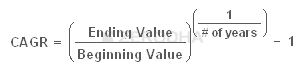

 Information – The index reflects the general market trend for a period of time. The index is a broad representation of the country’s state of the economy. A stock market index that up indicates people are optimistic about the future. Likewise, when the stock market index is down, people are pessimistic about the future.
 Benchmarking – For all the trading or investing activity that one does, a yardstick to measure the performance is required. Assume over the last 1 year you invested Rs.100,000/- and generated Rs.20,000 return to make your total corpus Rs.120,000/-. How do you think you performed? Well on the face of it, a 20% return looks great. However, what if Nifty moved to 7,800 points from 6,000 points generating a return on 30% during the same year?
 Trading – Trading on the index is probably one of the most popular uses of the index. Majority of the traders in the market trade the index. They take a broader call on the economy or general state of affairs and translate that into a trade.
 Portfolio Hedging – Investors usually build a portfolio of securities. A typical portfolio contains 10 – 12 stocks which they would have bought from a long term perspective. While the stocks are held from a long term perspective, they could foresee a prolonged adverse movement in the market (2008), potentially eroding the capital in the portfolio. In such a situation, investors can use the index to hedge the portfolio. We will explore this topic in the risk management module.

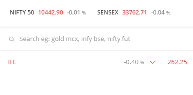

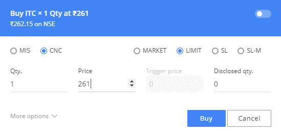
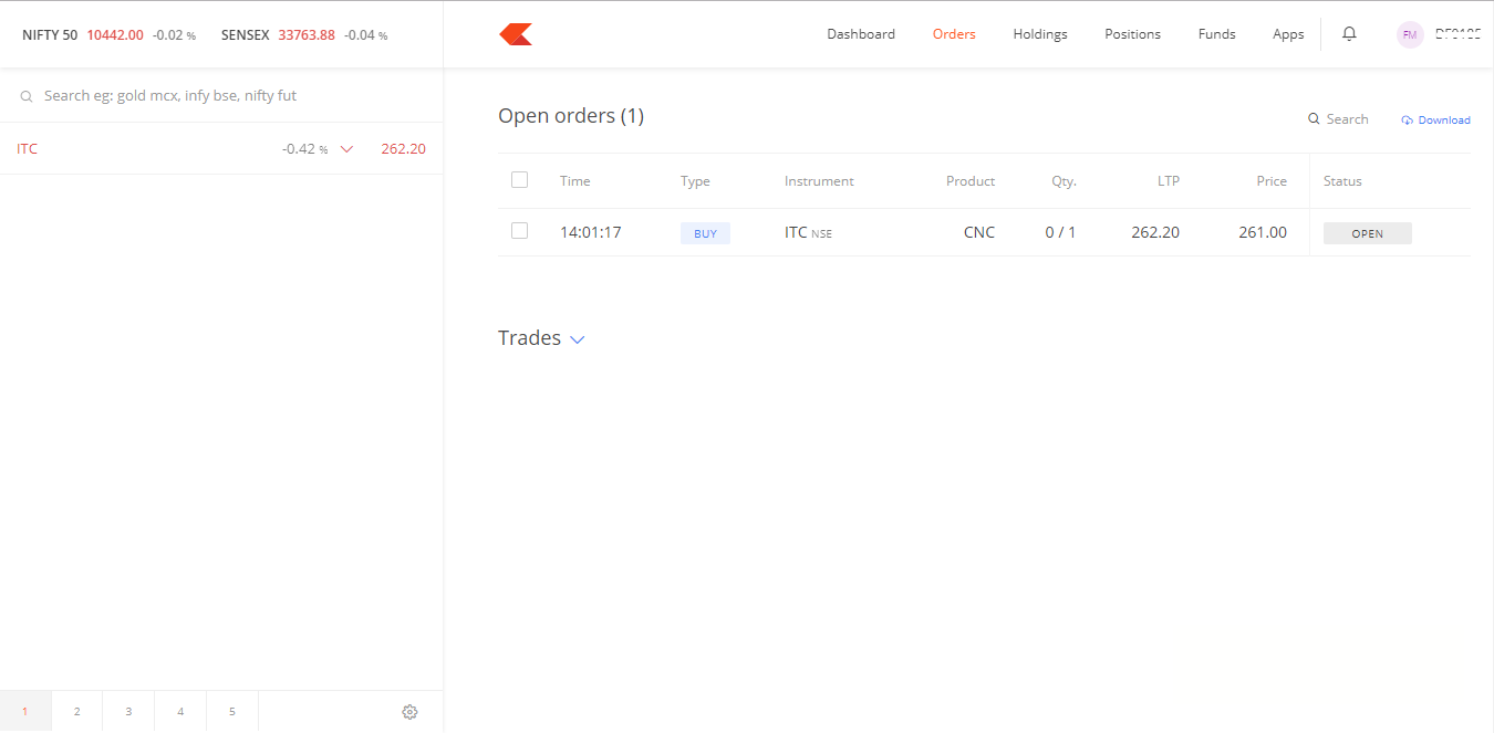
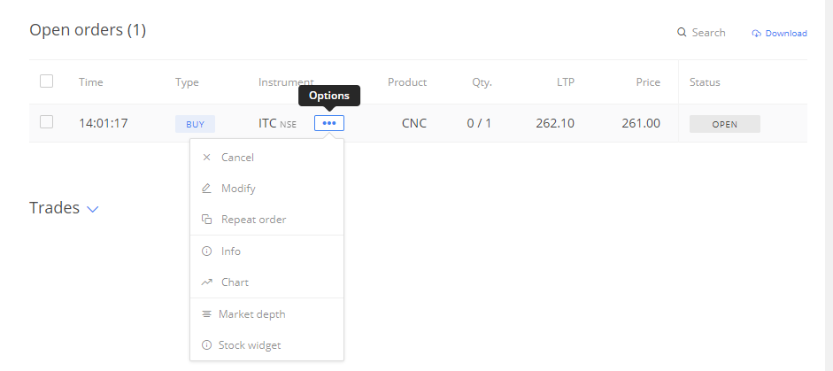
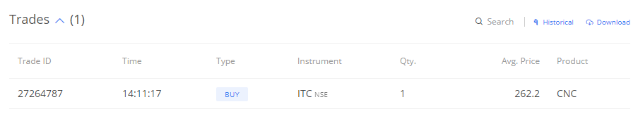
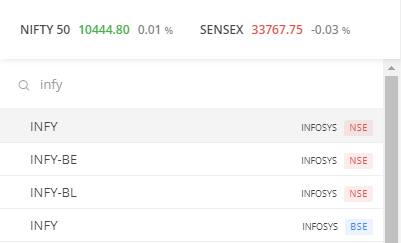
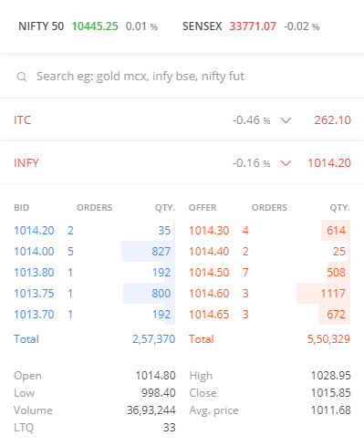
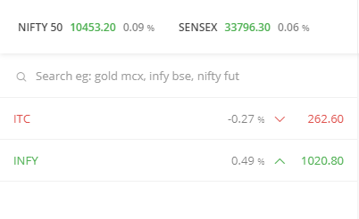


 11.2 – Dividends
 11.3 – Bonus Issue
 11.4 – Stock Split
 11.5 – Rights Issue
 11.6 – Buyback of shares
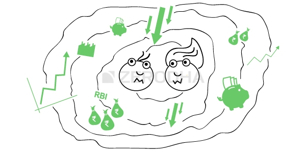
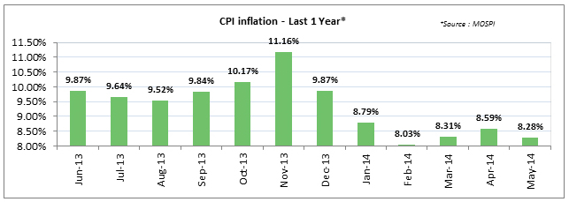
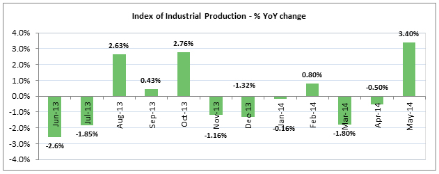

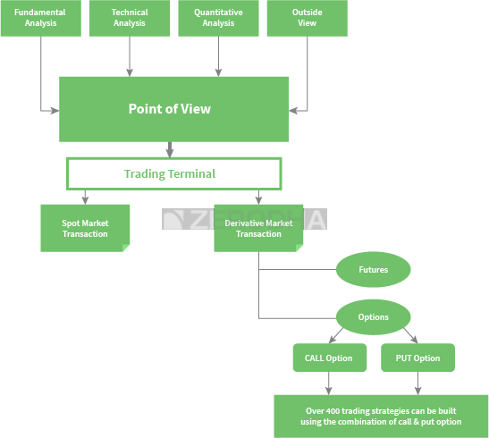


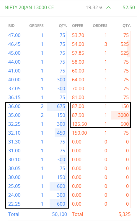
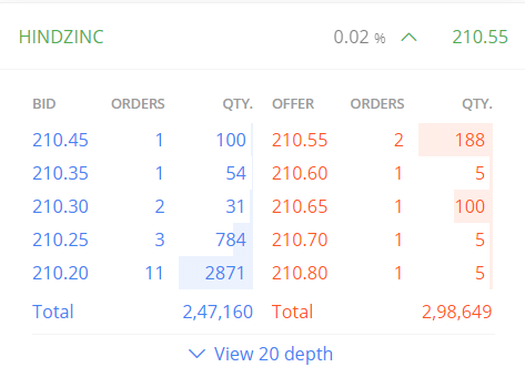
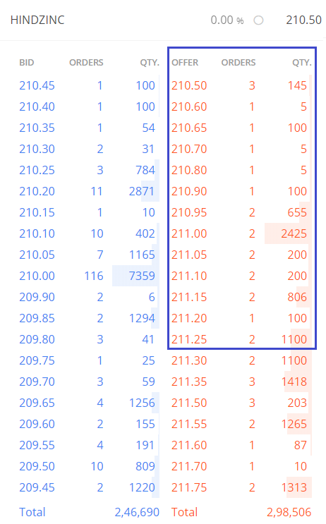
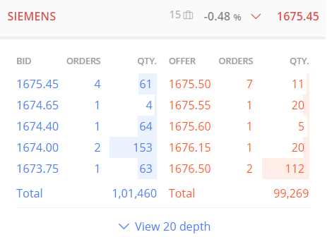
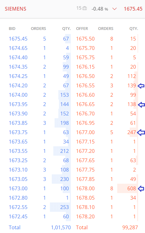
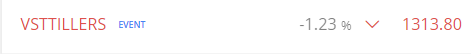
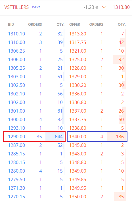


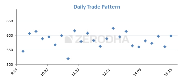
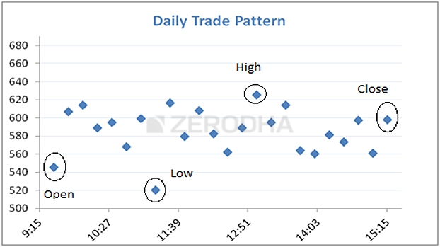

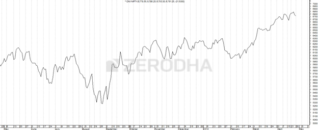
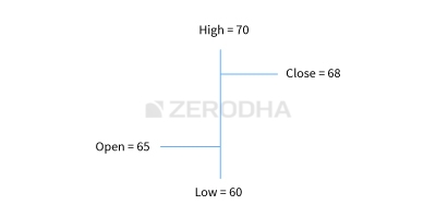
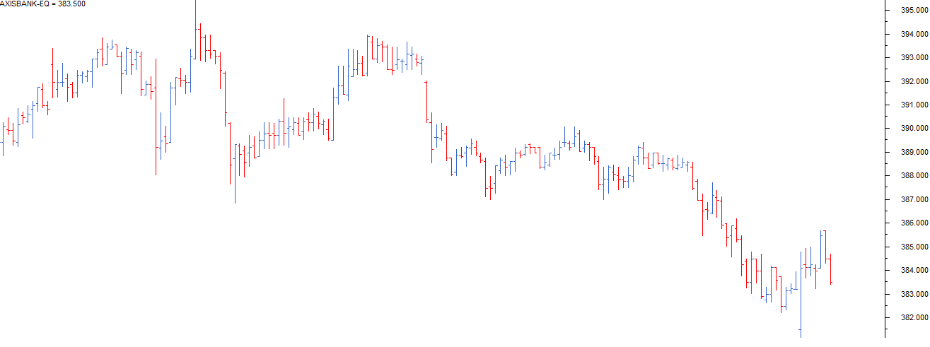
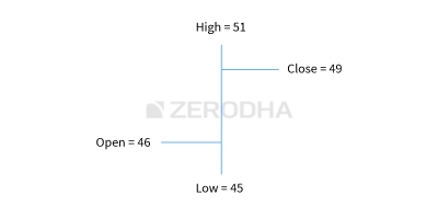
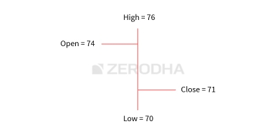
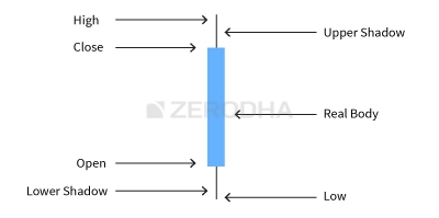
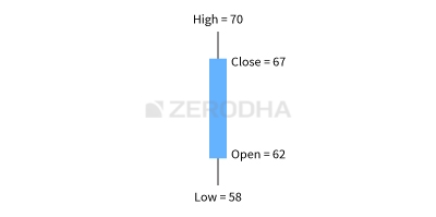
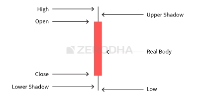
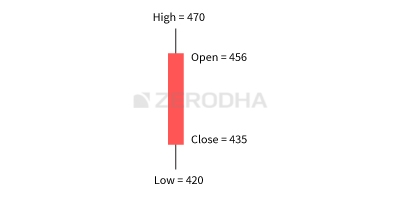
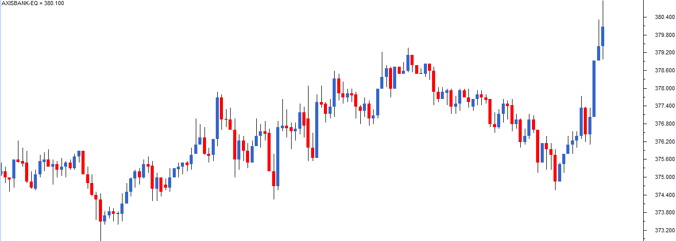


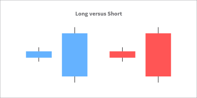

 5.3 – Bullish Marubozu
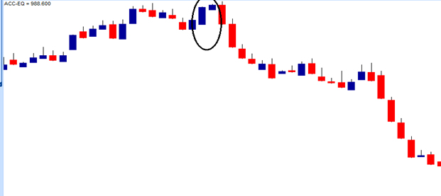
 5.5 – Bearish Marubozu
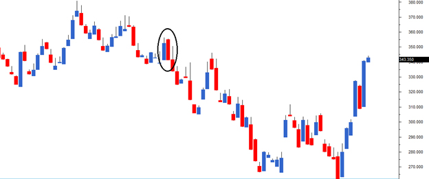
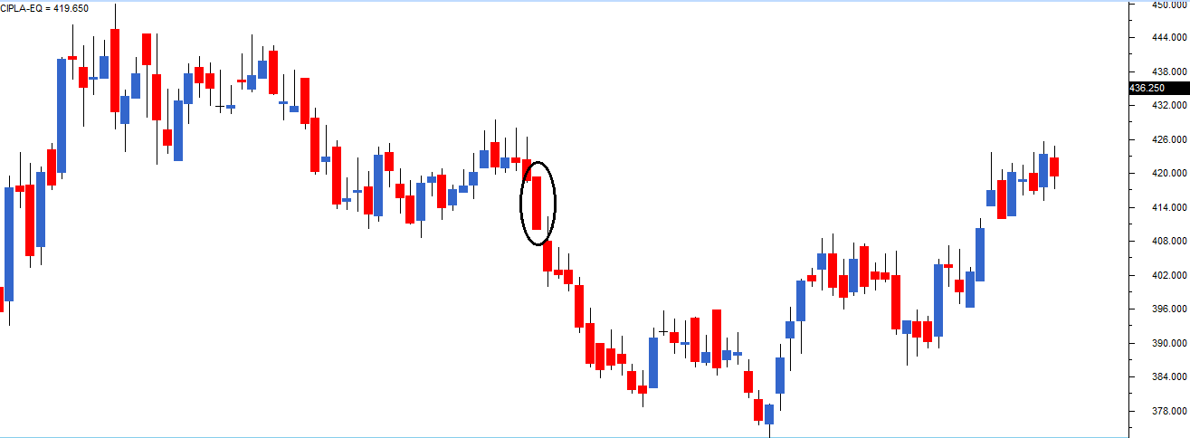
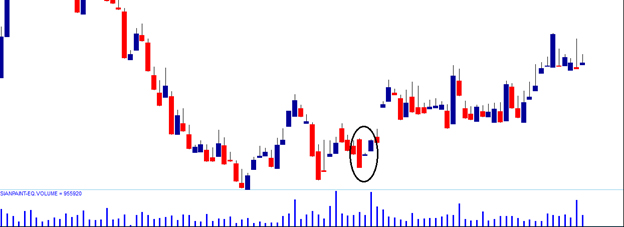


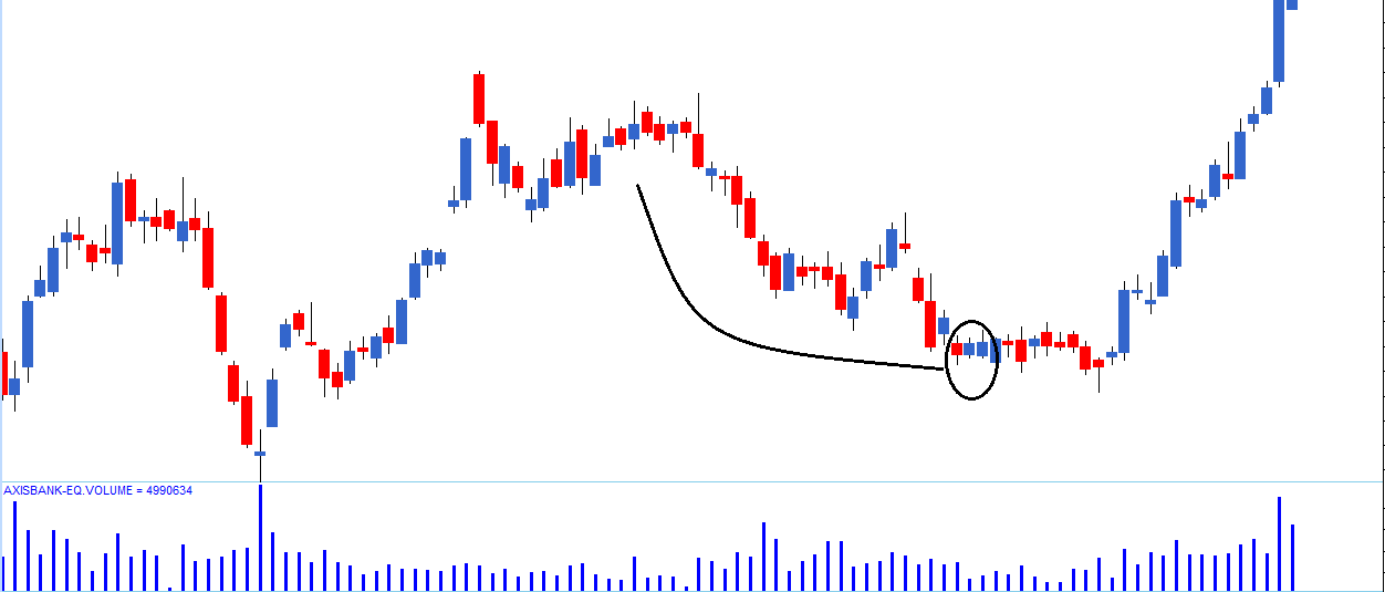
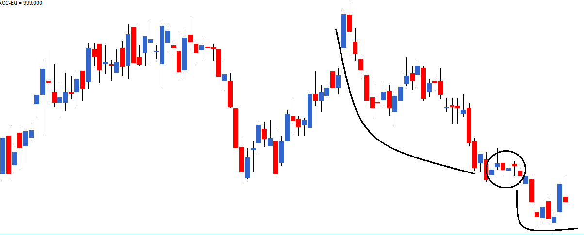
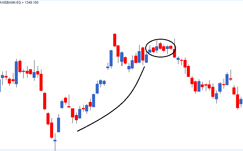
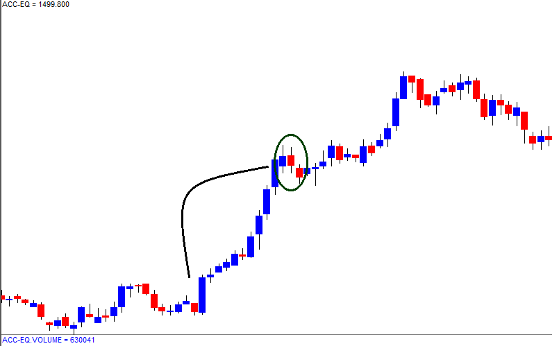
 6.4 – The Dojis
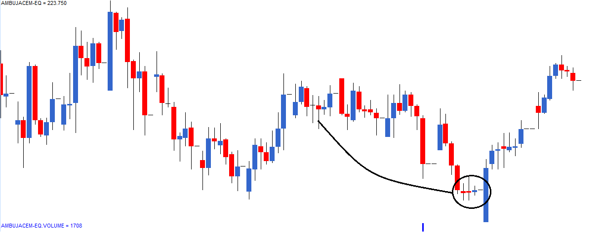
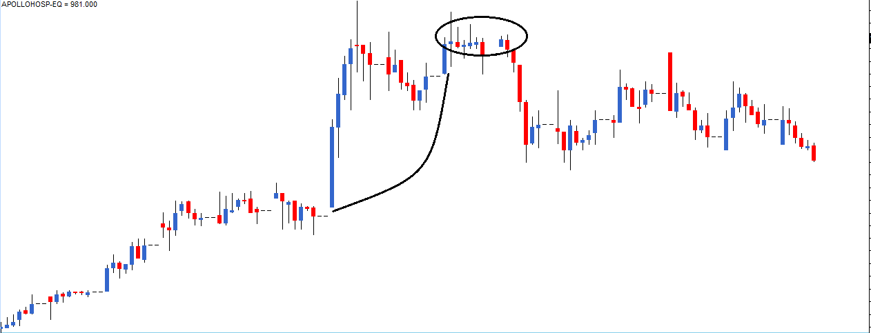


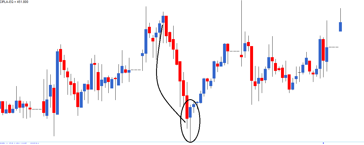
 7.5 – The shooting star
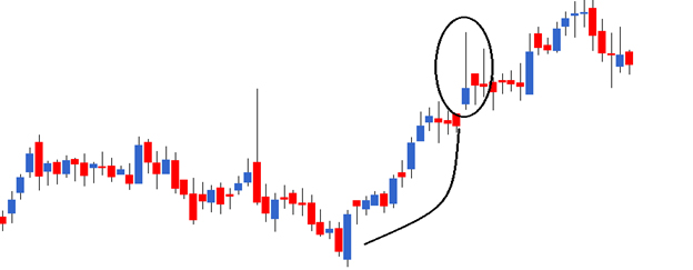

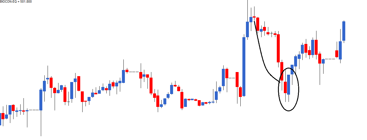
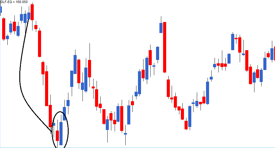
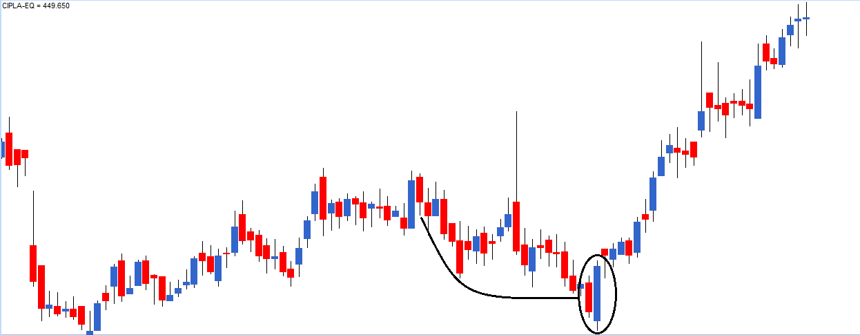
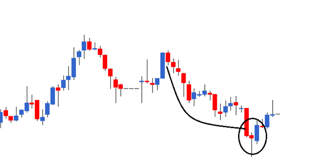
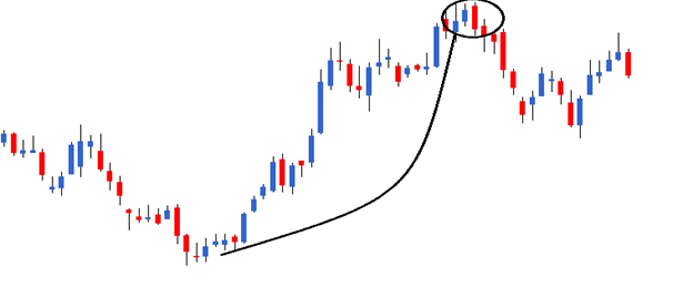
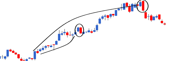
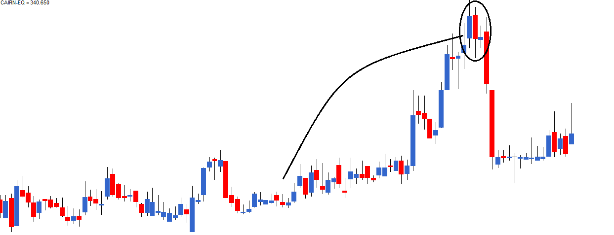

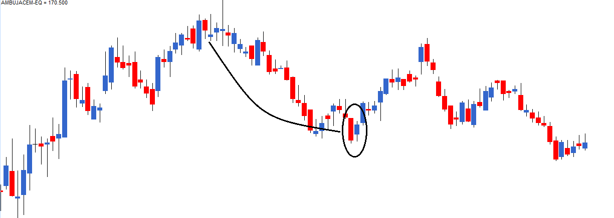
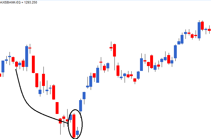
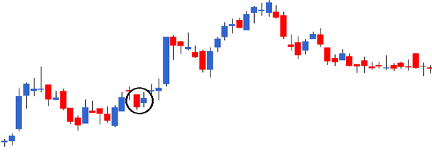
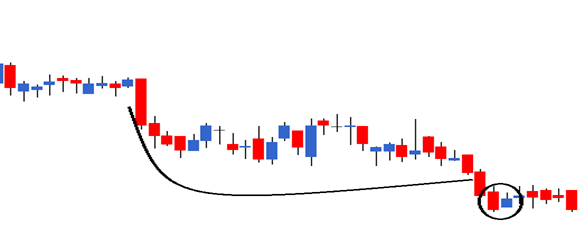
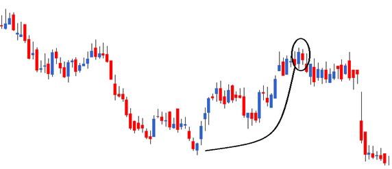
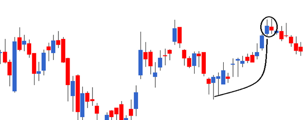

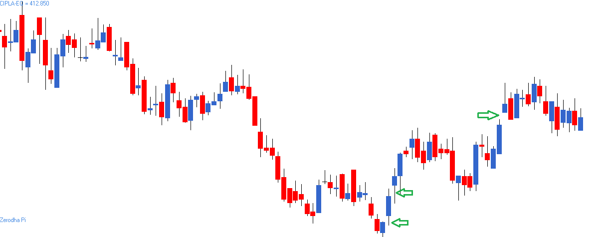
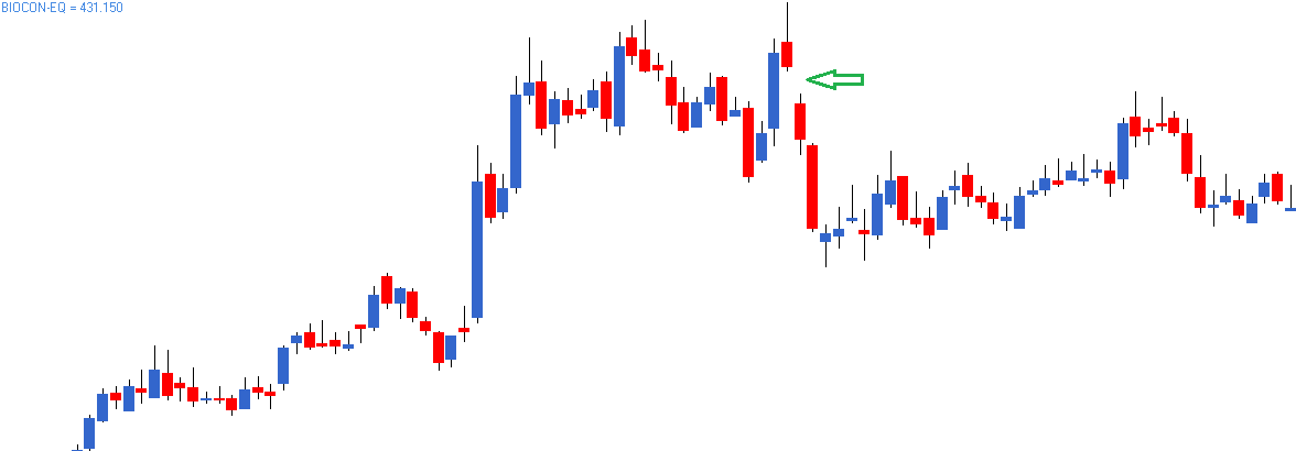
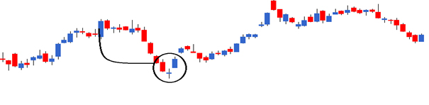
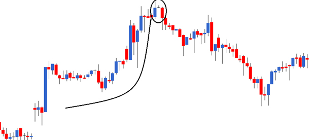

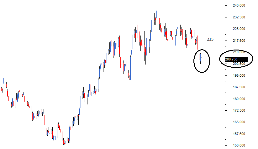

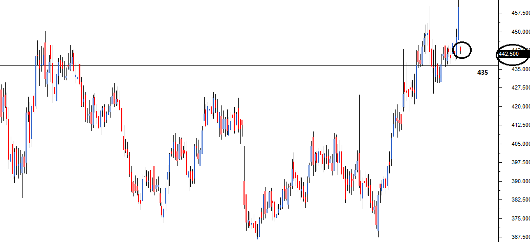
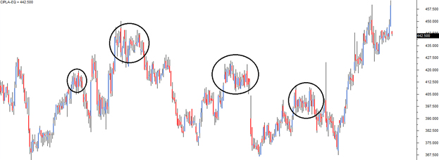

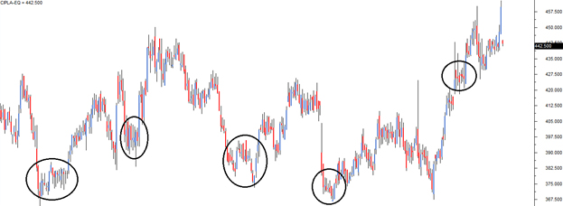
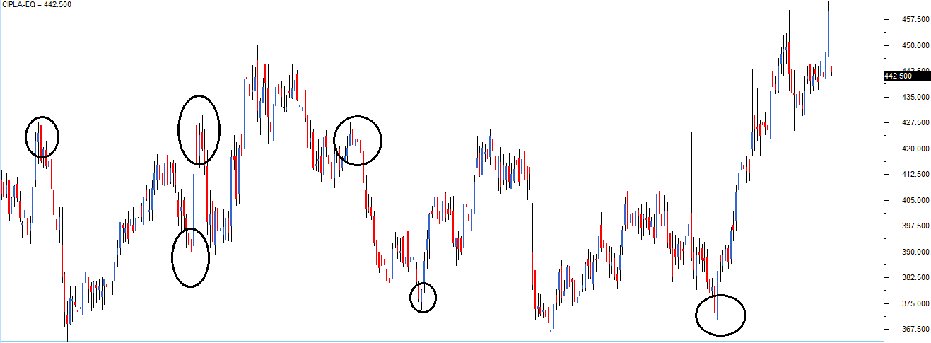
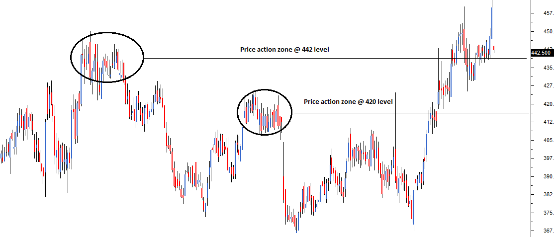
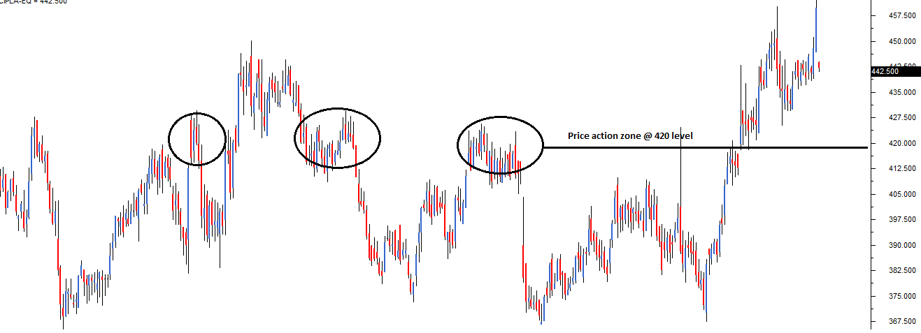
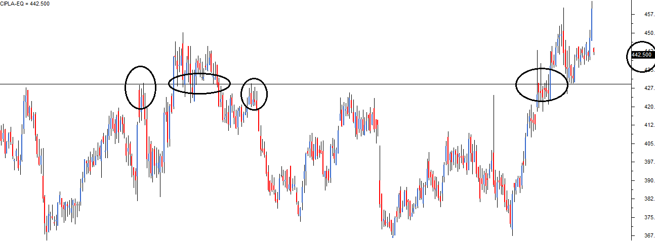
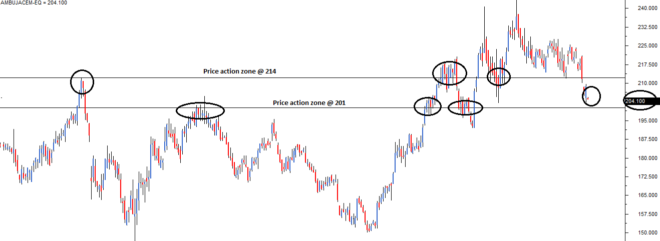
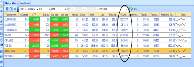
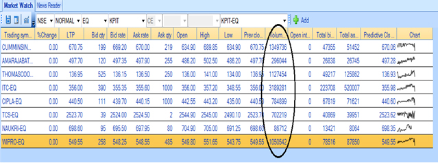
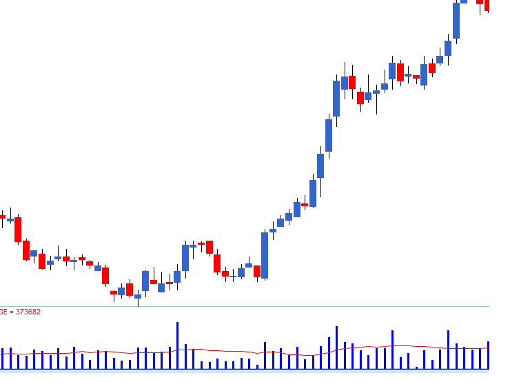

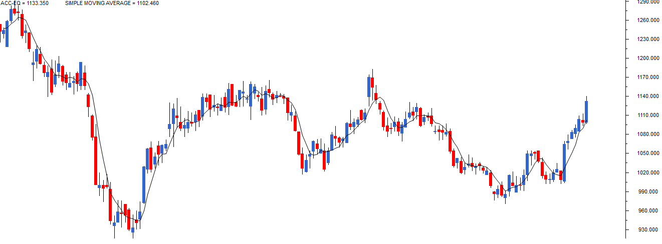
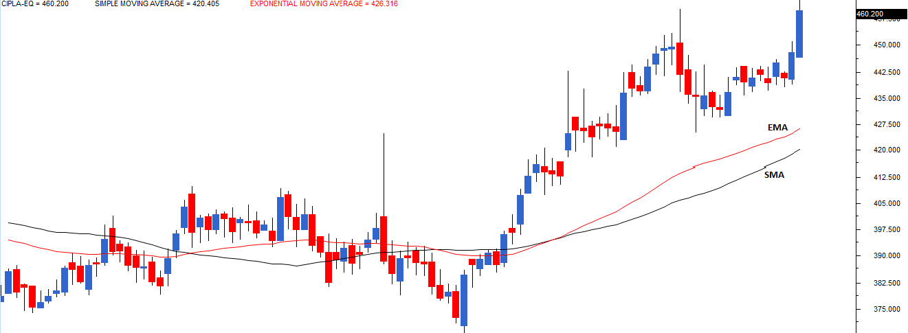
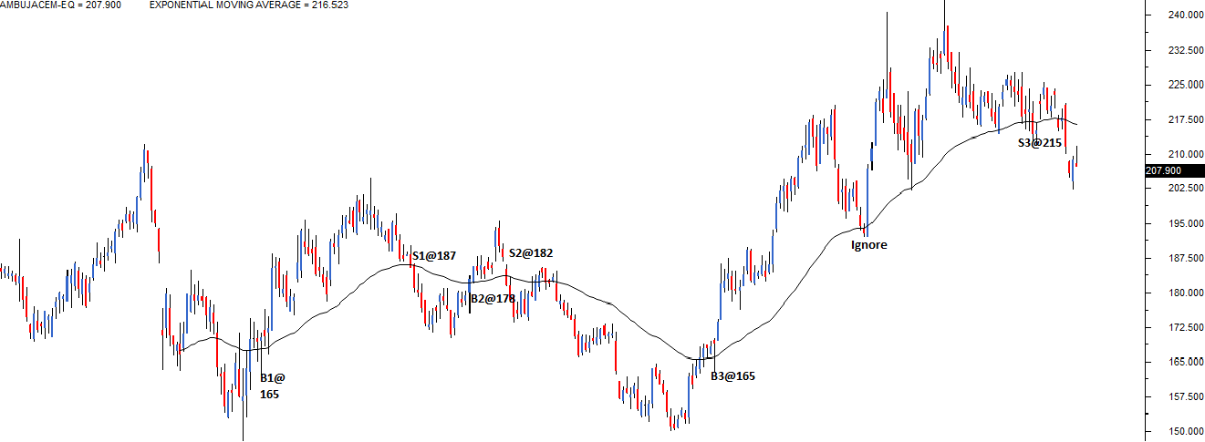
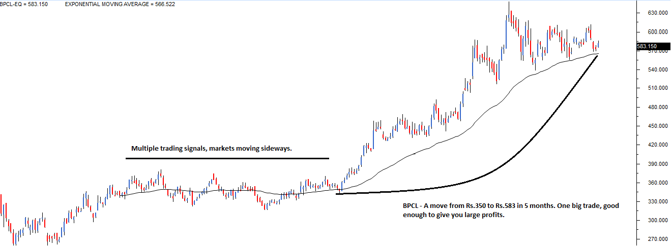
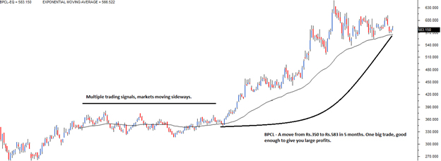
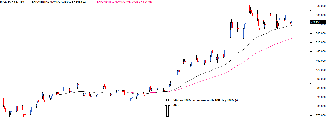


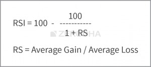
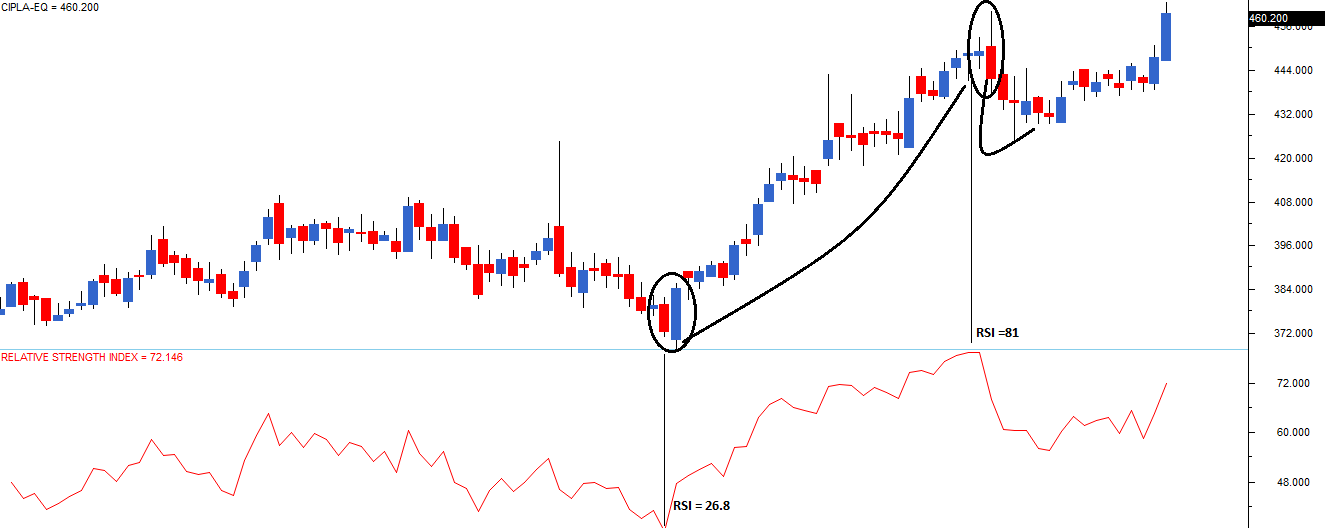


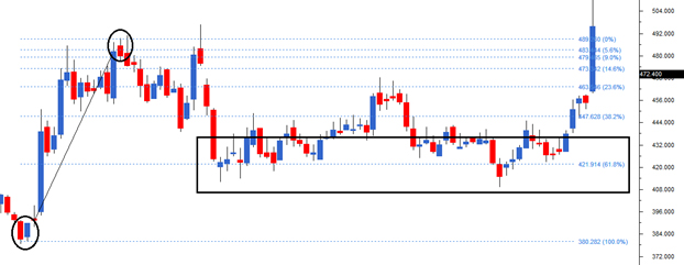
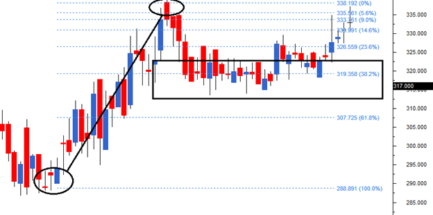
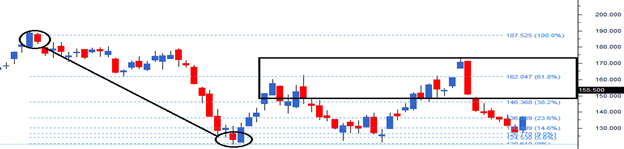
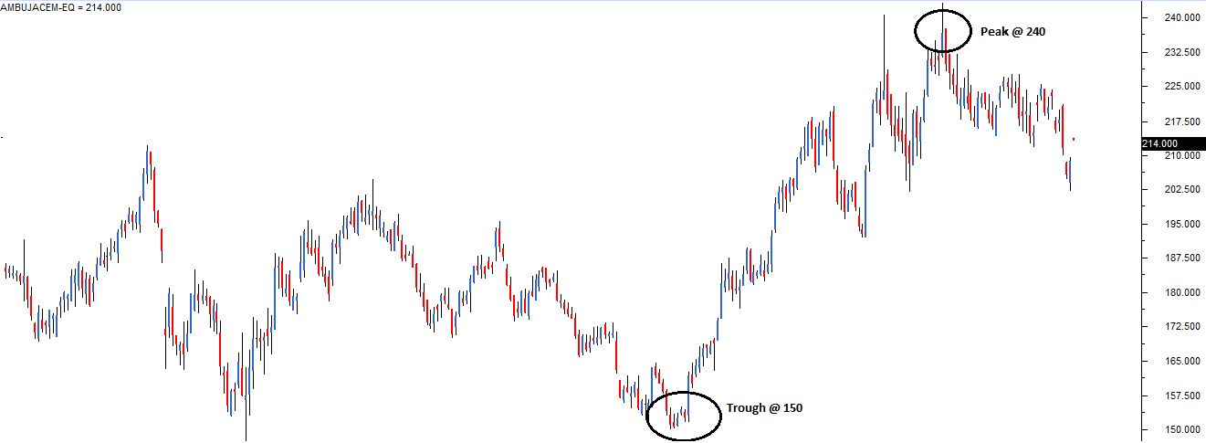
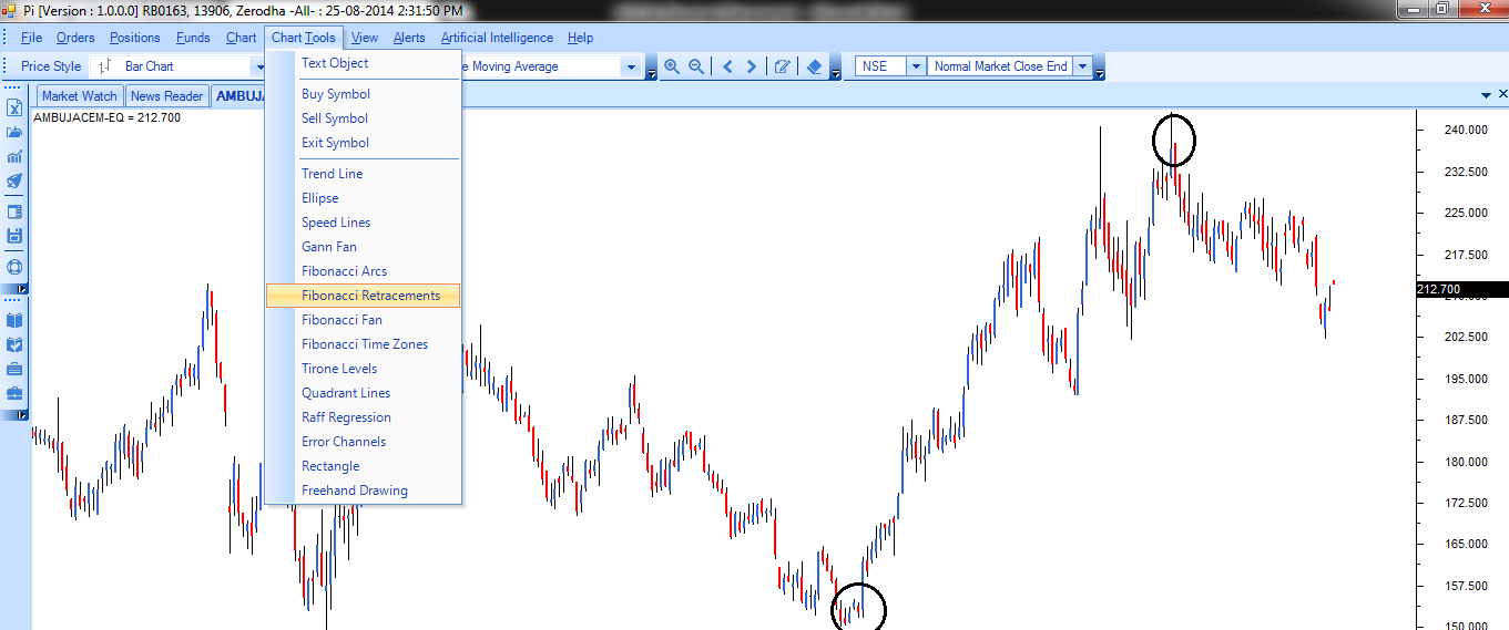
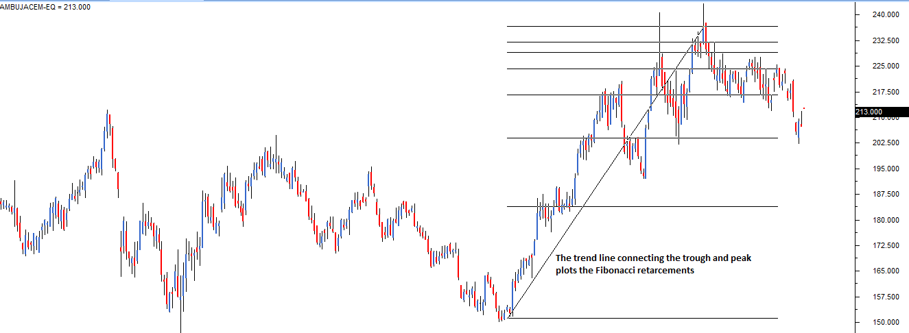
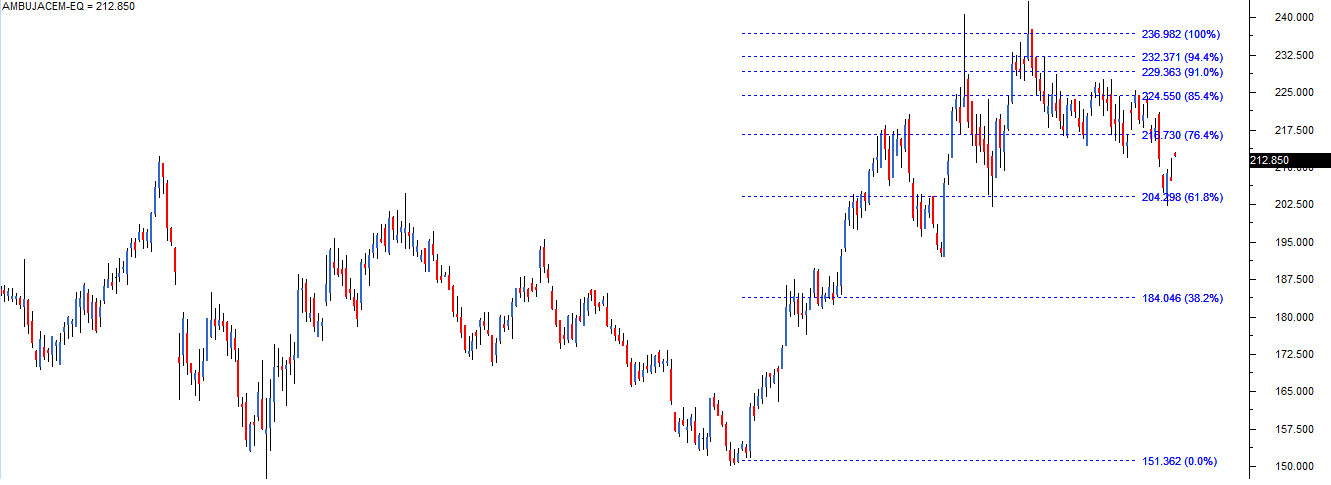

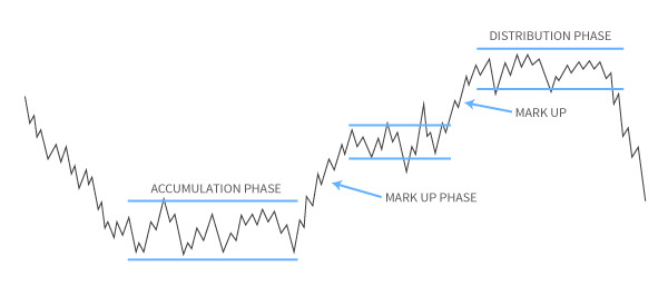
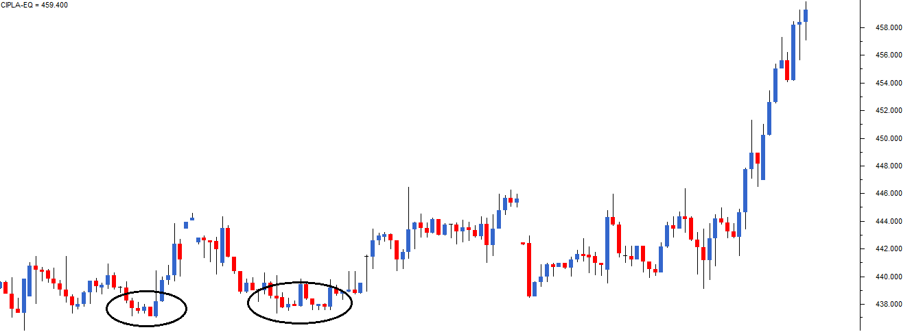
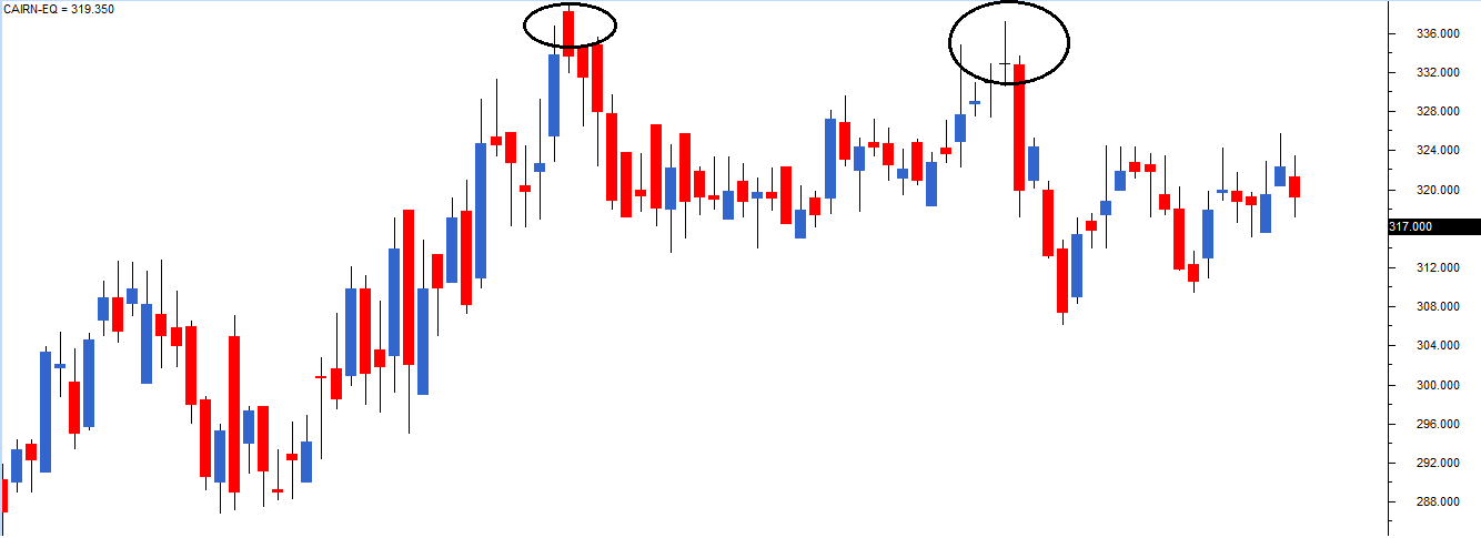
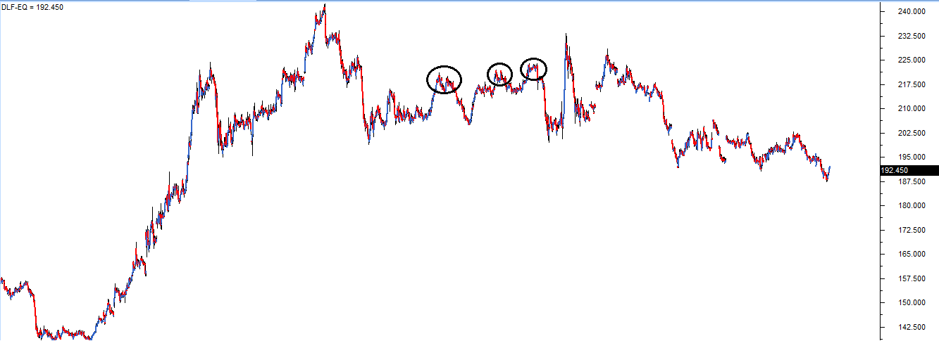
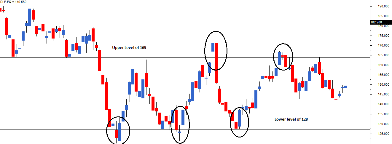

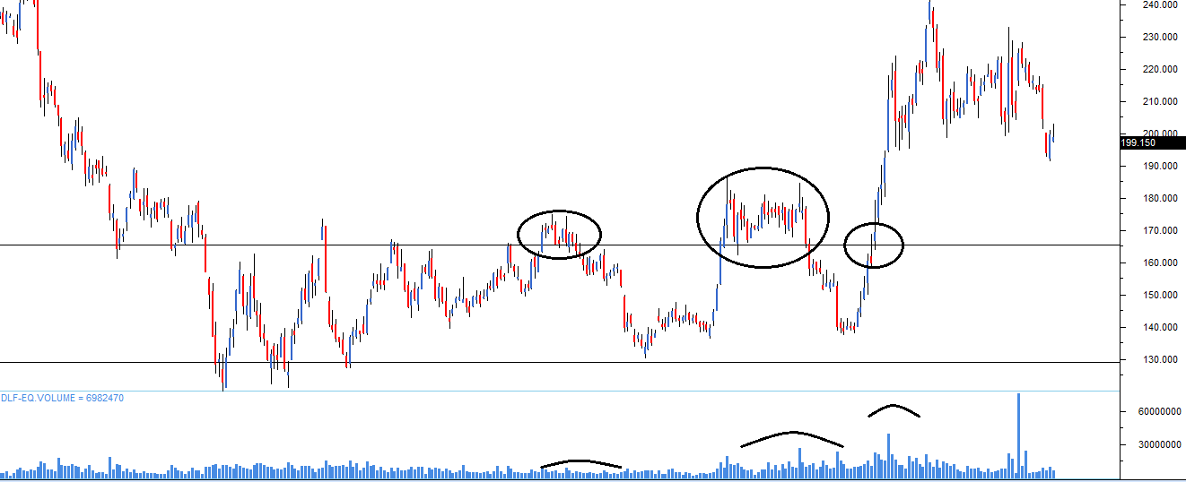
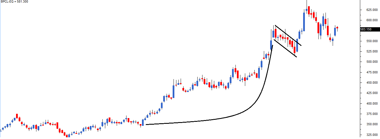


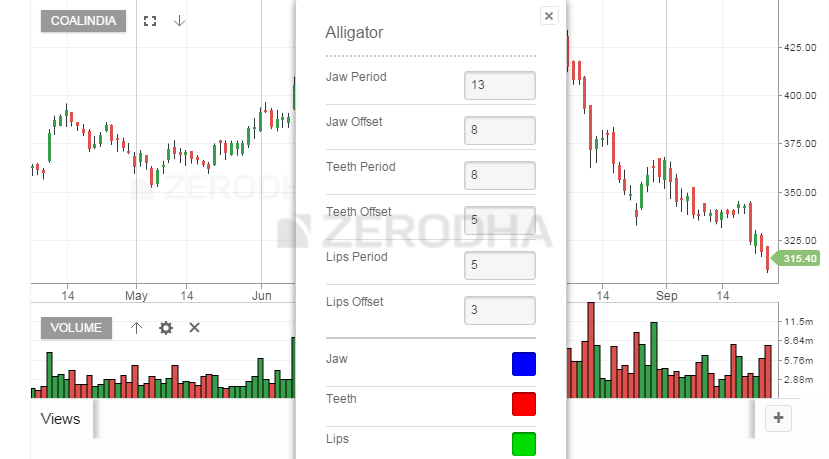
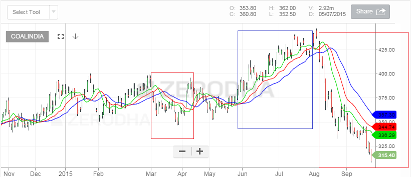
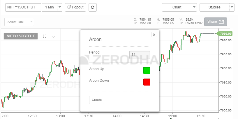
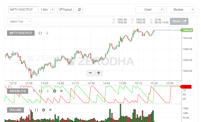

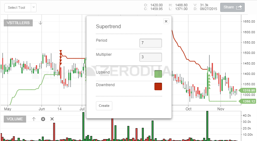
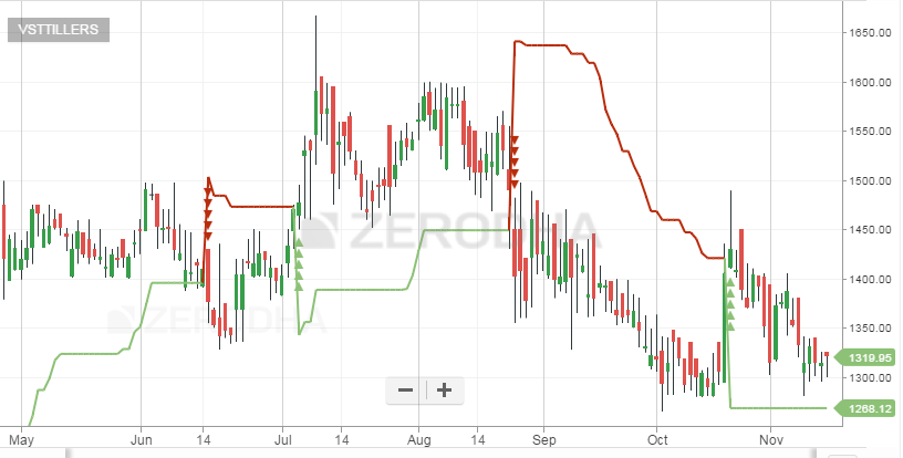
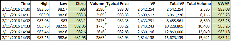
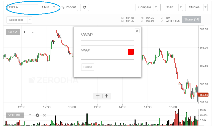

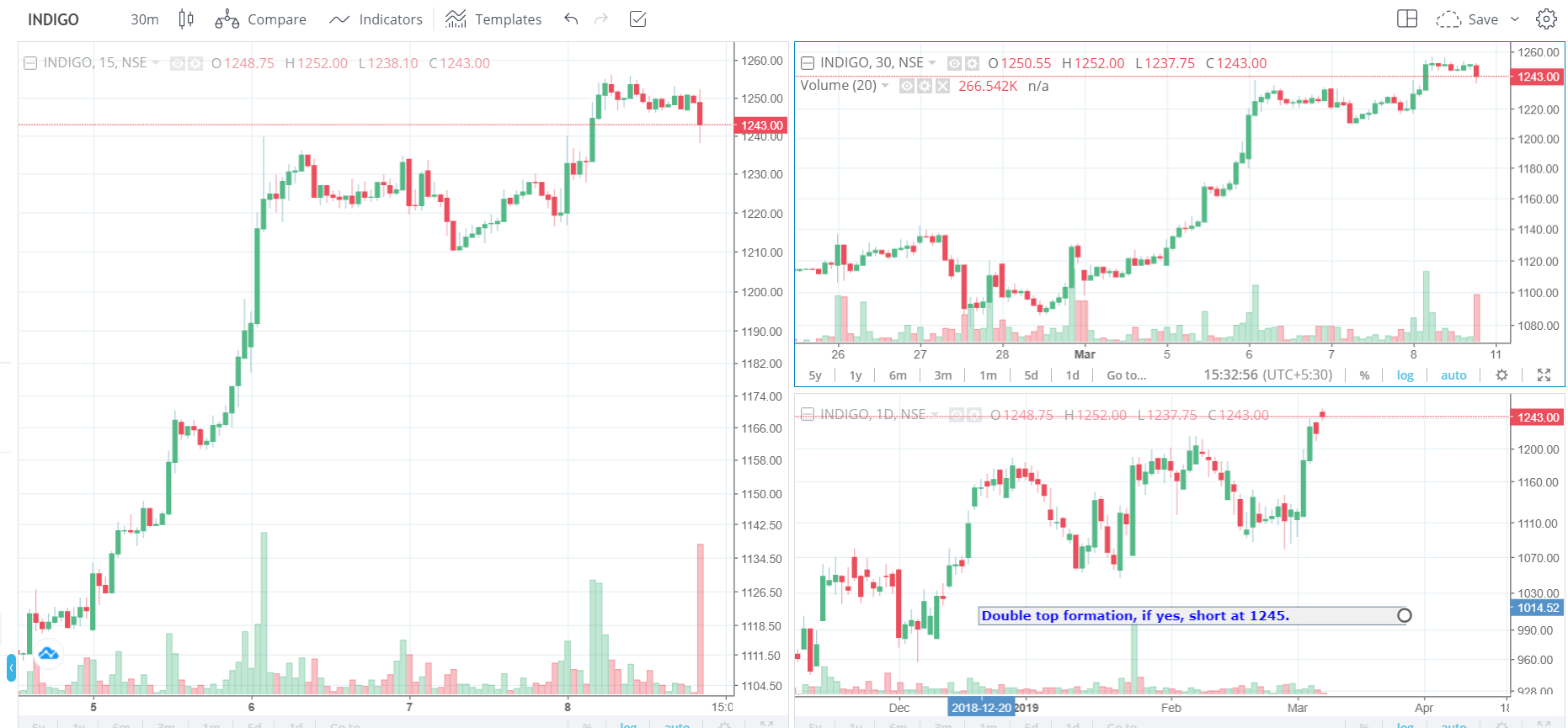
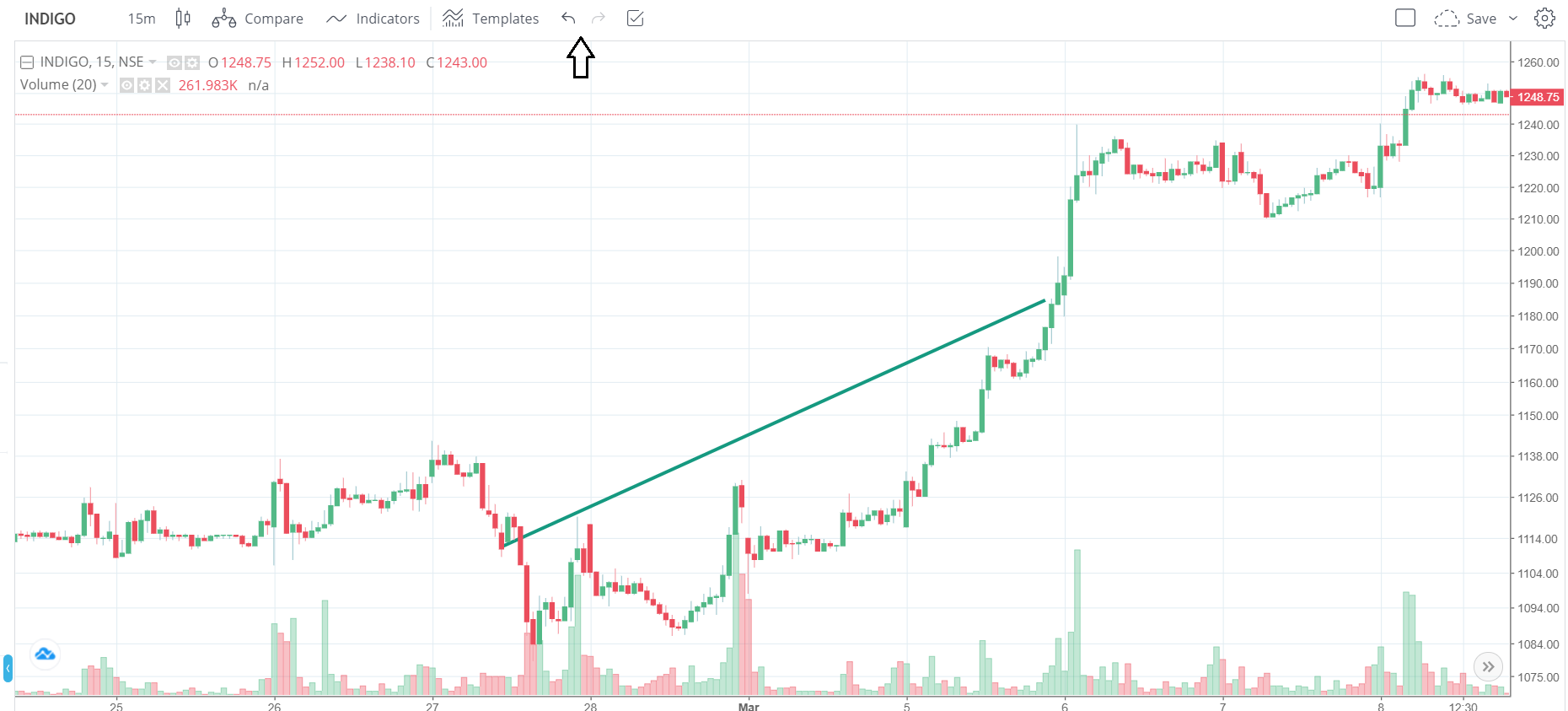
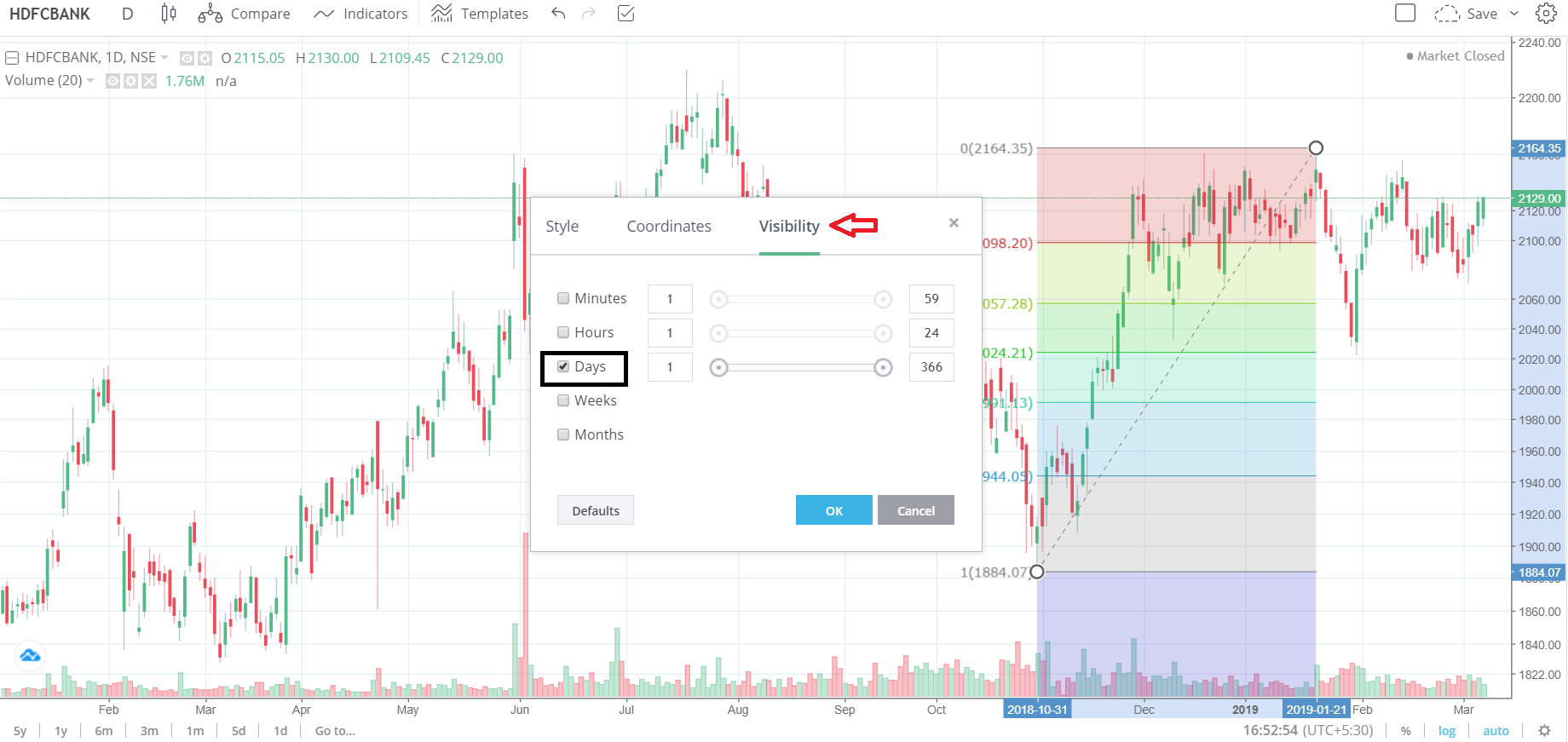
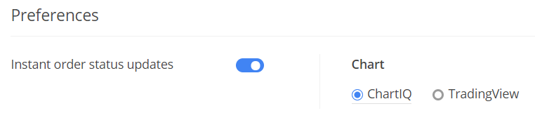

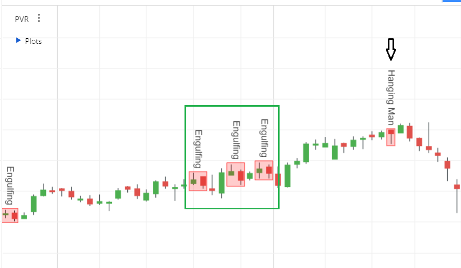

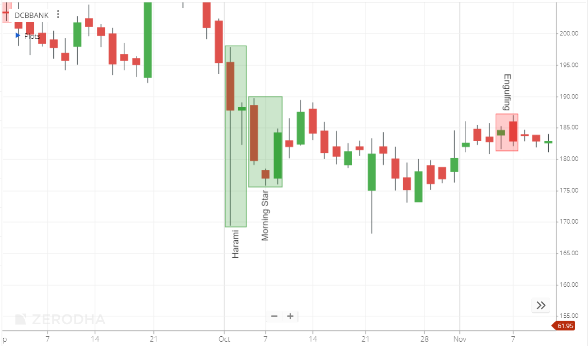

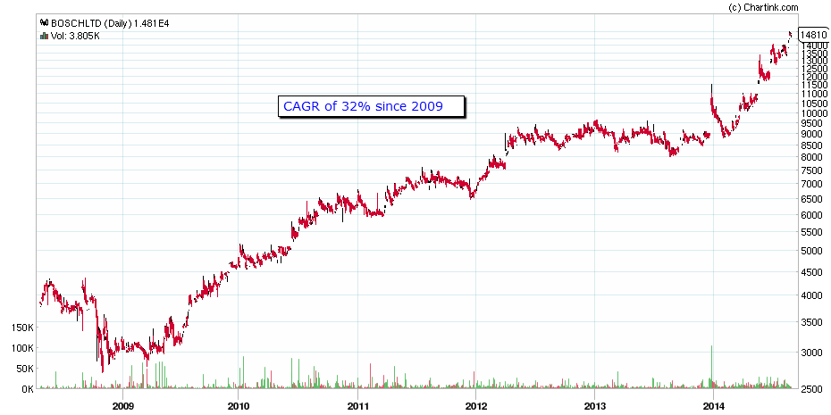

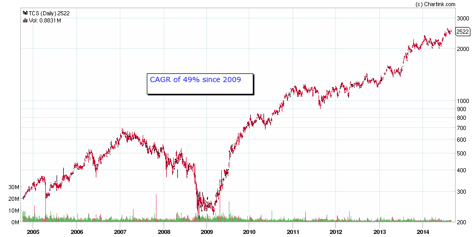
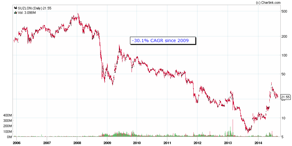
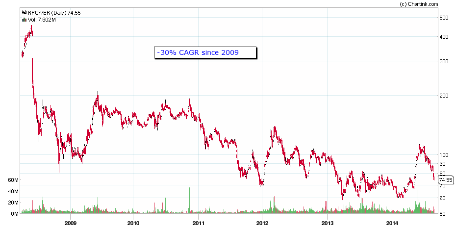
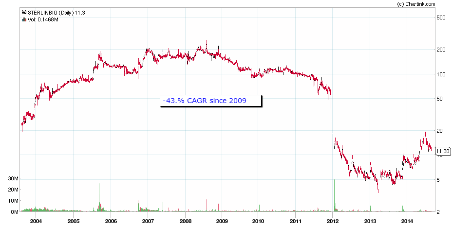
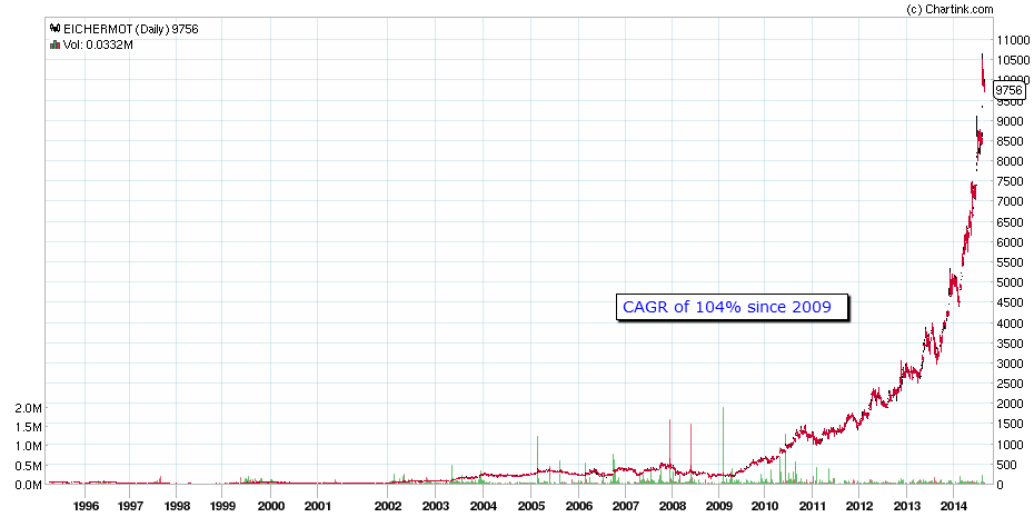
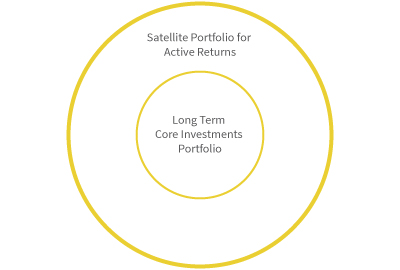


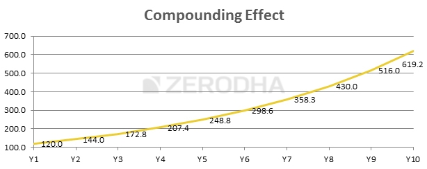


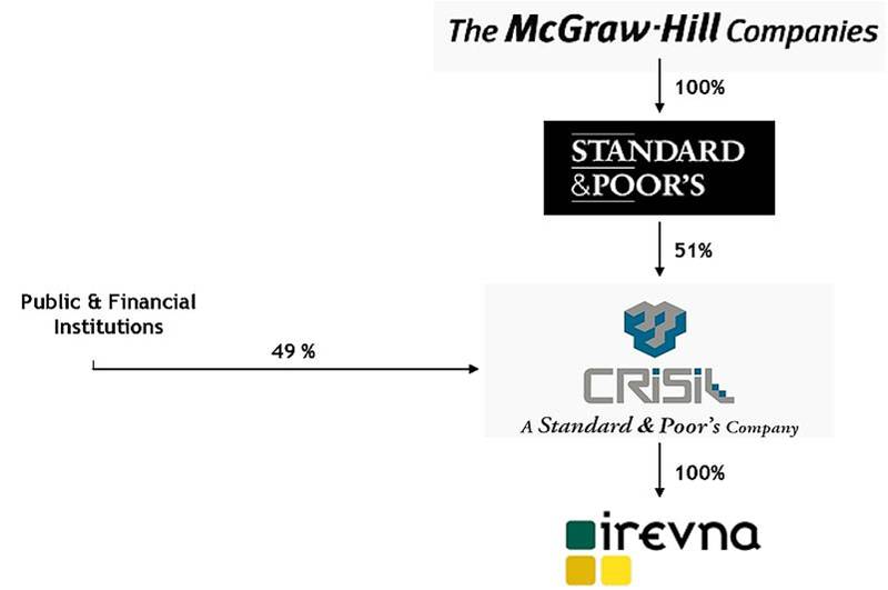
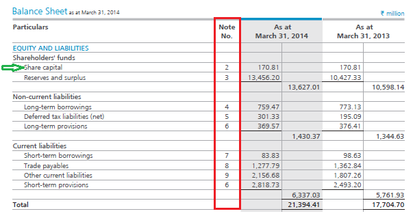
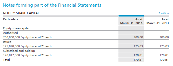
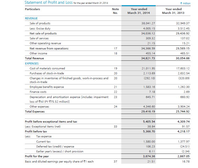

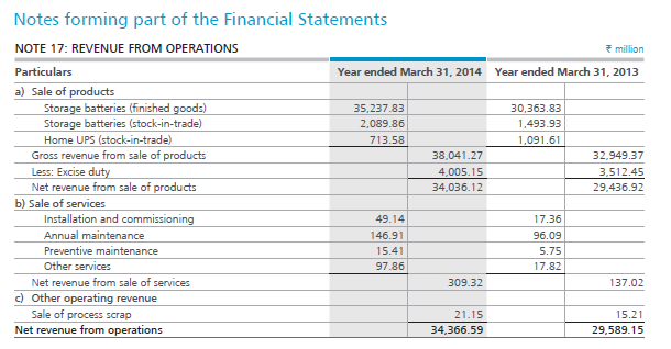
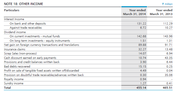

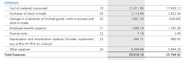
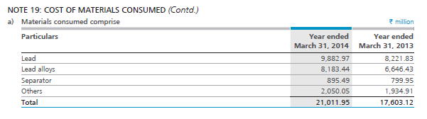
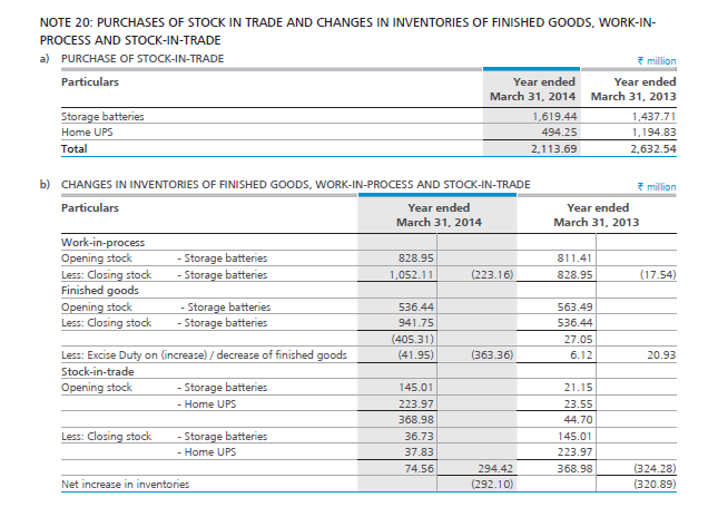
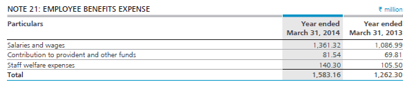
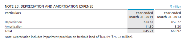 The last line item on the expense side is “other expenses” at Rs.434.6 Crs. This is a huge amount classified under ‘other expenses’. Hence it deserves a detailed inspection.
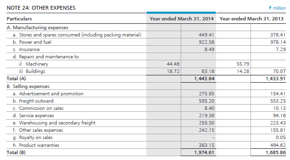
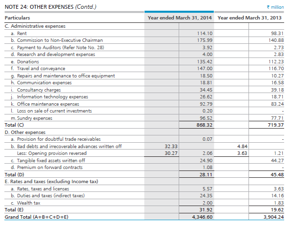
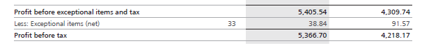
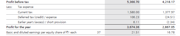
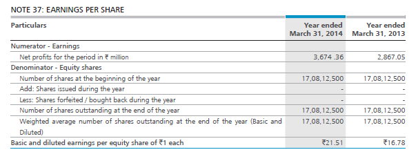


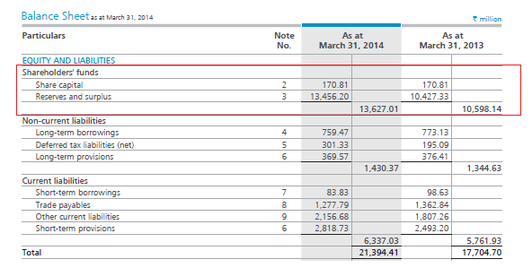
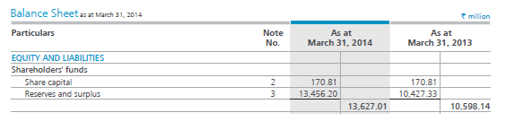
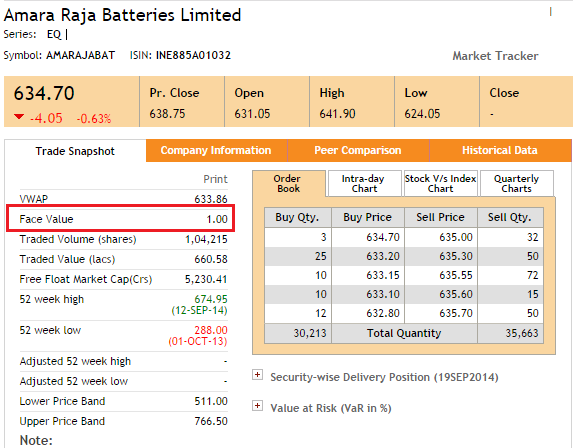
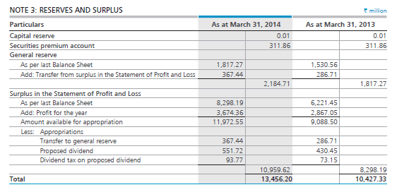
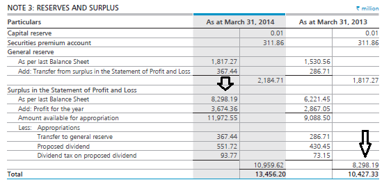
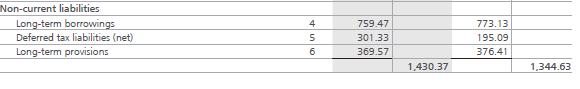
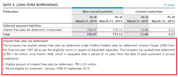
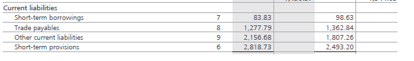
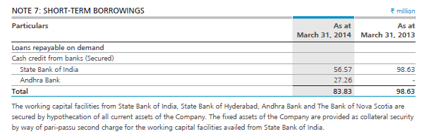
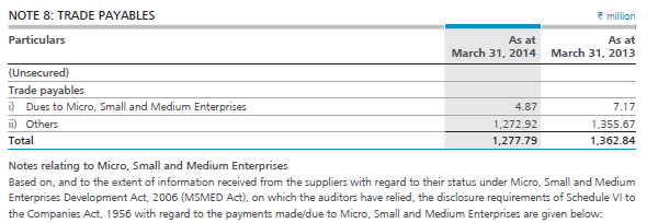
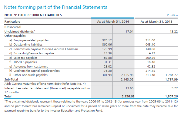
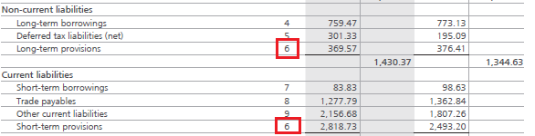
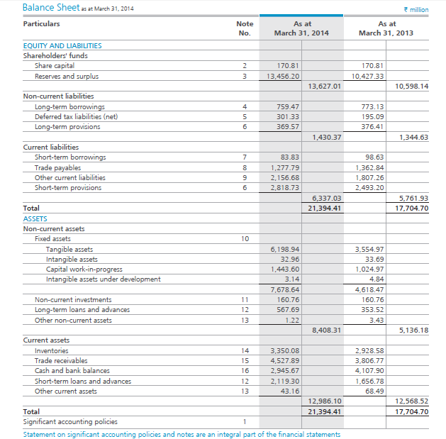
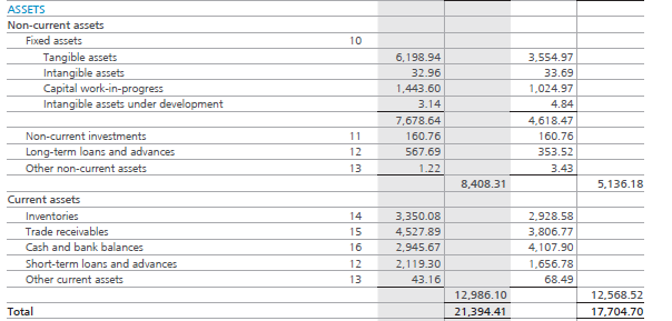

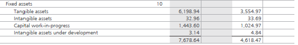
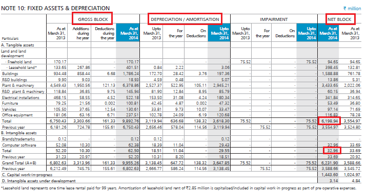
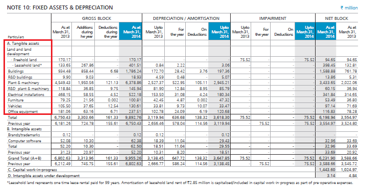
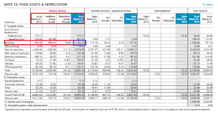
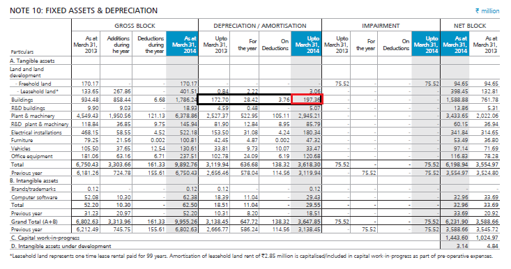
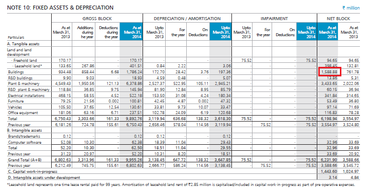

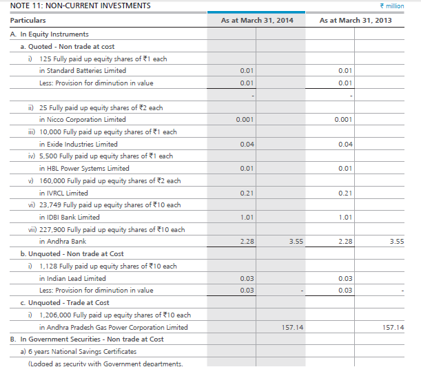

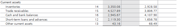
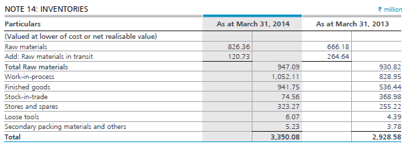
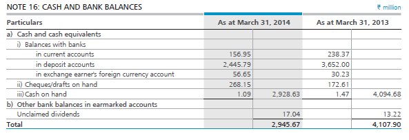
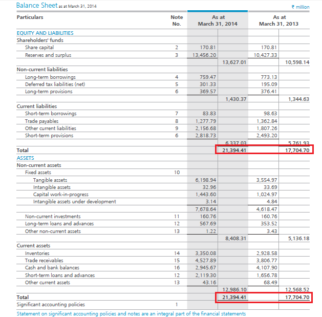
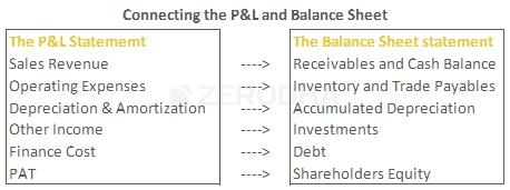

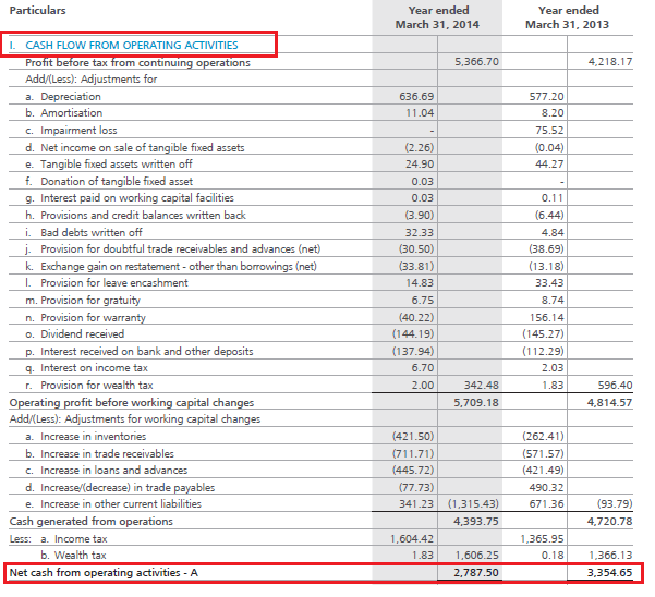
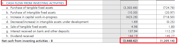
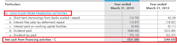
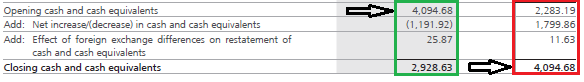
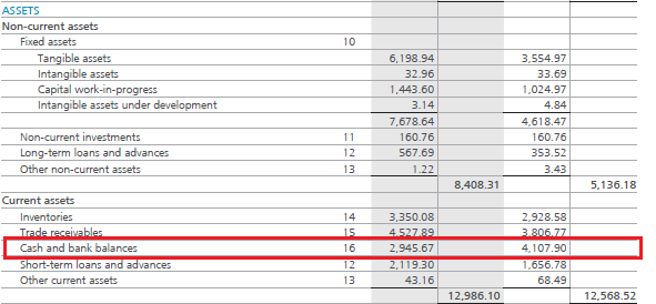


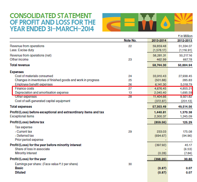
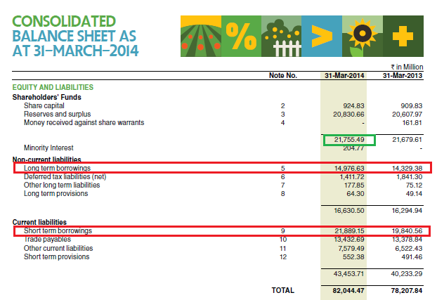
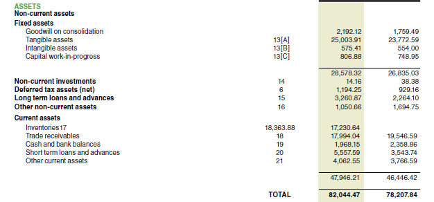

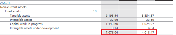
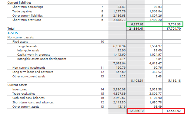
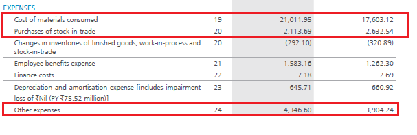
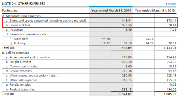

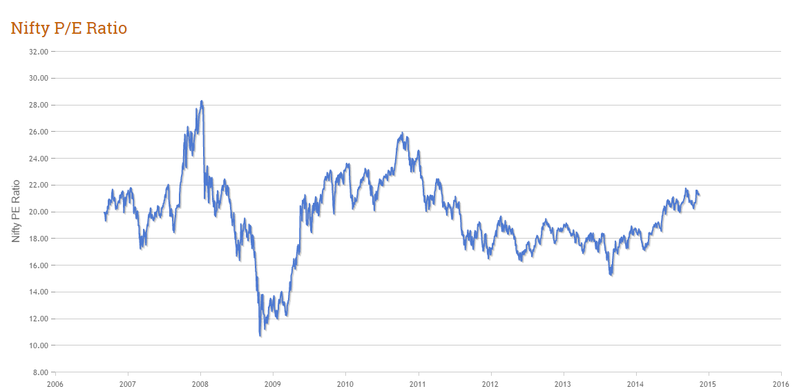


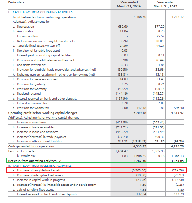
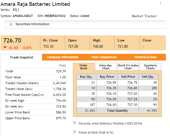
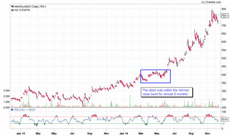


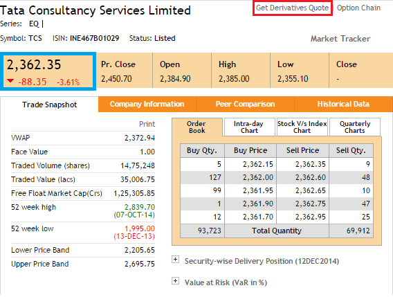
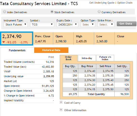
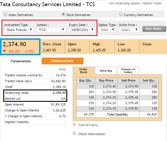
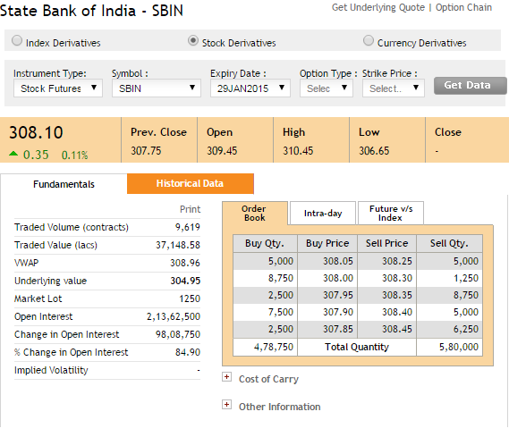

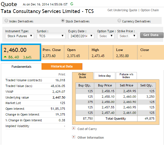
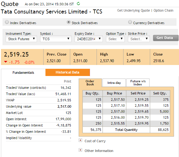

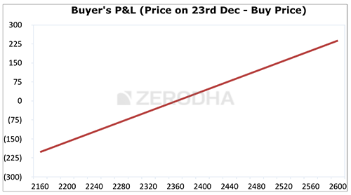

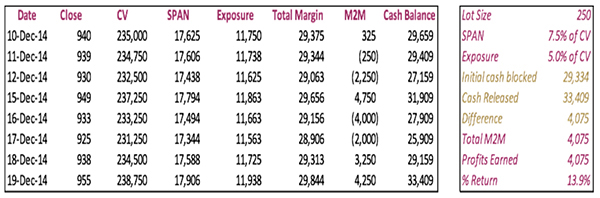

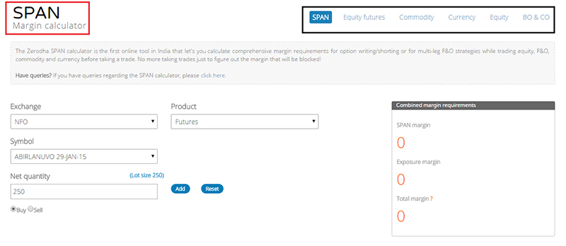
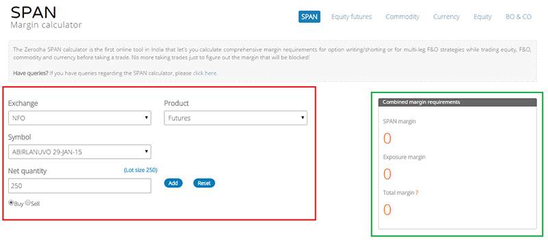
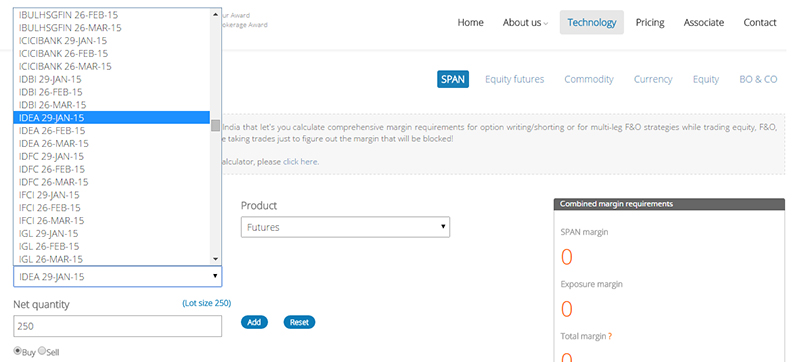
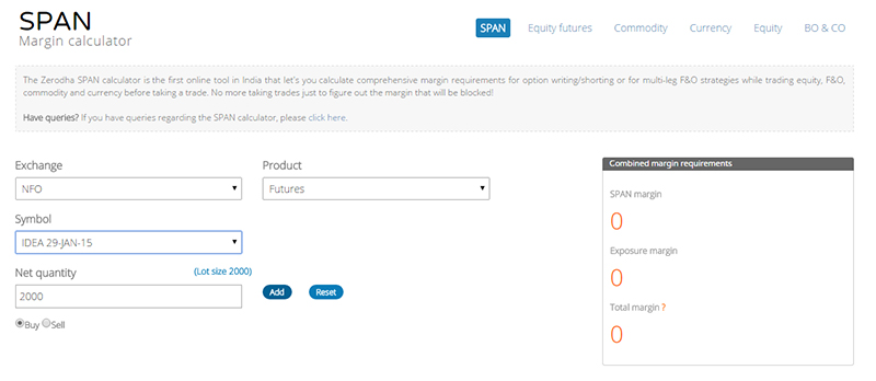
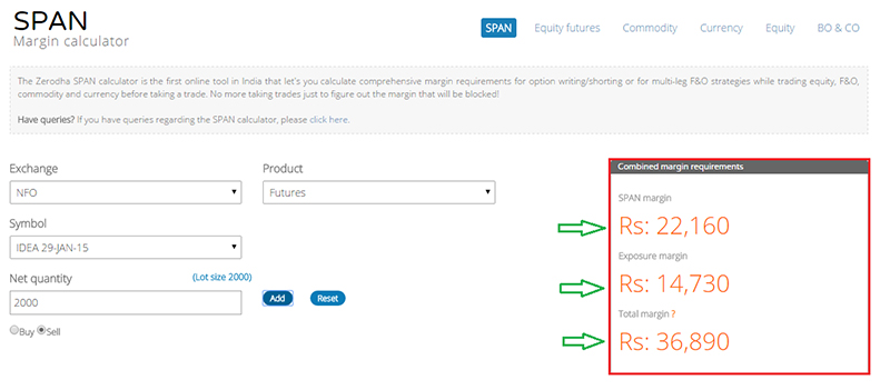
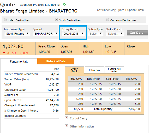
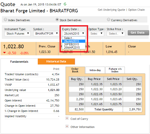
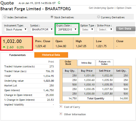
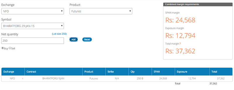
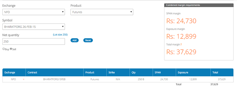
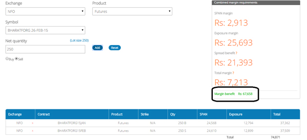

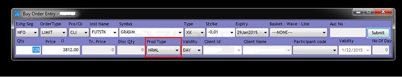
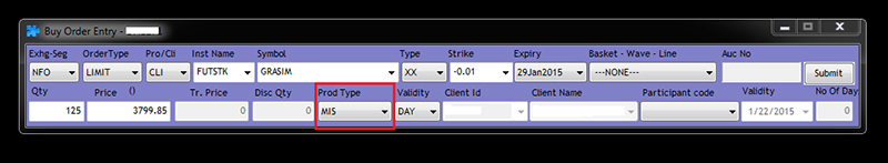
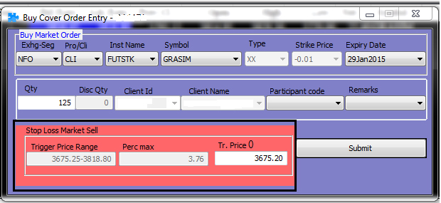
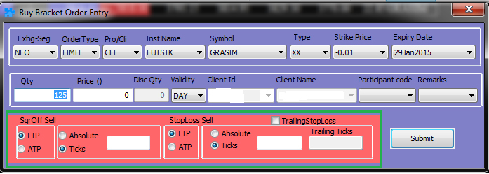
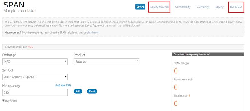
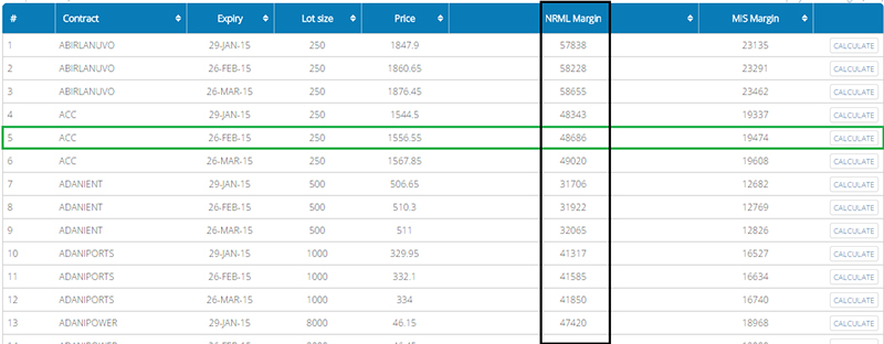
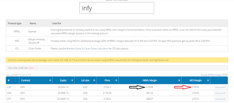
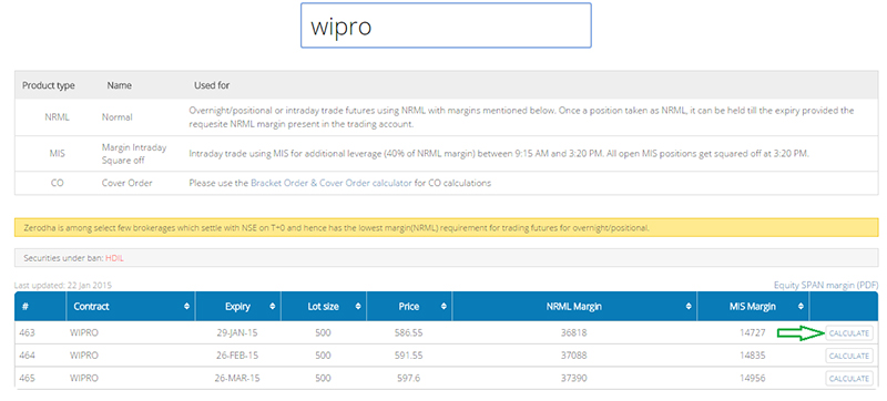
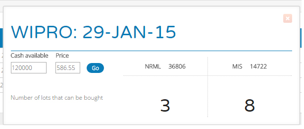
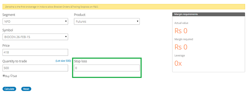
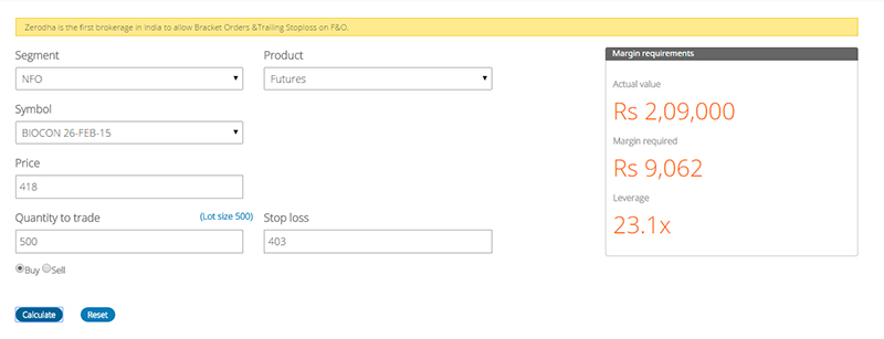
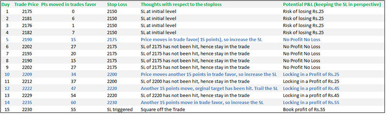

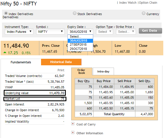

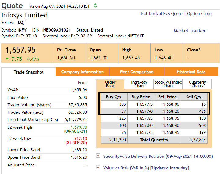

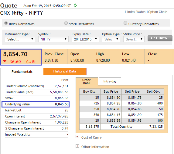
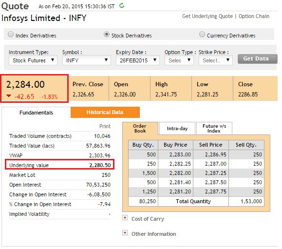
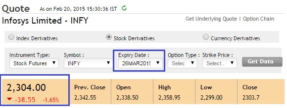
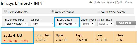
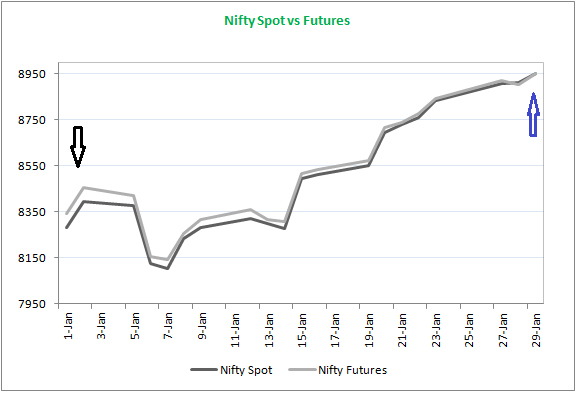

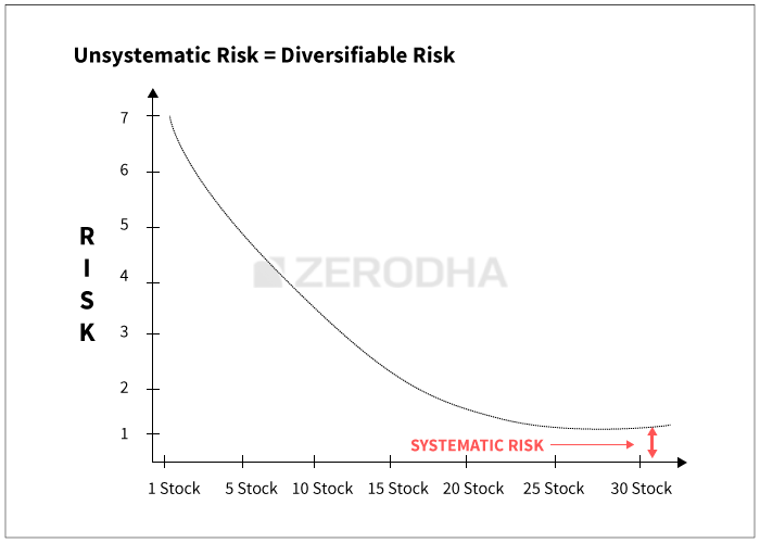

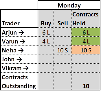
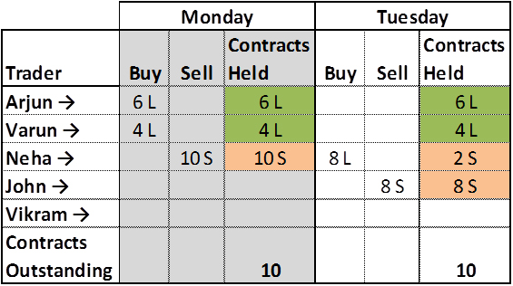
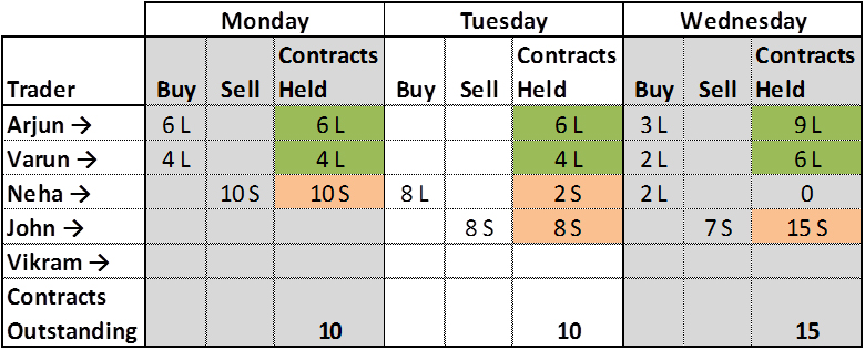
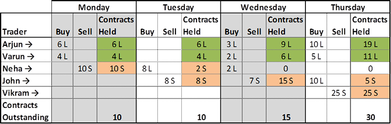
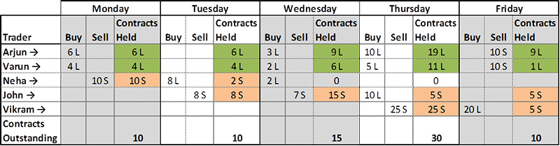
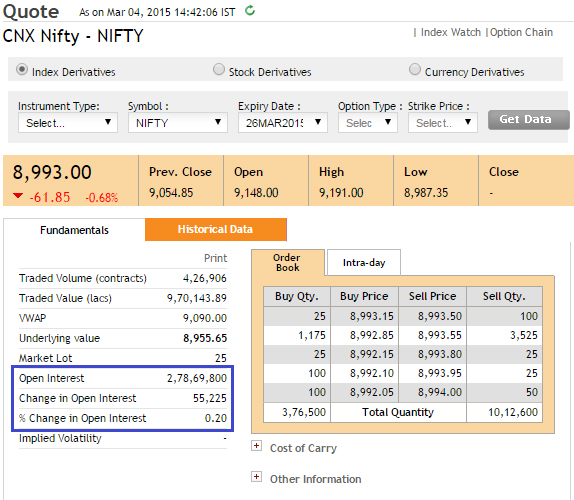
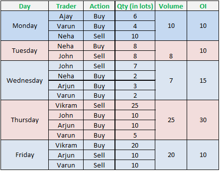


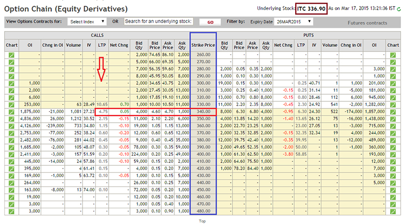


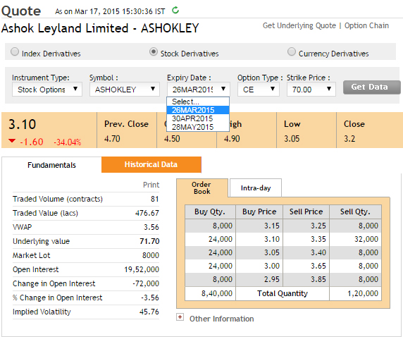


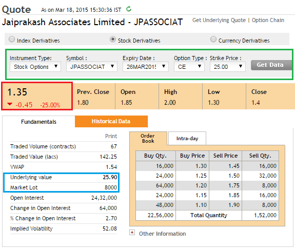


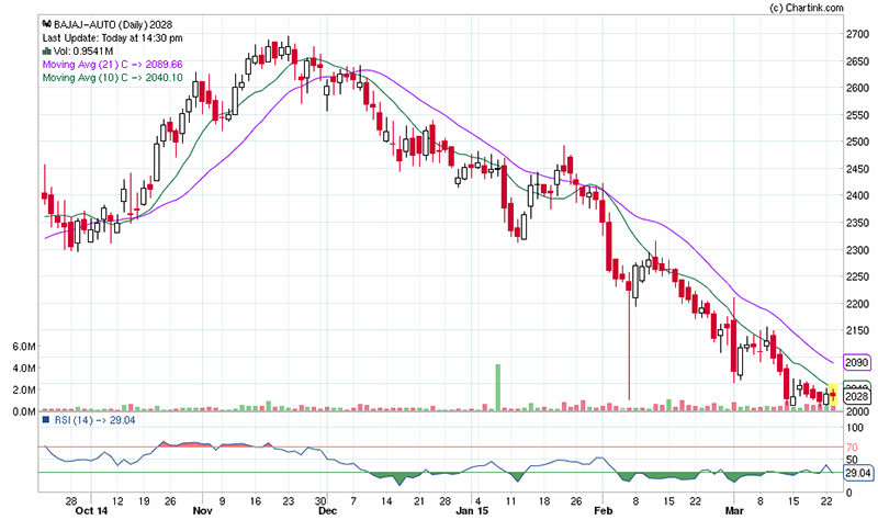
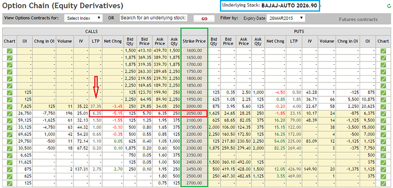
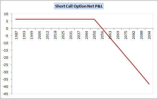
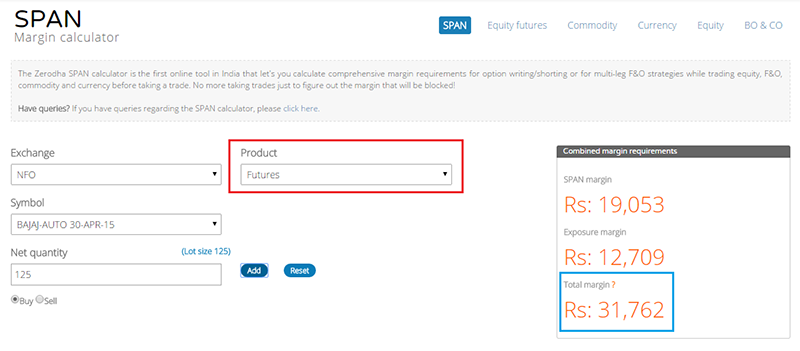
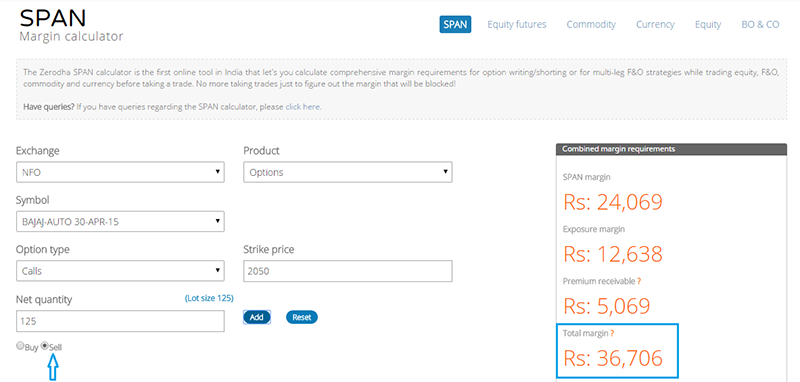


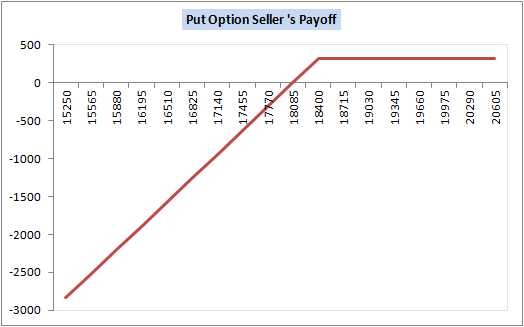
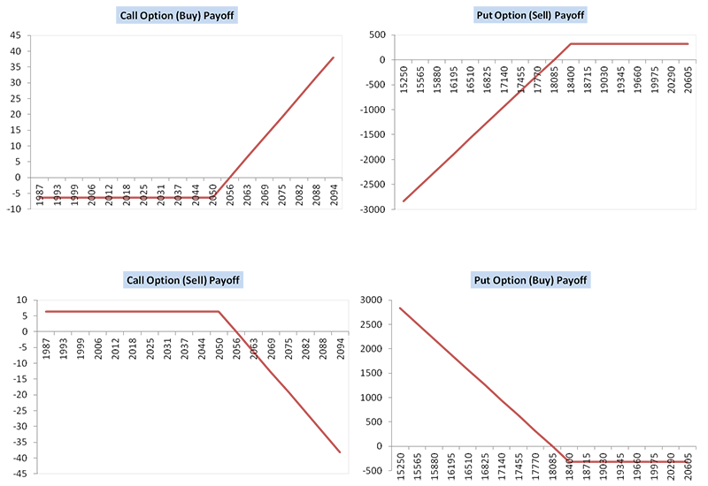


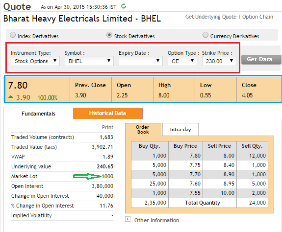
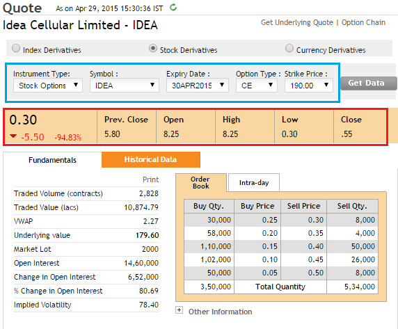


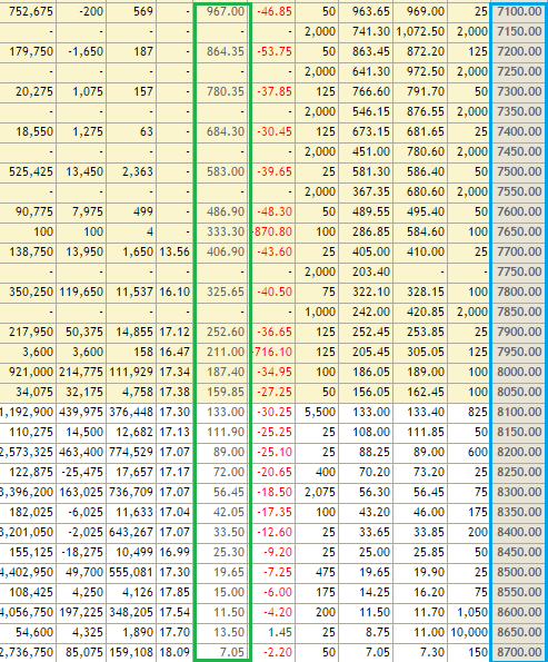
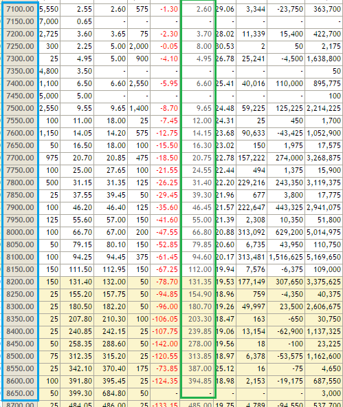
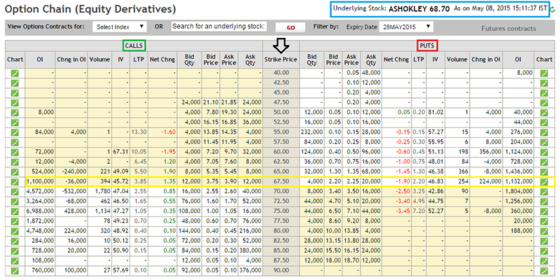

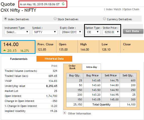
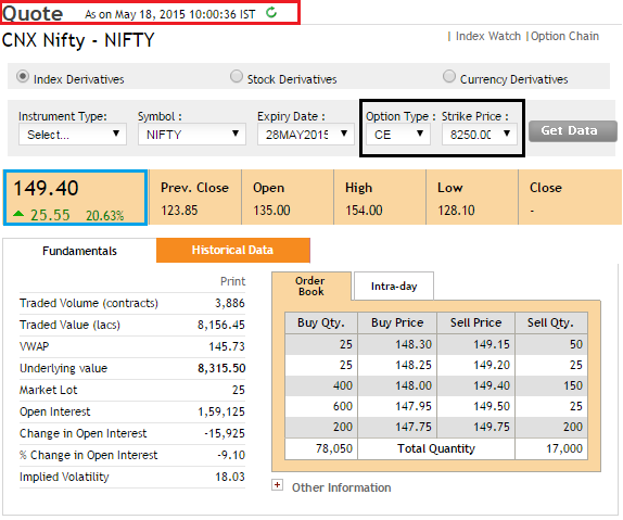
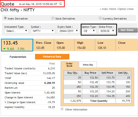

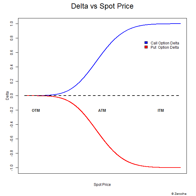

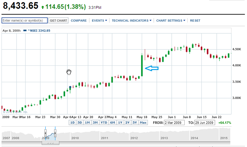
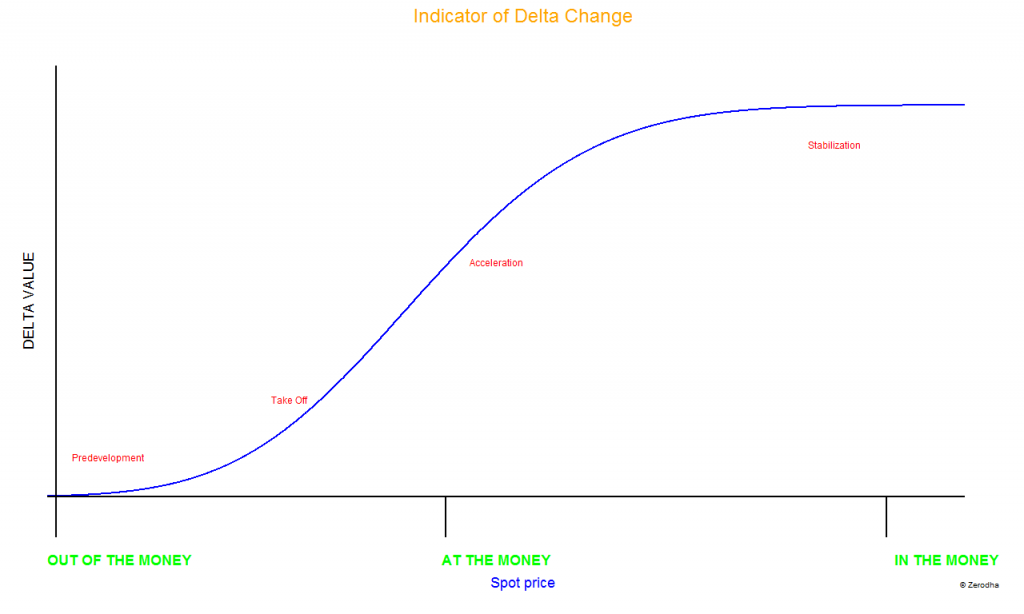


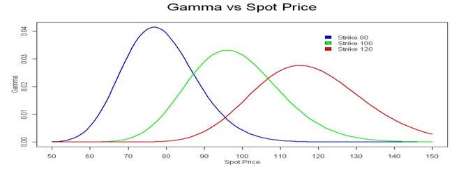
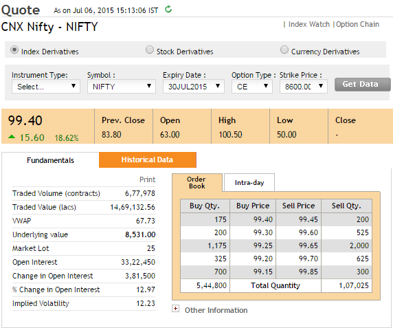
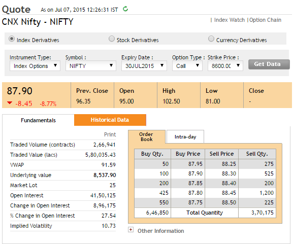
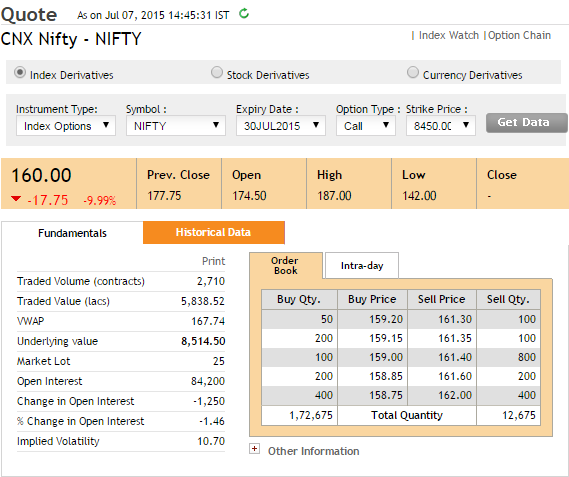


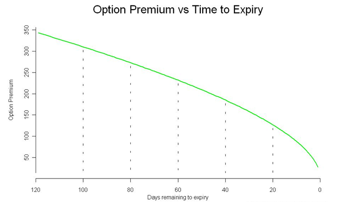
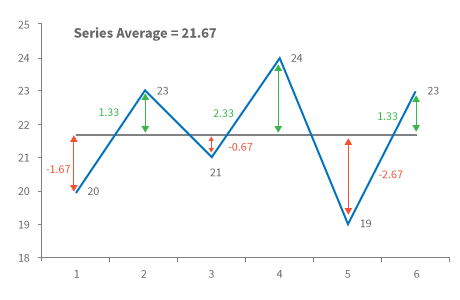


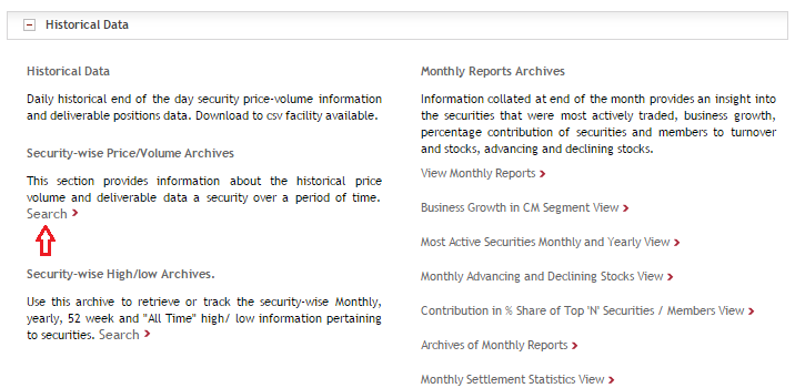
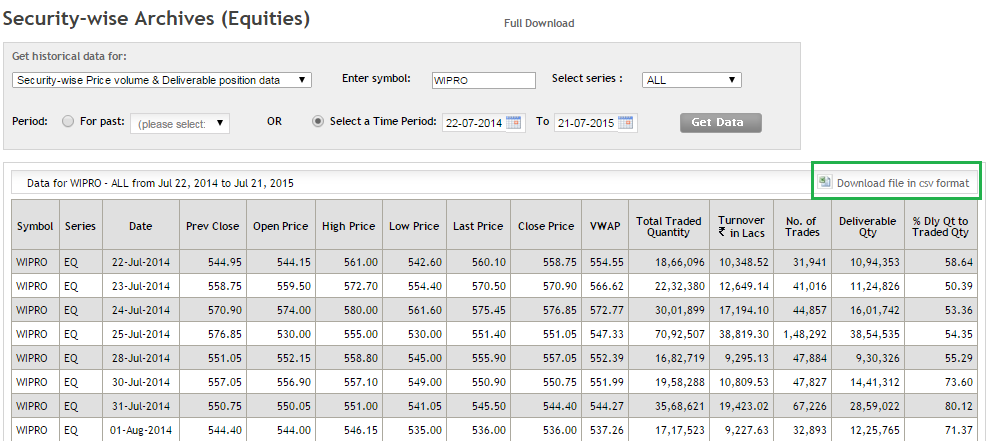
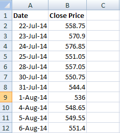
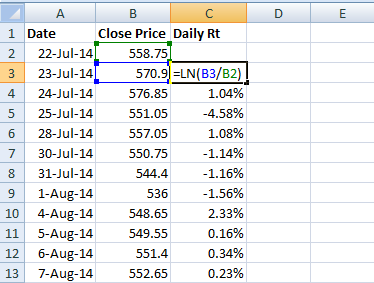
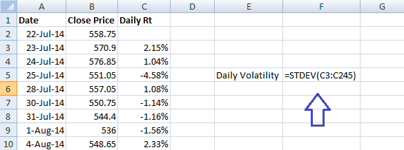
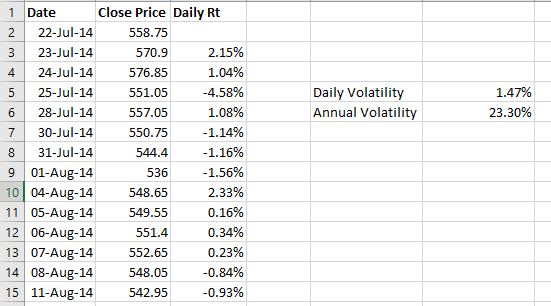
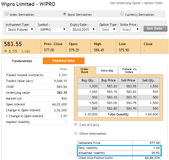
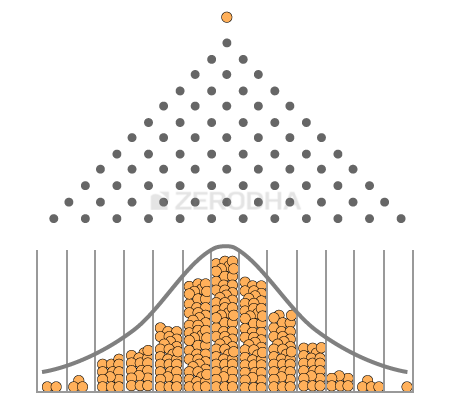
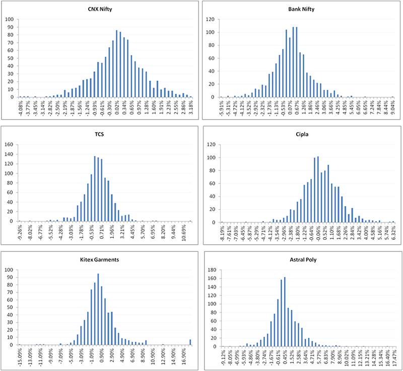
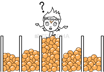
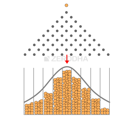
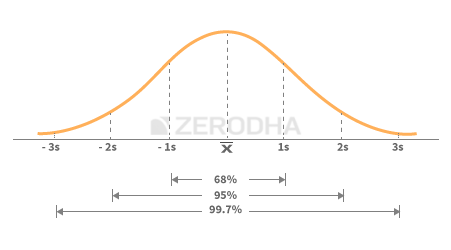
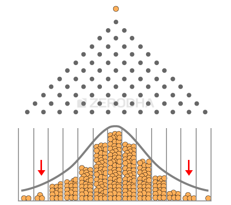
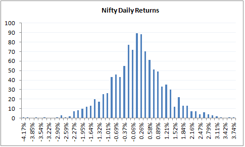

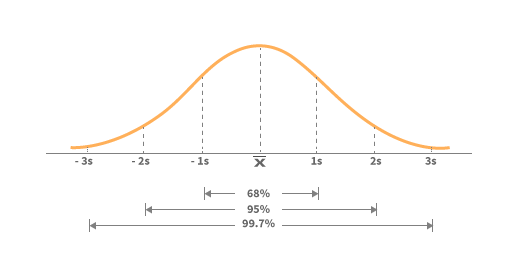
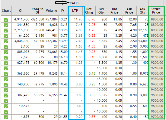
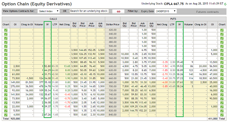

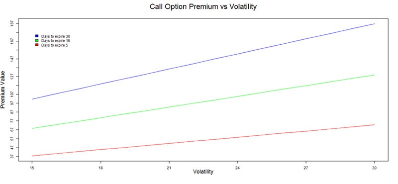

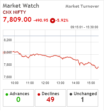

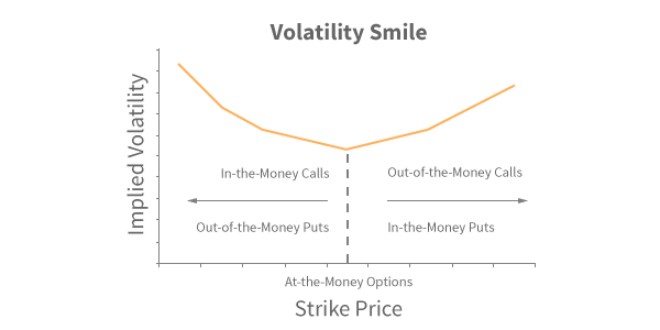
 For instance as of today, Nifty is trading at 7789. Suppose the current implied volatility of option positions is 20%, then a 7800 CE and 8000 CE bull call spread would cost 72 with a potential profit of 128. However if the implied volatility is 35% instead of 20%, the same position would cost 82 with potential profit of 118. Notice with higher volatility a bull call spread not only costs higher but the profitability greatly reduces.
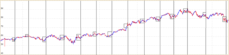
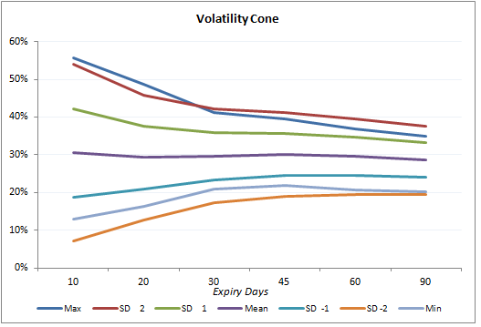
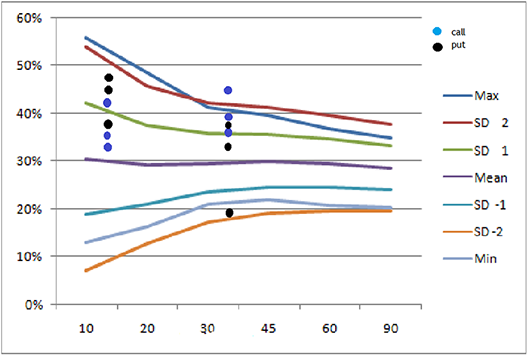
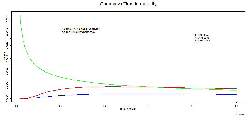
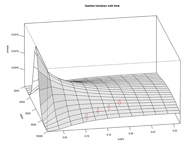
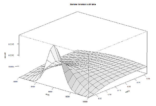
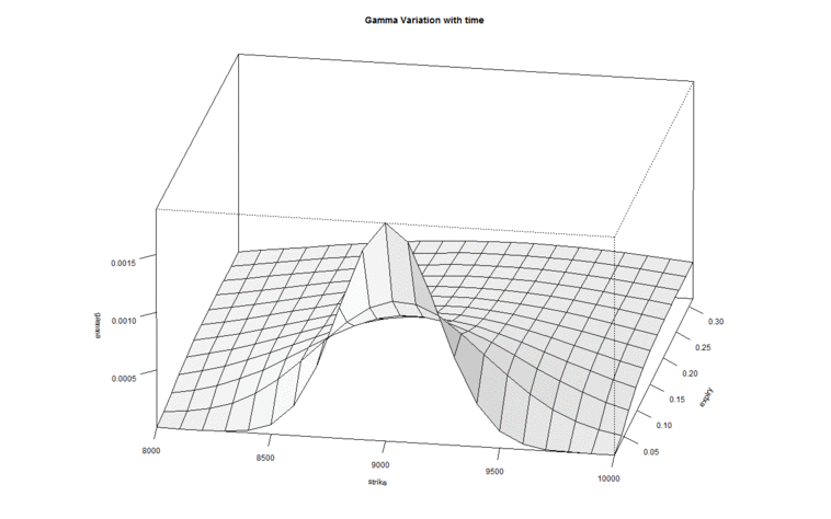
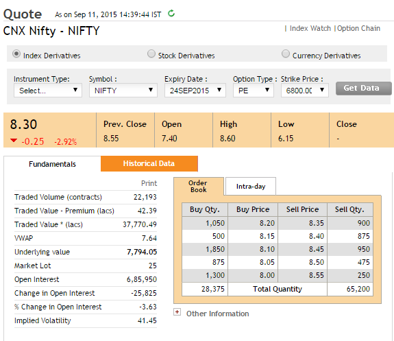
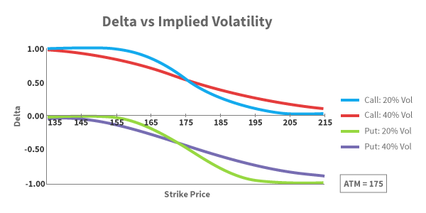
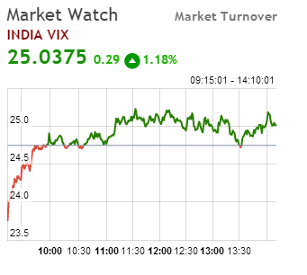

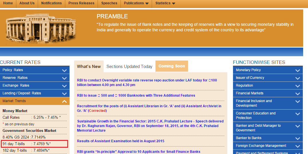
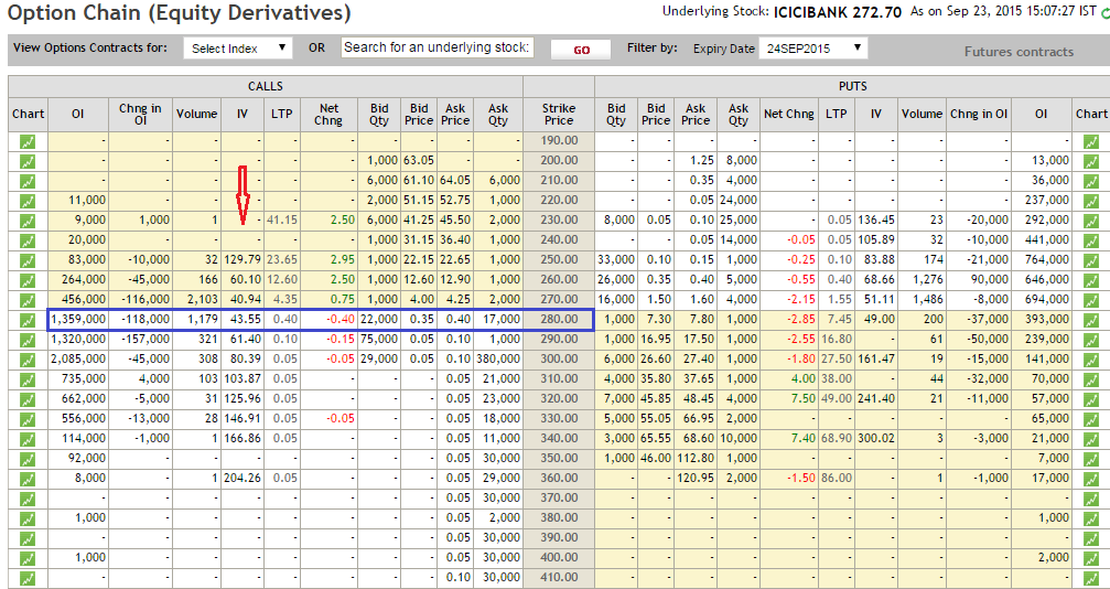
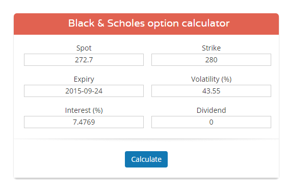
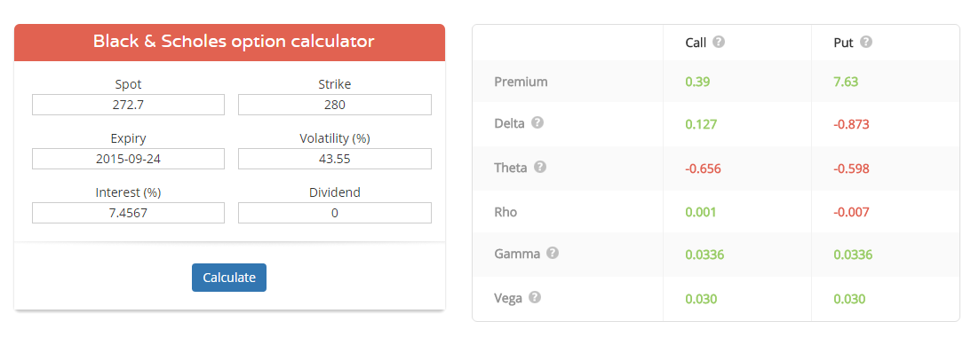

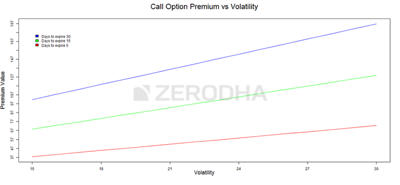
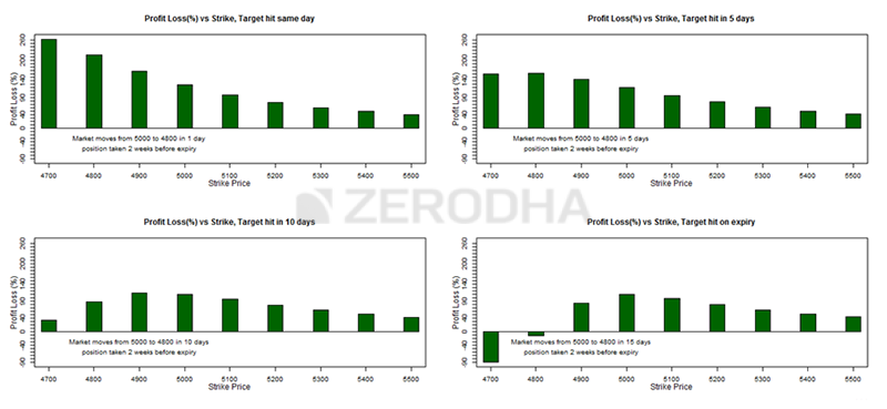

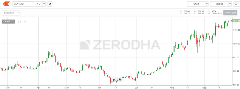
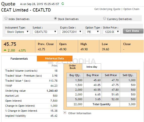
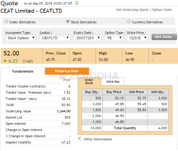
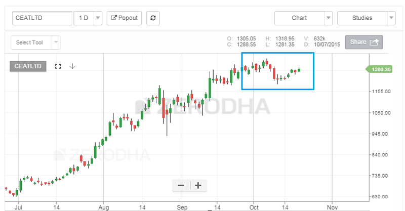

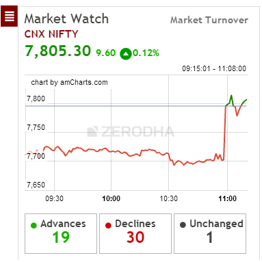

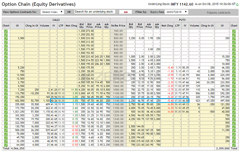
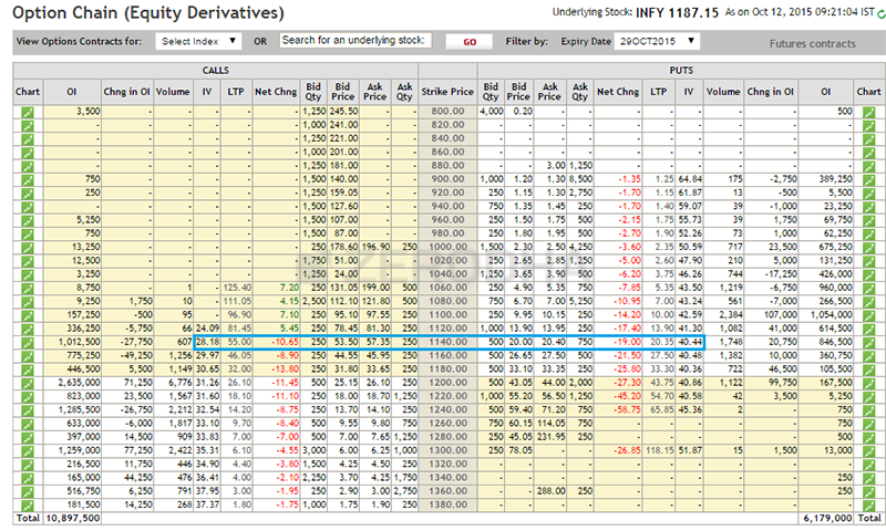

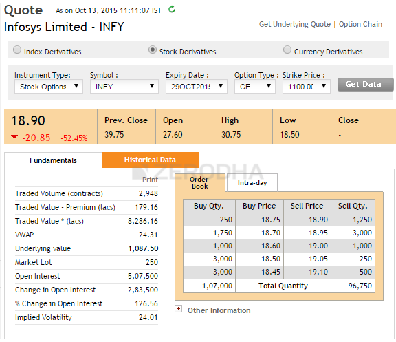
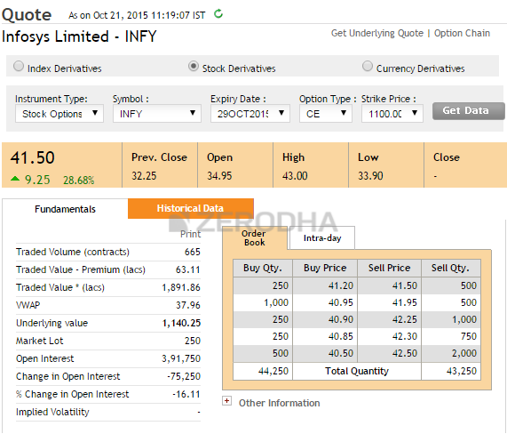


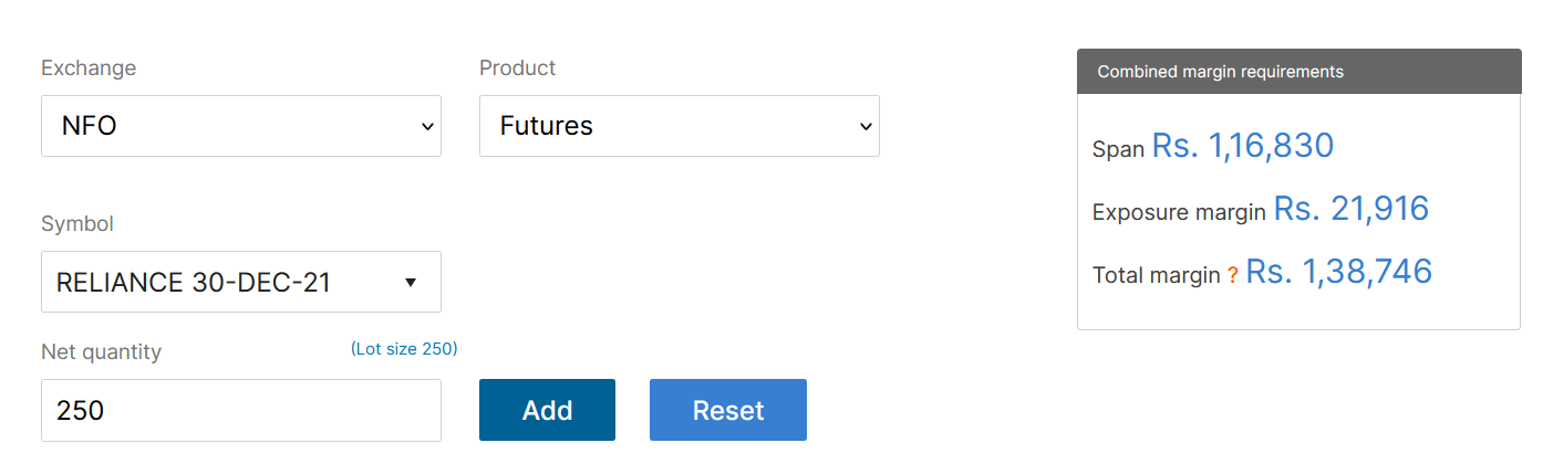
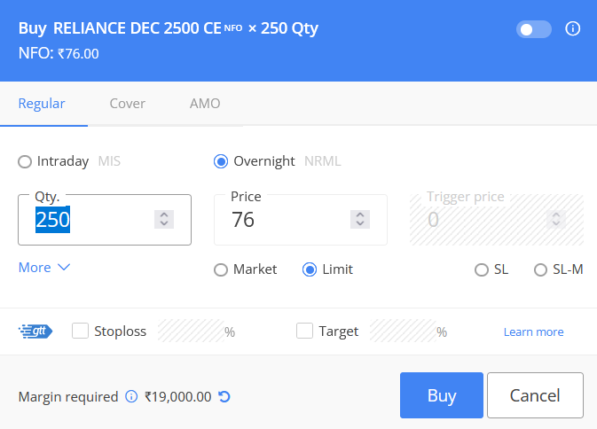
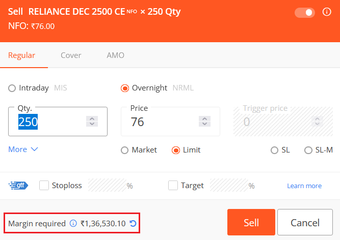


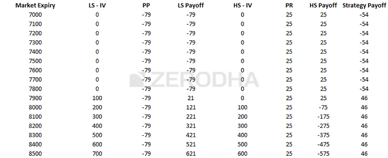
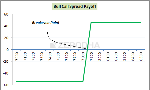


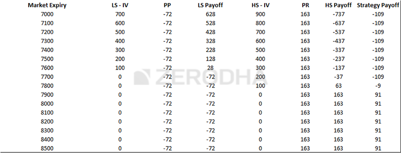
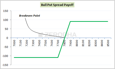

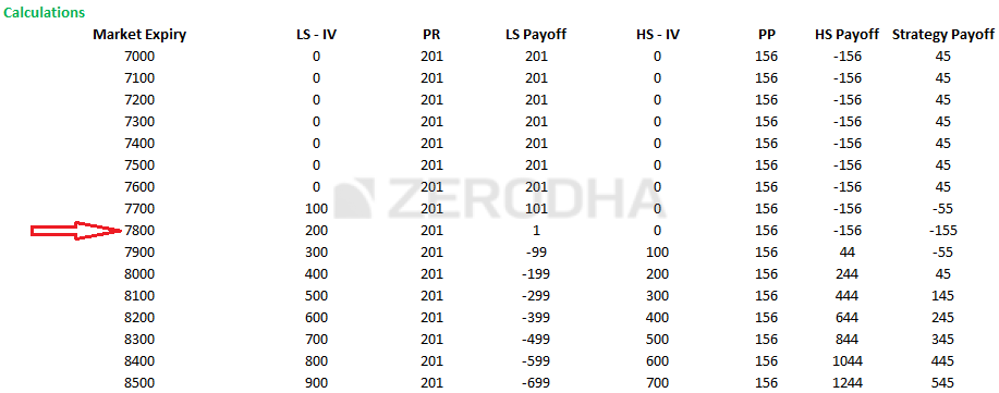

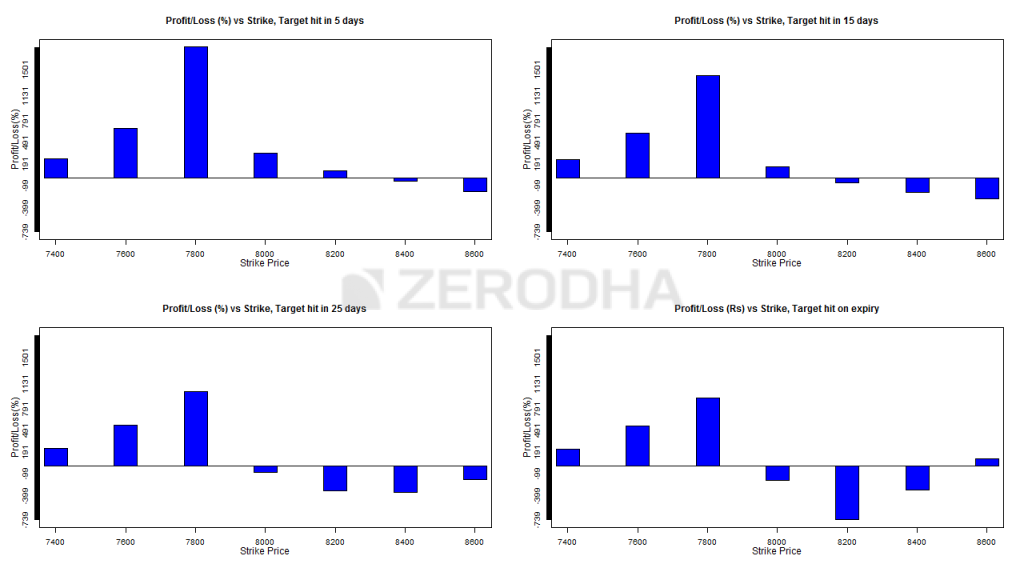


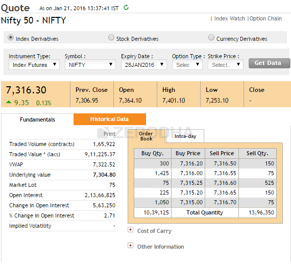
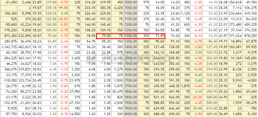
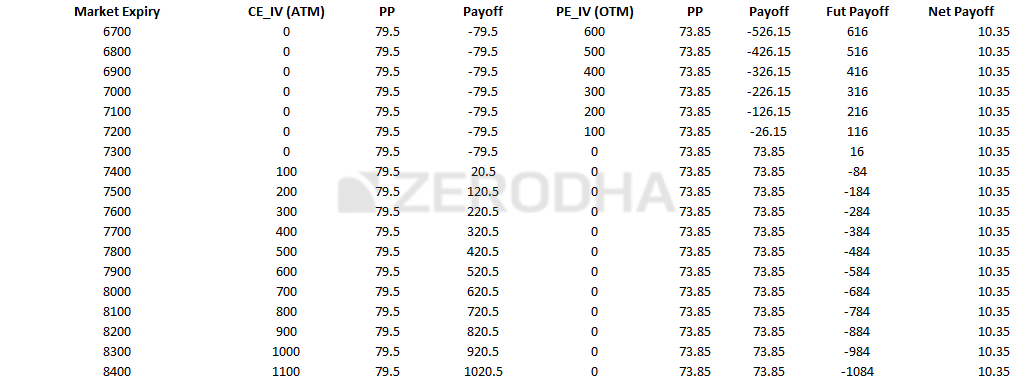

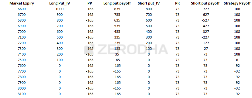
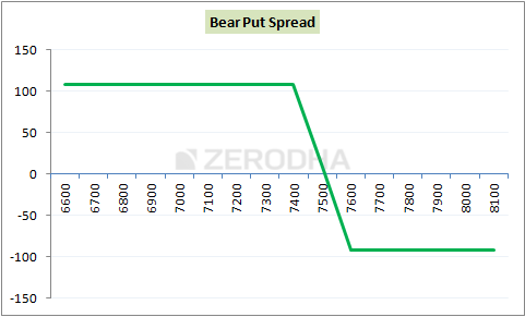
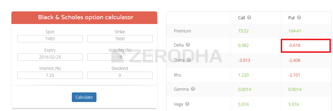
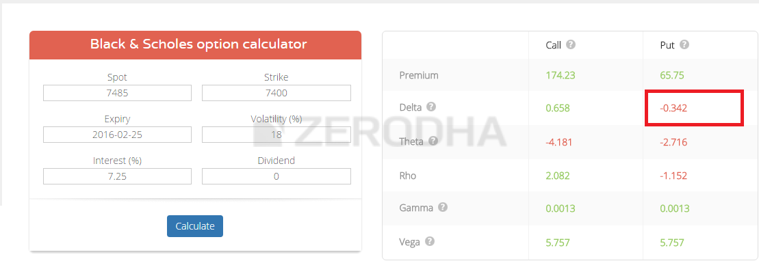
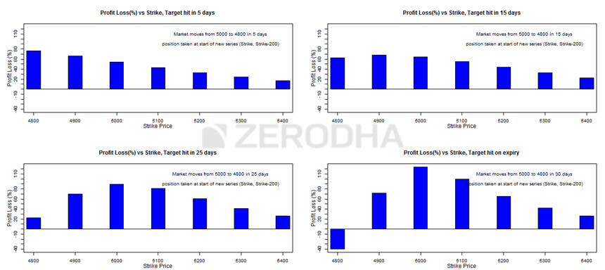
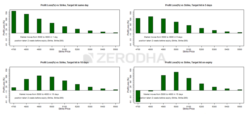
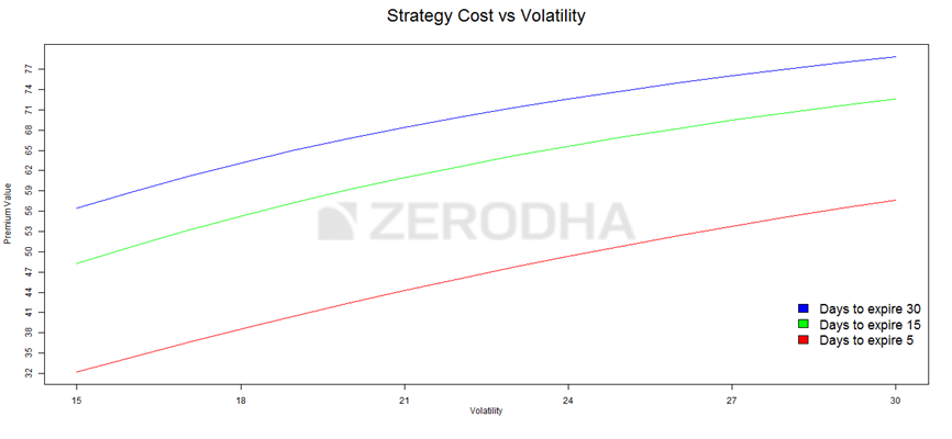

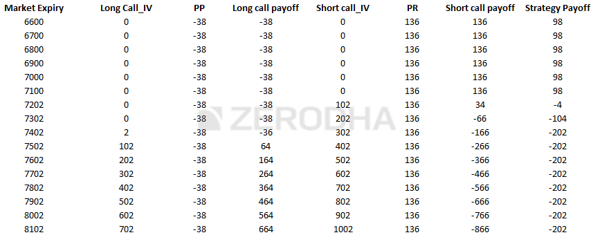
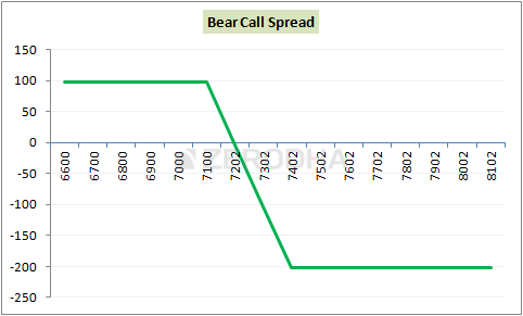
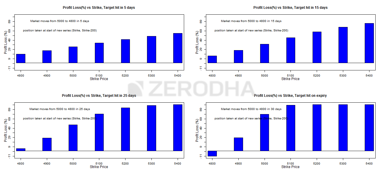
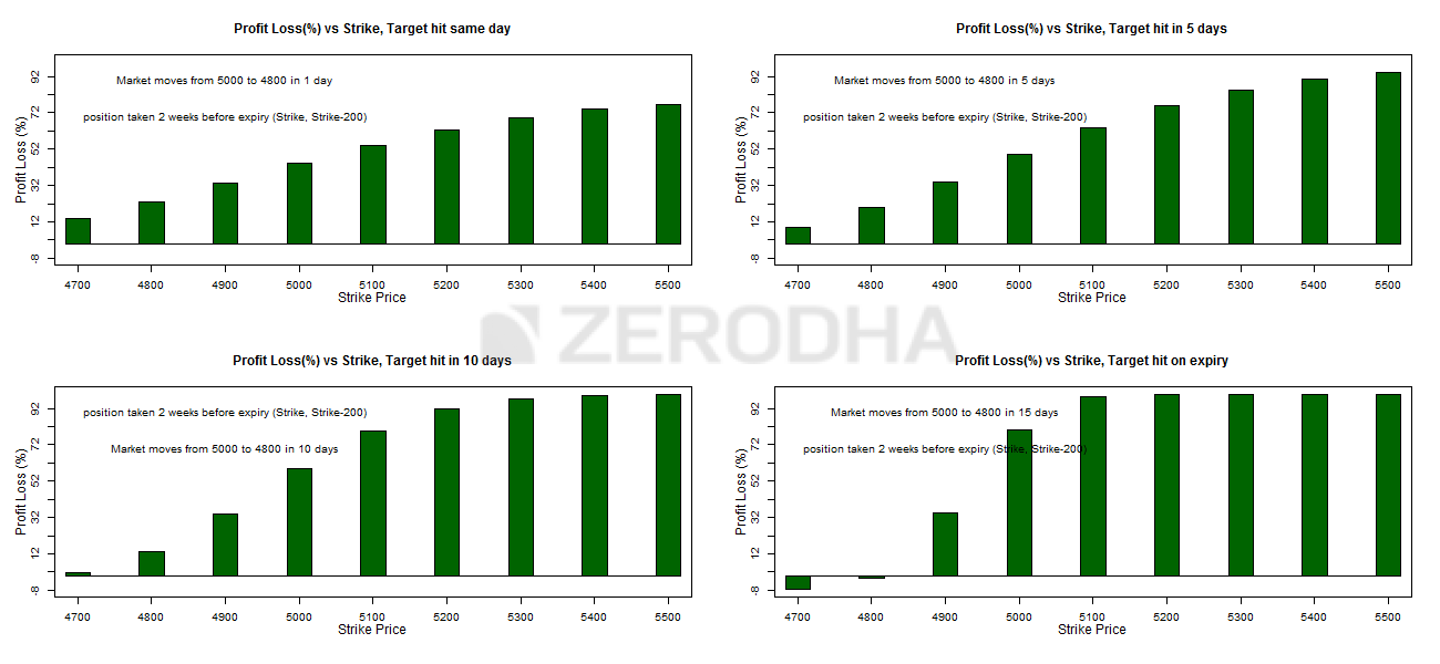
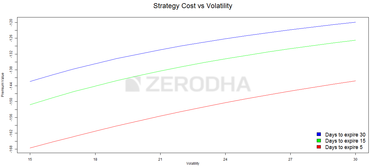

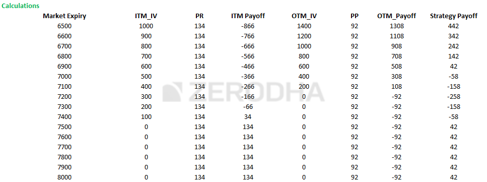
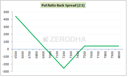
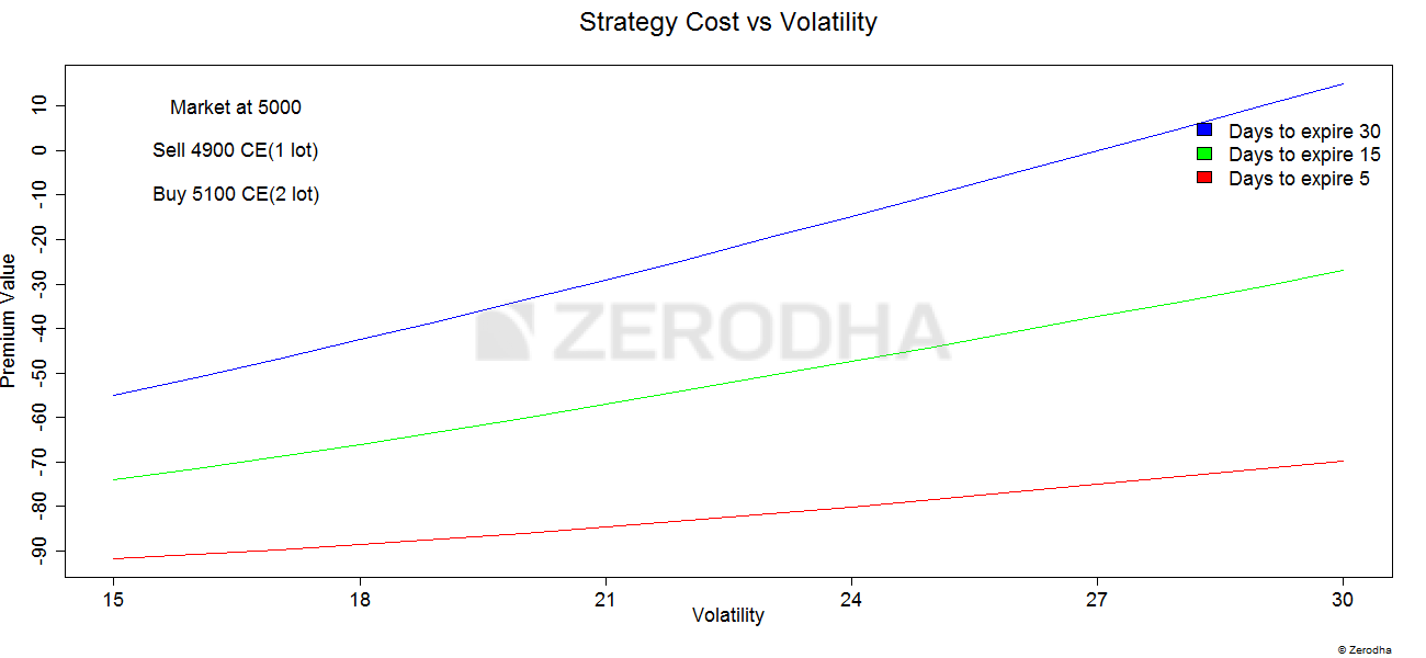

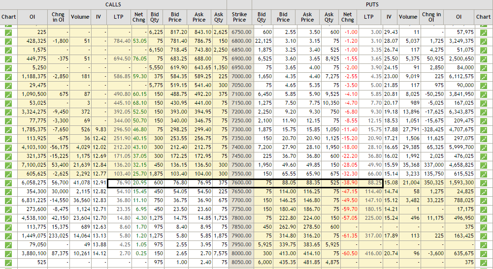
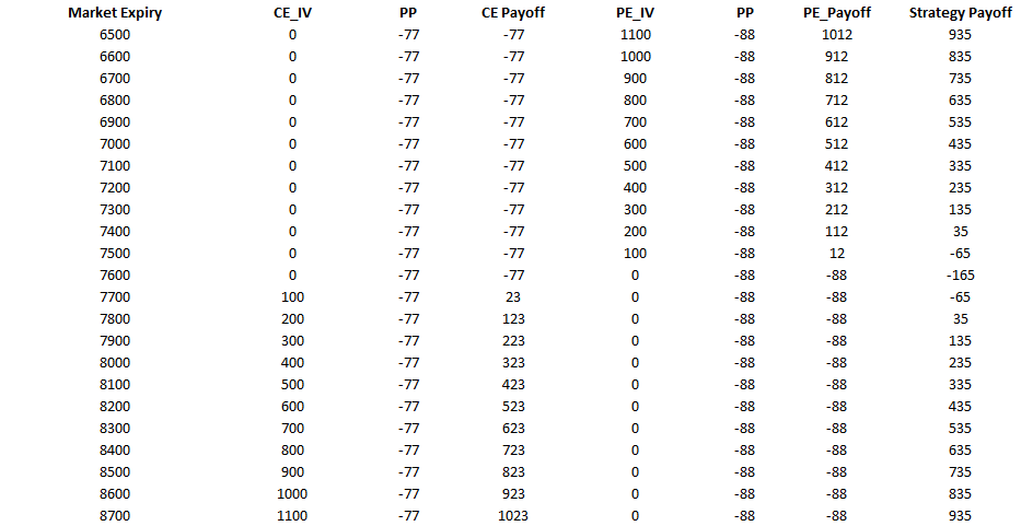

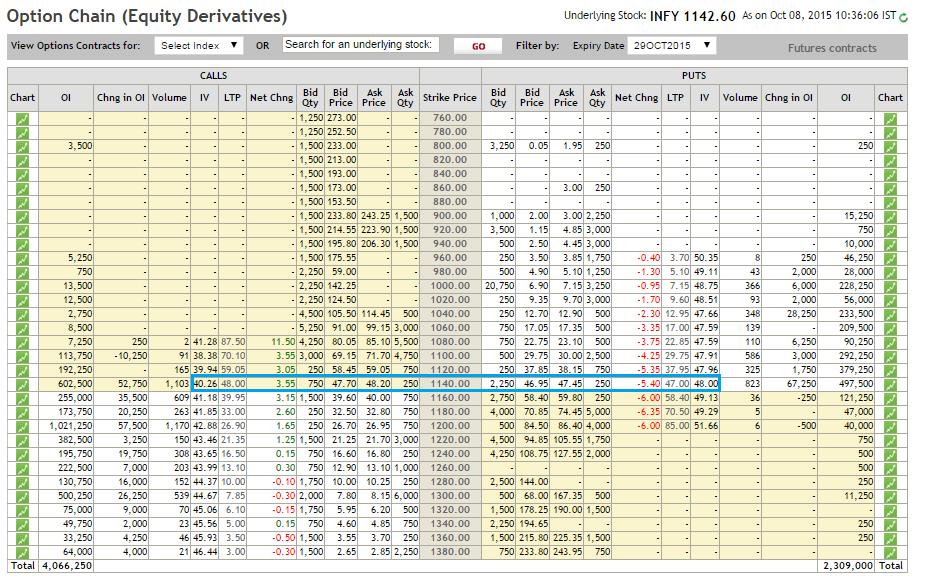
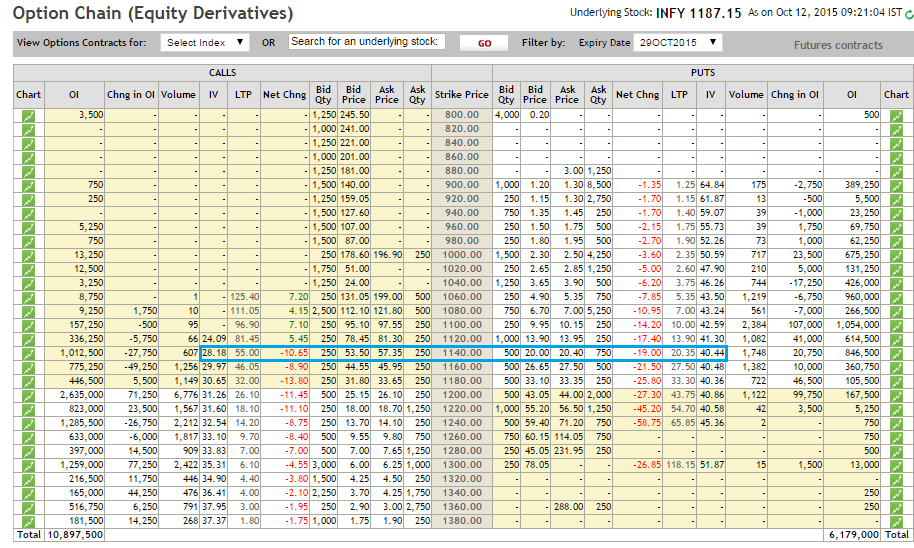

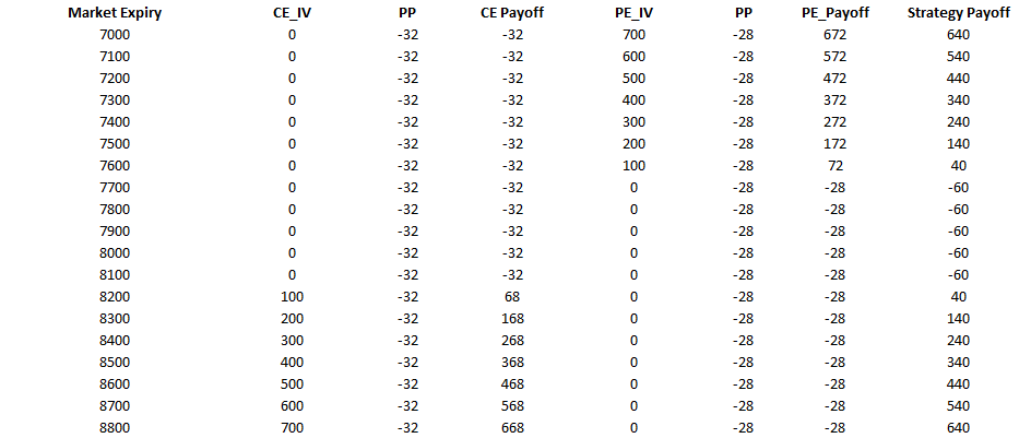
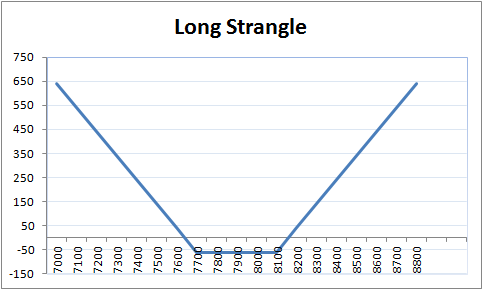


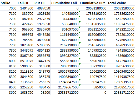
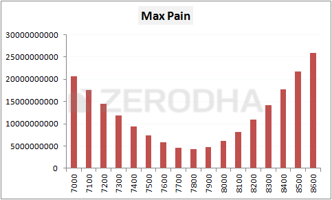
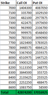

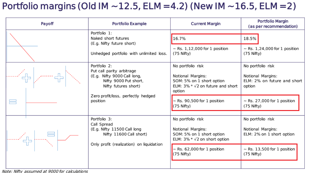


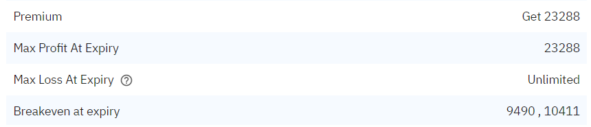
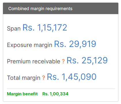
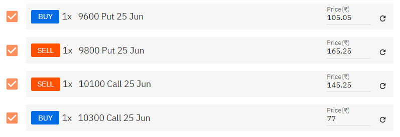

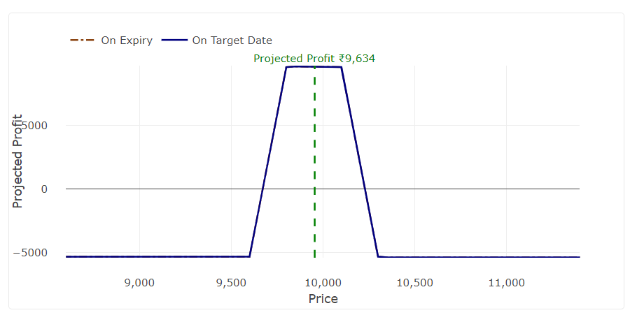


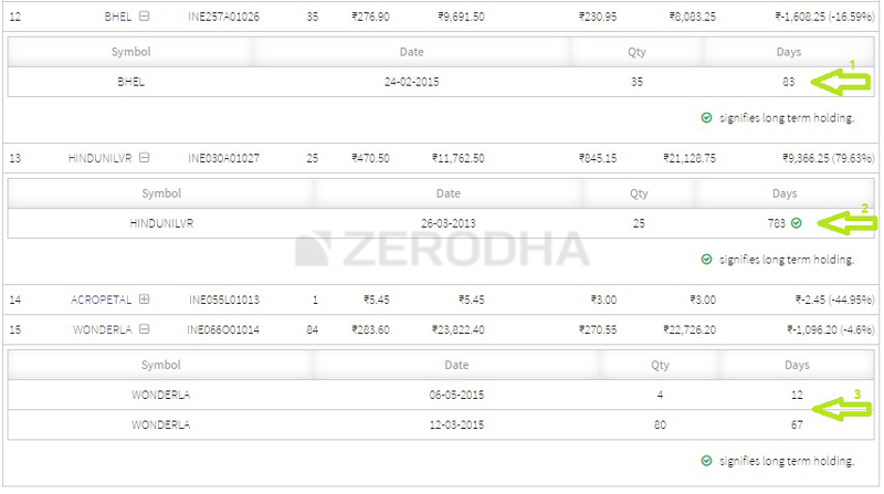


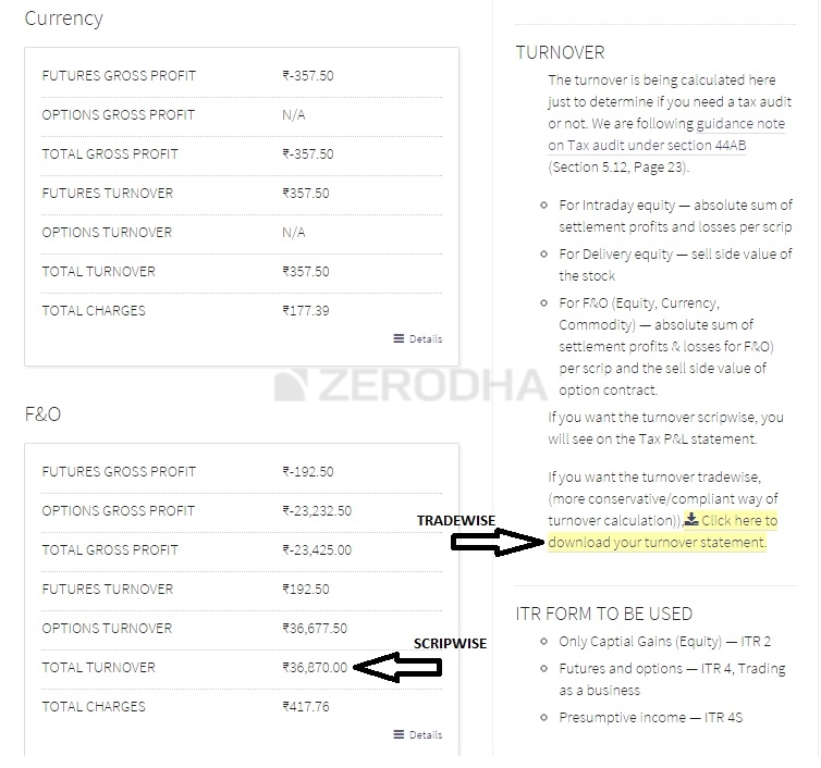
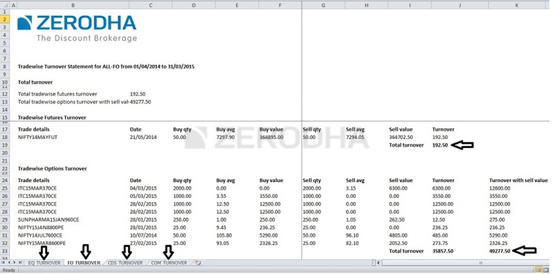


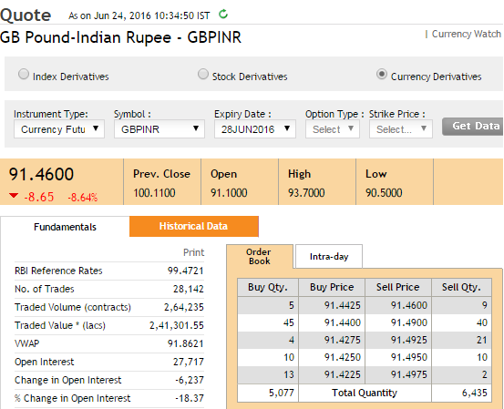
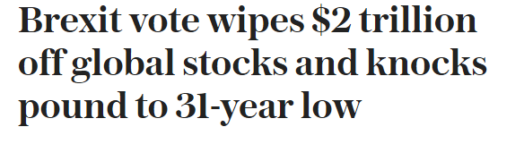
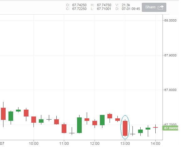
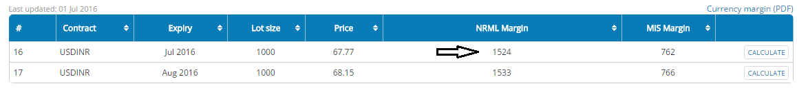
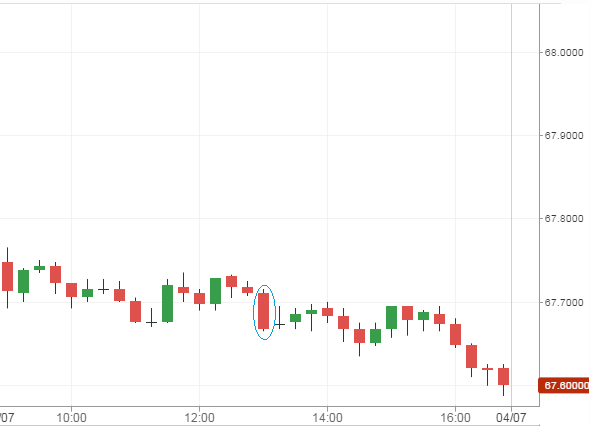

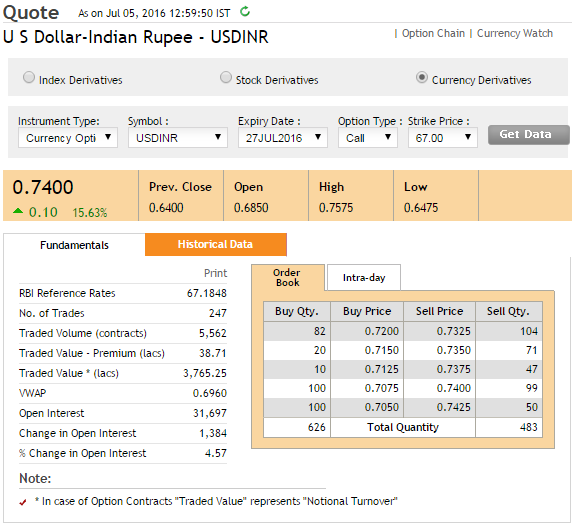
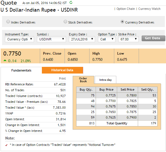
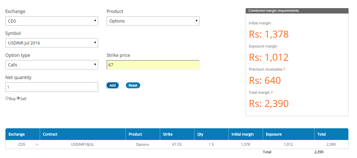


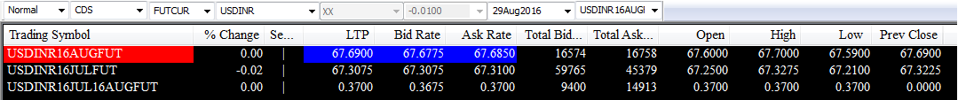
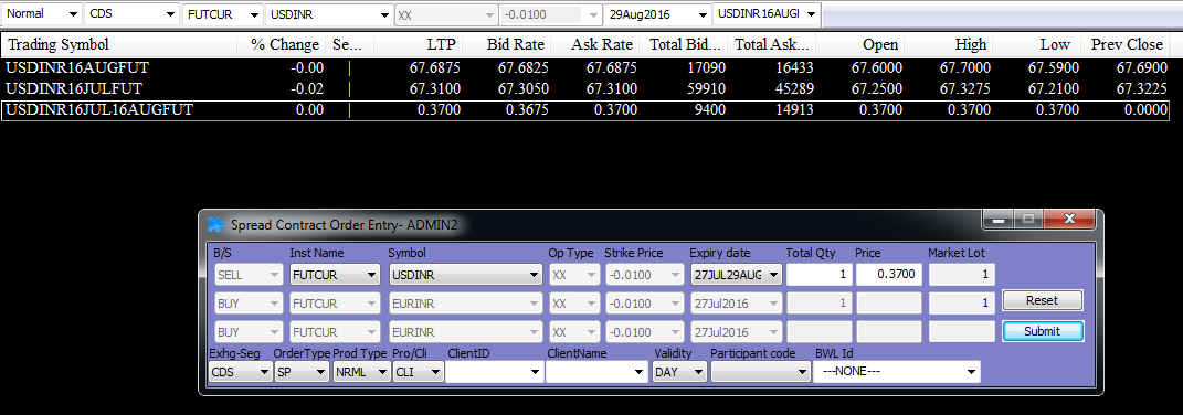
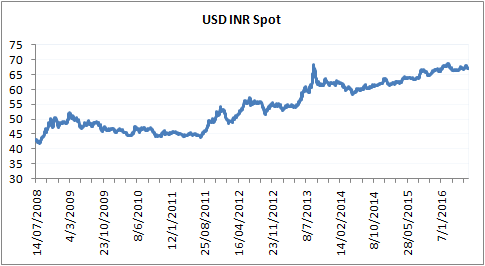
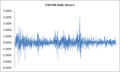

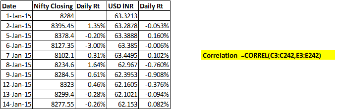

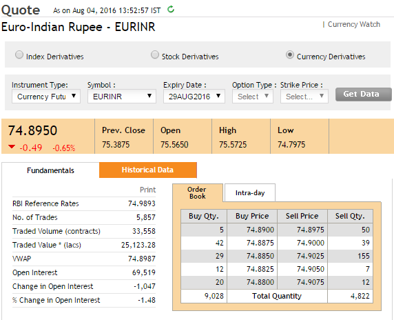
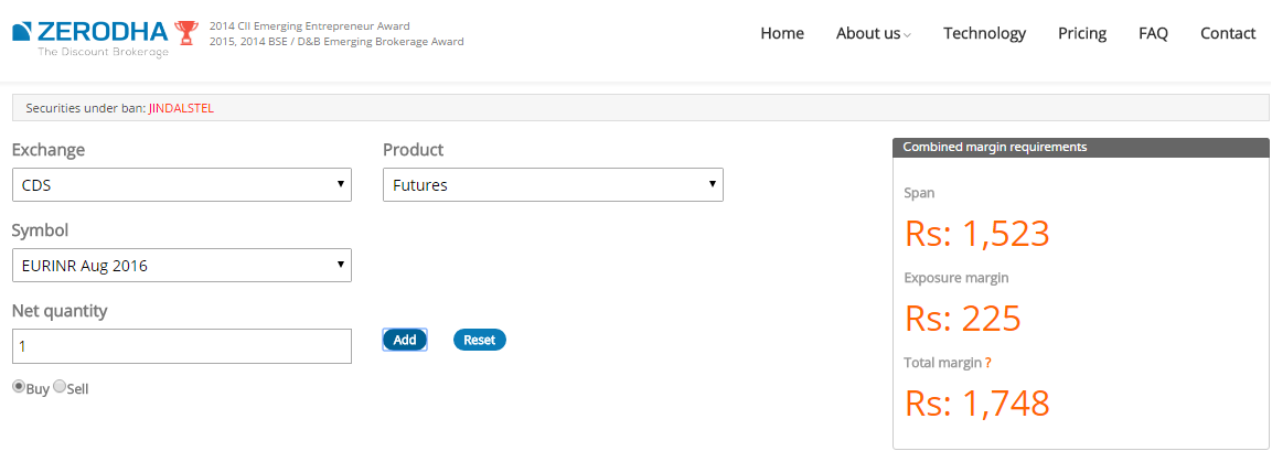

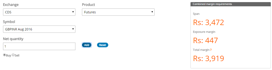

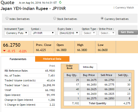
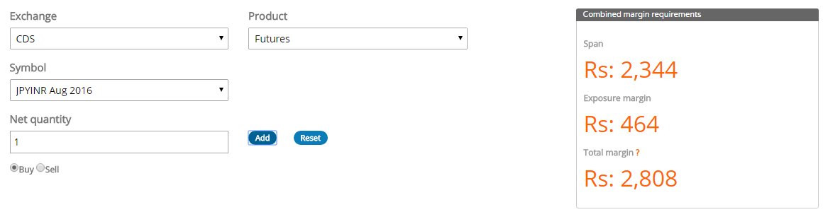
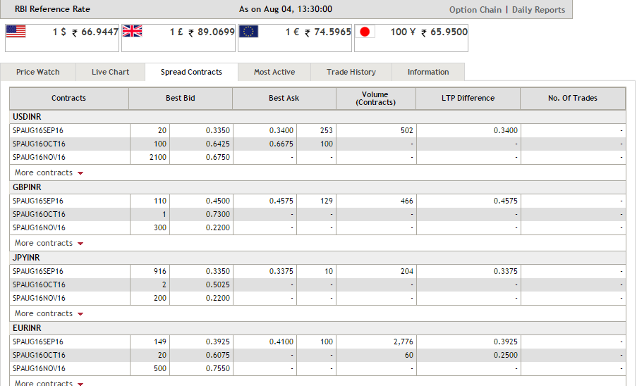
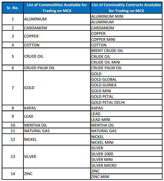

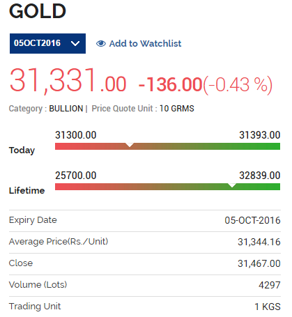

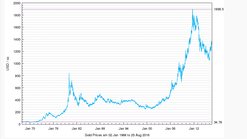
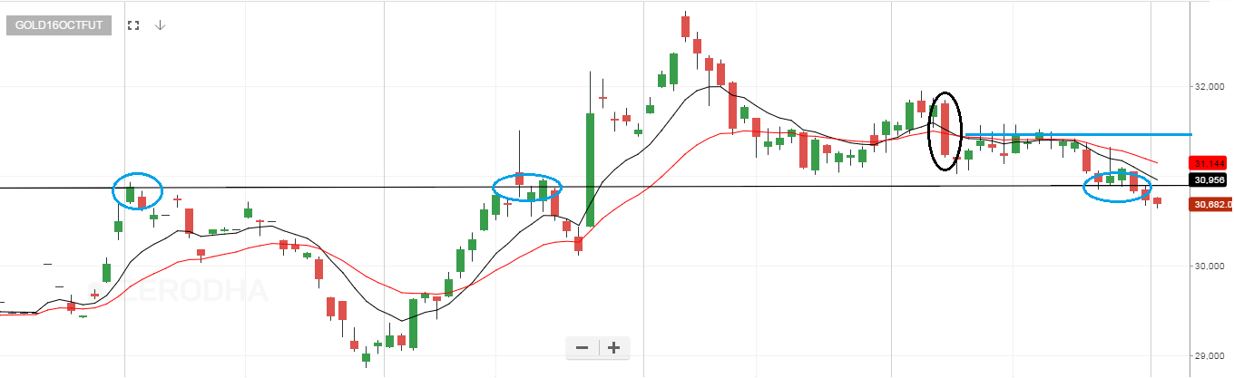

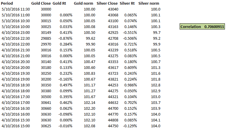
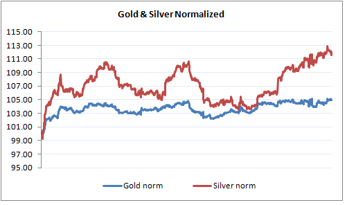
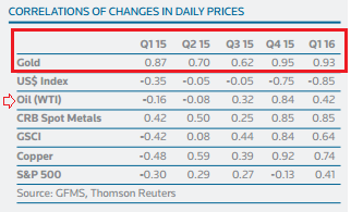
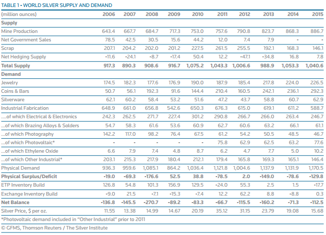
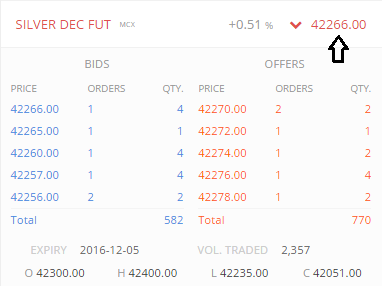
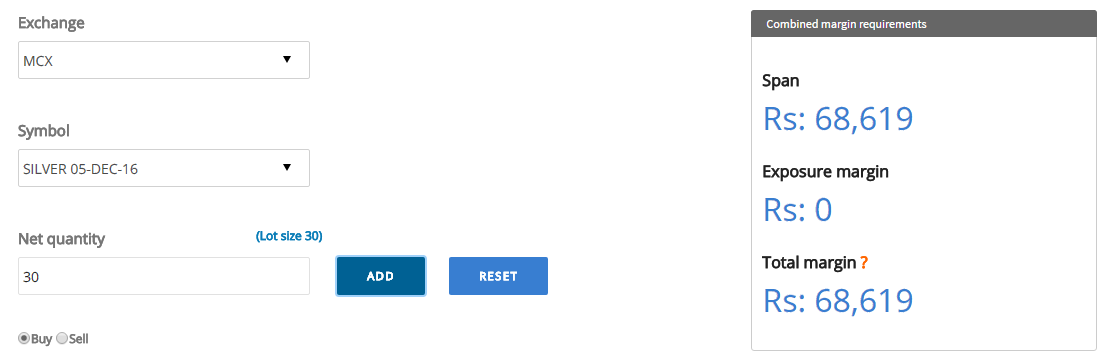


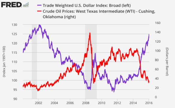

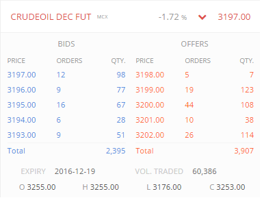
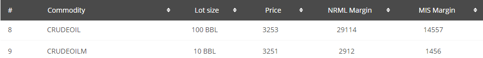
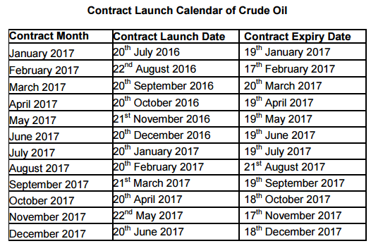
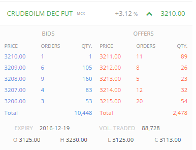
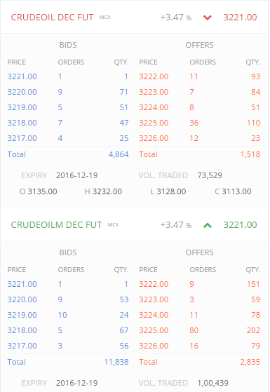


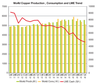
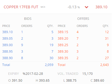
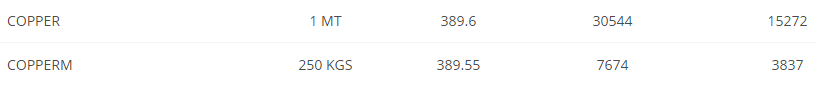
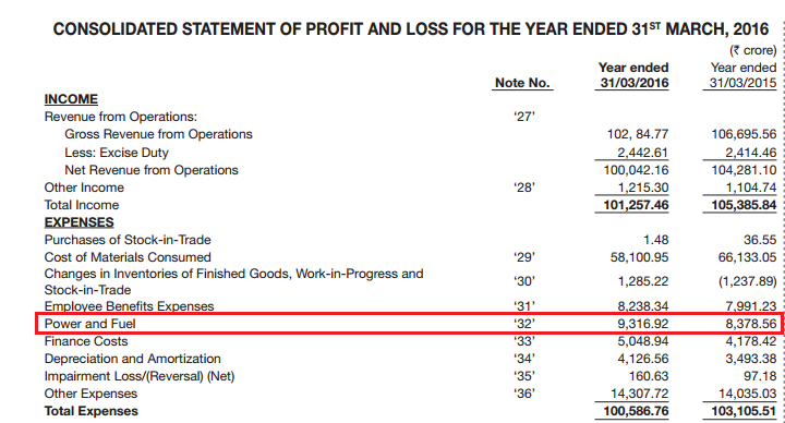
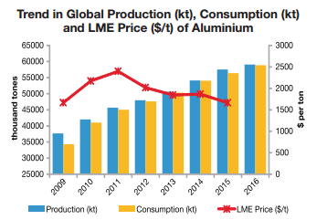
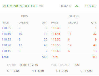
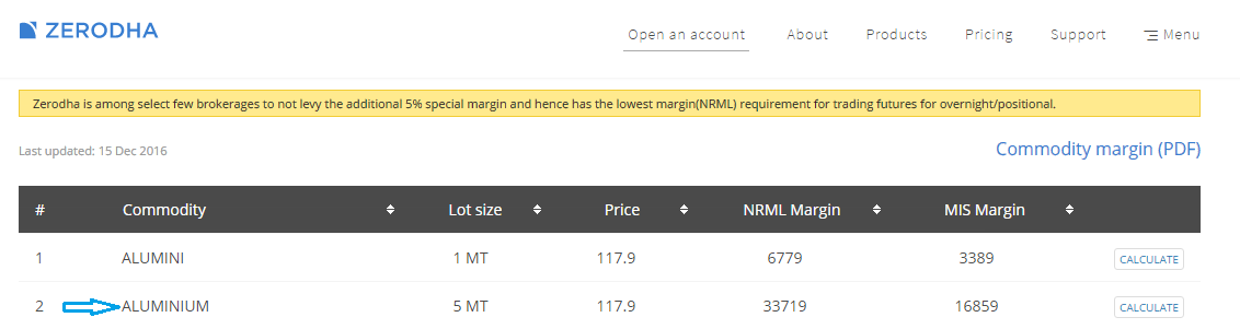


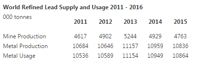
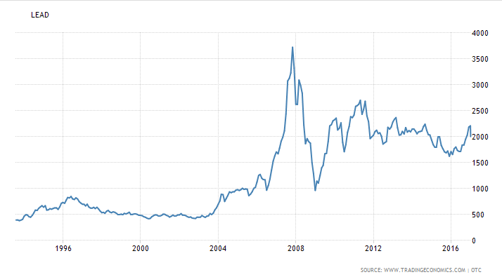
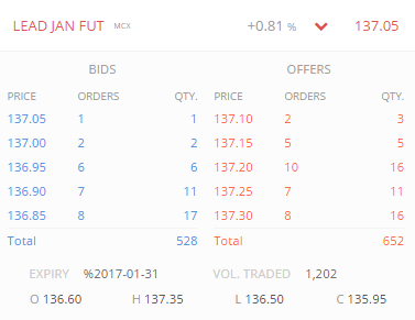


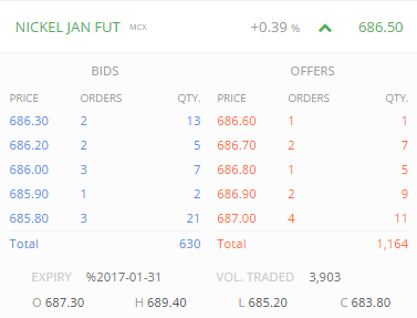
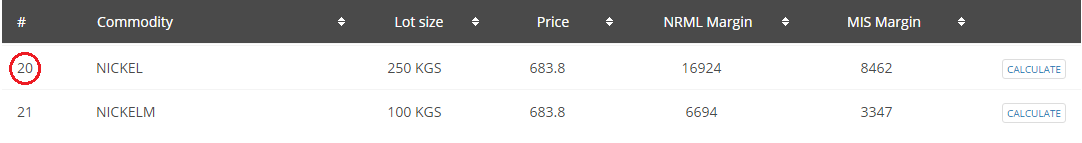
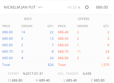
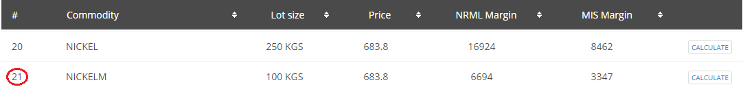

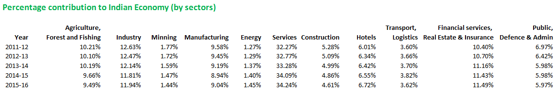
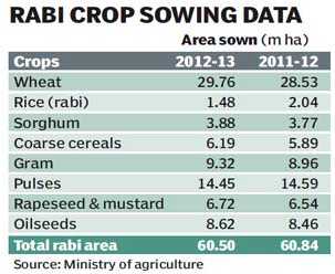
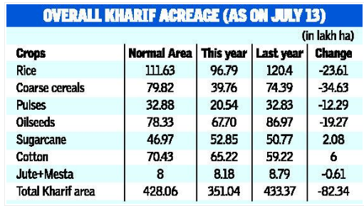
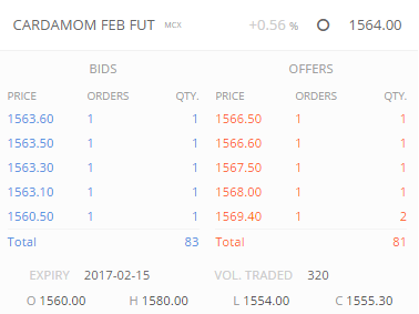
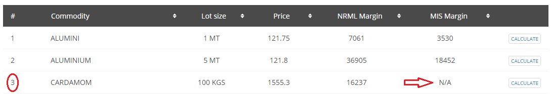
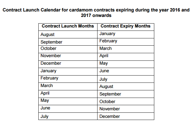
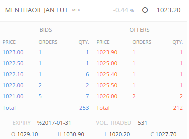


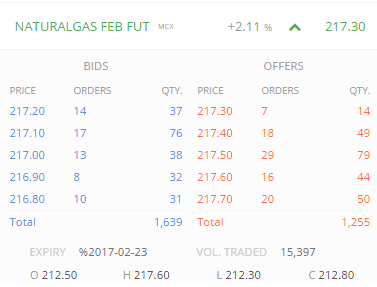

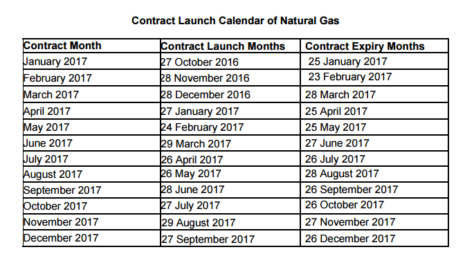
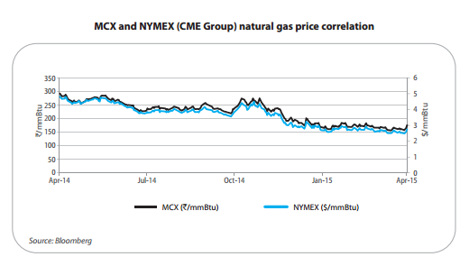


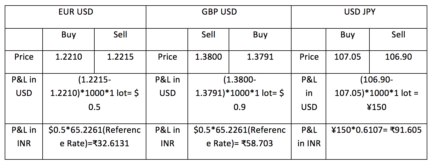


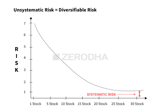

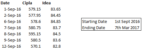
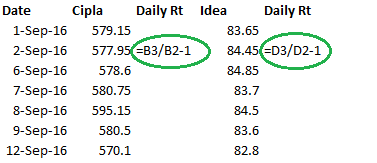
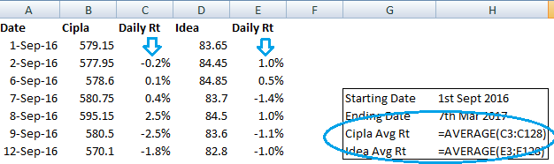
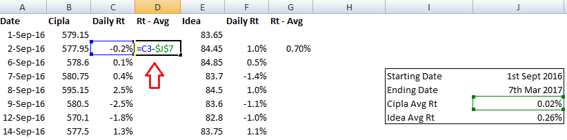
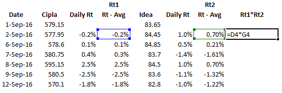
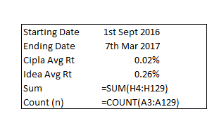
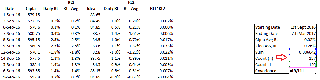

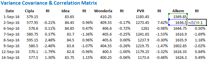
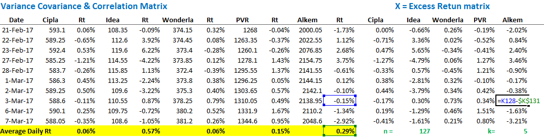
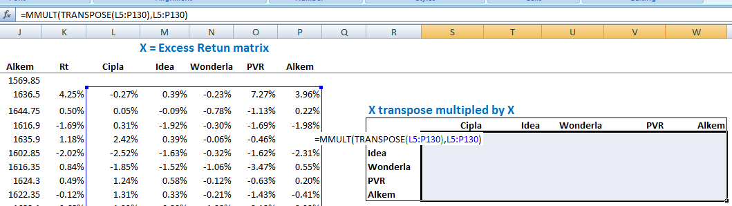
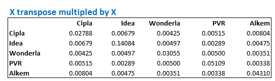
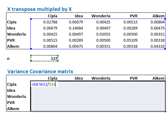
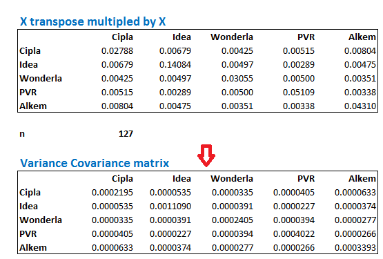

 5.1 – Correlation Matrix
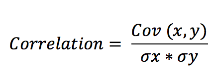

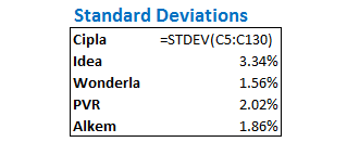
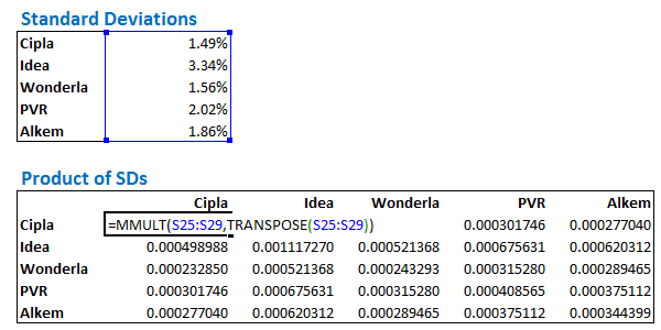
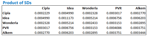
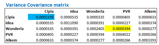
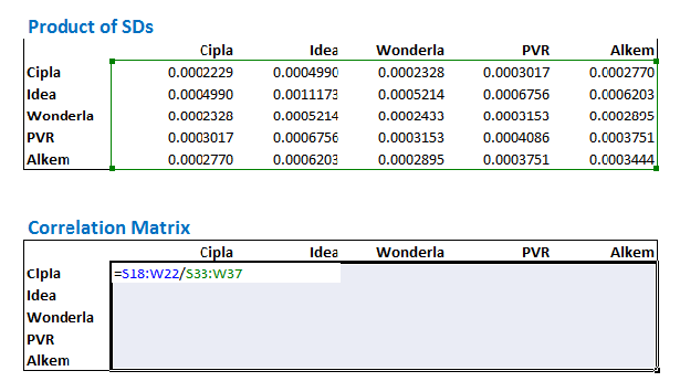
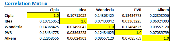
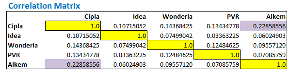
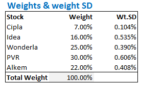
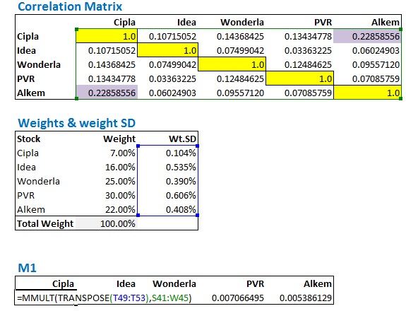
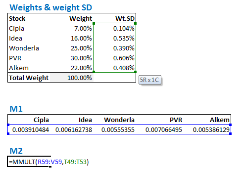
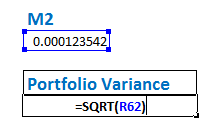


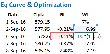
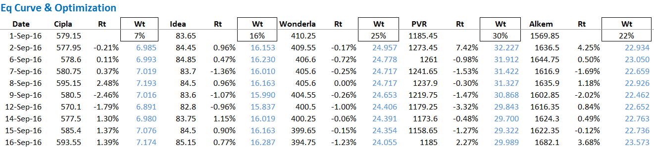


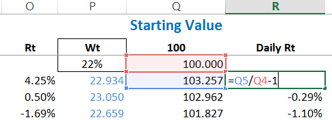
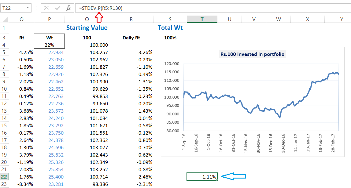


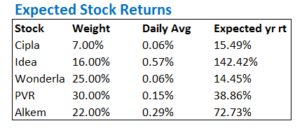
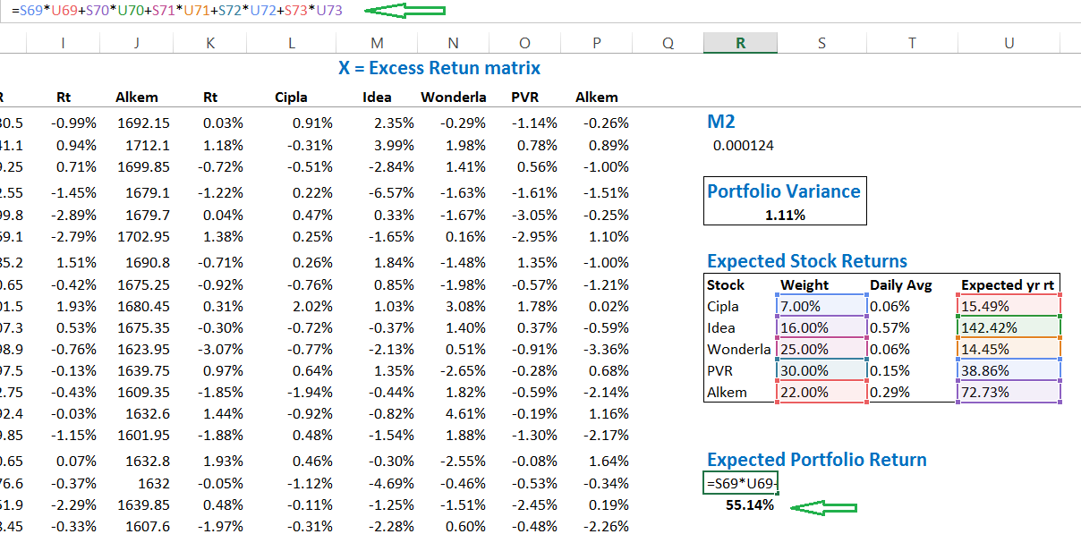

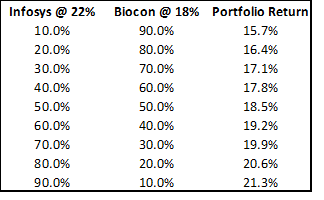
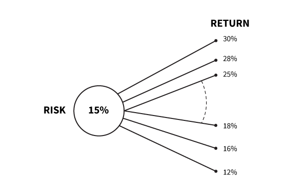
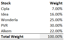
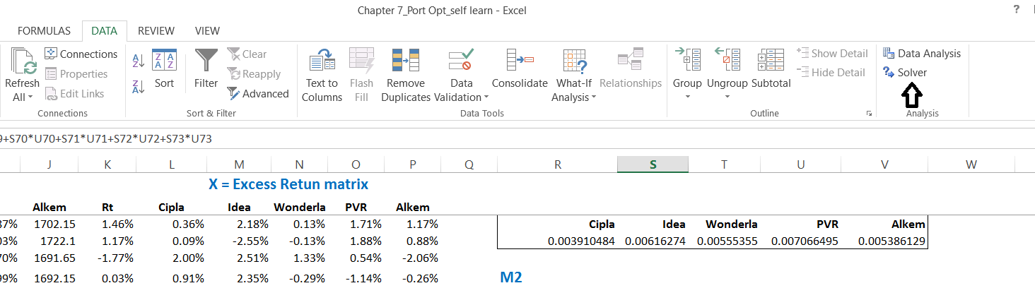
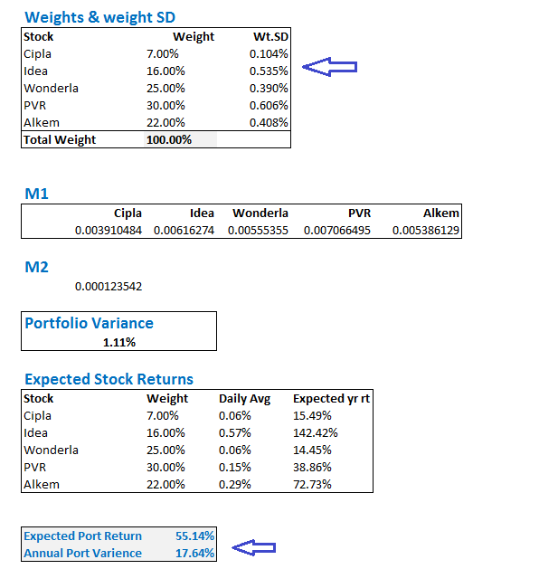
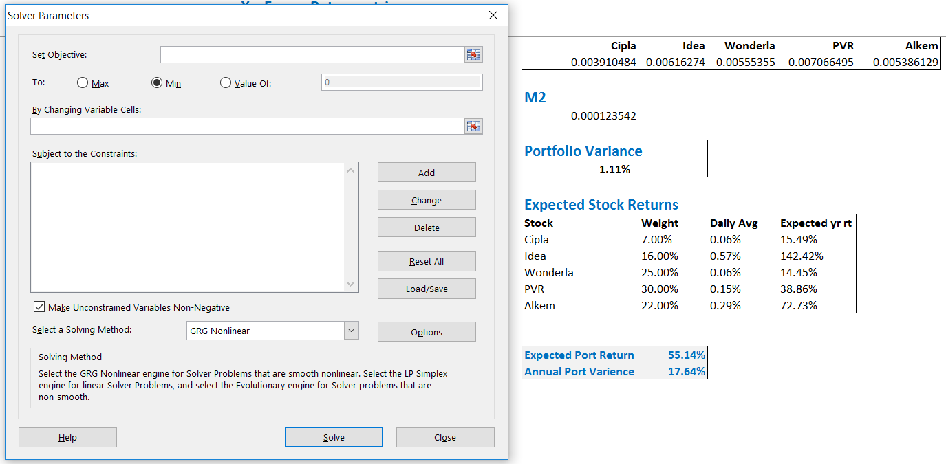
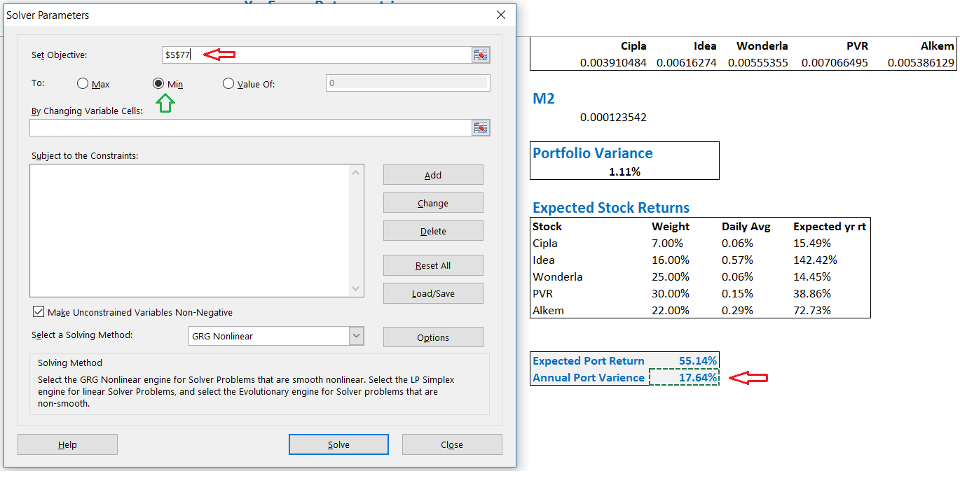
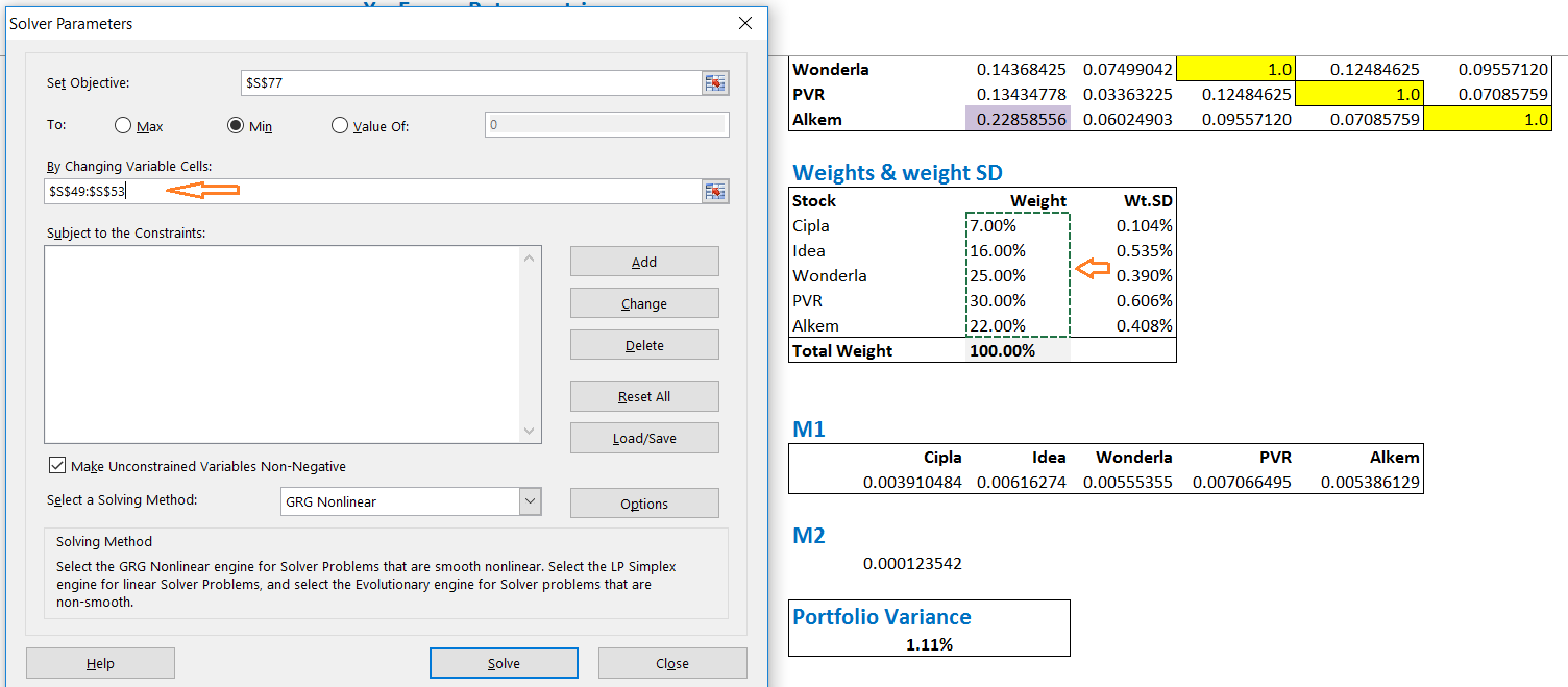
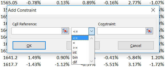
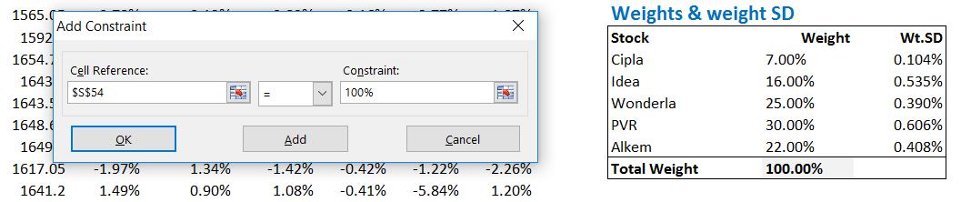
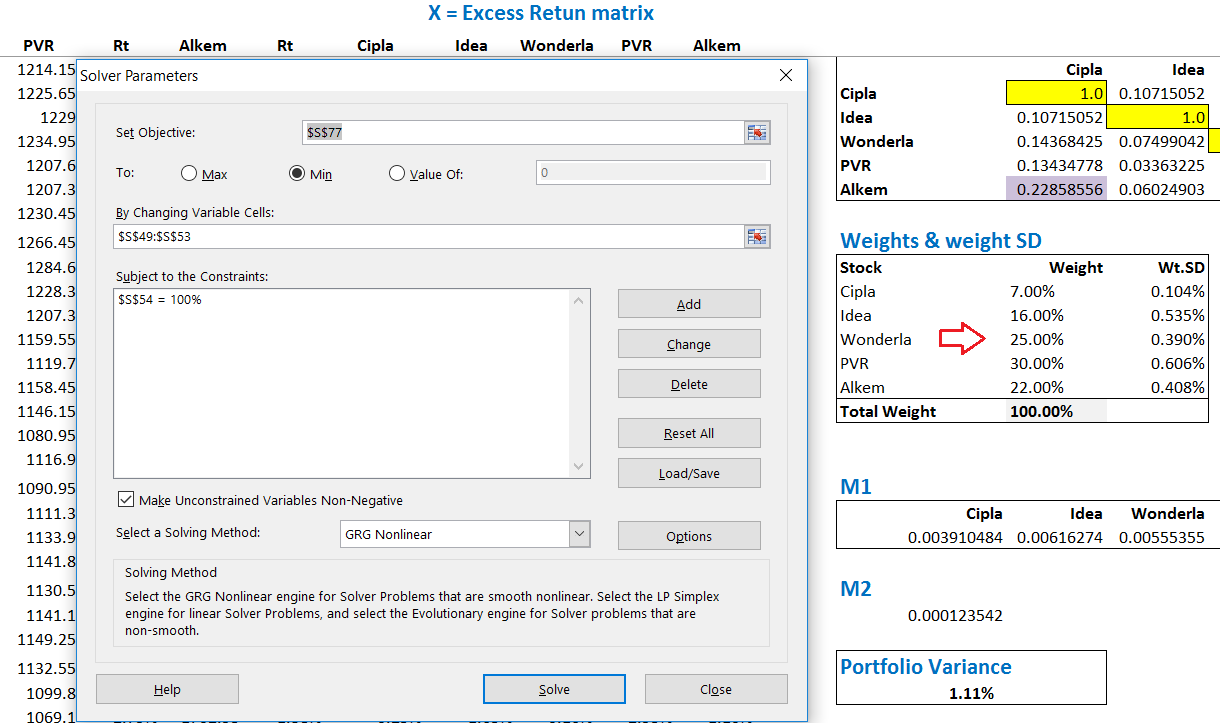
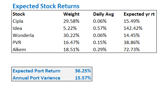

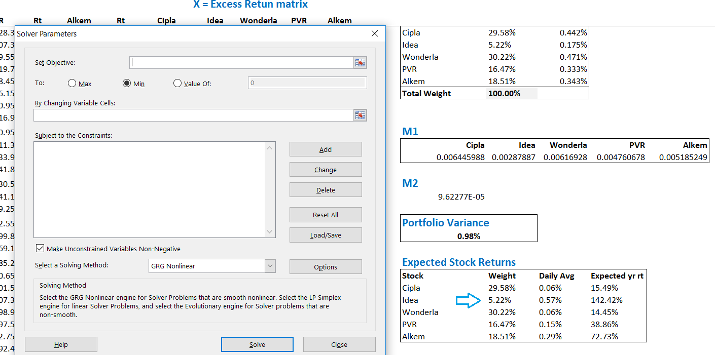
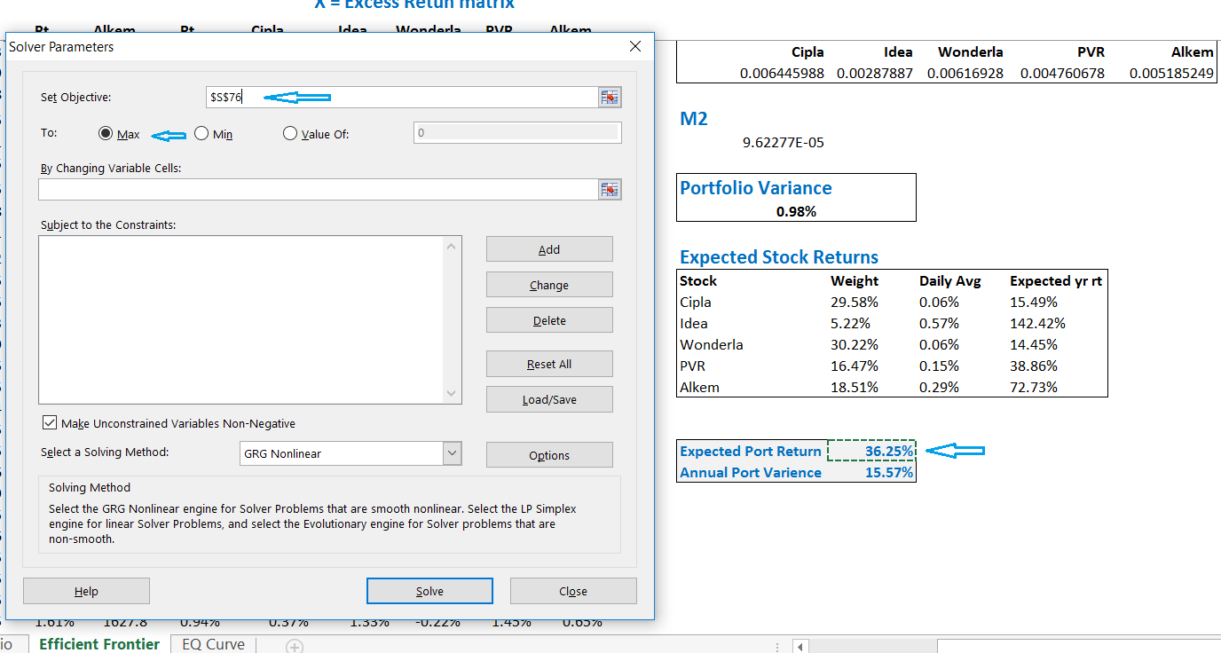
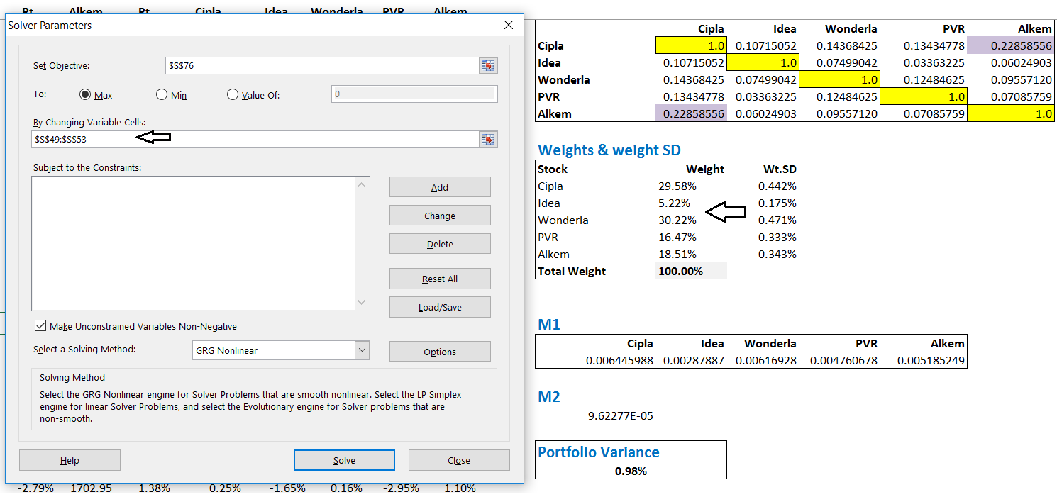
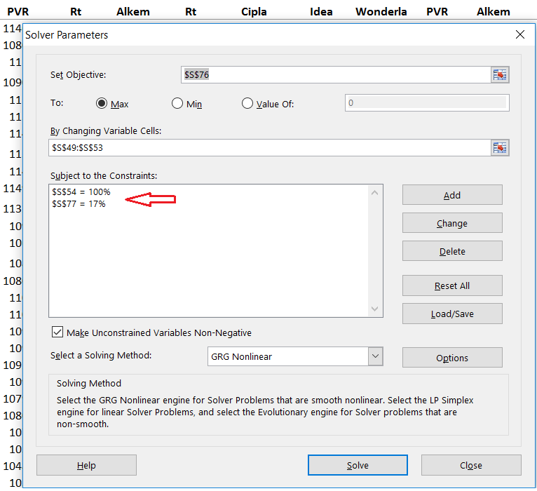
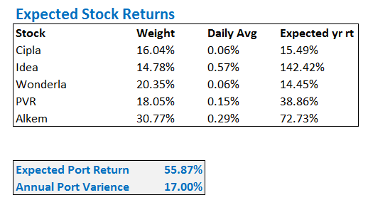
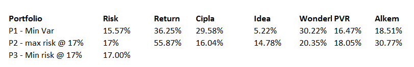
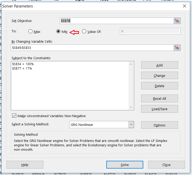
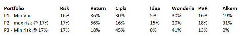
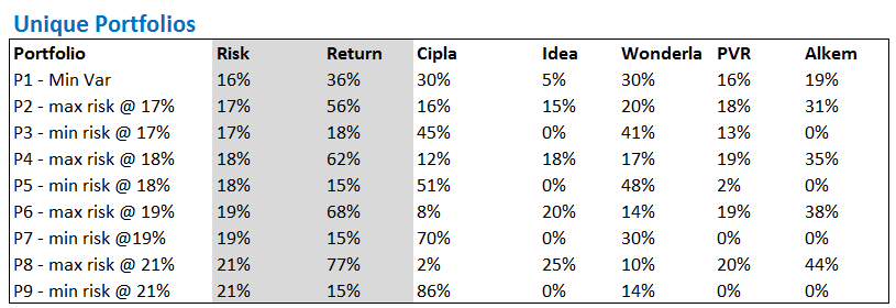
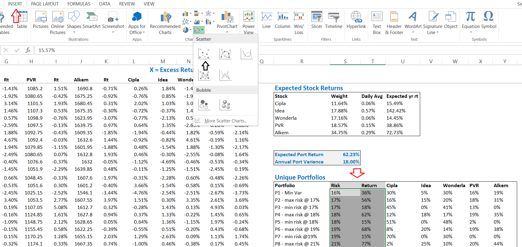
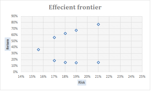


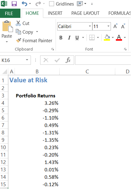
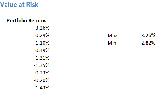
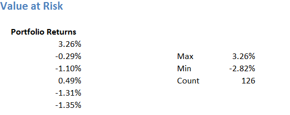
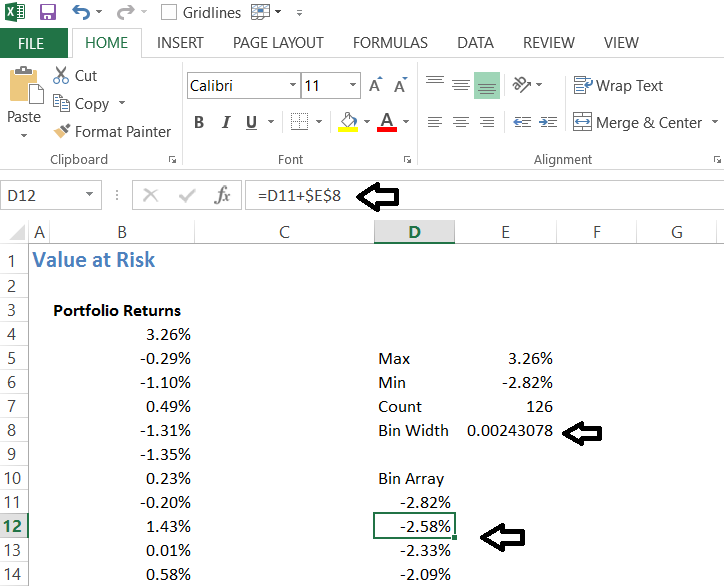
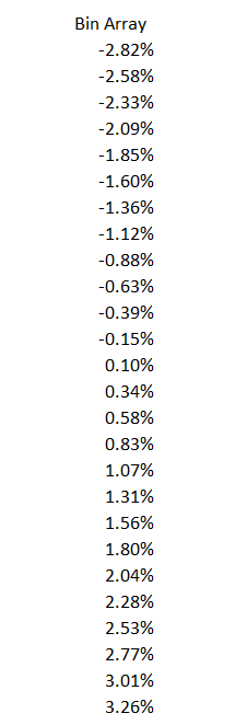
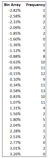
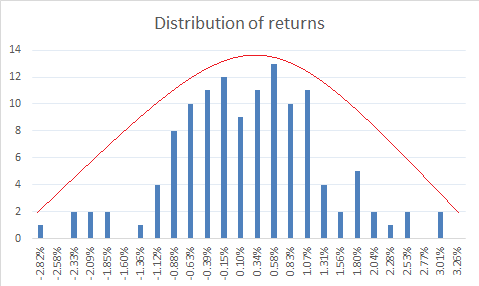
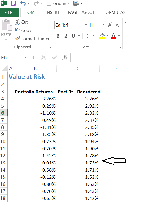

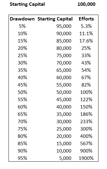


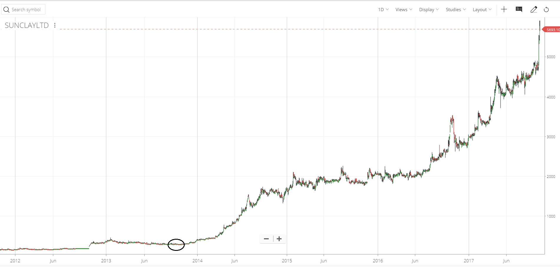
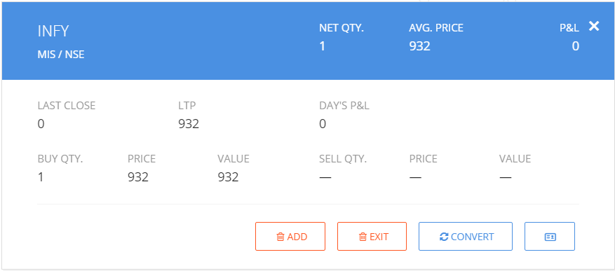


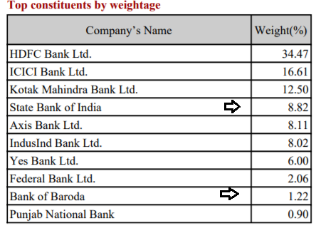


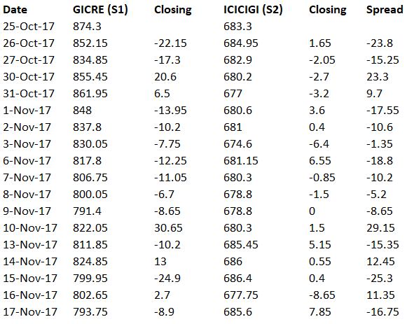
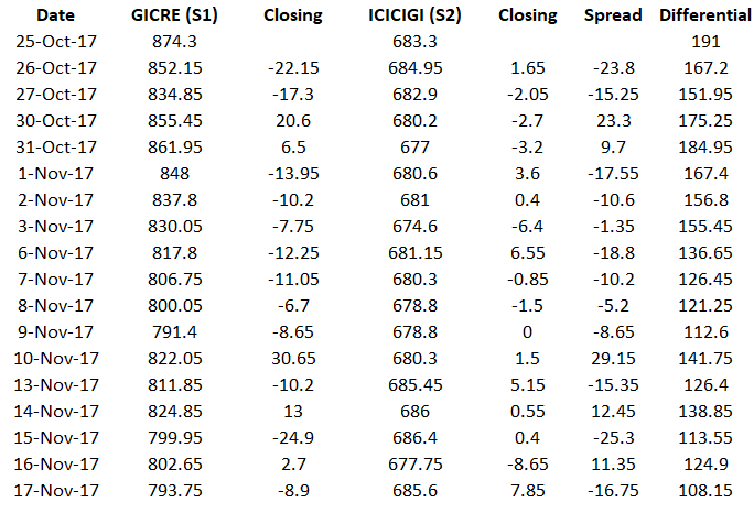
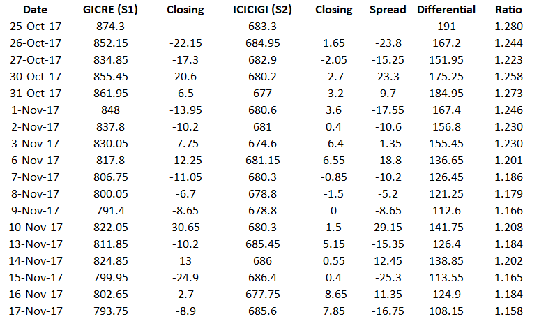
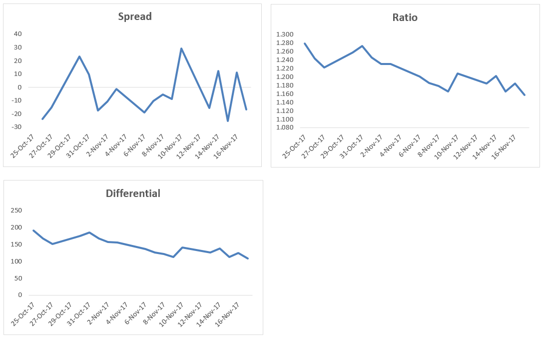

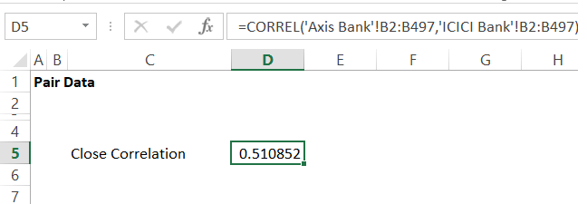
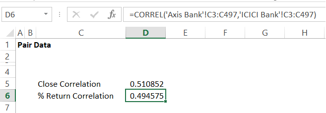
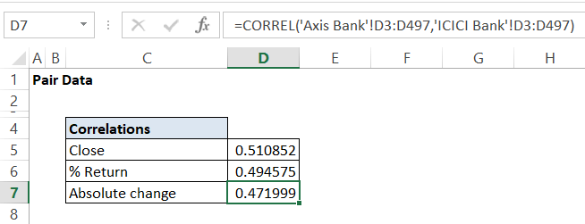
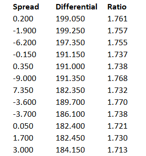
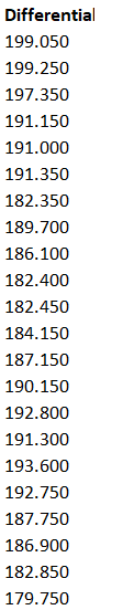
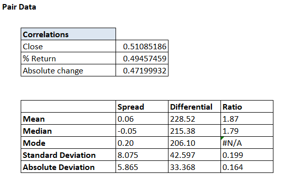
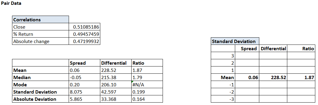
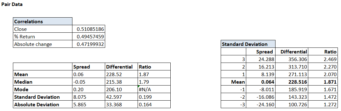


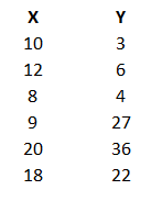
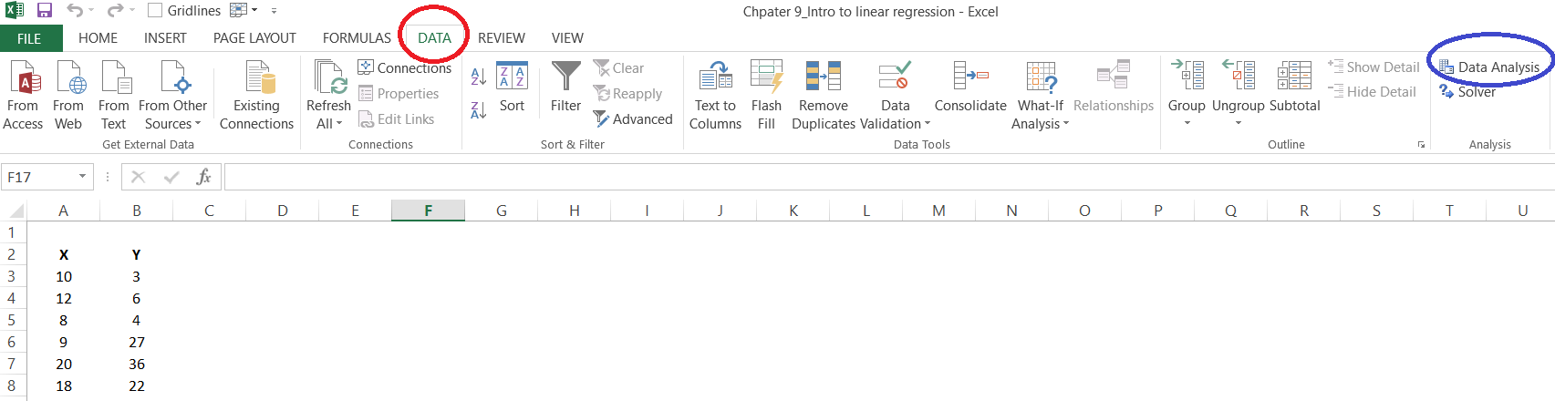

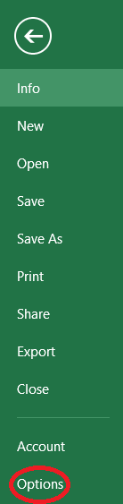
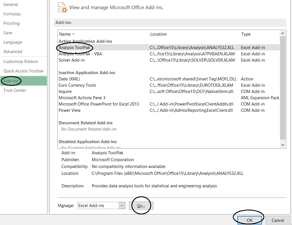
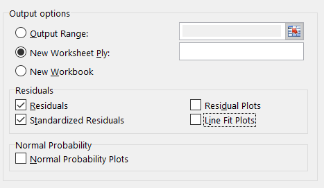

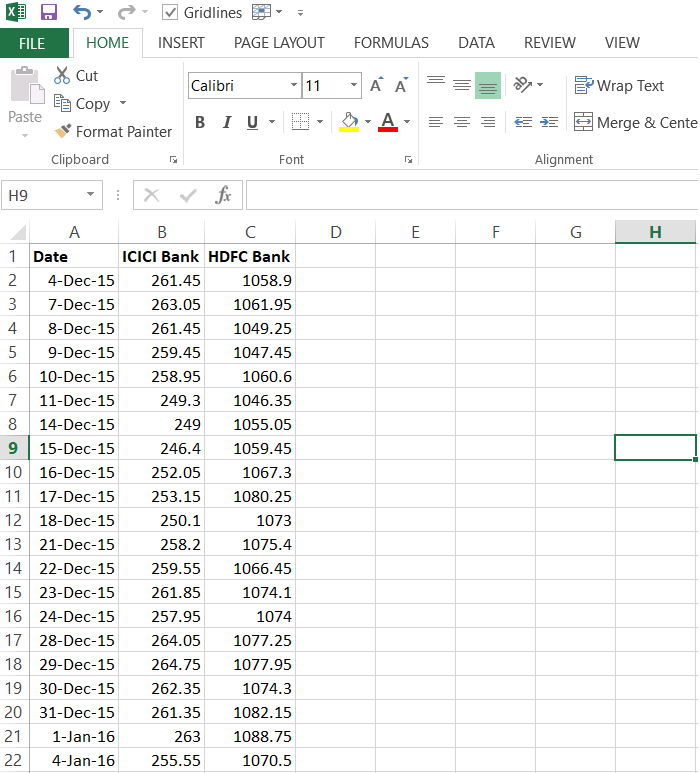
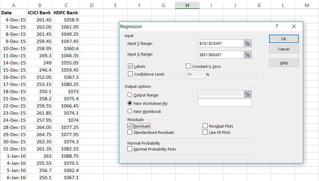
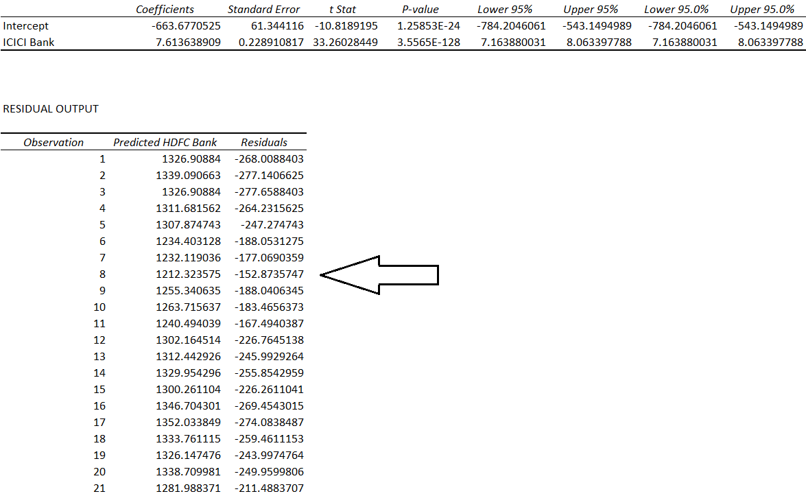
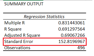
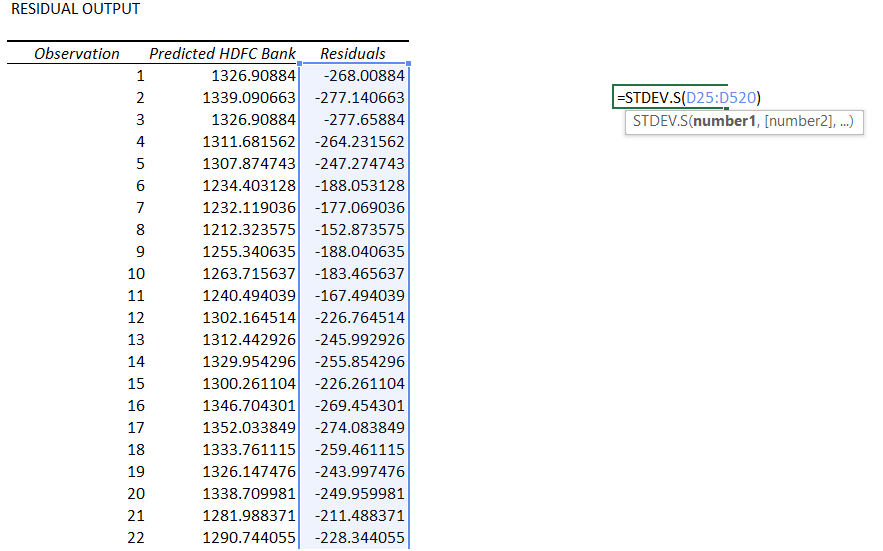
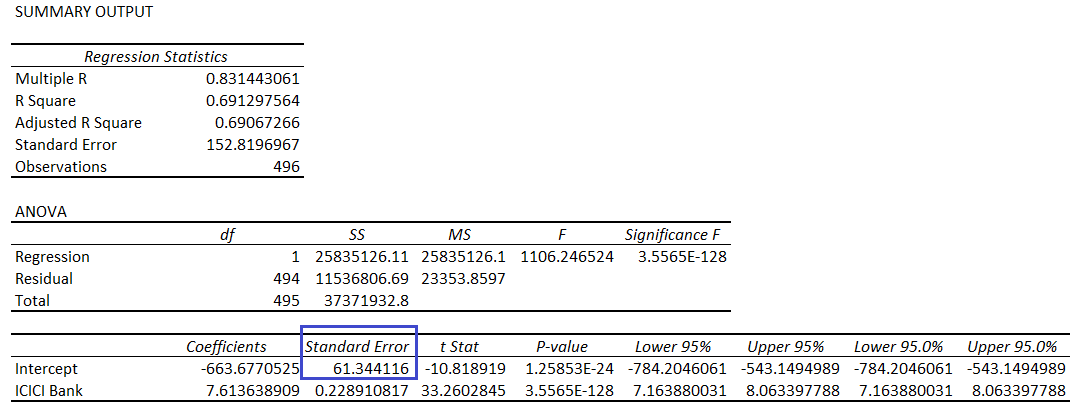

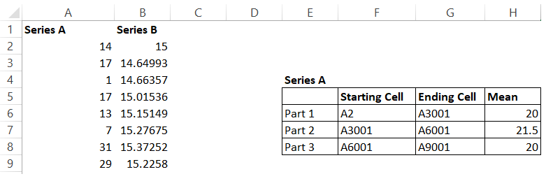
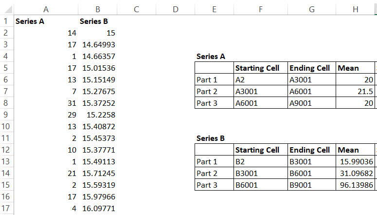
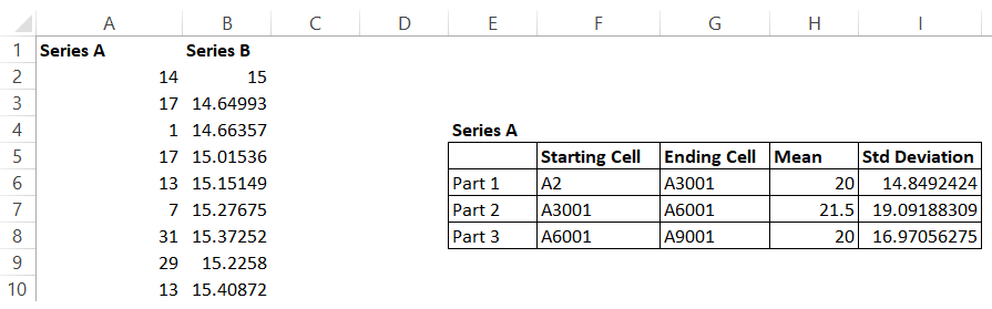
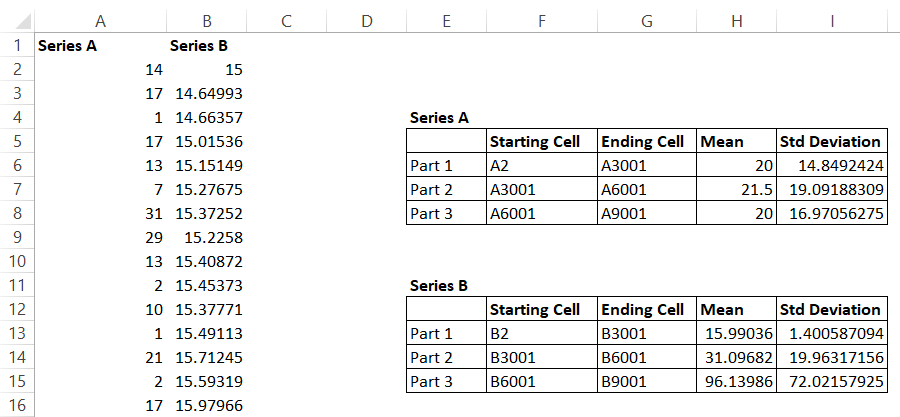

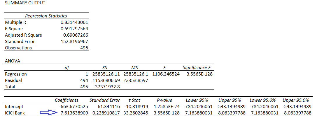

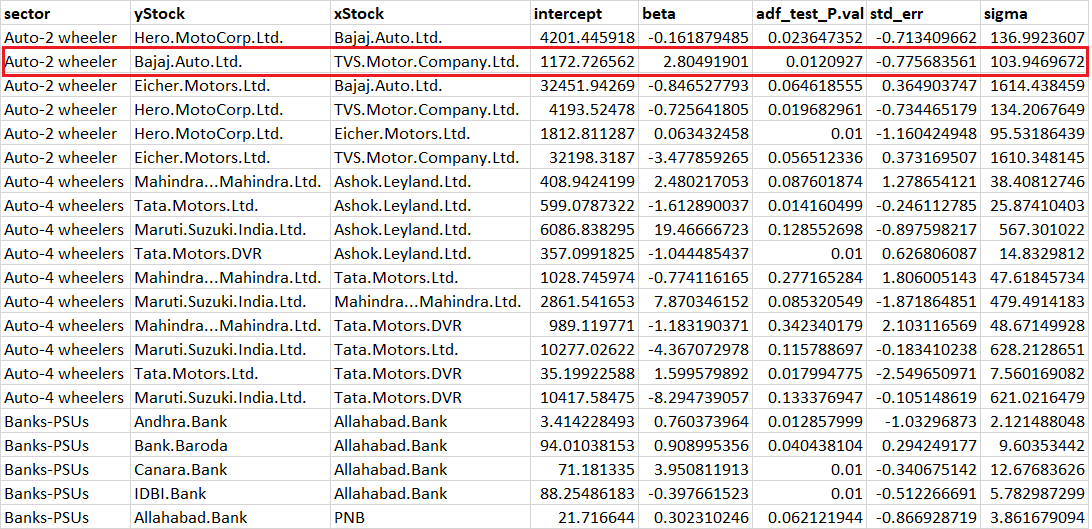
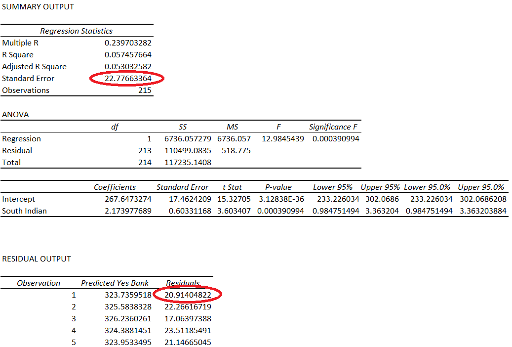
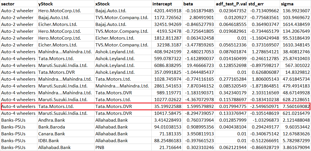
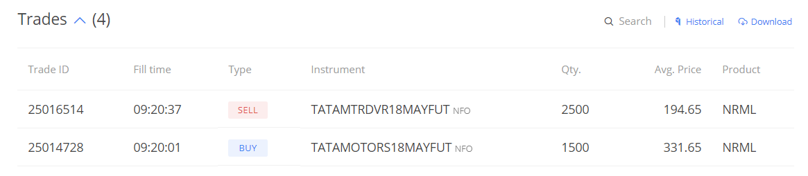
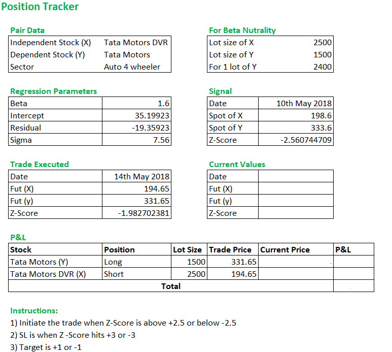
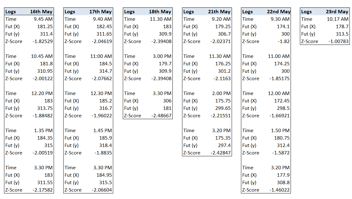

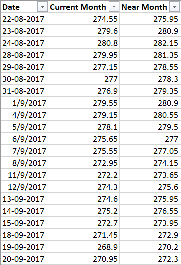
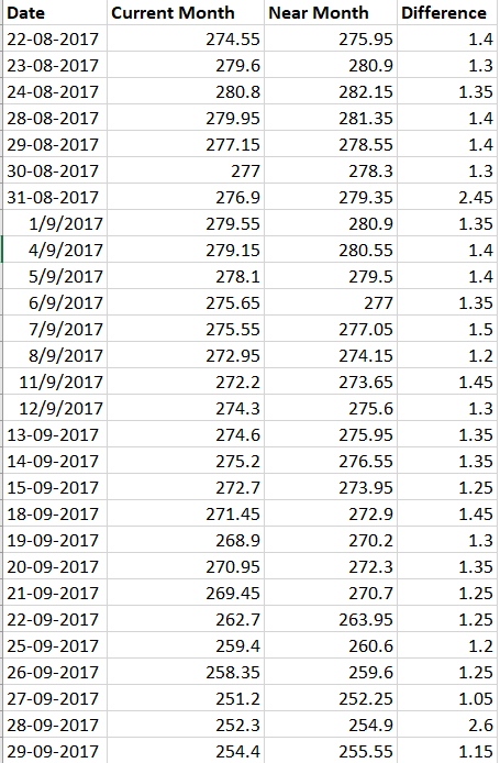
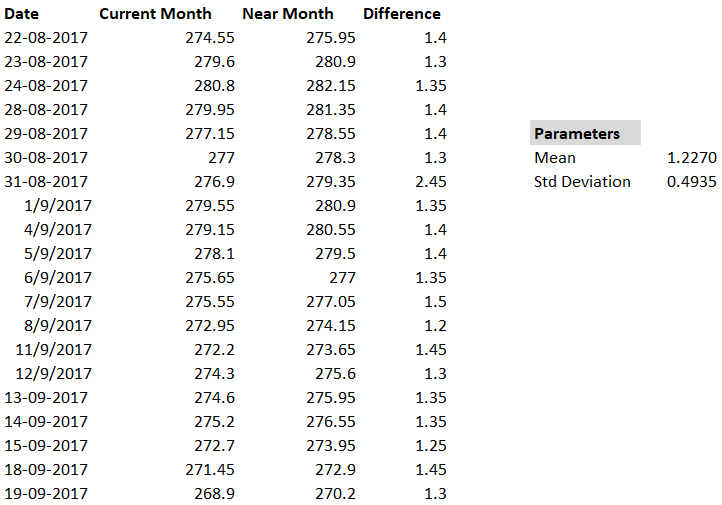


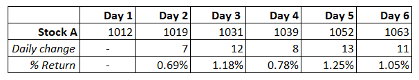

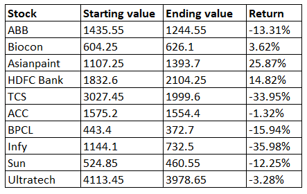

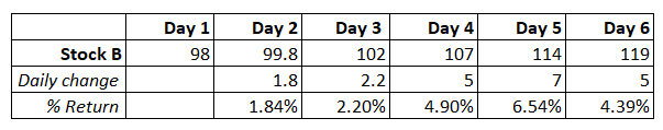

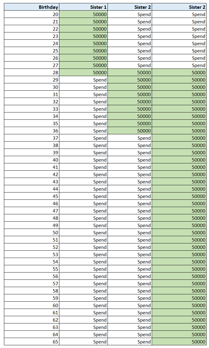

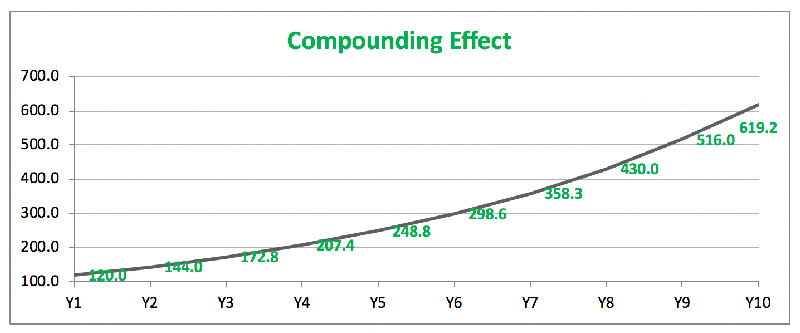

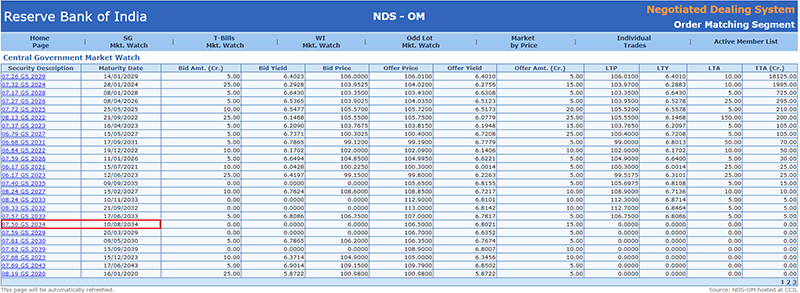

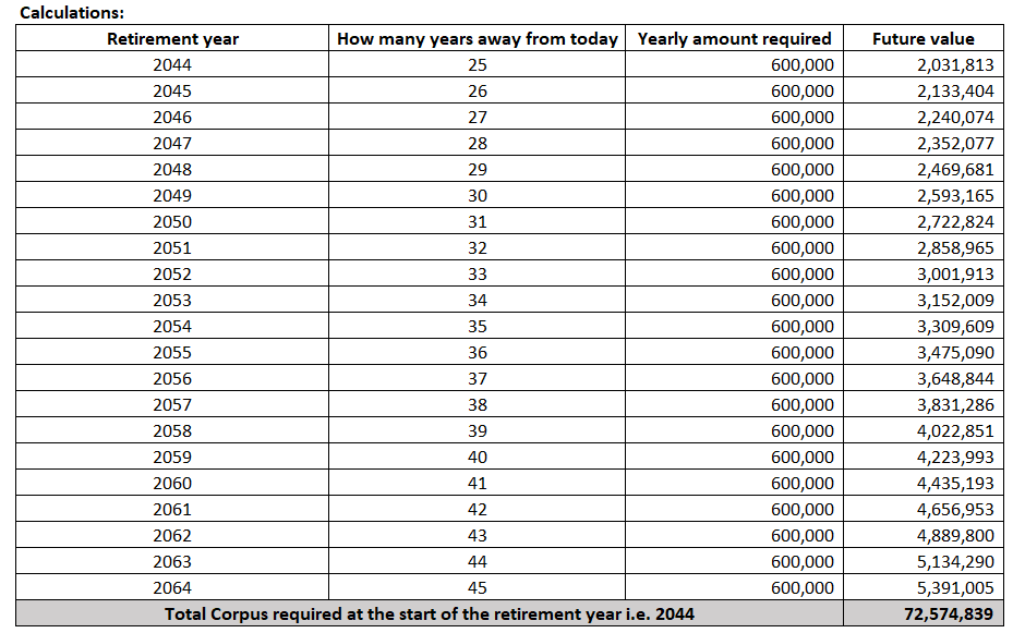

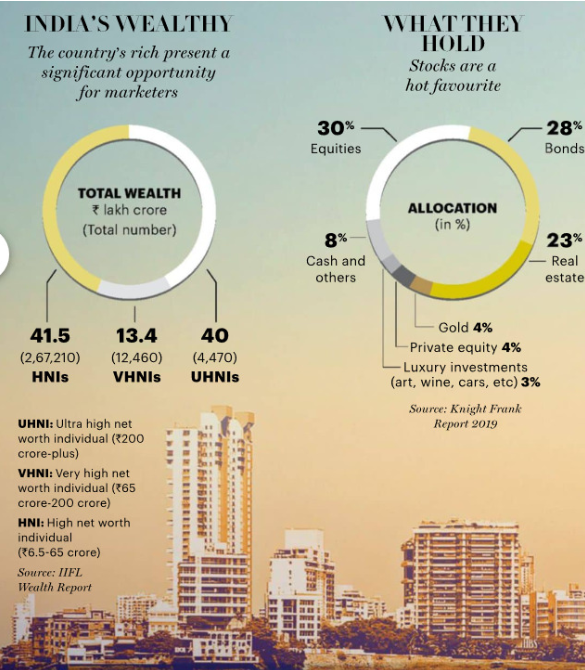
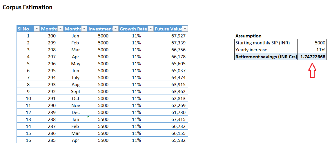


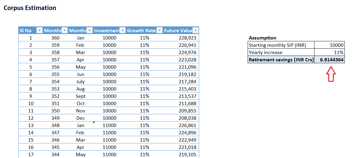

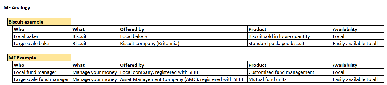
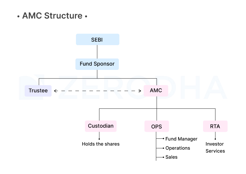
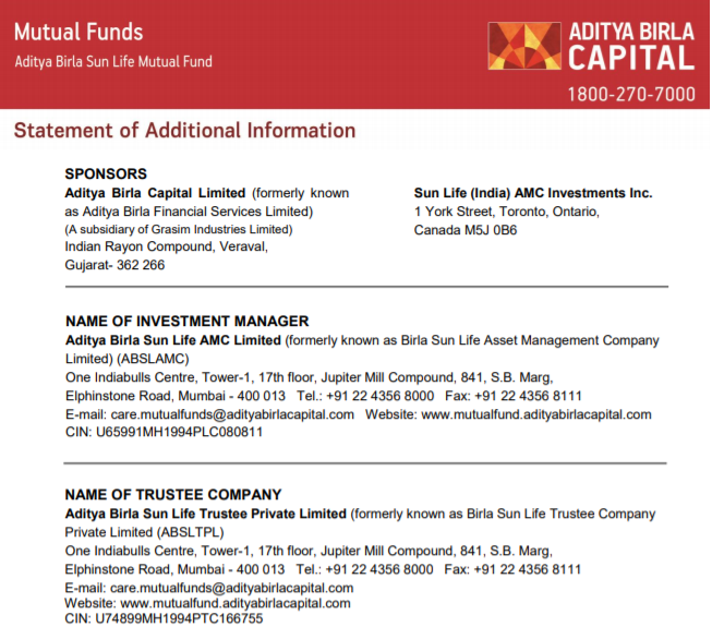


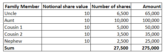
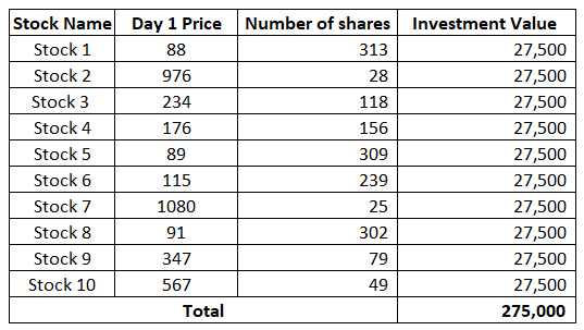
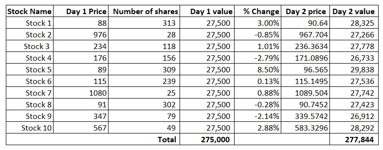
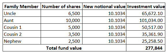


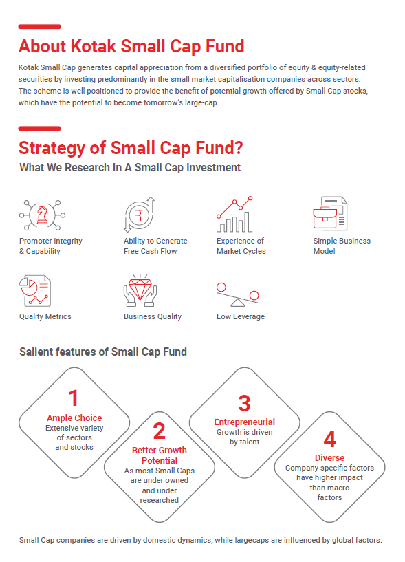

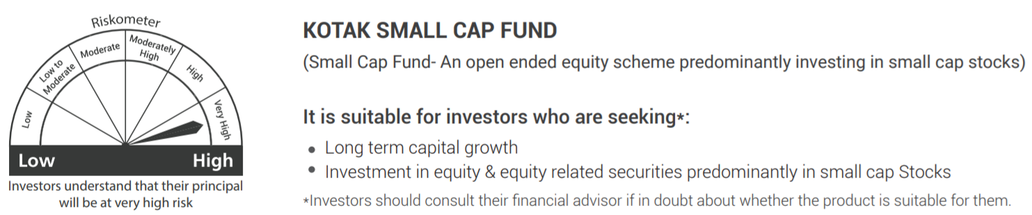

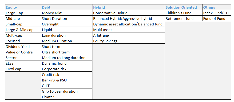
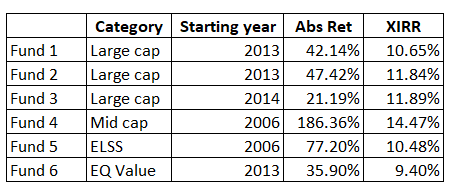
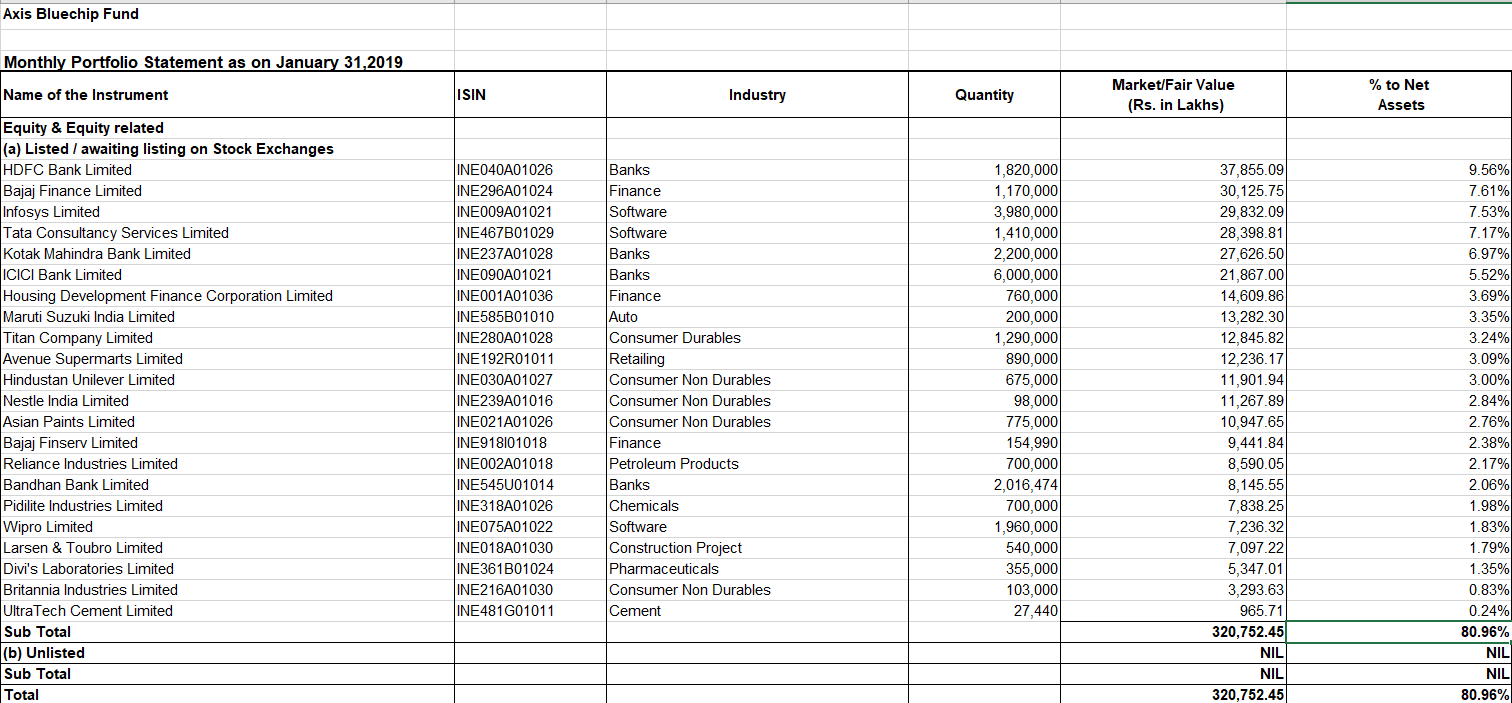

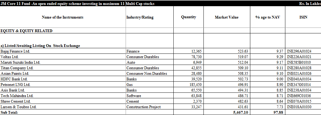
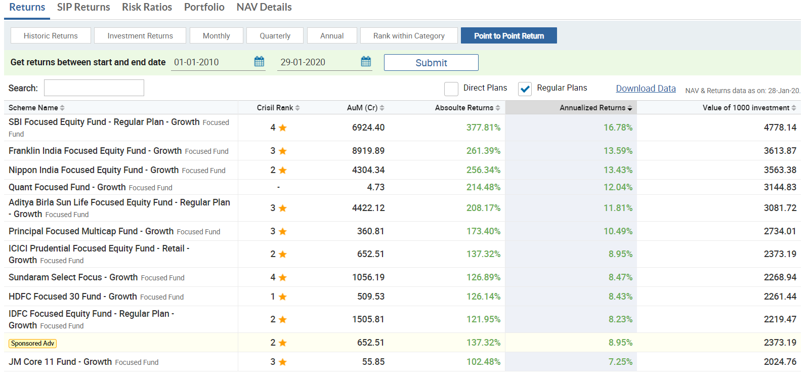
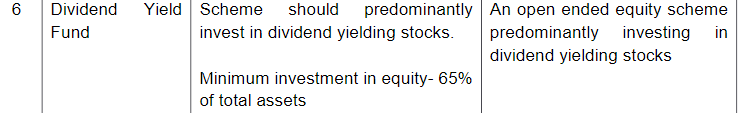

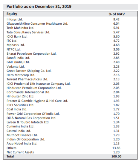
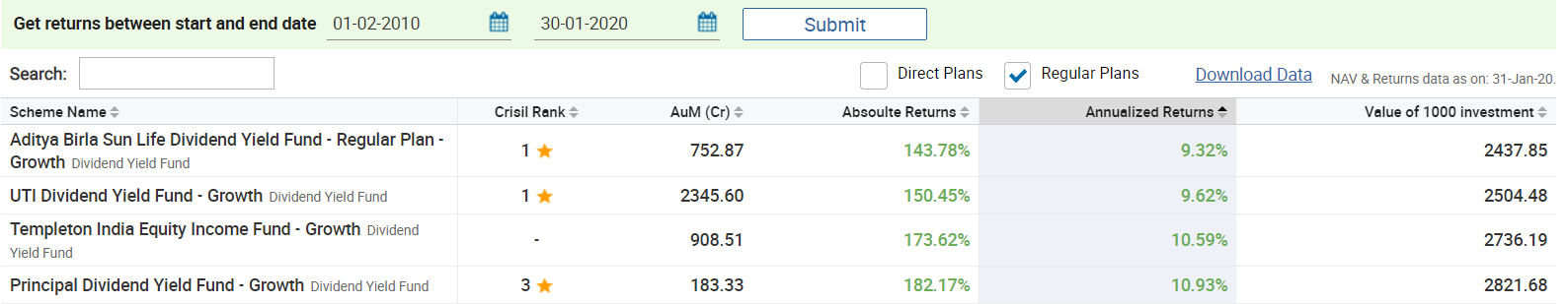
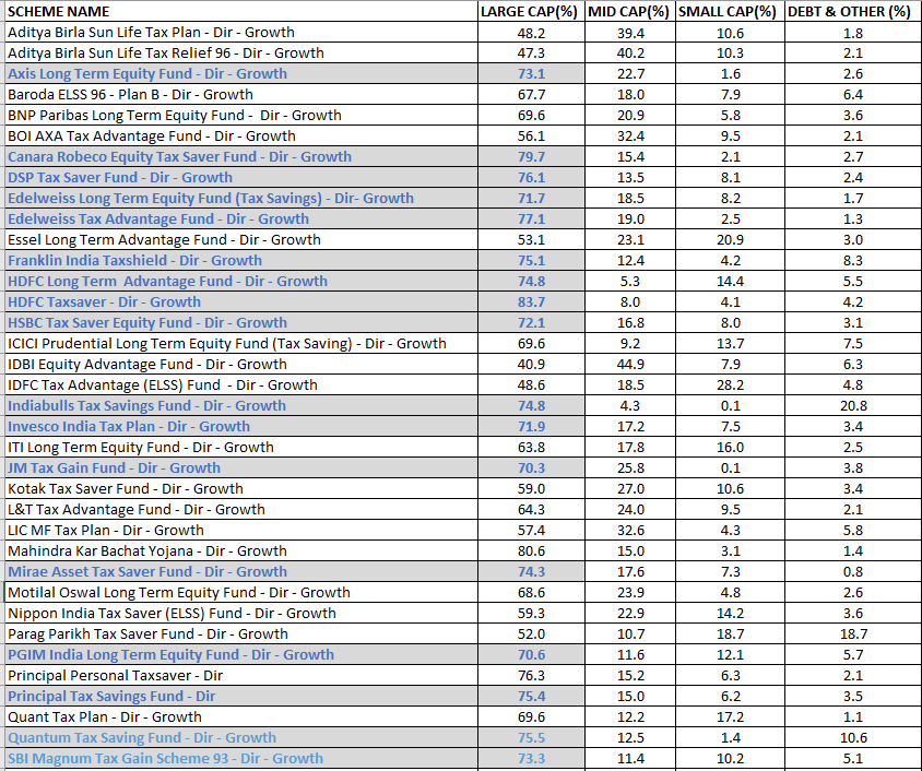
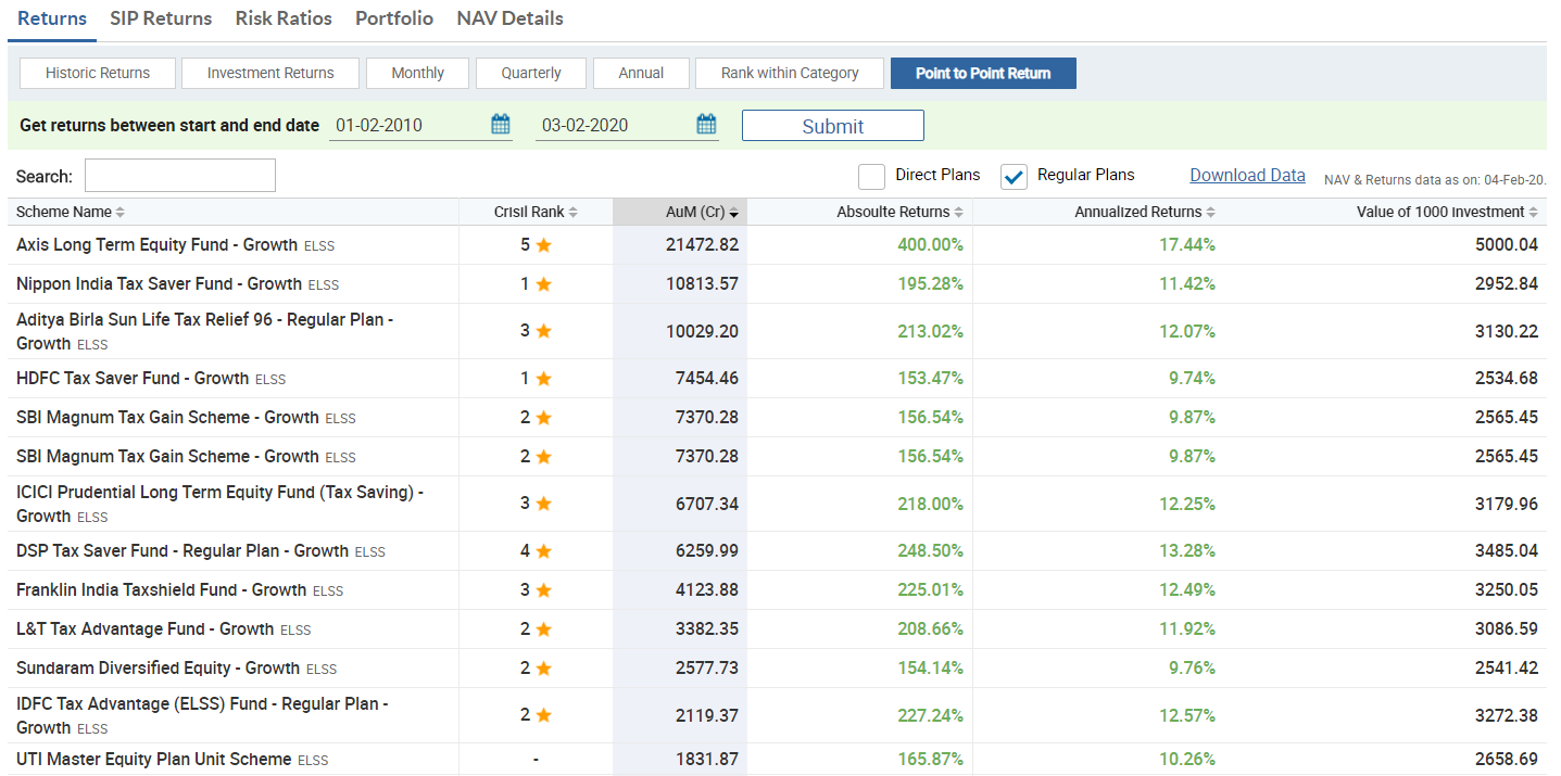

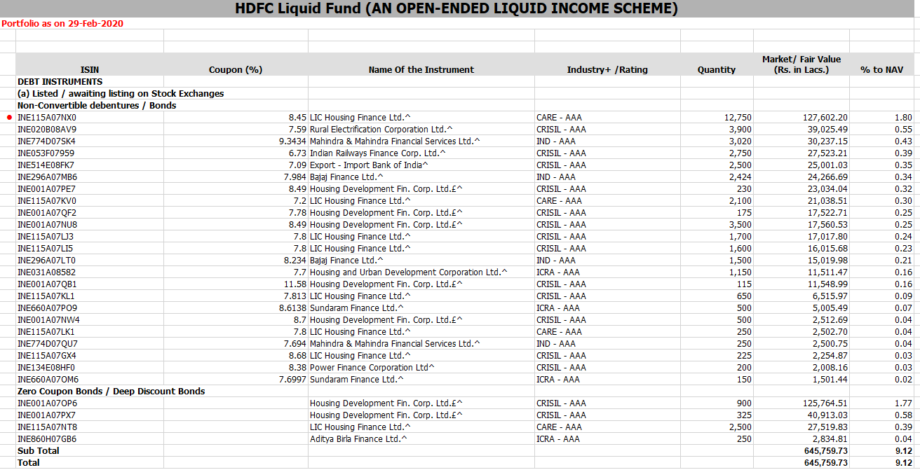
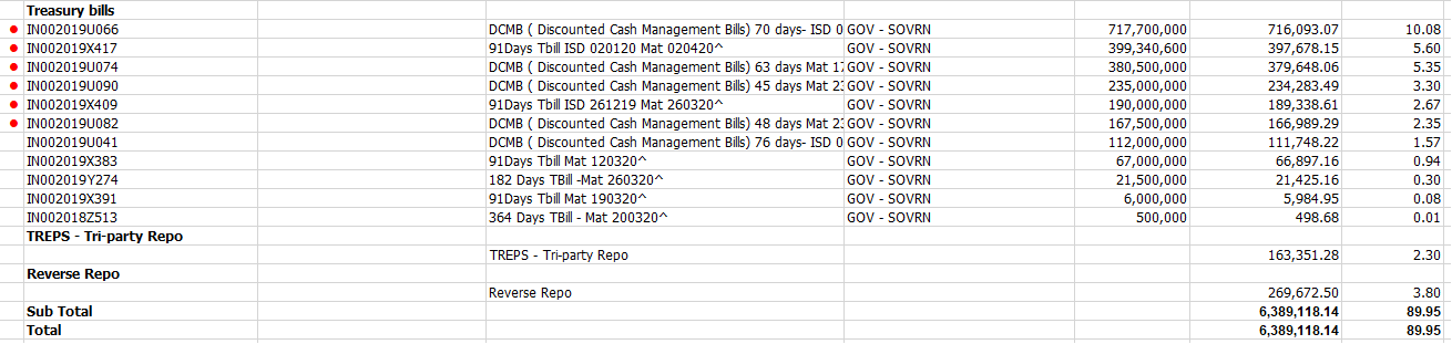
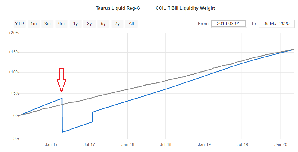
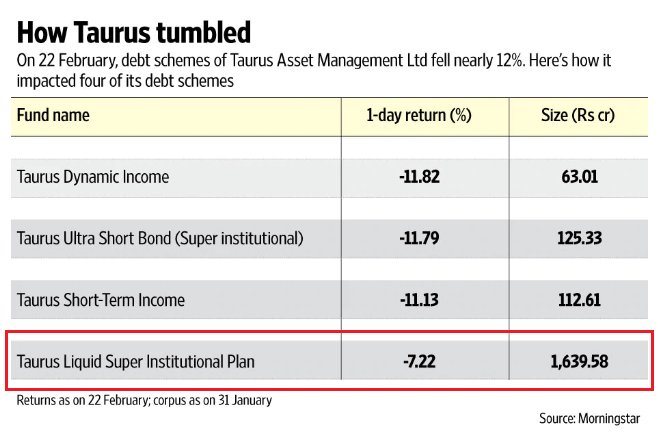

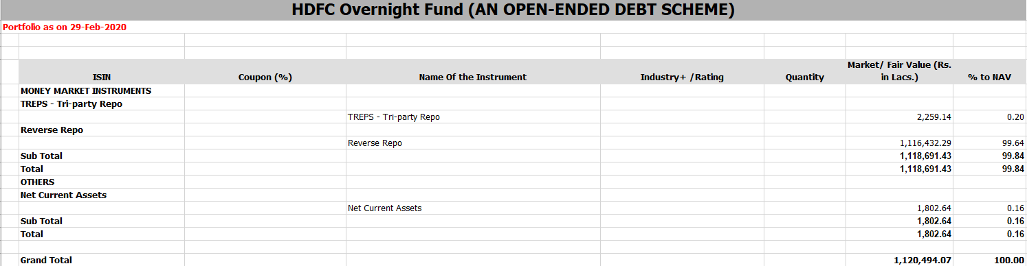
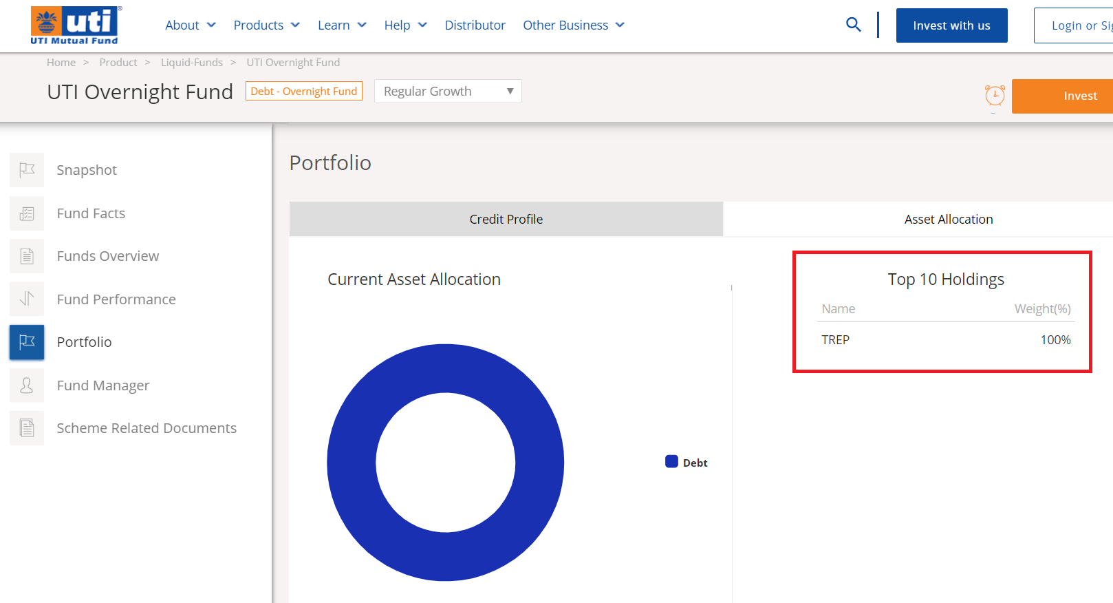
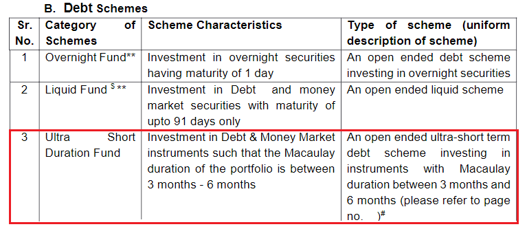
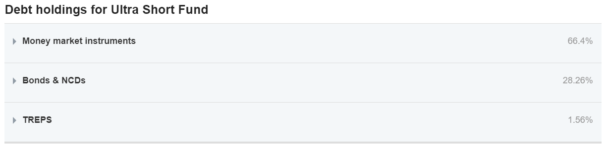
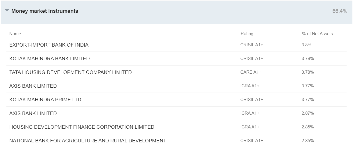
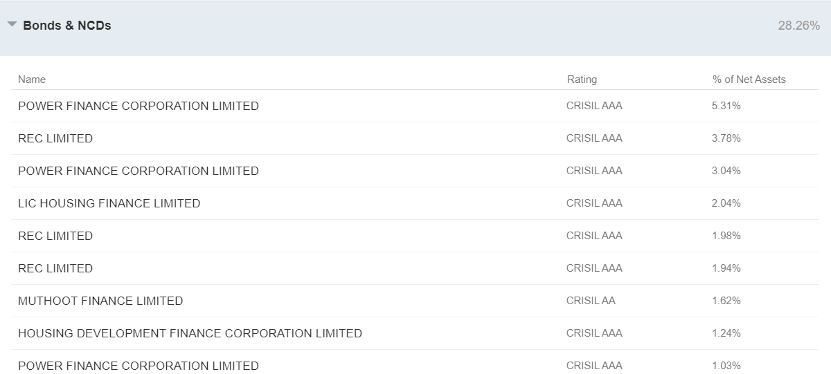


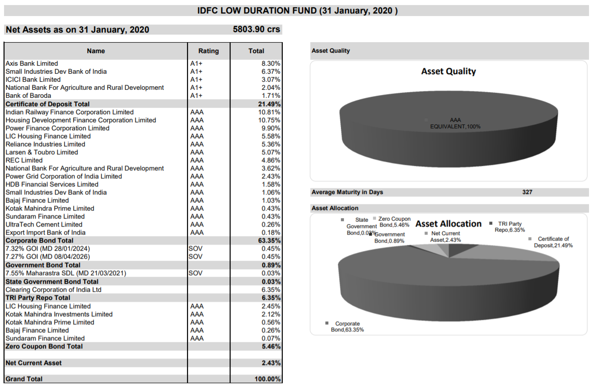

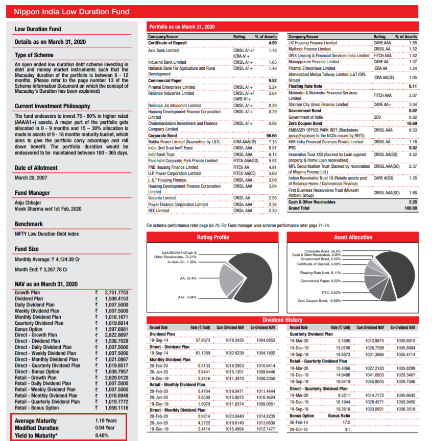

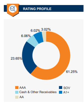


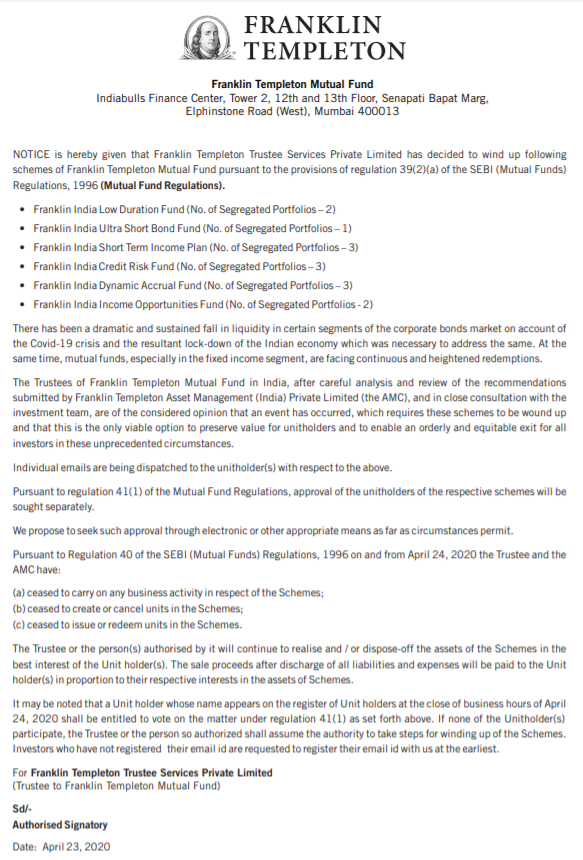

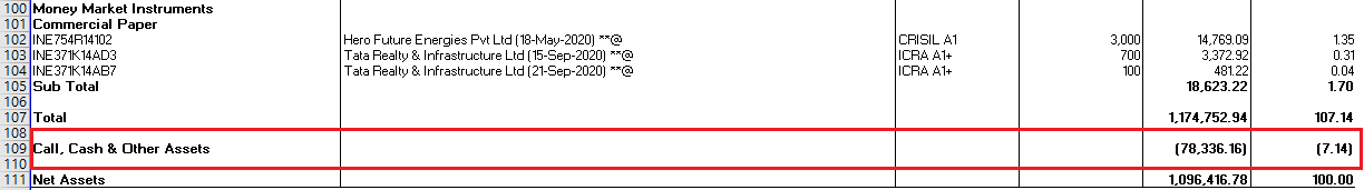
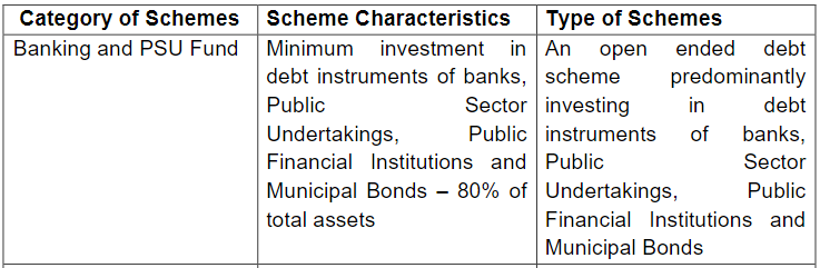
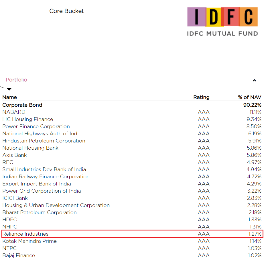
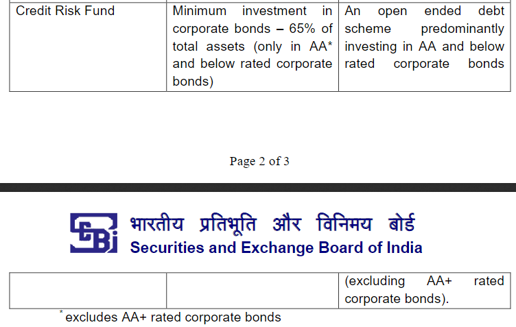

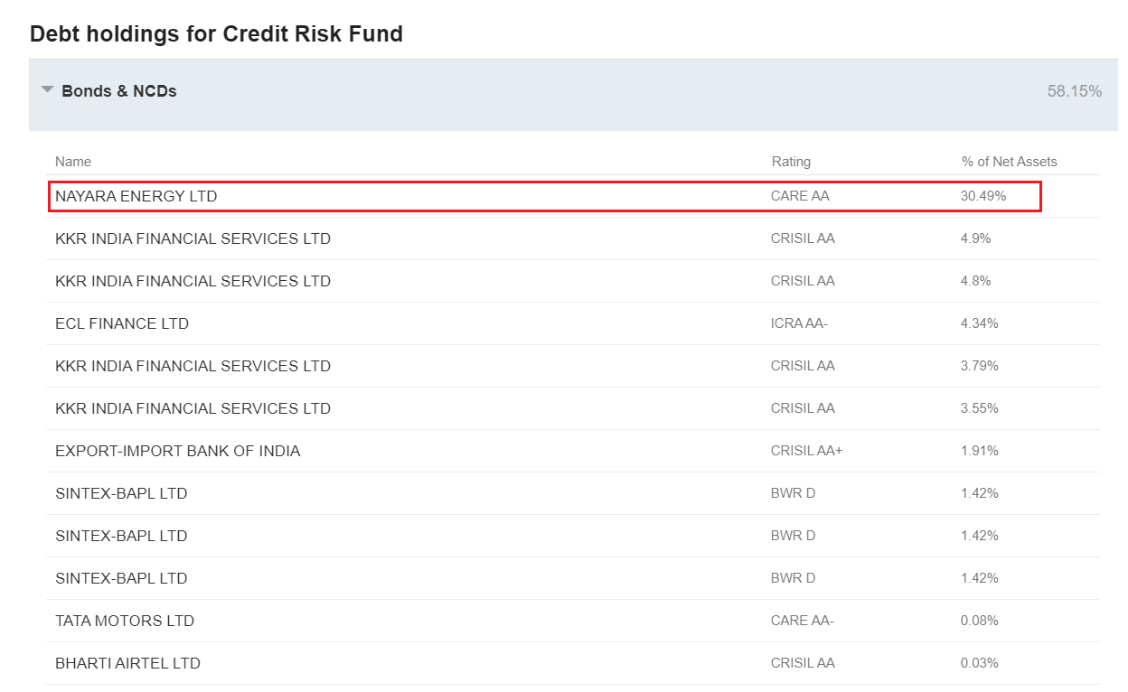
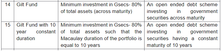

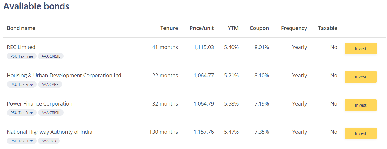
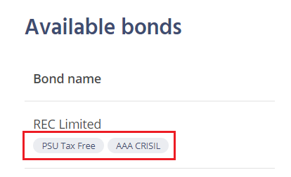

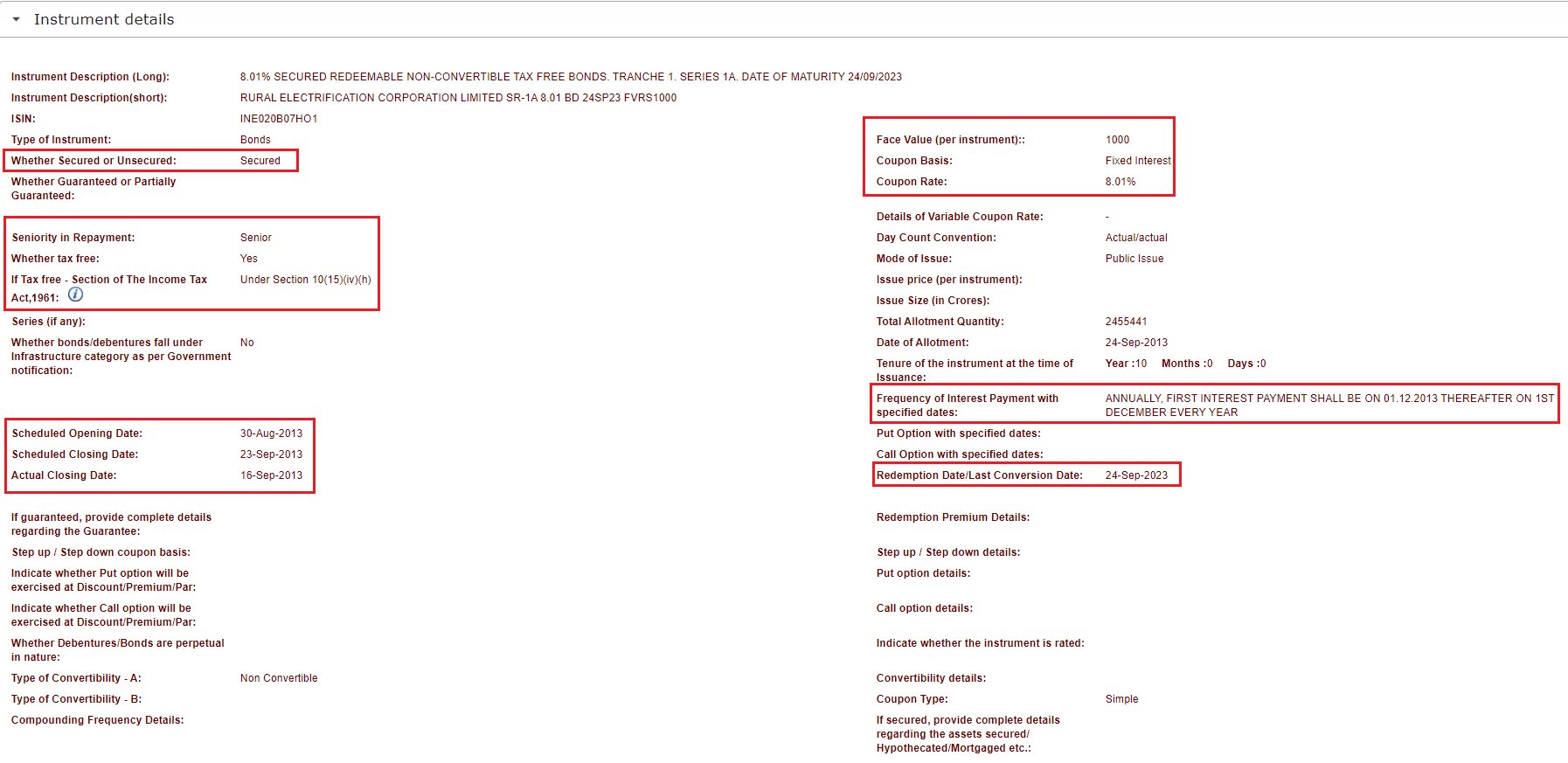
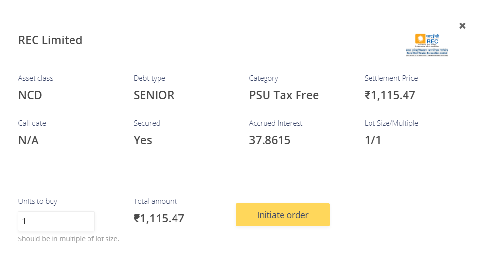
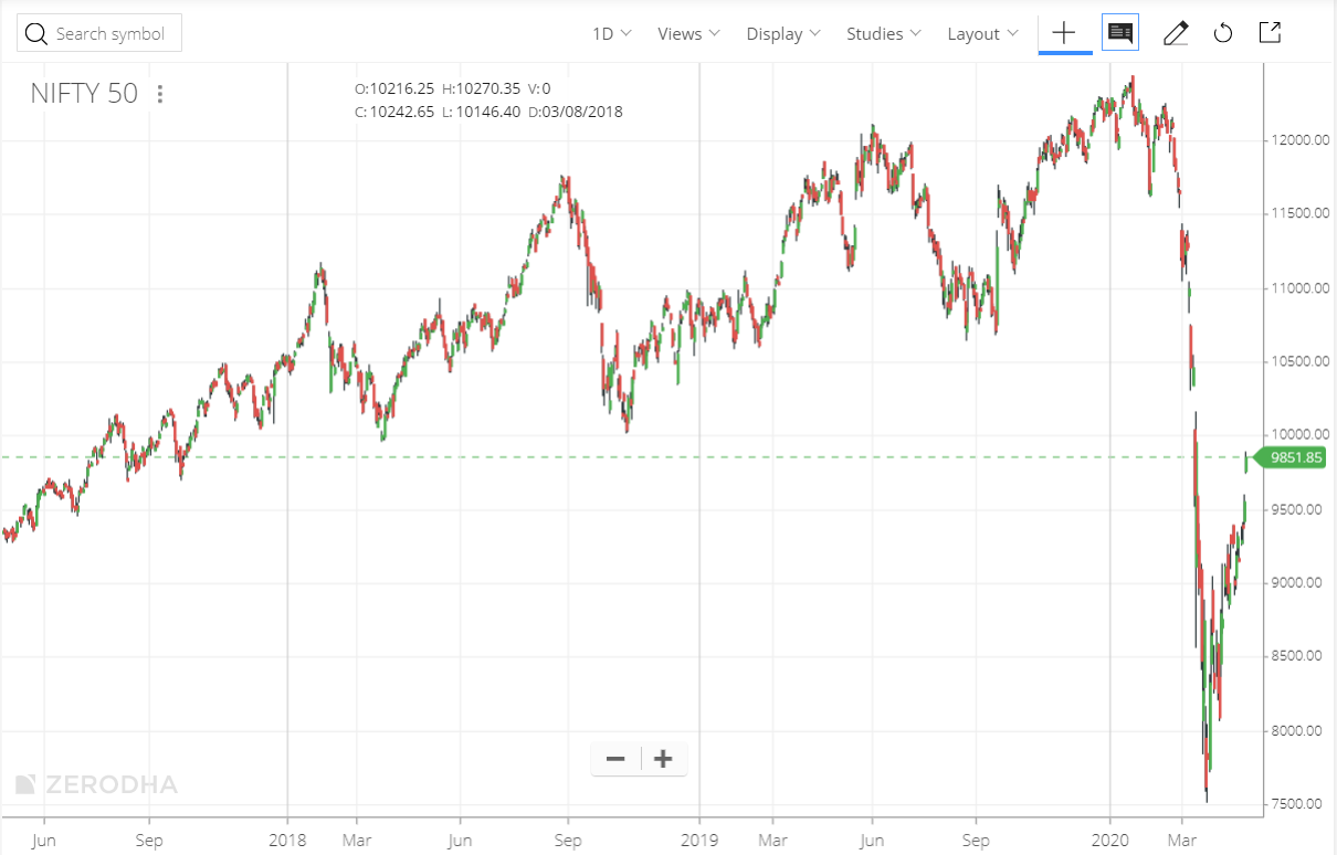
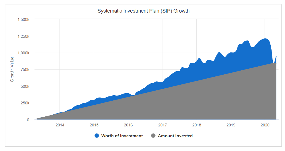

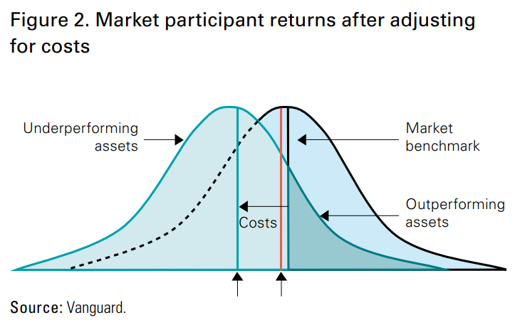
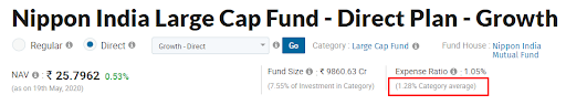
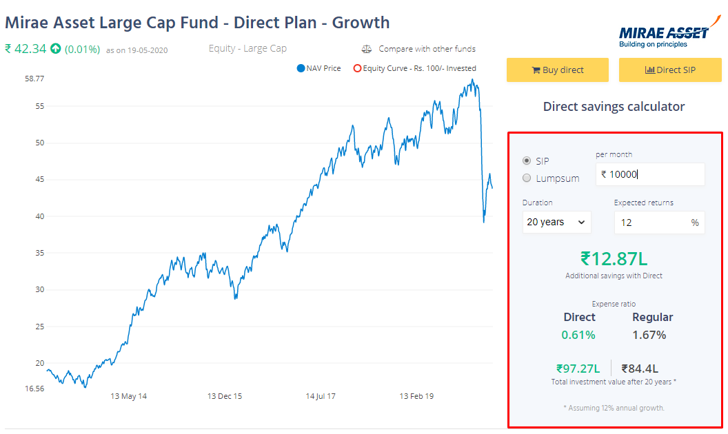

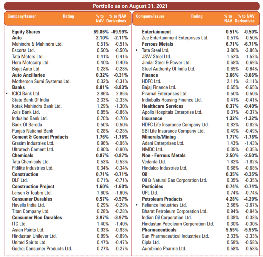


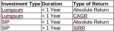

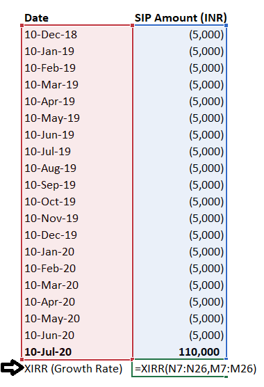
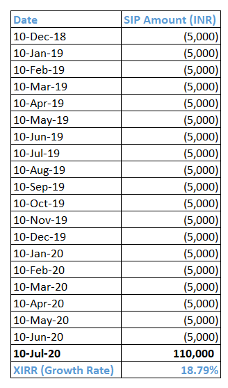
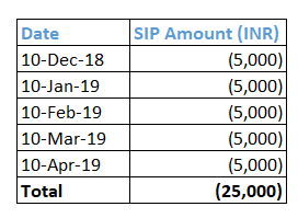
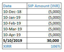


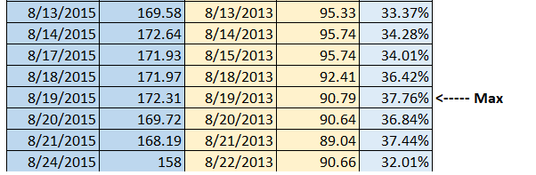
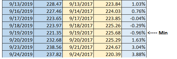
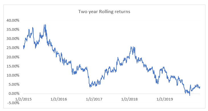
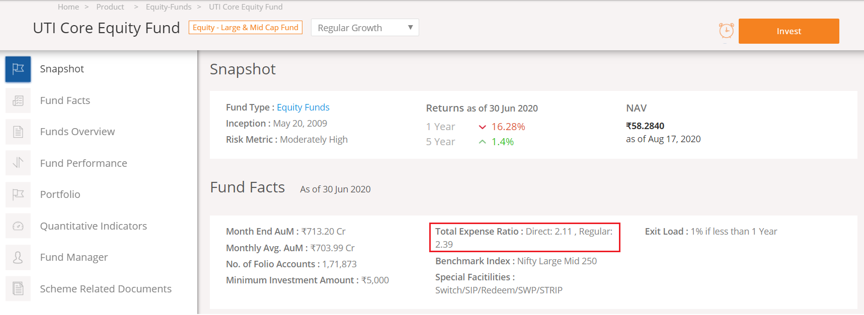

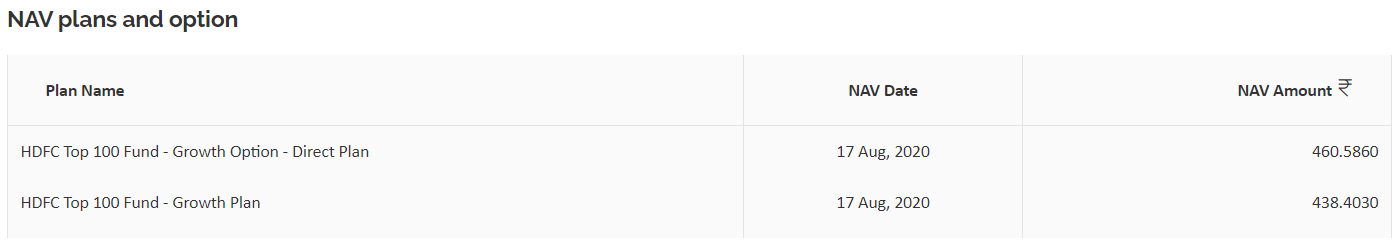
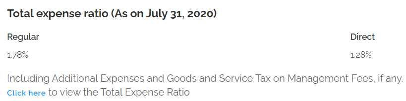

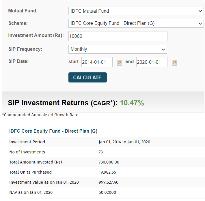
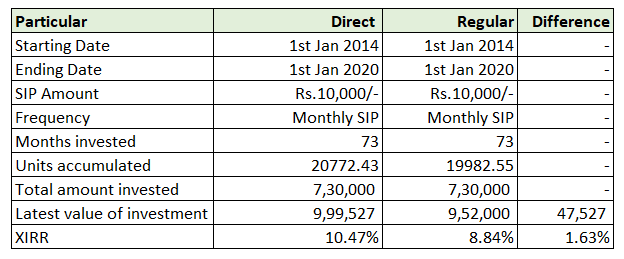

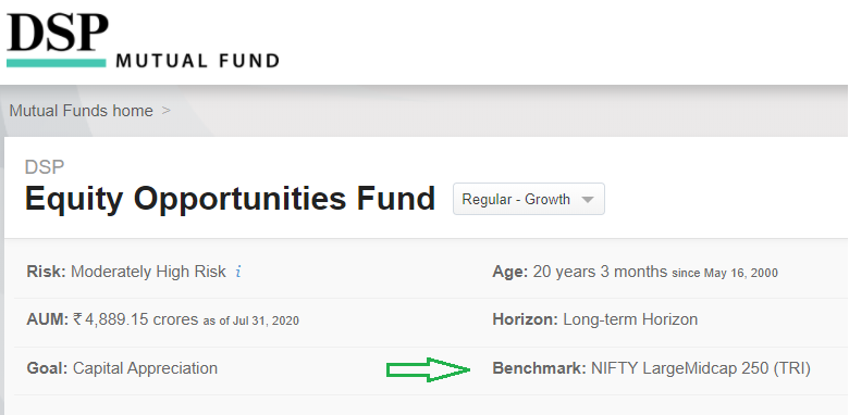
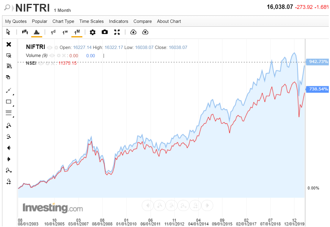
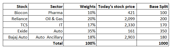
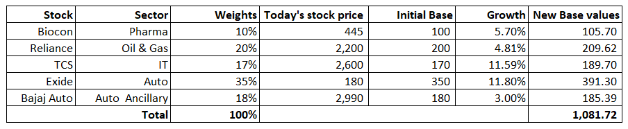
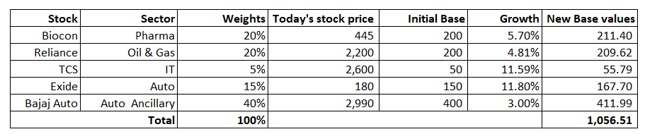
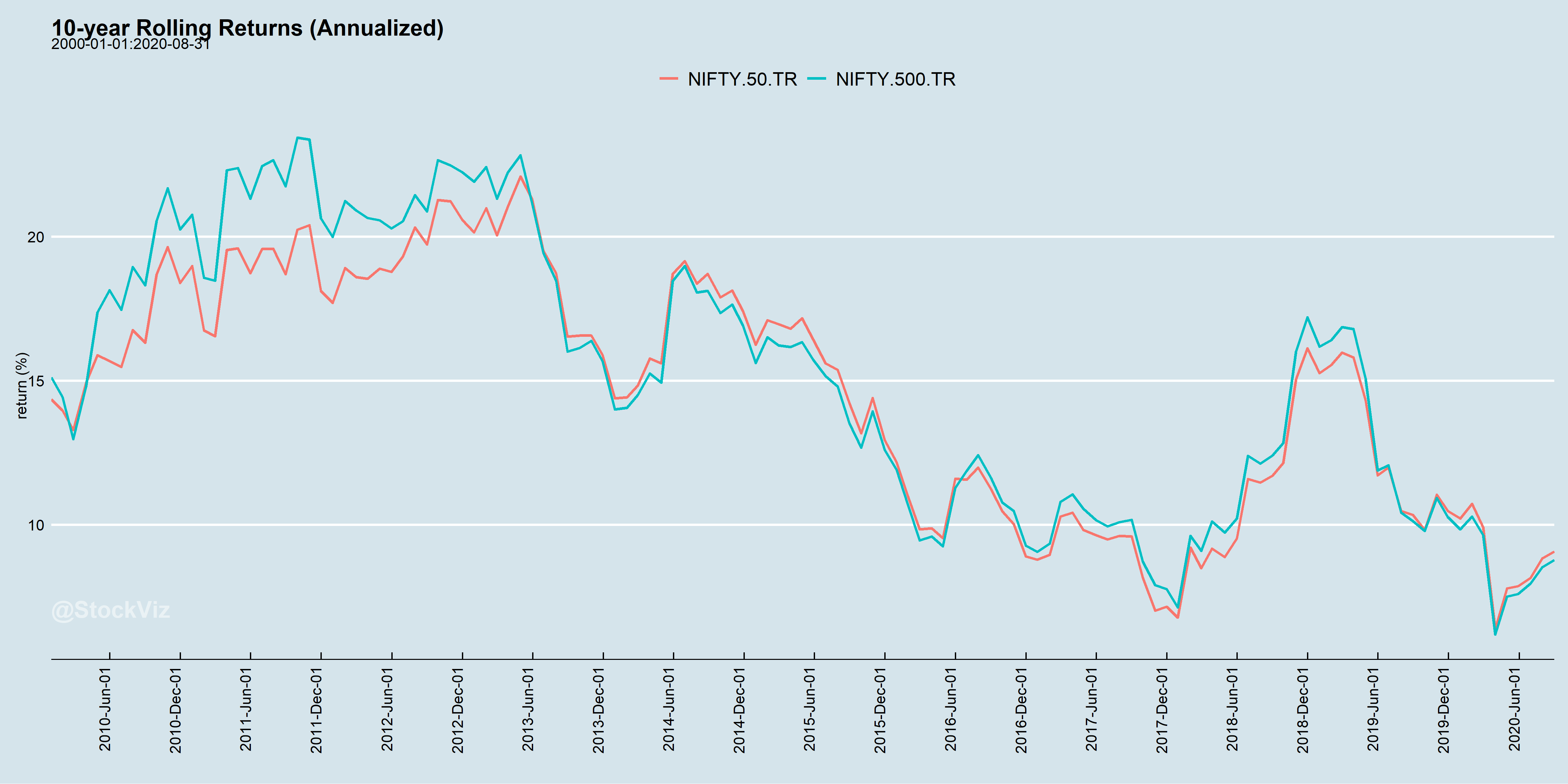
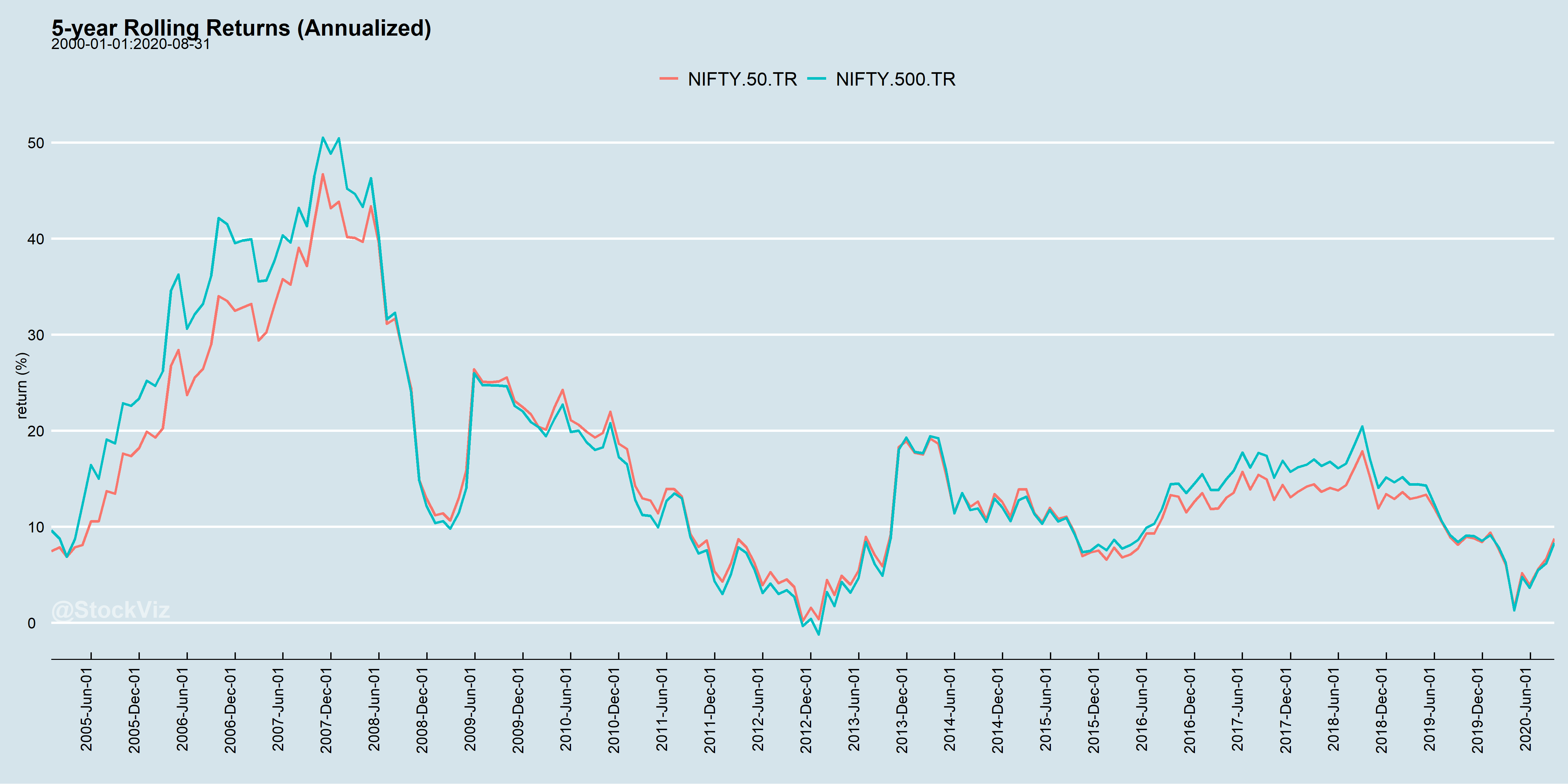

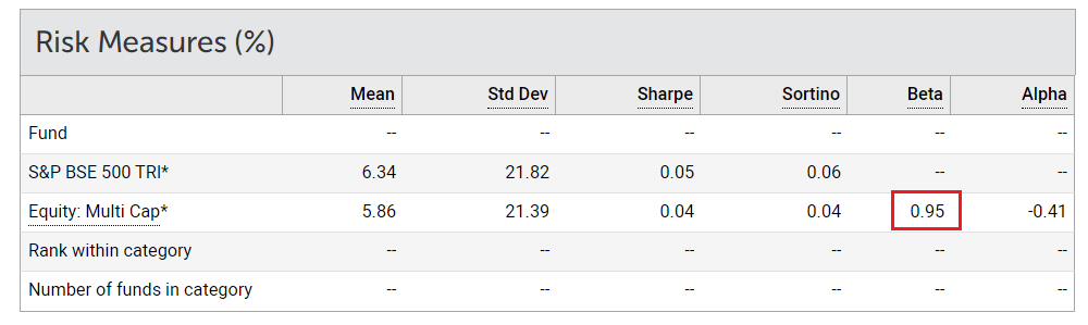
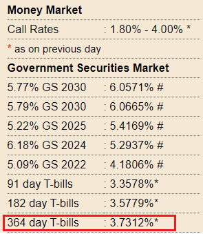

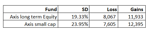
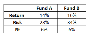
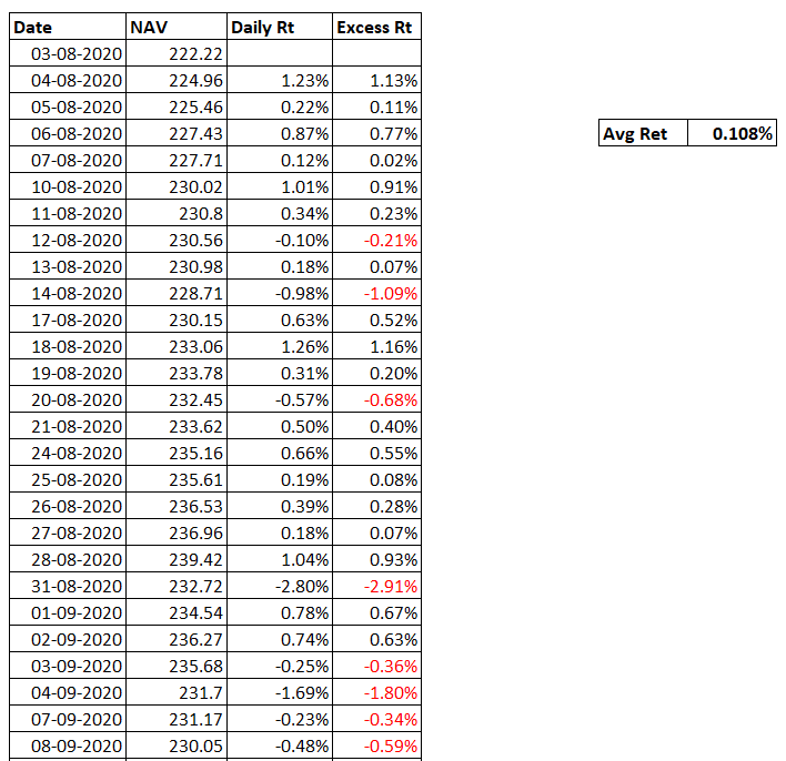

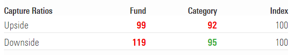
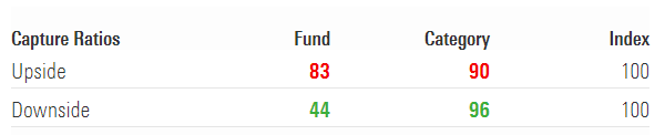


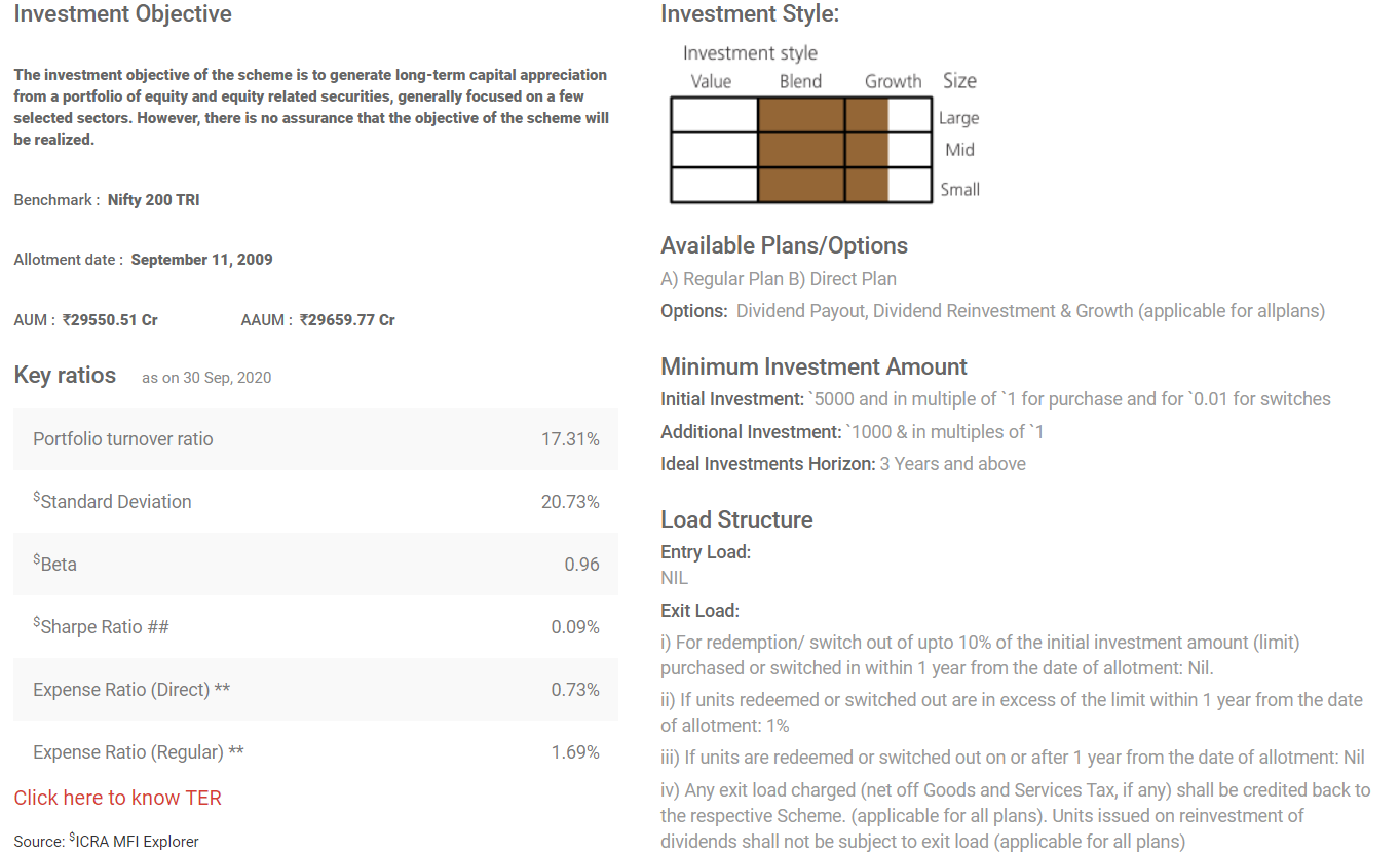
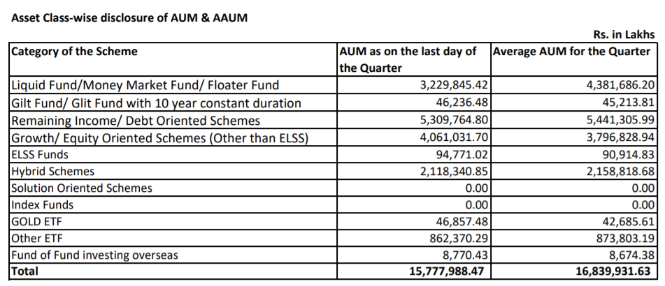
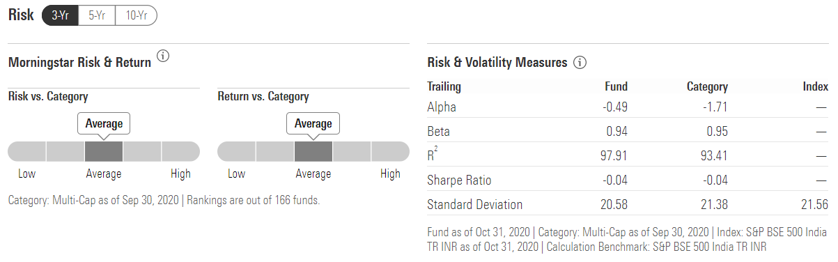
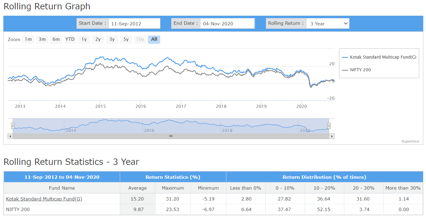
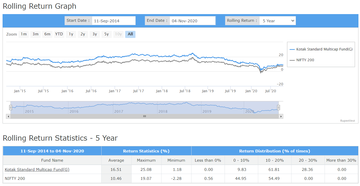
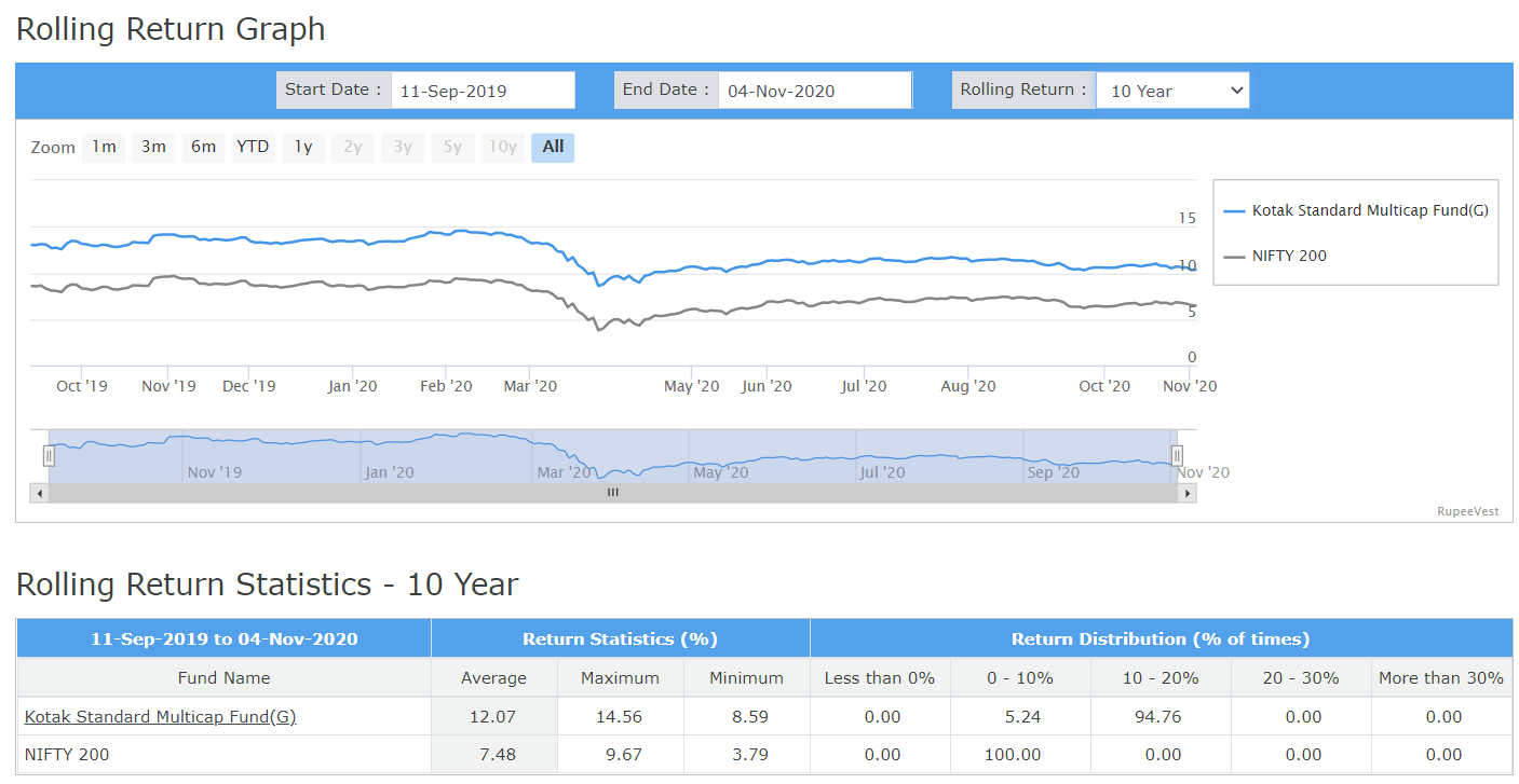
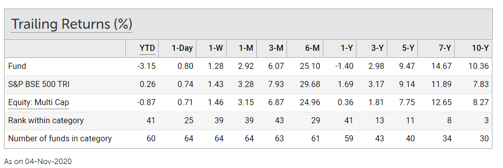
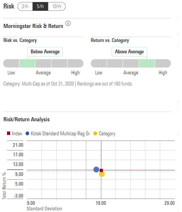
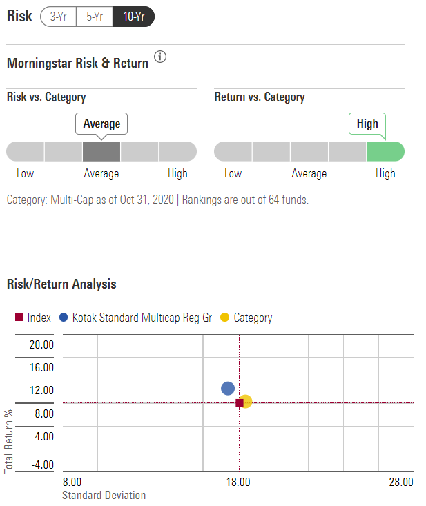
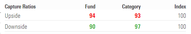
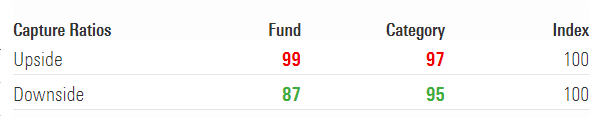

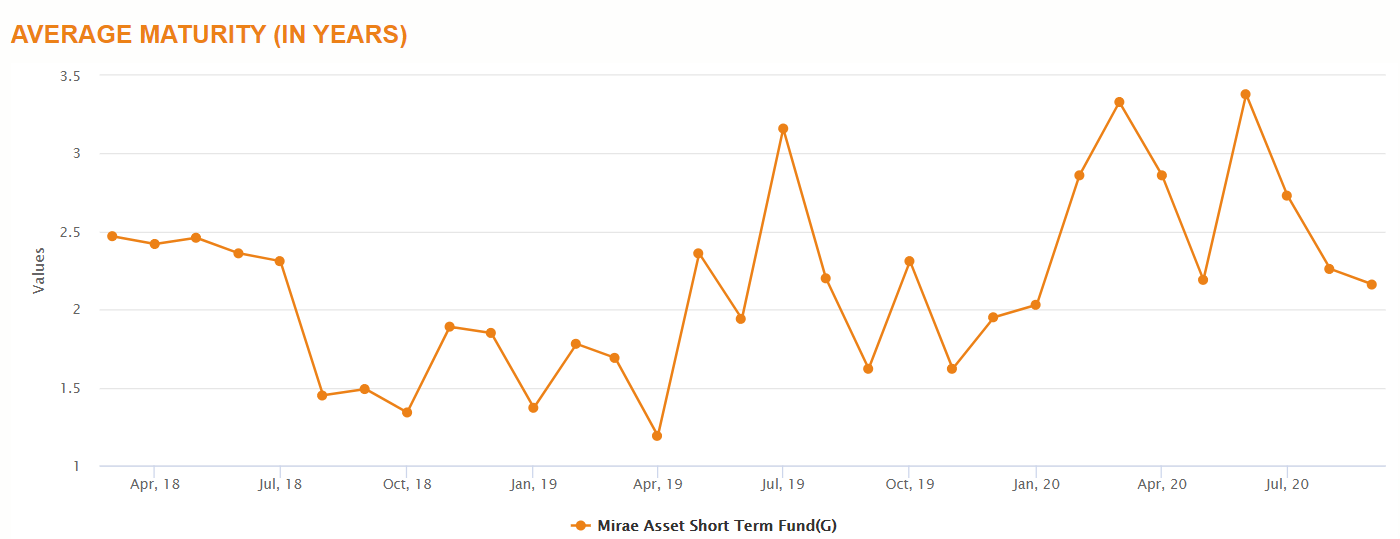
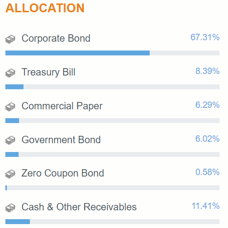
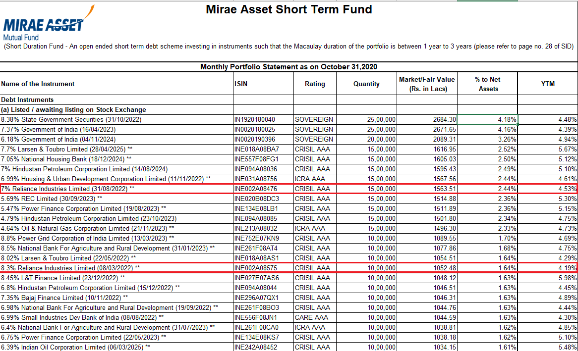

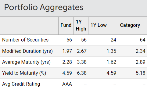
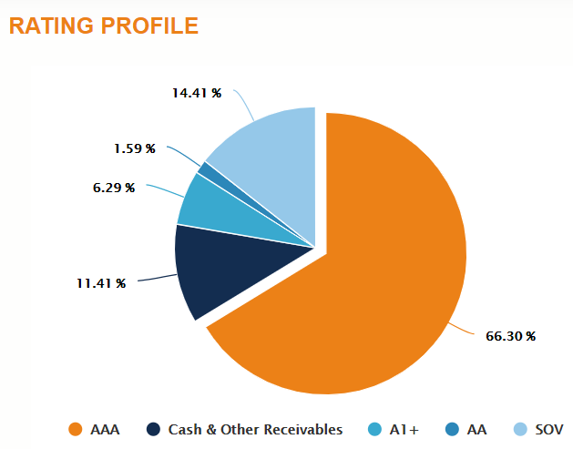
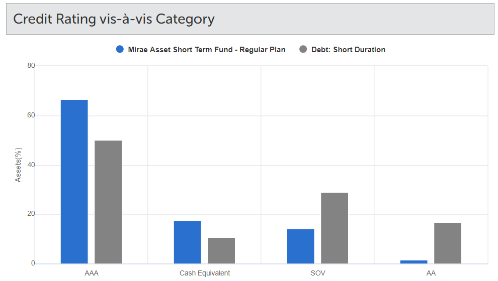

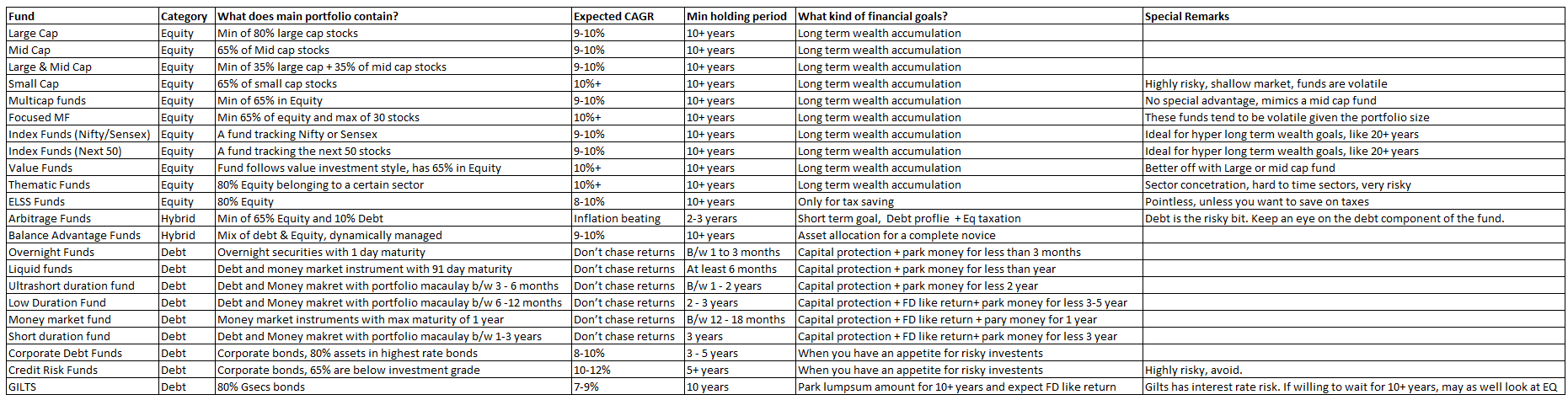
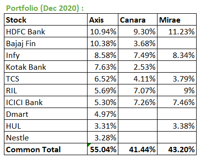

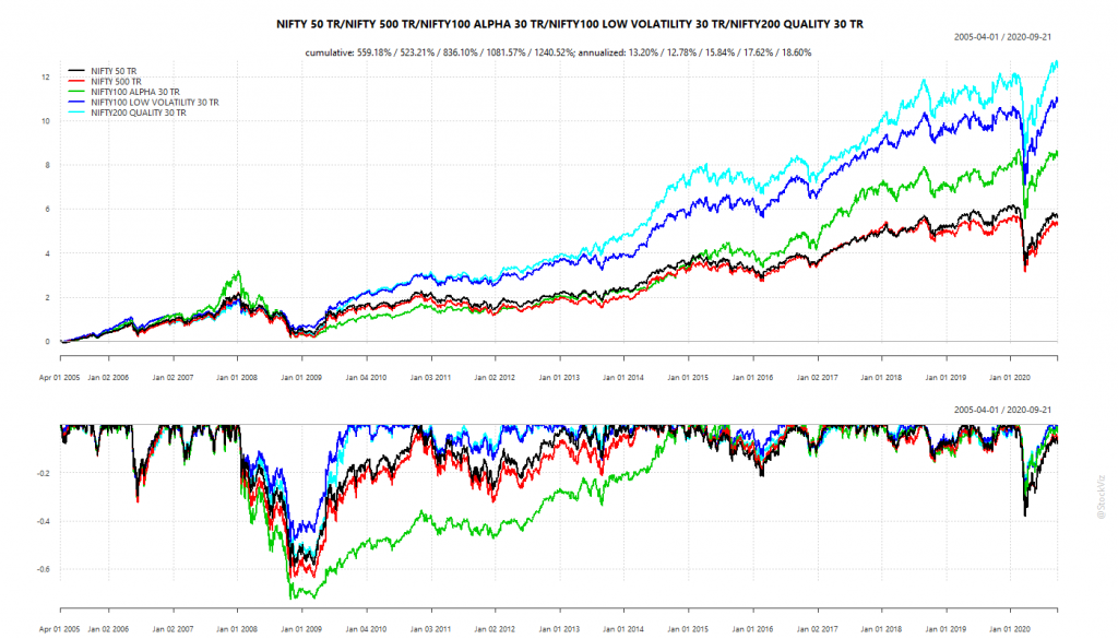
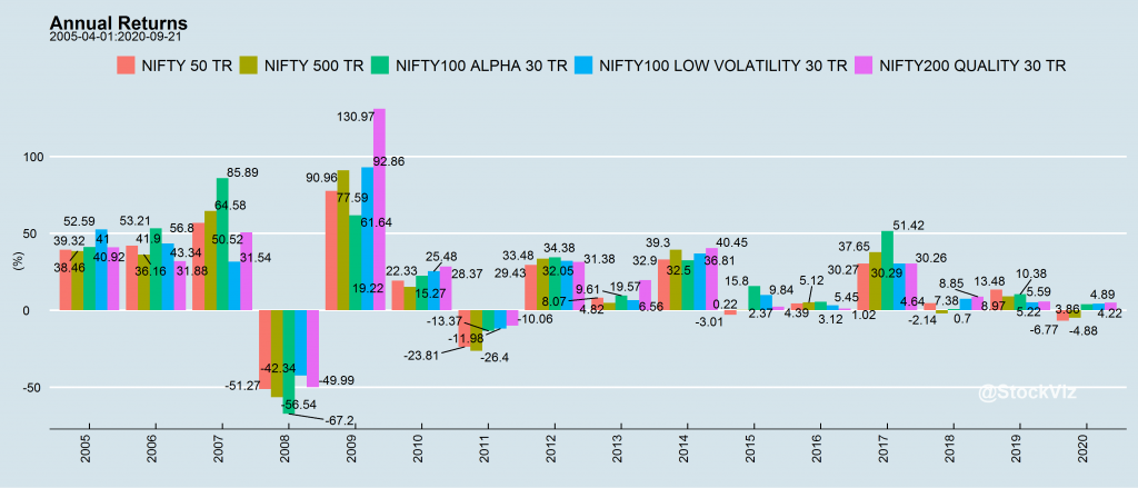
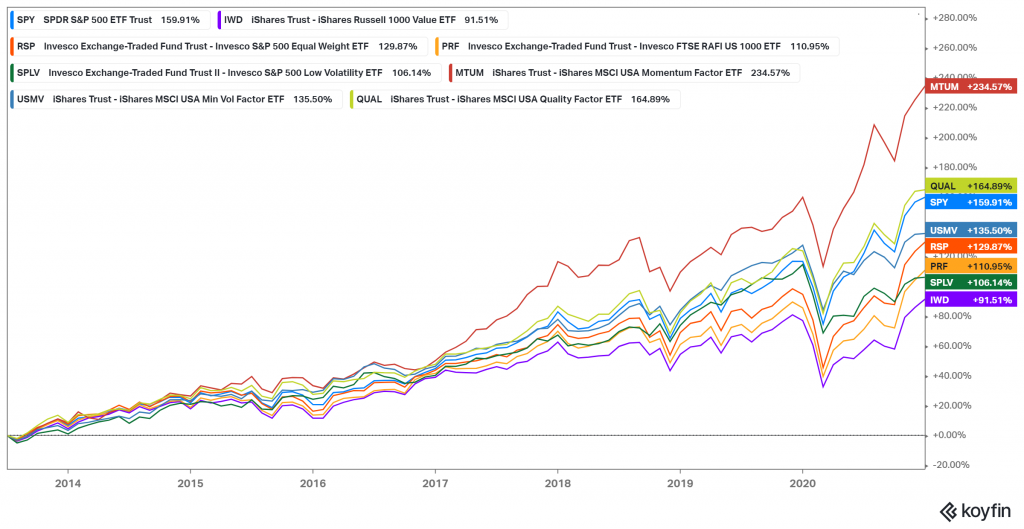
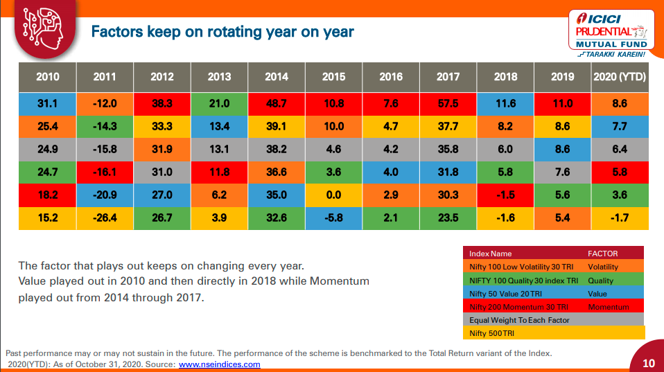
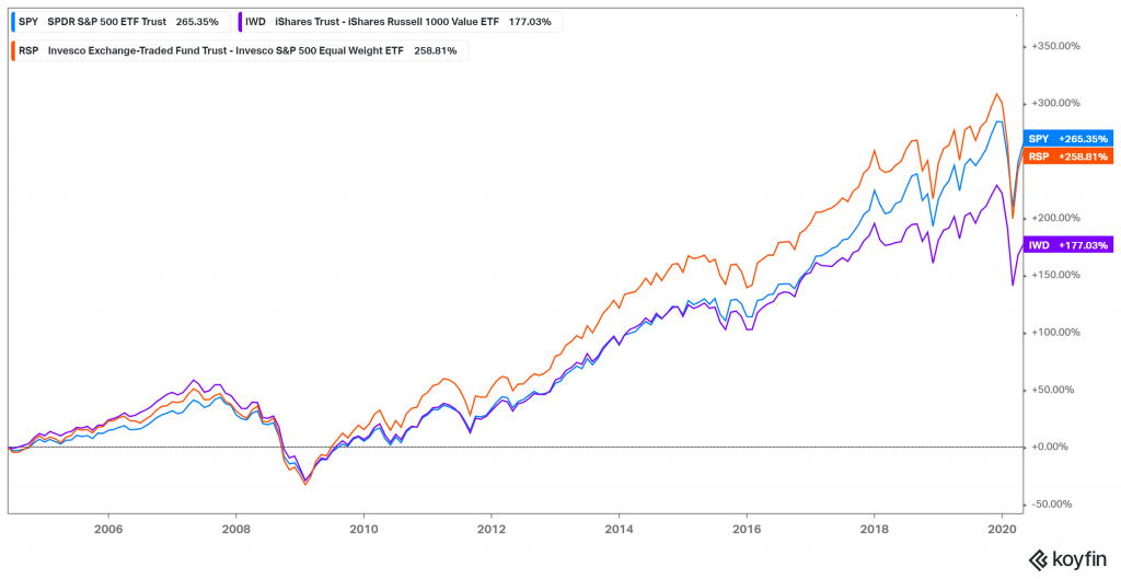


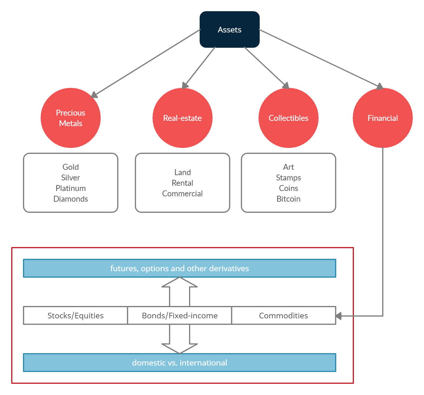


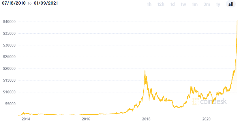
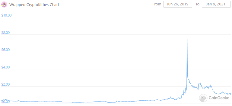
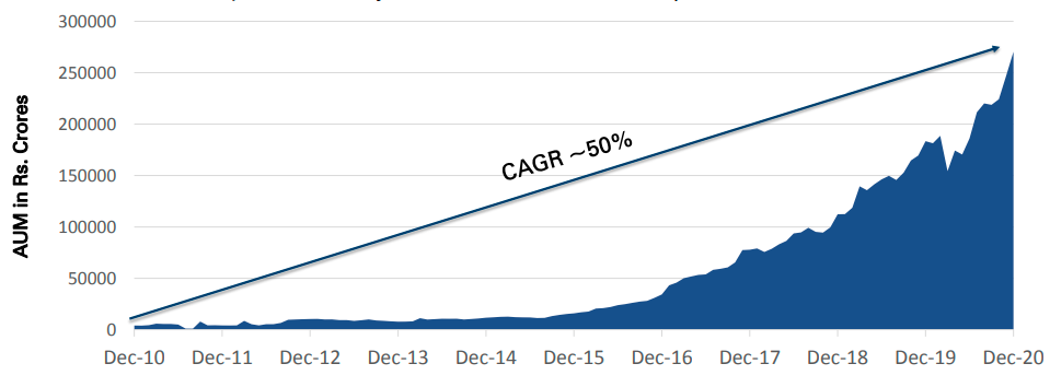

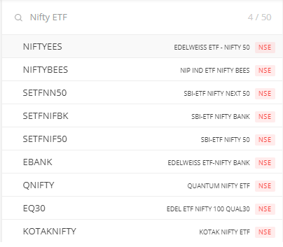
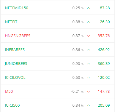


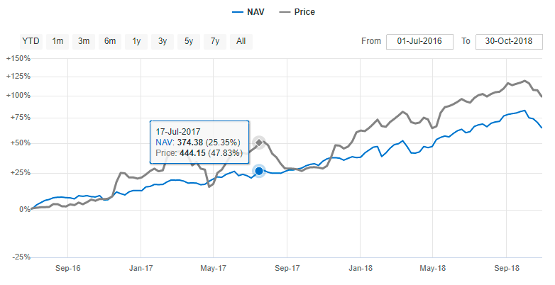
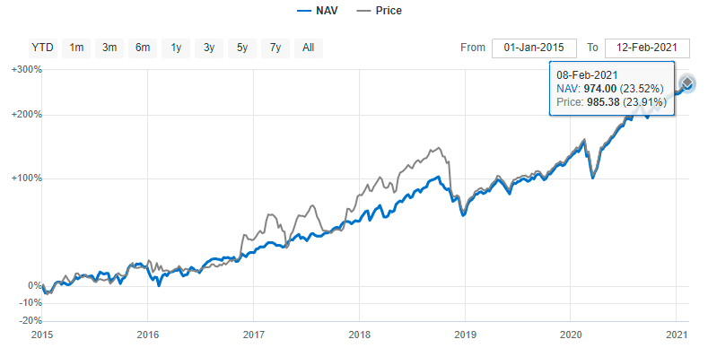

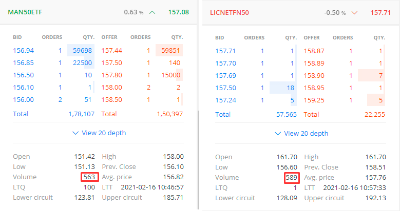
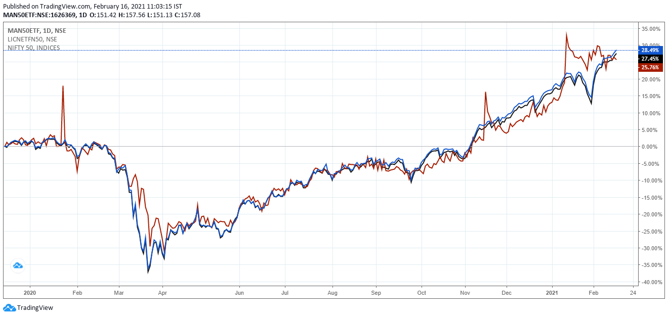


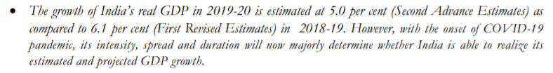
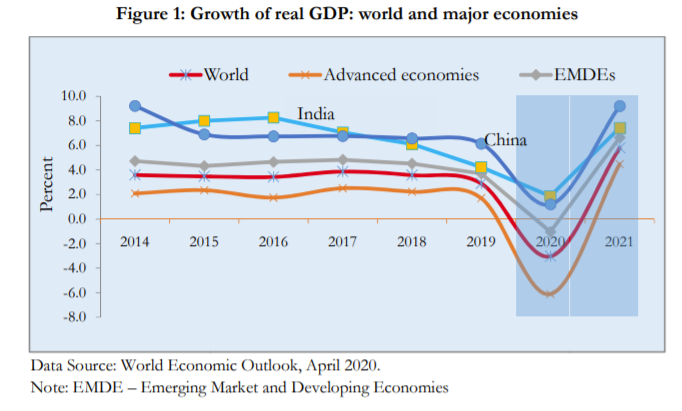


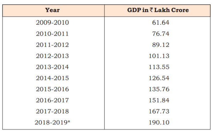


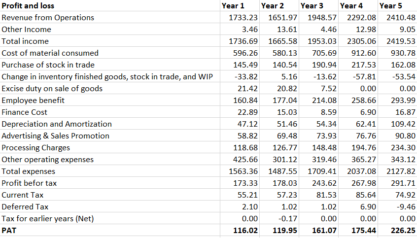


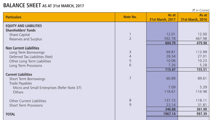
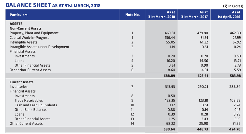


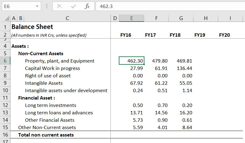
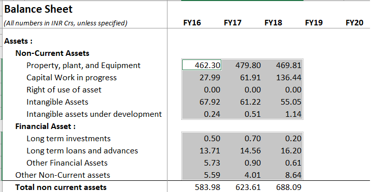
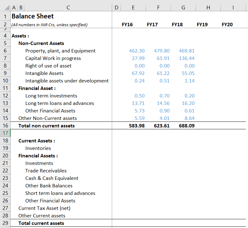
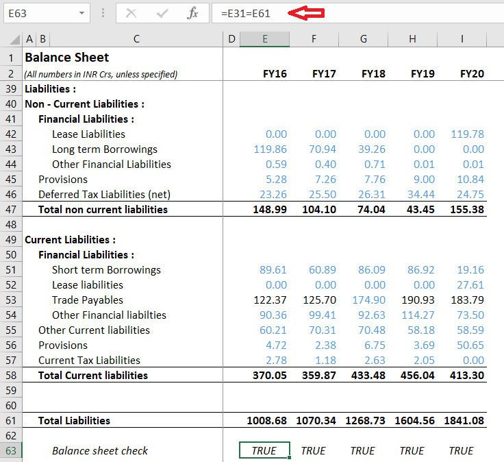
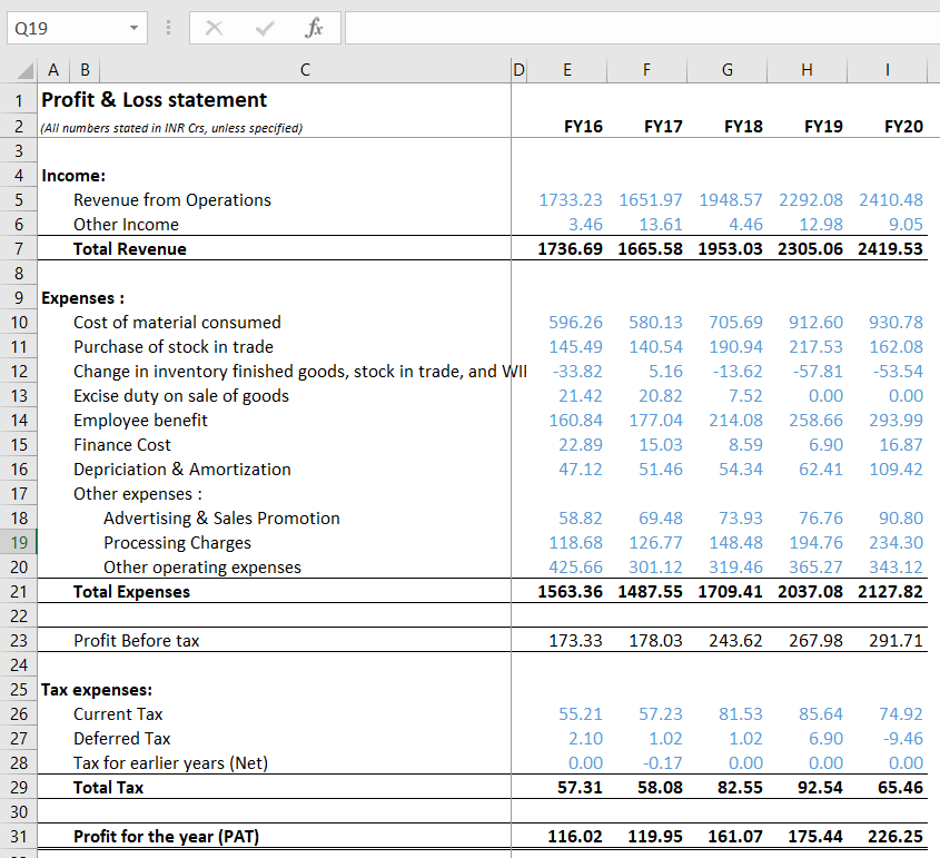

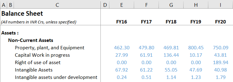
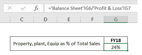
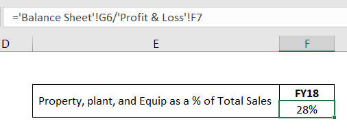

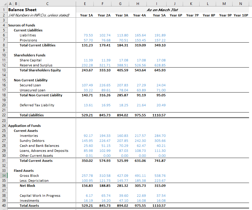

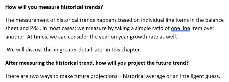

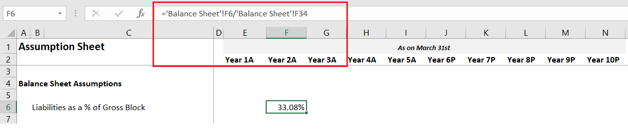
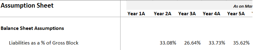
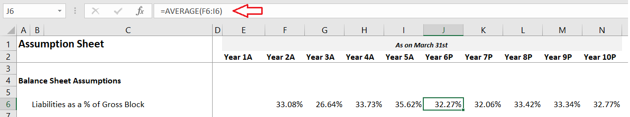
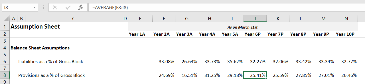

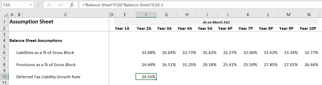


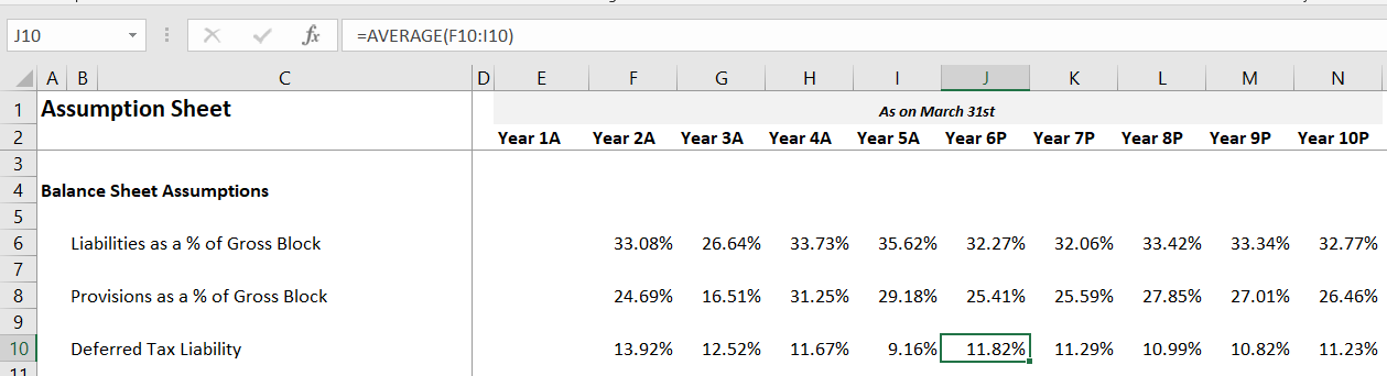

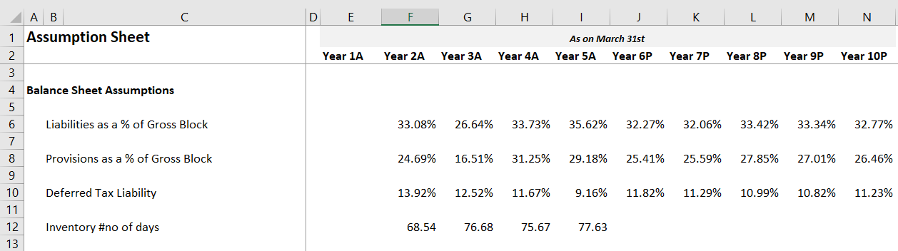

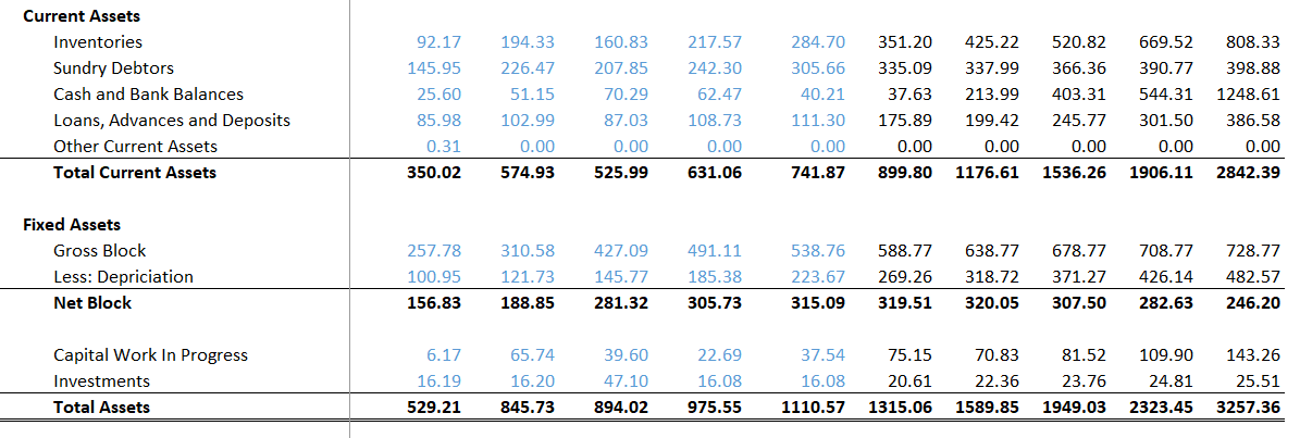
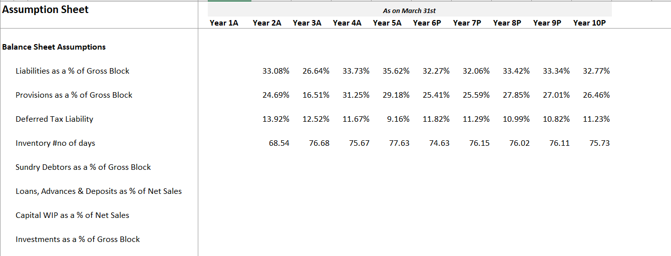

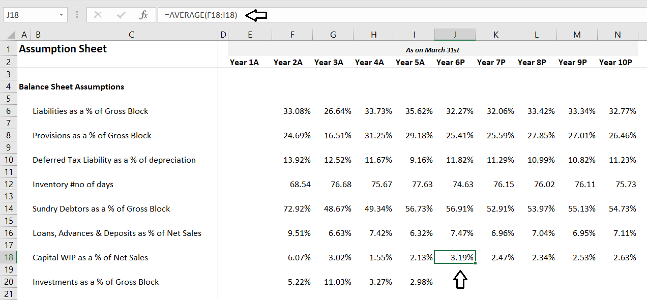
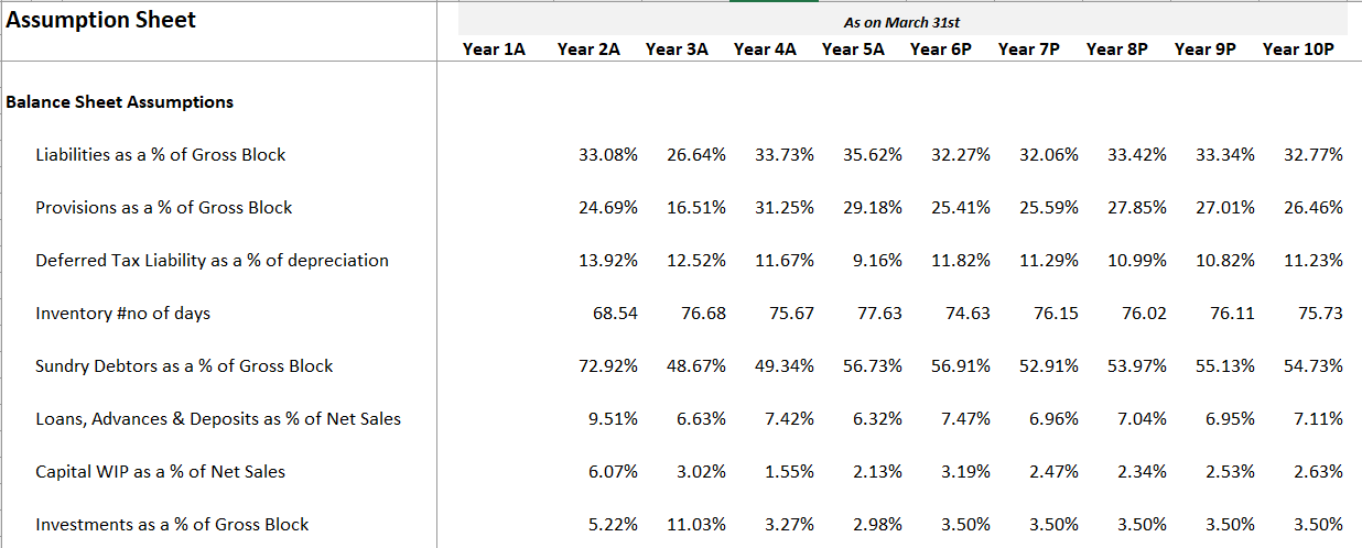

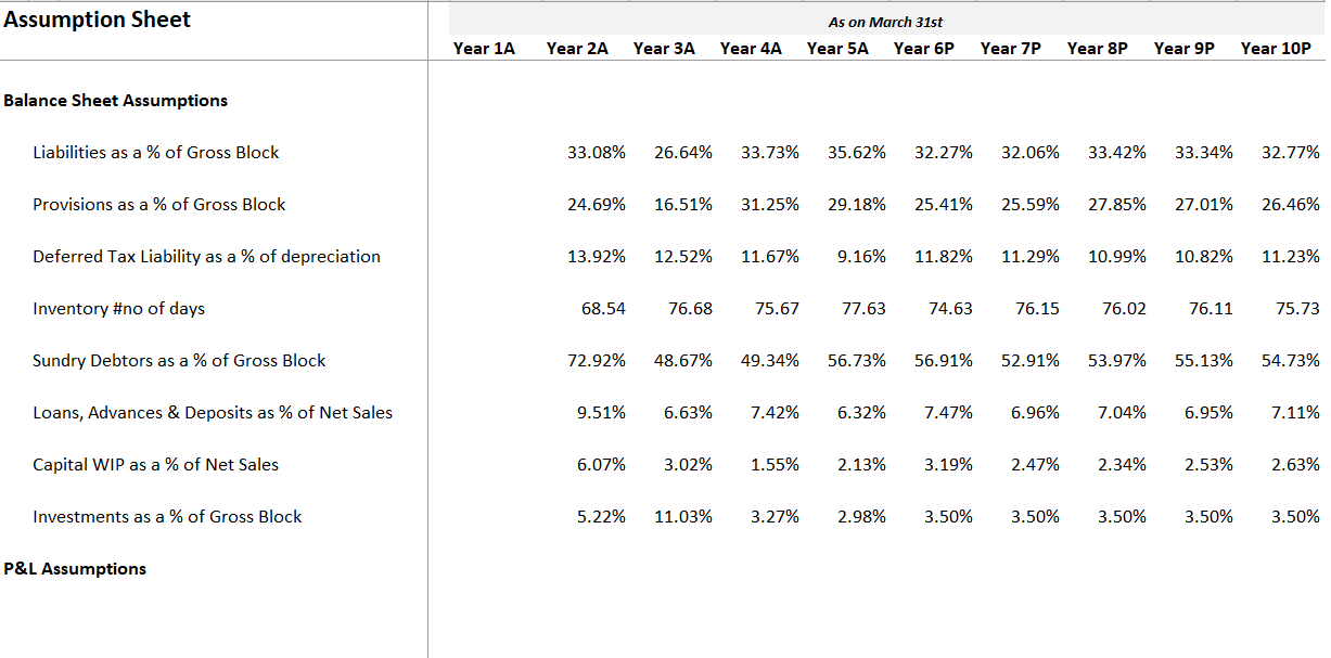


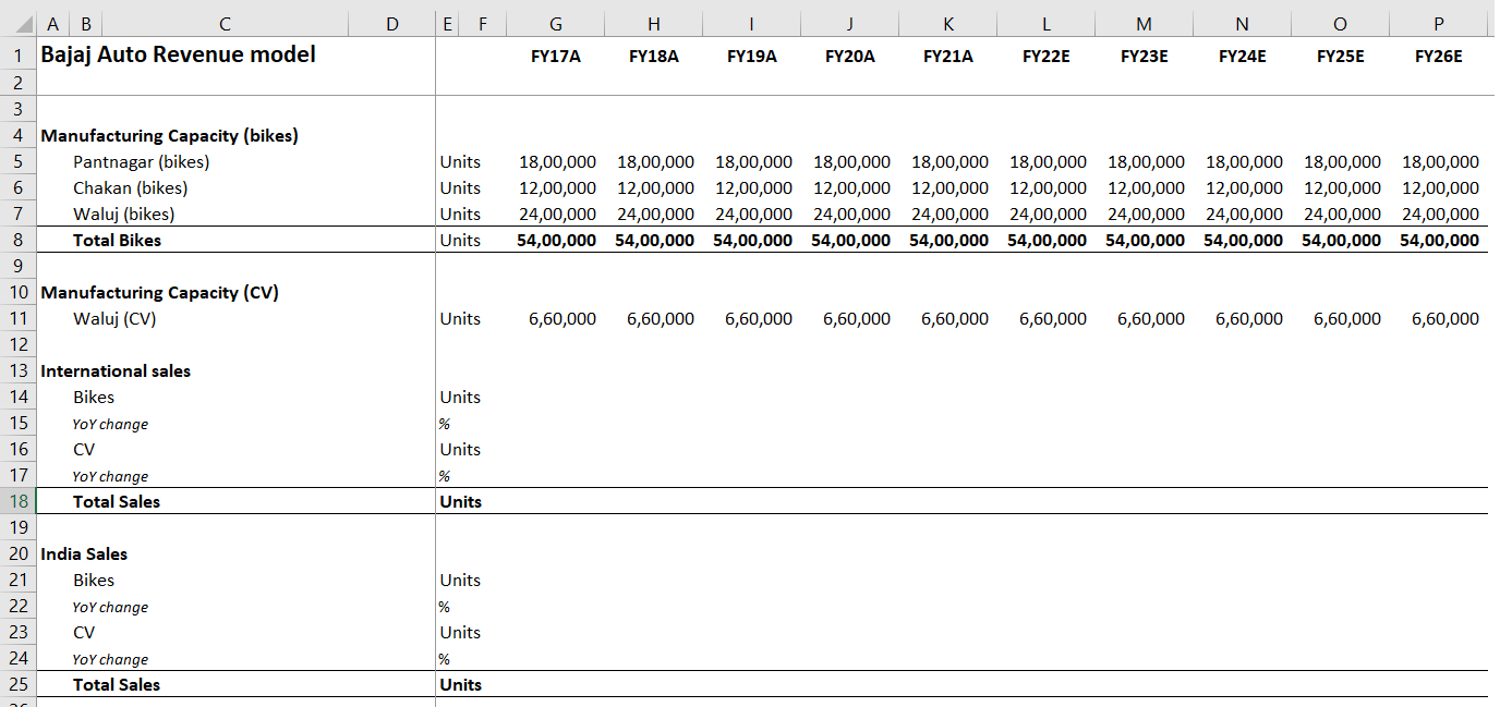
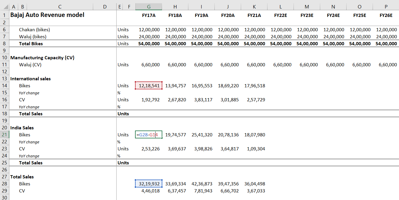
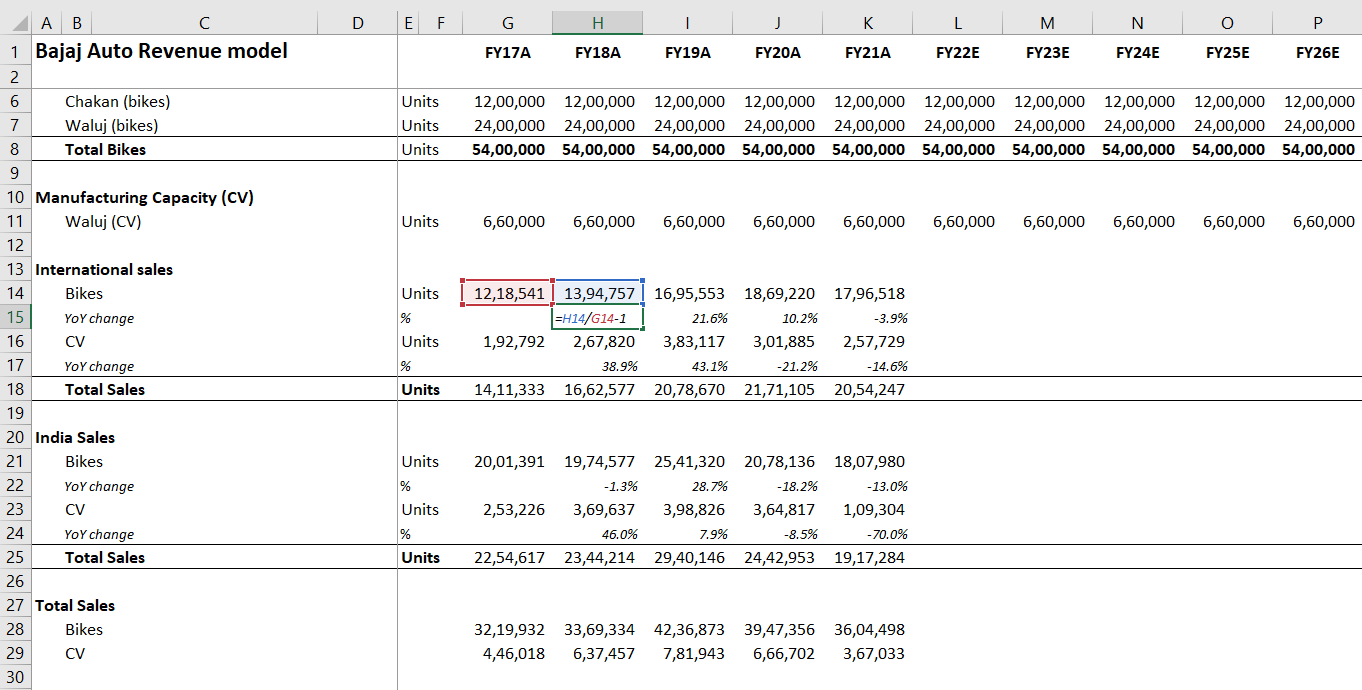
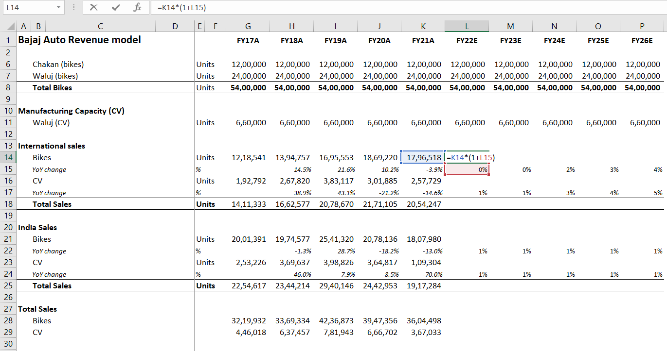
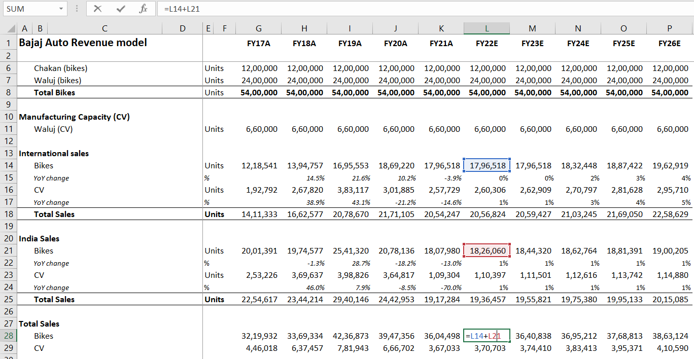


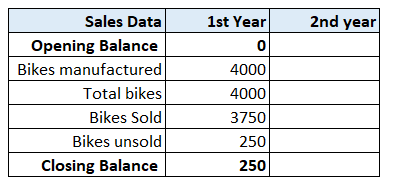
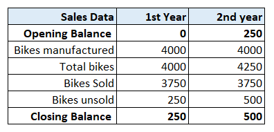
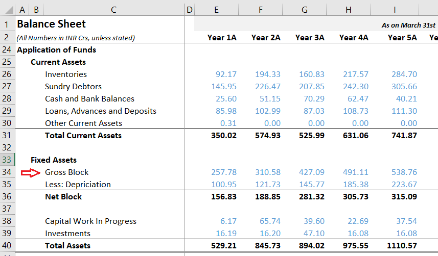
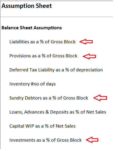


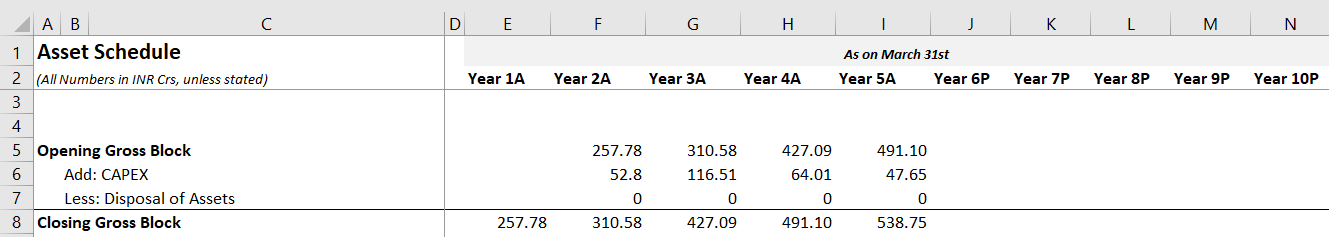
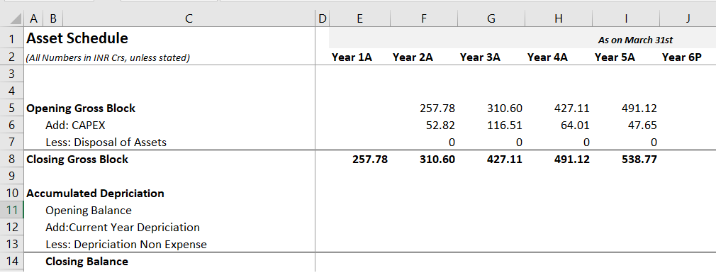
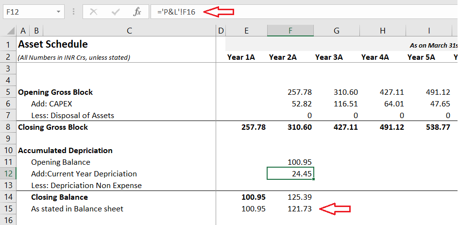
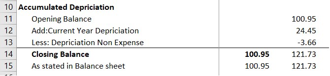

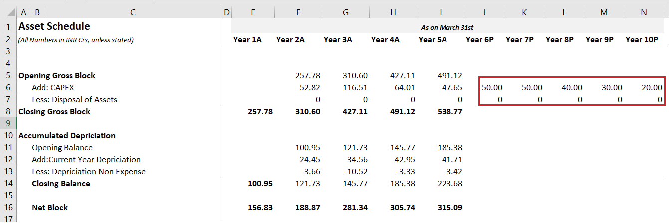

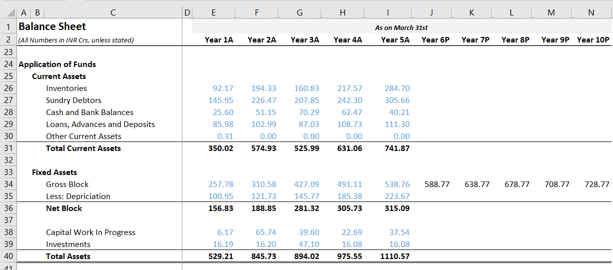
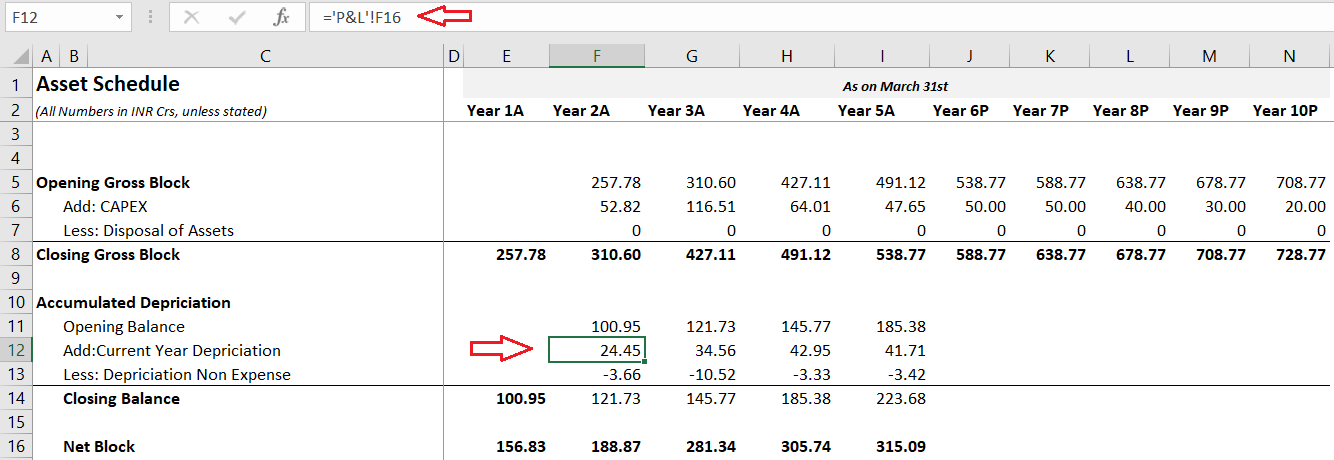
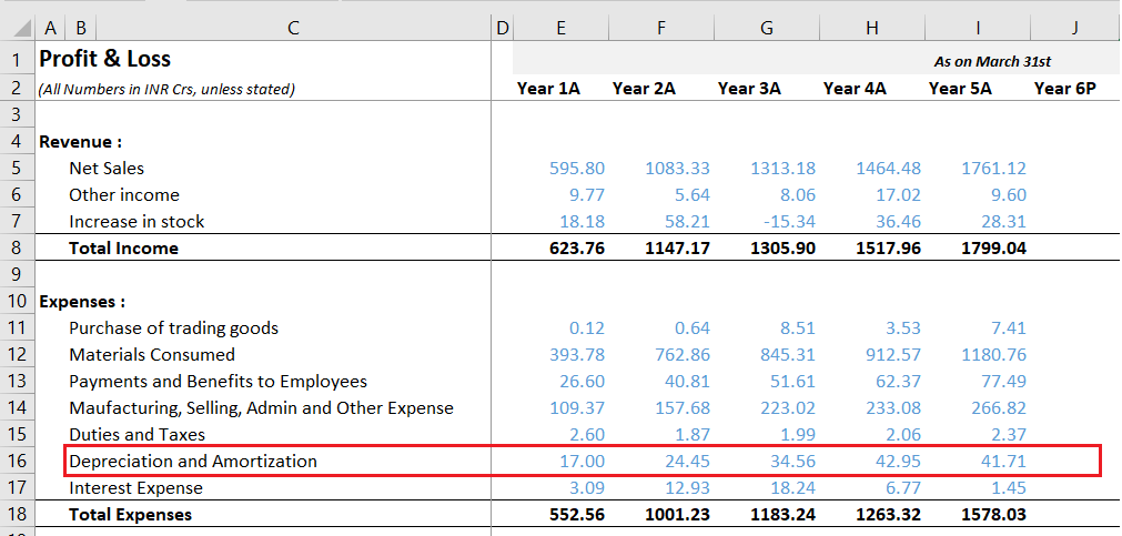

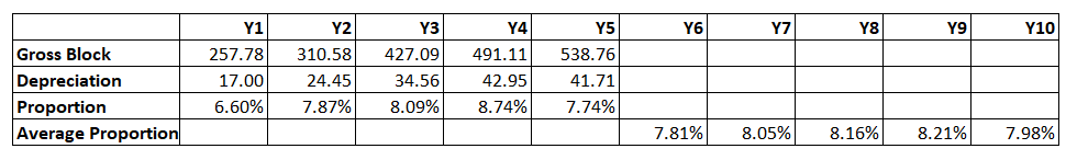
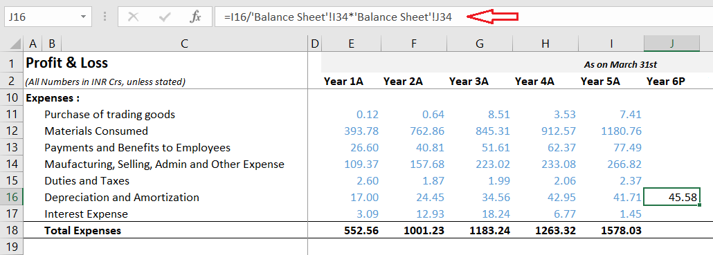
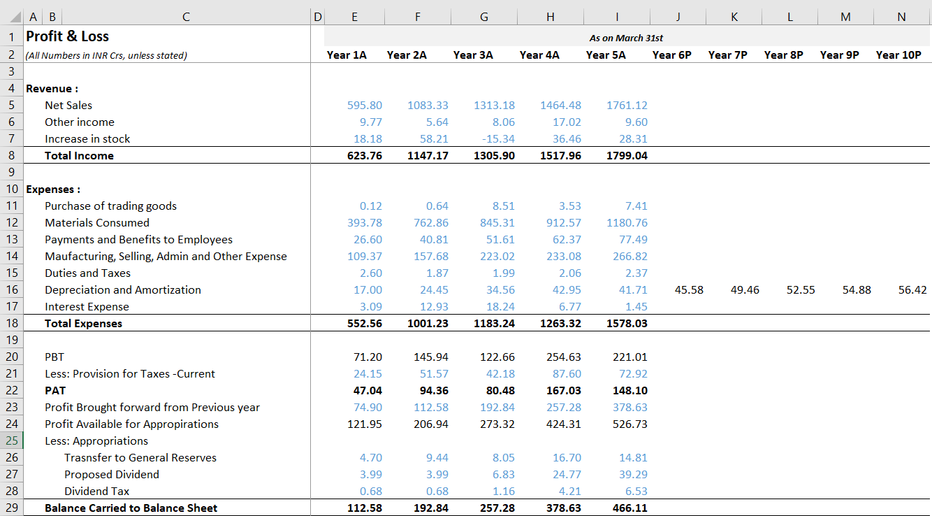


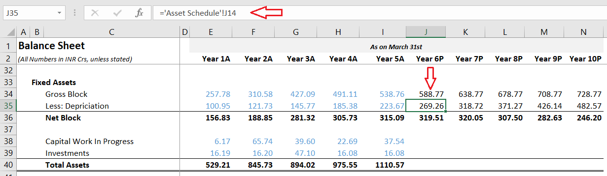


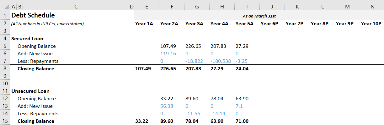


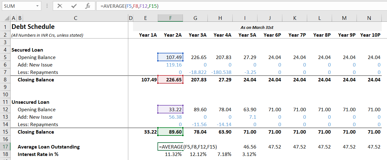
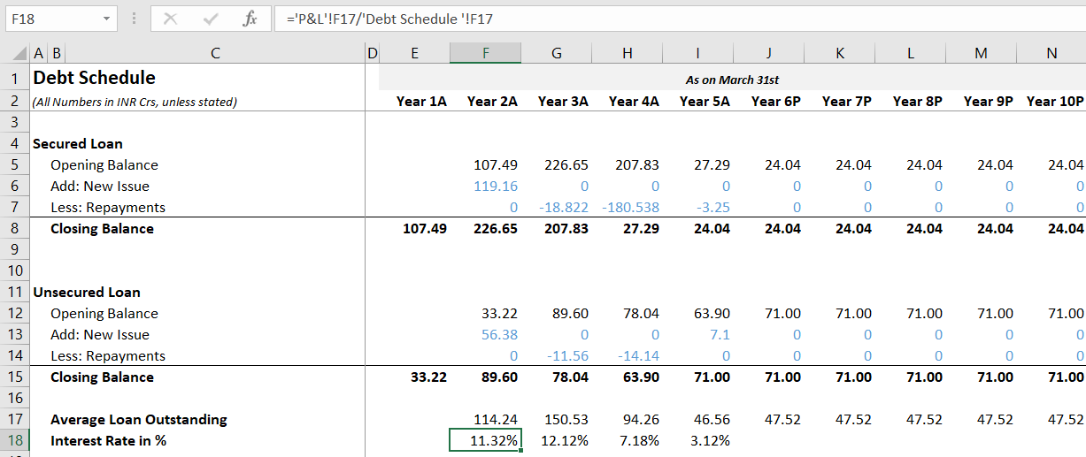
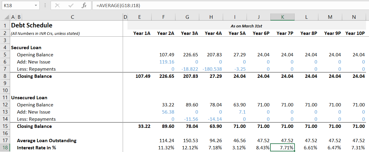
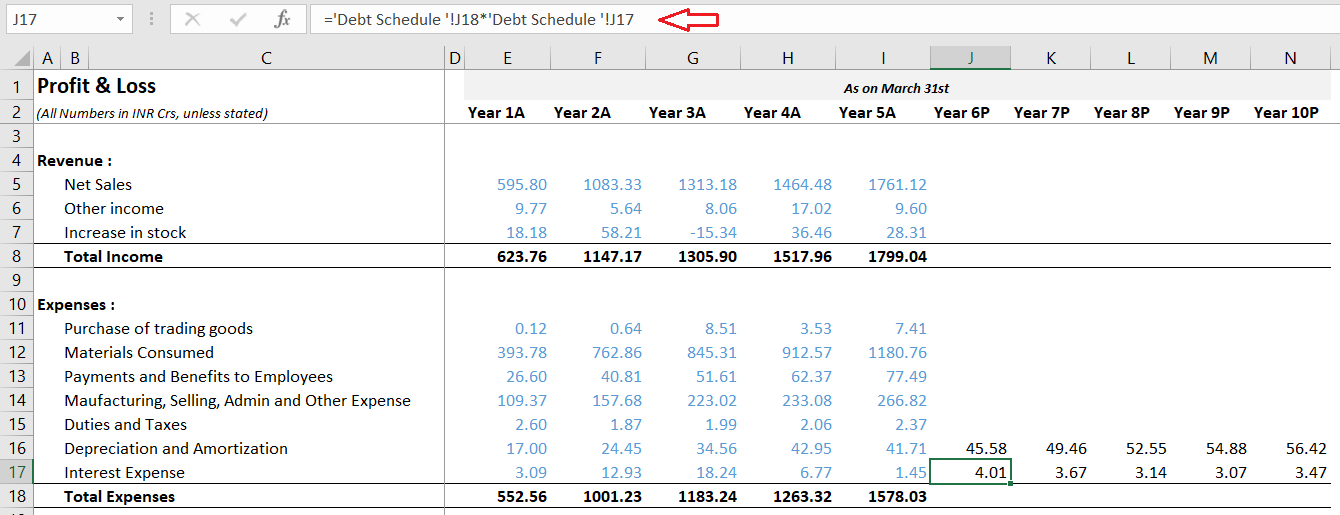
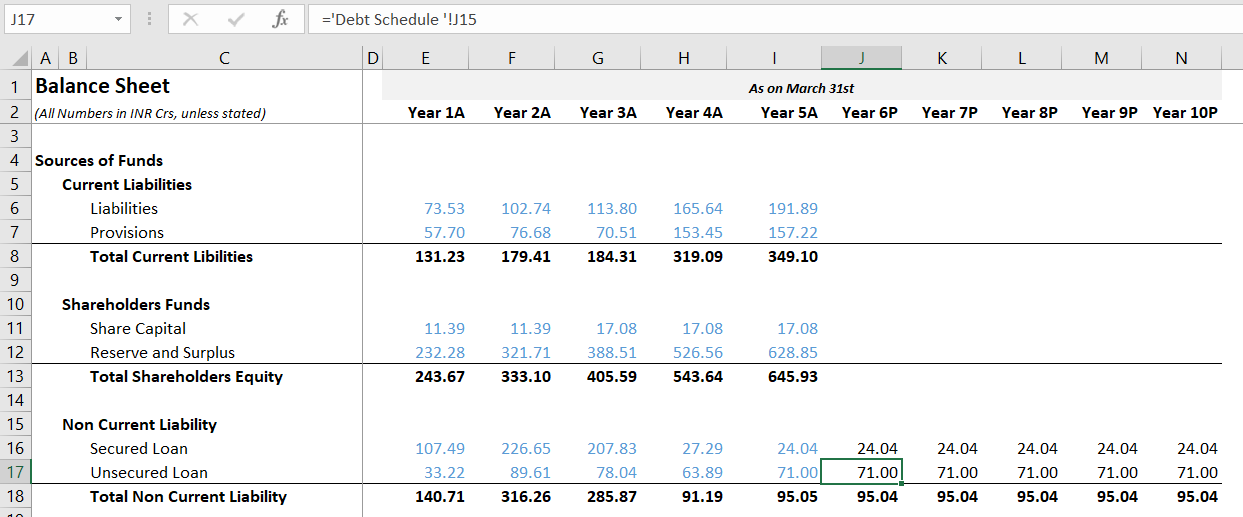

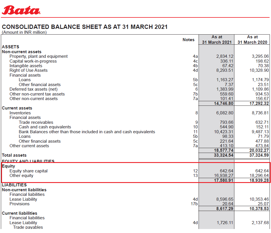

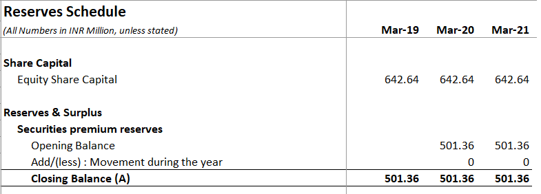


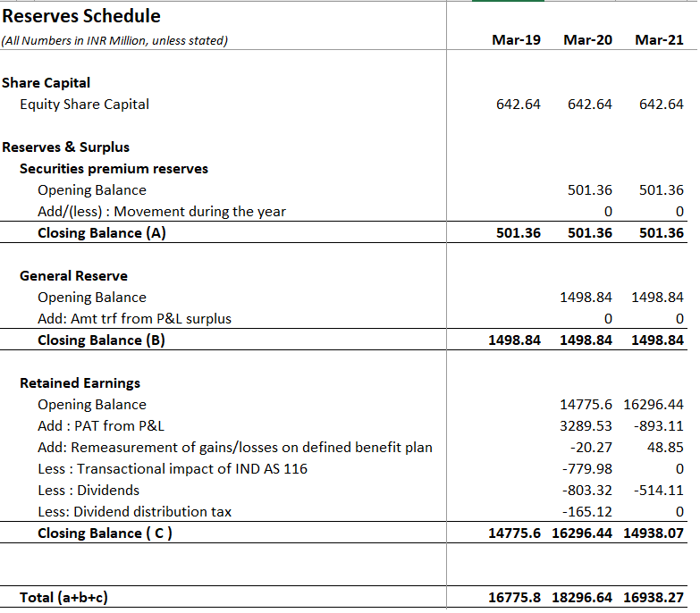


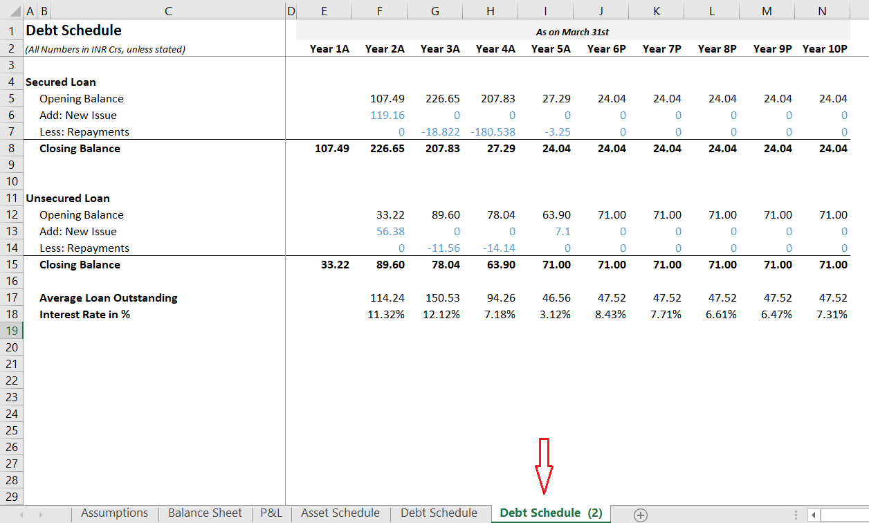
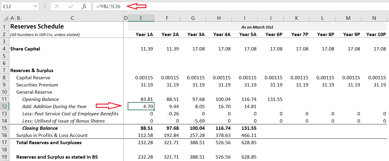
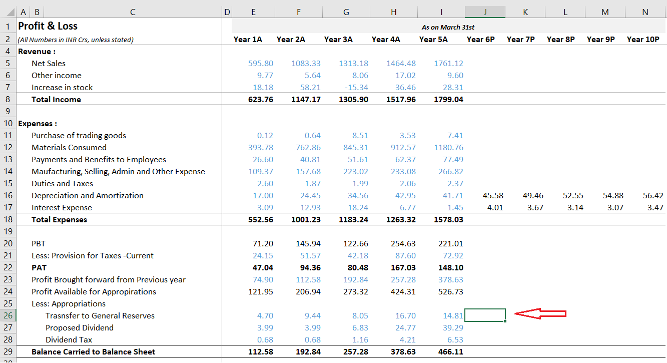

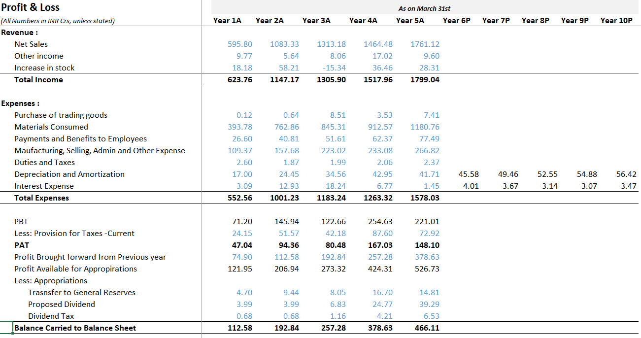

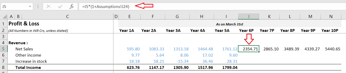
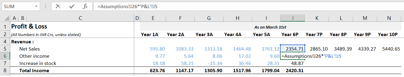
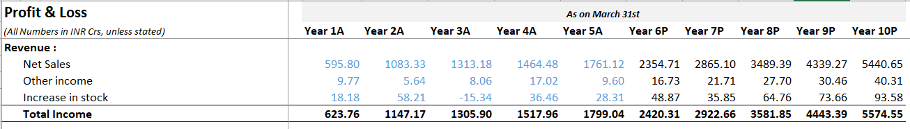
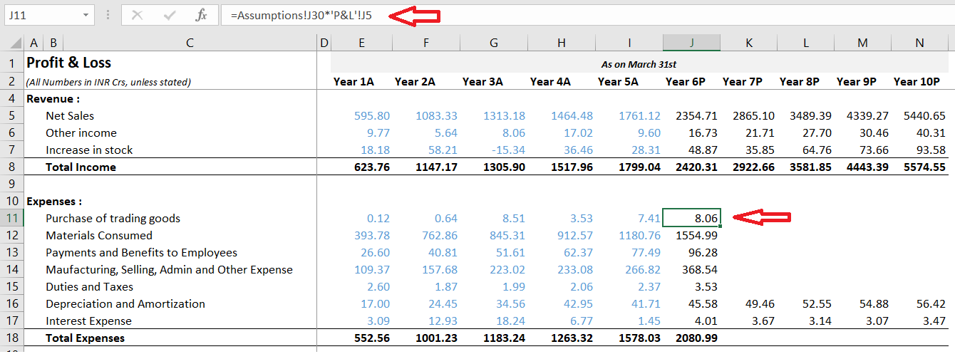
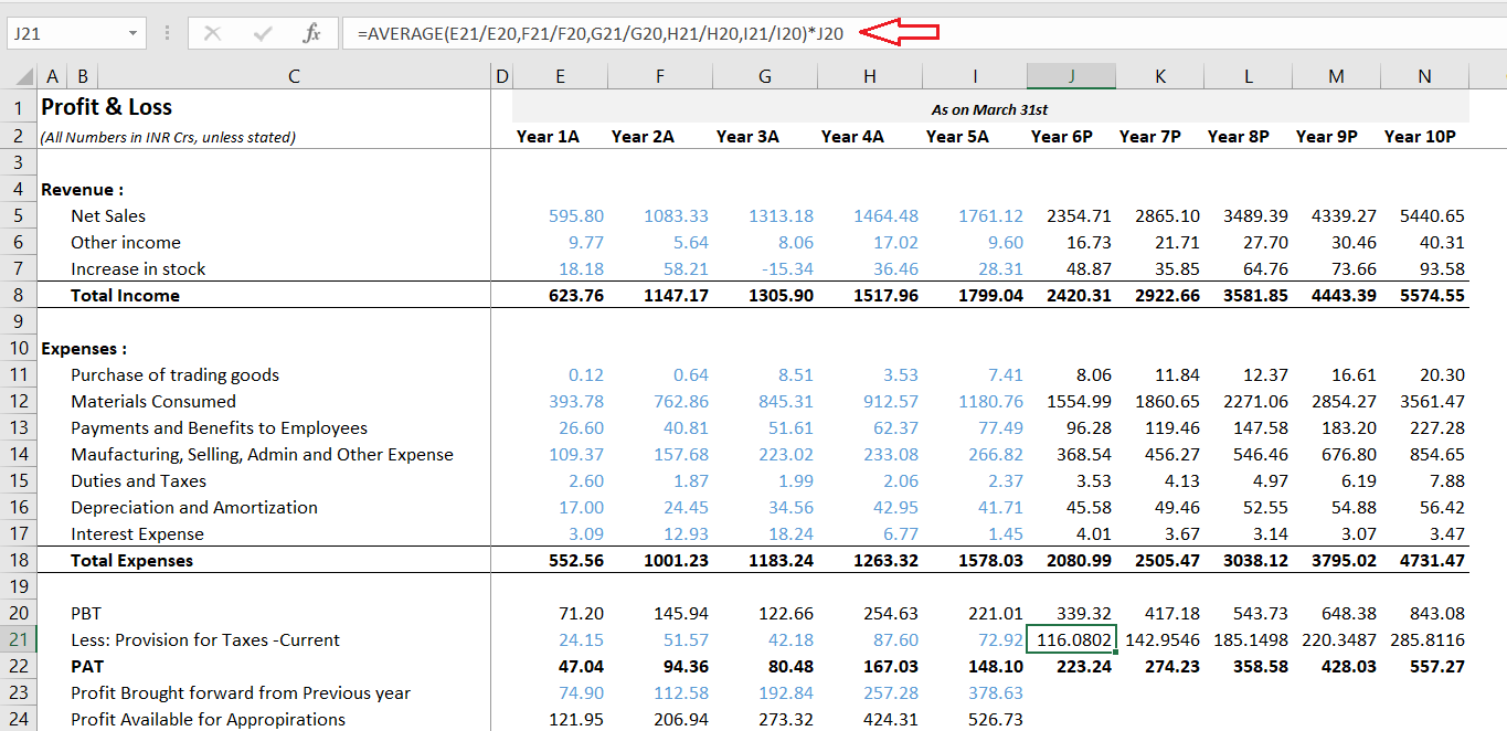
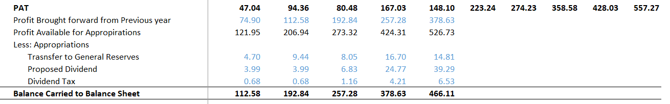
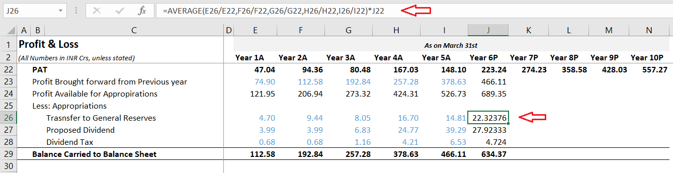
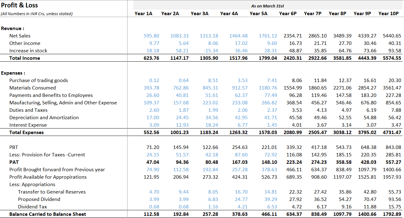
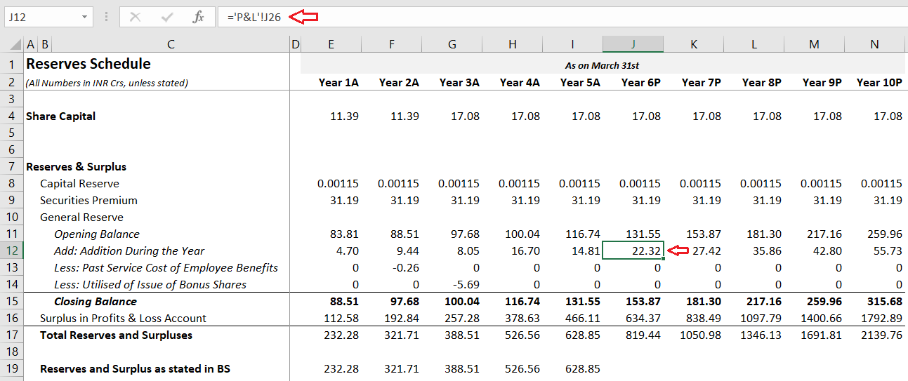
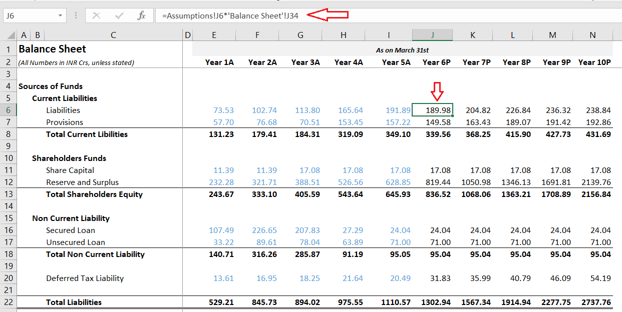
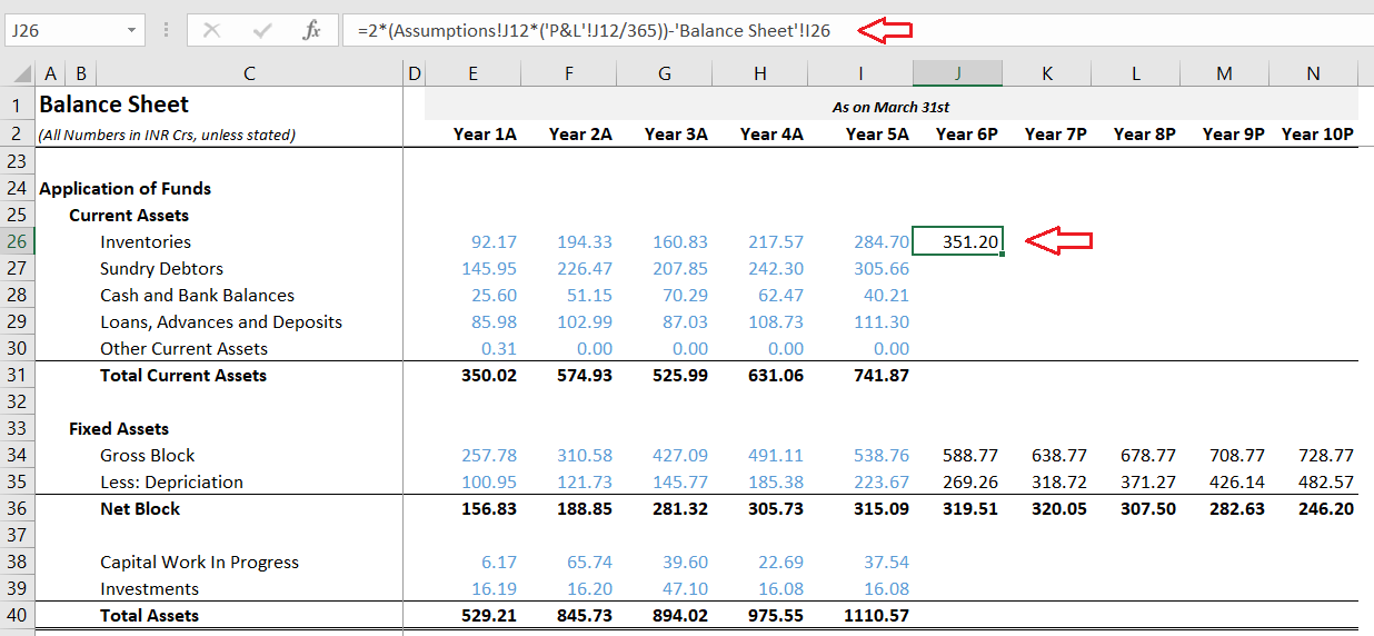
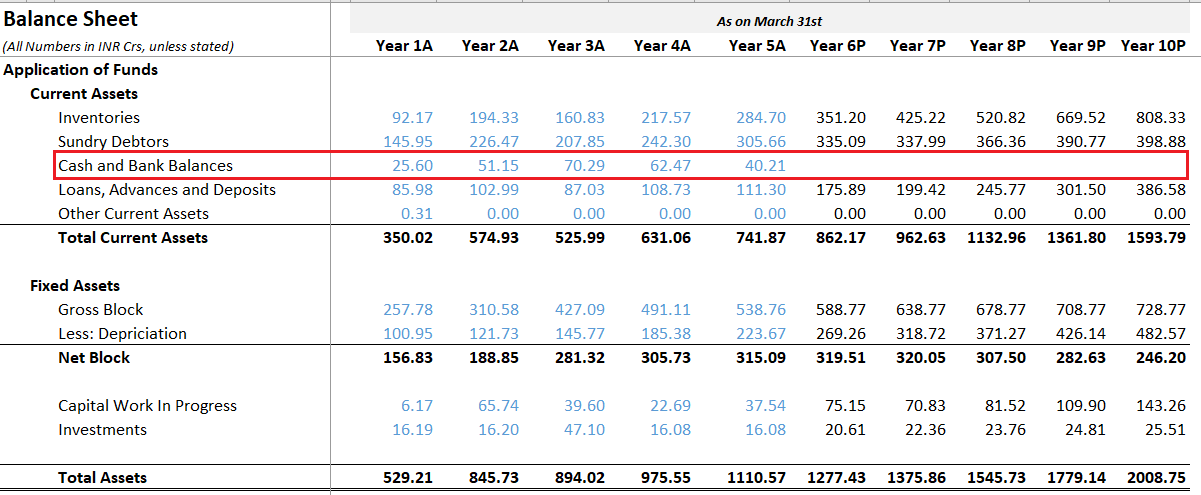


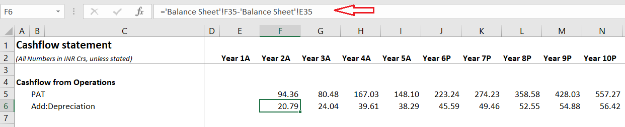
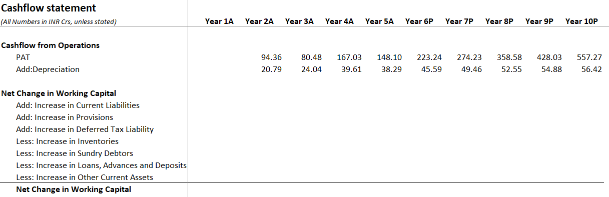
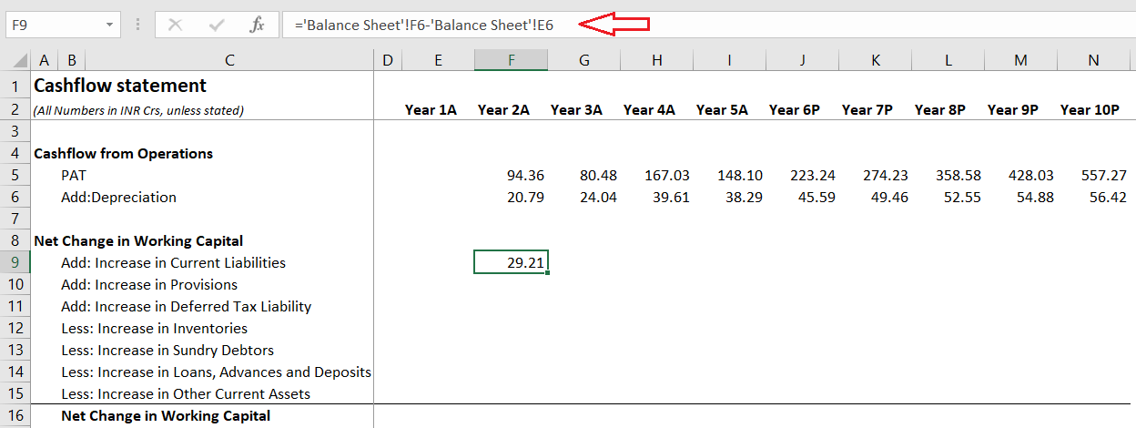
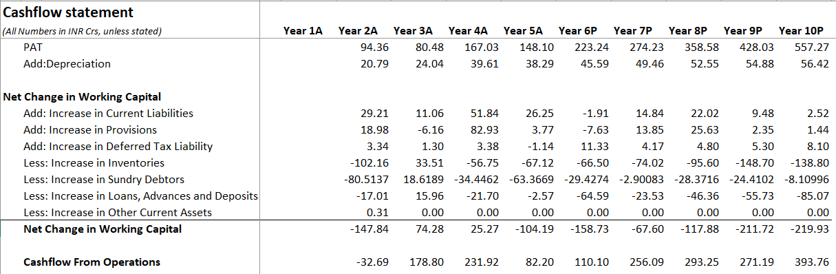
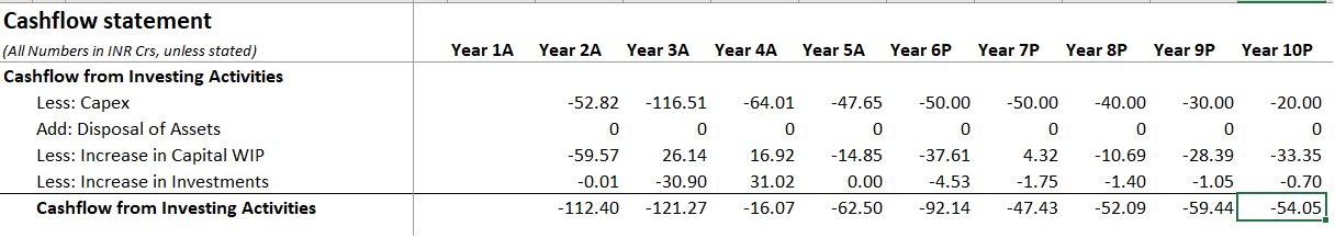
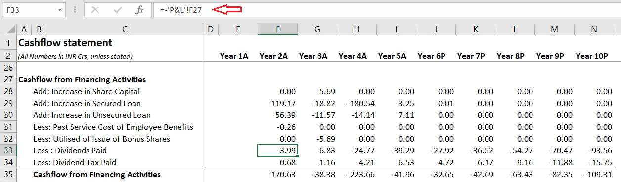
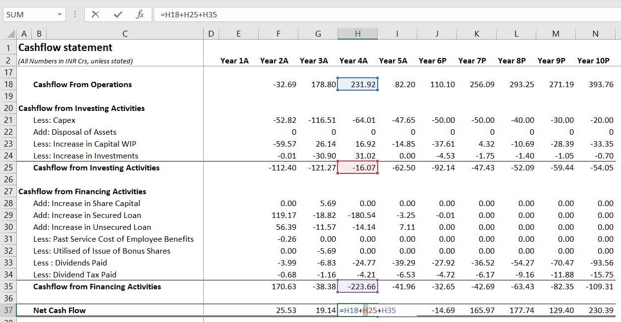
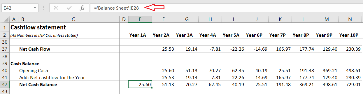
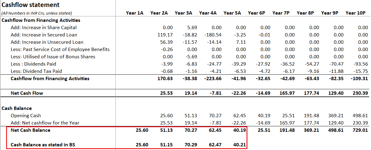
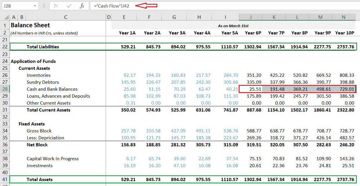

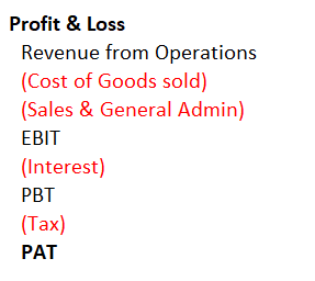


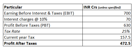


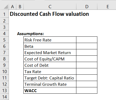
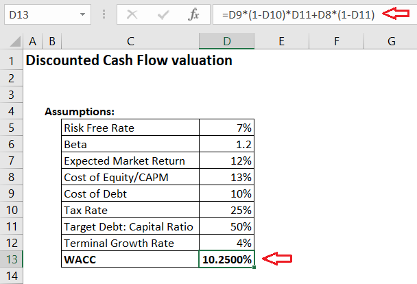
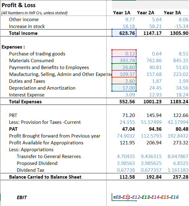
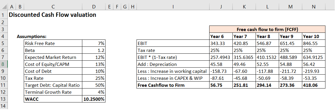


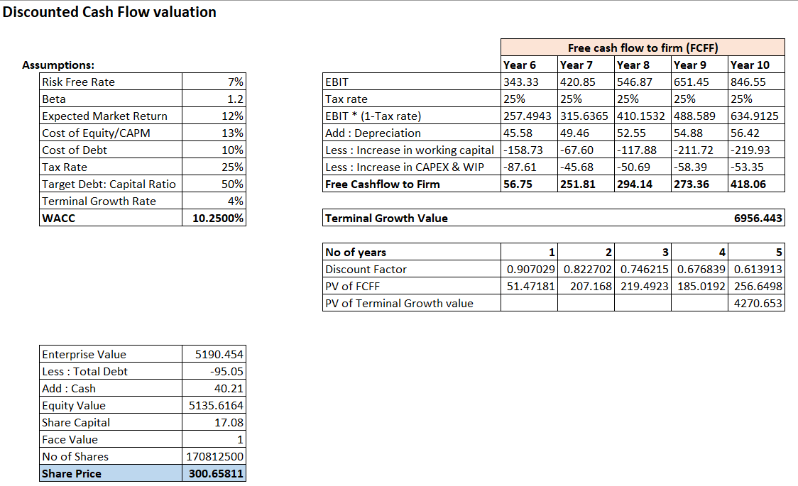


